17 Bold 2026 Home Decor Trends Taking Over Pinterest
Ever scroll through gorgeous rooms and wonder how they get that effortless, magazine-worthy look? You’re about to find out. This year’s 2026 home decor trends are all about bold color, soft texture, and small changes that make a room feel entirely new.
Whether you’re refreshing one corner or planning a full redesign, these ideas are simple enough to try this weekend and impactful enough to notice immediately. In my experience, the best home updates rarely require a full renovation, just the right color, texture, or piece in the right spot. I’ve noticed that even one small change, done well, can completely shift how a room feels to live in. From moody accent walls to dreamy ombre finishes, this list will give you real, doable inspiration you’ll want to save and revisit all year.
1. Ethereal Mist Walls
- Creates a soft, dreamy backdrop without using bold color
- Works beautifully in bedrooms and quiet reading corners
- Mimics the misty, ethereal landscapes trending across Pinterest
- Pairs well with sheer fabrics and low-profile furniture
- I’ve noticed this finish looks completely different morning versus evening light
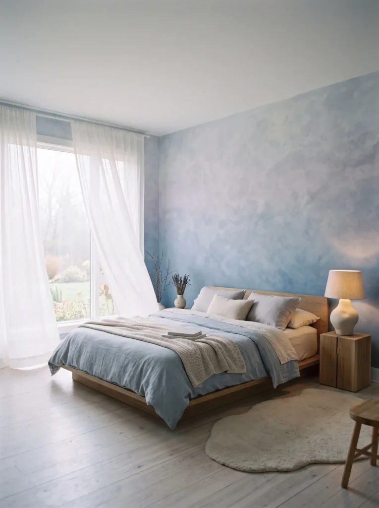
Foggy, misty wall treatments are replacing flat paint with something far more atmospheric. This look borrows from the “ethereal places” aesthetic currently dominating Pinterest searches, translating dreamy, fog-covered landscapes into a soft ombre or cloud-textured wall finish. In my experience, this works best in bedrooms, where the effect feels calming rather than cold. Unlike a single flat color, this treatment shifts subtly depending on the light in the room, giving the space a quiet, almost cinematic quality. It’s a fresh alternative to bold accent walls for anyone wanting mood without commitment to intense color.
The technique itself is simple: a soft gradient, blended by hand or achieved with a specialty plaster finish, moving from pale grey-blue into a whisper of lavender or mist green. That’s why many designers recommend testing a sample swatch on the actual wall before committing, since the blend depends heavily on natural light. I’ve seen this work particularly well paired with sheer curtains and minimal furniture, letting the wall itself become the room’s main visual feature. The result feels serene, current, and noticeably more artistic than a standard painted room.
2. Sunset Ombre Nook
- Adds warmth and depth using a color gradient instead of one flat shade
- Perfect for small nooks, corners, or single accent walls
- Evokes a nostalgic, golden-hour feeling all day long
- Pairs beautifully with rattan, brass, and warm textiles
- A striking focal point that needs very little else around it
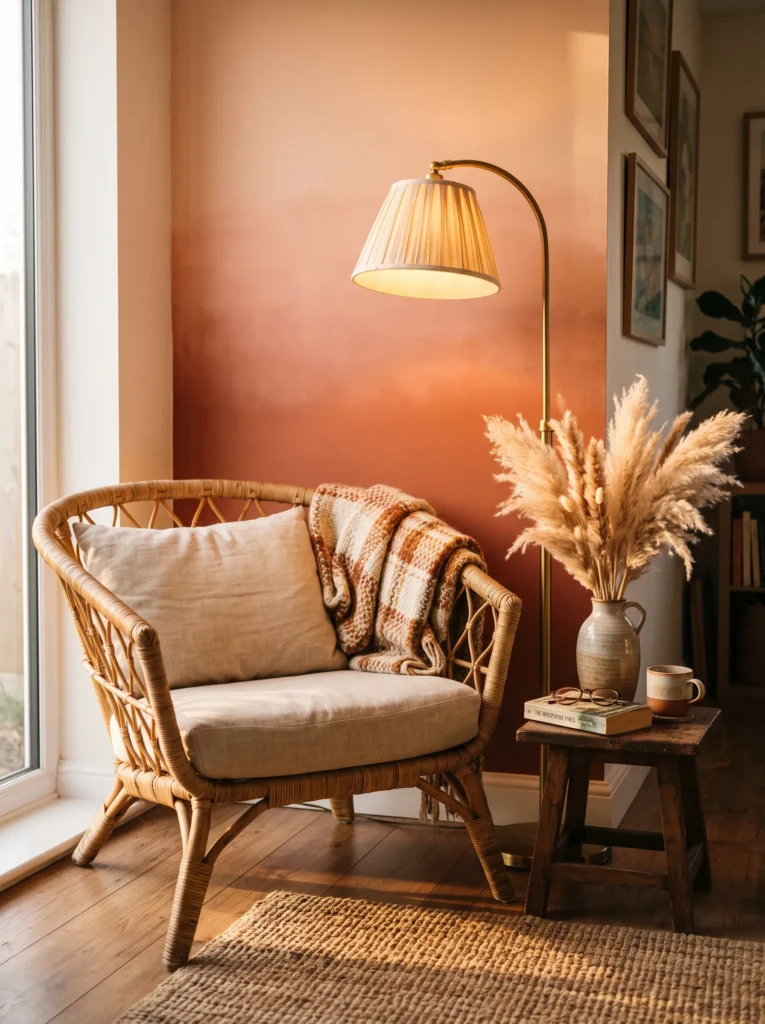
Gradient walls are giving the classic accent wall a much-needed refresh. Instead of one solid color, this look blends soft peach into deep rust or terracotta, mimicking the warmth of a sunset frozen in place. In my experience, this treatment works best in small, cozy spots — a reading nook, a window seat, a compact home office — where the gradient can be fully appreciated at a glance. It brings genuine warmth into a room without relying on a single bold paint color, which makes it feel more layered and considered than a typical accent wall.
What makes this trend so appealing is how little else the space needs once the wall is done. A rattan chair, a brass lamp, and one warm textile are usually enough to complete the look. That’s why many designers recommend keeping surrounding furniture simple, letting the gradient remain the clear focal point. I’ve seen this work particularly well in west-facing rooms, where real sunset light interacts beautifully with the painted gradient. The overall effect feels nostalgic yet entirely fresh, a color technique that photographs as well as it feels to sit in.
3. Reflective Glass Details
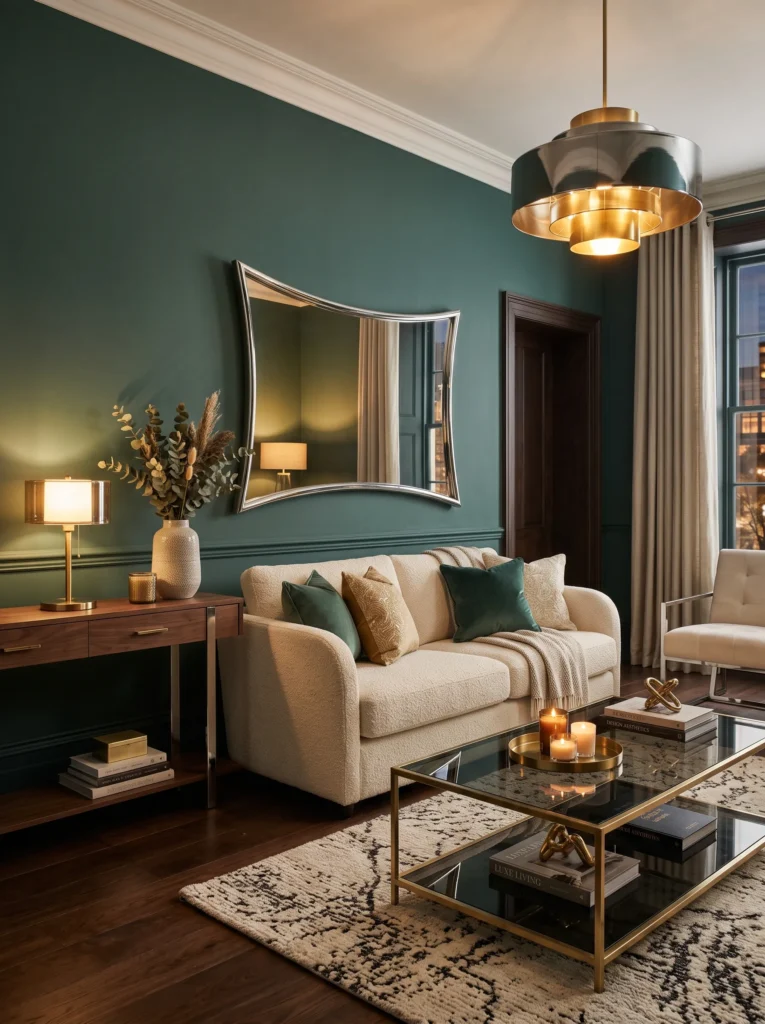
- Adds subtle light and depth without extra clutter
- Works through tables, lighting, and small decorative objects
- Reflects existing colors and textures, making rooms feel bigger
- Pairs beautifully with darker, moodier wall colors
- A refined trend that photographs exceptionally well after dark
Glass is having a quiet resurgence, not as an entire design theme, but as a way to add depth through reflection. Smoked-glass tables, mirrored side tables, and sculptural glass lighting all bounce existing colors and textures around a room, making it feel larger and more layered than it actually is. In my experience, this trend works especially well in living rooms with darker, moodier wall colors, since the glass catches ambient light and keeps the space from feeling too heavy or closed in. It’s a subtle upgrade, easy to introduce without redesigning the whole room.
The real value of this trend shows up after sunset. Glass surfaces catch lamp light and candlelight in a way flat, opaque furniture simply can’t, creating a soft, layered glow throughout the room. That’s why many designers recommend pairing at least one glass piece with warm metal accents like brass, which reflects beautifully against the smoked or clear surface. I’ve seen this work particularly well in smaller living rooms, where a glass coffee table visually opens up the floor space. The result is a room that feels luminous, current, and quietly more sophisticated by evening.
You May Also Love:2026 Trendy Color Palette: Interior Inspiration
4. Plum Noir Accent Wall
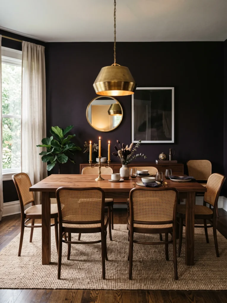
- Adds instant drama without feeling dark or heavy
- Pairs beautifully with brass, rattan, and warm wood tones
- Works well in dining rooms, entryways, or home offices
- A single wall commitment, not a full-room overhaul
- I’ve noticed this shade photographs incredibly rich under warm lighting, almost velvety
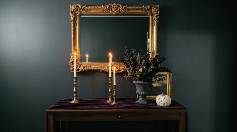
Deep, moody colors are having a real resurgence, and this near-black plum shade leads the pack. It reads as sophisticated rather than gloomy, especially when paired with warm metals and natural textures. In my experience, one accent wall in this tone can transform an entire room’s personality — suddenly it feels intentional, layered, and considered rather than plain. This works particularly well in smaller spaces like powder rooms or dining nooks, where a bold color choice has more visual impact. It’s a shade that leans elegant, not intense, which makes it far more livable than people initially expect.
What makes this trend accessible is how forgiving it is with existing furniture. Wood tones, brass fixtures, and cream textiles all sit comfortably against this deep backdrop without needing to be replaced. That’s why many designers recommend starting with just one wall before committing further, since the effect is often bolder in person than in photos. I’ve seen this work well in rooms with limited natural light, where the depth of the color actually feels cozy rather than dim. By evening, with warm lamp lighting, the wall takes on an almost velvety richness that neutral paint simply can’t replicate.
5. Wasabi Statement Corner
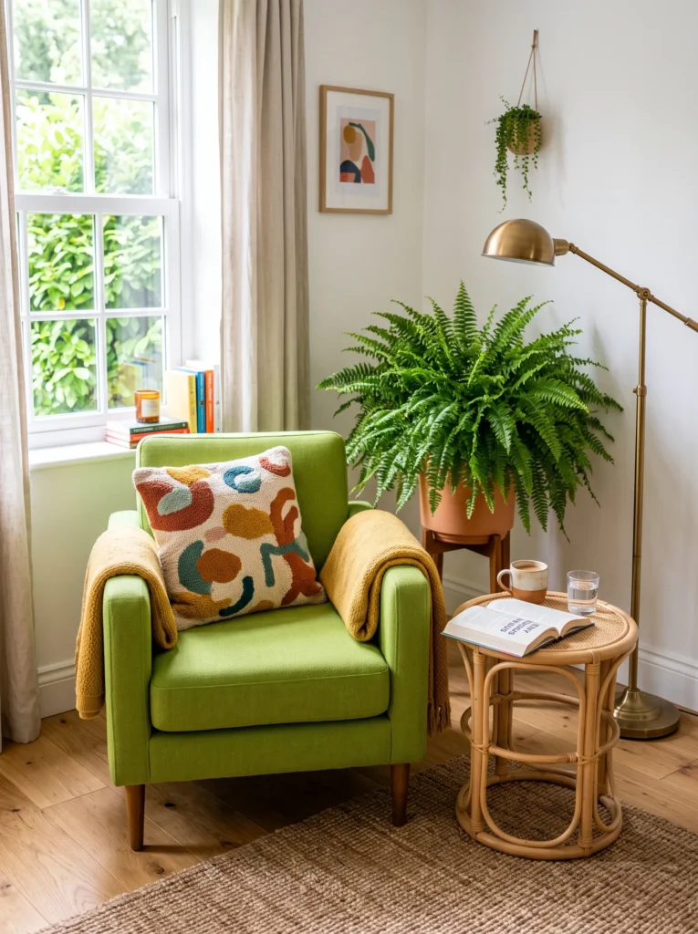
- Introduces bold color without repainting an entire room
- Ideal for small nooks, chairs, or single statement pieces
- Brings energy and personality into otherwise neutral spaces
- Works beautifully with greenery and natural textures
- A low-commitment way to test bold color before going bigger
Bright, punchy greens are stepping out of the background and into the spotlight this year. Unlike softer sage tones that blend quietly into a room, this citrusy shade demands attention, and that’s exactly the point. It works best as a single statement piece — a chair, a lamp, a cushion — rather than covering an entire wall. That’s why many designers recommend starting small with this color, since its energy can feel overwhelming in large doses. In smaller spaces especially, one bold piece does more visual work than an entire room repainted in the same shade.
The appeal here is emotional as much as visual. This color brings a genuine sense of playfulness into a space, which is part of why it resonates so strongly right now. I’ve noticed it works particularly well paired with natural materials like rattan and wood, which ground the brightness and keep the look from feeling too loud. A reading nook, home office corner, or entryway bench are all excellent places to introduce this shade. The result is a room that feels awake and expressive, without requiring a full commitment to a bold, unconventional color.
6. Persimmon Kitchen Pop
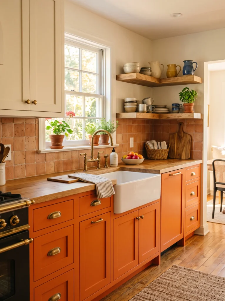
- Adds warmth and energy without feeling overly bold
- Pairs beautifully with white, cream, and natural wood tones
- Works well on lower cabinets, an island, or an accent wall
- Brings a cheerful, lived-in feeling into everyday spaces
- A great alternative for anyone hesitant about traditional red or yellow
Warm, citrus-inspired orange is proving that bold color doesn’t have to feel overwhelming. This shade sits comfortably between red and yellow, giving it a cheerful quality that feels more approachable than either. It works especially well in kitchens, where it gets steady exposure to natural light throughout the day. In my experience, painting just the lower cabinets in this tone — while keeping uppers white — creates balance without overpowering the whole space. It’s proof that bold choices can still feel calm and livable, which is likely why homeowners hesitant about color are finally willing to try it.
This shade also has a practical advantage: it works with materials most people already have. Wood countertops, brass fixtures, and white tile all complement it without requiring a full kitchen renovation. I’ve seen this work well even as a small accent — a single shelf of ceramics or a painted stool — for anyone not ready to commit to cabinetry. The overall effect is a kitchen that feels warmer and more personal, moving away from the sterile all-white look that’s dominated kitchen design for years. It’s color with genuine emotional warmth built in.
7. Cool Blue Retreat
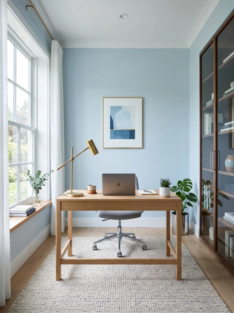
- Creates a calm, focused feel in workspaces and bathrooms
- Reads modern and crisp rather than cold or clinical
- Pairs well with chrome, glass, and white oak finishes
- Works as a full wall or a single furniture piece
- I’ve noticed this shade holds up beautifully under bright daylight without feeling harsh
Cool, glacial blue is quickly becoming the color of choice for spaces that need clarity. Unlike traditional navy, which leans heavy and formal, this icier tone feels fresh and almost weightless. It works particularly well in home offices, bathrooms, and transitional spaces like hallways, where a sense of calm actually improves how the room functions. In my experience, this shade performs best paired with reflective materials — chrome, glass, mirrored surfaces — which amplify its crisp, contemporary quality. It’s a color that feels intentional rather than decorative, giving a space a quiet sense of purpose.
What sets this blue apart from past blue trends is its restraint. It doesn’t compete with a room the way bolder colors do, which makes it ideal for spaces meant for focus or reflection. That’s why many designers recommend it for home offices specifically, where mental clarity matters more than visual excitement. I’ve seen this work particularly well in small bathrooms, where a single wall or vanity in this tone instantly elevates the space without a full renovation. Paired with white oak or brass, the result feels polished, current, and noticeably more sophisticated than standard white walls.
8. Jade Green Layering
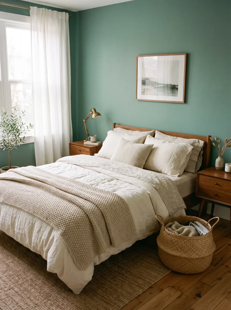
- Works as a full-room color without feeling overwhelming
- Pairs naturally with linen, wood, and woven textures
- Reads as an elevated neutral rather than a bold accent
- Suits bedrooms, living rooms, and even kitchens
- A soothing option for anyone new to using color confidently
Soft, cultivated green is proving to be one of the most flexible colors of the year. It sits comfortably between mint and moss, which gives it a grounded quality that feels closer to a neutral than a statement color. That’s what makes it so easy to commit to fully — floor to ceiling, if desired — without the room ever feeling too intense. In my experience, this tone works especially well in bedrooms, where its calming quality genuinely supports better rest. It also photographs beautifully in natural light, which explains why it’s showing up so consistently across home inspiration boards lately.
The real strength of this shade is how effortlessly it layers with natural materials. Linen bedding, wood furniture, and woven baskets all deepen its organic feel without adding visual clutter. I’ve seen this work well in kitchens too, particularly on lower cabinetry paired with warm wood countertops. Because it reads as sophisticated rather than trendy, it’s a safer long-term investment than more saturated colors. Homeowners looking to move away from stark white or gray, without committing to something loud, will likely find this shade to be the easiest bold choice they make this year.
9. Neo Deco Glamour
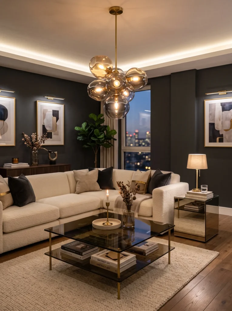
- Brings streamlined glamour without feeling overly ornate
- Combines geometric shapes with soft, modern furniture
- Works well in living rooms, entryways, and dining spaces
- Balances chrome and brass for a layered metallic look
- A striking option for anyone wanting drama with structure
Architectural glamour is making a comeback, but with a distinctly modern edge. This look leans on fan shapes, geometric paneling, and chrome details, softened by curved furniture and warm lighting. It’s less about vintage recreation and more about borrowing structure from the past while keeping the overall feel current. In my experience, the key to pulling this off successfully is restraint — one or two strong geometric elements paired with simpler surrounding pieces, rather than layering pattern on pattern. That’s why many designers recommend starting with a single fan-shaped mirror or panel before building the rest of the room around it.
What makes this style so compelling is the tension between hard and soft elements. Sharp geometric lines paired with a curved velvet sofa create visual interest without feeling chaotic. I’ve seen this work particularly well in entryways and formal living rooms, spaces that benefit from a bit of drama and structure. Mixing chrome and brass finishes adds further depth, avoiding the flatness of an all-one-metal room. The overall effect feels measured and intentional — bold enough to make a statement, but architectural enough to avoid feeling like a costume of a bygone era.
10. Afrohemian Textiles
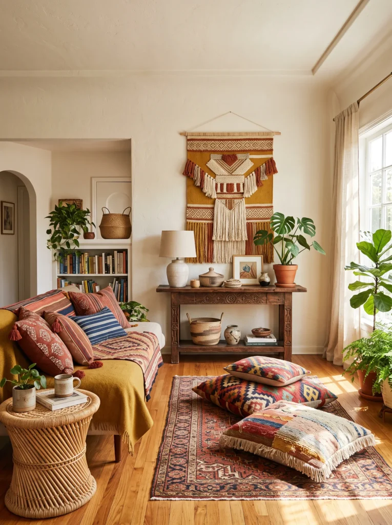
- Adds rich texture and global character to any room
- Works through layered rugs, cushions, and wall art
- Brings warmth without relying on paint color alone
- Mixes well with existing wood and rattan furniture
- I’ve noticed layering two or three patterns together feels intentional rather than busy
Global textures are moving to the center of home design, and this fusion style leads the charge. It combines handwoven textiles, carved wood, and natural fiber baskets into a look that feels collected rather than curated from a single catalog. In my experience, the easiest entry point is textiles — a patterned throw pillow, a woven wall hanging, a floor cushion — since these pieces layer easily onto furniture you already own. This style rewards mixing rather than matching, which makes it especially forgiving for anyone nervous about getting a “trend” exactly right.
The depth of this look comes from combining materials, not just colors. Carved wood, woven rattan, and hand-loomed textiles all bring different textures into the same space, creating richness without visual clutter. That’s why many designers recommend starting with two or three pieces rather than overhauling a whole room at once. I’ve seen this work particularly well in living rooms and reading corners, where texture does more emotional work than color alone. The result feels lived-in and personal, a home built from meaningful pieces rather than a single, uniform aesthetic.
11. Checkerboard Accent Floor
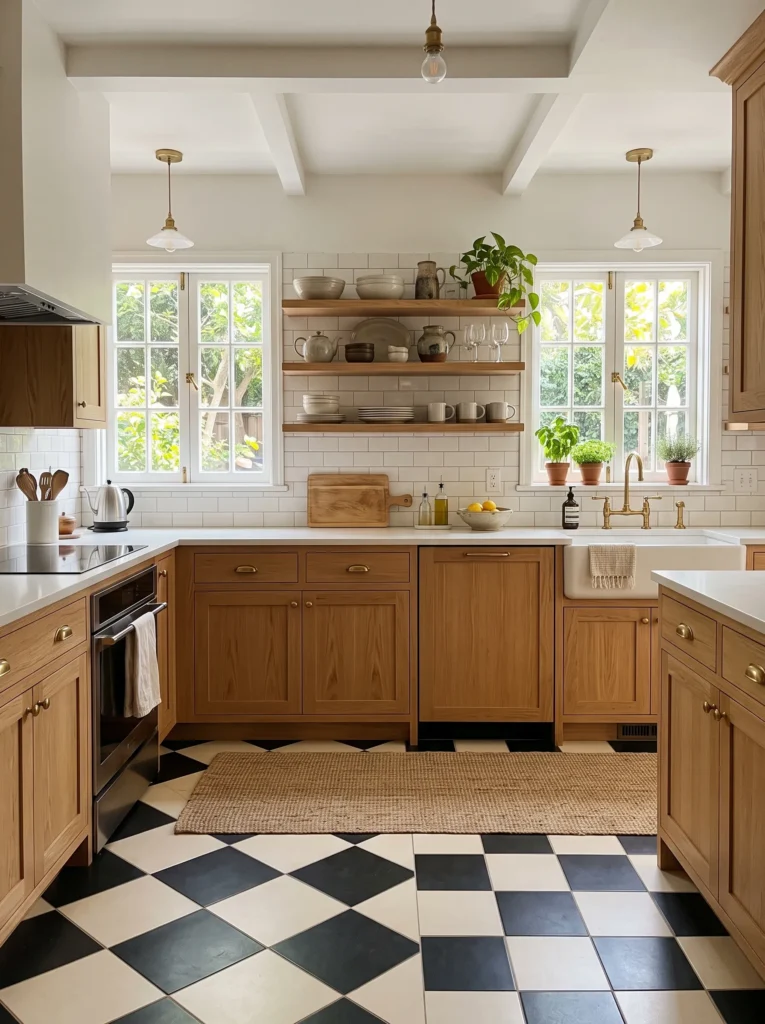
- Grounds a room with a bold, graphic pattern underfoot
- Works beautifully in kitchens, entryways, and bathrooms
- Balances busier decor by giving the eye a clear anchor
- Available in peel-and-stick versions for easy installation
- A timeless pattern that won’t feel dated in a few years
Graphic flooring is having a real resurgence, and the checkerboard pattern remains the most requested version. It brings instant personality to a room, particularly kitchens and entryways that see the most foot traffic and visual attention. What makes this pattern so enduring is that it isn’t tied to one specific design era, so it continues to feel fresh regardless of what other trends come and go. In my experience, this flooring works especially well as a grounding element in eclectic spaces, giving mismatched furniture or bold wallpaper a clear visual anchor to work against.
Beyond aesthetics, this pattern solves practical problems too. High-contrast tile hides scuffs and everyday wear far better than plain flooring, which matters in busy households. Renters have embraced peel-and-stick versions, making the look achievable without committing to a full renovation. I’ve seen this work particularly well paired with warm wood cabinetry and brass fixtures, softening what could otherwise feel like a stark black-and-white statement. Whether in classic monochrome or a warmer cream-and-terracotta variation, this flooring choice consistently reads as timeless rather than trendy.
12. Wabi-Sabi Bathroom
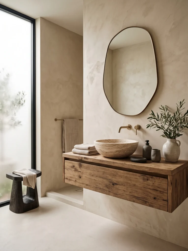
- Embraces natural imperfection instead of polished perfection
- Uses texture — plaster, stone, wood — as the main design feature
- Creates a calming, spa-like feel without excess decor
- Works especially well in small or awkwardly shaped bathrooms
- A grounding style for anyone wanting less visual noise, not more
Imperfect, textural design is quietly replacing the polished, everything-matches bathroom look. This approach leans into raw materials — lime plaster, natural stone, weathered wood — celebrating slight variations rather than hiding them. In my experience, this style works especially well in small bathrooms, where a textured plaster wall or stone sink creates visual interest without adding clutter or competing colors. It’s a philosophy as much as a design choice: fewer, better materials instead of more decorative objects. That’s why many designers recommend this approach for anyone feeling overwhelmed by constant redecorating pressure.
The calming effect of this style comes from its restraint. Muted clay tones, natural light, and simple textiles create a space that feels more like a retreat than a functional room. I’ve seen this work particularly well in older homes with awkward layouts, where leaning into imperfection actually suits the existing architecture better than trying to disguise it. A single textured wall, paired with a stone vessel sink and linen towels, does more for the room’s atmosphere than an entire cabinet of matching accessories ever could. It’s proof that a calmer bathroom doesn’t require more — just better-chosen materials.
13. Opalescent Accents
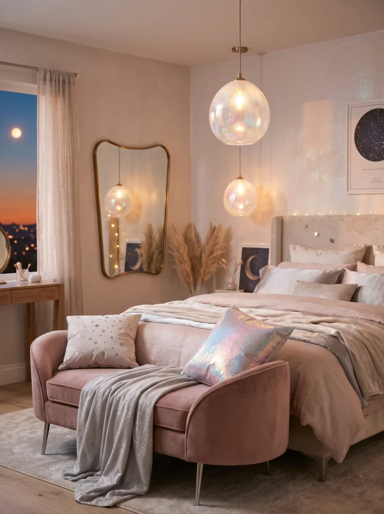
Alt Text: Shimmering opalescent glass pendant lamp in a soft pearl-toned bedroom
- Adds subtle shimmer without feeling overly glossy or busy
- Works beautifully in lighting fixtures, mirrors, and small accents
- Creates a soft, celestial glow as natural light shifts
- Pairs well with blush, silver, and soft pastel tones
- I’ve noticed one shimmering piece is often more elegant than several
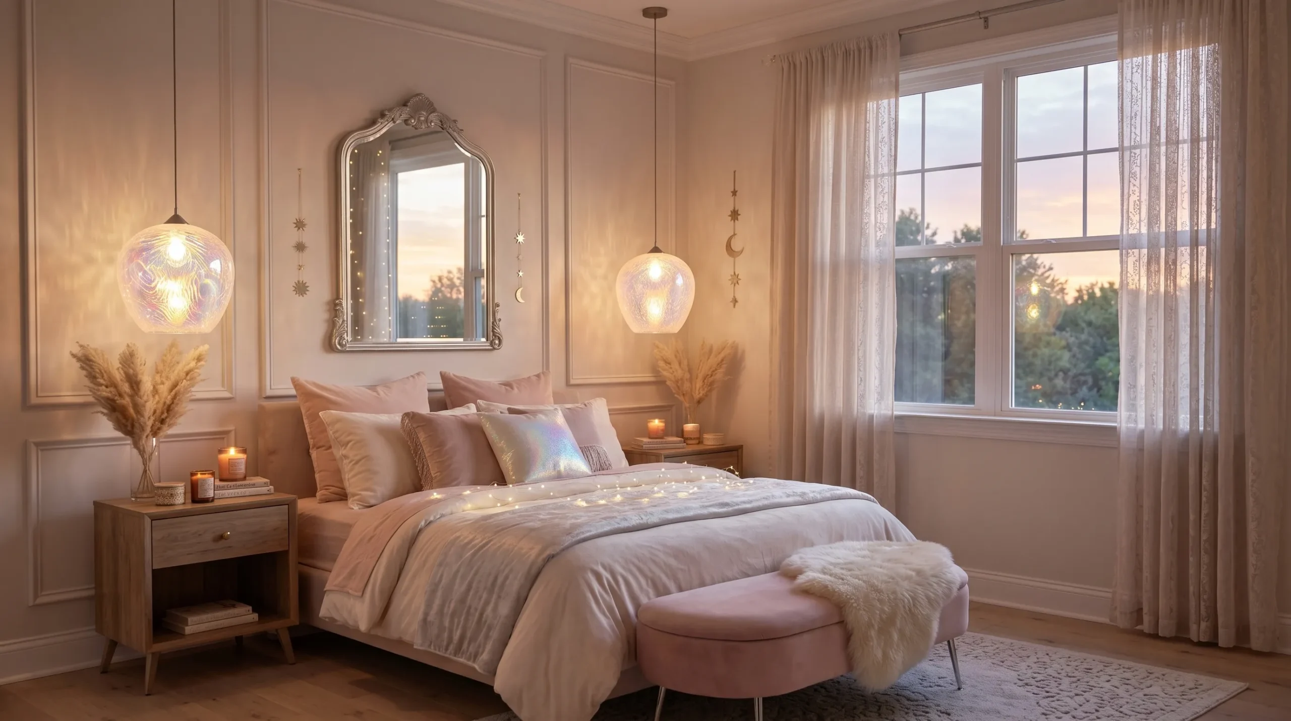
Soft iridescence is bringing a quiet sense of magic back into interiors this year. Rather than full-on sparkle, this trend favors subtle shifts in color and light — a pearl-finished lamp, a mirrored surface, a glass vase that catches the sun differently throughout the day. In my experience, this effect works best in bedrooms and living rooms with strong natural light, since the shimmer changes character from morning to evening. It’s a refined way to add visual interest without relying on bold pattern or saturated color, which makes it especially appealing for smaller or more minimal spaces.
The key to this look is restraint. One or two opalescent pieces — a light fixture, a decorative object, a mirror frame — do more visual work than a room full of shiny accents. That’s why many designers recommend choosing a single hero piece rather than scattering shimmer throughout a space. I’ve seen this work particularly well paired with soft neutrals and blush tones, which let the iridescence feel luminous rather than gaudy. The overall effect is dreamy and a little otherworldly, a subtle upgrade that feels considered rather than decorative for decoration’s sake.
14. Gummy Texture Accents
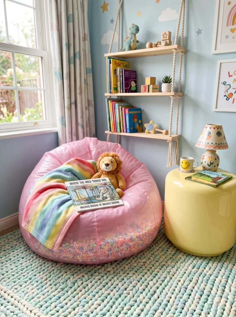
- Brings a fun, tactile quality into playful or casual spaces
- Works well in kids’ rooms, playrooms, or creative corners
- Adds softness through rounded, glossy, bendable materials
- Pairs naturally with pastel or candy-inspired color palettes
- A playful contrast when mixed into otherwise minimal rooms
Tactile, bendy textures are having an unexpected design moment, especially in playful and family-friendly spaces. Think rounded, glossy furniture edges and rubberized finishes that feel almost squeezable to the touch. In my experience, this trend works best in kids’ rooms and casual hangout spaces, where its playful energy feels appropriate rather than out of place. It’s less about a specific color and more about a feeling — softness, roundness, a slight sense of fun that adult-focused design often leaves out entirely.
What makes this texture trend interesting is how well it contrasts against minimal backdrops. A single glossy, rounded stool or bean bag in an otherwise neutral room instantly adds personality without overwhelming the space. I’ve seen this work particularly well in playrooms and creative studios, where a bit of whimsy actually improves how the room feels to spend time in. Pairing this texture with pastel tones amplifies the candy-like quality, while keeping surrounding furniture simple prevents the room from feeling overly juvenile. It’s proof that texture alone can carry a design statement.
15. Art Deco Fan Motifs
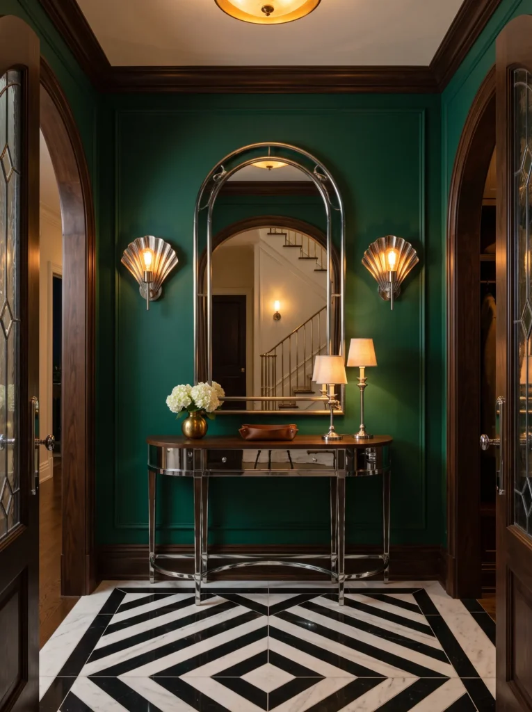
- Introduces geometric glamour through lighting and mirrors
- Works well in entryways, dining rooms, and powder rooms
- Pairs beautifully with brass, emerald, and black accents
- A striking way to add architectural interest without construction
- Best used sparingly — one fan motif is often enough
Fan-shaped detailing is bringing a refined sense of drama back into entryways and formal spaces. This geometric motif, borrowed from classic architectural design, shows up most often in lighting fixtures, mirror frames, and decorative panels. In my experience, this look works best when used sparingly — one fan-shaped sconce or mirror as a focal point, rather than repeating the motif throughout a room. It reads as elegant and considered, especially when paired with rich colors like emerald or deep plum, which amplify the sense of glamour without tipping into excess.
The strength of this trend lies in its architectural quality. Unlike purely decorative patterns, fan motifs add a sense of structure and intention to a space, making even a small entryway feel more formal and considered. That’s why many designers recommend pairing it with polished brass or chrome, which reinforces the glamorous, streamlined feel. I’ve seen this work particularly well in powder rooms and dining spaces, where a single striking piece — a sconce, a mirror — does more to elevate the room than a full wall of ornamentation ever could.
16. Circus Stripe Accents
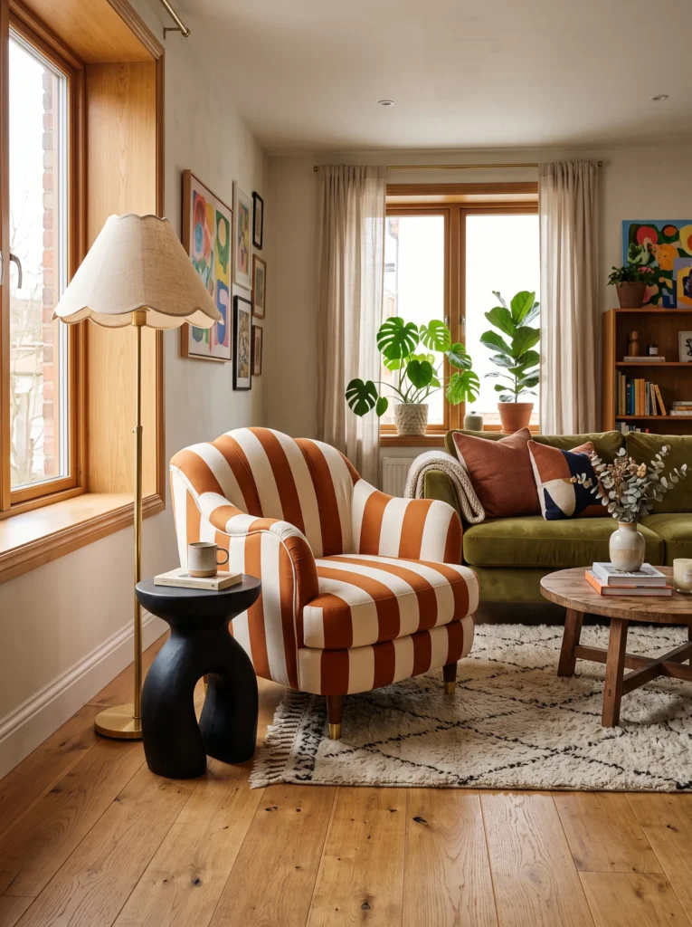
- Adds bold pattern and playful energy without feeling childish
- Works well as a single statement chair or lampshade
- Pairs nicely with warm neutrals and natural wood tones
- Balances vintage charm with a fun, exaggerated silhouette
- I’ve noticed one striped piece often reads as chic rather than costume-like
Bold stripes and exaggerated shapes are bringing a sense of playful theater into grown-up living rooms. Inspired by vintage circus visuals, this trend translates surprisingly well into everyday spaces through a single striped chair, a scalloped lampshade, or a sculptural side table. In my experience, the trick to making this feel sophisticated rather than costume-like is limiting it to one hero piece surrounded by calm, neutral furniture. It’s a style that rewards confidence in small doses, rather than an entire room dressed head to toe in stripes and curves.
The appeal here is the contrast between whimsy and restraint. A single exaggerated silhouette — a scalloped lamp, a striped ottoman — feels intentional and collected rather than overwhelming when everything else in the room stays simple. That’s why many designers recommend pairing this piece with warm wood tones and soft neutrals, which ground the playfulness in something more timeless. I’ve seen this work particularly well in living rooms and reading nooks, where a bit of visual fun genuinely lifts the mood of the space without sacrificing sophistication.
17. Layered Metallic Mixing
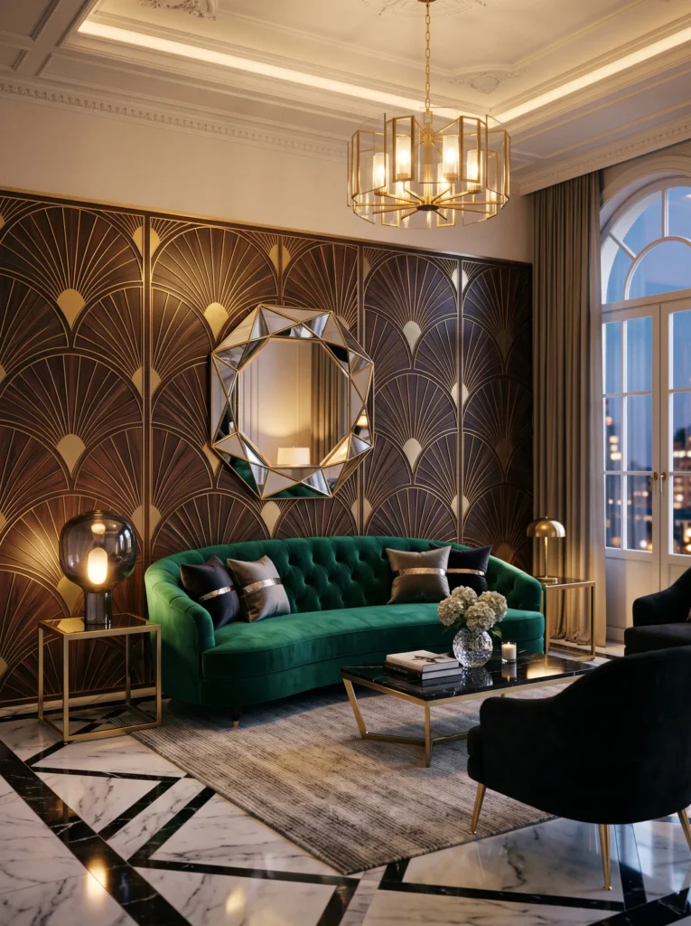
- Adds depth and richness by combining two metal finishes
- Prevents a room from feeling flat or overly matched
- Works well through lighting, hardware, and mirror frames
- Pairs beautifully with deep or moody wall colors
- A subtle way to make a space feel more collected over time
Mixing metals is replacing the long-standing rule of matching every fixture in a room. Combining brass and chrome, or brass and blackened steel, creates a layered look that feels collected rather than store-bought as a single set. In my experience, this works especially well in living rooms and dining spaces, where lighting, mirror frames, and furniture hardware naturally offer several chances to introduce a second metal tone. It’s a subtle shift, but one that makes a noticeable difference in how considered and personal a room feels.
The key to pulling this off is balance rather than randomness. One dominant metal — say, brass — paired with smaller chrome or silver accents keeps the mix feeling intentional rather than mismatched. That’s why many designers recommend choosing a primary and secondary metal before shopping for new pieces. I’ve seen this work particularly well against deep, moody wall colors, where reflective metal surfaces catch and bounce light beautifully. The overall effect is a room that feels layered and lived-in, built gradually rather than furnished all at once from a single catalog.
Your home doesn’t need a full renovation to feel fresh — just the right idea in the right spot. These 2026 home decor trends prove that small, intentional changes can completely transform how a room looks and feels. I’ve seen how something as simple as a bold accent wall or a single curved chair can bring an entire space to life. Pick one idea that speaks to you, try it in your own home, and watch the difference it makes. Save this post for later, come back to it whenever you need fresh inspiration, and share it with anyone who loves a good home refresh as much as you do.
Final Thoughts
Your home doesn’t need a full renovation to feel fresh just the right idea in the right spot. These 2026 home decor trends prove that small, intentional changes can completely transform how a room looks and feels. I’ve seen how something as simple as a bold accent wall or a single curved chair can bring an entire space to life.
Pick one idea that speaks to you, try it in your own home, and watch the difference it makes. Save this post for later, come back to it whenever you need fresh inspiration, and share it with anyone who loves a good home refresh as much as you do.