
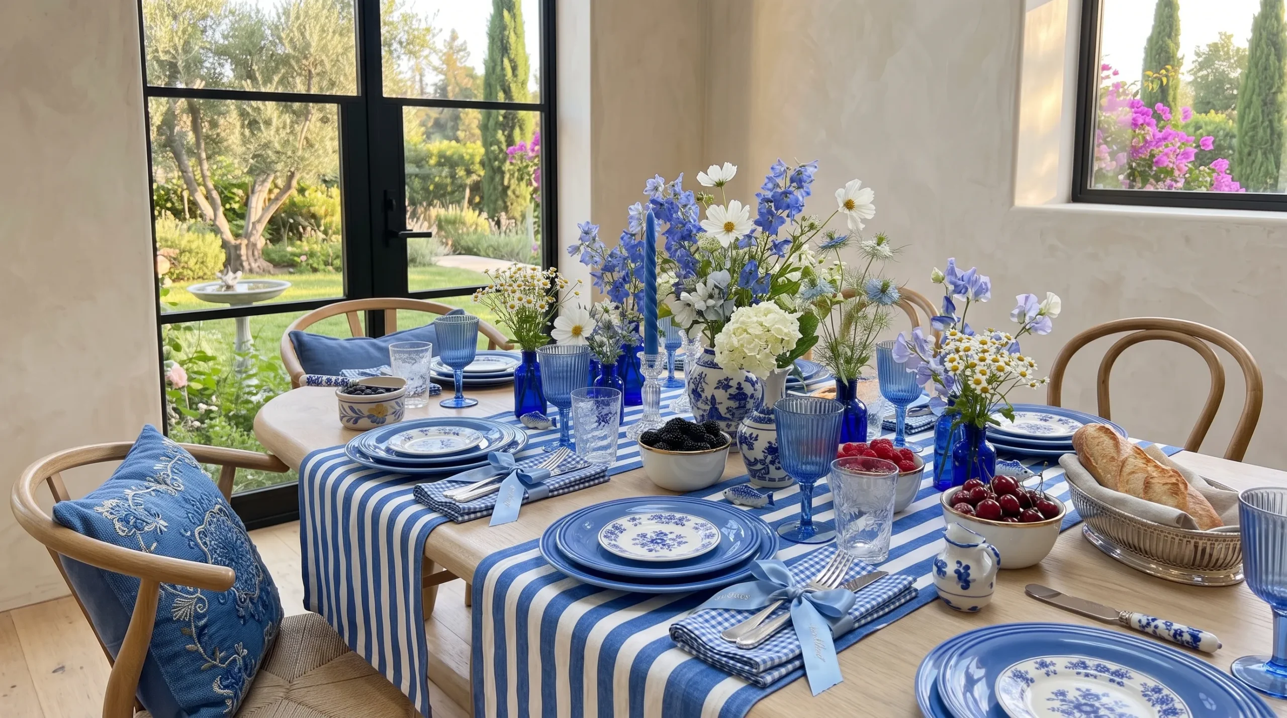
30+ Spring Table Decor Ideas You’ll Want to Save
Ever scrolled past a table so beautiful you saved it before even reading the caption? That’s the kind of pull we’re going for here. This collection of spring table decor ideas is built for exactly that moment, the one where a simple table becomes the first thing your guests notice and the last thing they stop talking about.
Whether you’re hosting a big spring brunch or want your everyday dinner to feel a little more intentional, these ideas solve the same problem: knowing where to start. In my experience, the tables that photograph best rarely rely on one big centerpiece. They build their charm through layered color, texture, and small, thoughtful details instead. I’ve noticed that once you see a few of these approaches side by side, it becomes much easier to picture your own version, whether that means a lavender-toned dinner party or a citrus-bright weekend lunch. Stick around till the end, too, because some of the dreamiest, most scroll-stopping tablescapes are saved for last.
Butter Yellow Tablescape: A Warm Spring Table Decor Idea
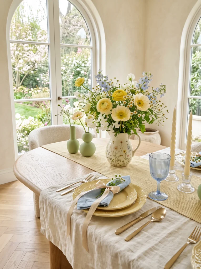
- Butter yellow feels warmer and more sophisticated than classic sunny yellow
- Pairs beautifully with cream, wood, and brass tones
- Works for casual brunches and dressed-up dinners alike
- Muted yellow photographs better than bright yellow under natural light
- Easy to build gradually — start with one runner, add pieces over time
Butter yellow is having a real moment, and it’s easy to see why once you try it. Unlike the classic sunny yellow you might picture, this softer, creamier tone feels grounded and elegant rather than loud or seasonal-only. It works beautifully with warm woods, brass flatware, and cream dishes, which is exactly why designers keep leaning into it for modern spring table decor this year. In my experience, this shade photographs especially well in natural light, making it a favorite for anyone sharing table setups online. Start small with napkins or a runner, then build from there.
This palette also transforms how a room feels overall, not just the table itself. Butter yellow reflects light softly, so even a cloudy afternoon feels warm once it hits the linens and ceramics around it. Pair it with textured elements like a woven placemat or a raw wood charger, and the whole setup instantly feels more layered and intentional. I’ve seen this work well for both quiet weekday lunches and bigger spring gatherings, since the color never tips into overly formal or overly casual territory. It holds a comfortable middle ground few other shades manage this well.
Sculptural Bud Vase Cluster
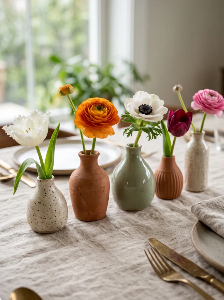
- Single-stem vases feel intentional, not like a leftover bouquet
- Mismatched shapes add sculptural interest without looking cluttered
- Lets each flower actually be seen, instead of lost in a bunch
- Great for smaller budgets since you only need a few stems
- Works well even with basic grocery-store flowers
Sculptural bud vases are quietly replacing the classic single centerpiece, and once you see it done well, it’s hard to go back. Instead of one large arrangement, you cluster three to five small, differently shaped vases, each holding just one flower. The effect feels curated and gallery-like rather than fussy or overdone. That’s why many designers recommend this approach for smaller tables, where a big centerpiece can block sightlines and conversation. Every stem gets room to actually be noticed, which changes how the whole table reads visually, even before guests sit down.
The best part is how forgiving this idea is for beginners still learning to style a table. You don’t need florist-level skill, since each vase only holds one flower and mismatched shapes are the whole point. I’ve tried this with basic grocery-store tulips, and it still looked intentional and expensive. Odd numbers work best here, so aim for three or five vases rather than an even count. Vary the heights slightly too, since a flat row feels static while a staggered cluster naturally draws the eye across the table.
You May Also Love: 21 Modern Thanksgiving Decor Ideas for a Stylish Feast
Checkerboard Linen Runner
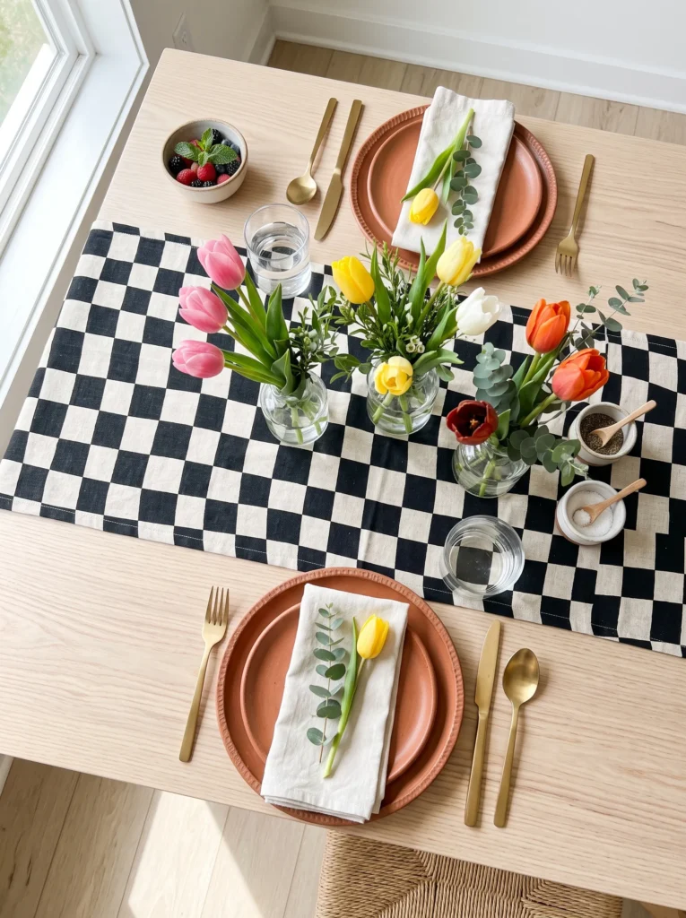
- Checkerboard patterns feel graphic and modern without being loud
- Instantly gives a plain table more personality
- Neutral colors mean it works with almost any dish set you own
- Budget-friendly, since one runner does most of the visual work
- One of the trending patterns across home decor and fashion this season
Checkerboard prints are everywhere right now, and your spring table doesn’t have to skip the trend to feel current. A black-and-cream runner brings instant graphic energy to an otherwise plain setup, without you needing to touch anything else on the table. Layer it under simple terracotta or white plates so the pattern stays the clear focal point. This works especially well in minimal dining rooms, since the print adds interest without adding clutter. It’s also one of the easiest updates here, since a single runner can shift the entire feel of a table in seconds.
What stands out most about this trend is how well it photographs, especially for anyone sharing their setup online. The strong contrast catches the eye immediately, which makes it a natural fit if you want something scroll-stopping and shareable. Pair the runner with a few low, simple vases so nothing competes with the pattern underneath it. I’ve noticed guests always comment on this setup first, even before noticing the food on the table. It proves that sometimes the boldest choice is also the simplest, and a dozen decorative pieces were never really necessary.
Citrus Grove Tablescape
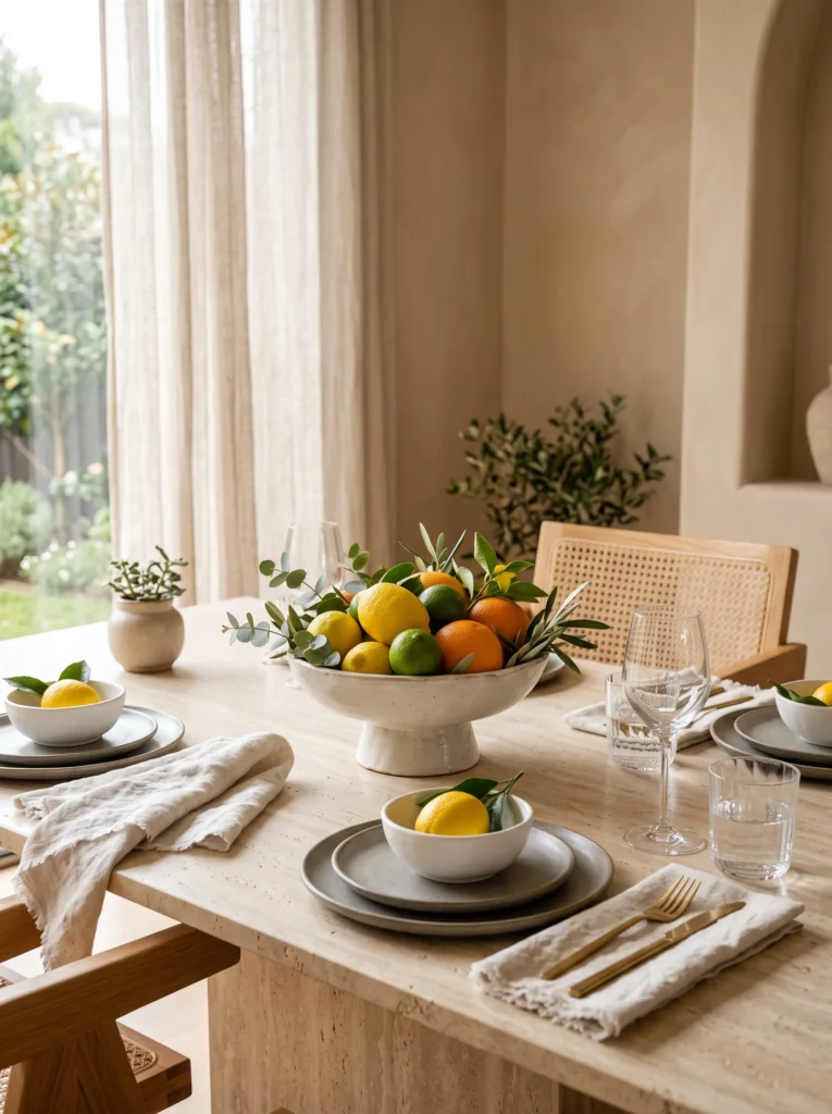
- Bold citrus tones feel energetic without clashing
- Real fruit doubles as decor and snack, zero waste
- Terracotta grounds the bright colors so it doesn’t feel chaotic
- Works beautifully for daytime brunches with strong natural light
- Guests always end up picking at the fruit mid-meal
Citrus is stepping out of the kitchen bowl and straight onto the table, and it makes for one of the most vibrant spring table decor ideas you can pull together in minutes. Whole blood oranges, lemons, and a little trailing greenery create a centerpiece that feels alive and sun-drenched, even before anyone sits down. Pair it with warm terracotta plates so the palette feels intentional instead of random. In my experience, this look photographs beautifully in early afternoon light, when the citrus practically glows against the linen. It’s also refreshingly low-effort for something this striking.
Part of what makes this idea work so well is that nothing here is purely decorative. Guests can eat the fruit once the meal winds down, which keeps the table feeling relaxed rather than staged for a photo. Mix in a few sprigs of rosemary or eucalyptus between the citrus for texture and a subtle herbal scent at the table. I’ve tried this for both casual weekend lunches and slightly dressier dinners, and it holds up in both settings. The colors read as warm and inviting rather than overwhelming, especially against a neutral linen base.
Designer Ceramic Stack
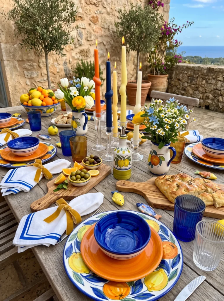
- Stacking mismatched ceramic finishes adds texture without extra decor
- Handmade-look glazes feel far more special than uniform dinnerware sets
- Each place setting becomes its own small design moment
- Great way to actually use collected pottery instead of storing it
- Guests always ask where each plate came from
Plate stacking has quietly become one of the easiest ways to make a table feel designer-level without buying anything new. Layer two or three ceramic pieces with different glazes and finishes at each setting, letting texture do the work instead of a big centerpiece. A speckled stoneware base under a glossy terracotta salad plate instantly reads as intentional and collected. In my experience, this trick works especially well if your ceramics already come from different sources, since the slight mismatch is exactly what makes each stack feel handmade and personal rather than store-bought and uniform.
This idea also solves a common styling problem: what to do when your dinnerware doesn’t perfectly match. Instead of hiding the differences, stacking puts them on display as a feature. Choose pieces within a similar color family so the layers feel cohesive even without matching patterns. I’ve tried this with a mix of thrifted and new ceramics, and it consistently looks more expensive than anything actually cost. Keep the rest of the table simple, like plain linens and minimal glassware, so each stacked plate genuinely gets noticed as its own small detail.
Confetti Napkin Mix
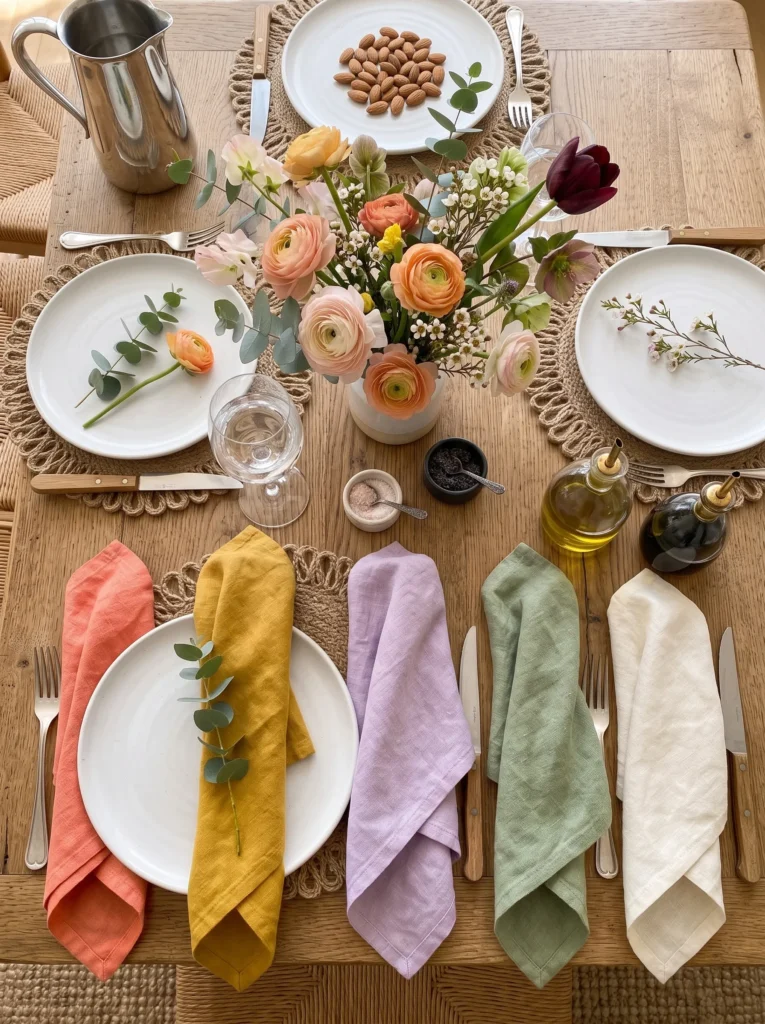
- Mixed napkin colors add instant personality to a plain table
- No florals needed, the napkins alone carry the color story
- Budget-friendly since napkins cost far less than fresh flowers
- Easy to swap seasonally without buying new dinnerware
- Works even when everything else on the table is basic
Skip the flowers this time and let colorful napkins carry the entire spring mood instead. Pick four or five different shades, like coral, mustard, and lavender, and place one at each setting so no two look identical. Against simple white plates, the mismatched napkins become the clear focal point without needing anything else elaborate on the table. That’s why many designers recommend this trick for last-minute gatherings, since it delivers a big visual impact for very little effort or cost. It’s proof that color doesn’t always have to come from a centerpiece.
What makes this idea so practical is how easily it adapts to whatever you already own. I’ve pulled this together using napkins collected over several years, none originally bought as a set, and the mismatch actually reads as intentional styling. Fold them simply, either flat under the plate or loosely rolled beside the fork, so the fabric and color stay the visual star. Add one small detail, like a sprig of herb tucked into the fold, if you want a touch more texture without overcomplicating things.
Hand-Blown Glass Moment
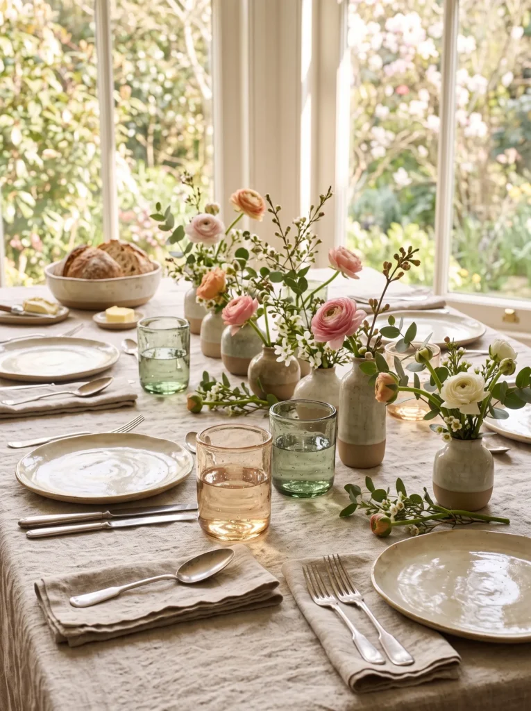
- Hand-blown glass has natural imperfections that feel warm, not sterile
- Mixed colors and shapes add interest without any extra decor
- One good glassware set upgrades the whole table instantly
- Catches and scatters light beautifully during daytime meals
- Often becomes the piece people compliment most at a dinner
Hand-blown glassware brings a level of warmth that machine-made glass just can’t match. Each piece has slight irregularities, subtle bubbles, a slightly uneven rim, that make the whole table feel more human and less mass-produced. Mixing two or three complementary tones, like amber and smoky green, adds color without needing a single flower on the table. This is one of those spring table decor ideas that photographs beautifully in daylight, since natural light passing through the glass creates soft, shifting color reflections across the linen underneath it throughout the meal.
The best part about investing in artisan glassware is that it never goes out of style the way trendy centerpieces sometimes do. I’ve used the same set of hand-blown tumblers for years now, and they still feel fresh with every new tablescape I build around them. Because the glass itself carries so much visual interest, you can genuinely keep everything else minimal, plain linens, simple plates, and let the glassware be the one standout element. It’s a small investment that pays off in nearly every future table you set.
Sculptural Candle Play
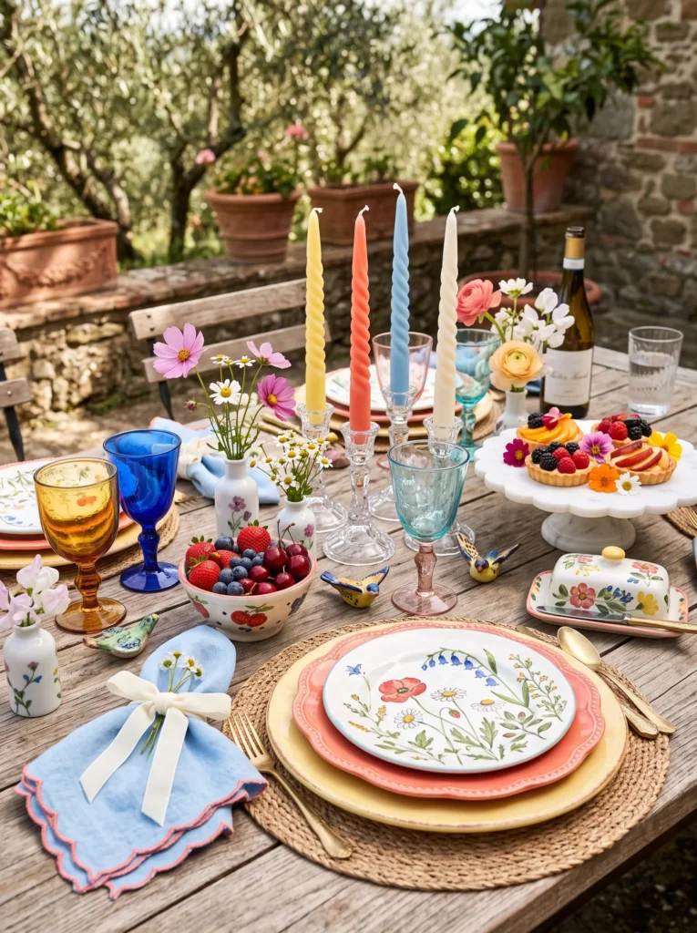
- Sculptural candle shapes add personality without any flowers at all
- Mixing heights and forms creates visual movement across the table
- Playful shapes photograph beautifully lit or unlit
- Works for both daytime brunches and evening dinners
- Mixing three candle shapes together never looks cluttered
Sculptural candles are having a real moment, and they’re a genuinely fun way to skip florals altogether. Instead of a traditional taper, mix in a twisted candle, a knot-shaped pillar, and an organic blob-style candle across the table at different heights. The playful shapes alone create visual interest, whether they’re lit for an evening dinner or simply displayed during the day. I’ve noticed this trick works particularly well for anyone who wants a table that feels current and design-forward without spending money on fresh flowers every single week or gathering.
What makes sculptural candles such a smart styling choice is their versatility across seasons and occasions. Unlike flowers, they don’t wilt, so your table setup stays picture-perfect for days at a time. Cluster three or four different shapes together rather than spacing them evenly, since a slightly uneven grouping feels more artistic and less rigid. I’ve tried this cluster approach for both a casual weekday dinner and a small celebration, and it held up beautifully in both settings. Soft pastel or cream tones keep the shapes feeling spring-appropriate without leaning too playful or juvenile.
Rainbow Glass Vase Cluster
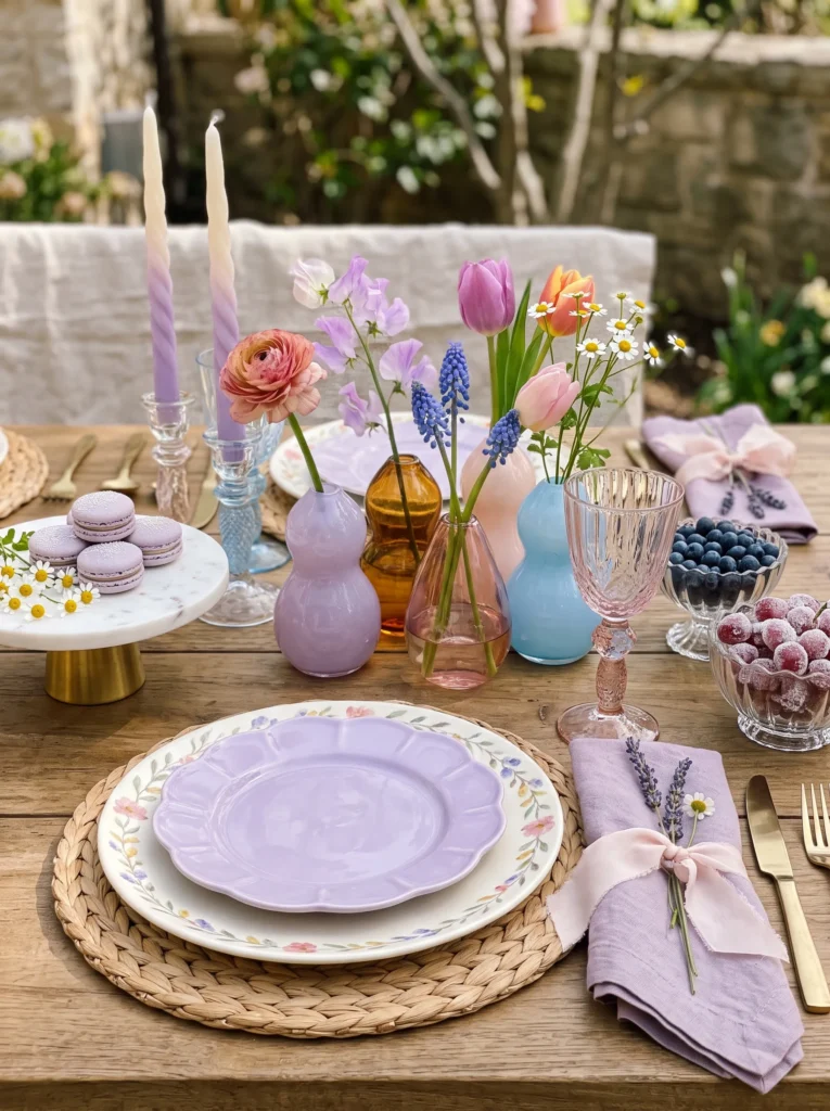
- Mixed pastel bud vases replace one big arrangement with dozens of small color moments
- Single stems keep the look airy instead of heavy or formal
- Watercolor-rim plates add color even before the flowers go in
- Ombré candles tie the whole palette together without matching exactly
- Clustering odd numbers of vases always looks more natural than pairs
Scattering hand-blown glass across the table is quickly replacing the single showstopper centerpiece, and it’s easy to see why once you try it. Each small vase in lavender, amber, blush, or sky blue holds just one bloom, so the eye moves across the whole table instead of stopping at one spot. Layer in scalloped lavender plates and ombré candles fading from ivory to lilac, and the color story feels intentional without a hint of matchy-matchy. In my experience, this scattered approach also makes photographing your table setup far easier, since every angle has something worth catching.
What makes this idea genuinely modern is how it treats glass itself as decoration, not just a vessel for flowers. Fluted crystal bowls of sugared grapes and a marble stand of lavender macarons add height and texture without competing for attention. Champagne gold flatware ties the metals together quietly. I’ve tried building this look gradually, adding one vase at a time from different shops, and it never once felt disjointed. The layered pastels read as soft and elegant rather than overly sweet, especially against neutral woven chargers underneath.
Fluted Glass Elegance
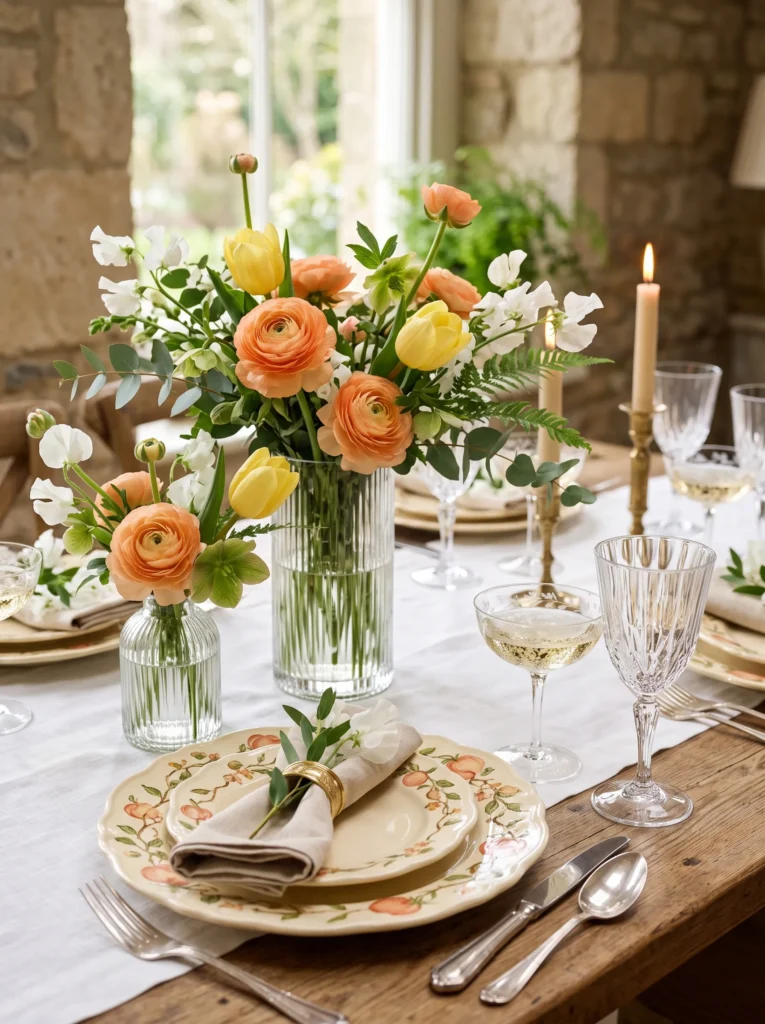
- Fluted glass catches light beautifully even without direct sun
- Asymmetrical vase heights keep the arrangement feeling relaxed, not stiff
- Peach and butter-yellow read as fresh rather than overly sweet
- Etched coupes add old-world glamour to a soft, modern palette
- Works for both bridal brunches and everyday spring dinners
Fluted glass has a quiet elegance that instantly elevates a table, and pairing several vase heights together creates real movement across the surface. Mixing peach ranunculus with butter-yellow tulips and a few delicate flowering branches keeps the arrangement airy instead of dense. Scalloped buttercream plates with hand-painted botanical details continue the story onto each place setting. This combination works especially well for romantic spring table decor that leans elegant without feeling fussy, since the pastel palette stays soft while the fluted crystal adds just enough sparkle and formality to the overall look.
The real trick here is asymmetry. Rather than lining vases up evenly, cluster tall and short pieces together so light catches each one differently. I’ve styled this look with etched champagne coupes mixed alongside plain ribbed goblets, and the contrast between ornate and simple glass kept things feeling collected, not overly matched. A travertine board piled with lemon pastries or ceramic bowls of apricots adds warmth and texture nearby. It’s proof that pastel doesn’t have to mean plain, and elegant doesn’t have to mean stiff or overly formal.
Smoked Glass Layers
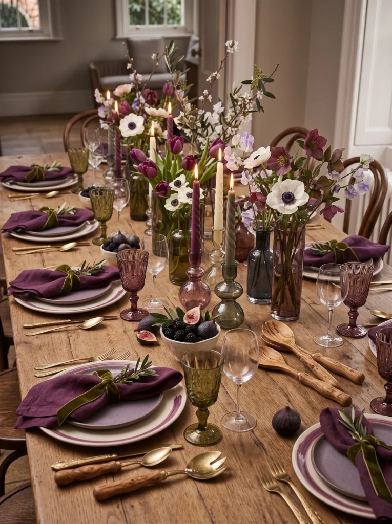
- Smoked glass adds depth and shadow that clear glass can’t achieve
- Olive and plum tones feel rich without veering into heavy or dark
- Layering multiple smoked vases replaces one large, expected centerpiece
- Spiral candles in matching tones tie the moody palette together
- Color depth holds up beautifully under candlelight for evening dinners
Smoked glass brings a moodier, more sophisticated edge to spring styling, and scattering several tinted vases across the table creates genuine depth other looks miss. Mixing olive, charcoal, and soft plum vessels, each holding a single anemone or tulip stem, gives the table a layered, gallery-like quality. That’s why many designers recommend this approach for evening dinners specifically, where candlelight interacts beautifully with the tinted glass. Matte ivory plates with hand-painted plum edging ground the darker tones, keeping the whole setting from feeling too heavy or somber despite the richer palette.
This idea works particularly well if you already gravitate toward deeper, moodier colors but still want something spring-appropriate. Spiral candles in plum, ivory, and smoky green add height and warmth without introducing new colors to the mix. I’ve noticed pairing smoky lavender side plates with the deeper dinner plates keeps the layering feeling intentional rather than random. Ceramic bowls of blackberries and figs, plus a marble pedestal of pastries, round out the table beautifully. Antique brass flatware and hand-carved olive wood servers add one final earthy, textural touch.
Lavender Parfait
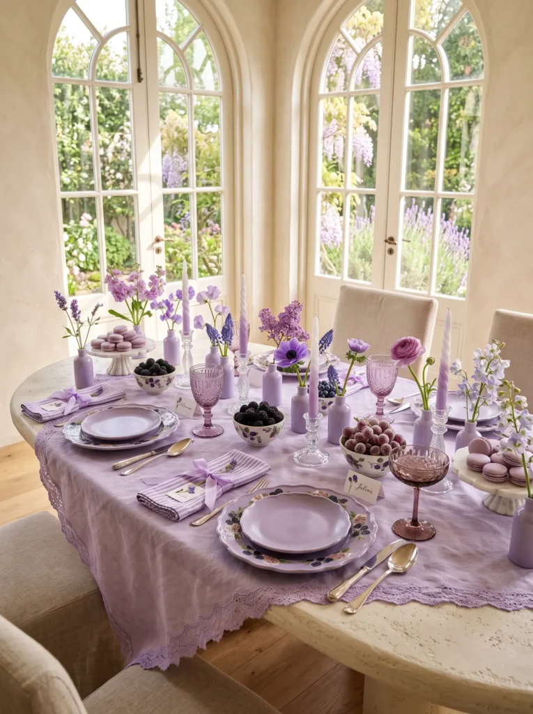
- Creates a true monochromatic lavender palette with rich tonal variation
- Replaces large floral arrangements with delicate floral moments across the table
- Layers desserts, berries, and ceramics into the styling for extra personality
- Uses different shades of lilac instead of relying on greenery
- Feels romantic, modern, and effortlessly luxurious
One mistake often made in table styling is assuming spring means green everywhere. In reality, the strongest spring table decor ideas usually revolve around one dominant color story with two to three supporting shades, not green dominating every design. The beauty of this table comes from its commitment to one color story instead of competing palettes. Lavender appears in soft layers through ceramics, linens, glassware, candles, desserts, and flowers, creating an elegant rhythm across the entire table. Rather than placing one oversized bouquet in the center, delicate bud bottles filled with individual stems encourage the eye to explore every place setting. Small bowls of berries, marble serving pieces, and silk ribbons add richness without overwhelming the composition, resulting in a sophisticated setting that feels artistic yet welcoming.
Luxury styling often succeeds because every detail belongs to the same visual family while still introducing different textures. Matte ceramics contrast beautifully with sparkling crystal, delicate petals soften polished marble, and glossy berries add subtle depth to the monochromatic palette. I’ve noticed that using several shades of lavender instead of one flat tone makes the entire table feel more natural and editorial. The final result is elegant, memorable, and perfectly suited to modern spring entertaining with a fresh, fashion-inspired personality.
Robin Egg Brunch
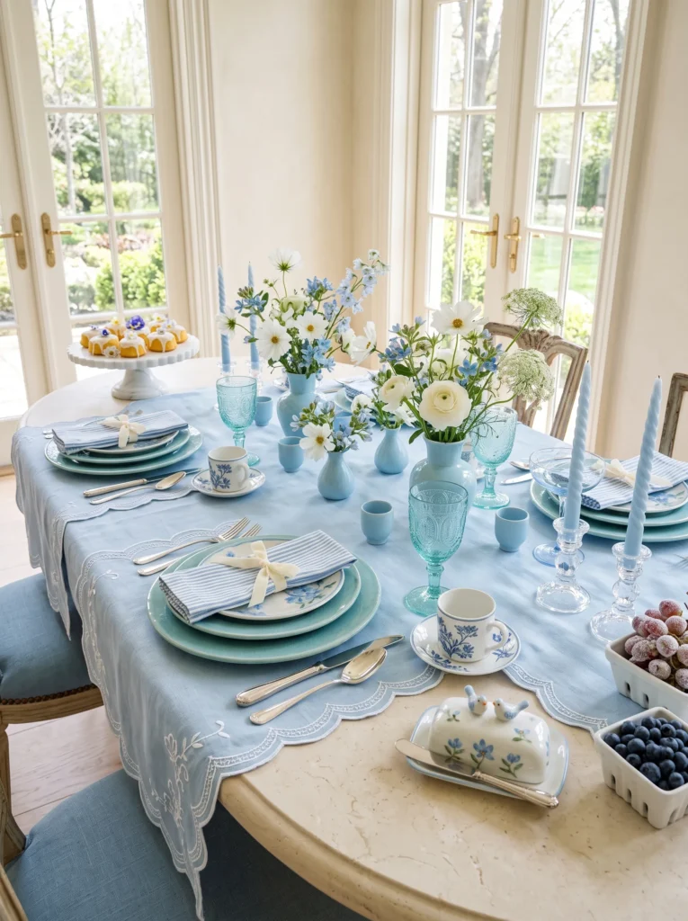
- Turns soft blue into the star instead of using it as an accent
- Creates a fresh café-inspired spring brunch atmosphere
- Mixes glossy ceramics with delicate crystal for layered elegance
- Uses flowers to support the palette instead of overpowering it
- Feels airy, sophisticated, and effortlessly photogenic
A single dominant palette instantly makes a table feel more intentional, and robin’s egg blue delivers that calm, collected elegance without becoming predictable. The color flows naturally through handcrafted ceramics, pressed glass, embroidered linens, and tiny decorative accents, while white flowers keep the overall styling crisp and luminous. Rather than creating one focal point, each place setting becomes its own miniature composition filled with thoughtful details that encourage guests to pause and admire the craftsmanship before the meal even begins.
Texture quietly elevates every layer of this design. Crackled ceramic glazes, velvet ribbon, polished marble, and sparkling crystal all catch the changing daylight in different ways, creating subtle movement across the table. In my experience, limiting the palette to blue, white, and soft ivory allows every object to feel connected while preventing visual clutter. The finished setting feels bright, luxurious, and fresh, making it perfect for relaxed weekend brunches, bridal showers, or elegant spring celebrations.
Blush Rosé Afternoon
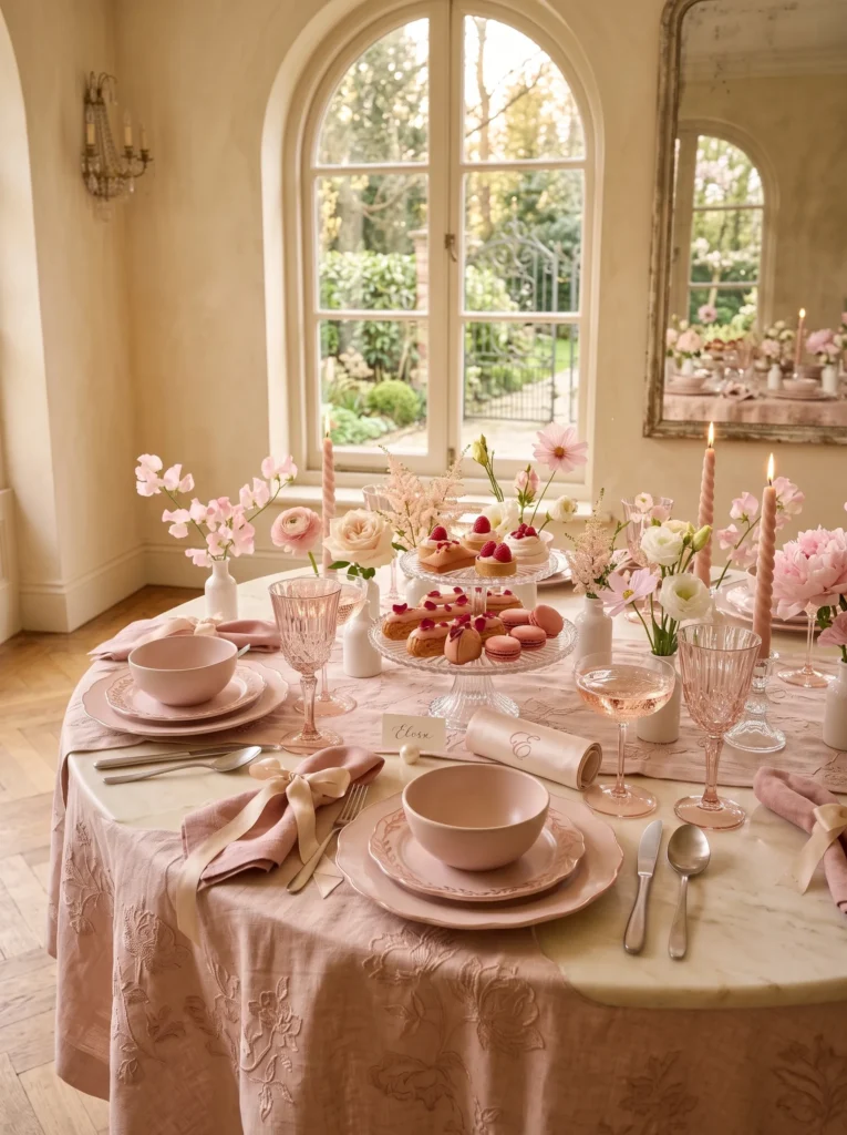
- Builds a luxurious monochromatic blush palette
- Layers desserts and tableware into the decorative styling
- Creates a soft editorial look with subtle tonal variation
- Feels elegant without becoming overly formal
- Perfect for spring brunches, birthdays, or Mother’s Day
Blush tones become far more sophisticated when layered thoughtfully instead of relying on a single shade. Soft rose ceramics, crystal glassware, embroidered textiles, and delicate pastries all contribute to the atmosphere before the flowers even come into focus. Tiny floral arrangements scattered across the table create rhythm and intimacy, allowing every guest to enjoy the blooms without a large centerpiece interrupting conversation. The overall styling feels warm, feminine, and effortlessly refined while remaining relaxed enough for everyday entertaining.
The beauty of this palette comes from its quiet contrast between glossy crystal, matte pottery, polished marble, and soft fabric textures. Every material reflects light differently, adding richness without introducing competing colors. I’ve found that repeating blush through several subtle details rather than one dramatic feature creates a far more luxurious editorial appearance. The finished table glows beautifully in afternoon sunlight, offering a timeless setting that feels both inviting and beautifully curated.
Cobalt Lemon Lunch
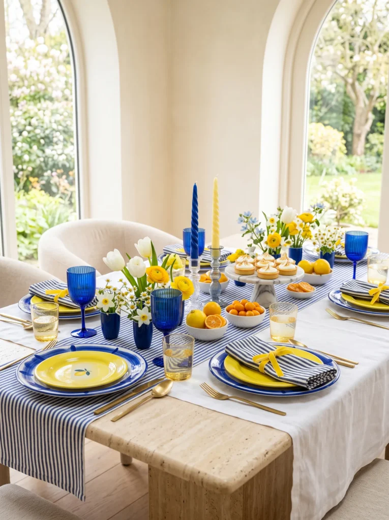
- Makes cobalt blue the clear hero instead of a background accent
- Uses lemons as colorful styling pieces throughout the table
- Adds playful contrast while keeping the layout elegant
- Creates many small moments for close-up Pinterest photos
- Feels energetic, modern, and perfect for sunny spring lunches
Bold color can feel luxurious when it is repeated thoughtfully instead of used everywhere at once. Here, cobalt appears through ceramics, glassware, candles, and ribbons, while bright lemons create crisp bursts of yellow that keep the palette fresh and cheerful. Small bud cups filled with simple blooms replace a traditional centerpiece, allowing every place setting to feel open and inviting. The combination feels lively and artistic without becoming chaotic, making the table look collected rather than overly designed.
The strongest detail is the contrast between glossy blue pottery and natural citrus textures. Smooth ceramic surfaces catch the sunlight differently than the lemons and chamomile, creating movement across the entire table. In my experience, pairing one saturated color with one bright seasonal accent always photographs beautifully because the eye immediately understands the palette. The finished setting feels joyful, sophisticated, and full of Mediterranean-inspired energy that instantly lifts the mood of a spring gathering.
Apricot Parfait Party
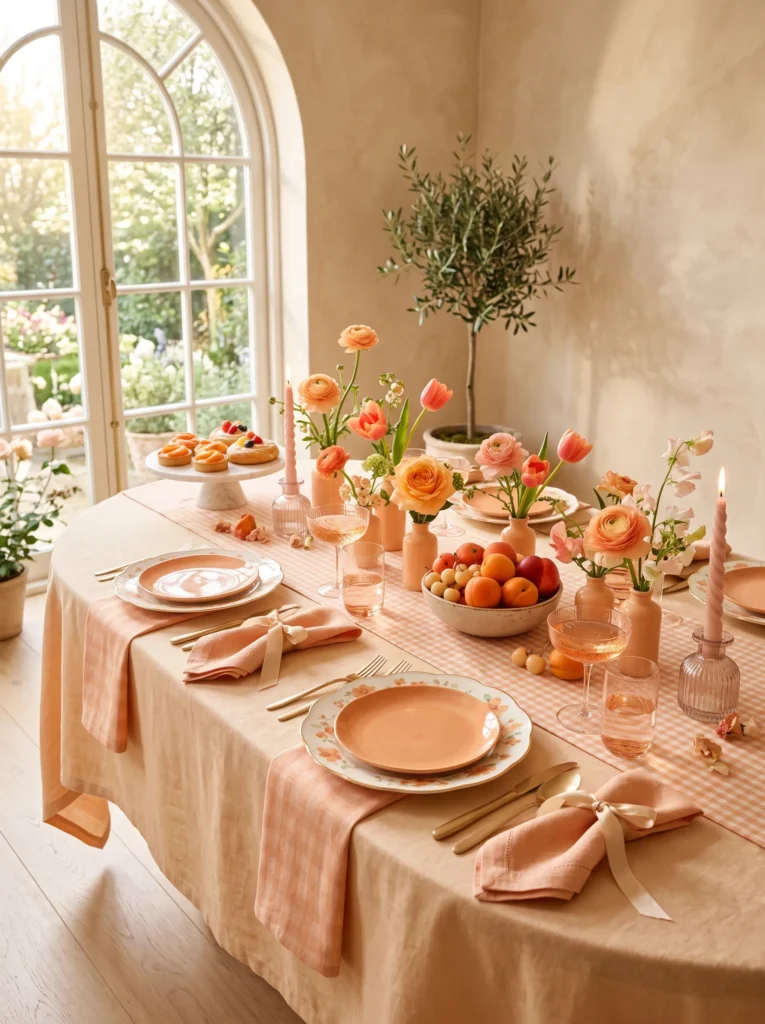
- Creates a warm monochromatic palette without feeling flat
- Uses fruit, pastries, and flowers together for layered texture
- Keeps the table soft, feminine, and editorial
- Adds depth through different shades of peach and apricot
- Feels luxurious while remaining relaxed and approachable
Apricot is one of those colors that instantly makes a room feel warmer and more inviting, especially when layered through ceramics, fruit, and soft linen. Instead of relying on one floral arrangement, this table spreads color across pastries, cherries, candles, ribbons, and tiny bud bottles filled with delicate spring blooms. Every detail belongs to the same peach-toned family, creating harmony while still offering enough variation to keep the eye moving naturally around the table.
The palette feels especially beautiful because matte pottery, glossy fruit skins, silk ribbon, and crystal glass all reflect light differently throughout the day. Those subtle shifts make the table look rich and dimensional without introducing extra colors. I’ve noticed that warm peach tones photograph exceptionally well in natural sunlight because they glow softly rather than appearing harsh. The final effect is elegant, cheerful, and perfect for intimate spring brunches or celebratory afternoons with friends.
Violet Berry Social
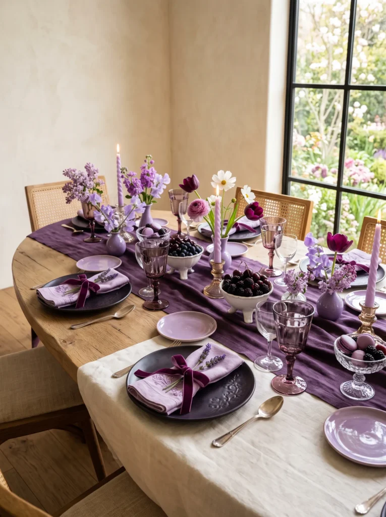
- Lets violet and berry shades become the main design statement
- Layers fruit, desserts, and flowers into one cohesive palette
- Creates dramatic color without looking heavy or dark
- Feels luxurious, romantic, and highly Pinterest-worthy
- Adds richness through velvet, crystal, and matte ceramics
Deep violet instantly gives a spring table a more fashion-forward personality than typical pastels. Blackberry-glazed ceramics, amethyst crystal, and velvet ribbon create a rich foundation, while lilac flowers and white cosmos keep the overall styling light and airy. Instead of one dramatic bouquet, small arrangements repeat the same tones across the table so every seat feels connected to the palette. The berries and macarons add playful texture while reinforcing the luxurious monochromatic color story.
What makes this look work is the balance between dramatic color and soft spring light. Matte ceramics absorb light, crystal goblets sparkle, and glossy berries introduce tiny reflective highlights that keep the table from feeling too serious. In my experience, repeating violet through flowers, desserts, linens, and accessories creates a designer-level look without requiring elaborate decorations. The finished setting feels elegant, unexpected, and perfect for evening brunches, birthdays, or sophisticated spring celebrations.
Italian Gelato Table
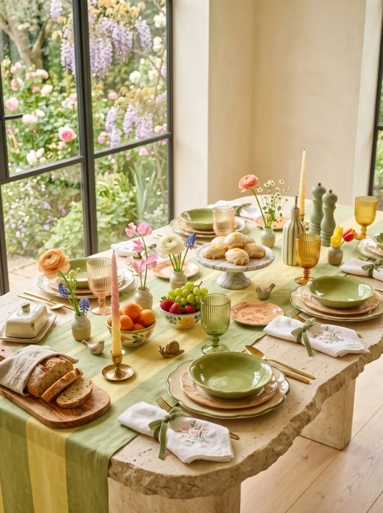
- Replaces one large centerpiece with beautifully layered decorative moments
- Makes handcrafted ceramics feel like artwork across the table
- Blends playful colors while keeping the overall look elegant
- Adds personality through small accessories instead of visual clutter
- Feels like an Anthropologie-inspired spring brunch ready to photograph
The most beautiful spring table decor ideas rarely rely on one dramatic arrangement anymore. Instead, they unfold naturally through dozens of carefully placed details that invite the eye to wander. Tiny bud cups holding individual flowers sit beside artisan ceramics, colorful fruit, and sculptural accessories, creating a relaxed composition that feels collected over time. Every place setting offers something slightly different, making the table look authentic rather than perfectly matched. The result feels warm, playful, and effortlessly luxurious without a single oversized floral arrangement taking over the entire scene.
What makes this styling especially memorable is the balance between color, texture, and craftsmanship. Hand-painted ceramics, embroidered linens, marble serving pieces, and velvet ribbons all introduce subtle variation while staying within the same cheerful palette. In my experience, these smaller decorative moments photograph far better because every close-up reveals another thoughtful detail. Guests naturally explore the table as they sit down, noticing charming touches that make the setting feel personal, inviting, and unlike a traditional seasonal tablescape.
Berry Blossom Brunch
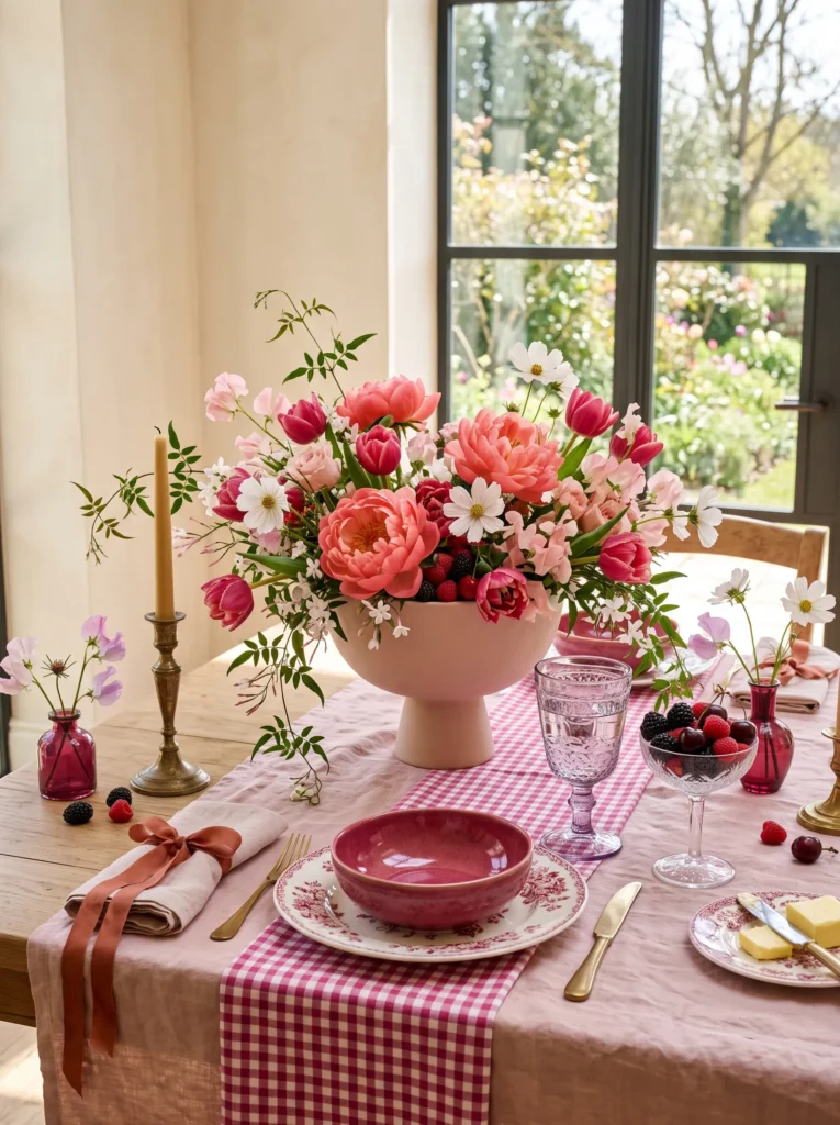
- Uses berries as decorative color instead of only food
- Mixes vintage-inspired tableware with modern shapes
- Creates a fresh palette full of texture and movement
- Gives every place setting its own unique personality
- Feels romantic, vibrant, and perfect for spring gatherings
Instead of choosing one dominant color, this tablescape celebrates layered berry shades that move gracefully from soft blush to deep raspberry. Fresh fruit, floral ceramics, pressed glass, and blooming flowers all work together to create a lively composition filled with texture and depth. The result feels collected over time rather than assembled for a single occasion, making the table appear personal, welcoming, and effortlessly stylish from every perspective. Soft ribbons and vintage details add charm while allowing the vibrant palette to remain the true centerpiece.
One of the reasons this look photographs so beautifully is the balance between polished finishes and organic elements. Smooth ceramic glazes contrast with delicate flower petals, while glossy berries introduce natural highlights that catch changing daylight. I’ve seen this combination create a boutique café atmosphere even in simple dining rooms because every layer contributes something visually different. The finished table feels luxurious without becoming formal, encouraging guests to linger, relax, and enjoy the celebration long after the meal has ended.
Pistachio Market Morning
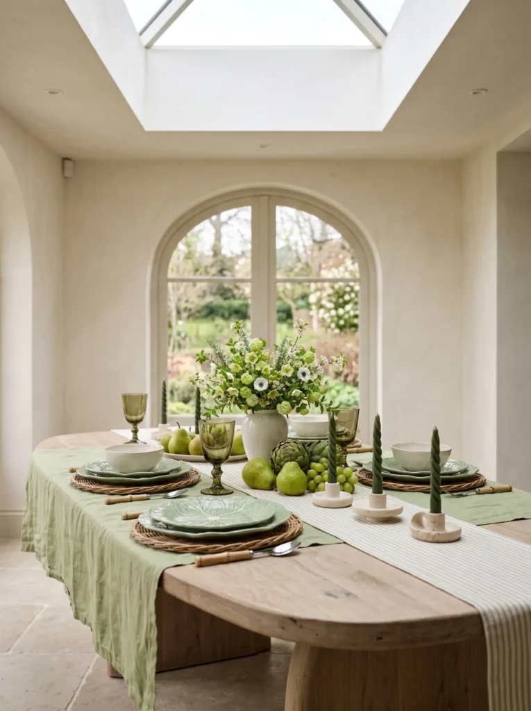
- Introduces rich botanical textures beyond traditional flowers
- Makes fresh produce part of the visual design
- Layers sculptural ceramics for a collected designer look
- Creates a calming palette inspired by spring markets
- Blends organic materials with contemporary styling
Inspired by the feeling of wandering through a European farmers’ market, this table celebrates fresh greenery as much as seasonal blooms. Sculptural cabbage-inspired ceramics, fragrant herbs, pear blossoms, and textured vegetables combine to create a layered arrangement that feels organic and sophisticated. Rather than filling every space, clusters of produce naturally guide the eye along the table while artisan pottery adds handcrafted character. The muted green palette feels refreshing and calming, offering a quieter alternative to brighter spring color schemes without sacrificing visual impact.
Texture becomes the true star of this arrangement. Matte ceramics sit beside glossy fruit, woven willow chargers soften the stone surfaces, and flowering herbs introduce delicate movement that changes throughout the day. In my experience, mixing edible ingredients into a tablescape creates a more relaxed atmosphere because everything feels useful instead of purely decorative. The finished styling captures the effortless beauty of seasonal living, making guests feel as though they have gathered around a beautifully curated kitchen garden.
Sorbet Picnic
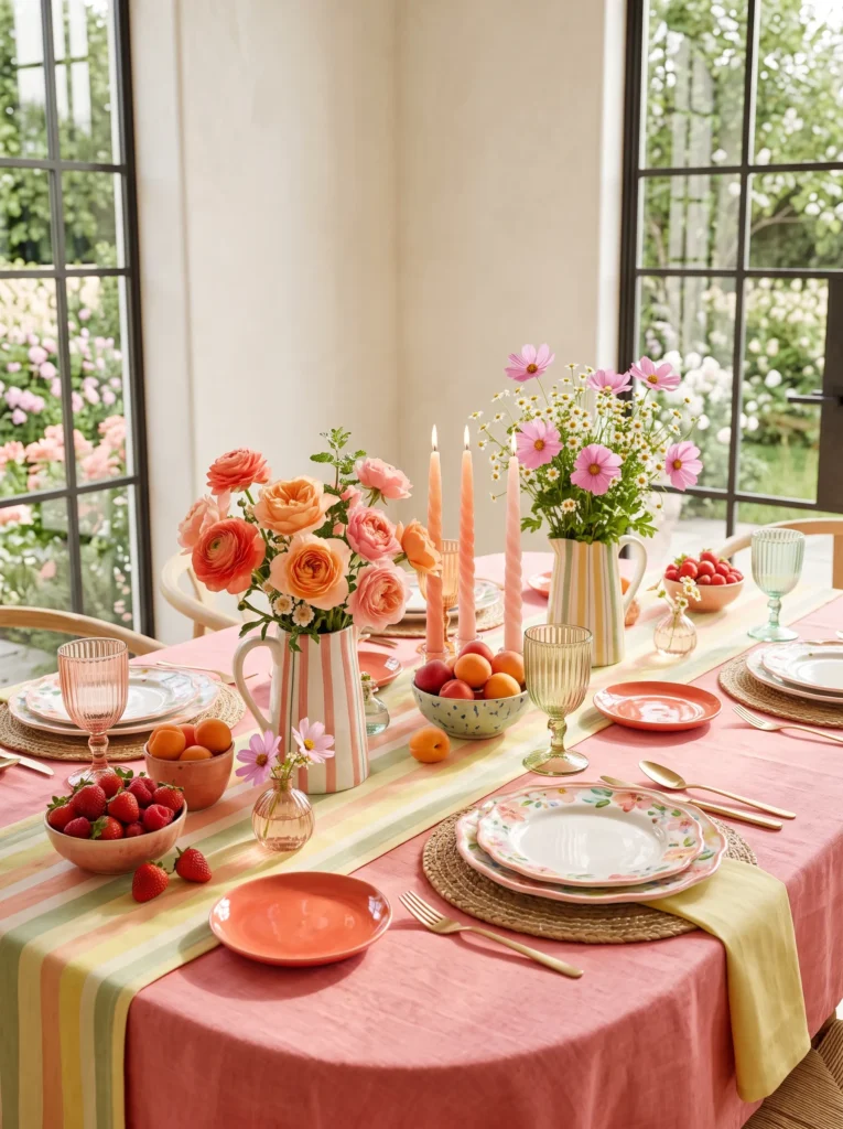
- Brings playful designer colors without feeling overwhelming
- Makes everyday brunches feel like boutique café experiences
- Blends handcrafted ceramics with fresh seasonal produce
- Creates dozens of interesting details that make Pinterest users stop scrolling
- Feels joyful, artistic, and collected rather than perfectly matched
The prettiest spring tables often feel like they evolved naturally instead of being purchased as a matching collection. This colorful setup layers warm sorbet shades through ceramics, flowers, fruit, candles, and linens, creating a relaxed European garden atmosphere that instantly feels welcoming. Instead of one large centerpiece, smaller moments unfold across the table, from striped pitchers overflowing with coral blooms to tiny berry bowls nestled beside glowing candles. Every element contributes another layer of color, making the setting look rich, inviting, and beautifully photographed from every angle.
What truly makes this table memorable is the conversation between materials rather than flowers alone. Glossy hand-painted ceramics reflect sunlight differently than matte stoneware, while ribbed colored glass catches subtle highlights throughout the afternoon. I’ve noticed these mixed finishes create much more visual interest than perfectly coordinated tableware because every place setting feels unique. The scattered fruit introduces natural texture and freshness, transforming the entire dining experience into something that feels cheerful, luxurious, and effortlessly curated for modern spring entertaining.
Cherry Blossom Cascade: An Elegant Spring Table Decor Idea
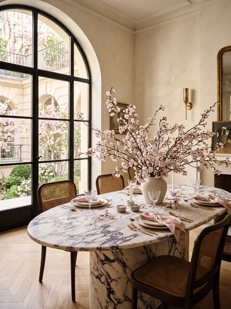
- Dramatic flowering branches instantly make the table feel professionally styled
- The height draws the eye upward, making the entire dining room feel larger
- Soft blush blossoms add romance without overwhelming the neutral palette
- A few fallen petals create a naturally effortless designer look
- Perfect for Easter brunch, bridal showers, or elegant spring entertaining
The moment flowering cherry branches enter a dining room, the entire space feels brighter, softer, and undeniably luxurious. Instead of relying on multiple decorations, let one oversized organic arrangement become the statement piece while keeping everything else beautifully understated. The airy blossoms introduce graceful movement that changes throughout the day as sunlight filters through each branch. I’ve noticed this approach always photographs beautifully because the delicate blooms create visual height while preserving an open, uncluttered table that still feels welcoming for guests and everyday family gatherings.
One reason this design continues appearing in premium interiors is its effortless balance between simplicity and elegance. Pair soft linen layers with sculptural ceramics, warm brass accents, and crystal glassware to let the blossoms remain the hero. The gentle pink tones complement nearly every neutral palette while making the dining room feel refreshed after winter. For anyone collecting fresh ideas, this arrangement delivers maximum impact with surprisingly few decorative pieces, creating a timeless editorial look that feels both sophisticated and naturally inviting.
Entry Console Bloom
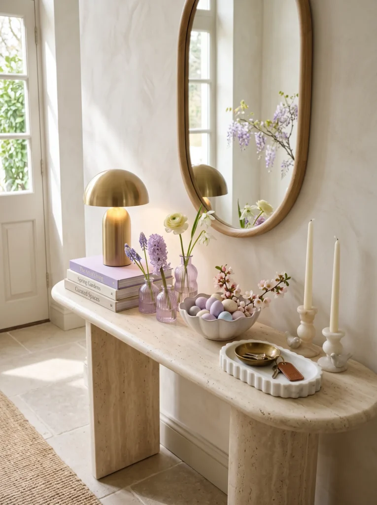
- Gives the entryway a fresh seasonal welcome without looking cluttered
- Uses several decorative moments instead of one large centerpiece
- Blends soft lavender with warm neutrals for an elegant first impression
- Makes everyday objects feel intentional and beautifully displayed
- Creates a boutique hotel entrance inspired by luxury interiors
The entry console is often the first surface guests notice, making it the perfect place to introduce a refined spring palette. Instead of filling the table with one dramatic arrangement, layer several smaller pieces that each contribute their own personality. Ripple-glass bud vases, sculptural marble trays, stacked linen books, and delicate spring blooms create movement without overwhelming the space. The lavender accents instantly brighten neutral walls while maintaining the calm, collected atmosphere that defines modern luxury homes.
The styling feels successful because every object has room to breathe. Warm brass lighting, soft ceramic textures, and fresh flowers balance decorative accessories with practical items like a key bowl or catchall tray. In my experience, entry tables look far more expensive when different heights are created through books, lamps, and small vases instead of oversized centerpieces. The finished space welcomes guests with effortless elegance while making the entire home feel lighter and refreshed for the season.
Coffee Table Citrus Edit
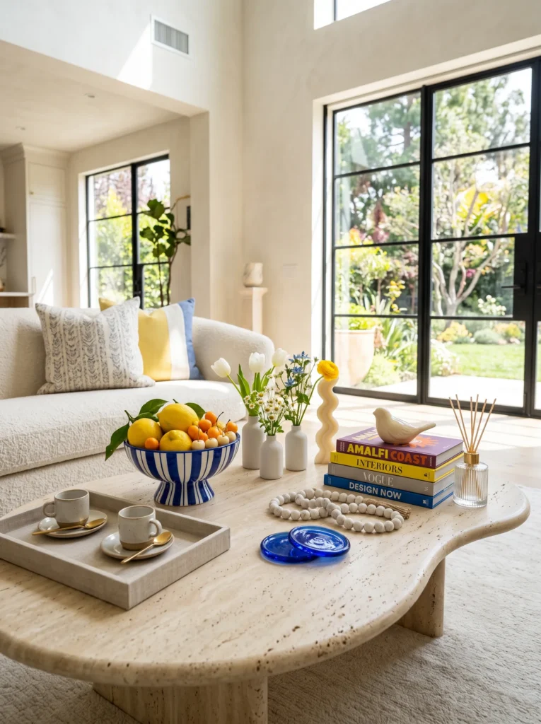
- Brings vibrant seasonal color into the living room without redecorating
- Mixes books, fruit, candles, and ceramics into one cohesive display
- Creates beautiful close-up styling moments for Pinterest photography
- Uses fresh citrus to introduce color naturally
- Feels modern, playful, and designer curated
A beautifully styled coffee table tells a story through layers rather than a single decorative object. Here, fresh citrus, artisan ceramics, fashion books, and tiny floral accents work together to create an inviting composition that feels relaxed yet polished. The bright lemon tones instantly energize the room while cobalt accessories introduce bold contrast without overpowering the softer surroundings. Each object has a purpose, encouraging the eye to move naturally across the table and discover new details from every angle.
What keeps this arrangement feeling luxurious is the careful balance between decorative and functional pieces. Espresso cups, diffusers, and coasters make the styling feel lived in rather than staged, while sculptural candles and handcrafted pottery provide artistic interest. I’ve found that combining practical objects with seasonal touches creates a more authentic atmosphere than relying on decorative accessories alone. The finished coffee table becomes a cheerful focal point that instantly refreshes the entire living room for spring.
Bedside Spring Styling
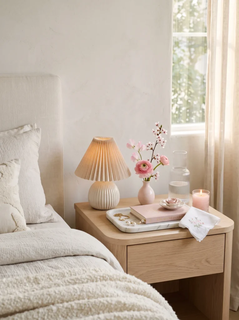
- Refreshes the bedroom with subtle seasonal color
- Combines practical essentials with elegant decorative details
- Keeps the tabletop calm instead of overcrowded
- Adds soft floral touches without dominating the space
- Creates a luxurious boutique hotel feel
Even a small bedside table can become part of your spring decorating by focusing on thoughtful details rather than adding more accessories. A pleated ceramic lamp, a delicate floral stem, and a beautiful water carafe create a refined arrangement that feels peaceful from the moment you wake up. Soft blush tones layered with ivory and natural wood make the bedroom feel brighter while preserving the calm atmosphere needed for rest and relaxation.
Luxury bedside styling is all about restraint. Every piece should feel useful, beautiful, or both, allowing the tabletop to remain clean and uncluttered. In my experience, one carefully chosen bloom often has more impact than a full bouquet because it lets the surrounding textures stand out. The result is a serene, elegant corner that quietly celebrates the season without competing with the rest of the bedroom.
Kitchen Island Market
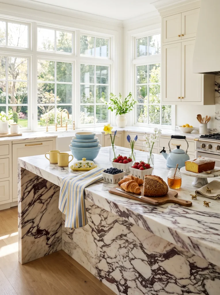
- Makes the island feel like a welcoming spring market display
- Layers breakfast essentials into the decorative styling
- Adds cheerful color without filling the surface with flowers
- Blends useful kitchen pieces with seasonal accents
- Creates an inviting gathering spot for family and guests
A kitchen island naturally becomes the heart of the home during spring, making it the perfect place to introduce seasonal color through everyday objects. Instead of decorating with one centerpiece, combine stacked ceramics, fresh pastries, berry baskets, and tiny floral bottles to create an arrangement that feels both beautiful and useful. The butter-yellow and sky-blue palette brightens the marble surface while allowing practical kitchen essentials to become part of the design. Every detail contributes warmth without making the space feel staged or overcrowded.
The beauty of this setup comes from its relaxed balance between function and style. Wooden boards, enamel cookware, and woven baskets add texture that contrasts beautifully with polished marble and glossy ceramics. I’ve noticed that displaying ingredients and breakfast pieces together creates a welcoming atmosphere because the kitchen feels ready to be enjoyed instead of simply admired. The finished island looks cheerful, lived in, and filled with thoughtful details that celebrate the freshness of spring.
Window Café Corner
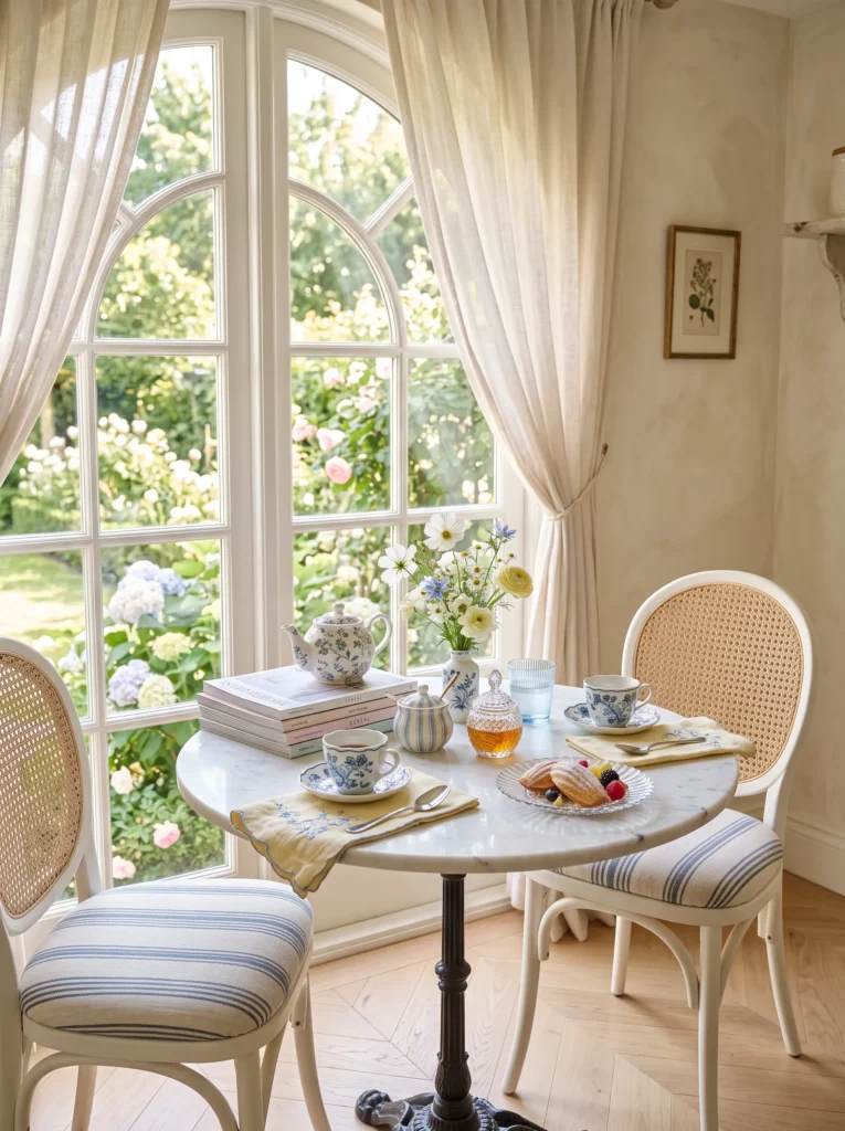
- Transforms a small breakfast nook into a cozy spring retreat
- Uses layered tableware instead of oversized decorations
- Creates a charming café atmosphere inside the home
- Keeps the palette bright, soft, and inviting
- Perfect for morning coffee or afternoon tea
A small café table offers the perfect opportunity to celebrate spring without needing elaborate decorations. Beautiful porcelain cups, tiny floral bottles, pastries, and embroidered linens create a setting that feels personal and inviting from the very first glance. The soft blue palette reflects the daylight pouring through nearby windows, giving the entire corner a light and airy atmosphere. Every object feels intentionally chosen, making the space ideal for quiet mornings, reading, or sharing coffee with a friend.
What makes this corner feel special is the thoughtful layering of everyday pieces. Instead of hiding beautiful tableware inside cabinets, display it proudly alongside seasonal blooms and delicate textiles. In my experience, these smaller styled corners often become favorite places in the home because they feel intimate and effortless. The combination of natural light, handcrafted ceramics, and subtle spring colors creates a peaceful escape that encourages slower moments throughout the day.
Sunroom Garden Table
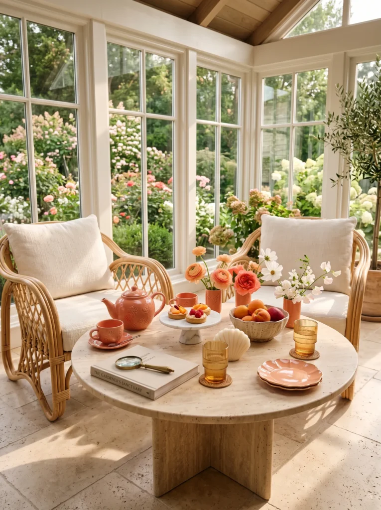
- Creates a relaxing spring destination inside the sunroom
- Mixes tea service, fruit, and flowers into one cohesive display
- Introduces warm coral tones without overwhelming the room
- Uses decorative accessories with practical purpose
- Feels elegant enough for entertaining yet comfortable every day
A sunroom table should feel relaxed, cheerful, and connected to the garden beyond the windows. Instead of a formal arrangement, this styling celebrates slow afternoons with beautiful tea service, seasonal fruit, and delicate floral touches spread naturally across the tabletop. Warm coral ceramics and peach accents reflect the sunshine, creating an inviting glow that changes throughout the day. The layered accessories encourage lingering conversations while keeping the overall composition light and uncluttered.
The most successful sunroom styling combines comfort with thoughtful details. Gardening books, woven coasters, and handcrafted pottery make the table feel personal rather than perfectly arranged. I’ve found that repeating warm coral through ceramics, flowers, and desserts creates harmony while still allowing natural greenery outside the windows to provide contrast. The result is a welcoming retreat filled with warmth, texture, and quiet spring charm.
Vanity Blossom Edit
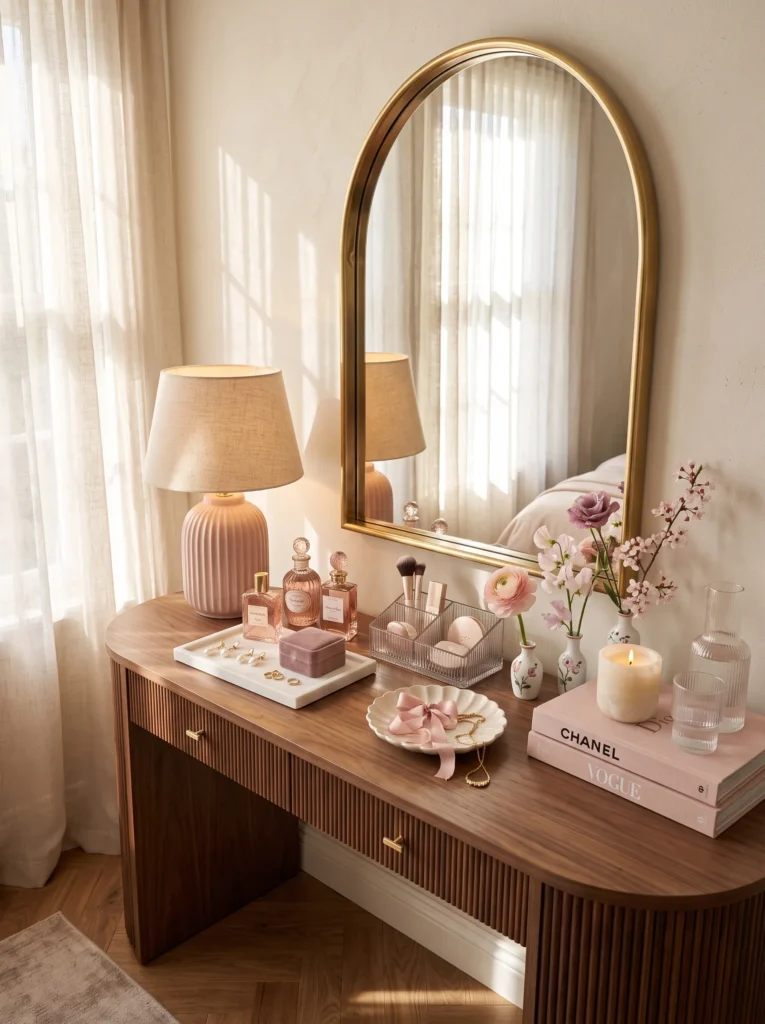
- Refreshes a vanity with soft seasonal elegance
- Turns everyday beauty essentials into decorative accents
- Introduces layered blush tones without visual clutter
- Creates a luxurious dressing area with practical charm
- Feels timeless, feminine, and beautifully curated
A thoughtfully styled vanity becomes more than a place to get ready — it transforms into a beautiful daily ritual. Instead of relying on a large bouquet, delicate bud bottles, vintage perfume bottles, and elegant jewelry trays create visual interest while keeping the surface functional. Soft blush and champagne tones flow naturally through the accessories, making the entire corner feel brighter and more refined. Every object contributes to a peaceful atmosphere that encourages slower mornings and adds quiet luxury to the bedroom.
The beauty of this arrangement comes from balancing decorative pieces with items used every day. Crystal organizers, perfume bottles, candles, and fresh blooms all feel intentional because they serve both practical and aesthetic purposes. I’ve noticed that repeating one soft color across glass, ceramics, and textiles creates an editorial look without making the space feel overly decorated. The finished vanity feels graceful, personal, and perfectly suited to welcoming the fresh energy of spring.
Patio Bistro Escape
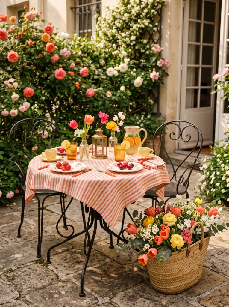
- Brings café-inspired charm to outdoor entertaining
- Uses fresh flowers naturally without overwhelming the tabletop
- Layers vibrant colors for an energetic spring mood
- Keeps the table functional while looking beautifully styled
- Creates a picturesque setting for coffee or brunch
Outdoor spring styling feels most inviting when the table remains open for conversation and refreshments. Here, the flowers arrive in a woven market basket placed beside the table, allowing handcrafted ceramics, colorful drinks, and seasonal fruit to become the visual focus. Coral linens and butter-yellow details add cheerful warmth while the surrounding garden naturally completes the scene. The result feels relaxed, welcoming, and effortlessly European without relying on oversized arrangements.
What gives this patio table its personality is the mix of handcrafted materials and fresh seasonal elements. Weathered iron, woven baskets, ribbed glass, and artisan pottery create rich texture that photographs beautifully in natural sunlight. In my experience, placing flowers around the seating area rather than directly in the center makes outdoor tables feel more spacious and comfortable. The finished setting captures the carefree spirit of spring while remaining elegant enough for entertaining.
Library Side Table
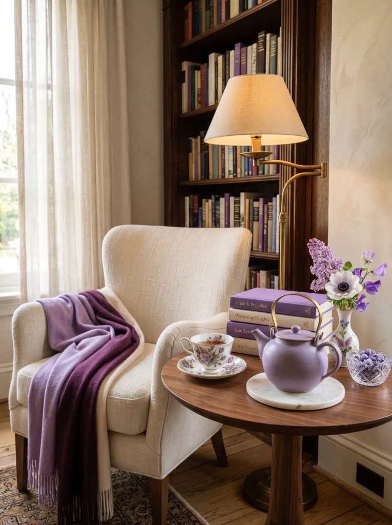
- Brings seasonal color into a cozy reading space
- Creates an elegant display using books, tea, and florals
- Balances decorative beauty with everyday comfort
- Introduces rich lavender tones in a sophisticated way
- Makes even a small side table feel intentionally styled
A reading corner becomes even more inviting when its side table reflects the calm beauty of the season. Instead of filling the surface with decorative accessories alone, combine a beautiful teapot, favorite books, delicate flowers, and warm lighting to create a space that encourages quiet moments. The layered lavender palette feels sophisticated rather than overly sweet, while natural walnut furniture grounds the lighter tones with warmth and depth.
Small tables often have the greatest impact because every object is carefully chosen. A handcrafted teacup, marble coaster, and single floral stem provide just enough detail to make the corner feel complete without sacrificing function. I’ve found that repeating one rich accent color through books, ceramics, and textiles creates a designer-inspired composition that feels cohesive and timeless. The finished space invites you to slow down, settle into a comfortable chair, and enjoy the peaceful atmosphere that spring naturally brings.
Garden Potting Bench
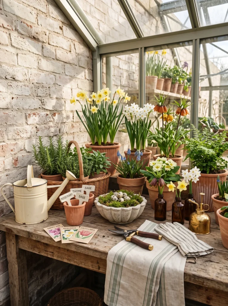
- Turns a practical potting bench into a beautiful seasonal feature
- Layers gardening tools with decorative spring accents
- Creates texture through natural materials instead of clutter
- Celebrates spring with herbs, bulbs, and handcrafted pottery
- Makes functional spaces feel just as stylish as living areas
A potting bench doesn’t have to be purely practical. By arranging terracotta planters, vintage gardening tools, seed packets, and flowering bulbs with intention, the space becomes an extension of your home’s spring decor. Small amber bottles holding individual blooms add softness without interrupting the workspace, while woven baskets and enamel accessories create warmth. The overall styling feels collected, relaxed, and deeply connected to the season, making gardening feel like part of the home’s overall design story.
The charm comes from embracing authentic materials rather than polished perfection. Weathered wood, aged brass, natural linen, and handmade pottery all develop beautiful character over time. I’ve seen this approach work especially well because it celebrates everyday gardening rituals instead of hiding them away. The finished bench feels inspiring, functional, and full of quiet personality while inviting you to spend more time tending plants and enjoying the fresh spring air.
Home Office Desk Refresh
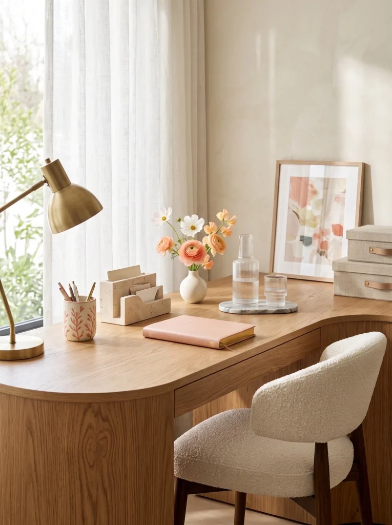
- Brings fresh seasonal energy into a productive workspace
- Keeps the desk organized while adding personality
- Introduces subtle spring color without distraction
- Blends office essentials with elegant decorative details
- Creates a workspace that feels calm and inspiring
Refreshing a desk for spring doesn’t require filling it with decorations. A carefully chosen bud vase, handcrafted organizer, beautiful notebook, and sculptural lamp create an environment that feels lighter while preserving valuable workspace. Soft coral accents introduce warmth without overwhelming the neutral palette, allowing the office to remain focused and functional. Every item earns its place by combining usefulness with thoughtful design, creating a desk that’s both productive and visually uplifting.
The most successful workspaces balance inspiration with simplicity. Natural wood, stone, glass, and ceramics provide texture without unnecessary clutter, while fresh flowers quietly remind you of the changing season. In my experience, reducing visual noise actually makes decorative details feel more luxurious because each object receives the attention it deserves. The finished desk feels sophisticated, organized, and motivating enough to make everyday work a little more enjoyable.
Spring Bar Cart
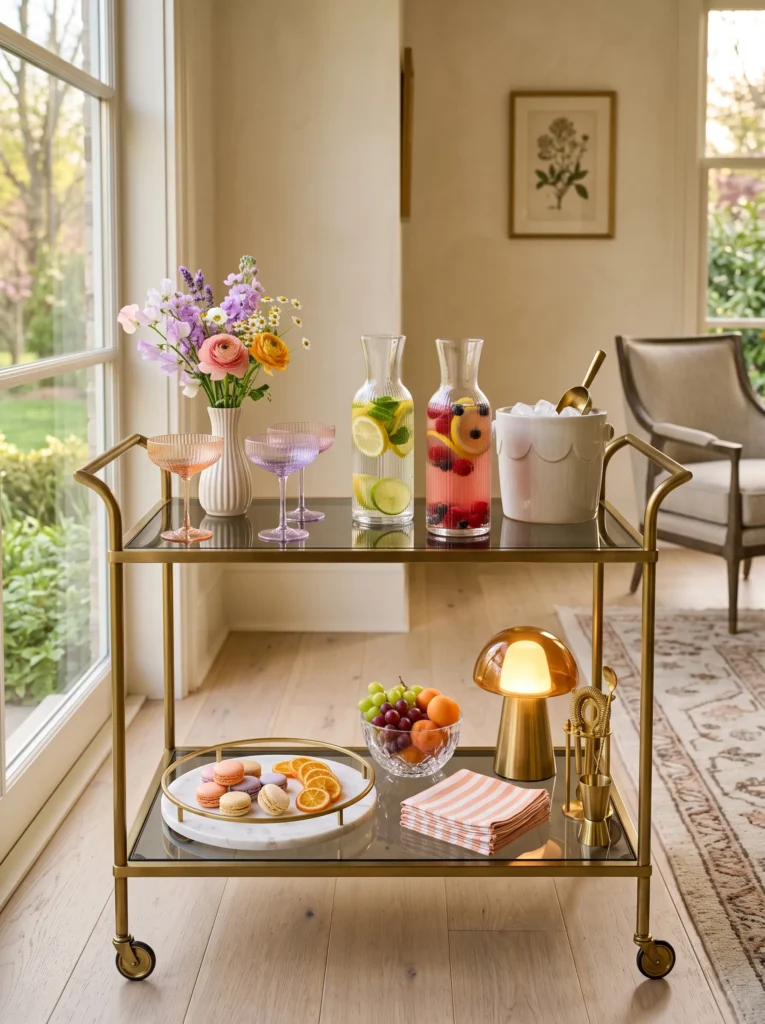
- Gives a bar cart a cheerful spring makeover
- Layers colorful glassware with seasonal florals and fruit
- Creates an elegant entertaining station without overcrowding
- Uses decorative pieces that remain practical
- Brings vibrant personality into the living room
A spring bar cart should feel light, colorful, and ready for spontaneous gatherings. Instead of relying on bottles alone, combine artisan glassware, fresh fruit, delicate flowers, and marble serving pieces to create an inviting display that feels both useful and decorative. The peach and lavender palette adds softness while crystal reflections catch the evening light, making the cart feel lively from every angle. Every shelf offers a different composition, encouraging guests to explore the styling as they mingle.
The layered arrangement succeeds because it mixes entertaining essentials with thoughtful decorative accents. Colored crystal, handcrafted ceramics, fresh citrus, and seasonal blooms work together without competing for attention. I’ve found that incorporating rechargeable lighting transforms a bar cart after sunset, adding warmth and highlighting the beautiful textures of the glass and stone. The result is a polished yet approachable entertaining station that feels modern, luxurious, and perfectly suited to spring celebrations.
Conclusion
Styling a beautiful table was never about spending more, it’s about choosing details with intention. These spring table decor ideas prove that small, layered touches, a color story, a cluster of bud vases, a stack of mismatched plates, can turn an ordinary meal into something people remember long after they leave.
I’ve seen how a few simple changes like these can completely transform the feel of a room, no full redecorating required. So save this post to Pinterest for later, pick one idea to try in your own space this week, and pass it along to a friend whose table could use a little spring magic too.