15 Moody Dining Room Ideas for Candlelit Dinners
Your dining room might be the one room in your house that’s allowed to go dark — and nobody’s telling you that.
If you’ve been hesitant to commit to a bold, saturated color anywhere in your home, start here. These moody dining room ideas prove that a dining room can handle drama in a way a bedroom or living room simply can’t, because it’s a space you experience almost entirely under warm, artificial light. I’ve built this list around full, real scenes — walls, tables, chairs, lighting, tableware, greenery — not just paint swatches, so you can actually picture (and recreate) each one. Whether you’re ready to paint a full wall or want to test the look with velvet chairs or a single lacquered cabinet, there’s a starting point here for you.
Why the Dining Room Is Built for Moody Color
Most people assume dark paint belongs in bedrooms and moody colors have no place near a dinner table. That’s backwards.
A dining room is one of the few rooms in a house used almost exclusively in the evening, which is exactly why deep, saturated color works there better than almost anywhere else in the home — you’re rarely seeing it under flat daylight, only under candlelight, dimmed sconces, or a warm-toned chandelier, where dark walls turn rich instead of heavy.
I noticed this firsthand after painting our own dining room a deep espresso brown — by daylight my husband thought I’d made a mistake, but the second we lit it for dinner, the room felt like a different house entirely.
This post solves that hesitation: fifteen real, fully styled moody dining rooms, built idea by idea, so you can see exactly how the drama comes together — walls, table, lighting, and every surface in between.
1. Charcoal Wainscoting Dinner — A Moody Dining Room Idea
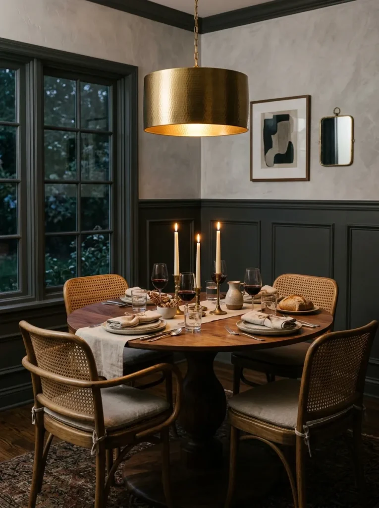
- Lower third of the wall wrapped in charcoal wainscoting, painted in a scrubbable semi-gloss enamel
- Upper walls finished in a slightly lighter charcoal-grey plaster for subtle depth
- Round pedestal dining table in black walnut with a sculpted curved base
- Mixed dining chairs — natural cane-back rattan, unmatched on purpose
- Brass drum pendant on a dimmer, paired with taper candles in brass holders down the table
- Built-in glass-front cabinet painted matte black with unlacquered brass hardware
- Matte black stoneware dinnerware with smoked glass tumblers stacked inside the cabinet
- Snake plant in a blackened terracotta pot tucked near the window
Why this works: Wainscoting on the lower wall isn’t just decorative — it’s the most durable way to bring dark color into a room where chairs get pushed back constantly.
My husband has installed wainscoting in more dining rooms than any other room in a house, and there’s a reason: it takes the daily wear — chair backs, scuffs, the occasional dropped fork — while the plaster above stays untouched. In a room this size, painting only the lower panel in charcoal and leaving the upper wall a shade lighter also keeps the ceiling from feeling like it’s closing in, which is the single biggest complaint people have about going dark in a smaller dining room.
The round pedestal table does real work here too. With cane-back chairs mismatched around it, the room avoids the overly formal, matchy-matchy feel that makes dark dining rooms look staged instead of lived-in. Brass candlelight against black wainscoting is the detail that photographs beautifully but also just works at an actual Tuesday dinner — warm, low, flattering light that a ceiling fixture alone never quite achieves. It’s a moody dining room built for real use, not just for looks.
2. Aubergine & Brass Formal
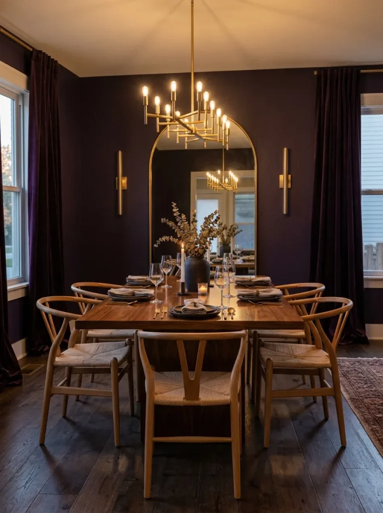
- Deep aubergine walls in a washable eggshell finish, full coverage floor to ceiling
- Long rectangular dining table in lacquered walnut, seats ten comfortably
- Matched wishbone chairs in warm oak for a softer counterpoint to the saturated wall
- Brass linear chandelier on a dimmer switch, hung low over the table
- Wall sconces flanking a large arched mirror at one end of the room
- Oak sideboard with woven cane-front doors, holding stacked white-and-gold rimmed china
- Cut crystal glassware displayed on an open shelf above the sideboard
- Trailing pothos in a brass pot placed on the sideboard’s left corner
- Floor-length velvet drapery in a tone-on-tone aubergine
- Vintage-style rug in warm reds and blues layered beneath the table
Why this works: A single saturated wall color paired with warm oak furniture reads as dramatic dining room style rather than heavy, because the wood keeps the palette grounded.
Aubergine is one of the most underused colors in a moody dining room, and that’s a mistake — it has the depth of black without ever going cold. I chose oak wishbone chairs specifically to keep the room from feeling like a Victorian parlor; the clean, curved silhouette pulls the whole space into 2026 rather than 1986. Brass sconces flanking the mirror double the candlelight in the room after dark, which matters more than people expect once the sun goes down and the chandelier is the only other light source.
Lighting layering is what separates a dining room that photographs well from one that actually feels good to eat dinner in. A dimmable chandelier set at 2700K gives you flexibility — bright for setting the table, low and warm once guests arrive. I’ve noticed the mirror does double duty too, bouncing that low light back across the room so the far wall never disappears into total darkness, which is a common issue in aubergine or navy rooms without a secondary reflective surface.
3. Espresso Velvet Banquette
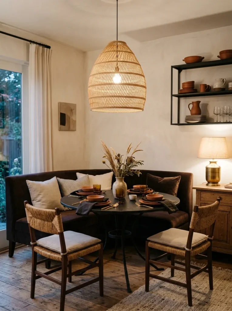
- Warm white plaster walls left intentionally neutral, letting the furniture carry the color
- Built-in banquette seating along one wall, upholstered in espresso brown velvet
- Round pedestal table with a wrought iron base and a honed black stone top
- Wrought iron chairs with slim woven rush seats on the opposite side
- Woven rattan pendant light layered with a brass buffet lamp on the open shelving
- Black-stained open shelving unit displaying stacked terracotta dinnerware
- Fiddle leaf fig in a woven seagrass basket in the room’s back corner
- Sculptural ceramic wall piece above the banquette in place of framed art
- Flatwoven rug in a geometric charcoal-and-cream pattern beneath the table
Why this works: A built-in banquette anchored directly into wall studs holds up to daily use far better than a freestanding bench, and it lets the wall color stay neutral while the velvet carries all the drama.
I’ve seen this backfire when people install a banquette without checking the wall for proper blocking — my husband always frames in solid backing before the velvet upholstery goes on, because a bench that wobbles undoes the whole moody dining room design in about a week. Here, the espresso velvet does the heavy lifting instead of paint, which is a good option for renters or anyone hesitant to commit a full wall to dark color.
The stone-and-iron table keeps the room from tipping into overly soft or precious, balancing the velvet’s plush texture with something cooler and more architectural. Open shelving with stacked terracotta dinnerware brings warmth and texture without adding another dark surface to the room, and it means the everyday dishes are part of the styling rather than hidden away. This is one of the easiest moody dining room ideas to try in stages — start with the banquette, add the lighting layer later.
4. Navy Gallery Wall Dinner
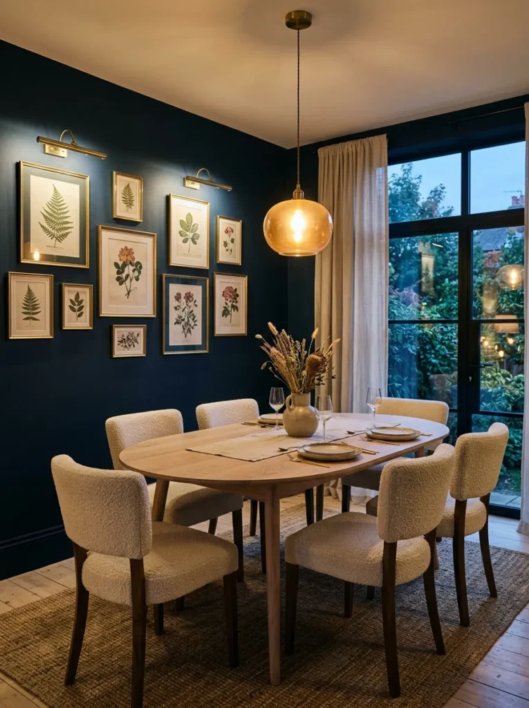
- Deep ink-navy walls in a washable matte finish, floor to ceiling
- Oval pedestal table in bleached white oak, seats eight
- Cream boucle upholstered dining chairs, armless, matched set
- Amber glass pendant over the table, set on a dimmer at 2700K
- Brass picture lights mounted above a gallery wall of framed vintage botanical prints
- Fluted oak sideboard with brass pulls, holding stacked ivory china behind closed doors
- Cream-and-rust striped dhurrie rug beneath the table
- Trailing philodendron in a matte navy ceramic pot on the sideboard
- Linen roman shades in soft cream at the window
Why this works: Ink-navy reads as sophisticated rather than cave-like as soon as it’s paired with pale oak and cream upholstery, which keeps the room bright even under a dark wall color.
Botanical prints belong in a dining room more than almost anywhere else in the house, and I say that as someone who studied plant science before I ever picked up a paint brush — there’s something about eating dinner surrounded by framed greenery that makes a dark room feel alive instead of closed in. The brass picture lights above the gallery wall matter here too: without a dedicated light source, dark walls swallow artwork completely after sunset, and the whole gallery effect disappears the moment the overhead pendant dims.
The oval table softens what could otherwise feel like a very formal, boxy room, and bleached oak against ink-navy walls is a contrast I come back to again and again in moody dining room design because it never looks dated. Boucle chairs bring in texture without adding another pattern to compete with the striped rug. This is a room built for lingering — the kind of dinner that runs two hours past dessert because the lighting never once feels harsh.
5. Bottle Green Ceiling
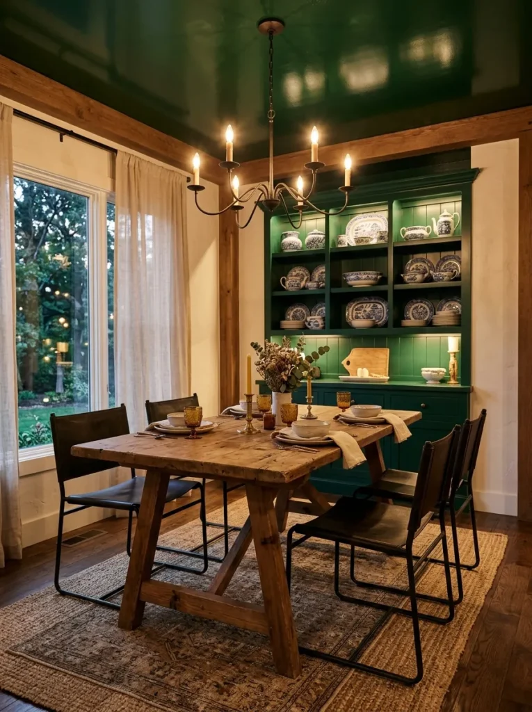
- Ceiling painted high-gloss bottle green, walls left in warm white limewash
- Long trestle table in reclaimed pine with a matte black steel base
- Black metal dining chairs with camel leather sling seats, matched set
- Wrought iron chandelier with exposed bulbs, dimmable, hung low
- Built-in hutch painted to match the ceiling in bottle green, glass-front doors
- Green-and-white transferware stacked and displayed inside the hutch
- Layered jute rug beneath a smaller vintage runner rug
- Large potted olive tree in a raw concrete planter near the window
Why this works: A gloss ceiling reflects available light back into the room, which is why a dark, glossy ceiling in a dining room often reads brighter in person than it does in photos.
Painting the ceiling instead of the walls is one of the most underused moves in dark, dramatic dining room style, and it’s worth trying before committing to four walls of color. The high-gloss finish is doing real work here — matte paint absorbs light, but gloss bounces it, so a bottle-green ceiling over warm white walls creates drama overhead without making the room feel smaller or darker at eye level. It’s a good entry point for anyone nervous about full-wall color commitment but still craving a moody dining room design.
The reclaimed pine table and black steel base keep the room from tipping into anything precious, and camel leather slings on the chairs add warmth against all that cool green and black. My husband has framed out plenty of built-in hutches over the years, and matching the hutch paint to the ceiling color — rather than the walls — ties the whole room together in a way most people don’t think to try.
6. Lacquered Black Cabinet Statement
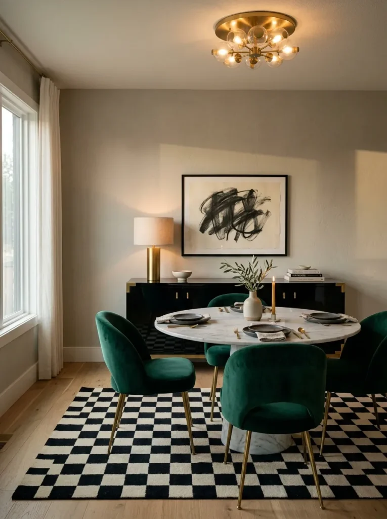
- Warm greige plaster walls, kept intentionally quiet and neutral
- High-gloss black lacquer sideboard with unlacquered brass hardware as the room’s color anchor
- Round honed marble table with a slim black steel base
- Emerald green velvet dining chairs, curved backs, matched set
- Sculptural brass flush-mount ceiling fixture in place of a chandelier
- Pair of brass candlesticks with ivory tapers styled on the marble table
- Black-and-cream checkerboard rug beneath the table
- ZZ plant in a matte black ceramic pot in the room’s corner
- Large abstract art piece in muted charcoal tones above the sideboard
Why this works: Locating the boldest color in a single lacquered cabinet, rather than the walls, gives a room the same visual drama dark dining room ideas typically bring, without the commitment of painting an entire space.
I painted a cabinet in high-gloss black for a client last year who was terrified of dark walls, and it remains one of my favorite moody dining room solutions precisely because it’s reversible — if the mood ever shifts, repainting one cabinet is a weekend project, not a full room overhaul. The emerald chairs pick up just enough saturation to keep the neutral walls from feeling like an afterthought, and the marble table’s cool grey veining bridges the greige walls and the black lacquer without introducing a fourth competing tone.
A flush-mount fixture instead of a hanging chandelier is a deliberate choice for smaller dining rooms or lower ceilings, where a dropped fixture can make the space feel cramped. Layer in the brass candlesticks at the table for actual candlelight during dinner, since the flush mount alone won’t give you that warm, flickering secondary light source a chandelier naturally provides. Checkerboard flooring underfoot adds graphic energy without asking the walls to do any more work.
7. Burgundy Live-Edge Table
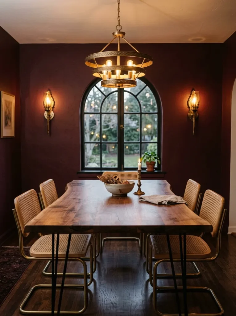
- Deep burgundy walls in a washable satin finish, full coverage
- Live-edge walnut slab table with a raw, unfinished edge and a black steel hairpin base
- Mixed dining chairs — half black rattan, half vintage brass-frame chairs with cream cushions
- Antique-brass tiered chandelier, dimmable, hung slightly lower than standard for intimacy
- Wall-mounted brass sconces on either side of a large arched window
- Black-stained open shelving displaying rust and cream stoneware
- Vintage Persian-style rug in burgundy, rust, and cream tones
- Trailing ivy in a rust-colored ceramic pot on the shelving’s lower tier
Why this works: A live-edge tabletop against a fully saturated burgundy wall keeps the room from feeling overly polished, because the raw wood edge introduces texture that flat paint alone can’t provide.
Burgundy is one of the moodiest colors you can put on a dining room wall, and it’s also one of the most forgiving under warm, dimmed light — where a true red can turn garish by candlelight, burgundy just deepens. I mixed rattan and brass-frame chairs here on purpose; a fully matched dining set in a room this saturated can tip into feeling like a stage set rather than somewhere people actually eat. The live-edge table grounds all of it in something organic and a little imperfect.
Hanging the chandelier lower than the standard 30–34 inches above the table isn’t a mistake — it’s intentional for dinner-party intimacy, pulling the light and the conversation down closer to the table itself. I’ve noticed this single adjustment does more to create genuine dramatic dining room style than any paint color choice. Layer the brass sconces in for secondary light once the sun goes down, and the room holds its warmth from six o’clock through dessert.
8. True Black Board-and-Batten
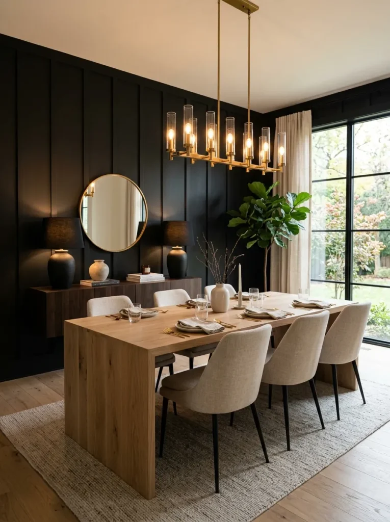
- Walls fully painted in true matte black, with vertical board-and-batten paneling for texture
- Long rectangular table in white oak with a simple waterfall-edge base
- Upholstered dining chairs in oatmeal linen, boxy modern silhouette
- Sculptural brass and glass chandelier, dimmable, warm 2700K bulbs throughout
- Secondary lighting from a pair of black ceramic buffet lamps on a floating console
- Floating black-stained console shelf in place of a full sideboard
- Handmade stoneware in a soft sage glaze, stacked on the console
- Large potted bird of paradise in a black steel planter near the window
- Wool boucle rug in undyed cream beneath the table
Why this works: Board-and-batten paneling adds physical depth to a dark wall, which matters because flat black paint on a smooth wall can read as a void rather than a rich, dimensional color.
True black is the boldest move on this entire list, and it only works when the room has enough secondary light sources to keep it from feeling like a cave after dark. This is the room where lighting layering matters most: the chandelier alone isn’t enough. Pair it with the buffet lamps on the console, and make sure every bulb in the room runs warm — anything above 3000K will read cold and clinical against true black, undoing the whole moody effect you’re going for.
Board-and-batten is a detail my husband installs constantly in older Austin homes being updated for a more current look, and it’s the reason this wall doesn’t feel flat despite being a single, uninterrupted color. White oak and oatmeal linen keep the room from tipping into anything severe, and the waterfall-edge table base adds a clean, current line that reads more 2026 than traditional. This is a genuinely dramatic dining room design, but never a dark one.
9. Forest Wallpaper Surprise
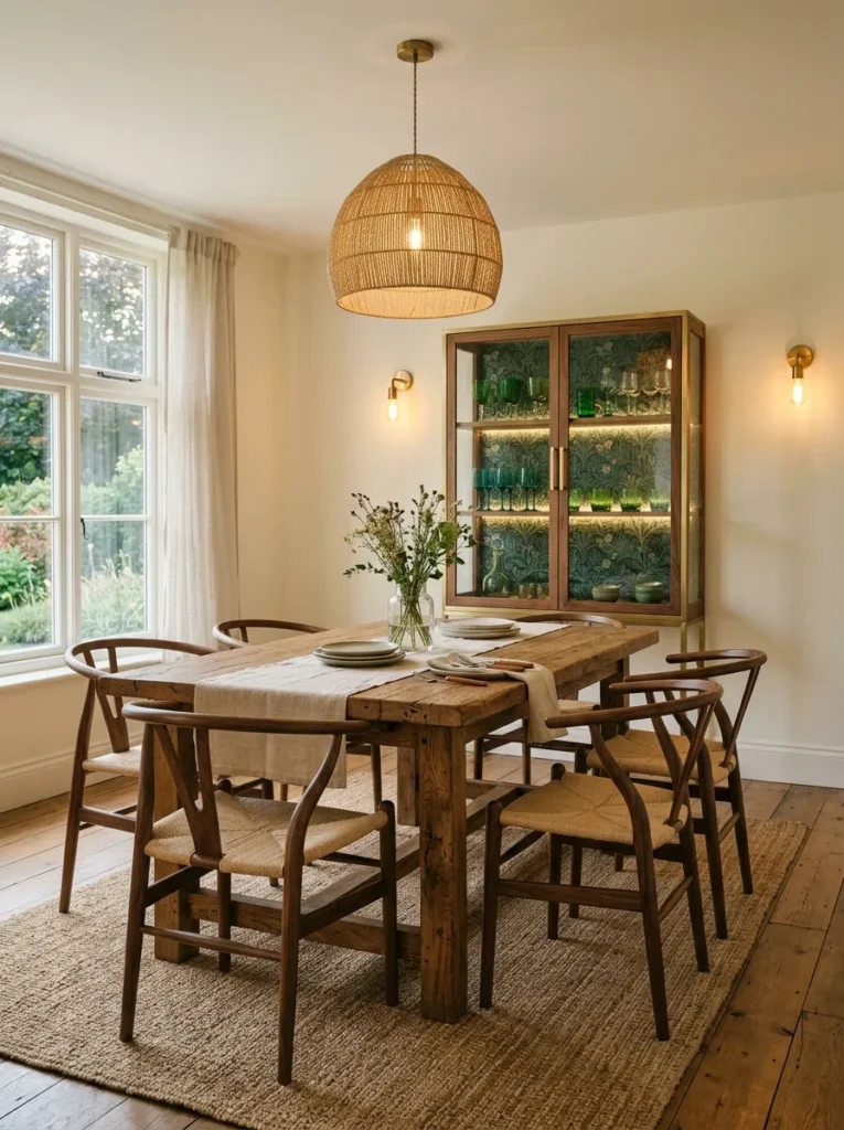
- Warm cream walls left plain, with a dramatic dark forest-green botanical wallpaper lining the inside of a glass-front cabinet only
- Rectangular reclaimed oak table with turned wood legs, farmhouse-adjacent but refined
- Curved wishbone-style chairs in a warm walnut stain, matched set
- Woven abaca pendant light layered with a pair of brass wall sconces
- Glass-front cabinet with the forest wallpaper as a hidden interior surprise, displaying green rimmed glassware
- Cream linen table runner with brass candlesticks and ivory tapers
- Natural jute rug, undyed, beneath the table
- Trailing pothos in an unglazed terracotta pot on the windowsill
Why this works: Hiding a bold, saturated pattern inside a cabinet rather than putting it on the walls gives a room a genuine sense of discovery, and it’s a low-commitment way to try dramatic dining room style if you’re not ready to paint.
This is one of my favorite tricks for anyone who loves moody, saturated color but rents their home or simply isn’t ready to commit a full wall to it. The forest wallpaper only reveals itself when the cabinet doors are open or when light hits the glass just right in the evening, which makes the room feel considered rather than obvious. I’ve tried this in my own dining room with a smaller version of the same idea, and guests notice it almost every time — it becomes a genuine conversation piece rather than just a backdrop.
The reclaimed oak table and wishbone chairs keep the rest of the room calm and neutral, letting the wallpaper moment carry all the visual weight. Abaca and brass together add warmth and texture without competing with the green glassware behind the cabinet doors. It’s a quiet, editable approach to a moody dining room, one that can grow bolder over time without a full renovation.
10. Charcoal Velvet Chairs, Neutral Room
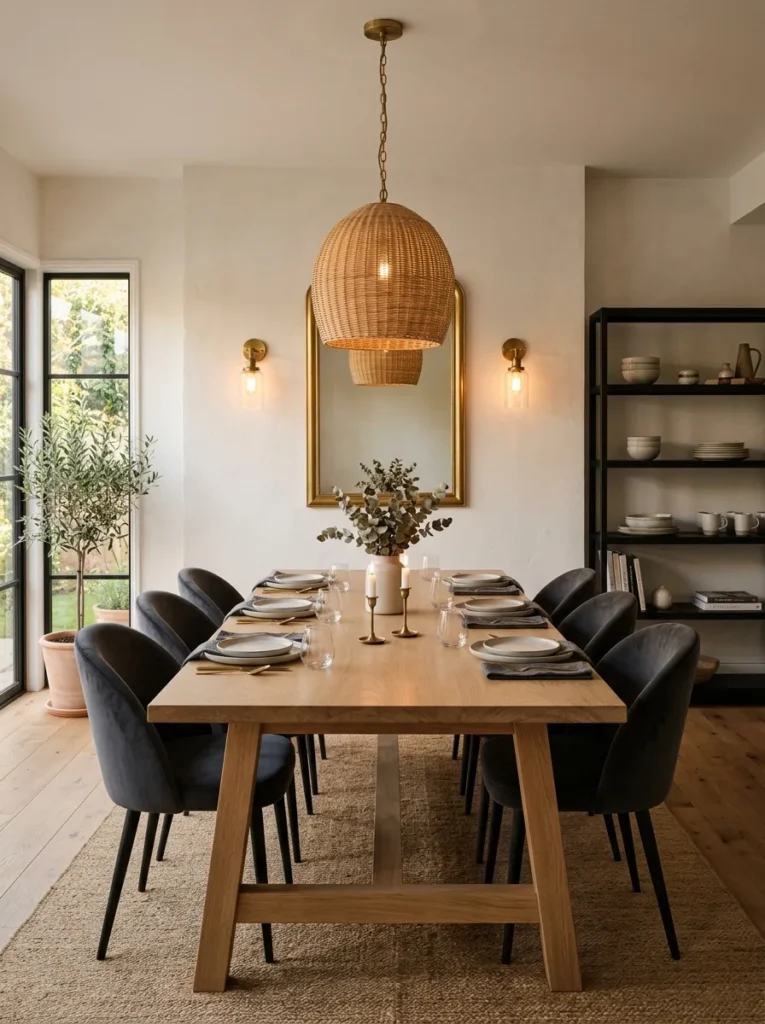
- Warm white plaster walls, kept entirely neutral and quiet
- Long rectangular white oak table with a simple trestle base
- Charcoal velvet upholstered dining chairs, curved backs, matched set — the room’s sole color statement
- Woven rattan chandelier layered with brass wall sconces flanking a large mirror
- Black-stained open shelving with stacked cream stoneware and smoked glass tumblers
- Vintage wool rug in soft grey and cream tones beneath the table
- Snake plant in a cream ceramic pot on the open shelving’s lower shelf
- Linen café curtains in undyed cream at the lower half of the window
Why this works: Locating dark, saturated color entirely in the seating rather than the walls is one of the lowest-risk ways to test moody dining room design before committing to paint.
Chairs are the easiest, least permanent place to introduce drama into a dining room, and this is the option I recommend most often to anyone hesitant about painting. Charcoal velvet against warm white walls reads as sophisticated and current rather than heavy, because the neutral backdrop gives the eye somewhere to rest. Swap the chairs down the line and the entire mood of the room shifts without touching a single wall — that flexibility matters more than people expect once they’ve lived with one look for a few years and want a change.
The mirror flanked by brass sconces does real functional work here, bouncing candlelight and pendant light back across a room that would otherwise feel a little flat given the neutral walls. Rattan overhead keeps the lighting warm and textural rather than sharp, and the open shelving’s cream stoneware adds just enough visual interest to keep the room from reading as sparse. This is a moody dining room idea that grows with you.
11. Deep Teal Panel Moulding
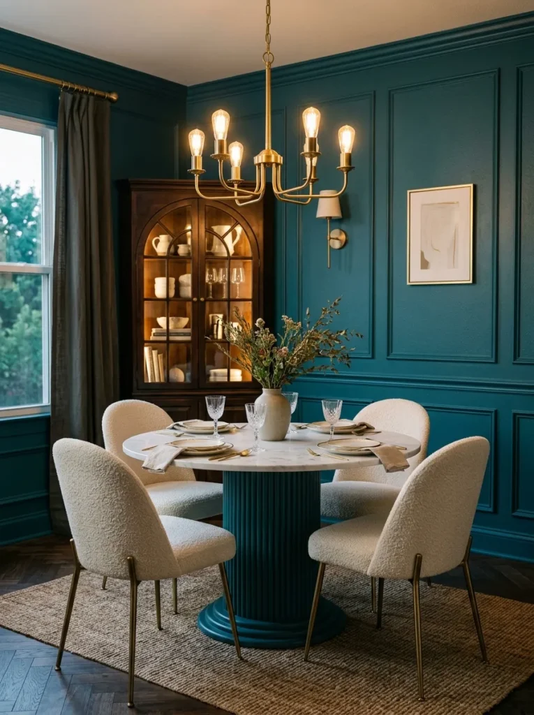
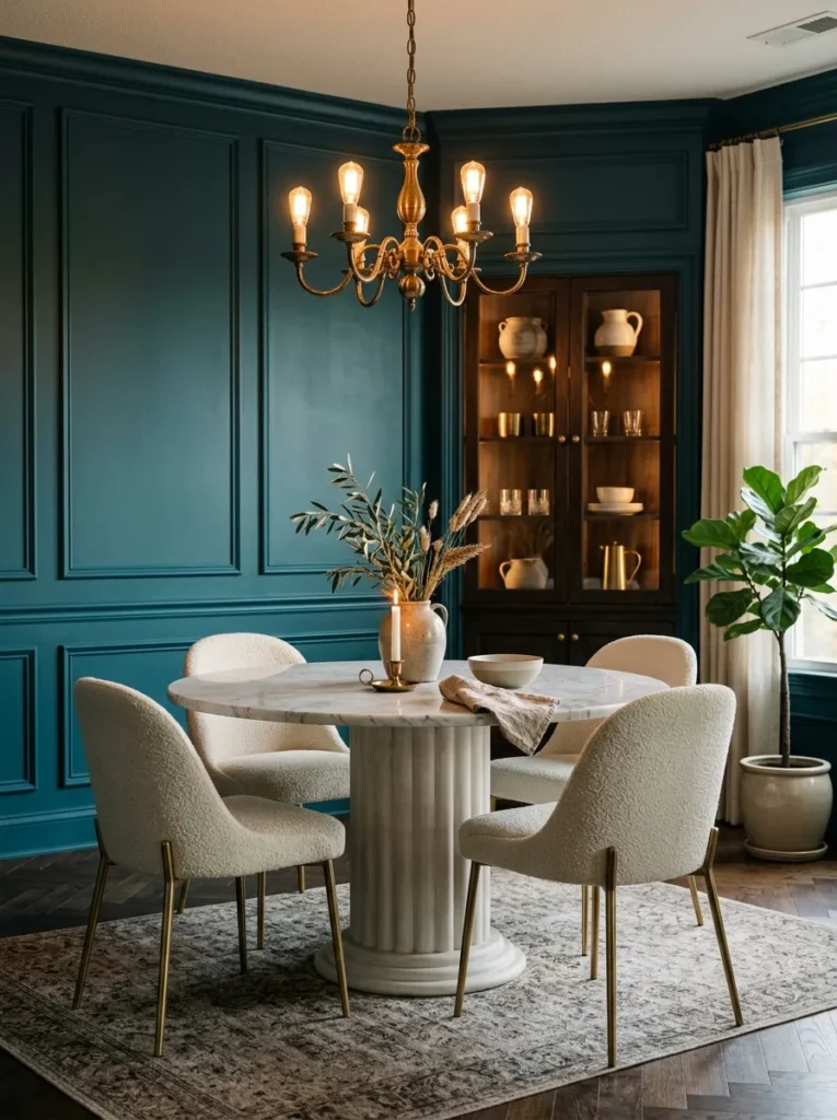
- Deep teal walls with applied panel moulding painted the same tone for a monochromatic, architectural effect
- Round marble-top table with a fluted plaster pedestal base
- Dining chairs in cream bouclé with slim brass legs
- Antique brass chandelier with fabric shades, dimmable, warm-toned bulbs
- Brass picture light above a single large abstract art piece rather than a full gallery wall
- Built-in corner cabinet, glass-front, holding stacked cobalt-and-white china
- Cream linen drapery pooling slightly at the floor
- Vintage runner rug in teal, rust, and cream
Why this works: Panel moulding painted the same color as the wall behind it creates depth and shadow lines that flat paint alone cannot achieve, which is why monochromatic moulding often reads as more architectural than a contrasting trim color.
Teal doesn’t get nearly enough credit in dark, dramatic dining room style — it has all the depth of navy with a little more warmth underneath it. Painting the panel moulding the exact same shade as the wall, rather than picking out the trim in white, is a deliberately restrained choice; the moulding still reads clearly thanks to the shadow lines it casts under warm light, but the room feels seamless rather than busy. The fluted pedestal base on the table echoes that same architectural language in miniature.
Brass legs on the chairs keep the room from feeling too solid or blocky against all that moulding, and a single oversized art piece — lit with its own picture light — does more for the room than a cluttered gallery wall would. The cobalt china inside the corner cabinet is the one unexpected color note in an otherwise teal-and-brass room, and it’s a detail guests always ask about.
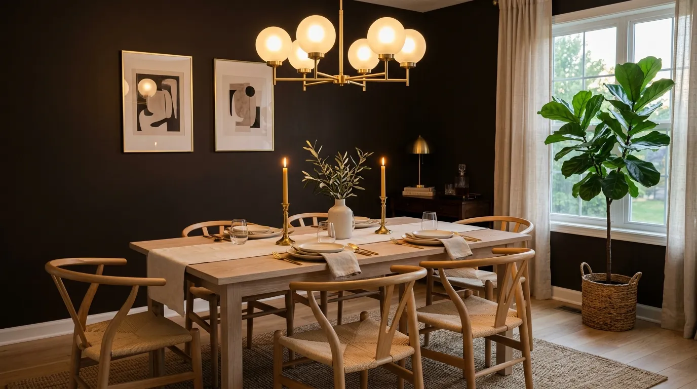
12. Espresso Brown Full Room
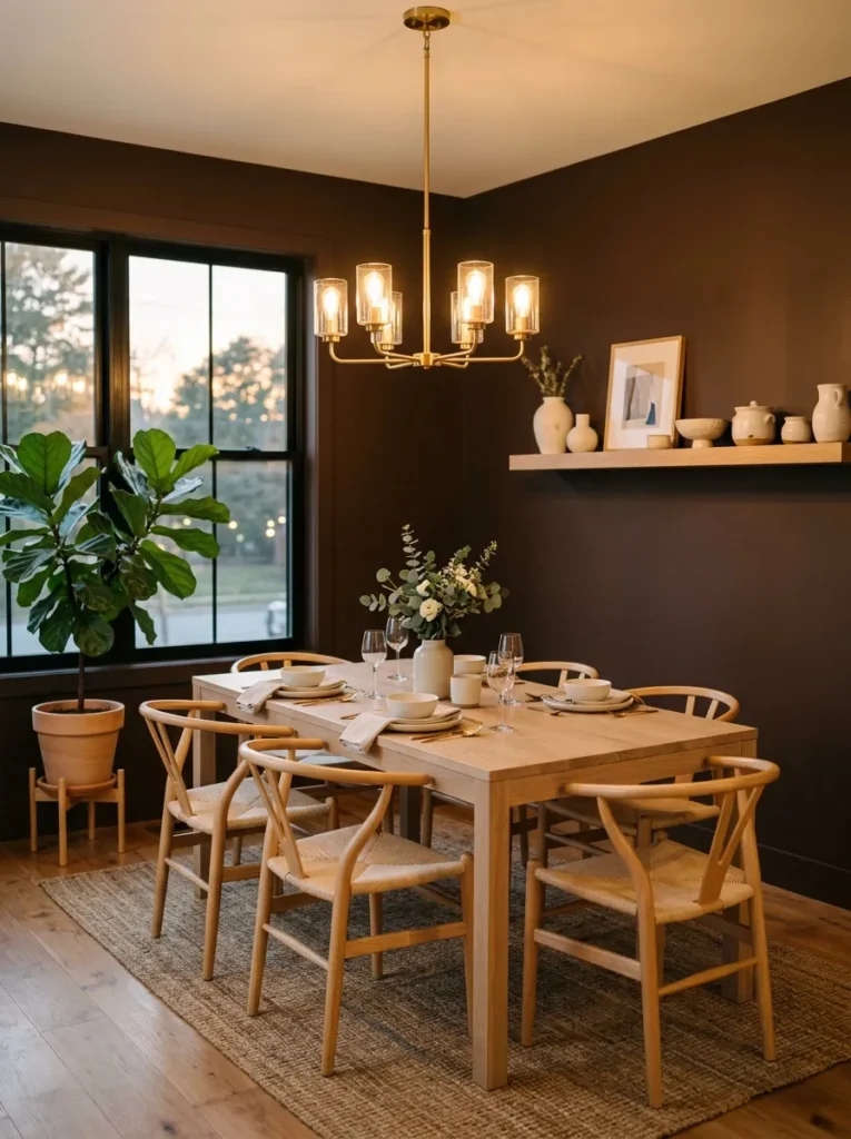
- Espresso-brown walls in a warm, deep matte finish, floor to ceiling
- Rectangular table in bleached white oak with a simple block-leg base, chosen deliberately to contrast the dark walls
- Wishbone chairs in natural cane, unstained
- Brass and frosted-glass chandelier, dimmable, hung at standard height
- Floating white oak shelf displaying handmade ivory ceramics
- Ivory linen table runner with unbleached beeswax candles in brass holders
- Natural jute rug, undyed, beneath the table
- Large fiddle leaf fig in a raw clay pot near the window, positioned to catch morning light for the plant’s health even though the room is used mostly in the evening
Why this works: Pairing the darkest wall color on this list with the palest possible wood keeps espresso brown from reading as somber, because the high contrast does the visual work that a busier room would need multiple colors to achieve.
Espresso brown was the color I chose for my own dining room, and it’s still the one I get asked about most. What surprised me was how different it looks depending on the hour — by daylight it can look almost black, but the second the chandelier goes on and the sun’s fully down, it warms up into something closer to dark chocolate. That shift is part of the appeal, not a flaw, and it’s exactly why dining rooms suit this kind of deep color better than almost any other room in the house.
Bleached white oak furniture against espresso walls is the highest-contrast pairing on this whole list, and it keeps the room from ever feeling like it’s disappearing into itself. I positioned the fiddle leaf fig near the window specifically for its light needs during the day, even though the room itself comes alive after dark — a small detail that matters if you actually want the plant to thrive long-term, not just look good in a single photo.
13. Black Steel Windows Feature
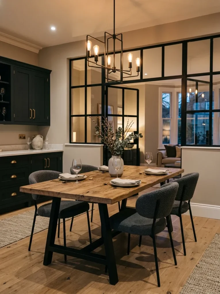
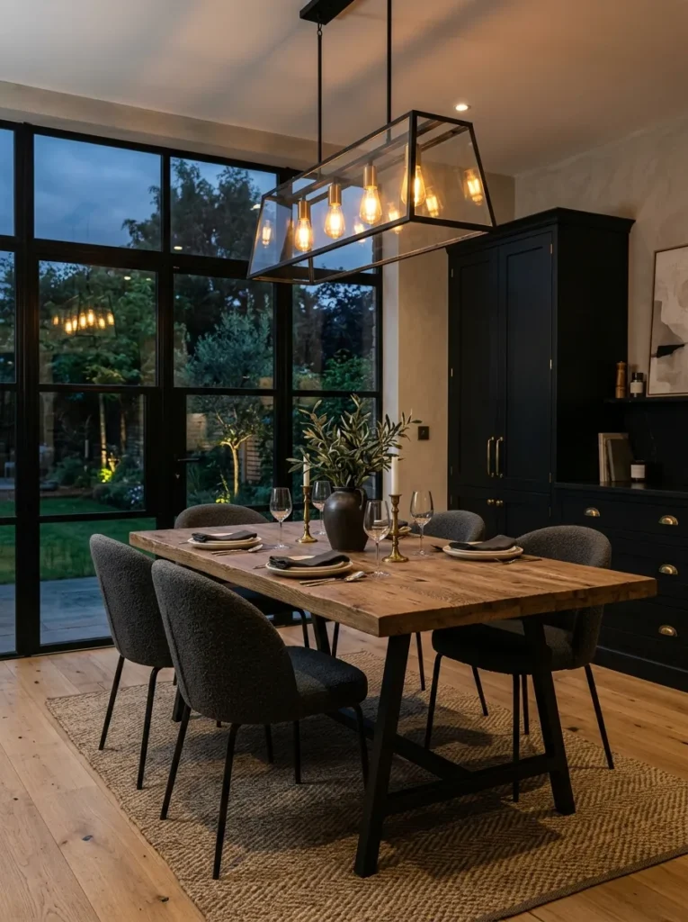
- Warm greige plaster walls, kept quiet to let the architecture lead
- Black steel-framed interior windows separating the dining room from an adjacent hallway, acting as the room’s defining feature
- Long rectangular reclaimed elm table with a black steel trestle base to echo the window frames
- Dining chairs in charcoal boucle with black steel legs, matched set
- Black steel and glass chandelier, dimmable, industrial silhouette softened with warm bulbs
- Black-stained built-in cabinetry with brass hardware along one wall
- Stacked stoneware in a warm oatmeal glaze inside the cabinetry
- Vintage kilim rug in muted rust and charcoal tones
Why this works: Black steel-framed interior windows bring architectural drama into a dining room without requiring any wall paint at all, which makes them a strong option for open-concept homes where a fully painted room isn’t practical.
My husband’s crews install black steel window features constantly in open-concept remodels, because they let a dining room feel visually separated from the rest of the house without a single wall going up. It’s become one of the most requested details in newer Austin builds, and for good reason — the black steel grid does the same visual job as a dark accent wall, drawing a clear boundary and adding weight to the room, while still letting light pass through from either side.
Matching the table base and chair legs to the same black steel keeps the whole room feeling like one cohesive architectural statement rather than a collection of separate choices. Charcoal boucle softens all that black metal, and the built-in cabinetry gives the room storage without competing for attention. This is a moody dining room design built around structure first, color second — proof that drama doesn’t always require paint.
14. Rust & Terracotta Warm Moody
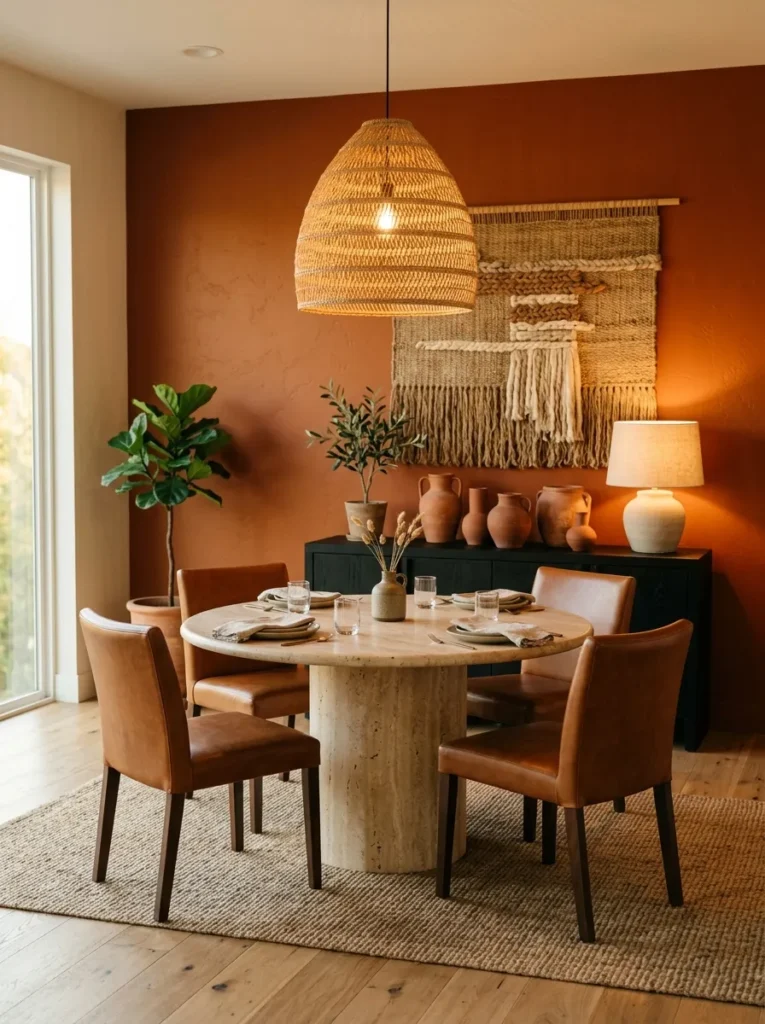
- Warm rust-orange walls in a deep, muted matte finish — a departure from cooler moody tones
- Round table in raw travertine with a simple cylindrical stone base
- Dining chairs in cognac leather with black steel frames
- Woven jute pendant light layered with a pair of ceramic table lamps on a low console
- Black-stained low console in place of a full sideboard, holding terracotta and cream ceramics
- Terracotta and cream striped runner rug beneath the table
- Large potted rubber plant in an unglazed terracotta pot near the window
- Handwoven wall hanging in rust, cream, and black tones above the console
Why this works: Rust proves that moody dining room ideas don’t have to mean cool, jewel-toned color — a warm, earthy saturated tone can carry the same dramatic weight as navy or black while feeling entirely different at the table.
Every list of dark dining room decor defaults to green, navy, or black, and rust rarely gets mentioned, which always surprises me given how well it performs under warm evening light. Travertine’s natural variation keeps the round table from feeling too smooth or sterile against all that saturated color, and cognac leather chairs pick up the warmth of the walls rather than fighting it. This is a genuinely different mood than a cooler moody dining room, closer to candlelit and sun-baked than dramatic and formal.
The low console instead of a tall sideboard keeps sightlines open in a smaller room, and ceramic lamps on top add a warm secondary light source beyond the jute pendant. I’ve noticed rust rooms photograph beautifully at golden hour but genuinely shine after dark, when the terracotta pots and woven wall hanging catch every bit of warm bulb light in the room. It’s an unexpected, earthy take on dramatic dining room style.
15. Onyx Marble Statement Table
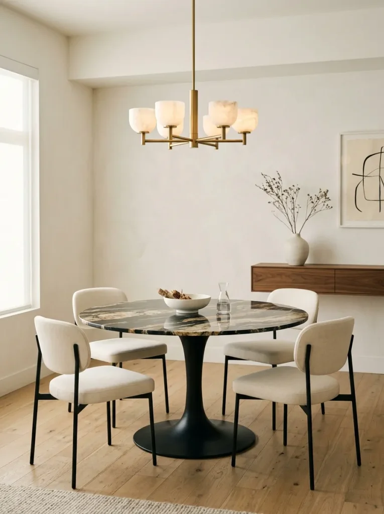
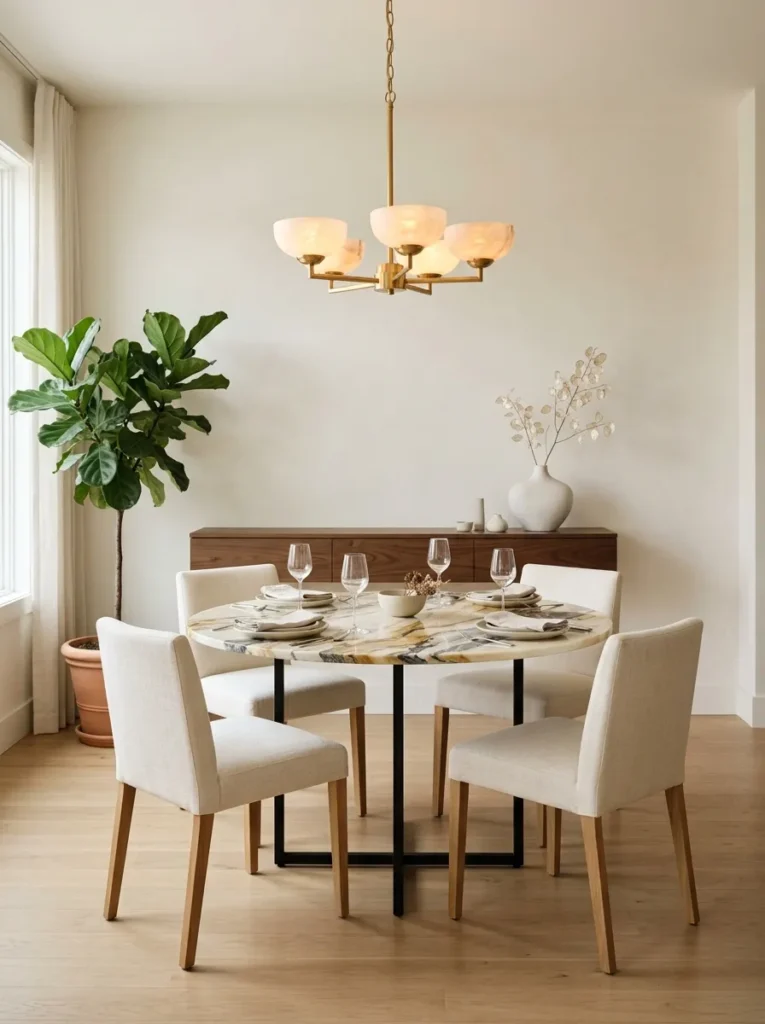
- Soft warm white walls, left completely plain and unadorned
- Round table with a genuine onyx marble top, dramatic natural veining, on a black steel base — the room’s single boldest object
- Dining chairs in cream linen with a low, curved silhouette
- Sculptural brass and alabaster chandelier, dimmable, warm ambient glow
- Floating white oak console holding a single large ceramic vessel, nothing else
- Sheer linen curtains in undyed cream, minimal hardware
- Pale wool rug in undyed cream beneath the table
- Single olive tree in a raw concrete planter, the room’s only greenery
Why this works: A single dramatic material — like a bold marble slab — can carry an entire room’s mood on its own, without needing any additional saturated color elsewhere in the space.
This is the most restrained idea on the entire list, and it’s here on purpose: not every moody dining room needs a dark wall at all. The onyx table top does all the emotional work, with its deep, almost translucent veining catching the chandelier’s light differently depending on where you’re sitting. I styled a nearly identical room for a client last spring who wanted drama without darkness, and the response at her first dinner party was the marble table, every single time — nobody mentioned the walls at all.
Keeping everything else quiet — plain walls, cream linen, a single ceramic vessel on the console — is what makes the marble read as intentional rather than accidental. This is proof that moody dining room ideas don’t require paint or pattern at all; sometimes the boldest material choice is enough to carry the entire room’s atmosphere on its own.
Styling Principles: Lighting Layers & Choosing a Durable Dark Paint Finish
A moody dining room lives or dies on two things most lists skip entirely: how the room is lit, and what paint finish is actually on the walls.
Layer your lighting, don’t rely on one fixture. A single overhead chandelier — even a beautiful one — isn’t enough to make a dark dining room feel warm rather than dim. Plan for at least two light sources beyond the main fixture: wall sconces, a buffet lamp, or simple taper candles at the table. Keep every bulb in the room at a warm 2700K; anything cooler will read flat and clinical against a saturated wall color. And put the main fixture on a dimmer — you’ll want it brighter while setting the table and much lower once dinner starts.
Choose a washable, scrubbable finish over a flat matte. Dining rooms take more wear than people expect — chair backs against the wall, the occasional splash, hands brushing past on the way to the table. An eggshell or satin finish in a dark color cleans easily without dulling the color the way flat matte can over time. If you want the deepest, richest black or charcoal but still need durability, wainscoting or board-and-batten paneling on the lower half of the wall (finished in a scrubbable enamel) gives you both the color depth and the practical protection a full flat-painted wall won’t.
Frequently Asked Questions About Moody Dining Room Ideas
Is a moody dining room too dark? Not if it’s lit correctly. A dining room is used mainly in the evening, so dark walls read as warm and dramatic under layered artificial light rather than gloomy the way they might in a room used all day under natural light.
What’s the best paint finish for a dining room? Eggshell or satin is generally the best choice for a dining room. It’s washable enough to handle daily wear from chairs and spills while still holding a rich, saturated color better than flat matte over time.
What’s the best lighting for a moody dining room? Layer at least two to three light sources — a dimmable chandelier or pendant, plus sconces, a buffet lamp, or candles — and keep every bulb at a warm 2700K to avoid a cold, flat effect against dark walls.
How can I try a moody dining room look on a budget? Start with one element instead of a full room: dark dining chairs, a lacquered cabinet, or wallpaper inside a glass-front cabinet all deliver the same dramatic effect as painting the walls, at a fraction of the cost and commitment.
Will a moody color make a small dining room feel smaller? Not necessarily. High-contrast furniture, a glossy or reflective ceiling, and a mirror to bounce light can all keep a small dark dining room feeling grounded and intentional rather than cramped.
Do moody dining rooms work with an open-concept layout? Yes — architectural features like black steel interior windows or a painted ceiling can create the sense of a defined, dramatic dining space without requiring a fully enclosed room or a painted accent wall.
Conclusion
A moody dining room isn’t about making a space feel dark or heavy — it’s about making it feel intentional, warm, and worth lingering in. Across these 15 moody dining room ideas, the common thread is layered lighting, real materials, and color placed with purpose, whether that’s on the walls, the chairs, or a single statement table. I’ve seen how a change this size can completely shift how a room feels the moment the sun goes down.
Save this post to Pinterest for when you’re ready to plan your own space, try even one idea this season, and share it with anyone who’s been afraid to go bold at the table.