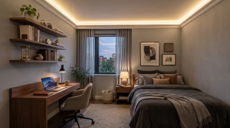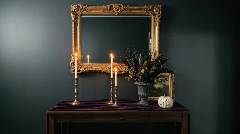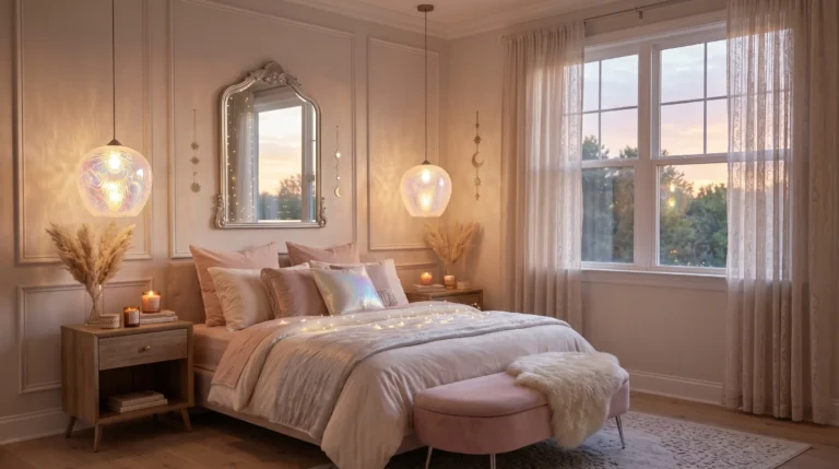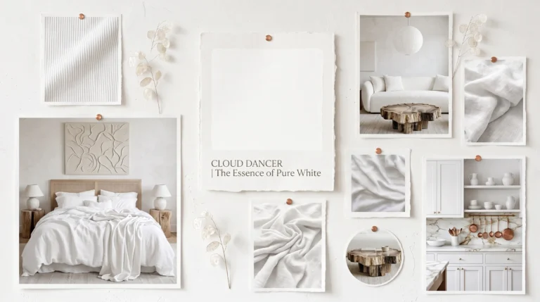
2026 Trendy Color Palette: Interior Inspiration
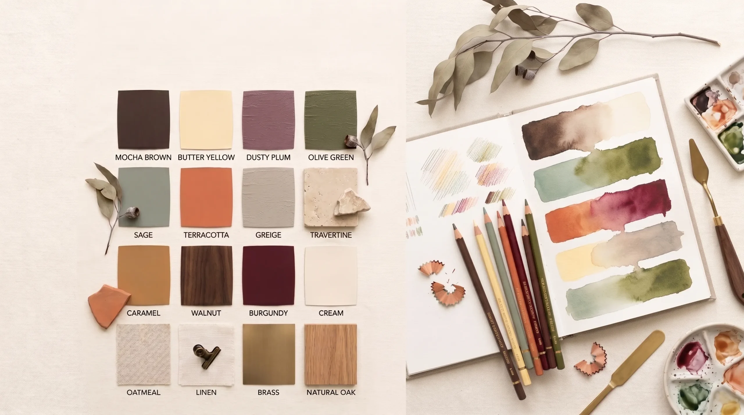
Ready to refresh your home with colors that feel warm, modern, and effortlessly stylish? The 2026 trendy color palette is inspiring a new wave of earthy palettes that bring comfort, elegance, and personality into every room.
If you’ve ever wondered which colors work beautifully together or struggled to make your space feel cohesive, this guide is here to help. Instead of focusing on just one trending shade, you’ll discover thoughtfully paired color combinations along with inspiring room ideas that show exactly how to use them in real homes. From cozy mocha tones and buttery yellows to calming sage greens and sophisticated burgundy accents, these combinations are designed to feel timeless while still looking fresh and Pinterest-worthy.
In my experience, the most inviting interiors don’t rely on expensive renovations they start with a balanced color palette that naturally ties everything together. I’ve noticed that even small updates, like changing textiles, artwork, or accent furniture, can completely shift the mood of a space when the colors complement one another. Whether you’re decorating a single room or planning a whole-home refresh, these 17 ideas will give you practical inspiration that’s easy to personalize, beautiful to save, and designed to help you create a home you’ll love walking into every day.
2026 Trendy Color Palette Overview
- Introduces the biggest interior color trends expected to define 2026
- Makes it easier to mix warm neutrals with richer statement shades
- Creates a timeless foundation before choosing furniture or décor
- Helps every room feel coordinated without looking overly matched
- Works beautifully across modern, organic, Scandinavian, and quiet luxury interiors
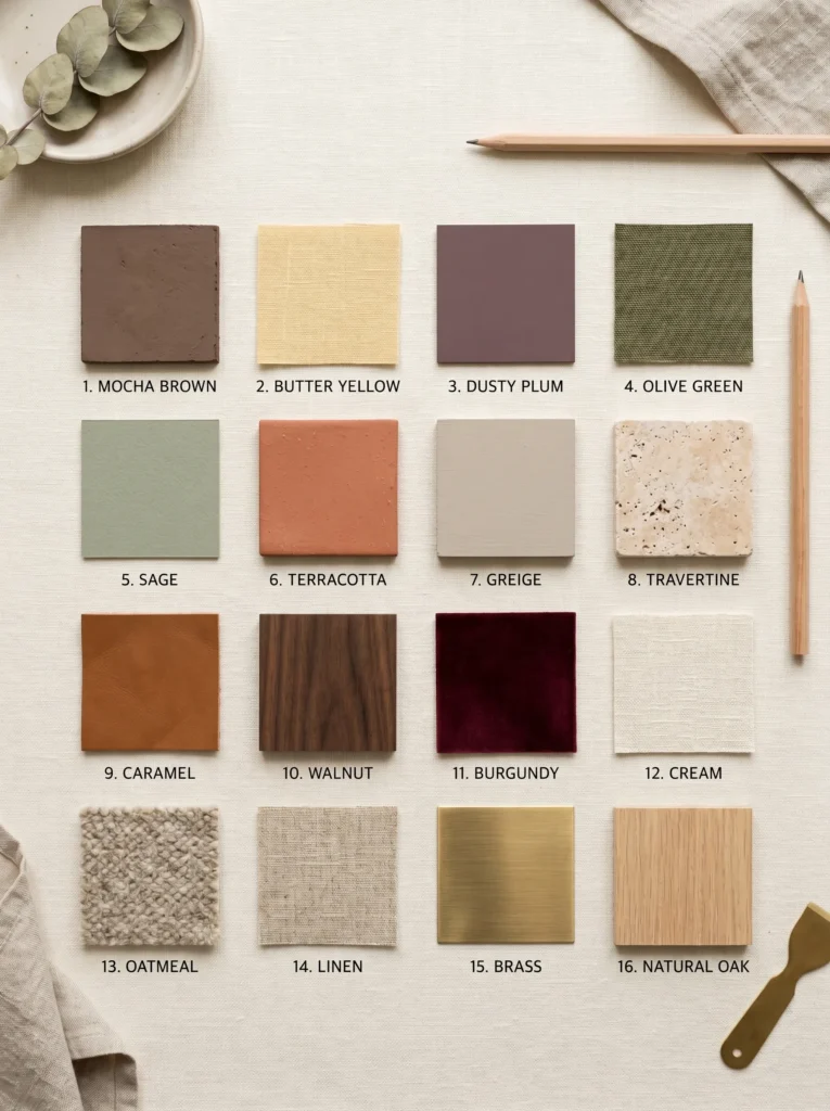
The biggest interior design trend for 2026 is moving away from cool gray palettes and embracing warm, nature-inspired colors that instantly make a home feel more welcoming. The 2026 trendy color palette pairs beautifully with earthy companions like mocha, olive green, butter yellow, dusty plum, terracotta, caramel, sage, walnut, travertine, greige, oatmeal, linen, cream, and rich burgundy. Instead of relying on a single trending shade, these carefully balanced combinations create depth, softness, and lasting style that feels current while remaining timeless enough to enjoy for many years.
I’ve noticed that the most beautiful homes rarely depend on one dominant color alone. Instead, they layer several complementary tones inspired by nature to create warmth and visual harmony throughout every space. That’s why many designers recommend starting with a cohesive palette before selecting furniture, fabrics, or decorative accessories. Throughout the ideas in this guide, you’ll see these trending combinations used in different ways — from subtle neutral layering to bold accent colors — making it easy to recreate a professionally designed look while keeping your home personal, inviting, and effortlessly Pinterest-worthy.
1. Mocha Velvet Living Room
- Creates a warm, inviting space that feels luxurious without looking overdone
- Adds depth through layered textures instead of bold patterns
- Pairs beautifully with light neutrals for a timeless look
- Makes everyday living rooms feel cozy in every season
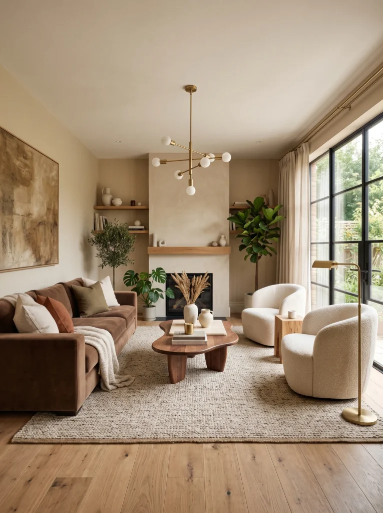
Nothing transforms a living room faster than rich earthy tones paired with plush textures. A mocha-inspired palette instantly creates warmth while still feeling modern and refined. If you’re decorating around the 2026 trendy color palette, velvet seating becomes a beautiful focal point without overwhelming the room. Balance the deeper shade with cream upholstery, pale wood finishes, and soft lighting to keep everything feeling bright. The result is a welcoming space that photographs beautifully for Pinterest while remaining practical for everyday family life and relaxing evenings.
The secret to making this look feel expensive is layering different materials instead of adding more color. Combine velvet with boucle, linen, woven baskets, ceramic accessories, and natural wood for effortless contrast. In my experience, this combination prevents darker shades from making a room feel heavy. A few brass accents and oversized greenery complete the look without cluttering the space. You’ll notice the room feels calmer, richer, and more thoughtfully designed, even if you’ve only updated a few key furniture pieces and decorative accessories.
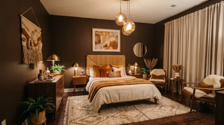
2. Earthy Bedroom Layers
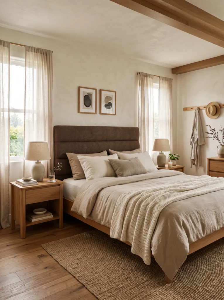
- Makes the bedroom feel calm and relaxing
- Uses layered textiles instead of excessive decor
- Works with both modern and classic furniture
- Creates a boutique hotel atmosphere at home
The easiest way to refresh a bedroom is by focusing on layers instead of replacing every piece of furniture. Soft earth-inspired bedding, textured throws, and upholstered accents create a comforting retreat that feels effortlessly stylish. Rather than matching everything perfectly, combine warm neutrals with one deeper accent color for visual balance. This approach gives the room personality while maintaining a peaceful atmosphere. Even small bedrooms benefit from these layered textures because they add richness without making the space appear crowded or visually busy.
I’ve noticed that bedrooms using natural fabrics always feel more inviting than those filled with shiny finishes. Linen sheets, chunky knit blankets, woven benches, and subtle wood tones work together to create a relaxed environment that never feels trendy for only one season. That’s why many designers recommend keeping decorative accessories minimal while investing in quality textiles. The finished room feels sophisticated, comfortable, and easy to update later with simple seasonal accents instead of complete redesigns.
3. Statement Dining Corner
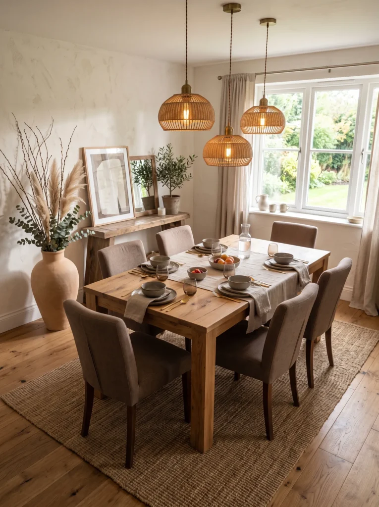
- Gives everyday dining spaces a designer-inspired feel
- Blends natural materials with rich upholstered seating
- Creates an inviting setting for gatherings
- Adds warmth without making the room feel dark
A thoughtfully designed dining corner encourages people to linger long after the meal ends. Rich upholstered chairs paired with natural wood instantly make the area feel more welcoming while maintaining a clean, contemporary style. This color direction complements the 2026 trendy color palette beautifully because it highlights warmth rather than bold contrast. Add textured ceramics, woven placemats, and soft lighting to create depth. The overall effect feels elegant enough for entertaining while remaining comfortable for casual breakfasts, family dinners, and everyday conversations.
One detail I’ve seen work well in many homes is mixing smooth and textured finishes around the table. Stoneware dishes, linen napkins, wooden serving boards, and matte lighting fixtures prevent the space from feeling flat. Even if your dining room is small, these subtle combinations create visual richness without overcrowding it. A large centerpiece with dried branches or seasonal greenery finishes the arrangement naturally. The room becomes more inviting, easier to style throughout the year, and noticeably more memorable in photographs.
4. Butter Yellow Accents
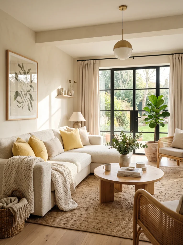
- Instantly brightens neutral interiors without overwhelming the space
- Adds cheerful energy while keeping the room sophisticated
- Works beautifully with wood, linen, and soft cream tones
- Easy to update seasonally using pillows, artwork, and accessories
A touch of butter yellow can completely refresh a neutral room without requiring a full makeover. This soft, sunny shade brings warmth, optimism, and a welcoming atmosphere that feels perfect for modern homes. Instead of painting entire walls, introduce the color through cushions, throws, artwork, or decorative ceramics. I’ve noticed these smaller accents create a balanced look that’s much easier to update over time. Combined with natural wood and creamy textiles, the room feels brighter, lighter, and effortlessly stylish throughout every season.
Many homeowners hesitate to use yellow because they fear it will feel overwhelming, but this muted version behaves almost like a neutral. Pair it with ivory, oatmeal, beige, and oak finishes to create a relaxed palette that feels both current and timeless. Small repeating touches across the room help everything look intentional rather than random. The finished space feels fresh in daylight, cozy in the evening, and incredibly photogenic for Pinterest-inspired interiors that still function beautifully for everyday living.
5. Olive Kitchen Charm
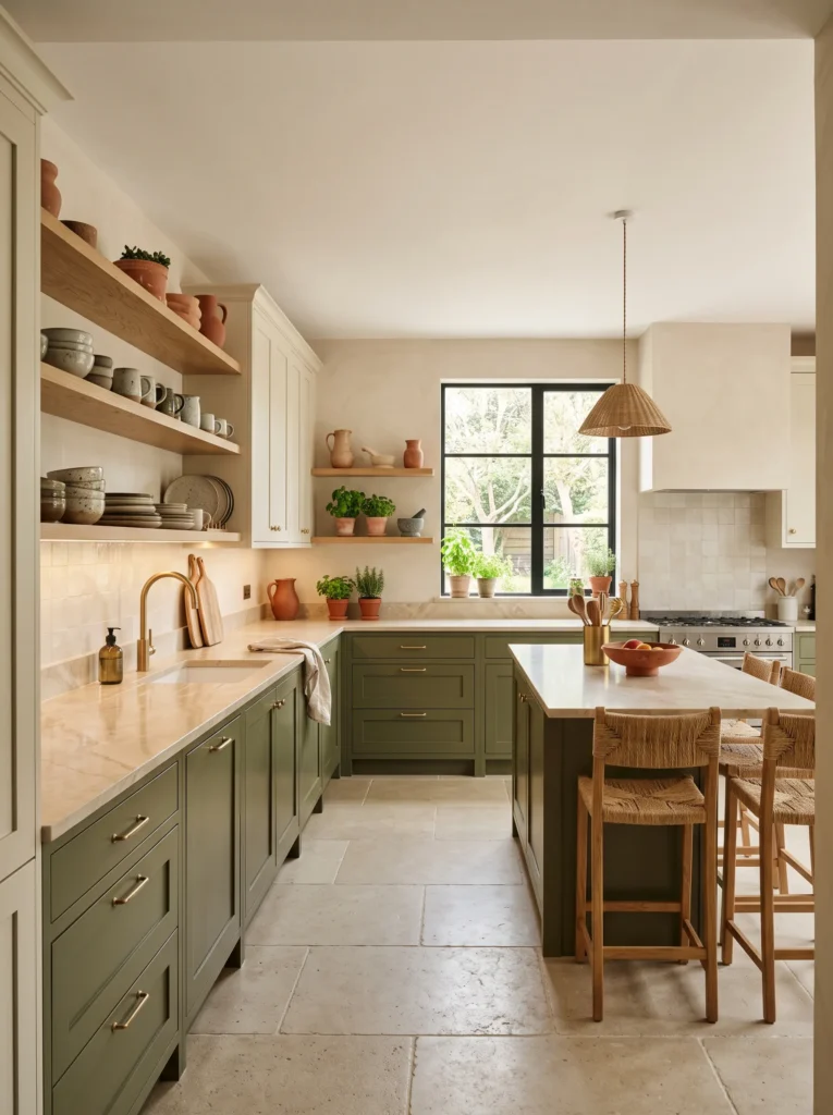
- Gives kitchens a grounded, designer-inspired appearance
- Pairs beautifully with warm metals and natural materials
- Feels timeless rather than overly trendy
- Adds depth without making the room feel dark
An olive-inspired kitchen creates a welcoming atmosphere that feels connected to nature while remaining elegant enough for modern homes. Rich green cabinetry combined with warm wood shelving and creamy surfaces produces a layered look full of depth and character. Rather than relying on bold contrasts, this palette celebrates subtle variation and natural textures. That’s why many designers recommend olive for cabinetry that needs lasting appeal. The overall result feels sophisticated, comfortable, and equally suited to everyday cooking or entertaining guests.
In my experience, olive works best when balanced with lighter materials that keep the room feeling open. Cream countertops, brushed brass hardware, textured ceramics, and woven accents soften the richness of the cabinetry beautifully. Plants and fresh herbs naturally complete the color story without additional decorating effort. Even compact kitchens feel more inviting because the layered palette introduces warmth instead of visual heaviness. The finished design looks refined today while remaining easy to enjoy for years without feeling dated.
6. Dusty Plum Retreat
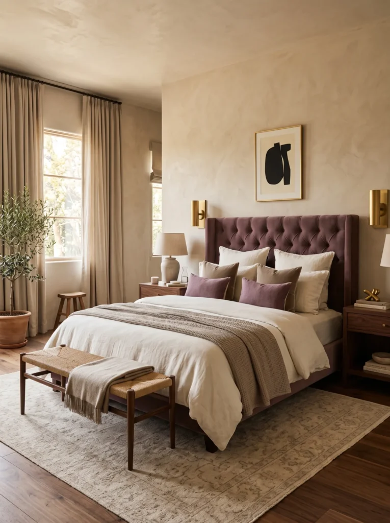
- Introduces color without overpowering the room
- Creates a relaxing boutique-style bedroom
- Blends beautifully with warm neutral furnishings
- Adds richness through soft, muted tones
Dusty plum offers a refined alternative to traditional neutral bedrooms while maintaining a calm and restful atmosphere. Used on a headboard, accent wall, or decorative textiles, the muted shade creates gentle contrast without becoming visually overwhelming. It pairs effortlessly with taupe, walnut wood, cream fabrics, and subtle metallic accents for a layered designer look. If you’re exploring ideas inspired by the 2026 trendy color palette, this sophisticated combination feels modern while remaining comfortable enough for everyday living and long-term decorating.
The beauty of dusty plum lies in its versatility across changing seasons. During warmer months, combine it with lightweight linen and fresh greenery for an airy appearance. As temperatures cool, introduce chunky knit blankets and velvet cushions for additional warmth. I’ve seen this work well in both spacious primary bedrooms and smaller guest rooms because the muted tone adds personality without making the space feel enclosed. The finished room feels elegant, restful, and wonderfully inviting from morning until night.
7. Chocolate Home Office
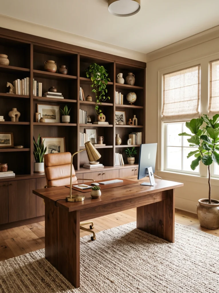
- Creates a focused and comfortable work environment
- Adds warmth compared to all-white office designs
- Makes the workspace feel polished and timeless
- Blends beautifully with natural wood furniture
A chocolate-inspired workspace feels grounded, elegant, and surprisingly calming during busy days. Rich brown cabinetry or shelving adds visual depth while keeping the room welcoming instead of formal. Pair the darker shade with beige walls, walnut furniture, and soft textiles to maintain a balanced look. This combination works especially well in home offices because it reduces visual glare while creating a cozy atmosphere. The finished space feels intentional, productive, and stylish enough to enjoy even after the workday ends.
I’ve noticed that earthy offices encourage longer periods of comfortable focus than overly bright spaces. Adding linen window treatments, woven storage baskets, and warm lighting softens the richness of the furniture without distracting from the workspace. A few leafy plants introduce freshness and prevent the palette from feeling too serious. Even a compact office gains personality through these layered materials. The result is a practical room that supports productivity while looking beautifully curated in everyday life and photographs.
8. Sage Reading Nook
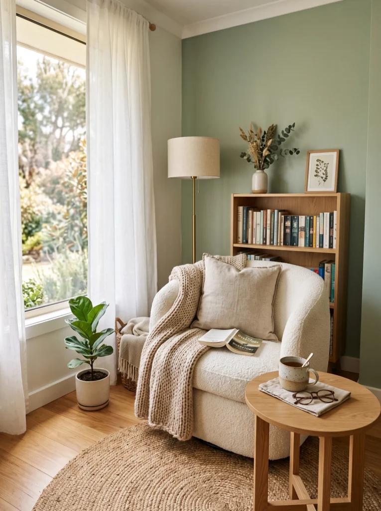
- Turns an unused corner into a relaxing retreat
- Brings a gentle nature-inspired color indoors
- Encourages slow mornings and quiet evenings
- Works well in both large and small homes
Every home benefits from a quiet corner designed for slowing down, and sage green creates exactly that feeling. The soft earthy tone instantly makes the space feel connected to nature without overwhelming nearby décor. A comfortable chair, layered textiles, and a simple wooden table are often all you need to complete the look. The gentle palette blends easily with existing neutral furniture, making this one of the easiest upgrades for homeowners who prefer timeless interiors over constantly changing decorating trends.
In my experience, lighting plays an equally important role in making a reading nook feel inviting. Position the chair near natural light during the day and add a warm table lamp for evenings. Linen fabrics, woven baskets, and handmade ceramics enhance the organic atmosphere while keeping everything practical. This small corner soon becomes a favorite place for reading, journaling, or simply enjoying a quiet cup of coffee. The finished design feels peaceful, balanced, and effortlessly Pinterest-worthy without requiring an expensive renovation.
9. Espresso Entryway
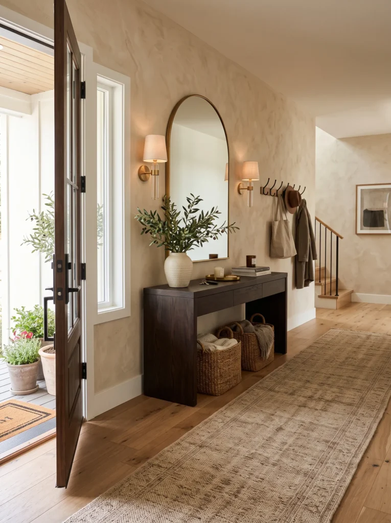
- Creates a memorable first impression
- Makes everyday essentials look organized
- Adds warmth to small entrance spaces
- Combines function with elevated style
Your entryway sets the mood for the rest of the home, making it the perfect place to introduce richer earthy tones. An espresso wood console paired with warm neutrals creates depth while still feeling open and welcoming. If you’re decorating around the 2026 trendy color palette, this combination offers a sophisticated way to embrace the trend without changing every room. Add a large mirror, woven baskets, and simple greenery to complete a practical space that feels polished from the moment guests arrive.
One of the biggest improvements comes from keeping decorative pieces intentional rather than excessive. A single ceramic vase, neatly arranged storage baskets, and soft lighting often create more impact than crowded surfaces. I’ve seen this approach work especially well in narrow hallways because darker wood anchors the space while lighter walls maintain brightness. The overall result feels elegant, organized, and welcoming every day, making even routine arrivals and departures feel a little more enjoyable.
10. Terracotta Bathroom Spa
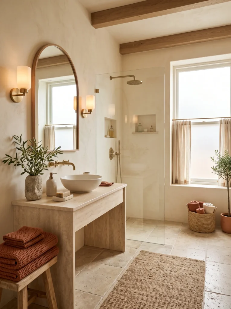
- Brings warmth into bathrooms that often feel cold
- Creates a spa-like atmosphere with minimal updates
- Pairs beautifully with stone and brass finishes
- Makes everyday routines feel more relaxing
A few terracotta accents can completely change the mood of a bathroom without requiring a full renovation. Warm towels, ceramic containers, and earthy accessories instantly soften cool surfaces like tile and stone. Combined with creamy walls and natural materials, the palette creates a relaxing retreat that feels inspired by boutique hotels. Instead of relying on bright colors, this approach embraces warmth through texture and subtle contrast. The finished space feels calm, inviting, and beautifully balanced for everyday use.
I’ve found that bathrooms benefit most from simple, intentional styling rather than excessive décor. Rolled towels, handmade soap dishes, woven baskets, and a small olive branch arrangement add character while remaining practical. Soft lighting enhances the earthy palette and creates a peaceful atmosphere during evening routines. Even smaller bathrooms feel more luxurious because the warm colors reduce the clinical appearance common in many modern spaces. The result is timeless, functional, and effortlessly elegant in photos.
11. Greige Gallery Wall
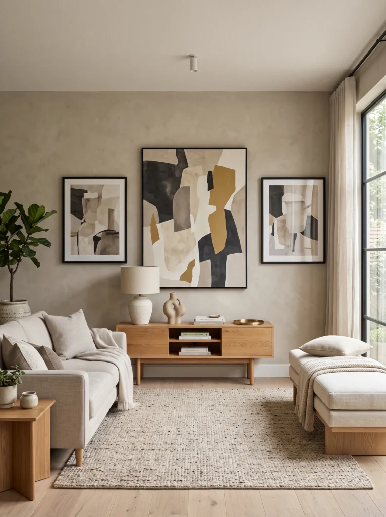
- Adds personality without overwhelming the room
- Creates a polished designer-inspired focal point
- Makes artwork stand out beautifully
- Works with nearly every decorating style
A greige backdrop offers the perfect balance between warm beige and cool gray, allowing artwork to become the true focal point. Oversized prints, sculptural frames, and layered neutral décor feel cohesive against this versatile wall color. Rather than filling every inch with decorations, leave generous spacing so each piece can breathe. That thoughtful arrangement creates a gallery-inspired appearance that’s both elegant and approachable. The finished wall adds visual interest while keeping the room calm and uncluttered.
I’ve noticed that mixing artwork sizes creates a more collected look than using perfectly matching frames alone. Combine abstract prints, textured canvases, and simple photography while repeating similar frame finishes throughout the display. A nearby console with ceramics or books strengthens the composition without making it feel crowded. This idea works equally well in hallways, living rooms, and dining areas because the neutral background allows seasonal accessories to evolve naturally over time while maintaining a timeless foundation.
12. Walnut Dining Style
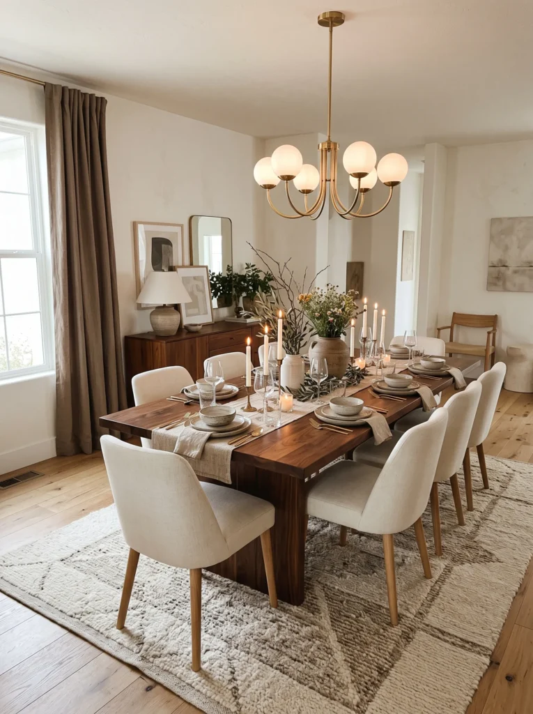
- Gives the dining room lasting warmth and character
- Balances rich wood with soft neutral fabrics
- Creates an inviting atmosphere for entertaining
- Looks sophisticated without feeling formal
Walnut furniture continues to define modern interiors because it introduces richness without overpowering the surrounding palette. A beautifully crafted dining table becomes the natural centerpiece, especially when paired with cream upholstery and layered natural textures. The warm wood tones complement many trending color directions while remaining timeless enough to last through changing styles. That’s why many designers recommend investing in quality wood furniture before replacing decorative accessories. The room immediately feels more welcoming and thoughtfully designed.
In my experience, the most memorable dining rooms rely on texture instead of excessive decoration. Linen curtains, ceramic serving pieces, woven placemats, and soft lighting create depth while allowing the walnut grain to remain the highlight. Fresh greenery or seasonal branches provide an effortless finishing touch that changes throughout the year. Whether hosting a celebration or sharing a quiet weekday dinner, the space feels comfortable, elegant, and ready for beautiful everyday moments that naturally inspire Pinterest-worthy photographs.
13. Burgundy Accent Wall
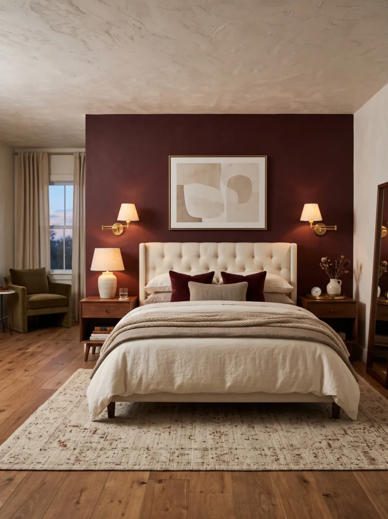
- Adds dramatic depth without overwhelming the room
- Creates a cozy backdrop for light-colored furniture
- Elevates neutral interiors with rich color contrast
- Makes the bedroom feel warm and inviting year-round
A burgundy accent wall introduces instant character while keeping the rest of the room calm and balanced. Positioned behind the bed, the rich tone naturally draws attention to the focal point without making the entire space feel dark. Pair it with cream bedding, walnut furniture, and soft linen curtains to create a layered palette that feels elegant rather than dramatic. This combination delivers warmth and sophistication while remaining practical for everyday living, making the bedroom feel both luxurious and restful.
I’ve seen this work especially well when natural textures soften the richness of the wall color. Woven rugs, boucle benches, ceramic lamps, and warm wood finishes prevent the design from feeling too formal. During daylight, the deep shade adds beautiful depth, while evening lighting creates a cozy retreat that’s perfect for relaxing. Even simple décor looks more intentional against this backdrop. The finished room feels timeless, comfortable, and effortlessly stylish without relying on excessive accessories.
14. Travertine Kitchen Details
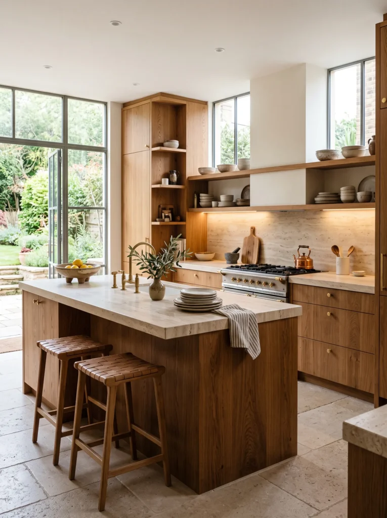
- Brings natural texture into modern kitchens
- Creates a clean yet welcoming atmosphere
- Complements both light and dark cabinetry
- Adds timeless character that ages beautifully
Travertine continues to stand out as one of the most versatile natural materials for kitchens because it combines elegance with warmth. Its soft texture and subtle movement create visual interest without competing with cabinetry or décor. Whether used on countertops, backsplashes, or decorative accessories, the stone instantly elevates the room. Combined with warm wood and brushed brass finishes, the kitchen feels balanced, organic, and designed to remain beautiful for years rather than following short-lived decorating trends.
One detail I’ve noticed is that travertine becomes even more striking when paired with handmade pieces instead of perfectly polished accessories. Ceramic bowls, wooden cutting boards, linen towels, and fresh herbs reinforce the relaxed aesthetic while making the kitchen feel lived in. The natural variation within the stone means every surface feels unique, giving the room a custom appearance. Together, these simple materials create a welcoming environment that’s equally suited for cooking, gathering, and entertaining.
15. Caramel Cozy Lounge
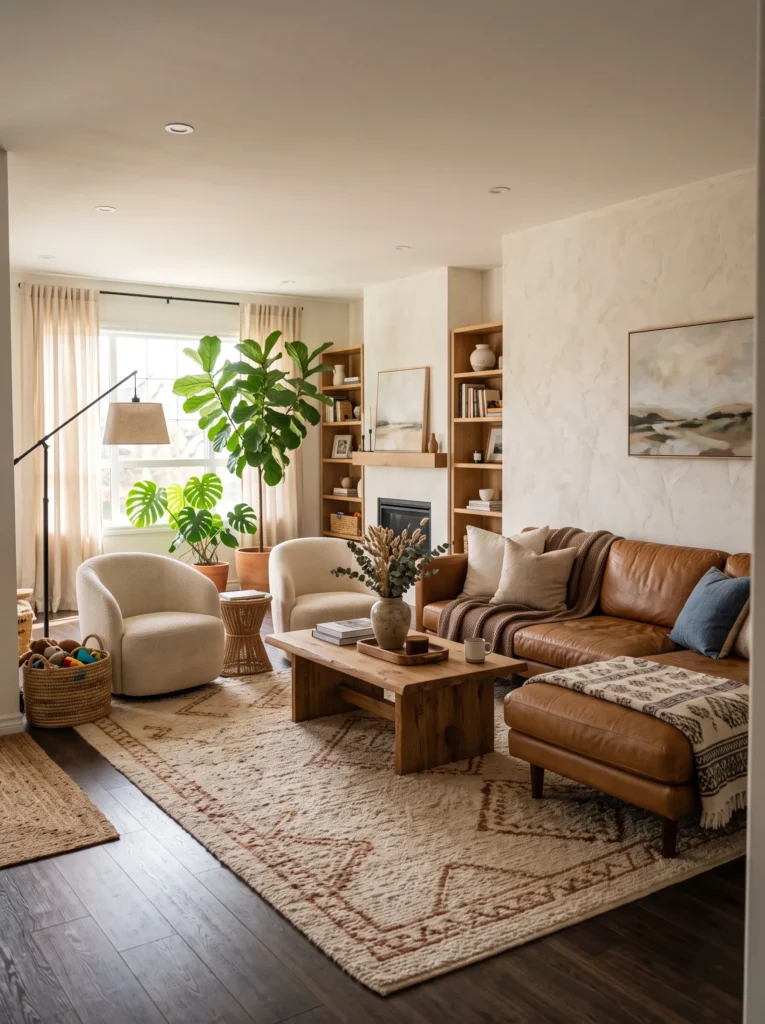
- Creates a relaxed family-friendly gathering space
- Layers warm tones without feeling heavy
- Adds timeless style through natural materials
- Looks inviting in every season
Nothing makes a lounge feel more welcoming than the warmth of caramel leather combined with soft natural textures. The rich upholstery develops character over time, making the room feel even more comfortable with everyday use. Layer cream cushions, knitted throws, and oak furniture to balance the deeper tones while maintaining an airy atmosphere. Inspired by the 2026 trendy color palette, this palette embraces earthy warmth that feels sophisticated, practical, and perfectly suited to modern family living.
In my experience, leather looks best when surrounded by softer materials that add visual contrast. Boucle chairs, woven baskets, linen curtains, and textured rugs prevent the room from appearing too polished while creating a relaxed environment everyone enjoys. A few oversized plants introduce freshness and naturally tie the earthy palette together. The result is a lounge that’s stylish enough for entertaining yet durable enough for everyday life, offering comfort that only improves as the years pass.
16. Mocha Linen Layers
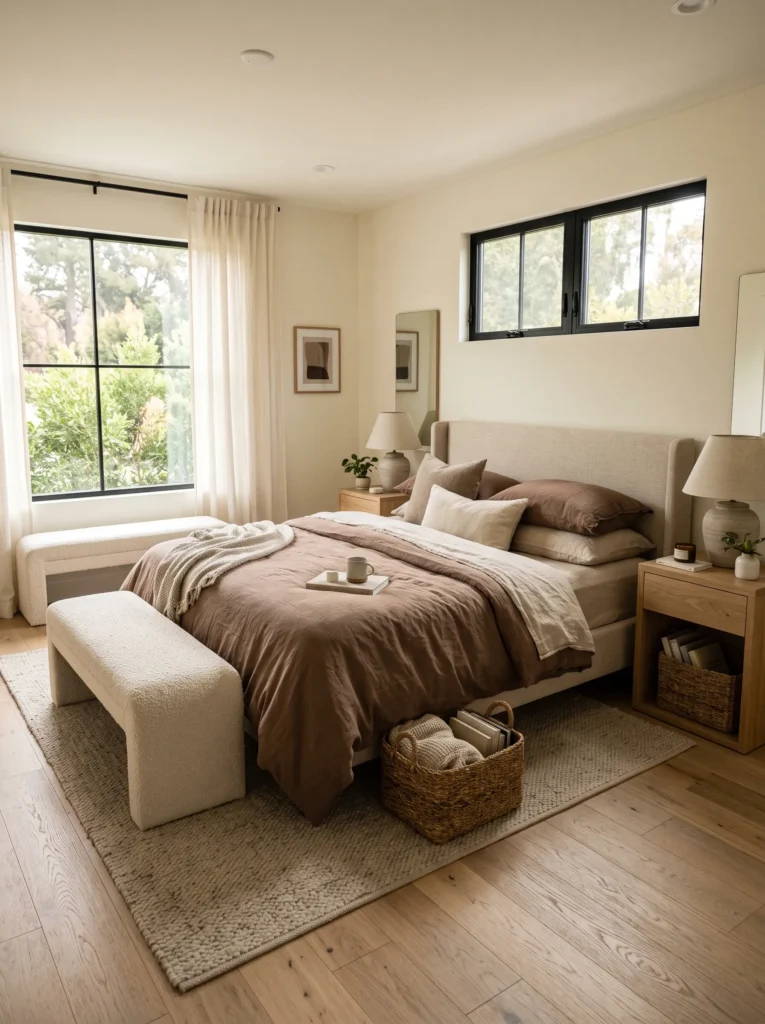
- Creates a cozy bedroom without adding visual clutter
- Layers soft textures for a relaxed designer look
- Works beautifully with neutral furniture and natural wood
- Feels timeless while staying on trend
Sometimes the biggest transformation comes from changing fabrics instead of furniture. Layering mocha linen bedding with oatmeal, ivory, and warm taupe instantly creates a bedroom that feels calm, welcoming, and beautifully curated. The earthy palette adds subtle depth without making the room feel dark, making it ideal for both compact and spacious homes. If you’re embracing the 2026 trendy color palette, this layered approach offers a simple way to introduce the trend while maintaining a timeless, restful atmosphere you’ll enjoy every day.
I’ve noticed that natural linen becomes even more beautiful as it softens with use, giving the bedroom an effortless lived-in character. Pair it with woven baskets, ceramic lamps, and light oak furniture to create gentle contrast without overwhelming the space. Keeping decorative accessories minimal allows the layered textures to become the main feature. The finished room feels peaceful from sunrise to bedtime, proving that comfort and style can work together without requiring a complete bedroom makeover.
17. Organic Coffee Corner
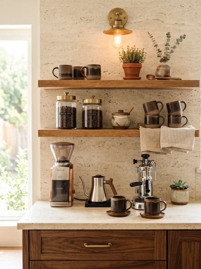
- Turns an everyday routine into a beautiful design feature
- Makes kitchen counters feel organized and inviting
- Uses natural materials for lasting visual appeal
- Creates a charming Pinterest-worthy morning setup
A thoughtfully styled coffee corner brings personality to the kitchen while making daily routines feel more enjoyable. Floating wood shelves, handmade ceramics, and warm neutral tones create a welcoming display that’s both decorative and functional. Rather than hiding everything behind cabinet doors, arrange your favorite mugs, coffee jars, and simple accessories with intention. The layered materials produce a relaxed organic aesthetic that feels authentic instead of overly styled, making even a small kitchen look thoughtfully designed and inviting.
In my experience, the most beautiful coffee stations prioritize everyday usability over excessive decoration. Keep frequently used items within easy reach, introduce a small plant for freshness, and repeat warm earthy tones throughout the arrangement for visual harmony. Soft lighting or nearby natural daylight enhances every texture, from stone countertops to handcrafted pottery. The result is a charming corner that encourages slow mornings, photographs beautifully for Pinterest, and remains practical enough to enjoy every single day.
Frequently Asked Questions
What is the trendy color palette for 2026?
The 2026 trendy color palette centers on warm, earthy tones: mocha, olive green, butter yellow, dusty plum, terracotta, caramel, sage, walnut, travertine, greige, and rich burgundy, replacing the cooler grays that dominated previous years.
What colors pair well with mocha in 2026 interiors?
Mocha pairs beautifully with cream, oatmeal, pale wood tones, and brass accents for a warm, layered look that feels current without being overpowering.
Is sage green still trending in 2026?
Yes sage green remains a popular nature-inspired neutral, especially in reading nooks, bedrooms, and accent pieces where a soft, calming tone is desired.
Final Thoughts
Beautiful homes begin with thoughtful color choices, and these ideas show how a carefully layered palette can completely transform the feeling of any space. Whether you love warm neutrals, rich earthy tones, or subtle statement colors, the 2026 trendy color palette offers endless inspiration for creating a home that feels welcoming, stylish, and uniquely yours. I’ve seen how even a few intentional color updates can make a room feel brand new.
If these ideas inspired you, save this guide to Pinterest for future projects, try your favorite combinations at home, and share it with friends who are planning their next decorating makeover. Explore more 2026 home decor trends →