15 Classy Man Cave Ideas That Skip the Cliché
Most man cave inspiration online still means neon beer signs, mismatched folding chairs, and a wall of jerseys with nowhere to breathe. It doesn’t have to. These classy man cave ideas prove a personal retreat can feel genuinely sophisticated — leather, walnut, brass, and stone doing the work that novelty decor never could. I’ve spent years watching my husband build out basements and bonus rooms for clients, and the ones that turn out beautifully always start the same way: fewer pieces, better materials, real lighting.
Whether you’re drawn to a proper whiskey bar, a home theater with actual acoustic planning, or a quiet reading corner with a decanter close by, these fifteen ideas are built to be recreated, not just admired.
Why “Man Cave” Usually Means Neon Signs — and What a Classy Version Actually Requires
“Man cave” usually conjures neon beer signs and jersey-covered walls — but that reputation has more to do with execution than the concept itself. Here’s the real design fact: a room reads as sophisticated or as cluttered novelty almost entirely based on material quality and restraint, not its theme. The same vinyl collection, whiskey bottles, or team memorabilia displayed on open painted shelving under proper lighting looks like a lounge; crammed onto mismatched furniture under a single overhead bulb, it looks like a garage sale.
My husband has wired more finished basements into home theaters than I can count, and the ones that feel genuinely high-end always start with fewer, better pieces — never more of them. This post walks through fifteen ways to build that kind of room, one idea at a time.
1: Vintage Motorsport Lounge — A classy man cave ideas for Car Lovers
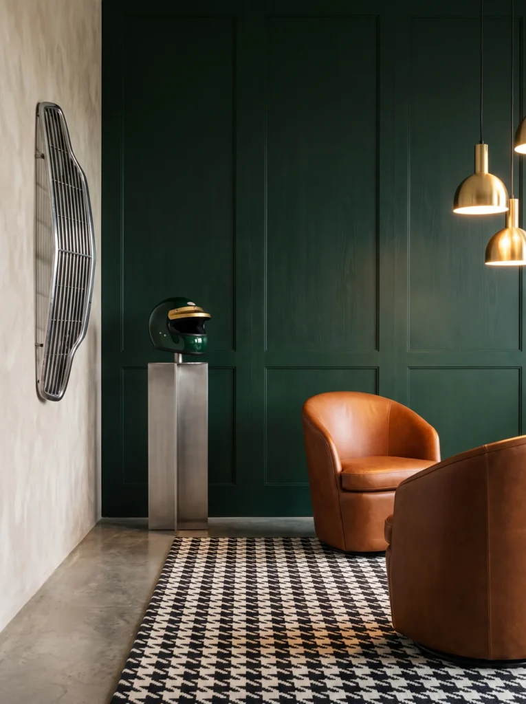
- Walls: Deep racing-green paneling on the lower half, with raw plaster in warm gray above for contrast and texture
- Flooring: Polished concrete with a subtle epoxy fleck, giving a garage-inspired base without looking like an actual garage
- Seating: Two low-slung leather bucket chairs in cognac, angled toward a framed piece of automotive art rather than each other
- Lighting: Brushed-aluminum task lighting on an articulating arm, plus a warm brass pendant over a small side bar
- Centerpiece: A restored vintage racing helmet displayed on a brushed-steel stand, mounted at eye level like sculpture
- Storage/display: A slim steel shelving unit holding model cars and a small stack of racing programs, edited down to a handful of pieces
- Rug: A houndstooth wool rug in black and cream, referencing classic racing textiles without being literal
- Standout detail: A salvaged chrome grille or hood ornament mounted directly on the plaster wall as sculptural wall art
Why this works: Treating a single restored object — a helmet, a grille, a piece of chrome — as sculpture rather than scattering a full collection across the room is what keeps a hobby-driven space from tipping into clutter.
A motorsport-inspired room can go wrong fast if it leans on posters and merchandise instead of genuine materials. Racing green paired with brushed aluminum and cognac leather borrows the same restraint you’d find in an actual vintage car showroom — confident color, minimal clutter, one hero object per wall. That single vintage helmet on its steel stand does more visual work than a dozen framed magazine covers ever could. It’s a small editing decision, but it’s the one that separates a genuinely elevated hobby room from a garage sale aesthetic.
I’ve noticed that houndstooth textiles carry a surprising amount of motorsport history without ever feeling costume-y or literal, which makes the rug here a quiet but important choice. It grounds the polished concrete floor and softens the room just enough to feel like a lounge instead of a workshop. The brushed-steel shelving, kept sparse with only a few model cars on display, echoes that same restraint. Every material in this room points back to the same era and story, which is what makes it feel intentional rather than assembled from a theme.
2: Screening Room in Charcoal Velvet
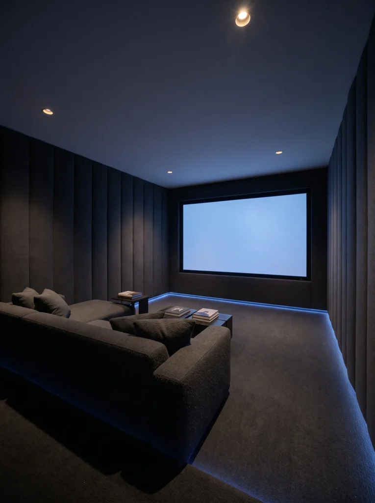
- Walls: Charcoal-gray acoustic wall panels (fabric-wrapped, channel-tufted) covering the main viewing wall to absorb sound and add texture
- Flooring: Dense charcoal wool-blend carpet, chosen specifically to dampen echo rather than for looks alone
- Seating: A deep-set sectional in bouclé wool, oversized enough for stretching out, not a formal sofa silhouette
- Lighting: Recessed dimmable ceiling lights on a warm 2700K setting, plus rope lighting hidden along the floor for a theater-aisle effect
- Centerpiece: A recessed media wall with the screen flush-mounted, framed by the acoustic paneling so no hardware is visible
- Storage/display: A low walnut credenza beneath the screen holding equipment out of sight behind closed doors
- Rug: None needed — the wall-to-wall carpet handles both comfort and acoustics
- Standout detail: A floor-level LED strip that shifts to a dim blue wash the moment the screen turns on
Why this works: Prioritizing acoustic wall panels and a low-glare charcoal palette over decor is what makes a screening room sound and look like a real theater instead of a rec room with a big TV.
My husband has wired enough basement theaters to have strong opinions about this one: acoustic wall panels aren’t optional if you want a room that actually sounds like a theater, not a rec room with a big TV. Real sound absorption starts in the framing stage, and he always tells clients to run the wiring for surround speakers before drywall goes up, not after. That’s the detail most man cave articles skip entirely. The charcoal palette isn’t just moody for its own sake — darker walls and low-glare finishes genuinely improve picture contrast on the screen.
There’s something about walking into a fully dimmed screening room with the aisle lighting glowing along the floor that changes how a space feels the second you enter it. In my experience, this is the idea that makes guests stop mid-conversation. The bouclé sectional does double duty here, staying comfortable for a three-hour movie while still looking intentional with the lights up. Combined with the flush-mounted screen and hidden equipment, the whole wall reads as one clean architectural feature rather than a cluttered electronics setup.
3: Vinyl Lounge with Brass Accents
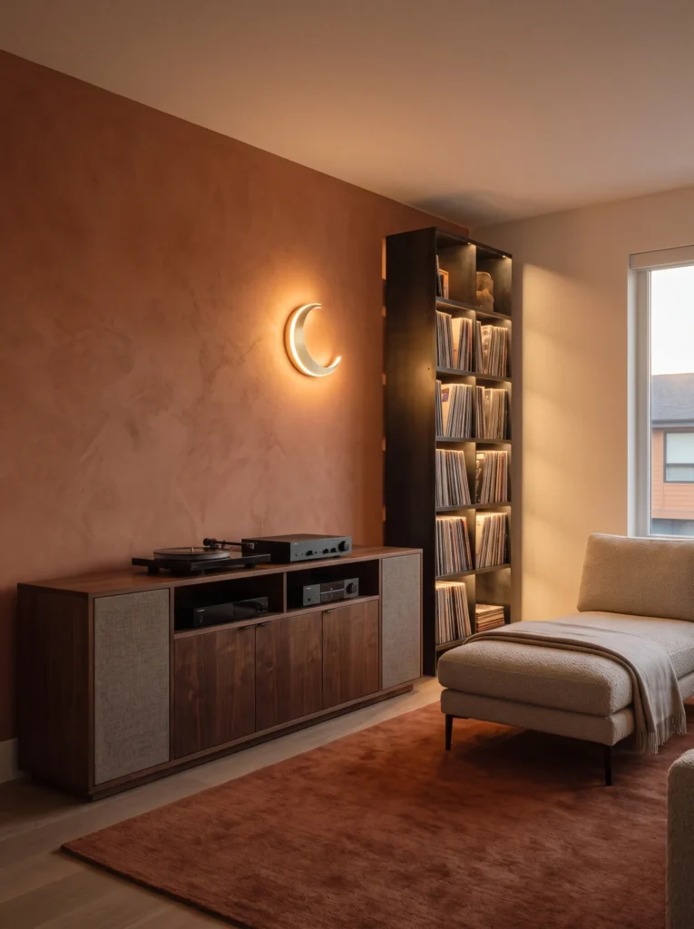
- Walls: Warm terracotta clay plaster on one accent wall, paired with soft greige on the remaining walls
- Flooring: Dark walnut-stained hardwood, left bare to let sound resonate properly through the room
- Seating: A single curved bouclé chaise in oatmeal, positioned near the speakers rather than facing a screen
- Lighting: A sculptural brass arc floor lamp beside the chaise, plus warm puck lighting inside the record shelving
- Centerpiece: A record player on an open walnut console, paired with a set of floor-standing speakers left visibly exposed as design objects
- Storage/display: Vertical record storage in blackened steel, holding vinyl spine-out like a curated collection rather than stacked flat
- Rug: A hand-knotted wool rug in rust and cream, grounding the seating area without competing with the terracotta wall
- Standout detail: A curved brass wall sconce shaped like a crescent, mounted directly above the console as a focal point
Why this works: Treating speakers and record storage as visible design objects, rather than hiding them, turns a listening setup into the room’s actual centerpiece.
A vinyl setup deserves better than a milk crate on the floor. Speaker cabinets in walnut or brushed metal finishes are genuinely beautiful pieces of furniture on their own, and once you stop treating them as equipment to hide, the whole layout of the room changes. Positioning the chaise near the speakers instead of facing a screen signals immediately what this corner is for. The terracotta accent wall adds warmth without leaning into cliché “man cave” darkness, and it photographs beautifully against the blackened steel shelving nearby.
I’ve noticed that record collections almost always look better organized by spine than stacked flat in boxes — it’s a small change that makes even a modest collection of forty albums feel intentional and gallery-like. The crescent sconce above the console does more than light the space; it acts as a piece of wall art in its own right, especially once the puck lighting inside the shelving turns on at dusk. Together, these details make the corner feel considered rather than assembled from spare parts.
4: Green Felt & Leather Game Room
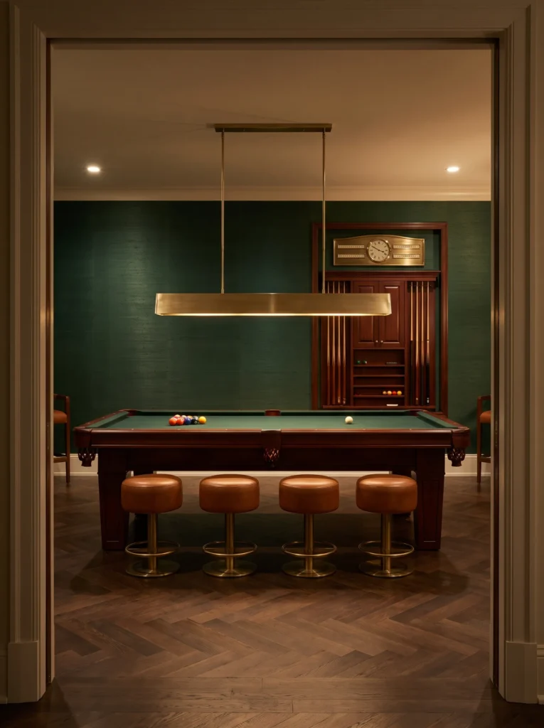
- Walls: Deep bottle-green grasscloth wallpaper on the main wall, with painted trim in matching green for a tailored, monochrome look
- Flooring: Herringbone-pattern engineered wood, chosen for durability under a heavy game table
- Seating: Four leather bar-height stools in cognac, tucked around the table rather than a separate seating area
- Lighting: A linear brass pendant fixture centered directly over the table, plus dimmable wall sconces flanking a nearby bookshelf
- Centerpiece: A regulation-size pool table with a bottle-green felt top and mahogany rails
- Storage/display: A built-in cue rack mounted flush against the wall, holding cues and a scoreboard as functional wall art
- Rug: None under the table itself, but a low-pile wool runner along the walking perimeter to protect the herringbone floor
- Standout detail: A brass-framed scoreboard clock mounted above the cue rack, doubling as both function and focal point
Why this works: Getting the subfloor and structural support right before styling is what lets the room’s real centerpiece — the pool table — actually perform, while the textured grasscloth wall keeps the flat green felt from looking bare.
A pool table is only as impressive as the floor underneath it, and that’s a detail most people underestimate. Regulation tables are heavy — often 700 to 1,000 pounds once assembled — so my husband always checks subfloor support and levelness before anyone talks about felt color or lighting. Skipping that step is how you end up with a table that never sits quite right no matter how many shims you add. Once the structural side is handled, the design choices get to do their job: a linear brass pendant centered low over the table gives the room a genuine billiards-hall feel instead of a rec-room afterthought.
The grasscloth wall is what elevates this from a basement game table to an actual design moment. Texture does a lot of visual work in a room built around one big, flat surface — without it, the green felt has nothing to play off of. Cognac leather stools tucked around the table keep the footprint tight and intentional, rather than adding a separate lounge area that competes for attention. The result is a room built entirely around one confident, well-executed centerpiece.
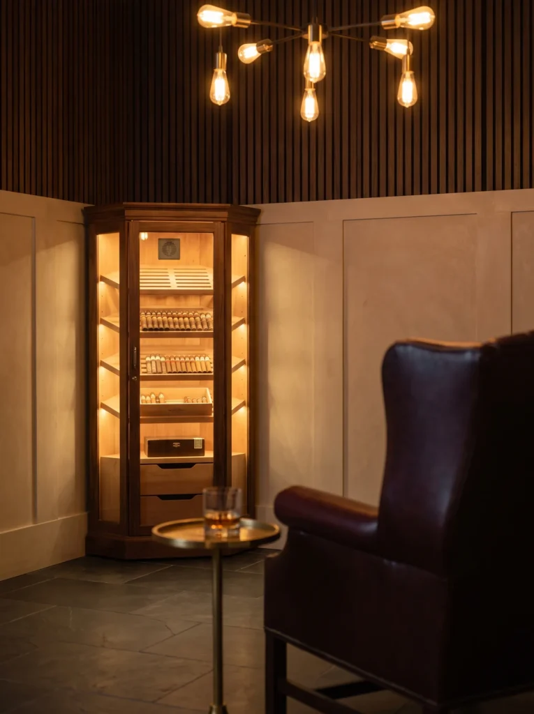
5: Cigar Lounge with Stone & Leather
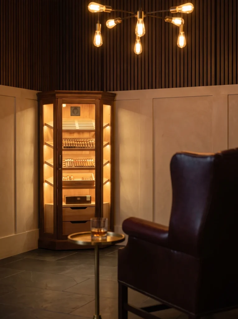
- Walls: Limestone-look plaster wainscoting on the lower half, with warm amber-toned wood slats on the upper wall for texture and airflow
- Flooring: Honed slate tile, chosen for its ability to handle heat, moisture, and easy cleaning near a smoking area
- Seating: Two oxblood leather wingback chairs, angled around a low brass-and-stone side table
- Lighting: A single Edison-bulb chandelier on a dimmer, plus a brass reading lamp beside each chair
- Centerpiece: A built-in cedar-lined humidor cabinet with a glass front, mounted at eye level like a display case
- Storage/display: Open oak shelving for glassware, positioned away from the humidor to avoid temperature swings
- Ventilation: A dedicated inline exhaust fan and makeup-air vent, professionally sized for the room’s square footage
- Standout detail: A hand-forged iron fireplace screen repurposed as a decorative room divider near the entry
Why this works: Sizing the ventilation system to the room instead of just installing a fan is what keeps a cigar lounge usable long-term, while heat- and moisture-resistant materials let leather furniture stay without upkeep worries.
Ventilation is the detail every cigar-room article skips, and it’s the one that actually determines whether the space works long-term. My husband has installed inline exhaust systems for a handful of clients building cigar rooms, and the sizing has to match the room’s cubic footage, not just get “a fan” bolted into a wall. Skip it and the smell embeds into every soft surface within a month. Handled correctly, the room stays genuinely usable — and that practical decision is what separates a real cigar lounge from a basement corner with an ashtray and good intentions.
Slate flooring and limestone wainscoting do more than look good together; they’re both materials that shrug off heat, ash, and humidity without staining. That durability lets you commit to leather furniture without worrying about upkeep. The cedar-lined humidor as a glass-front display piece turns storage into the room’s visual anchor, the way a wine wall does in a dining room. Paired with the low Edison-bulb glow, the whole space reads warm and clubby rather than dim or heavy — a balance that’s harder to strike than it looks.
6: Stadium Seat Sports Lounge, Done Right
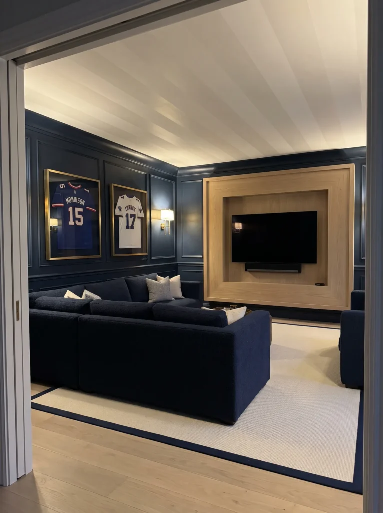
- Walls: Deep navy paneling with a single row of professionally framed jersey shadow boxes, spaced evenly rather than clustered
- Flooring: Wide-plank white oak, kept light to counter the navy walls and avoid a dark, cave-like feel
- Seating: A tailored navy bouclé sectional with brass-capped wood legs — no team logos on the furniture itself
- Lighting: Warm brass sconces flanking the media wall, plus a dimmable linear fixture over a small snack bar
- Centerpiece: A wall-mounted screen framed in the same white oak as the flooring, so it reads as built-in rather than bolted on
- Storage/display: A single glass-front cabinet holding one or two genuinely meaningful memorabilia pieces, not a full collection on display
- Rug: A cream wool rug with a subtle navy border, anchoring the seating without adding pattern noise
- Standout detail: A hand-painted stripe detail on the ceiling in the team’s secondary color, kept subtle enough to read as design rather than fandom
Why this works: Displaying one or two meaningful memorabilia pieces instead of an entire collection is what keeps a sports-fan room feeling curated rather than like a cluttered gift shop.
The difference between a sports-fan room and a cluttered memorabilia wall almost always comes down to editing. I’ve watched clients try to display every jersey, ticket stub, and bobblehead they own, and the room ends up looking like a gift shop instead of a lounge. Choosing one or two pieces that actually mean something — a signed ball from a specific game, a jersey tied to a real memory — and framing them properly does more for the room than a wall of forty items ever could. That restraint is what makes a fan’s space feel curated instead of accumulated.
Color is doing quiet work here too. Deep navy walls paired with light oak flooring keep the room from feeling heavy, even with a large screen as the focal point. The hand-painted ceiling stripe is a small, confident gesture — it nods to team colors without turning the whole room into branded merchandise. That single detail, paired with tailored bouclé seating instead of a logoed recliner, is usually enough to convince a skeptical guest that a sports room really can look this good.
7: Workshop Lounge in Steel & Oak
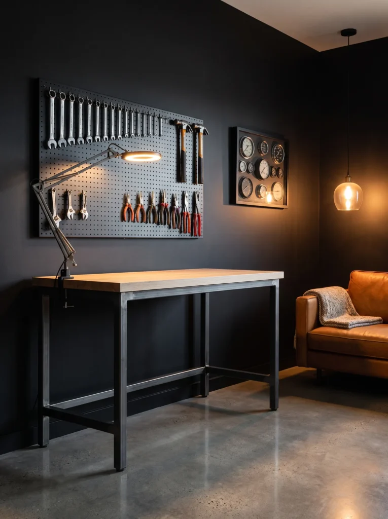
- Walls: Raw concrete-look microcement on the lower half, painted matte black upper wall for contrast and to hide equipment shadows
- Flooring: Sealed polished concrete, chosen for durability under tools and rolling stools
- Seating: A pair of industrial leather-and-steel stools at a workbench, plus a low leather sofa in the lounge corner
- Lighting: Adjustable black gooseneck task lamps over the workbench, with warm pendant lighting over the seating area to shift the mood from “shop” to “lounge”
- Centerpiece: A custom steel-and-white-oak workbench, long enough for hobby projects, positioned as the room’s visual spine
- Storage/display: Pegboard wall in blackened steel, holding tools arranged by size like a curated tool wall, not a jumble
- Electrical: Dedicated 20-amp circuits and multiple floor outlets, planned in before drywall for tool use without extension cords
- Standout detail: A vintage tin sign or restored gauge cluster mounted as wall art above the bench, not scattered decor
Why this works: Planning dedicated electrical circuits before drywall and shifting lighting between task and lounge zones is what lets a workshop function like a shop and unwind like a lounge in the same room.
Getting the electrical right here is not a cosmetic decision — it’s the one thing that determines whether this room actually functions. My husband tells clients building a workshop-lounge hybrid to plan dedicated circuits and floor outlets during the framing stage, because retrofitting power after drywall is expensive and usually means visible cords running across a floor you just finished. Get that wiring planned early and the whole room stays clean, both visually and practically. It’s the kind of detail that never shows up in a finished photo but is exactly why the room works day to day.
The trick to making a workshop feel like a hangout space, not just a garage, is the lighting shift between zones. Task lighting over the bench should feel utilitarian and bright, while the seating corner needs warm, low pendant light to signal “relax here” instead of “keep working.” Pairing raw concrete flooring with a leather sofa creates exactly that contrast — functional where it needs to be, comfortable where it counts. The curated pegboard wall finishes the look, turning tool storage into something worth looking at.
8: Library Nook in Espresso & Brass
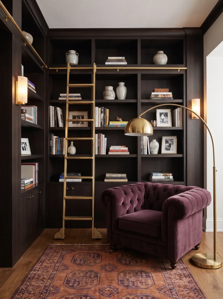
- Walls: Espresso-brown wood paneling floor to ceiling on one wall, painted warm cream on the remaining walls
- Flooring: Dark walnut herringbone, softened underfoot by a large area rug
- Seating: A single tufted leather chesterfield chair in deep plum, paired with a brass-and-glass side table
- Lighting: A brass library sconce mounted directly to the paneled shelving, plus a floor-standing arc lamp beside the chair
- Centerpiece: Floor-to-ceiling built-in bookshelves in espresso wood, with a rolling brass ladder for the top shelves
- Storage/display: Closed lower cabinets for less photogenic items, open upper shelves styled with books grouped by color and height
- Rug: A faded vintage-style Oushak rug in rust, plum, and cream tones
- Standout detail: A hidden panel in the bookshelf that swings open to reveal a small hidden bar nook
Why this works: A library only feels sophisticated when the shelving is edited and grouped intentionally — books stacked at random heights and colors read as cluttered no matter how expensive the room looks otherwise.
Built-in shelving is one of the best investments you can make in a room like this, and it’s worth doing properly rather than settling for a stock bookcase. A rolling brass ladder isn’t just a design flourish — it makes floor-to-ceiling storage genuinely usable, and it adds a quiet architectural moment that photographs beautifully from almost any angle. Espresso-toned wood paneling against a cream wall keeps the room from feeling like a dark, closed-off study, which is a common mistake in library-style spaces that lean too heavy on brown tones throughout.
The hidden bar panel is the detail that turns this from a pretty reading nook into a room people actually want to spend an evening in. I’ve seen this kind of reveal genuinely delight guests the first time a bookshelf swings open — it’s unexpected in a way that neon signage or novelty decor never manages to be. Grouping books by color and height across the open shelves, rather than alphabetically, keeps the display looking curated and calm even as the collection grows over time.
9: Poker Room in Charcoal & Copper
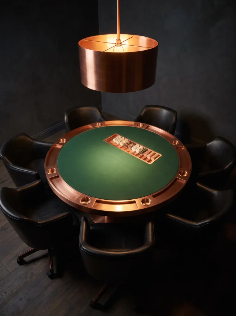
- Walls: Charcoal limewash finish with a subtle textured hand-troweled look, kept matte to avoid glare during evening games
- Flooring: Dark stained oak, protected under the table with a low-pile rug
- Seating: Six leather-and-brass swivel chairs around the table, chosen for comfort during long games rather than dining-style chairs
- Lighting: A copper drum pendant centered directly over the table, dimmed low, with no other overhead light active during play
- Centerpiece: A custom round poker table with a felt top in deep forest green and a copper-trimmed rail
- Storage/display: A copper-fronted bar cart nearby, stocked simply, wheeled in rather than built in for flexibility
- Rug: A dark charcoal wool rug with a subtle diamond weave, sized to sit just under the chairs
- Standout detail: A copper chip-and-card caddy built into the table rail itself, eliminating loose trays
Why this works: Lighting a poker table with one low, focused pendant instead of overhead room lighting instantly makes the space feel like a real game room instead of a dining table with cards on it.
The single biggest mistake in a DIY poker setup is lighting the whole room evenly instead of focusing everything on the table. A copper pendant hung low and dimmed creates that classic pooled-light effect you’d see in an actual card room, and it does more to set the mood than any amount of decor around the edges. Charcoal limewash on the walls absorbs the extra glow rather than reflecting it, which keeps the light feeling intimate instead of harsh. It’s a genuinely simple fix that most people overlook entirely.
Copper as the metal choice here does real work against the darker palette. It’s warmer than brass and reads slightly more modern, which keeps the whole room from feeling like a stereotypical smoky card room from decades past. Building the chip caddy directly into the table rail solves a real functional annoyance — loose trays sliding around mid-game — while also keeping the tabletop looking clean between hands. Small functional choices like this are usually what separate a genuinely well-designed game room from one that just has nice furniture in it.
10: Arcade Cabinet as Furniture
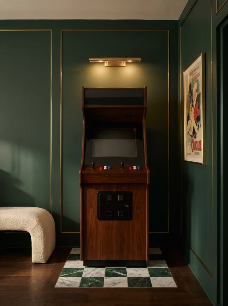
- Walls: Deep forest-green paneling with brass picture rail trim, evoking an old parlor rather than a game room
- Flooring: Checkerboard marble-look tile in cream and charcoal, used sparingly as a rug-sized inset rather than across the whole floor
- Seating: A curved bouclé bench along one wall, positioned to watch gameplay rather than facing it head-on
- Lighting: A brass picture light above the cabinet, plus warm wall sconces flanking the seating bench
- Centerpiece: A fully restored vintage arcade cabinet in its original wood cabinet finish, refinished and treated like a piece of furniture rather than tucked in a corner
- Storage/display: A slim glass display case beside the cabinet holding two or three original game posters or ephemera, matted and framed
- Rug: None needed given the marble-tile inset already anchors the seating area
- Standout detail: The cabinet’s original coin mechanism kept intact and functional, a small nostalgic detail that still works
Why this works: Lighting and framing the cabinet like a piece of furniture, rather than just plugging it in against a wall, is what turns it from novelty decor into a genuine design statement.
A restored arcade cabinet photographed like furniture, under a proper picture light, looks nothing like the same cabinet shoved against a basement wall under fluorescent lighting — the difference is entirely in how it’s framed and lit. Treating it like an art piece, with a dedicated light source and breathing room on either side, is what elevates this from novelty decor to a genuine design statement. The forest-green paneling and brass trim borrow language from a traditional parlor, which is exactly what keeps this idea from tipping into cliché arcade-room territory.
The marble-tile inset is a small architectural gesture that goes a long way. Rather than tiling the whole floor, which can feel busy in a small room, a single checkerboard section beneath the cabinet acts almost like a spotlight on the ground plane. That kind of restraint is something I come back to again and again in these rooms — one confident material choice, used sparingly, nearly always outperforms the same material spread across an entire space.
11: Whiskey Cellar Meets Reading Corner
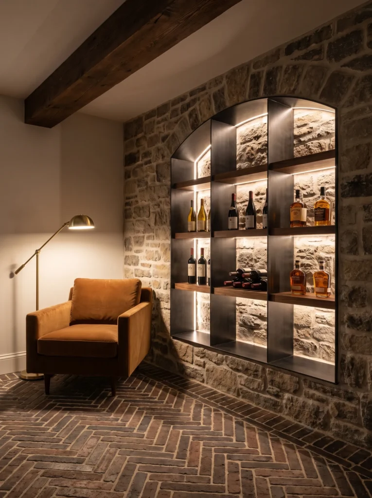
- Walls: Rough-hewn stone veneer on one wall, paired with warm plaster in a soft clay tone on the rest
- Flooring: Reclaimed brick pavers laid in a herringbone pattern, chosen for their cellar-like texture and durability
- Seating: A single worn leather club chair in cognac, positioned beside a small arched wine-cellar-style niche
- Lighting: Warm recessed niche lighting inside the stone wall, plus a brass swing-arm reading lamp beside the chair
- Centerpiece: An arched wine-and-whiskey storage niche built into the stone wall, holding bottles at a slight downward angle
- Storage/display: A narrow floating oak shelf beneath the niche for glassware, kept minimal
- Rug: A small worn kilim rug beneath the chair, adding pattern without overwhelming the stone texture
- Standout detail: A reclaimed wood ceiling beam left exposed and slightly darkened to anchor the room’s cellar character
Why this works: Building proper structural support behind the stone veneer is what makes the wine niche look genuinely carved into the wall, while reclaimed brick brings real age and texture a brand-new build couldn’t otherwise fake.
Stone veneer walls need real structural planning if you want them to hold weight-bearing niches like this one, and that’s a detail worth getting right before installation, not after. My husband has framed out niches like this for clients, and the key is building proper blocking behind the wall so the shelving and bottle storage don’t rely on the veneer itself for support. Done correctly, the niche looks like it was carved directly from the stone, which is exactly the illusion that makes this idea feel authentic rather than decorative.
Reclaimed brick flooring does something interesting here that most modern materials can’t replicate — it brings genuine age and texture into a room without requiring actual age. Paired with the exposed ceiling beam and the arched niche, the whole space reads like a converted cellar rather than a finished basement corner, even in a brand-new build. A single worn leather chair and one reading lamp are all this space really needs; adding more furniture would compete with the architecture instead of letting it lead.
12: Mixed-Metal Home Gym Lounge
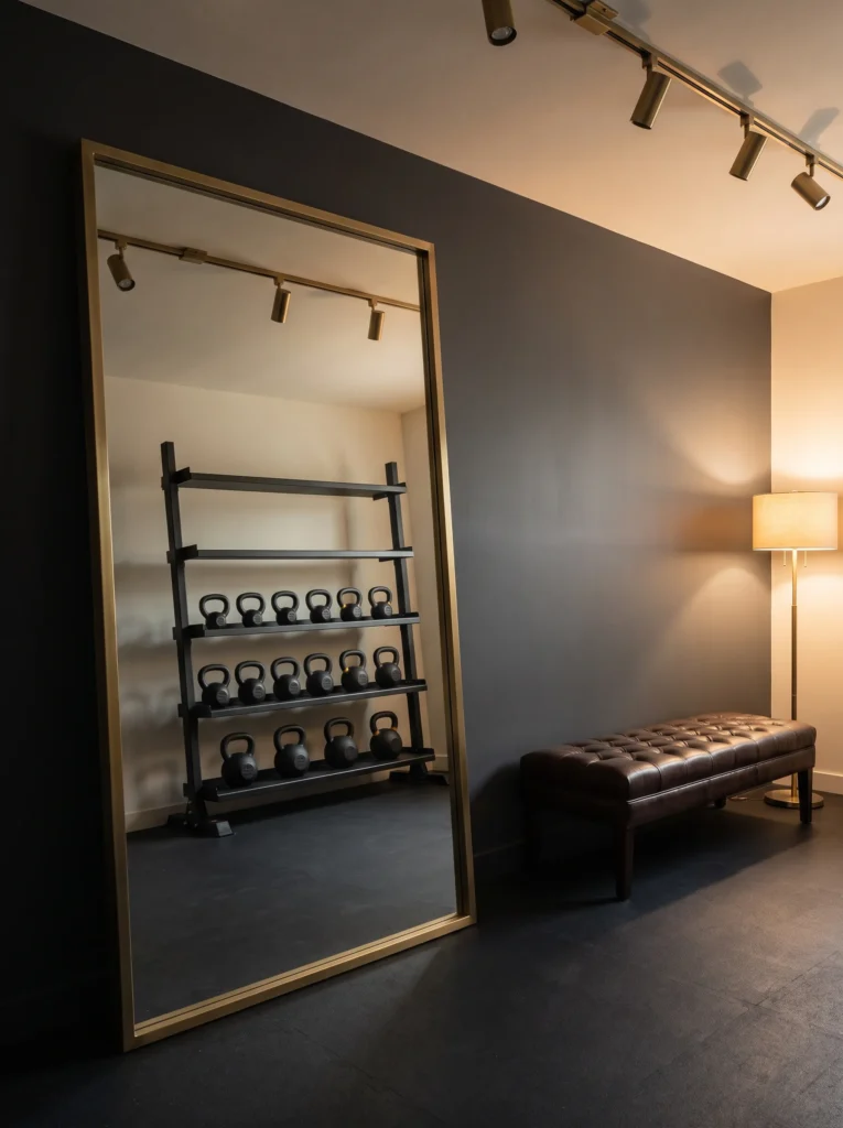
- Walls: Warm graphite gray on the main wall, with one mirrored wall panel for functional gym use disguised behind a slim brass frame
- Flooring: Rubber gym flooring in a deep charcoal tone, chosen to look intentional rather than purely functional
- Seating: A low leather bench along the wall for resting between sets, not a full lounge suite
- Lighting: Warm dimmable track lighting overhead, plus a single brass floor lamp in the seating corner
- Centerpiece: A wall-mounted rack in blackened steel holding kettlebells and dumbbells arranged by size, displayed like a design object
- Storage/display: A narrow oak shelf beneath the mirror holding a speaker and a small stack of folded towels, kept minimal
- Rug: None on the gym side; a small wool runner anchors the bench area only
- Standout detail: A brass-framed mirror large enough to double as both function and a genuine design statement, not a slapped-on gym mirror
Why this works: Framing a functional gym mirror in brass, rather than leaving it raw, is the single change that makes a workout corner look designed instead of bolted on as an afterthought.
Most home gyms fail visually for one simple reason: every piece of equipment gets treated as purely functional, with zero thought given to how it’s displayed. A blackened steel rack holding weights arranged by size, largest to smallest, reads completely differently than the same weights piled in a plastic bin in the corner. That’s a five-minute organizational fix that changes the entire feel of the space. Warm graphite walls also do quiet work here, keeping the room from feeling clinical or cold the way most home gyms tend to.
Rubber flooring doesn’t have to look like a commercial gym if you choose a deep, warm charcoal tone instead of the standard black-and-gray fleck pattern most suppliers default to. Paired with dimmable warm-toned track lighting instead of harsh overhead fluorescents, the whole room shifts from “workout space” to something that still feels like part of the home. I’ve noticed that this kind of lounge-adjacent gym corner actually gets used more consistently — when a space looks good, people spend more time in it.
13: Quiet Luxury Music Room
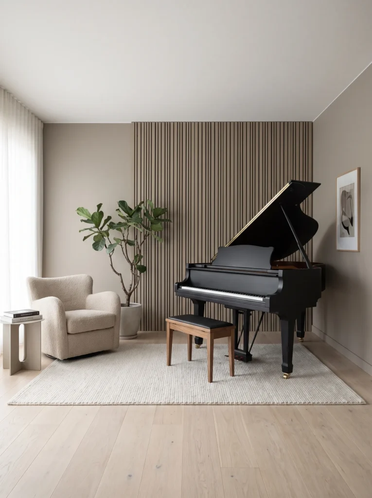
- Walls: Soft warm taupe with a subtle vertical wood-slat treatment on one wall for acoustic diffusion
- Flooring: Light white oak, left unstained to keep the room feeling airy despite the moody instrument focus
- Seating: A single curved bouclé armchair in oatmeal, positioned near a piano rather than facing a screen
- Lighting: A sculptural floor lamp with a linen shade beside the piano, plus warm recessed lighting on a low dim
- Centerpiece: A matte black baby grand or upright piano, positioned at an angle rather than flush against the wall
- Storage/display: A slim wall-mounted shelf holding sheet music and a small stack of vinyl, kept sparse
- Rug: A pale wool rug beneath the piano bench, muting footsteps without deadening the room’s natural acoustics
- Standout detail: The wood-slat wall doubles as genuine acoustic treatment, not purely decorative slats
Why this works: Treating the wood-slat wall as genuine acoustic diffusion, not just decoration, and angling the piano properly is what makes the instrument actually sound better — not just look better — in the room.
Acoustic diffusion is a real, measurable design consideration in a music room, not a decorative afterthought — vertical wood slats spaced with air gaps behind them scatter sound waves rather than letting them bounce flatly off a hard wall. That’s the difference between a room where an instrument sounds rich and a room where every note sounds harsh and boxy. Positioning the piano at an angle instead of flush against the wall also helps sound project into the room properly instead of straight into a corner. These are small, research-backed choices that most decor-focused articles never mention.
The soft taupe and white oak palette here is deliberately quiet, almost restrained, because a music room doesn’t need visual noise competing with the instrument itself. That’s a shift from the darker, moodier palettes used elsewhere in this list, and it’s intentional — a piano or guitar collection already carries visual weight on its own. Letting the room stay light and airy around it keeps the focus exactly where it should be, and it photographs beautifully in natural daylight, which most evening-focused man cave spaces can’t offer.
You’ll Also Love: 15 Masculine Home Office Ideas That Boost Your Focus
14: Golf Simulator Lounge
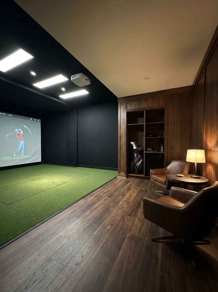
- Walls: Matte black on the hitting-bay wall to reduce screen glare, paired with warm walnut paneling in the adjacent lounge corner
- Flooring: Artificial turf strip sized precisely to the simulator’s hitting area, transitioning into dark walnut flooring for the lounge side
- Seating: A pair of leather swivel chairs angled toward a small bar ledge, positioned to watch play without standing in the hitting zone
- Lighting: Bright, even ceiling lighting over the hitting bay for camera accuracy, shifting to warm low lighting in the lounge corner
- Centerpiece: A projector-and-screen simulator setup built into a matte black surround, framed to look intentional rather than like mounted equipment
- Storage/display: A slim golf bag nook built into the walnut paneling, holding clubs upright and out of the walking path
- Rug: None in the hitting zone; a low-pile wool rug anchors the lounge chairs only
- Standout detail: Ceiling-mounted acoustic baffles disguised as a design feature rather than left exposed as raw foam
Why this works: Confirming ceiling clearance before construction and lighting the hitting bay and lounge corner differently is what keeps a simulator room functional for actual swings instead of just for putting.
Simulator rooms have one non-negotiable requirement that most people learn the hard way: ceiling height and clearance need to be measured and confirmed before any construction begins, since a full swing needs several feet more overhead room than people expect. My husband always checks this first with clients before framing anything, because retrofitting a low ceiling after the fact is far more expensive than planning for it up front. Get that measurement wrong and the whole room becomes unusable for anything beyond putting.
Lighting has to do double duty in this kind of space, which is trickier than in most other rooms on this list. The hitting bay genuinely needs bright, even, glare-free lighting for the simulator’s cameras to track the ball accurately, while the lounge corner just a few feet away wants the opposite — warm, low, relaxed lighting for watching and socializing. Handling that transition well, rather than lighting the whole room the same way, is what keeps this from feeling like a garage with a projector bolted to the wall.
15: Cognac Leather Reading & Whiskey Corner — A Classy Man Cave Idea for Daylight Hours
- Walls: Warm cream plaster with a single deep bottle-green built-in bookshelf wall for contrast
- Flooring: Light white oak, kept bright to balance the darker green shelving
- Seating: One oversized cognac leather chair with a matching ottoman, positioned near a window rather than against a wall
- Lighting: Natural daylight as the primary source, supplemented by a brass reading lamp clipped to the shelving
- Centerpiece: The bottle-green built-in shelving unit itself, styled with books, a small whiskey tray, and a few framed prints
- Storage/display: A slim brass tray on the lower shelf holding two glasses and a single decanter, kept deliberately sparse
- Rug: A faded vintage rug in cream and green tones, softening the bright oak floor
- Standout detail: A small brass reading lamp with an adjustable arm clipped directly to the shelving, rather than a separate floor lamp taking up space
Why this works: Positioning the main seat near natural daylight instead of tucking it into a dark corner is what makes this idea feel different from every other moody, evening-only space on this list.
Every idea in this list so far has leaned into evening drama, but a genuinely well-designed man cave should work in daylight too. Placing a single leather chair near a window, with the bottle-green shelving as backdrop, gives this space a completely different personality by morning — bright, calm, and readable — than it has after dark. That range is something worth building into at least one corner of a home retreat, since these rooms often get used far more during the day than people initially plan for.
Sparse styling on the shelving tray is intentional here, and it’s a principle I come back to in nearly every room I style: one decanter and two glasses look considered, while five bottles and a cluttered arrangement look like a bar cart that wandered onto a bookshelf. A single small reading lamp clipped to the shelf, rather than a floor lamp taking up precious space, keeps the footprint tight enough for even a small room. This is the idea I’d recommend for anyone working with limited square footage.
Styling Principles: Editing Personal Collections & Lighting for Evening Use
The line between “classy man cave” and “cluttered novelty room” almost never comes down to budget — it comes down to editing. A collection of eighteen well-spaced whiskey bottles will always outshine forty crammed onto a cart, and one meaningful piece of memorabilia, properly framed, says more than a wall covered edge to edge. Before adding anything new to a space like this, ask whether it earns its spot or is simply filling empty wall space out of habit.
Material quality matters more than theme. Leather, walnut, brass, and stone read as intentional in almost any configuration, while plastic, particleboard, and printed signage read as novelty no matter how the room is arranged. A room reads as sophisticated or cluttered almost entirely based on material quality and restraint, not the theme itself. Investing in fewer, better pieces will consistently outperform a room full of budget items chasing a specific look.
Lighting deserves equal attention, since most of these rooms are used almost exclusively in the evening. Layer at least three sources — ambient, task, and accent — and skip the single overhead fixture entirely where possible. Warm dimmable lighting in the 2700K range does more to set a lounge-like mood than any single piece of furniture, and it’s often the cheapest upgrade available in a room like this.
FAQs
1. How do I make a man cave look classy instead of cluttered? Edit down to fewer, higher-quality pieces and give each one visible breathing room rather than displaying an entire collection at once. Spacing and material quality matter more than the theme itself.
2. What’s the best flooring for a man cave? It depends on function: wide-plank oak or walnut works well for lounge-style rooms, sealed polished concrete suits workshop or gym spaces, and slate or brick pavers handle moisture and heat well in bar or cigar-focused rooms.
3. What are budget-friendly ways to elevate a man cave? Swap harsh overhead lighting for warm dimmable lamps, edit displayed items down to a handful of meaningful pieces, and prioritize one or two quality materials — like a walnut shelf or leather chair — over multiple cheaper additions.
4. Do I need soundproofing for a home theater or media room? Yes, if the goal is genuine sound quality. Fabric-wrapped acoustic wall panels and dense carpet meaningfully reduce echo, and running surround-sound wiring before drywall goes up avoids costly retrofitting later.
5. What’s the best lighting for a home bar or entertainment area? Focused, warm-toned lighting works best — a single picture light over a bar wall or a low-hung pendant over a game table creates a pooled, intimate glow that reads far more sophisticated than even overhead room lighting.
6. How much space do I need for a golf simulator or pool table? Both require more clearance than people expect. A golf simulator needs several feet of ceiling clearance above a full swing, and a regulation pool table needs roughly five feet of clearance on all sides for a full cue stroke.
Conclusion
A man cave doesn’t need neon signs or a novelty theme to feel like the best room in the house — it needs restraint, good materials, and lighting that actually sets a mood. These fifteen classy man cave ideas prove that a bar wall, a screening room, or a simple reading corner can hold up to real design scrutiny while still feeling personal and lived-in. I’ve seen how a few intentional changes — editing a collection down, swapping harsh overhead light for something warmer — can completely transform how a space feels by evening.
Save this post for later, try one idea in your own space this weekend, and pass it along to anyone still holding onto a plastic folding table.