15 Thanksgiving Dinner Table Setting Ideas to Try
A beautiful centerpiece can only carry a table so far. The moment guests sit down, what they actually notice is everything else — the plate, the glass in their hand, the napkin folded at their seat. That’s exactly why this collection of Thanksgiving dinner table setting ideas covers the whole picture, not just the middle of the table. I’ve hosted enough Thanksgivings in my own dining room to know that guests remember how a table felt to sit at, more than they remember any single flower arrangement.
Inside, you’ll find 15 fully styled tables — linens, china, glassware, flatware, napkins, place cards, and chairs — each with a distinct color story and one genuinely unexpected detail. Whether your style leans moody and formal or rustic and relaxed, there’s a complete setting here ready to recreate, seat by seat.
Why Repetition Matters More Than the Centerpiece
Most Thanksgiving tables lean entirely on the centerpiece to do the visual work, and that’s exactly why so many still feel unfinished once the food is served. A table reads as intentionally styled, rather than simply set, when small details repeat at every seat: the same napkin fold, the same place card style, the same glassware silhouette. That repetition is what tells the eye a table was planned, before anyone even notices the centerpiece.
I learned this hosting twelve people one Thanksgiving — the centerpiece got the compliments, but it was the matching napkin knots down the whole table that made a guest ask if I’d hired a stylist. This guide covers that full system: linens, plates, glassware, flatware, napkins, place cards, and chairs, so your whole table feels composed.
1. Moody Jewel-Tone Formal
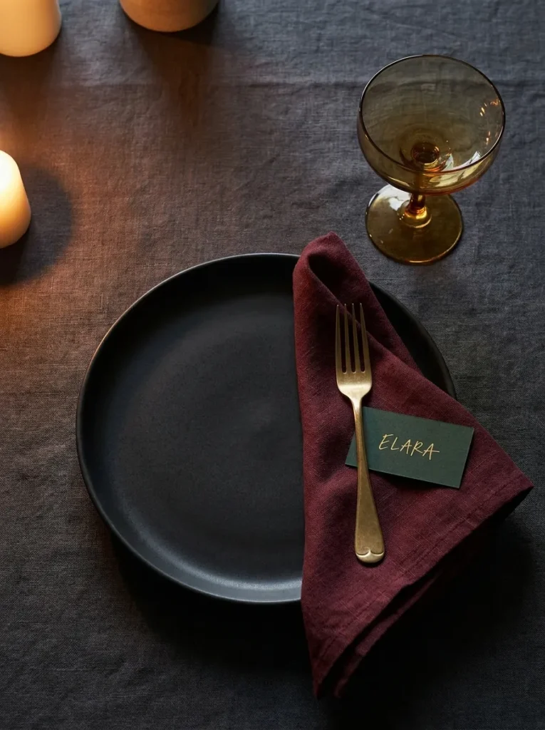
- Linens: Deep emerald velvet runner over a charcoal linen tablecloth
- Place setting: Matte black stoneware dinner plates with a slate-gray charger underneath
- Glassware: Smoked amber coupe glasses paired with slim crystal water goblets
- Flatware: Aged brass flatware with a hammered texture
- Napkins: Burgundy linen napkins folded into a simple diagonal pocket, held with a brass ring
- Place cards: Hand-lettered calligraphy on dark green pressed cardstock, tucked into the napkin fold
- Chair styling: Chair backs left bare — no ties or bows, letting the dark wood frame speak for itself
- Centerpiece: Kept low and brief here — for full centerpiece styling, see our dedicated Thanksgiving Centerpiece Ideas guide
Why this works: Repeating the same amber-and-brass color story across every glass and fork is what makes twelve place settings read as one cohesive table instead of a random collection of dishes.
This is the table setting for anyone who wants Thanksgiving to feel a little more like a candlelit dinner party than a casual family meal. The combination of matte black stoneware and warm brass hardware creates real depth once the sun goes down, especially under candlelight or a dimmed chandelier. I’ve noticed that darker palettes like this one actually photograph better in evening light than pale, all-white settings — the contrast between the amber glass and black plate holds up beautifully in photos, which matters if you’re planning to capture the table before the meal starts.
Every piece in this setting was chosen to catch light rather than reflect it flatly. Smoked amber glass throws a warm glow across the table once candles are lit, and the hammered brass flatware picks up that same tone instead of competing with it. In my experience, this kind of tonal consistency is what separates a table that looks “put together” from one that just has nice individual pieces. Guests notice it even if they can’t say exactly why — it simply feels finished, intentional, and worth lingering at long after the meal is done.
2. Rustic Natural Linen
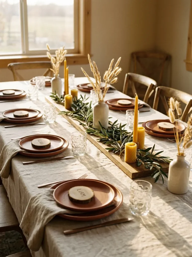
Farmhouse-style tables often default to burlap and mason jars — but a genuinely elevated rustic table setting leans on texture and craftsmanship instead of costume-like props.
- Linens: Undyed heavyweight linen tablecloth in oatmeal, left slightly wrinkled for texture
- Place setting: Hand-thrown stoneware plates in a warm terracotta glaze, no charger
- Glassware: Hand-blown recycled glass tumblers with visible tiny air bubbles
- Flatware: Brushed bronze flatware with a slightly matte finish
- Napkins: Undyed linen napkins tied with natural jute twine and a single dried wheat stalk
- Place cards: Small wood slice rounds with names burned in using a wood-burning tool
- Chair styling: A single sprig of dried eucalyptus tucked into the chair rung with twine
- Centerpiece: Left simple and low-key — full arrangement ideas live in our separate centerpiece post
Why this works: Using one continuous material — natural linen and unfinished wood — at every seat is what keeps a rustic table from tipping into cluttered or mismatched.
There’s a specific kind of rustic that reads as expensive, and it has almost nothing to do with burlap. It comes down to natural, slightly imperfect materials repeated with discipline: the same oatmeal linen, the same bronze finish, the same wood tone at every single seat. My husband’s crew works with a lot of reclaimed wood on renovation jobs, and he’s told me more than once that the pieces homeowners love most are the ones with visible grain and small imperfections — that same principle applies directly to a table. Uniformity of material, not uniformity of perfection, is what makes rustic decor look curated instead of accidental.
The wood-slice place cards are the detail that consistently gets photographed first at this kind of table, and they’re inexpensive to make with a basic wood-burning pen from a craft store. Pair them with the bubbled glass tumblers and the whole setting starts to feel handmade in the best sense. This is a strong choice for a Thanksgiving table setting hosted somewhere with natural surroundings — a farmhouse, a cabin, or simply a home with a lot of wood and greenery already present, since the materials echo what’s already in the room.
3. Modern Monochrome
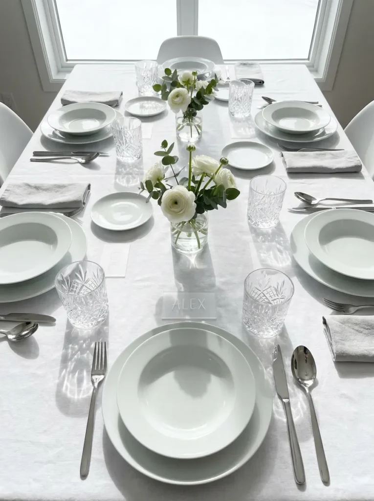
- Linens: Crisp white cotton tablecloth with a subtle woven grid texture
- Place setting: Pure white porcelain plates stacked with a matching white ribbed charger
- Glassware: Clear cut-crystal tumblers with a geometric faceted pattern
- Flatware: Brushed stainless steel flatware with a squared-off modern handle
- Napkins: White linen napkins folded into a clean rectangle, secured with a slim silver cuff
- Place cards: Frosted acrylic tags with names etched in a thin sans-serif font
- Chair styling: Chairs left completely bare and architectural, no ties
- Centerpiece: Kept minimal — one low detail only, with fuller ideas covered in our centerpiece guide
Why this works: A tonal, all-white table setting relies entirely on texture and shape contrast to avoid looking flat or unfinished, since color variation isn’t doing any of the visual work.
Monochrome settings are unforgiving in a specific way: without color to create interest, every texture and silhouette has to earn its place at the table. That’s why this setting leans on contrast in form rather than hue — the ribbed charger against smooth porcelain, faceted crystal against squared flatware, frosted acrylic against woven linen. Skip this look if your dining room already leans heavily neutral or gray, since it can start to visually disappear into the walls. It performs best in a room with some architectural detail or a darker wood table underneath to anchor it.
I styled a version of this table for a client last fall who wanted something that felt current rather than traditionally “Thanksgiving,” and the acrylic place cards were the detail every guest picked up and asked about. They’re a small investment compared to custom stationery but photograph with a crisp, almost jewelry-like quality under overhead lighting. This modern monochrome direction works especially well for a Thanksgiving table setting hosted in a newer build or a home with clean, contemporary lines already established elsewhere.
4. Vintage Mixed China Eclectic
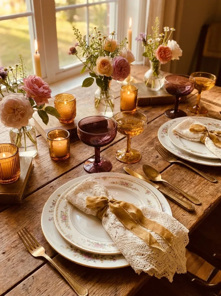
- Linens: Faded rose-pink vintage tablecloth with a small floral print
- Place setting: Intentionally mismatched vintage china plates — florals and gold-rimmed patterns mixed deliberately
- Glassware: Mismatched vintage jewel-toned coupe glasses in amethyst, green, and amber
- Flatware: Ornate silver-plate flatware sourced from estate sales
- Napkins: Lace-trimmed cotton napkins folded loosely and tied with thin gold ribbon
- Place cards: Vintage postcard clippings with names written in fountain pen ink
- Chair styling: A small dried flower posy tied to each chair back with the same gold ribbon
- Centerpiece: Referenced only briefly — see our centerpiece post for the full mixed-vintage arrangement
Why this works: Deliberately mismatched pieces read as “curated collection” rather than “mismatched” only when one element — here, the gold ribbon — repeats consistently across every single seat.
Mixing vintage china successfully isn’t about randomness, even though it can look that way at first glance. The trick is picking pieces that share one connecting thread — in this case, gold-rimmed edges and jewel-toned glass — so the eye has an anchor point even as patterns and shapes vary from plate to plate. I’ve collected these pieces slowly from estate sales and thrift shops over several years, and no two place settings at my table are identical, yet the table never feels chaotic because that gold thread ties everything together consistently.
This is the most personal and collected-feeling table setting on this list, and it tends to be the one guests linger over longest, asking questions about individual pieces. Budget-wise, it’s also one of the more affordable directions here, since vintage and estate-sale finds are typically far cheaper than new sets, especially for hosts seating eight or more people. The gold ribbon on both napkins and chairs is the small repeating detail that keeps this eclectic Thanksgiving table setting looking gathered rather than accidental.
5. Warm Metallic Glam
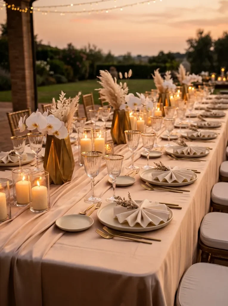
- Linens: Champagne satin tablecloth with a subtle sheen
- Place setting: Ivory bone china plates rimmed in a wide brushed-gold band
- Glassware: Gold-rimmed clear wine goblets paired with short gold-flecked tumblers
- Flatware: Polished gold flatware with a rounded, sculptural handle
- Napkins: Ivory silk-blend napkins folded into a fan shape, secured with a gold leaf-shaped clip
- Place cards: Small gold-foil tented cards with names in metallic copper ink
- Chair styling: A thin gold cord wrapped once around each chair back, no bow
- Centerpiece: Kept brief — see our centerpiece guide for the full metallic arrangement
Why this works: Using one single metal — gold — across every reflective surface at the table, rather than mixing gold and silver, is what keeps a glam table looking polished instead of busy.
There’s a common mistake with metallic tables: mixing gold and silver pieces because “it’s all sparkly anyway.” It rarely holds together. This setting commits to gold exclusively, from the flatware to the goblet rims to the foil place cards, and that single-metal discipline is what makes it read as genuinely glamorous rather than cluttered with mismatched shine. Under evening light, satin linens and gold surfaces bounce light differently than matte materials do, which is worth knowing if you’re setting this table for a nighttime Thanksgiving dinner rather than an afternoon one.
This is a strong pick for a Thanksgiving dinner table setting that doubles as a bit of a celebration — a first holiday hosting a new home, a family milestone, or simply a year you want to go all out. The fan-folded napkins take a little practice, so I’d recommend folding a test one the morning of before doing all twelve. Once mastered, though, they’re one of the fastest ways to make a table look formally styled without any additional cost.
Also View: 15 Thanksgiving Table Centerpiece Ideas Guests Will Love
6. Deep Plum Botanical
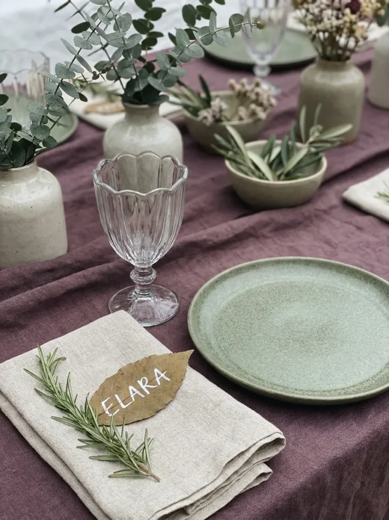
- Linens: Rich plum linen tablecloth with a fine ribbed weave
- Place setting: Dusty sage green stoneware plates with a matte finish
- Glassware: Clear hand-pressed glass goblets with a scalloped rim
- Flatware: Matte black flatware with a thin, tapered handle
- Napkins: Sage green linen napkins rolled and tucked through a dried sprig of rosemary in place of a ring
- Place cards: Pressed autumn leaves with names painted directly on the leaf in white ink
- Chair styling: Chairs left unstyled to let the plum-and-sage color pairing carry the visual weight
- Centerpiece: Referenced only in passing — full styling in our centerpiece post
Why this works: A plum-and-sage color pairing is an uncommon combination for a Thanksgiving table, but it reads as distinctly autumnal without relying on the expected orange-and-brown palette most tables default to.
Thanksgiving tables tend to reach for orange, rust, and brown almost automatically, and while that palette works, it’s also the one every table on Pinterest already looks like. Plum and sage together still feel unmistakably seasonal — there’s something inherently autumn about that combination — but it stands apart visually the moment guests walk into the room. The rosemary sprig doing double duty as a napkin ring is a small, fragrant detail that guests genuinely notice, since it adds scent to the table experience in a way most settings never consider.
I used this palette for my own table two years ago after getting a little tired of the same rust-and-cream look showing up everywhere, and it remains one of the most complimented tables I’ve ever set. Pressed leaves with hand-painted names cost almost nothing if you collect them the week before from your own yard, and they hold up surprisingly well through a full seated meal. This unexpected color pairing is proof that a Thanksgiving table setting doesn’t need to follow the expected palette to still feel completely appropriate for the holiday.
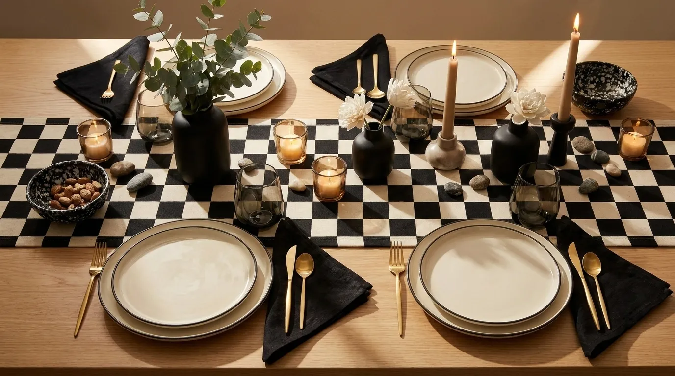
7. Checkerboard Modern
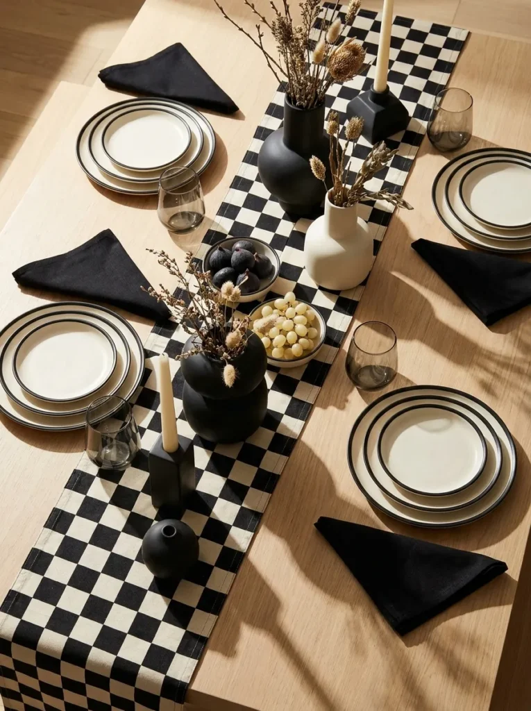
- Linens: Black-and-cream checkerboard-print linen runner over a plain ivory tablecloth
- Place setting: Cream stoneware plates
- with a single thin black rim line
- Glassware: Smoked gray stemless wine glasses with a matte finish
- Flatware: Matte black flatware with a flat, squared silhouette
- Napkins: Solid black linen napkins folded into a simple triangle, no ring used
- Place cards: Small black-and-white striped cards with names in bold black block lettering
- Chair styling: Chairs left bare and graphic, letting the runner carry the pattern
- Centerpiece: Kept minimal and low — see our centerpiece guide for detailed arrangement ideas
Why this works: A single graphic pattern confined to one element — the runner — keeps a bold checkerboard look from overwhelming the rest of a full table setting.
Graphic prints are one of the trickiest table trends to pull off at scale, because what looks striking in one photo can quickly become overwhelming across eight or ten place settings. The fix is containment: let the checkerboard pattern live only on the runner, and keep every other element — plates, napkins, glassware — completely solid. That contrast between pattern and solid color is what makes this table feel current and graphic rather than chaotic. It’s a distinctly 2020s take on Thanksgiving styling, closer to a design magazine spread than a traditional holiday table.
This direction works particularly well in a dining room that already has some black accents — window frames, light fixtures, or chair legs — since the table setting will feel connected to the room rather than dropped into it. Stemless glassware is also a practical choice worth mentioning here: it sits lower on the table and reduces the chance of tipping during a long, lively meal with a lot of passing dishes, which matters more than people expect once the table is full of serving platters.
8. Coastal Blue & White
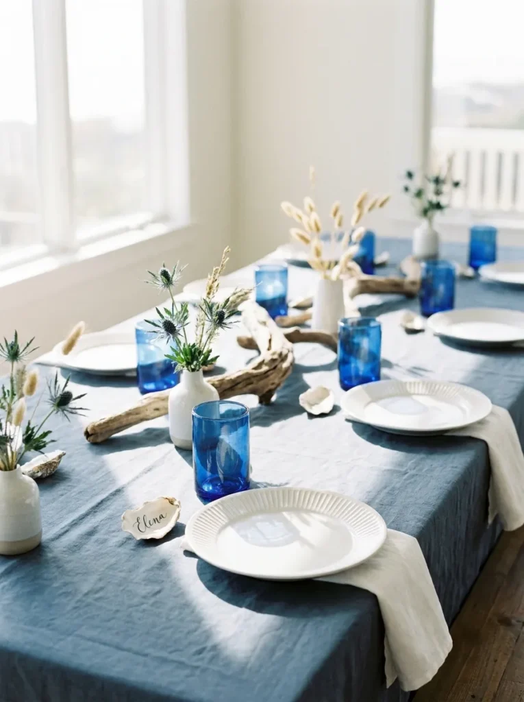
- Linens: Slate blue linen tablecloth with a soft, slightly nubby texture
- Place setting: White ribbed stoneware plates with a matte finish
- Glassware: Cobalt blue glass tumblers paired with clear stemmed water glasses
- Flatware: Brushed silver flatware with a narrow, straight handle
- Napkins: White waffle-weave napkins rolled and tied with a thin strip of navy grosgrain ribbon
- Place cards: Small oyster shells with names written directly on the shell in white paint pen
- Chair styling: Chairs left plain, allowing the blue-and-white palette to stay the visual focus
- Centerpiece: Kept brief — full styling covered in our centerpiece guide
Why this works: Limiting this palette to just two colors, slate blue and white, keeps a coastal-inspired Thanksgiving table feeling calm and cohesive rather than themed or costume-like.
Blue isn’t a color most people associate with Thanksgiving, but a muted slate blue paired with crisp white feels seasonal in an unexpected way, especially against a wood table underneath. If your family’s Thanksgiving traditions lean more coastal than classic New England, this palette lets the table reflect that without abandoning the holiday altogether. The oyster shell place cards are a detail worth planning ahead for — they need a day to dry fully after painting, so I’d prep them at least 24 hours before guests arrive.
If your Thanksgiving table needs a leaf inserted to seat a larger group, my husband always recommends checking that the extension mechanism is fully locked and level before laying any linens down, since an unstable leaf becomes obvious the moment glassware gets set on top of it. This blue-and-white setting works especially well for a table extended for a bigger group, since the simple two-color palette stays calm and readable even across ten or twelve place settings.
9. Terracotta Sunset
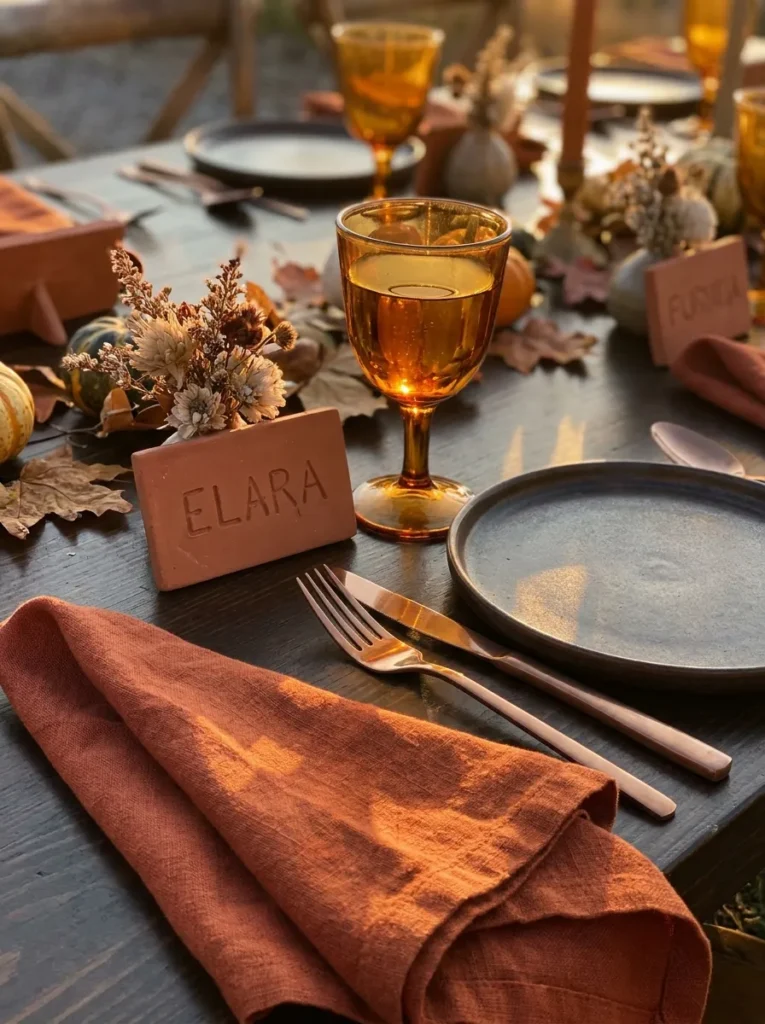
- Linens: Burnt orange linen tablecloth with a slightly heavier weave
- Place setting: Warm cream stoneware plates with a raw, unglazed edge
- Glassware: Amber-tinted hand-blown wine glasses with a rounded bowl
- Flatware: Brushed copper flatware with a slim, rounded handle
- Napkins: Rust-colored linen napkins folded into a simple envelope, tucked with a single dried marigold
- Place cards: Small clay tiles with names carved in before firing
- Chair styling: A woven raffia tie wrapped around each chair back
- Centerpiece: Referenced briefly only — see our centerpiece post for full styling
Why this works: Pairing warm copper metal with warm linens, rather than cool silver, keeps this burnt-orange palette consistent instead of visually competing at the temperature level.
This is the table setting for anyone who wants a Thanksgiving table that leans fully into fall rather than working against it. Copper flatware against burnt orange linen creates a genuinely warm glow once evening light hits the table, and the raw, unglazed edge on the stoneware plates adds a handmade texture that catches candlelight beautifully. Skip cool-toned silver flatware entirely here — even a small mismatch in metal temperature is more noticeable than most people expect once a full table is set.
The clay place card tiles take some advance planning since they need to be shaped, carved, and fired, but they’re a detail I’ve seen guests keep as a small souvenir long after the meal ends. That kind of small, tactile keepsake is part of what makes a Thanksgiving dinner table setting memorable beyond the meal itself. If clay firing isn’t accessible, air-dry clay from a craft store works as a close substitute and holds carved lettering just as well.
10. Black & Gold Art Deco
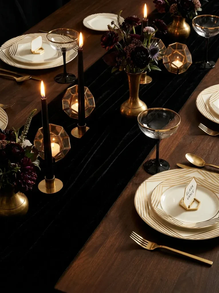
- Linens: Black velvet runner over a solid ivory tablecloth
- Place setting: Ivory china plates with a thin, precise black-and-gold striped rim
- Glassware: Black-stemmed crystal coupe glasses with a clear bowl
- Flatware: Polished gold flatware with a sharp, geometric handle
- Napkins: Ivory silk napkins folded into a sharp rectangle, banded with a thin black-and-gold paper cuff
- Place cards: Geometric gold-foil cards with a deco-style patterned border
- Chair styling: Chairs left architectural and bare to preserve the sharp, linear look
- Centerpiece: Kept minimal — full arrangement detailed in our centerpiece guide
Why this works: Sharp, straight-edged details — the velvet runner, the striped china rim, the geometric place cards — carry an Art Deco feel through the whole table without requiring a single curved or floral element.
Art Deco styling on a Thanksgiving table is still fairly rare, which is exactly what makes it stand out in a sea of rustic and traditional tablescapes. The visual language here is all about precision: straight lines, sharp corners, and a black-and-gold palette applied with restraint rather than excess. Every element, from the striped china rim to the paper napkin cuff, echoes the same geometric sensibility, which is what holds this dramatic look together across a long table rather than letting any one piece feel out of place.
This direction photographs exceptionally well under low, warm lighting, since the black velvet absorbs light while the gold flatware and foil place cards reflect it, creating real depth in a single frame. It’s a strong choice for a Thanksgiving dinner hosted somewhere sleek and modern, or for a host who wants the table to feel more like a special occasion than a typical family dinner. This kind of striking, editorial-style Thanksgiving table setting tends to be the one guests photograph before they even sit down.
11. Soft Blush Romantic
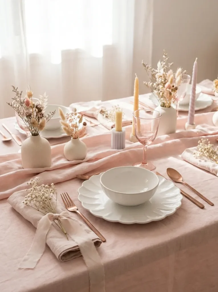
- Linens: Blush pink linen tablecloth with a subtle crinkled texture
- Place setting: Soft ivory scalloped-edge plates
- Glassware: Pale pink tinted glass goblets with a delicate thin stem
- Flatware: Rose gold flatware with a slender, slightly curved handle
- Napkins: Blush chiffon-blend napkins tied loosely with a strand of dried baby’s breath
- Place cards: Small handwritten cards on soft pink watercolor paper with a painted floral corner
- Chair styling: A single stem of dried pampas grass tucked into each chair back
- Centerpiece: Kept brief here — see our centerpiece guide for the full romantic arrangement
Why this works: Soft, low-saturation colors like blush and rose gold read as romantic rather than washed out only when paired with texture — scalloped edges, crinkled linen, dried baby’s breath — that gives the eye something to focus on.
Pale color palettes carry a real risk of looking flat or unfinished if every surface is smooth and matte. This setting avoids that by leaning hard on texture: the crinkled linen, the scalloped plate edge, the delicate dried baby’s breath tied into the napkins. That layered texture is what keeps a blush palette from reading as bland, even in a color family that’s naturally soft and quiet rather than bold or graphic.
I’ve noticed this palette tends to work best for a smaller, more intimate Thanksgiving gathering rather than a large extended-family table, simply because the softness reads more clearly with fewer place settings competing for attention. It’s also a lovely direction for a Thanksgiving hosted around a milestone — an engagement, a first hosted holiday in a new home — where a slightly more romantic table setting feels appropriate for the occasion. Pampas grass tucked into the chair is an easy, low-cost detail that adds real texture without any floral arranging skill required.
12. Autumn Harvest Neutral,Thanksgiving dinner table setting ideas
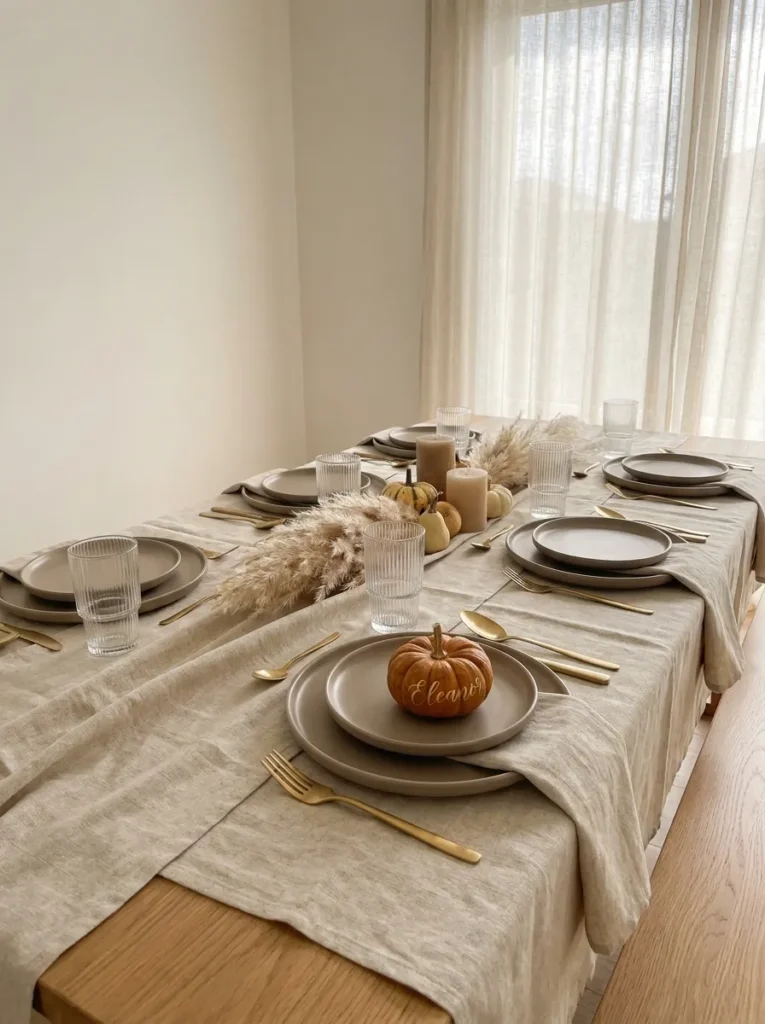
- Linens: Oatmeal linen tablecloth layered with a thin cream ribbed runner
- Place setting: Warm taupe stoneware plates with a soft matte glaze
- Glassware: Clear ribbed glass tumblers with a subtle vertical texture
- Flatware: Brushed gold flatware with a simple, slightly rounded handle
- Napkins: Cream linen napkins folded into a loose roll, tied with a strip of dried corn husk
- Place cards: Small mini pumpkins with names written in gold paint pen
- Chair styling: Chairs left plain and understated to keep focus on the tabletop layering
- Centerpiece: Referenced briefly only — see our centerpiece guide for full styling
Why this works: Neutral color palettes read as intentional rather than boring when texture is layered — ribbed glass, matte stoneware, woven linen — since texture does the visual work that color would otherwise carry.
A table built entirely from neutrals can easily tip into looking unfinished if every surface is smooth and flat. The fix is layering texture instead of color: ribbed glass against matte stoneware, a woven runner over plain linen, corn husk against soft cotton. Each material adds a slightly different tactile quality even though the palette barely shifts from cream to taupe to gold. That’s what keeps a neutral Thanksgiving table setting feeling deliberately calm rather than accidentally plain.
This is one of the easiest palettes on this list to build gradually, since most of these pieces — taupe stoneware, gold flatware, cream linen — are versatile enough to use again for everyday dinners long after the holiday ends. Mini pumpkins as place card holders are inexpensive, available at nearly any grocery store in November, and add a small seasonal touch without committing to a full autumnal color scheme. It’s a practical, budget-conscious choice for hosts who want their table to still feel elevated.
13. Charcoal & Copper Industrial
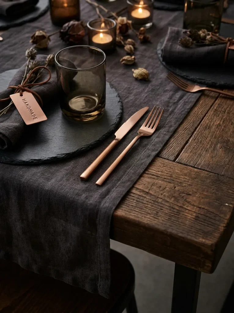
- Linens: Charcoal gray linen table runner over a bare, sealed wood table
- Place setting: Dark slate plates with a raw, unfinished-looking edge
- Glassware: Smoked charcoal tumblers with a thick, chunky base
- Flatware: Aged copper flatware with a heavy, substantial weight
- Napkins: Charcoal waffle-knit napkins folded flat, secured with a thin leather cord
- Place cards: Small copper tags stamped with names, hung from the leather napkin cord
- Chair styling: Chairs left completely bare, letting the industrial materials stand alone
- Centerpiece: Kept brief here — full arrangement covered in our centerpiece post
Why this works: Skipping a tablecloth entirely and letting a sealed wood table show through the runner is the unexpected choice that gives this setting its industrial edge.
Most Thanksgiving tables default to full tablecloth coverage, but leaving the wood grain exposed alongside a narrow runner creates a more architectural, restaurant-quality look that stands apart immediately. This only works if the table surface itself is in good shape, so it’s worth checking for water rings or scratches beforehand — my husband always tells clients that a quick coat of furniture wax a few days ahead can restore some shine to an older wood table before styling it bare like this.
The stamped copper tags are a detail that takes a little more effort than a printed place card, but a basic metal stamping kit from a craft store makes it manageable for a full table of guests in one sitting. This charcoal-and-copper direction suits a more modern, loft-style home best, or any Thanksgiving dinner table setting aiming for a slightly moodier, less traditional feel than the classic orange-and-cream holiday table.
14. Cream & Sage Botanical Formal
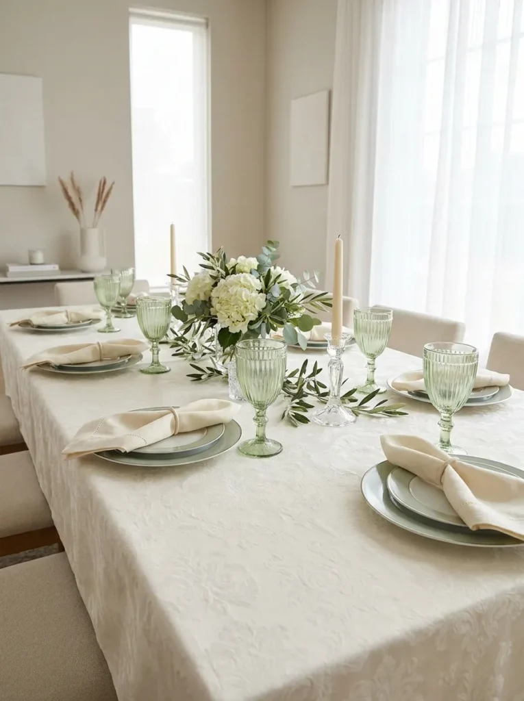
- Linens: Ivory damask tablecloth with a subtle woven floral pattern
- Place setting: Cream porcelain plates with a raised sage green botanical rim design
- Glassware: Pale green tinted crystal goblets with a fluted stem
- Flatware: Silver flatware with an ornate, slightly scrolled handle
- Napkins: Sage green linen napkins folded into a bishop’s sleeve, no ring needed
- Place cards: Cream cardstock with a hand-painted watercolor sprig and calligraphy name
- Chair styling: A slim sage ribbon tied in a simple knot at each chair back
- Centerpiece: Kept brief — full styling detailed in our centerpiece guide
Why this works: A raised botanical pattern on the plate itself, rather than a printed one, gives this formal table a dimensional, tactile quality that a flat pattern can’t replicate.
This is the most traditionally formal setting on this list, built for a Thanksgiving dinner table setting that leans closer to a special-occasion dinner party than a casual family gathering. The bishop’s sleeve napkin fold is more advanced than a simple roll or triangle, so I’d recommend practicing it once or twice before the day itself — it holds its shape best with a slightly starched linen rather than a soft, worn one. Once mastered, it adds real height and drama to each place setting without any additional props.
Sage green and cream is a gentler, more classic pairing than some of the bolder palettes here, making it a dependable choice for a multigenerational Thanksgiving table where guests might range from grandparents to young adults. The scrolled silver flatware and fluted glassware lean traditional, but the pale green tones keep the overall feel current rather than dated. It’s a formal table that still feels approachable rather than stiff.
15. Mustard & Walnut Vintage Modern
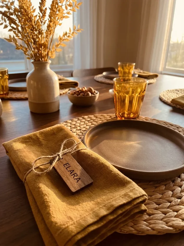
- Linens: Mustard yellow linen tablecloth with a soft, slightly heavy drape
- Place setting: Warm walnut-brown stoneware plates with a glossy glaze
- Glassware: Amber-tinted vintage-style tumblers with a faceted base
- Flatware: Matte bronze flatware with a slightly wide, flat handle
- Napkins: Mustard linen napkins folded into a simple pocket, tucked with a small dried sunflower
- Place cards: Small walnut wood tags with names printed using a wood-burning stencil
- Chair styling: A thin leather cord wrapped once around each chair back
- Centerpiece: Referenced briefly only — see our centerpiece post for full styling
Why this works: Mustard yellow is an underused color on Thanksgiving tables despite being one of the most historically accurate autumn tones, closer to what mid-century tables actually used than the orange-heavy palettes common today.
Mustard has a slightly retro association that some hosts shy away from, but paired with warm walnut brown, it reads as vintage-modern rather than dated — closer to a 1970s dinner party reimagined for a 2026 table than a costume-like throwback. The glossy glaze on the stoneware plates keeps the look from feeling too heavy or somber, adding a bit of shine that balances the matte bronze flatware and linen textures around it.
I’ve seen this combination work particularly well for hosts who inherited vintage serving pieces from a parent or grandparent and want a table that complements those heirlooms rather than clashing with them. The leather cord chair detail is a small, low-cost way to add a tactile element without any sewing or tying skill beyond a simple wrap. This palette proves a Thanksgiving dinner table setting doesn’t need to follow current trend colors to feel genuinely intentional and well put together.
Styling Principles: What Makes a Full Table Feel Cohesive
The difference between a table that looks staged and one that looks thrown together usually comes down to repetition, not perfection. A napkin fold repeated at every seat, the same metal finish across every piece of flatware, one consistent glassware style down the whole table — these small repeated choices are what make twelve different place settings read as a single, intentional design rather than twelve separate decisions. In my experience, hosts often focus so much energy on the centerpiece that they forget the plates, napkins, and glassware are doing most of the visual work once guests actually sit down.
A useful rule of thumb: pick one metal finish and commit to it across flatware, chargers, and any hardware at the table. Mixing gold and silver rarely reads as intentional unless it’s done with real restraint. The same goes for color — most of the ideas above use two to four core tones, never more, because a table setting with too many competing colors starts to feel cluttered no matter how beautiful each individual piece is. Consistency, more than any single expensive item, is what makes a Thanksgiving table setting feel complete.
Frequently Asked Questions
Do all my place settings need to match exactly? Not exactly, but they should share at least one repeating element — the same napkin fold, glassware style, or metal finish — so the table reads as cohesive even if individual plates or chairs vary slightly, as with the vintage mixed china approach.
What’s a budget-friendly way to elevate a Thanksgiving table setting? Focus your budget on one high-impact detail, like flatware finish or napkin rings, and keep everything else simple; a single consistent metal tone across an otherwise basic table setting reads as far more styled than scattered spending across many small items.
Can I mix vintage and modern pieces on the same table? Yes, as long as one consistent element ties them together, such as a repeated ribbon color, metal finish, or glass tone, since that shared thread is what keeps mismatched pieces from looking accidental.
How do I set a table for a large Thanksgiving group of 10 or more? Choose a palette with no more than two to three colors, since simpler color stories stay legible and organized even across a long table, and confirm any table leaf or extension is stable and level before adding linens and glassware.
Should I use cloth or paper napkins for a formal Thanksgiving table? Cloth napkins generally read as more formal and are worth the investment for a special-occasion Thanksgiving dinner table setting, though a heavier, higher-quality paper napkin can work for a more casual gathering if folded and styled with the same care.
What’s the easiest full table setting to execute for a first-time host? The Autumn Harvest Neutral or Coastal Blue & White ideas are the most forgiving starting points, since both rely on just two or three colors and simple folds rather than advanced techniques like the bishop’s sleeve.
Conclusion
A great Thanksgiving table isn’t built around one showpiece — it’s built around consistency, from the first plate to the last chair. I’ve seen how small, repeated details, like a matching napkin fold or a single metal finish carried across every seat, do more to transform a table than any single expensive purchase. Whichever of these Thanksgiving dinner table setting ideas speaks to your own gathering, pick one and try it in full this year, from linens to place cards.
Save this post to Pinterest so it’s ready when you start planning, and share it with anyone hosting this season who could use a little inspiration at their own table.