15 Thanksgiving Chalkboard Ideas for a Warm Home
Most Thanksgiving decor just sits there looking pretty. A chalkboard is the rare exception — it can actually work for you while your guests are in the house. That’s the real appeal behind Thanksgiving chalkboard ideas: they’re not just another seasonal accent, they’re one of the only pieces of decor that pulls double duty as an actual hosting tool.
I started leaning on chalkboards years ago after one particularly chaotic Thanksgiving where I answered “what’s for dessert?” more times than I care to admit. A simple menu board solved that instantly, and it opened my eyes to how much more a chalkboard could do beyond looking seasonal. From there, I started experimenting — a gratitude tree by the door, tiny place cards with pressed leaves, a quiet quote tucked in the guest bathroom.
This roundup covers all fifteen ideas, from fully interactive gratitude boards to purely decorative botanical pieces, with real lettering technique and placement guidance for each one, so you can pick the boards that actually fit how your Thanksgiving runs.
Why a Chalkboard Actually Earns Its Place at Thanksgiving
Most Thanksgiving decor sits there looking pretty and doing nothing else. A chalkboard is different — it’s one of the only pieces in your whole setup that can actually work for you during the meal, not just around it. Guests read a live menu board, add what they’re grateful for, or find their seat without you repeating yourself four times while the turkey rests. That’s a genuine hosting tool, not a prop.
A well-placed chalkboard earns its spot at a Thanksgiving table because it solves a real problem — communication during a chaotic, multi-course meal — that static signage simply can’t.
In my experience, the boards my guests remember aren’t the fanciest ones. They’re the ones they got to touch — writing their own line on a gratitude board before dinner, or checking the menu board twice because they forgot what the third side dish was. This post covers 15 Thanksgiving chalkboard ideas that actually do something, from decorative botanical pieces to interactive boards guests use themselves — plus the lettering technique and placement that makes each one work.
1. Wheat-Bordered Menu Board
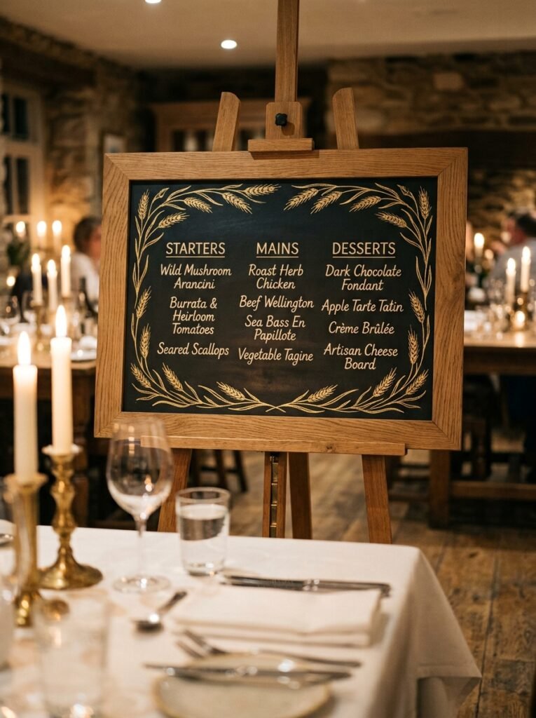
- Size/frame: 24×36-inch chalkboard in a raw oak frame, large enough to read from across the dining room
- Design concept: hand-drawn wheat stalks bordering three columns — starters, mains, desserts
- Function: fully functional menu board guests reference throughout the meal
- Color approach: warm metallic gold chalk marker for the wheat, cream chalk marker for the lettering
- Placement: propped on an easel just behind the dining table, visible from every seat
- Integration: echoes the wheat sheaves in the table runner without repeating them exactly
- Technique tip: sketch the wheat border first in regular chalk, erase and adjust, then trace over it in marker once you’re happy with the spacing
- Construction detail: my husband always tells clients that anything over 20 inches needs a wall bracket or a weighted easel base — a board that size on a flimsy tripod easel will tip the second someone brushes past it
Why this works: A menu board answers the one question every guest asks at least twice — “what else is coming?” — without you having to say it out loud.
I built my first wheat-bordered menu board the year we had fourteen people at two pushed-together tables, and it saved me from repeating the lineup all afternoon. Guests would glance over, see dessert was pumpkin and pecan, and settle back into conversation instead of hovering near the kitchen asking. That’s the real value here — it’s not just a pretty sign, it’s a board that does a job. Once people know it’s there, they use it, and you get to actually sit down for your own dinner.
Wheat illustration is forgiving for beginners because it doesn’t need to be botanically accurate — loose, slightly uneven stalks read as intentional and rustic rather than sloppy. Gold metallic chalk marker catches candlelight in a way plain white chalk never does, which matters most for an evening meal. Keep the wheat confined to the border and resist the urge to scatter it across the whole board; a busy background makes the actual menu text harder to read from a distance, which defeats the board’s purpose entirely.
2. Amber Script Welcome Board
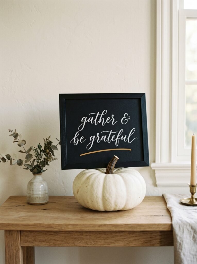
- Size/frame: compact 12×16-inch chalkboard, thin black metal frame
- Design concept: a single elegant cursive line — a short welcome or thankful phrase — centered with generous white space around it
- Function: purely decorative, a first visual moment guests see at the door
- Color approach: white chalk for the script, one small amber-orange chalk marker accent underline
- Placement: entry table or console, propped against a small pumpkin or gourd
- Integration: pairs with neutral entry decor rather than competing with a busier tablescape further inside
- Technique tip: rough out your lettering in pencil-thin chalk first, mapping where each loop and tail falls, before committing to your final pass — cursive is unforgiving of last-minute size changes
Why this works: A small, restrained script board at the entry sets the tone for the whole visit before a guest has even taken off their coat.
I’ve noticed the entry boards that get photographed most aren’t the busiest ones — they’re the simplest. One line, well-spaced, in a confident script, reads as intentional in a way a crowded design never does. There’s a real design principle behind this: negative space signals quality. A board packed edge to edge with lettering and doodles can feel cluttered even when the individual elements are nice. Give your words room to breathe and the whole piece looks more considered, more like something you’d actually want photographed.
Cursive chalk lettering is a learnable skill, not a talent you’re born with. Start with a basic serif or brush-script alphabet reference, practice the connecting strokes separately from full words, and size your first draft larger than you think you need — chalk lettering tends to shrink visually once it’s centered on a board. A single amber underline beneath the final word gives the eye a stopping point and keeps the whole composition from feeling like it’s floating in space.
3. Line-Art Turkey Corner
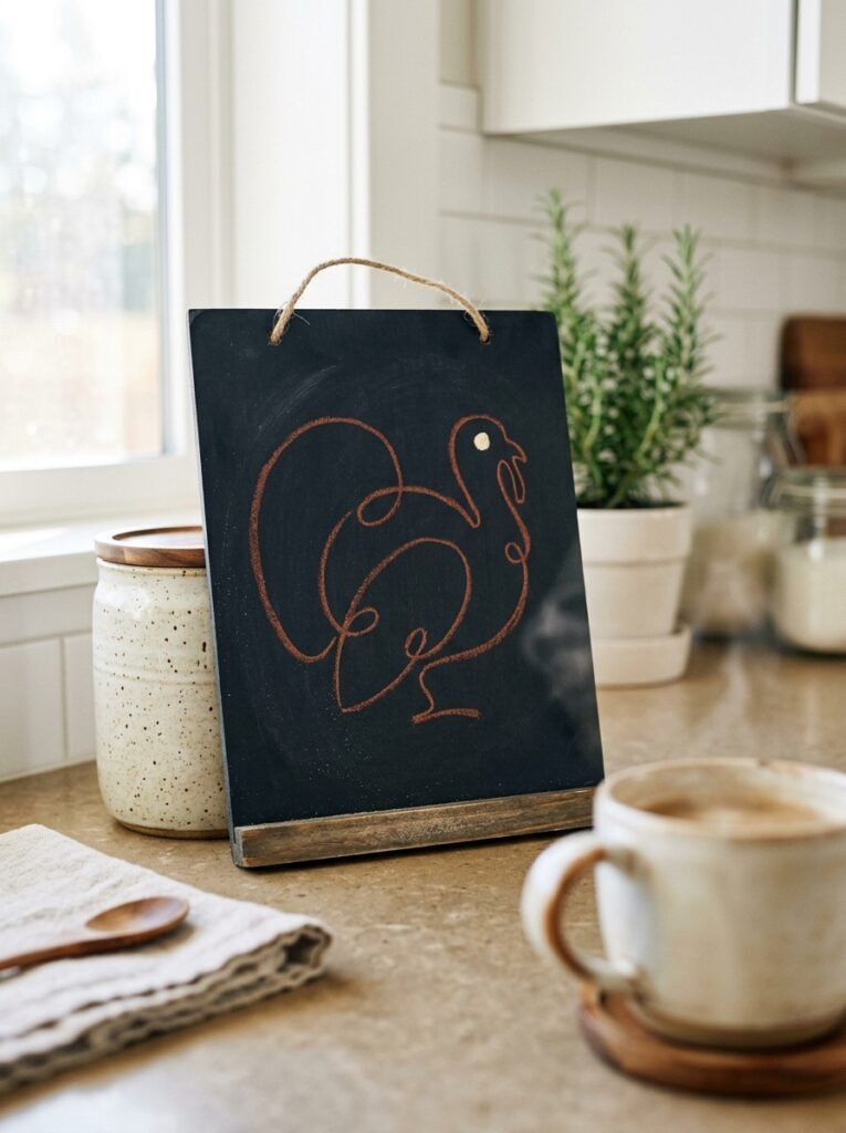
- Size/frame: small 10×14-inch chalkboard, no frame, raw edge
- Design concept: a single continuous-line minimalist turkey silhouette, no shading, no detail beyond the outline
- Function: decorative accent near a beverage or coffee station
- Color approach: mixed chalk markers — rust for the outline, one small cream dot for the eye
- Placement: kitchen counter or coffee cart, leaning against a canister or small vase
- Integration: a lighter, playful counterpoint to a more formal dining room display elsewhere in the house
- Technique tip: practice the line on scrap paper first without lifting your pen — a continuous line reads as confident and modern, while a broken, retraced line looks hesitant
- Construction detail: for a lightweight board like this, my husband’s rule of thumb is a small adhesive putty on the back corners if it’s sitting on a counter near a high-traffic kitchen path, so it doesn’t slide when someone reaches past it
Why this works: A single unbroken line naturally corrects for small wobbles that a multi-stroke drawing would expose, which is why continuous-line art reads as confident even from a beginner’s hand.
This is the idea I reach for when I want something Thanksgiving-specific without leaning into anything traditional or heavy. A minimalist turkey outline feels current in a way that a fully shaded, realistic turkey drawing doesn’t — it sits closer to modern line art than holiday clip art. It’s also genuinely fast to execute, which matters on a day when you’re managing a dozen other things. One confident line, one small color accent, and you’ve got a board that photographs cleanly against almost any kitchen backdrop.
Rust-toned chalk marker works better than black or brown here because it ties back to Thanksgiving’s warm palette without being literal about it — no orange-and-brown turkey clip art needed. Keep the line weight consistent throughout the drawing; varying thickness mid-stroke is what makes beginner line art look uneven. If you’re nervous about committing directly to the board, sketch your outline in a light chalk pencil first, then trace over it once you’re confident in the proportions.
4. Guest Gratitude Wall Board
- Size/frame: large 30×40-inch chalkboard, simple black wood frame, mounted flat to the wall
- Design concept: a header phrase at the top with the rest of the board left blank for guests to fill in
- Function: fully interactive — guests write what they’re thankful for as they arrive throughout the day
- Color approach: white chalk provided in a small dish nearby, header written in gold chalk marker for contrast
- Placement: wall near the entry or hallway leading into the dining room, at a height everyone can reach
- Integration: works independently of your tablescape since it lives in a different room entirely
- Technique tip: pre-draw faint guide lines in a light chalk pencil across the blank space so guest handwriting stays roughly level instead of drifting diagonally as the board fills up
- Construction detail: for a board this size mounted directly to drywall, my husband insists on anchors rather than just nails — a 30×40 board plus frame has real weight, and kids leaning on it to reach the top will test a weak mount fast
Why this works: An interactive gratitude board turns guests from passive viewers into participants, which is exactly why it ends up being the most-photographed piece in the house by the end of the night.
I’ve seen this work well in almost every home that tries it — there’s something about handing someone chalk and blank space that gets even quiet guests to write something. The trick is starting the board yourself with two or three entries before anyone arrives, so it doesn’t feel intimidating to be the first name on an empty board. By the time dessert is served, you’ll have a wall full of handwriting in a dozen different styles, which is a far better keepsake than anything printed or pre-designed could give you.
Keep the header phrase short — something like “we’re thankful for” leaves the rest open without dictating format. Faint guide lines matter more here than on any other board in this list, since you’re not controlling the handwriting yourself. Without them, entries drift downward across a wide board and the whole piece looks messier by hour three of the gathering than it did at the start.
5. Botanical Place Card Set
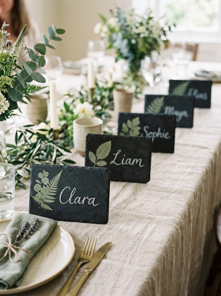
- Size/frame: a cluster of small 4×6-inch mini chalkboards, no frames, raw slate edges
- Design concept: one pressed-leaf illustration per card with a guest’s first name beneath it — no two leaves identical
- Function: fully functional place-setting markers guests use to find their seat
- Color approach: white chalk for names, a single sage-green chalk marker for each leaf
- Placement: propped against the base of each water glass or folded napkin at every setting
- Integration: ties back to any greenery in your centerpiece without duplicating it exactly
- Technique tip: trace a real leaf from your yard onto the board first with chalk pencil for an accurate outline, then fill in with marker — real leaf shapes read as far more natural than freehand approximations
- Construction detail: buy mini boards in bulk rather than cutting down a large one yourself — my husband’s seen too many DIY slate cuts end up with uneven edges that chip during a busy dinner service
Why this works: Individual place-setting boards solve seating logistics for large gatherings more reliably than printed cards because handwritten name boards are cheap enough to redo on the spot if your seating plan shifts last minute.
This is the idea I come back to every year we host more than eight people. Assigned seating heads off that awkward hover-and-shuffle moment at the table, and a tiny hand-lettered board does it with more warmth than a printed card ever could. I use a different leaf for every guest — oak, maple, whatever I find on a fall walk — so the set feels gathered rather than manufactured. It’s a small detail, but it’s the one people mention most when they sit down.
Sage green paired with white chalk keeps the set cohesive even though every leaf shape is different, which matters when you’ve got a dozen or more scattered down a long table. Size the name lettering slightly larger than feels necessary — small boards read as cluttered fast if the name competes with the leaf for space. Set the leaf above the name, never beside it, so the eye reads the card in one clean vertical motion.
6. Two-Tier Dessert Menu
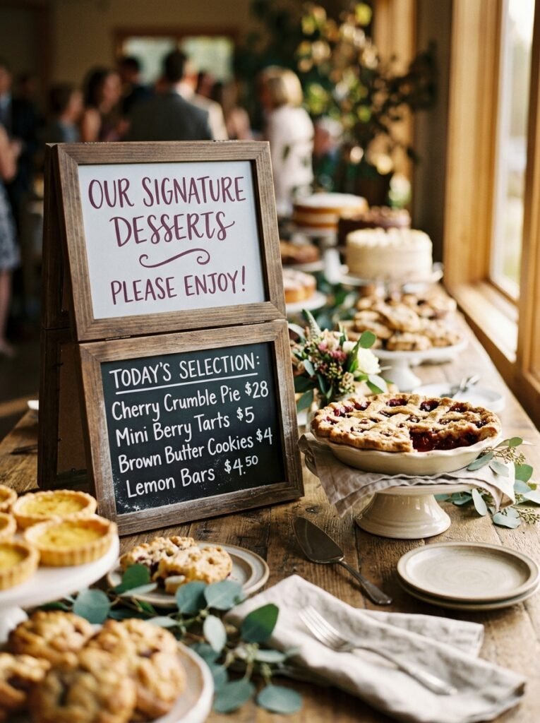
- Size/frame: two stacked chalkboard risers, 8×10-inch top tier and 14×18-inch bottom tier, unfinished wood frames
- Design concept: dessert names on the smaller top board, a short serving note (“ask about gluten-free!”) on the bottom
- Function: fully functional signage for a dessert table or buffet
- Color approach: deep plum chalk marker for headers, white chalk for details
- Placement: dessert table, nestled between pie stands at guest eye level
- Integration: a smaller, food-adjacent counterpart to the main dining room menu board
- Technique tip: letter the top tier first and let it fully set before handling the bottom board — smudging a finished top tier while you’re still working underneath it is the most common mistake with stacked signage
- Construction detail: my husband recommends a rubber shelf liner between the two risers if you’re stacking boards on a buffet — it stops the top tier from sliding when guests reach past for a slice
Why this works: Splitting dessert information across two visual tiers lets guests scan quickly instead of reading one dense paragraph of text while balancing a plate.
I started doing tiered dessert boards after one Thanksgiving where my single big sign got crowded with too much text and nobody actually read it standing in line. Breaking the information into a short top line and a supporting bottom note fixed that completely — people glance, they get what they need, they move on. It’s a small layout shift, but it changes how usable the sign actually is in a real hosting scenario where guests are holding plates and don’t want to stand there decoding your handwriting for a full minute.
Deep plum reads beautifully against natural wood and pairs well with the burgundy or rust tones common in a Thanksgiving dessert spread. Keep each tier to one short line of text — this isn’t the place for full recipe descriptions. If you’re listing more than three desserts, consider a third small riser rather than cramming everything onto two boards; legibility should always win over fitting everything on fewer pieces.
You’ll Also Love: 15 Thanksgiving Dinner Table Setting Ideas to Try
7. Harvest Scene Centerpiece Board
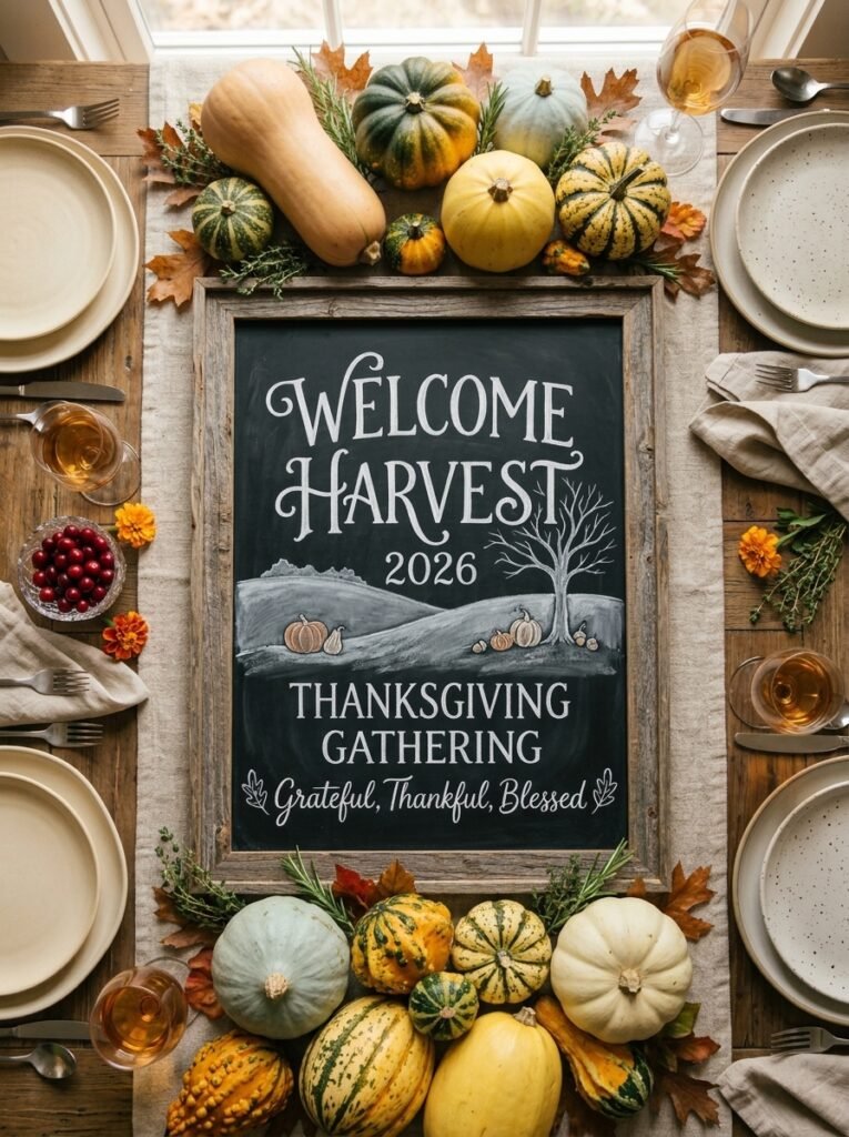
- Size/frame: large 24×30-inch chalkboard, thick weathered-wood frame, freestanding on a plate stand
- Design concept: an illustrated horizontal scene — a rolling hill line, scattered pumpkins and gourds, a single bare tree — no text at all
- Function: purely decorative, the visual centerpiece of the dining table itself
- Color approach: mixed chalk markers — burnt orange and warm brown for the gourds, soft gray for the hill line and tree
- Placement: flat on the table runner, laid horizontally as the literal centerpiece instead of a floral arrangement
- Integration: replaces rather than competes with a traditional floral centerpiece
- Technique tip: work back to front — sky and hill line first, then larger foreground gourds last — so nothing gets drawn over accidentally
- Construction detail: lay the board flat on a folded towel while you work rather than propped on an easel; a wide horizontal scene is much easier to keep proportional when you’re looking straight down at it
Why this works: A horizontal illustrated scene laid flat as a table centerpiece draws less height than a floral arrangement, which keeps sightlines open for conversation across the table — something florists rarely mention but hosts notice immediately.
This is the idea that surprises people most, because it replaces the centerpiece everyone expects with something nobody’s seen done quite this way. I tried it the year our dining table felt too tall with a traditional arrangement blocking half the guests’ faces from each other, and it solved the problem completely while still giving the table a clear focal point. It photographs beautifully from directly overhead, which matters if you’re posting your tablescape, and it costs almost nothing compared to a full floral centerpiece.
Illustrated scenes like this reward a limited color palette more than a wide one — three or four tones max keeps the piece cohesive instead of busy. Burnt orange and warm brown gourds against a soft gray hill line give you enough contrast to read clearly from across the table without needing a dozen colors. Skip lettering entirely on this board; the scene itself is the statement, and adding text usually just clutters a composition that works because of its simplicity.
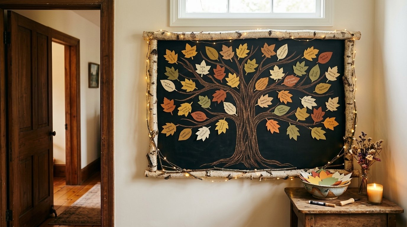
8. Thankful Tree Board
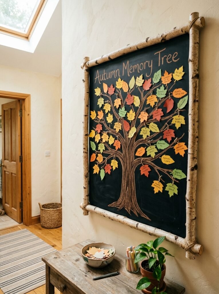
- Size/frame: 20×24-inch chalkboard, natural birch-branch frame instead of a standard wood or metal frame
- Design concept: an illustrated bare tree trunk and branches taking up most of the board, left empty for guests to add chalk-drawn or paper leaves
- Function: interactive — guests write one word of thanks on a small leaf shape and stick or draw it onto a branch
- Color approach: brown chalk marker for the trunk outline, guests write in whatever chalk color they choose for variety
- Placement: dining room, near the doorway guests pass through before sitting down
- Integration: distinct from the gratitude wall board earlier in this list — that one is open text on a blank field, this one channels responses into a literal tree shape, which reads as a completely different visual and gives you a different kind of keepsake photo
- Technique tip: draw the trunk and three or four main branches only — leave the smaller branch details for guests’ leaves to fill in visually, so the board looks intentionally unfinished rather than sparse
- Construction detail: a birch-branch frame has real weight variation piece to piece, so my husband always says to weigh it in your hands before mounting — an unevenly weighted frame will hang crooked no matter how carefully you level it
Why this works: A tree shape gives an open-ended prompt a visual destination, so even guests who feel shy about writing something personal have a clear, low-pressure place to put it.
I switched to this format after noticing our blank gratitude wall board sometimes intimidated first-time guests — a completely open field can feel like it demands something profound. A tree fixes that instantly, because adding one small leaf feels manageable in a way that filling blank space doesn’t. By the end of the night the branches are full and the trunk almost disappears under handwriting and paper leaves, which ends up being one of the most photographed corners of the whole gathering.
Keep the trunk illustration loose and slightly asymmetrical rather than perfectly centered — a stiff, symmetrical tree looks more like clip art than a hand-drawn piece. Precut small leaf shapes from brown kraft paper ahead of time and set them in a bowl nearby with a few markers; guests are far more likely to participate when the leaf is already cut out for them than when they have to draw and cut their own.
9. Quiet Grateful Quote Board
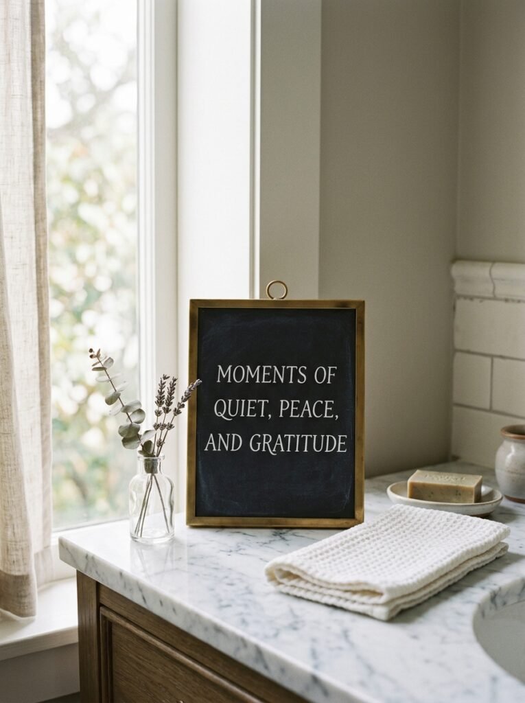
- Size/frame: small 10×12-inch chalkboard, thin brushed-brass frame
- Design concept: a single short quote about gratitude in a refined serif hand-lettering style, no illustration at all
- Function: purely decorative, a quiet visual moment away from the main gathering spaces
- Color approach: white chalk only, no color accents
- Placement: guest bathroom counter or powder room shelf
- Integration: a deliberately understated counterpoint to the louder, more colorful boards in the main living spaces
- Technique tip: choose a short quote — under ten words — and center it across three lines rather than one long line, which reads more elegantly on a small board and avoids cramped margins
- Construction detail: brass frames near a sink or humid bathroom benefit from a quick wipe-down before the day starts, since brass can pick up a faint tarnish film in a steamy room that dulls its shine in photos
Why this works: A guest bathroom is one of the most overlooked decor opportunities in holiday hosting, even though it’s a space nearly every guest visits privately at some point during the day.
I added a small quote board to our powder room a few years back almost as an afterthought, and it’s become one of my favorite details precisely because it’s unexpected there. Guests don’t anticipate a styled moment in the bathroom, so finding one feels like a small gift rather than an obvious display piece. It doesn’t need to compete with anything else in the house — it just needs to be calm, well-lettered, and a little bit lovely for the thirty seconds someone spends in front of the mirror.
Serif lettering suits a quiet quote board better than a playful script, since the mood here is reflective rather than festive. White chalk alone, with no color accent, keeps the piece from feeling like it’s trying too hard in a small space. Leave real margin around all three lines of text — a cramped quote on a tiny board reads as an afterthought, while one with breathing room reads as considered.
Alt text: Small brass-framed chalkboard with a white serif gratitude quote on a bathroom counter
10. Countdown to Thanksgiving Board
- Size/frame: medium 16×20-inch chalkboard, simple black frame
- Design concept: a large number counting down the days until Thanksgiving, with a small daily gratitude prompt beneath it that changes each morning
- Function: fully functional, a daily-use kitchen board in the week leading up to the holiday
- Color approach: white chalk for the number, one accent color rotated daily just for the prompt line
- Placement: kitchen, near the spot where your family already checks the calendar or grocery list
- Integration: the only board on this list meant to be used before the day itself, building anticipation rather than decorating the event
- Technique tip: use a stencil or ruler guide for the large countdown number so it stays a consistent size day to day — freehand numbers tend to drift in scale, which is noticeable when you’re erasing and redrawing daily
- Construction detail: if you’re mounting this somewhere it’ll be touched daily, my husband suggests a slightly recessed hook system rather than a surface hook, so the board sits flush and doesn’t wobble every time someone updates it
Why this works: A daily countdown turns the week before Thanksgiving into its own small ritual instead of a single day of decor that appears overnight.
I’ve noticed our kids check this board every single morning during Thanksgiving week, which is honestly more engagement than any other holiday decor piece gets in our house all year. Updating the number and writing a new one-line prompt takes under a minute, but it makes the lead-up to the holiday feel intentional instead of just busy. By the time the day arrives, the board’s already done its job building anticipation, and you can leave it up through the meal itself as a small record of the week.
A rotating daily prompt works best when it’s short and specific rather than open-ended every time — one day ask what smell reminds someone of Thanksgiving, the next ask for a favorite childhood memory. Erase only the number and prompt line each morning, leaving any decorative border intact, so you’re not redrawing the whole board daily. That approach keeps the ritual quick enough that it actually sticks through the full week.
11. Gravy Station Sign
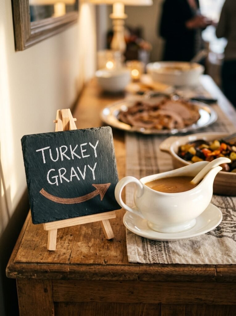
- Size/frame: small freestanding 8×10-inch chalkboard easel, no frame, natural slate edge
- Design concept: a short, slightly playful labeling phrase with a small hand-drawn arrow pointing toward the gravy boat itself
- Function: fully functional — a buffet-style labeling sign for a specific dish or station
- Color approach: white chalk lettering, single warm-brown chalk marker arrow
- Placement: directly beside the gravy boat or sauce station on a sideboard or buffet
- Integration: part of a small family of individual dish-label signs rather than one large all-purpose menu board — this one calls out a single item with personality instead of listing the whole spread
- Technique tip: angle the arrow slightly rather than drawing it perfectly straight — a straight arrow can look stiff on a small casual sign, while a slight curve feels more hand-drawn and natural
- Construction detail: a mini easel on a buffet gets bumped constantly during serving, so weight the back legs with a small adhesive pad if your buffet surface is a hard material like marble or glass, where the easel feet tend to slide
Why this works: Small individual labeling signs at a buffet reduce the number of times a host has to answer “what’s this?” more effectively than one comprehensive menu board, because guests read what’s directly in front of the dish they’re already reaching for.
This is one of the smallest boards on this list, and it’s also one of my favorites, because it does a real job with almost no effort. I keep a few of these mini easels in a kitchen drawer year-round and pull them out for any dish that tends to get questions — gravy, a less obvious side dish, anything with a specific ingredient someone might need to know about for allergies. It takes two minutes to letter, and it saves you from standing at the buffet fielding the same question five times over.
Keep the phrase short enough to read at a glance — three or four words is plenty for a sign this size. A small arrow does more work than you’d expect, since it removes any ambiguity about exactly which dish the sign refers to on a crowded buffet table. Skip elaborate lettering styles here; a clean, legible hand print reads faster than cursive when someone’s holding a plate and moving through a line.
12. Layered Frame Gallery Board
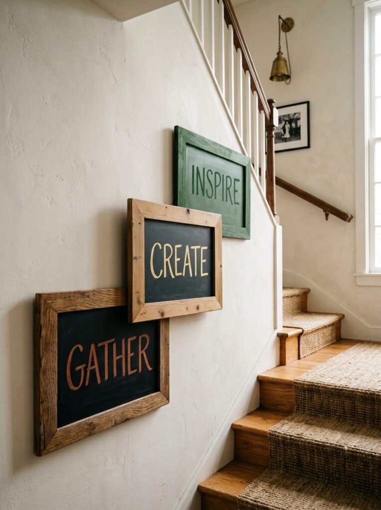
- Size/frame: three different-sized chalkboards (8×10, 11×14, 16×20) in mismatched natural wood tones, arranged in a cluster
- Design concept: each board carries one word — “gather,” “give,” “thanks” — spread across the cluster instead of one board carrying a full phrase
- Function: decorative, a wall-gallery moment rather than a single focal sign
- Color approach: each board lettered in a slightly different warm tone — rust, gold, and deep green chalk markers — so the trio reads as coordinated rather than matched
- Placement: a stairway wall or an empty wall segment in the dining room, arranged in a loose diagonal cluster rather than a straight row
- Integration: offers wall-based visual interest distinct from every table-surface board on this list, filling a vertical space many Thanksgiving setups leave completely bare
- Technique tip: arrange the physical boards on the floor first and photograph the layout before hanging anything — it’s much easier to adjust spacing on the ground than to keep rehanging boards on the wall
- Construction detail: for a cluster like this, my husband recommends starting with the largest board centered at eye level and working outward, rather than hanging left to right — it keeps the visual weight balanced even with three different sizes
Why this works: Splitting one phrase across a cluster of different-sized boards turns a wall into a designed moment instead of a single flat sign, which is exactly the kind of layered detail that photographs as more intentional.
I built this gallery wall the year I realized every board in our house was living flat on a table or counter, and the actual walls around our dining room stayed empty the whole holiday. Clustering three mismatched boards with one word each solved that gap completely, and it turned an unused stairway wall into one of the most complimented spots in the house. The mismatched wood tones matter here — a set of three identical frames would read as a kit purchase, while different tones read as gathered and personal.
Vary board size meaningfully rather than using three boards that are nearly the same dimensions — real visual hierarchy needs at least a few inches of difference between the smallest and largest piece. Keep the lettering style consistent across all three boards even though the colors differ, since matching typography is what visually unifies a mismatched cluster. Space the boards close enough to read as one grouping, roughly two to three inches apart, rather than scattering them across the whole wall.
13. Kids’ Thankful Doodle Board
- Size/frame: low-mounted 14×18-inch chalkboard, simple painted white frame
- Design concept: a loose, casual header phrase with the rest of the board completely open for kids to draw whatever they’re thankful for, rather than write it
- Function: interactive, specifically designed for younger guests who may not yet write full sentences
- Color approach: a rainbow of chalk colors kept in a small caddy nearby, no restriction to a coordinated palette on this one board
- Placement: mounted low on a hallway or mudroom wall, at true kid height rather than adult eye level
- Integration: intentionally the least color-coordinated board in the house, set apart in a hallway rather than a main entertaining space so it doesn’t compete visually with the rest of your styled decor
- Technique tip: mount it lower than feels right at first — most adults hang decor at their own eye level out of habit, but a board kids can’t comfortably reach won’t get used
- Construction detail: for a board mounted at child height in a hallway, my husband always flags it as a spot worth double-checking for secure wall anchors, since kids leaning their full weight on a low board puts more lateral stress on the mount than a board hung higher up ever sees
Why this works: Chalkboards mounted below standard adult eye level see significantly more genuine, unprompted use from young children, simply because reachable height removes the need for an adult to lift them up to participate.
This board doesn’t match anything else in the house, and that’s exactly the point. I stopped trying to keep our young cousins’ contributions color-coordinated with the rest of the decor years ago — it wasn’t sustainable, and honestly, the wild mix of colors and scribbled turkeys is what people end up photographing anyway. Letting go of the styling rules for this one board, and just this one, has made it one of the most genuinely joyful spots in the house every single year, full of drawings that have nothing to do with any color palette at all.
Keep the header short and simple enough for a young reader — “I’m thankful for” works better than anything more elaborate. Provide a wide range of chalk colors rather than a curated few, since restricting color choice on a board meant for kids tends to frustrate rather than focus them. Expect this board to look nothing like the rest of your styled decor, and plan its placement somewhere slightly separate, like a hallway or mudroom, so that contrast reads as charming rather than out of place.
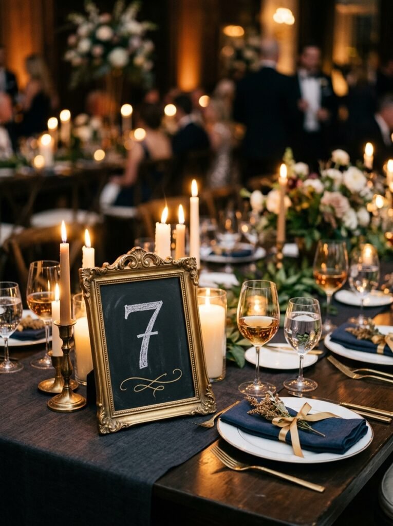
14. Elegant Table Number Set
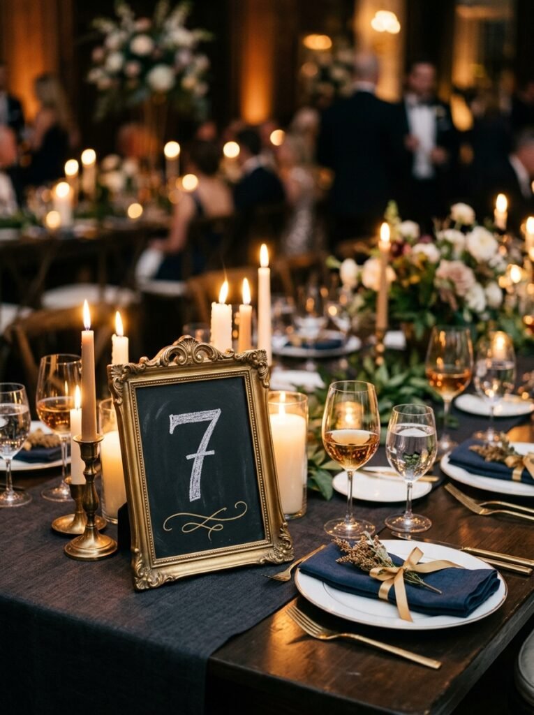
- Size/frame: a set of small 5×7-inch chalkboards, brushed-gold thin metal frames, one per table if hosting across multiple tables
- Design concept: a single large number in a refined serif style, with one small decorative flourish — a sprig, a dot pattern, or a thin underline — beneath it
- Function: fully functional, table-numbering signage for larger gatherings spanning more than one table
- Color approach: deep charcoal chalk marker for the number, gold chalk marker for the flourish beneath
- Placement: centered at each individual table, propped against a small vase or candle cluster
- Integration: the most formal, refined board in the entire list, suited specifically to a larger, multi-table hosting setup rather than a single intimate table
- Technique tip: letter the number first using a light grid guide so its proportions stay consistent, then add the flourish freehand afterward — a mismatched number size across a set of boards is the fastest way to make the set look unfinished
- Construction detail: brushed-gold metal frames are lightweight compared to wood, so if your tables are near an open window or door, my husband suggests a small weighted base or double-sided tape on the stand to keep them from tipping in a draft
Why this works: A matching set of elegantly lettered table numbers signals a level of planning to guests the moment they walk in, before a single dish has even been served.
I only pull this idea out for the years we’re hosting a genuinely large group split across more than one table, but when we do, it’s consistently the detail that gets the most comments as people find their seats. There’s something about a matching, well-lettered set that reads as far more considered than a hastily written single number on a scrap of paper, and it barely takes any extra effort once you’ve settled on the design. Guests notice consistency across a set even when they can’t articulate exactly why it feels polished.
Consistency is the entire game with a matching set like this — the same number size, the same flourish placement, the same frame style across every single board in the group. Charcoal reads more formal and refined than a standard black or brown chalk, which matters for a set meant to feel elevated rather than casual. Keep the flourish genuinely small; it’s meant to complement the number, not compete with it for visual weight.
15. Framed Recipe Card Board
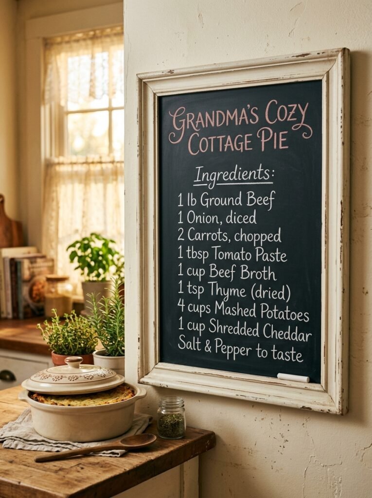
- Size/frame: medium 12×16-inch chalkboard, distressed antique-white frame
- Design concept: a single family recipe — a grandmother’s stuffing, a specific pie — hand-lettered in full, formatted like an old recipe card
- Function: decorative and personal, a sentimental display piece rather than a practical station sign
- Color approach: white chalk for the ingredient list, one soft dusty-rose chalk marker for the recipe title only
- Placement: kitchen wall near the actual dish it references, or propped on a shelf beside the serving dish itself
- Integration: the most personal, story-driven board in the list, standing apart from every functional or purely botanical piece above by centering a specific family history rather than general gratitude or menu information
- Technique tip: write the title first in the accent color and let it fully dry or set before starting the ingredient list beneath it, so your hand doesn’t drag through fresh marker while working down the board
- Construction detail: for a board displayed permanently in a kitchen near cooking heat and steam, my husband recommends keeping it at least a foot from the stovetop — repeated heat exposure can warp a wood frame over several seasons
Why this works: Displaying a handwritten family recipe as kitchen decor preserves it in a genuinely more durable, visible format than a recipe box or a phone note, both of which are easy to lose or forget to reference.
This is the board I made the year my grandmother’s stuffing recipe was still only written on a stained index card tucked in a drawer, and I wanted it somewhere I’d actually see it every Thanksgiving. Writing it out in full on a chalkboard turned a fragile piece of paper into something permanent and visible, and it’s become the one board every relative asks about specifically, because they recognize the recipe before they even finish reading the ingredient list. It’s less about design polish and more about the story the piece is quietly telling.
Format the list the way an old recipe card would — ingredients first, brief instructions beneath, nothing more elaborate than that. Dusty rose on the title alone, rather than throughout the whole board, keeps the piece from feeling like a printed graphic and lets it read as genuinely handwritten. This board works best left mostly still year to year rather than erased and redone, since its value comes from consistency and sentiment, not fresh seasonal styling.
Styling Principles: Decorative vs. Functional Chalkboards
The biggest mistake I see with Thanksgiving chalkboards is treating every single one like it needs to work hard. It doesn’t. A chalkboard only needs to be functional if it’s solving a real problem — otherwise, its job is purely visual, and that’s a completely valid job on its own. Before you start lettering, decide which category each board falls into, because the two types call for different design choices entirely.
Functional boards — menu signs, place cards, gravy station labels — need to prioritize legibility above everything else. Simple lettering, high contrast, short phrasing. A gorgeous illustrated border means nothing if a guest can’t read what side dish is coming next from across the room. Save your most elaborate lettering styles and illustrations for the decorative pieces, where the only job is to look beautiful.
Interactive boards need a third consideration: they have to invite participation without intimidating anyone. A completely blank board can feel like a test. A board with a clear shape to fill in — a tree, a short prompt, a few starter entries you write yourself — gives guests permission to jump in. In my experience, the interactive boards that actually get used are the ones that make the first move easy, not the ones that ask guests to generate an idea from nothing.
Finally, resist matching every board to the same exact palette. Real hosted spaces have some variation — a kids’ board that breaks all the color rules, a formal table-number set that’s more refined than everything else. That contrast is what makes a full house of chalkboard decor feel gathered over time rather than bought as a single matching kit.
Frequently Asked Questions
Should I use chalk or chalk markers for Thanksgiving chalkboard designs? Chalk markers give you more precise, vibrant lines and work best for detailed illustrations, metallic accents, and anything you want to photograph well, while traditional chalk is easier to erase and better suited for boards you’ll update daily, like a countdown or a rotating prompt.
How do I keep a gratitude board organized once a lot of guests start adding to it? Pre-draw faint guide lines with a light chalk pencil before guests arrive, and start the board yourself with two or three entries so new additions have a visual pattern to follow instead of drifting across open space.
What’s the easiest lettering style for a beginner to start with? A simple, consistent print style is easier to master than cursive script, since it doesn’t rely on connected strokes or precise spacing — sketch your layout lightly in chalk pencil first, then commit to your final lettering once the spacing looks right.
Do I need to buy expensive chalkboards to make these ideas work? No — small unframed slate boards and mini chalkboard easels are inexpensive and work just as well as large framed pieces for many of these ideas, particularly place cards, station signs, and table numbers.
How do I keep my chalkboard art from smudging during the meal? A light coat of chalkboard sealant or clear acrylic spray after your design has fully dried will keep chalk marker designs from smudging under handling, though it will also make the board harder to erase and reuse afterward.
Can I preserve a chalkboard design after Thanksgiving is over? Sealing the board is the most reliable way to preserve a design long-term, but if you’d rather reuse the board, take a well-lit photo of the finished piece before erasing it so you still have a record of the design.
Conclusion
A great Thanksgiving table isn’t just set — it’s thoughtfully layered, and chalkboards are one of the easiest ways to add that layer without much cost or effort. Whether you go for a fully interactive gratitude tree, a practical menu board, or a quiet quote tucked in the guest bathroom, these Thanksgiving chalkboard ideas give you real options for function and beauty, not just decoration for decoration’s sake.
I’ve seen how much a small handwritten detail changes the feel of a hosted holiday — guests notice it, they interact with it, and it becomes part of the memory of the day.
Pick one or two ideas from this list to try this year, save this post to your Thanksgiving board on Pinterest, and pass it along to anyone else hosting this season. Small, intentional details like these are what make a gathering feel truly personal.