15 Jewel Tone Bedroom Ideas That Feel Rich
Most people think jewel tones are risky in a bedroom. They’re actually one of the safest saturated-color choices you can make.
Here’s why: jewel tone bedroom ideas work because jewel tones share a similar depth of saturation, even when they sit on opposite sides of the color wheel. Sapphire and topaz look nothing alike, but they’re matched in intensity — which is exactly what lets them sit together in one room without clashing the way two primary colors would.
A room built from colors of matching saturation will always read as intentional, even when the hues themselves are bold.
I noticed this firsthand repainting a client’s guest room in Austin — pairing deep amethyst with warm brass felt more cohesive than the “safe” gray palette it replaced. This post breaks down exactly which jewel tones pair well, which metals complement them, and how to combine more than one confidently — something most roundups never actually explain.
1. Citrine & Espresso — A Jewel Tone Bedroom Idea
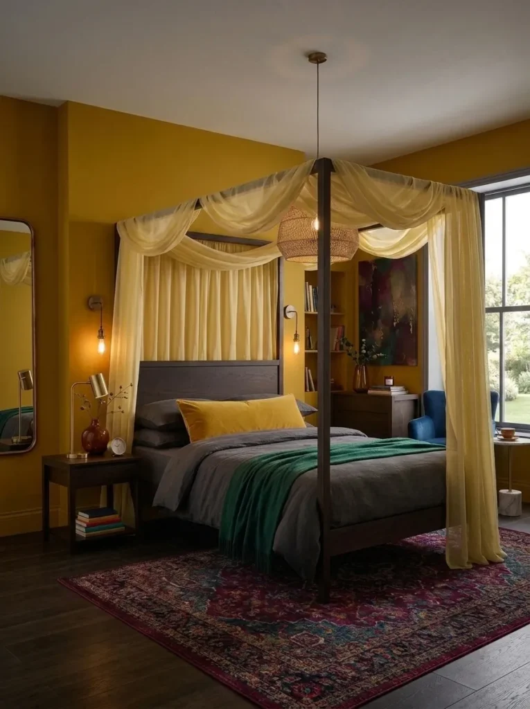
- Deep citrine gold walls, warmer and more saturated than topaz, closer to true amber-yellow
- Espresso wood four-poster bed frame with slim, tapered posts
- Charcoal linen bedding to ground the warmth of the walls
- Aged bronze sconces mounted low on either side of the headboard
- A woven jute pendant shade layered above for texture and softness
Why this works: Citrine is one of the rare jewel tones warm enough to feel cozy even at full saturation, making it a strong choice for bedrooms that get limited natural light.
Citrine reads differently than topaz — less amber, more true gold, with an intensity that can feel almost sunlit even in a north-facing room. That warmth is exactly what makes it work at full wall coverage in a way a cooler jewel tone couldn’t; instead of feeling closed in, a citrine room tends to feel lit from within. Espresso wood furniture, rather than the lighter walnut used elsewhere, deepens the palette instead of contrasting against it, letting the whole room read as one cohesive, saturated statement. Charcoal linen bedding keeps the warmth from tipping into anything overly bright or nursery-adjacent.
In my experience, citrine gets overlooked because people associate yellow with pastel, cheerful spaces rather than something moody or grown-up. At this depth of saturation, though, it behaves entirely differently — rich, warm, and surprisingly calming once the lighting is right. Aged bronze sconces mounted low, rather than a central overhead fixture, keep the light source close to eye level, which flatters citrine’s warmth far better than a bright ceiling light ever could.
2. Amethyst Velvet Nook
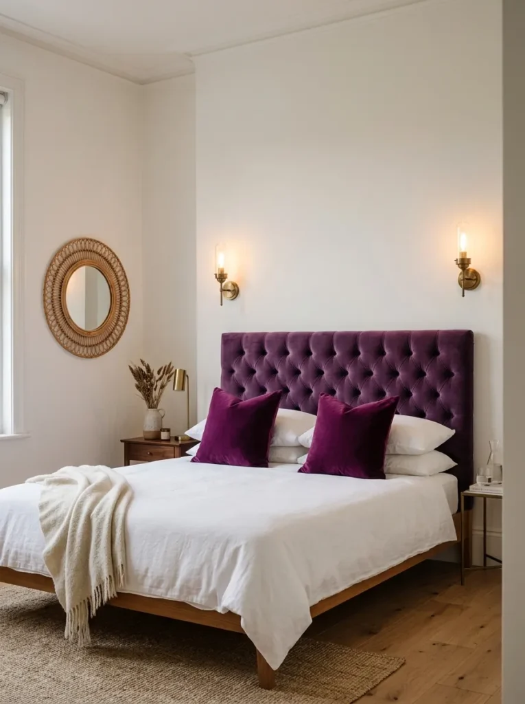
- A tufted amethyst velvet headboard becomes the room’s single statement piece
- Warm white walls keep the surrounding space quiet so the headboard can lead
- Antique brass sconces mounted directly above the bed replace bulky table lamps
- A round rattan mirror adds organic texture against all the velvet
- Deep plum throw pillows tie the color story together without repeating it
Why this works: One saturated statement piece surrounded by quiet neutrals lets a bold jewel tone anchor a room without overwhelming it.
I painted my own guest room a soft warm white specifically so I could bring in an amethyst velvet headboard without it competing with anything else. That was the moment I really understood restraint with jewel tones — you don’t need four saturated elements to make a room feel rich, you need one done exceptionally well. The velvet alone carries the entire mood, from the way it catches afternoon light to how it deepens almost to black by evening. Everything else in the room, from bedding to trim, exists purely to support that one piece.
Antique brass works particularly well against amethyst because both colors share a similar warmth underneath their surface tone, even though purple reads as cool at first glance. Mounting the sconces directly on the wall above the headboard, instead of using freestanding lamps, keeps the nightstands clear and the whole vignette feeling architectural rather than assembled. A round rattan mirror on the opposite wall softens the velvet’s formality with something more relaxed and textural. The combination feels curated without feeling precious, which is exactly the balance a jewel-toned bedroom decor scheme needs to avoid looking like a showroom.
You’ll Also Love:18 Whimsical Bedroom Ideas for Adults with Dreamy Charm
3. Topaz & Plum Layers
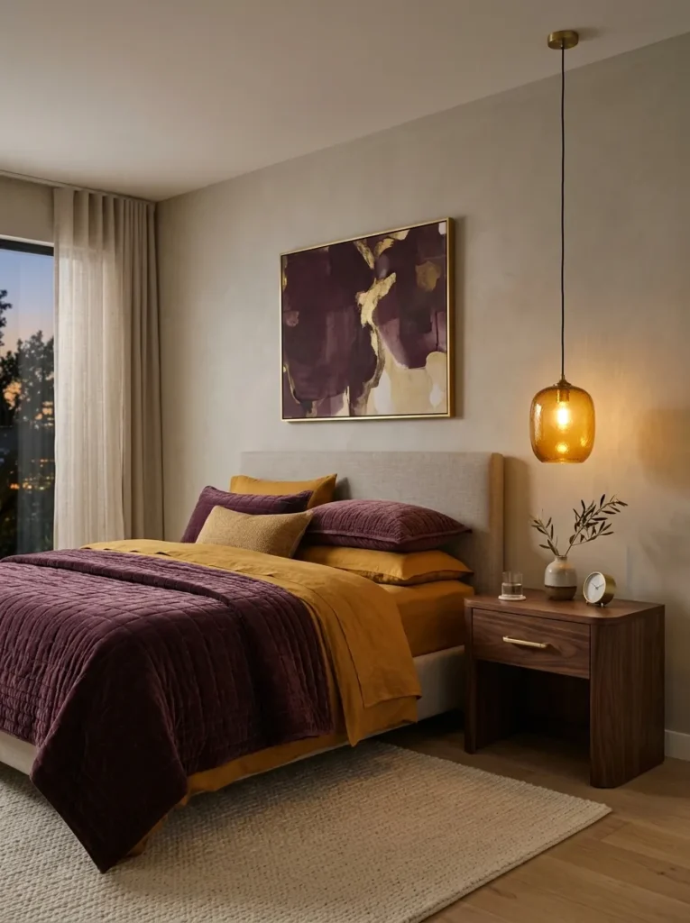
- Topaz gold bedding layered under a deep plum quilted coverlet
- Walls painted a warm greige let both tones stand out equally
- A curved walnut nightstand keeps the furniture silhouette current
- An amber glass pendant light replaces a traditional overhead fixture
- Brass drawer pulls carry the warm metal tone throughout the room
Why this works: Combining two jewel tones of similar warmth, like topaz and plum, lets a room feel layered rather than matchy or accidental.
Topaz and plum sit close enough in warmth that they read as intentionally paired rather than randomly combined, even though they’re technically two distinct jewel tones. This is the detail most single-color bedroom guides skip entirely: color pairing isn’t really about matching hue, it’s about matching undertone. A gold-based topaz and a red-based plum both carry warmth, so layering them together, rather than choosing one, creates depth without visual conflict. This is where gemstone color palette bedroom design earns its name — the tones genuinely interact the way stones do when set side by side in jewelry.
Amber glass pendant lighting does something a standard overhead fixture can’t in a room like this — it tints the light itself, so the warm tones in the walls and bedding glow rather than sit flat. My husband, who’s worked on plenty of older Austin homes over the years, always points out that warm-toned rooms live very differently depending on bulb temperature alone. A soft warm bulb, somewhere around 2700K, keeps topaz and plum from turning muddy after dark. It’s a small detail that makes a real difference in how the whole room feels once the sun goes down.
4. Garnet Accent Wall Nook
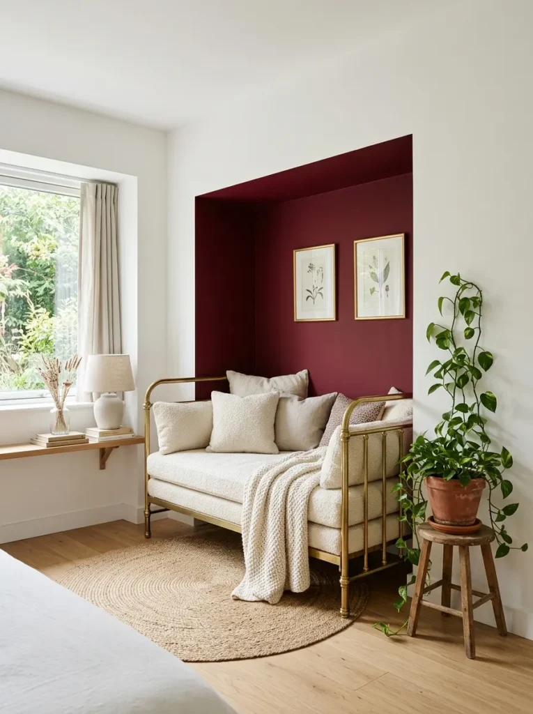
- Crisp white walls throughout, with one nook painted deep garnet as a contained accent
- A brass daybed frame sits inside the garnet nook, creating a defined reading corner
- Cream boucle cushions soften the depth of the garnet behind them
- Woven jute rug underfoot keeps the space grounded and casual
- Trailing pothos in a terracotta pot softens the corner’s hard edges
Why this works: Containing a saturated jewel tone to one wall or nook lets smaller bedrooms use bold color without it overwhelming the whole room.
Garnet is one of the richer, more red-adjacent jewel tones, which makes it a color best used with restraint rather than across four walls. Painting it into a single defined nook — rather than the entire room — gives you all the visual impact of a saturated jewel tone while keeping the rest of the space light, bright, and easy to live in. This approach works especially well in bedrooms with limited natural light, where a fully dark room can start to feel closed in rather than cozy. It’s a practical way to try jewel tone bedroom ideas without committing to a full repaint.
Plants do more work in a room like this than people expect. As someone with a background in plant science, I always tell readers that a trailing pothos or philodendron softens hard architectural lines in a way that furniture alone can’t replicate. Against a deep garnet wall, the green foliage reads almost like a natural accent color, even without being the room’s focus. It’s an easy, low-cost way to finish a nook like this and keep it feeling alive rather than static.
5. Bronze Amber Nightscape
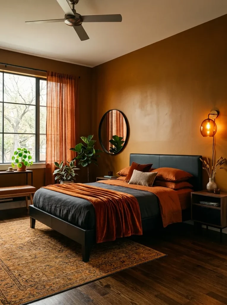
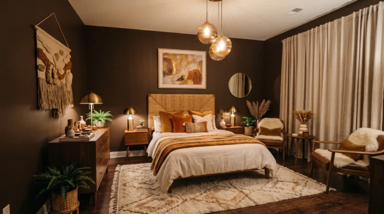
- Deep amber-brown walls, darker and more bronzed than citrine, almost molten in low light
- Matte black bed frame with a wide, low headboard
- Burnt orange velvet throw folded at the foot of the bed
- A single amber glass sconce mounted asymmetrically above the nightstand
- Aged leather bench in deep cognac at the window
Why this works: A bronzed amber wall color absorbs light differently than a flat brown, giving the room a warm glow even with minimal lighting.
Amber at this depth moves past yellow entirely and into something closer to bronze — a color that shifts noticeably depending on the light hitting it, glowing warm in the evening and reading almost chocolate-brown in shadow. That range is part of what makes it such an underused jewel tone in bedroom design; most guides treat amber as a bright accent color rather than a wall-worthy saturated hue. A matte black bed frame with a wide, low headboard keeps the furniture from competing with the wall’s shifting tone, letting the color itself do the visual work.
I’ve noticed that asymmetrical lighting placement — one sconce, off-center, rather than a matched pair — actually suits a room this warm better than symmetry does. It creates natural shadow and depth instead of flattening the wall evenly, which matters when the whole point of amber is how it changes throughout the day. A cognac leather bench near the window picks up the same warmth without repeating it exactly, and a folded burnt orange throw adds one final layer of richness at the foot of the bed.
6. Teal & Warm Brass
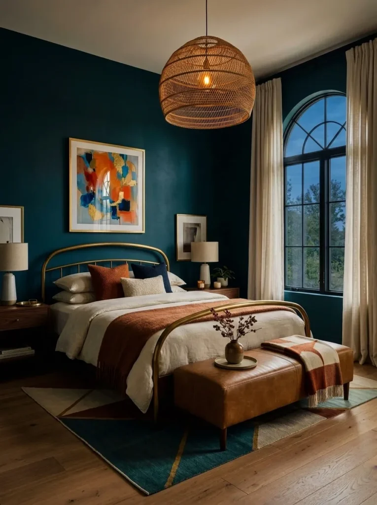
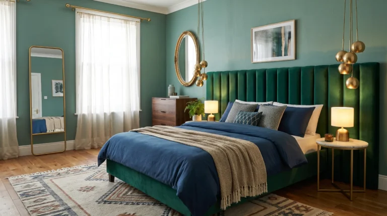
- Deep teal walls in a soft matte finish, avoiding anything glossy or cold
- Warm brass bed frame with a curved, organic silhouette
- Camel leather bench at the foot of the bed for textural contrast
- Linen drapery in a warm ivory softens the teal’s coolness
- A single oversized woven pendant light replaces a traditional chandelier
Why this works: Teal reads as one of the more versatile jewel tones because it sits between blue and green, letting it pair with both warm and cool metals.
Teal occupies an unusual place among jewel tones — it’s cool enough to feel calming, but it carries just enough green undertone to soften into warmer pairings, unlike a true sapphire blue. That flexibility is why it works so well with brass here instead of the cooler nickel or chrome you’d typically reach for with blue-based colors. A matte finish on the walls matters more than people think in a room this saturated; anything glossy would bounce light unpredictably and make the teal feel colder than intended. Matte keeps the color rich without tipping into cold or clinical.
My husband’s crew has painted enough accent walls over the years for him to have a strong opinion on sheen, and he’s right that eggshell or matte almost always outperforms satin in a deeply saturated color like this. Camel leather and warm ivory linen bring in just enough warmth to keep teal from reading as sterile, while the woven pendant overhead softens the whole room’s silhouette. It’s a jewel tone bedroom that feels current, textural, and genuinely livable rather than staged.
7. Midnight Amethyst Drama
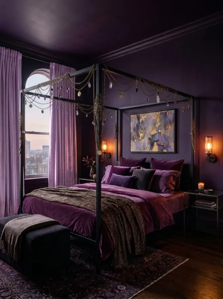
- Near-black amethyst walls, deep enough to read as charcoal-purple in daylight
- Black steel four-poster bed frame with slim, minimal lines
- Deep plum velvet bedding layered with a single dark bronze throw
- Low, warm-toned wall sconces instead of any overhead lighting
- Smoked glass nightstands that nearly disappear against the dark walls
Why this works: A near-black jewel tone reads as dramatic rather than gloomy when every light source in the room is warm and low.
This is jewel tone decor taken to its most saturated extreme — walls dark enough that amethyst almost reads as black until direct light hits them, then the purple undertone reveals itself completely. Rooms this dark live or die by their lighting plan. Overhead lighting flattens a color this deep and makes it feel like a mistake instead of a mood. Low sconces and warm bulbs do the opposite, catching just enough of the wall’s surface to keep the purple alive after sunset. It’s not a color scheme for someone chasing brightness — it’s for someone who wants their bedroom to feel like a retreat at the end of the day.
In my experience, the biggest hesitation people have with a room this dark isn’t the color itself, it’s the fear that it’ll feel small. The opposite tends to happen when the trim, ceiling, and wall are all painted the same near-black amethyst — the room loses its edges instead of shrinking. A black steel bed frame with slim lines keeps the furniture from adding visual bulk, and smoked glass nightstands nearly vanish against the walls, letting the color itself carry the whole room.
8. Sapphire Noir
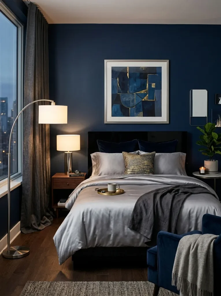
- Deep navy-sapphire walls with a slight sheen, almost ink-like at night
- Black lacquered headboard with a low, wide profile
- Silver-gray silk bedding for a cool, reflective contrast
- A single brushed chrome floor lamp angled toward the reading side of the bed
- Charcoal linen drapery pooling slightly on the floor for weight
Why this works: A slight sheen on a dark saturated wall catches available light instead of absorbing it completely, keeping a very dark room from feeling flat.
Most advice about dark paint pushes people toward matte finishes, but sapphire this deep actually benefits from a soft eggshell sheen. It catches whatever light does enter the room — a passing headlight, a lamp across the space — and keeps the wall feeling alive instead of like a flat void. This is a genuinely moody, nighttime-leaning version of jewel tone bedroom ideas, built for people who want their bedroom to feel like a retreat rather than a bright, airy space. Silver-gray silk bedding reflects just enough light to keep the whole room from reading as one solid block of navy.
I’ve noticed that a lot of dark bedrooms fail not because of the wall color but because of what’s layered on top of it — too much pattern, too many finishes competing for attention. This room works because everything stays deliberately quiet: one metal finish, one fabric texture, one light source. Charcoal linen drapery pooling on the floor adds weight and softness without introducing a second color story, keeping the whole space feeling intentional rather than assembled.
9. Garnet & Black Iron
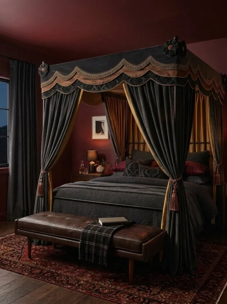
- Deep garnet walls with a matte finish, verging on oxblood in low light
- Black iron canopy bed frame with slim, architectural lines
- Charcoal bouclé bedding for texture against the smooth walls
- A single amber-toned bulb in an exposed black sconce
- Aged leather bench in deep espresso at the foot of the bed
Why this works: Pairing a warm, dark jewel tone with matte black iron keeps a saturated room from tipping into anything ornate or dated.
Garnet is one of the darkest, most red-leaning jewel tones, and at full wall coverage it can start to feel heavy without the right furniture to balance it. Black iron does that work here — its slim, architectural lines keep the room feeling current rather than like a Victorian study, which is the trap a lot of deep red-toned rooms fall into. This is the kind of jewel tone bedroom decor that photographs beautifully in low light specifically because the color and the metal share the same restrained, almost graphic quality. Nothing about it reads as fussy.
My husband always points out that matte finishes hide imperfections in older plaster walls far better than anything with sheen, which matters if you’re working with an older Austin home like a lot of our clients are. A matte garnet wall forgives small texture inconsistencies that a glossier finish would highlight under lamp light. Charcoal bouclé bedding and an aged espresso leather bench add just enough textural variation to keep the dark palette from feeling like one flat surface.
10. Magenta & Copper Botanicals
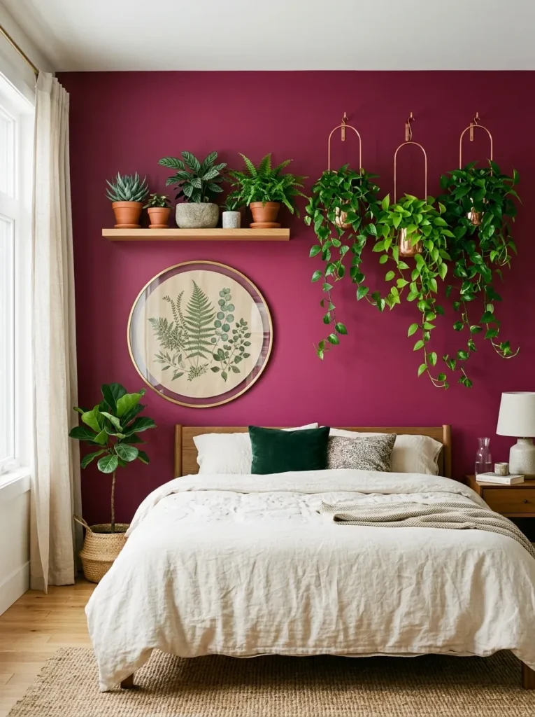
- Deep matte magenta wall as the backdrop behind the bed
- Copper plant hangers holding trailing pothos and ferns at staggered heights
- A round botanical print in a slim brass frame beside the headboard
- Cream linen bedding to soften the intensity of the wall color
- Terracotta and raw stone planters grouped on a floating shelf
Why this works: Magenta is one of the most underused jewel tones in bedroom design, and trailing greenery keeps its intensity feeling alive rather than overwhelming.
Magenta rarely gets used at full saturation because most people only picture it as pink. At its deepest, though, it behaves like a cooler, more sophisticated cousin of ruby — vivid, confident, and easier to live with than expected once warm metal and greenery are layered in. Copper, rather than the brass used elsewhere in this palette, echoes magenta’s cooler undertone instead of fighting it, a pairing most jewel tone bedroom ideas skip entirely. The result reads as bold but never garish, especially once trailing plants soften the wall’s edges.
As someone who came to decorating through plant science, I treat greenery as part of the color palette, not an afterthought. In a magenta room, trailing pothos acts almost like a visual palate cleanser, its cool green undertone cutting through all that saturated pink-purple. Grouping terracotta and raw stone planters at different heights on one floating shelf creates real depth — far more than a single potted plant on a nightstand ever manages. It’s a small styling shift that consistently photographs better than anything store-bought.
11. Indigo Gallery Wall
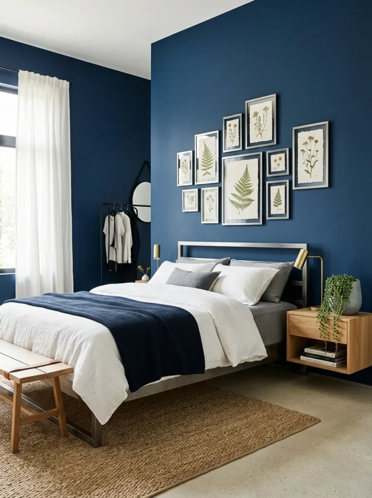
- Deep indigo walls, cooler and darker than sapphire, closer to twilight
- A small gallery wall of framed pressed botanicals in mismatched pewter frames
- Brushed pewter bed frame with slim, rounded legs
- Dove gray bouclé throw folded at the foot of the bed
- A single trailing string-of-pearls plant in a matte ceramic pot
Why this works: A gallery wall of botanical prints gives a saturated indigo room a personal, collected feel instead of looking like a single styled purchase.
Indigo sits just past sapphire on the color wheel, deep enough to feel almost twilight-toned rather than simply blue. Most jewel-toned bedroom decor treats wall art as an afterthought — one large piece, centered, done. A gallery wall of pressed botanical prints does more work here, breaking up the indigo’s intensity with texture and white space instead of one more block of solid color. Mismatched pewter frames keep it from looking too curated, which matters in a room this saturated; anything overly polished starts to feel like a showroom rather than a bedroom.
I’ve noticed that gallery walls get overlooked in bold color schemes because people assume dark walls need to stay simple. The opposite is often true — a dark wall is actually the best backdrop for framed art, since the color recedes and lets the frames stand out clearly. A trailing string-of-pearls plant in a matte ceramic pot adds one final organic note, its pale beaded leaves catching light against all that deep indigo in a way no other plant quite replicates.
12. Amber & Amethyst Botanical Nook
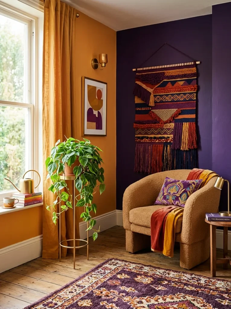
- Warm amber accent wall paired with a deep amethyst reading nook in the corner
- A woven wall hanging in rust and plum tones above the reading chair
- Brushed gold plant stand holding a trailing philodendron beside the chair
- Camel bouclé armchair with a curved, low-profile silhouette
- Small brass watering can left visibly on the windowsill as a styling detail
Why this works: Splitting a room into two distinct jewel-toned zones — one warm, one cool — gives a bedroom two moods without needing two rooms.
This is one of the more unexpected ways to combine jewel tones: rather than blending amber and amethyst across the same wall, each color gets its own defined zone. The sleeping area stays warm and amber-toned, while a corner nook shifts into deep amethyst, creating a natural transition point in the room instead of one continuous color story. A woven wall hanging in rust and plum ties both zones together visually without repeating either wall color exactly. It’s a layout that works especially well in slightly larger bedrooms with a genuine corner to dedicate to reading or plant styling.
I’ve styled a nook almost identical to this one for a client who wanted her bedroom to feel like two different times of day depending on where she was sitting. A trailing philodendron on a brushed gold stand does a lot of that work, its glossy leaves catching amber light in the morning and reading almost black against amethyst by evening. Leaving a small brass watering can visibly on the windowsill sounds minor, but it signals a lived-in, cared-for space rather than a staged one.
13. Peacock Depths
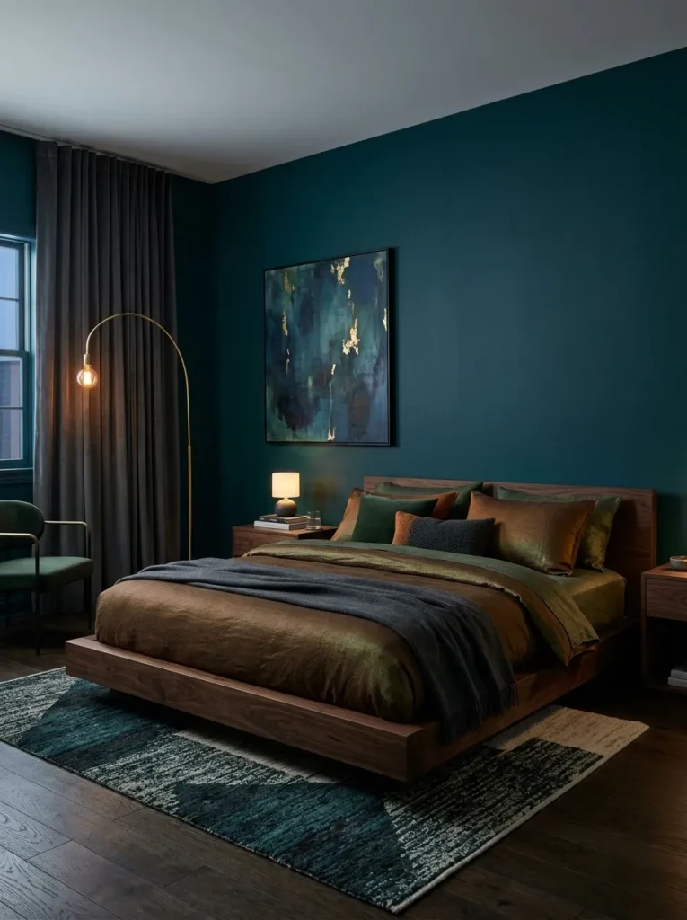
- Deep peacock blue-green walls, richer and more saturated than teal, closer to true jewel intensity
- Black walnut bed frame with a low, streamlined profile
- Emerald-adjacent bronze bedding, catching green undertones without being green itself
- A single oversized brass arc lamp casting warm light over the headboard
- Charcoal velvet drapery pooling on the floor for added depth
Why this works: Peacock sits at the most saturated point between blue and green, giving it a natural depth that reads as luxurious rather than simply dark.
Peacock is often confused with teal, but it carries far more intensity — less gray, more true saturation, which is exactly what makes it feel dramatic rather than muted. At full wall coverage, it needs a furniture silhouette that won’t compete with it, which is why black walnut works so well here; its low, streamlined shape stays quiet against all that color. This is a genuinely different mood from the softer teal room earlier in this list, proving how much range exists within cooler jewel tones alone. Bronze bedding with subtle green undertones keeps the palette cohesive without introducing an entirely new hue.
I’ve noticed that peacock-toned rooms tend to feel best in the evening, once the brass arc lamp is the only real light source. During the day, this color can read almost black in shadowed corners, then shift into full jewel intensity the moment warm light hits it directly. Charcoal velvet drapery adds weight without competing for attention, letting the wall color remain the clear focal point of the entire room.
14. Aubergine & Gunmetal
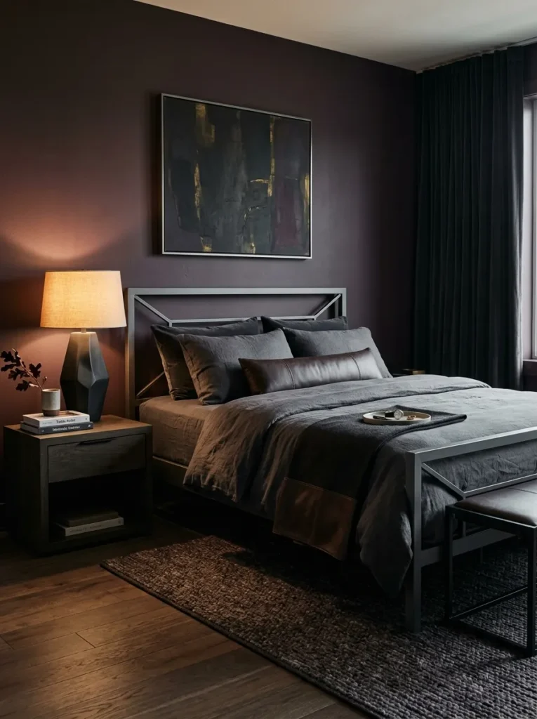
- Deep aubergine walls, a purple-brown jewel tone distinct from amethyst’s cooler violet
- Gunmetal gray bed frame with sharp, architectural angles
- Espresso leather bedding accents against soft charcoal linen sheets
- A single sculptural black ceramic lamp with no visible shade
- Dark smoked oak flooring to keep the whole room in one tonal family
Why this works: Aubergine reads as warmer and more grounded than amethyst, making it a jewel tone that feels less overtly “purple” and more sophisticated in a bedroom setting.
Aubergine sits closer to eggplant than lavender, carrying a brown undertone that most people don’t associate with jewel tones at all. That’s exactly what makes it useful here — it delivers the same saturated depth as amethyst or plum without reading as obviously purple, which can feel like a more approachable entry point for someone hesitant about bold color. Gunmetal gray, rather than the softer pewter or nickel used elsewhere, adds sharp architectural weight that suits aubergine’s grounded, almost earthy quality. Nothing about this combination feels precious or overly styled.
My husband has pointed out more than once that dark, tonal rooms like this one actually make small bedrooms feel larger, not smaller, because the eye stops registering where the walls end and the furniture begins. Keeping the flooring in the same smoked oak family as the walls reinforces that effect here. Espresso leather accents against charcoal linen add just enough texture variation to keep the room from feeling like one flat surface, without introducing a single additional color.
15. Golden Ochre & Onyx Botanicals
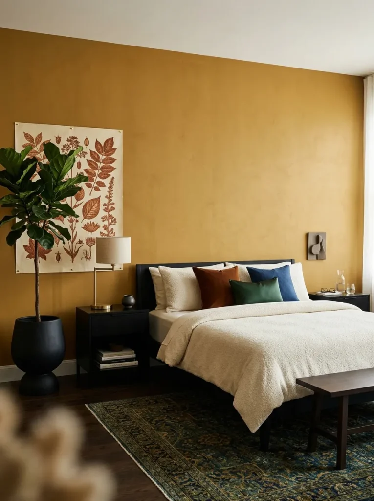
- Deep golden ochre walls, more muted and earthy than citrine, closer to aged mustard
- Onyx black nightstands with a sleek, minimal profile
- Cream boucle bedding to lighten the earthiness of the walls
- A trailing fiddle leaf fig in a tall matte black planter in the corner
- A large abstract botanical print in warm sienna tones, unframed and pinned flat to the wall
Why this works: Muted ochre reads as sophisticated rather than rustic when paired with sharp black accents and clean, minimal styling.
Golden ochre sits apart from the brighter citrine and bronzed amber used elsewhere in this list — it’s dustier, more muted, closer to an aged mustard than a true gold. That muted quality is what keeps it from feeling overly warm or cottage-adjacent; paired with sleek onyx black furniture, it reads as considered and current instead of rustic. This is one of the more architectural jewel tone combinations in this post, built around sharp contrast rather than layered warmth. Cream bouclé bedding softens the pairing just enough to keep the room feeling like a bedroom rather than a gallery.
A tall fiddle leaf fig does most of the styling work in the corner of this room, its large, structured leaves echoing the sharp lines of the onyx furniture rather than softening them the way trailing plants do elsewhere in this list. Pinning a large botanical print flat to the wall, unframed, keeps the room feeling modern and slightly unexpected. It’s a detail most bedrooms skip entirely, and it’s exactly the kind of small choice that makes a saturated jewel-toned room feel current rather than dated.
Styling Principles: How to Use Jewel Tones With Confidence
The biggest mistake people make with jewel tone bedroom ideas isn’t choosing the wrong color — it’s assuming only one jewel tone can appear in a room at a time. In reality, jewel tones combine well precisely because they share a similar depth of saturation, even across very different hues.
Two jewel tones will almost always pair successfully if they’re matched in saturation, regardless of where they sit on the color wheel.
The real skill is in metal pairing: cooler jewel tones like sapphire, amethyst, and indigo read best against nickel, chrome, or pewter, while warmer tones like citrine, amber, garnet, and topaz come alive next to brass, copper, or bronze. Keeping furniture silhouettes clean and modern — curved edges, slim frames, minimal ornamentation — is what keeps a saturated room feeling like 2026, not a decade-old mood board.
Frequently Asked Questions About Jewel Tone Bedroom Ideas
Can you mix multiple jewel tones in one bedroom? Yes — as long as the tones are similar in saturation, they’ll read as intentional rather than clashing, even when they sit on opposite sides of the color wheel.
What metal accents work best with jewel tones? Cool jewel tones like sapphire and amethyst pair best with silver, chrome, or nickel, while warm jewel tones like garnet, citrine, and amber pair best with brass, copper, or bronze.
Is jewel tone decor too bold for a small bedroom? Not if it’s contained. Painting one accent wall or a single nook in a saturated jewel tone, rather than the entire room, gives smaller spaces the same visual impact without feeling closed in.
What’s a budget-friendly way to try jewel tone bedroom decor? Start with textiles — a velvet throw, a set of jewel-toned pillows, or a single piece of framed botanical art — before committing to a full paint job.
What’s the best lighting for saturated jewel tone walls? Warm, low-placed lighting, like wall sconces near eye level, brings out richness in a dark jewel tone far better than a single bright overhead fixture.
Does jewel tone decor feel dated, or is it still current? Jewel tones stay current when paired with clean-lined, curved modern furniture rather than ornate or heavily tufted pieces — the color can be bold while the silhouette stays restrained.
Conclusion
A bedroom doesn’t need to be loud to feel rich — it just needs color that’s chosen with intention. That’s the real thread running through every one of these jewel-tone bedroom ideas, whether it’s a single garnet accent wall or a full sapphire-and-amethyst duotone. I’ve seen firsthand how one well-placed velvet headboard or a trailing plant against a saturated wall can completely change how a room feels, day or night.
Pick one idea that speaks to you, try it in your own space, and save this post for when you’re ready to plan the rest. A little boldness, done thoughtfully, goes a long way.