15 Dark Green & Gold Bedroom Ideas Worth Stealing
There’s a moment when you walk into a dark green & gold bedroom done right, and it stops you mid-step. The color doesn’t feel heavy — it feels intentional, like the room was built around a mood instead of a shopping list. That’s the difference I’m chasing across all 15 of these ideas. I came to home decor through plant science, not design school, so my eye has always gone straight to color first — the way a deep bottle green shifts under morning light versus lamp light, the way one wrong gold finish can make an entire room look cheap. My husband runs a home construction company, and between his crew’s hands-on experience with paint, paneling, and lighting, and my own instinct for how color behaves in a real room, this list leans on more than just what looks good in a photo.
Each idea below pairs a specific shade of green with a specific gold application, so you can find the exact combination that fits your own space.
1. Pine & Antique Brass — A Dark Green & Gold Bedroom Idea
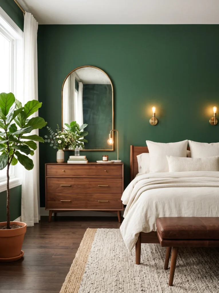
- Deep pine green walls in a matte or eggshell finish set the tone — never gloss, which shows every roller mark in a color this saturated
- Antique brass hardware on the dresser and door pulls instead of polished gold, which keeps the room from feeling like a hotel lobby
- A single arched mirror in the same antique brass ties the metal tone together without repeating it everywhere
- Warm bedding in ivory or oatmeal linen breaks up the density of the green
- A low, wide bench at the foot of the bed in chocolate brown leather adds an unexpected grounding note
Why this works: Antique brass has a soft, low-glare finish that reads as understated luxury against pine green, while polished gold in the same room tends to look showy instead of considered.
My husband has repainted more dark-walled bedrooms than either of us can count, and one thing he always flags is sheen. Eggshell on a color this deep hides imperfections and still gives you a soft glow under lamp light, while satin or gloss magnifies every dent and seam in the drywall. Pine green in particular can look almost black in a room with limited daylight, so getting the finish right matters more here than in a lighter palette. It’s a small decision that makes a noticeable difference once the paint actually dries.
Not all gold finishes behave the same way against dark green, and this is where a lot of rooms go wrong. Polished gold throws hard, bright reflections that can feel cold and almost commercial next to pine green’s warmth. Antique brass, by contrast, has a slightly matte, aged quality that absorbs light rather than bouncing it, which lets the green stay the star of the room. I’ve noticed that swapping just the hardware finish, without touching anything else, is often the single change that makes a green bedroom look intentional instead of accidental.
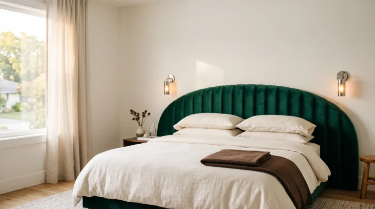
2. Bottle Green Lacquer Cove
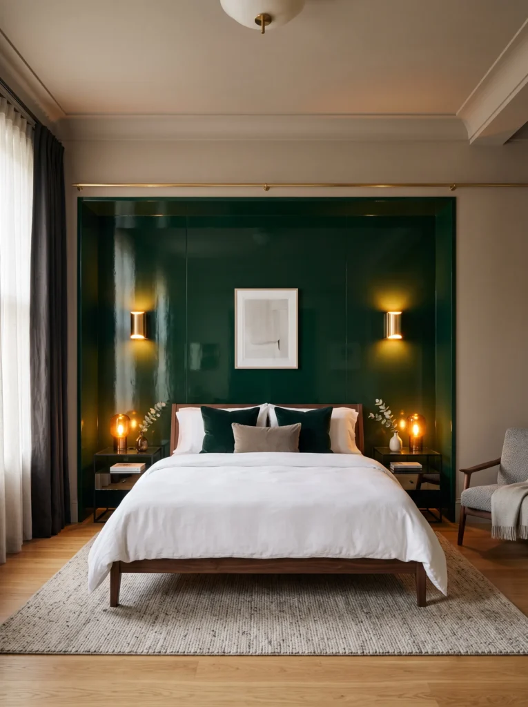
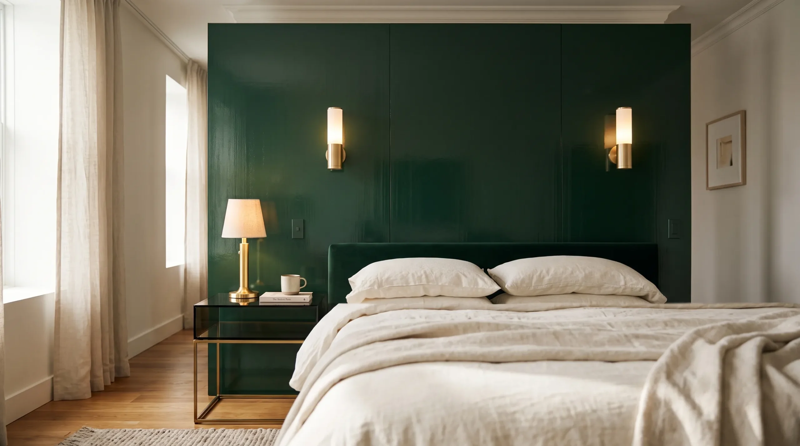
- A recessed cove behind the headboard, painted or lacquered in bottle green, creates depth without adding a single extra object to the room
- High-gloss lacquer on just that one wall section catches light differently than the surrounding matte walls, giving the space a layered, architectural feel
- Brushed gold sconces mounted directly on the lacquered surface instead of a table lamp, which keeps nightstands clear
- A slim brass picture rail traces the top edge of the cove, adding a hairline of gold without a single frame or mirror
- Smoked glass nightstands on either side reflect the lacquer’s shine back into the room
Why this works: Pairing one high-gloss surface against matte walls does more for a room’s sense of depth than adding more furniture ever could.
Lacquer is not a finish most people attempt on their own, and for good reason. It takes multiple thin coats with sanding between each layer, and any dust in the room shows up permanently once it cures. My husband’s crew treats lacquered accent walls the way they’d treat cabinetry — as a specialty finish, not a weekend paint job. Done well, though, bottle green lacquer behaves almost like glass, holding onto every bit of available light and throwing it back into the room. That’s what gives this kind of cove its quiet, expensive-looking presence.
Light temperature changes this idea completely. Under cool white bulbs, brushed gold sconces against bottle green lacquer can look almost silver, flattening the whole effect. Switch to warm 2700K bulbs, and the same fixtures pull gold and amber tones out of both the metal and the lacquer, making the cove glow instead of just reflect. This is one of those details that rarely gets mentioned, yet it’s the difference between a headboard wall that photographs beautifully and one that falls flat in person. Bulb temperature is decor, even if it never shows up on a shopping list.
You’ll Also Love: 15 Jewel Tone Bedroom Ideas That Feel Rich
3. Hunter Green Canopy
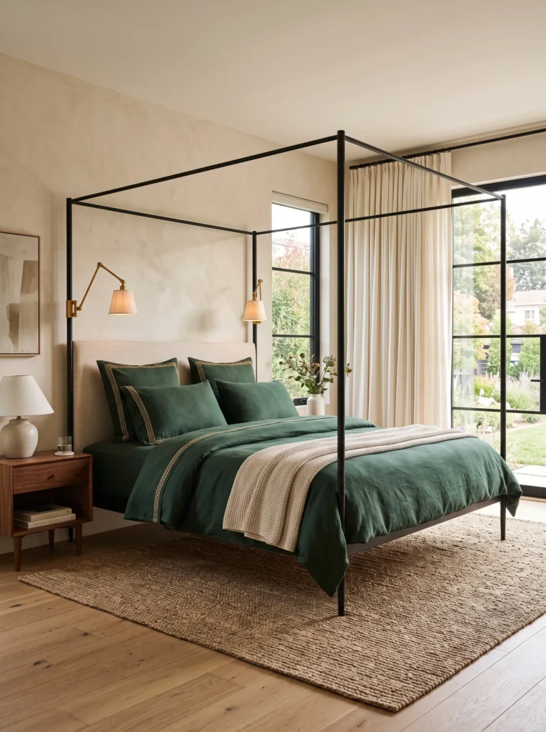
- A four-post canopy frame in blackened iron, left bare rather than draped, keeps the architecture visible instead of hidden under fabric
- Hunter green bedding with gold-threaded embroidery along the pillow edges brings the metallic detail into the textiles instead of the furniture
- A pair of brass reading sconces clipped directly to the canopy posts eliminates the need for nightstand lamps
- Ivory linen curtains hung loosely at the room’s window soften the iron frame’s angularity
- A woven jute rug underfoot keeps the room from feeling too formal
Why this works: Letting gold show up in stitching rather than hardware gives a canopy bed a lived-in richness that pure metal accents can’t replicate on their own.
I’ve always liked the idea of a canopy bed that doesn’t try too hard. This one skips the yards of draped fabric and lets the iron frame stand on its own against hunter green bedding, which feels more like something you’d find in an old Southern farmhouse than a showroom. The gold thread running along the pillow edges catches light in small flashes rather than one big statement, which keeps the whole look from tipping into costume territory. It’s a quieter kind of luxury, built from texture instead of shine.
Hunter green sits noticeably lighter and more olive-leaning than a true forest or bottle green, which makes it a forgiving choice for bedrooms that don’t get much natural daylight. Paired with blackened iron rather than warm wood tones, the palette reads as more architectural than cozy. That contrast between a cool-toned green and a warm gold thread detail is what keeps the room from feeling one-note. In my experience, mixing a slightly cooler green with warm metal accents almost always outperforms matching everything to the same temperature.
4. Forest Green Fluted Wall
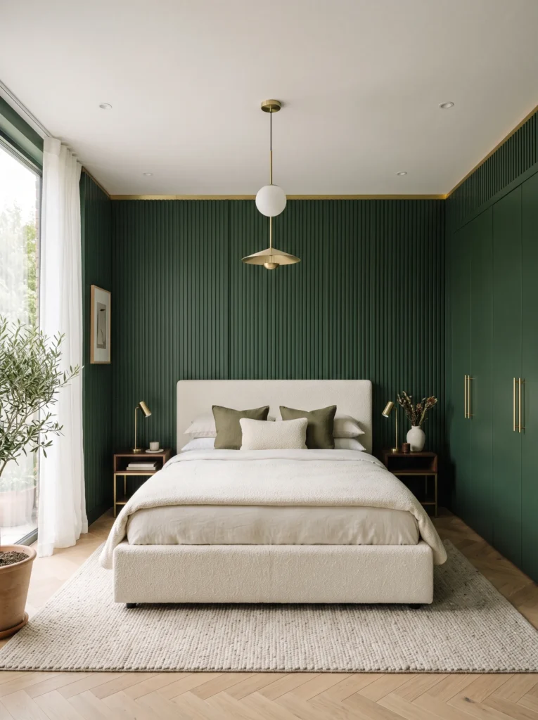
- Fluted wood paneling painted in forest green runs floor to ceiling behind the bed, adding vertical texture without a single extra accessory
- A slim brass strip inlaid where the paneling meets the ceiling defines the edge cleanly, almost like a shadow gap in reverse
- The bed frame itself is upholstered in ivory bouclé, which keeps the overall look soft rather than severe
- Gold hardware appears only on the closet doors, kept minimal and low-profile rather than ornate
- Everything else in the room stays intentionally empty — no gallery wall, no layered rugs, just the paneling doing the work
Why this works: Vertical fluting reads as architecture rather than decoration, which is what gives a dark green room its modern, gallery-like calm.
Fluted paneling has become one of the most requested details my husband’s crew installs, and forest green is by far the most popular color choice for it. The vertical grooves catch light in narrow bands, so even a single fixed lamp creates subtle movement across the wall throughout the day. Forest green sits between the coolness of hunter and the depth of bottle green, which makes it especially good at looking crisp rather than heavy. Paired with ivory bouclé, the whole wall feels architectural instead of decorative, which is exactly the modern effect most people are chasing.
A room this pared-back lives or dies on restraint, and that’s harder than it sounds. The instinct is to add a mirror, a piece of art, maybe a plant, but every extra object competes with the fluting’s clean lines. I’ve noticed that clients who trust the paneling to be the statement, and stop there, end up with rooms that photograph like something out of a design magazine. The single brass inlay strip is doing more visual work than a dozen small accessories would, precisely because it’s the only metal detail in the entire wall.
You’ll Also Love: 15 Cherry Red Bedroom Ideas Worth Stealing
5. Deep Teal-Green Minimalist Suite
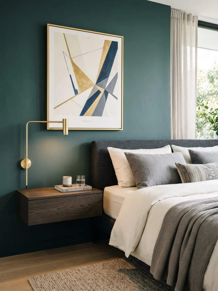
- Walls in a deep teal-green painted in a low-sheen matte finish give the room a cool, almost aquatic depth rather than a traditional garden green
- A floating nightstand in smoked oak, mounted rather than freestanding, keeps the floor line uninterrupted
- A single brass-framed piece of abstract art hangs above the nightstand instead of a mirror, breaking from the expected gold-mirror formula entirely
- Bedding stays entirely in ivory and warm gray, letting the wall color and the art carry all the saturation
- A polished gold reading lamp with a slim silhouette sits on the nightstand as the only other metal element in the room
Why this works: Choosing framed art over a mirror in the gold accent spot avoids the most overused pairing in green-and-gold bedrooms and gives the wall more personality.
Teal-green is often overlooked in bedroom design because people assume it will feel cold, but the opposite tends to be true when it’s balanced with warm metal and neutral textiles. This shade sits further from true green than any other color in this list, leaning into blue without losing its garden-inspired root. That subtle shift makes it a strong choice for bedrooms with south-facing windows, where warm daylight can otherwise wash out a true forest green. Paired with a single brass-framed art piece, the wall gains a focal point that feels curated rather than expected.
Polished gold gets a bad reputation in dark, moody rooms, but it works beautifully here because everything else in the space is so quiet. One polished fixture against a matte, low-saturation wall does not compete with anything, so it reads as a deliberate flash of shine rather than clutter. In my experience, the mistake most people make is scattering three or four gold pieces around a room and diluting all of them. A single polished lamp, in a room this restrained, ends up doing more visual work than a whole suite of matching hardware ever could.
6. Aged Brass Inlay Headboard
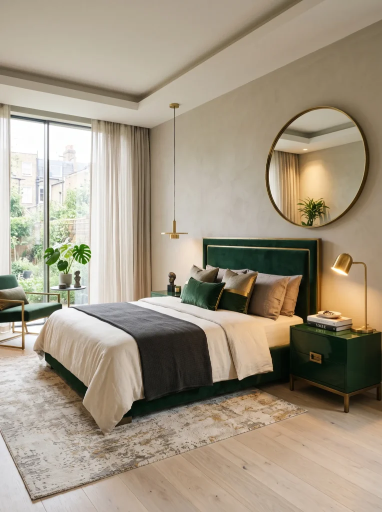
- A custom upholstered headboard in dark bottle green velvet features a thin aged brass inlay tracing its outer edge, like a picture frame built into the furniture itself
- The headboard sits low and wide, almost bench-like, which gives the room a more contemporary silhouette than a tall traditional headboard
- Nightstands in a matching bottle green lacquer pick up the same tone without repeating the velvet texture
- A single oversized round mirror in aged brass, offset to one side rather than centered, breaks the room’s symmetry on purpose
- Floors stay pale — either bleached oak or a light stone-look tile — to keep the dark green from making the room feel closed in
Why this works: An inlay detail built directly into the furniture, rather than added as a separate accessory, gives a room a custom, tailored feel that store-bought pieces rarely achieve.
This idea came out of a conversation with an upholsterer my husband’s company works with regularly, who pointed out that inlay detailing is far more common in high-end furniture than most people realize. It is not the kind of thing you can bolt onto an existing headboard as an afterthought. The brass strip has to be set into the frame during construction, which is part of why custom pieces like this carry a higher price tag than mass-produced alternatives. The payoff, though, is a headboard that looks tailored rather than assembled, with a level of finish that separates it instantly from anything found on a big-box showroom floor.
Offsetting the mirror rather than centering it is a small decision with an outsized effect. Centered symmetry reads as expected and a little formal, while an off-center placement gives the eye somewhere specific to land first. Aged brass, unlike brighter gold tones, has a slightly uneven, hand-finished quality that suits this kind of asymmetry particularly well. I’ve seen this pairing work in several bedrooms now, and it consistently photographs better than a matched, centered arrangement, largely because it feels like a considered choice rather than a default one.
7. Racing Green Panel Wall
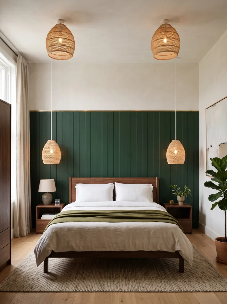
- Wood panel moulding painted in racing green covers the lower two-thirds of the wall, with a lighter plaster finish above it, splitting the room into two distinct zones
- A slim brass reveal strip runs along the top edge of the paneling, marking the transition instead of leaving it as a raw paint line
- The bed frame is a low platform in dark walnut, chosen so it doesn’t compete with the paneling’s horizontal lines
- Gold appears again in the drawer pulls on a single freestanding chest, kept sparse rather than scattered across multiple pieces
- A pair of woven rattan pendant lights, rather than a chandelier, keeps the ceiling light and airy
Why this works: Splitting a wall into two finishes lowers the visual weight of a dark color without losing any of its richness.
Racing green leans darker and slightly blacker than hunter or forest green, which is exactly why the two-tone wall treatment matters here. Full-height dark paneling in this particular shade can start to feel cave-like in a room without much natural light, but capping it at roughly two-thirds height and finishing the top in a soft plaster tone keeps the ceiling from visually dropping. This is a trick my husband’s crew uses often on accent walls in general, not just green ones — it is one of the simplest ways to make a saturated color feel intentional rather than overwhelming.
Brass reveal strips are a small construction detail that rarely get mentioned in decor articles, but they solve a real problem. Without one, the line between panel and plaster tends to look unfinished, almost like the painters ran out of paint. A thin strip of brass trim closes that gap cleanly and adds a hairline of warmth exactly where the eye naturally travels. It’s a detail that costs very little relative to the overall room but noticeably raises how finished the whole wall looks in person and in photos.
8. Moss-Dark Reading Nook
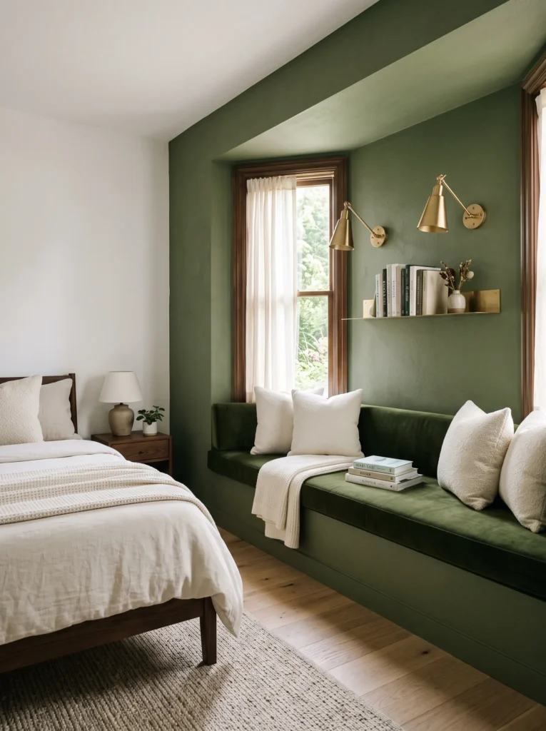
- A built-in window bench upholstered in deep moss-green velvet sits beneath a bay window, framed by matching moss-green wall paint so the whole corner reads as one continuous shape
- Brushed gold library sconces mount on either side of the window, angled downward for reading rather than ambient glow
- A slim brass shelf ledge runs above the bench, just wide enough to hold a few books without needing a full bookcase
- Ivory bouclé throw pillows break up the density of the velvet without introducing a new color
- The wall opposite the nook stays a soft plaster white, so the green corner functions almost like a piece of installed art
Why this works: Matching the bench and the wall in the exact same green removes the visual seam between furniture and architecture, making the whole corner feel built-in rather than decorated.
A reading nook like this works because it treats the corner as one object instead of three separate ones — bench, wall, window. Moss-dark green sits closer to olive than any of the true forest or bottle greens used elsewhere in this list, which gives it a slightly more muted, garden-adjacent quality. That softness matters in a nook meant for lingering rather than sleeping. I’ve noticed that clients who paint the bench and wall in identical shades, rather than close-but-different ones, consistently end up with a corner that photographs as intentional rather than assembled from separate purchases.
Reading light needs a different temperature than the rest of a bedroom, and this is where a lot of nooks fall short. General ambient bulbs at 2700K are perfect for the room overall, but a slightly cooler, more focused bulb in the actual reading sconces — closer to 3000K — reduces eye strain during actual page-turning without clashing with the warmer glow around it. Brushed gold hardware holds up well under either temperature, which is part of why it’s the more forgiving finish choice for fixtures that serve a genuinely functional purpose.
9. Spruce Green Lacquered Nightstands
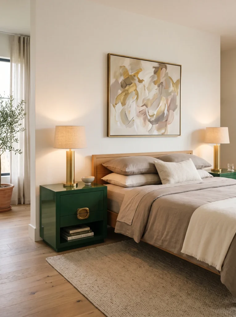
- Walls stay a quiet warm white, letting a pair of spruce green lacquered nightstands function as the room’s entire color statement
- Each nightstand features a single antique brass pull, oversized and sculptural rather than a standard knob
- A large abstract painting in muted gold and cream tones hangs above the bed, echoing the metal tone without matching it exactly
- Bedding stays in warm taupe linen, keeping the palette grounded and preventing the green from feeling isolated
- A pair of brass-based table lamps with linen shades sit atop the nightstands, tying the metal tones together at eye level
Why this works: Concentrating a bold color into just two furniture pieces, rather than the walls, gives a room flexibility and makes the green feel like a deliberate styling choice rather than a full commitment.
Not every room needs to commit to dark walls, and this idea proves the point. Spruce green — cooler and slightly blue-leaning compared to forest or hunter green — shows up here only on lacquered furniture, which means the color can be swapped out later without repainting an entire room. This approach tends to suit renters or anyone hesitant about painting a bedroom a saturated dark tone. The lacquer finish also does a lot of work here, giving the nightstands a reflective quality that a matte painted piece simply can’t replicate under lamp light.
Gold tone consistency matters more than most people expect when color is this concentrated. Antique brass pulls and brass lamp bases in the exact same warmth create a sense of coordination even though the fixtures are different shapes and functions. Mixing polished gold lamps with antique brass pulls in a room this pared-back would read as mismatched rather than eclectic. That’s why matching metal undertones — not just the general category of “gold” — is one of the most overlooked steps in pulling a two-piece color statement like this together successfully.
10. Emerald-Adjacent Arch Nook
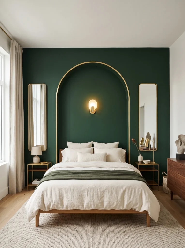
- A recessed arched nook is carved into the wall behind the bed and painted in a deep pine-bottle green, distinctly darker and moodier than a true emerald so it doesn’t overlap with lighter jewel-tone looks
- The arch is outlined in a thin brass trim that follows its curve exactly, giving the shape a finished, almost storybook quality
- A single wall-mounted brass sconce sits inside the arch, centered above the headboard, replacing the need for nightstand lamps entirely
- The bed itself stays simple — ivory linen bedding with no extra pattern — so the architectural arch remains the focal point
- Flanking the arch, two narrow brass-framed mirrors hang vertically, echoing the curve without repeating it
Why this works: An architectural arch gives a dark green accent wall a shape to hold onto, which keeps the color from reading as flat paint.
Arched niches are one of the more involved builds my husband’s team takes on, since the curve has to be framed out before drywall goes up rather than cut in afterward. It’s a bigger commitment than a flat accent wall, but the payoff is a headboard wall with real depth and shadow, especially once a sconce is mounted inside it. Pine-bottle green, deeper and more blue-leaning than a classic emerald, suits this kind of recessed detail particularly well because the shadow cast by the arch itself adds another layer of tonal variation across the same wall.
Brass trim following a curve is genuinely harder to install cleanly than a straight strip, which is part of why it reads as a higher-end detail when done well. The metal has to be scored and bent in small increments to avoid visible kinks along the arch. In my experience, this is a detail worth hiring out rather than attempting as a first DIY project, since an uneven curve draws the eye in the wrong way. Done correctly, though, it turns a simple paint color into a piece of architecture.
11. Olive-Dark Boucle Bench Suite
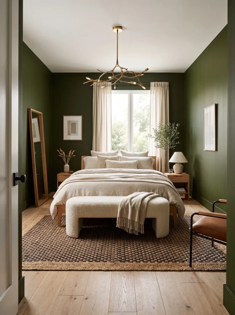
- Walls in a muted olive-dark green, warmer and more brown-leaning than the other greens on this list, create a room that feels earthy rather than jewel-toned
- A boucle-upholstered bench in warm ivory sits at the foot of the bed, adding texture without introducing a new color
- Gold shows up exclusively in the ceiling fixture — a sculptural brass pendant with an organic, branch-like form
- Nightstands are left unlacquered, in a raw white oak, intentionally breaking from the metallic or lacquered surfaces used throughout the rest of the list
- A woven leather and jute rug anchors the floor, keeping the overall palette grounded in natural materials rather than polish and shine
Why this works: Pairing a warmer, earthier green with raw wood instead of lacquer proves that this color palette doesn’t have to mean high-gloss glamour to feel elevated.
Not every dark green room needs to lean into shine, and this idea makes that case directly. Olive-dark green sits noticeably warmer than bottle, pine, or teal-green, closer to the color of an actual olive branch than a garden hedge. That warmth pairs naturally with raw, unfinished wood tones rather than the lacquered or metallic surfaces used elsewhere in this list. I’ve noticed that rooms built around this particular green tend to feel more restful and less formal, which makes it a strong option for anyone who wants the richness of a dark palette without the room feeling overly polished or precious.
12. Charcoal-Green Statement Ceiling
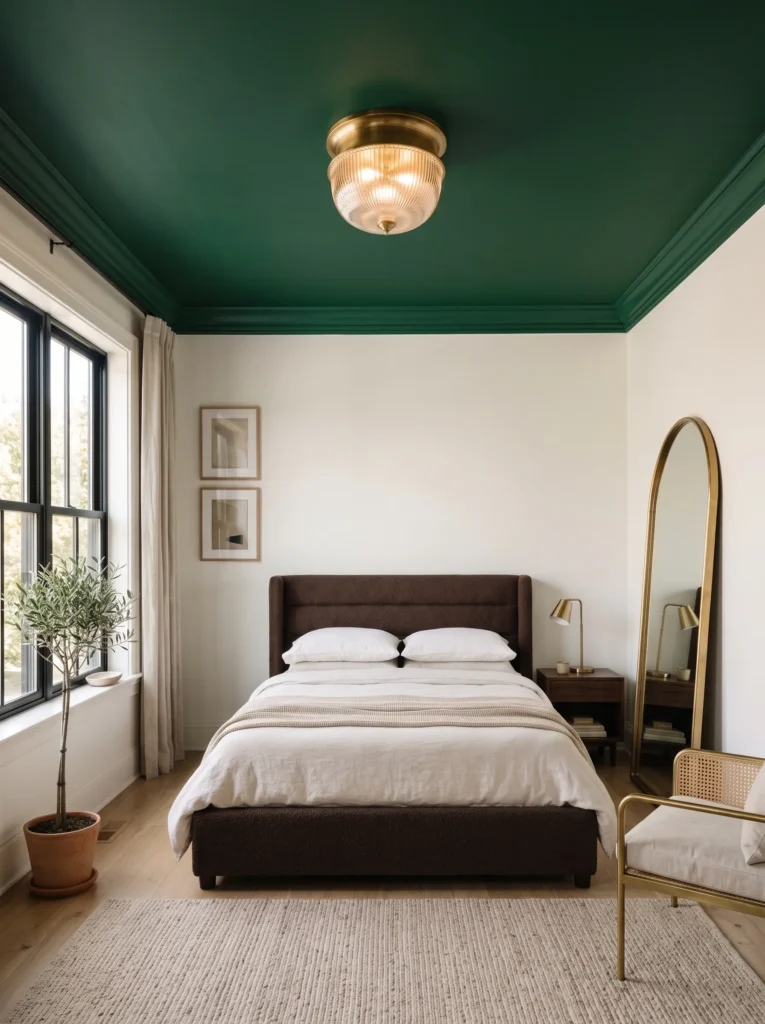
- Instead of a green accent wall, the ceiling itself is painted in a deep charcoal-green, while the walls stay a soft warm white, flipping the usual formula entirely
- A brass flush-mount fixture with a fluted glass shade centers the ceiling, catching light against the dark backdrop above it
- Crown moulding is painted to match the walls rather than the ceiling, keeping a crisp line between the two colors
- The bed frame is upholstered in a deep chocolate brown boucle, picking up warmth from the ceiling color without matching it exactly
- A single oversized brass floor mirror leans in the corner, angled to reflect the ceiling’s color back into the room
Why this works: Painting the ceiling instead of the walls is an unexpected way to bring dark green into a bedroom without making the whole room feel enclosed.
A painted ceiling is one of the more dramatic moves in this entire list, and it’s not one every room can handle. Rooms with at least eight-foot ceilings and decent natural light tend to be the best candidates, since a dark ceiling in a low, dim room can genuinely make the space feel smaller. Charcoal-green, nearly black in low light and only revealing its green undertone in direct sun, is a forgiving choice for this technique because it reads as sophisticated shadow rather than an obvious color statement from below. It’s a detail that surprises people the first time they see it done well.
Sheen matters even more on a ceiling than on a wall, since light hits it at a completely different angle. A flat or matte finish is almost always the right call here — anything with sheen will bounce overhead light unevenly and highlight every roller mark and seam. My husband’s team treats ceiling paint as its own separate decision from the walls for exactly this reason, even when the color matches. Paired with a fluted glass and brass fixture, a matte charcoal-green ceiling holds its color evenly and gives the room a quiet, enveloping depth that a painted wall alone can’t achieve.
13. Deep Sage-Green Arched Headboard
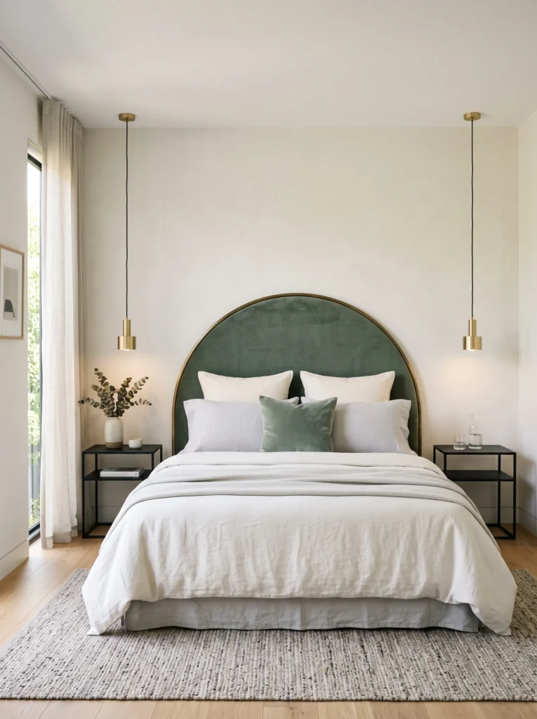
- An arched upholstered headboard in deep sage-green velvet, cooler and grayer than the other greens in this list, gives the room a softer, more contemporary edge
- A slim antique brass frame outlines the headboard’s curve, similar to a picture frame built around the furniture itself
- Nightstands in matte black metal, rather than wood or lacquer, introduce a cooler material that keeps the room from feeling overly warm
- A single pendant light in brushed gold hangs on each side of the bed instead of table lamps, freeing up nightstand surface entirely
- Bedding stays in cool ivory and pale gray, reinforcing the room’s more restrained, contemporary mood
Why this works: Introducing black metal alongside gold and green adds a third material note that keeps the palette from feeling predictable.
Sage-dark green reads noticeably grayer and cooler than pine, bottle, or forest green, which makes it one of the more versatile shades on this list for bedrooms with a lot of natural light. Where deeper, warmer greens can start to look muddy in bright afternoon sun, sage-green tends to hold its color evenly throughout the day. Pairing it with matte black hardware, rather than wood tones, gives the room a slightly more architectural, modern feel. I’ve noticed this combination works especially well in newer builds with cleaner lines, where a more traditional wood nightstand can feel slightly out of place.
Pendant lights mounted at bedside height solve a problem that table lamps create in smaller rooms — surface clutter. With nightstands left completely clear, the black metal base becomes a clean, sculptural object rather than a stand for a lamp. Brushed gold pendant hardware, chosen specifically over polished gold, keeps the fixtures from competing visually with the arched headboard’s antique brass frame. Two different gold finishes in one room can clash if they’re placed close together, so keeping the fixtures brushed while the headboard trim stays antique avoids that mismatch entirely.
14. Bottle Green Cane Accent Wall
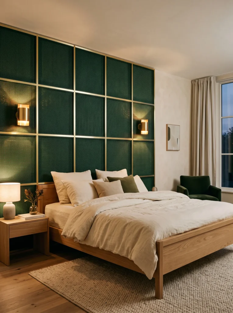
- Cane webbing panels, stained a deep bottle green rather than left in natural rattan tone, cover a single accent wall behind the bed
- A slim brass frame borders each cane panel, creating a subtle grid pattern across the wall
- The bed frame stays low and simple in natural oak, letting the textured wall carry the room’s visual interest
- A pair of small brass wall lights, mounted directly through the cane panels, cast a soft dappled glow across the texture
- Warm cream bedding keeps the room feeling light despite the wall’s density
Why this works: Staining cane webbing in a saturated color rather than leaving it natural gives a familiar material an entirely different, more modern character.
Cane webbing has become a popular material in higher-end interiors over the last few years, almost always left in its natural, undyed state. Staining it a deep bottle green instead is a less common move, and it changes the material’s whole personality — from breezy and coastal to something moodier and more considered. The natural texture and slight gaps in the weave still let light filter through unevenly, which is part of what gives this wall its dimension. That’s a quality flat paint or solid paneling simply can’t replicate, and it’s why this idea reads as genuinely different from a standard green accent wall.
Lighting through a textured material like cane requires more thought than lighting a flat surface. Mounted directly through the panels, small brass fixtures cast light in slightly irregular patterns across the weave, creating shadow play that shifts throughout the evening. That’s why warm 2700K bulbs matter even more here than in some of the other ideas on this list — cooler light tends to flatten the texture’s shadows, while warm light exaggerates them, giving the whole wall a sense of movement it wouldn’t otherwise have.
15. Ink-Green Marble Nightstand Pair
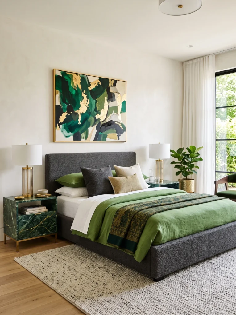
- Nightstands carved from a deep green-black marble, veined subtly with gold-toned mineral streaks, sit on either side of the bed as the room’s clear focal point
- Walls stay a soft warm plaster white, letting the marble’s natural pattern read as the room’s only bold gesture
- A pair of polished gold table lamps with fluted glass bases echo the marble’s natural veining
- The bed frame is upholstered in a deep charcoal bouclé, quiet enough not to compete with the stone
- A large abstract piece of art in muted green and gold tones hangs above the bed, tying the nightstands’ palette to the wall
Why this works: Letting a natural material’s own veining supply the gold tone, rather than adding gold hardware separately, gives a room a more organic, less obviously styled feel.
Marble with natural gold-toned veining is one of the more overlooked ways to bring this color combination into a room, largely because it’s supplied entirely by the stone rather than added through paint or metal accents. Every slab is different, so no two ink-green marble nightstands will show the exact same pattern, which gives a room a one-of-a-kind quality mass-produced furniture can’t match. My husband’s crew has installed marble in enough kitchens and bathrooms to know that this material demands careful sealing, especially in a bedroom where drinks or lotions might sit on the surface daily without much thought.
Because the marble already carries both the green and gold color story within its own veining, everything else in the room can stay quiet without the space feeling underdressed. Polished gold lamp bases pick up the stone’s natural streaks rather than introducing a separate, competing metal tone. That restraint is what makes this idea feel less like a styled room and more like a considered one, where the boldest element in the space came from the material itself rather than an accessory added on top of it.
Styling Principles: Getting Dark Green and Gold Right
Choosing the right gold finish is the single biggest factor separating a green-and-gold bedroom that looks expensive from one that looks like it came straight off a big-box shelf. Polished gold throws hard, bright reflections that read as cold and almost commercial against a deep green backdrop — it works best in rooms that are already fairly minimal, where it can stand alone as a single deliberate flash of shine.
Antique brass and brushed gold, by contrast, absorb light rather than bounce it, giving off a softer, aged quality that suits denser, moodier greens like bottle, pine, or racing green. A good rule of thumb: the darker and more saturated the green, the more forgiving a matte or antique metal finish will be. And once you pick a finish, stay consistent within eyeshot of each other — mixing polished and antique gold on fixtures placed close together almost always reads as mismatched rather than intentional.
Balancing a dark green room with the right light source matters just as much as the wall color itself. Warm bulbs around 2700K pull amber and gold tones out of both the paint and the metal, making the whole room feel lit from within rather than just lit. Cooler bulbs flatten that warmth and can make even antique brass look almost silver. Natural daylight also changes how a green reads throughout the day — a shade that looks moody and rich in the morning can shift dramatically under afternoon sun, so it’s worth testing paint swatches at different times of day before committing to a full wall.
Avoiding a heavy or dated look comes down to restraint and material variety. The biggest mistake is defaulting to the same formula in every corner of the room — green walls, gold mirror, velvet throw, repeat. Instead, let gold show up in just one or two places per idea: hardware, a light fixture, or textile threading, not all three at once. Mixing in a raw or matte material — unlacquered wood, woven cane, bouclé — keeps a saturated green from feeling like it’s trying too hard, and it’s often what separates a room that feels current from one that feels stuck in a single design moment.
Frequently Asked Questions About Dark Green and Gold Bedrooms
Which gold finish works best with dark green? Antique brass and brushed gold tend to pair best with deeper, more saturated greens like bottle or pine green, since their softer, low-glare finish keeps the room from feeling cold or showy. Polished gold works well too, but it’s best used sparingly, as a single standout fixture rather than spread across multiple pieces.
Is dark green too dark for a small bedroom? Not necessarily. A small room can absolutely handle dark green if the color is balanced with a lighter ceiling, plenty of natural or warm artificial light, and a few reflective elements like a mirror or a glossy nightstand finish. Painting only part of a wall, or using green on furniture rather than every surface, is also a reliable way to bring the color into a smaller space without it feeling closed in.
What’s the best paint sheen for dark green walls? Matte or eggshell finishes are generally the better choice for dark green walls, since anything with more sheen tends to highlight roller marks, dents, and seams in the drywall. Eggshell also gives a soft, gentle glow under lamp light without the harsher reflections that satin or gloss can create on a deeply saturated color.
What are some budget-friendly ways to try this look? Swapping just the metal hardware on existing furniture — drawer pulls, a mirror frame, a single lamp — is one of the most affordable ways to test the palette before committing to a full room. Painting one accent wall in a deep green, rather than the entire room, is another low-cost way to see how the color behaves in your specific lighting before going further.
What’s the best lighting for a dark green and gold bedroom? Warm bulbs in the 2700K range consistently bring out the richest version of this color pairing, since they pull amber and gold tones from both the paint and the metal finishes in the room. Cooler, whiter bulbs tend to flatten the warmth of the gold and can make even a rich green wall look duller than it actually is.
Can I mix different shades of dark green in the same bedroom? It’s best to stick to one dominant green throughout a single room, since mixing several distinct shades — like bottle green walls with hunter green textiles — can start to look unintentional rather than layered. If you want variation, look for closely related tones within the same family, or save the contrast for a separate room in the home.
Conclusion
A dark green & gold bedroom doesn’t have to mean one predictable formula. Whether it’s an antique brass inlay built into a headboard, a marble nightstand with its own natural gold veining, or a single sculptural pendant doing all the metallic work in the room, the richness comes from choosing details with intention rather than defaulting to what’s expected.
I’ve seen how a small shift — swapping a gold finish, adjusting a bulb’s warmth — can change how an entire room feels, sometimes more than the paint color itself. Save this post to Pinterest, pick one idea to try in your own bedroom this season, and pass it along to anyone who’s been eyeing a moodier, more grounded palette for their space.