15 Cherry Red Bedroom Ideas Worth Stealing
Cherry red isn’t a color you ease into. It’s a color you commit to, and if you get the styling right, it might just become your favorite room in the house.
I’ve painted my share of bold walls over the years, and cherry red is one of those colors people talk themselves out of before they even try it. That hesitation usually comes from seeing the same tired pairing everywhere: red walls, black furniture, done. But these cherry red bedroom ideas prove there’s a lot more range in this color than most people realize. From soft cottage-inspired takes to sculptural art deco headboards, this list covers fifteen genuinely different ways to bring cherry red into a bedroom without it feeling like a dare.
1. Cherry & Gold Glamour — A Bold Cherry Red Bedroom Idea
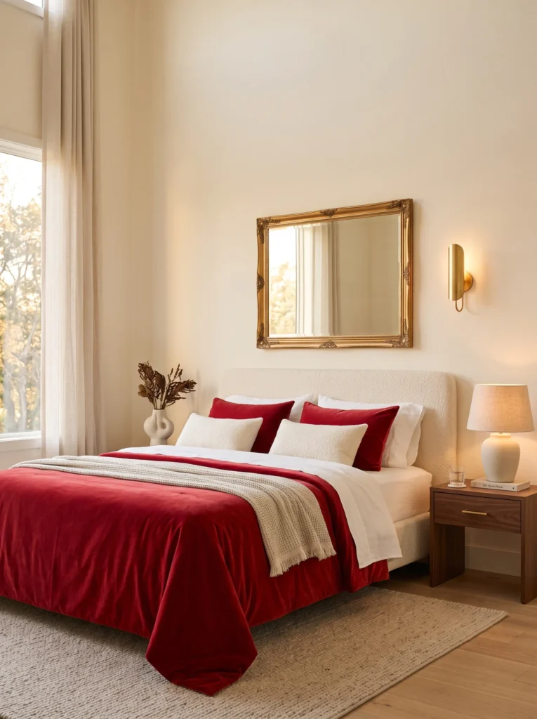
- Deep cherry red velvet bedding anchors the room the moment you walk in
- Antique gold hardware and a vintage mirror frame keep the palette from feeling flat
- Ivory boucle headboard softens the red so it reads elegant, not overwhelming
- Warm brass sconces replace overhead lighting for a more flattering evening glow
- Walnut nightstands ground the gold and red with a neutral, grounding tone
Why this works: Pairing cherry red with warm metallics and ivory keeps the color anchored instead of overpowering, which is the difference between a bedroom that feels curated and one that feels like a dare.
A cherry red bedroom doesn’t need to shout to feel confident, and this is a good example of that. The ivory boucle headboard takes the visual weight off the walls, letting a plush cherry red bedspread do the talking without tipping into overwhelming territory. In my experience, gold accents are what separate a cherry red room that feels intentional from one that feels like a leftover holiday theme. A vintage brass mirror, a few soft ivory textiles, and walnut furniture keep the whole palette feeling grounded, warm, and genuinely livable day to day.
Cherry red and antique gold have a natural warmth in common, which is part of why this pairing feels cohesive rather than clashing. The velvet bedding catches light differently depending on the hour, appearing almost garnet under daytime brightness and deepening to a warmer, more saturated red once the brass sconces are the only light source at night. That shift alone gives the room two distinct moods without changing a single piece of furniture. It’s a detail most bedrooms don’t offer, and it’s one guests tend to notice and comment on.
2. Morning Light Cherry Nook
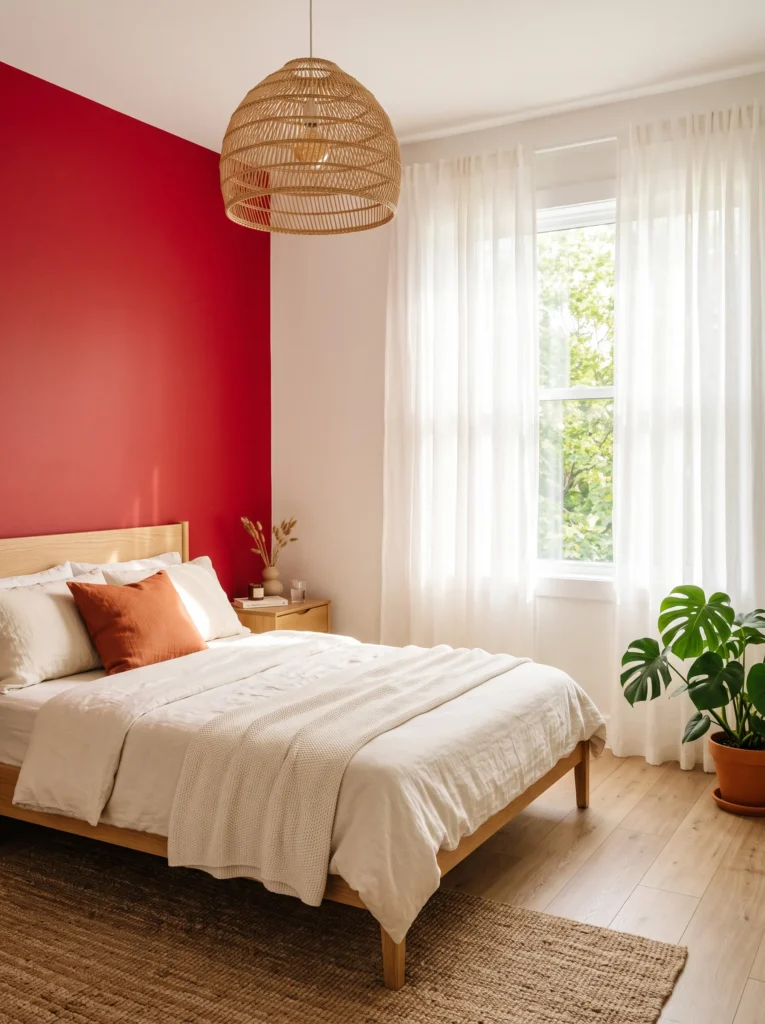
- South-facing window paired with a cherry red feature wall creates a natural spotlight effect
- Warm oak bed frame keeps the red from feeling too formal or heavy
- Sheer linen curtains filter direct sun so the red doesn’t overheat visually at midday
- Rattan pendant lamp softens the room’s edges once natural light fades
- Cream linen bedding acts as a visual break between the wall and the floor
Why this works: Warm-spectrum colors like red are perceived as advancing, which means a cherry red wall in a sunlit room reads as closer and more enveloping rather than flat or distant.
There’s a reason color scientists talk about warm hues differently than cool ones: red doesn’t just sit on a wall, it visually steps forward into the room. That’s exactly what happens here. In the morning, direct sun hits the cherry red feature wall and the color reads bright, almost coral-leaning, energizing the whole space. I’ve noticed this effect surprises a lot of people who assume red bedrooms will always feel dark or heavy. Paired with warm oak furniture, the wall never feels stark, just saturated in a way that photographs beautifully.
By evening, the same wall shifts into something completely different. Without direct sunlight, the cherry red deepens and quiets down, especially once the rattan pendant is the only light source in the room. The oak furniture and cream linens keep grounding the space, but the red itself takes on a moodier, more intimate character than it had six hours earlier. This is the kind of transformation that’s hard to plan for on a swatch card, but it’s exactly why testing paint in the actual room, at different times of day, matters more than people think.
3. Cherry Noir Retreat
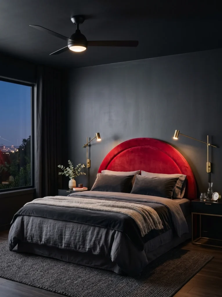
- Curved cherry red velvet headboard softens the sharp lines of a charcoal accent wall
- Charcoal and deep grey tones keep the red from feeling too bright or juvenile
- Brass reading sconces mounted directly to the headboard save nightstand space
- Matte black ceiling fan adds a subtle architectural line without competing with the color
- A satin paint finish on the charcoal wall holds up better against daily scuffs than matte
Why this works: Cherry red against charcoal and deep grey pulls the color toward sophisticated rather than youthful, proving red can anchor a moody palette instead of only a bright one.
My husband’s spent enough years on renovation jobs to have strong opinions about paint finishes, and this is one of the rooms where his advice actually shaped the design. He recommends a satin finish over matte for accent walls behind a headboard, since matte finishes show scuffs and fingerprints far more easily in a space people touch and lean against daily. The charcoal wall here gets that satin treatment, and it makes a real difference in how the room holds up over time. The curved velvet headboard in cherry red softens what could otherwise feel like a sharp, cold pairing.
Deep grey and charcoal don’t compete with cherry red the way brighter neutrals sometimes do, which is why this combination reads more like a sophisticated retreat than a typical red bedroom. The brass sconces mounted to the headboard keep the nightstands clear and add a warm point of light against all that charcoal. It’s a small functional choice that also happens to look intentional, which is really the goal in any room like this: every piece doing more than one job.
4. Cherry & Forest Drapery
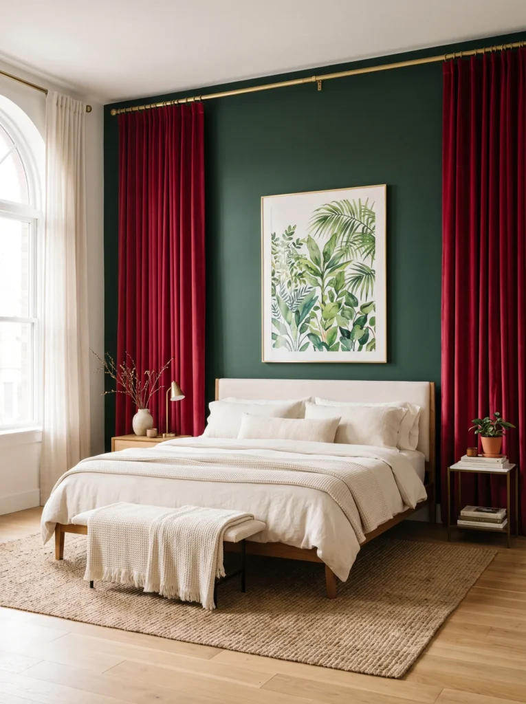
- Floor-to-ceiling cherry red velvet drapes frame the bed like a statement piece
- Deep forest green accent wall behind the headboard grounds the red without dulling it
- Cream bedding and a jute rug keep the palette from feeling too saturated
- Brushed brass curtain rods tie the metals together across the room
- A single oversized botanical print continues the green tone without adding a second pattern
Why this works: Forest green is red’s natural complement on the color wheel, which is why this pairing feels vibrant and cohesive rather than clashing or overdone.
As someone who came to design through plant science, I’ll admit this is one of my favorite pairings in the whole lineup. Deep forest green has an earthy weight to it that keeps cherry red from tipping into anything too sweet or juvenile, and the botanical print on the wall reinforces that connection without adding visual clutter. The drapery does most of the heavy lifting here, framing the bed the way a good piece of art frames a room. Cream bedding and a natural jute rug give your eyes somewhere to rest between all that saturated color.
This is a full-room approach where texture matters as much as hue. The velvet drapes catch and hold light differently than a painted wall would, so the red shifts subtly throughout the day depending on how much sun filters through the fabric. Paired with the deep forest green, the whole space feels more like a conservatory than a typical bedroom, warm and layered rather than flat. It’s proof that a bold color story doesn’t need five different elements competing for attention, just two strong tones handled with restraint.
5. Cherry Chair Statement
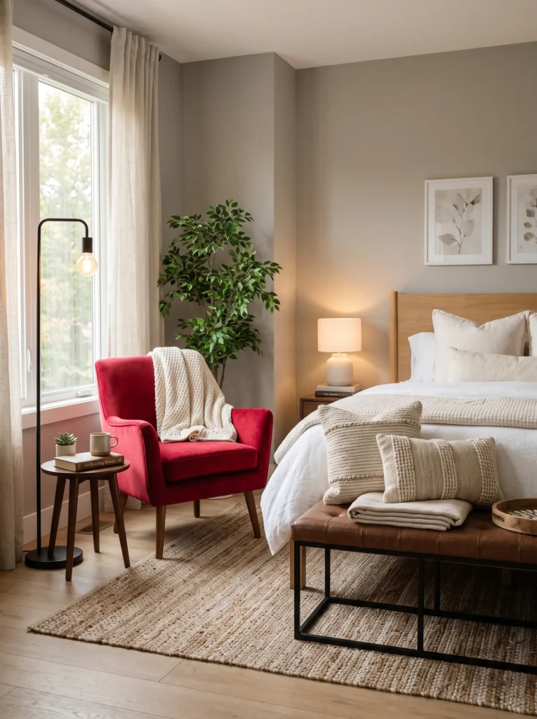
- A single cherry red velvet accent chair becomes the room’s focal point, not the walls
- Soft grey walls in a warm undertone let the chair read as bold, not busy
- Chocolate brown leather bench at the foot of the bed adds depth and grounding weight
- Woven cream throw pillows soften the leather and grey combination
- Matte black floor lamp beside the chair creates a dedicated reading corner
Why this works: Using cherry red on a single furniture piece instead of a wall lets renters and commitment-shy homeowners try the color without repainting anything.
This is the idea I recommend most often to readers who love cherry red but aren’t ready to paint an entire wall. A single accent chair in a rich cherry red velvet does the same visual job as a feature wall, just on a smaller, more flexible scale. Warm-toned soft grey walls keep the background quiet enough that the chair actually stands out instead of competing with its surroundings. Chocolate brown leather at the foot of the bed adds a grounding, almost masculine weight that balances the softness of the velvet chair beautifully.
I’ve noticed this layout works especially well in smaller bedrooms where a full red wall might feel like too much. The chair creates a natural reading nook, especially with a dedicated floor lamp nearby, and the whole corner becomes a little retreat within the room. Cream throw pillows on both the bench and the chair tie the grey, brown, and red together without introducing a fourth competing color. It’s a genuinely low-commitment way to test whether cherry red belongs in your life before going bigger.
6. Cherry Noir Gallery Wall
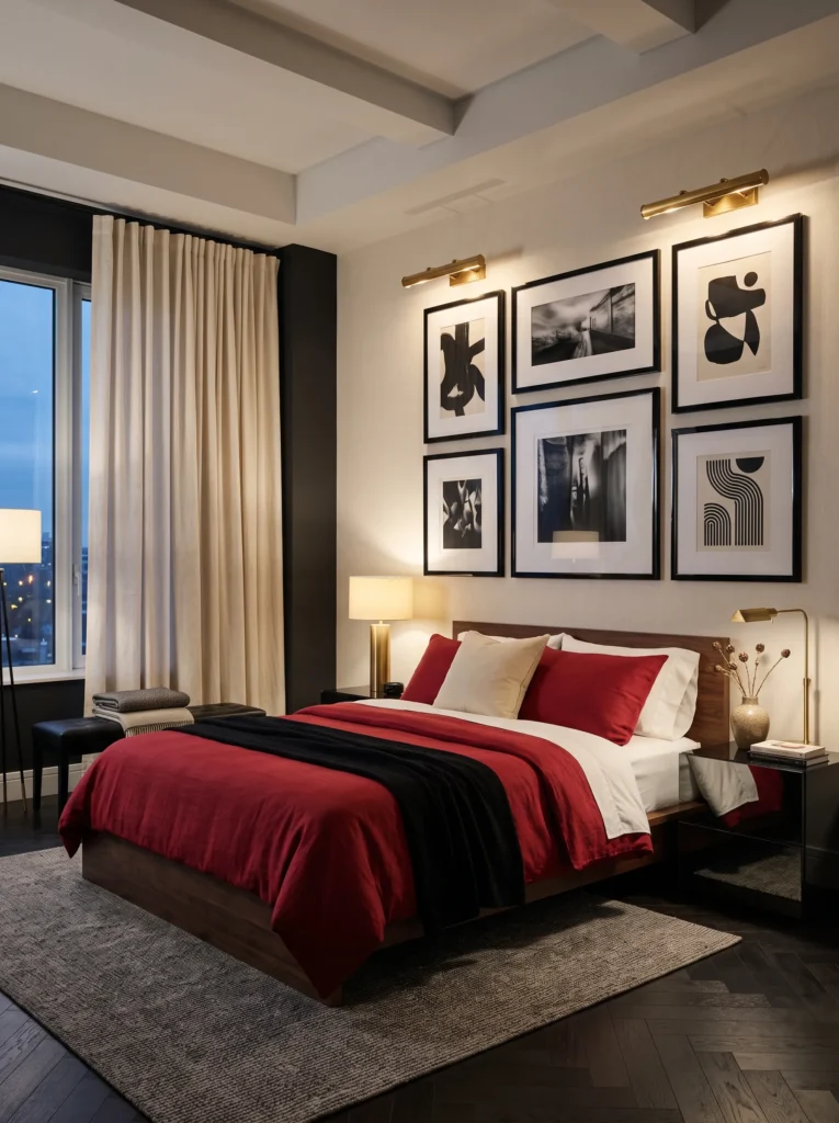
- Cherry red bedding paired with a black-and-cream gallery wall keeps the room graphic and modern
- Glossy black picture frames in varied sizes add rhythm without needing extra furniture
- Cream linen curtains soften the black-and-red contrast so it doesn’t feel too stark
- Brass picture lights above select frames create warm pools of light after dark
- High-gloss black nightstands reflect the cherry red bedding, doubling the color’s visual presence
Why this works: Saturation, not just hue, determines whether cherry red feels energizing or overwhelming, which is why this room uses matte bedding against glossy black to control the intensity.
There’s a real piece of color science behind why this room works as well as it does. Saturation level, separate from the hue itself, is what decides whether a color like cherry red reads as vibrant and controlled or chaotic and overwhelming. Here, a matte cherry red bedspread keeps the saturation grounded, while glossy black frames and nightstands add contrast without adding more color. The gallery wall becomes the room’s main design statement instead of the paint itself, which is a genuinely different approach than most cherry red bedrooms take.
In the morning, natural light bounces off the glossy black surfaces and makes the whole wall feel crisp and graphic, almost gallery-like. Once evening comes and the brass picture lights switch on, the mood shifts entirely, with warm pools of light softening the black-and-cream contrast into something cozier and more intimate. The cherry red bedding stays the visual anchor through both moods, proving that a single well-chosen colored element can carry a room through very different lighting conditions.
You’ll Also Love: 18 Dark Feminine Bedroom Ideas for a Moody Retreat
7. Cherry Cane Arch
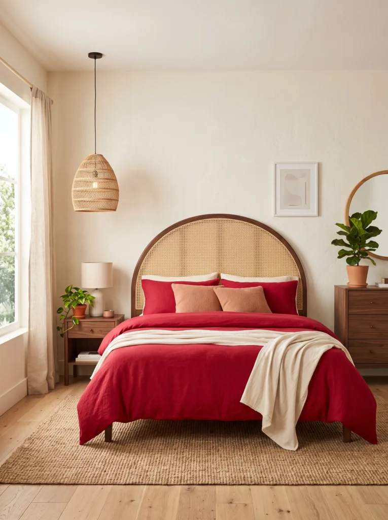
- Arched cane headboard adds a natural, textural contrast against the smooth cherry red bedding
- Warm cream walls keep the room bright and let the cane detailing stand out
- Walnut furniture throughout ties the cane headboard to the rest of the room
- Woven jute pendant light continues the natural material story overhead
- Terracotta throw pillows bridge the cherry red and warm wood tones
Why this works: Cane and rattan textures soften a saturated color like cherry red by adding visual movement, which keeps the room from feeling flat or one-dimensional.
An arched cane headboard is one of my favorite ways to bring texture into a cherry red bedroom without adding another color to the mix. The natural woven pattern catches light and shadow in a way that smooth upholstery simply can’t, and it gives the eye something to explore even in a fairly simple room. Cream walls keep the space bright enough that the cane detailing stays visible instead of getting lost, and walnut furniture throughout the room echoes the same warm, natural tone. It’s a pairing that feels organic rather than styled.
This is also a genuinely versatile look, since cane headboards work in both traditional and modern bedrooms without feeling dated either way. Terracotta throw pillows on the cherry red bedspread bridge the gap between the wood tones and the red, keeping the whole palette feeling warm and cohesive. I’ve seen this work well in bedrooms with lower natural light too, since cream walls and cane texture both help bounce whatever light is available around the room rather than absorbing it.
8. Cherry Deco Tufted
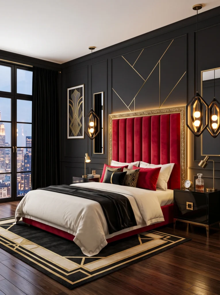
- Channel-tufted headboard in cherry red velvet brings an art deco sense of structure to the room
- Black lacquered nightstands add sharp, glossy contrast against the soft tufted texture
- Antique gold trim on the headboard frame reinforces the deco styling
- Black-and-gold pendant lights replace nightstand lamps for a more sculptural look
- A high-gloss paint finish on the trim work resists yellowing better than satin over time
Why this works: Vertical channel tufting draws the eye upward, which makes cherry red feel architectural and deliberate rather than purely decorative.
Channel tufting is a detail my husband has installed custom headboards around more than once, and he’ll tell you the vertical lines do more than just look good, they actually change how a room reads visually. Here, the cherry red velvet headboard’s tufted channels pull the eye upward, giving the whole wall a sense of height and structure. Paired with black lacquer and antique gold trim, the effect leans distinctly art deco, more architectural than the typical soft, romantic take on a red bedroom. It’s a confident look that rewards a room with good bones.
On the finish side, gold trim work on furniture and headboard frames tends to hold up better over the years with a high-gloss paint or lacquer finish rather than satin, since gloss resists yellowing and dulling from UV exposure more effectively. That’s a detail most design posts skip entirely, but it matters if you want the deco gold accents to stay sharp rather than fading into a muddy bronze after a few years near a sunny window.
9. Cherry Wingback Corner
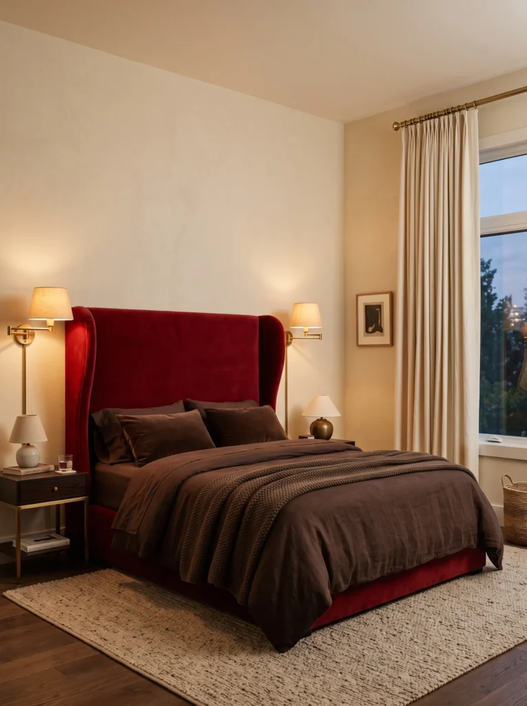
- Upholstered wingback headboard in cherry red creates a cocooning, high-back silhouette
- Deep chocolate brown bedding grounds the tall red headboard so it doesn’t overwhelm the room
- Brass floor-length curtain rods add a slim metallic line against soft cream drapery
- A low-pile wool rug in warm oatmeal keeps the room feeling soft underfoot
- Sconces flanking the headboard replace table lamps for a cleaner, more tailored look
Why this works: A wingback headboard’s height and enclosed shape make cherry red feel protective and enveloping instead of purely bold, which suits smaller or lower-light bedrooms particularly well.
Not every cherry red bedroom needs to feel loud, and this corner is proof of that. The wingback headboard’s tall, curved sides create a cocooning effect, almost like a nook within the room, which softens how the color reads even though it’s a fairly saturated red. Chocolate brown bedding keeps the palette grounded and prevents the tall headboard from feeling like it’s swallowing the space. I’ve noticed wingback styles work especially well in bedrooms with lower ceilings, since the vertical lines draw the eye up without needing extra height in the room itself.
Cream drapery and a warm oatmeal wool rug round out the palette with texture rather than more color, letting the red and brown do the visual work. Brass curtain rods add just enough metallic detail to keep things from feeling too heavy or dark. Sconces mounted directly beside the headboard free up nightstand space and give the whole corner a tailored, intentional look that feels more like a boutique hotel room than a typical bedroom setup.
10. Cherry Sage Cottage
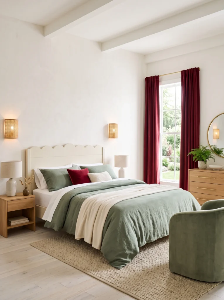
- Scalloped wood headboard painted cream adds a soft, cottage-inspired silhouette
- Sage green bedding and a matching accent chair balance the cherry red drapery
- Whitewashed oak flooring keeps the room feeling light despite the saturated colors
- Woven rattan wall sconces continue the natural, cottage-core material palette
- Vintage brass drawer pulls on the dresser add subtle warmth without competing with the sage
Why this works: Sage green’s muted, greyed-down quality softens cherry red into something closer to romantic than intense, which is why this pairing reads calm rather than loud.
I’ll admit this is one of the gentler takes on cherry red in this whole list, and that’s exactly the point. Sage green has enough grey in its undertone that it tempers cherry red without competing with it, so the room ends up feeling soft and lived-in rather than dramatic. The scalloped headboard adds a whimsical, almost heirloom quality that pairs naturally with the cottage feel of whitewashed oak floors. It’s a look that would feel just as at home in a hundred-year-old farmhouse as it would in new construction.
Whitewashed oak flooring does a lot of quiet work in this room, keeping things bright underfoot so the cherry red drapery and sage bedding don’t pull the space into feeling too heavy. Rattan sconces and brass drawer pulls add just enough warmth to keep the room from feeling cold or overly muted. In my experience, this palette works especially well for anyone who loves the idea of a bold red bedroom but wants something closer to a garden cottage than a nightclub.
11. Cherry Bronze Twilight
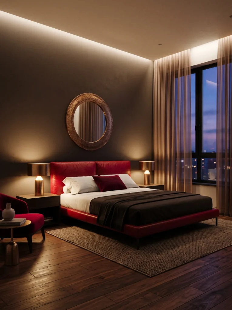
- Low platform bed with an upholstered cherry red leather headboard feels modern and grounded
- Bronze metallic accents on the lamps and mirror frame add warmth without gold’s shine
- Deep espresso wood flooring anchors the room in a rich, masculine tone
- Sheer bronze-toned curtains shift the room’s light quality dramatically between morning and evening
- A leather headboard resists fading better than fabric upholstery in rooms with direct sun exposure
Why this works: Leather holds cherry red’s pigment more evenly over time than many fabric weaves, which matters most in bedrooms that get strong afternoon sun.
This is a room built around how dramatically light changes cherry red’s personality throughout the day. In the morning, sun filters through the sheer bronze curtains and the leather headboard reads warm and almost amber-tinted, energizing the whole space. My husband’s pointed out on more than one renovation that leather upholstery tends to hold saturated colors like cherry red more evenly over years of sun exposure than certain fabric weaves, which fade unevenly along the exposed edge first. That durability detail alone makes leather worth considering for a west-facing bedroom.
By evening, the same room transforms completely. Once the sun drops and the bronze lamps take over, the leather headboard deepens into a rich, almost wine-toned red, and the espresso flooring makes the whole space feel enclosed and intimate. The bronze accents catch just enough lamplight to glow softly rather than shine, which keeps the mood warm instead of flashy. It’s a genuinely different room depending on what time you walk into it.
12. Cherry Silk Fan Suite
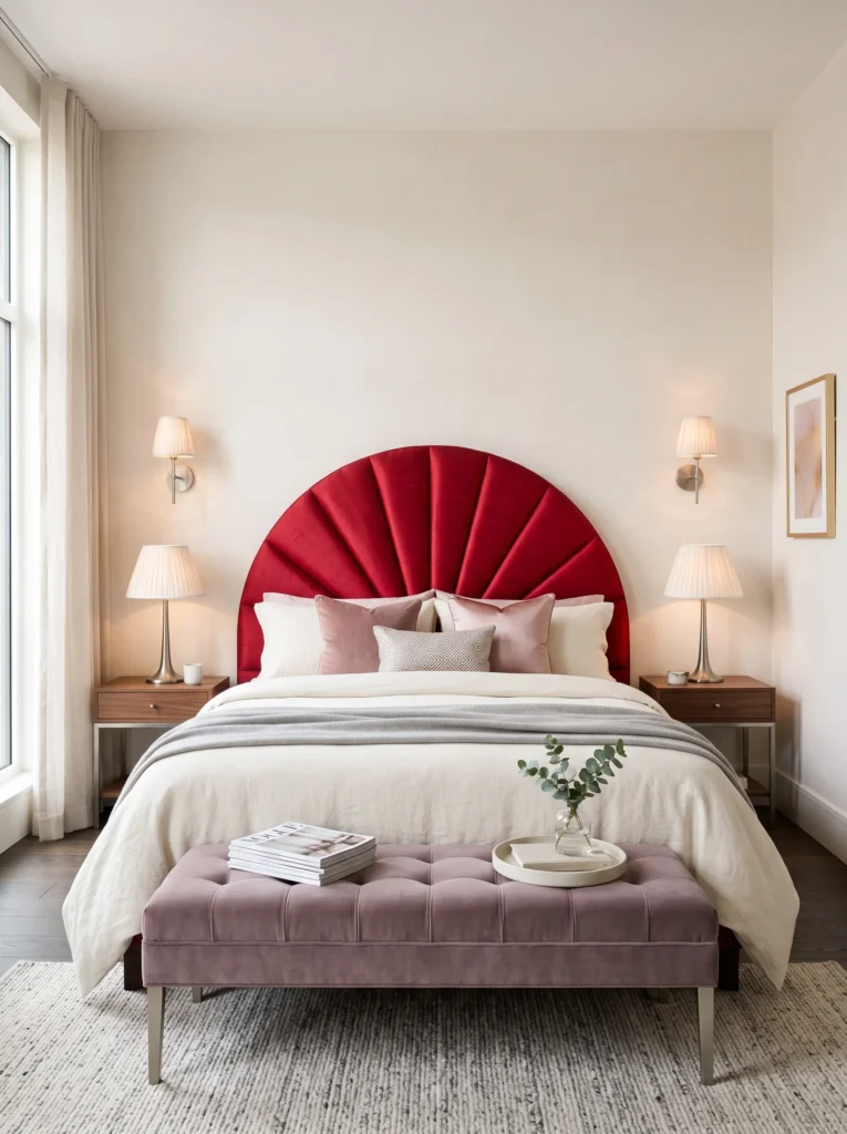
- Fan-shaped headboard upholstered in cherry red dupioni silk adds a sculptural focal point
- Dusty mauve velvet bench softens the transition between cherry red and the room’s neutrals
- Brushed pewter lighting and hardware add a cool metallic contrast against the warm red
- Pleated ivory silk lampshades diffuse the light into a soft, boudoir-style glow
- Mauve and cherry red pillows layered together build tonal depth without adding new colors
Why this works: Pairing cherry red with a cool, muted tone like dusty mauve keeps the palette from leaning too warm, which is why this room reads elegant rather than heavy-handed.
A fan-shaped headboard is one of the most elegant silhouettes you can bring into a cherry red bedroom, and dupioni silk gives it a subtle sheen velvet can’t replicate. Unlike the plush, matte texture used elsewhere in this list, silk catches light in shifting highlights across its pleats, which keeps the headboard from reading as a single flat block of color. Dusty mauve on the bench and pillows tempers the red’s intensity without pulling the room toward anything heavy or dark. It’s a pairing that feels considered rather than accidental, exactly what a well-planned bedroom should feel like.
Pewter hardware and lighting fixtures add a cool, quiet contrast that keeps this red-and-mauve palette from leaning too warm. Pleated ivory silk lampshades diffuse light into a soft, even glow rather than a harsh spotlight, flattering both the mauve velvet and the cherry red silk headboard equally well once evening sets in. During the day, natural light picks up the sheen in the dupioni silk, giving the headboard a subtle shimmer that photographs beautifully. It’s a bedroom built for someone who wants cherry red to feel refined and settled, not overwhelming or over the top.
13. Cherry French Chateau
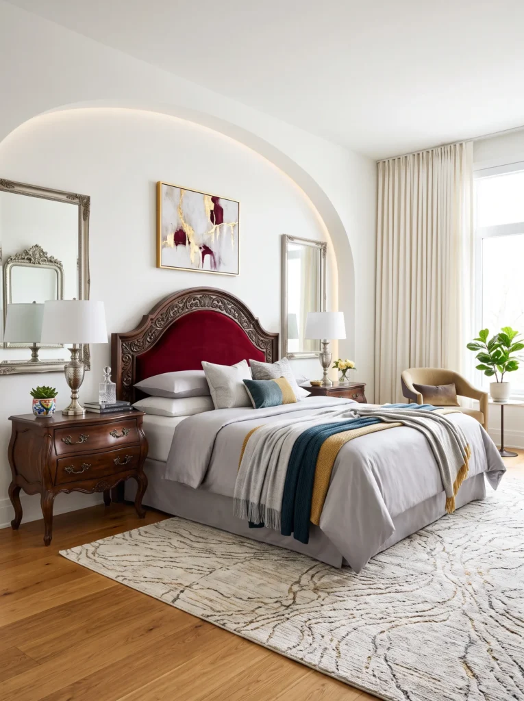
- Hand-carved arched wood headboard with a cherry red velvet inset adds old-world elegance
- Alabaster white walls keep the room bright enough for the carved detail to stand out
- Antique silver mirror and lamp bases add a cool metallic note against the warm red
- Soft dove grey bedding tempers the cherry red inset without dulling its richness
- French provincial nightstands with cabriole legs complete the room’s traditional, tailored character
Why this works: A carved wood frame turns cherry red into a small, contained detail rather than the room’s dominant feature, proving the color can read traditional and restrained just as easily as bold.
Carved wood headboards have a way of making cherry red feel intentional rather than loud, since the velvet inset is framed by real craftsmanship instead of stretching across the whole wall. In my experience, this is the kind of detail that makes a room feel finished rather than simply decorated, especially when the carving itself is left unpainted so the wood grain stays visible against the deep red velvet. Alabaster white walls give the carving room to breathe, and antique silver accents throughout keep the palette from leaning too warm. It’s a traditional approach that still feels current and considered.
Dove grey bedding sits between the red velvet and white walls, softening the transition without pulling focus away from the carved headboard itself. The French provincial nightstands, with their curved cabriole legs, echo the same old-world character as the headboard, so the whole room reads as one cohesive style rather than mismatched pieces. Antique silver lamp bases and a fluted mirror frame add just enough shine to catch the light without competing with the wood carving’s detail. This is a bedroom built for someone who wants cherry red to feel elegant and established, not trendy or temporary.
14. Cherry Cream Canopy
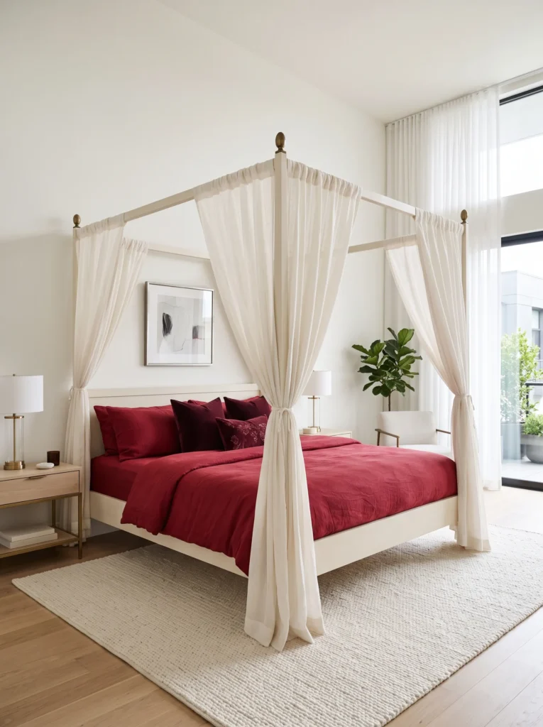
- Four-poster canopy bed frame in warm cream wood softens the boldness of cherry red bedding
- Sheer ivory canopy drapery filters light and adds a romantic, airy layer overhead
- Deep merlot accent pillows add tonal depth without introducing a new color family
- Antique brass finials on the bedposts catch light and add subtle shine
- Hand-knotted cream rug grounds the room without competing with the canopy’s height
Why this works: A canopy frame draws the eye vertically and adds volume through structure rather than color, which keeps a cherry red room from relying on the wall paint alone for impact.
A canopy bed changes the proportions of a room in a way flat furniture simply can’t, and that matters a lot when you’re working with a color as strong as cherry red. The cream wood frame keeps things airy, while the sheer ivory drapery softens the whole silhouette, letting light diffuse through it rather than bouncing directly off a solid surface. Cherry red bedding underneath still reads as the star of the room, but the canopy gives it somewhere to breathe instead of feeling boxed in by four plain walls.
Deep merlot pillows layered on top of the cherry red bedding add tonal richness without pulling in an entirely separate color, which keeps the palette feeling cohesive rather than busy. I’ve noticed canopy frames tend to work particularly well in bedrooms with higher ceilings, since the vertical lines make good use of that extra height instead of leaving it empty. The antique brass finials are a small detail, but they catch just enough light to feel finished rather than plain.
15. Cherry Pink Blush Contrast
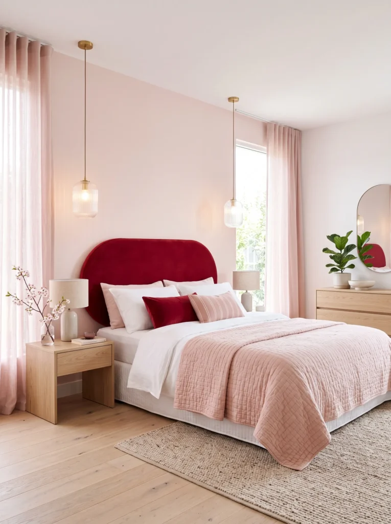
- Upholstered oval headboard in cherry red creates a soft, sculptural focal point
- Blush pink walls keep the room feeling light, fresh, and unexpectedly modern
- White oak furniture throughout adds warmth without darkening the overall palette
- Fluted glass pendant lights add texture and a touch of vintage glamour overhead
- Sheer blush curtains let soft daylight fill the room without washing out the red
Why this works: Pairing cherry red with a lighter, warmer pink rather than a deep neutral shows the color can feel fresh and youthful, not only formal or dramatic.
Most cherry red bedrooms lean into dark, dramatic pairings, so this one intentionally goes the opposite direction. Blush pink walls keep the whole room feeling bright and soft, and the contrast between the two reds, one deep and saturated, one pale and warm, ends up feeling surprisingly modern rather than clashing. The oval headboard’s rounded shape softens the room further, avoiding any harsh lines that might make the color combination feel too intense. White oak furniture keeps things light and prevents the room from leaning too pink or too red in either direction.
I’ve seen this palette work particularly well for younger homeowners or anyone wanting a cherry red bedroom that feels fresh rather than formal. Fluted glass pendants add a touch of vintage glamour without overwhelming the soft color story, and sheer blush curtains let plenty of daylight in without washing out the cherry red headboard’s richness. It’s a genuinely different mood than most red bedrooms achieve, playful but still clearly intentional.
Styling Principles: How to Wear Cherry Red Without Overwhelming a Room
Cherry red isn’t a color you add casually. It’s a color you plan around, and that’s really the difference between a bedroom that feels curated and one that feels chaotic. The biggest mistake I see people make is treating cherry red like any other paint color, choosing it the same way they’d choose sage green or greige, without accounting for how differently a warm, saturated hue behaves in a room.
Here’s the science behind it: warm-spectrum colors like red are perceived as advancing, meaning they visually come toward you rather than receding the way cool tones do. That’s why a cherry red wall can make a large bedroom feel more intimate and enclosed, which is a benefit in a cavernous room but a liability in a small one. If your bedroom is already tight on square footage, consider using cherry red on a single furniture piece, a headboard, or drapery instead of a full wall, so the color adds richness without shrinking the room further.
Saturation matters just as much as the hue itself. A muted, matte cherry red reads as cozy and grounded, while a glossy, high-saturation version of the same color can feel energizing, even a little intense, in the same space. This is why two cherry red bedrooms can feel completely different depending on the paint finish and the surrounding materials, not just the shade of red itself.
Lighting is the other variable that changes everything. Natural daylight brings out cherry red’s brighter, almost coral undertones, especially in a room with south-facing windows. Warm lamp or candlelight in the evening pulls the same color toward something deeper and more wine-toned. In my experience, this is the detail most people don’t think about until they’ve already painted, and it’s worth testing a sample swatch at both times of day before committing to a full wall.
The most successful cherry red bedrooms all share one thing in common: restraint elsewhere in the room. Pair the red with one or two supporting tones, not four or five, and let texture, not additional color, do the rest of the work. A velvet headboard, a woven rug, a carved wood frame, these add depth without competing with the red for attention. That balance, more than any specific color pairing, is what makes a bold bedroom feel intentional instead of overwhelming.
Frequently Asked Questions About Cherry Red Bedroom Ideas
Is cherry red too bold for a bedroom? Not if you plan the palette around it. A single dominant color like cherry red works best when paired with just one or two supporting neutrals, rather than several competing tones. The boldness comes from confidence in the color, not from how much of it you use. A cherry red accent chair or headboard can deliver the same visual impact as a full painted wall, just at a smaller, more manageable scale for anyone hesitant to commit.
What’s the best paint finish for cherry red walls? Satin generally holds up better than matte in a bedroom, especially on any wall near a headboard or high-touch surface. Matte paint finishes show scuffs, fingerprints, and daily wear more visibly than satin finishes, which is an important factor in bedrooms where the wall gets touched or leaned against often. Satin also reflects a small amount of light, which helps cherry red keep its richness rather than reading flat under artificial lighting at night.
How do I balance cherry red without it overwhelming the room? Restraint elsewhere in the room is what makes a bold color feel intentional. Stick to one or two supporting tones, whether that’s soft grey, cream, forest green, or gold, and let texture do the rest of the visual work instead of adding more color. Velvet, cane, carved wood, and leather all add depth to a cherry red room without competing with the paint or fabric for attention. The goal is one confident color story, not several fighting for the spotlight.
What are budget-friendly ways to try cherry red without a full renovation? Start small. A cherry red accent chair, a set of velvet throw pillows, or a single piece of drapery lets you test the color before committing to a full wall or headboard. Even a gallery wall with one or two cherry red-toned prints can introduce the color in a low-risk way. Testing cherry red on a small, removable piece of furniture or fabric is a lower-commitment way to gauge how the color feels in a specific room before painting an entire wall.
What colors pair best with cherry red in a bedroom? Forest green, antique gold, soft grey, dove grey, sage, chocolate brown, and blush pink all pair naturally with cherry red, each creating a distinctly different mood. Gold and brass lean the room toward glamour, forest green leans earthy and grounded, while soft grey and dove grey keep things sophisticated and calm. The undertone of the paired color, not just its hue, largely determines whether a cherry red room feels warm and cozy or cool and refined.
Does cherry red look different depending on the room’s natural light? Yes, significantly. Cherry red typically appears brighter and more coral-leaning under direct morning sunlight, then shifts toward a deeper, wine-like tone under warm lamp or candlelight in the evening. This is one of the most overlooked factors when choosing the color, and it’s worth observing a paint swatch in the actual room at different times of day rather than relying on how it looks in a store or on a screen.
Conclusion
Cherry red has a reputation for being intimidating, but as these fifteen cherry red bedroom ideas show, it’s really just a color that rewards a little planning. Whether you’re drawn to the softness of a cane headboard, the drama of a carved wood frame, or the confidence of a single velvet accent chair, there’s a version of cherry red bedroom decor here that fits your space and your comfort level with bold color.
I’ve seen how a single well-placed red element can completely change how a room feels, morning and night alike. Save this post, pick one idea to try first, and share it with a friend who’s been eyeing red for their own bedroom too.