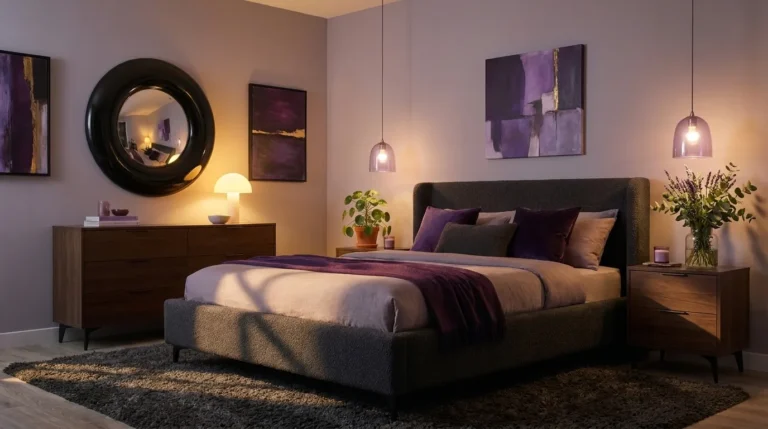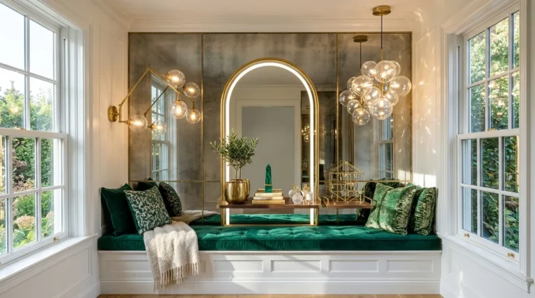
18 Dark Feminine Bedroom Ideas for a Moody Retreat
Ever walked into a bedroom and felt like it was hugging you? That’s the magic of going dark. If you’ve been scrolling for dark feminine bedroom ideas but keep landing on the same tired velvet-and-blush formula, you’re about to see something different — full, complete rooms built to actually live in, not just photograph once and forget.
I’ve worked alongside my husband on enough renovations to know that dark rooms live or die by two things: lighting and layering. Get those right, and a moody bedroom feels like a warm hideaway. Get them wrong, and it feels like a cave. In my experience, most people avoid dark colors entirely because nobody ever shows them how to make the room breathe. This guide fixes that. Fully styled ideas, each with its own palette, lighting plan, and personality, so you can pick the one that feels most like you and actually bring it home.
1. Magenta Midnight Muse — A Dark Feminine Bedroom Idea
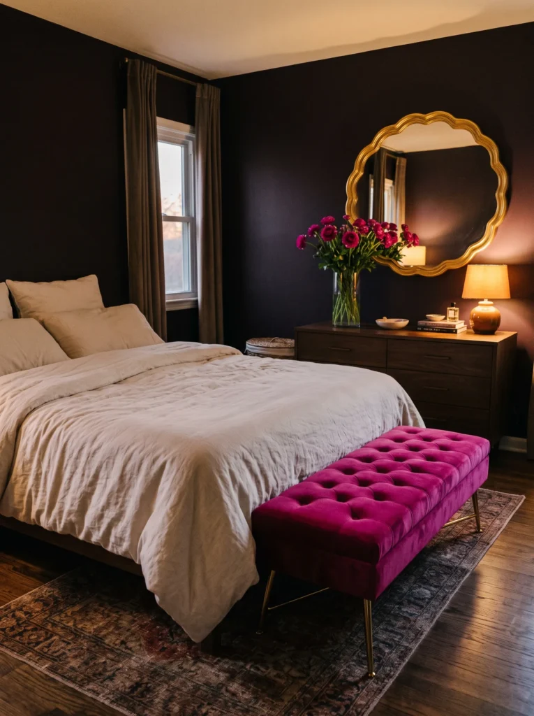
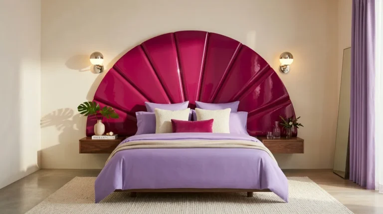
Color palette: Deep aubergine-black walls, vivid magenta velvet bench, brushed gold hardware, cream linen bedding.
- Aubergine-black walls in matte finish, dark enough to read almost pure black from across the room but revealing a deep purple undertone up close
- Vivid magenta velvet bench at the foot of the bed, a genuinely saturated pink-purple rather than a muted rose or blush
- Brushed gold hardware throughout, including a scalloped gold mirror hung above the dresser at a slight tilt
- Cream linen sheets kept plain, letting the aubergine-black and magenta carry the room’s full visual weight
- A curved brass reading lamp beside the bed, shade angled downward to create a warm, contained pool of light
- A tall glass vase of fresh magenta ranunculus on the dresser, echoing the bench color in a living, seasonal form
Why this works: Magenta is a genuinely bold, saturated color rarely used in dark feminine bedrooms, and pairing it against near-black walls creates far more visual drama than the muted blush accents used in nearly every competing article.
Magenta against aubergine-black walls is a pairing you won’t find in the typical scroll of dark feminine bedroom ideas, which tend to lean on soft blush or dusty rose as the default accent. I painted a small nursery-turned-office in almost this exact aubergine-black a few years back, and I remember being nervous it would feel like a cave until we brought in one saturated piece of furniture — that’s exactly the logic behind this bench. A scalloped gold mirror tilted slightly off the wall catches both the magenta and the aubergine undertone in its reflection. In my experience, one confidently saturated accent piece does more to make a room memorable than an entire palette of carefully coordinated soft tones.
Fresh magenta ranunculus on the dresser keeps this vivid room feeling alive and current rather than static, refreshed weekly instead of relying on dried stems that would mute the room’s energy over time. The curved brass reading lamp beside the bed creates a warm, contained glow at night, which matters in a room this saturated — I’ve walked into showroom versions of near-black rooms lit with one flat overhead bulb, and the drama just disappears under that kind of light. I’ve noticed rooms built around one bold, unexpected color like magenta tend to photograph as far more distinctive than the safer blush-and-gold formula most people default to.
You’ll Also Love:25 Small Maximalist Bedroom Ideas (Bold, Not Cluttered)
2. Cobalt & Rose Gold Reverie
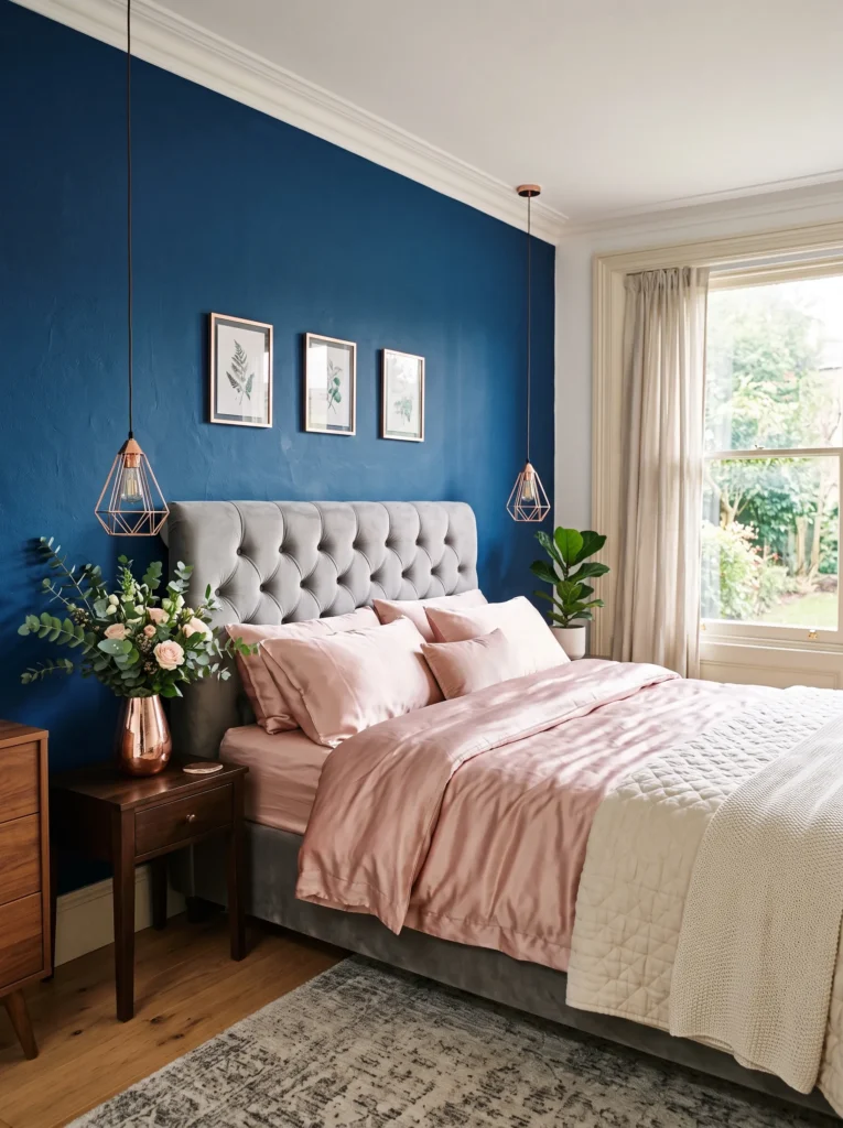
Color palette: Deep cobalt-blue walls, rose gold hardware, blush-pink silk bedding, warm ivory trim.
- Cobalt-blue walls in a rich matte finish, more vivid and saturated than navy, with a true bright blue depth that stays jewel-toned rather than muted
- Rose gold hardware throughout, including a rose gold pendant light hung low and slightly off-center above the nightstand
- Blush-pink silk bedding, cooler and more lustrous than cream, chosen to shimmer softly against the deep cobalt backdrop
- Curved velvet headboard in a soft dove-grey, acting as a visual buffer between the vivid cobalt walls and the shimmering pink bedding
- Wide ivory trim around the window casing, keeping the cobalt from feeling like it’s closing in
- A cluster of fresh eucalyptus and blush garden roses in a low rose gold vase on the nightstand, refreshed weekly
Why this works: Cobalt is a far more vivid, saturated blue than the navy most dark feminine bedroom ideas default to, and pairing it with rose gold rather than warm brass creates a distinctly cooler, more contemporary version of the aesthetic.
Cobalt blue paired with rose gold sidesteps the warm brass-and-navy formula that dominates most dark feminine bedroom ideas, offering something distinctly cooler and more contemporary instead. A client of ours picked this exact combination for a guest room a couple of springs ago, and what surprised me most was how much younger and fresher it read compared to the brass-heavy rooms we’d done before — rose gold just changes the whole temperature of a space. A dove-grey velvet headboard sits between the two boldest elements in the room, softening the transition from wall to bedding. In my experience, cobalt reads far more sophisticated than people expect once it’s paired with the right cool-toned metallic.
Fresh eucalyptus and blush roses in a rose gold vase keep this room feeling current and alive rather than heavy, and the pink-toned metal echoes the flowers without introducing an unnecessary extra color. Wide ivory trim around the window casing does quiet but important work here, giving the eye a resting point against the saturated cobalt. I’ve painted a cobalt accent wall without that kind of defined trim before, and it genuinely felt like the color was pressing in by evening — adding the ivory break the second time around fixed that completely.
3. Midnight Gold Romance
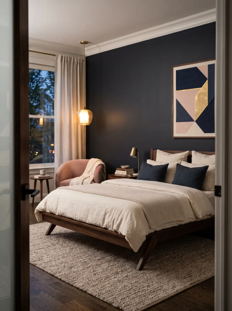
Color palette: Charcoal-navy walls, warm gold accents, blush pink accent chair, cream bedding.
- Charcoal-navy walls, darker and cooler than plain navy, warmer than pure charcoal, landing between the two
- A single blush velvet accent chair in the corner, the only saturated warm color against the cool wall tone
- Cream linen bedding kept simple, no pattern, so the wall color and the chair carry the visual weight
- Dark walnut bed frame with angular, straight legs, a deliberate break from the curved silhouettes common in this style
- Brushed gold ceiling pendant with a fabric shade, hung slightly off-center above the reading chair
- A stack of hardcover books topped with a single brass letter opener on the nightstand
Why this works: An off-center pendant breaks the expected symmetry of a light fixture centered over the bed and instead draws the eye toward the reading corner — a small architectural choice that changes how the whole room is used.
Angular walnut furniture against a charcoal-navy wall reads completely different from the rounded, tufted shapes that dominate most dark feminine bedroom ideas right now, and that contrast is the whole point of this room. The straight lines keep the space from tipping into overly soft or precious, while the blush chair and cream linens still carry the warmth the color scheme needs. It’s a slightly more tailored, grown-up version of the aesthetic — the kind of room that photographs well but also holds up to actually living in every day.
Off-center lighting is a small decision that does a lot of work here. I’ve noticed that centered ceiling fixtures in dark rooms tend to flatten everything beneath them into one dim pool, while shifting the light toward a specific activity makes the whole room feel more considered. My husband installs dimmer combinations like this on nearly every dark-painted bedroom he’s worked on, because a single fixed brightness level in a dark room rarely suits both reading and sleeping.
4. Aubergine & Antique Mirror
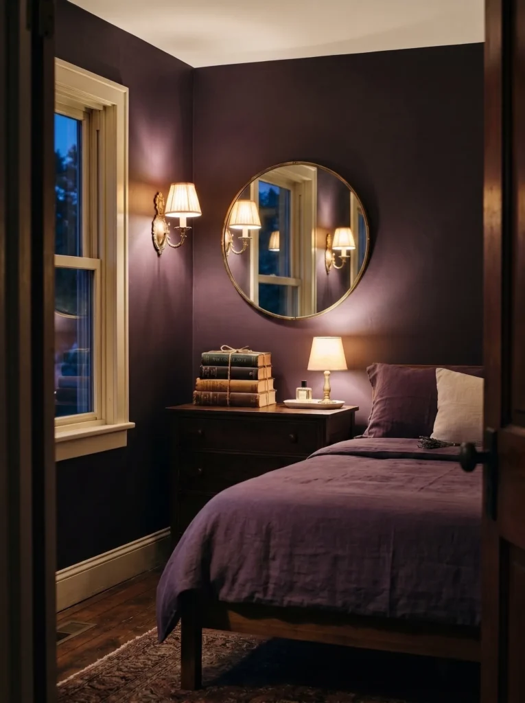
Color palette: Deep aubergine walls, lavender-grey coverlet, brass hardware, warm cream ceiling.
- Aubergine painted in a soft matte finish, never satin, which flattens the depth this color needs
- Lavender-grey linen coverlet, the only cool-toned textile, keeping the aubergine from tipping too purple
- Antique foxed mirror above the dresser, glass slightly imperfect with age spots
- Brass double sconces flanking the mirror, angled to catch and scatter reflections across the ceiling at night
- Wide cream trim around the window and door frames, a thin visual break
- A single stack of vintage hardback books on the dresser, spines facing out
Why this works: Aubergine shifts color under different light throughout the day, and the antique mirror amplifies that shift instead of just adding decoration.
Deep aubergine walls read almost black in daylight and glow purple-violet under lamp light — that shift is the entire personality of this room. Most dark feminine bedroom ideas pick one dark tone and treat it as static, but aubergine actually changes character depending on the hour. Paired with a soft lavender-grey coverlet and warm brass sconces, the color reads sophisticated rather than gothic. In my experience, aubergine intimidates people on a paint chip far more than it does on an actual wall, especially once warm lighting is layered in properly.
The antique mirrored dresser is what actually makes this room feel finished rather than half-styled. Its foxed, slightly imperfect glass catches the aubergine wall color and throws soft violet reflections across the ceiling at night. I’ve noticed that most styled dark bedrooms rely on one flat mirror for symmetry, but an antique piece with texture adds depth instead of just doubling the room visually.
5. Plum Silk Cocoon
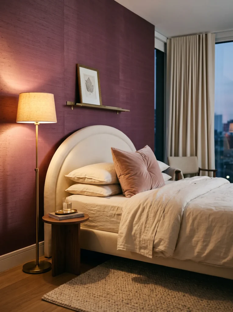
Color palette: Deep plum silk walls, warm gold hardware, cream linen sheets, soft blush throw pillow.
- Plum silk-finish paint used only behind the bed as an accent wall, keeping cost and drama contained
- Curved headboard upholstered in matching plum silk, rounded rather than angular
- Warm gold brass hardware on the dresser and bed frame legs, the only metallic in the room
- Cream linen sheets with a single soft blush velvet lumbar pillow
- Fabric-shaded brass floor lamp positioned beside the headboard, throwing a candle-like glow
- A narrow brass shelf above the headboard holding one small framed print
Why this works: Silk reflects light instead of absorbing it the way velvet does, which is why this plum room reads soft and glowing rather than heavy.
Plum silk against warm gold hardware is a combination most dark feminine bedroom ideas underuse, favoring velvet almost exclusively. Silk catches light completely differently — it shimmers rather than absorbs. A curved headboard wrapped in the same plum silk pulls the eye toward one soft, glowing shape rather than a flat expanse of color. I’ve tried both velvet and silk in dark rooms, and silk consistently reads lighter and more luxurious under warm lamp light, even though the underlying color is just as saturated.
Warm gold hardware and a single brass floor lamp keep this room from feeling like a jewelry box gone too far. The lamp’s fabric shade throws a candle-like glow across the silk headboard each evening. In my experience, one strong light source aimed directly at a textured surface does more for a moody bedroom than three scattered accent lights, and it costs far less to install.
6. Charcoal Bloom Corner
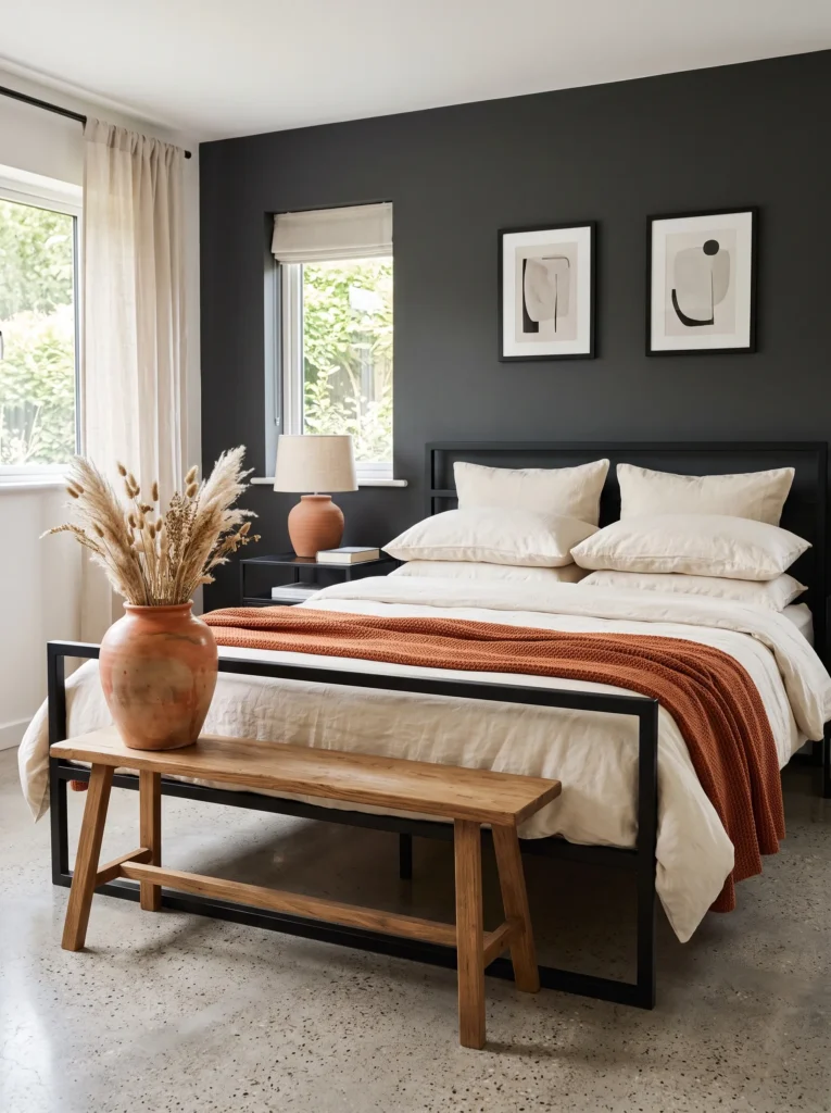
Color palette: Charcoal walls, terracotta accents, cream bedding, muted sage-green dried botanicals.
- Charcoal walls in matte finish, paired with terracotta instead of the usual blush or gold
- A single ceramic terracotta vase holding dried pampas and eucalyptus stems on a low bench at the foot of the bed
- Low, angular bed frame in matte black steel, a sharp contrast to the plush curved frames common in this style
- Woven jute rug underfoot, adding warmth and texture without introducing another color
- Cream linen bedding kept plain
- A woven terracotta-toned throw draped over the foot of the bed
Why this works: Dried botanicals and a jute rug bring warmth and texture into a charcoal room without adding a single new color, keeping the palette calm instead of busy.
Charcoal walls paired with terracotta and dried botanicals sidestep the pink-and-gold formula almost every dark feminine bedroom idea defaults to. Dried pampas and eucalyptus stems add texture without demanding water or bright light, which matters in a room that intentionally keeps natural light low. I’ve noticed dried botanicals age beautifully in dark rooms, taking on a muted, sun-bleached quality that fresh flowers never develop.
A woven jute rug underfoot keeps this charcoal room from feeling cold or overly formal despite the dark wall color. Combined with a low, angular bed frame in matte black steel, the whole room leans architectural rather than overtly romantic. In my experience, mixing in one raw, natural material like jute keeps a fully dark palette from tipping into something that feels staged.
7. Navy & Brass Study
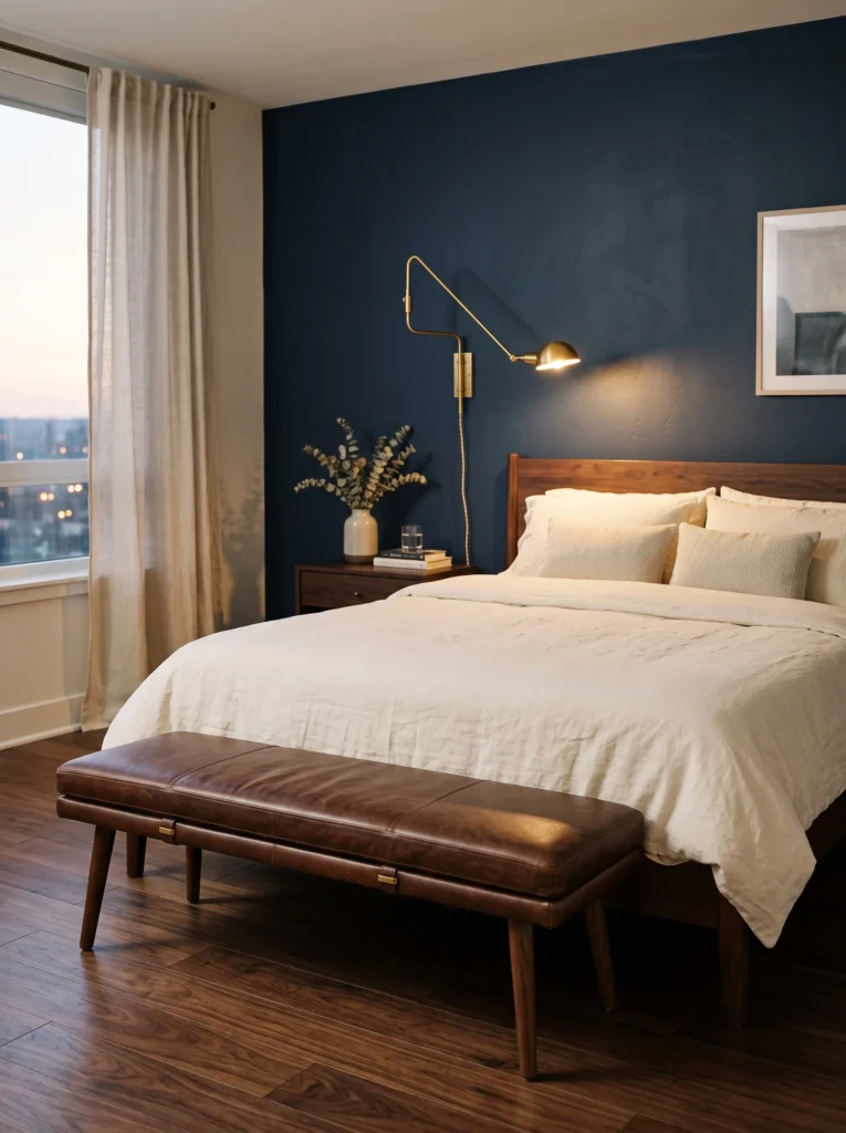
Color palette: Deep navy walls, warm brass hardware, cream linen bedding, chocolate-brown leather accent.
- Navy walls in a matte finish, deep enough to read almost black in low light but distinctly blue under daylight
- Brass library-style sconce mounted directly above the headboard, angled downward like a reading light
- Chocolate-brown leather bench at the foot of the bed
- Cream linen bedding kept simple and unpatterned
- Brass picture light above a small stack of leather-bound books displayed flat
- Wide-plank dark walnut flooring, left unrugged in one corner to show off the wood grain
Why this works: Brass reads warmer against navy than it does against black or charcoal, because the blue undertone in navy makes gold-toned metal appear richer by contrast.
Navy and brass together read more like a study than a typical dark feminine bedroom, and that’s exactly the appeal. A library-style sconce mounted directly above the headboard, angled down like task lighting, reinforces that studious, grown-up mood. In my experience, this pairing works especially well in rooms shared with reading habits, where the light needs a real job to do, not just ambiance.
Chocolate-brown leather is the detail that keeps this room from feeling too cool or masculine despite the navy base. Paired with unrugged walnut flooring in one corner, the room shows off real material texture rather than relying on soft textiles alone. I’ve noticed leather and brass together hold up in daily use far better than velvet does, which matters in a room people actually live in.
8. Lavender Ink Dream
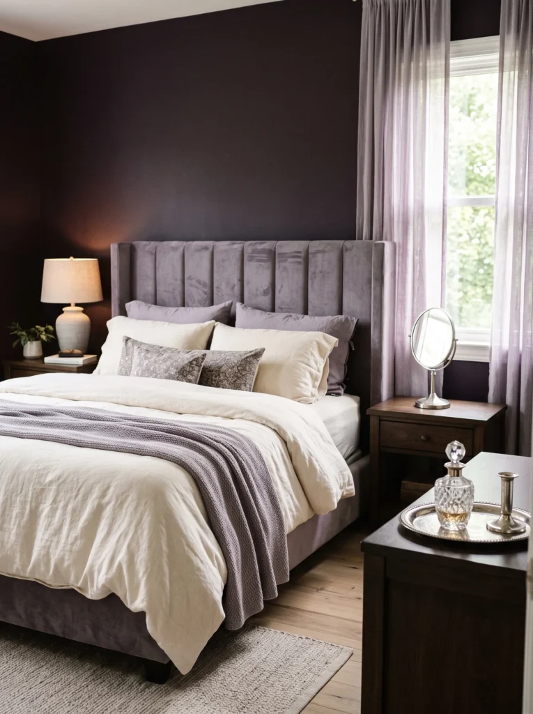
Color palette: Deep ink-purple walls, soft lavender bedding, brushed silver hardware, warm cream accent.
- Ink-purple walls in matte finish, dark enough to read black from across the room but distinctly violet up close
- Soft lavender linen duvet layered over cream sheets
- Brushed silver hardware, a cooler metallic choice that suits the purple-lavender palette better than warm metals would
- Curved velvet headboard in a dusty lavender-grey, softer and more muted than the deep ink walls behind it
- Silver-framed vanity mirror with a small brushed-silver tray beneath it
- Sheer lavender-grey curtains layered over blackout liners
Why this works: Cool-toned silver hardware keeps this ink-purple and lavender palette from clashing, proving the metallic choice matters as much as the wall color itself.
Ink-purple and lavender together create one of the softest, most monochromatic palettes in this collection, and the brushed silver hardware is what keeps it cohesive. I’ve noticed that monochromatic dark rooms like this one photograph beautifully but require real discipline — adding even one warm-toned object can throw off the entire cool, dreamy effect.
Layered curtains are the detail that makes this room genuinely livable. Sheer lavender-grey panels over blackout liners let the space shift from soft and glowing during the day to fully dark at night. My husband installs this exact double-curtain setup often, since dark-painted rooms need real control over natural light, not just heavy drapes that block everything all the time.
9. Charcoal & Antique Gold Boudoir
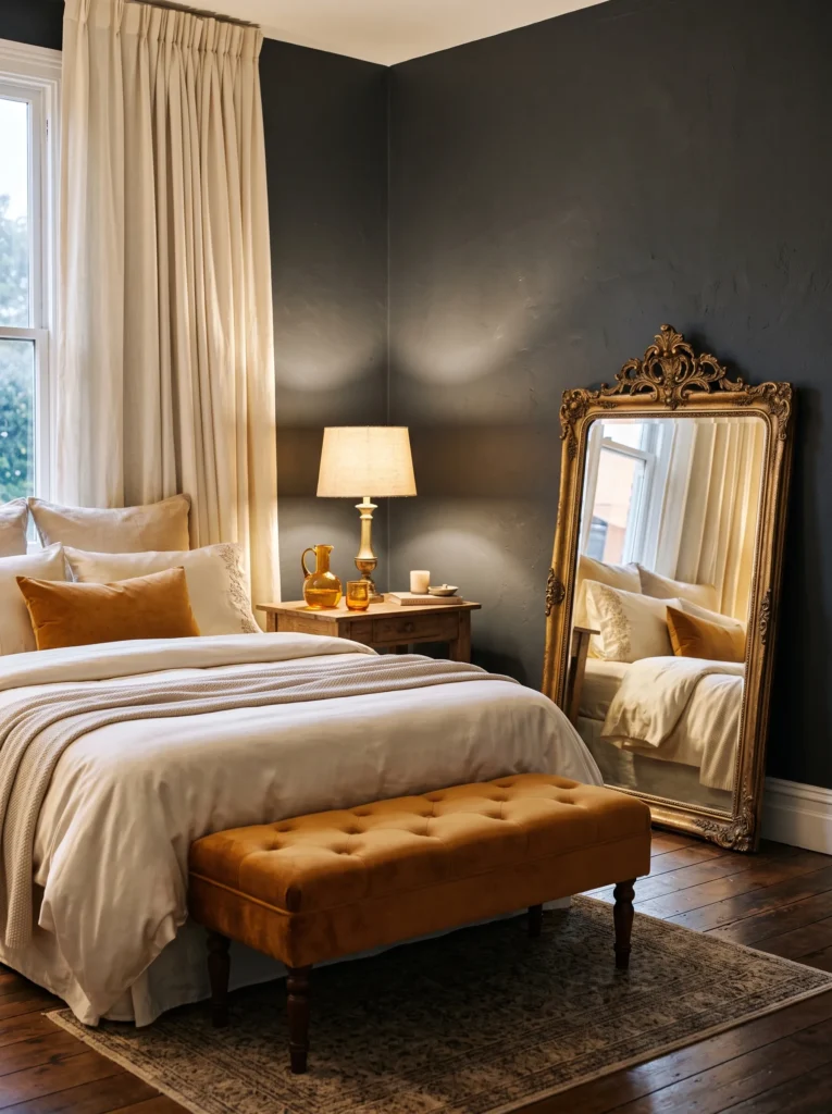
Color palette: Deep charcoal walls, antique gold hardware, cream silk bedding, warm amber accent.
- Charcoal walls in matte finish, cooler and more neutral than aubergine or navy
- Antique gold hardware with a slightly worn, tarnished finish rather than polished brass
- Cream silk bedding paired with a single amber glass carafe and glass on the nightstand
- Curved bench seat upholstered in warm amber velvet at the foot of the bed
- Antique gold-framed vanity mirror propped against the wall rather than hung
- Wide cream drapery panels pooling slightly on the floor
Why this works: Antique, slightly tarnished gold reflects less light than polished brass, keeping a charcoal room from feeling cold or overly formal.
Antique gold does something polished brass can’t in a charcoal room — it softens the light instead of bouncing it sharply. In my experience, worn metallics photograph just as well as polished ones, but they age into a room instead of always looking freshly installed.
The leaned vanity mirror is a small choice that changes how the whole room reads. Propped against the wall at a slight angle, it catches the amber glass carafe’s reflection along with soft daylight. I’ve noticed this kind of intentional imperfection is exactly what separates a room that feels genuinely styled by someone who lives there from one that feels staged for a single photo.
10. Berry Wine Glow
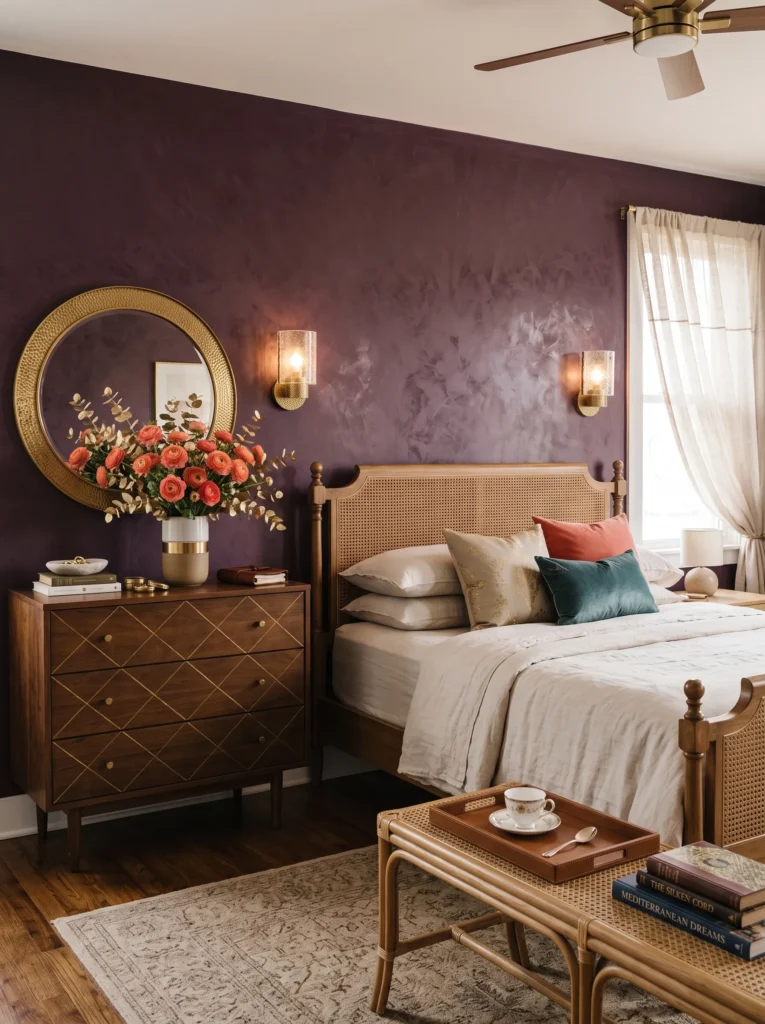
Color palette: Deep berry-wine walls, hot coral accent pillow, brushed brass hardware, cream linen base.
- Berry-wine walls in matte finish, richer and more saturated than plum, closer to a deep cranberry
- One bold coral velvet lumbar pillow against otherwise neutral cream bedding
- Brushed brass wall sconces flanking a curved rattan headboard
- Cream linen curtains with a subtle coral pinstripe along the hem
- A round brass mirror hung slightly off-center above the dresser
- A ceramic bowl of fresh ranunculus in coral and cream tones, refreshed weekly
Why this works: A single saturated coral accent against berry-wine walls creates real visual pop that pastel blush can’t achieve.
Berry-wine walls paired with a bold coral accent break from the muted blush-and-gold formula that dominates almost every dark feminine bedroom idea currently online. In my experience, one confidently bold accent color does more for a room’s personality than five muted ones layered together cautiously.
Fresh ranunculus in coral and cream tones, replaced weekly, keeps this vibrant room feeling alive rather than static. I’ve noticed clients hesitate on bold accent colors most in the bedroom, assuming dark rooms must stay muted, but a single vibrant note is often what makes the whole space memorable.
11. Sapphire & Fuchsia Nights
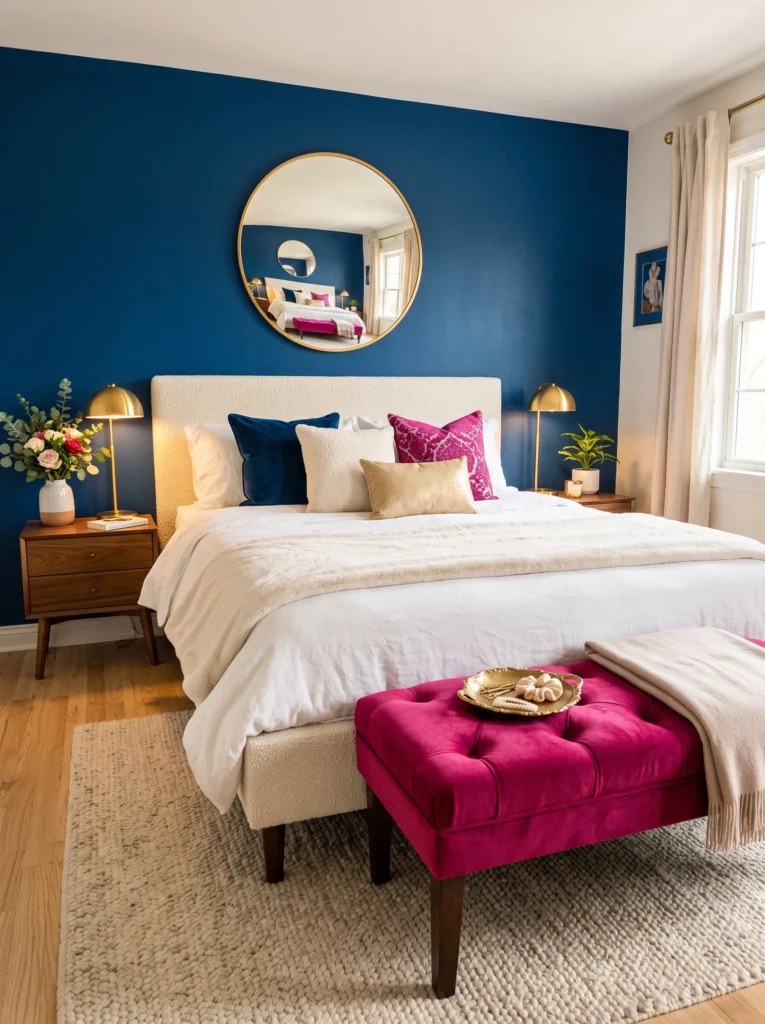
Color palette: Deep sapphire-blue walls, fuchsia velvet bench, warm gold hardware, cream bedding.
- Sapphire walls in a rich matte finish, more vibrant and jewel-toned than navy
- Fuchsia velvet bench at the foot of the bed, a genuinely bold pink
- Warm gold hardware throughout, chosen because gold reads richer against sapphire than silver
- Curved bed frame upholstered in cream boucle
- A gold-framed round mirror hung above the bench
- A small gold dish holding a stack of fuchsia and gold hair accessories
Why this works: Pairing two bold tones instead of one bold tone against a neutral base is a genuinely different formula than the muted-plus-metallic approach nearly every competing article relies on.
Sapphire and fuchsia together is a bolder pairing than almost anything else in this collection. In my experience, rooms built around two strong colors instead of one need a neutral anchor piece, or the space can start to feel chaotic rather than curated.
The gold dish of hair accessories on the bench is a small, practical touch that makes this room feel genuinely used rather than staged. I’ve noticed rooms with this kind of true, functional daily object tend to feel more authentic and lived-in than ones styled with purely decorative props.
12. Oxblood & Marigold Statement
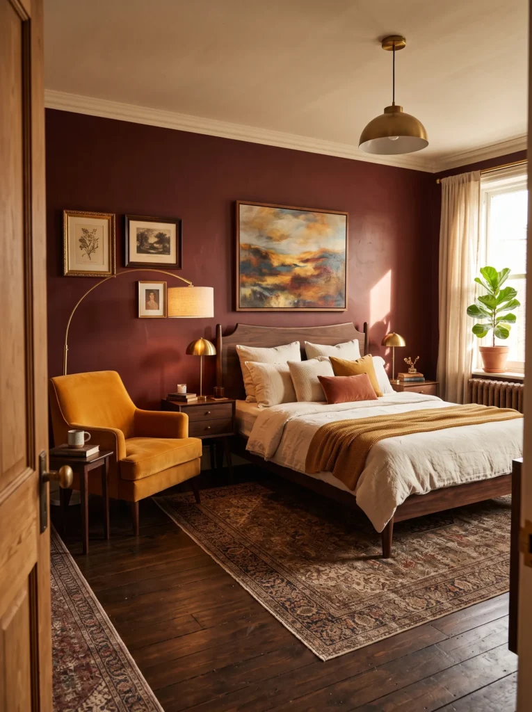
Color palette: Deep oxblood-red walls, marigold-yellow accent chair, brushed brass hardware, cream linen bedding.
- Oxblood walls in matte finish, warmer and richer than a true red, close to aged leather in tone
- Marigold-yellow velvet accent chair in the corner, a genuinely vibrant warm yellow
- Brushed brass floor lamp beside the chair, angled to create a dedicated reading nook
- Cream linen bedding kept simple and unpatterned
- Dark walnut bed frame with subtly curved legs
- A small gallery of three mismatched vintage frames above the chair
Why this works: Oxblood and marigold sit opposite each other on the color wheel, creating a bolder, more visually striking room than the tonal palettes most dark feminine bedroom ideas default to.
Oxblood and marigold are true complementary colors, which is a genuinely different approach than the tonal palettes used throughout most dark feminine bedroom ideas. In my experience, complementary color pairings intimidate people more than they should, but they create far more visual interest than sticking to one color family.
The small gallery of mismatched vintage frames above the chair pulls both the oxblood and marigold tones together. I’ve noticed rooms that commit fully to a true complementary pairing like this one tend to photograph as more distinctive and memorable than safer, same-family color schemes.
13. Teal & Blush Fantasy
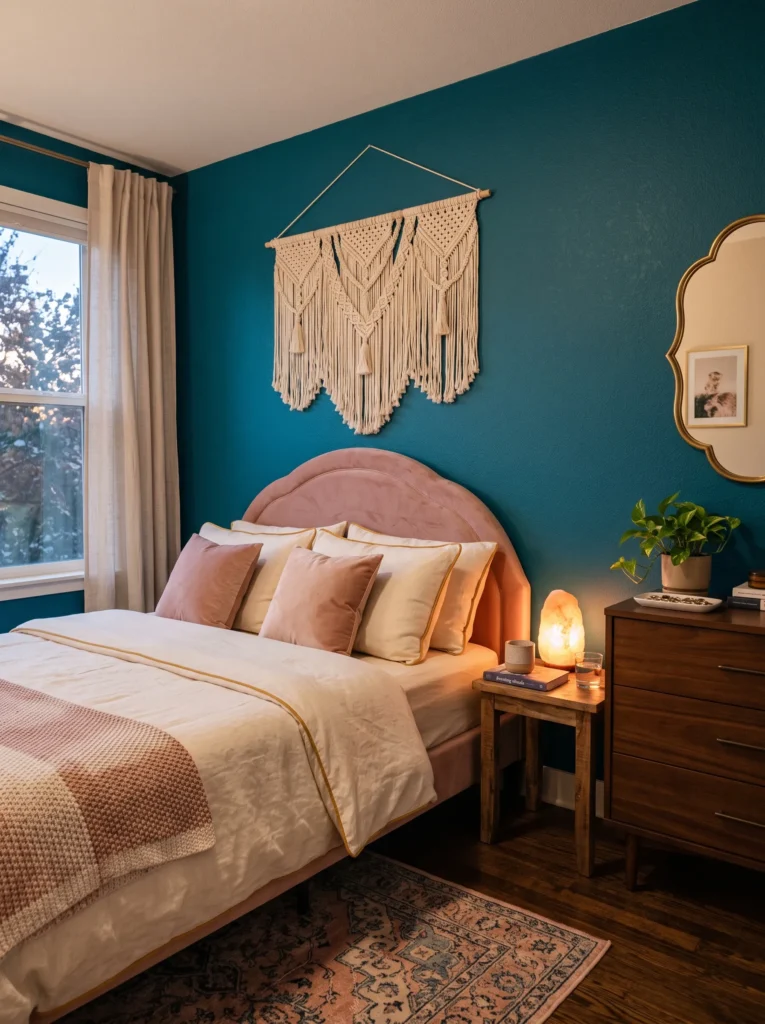
Color palette: Deep peacock-teal walls, blush-pink velvet headboard, warm gold hardware, cream bedding.
- Peacock-teal walls in matte finish, more saturated and jewel-toned than a standard teal
- Curved blush-pink velvet headboard, a genuinely warm pink rather than a dusty or muted rose
- Warm gold hardware and a scalloped brass mirror above the dresser
- Cream linen sheets with a thin gold piping detail along the edge
- A pink Himalayan salt lamp on the nightstand
- A woven cream macramé wall hanging above the headboard
Why this works: Teal and blush sit on opposite temperature ends of the color wheel, cool versus warm, creating real visual movement instead of a safer, single-temperature palette.
Peacock-teal and blush together create a genuinely playful, feminine energy that most dark feminine bedroom ideas don’t reach for. In my experience, teal intimidates people far more on a paint chip than it does once it’s actually up on a wall and balanced with a warm accent like blush.
The salt lamp is a small, practical detail that does real work in this room, softening the cooler teal walls at night without introducing a competing color. I’ve noticed small textured additions like the macramé hanging often matter more to how a room feels day-to-day than the big furniture pieces do.
14. Amethyst & Copper Glow
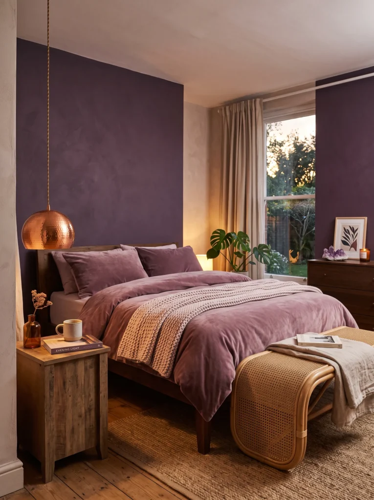
Color palette: Deep amethyst-purple walls, warm copper hardware, dusty mauve bedding, cream accent.
- Amethyst walls in matte finish, more vivid and jewel-toned than plum or aubergine
- Warm copper hardware and a copper pendant light, distinctly different from the brass and gold used throughout most of this collection
- Dusty mauve velvet bedding, warmer and pinker than lavender-grey
- Curved rattan bench at the foot of the bed
- A copper pendant light hung low over the nightstand instead of centered
- A cluster of amethyst crystal points displayed on the dresser
Why this works: Copper oxidizes and develops a distinct patina over time, unlike brass or gold, meaning this room’s metallic accents will genuinely deepen and change color as they age.
Amethyst walls paired with copper hardware is a combination that stands apart from the brass-heavy palettes used throughout most dark feminine bedroom ideas. In my experience, unusual metallic choices like copper are what make a room feel personally curated rather than pulled straight from a standard mood board.
The cluster of amethyst crystal points on the dresser ties the wall color back to something tactile and real. I’ve noticed that rooms built around one confidently saturated color, like this deep amethyst, tend to need exactly this kind of natural texture to keep from feeling like a single flat wash of color.
15. Crimson & Ivory Drama
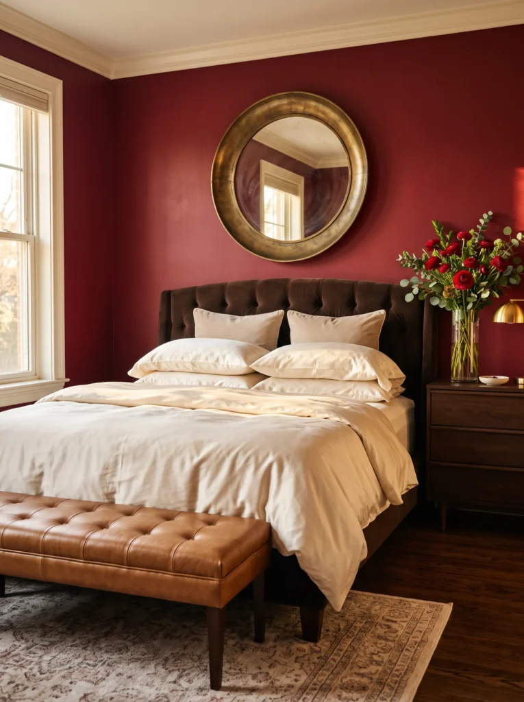
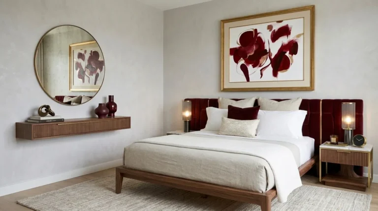
Color palette: Deep crimson-red walls, ivory silk bedding, aged brass hardware, warm caramel leather accent.
- Crimson walls in matte finish, a true saturated red rather than the browner oxblood tone used elsewhere
- Ivory silk bedding, cooler and crisper than cream
- Aged brass hardware with a deliberately uneven patina
- A caramel leather bench at the foot of the bed
- A large round aged-brass mirror hung directly above the headboard
- A single tall glass vase of deep red ranunculus on the dresser
Why this works: Crimson is one of the boldest, least common colors in this style, and pairing it with crisp ivory rather than warm cream creates the sharpest, most dramatic contrast of any idea in this list.
Crimson red is a color almost no dark feminine bedroom idea reaches for directly. In my experience, one confident statement piece like this large mirror does more for a saturated room than five smaller decorative objects combined.
Caramel leather at the foot of the bed grounds the vivid red and bright silk with something textured and warm. I’ve seen crimson used sparingly as a single throw pillow in most styled bedrooms, but committing to it as a full wall color, balanced correctly with ivory and leather, creates a genuinely memorable, dramatic room.
16. Espresso Velvet Manor
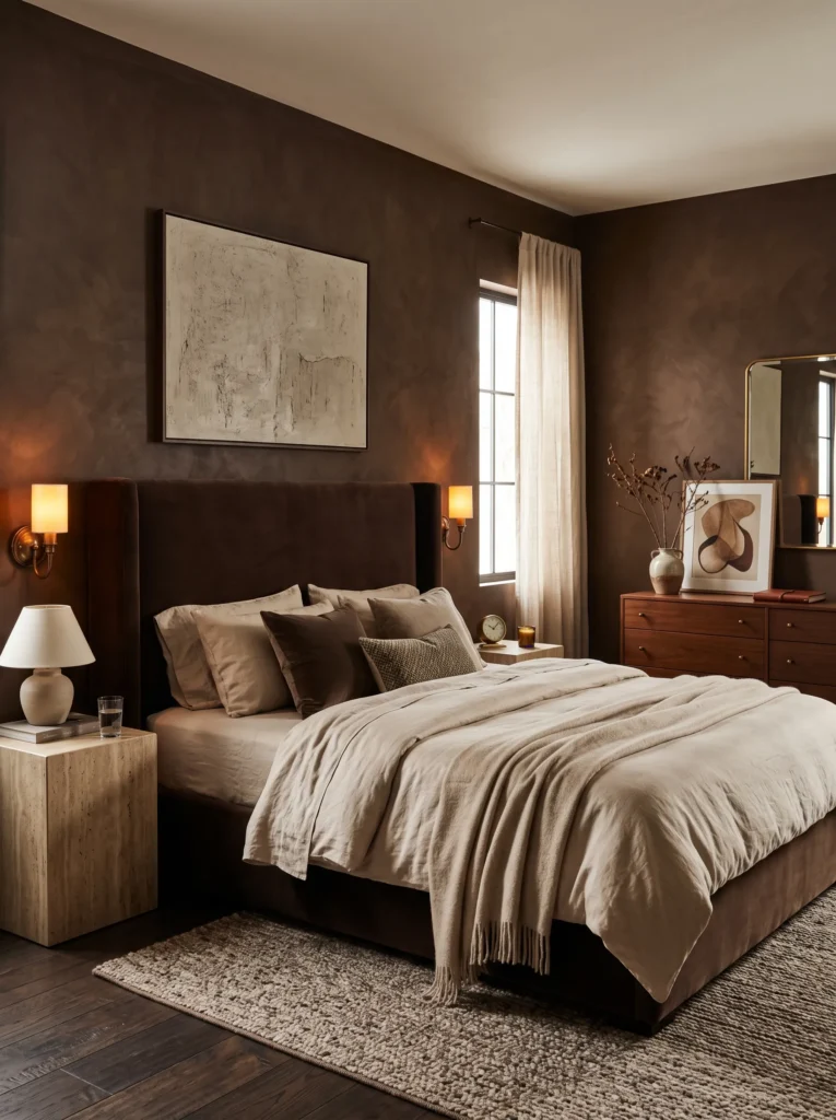
Color palette: Warm espresso limewash walls, chocolate velvet bed, champagne linen bedding, bronze accents.
- Wrap the room in warm espresso limewash walls for a cocoon-like atmosphere
- Make an oversized chocolate velvet bed the statement piece
- Pair travertine nightstands with vintage bronze sconces
- Layer champagne linen bedding with a soft cashmere throw
- Complete the space with a sculptural walnut dresser and one large abstract painting
Why this works: Warm brown tones feel luxurious because they create depth through natural materials instead of relying on high contrast alone.
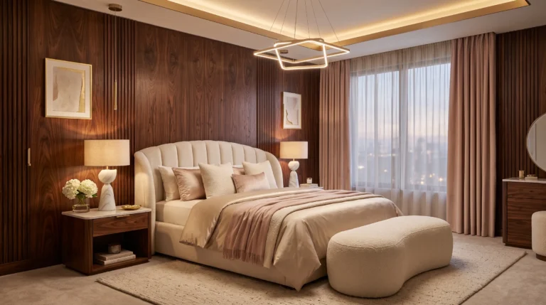
Dark feminine bedrooms don’t have to revolve around black. Rich espresso walls create a softer, more inviting backdrop while still delivering the dramatic atmosphere many homeowners love. The oversized chocolate velvet bed immediately grounds the room, and champagne bedding introduces just enough brightness to keep the palette balanced. Travertine and walnut add natural warmth that prevents the space from feeling flat or overly formal. I’ve noticed that combining layered earth tones with velvet textures creates a bedroom that feels welcoming during every season instead of looking overly styled.
Living in Austin has taught me that warm colors often make a bedroom feel more relaxing than cooler palettes, especially when natural afternoon light fills the space. My husband also reminds clients that investing in quality millwork and timeless materials creates more impact than constantly changing decorative accessories. A paneled wall finished in a rich espresso tone instantly elevates the room, while bronze lighting develops a beautiful patina over time. The finished space feels collected, comfortable, and sophisticated without chasing short-lived design trends.
17. Black Orchid Retreat
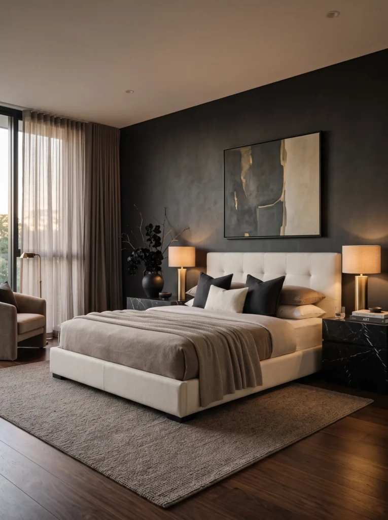
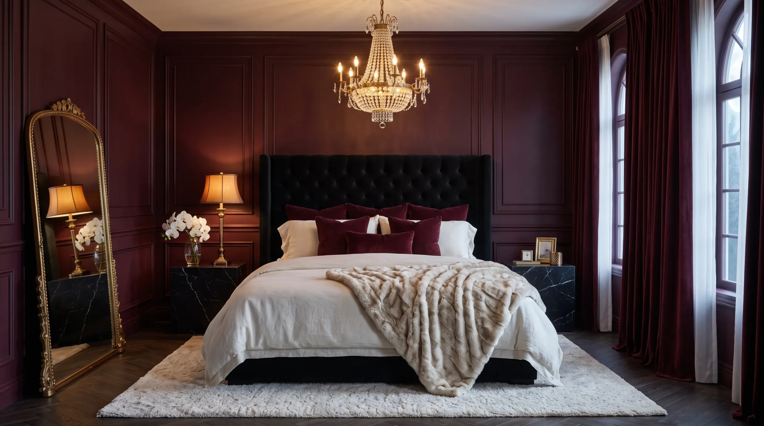
Color palette: Charcoal walls, ivory upholstered bed, black marble accents, aged brass.
- Decorate with sculptural black orchid arrangements instead of colorful flowers
- Anchor the room with an ivory upholstered bed for elegant contrast
- Add black marble nightstands and brushed brass table lamps
- Keep the palette limited to charcoal, ivory, soft taupe, and aged brass
- Style with only one oversized ceramic vase and minimal accessories
Why this works: Limiting decorative objects allows exceptional natural forms to become the room’s most memorable design feature.
A luxurious bedroom often feels more intentional when nature becomes part of the design instead of an afterthought. Sculptural black orchids introduce graceful movement and dramatic contrast without overwhelming the room. Their elegant shape pairs beautifully with an ivory upholstered bed, creating balance between light and dark elements. Charcoal walls, black marble, and brushed brass complete the composition with understated sophistication. Rather than filling every surface, keeping the décor restrained allows the eye to appreciate each carefully selected material and gives the room a refined boutique hotel atmosphere.
My background in plant science has made me appreciate how botanical forms soften strong architectural interiors. Orchids naturally bring elegance because their graceful stems create movement against clean lines and structured furniture. I’ve found that displaying one exceptional arrangement has a far greater impact than scattering multiple small plants throughout the room. This approach also keeps maintenance simple while preserving the uncluttered aesthetic. The result is a bedroom that feels luxurious, calming, and timeless without depending on excessive decoration or bold seasonal trends.
18. Emerald Noir Sanctuary
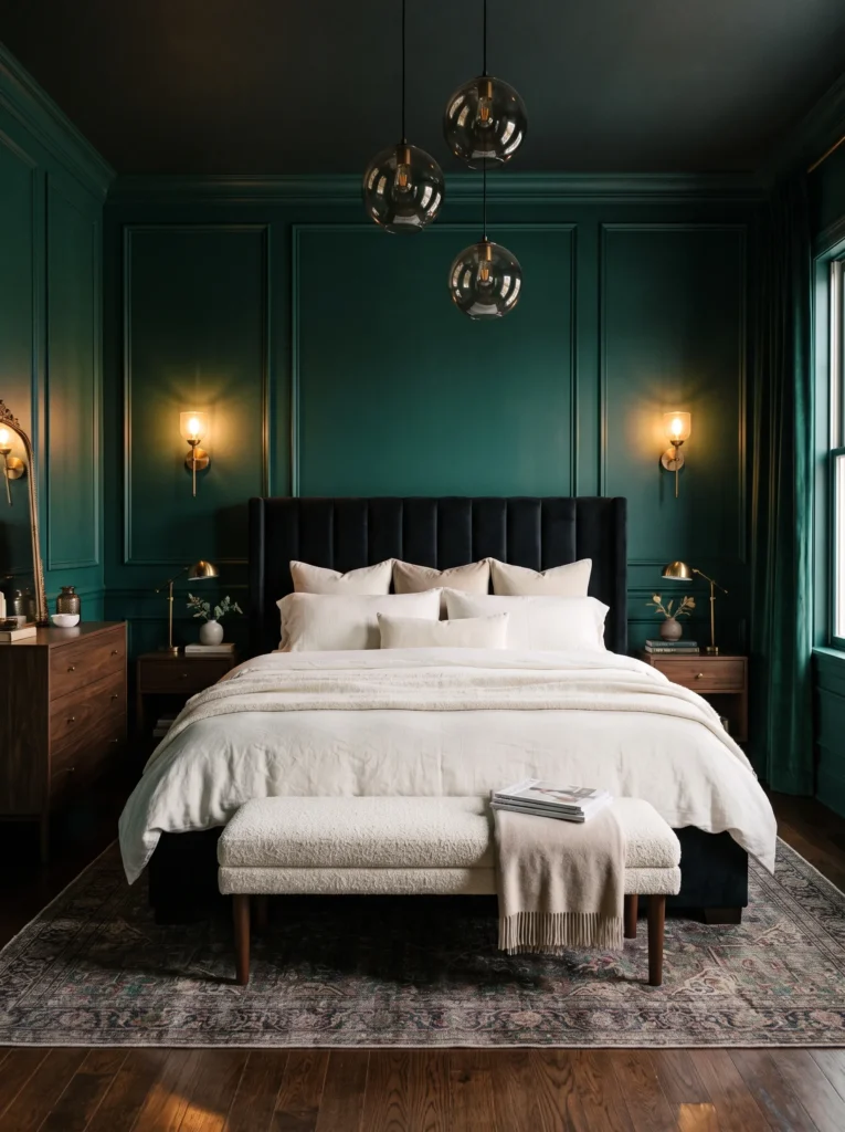
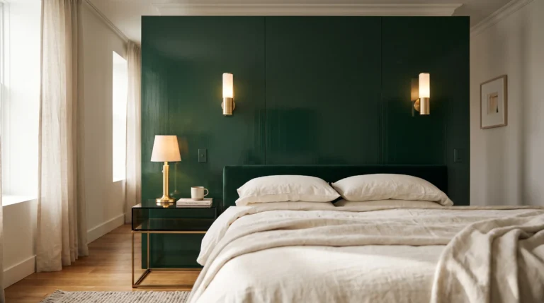
Color palette: Deep emerald paneled walls, black velvet bed, ivory linen bedding, antique brass accents.
- Choose deep emerald paneled walls for a rich, jewel-toned backdrop
- Anchor the room with an oversized black velvet channel-tufted bed
- Add antique brass sconces and smoked glass pendant lights for layered warmth
- Balance the darker palette with ivory linen bedding and a soft boucle bench
- Finish with dark walnut furniture and one oversized vintage landscape painting
Why this works: Emerald creates depth without overwhelming the room, while warm brass and natural wood prevent a dark palette from feeling cold.
Deep emerald is one of those colors that instantly changes the personality of a bedroom. Unlike plain charcoal or black, it reflects light with subtle dimension, making the walls feel rich rather than flat. Pairing it with a dramatic black velvet bed creates a luxurious foundation, while antique brass lighting introduces warmth that softens the darker palette. I’ve noticed that limiting the room to one statement artwork and a few carefully chosen accessories keeps the space calm, allowing the beautiful materials to become the true decoration instead of filling every surface.
My husband often says the best rooms begin with strong architectural elements rather than decorative extras, and this design follows that philosophy perfectly. Paneled walls, quality walnut furniture, and layered natural fabrics create a timeless backdrop that can evolve with changing décor over the years. Soft ivory bedding prevents the room from feeling heavy, while a boucle bench introduces tactile contrast. The overall effect feels refined, welcoming, and quietly luxurious — exactly the kind of bedroom that remains stylish long after passing trends disappear.
Styling Principles: Keeping Dark Rooms Warm, Not Heavy
A dark feminine bedroom only works if it breathes. The biggest mistake I see people make is treating the paint color as the whole project — pick a moody shade, call it done — when the real work happens after the paint dries.
- Never rely on one light source. A single overhead fixture reads flat and cave-like. Aim for at least two warm-toned sources (2700K).
- Match your accent temperature to your wall’s undertone. Warm brass suits purple, red, and warm charcoal. Cooler silver or rose gold suits blue, teal, and true jewel-purple.
- Give the eye a resting point. Cream trim, a lighter rug, or unpainted wood breaks up a fully dark room.
- Add one living or textured element. A plant, fresh flowers, jute, rattan, or leather keeps a saturated palette from feeling static.
- Test the color at night before committing. A dark room is used most after sunset, so that’s the lighting condition that matters most.
Frequently Asked Questions About Dark Feminine Bedroom Ideas
How do I keep a dark bedroom from feeling too heavy or cave-like? Layer at least two warm light sources instead of relying on one overhead fixture, and include a lighter anchor somewhere in the room — cream trim, a pale rug, or natural wood flooring.
What are the best dark colors for a good night’s sleep? Deeper, cooler-toned colors like navy, charcoal, and true black tend to support melatonin production better than warm, bright colors, since they reflect less ambient light back into the room at night.
Can I try this look on a budget? Yes. Start with one accent wall instead of painting the entire room, and focus your budget on one or two well-placed light fixtures rather than furniture.
What’s the best lighting setup for a dark bedroom? A mix of one ambient source and one task source, both on the warmer end of the color temperature scale. Dimmers are worth the small extra cost.
Will a dark bedroom feel too small in a small room? Not necessarily. Dark walls can make a small room’s edges recede rather than emphasize them, especially with a lighter ceiling color and good lighting.
Do I need to paint all four walls dark, or can I do just one? A single accent wall behind the bed delivers most of the mood with a fraction of the commitment and cost.
Final Thoughts
A moody bedroom isn’t about hiding from light — it’s about choosing warmth on your own terms. Whether you’re drawn to ink black and brass, cobalt and rose gold, or a bold pop of magenta against near-black walls, these dark feminine bedroom ideas prove that dramatic doesn’t have to mean heavy. I’ve seen how small changes like a well-placed lamp or one saturated accent piece can completely transform how a room feels to actually sleep in.
Save this post to Pinterest so you can revisit it when you’re ready to start, try one idea in a corner of your own space first, and pass it along to a friend who’s been dreaming of a moodier room too.