15 Soft Yellow Bedroom Ideas That Feel Calm
Yellow gets a bad reputation in bedrooms, and I get why. Most people picture a saturated, school-bus shade and assume it’s too loud for a room meant for rest. But soft yellow bedroom ideas built around the right pairing tell a completely different story. Yellow reflects more visible light than any other hue, which is exactly why a muted, desaturated version paired with a grounding secondary color — charcoal, navy, walnut brown — can feel warm and calm instead of overstimulating.
I painted a guest room butter yellow years ago with no grounding color at all, and it read more restless than restful. This post shows fifteen full-room pairings that get a soft yellow bedroom right, colors and all.
Why Soft Yellow Deserves a Second Look
Yellow gets skipped in bedroom design more than almost any other color, and it’s usually for the wrong reason. Here’s the actual science: yellow reflects more visible light than any other hue, which is why a saturated version can feel jittery in a room meant for winding down. The fix isn’t avoiding yellow — it’s choosing a muted, desaturated shade and grounding it with a color that absorbs light instead of bouncing it back, like charcoal, navy, or walnut brown.
I painted a guest room butter yellow years ago with no grounding color, and it read more “waiting room” than “restful.” Pair it right, and yellow becomes one of the warmest, most livable bedroom colors there is. This post shows exactly how.
1. Butter & Charcoal Contrast
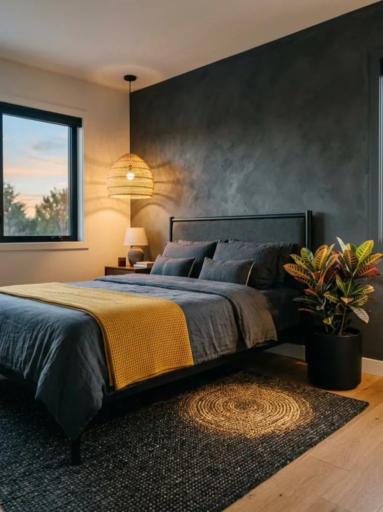
- WALLS: Butter yellow (a muted, low-chroma shade like Benjamin Moore’s “Hepplewhite Gold”) in eggshell finish, with one accent wall behind the headboard done in charcoal limewash for texture
- BEDDING: Charcoal linen duvet, layered with a mustard-yellow chevron-stitched throw at the foot of the bed
- WALL DECOR: A slim charcoal-framed botanical print with warm yellow tones in the foliage
- PLANTS: Croton ‘Petra’ in a matte charcoal ceramic pot — its naturally variegated yellow-orange veining echoes the wall color without adding another paint tone
- HANGING ELEMENT: A black woven rattan pendant light, hung slightly off-center over the nightstand
- RUG: Charcoal wool rug with a subtle flecked yellow thread running through it
- CURTAINS: Floor-length yellow linen curtains, unlined for soft diffusion
- FURNITURE/HARDWARE: Black matte metal bed frame with matching black matte drawer pulls
Why this works: Charcoal’s light-absorbing depth keeps a reflective color like yellow from feeling overstimulating, turning contrast into calm instead of visual noise.
Charcoal is one of the most effective grounding partners for yellow, and it’s not just an aesthetic pairing — it’s physics. Matte charcoal surfaces absorb the vast majority of light that hits them, which directly counteracts yellow’s tendency to bounce light around a room. That balance matters most in a bedroom, where the goal is calm, not stimulation. The limewash texture on the accent wall adds another layer of light control, since its uneven surface scatters reflection rather than throwing it straight back at you. The result reads moody and warm at once, not flat or one-note.
My husband always flags paint sheen first when clients bring him a yellow bedroom, since it changes everything. Eggshell on the main walls keeps the yellow soft rather than glossy, while a flat or limewash finish on the charcoal wall prevents any competing shine. In my experience, this is the detail most yellow bedrooms get wrong — a high-gloss yellow in a small room amplifies every light source in it, day and night. Keep sheens low across the board, and the charcoal will do its grounding job the way it’s meant to.
2. Ochre & Navy Depth
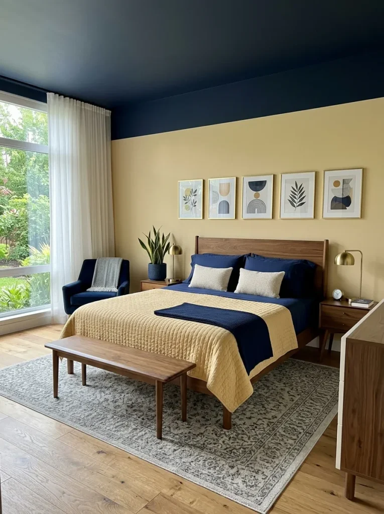
- WALLS: Pale ochre (a warm, dusty yellow like Farrow & Ball’s “Yellow Ground”) on three walls, with the ceiling painted in a deep navy for a “fifth wall” effect
- BEDDING: Crisp navy percale sheets layered under an ochre quilted coverlet with hand-stitched detailing
- WALL DECOR: A row of slim brass-framed prints with navy mats, hung in a tight horizontal gallery above the headboard
- PLANTS: Snake plant ‘Golden Hahnii’ in a navy ceramic pot — its natural yellow-striped leaf edges tie directly into the wall color
- HANGING ELEMENT: An unlacquered brass pendant light with a fluted glass shade
- RUG: A navy and cream jute rug, flat-woven for texture without bulk
- CURTAINS: Ochre linen curtains with navy trim tape along the leading edge
- FURNITURE/HARDWARE: Walnut bed frame with brass hardware and a navy-upholstered bench at the foot
Why this works: A navy ceiling paired with ochre walls is one of the most effective ways to add drama to a yellow bedroom without touching the floor plan.
Painting the ceiling is the single most underused trick in a yellow bedroom, and it belongs here for a reason. Navy overhead pulls the eye up, adds architectural weight to a room that could otherwise feel flat, and gives the ochre walls a dark anchor point instead of floating on their own. This pairing leans more sophisticated than sweet, which makes it a strong fit for a primary bedroom rather than a guest space. The brass accents catch just enough of the navy’s coolness to keep the whole room from skewing too warm or too heavy.
I styled a room almost exactly like this for a client’s guest suite last year, and the ceiling was the detail every visitor mentioned first. Navy overhead reads unexpected in a way flat white never does, and it makes the ochre walls feel intentional rather than accidental. The jute rug keeps the floor light and textural so the room doesn’t tip into dark and moody territory. Snake plants also happen to be nearly impossible to kill, which makes this pairing as practical as it is striking for a room that doesn’t get direct sun.
You’ll Also Love:15 Sage Green Bedroom Ideas for a Stylish Budget Room
3. Honey & Walnut Warmth
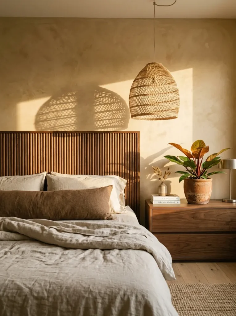
- WALLS: Honey yellow limewash, applied in loose, uneven strokes for handmade texture
- BEDDING: Unbleached linen sheets with a single walnut-brown bolster pillow as the only sharp contrast point
- WALL DECOR: A handwoven wall hanging blending honey and umber tones, hung asymmetrically above the dresser rather than centered over the bed
- PLANTS: Philodendron ‘Prince of Orange,’ whose copper-toned new leaves pick up the honey wall color, planted in a raw terracotta pot
- HANGING ELEMENT: A rattan pendant with an open weave that casts dappled shadow patterns
- RUG: A chunky jute rug in natural fiber tones
- CURTAINS: Unbleached linen curtains, left unhemmed at the bottom for a relaxed, lived-in edge
- FURNITURE/HARDWARE: Solid walnut bed frame with a reeded headboard panel, unlacquered brass hardware that will patina over time
Why this works: Walnut’s warm brown undertone sits close enough to yellow on the color wheel to feel cohesive, while its darker value keeps the room from reading flat.
Honey and walnut belong together because they’re working from the same warm family instead of fighting for attention. That closeness in undertone is exactly why this pairing feels so calm compared to a high-contrast combination — nothing in the room is competing, everything is complementing. The reeded texture on the walnut headboard adds dimension without adding another color, which is a trick worth remembering in any monochromatic-leaning room. Layer in raw terracotta and unlacquered brass, and every material in the space shares the same warm undertone, creating a room that feels curated rather than assembled piece by piece.
My husband’s crews reach for unlacquered brass on projects like this specifically because it ages instead of just sitting there looking the same for a decade. It picks up a soft patina over a few years that actually deepens the warmth of a room like this one. That’s a detail most bedroom guides never mention, but it matters if you’re choosing hardware you’ll live with for years. Pair it with a limewash finish on the walls, and the whole room develops richness over time instead of just looking good on day one.
4. Pale Ochre & Dusty Rose Romance
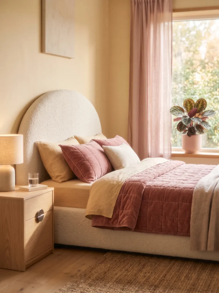
- WALLS: Pale ochre in a soft matte finish — the dominant surface color in the room
- BEDDING: Ochre linen duvet as the base layer, with a single dusty rose velvet lumbar pillow as the only rose textile
- WALL DECOR: An abstract painting majority ochre with loose dusty rose brushstroke accents, hung above the bed
- PLANTS: Calathea Roseopicta in a warm ochre-toned ceramic pot (not pink) so the plant reads as part of the yellow story, with its rose-striped leaves as the only rose note
- HANGING ELEMENT: A honey-toned rattan pendant light, not rose macramé
- RUG: A cream boucle rug with a thin ochre border
- CURTAINS: Ochre linen curtains, sheer weave for soft daylight diffusion
- FURNITURE/HARDWARE: A curved bed frame upholstered in cream boucle, chrome hardware on the nightstands, one dusty rose ceramic vase on the dresser as the sole extra rose touch
Why this works: Ochre and dusty rose sit on opposite temperature ends but share the same muted saturation, which is why a small dose of rose can accent yellow without competing with it.
This is the pairing to reach for when a bedroom needs a touch of softness without losing its warmth. Ochre carries the room — walls, curtains, bedding base, even the pendant — while dusty rose shows up only in small, deliberate doses: one pillow, one vase, the natural pink stripe in the Calathea’s leaves. Because both colors are desaturated to a similar degree, that small rose accent still reads as connected rather than random. The curved bed frame adds a soft, organic silhouette that echoes the pairing’s gentleness without introducing a third color to manage.
I’ve noticed the biggest mistake with this combination is letting the accent color creep until it takes over, which flips the whole room’s identity. Keep rose to one or two touches max, and let ochre stay the color your eye lands on first. Calathea Roseopicta earns its spot here because its foliage does double duty — pink striping ties to the accent, while its warm undertone still belongs to the yellow family it’s potted in.
5. Butter & Black Edge
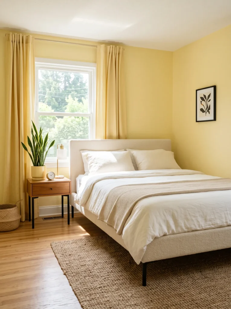
- WALLS: Butter yellow in matte finish, dominant across all four walls
- BEDDING: Butter yellow linen duvet as the base, with black piping along the pillow edges as the only black in the textile layer
- WALL DECOR: A slim black-framed line-art print, small in scale, hung off-center above the dresser
- PLANTS: Snake plant ‘Laurentii’ in a butter yellow ceramic pot, its dark green leaves with yellow edging tying naturally back to the wall color
- HANGING ELEMENT: A honey rattan pendant light (not black) to keep the ceiling sightline warm
- RUG: A pale yellow flatweave rug with a thin black border stripe
- CURTAINS: Butter yellow linen curtains, full length
- FURNITURE/HARDWARE: A cream-upholstered bed frame with black matte hardware on the nightstands — the single strongest black accent in the room
Why this works: A small, sharp dose of black gives a soft yellow room definition and prevents it from reading overly sweet, without ever competing with yellow for dominance.
Black works best in a yellow bedroom when it’s treated like punctuation, not paragraph. Here it shows up in exactly two places — the piping and the hardware — which is enough to sharpen the whole room without pulling focus from the walls. That restraint is what keeps this pairing from tipping into the moody, high-contrast territory of the charcoal combination earlier in this list. Instead, the room reads bright, current, and grounded all at once, since one or two decisive black touches read as intentional rather than an afterthought.
In my experience, this is the easiest yellow pairing for anyone nervous about “too much color,” since yellow does almost all the visual work and black simply frames it. A black-framed print, a set of matte drawer pulls, that’s genuinely enough. Adding more black than that starts to dilute the very brightness that makes a soft yellow room feel worth choosing in the first place, so resist the urge to layer it in everywhere.
6. Honey Yellow & Terracotta Sun
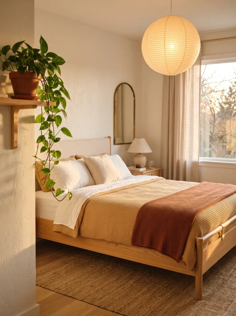
- WALLS: Honey yellow in a warm matte finish, covering the full room
- BEDDING: Honey yellow waffle-weave cotton duvet, with one terracotta throw folded at the foot as an accent layer
- WALL DECOR: A woven wall hanging in honey and terracotta tones, honey clearly the majority color, hung above the headboard
- PLANTS: A trailing Pothos ‘Neon’ in a terracotta pot — the plant’s chartreuse foliage reinforces the yellow story while the pot carries the accent color
- HANGING ELEMENT: A honey-toned paper lantern pendant, round and soft
- RUG: A honey and cream striped kilim rug, terracotta appearing only in a thin accent stripe
- CURTAINS: Honey linen curtains, unlined
- FURNITURE/HARDWARE: A light oak bed frame with unlacquered brass hardware, one terracotta ceramic lamp base on the nightstand as the strongest terracotta touch
Why this works: Terracotta and honey yellow share the same warm base tone, which is why this pairing feels sun-washed rather than clashing — but honey needs to lead so the room doesn’t read as an all-orange space.
Honey yellow and terracotta come from the same warm family, which makes this one of the coziest pairings on this list — but it’s also one of the easiest to get wrong. Let terracotta creep past a throw, a lamp base, and a pot, and the room starts reading orange instead of yellow. Keeping honey as the wall color, the curtain fabric, and the bedding base is what protects the room’s identity. The Pothos does quiet work here too, its chartreuse leaves picking up the yellow undertone even while sitting in a terracotta pot, reinforcing the room’s real anchor color.
My husband’s crews often point out that warm-toned rooms like this one perform best with layered lighting rather than one central fixture, since a single overhead source can flatten all that warmth into sameness. A paper lantern pendant plus a terracotta lamp on the nightstand gives the room two distinct light sources and two distinct moods — bright and diffused during the day, warm and pooled in the evening.
7. Pale Yellow & Gray-Blue Calm
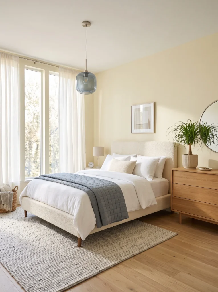
- WALLS: Pale yellow (a nearly-neutral, low-saturation shade) in matte finish across all walls
- BEDDING: Pale yellow linen sheets with a gray-blue quilted coverlet folded at the foot, not covering the full bed
- WALL DECOR: A single framed abstract print in gray-blue and cream, kept small and precise above the nightstand rather than over the bed
- PLANTS: A Ponytail Palm in a gray-blue ceramic pot, its narrow yellow-green fronds bridging both colors
- HANGING ELEMENT: A gray-blue glass pendant light with a simple round shade
- RUG: A pale yellow wool rug, nearly solid, with the gray-blue appearing only in a narrow woven border
- CURTAINS: Pale yellow linen curtains, sheer
- FURNITURE/HARDWARE: A cream bouclé bed frame with brushed nickel hardware, one gray-blue ceramic lamp on the dresser as the clearest secondary-color moment
Why this works: Gray-blue is a cool, low-saturation partner for pale yellow, which is why this pairing reads calm and airy rather than punchy — ideal for a room meant purely for rest.
Of every pairing on this list, this one leans furthest toward restraint, which makes it the right choice for anyone who wants the benefits of yellow’s warmth without much visual energy in the room at all. Pale yellow stays nearly neutral on the walls, letting gray-blue step in only through a handful of small, cool touches — the lamp, the pendant, the coverlet folded rather than draped full-width. That restraint is deliberate: gray-blue absorbs more light than it reflects, so even in small doses it tempers the brightness of the walls around it, keeping the whole room feeling settled rather than stimulating.
I’ve styled a room close to this for a client who specifically wanted “barely-there color,” and pale yellow with a whisper of gray-blue was the answer. It photographs as almost monochrome from across the room, then reveals its warmth up close. That quality makes it a strong option for smaller bedrooms, since low-contrast palettes tend to make a compact room feel more open than high-contrast ones do.
8. Buttercream & Warm White Softness
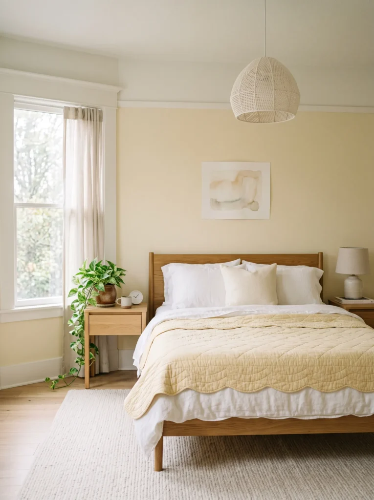
- WALLS: Pale buttercream yellow in matte finish, warm white trim and ceiling for contrast without coolness
- BEDDING: Warm white linen sheets layered under a buttercream quilted coverlet with a scalloped edge
- WALL DECOR: A trio of small warm-white matted prints in thin oak frames, arranged in a loose cluster above the headboard
- PLANTS: A Marble Queen Pothos in a warm white textured pot — its cream-and-green variegation bridges both colors without adding a third
- HANGING ELEMENT: A woven cream pendant shade with a visible oatmeal-toned weave
- RUG: A warm white shag rug with a subtle buttercream undertone
- CURTAINS: Buttercream linen curtains with a warm white lining for extra light diffusion
- FURNITURE/HARDWARE: An oak bed frame with brushed brass hardware, one buttercream ceramic lamp as the room’s brightest color moment
Why this works: Buttercream and warm white share nearly the same undertone, which makes this the lowest-contrast pairing on this list and the easiest starting point for anyone new to color in a bedroom.
This pairing works on a principle almost opposite to the charcoal or navy combinations earlier in this list: instead of contrast doing the work, closeness does. Buttercream and warm white sit so near each other on the color wheel that the room reads as a soft gradient rather than two distinct colors competing for attention. That subtlety makes it forgiving — there’s no wrong ratio to get wrong, since both tones are already working together. The oak furniture and brushed brass hardware add just enough warmth in a neutral material palette to keep the room from feeling sterile despite how quiet the color story is.
I’ve recommended this pairing more than any other to clients renting a space or nervous about commitment, since it reads as barely-there color rather than a bold statement. It’s proof that a bedroom doesn’t need high contrast to feel finished. Marble Queen Pothos earns its place here specifically because its variegation naturally straddles cream and green, giving the room a living element that ties the palette together without a single extra paint color.
9. Ochre & Forest Green Retreat
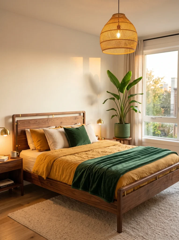
- WALLS: Pale ochre yellow in matte finish, dominant across all walls
- BEDDING: Ochre linen duvet as the base, with a forest green velvet throw folded at the foot as the sole green textile
- WALL DECOR: A single botanical line-art print in forest green ink on cream paper, small and centered above the dresser
- PLANTS: A Bird of Paradise in a forest green ceramic pot — kept to one dramatic plant rather than a cluster, so the green stays architectural rather than decorative clutter
- HANGING ELEMENT: A honey rattan pendant, not green, to keep the ceiling sightline warm and yellow-forward
- RUG: An ochre flatweave rug with a narrow forest green border stripe
- CURTAINS: Ochre linen curtains, full length
- FURNITURE/HARDWARE: A walnut bed frame with brushed brass hardware, one forest green ceramic vase on the dresser as the second-strongest green moment
Why this works: Forest green reads as a distinct partner to yellow here specifically because it appears only through material and plant choices, never through paint on the walls — a different application than the green tones used elsewhere in this color library.
Green and yellow are close neighbors on the color wheel, which means this pairing needs a firm hand to avoid drifting into the “olive-adjacent” territory already covered by other posts in this palette library. The fix is application: forest green shows up only through fabric, ceramic, and one statement plant, never on the walls themselves. That keeps ochre as the undeniable star while forest green functions purely as depth and grounding. A single Bird of Paradise does more for the room’s green presence than a scattering of smaller plants would, since its large leaves read as one confident gesture rather than a collection competing with the wall color.
That’s why many designers recommend choosing one plant to carry a secondary color rather than several — it keeps a room’s palette legible at a glance instead of busy. The velvet throw adds textural weight forest green alone couldn’t provide in a smaller dose, and because it’s the only saturated green textile in the room, it reads as intentional rather than incidental.
10. Soft Yellow & Lavender Hush
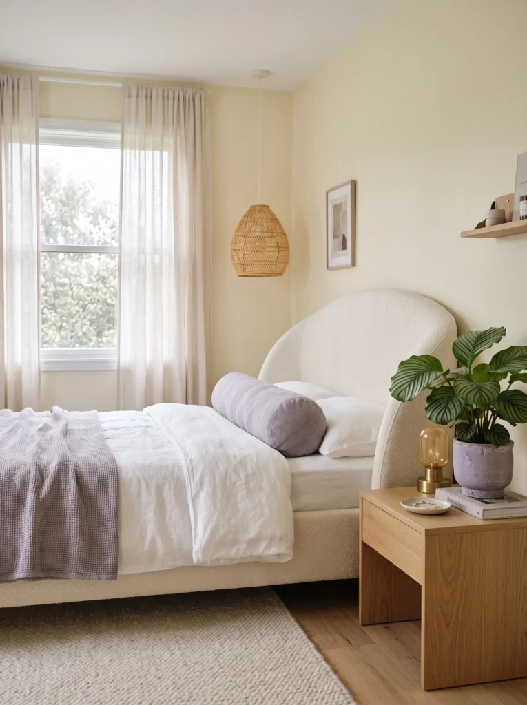
- WALLS: Soft, pale yellow in matte finish, dominant on all walls
- BEDDING: Pale yellow linen duvet as the base layer, with a lavender-gray bolster pillow as the primary accent
- WALL DECOR: A single abstract print, majority yellow with loose lavender brushstrokes, hung centered above the bed
- PLANTS: A Calathea Orbifolia in a lavender-gray pot, its silver-striped leaves picking up the accent color while its base green ties back to the room’s overall softness
- HANGING ELEMENT: A honey rattan pendant, kept warm-toned rather than lavender, so the ceiling sightline stays yellow-forward
- RUG: A pale yellow wool rug with a thin lavender-gray border
- CURTAINS: Soft yellow linen curtains, sheer weave
- FURNITURE/HARDWARE: A curved cream bed frame with brushed nickel hardware, one lavender-gray ceramic lamp as the room’s clearest secondary-color moment
Why this works: Lavender-gray, not true violet, is what keeps this pairing distinct from a fully lavender palette — here it functions purely as a cool accent against a warm yellow base, rather than as the room’s identity.
This pairing exists to prove yellow and lavender can share a room without either one taking over, as long as lavender stays firmly in a supporting role. Choosing a grayed-down lavender rather than a true violet is the key decision here — it reads as a shadow tone rather than a competing hue, which keeps the room from splitting into two separate color stories. Yellow carries the walls, the curtains, the bedding base; lavender-gray shows up only in the bolster, the lamp, and the rug border. That restraint is what separates this room from a lavender-anchored bedroom entirely.
I’ve noticed pale yellow and lavender-gray photograph beautifully together specifically because they sit at a similar, gentle saturation level, so nothing in the frame fights for attention. The curved bed frame adds a soft, current silhouette that matches the room’s overall hushed mood, and brushed nickel hardware keeps the metal tone cool enough to support lavender’s presence without warming it into something closer to rose.
11. Ochre & Wine Depth
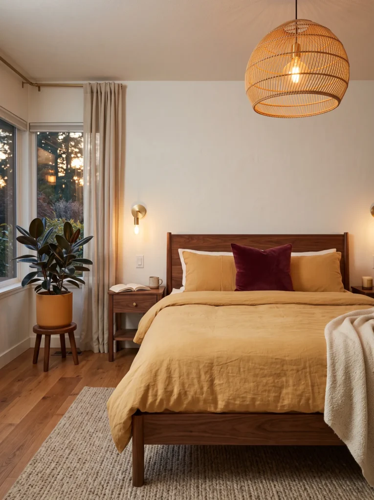
- WALLS: Pale ochre yellow in matte finish, dominant across all walls
- BEDDING: Ochre linen duvet as the base, with a wine-red velvet lumbar pillow as the sole deep accent
- WALL DECOR: A small oil-style abstract print in wine and cream tones, hung asymmetrically above the dresser
- PLANTS: A Rubber Plant ‘Burgundy’ in a wine-toned ceramic pot — its deep maroon leaves carry the accent color without needing more fabric or paint
- HANGING ELEMENT: A honey rattan pendant, kept warm and neutral rather than wine-toned
- RUG: An ochre flatweave rug with a thin wine-red pinstripe border
- CURTAINS: Ochre linen curtains, full length
- FURNITURE/HARDWARE: A walnut bed frame with brushed brass hardware, one wine-red ceramic vase on the nightstand
Why this works: Wine red is a deep, cool-leaning accent that grounds ochre the way charcoal or navy do, but adds a richer, more romantic edge instead of a moody one.
Wine red belongs to the same family of grounding colors as charcoal and navy — dark, saturated, and light-absorbing — but it carries a warmth that those cooler tones don’t. That makes this pairing feel closer to a jewel-toned library than a strictly moody one, even though it’s built on the same light-balancing logic. Keeping wine to a pillow, a plant, and a single vase is what keeps ochre in charge of the room’s overall mood. Push wine any further and the room starts to compete with the existing jewel tone and cherry red posts in this color library, which this pairing is specifically built to avoid.
I’ve noticed a single Rubber Plant ‘Burgundy’ does more visual work in a room like this than most people expect, since its leaf color alone reads as a deliberate design choice rather than an accident. That’s a detail worth remembering for anyone hesitant to commit to a bold accent color in fabric or paint — a well-chosen plant can carry it instead, and it’s a lot easier to change out later than a wall color.
12. Honey Yellow & Copper Glow
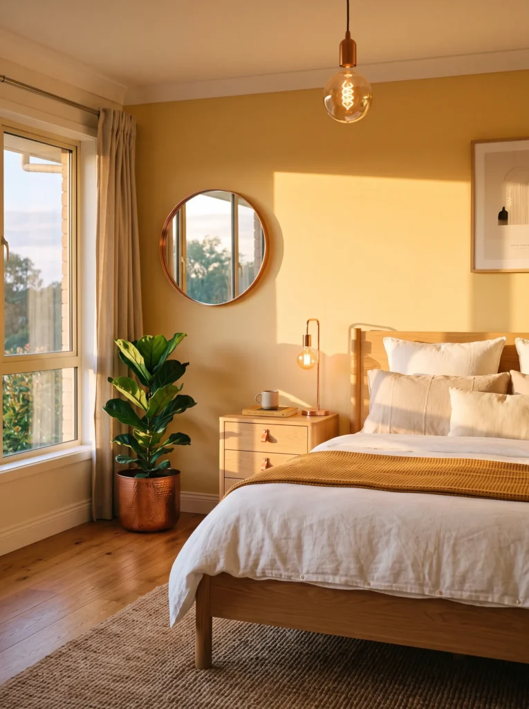
- WALLS: Honey yellow in a warm matte finish, dominant across all walls
- BEDDING: Honey yellow waffle-weave duvet, with a copper-toned quilted throw folded at the foot
- WALL DECOR: A round copper mirror with a slim frame, hung off-center rather than directly above the bed
- PLANTS: A Fiddle Leaf Fig in a copper-finish planter, its large glossy leaves catching light alongside the metal
- HANGING ELEMENT: A copper pendant light with an exposed bulb, industrial but warm
- RUG: A honey-toned jute rug, texture-forward with no pattern
- CURTAINS: Honey linen curtains, unlined
- FURNITURE/HARDWARE: A light oak bed frame with copper drawer pulls, echoing the pendant and mirror
Why this works: Copper is a metal-forward accent rather than a paint color, which is what separates this pairing from every terracotta or rust-based combination elsewhere in this list.
This is the one pairing on this list where the secondary “color” is really a metal, and that distinction matters. Copper catches and reflects light in a way paint never can, so instead of adding another flat color to compete with honey yellow, it adds movement — a mirror that throws light across the room at different times of day, a pendant that glows warm at night. That gives the room a dynamic quality the other pairings don’t have, since its appearance genuinely shifts between morning and evening. Honey yellow still carries every large surface, so copper reads as detail work, not decoration.
My husband’s crews often point out that mixing metal finishes is where a lot of homeowners get nervous, but a single consistent metal — here, copper on the mirror, pendant, and hardware — actually simplifies a room instead of complicating it. Committing to one metal finish throughout is a small decision that makes a noticeably bigger visual difference than most people expect.
13. Pale Yellow & Steel Blue Clarity
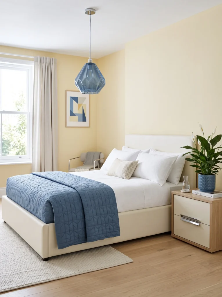
- WALLS: Pale yellow in matte finish, dominant and slightly cooler-leaning than the buttercream or honey shades used elsewhere
- BEDDING: Pale yellow linen sheets with a steel blue quilted coverlet, folded to show both colors in even measure
- WALL DECOR: A geometric print in steel blue line work on a cream background, hung centered above the headboard
- PLANTS: A Peace Lily in a steel blue ceramic pot, its white blooms adding a third neutral note without another paint color
- HANGING ELEMENT: A steel blue glass pendant with a faceted shade
- RUG: A pale yellow rug with a bold steel blue geometric border, more graphic than the other pairings in this list
- CURTAINS: Pale yellow linen curtains, sheer
- FURNITURE/HARDWARE: A cream bed frame with chrome hardware, matching the coolness of the steel blue accents
Why this works: Steel blue reads more graphic and saturated than the softer gray-blue pairing earlier in this list, giving this room a crisper, more clean-lined feel.
Where the gray-blue pairing earlier in this list leans hushed and nearly neutral, steel blue is more assertive — saturated enough to read as a genuine color choice rather than a shadow tone. That makes this the pairing to reach for in a bedroom that wants clarity and structure rather than softness. The geometric rug border and faceted pendant reinforce that crispness, giving the room clean, current lines instead of the softer, rounded silhouettes used elsewhere in this color library. Chrome hardware keeps every metal surface in the room cool, matching steel blue’s temperature rather than warming it.
In my experience, this is the pairing that photographs best in bright, north-facing rooms, since steel blue can read a little flat under warm afternoon light but comes alive under cooler daylight. If a room gets strong warm sun in the afternoon, this combination is worth testing at different times of day before committing to it at scale.
14. Mustard-Adjacent Ochre & Chocolate Brown
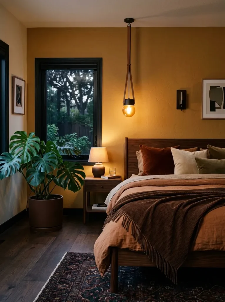
- WALLS: A deeper, more saturated ochre with mustard undertones (kept distinct from the paler ochre shades used elsewhere), matte finish
- BEDDING: Ochre linen duvet as the base, with a chocolate brown corduroy throw folded at the foot
- WALL DECOR: A large abstract print in chocolate brown ink on a cream background, hung above the headboard
- PLANTS: A Monstera Deliciosa in a chocolate brown ceramic pot — its large, deeply lobed leaves add scale and shadow against the warm wall color
- HANGING ELEMENT: A chocolate brown leather-strapped pendant, structural rather than delicate
- RUG: A chocolate brown flatweave rug with subtle ochre flecking
- CURTAINS: Ochre linen curtains, full length
- FURNITURE/HARDWARE: A dark walnut bed frame with black matte hardware, chosen deliberately darker than the lighter walnut used in the honey pairing earlier in this list
Why this works: Chocolate brown is deeper and more saturated than the walnut tone used elsewhere in this palette library, giving this pairing more visual weight and a more masculine, grounded feel.
This is the richest, most saturated pairing in the group, built for a bedroom that wants real depth rather than airy brightness. Chocolate brown goes further than the lighter walnut tone used in an earlier idea — it’s darker, more matte, and more architectural, which shifts the whole room’s mood toward grounded and substantial rather than soft. The deeper mustard-adjacent ochre on the walls can hold its own against that weight, which is exactly why this combination needed a more saturated yellow shade than the pale or buttercream tones used in gentler pairings elsewhere.
That’s why many designers recommend saving your darkest, most saturated color pairing for a primary bedroom rather than a guest room — it reads intentional and cocooning in a space meant for one or two people, rather than trying to appeal to every visitor. A single oversized Monstera reinforces that scale, giving the room presence without adding more furniture or color.
15. Soft Yellow & Teal Accent
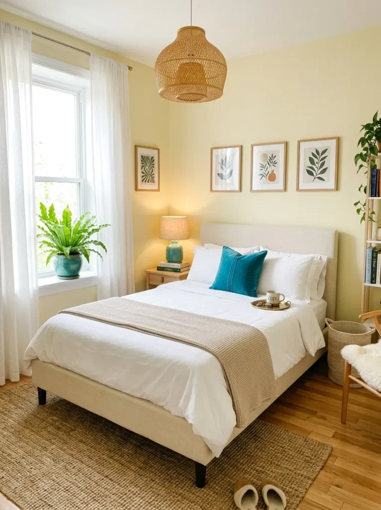
- WALLS: Soft, pale yellow in matte finish, dominant across all walls
- BEDDING: Pale yellow linen duvet as the base, with a teal velvet lumbar pillow as the primary accent
- WALL DECOR: A single abstract print, majority yellow with bold teal brushstroke details, hung centered above the bed
- PLANTS: A Bird’s Nest Fern in a teal ceramic pot, its ruffled bright green fronds bridging the warm and cool tones in the room
- HANGING ELEMENT: A honey rattan pendant, kept warm-toned so the ceiling sightline stays yellow-forward
- RUG: A pale yellow flatweave rug with a bold teal geometric border
- CURTAINS: Soft yellow linen curtains, sheer weave
- FURNITURE/HARDWARE: A cream bed frame with brushed brass hardware, one teal ceramic table lamp as the room’s clearest secondary-color moment
Why this works: Teal sits directly opposite yellow’s warm family on the color wheel, which makes even a small dose of it read as a deliberate, energizing accent rather than a clash.
Teal is the boldest, most saturated accent color in this entire list, and that’s exactly why it needs the tightest restraint of any pairing here. A single lumbar pillow, a lamp, a plant pot — that’s enough teal to wake up a soft yellow room without pulling it toward a completely different mood. Because teal and yellow sit almost opposite each other on the color wheel, even a small amount reads as vibrant rather than subtle, which makes this the pairing to reach for in a bedroom that wants a little personality without going fully saturated across the board.
I’ve seen this combination work particularly well in a teenager’s or young adult’s room, where a little more energy is welcome but full-on jewel-tone saturation isn’t quite the goal. The trick is keeping teal to genuinely small doses — a lamp, a pillow, a plant pot — since it’s strong enough that even three or four touches can start to overwhelm the softer yellow base surrounding it.
Styling Principles: How to Choose Yellow’s Grounding Partner
Soft yellow bedrooms live or die by one decision: what you pair it with. Yellow reflects more visible light than any other hue, so left alone in a bright, sunny room, it can quickly feel overstimulating rather than restful. The fix is choosing a secondary color that absorbs light instead of bouncing it — and letting the room’s natural light exposure guide that choice.
In rooms with strong, direct sun, lean toward deeper, more grounding partners — charcoal, navy, chocolate brown, or wine red. These colors physically counteract yellow’s reflective quality, keeping a sun-drenched room from feeling jittery by afternoon.
In rooms with limited or indirect natural light, choose a lighter secondary color — warm white, dusty rose, or gray-blue — so the room doesn’t lose the brightness yellow is there to provide in the first place. A north-facing bedroom with little direct sun rarely needs the added weight of charcoal or navy; it needs yellow’s light-reflecting quality working for it, not against a competing dark tone.
Across every idea in this list, yellow carries the walls, curtains, and bedding base, while the secondary color shows up in smaller, deliberate doses — a pillow, a lamp, a single piece of art. That ratio is what keeps a room feeling like a yellow bedroom with a great supporting color, rather than two colors competing for the same space. Finally, watch paint sheen closely. A high-gloss finish amplifies yellow’s light-reflecting properties even further, which is rarely what a bedroom needs. Matte or eggshell finishes let yellow read warm and soft instead of sharp and bright.
Frequently Asked Questions
Is yellow too bold for a bedroom? A saturated, high-chroma yellow can feel overstimulating in a room meant for rest, but a muted, desaturated yellow paired with a grounding secondary color is calm and livable. The boldness comes from saturation, not the color itself.
What colors pair best with soft yellow in a bedroom? Charcoal, navy, walnut brown, dusty rose, chocolate brown, and gray-blue all work well because they absorb light rather than reflect it, balancing yellow’s naturally bright quality.
What’s the best yellow shade for a small or dark bedroom? A pale, nearly neutral yellow like buttercream or pale ochre works best in small or low-light rooms, since it adds warmth without the visual weight of a deeper, more saturated shade.
How can I try a soft yellow bedroom on a budget? Start with one accent wall, a set of yellow linen curtains, or a quilted coverlet before committing to full-room paint. A single well-chosen plant with warm-toned foliage can also introduce the color story without any paint at all.
What plants work best in a yellow bedroom? Plants with warm, variegated, or copper-toned foliage — like Croton, Philodendron ‘Prince of Orange,’ or Calathea varieties — echo yellow’s warmth naturally and reinforce the room’s color story without adding another paint color.
Does paint sheen matter for a yellow bedroom? Yes. Matte or eggshell finishes keep a reflective color like yellow soft and warm, while glossier sheens amplify light bounce and can make a small or sunny room feel more stimulating than restful.
Conclusion
Soft yellow bedroom ideas don’t have to mean sunny and one-note — the right secondary color is what turns yellow from risky to genuinely restful. Whether it’s charcoal’s quiet contrast, walnut’s warmth, or a single dose of teal for energy, each pairing here shows a different way to make yellow feel intentional rather than random. I’ve seen how a small change like one grounding accent color can completely shift how a yellow room feels to actually sleep in.
Save this post before you start planning, try one pairing in your own space, and pass it along to anyone who’s been avoiding yellow for all the wrong reasons.