Christmas Color Schemes 2026: 15 Fresh Ideas Beyond Red and Green
What if your Christmas decor stopped looking like everyone else’s? Christmas color schemes 2026 are moving past red and green toward palettes that feel calm, modern, and personal. This post gives you 15 of them, each with exact tones, lighting advice, and a standout detail you can copy this weekend. In my experience, the rooms that look most expensive are rarely the ones with the most decor. They are the ones with a plan. I’ve noticed that two colors, one accent, and one bulb temperature do more than a dozen extra ornaments. Save this guide, pick one room, and start there.
Red and green are the most demanding colors in the holiday kit. They sit opposite each other on the color wheel, so at equal strength they vibrate against each other, and a room starts to feel loud by December 5. The fix is not more decor. It is a smaller plan. The best Christmas color schemes 2026 use two dominant tones, one accent, and one bulb temperature. Light matters more than most people expect.
Warm 2700K bulbs give off very little blue, so cool tones darken and warm ones glow. I learned that by watching a crisp blue ornament turn slate at dinner. Here are 15 palettes, each with exact tones and the lighting that makes it work.
1. Chartreuse and Midnight Navy
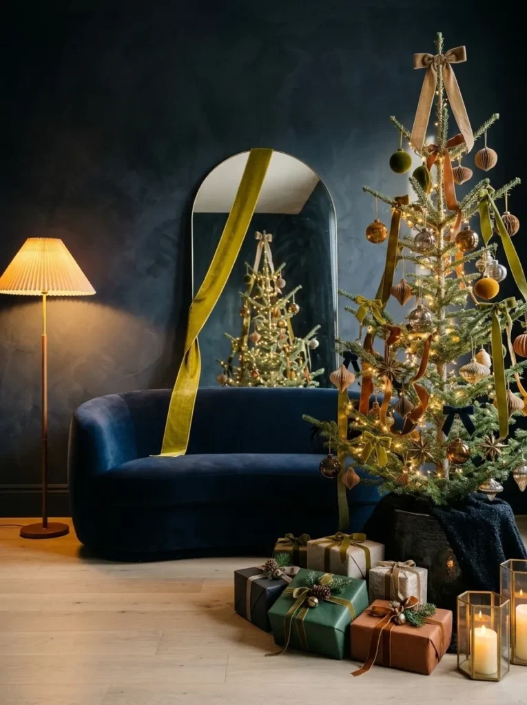
- Palette: Midnight navy limewash, chartreuse velvet, bleached oak, brushed nickel
- Anchor: A curved navy mohair sofa against the limewashed wall
- Standout detail: A six-inch chartreuse velvet ribbon running the full height of a leaning arched mirror
- Lighting: A 2200K amber floor lamp at night, cool window light by day
- Leave out: Red, gold, and any second bright color
Why this works: A bright color looks more luminous against a dark ground, so one chartreuse accent can carry an entire midnight navy room.
Chartreuse is the boldest move in this year’s holiday palettes, and midnight navy is what makes it safe. Dark backgrounds absorb light, so a bright color placed against them appears more luminous than the same color on white. That is the trick. A single six-inch velvet ribbon, running down the full height of a leaning arched mirror, becomes the brightest thing in the room. Everything else stays quiet: a curved mohair sofa, a round bleached oak side table, a brushed nickel lamp. Remove the usual red and green, and the room reads as modern, deliberate, and calm after dark.
By day, north-facing window light keeps the navy cool and the chartreuse crisp, almost botanical. After sunset, a 2200K lamp warms the wall to deep ink and turns the ribbon into a glowing line. Set one lamp low, beside the sofa, and skip overhead lights entirely. The limewash matters too: its chalky surface scatters light softly, so the navy never looks flat or shiny. In a typical American living room, this takes one wall, one mirror, and one ribbon. Guests notice the contrast first, then the calm. It feels collected, not staged.
2. Saffron and Petrol Teal
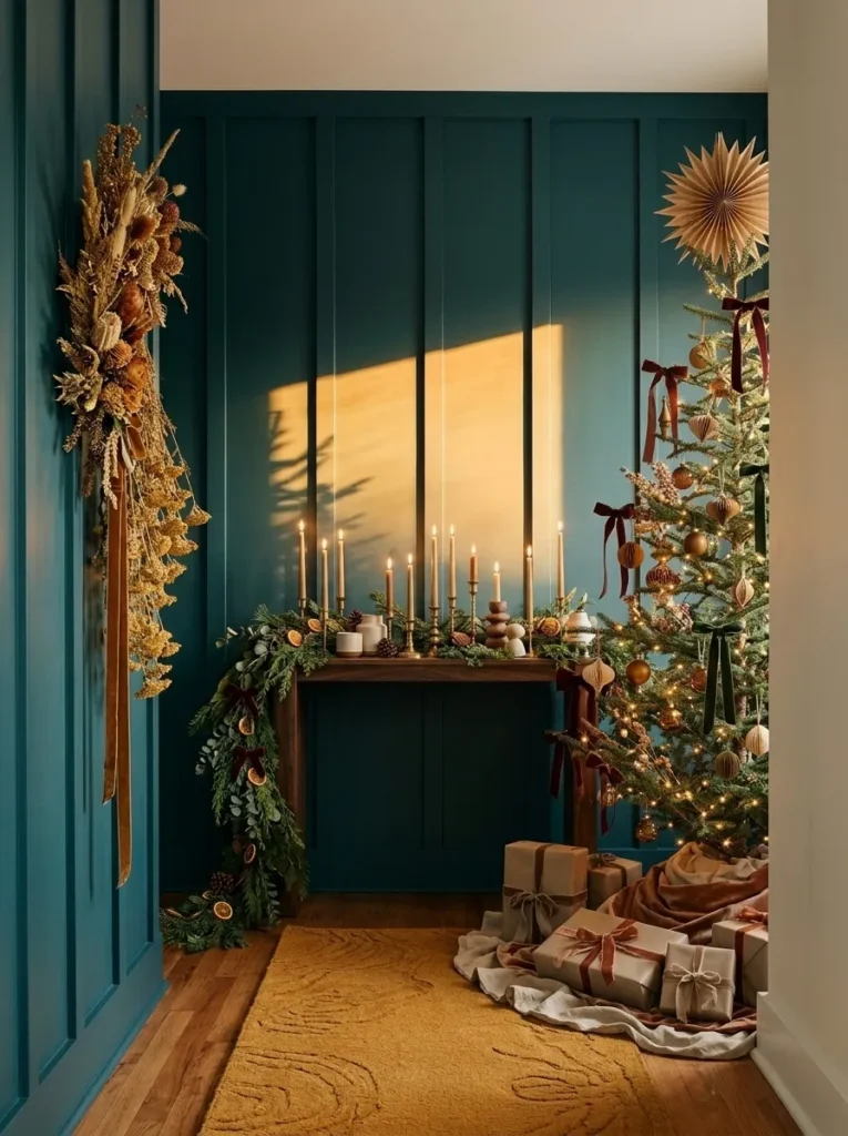
- Palette: Petrol teal board-and-batten, saffron wool, dark walnut, blackened steel
- Anchor: A narrow walnut console with a rounded front edge
- Floor: A 3-by-8-foot saffron wool runner
- Standout detail: A five-foot cascade of air-dried golden yarrow hung from one blackened steel hook
- Lighting: One 2400K picture light at night, low afternoon sun through the door glass by day
Why this works: A deep teal wall makes saffron accents look warmer and richer, which is why a small entry needs only these two colors.
My neighbor stopped mid-sentence in my entry last December and asked what color the wall was. It was petrol teal, but the saffron beside it was doing the talking. I had hung a five-foot cascade of air-dried golden yarrow from a single black steel hook, and the yellow seemed to hum against the paneling. Yarrow is a plant I know well from garden beds, and it holds its color for months once dried upside down for two to three weeks. That small plant science habit gave me a Christmas entry with no ornaments at all, yet nobody missed them.
Entries are often the smallest rooms in the house, which makes them perfect for a two-color plan. Board-and-batten painted petrol teal in satin gives the walls depth without glare. A 3-by-8-foot saffron wool runner pulls the eye down the hall, and a walnut console with a rounded edge keeps the line soft. At night, one 2400K picture light above the yarrow turns the yellow to deep honey. Add a non-slip rug pad, because wool on hardwood slides. Visitors step into color before they reach the living room, and the tone for the whole home is set.
3. Rust and Celadon Green
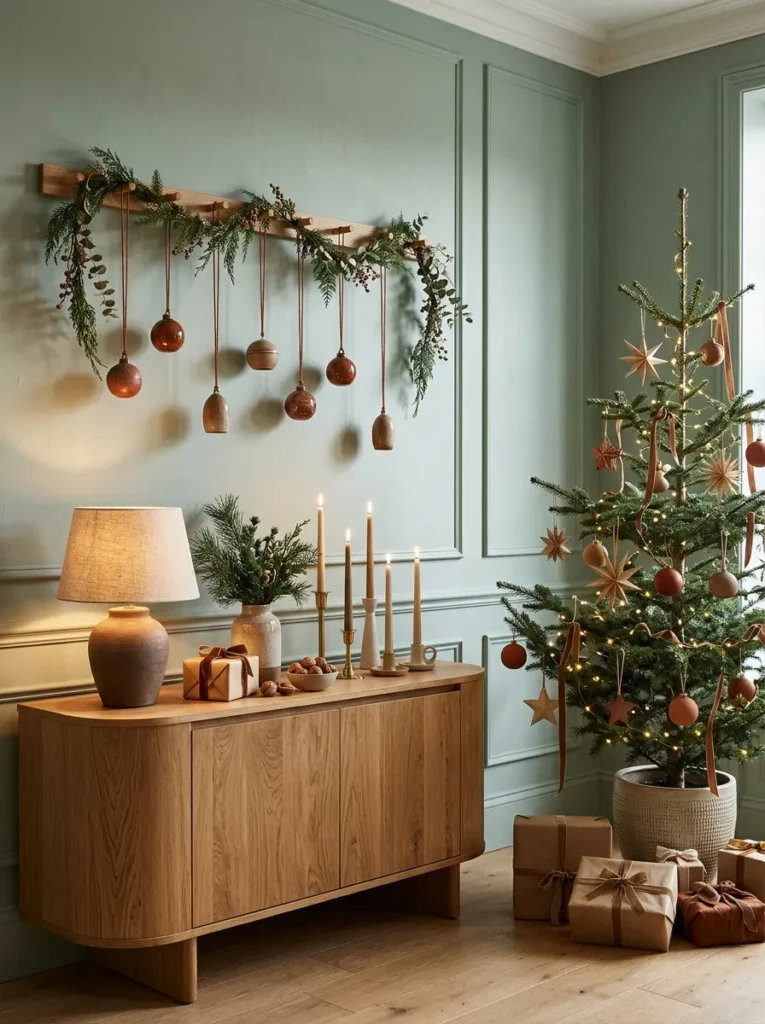
- Palette: Celadon matte wall, rust glaze, white oak, raw linen
- Anchor: A curved-front white oak sideboard
- Standout detail: Seven hand-glazed ceramic ornaments hung at staggered heights on rust linen cord from a floating oak rail
- Lighting: A ceramic lamp with a raw linen shade and a 2700K bulb
- Finish note: Matte or eggshell wall paint only
Why this works: Celadon is a gray-green, so it softens rust’s heat the way a neutral would, while still reading clearly as color.
Rust is not only an autumn color. Set against celadon, a soft gray-green, it turns warm and quiet instead of seasonal. I found this out by accident while testing glazed ceramic ornaments on my dining room wall in Austin. Seven pieces, hung at staggered heights from a floating oak rail, made the whole wall feel curated. The celadon cooled each rust tone just enough to keep it from reading as pumpkin season. Because the ornaments hang on rust linen cord, they sway slightly when someone walks past, and that tiny movement gives the display a quiet life.
My husband, who builds homes for a living, has one rule for paint like this: choose matte or eggshell. Glossier sheens bounce lamplight back as glare, which washes out a pale color like celadon at night. A flat finish scatters it, so the wall stays soft behind a 2700K lamp with a raw linen shade. Keep the white oak sideboard curved at the front and nearly bare, with one ceramic lamp and nothing else. The result is a dining room wall that looks finished, not decorated, and it works with any table you already own.
4. Dusty Lilac and Olive
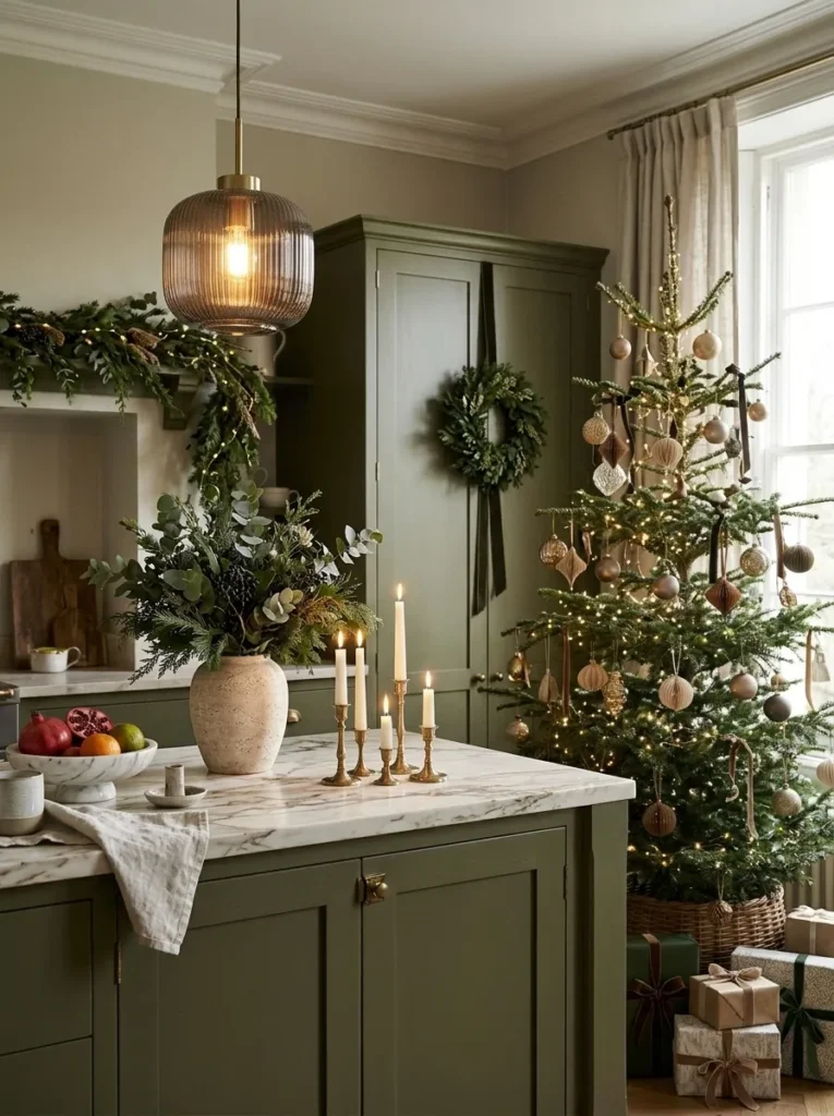
- Palette: Satin olive cabinetry, dusty lilac hyacinth, pale limestone, smoked glass
- Anchor: An olive-painted island topped with pale limestone
- Standout detail: Five pre-chilled hyacinth bulbs in clear glass forcing vases, lined along the island
- Lighting: A pair of smoked-glass globe pendants at 2700K, plus east window light by day
- Timing: Start the bulbs this week for blooms by Christmas
Why this works: Olive carries yellow, and yellow’s opposite is violet, so olive cabinets make dusty lilac look cleaner and brighter.
Violet sits opposite yellow on the color wheel, and olive green is built on yellow. That is why a pale lilac looks so clean against olive cabinets, with no extra effort. Five pre-chilled hyacinth bulbs, set in clear glass forcing vases along a limestone island, are the whole design. Their blooms open in dusty lilac, the roots show through the glass like sculpture, and the scent fills the kitchen without a single candle. It feels modern because nothing is glittery, nothing is red, and everything on the counter is alive and slightly different from the next piece.
Timing is the practical part. Pre-chilled bulbs usually bloom in four to six weeks, so start this week. Set each bulb so the base sits just above the water, never in it, or it rots. Keep the glasses cool and shaded until the roots fill the base, then move them into light. Overhead, two smoked-glass globe pendants at 2700K add a soft, amber haze. By day, east light keeps the olive earthy. Hyacinth bulbs are toxic to pets, so place the vases high. Five bulbs typically cost under twenty-five dollars, and the effect looks far more expensive.
5. Slate Gray and Lemon Yellow,Christmas Color Schemes 2026: 15 Fresh Ideas Beyond Red and Green
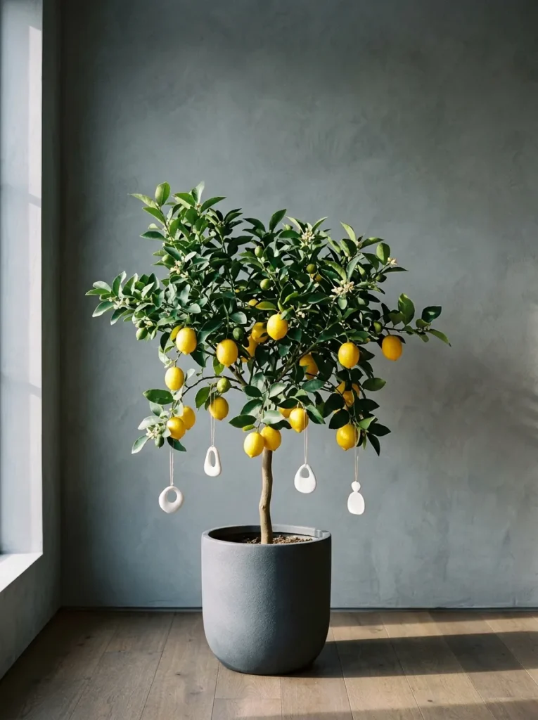
- Palette: Slate-gray plaster, ripe lemon yellow, smoked oak, unglazed white porcelain
- Anchor: A four-foot fruiting Meyer lemon tree in a matte slate planter
- Standout detail: Four unglazed white porcelain ornaments, hung only from the lower branches
- Lighting: A south-facing window by day, a 2700K bulb rated CRI 90+ at night
- Care: At least six hours of direct sun, and indoors before the first frost
Why this works: A fruiting Meyer lemon tree gives you a real yellow no ornament can match, and slate gray lets that yellow do all the talking.
Hang four ornaments on a lemon tree and you may never miss a spruce. Meyer lemons ripen in winter, which means the fruit is turning deep yellow right when you need color. Against slate-gray plaster, those lemons look almost lit from within. I keep one in my Austin sunroom, and visitors always ask whether the fruit is real. A matte slate planter and smoked oak floor keep everything grounded, while unglazed white porcelain ornaments add just enough holiday signal. It is the lowest-effort alternative tree I have ever styled, and the only one you can later use in cooking.
My husband, who builds homes, pays close attention to bulb quality, and this scene proves why. Bulb packaging lists a CRI, or color rendering index. Cheaper bulbs often sit near 80 and can muddy slate and yellow alike. A 2700K bulb rated 90 or higher shows both tones truthfully. Give the tree at least six hours of direct sun at a south window, water when the top inch of soil is dry, and move it indoors before the first frost. Placed in a bright corner, it becomes living furniture that looks calm in January, too.
6. Apricot and Pewter Gray
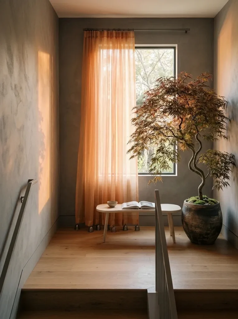
- Palette: Apricot silk organza, pewter-gray eggshell wall, pale ash wood, hammered pewter
- Anchor: A floor-length apricot silk organza panel on a pewter-finished pole
- Standout detail: Five hammered pewter sleigh bells tied at the panel’s hem
- Support: A slim pale ash bench beneath the window
- Lighting: Early morning sun through the organza, a 2400K wall sconce at night
Why this works: Sheer fabric tints the light itself, so one apricot panel colors an entire landing without adding another object.
I stood on my stair landing at 7 a.m. one December and watched the entire hallway turn peach. The cause was a single apricot silk organza panel I had hung the night before. Sunrise passed through it and painted the pewter-gray wall with a soft, warm glow. I stood there longer than I would admit. That is when I understood that color in a home is not only paint or fabric. It is also light, filtered. Since then I have used this trick for friends who want a Christmas look without adding more things to their shelves.
The organza is the color, and the pewter keeps it honest. Paint the wall in pewter-gray eggshell, add a slim ash bench under the window, and hang the panel from a pewter-finished pole so it falls to the floor. Tie five hammered pewter sleigh bells at the hem. They chime softly when a door opens, which gives the landing a gentle holiday sound without a speaker. At night, a 2400K sconce lights the fabric from the side, so the apricot glows like a lantern. Silk organza is delicate, so hang it away from candles and heaters.
7. Fuchsia and Ochre
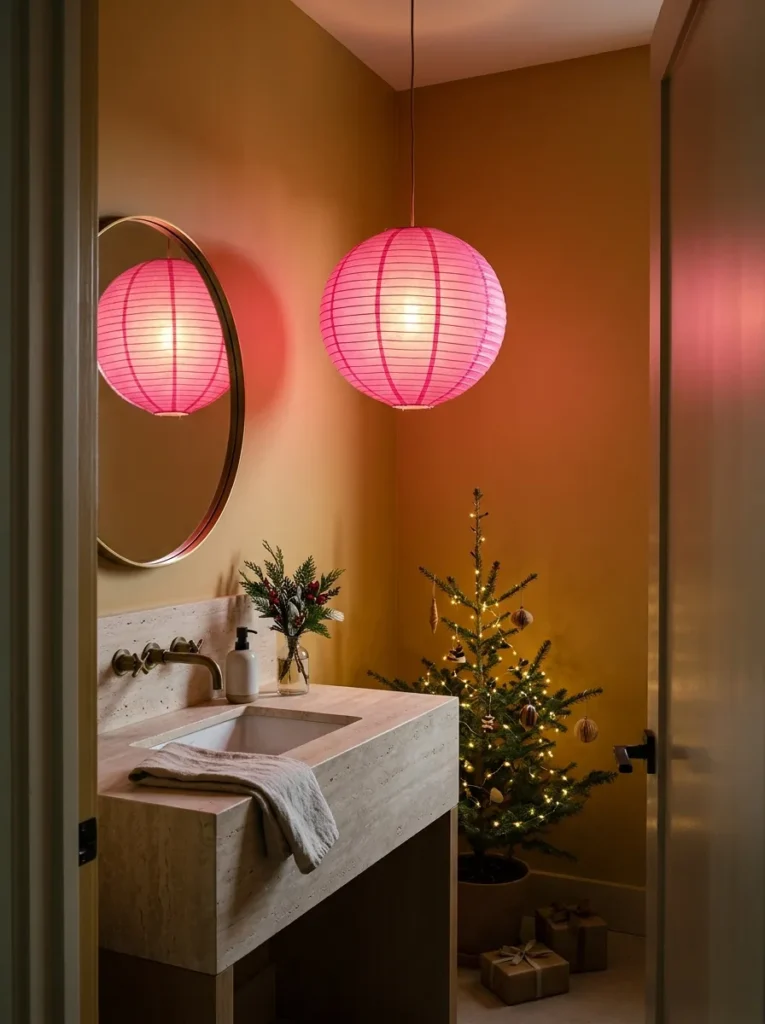
- Palette: Ochre satin walls, fuchsia washi paper, pale travertine, natural linen
- Anchor: A 24-inch fuchsia washi paper pendant lantern
- Support: A travertine vanity top and one folded natural linen towel
- Lighting: A cool-running 2700K LED inside the lantern, never an incandescent bulb
- Budget: One gallon of paint covers the whole room
Why this works: Colored paper filters light, so a fuchsia lantern tints the ochre walls around it and blends both colors without adding another object.
Light carries the color of whatever it passes through. A fuchsia washi paper lantern, lit from inside, throws a faint pink glow onto nearby walls, and on ochre that glow reads as sunset. That is the idea behind this powder room. The walls are ochre, the vanity top is pale travertine, and a single 24-inch lantern does everything else. Because paper diffuses a bulb instead of exposing it, the room has no hard shadows and no glare over the mirror. Small rooms reward bold decisions, and this one asks for two colors, one lantern, and one folded linen towel.
Safety first: paper and heat do not mix, so use a cool-running 2700K LED inside the lantern, never an incandescent or halogen bulb. Hang it well above head height and away from the sink splash, since damp air softens paper over time. Ochre paint in satin finish wipes clean, which matters in a room that guests use daily. A gallon typically covers a powder room with paint to spare, and a lantern costs roughly forty dollars. Few decor changes deliver this much color for so little money, or disappear as easily in January.
8. Mauve and Mahogany
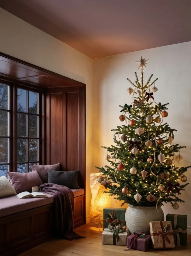
- Palette: Dusty mauve ceiling paint, mahogany stain, parchment, chalk-white walls
- Anchor: A built-in mahogany-stained window seat, 20 inches deep
- Standout detail: The ceiling painted dusty mauve while the walls stay chalk white
- Support: A wool flannel cushion one shade lighter than the ceiling and a parchment paper floor lantern
- Lighting: A 2200K LED inside the lantern, plus a string of warm micro LEDs along the window frame
Why this works: A colored ceiling adds color overhead, where it never competes with furniture, so the room feels wrapped instead of painted.
I made a mistake in this nook first. I painted all four walls dusty mauve, and the little room felt like the inside of a jewelry box. Heavy, too sweet, too much. Then I repainted the walls chalk white and moved the mauve to the ceiling alone. The change took one afternoon, and the space finally made sense. Now the color floats overhead like a soft lid, the mahogany window seat anchors the floor, and the chalk-white walls keep everything light. A friend curled up there with a novel last December and did not move for two hours.
Paint the ceiling first, then the walls, so any roller splatter lands on a surface you will cover anyway. Use a flat finish, which hides the small flaws every ceiling has. Add a window seat about twenty inches deep, topped with a wool flannel cushion one shade lighter than the ceiling, so the two colors echo across the room. At night, a parchment paper floor lantern with a 2200K LED bulb lights the mauve from below, and a string of warm micro LEDs along the window frame adds sparkle. The nook becomes a small, deliberate retreat from holiday noise.
9. Aqua and Coral
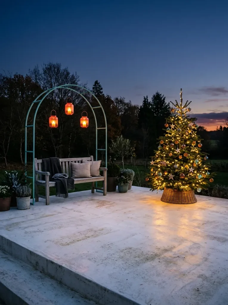
- Palette: Aqua powder-coated steel, coral glass, weathered cedar, pale concrete
- Anchor: An eight-foot aqua powder-coated steel arch beside the patio bench
- Standout detail: Three coral glass lanterns hung from the arch at staggered heights
- Lighting: Battery-powered 2200K LED candles inside the lanterns, no cords
- Safety: Wet-location-rated lighting only, with corded items on a GFCI outlet
Why this works: Aqua and coral sit near opposites on the color wheel, so a small amount of each looks vivid against quiet cedar and concrete.
Austin Decembers often run in the low 60s, which means the patio is usable and still ignored. I’ve noticed that guests drift outside the moment there is something worth looking at. An eight-foot aqua steel arch gives them that, standing like a doorway beside a weathered cedar bench. Three coral glass lanterns hang from it at staggered heights. By dusk they glow like small embers against the cool metal, and the patio feels like another room of the house. Aqua and coral sit near opposites on the color wheel, so each one makes the other look brighter.
Outdoor lighting is where my husband gets serious. He tells clients to look for a label reading “suitable for wet locations,” which is a stronger rating than “damp,” and to plug anything corded into a GFCI-protected outlet. Lanterns in this scene use battery-powered 2200K LED candles, so no cords cross the patio. Powder-coated steel resists rust better than bare metal, and a clear sealer slows cedar from graying. Expect to spend about two hundred dollars on the lanterns. The payoff is a space that looks designed from the kitchen window and still feels relaxed underfoot.
You’ll Also Love: Easy DIY Christmas Decorations 2026: 21 Handmade Ideas for a Beautiful Home
10. Sky Blue and Cinnamon
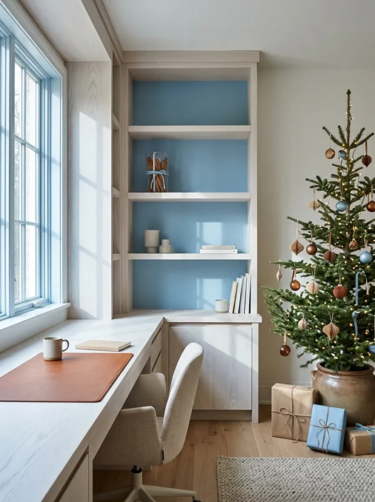
- Palette: Sky-blue paint, cinnamon saddle leather, white-washed oak, matte black steel
- Anchor: A built-in white-washed oak bookcase with sky-blue painted back panels
- Standout detail: A bundle of true cinnamon quills tied with sky-blue silk cord, standing in a glass beaker
- Desk: A 36-by-17-inch cinnamon saddle leather desk pad
- Lighting: A matte black swing-arm lamp with a 2700K bulb, plus north window light by day
Why this works: Cool colors appear to recede, so a sky-blue shelf back makes a shallow bookcase look deeper.
Cool colors visually recede, and warm colors advance. This office uses both rules at once. The sky-blue paint inside the bookcase pushes the back of each shelf away, so a twelve-inch-deep unit looks deeper than it is. The cinnamon leather desk pad pulls forward, giving your eyes a warm place to land. True cinnamon, Cinnamomum verum, forms thin, papery quills, unlike the thick single curl of supermarket cassia. Bundle a few quills with sky-blue silk cord, stand them in a glass beaker, and the desk smells like December without a candle flame near your paperwork.
My husband builds homes for a living, and he paints shelf backs before the shelves go in. Once a bay is installed, a roller cannot reach into it cleanly, and you end up with brush marks. Use a satin or eggshell finish so the blue stays soft rather than shiny. Keep shelves nearly bare: books, one beaker, one lamp. By day, north light keeps the blue clear and cool. At night, a matte black swing-arm lamp with a 2700K bulb turns the cinnamon leather rich and glowing. A calm, focused office for the cost of one quart of paint.
11. Glacier Blue and Graphite
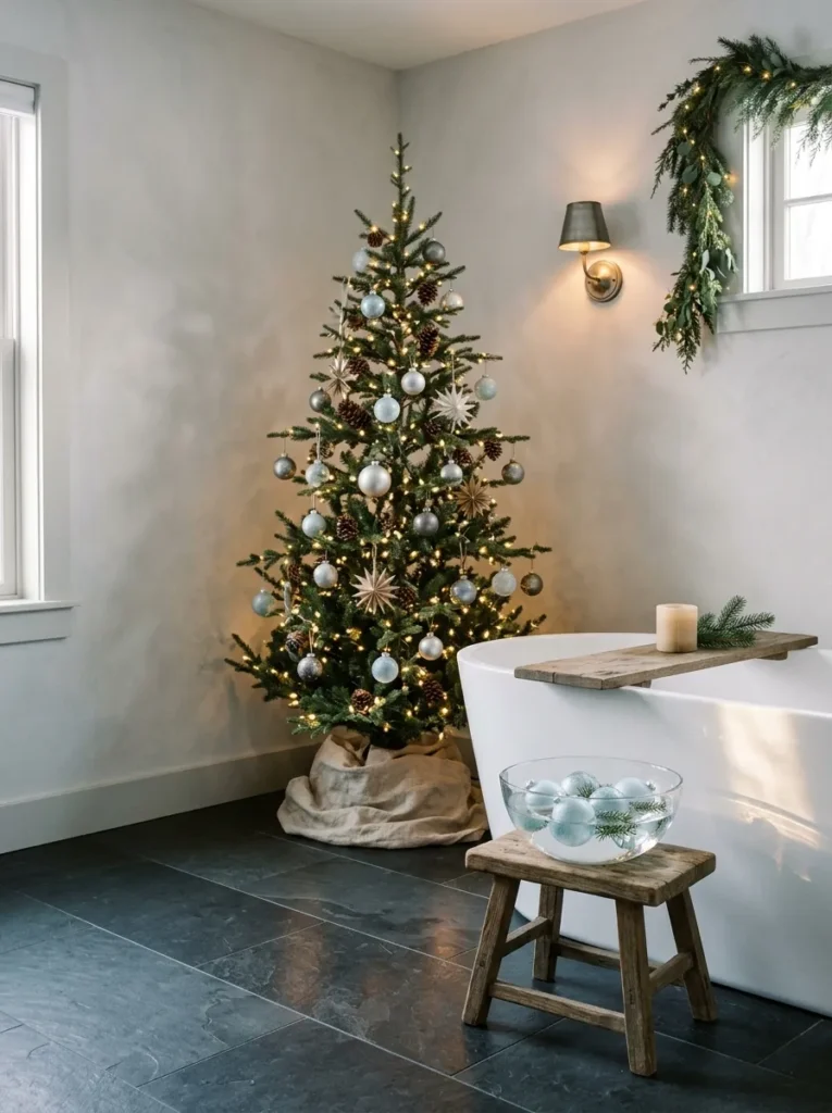
- Palette: Graphite honed slate, glacier-blue frosted glass, matte white enamel, aged zinc
- Anchor: A freestanding matte white tub on a honed graphite slate floor
- Standout detail: Five frosted glacier-blue glass ornaments floating in a wide glass bowl on a low stool
- Lighting: Two aged zinc wall sconces with 2200K bulbs, no overhead light
- Practical: Honed slate grips wet feet better than polished stone
Why this works: Frosted glass softens light into a glow, and dark graphite stone makes glacier blue look deep instead of icy.
A guest once soaked in our Austin guest bath after a long drive and later told me it felt like a hotel, only better. The reason was simple. I had set five frosted glacier-blue glass ornaments floating in a wide bowl beside the tub, and kept every other surface graphite or matte white. No red, no tinsel, no wreath on the door. Frosted glass does something clear glass cannot: it turns a single lamp into a gentle, even glow. The ornaments looked like pale moons on still water, and the room felt quiet in a way holidays rarely do.
Slate earns its place in a bathroom. Honed, meaning matte rather than polished, it grips wet feet far better than glossy stone, and its deep gray makes pale blue look rich instead of icy. Keep the bowl on a low stool, away from the tub’s edge, so a stray elbow never meets glass. Two aged zinc sconces with 2200K bulbs, placed at eye level, flatter skin and glass alike. Skip overhead lights during bath time. Ornaments cost about fifteen dollars for a set of six, and the room looks as though a designer planned it from the tile up.
12. Cocoa Brown and Mint
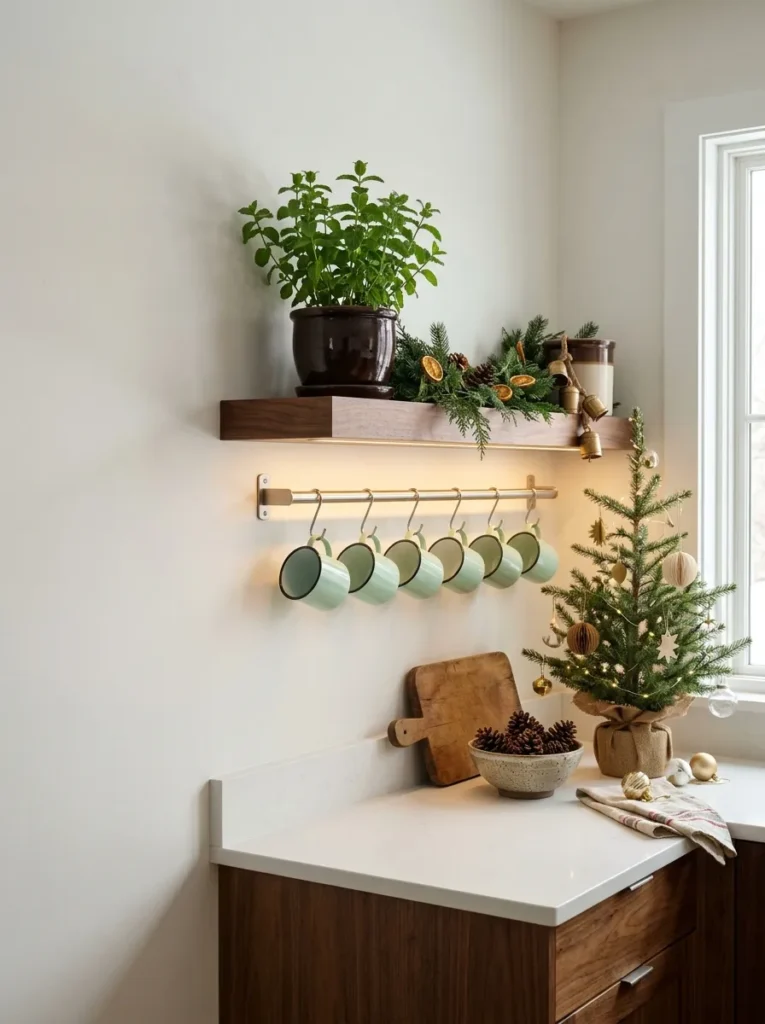
- Palette: Walnut cocoa, mint enamel, brushed stainless, honed white quartz
- Anchor: A floating walnut shelf with a slim brushed stainless rail below
- Standout detail: Six mint enamel mugs hung from the rail by their handles
- Support: A potted peppermint plant in a cocoa-glazed ceramic pot
- Lighting: A 2700K under-shelf LED strip, plus soft side window light
Why this works: A cool mint pastel keeps dark cocoa brown from feeling heavy, so the pairing reads as fresh instead of cozy-dark.
Peppermint is a natural hybrid of watermint and spearmint, and a single potted plant makes this nook smell like cocoa season. I keep one on my own counter in Austin, and I rub a leaf between my fingers every time I pass. Against a floating walnut shelf, the mint-green enamel mugs look fresh, almost like mint chocolate in color form. Cocoa brown anchors the scene, and mint keeps it light. Nothing here is red, nothing sparkles, and yet most guests recognize it as Christmas. The mugs are useful too, so the display never gathers dust.
Mount the shelf into wall studs, not just drywall, because six enamel mugs and a ceramic pot add real weight. Twelve inches of depth is enough. Hang the mugs from a slim brushed stainless rail by their handles, leaving a few inches between each so they swing freely. A 2700K under-shelf LED strip warms the walnut and makes the mint glow, while side window light keeps mornings crisp. Place the peppermint where it gets bright, indirect light, and pinch the tips to keep it full. Mint dislikes soggy soil, so water only when the top inch dries.
13. Amber and Indigo
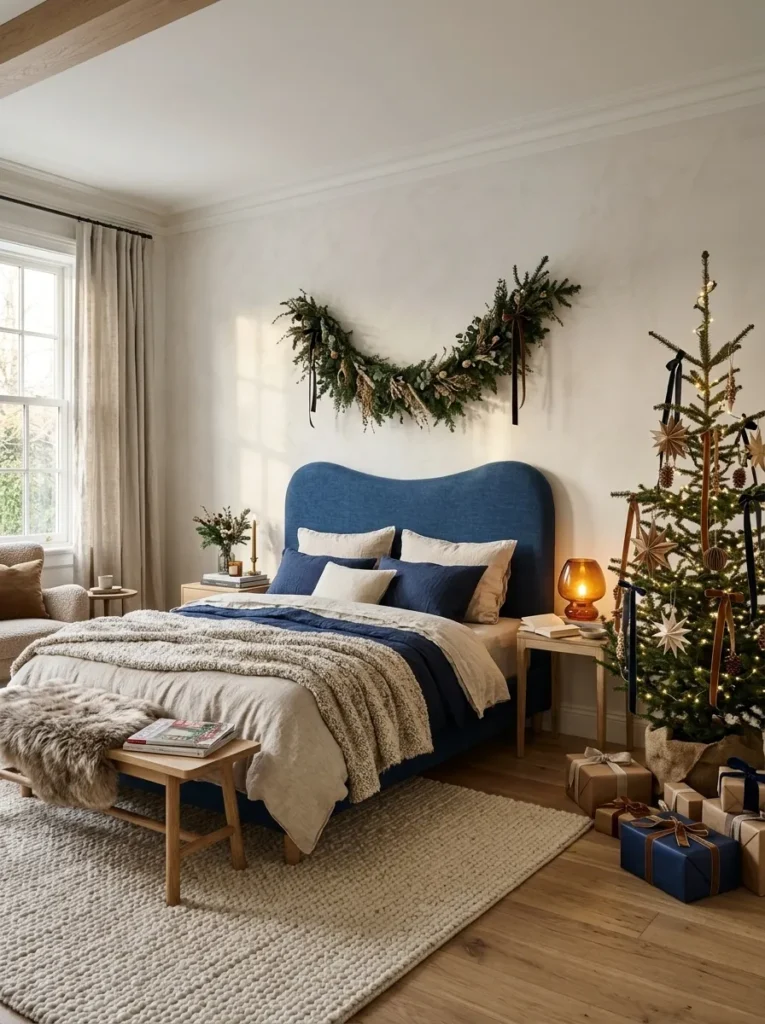
- Palette: Indigo linen, amber glass, pale plaster, ash wood
- Anchor: A curved indigo linen headboard
- Standout detail: One hand-blown amber glass lamp that tints the whole bed wall
- Support: A slim ash nightstand, kept almost bare
- Lighting: A 2200K bulb inside the amber lamp, soft sheer-filtered light by day
Why this works: Amber light makes indigo look deeper instead of flat, so one lamp can carry the color of an entire bedroom.
Indigo is one of the oldest dyes on earth, made from plants in the Indigofera genus, and it behaves differently from synthetic blues. Indigo-dyed linen shifts from navy to violet as light moves across it. Paired with amber glass, the effect is almost cinematic. A curved headboard upholstered in indigo linen gives the bed a soft, sculpted edge, while pale plaster walls keep the room open. Add one hand-blown amber glass lamp on an ash nightstand and nothing else. The result is a bedroom that feels like a candlelit evening, and it never needs a single red ornament.
By day, sheer curtains diffuse morning light and keep the indigo soft and violet-leaning. At night, switch to a 2200K bulb inside the amber lamp, and the headboard deepens to near black while the glass glows like honey. One practical note: indigo dye can rub onto pale sheets, a problem called crocking, so use cream or oatmeal bedding and wash it separately before first use. Keep the nightstand clear except for the lamp and one glass of water. Fewer objects mean the colors do all the work, and the room stays restful.
14. Grapefruit Pink and Charcoal
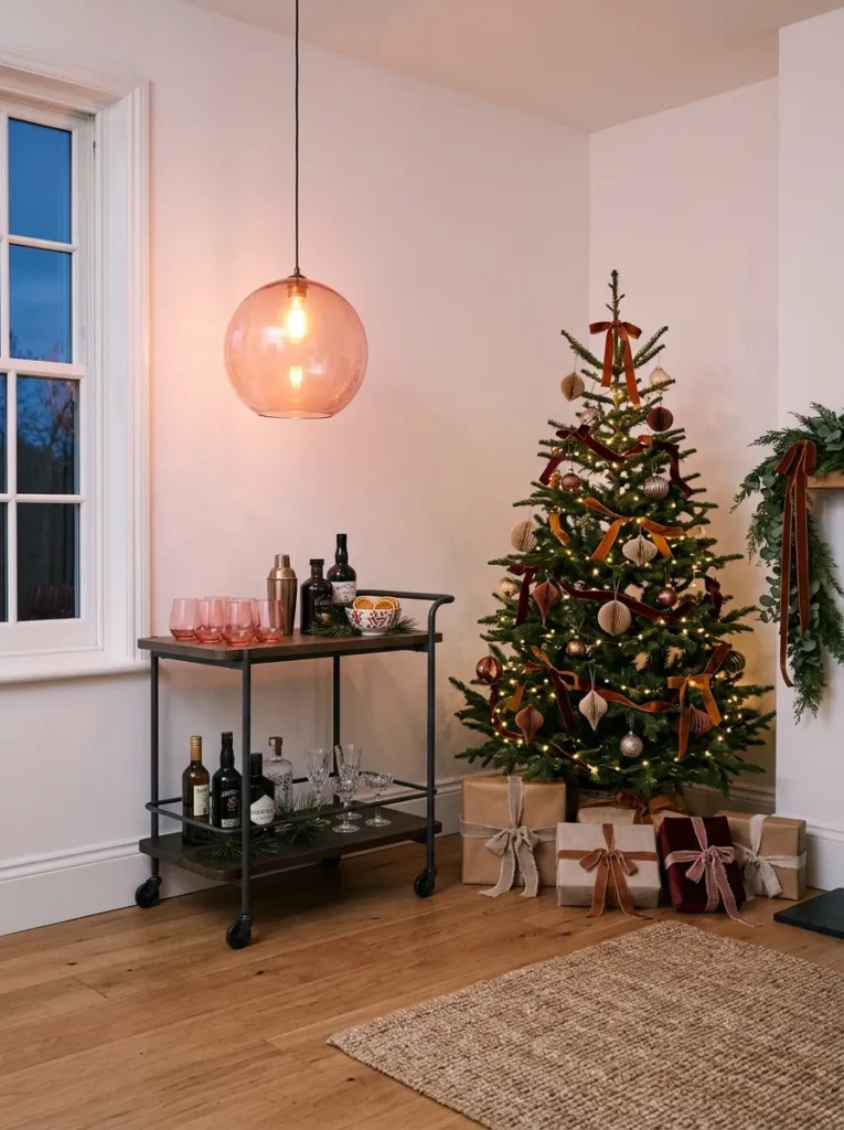
- Palette: Charcoal powder-coated steel, grapefruit-pink glass, smoked oak, matte white wall
- Anchor: A two-tier charcoal steel bar cart with a smoked oak top
- Standout detail: One oversized grapefruit-pink blown-glass pendant hung above the cart
- Support: Six stemless grapefruit-pink tumblers on the top tier
- Lighting: A 2200K bulb in the pendant, no overhead lights
Why this works: Pink glass tints the light passing through it, so one grapefruit pendant colors an entire bar corner without a single garland.
At my first Austin holiday party, I served drinks from a wooden tray, and everything blended into brown. The next year I rolled in a charcoal steel cart and set six grapefruit-pink tumblers on the top tier. Suddenly the drinks looked like part of the decor. Charcoal is a quiet backdrop, so pink glass stands out sharply, and a smoked oak top adds warmth without competing. Above the cart I hung one oversized pink glass pendant, and the whole corner turned into a destination. Guests gathered there before dinner, glass in hand, and nobody asked where the tinsel was.
My husband, who builds homes, gives one rule for pendants: hang them about 30 to 36 inches above the surface below, the same height he uses over a dining table. Any lower and the glass blocks sight lines; any higher and the glow scatters. Use a 2200K bulb so the pink glass reads warm rather than candy-bright. If you do not have a ceiling junction, a plug-in swag cord works with a ceiling hook rated for the weight. Keep the lower tier mostly empty. A bottle of sparkling water, a small pitcher, and nothing else keeps the look intentional.
15. Periwinkle and Camel
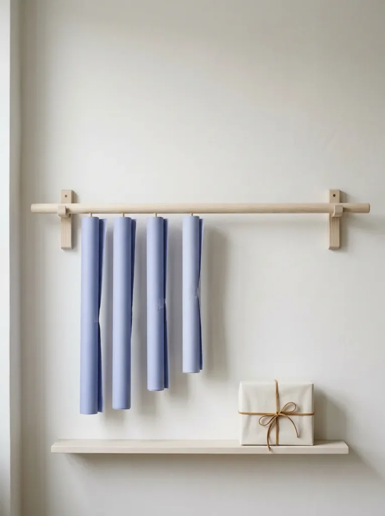
- Palette: Matte periwinkle paper, camel suede cord, pale ash wood, soft white wall
- Anchor: A wall-mounted pale ash dowel rail holding five paper rolls
- Standout detail: Every gift tied with camel suede cord and a hand-cut ash wood tag
- Support: A narrow pale ash shelf below for scissors and tape
- Lighting: North window light by day, a 2700K swing-arm lamp at night
Why this works: Periwinkle blends blue and violet, so it feels calm and festive, and camel keeps it warm instead of cold.
Periwinkle takes its name from the Vinca flower, a small blue-violet bloom that creeps across shady garden beds. It is a color I loved long before I started writing about homes. In a gift-wrapping station, it feels calm, a little unexpected, and very Christmas once it meets camel suede cord. Five rolls of matte periwinkle paper on a pale ash dowel rail look like art, so the chore of wrapping gifts becomes something you want to see. I’ve noticed that people finish wrapping sooner when the supplies are visible and beautiful.
My husband, who builds homes, mounts a rail like this into wall studs, never drywall alone, because five rolls weigh more than most people expect. Place it at eye level, with a narrow ash shelf below for scissors, tape, and tags. Tie each gift with camel suede cord instead of ribbon; it does not fray. By day, north light keeps the periwinkle cool and crisp. At night, a swing-arm lamp with a 2700K bulb warms the camel. Wrapping becomes a two-minute pleasure, and the corner doubles as a holiday display you never have to put away.
Styling Principles
The main design challenge with color-led Christmas decor is restraint. Every palette above works because it limits choices. These six rules keep any scheme looking planned.
- Choose two dominant tones and one accent. Three colors in total is enough to look rich. A fourth usually makes the room feel busy.
- Repeat each color in at least three places. A color that appears once reads as an accident. A color that appears three times reads as a plan.
- Match undertones. Warm yellow-based colors sit well together, and cool blue-based colors do the same. Mixing the two works only when you place them deliberately.
- Use one bulb temperature per room. Warm white between 2200K and 2700K flatters nearly every palette, and a CRI of 90 or higher shows colors accurately.
- Test every color at night. Hold a paint swatch or ornament in the room under your actual evening bulbs, because daylight lies about how a color will look at dinner.
- Keep one living or natural element. Hyacinths, a lemon tree, dried yarrow, or a peppermint plant add texture that no store-bought ornament can match.
FAQ
1. What Are the Christmas Color Trends for 2026?
Trending Christmas palettes pair one saturated accent with a deep or muted base. Examples include chartreuse and midnight navy, saffron and petrol teal, rust and celadon, and lilac and olive. The common thread is restraint, with two dominant tones instead of the traditional red-and-green mix.
2. What Colors Go With Christmas Besides Red and Green?
Many colors work, including navy, teal, mauve, ochre, apricot, aqua, and slate gray. Each pairs well with a warm or cool partner. A recognizable cue such as candles, evergreen, ribbon, or ornaments keeps the room reading as Christmas.
3. How Many Colors Should a Christmas Color Scheme Have?
Three colors is the practical limit: two dominant tones and one accent. This keeps a room cohesive, and it makes shopping easier because every purchase has to fit the plan.
4. What Light Bulb Color Is Best for Christmas Decor?
Warm white bulbs between 2200K and 2700K suit most holiday palettes. Pick bulbs with a CRI of 90 or higher, because lower-quality bulbs can make colors look muddy. Use one color temperature throughout a room so the palette stays consistent.
5. How Do I Test a Christmas Color Palette Before Buying Decor?
Place a paint swatch or sample ornament in the room and view it under your evening lighting for a full night. Light changes color, so a shade that looks right at noon may look different at 8 p.m. Photographing it can help you compare.
6. Can I Use Non-Traditional Colors and Still Make a Room Feel Like Christmas?
Yes. Seasonal cues carry the holiday feeling, and color can change freely around them. Evergreen, candlelight, ribbon, ornaments, bells, and fragrance such as cinnamon or peppermint all say Christmas in any palette.
Conclusion
Christmas color schemes 2026 do not ask you to throw out what you own. They ask you to choose. Pick two dominant tones, add one accent, light everything with one warm bulb, and let a single living or handmade detail do the talking. I’ve seen how small changes like these can completely transform a space.
Save this post on Pinterest so your favorite palette is waiting when you start decorating. Try one idea in one room this week. Then share the article with a friend who is tired of red and green. Make this the year your home feels like you.