15 Christmas Bedding Ideas That Feel Cozy, Not Kitschy
Your bed is the biggest textile surface in your bedroom, and most Christmas decor skips it entirely. Or worse, covers it in reindeer. If you want Christmas bedding ideas that feel grown-up, textured and genuinely beautiful, you’re in the right place. I’m Emily, and after years of styling our Austin home (with plenty of construction-site wisdom from my husband about which materials actually last), I’ve learned that texture and tone do the seasonal work, not cartoon prints. In this post, you’ll find 15 complete bedding layers, from duvet to throw, each with exact colors, fabrics and room pairings you can recreate. Save the ones you love, because December arrives fast.
Here’s the counterintuitive part: the least Christmassy-looking bed is often the most Christmassy. Texture and tone do more seasonal work than printed motifs. A flannel or sherpa duvet in a deep seasonal color reads as Christmas without a single reindeer, because fabric weight and color depth register faster than any pattern. That’s why adult bedrooms look best with texture first and print second. I learned this when I put a snowman duvet on our guest bed one December and it looked like a children’s catalog. This post solves that: 15 swappable, grown-up bedding layers you can fully recreate, from duvet to throw, without changing a single piece of furniture.
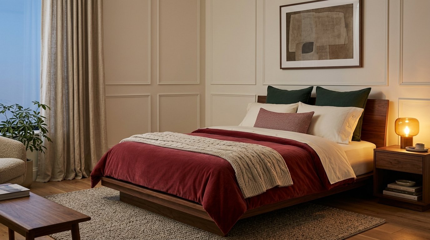
1. Cranberry Velvet and Pine — A Christmas Bedding Idea for Rich Winter Color

- Duvet: cranberry cotton-velvet cover with a medium-weight down-alternative insert, folded back 18 inches at the head
- Sheet layering: ivory percale fitted and top sheets, with the top sheet turned over the duvet fold
- Pillows (5 total): two standard shams in ivory percale, two 26-inch euros in pine-green cotton-linen, one 12 x 20 lumbar in cranberry-and-cream wool herringbone
- Throw: oatmeal wool-blend cable knit, folded in thirds across the foot
- Color split: red lives on the duvet, green lives only on the pillows
- Standout detail: cream mother-of-pearl buttons along the duvet placket
- Room integration: a walnut platform bed and warm white walls stay exactly as they are
Why this works: Cranberry sits closer to burgundy than to fire-engine red, which is why it reads as sophisticated holiday bedding instead of a costume.
Traditional red and green only looks dated when both colors arrive at full saturation. Mute them, and the pairing turns sophisticated. Cranberry sits close to the burgundy family, which has more blue in it than classic fire-engine red, so it settles into a room instead of shouting. Cotton velvet is the right fabric here because it breathes better than polyester velvet, so the bed doesn’t sleep hot. The pile also catches lamplight differently from every angle, so the duvet shifts from deep wine to near-black as the evening goes on. Green stays confined to pillows, keeping the palette controlled.
On a walnut platform bed against warm white walls, this combination looks tailored rather than themed. The oatmeal throw gives the eye somewhere to rest between the two strong colors, and the ivory sheets show along the folded edge as a clean border. Because nothing about the furniture or paint changes, the whole look lifts off in about ten minutes on January second. Most homes already have a bed frame in some shade of wood or upholstery, and this palette suits nearly all of them. Expect a bed that looks deep and rich at night and calm by day.
2. Oat Bouclé, Rust Accent

- Duvet: oat cotton-bouclé cover over a medium-weight insert
- Sheet layering: sand linen-cotton blend top sheet, folded back in a six-inch cuff
- Pillows (4 throw): two 26-inch euros in matching oat bouclé, one 20-inch square in rust washed linen with a hand-torn edge, one 12 x 22 lumbar in cream cotton chenille
- Throw: ivory brushed alpaca-blend with a four-inch fringe, tossed loosely over one corner
- Accent rule: rust appears in exactly one place; everything else stays in the oat-to-cream family
- Standout detail: the unhemmed, frayed edge on the rust pillow
- Room integration: a stone linen upholstered headboard and pale greige walls stay untouched
Why this works: A neutral bed with one rust accent reads as Christmas because a single saturated color against a tonal base looks deliberate, not decorated.
My first attempt at neutral Christmas bedding had seven pillows in five colors, and my husband asked where he was supposed to sleep. I stripped it back to one color story. Oat bouclé, sand linen and cream chenille all sit within a few shades of each other, so the eye reads them as one calm surface. Then a single rust pillow does the seasonal talking. I’ve noticed that one deliberate accent looks intentional, while three look accidental. The nubby bouclé loops also scatter light softly, which gives a plain bed real dimension without extra color.
Rust is the quiet cousin of Christmas red. It leans brown instead of blue, so it flatters oak nightstands, stone headboards and cream walls rather than fighting them. On a stone linen upholstered headboard against pale greige walls, the oat layers disappear into the room and the rust pillow glows like a lit candle. The torn linen edge adds a handmade note that no store-bought pillow quite has. Wash the bouclé cover on gentle and air-dry it flat; I’ve seen the loops snag in a hot dryer and never fully recover. That keeps the surface soft for years.
3. Frost Blue and Sherpa
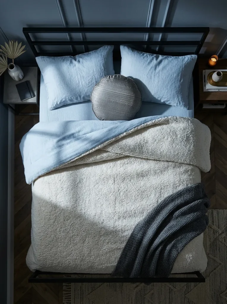
- Duvet: ivory sherpa-fleece cover with a cotton-flannel back, insert in a medium weight
- Sheet layering: frost-blue cotton-flannel top sheet, turned back ten inches to show at the cuff
- Pillows (3 throw): two 22-inch euros in frost-blue stonewashed linen, one 14-inch round in pewter metallic jacquard
- Throw: oversized pewter-gray merino-blend in a basket weave, draped across the foot rail
- Standout detail: the round pewter jacquard pillow, the room’s only shimmer, which echoes frost on a window
- Care: wash cold, tumble low, no fabric softener
- Room integration: works with slate-gray walls and a black iron bed frame, where the pale layers pop at thumbnail size
Why this works: Pale blue, ivory and pewter signal winter through color temperature and texture alone, with no printed motif needed.
Winter doesn’t have to arrive in red. Ivory, pale blue and pewter evoke snow and frost, and they bounce more lamplight around the room than any deep color can. That matters in December, when the sun is down by 5:30 here in Austin and the bedroom runs on lamplight all evening. An ivory sherpa duvet gives the bed visible depth, almost like a fresh drift, while frost-blue flannel sheets show at the folded cuff. I’ve noticed this palette suits people who find red heavy. It looks calm, crisp, and seasonal without printed snowflakes.
Contrast is what makes this look expensive. Against slate-gray walls and a black iron bed frame, the ivory sherpa glows and the blue stays crisp instead of washing out. My husband spends his days around materials that take abuse, and his rule applies to bedding too: tighter construction lasts longer. Choose sherpa with a knit backing and dense pile, because thin, loose versions mat after a few washes. Wash cold, tumble on low, and skip fabric softener, which coats the fibers and flattens them. Treated this way, the cover looks fluffy on January first and still fluffy next December.
4. Midnight Sateen, Gold Bolster

- Duvet: black cotton-sateen cover over a lightweight insert, so the sheen stays smooth
- Sheet layering: ecru Tencel-lyocell top sheet, turned back eight inches
- Pillows (3 throw): two 24-inch euros in black ribbed-cotton matelassé, one 8 x 26 bolster in antique-gold silk-blend dupioni
- Throw: charcoal mohair-blend with a soft halo nap, folded once along the foot
- Gold rule: gold appears on the bolster alone, with no tinsel-bright accents
- Standout detail: the bolster’s slubbed dupioni looks hand-spun and catches the lamp
- Room integration: a curved white oak headboard and bone-white limewash walls make the duvet the room’s one dark shape
Why this works: Black cotton sateen with a single gold accent reads as quiet luxury because the sheen does the work that tinsel would otherwise do.
I hesitated to put a black duvet on a Christmas bed. Then I tried it in our own bedroom, and my sister-in-law walked in, stopped, and asked which boutique hotel we’d copied. Black cotton sateen has a quiet sheen that photographs like silk without the price or the fuss. Against bone-white limewash walls it becomes a single silhouette, and the antique-gold bolster is the only warm note. I’ve seen gold go cheap when it appears in five places. Here it lives in one slubbed, curved bolster, and that restraint is what makes the bed look expensive rather than decorated.
Curves are what keep black from feeling heavy. The bolster’s rounded ends echo the arc of a white oak headboard, softening the dark rectangle of the duvet. Under evening lamplight, the sateen picks up a gentle glow, and the mohair throw adds a soft haze at the foot, like fog on a dark lake. Pick a lightweight insert so the cover stays smooth rather than puffed, because puffiness fights sateen’s sleek surface. Keep the ecru Tencel cuff visible; that pale strip separates black from white and gives the bed a tailored, hotel-sharp edge that photographs from across the room.
5. Aubergine Wide-Wale Corduroy
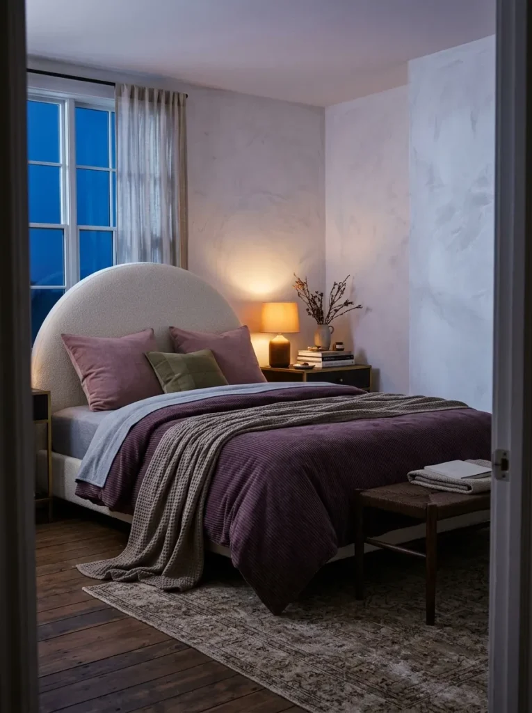
- Duvet: aubergine wide-wale cotton-corduroy cover, ridges running horizontally
- Sheet layering: heather-gray cotton-jersey top sheet, folded back six inches
- Pillows (3 throw): two 24-inch euros in dusty-rose cotton-slub, one 18-inch square in olive wool-flannel
- Throw: mushroom-gray chunky waffle-knit cashmere-blend, draped over one side
- Standout detail: horizontal ridges that stripe the bed in lamplight
- Seasonal nod: purple is the traditional Advent color, so the palette carries meaning without a motif
- Room integration: a cream arched upholstered headboard and chalky white lime-plaster walls
Why this works: Aubergine is the traditional Advent color, so a plum duvet carries real seasonal meaning without a single printed motif.
Purple has marked Advent in church tradition for centuries, which makes aubergine one of the most meaningful Christmas colors and one of the least used. Deep shades absorb light, so a plum duvet makes a bedroom feel enclosed and intimate after dark. Wide-wale corduroy, with ridges spaced roughly eight to the inch or fewer, adds visible structure, so the color never looks flat. Run the ridges horizontally and lamplight stripes across the bed like a tailored suit fabric. Dusty-rose and olive pillows echo the jewel mood without competing, and the gray jersey cuff gives the eye a neutral pause.
Set against a cream arched headboard and chalky white plaster walls, the aubergine becomes a rich, sculptural block of color. The arch softens the strict ridges, a pairing that feels current rather than traditional. Because corduroy is a sturdy cotton weave, it handles nightly use well and gets softer with every wash. Turn the cover inside out before laundering to protect the ridges, and tumble it low. For a deeper effect, keep the lighting amber and low; the plum drinks it in and the dusty-rose pillows glow like the last color left in a winter evening sky.
6. Tartan Runner Over Twill

- Duvet: mushroom-gray heavyweight cotton-twill cover, plain and unfussy
- Sheet layering: crisp white cotton-poplin top sheet, folded back eight inches
- Pillows (3 throw): two 22-inch euros in mushroom twill, one 14 x 20 lumbar cut from the tartan wool
- Throw (runner): moss, black, gray and brick-red wool-blend tartan blanket, folded lengthwise across the lower third with the fringe hanging
- Texture-first rule: the pattern stays on one folded blanket, never the whole bed
- Standout detail: a thin brick-red check line, the only red on the bed
- Care: machine-wash the twill cover; air out and spot-clean the wool
- Room integration: a white oak slat bed and putty-gray walls
Why this works: Tartan reads as adult when it is confined to one folded wool layer over a plain twill base, never spread across the entire bed.
Tartan is the one pattern I allow on an adult Christmas bed, as long as it stays contained. A single wool blanket folded into a runner gives you the whole plaid mood in one controlled stripe. The moss, black and gray base keeps it moody, and the thin brick-red line does the Christmas work. I’ve noticed that tartan on a full duvet reads like a lodge catalog, while tartan on a folded runner reads like a design choice. The mushroom twill beneath gives the pattern a plain stage, so the eye sees one confident layer instead of competing prints.
Twill is the quiet workhorse here. Its diagonal weave is dense, hides wear and resists snagging, which is why my husband specifies similar tight weaves for upholstery in his clients’ homes. That makes it a smart base for a bed used every night. Wash the twill cover warm, and treat the wool runner gently: air it out, spot-clean it, and clean it just once a season. Wool resists odors and dirt naturally, so it rarely needs more. Against putty-gray walls and a white oak slat bed, the whole combination looks grounded, tailored and ready for a quiet December morning.
7. Sage Gauze and Eucalyptus

- Duvet: sage-green cotton double-gauze cover, lightly crinkled, over a lightweight insert
- Sheet layering: ivory cotton waffle-weave top sheet, folded back in a deep ten-inch cuff
- Pillows (4 throw): two 24-inch euros in matching sage gauze, one 16-inch square in cypress-green tonal jacquard with a leaf-vein weave, one 12 x 20 lumbar in raw oat linen
- Throw: undyed cream cotton-slub with knotted tassel ends, tossed across one corner
- Standout detail: the leaf-vein jacquard, which is woven into the cloth and never printed on it
- Color note: the sage leans gray, the same silvery cast you see on eucalyptus leaves
- Room integration: a pale ash bed frame and white shiplap walls
Why this works: Gray-leaning sage green reads as evergreen foliage without a single printed branch, so the bed feels seasonal and stays modern.
Evergreen branches were bringing Christmas indoors long before anyone printed it on a duvet. Sage green borrows that idea in its quietest form. Eucalyptus leaves owe their silvery cast to a waxy coating, which is why gray-leaning greens look soft instead of loud. Double-gauze cotton adds the second piece of the look: its crinkled, airy texture reads like a loose-woven botanical, and it stays breathable under a lightweight insert. Together they make a bed that feels grown rather than decorated, with no printed foliage anywhere on the surface to date it in two seasons.
On a pale ash bed against white shiplap walls, the sage layers look like a sunlit greenhouse corner. The ivory waffle cuff adds a grid of tiny shadows, while the cypress-green leaf-vein pillow gives a single woven detail worth leaning in to see. Gauze is also forgiving in daily life: it wrinkles by design, so there’s no ironing, and it softens with every wash. Tumble it low and shake it out while damp. For a bedroom that already holds plants, a nightstand pothos or snake plant simply continues the palette, with no extra purchases required beyond the textiles themselves.
8. Espresso Flannel, Cream Shearling

- Duvet: espresso-brown brushed-cotton flannel cover over a medium-weight insert
- Sheet layering: oyster cotton-poplin top sheet, turned back six inches
- Pillows (3 throw): two 24-inch euros in cream faux-shearling, one 12 x 24 lumbar in caramel faux-suede
- Throw: chestnut-brown brushed wool with a cream blanket-stitched edge, folded in half across the foot
- Standout detail: the hand-stitched cream edge on the chestnut throw, a thin line that frames the whole foot of the bed
- Temperature rule: every tone stays in one warm family, from espresso to oyster
- Room integration: a cognac leather headboard and warm white walls
Why this works: Chocolate brown and cream echo cocoa, gingerbread and firelit wood, which are three Christmas cues that need no printed icons.
Brown might be the most underrated Christmas color. It echoes cocoa, gingerbread and firelit wood, three seasonal cues that don’t need a single printed icon. Espresso flannel makes that mood wearable: brushed cotton has a soft, matte surface that absorbs light, so the bed looks deep rather than flat. I put this combination on our own bed after a friend asked for “Christmas without the red,” and she texted me a photo of hers the next morning. Cream shearling pillows lift the darkness, and the cognac leather headboard ties the palette together.
Against warm white walls and a cognac leather headboard, the espresso duvet becomes the bed’s anchor and the cream shearling pillows become its highlights. The caramel faux-suede lumbar bridges the two, matching the leather and keeping the palette to one temperature. Pilling is the usual complaint with flannel, so check the fabric. My husband’s advice for any textile is to inspect the weave, and with flannel that means a tight, evenly brushed surface with no bald patches. Wash it inside out on cool and tumble low. Done well, it stays smooth all season.
You’ll Also Love: 15 Black and Gold Christmas Decorations for a Glamorous Holiday
9. Cream Quilt, Spruce Wool

- Duvet: cream diamond-quilted cotton cover with a lightweight fill
- Sheet layering: white cotton-percale top sheet, flipped over ten inches
- Pillows (3 throw): two 22-inch euros in spruce-green heavy cotton canvas, one 14-inch square in cream wool-felt
- Throw: spruce-green boiled wool with a raw-cut edge, folded in half across the lower third
- Standout detail: the raw-cut edge, which needs no hemming because boiled wool doesn’t unravel
- Material rule: everything on the bed is natural fiber, from cotton to wool
- Room integration: dusty-clay plaster walls and a whitewashed pine frame
Why this works: Boiled wool is dense and warm, so one spruce-green throw adds real winter comfort as well as seasonal color.
The Austin freeze of 2021 changed how I think about bedding. For three days, every blanket in our house became functional, and the one I reached for first was a dense green boiled-wool throw. It turns out that beautiful and useful can be the same object. Boiled wool is felted, so it’s thick, warm and doesn’t unravel when cut. Layered over a cream quilted cover, its spruce green looks like a pine bough against fresh snow. I’ve kept that combination ever since, and guests always reach out and touch the wool first.
Against dusty-clay plaster walls and a whitewashed pine frame, the cream diamond quilting catches shadow like soft topography. The spruce throw anchors the lower third of the bed, while two spruce canvas pillows repeat the green in miniature. Everything on this bed is natural fiber, so it breathes and drapes well, and nothing needs ironing. Wash the quilted cover on gentle and the white percale sheet on warm, but only spot-clean the wool. Its raw edge needs no hemming and no fuss. The result is a bed that looks beautiful and works hard.
10. Navy Linen, Copper Thread
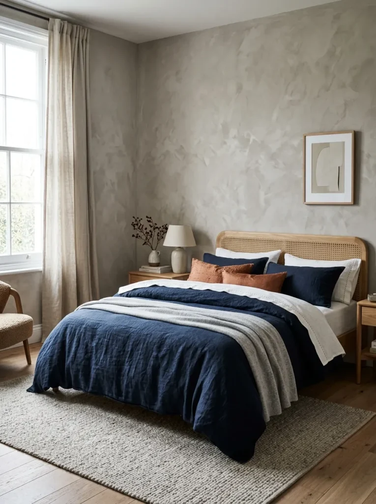
- Duvet: midnight-navy stonewashed linen cover with a copper running-stitch border, over a lightweight insert
- Sheet layering: chalk-white cotton-percale top sheet, turned back seven inches
- Pillows (4 throw): two 26-inch euros in navy linen, one 18-inch square in burnt-copper raw silk, one 12 x 20 lumbar in dove-gray ribbed cotton
- Throw: dove-gray cable-knit merino, folded across the foot
- Standout detail: the copper running stitch, a metallic note with no sparkle
- Color logic: navy and copper sit near opposite sides of the color wheel, so each deepens the other
- Room integration: a caned natural-oak headboard and warm gray plaster walls
Why this works: Navy and copper sit near opposite sides of the color wheel, so each makes the other look richer.
Blue and orange sit opposite each other on the color wheel, which is why a navy bed with one copper accent looks so vivid. The contrast makes both colors appear richer than either would alone. Navy washed linen suits this job well: flax is among the strongest natural textile fibers and gets softer rather than weaker with washing, so the cover improves all season. A copper running stitch along the duvet’s border adds the metallic note without any sparkle. Thread stays quiet in daylight and glints only when lamplight shifts across it.
Navy can read like deep water in a sunlit room, especially against warm gray plaster and a caned oak headboard. The chalk-white percale cuff keeps the dark linen crisp, and the dove-gray merino throw softens the foot of the bed. Linen wrinkles naturally, so leave it relaxed; a smooth press fights its character. The burnt-copper raw-silk pillow is the single warm square, and cane’s open weave repeats the handmade texture. Expect a bed that looks collected over time, as though each piece was found on a trip rather than bought as a matching set.
11. Blush Chenille, Oxblood Silk

- Duvet: blush chenille cotton-blend cover over a medium-weight insert
- Sheet layering: ivory washed-cotton percale top sheet, folded back six inches
- Pillows (3 throw): two 22-inch euros in oxblood silk charmeuse, one 12 x 22 lumbar in ivory ribbed-cotton knit
- Throw: camel brushed-wool herringbone, folded once across the foot
- Standout detail: oxblood charmeuse that folds like ribbon, the only hint of gift wrap
- Color logic: blush and oxblood stay tonal, while the walls supply the green complement
- Room integration: olive-green walls and a charcoal-stained ash platform bed
Why this works: Blush and oxblood belong to the same tonal family, so pink bedding can read as Christmas instead of nursery.
Pink may be the most underestimated Christmas color. Blush pairs with oxblood the way light cranberry pairs with deep burgundy, a tonal family rather than a clash. Chenille helps: its looped, dense pile gives the surface a velvety softness that reads as grown-up, not nursery. In winter, when daylight is limited, the soft pink adds warmth to the whole room. Silk charmeuse in oxblood supplies the sheen, and its liquid drape folds over the pillow’s edge like ribbon, which gives the bed a hint of gift wrap without any bows.
I first tried this combination after a friend painted her bedroom olive green and asked me what on earth to put on the bed in December. Blush chenille against olive turned out to be the answer: the pink looked luminous and the green looked even deeper. The camel herringbone throw adds a tobacco-colored neutral that connects the two, and the ivory knit lumbar lifts the middle of the bed. I’ve noticed guests photograph this look more than any other, probably because pink and green together feel unexpected yet instantly familiar. Nothing else in the room needs to change.
12. Charcoal Jersey, Ivory Cable

- Duvet: charcoal-heather cotton-jersey cover, T-shirt soft, over a lightweight insert
- Sheet layering: crisp white cotton-percale top sheet, folded back eight inches for a sharp stripe
- Pillows (3 throw): two 24-inch euros in ivory cable-knit cotton, one 12 x 22 lumbar in tomato-red wool flannel
- Throw: ivory chunky merino arm-knit, piled loosely at the foot
- Standout detail: one tomato-red lumbar, the only bright color on the bed
- Budget note: jersey covers are year-round basics, so only the cable pillow covers and throw are seasonal
- Room integration: a mid-century teak bed frame and white-painted brick wall
Why this works: Value contrast, charcoal against ivory, signals winter more clearly than any printed snowflake.
Scandinavian winter design relies on value contrast, the gap between light and dark, more than on any single color. Charcoal jersey and ivory cable knit sit at opposite ends of the value scale, so the bed has graphic punch even before the red appears. Jersey itself is a knit, which means it stretches and drapes instead of holding a stiff shape, so the duvet slumps into soft folds. Ivory cable knit then adds the sweater texture that signals winter at a glance. One tomato-red wool lumbar sits in the middle, a single bright mitten on a snowy path.
This is one of the most affordable Christmas bedding ideas in this list, because jersey duvet covers are everyday basics and only the cable pillow covers and throw are seasonal. Against a white-painted brick wall and a mid-century teak frame, the charcoal looks crisp and the teak’s warm grain keeps the palette from going cold. Brick texture echoes the cable knit’s raised ribs, a subtle conversation between wall and bed. I’ve seen this combination hold up in rental bedrooms, where walls can’t change. Most pieces wash easily, and the red lumbar can return to a drawer in January.
13. Champagne Sateen, Ivory Fringe
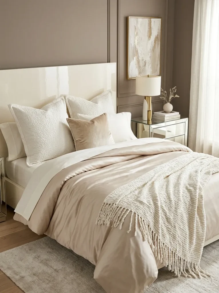
- Duvet: champagne cotton-sateen cover, 300 to 400 thread count, over a lightweight insert
- Sheet layering: ivory cotton-percale top sheet, folded back nine inches
- Pillows (3 throw): two 24-inch euros in ivory cotton matelassé, one 16-inch square in champagne cut-velvet
- Throw: ivory hand-loomed cotton-chenille with six-inch twisted fringe, laid across the foot
- Standout detail: the twisted fringe, which swings when you sit down
- Metallic rule: gold lives in the fabric’s sheen alone, with no metallic thread or hardware
- Room integration: a lacquered ivory headboard and mushroom-taupe walls, with a mirrored nightstand to double the light
Why this works: Champagne reads as gold through sheen rather than glitter, so a sateen duvet delivers metallic warmth without any metallic fabric.
Gold doesn’t have to be metallic. Champagne is a pale, slightly gray-yellow tone that reads as gold through sheen rather than glitter, which is why it suits a bed so well. Cotton sateen is woven so more thread floats on the surface, giving it that smooth glow without the fragility of silk. A thread count around 300 to 400 gives it enough body to hold its drape. Over an ivory percale cuff, the champagne duvet catches daylight like a satin ribbon, shifting from pale gold to near-white as you walk past, so the bed changes with the hour.
Against mushroom-taupe walls and a lacquered ivory headboard, the champagne reads soft and polished, never flashy. Twisted fringe on the ivory throw adds movement; it swings when you sit down, which is a small tactile pleasure that photographs well. Add a mirrored nightstand and the sheen doubles, bouncing lamplight across the room. I’ve seen this look work especially well in smaller bedrooms, where extra light matters more than extra decoration. Keep everything else matte so the sateen is the star. Wash the cover cool and tumble it low; high heat dulls sateen’s sheen over time.
14. Kantha Quilt, Turmeric Velvet

- Duvet: plain ivory stonewashed-cotton cover, a quiet base layer
- Sheet layering: white cotton-voile top sheet, turned over eight inches
- Pillows (3 throw): two 24-inch euros in turmeric cotton-velvet, one 14 x 20 lumbar in ink-black linen with a cream tassel
- Throw (kantha): hand-stitched cotton kantha in ink-black and cream block print with turmeric running stitch, folded in thirds across the lower half
- Standout detail: the visible running stitch, slightly irregular because it is done by hand
- Care: many modern block-print kanthas wash cold on gentle; check vintage pieces before washing
- Room integration: a dark-stained mango-wood bed and paper-white walls
Why this works: In kantha, the hand stitching is the pattern, so the bed gains texture and history without any holiday motif.
I found my first kantha quilt at the Round Top antiques fair, folded in a vendor’s stall. The seller explained that kantha is made by layering old cotton cloth and stitching it together by hand in rows of running stitch, which is why no two are alike. I carried it home, draped it over our bed in December, and it changed everything. The slightly irregular stitching and faded ink-black-and-cream print gave the bed history. A turmeric velvet pillow picked up the thread color, and the room looked like it had been collected over decades, not bought in one afternoon.
Kantha works because the stitching is the pattern. Rows of running stitch quilt the layers together and create gentle ripples, so the surface has texture before color even registers. Against paper-white walls and a dark-stained mango-wood bed, the ink-black print reads graphic and the turmeric pops. Real vintage kantha can be fragile, so check the stitching before buying; modern block-print versions are sturdier and often machine-washable on a cold, gentle cycle. Use the quilt as a throw, folded in thirds across the lower half, so the plain ivory duvet beneath keeps the bed calm and easy to launder.
15. Peacock Teal Herringbone — A Christmas Bedding Idea with Evergreen Depth

- Duvet: peacock-teal cotton herringbone-weave cover over a medium-weight insert
- Sheet layering: sand cotton-percale top sheet, folded back eight inches
- Pillows (3 throw): two 24-inch euros in camel heavy-cotton basketweave, one 14-inch round in ivory faux-sheepskin
- Throw: ivory-and-camel color-block mohair-blend, laid across the foot like a runner
- Standout detail: the herringbone’s V-shaped weave, which looks like a fir bough up close
- Color logic: teal sits between blue and green, so it feels evergreen without being literal
- Room integration: a woven rattan bed frame and warm white plaster walls
Why this works: A herringbone weave resembles fir boughs up close, so teal herringbone bedding hints at evergreen through structure rather than print.
Teal is evergreen in disguise. Sitting between blue and green, peacock teal gives you the depth of a pine forest with a cooler, more modern attitude, so it avoids the traditional Christmas-tree look. The weave adds a second layer of meaning: herringbone’s V-shaped rows resemble fir boughs when you look closely, so the pattern hints at evergreen through structure alone, without any printed branch. Because the pattern is woven rather than printed, it reads as texture, and tone-on-tone weaves like this one stay quiet from across the room while rewarding anyone who leans in to look.
I’ve tried teal beside camel and ivory, and the camel is what makes it work. Warm basketweave pillows keep the teal from feeling icy, while the ivory sheepskin round adds a soft, rounded shape against all that angular weave. On a woven rattan frame and warm white plaster walls, the palette looks like a sunlit corner of a lodge, relaxed and collected. The color-block mohair throw ties everything together: a broad ivory stripe beside a camel one, laid across the foot like a runner. Rattan’s open weave keeps the bed light, so the dark teal never dominates.
Styling Principles: Texture First, Print Second
Start with texture, then add color. A flannel, sherpa, velvet or wool surface signals winter before the eye registers any hue. If a bed has two or three distinct textures, it already looks seasonal.
Keep one dominant color and one accent. Every bed in this list has a base color that covers most of the surface and a single smaller note, such as rust, copper, tomato red or oxblood. Three or more competing accents is where a bed starts to look cluttered.
Put the seasonal layer on top, not underneath. Duvet covers, pillow covers and throws are the swappable parts. Your mattress, sheets and bed frame stay the same, which keeps the bed practical for everyday life.
Use pattern in one place. Tartan, kantha or a woven herringbone works best as a single folded layer or a weave you notice up close, rather than across the full bed.
Respect the room you already have. Check the wall color and bed frame first, then choose a palette that suits them. A bed that fits its room looks intentional, and a bed that fights it looks costumed.
A bed reads as seasonal when its fabrics have weight, texture and depth of tone, and printed motifs are optional.
FAQs
1. What are the best fabrics for winter bedding? Flannel, sherpa, wool, velvet and heavyweight cotton are the best fabrics for winter bedding, because they trap warmth and add visible texture. Cotton flannel and cotton velvet breathe better than polyester versions, so they are a smarter choice if you tend to sleep warm.
2. How do I make Christmas bedding look elegant instead of kitschy? Choose texture and tone over printed motifs. A deep-colored flannel, velvet or bouclé duvet signals Christmas on its own, so you can skip reindeer, Santa and snowman prints. Limit pattern to one folded layer, and keep accent colors to one or two.
3. How can I try Christmas bedding on a budget? Swap only the smallest layers: a throw blanket and two or three pillow covers. Pillow covers often cost roughly $15 to $35 each, and a good throw often runs $30 to $80, while a full duvet cover can cost more. Keep your existing sheets and duvet insert.
4. Which seasonal bedding is washable, and which is dry-clean only? Cotton flannel, cotton jersey, corduroy, linen, twill and most sherpa covers are usually machine-washable on a cool, gentle cycle. Silk charmeuse, boiled wool and vintage textiles often need spot-cleaning or dry-cleaning. Always follow the care label on each piece.
5. How many throw pillows should a Christmas bed have? Three to four throw pillows plus your sleeping pillows is a good range. Two matching euro pillows with one contrasting accent pillow is a balanced starting point, and it looks neat without taking long to arrange every morning.
6. How do I transition my bedding after the holidays? Wash each seasonal piece first, since stains set when stored. Fold everything into a breathable cotton bag or a lidded box, because sealed plastic can trap moisture. Keep your plain base layers on the bed, then add a new throw or pillow cover to carry the room into January.
Conclusion
A beautiful bed doesn’t need reindeer, tinsel or a theme. It needs texture, one confident color story and a few swappable layers. Whether you choose cranberry velvet, oat bouclé or a hand-stitched kantha, these Christmas bedding ideas prove that a bed can feel deeply seasonal and still look like you. I’ve seen how small textile changes can transform a whole bedroom in an afternoon, and I hope one of these looks inspires yours.
Save this post to your Pinterest board, try one idea this weekend, and share it with a friend who’s still staring at her plain white duvet.