15 Christmas Chalkboard Art Ideas: Simple, Festive & Fun
A blank wall on December 1 is an invitation. Christmas chalkboard art ideas can fill it with a countdown, a cocoa menu, or a carol sheet, then change every day until Christmas Eve. Unlike a store-bought sign, it never has to say the same thing twice.
If you’ve ever hung a chalkboard and then stared at it, unsure what to write, this guide is for you. Here are 15 complete ideas, from an Advent grid in the kitchen to a snowflake wall in the powder room. Each one gives you exact colors, board sizes, and lettering techniques you can copy this weekend, even if you’ve never held chalk. In my experience, the difference between a board that looks homemade and one that looks designed is rarely talent.
It’s planning: one hero element, a limited palette, and plenty of empty space. Save your favorites, and let’s fill that wall.
Why a Chalkboard Belongs in Your Christmas Plan
The best Christmas decoration is the one you can’t finish. Psychologists call it habituation: the brain stops noticing anything that never changes, which is why a perfect garland fades from view by mid-December. A chalkboard keeps getting noticed because it keeps changing. In my own kitchen, the ornaments go invisible within a week, yet someone always stops to read the board and add to it.
A Christmas chalkboard works because it changes daily, and the brain keeps noticing what changes. These 15 ideas give every board a real job and a design worth saving.
1. Advent Countdown Grid — A Christmas Chalkboard Art Idea for the Whole Family
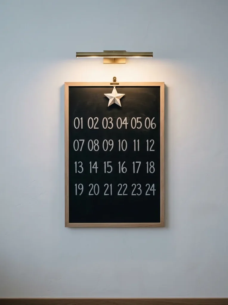
- Board: 24 x 36 in matte black slate-finish board in a slim raw white oak frame
- Design and function: 24 numbered squares in four rows of six. Kids add a tiny chalk drawing on each day, so the board counts down to December 24.
- Color: Crisp white chalk on black, with one accent: an ochre-yellow chalk outline marking today’s square
- Placement: Kitchen wall above the butcher-block counter, hung at eye level for the whole family
- Integration: Pairs with oak shelving and a single aged-brass picture light
- Standout detail: A hand-cut paper star on a brass binder clip that slides forward each morning
Why this works: A visible countdown that changes every morning gives a chalkboard a job, and a board with a job gets looked at all season.
Most Advent calendars hide the countdown behind little doors, but a chalkboard puts the whole month in plain sight. The idea has old roots: in the 1800s, German Protestant families marked a chalk line on a door each December day until Christmas Eve. A 24-by-36-inch board brings that habit into the kitchen, where everyone passes it a dozen times daily. Grid it into four rows of six squares, number each one, and let kids add a tiny drawing when its day arrives. The board stays useful because it changes every morning, which keeps it from fading into the wall.
Lettering is where beginners stumble, so start with the grid. Lay painter’s tape along each line, rub white chalk over the tape edges, then peel it away for razor-straight borders with no ruler wobble. Number each square in simple block numerals, with vertical strokes slightly thicker than horizontal ones. A chalk pencil gives sharper numbers than stick chalk on a two-inch square. Clip a hand-cut paper star to a brass binder clip and slide it forward each morning. Under a small picture light, the matte black surface and white numerals stay readable from across the room.
2. Botanical Holly Sprig
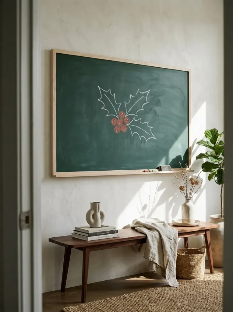
- Board: 30 x 40 in deep spruce-green slate-finish board in a wide pale ash frame
- Design and function: One life-scale holly sprig with three leaves and a single berry cluster, left in generous margin like a museum plate
- Color: White chalk outlines, sage-green chalk shading, and brick-red chalk pastel berries on spruce green
- Placement: Entry wall above a walnut bench, with the center of the board at about 57 inches
- Integration: A slim bud vase on the bench holds one real holly sprig, so the drawing and the plant echo each other
- Standout detail: A single white dot of highlight on every berry
Why this works: A single oversized botanical drawing reads as art, not a seasonal sign, and gives an entry one calm focal point.
My first holly drawing looked like a green blob wearing red polka dots. Then I remembered my plant science training and sketched from a real sprig instead. Holly leaves have a spiky, wavy edge and a pale center vein, details that make a chalk version believable. Only female holly plants produce berries, and they grow in tight clusters, never as one lonely dot. This 30-by-40-inch board in deep spruce green sits in the entry, so guests meet a botanical illustration before taking off their coats. It feels more like a gallery piece than a school project.
Technique matters more than talent here. Sketch the leaf spine first with a firm white line, then add the wavy outline, and smudge one half of each leaf with a fingertip for shading. Berries go in with red chalk pastel, finished with one tiny white dot of highlight. My husband, who builds homes for a living, insists large boards near an entry be anchored into wall studs with 3-inch screws, never plastic drywall anchors, because a 30-by-40-inch framed board can weigh 15 pounds or more. Door slams and swinging bags test mounting more than you’d expect.
3. Arched Cocoa Menu
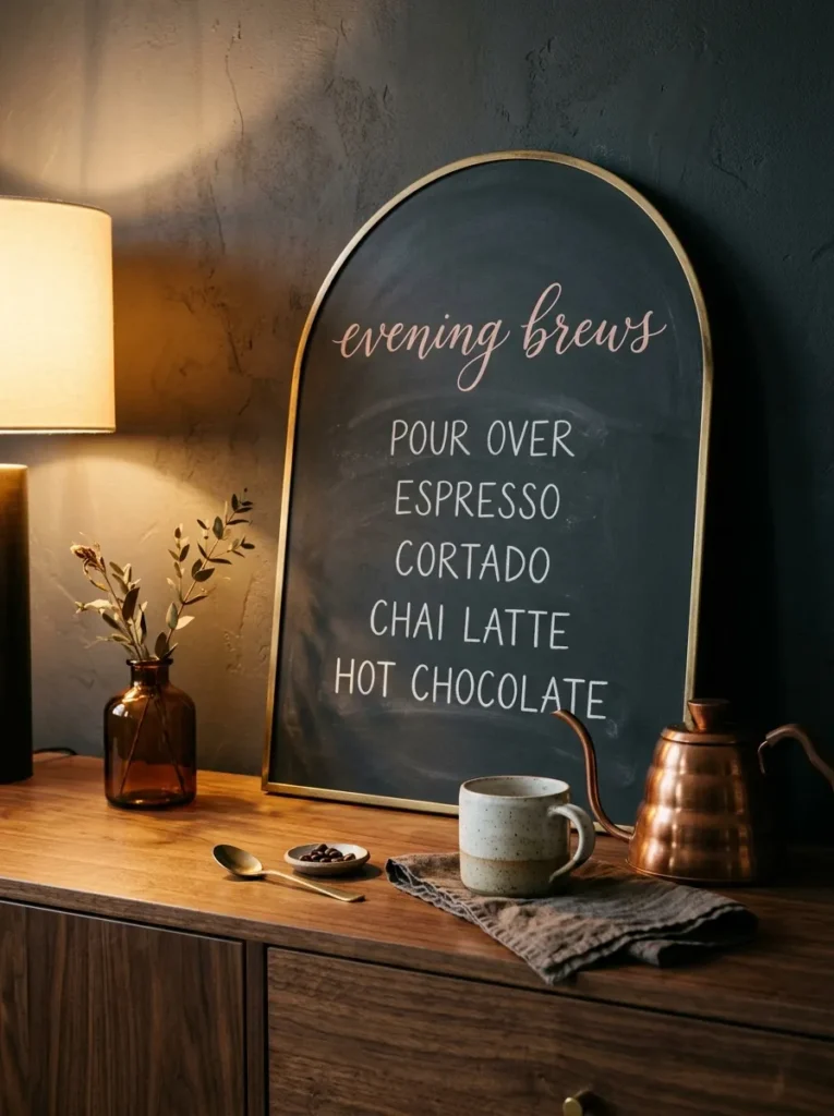
- Board: Arched 18 x 26 in charcoal board, unframed, with the edge hand-painted antique brass
- Design and function: A four-drink hot cocoa menu with toppings, so guests can serve themselves without asking
- Color: Blush-pink script title, white block capitals for drinks, butter-yellow lowercase for toppings on charcoal
- Placement: Walnut dining sideboard, leaning against the wall at the back of a serving tray
- Integration: A copper kettle and a stack of speckled cream mugs sit beside it
- Standout detail: A narrow tally column where guests add a chalk tick for their favorite, so you know the winner by New Year’s Eve
Why this works: A menu board answers the “what’s available?” question before guests ask, which keeps a drink station running on its own.
A cocoa menu does real work: it tells guests what’s on offer before anyone has to ask. A common signage rule of thumb allows about one inch of letter height for every 10 feet of viewing distance, so a board read from the sofa needs lettering at least an inch tall. I learned that after hosting a holiday open house where nobody could read my first menu from the doorway. This arched 18-by-26-inch board in charcoal now stands on the dining sideboard, with the title in blush chalk and four drinks listed in clear capital letters beneath it.
Hierarchy keeps a menu from looking crowded. Use one flowing script word for the title, then switch to plain block capitals for the drinks, and add toppings in smaller butter-yellow lowercase underneath each name. Try peppermint mocha, salted caramel, Mexican spice with cinnamon, and white chocolate with orange zest. Mark faint baselines with a ruler first, then wipe them away with a damp cotton swab once the lettering is done. I’ve seen menus go from messy to polished just by keeping the same letter height across all four drinks. A warm table lamp turns the chalk golden after dark.
4. Dickens Script Mantel
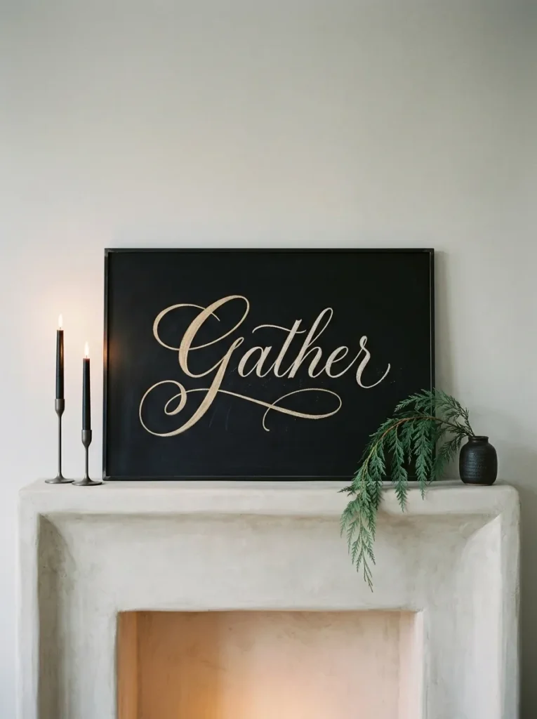
- Board: 36 x 24 in landscape board in matte black, set in a thin blackened-steel frame
- Design and function: One line from A Christmas Carol, “God bless us, every one,” lettered in flowing script as a quiet focal point rather than signage
- Color: Warm-white chalk script, with a champagne-gold chalk marker on the swash capital G and the underline flourish
- Placement: Hung and centered above the living room fireplace mantel
- Integration: Two matte black taper holders and one cedar branch in a ceramic vessel sit on the shelf below
- Standout detail: An oversized swash G whose tail runs under the entire line
Why this works: One short line of lettering, given a large board and plenty of empty space, reads as quietly confident rather than crowded.
I once ruined a perfectly good quote by running out of board. The first three words sat comfortably, then the last two squeezed against the frame like commuters on a train. Now I letter every line on scrap paper first, count the characters, and mark the center point on the board before touching chalk. For this mantel piece, I chose Dickens’s line from A Christmas Carol, God bless us, every one, because it’s short enough to breathe on a 36-by-24-inch board. Short quotes look expensive. Long ones look like homework. Big letters read from the sofa.
Faux calligraphy is easier than it looks. Write the whole line in a single, even stroke, tilting every letter the same direction. Then thicken only the downstrokes by tracing a second line beside each one and filling the gap with chalk. The champagne-gold chalk marker goes on the swash capital G, with its tail running under the entire line. A French cleat is how my husband hangs heavy boards above a mantel: two matching 45-degree strips, one on the wall and one on the frame, so the weight spreads across studs instead of one hook. It also stays level.
5. Line-Art Tree Triptych
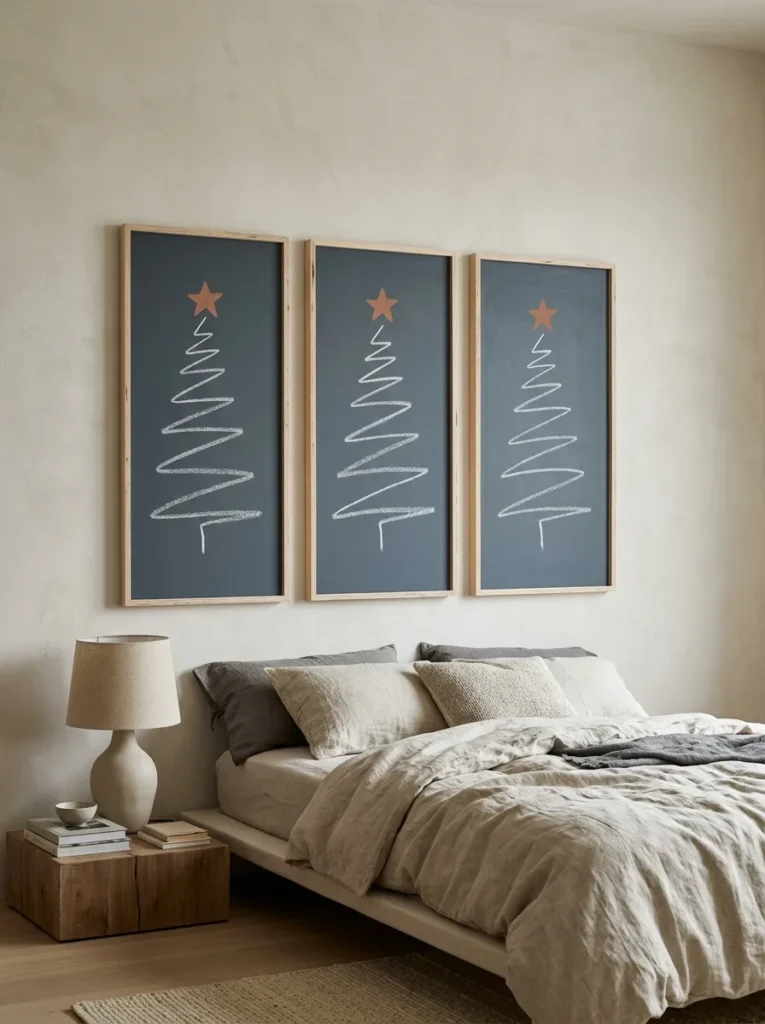
- Board: Three 10 x 30 in panels in graphite blue-gray, cut from birch plywood, hung two inches apart
- Design and function: Three trees drawn as loose single-line zigzags, one tall, one medium, one small, to calm a bedroom wall
- Color: White chalk line only, plus one small terracotta star on the tallest tree
- Placement: Bedroom headboard wall, centered above a low linen-covered bed
- Integration: Oatmeal linen bedding and one ceramic bedside lamp keep the palette quiet
- Standout detail: Plywood edges left raw and unpainted, so the layered birch lines echo the drawn ones
Why this works: Leaving small gaps in a line drawing lets the eye finish the shape, which is why minimal trees feel calm instead of empty.
Minimal Christmas chalkboard art succeeds on a principle designers call closure: the eye completes a shape even when the line breaks. Draw a tree as a loose zigzag with a few gaps, and viewers still see a tree. That is why this three-panel set feels calm in a bedroom, where busy decor would work against rest. The panels are 10 by 30 inches, hung two inches apart, with a tall, a medium, and a small tree. The graphite blue-gray board reads softer than pure black, and the empty space around each tree gives the wall room to breathe.
Hold the chalk at a shallow 45-degree angle and pull it toward you. Pushing makes chalk skip and chatter. Start each tree at the trunk base, zigzag upward in five even turns per side, and finish with a pointed tip, lifting the chalk only when you must. Sharpen a stick of chalk on fine sandpaper for a thinner line. Practicing the zigzag on cardboard first saves a lot of wiping. Finish the tallest tree with one small terracotta star, the only color on the boards, and let the exposed birch edges frame the whole set.
6. Nativity Silhouette Panel
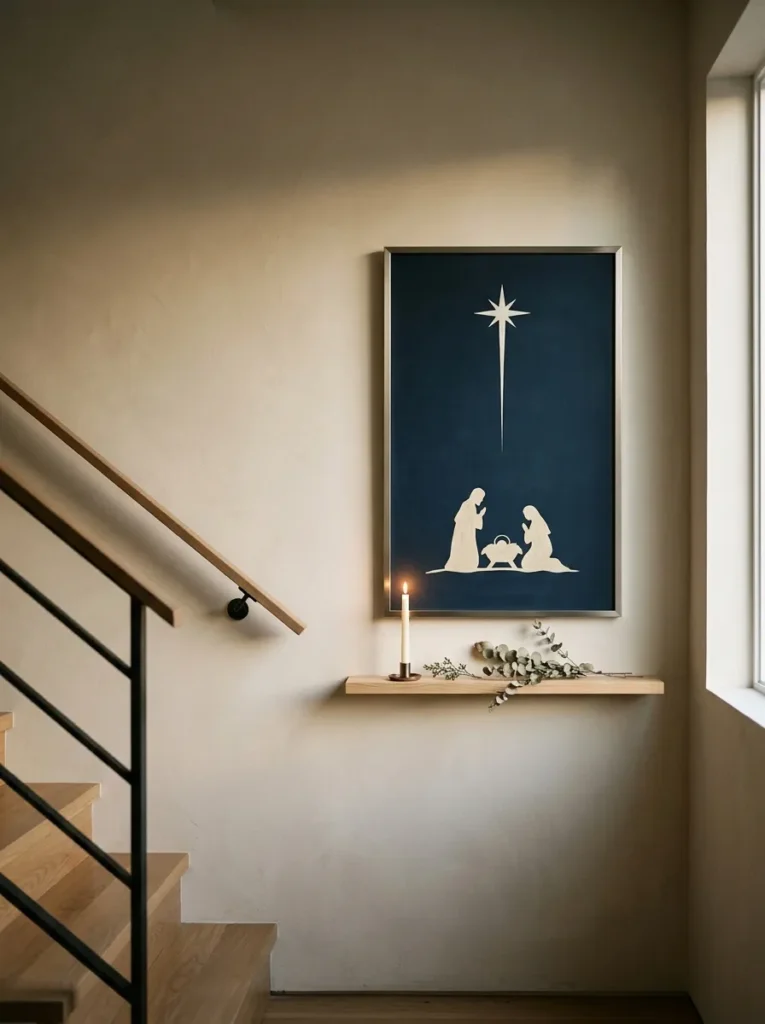
- Board: 20 x 30 in deep midnight-navy board in a slim brushed-nickel frame
- Design and function: A nativity scene told in silhouette: a stable roofline, three figures, and one star, with no faces or fine detail
- Color: Cream silhouettes, a pearl-white star, and a smudged ultramarine chalk haze above the horizon
- Placement: Stair landing wall, above a narrow pine ledge
- Integration: A single LED taper on the ledge lights the board from below after dark
- Standout detail: One long star ray, drawn with a ruler, pointing straight to the stable roof
Why this works: A silhouette keeps a traditional nativity scene modern, because simple shapes tell the story without any detail.
A nativity scene doesn’t need faces to tell its story. A silhouette uses just a stable roof, three figures, and one star, and that restraint feels modern on a stair landing. I like it on navy because the cream shapes glow even in a dim stairwell. Laying a stick of chalk on its side makes broad, soft fills, which turn the shapes into solid cream silhouettes against the deep blue. Stand back every few minutes. From across the room, you’ll catch any lopsided roof, uneven horizon, or leaning figure at once.
Sketch the horizon first, about a third of the way up from the bottom, and rule it lightly. Build the stable roof as a simple triangle on two posts, then add the figures as soft ovals topped with smaller heads. Smudge a band of ultramarine chalk above the horizon with a dry cloth, then pull the star’s one long ray to the roof with a ruler. My husband adds one rule for stairwells: keep frames slim, because codes vary by city on how far anything may project into the stair width, and wall-hung art gets bumped.
7. Gift Wrap Ledger
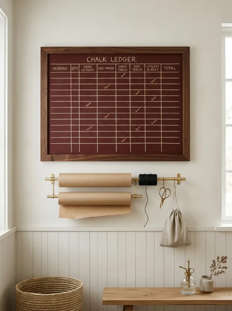
- Board: 24 x 18 in landscape board in oxblood red slate finish, set in a stained-walnut frame
- Design and function: A gift ledger with four columns (Name, Gift, Wrapped, Shipped) and eight rows, so nothing gets forgotten or bought twice
- Color: Cream chalk grid and lettering, with tan chalk check marks on finished rows
- Placement: Laundry room wall, above a folding counter that doubles as the wrapping station
- Integration: A brass dowel rack below holds kraft paper rolls, with a spool of black twine nearby
- Standout detail: Tan check marks stay on completed rows instead of being erased, so progress shows at a glance
Why this works: A gift ledger on a chalkboard turns a mental to-do list into a visible one, and visible lists get finished.
Gift wrapping goes faster when everything is in one place, and the board is the brain of the station. Most wrapping paper sold in the United States comes on 30-inch-wide rolls, so a rack over 30 inches wide sits under a 24-by-18-inch board above a folding counter. Rule four columns and eight rows, then label them Name, Gift, Wrapped, and Shipped. Each finished present earns a check mark, and everyone can see progress at a glance. Duplicate gifts and forgotten names are easy to make in December, and a visible ledger prevents both before the tape comes out.
Letter the header row with a chalk marker so it survives wiping, and use stick chalk for the name rows so you can edit them. Rule the grid with a yardstick and chalk, keeping rows two inches apart for easy reading. Write each name in small capitals, all the same height. A check mark in tan chalk reads better than an erased line, because finished rows show the work already done. Add a roll of kraft paper, a spool of black twine, and a pair of brass scissors, and the corner finally looks intentional.
8. Reindeer Roll Call
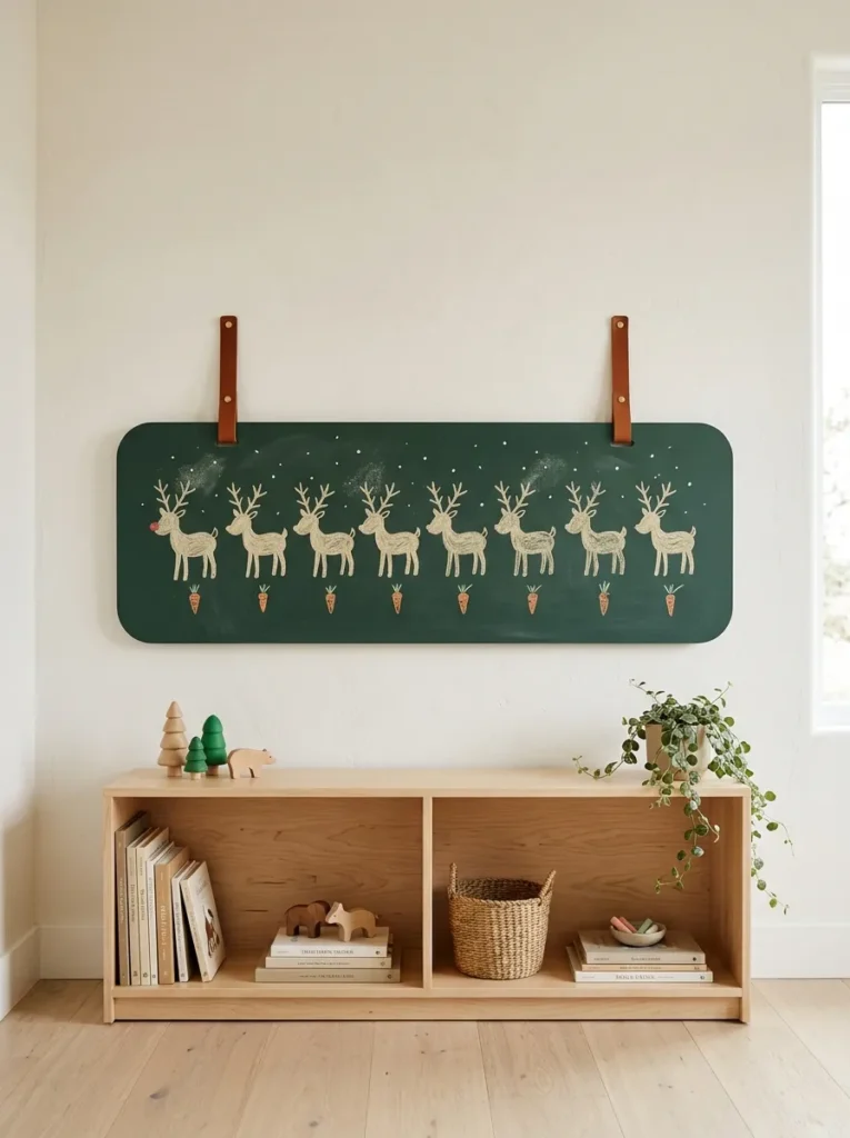
- Board: 48 x 14 in landscape board in deep forest green with rounded corners, hung from two cognac leather straps on a peg rail
- Design and function: Nine reindeer in a row, built from ovals and Y-fork antlers, with names lettered underneath. Kids draw a tiny carrot under a reindeer for each chore or kind act.
- Color: Cream chalk reindeer, orange chalk carrots, and a single vermilion-red nose on Rudolph
- Placement: Playroom wall, with the board’s center about 36 inches from the floor
- Integration: A low maple bookshelf with canvas bins sits directly below
- Standout detail: A cereal-box stencil traces all nine bodies, then each reindeer gets its own head tilt or antler fork
Why this works: A chart kids can add to themselves gets checked daily, because children care most about the things they’re allowed to touch.
A neighbor’s four-year-old once studied my first reindeer drawing and asked why Dasher had three legs. Fair question. Realistic animals are hard in chalk, so I now build every reindeer from basic shapes: an oval body, a smaller oval head, four straight legs, and antlers shaped like Y-forks. Nine reindeer march across a 48-by-14-inch forest-green board at kid height, each with a name beneath. Children can add a tiny orange carrot below a reindeer whenever they finish a chore or kind act. The board becomes a game they actually want to check every morning.
Cut one reindeer stencil from a cereal box and trace it with the side of a chalk stick for nine matching bodies. Then change each one’s character: tilt a head, add a different antler fork, or give one a tiny scarf. Letter the names in simple lowercase bubble letters about an inch tall, so small readers can sound them out. Rudolph goes last, and his nose gets the board’s only vermilion-red dot. Hang it from two leather straps on a peg rail, with the board’s center about 36 inches from the floor, within reach of small hands.
9. Porch Carol Sheet
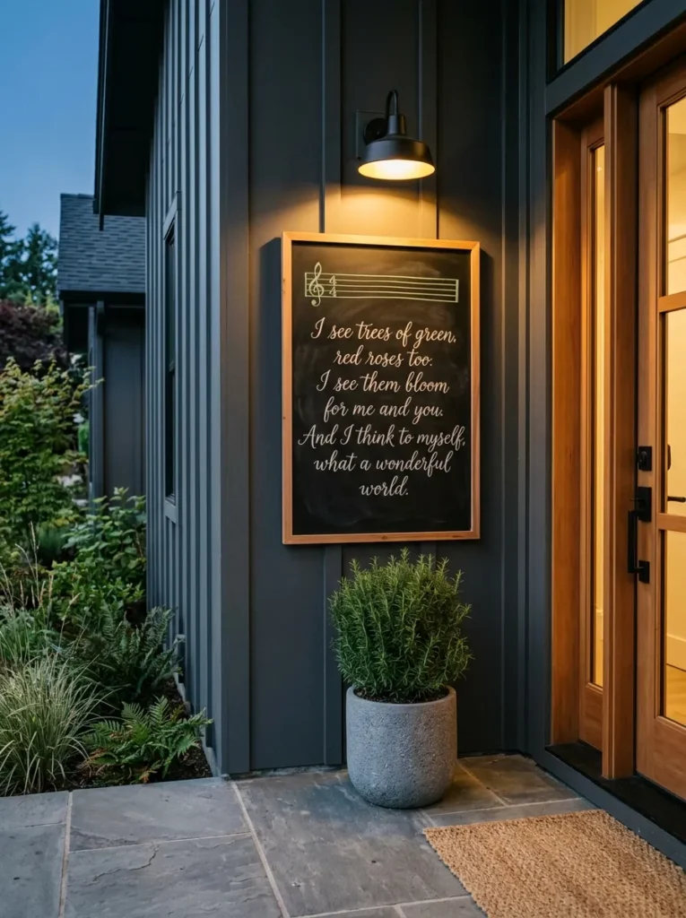
- Board: 24 x 36 in portrait board, soft-black chalk finish on painted galvanized steel, in a cedar frame
- Design and function: The first verse of “Joy to the World” lettered beside a five-line music staff, so carolers and neighbors can sing without phones
- Color: Ivory lyrics and notes, with sage-green staff lines
- Placement: Porch wall beside the front door, under the roof overhang
- Integration: A black wall sconce above lights the words after dark, with a rosemary topiary in a stone-gray pot below
- Standout detail: An oversized treble clef curling across the full height of the staff
Why this works: A lyric board beside the front door gives guests a reason to linger, and a song everyone can read becomes a song everyone sings.
Carolers forget words after verse one. Everyone does. That’s why a lyric board beside the door gets more use than any sign I’ve made. Isaac Watts wrote “Joy to the World” in 1719, so the lyrics are public domain and free to letter. Mine hangs on the porch of our Austin home, where December evenings often stay mild enough to sing outside. Neighbors can read along from the walkway, and nobody needs a phone screen. A 24-by-36-inch board gives you room for the first verse, a sage-green five-line music staff, and a few ivory notes.
Mark the staff first, five parallel lines spaced half an inch apart, using a ruler and sage chalk. Then letter each lyric line in ivory above or below it, in one serif style. Chalk marker on this board will run in rain, so it only belongs under a roof overhang. My husband builds porch boards from cedar, which resists rot, sealing the back and edges with exterior primer. He fastens them with stainless steel screws into framing, not siding alone, because wind finds weak mounting quickly. A black wall sconce above the board lights the words after dark.
10. Giant Ornament Rounds, Christmas Chalkboard Art Ideas
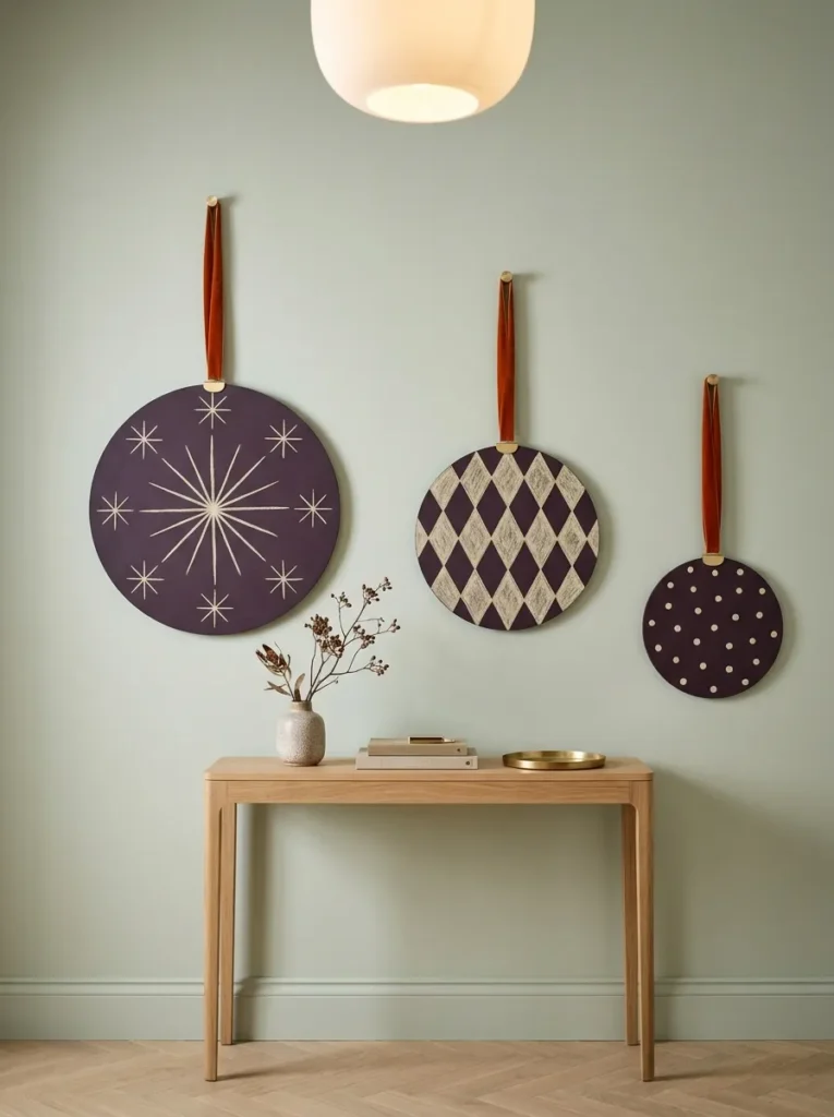
- Board: Three frameless round boards at 12, 16, and 20 inches, in deep eggplant slate finish with edges painted to match
- Design and function: Each round carries one pattern (harlequin diamonds, a 12-point starburst, and shrinking dots), so the trio reads as oversized ornaments
- Color: Cream chalk on eggplant, hung from burnt-orange velvet ribbon
- Placement: Long hallway wall, hung at staggered heights
- Integration: A narrow oak console and a runner rug below keep the hallway feeling styled
- Standout detail: A small brass cap glued to the top of each round, with a ribbon loop, completes the ornament illusion
Why this works: Round boards borrow the ornament shape, so a plain hallway wall reads as a Christmas display without a single piece of greenery.
Hand-blown glass ornaments trace back to Lauscha, Germany, in the 1800s, and their round, patterned shape is still one of the most familiar Christmas shapes. A round chalkboard borrows it. Group three at 12, 16, and 20 inches, because odd-numbered groupings tend to look balanced where even ones can look stiff. Hang them from velvet ribbon at staggered heights so they step down in a falling-ornament rhythm. In a hallway, where most walls stay blank, this trio turns a transit space into a gallery. Each round holds one pattern, so the whole set reads clearly from the front door.
Draw the inner border ring with a string compass: hold one end of a string at the board’s center with your thumb, tie chalk to the other end, and swing. Harlequin diamonds come from diagonal lines drawn every inch in both directions. For the starburst, rule 12 lines through the center, 30 degrees apart. Dots on the third round shrink from the edge to the center when you tap the chalk tip lightly. Cream chalk on eggplant stays crisp across the hallway. A brass cap glued to each round’s top, with a ribbon loop, finishes the ornament illusion.
11. Painted Starburst Arch
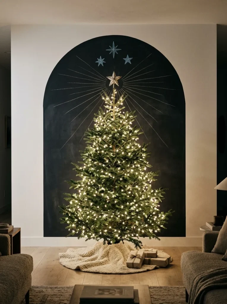
- Board: A 5 x 7 ft arch painted directly on the wall in charcoal chalkboard paint, with no frame
- Design and function: Thin white rays fan out from the tree’s top star, so the arch stretches the tree taller and gives a plain corner a clear focus
- Color: Charcoal arch, white chalk rays, and three ice-blue chalk stars near the top edge
- Placement: Living room corner, directly behind the Christmas tree
- Integration: A six-foot fresh fir wrapped in white lights, with a cream wool tree skirt on the floor
- Standout detail: The rays are chalk, so the pattern changes every December while the arch stays
Why this works: A dark backdrop makes tree lights read brighter, because contrast, not wattage, is what makes lights glow.
The year we moved into this house, our tree looked lost. It stood in front of a big white corner, and the lights simply disappeared into the wall. That taught me something I now repeat to everyone: lights need darkness to read as lights. So I painted a 5-by-7-foot arch of charcoal chalkboard paint behind the tree, with no frame. The tree’s lights now glow against it like a night sky. On the arch, thin white rays fan out from the tree’s top star, which stretches the tree taller and gives the corner a clear focus.
Paint two coats of chalkboard paint, letting each dry for the time on the can, and wait three days before drawing. Then rub the side of a white chalk stick across the arch and wipe it clean, which conditions the surface so the first drawing erases cleanly. Mark the star’s center point, then use a yardstick to rule each ray outward from it, lightly at first, then firmly. Vary the ray lengths in a long-short-long pattern. Add three ice-blue stars near the top edge, and the arch reads as a night sky.
You’ll Also Love:15 Christmas Bedding Ideas That Feel Cozy, Not Kitschy
12. Slate Gift Tags
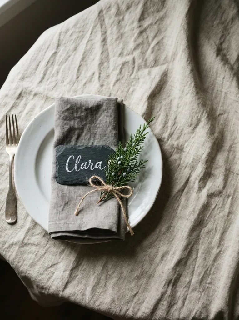
- Board: Eight 3 x 5 in natural slate tags with unfinished edges
- Design and function: One name per tag in white chalk marker. Each works as a place card at supper, then wipes clean and becomes a gift tag.
- Color: Charcoal-gray slate, white marker lettering, natural jute twine, and blue-green juniper
- Placement: Round breakfast nook table, with one tag resting on each white ironstone plate
- Integration: Stone-gray linen napkins and a sprig of juniper at every place
- Standout detail: The tags are real slate, so the same set returns every year
Why this works: Real slate tags are reusable, so one set of lettering becomes both the place card and the gift tag, then wipes clean for next year.
Slate is shale that has been compressed into a dense, fine-grained rock, which is why it holds chalk so crisply. That makes small slate tags better than painted ones for place cards. I learned the double-duty trick after my first holiday dinner, when paper place cards ended up in the trash before dessert. Now each 3-by-5-inch tag sits on a plate, carrying one name in white chalk marker. After the meal, a damp cloth wipes it clean, and it becomes a gift tag on that guest’s present, tied with jute twine and a juniper sprig.
Small tags need the right tool. Stick chalk is too broad for letters under half an inch, so use a fine-tip chalk marker and keep each name to one line. Print the first letter slightly larger, then letter the rest in even lowercase, centered on the tag with a quarter-inch of slate around the edges. I test the marker on the back of one tag first, because natural slate can ghost when wiped. If a faint shadow remains, a lightly dampened melamine sponge lifts it. Eight tags fit comfortably along a six-foot table.
13. Santa Sleigh Transom
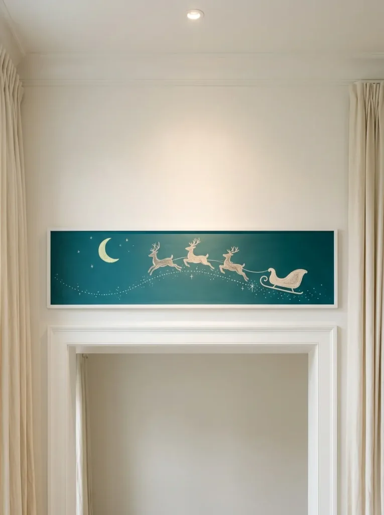
- Board: 60 x 10 in long, narrow board in peacock-teal slate finish, in a thin white-painted frame
- Design and function: Santa’s sleigh and three reindeer glide along a dotted arc over tiny rooftops. The long horizontal shape lifts the eye and makes a standard doorway feel taller.
- Color: Warm-white silhouettes, a pale lemon crescent moon, and white snow dots on peacock teal
- Placement: Above the wide doorway between the living room and the den
- Integration: White door casing and a pair of cream wool drapes on a black rod frame both sides
- Standout detail: The lemon crescent moon is the only colored shape, so the eye lands on it first
Why this works: A long, narrow board above a doorway adds height to the opening and gives the eye a Christmas scene to follow without using any usable wall space.
Since 1955, the U.S. military has tracked Santa’s route every Christmas Eve, so the sleigh already has an official flight path. This board puts it overhead. At 60 by 10 inches, it sits above a standard doorway and does a quiet design job: a long, narrow horizontal lifts the eye and makes the opening feel taller. A crescent moon, a sleigh, and three leaping reindeer glide along a dotted arc across peacock-teal, with tiny rooftops below. Because the board hangs above eye level, only the silhouettes matter, and simple shapes read better from a distance than detailed ones.
Draw the dotted arc first, a gentle curve rising from left to right, then set the sleigh near the left end. Make each reindeer slightly smaller than the one behind it, so the team seems to stretch into the distance. Fill every silhouette with the side of the chalk, then sharpen the outline with the tip. A pale lemon crescent moon sits just above the sleigh. For snow, press the chalk tip lightly and lift straight up, which leaves round dots instead of dashes. Step back often, because this board is meant to be seen from below.
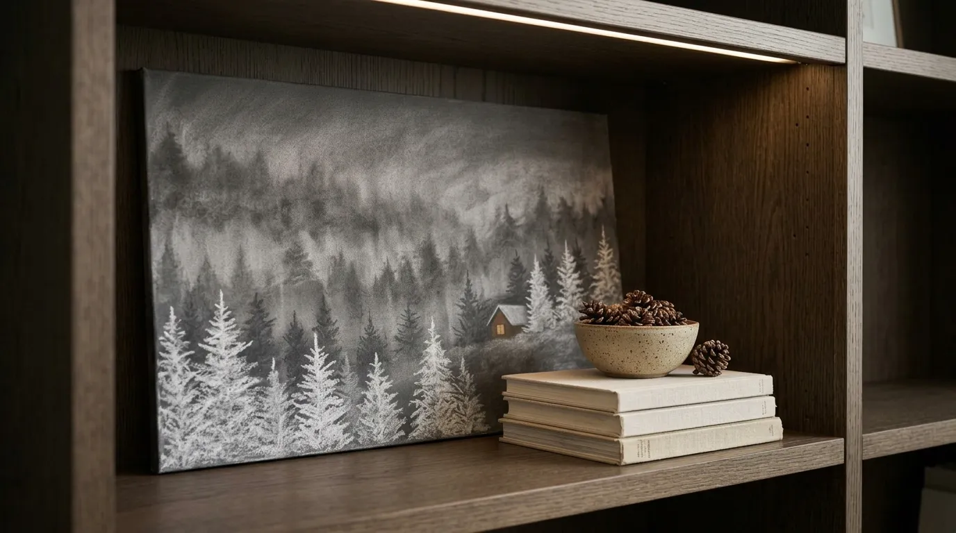
14. Bookcase Forest Panel
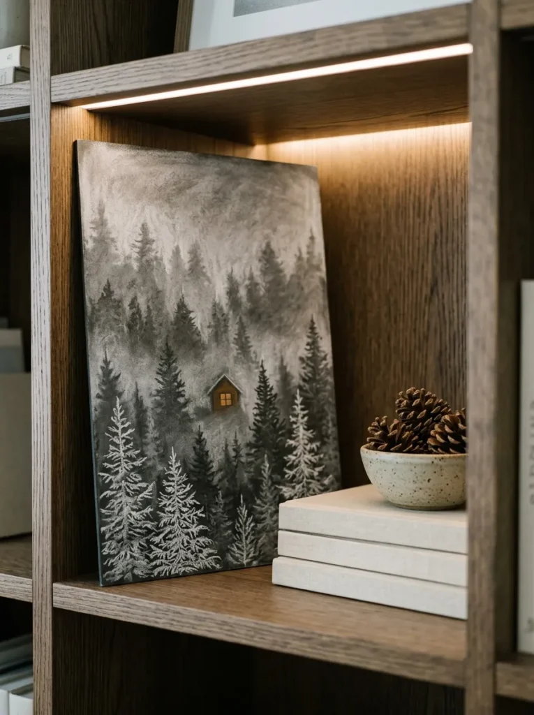
- Board: 16 x 26 in frameless panel in soft graphite, cut to slip into one bookcase cube with a quarter-inch gap
- Design and function: A conifer forest in three depths (narrow spruce, dense fir, open pine) that turns a bookshelf opening into a window-like scene
- Color: Smudged gray chalk for far hills, brighter mid-row trees, crisp white foreground, and one ochre-yellow cabin window
- Placement: Built-in bookcase in the home office, at eye level
- Integration: Stacked cream hardcovers and a ceramic bowl of pinecones sit beside the panel
- Standout detail: A tiny cabin in the middle distance with a single lit window
Why this works: Paler, softer chalk in the distance and crisp white up front creates real depth, so a small panel feels like a view instead of a drawing.
Plant science spoils conifer drawings for me. Most chalk evergreens are identical triangles, and I can’t unsee that. So the forest in this bookcase cube uses three real shapes: a narrow spruce with drooping boughs, a dense, symmetrical fir, and an open pine with tufted branches. Sized at 16 by 26 inches, the panel slips into one shelf opening like a window. Because it sits among books, guests lean in to look, which is exactly what a small chalkboard scene should do. It adds depth to a shelf without adding another object to dust.
Use atmospheric perspective to build depth: distant objects look paler and softer. Draw the far hills and back trees lightly with the side of a gray chalk and smudge them with a fingertip. Make the middle row slightly brighter, then draw the three foreground trees crisply in bright white. I once skipped the smudging step, and the whole scene looked flat, like a sticker. Add a tiny cabin in the middle distance with a single ochre-yellow lit window. A thin LED strip tucked under the shelf above grazes the panel, so every chalk stroke shows its texture.
15. Snowflake Powder Room — A Christmas Chalkboard Art Idea for Small Spaces
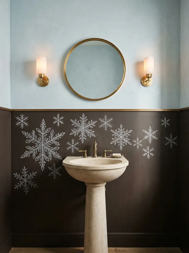
- Board: A 60 x 36 in band painted in espresso-brown chalkboard paint across the lower back wall
- Design and function: Snowflakes drift in three scales, so guests in a small room get close-range detail at eye level
- Color: White and pewter chalk on espresso brown, against a pale mist-blue plaster wall above
- Placement: Powder room, behind a pedestal sink
- Integration: A round brass mirror, a stone pedestal sink, and a pair of wall sconces
- Standout detail: The largest flakes cluster toward one end, as if wind pushed them across the wall
Why this works: Small rooms reward close-range detail, so a snowflake drift at eye level gives a powder room a feature guests actually stop to look at.
Snow crystals have six sides because water molecules lock into a hexagonal pattern as they freeze, so classic snowflakes grow six arms. Drawing them that way instantly looks right. I used that fact in our powder room, where a 36-inch espresso-brown chalkboard band wraps the wall behind the sink. Guests spend a few quiet minutes in there, and I’ve watched nearly everyone stop to study the snowflakes. Small rooms reward detail at close range. Three scales of flake, from hand-sized to thumbnail, drift across the band as if the wall were a snowy window at dusk.
Start every snowflake with three lines crossing at the center, 60 degrees apart, which gives six arms. Add matching V-shaped branches on each arm, at the same two distances from the center, so the flake stays symmetrical. Use a ruler for the largest flakes and freehand the tiny ones; slight wobble reads as natural. Vary the scale in three sizes and keep the biggest flakes toward one end, as if wind pushed them. Pewter chalk for the smallest flakes adds depth behind the white ones. Wipe with a dry microfiber cloth, since humid powder rooms can smear damp chalk.
Lettering Balance Principles
Balanced chalkboard lettering uses one dominant element, consistent letter height, and about one-third empty space. Four habits keep every board in this post looking composed:
- Give each board one hero. Pick a single element, such as the title, the star, or the swash capital, and make it the largest. Everything else supports it.
- Fill about two-thirds of the surface. Leaving roughly a third of the board empty gives lettering room to breathe and helps it read from farther away.
- Pair heavy with light. Set one bold block word beside thin script, or a thick border beside delicate line-art, so neither style overpowers the other.
- Hold one letter height per line. Uneven heights are the fastest way to make a board look rushed, and a faint chalk baseline fixes it.
I rarely go past three chalk colors on a single board, and most of the ideas above stop at two. More than that, and the eye has nowhere to rest.
FAQs
1. Is chalk or a chalk marker better for Christmas chalkboard lettering? Use stick chalk for soft shading and large shapes, and a chalk marker for small, crisp lettering. Stick chalk is dusty, but it wipes away with a dry cloth. Chalk markers give bold, opaque lines under half an inch wide, but they need a damp cloth to remove and can leave a faint ghost on porous surfaces like natural slate.
2. How do you keep chalkboard art from smudging? Work from top to bottom and, if you’re right-handed, from left to right, so your hand never rests on finished lines. Rest your wrist on a ruler or a folded index card to keep it above the surface. Condition a new board first by rubbing chalk over the whole surface and wiping it clean, and hang the board away from high-traffic spots where sleeves brush it.
3. What are the best fonts for beginners? Simple block capitals are the easiest place to start, because every letter has the same height and no connecting strokes. Next, try faux calligraphy: write in one even stroke, then thicken only the downstrokes. Bubble letters work well on kids’ boards. Save tightly connected scripts for later, once your baselines are steady.
4. How can you decorate with a chalkboard on a budget? A cut-to-size hardboard panel, a small can of chalkboard paint, and a thrifted frame often come in under $40 combined, though prices vary by store. Paint two coats and let the surface cure for three days. Stick chalk costs a few dollars, and a cereal-box stencil replaces any specialty tool.
5. How do you seal or preserve chalk art? Spray stick-chalk lettering with a matte artist’s fixative in light coats from 10 to 12 inches away, in a well-ventilated space. Sealing makes the drawing semi-permanent, so it will no longer wipe off cleanly; test a corner first. Chalk markers should not be sealed. For a keepsake, photograph the board in even daylight before you erase it.
6. How big should the lettering be? A common rule of thumb allows about one inch of letter height for every 10 feet of viewing distance. A board read from across a living room needs letters at least an inch tall, while a slate tag on a plate can use quarter-inch lettering.
Conclusion
A chalkboard is just a dark rectangle until you give it a job. Whether it counts down days or holds a carol for the neighbors, the right board turns a wall into the spot your family keeps coming back to. Choose one idea, one palette, and one wall, and let your first piece of Christmas chalkboard art ideas be imperfect. I’ve seen small changes like these transform a whole room.
Save this post to your Pinterest board, try an idea this weekend, and share it with a friend who’s staring at a blank wall. Your best December wall is one stick of chalk away.