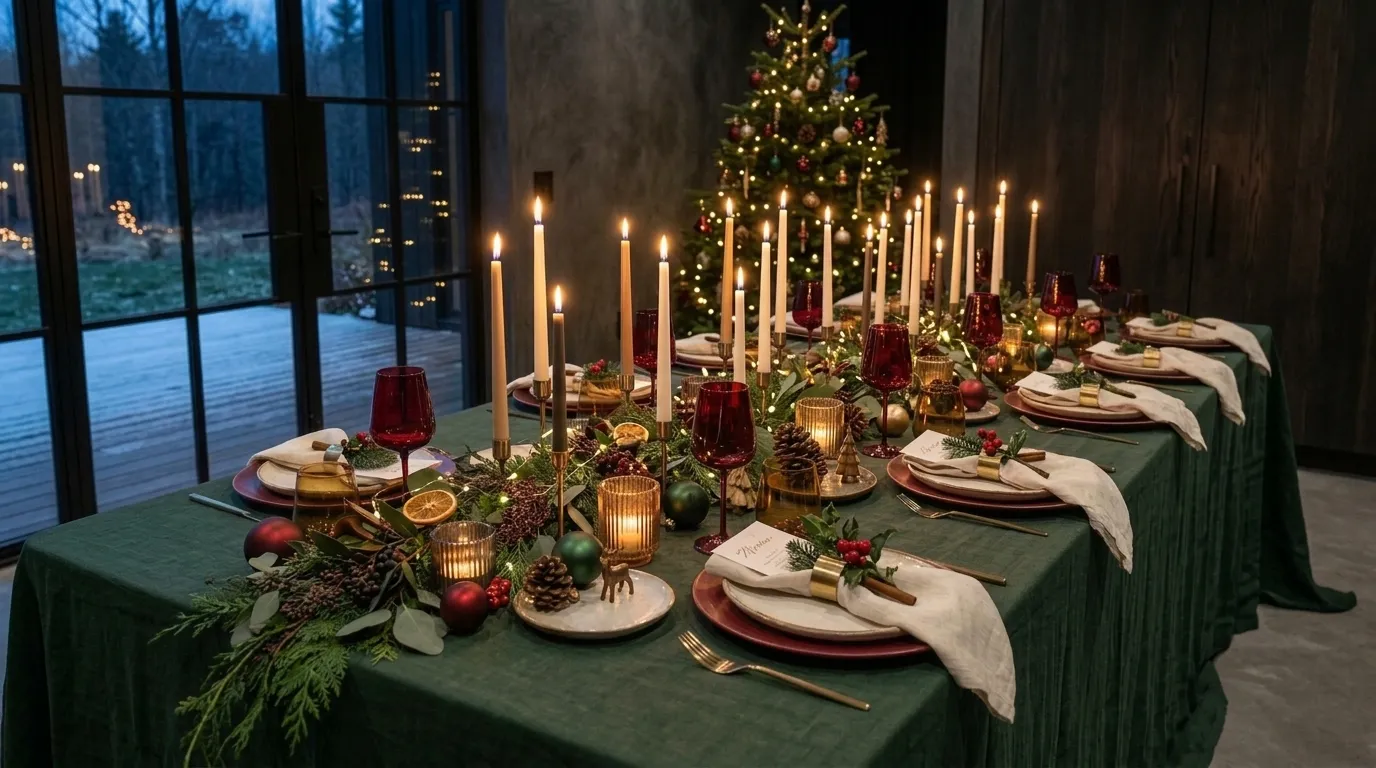
15 Christmas Table Setting Ideas for an Unforgettable Dinner
One beautiful plate doesn’t make a Christmas table. A system that repeats at every seat does. If your table has ever looked pretty at one seat and plain everywhere else, these Christmas table setting ideas will fix it. Each of the 15 settings below is a complete system, from tablecloth drop to napkin fold, with exact colors, finishes, and place card styles you can repeat at every place. I came to table styling through gardening, not design school, so I think in palettes and plans. My husband builds homes for a living, so I also check spacing and candle safety. In my experience, a table feels unforgettable when every detail repeats, and these ideas show you how, from scarlet poplin to a gray flannel runner.
Most people assume a standout Christmas table needs one standout setting. It doesn’t. A Christmas table setting looks complete when the same napkin fold, place card style, and glass color repeat at every seat, because repetition turns separate place settings into one composition. One gorgeous setting surrounded by plain ones reads as an accident, while ten matching places read as a plan. I learned this at an early Austin dinner, when I styled the head of the table beautifully and left everything else bare.
The guests at the far end noticed immediately. These Christmas table setting ideas fix that, giving you a repeatable system for every seat, from linens to chair backs.
1. Bottle Green and Vermilion — A Christmas Table Setting Idea for Modern Red and Green
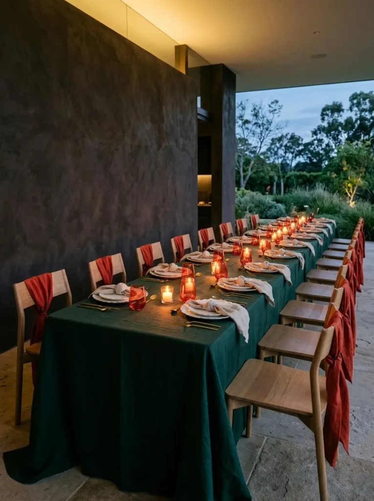
- Linens: Bottle-green heavy linen tablecloth with a tailored 10-inch drop
- Plates: Matte white stoneware, 11 inches, with a softly scalloped organic rim, no charger
- Glassware: Vermilion-tinted stemless tumblers, 9 ounces, thick-based
- Flatware: Brushed brass with slim, rounded handles
- Napkins: Oatmeal linen in a loose knot fold, no ring needed because the knot is the detail
- Place cards: A pressed noble fir sprig with the name inked on a cotton-rag tag, tucked under each knot
- Chairs: Plain oak chairs with a 2-inch vermilion linen sash tied in a flat loop on each back
- Centerpiece: Keep it low and sculptural; full designs are in the Christmas Table Centerpieces guide
Why this works: Red and green look modern, not traditional, when green covers most of the table and red appears only in glass and one small accent per chair.
Red and green sit opposite each other on the color wheel, so when both are saturated and equal in size, the pairing vibrates instead of settling. The fix is proportion. Let bottle-green linen carry most of the table, then limit vermilion to the tumblers and a single sash on each chair. Matte white plates with a softly scalloped rim rest between them, and brushed brass flatware keeps the palette warm. Every seat repeats the same three moves, so the table reads as one confident composition rather than a holiday cliché. I’ve seen it work at six seats and twelve.
The first time I paired red and green, I used equal amounts of both, and the table looked like a department store window. Proportion fixed everything. Vermilion-tinted tumblers also earned their place: stemless glasses are harder to knock over, and candlelight passing through the tinted glass throws a warm coral glow onto the white plates. Add a 2-inch vermilion linen sash tied in a flat loop on each oak chair back, and the color appears at eye level too. The loose-knot napkin takes ten seconds per seat, which matters when you’re setting twelve.
2. Ink and Smoked Brass
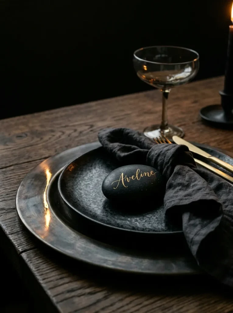
- Linens: Ink-black washed linen runner, 16 inches wide, with a 14-inch overhang at each end of a bare oak table
- Plates: Matte black stoneware with a shallow curved coupe edge, 10.5 inches, on satin smoked-brass chargers
- Glassware: Smoked-gray coupes with softly leaning, hand-blown bowls
- Flatware: Matte black with rounded, sculptural handles
- Napkins: Bone-white linen in a three-pleat band fold, slipped through a slim satin-brass cuff ring
- Place cards: A 3-inch oval black river stone with the name lettered in gold paint pen, doubling as a take-home keepsake
- Chairs: Intentionally plain curved-back oak stained black, nothing added
- Centerpiece: One low piece is plenty; full designs are in the Christmas Table Centerpieces guide
Why this works: Matte black absorbs light and satin brass reflects it, so the glow comes from the chargers instead of glaring off every surface.
Hold a dark river stone in your palm and it feels like the quietest object in the room. That’s exactly why it works as a place card. Each 3-inch stone gets a name in gold paint pen, then sits on the napkin like a small sculpture, and I’ve watched guests slip theirs into a coat pocket on the way out. The matte black stoneware beneath it absorbs light, while the smoked-brass charger glows from the edges. Because every stone, plate, and charger repeats at each seat, the table looks designed from end to end.
Dark tables punish crowding. My husband, who builds homes for a living, plans seating at 24 inches per person, and it’s the number I now use for every table. At that spacing, a 16-inch runner leaves each guest a clean arc of bare oak around the charger, and the curved coupe bowls never touch. Smoked-gray glassware softens the reflections, and matte black flatware with rounded handles nearly disappears until the first bite. Do the math before you buy: an eight-foot table seats eight comfortably along its sides this way, not twelve.
3. Chalk and Satin Silver
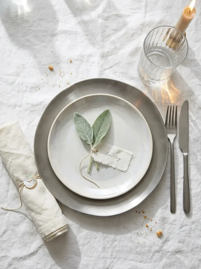
- Linens: Chalk-white heavy linen tablecloth with a 12-inch drop
- Plates: Pearl-glazed stoneware, 11 inches, with a softly irregular organic edge, on brushed pewter chargers
- Glassware: Rippled clear tumblers, 10 ounces
- Flatware: Satin-finish silver
- Napkins: Warm-white linen in a tight roll fold, secured with pearl-gray silk cord and a mother-of-pearl button
- Place cards: A silver-gray lamb’s ear leaf laid across each plate, the name on a cotton-rag tag tied to the stem
- Chairs: Ivory bouclé seat pads, backs left plain
- Centerpiece: Tall silver tapers down the center; full designs are in the Christmas Table Centerpieces guide
Why this works: A single-color table stays lively when it mixes at least three textures, because the contrast comes from surface rather than shade.
Lamb’s ear leaves are covered in fine, dense hairs, which scatter light and give them a frosted, silver-gray surface even under a lamp. That makes Stachys byzantina a rare living material for a monochrome table. Laid across a pearl-glazed plate with a cotton tag tied to the stem, one leaf adds softness that paper cannot match. Cut them the morning of the dinner, stand the stems in water, and place them just before guests arrive. In my experience, they stay crisp through the meal. The effect is frost on every plate, repeated seat after seat.
A monochrome table lives on texture, so I mix at least three: heavy linen, rippled glass, and satin silver. Candles then become a design and safety decision. My husband follows one rule on every job site and every dinner party: keep any open flame at least 12 inches from linens, rolled napkins, and place cards. That means tall tapers in weighted holders down the center of the table, never near an elbow. Dripless tapers keep the chalk-white cloth clean, and the rippled tumblers catch the flame in a hundred tiny highlights.
4. Peacock Teal and Copper
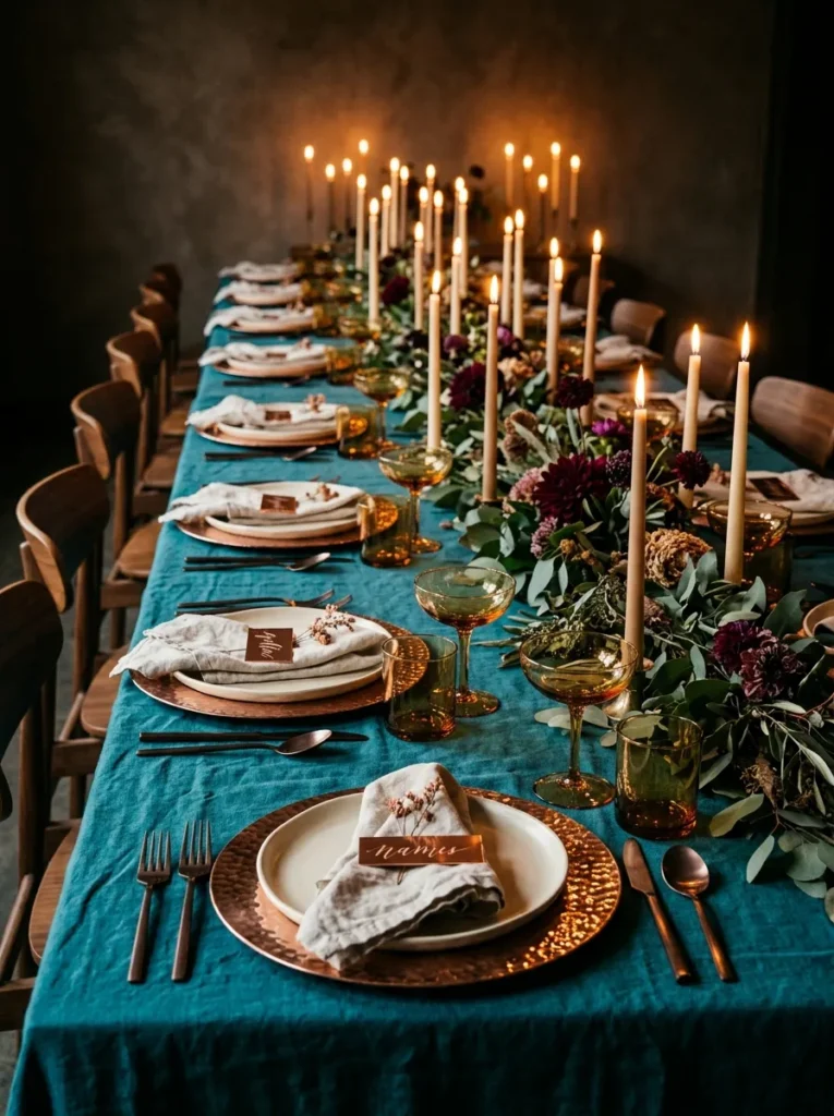
- Linens: Peacock-teal washed linen tablecloth with a 12-inch drop
- Plates: Glossy cream porcelain, 10.5 inches, on hammered copper chargers
- Glassware: Honey-amber coupes, 7 ounces
- Flatware: Brushed copper
- Napkins: Clay-pink linen in an envelope fold, wrapped once in 1/4-inch dark-teal velvet ribbon
- Place cards: A 2 by 3-inch tag of thin copper foil, the name pressed in with a ballpoint pen, laid on the napkin
- Chairs: Walnut chairs with dark-teal velvet seat pads, backs plain
- Centerpiece: Keep it low and in glass or ceramic; full designs are in the Christmas Table Centerpieces guide
Why this works: Teal and copper sit near opposite sides of the color wheel, so each makes the other look richer without needing a third color.
Teal and copper sit close to opposite sides of the color wheel, which is why each makes the other look richer. Candlelight does the rest. Warm flame light amplifies orange and copper tones while pushing teal deeper, so the same table looks brighter at 6 p.m. and moodier by 8. Hammered copper chargers catch the flame in dozens of small facets, and honey-amber coupes add a third warm note without changing the story. At every seat the plate, charger, glass, and foil tag repeat, so the palette reads clearly from head to foot.
The copper foil tag is my favorite small trick on this table. Press the name into the foil from the back with a ballpoint pen, and the letters rise on the front like they were stamped at a print shop. A 12-by-12-inch craft sheet cuts into about 24 tags, enough for a full table. I made my first set at the kitchen counter one December, and a friend asked where I’d bought them. The clay-pink envelope-fold napkin underneath keeps the copper from feeling cold, and the dark-teal ribbon ties it back to the tablecloth.
5. Mushroom Linen and Cedar
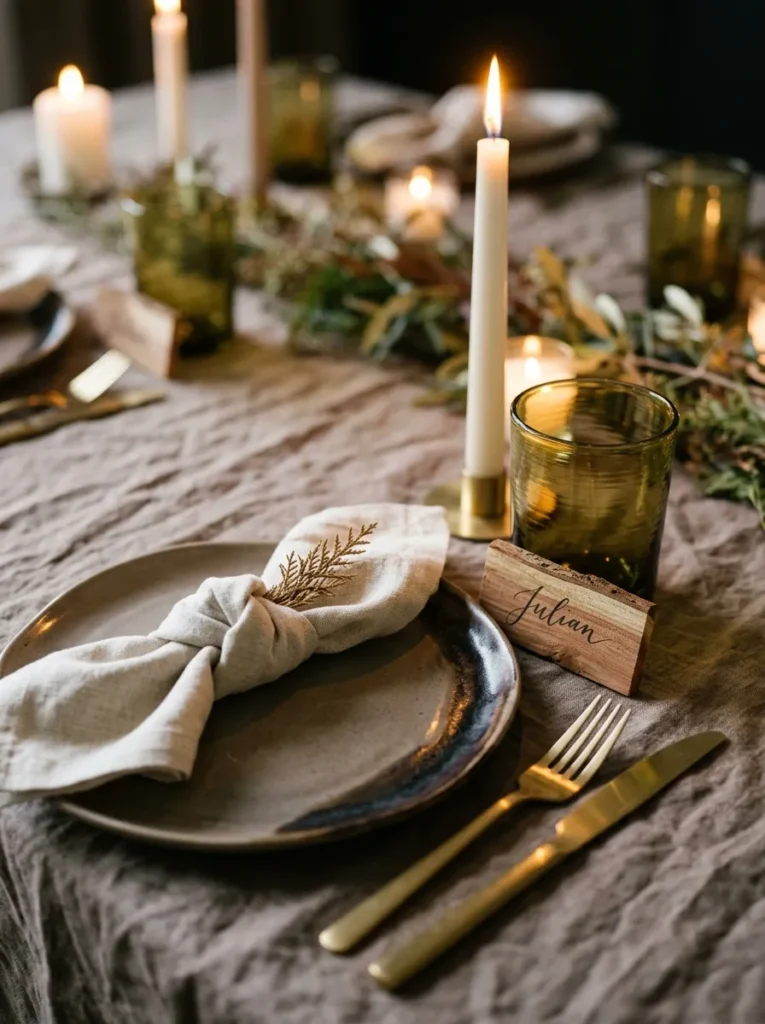
- Linens: Mushroom-taupe heavy linen tablecloth with a 13-inch drop
- Plates: Smoky taupe reactive-glaze stoneware with a darker pooled edge, 10.5 inches, no charger
- Glassware: Moss-green hand-blown stemless tumblers, 8 ounces
- Flatware: Oil-rubbed bronze
- Napkins: Ecru linen in a bow-tie fold, tied at the center with 1/2-inch olive cotton twill tape
- Place cards: A 3-inch cedar shim, the name inked on the wide end, leaning against each tumbler
- Chairs: Oatmeal-gray boiled-wool seat pads, backs plain
- Centerpiece: One low wooden bowl or a single branch is enough; full designs are in the Christmas Table Centerpieces guide
Why this works: A palette of muted tones with the same warm undertone, such as mushroom, moss, and ecru, reads as one calm color instead of three separate ones.
My husband keeps bundles of cedar shims in his truck to level doors and windows, and one December I borrowed a handful. Cut to 3 inches and inked with a fine marker, they make the best place cards I’ve ever used. The wedge shape leans against a tumbler without a stand, the wood smells faintly of a cedar chest, and guests always pick one up and turn it over. They’re real construction material, which is exactly why they feel modern: nothing about them is decorative, and everything about them is considered.
Reactive glaze stoneware pools darker at the edges and breaks lighter at the rim, so no two plates match and every plate still looks related. That’s the point: the palette is controlled, the surface is not. Moss-green tumblers add a deeper green note, the oil-rubbed bronze flatware adds depth without shine, and the bow-tie napkins add a small, tailored shape at the center of each plate. Muted tones with the same warm undertone read as one calm color, so the table feels restful rather than flat. Wool seat pads keep long dinners comfortable.
6. Tonal Blush and Oxblood
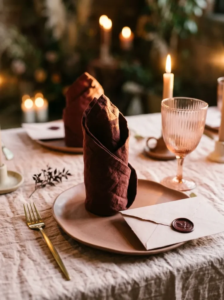
- Linens: Blush-pink stonewashed linen tablecloth with a 12-inch drop
- Plates: Matte rose-clay stoneware, 10.5 inches, with a shallow organic curve, no charger
- Glassware: Pale pink-tinted stemmed goblets, 9 ounces
- Flatware: Satin gold
- Napkins: Oxblood linen in a tall candle fold standing at the center of each plate, no ring needed
- Place cards: A blush cotton-rag envelope sealed with an oxblood wax stamp, the name in gold ink on the front and a handwritten note inside, leaning against each goblet
- Chairs: Oxblood velvet seat pads, backs plain
- Centerpiece: Keep it low and tonal; full designs are in the Christmas Table Centerpieces guide
Why this works: A tonal table needs three values, light, mid, and dark, or it photographs as one flat color.
Tonal schemes fail when every piece sits at the same depth of color. They work when you plan three values: light, mid, and dark. Here, blush linen is the light, rose-clay stoneware is the mid, and oxblood napkins are the dark. That ladder repeats at every seat, so the eye moves across the table instead of stalling on one flat pink. Satin gold flatware adds a thin warm line without breaking the palette. If you’re unsure, take a quick black-and-white photo of the table: you should still see three distinct steps.
I almost skipped pink entirely, worried it would read as a nursery. That risk is real when everything is one shade. Oxblood fixed it. A tall candle-fold napkin in deep red linen gives each setting a vertical, almost architectural shape, and the oxblood wax seal on the place card echoes it in miniature. Inside each envelope I write one line to the guest, and I’ve watched people read theirs before they’ve even picked up a fork. The pale pink goblets keep the glass soft, so the table feels warm, grown-up, and nowhere near sweet.
You’ll Also Love:15 Minimalist Christmas Decor Ideas for a Calm, Uncluttered Home
7. Cobalt Willow and Butter
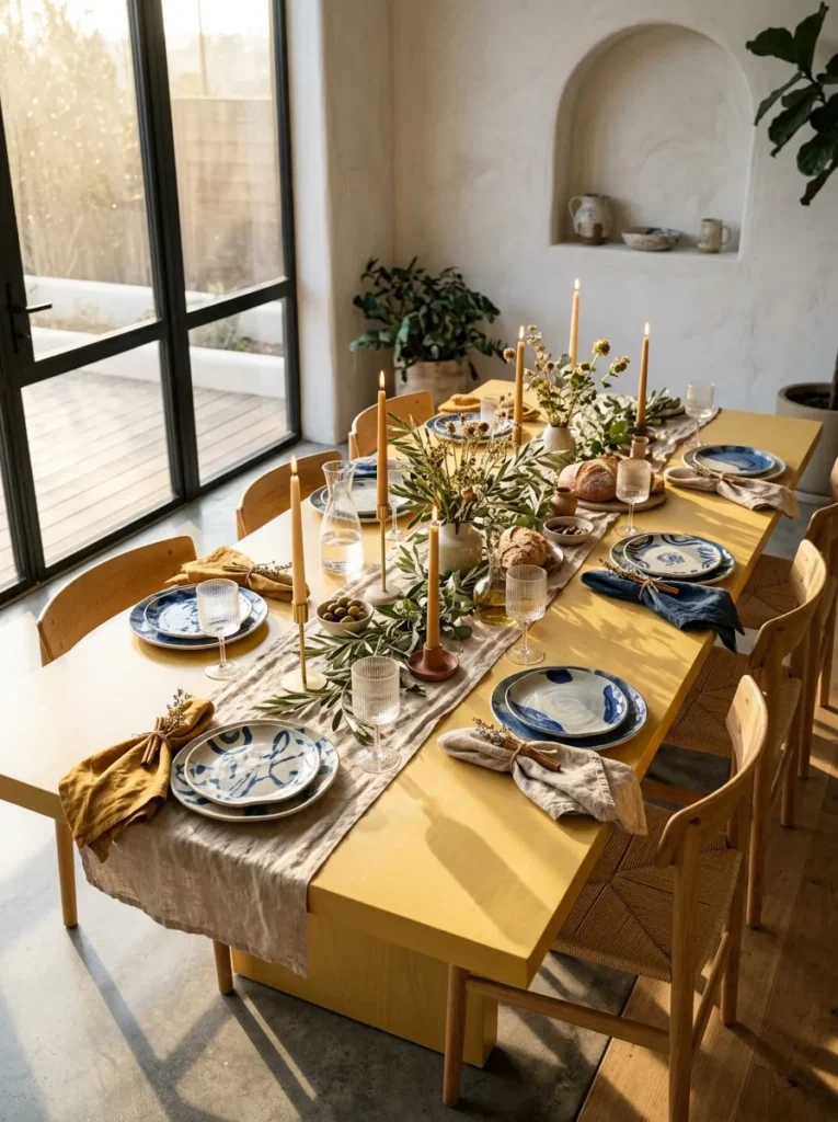
- Linens: Butter-yellow washed linen tablecloth with a 12-inch drop
- Plates: Mismatched vintage blue-and-white china, no two patterns alike, all 10 to 10.5 inches, no charger
- Glassware: Clear pressed-glass goblets with a vertical rib, 9 ounces
- Flatware: Vintage silver-plate in one pattern throughout
- Napkins: White linen with a cobalt ticking stripe in a pleated fan fold standing in the goblet, held by a thin cobalt silk cord
- Place cards: A 3-inch cinnamon stick wrapped in a cream cotton tag with the name inked in navy, laid across each plate
- Chairs: Plain chairs with cobalt-and-cream ticking-stripe seat pads
- Centerpiece: Keep it low and simple; full designs are in the Christmas Table Centerpieces guide
Why this works: Mixed blue-and-white china looks collected, not careless, when every plate shares one color and one diameter and the linen supplies the contrast.
Cobalt blue and butter yellow sit near opposite sides of the color wheel, so each looks stronger beside the other. That is why mixed blue-and-white china, which can look busy on plain white, feels bright and deliberate on a butter-yellow cloth. The yellow does the contrast work, so the plates only need to share two things: a diameter between 10 and 10.5 inches and a single blue. Pleated fan napkins standing in the goblets add height, and one cobalt cord repeats at every seat. The result looks collected over many years.
A friend once confessed that she kept three incomplete sets of blue-and-white china hidden in a cabinet because nothing matched. We pulled them out, sorted by diameter, and set ten places in an afternoon. The only rule was size: nothing under 10 inches, nothing over 10.5. Every guest ended up with a different pattern, and the first thing people did was compare plates. That’s the quiet bonus of mixed china: it starts conversation before the first dish arrives. A cinnamon-stick place card lying across each plate adds warm scent and holds the name.
8. Aubergine and Pistachio
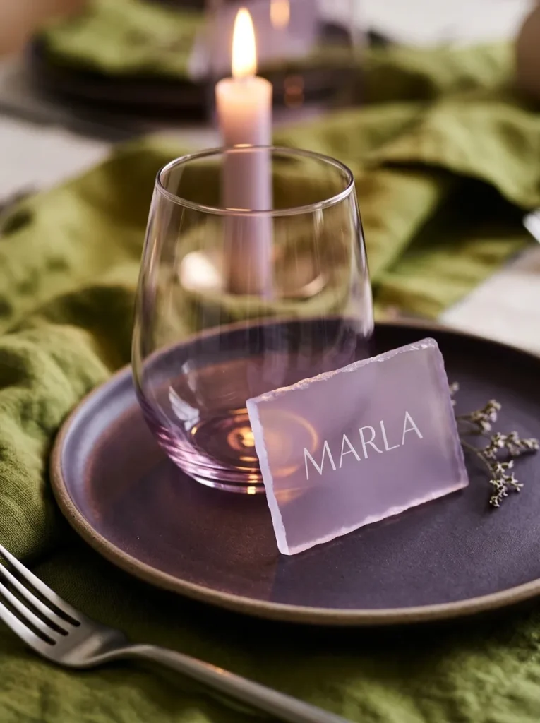
- Linens: Pale pistachio washed linen tablecloth with an 11-inch drop
- Plates: Matte aubergine stoneware, 10.5 inches, with a thick softened rim, no charger
- Glassware: Lilac-tinted stemless wine glasses, 10 ounces
- Flatware: Brushed nickel
- Napkins: Cream linen in a double-triangle fold with a hand-stitched aubergine edge, no ring needed
- Place cards: A 3 by 2-inch tile of frosted lilac acrylic, the name in white paint pen, doubling as a coaster
- Chairs: Pale ash chairs with pistachio linen seat pads, backs plain
- Centerpiece: Keep it low and sculptural; full designs are in the Christmas Table Centerpieces guide
Why this works: Dark purple looks sophisticated rather than heavy when a pale, slightly acidic green sits beside it, because the lighter color stops the plum from swallowing the table.
Aubergine and pistachio sit near opposite ends of the color wheel, purple against yellow-green, which is why the pairing feels fresh instead of heavy. A pale pistachio cloth gives the dark plates a clear stage, and lilac glass and frosted lilac acrylic place cards pick up the purple in lighter values. That sequence repeats at every seat, so the eye moves from pale green to deep plum to soft lilac. Brushed nickel flatware stays quiet, which matters when the colors are already speaking. I’ve seen this palette make a small dining room feel current.
Each surface here handles candlelight differently, which is what keeps a dark palette from going flat. The matte aubergine glaze absorbs it, the lilac glass lets it pass through, and the frosted acrylic tile scatters it into a soft glow. Frosted acrylic also wipes clean in seconds, so the place cards double as coasters and shrug off a splash of red wine. Pale ash chairs and pistachio seat pads keep the room itself light. Set the dimmer to a warm, low level and the whole table shifts from fresh by day to jewel-like by night.
9. Powder Blue and Cognac
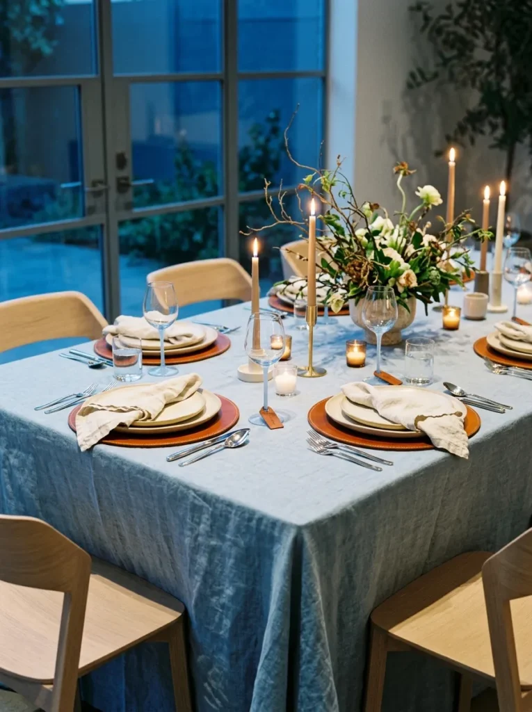
- Linens: Powder-blue stonewashed linen tablecloth with a 12-inch drop
- Plates: Matte cream stoneware, 10.5 inches, on round cognac vegetable-tanned leather chargers
- Glassware: Clear stemmed goblets with a pale-blue stem, 9 ounces
- Flatware: Polished silver with slim, rounded handles
- Napkins: Cream linen in a flat triple fold with a 1/2-inch cognac leather strap snapped around the middle
- Place cards: A cognac leather tag with the name inked in white, looped around each goblet stem with cream thread
- Chairs: Pale oak chairs with cream wool seat cushions, backs plain
- Centerpiece: Keep it low and in cream ceramic; full designs are in the Christmas Table Centerpieces guide
Why this works: Powder blue reads modern rather than nursery when it is paired with cognac, a warm brown that grounds the blue with the weight it lacks on its own.
After a red-wine spill ruined a linen placemat at a December dinner, I switched to leather chargers and haven’t gone back. Sealed vegetable-tanned leather wipes clean with a damp cloth and darkens gently with use, so each charger develops its own patina year after year. At the table, cognac against powder blue feels grown-up and slightly unexpected, and the leather’s matte surface keeps the cream plates from sliding. A tag in the same leather looped around each goblet stem repeats the material at eye level. Seat twelve and every setting looks equally deliberate.
Powder blue and cognac are a split of cool and warm, and that contrast is why neither looks dated. Blue recedes while brown advances, so the cognac chargers anchor each setting and the blue cloth gives the table its air. Cream plates sit between them as a neutral buffer. Silver flatware and pale blue goblet stems carry the cool tone up toward the candlelight. When the tapers burn down, the leather glows a deeper amber and the linen turns almost gray-blue. Expect the table to look different by dessert than at the first course.
10. Terracotta Saucer and Olive
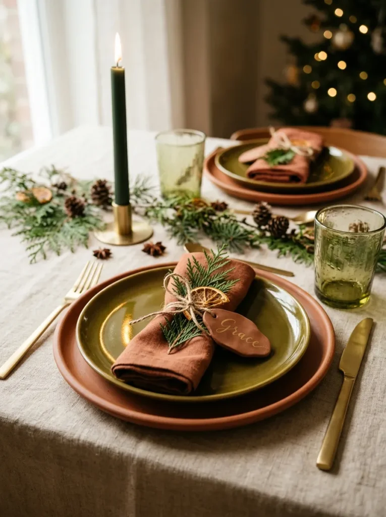
- Linens: Oat-colored heavy linen tablecloth with a 12-inch drop
- Plates: Glossy olive-green glazed stoneware, 10 inches, on unglazed 12-inch terracotta plant-saucer chargers sealed with clear matte sealer
- Glassware: Clear green-tinted recycled-glass tumblers, 8 ounces
- Flatware: Brushed stainless
- Napkins: Terracotta linen in a rolled cuff fold, tied with natural jute twine
- Place cards: A 2-inch oval tag of terracotta air-dry clay, the name pressed in with letter stamps, tied on with the twine
- Chairs: Natural rattan chairs with olive linen seat cushions tied at the back posts
- Centerpiece: Keep it low and matte; full designs are in the Christmas Table Centerpieces guide
Why this works: Terracotta and olive feel modern when matte clay sits against glossy glaze, because the contrast in surface does the work that bright color usually does.
I found my first terracotta charger in the garden center, not a housewares aisle. A 12-inch plant saucer, the kind that normally sits under a ficus, cost a few dollars and had exactly the matte, earthy roundness I wanted. Set an olive-green glazed plate on top and the saucer’s unglazed rim frames it like a halo. My plant-science side loves how honest the material is: it’s fired clay, nothing more. At every seat the same saucer repeats, so ten identical garden-center finds read as one considered decision, not a bargain hunt.
Unglazed terracotta is porous, which gives it that chalky matte look and also means it drinks up spills. Brush the saucers with two coats of clear matte water-based sealer and let them cure for 24 hours before the first dinner. Oat linen then keeps the earthy palette from going heavy, while the olive glaze adds a glossy surface against all that matte. Brushed stainless flatware keeps the metal quiet, and candlelight turns the olive glaze a deep, wet-looking green at the plate’s edge. The rolled-cuff napkins repeat the saucer’s color without repeating its texture.
11. Persimmon and Raspberry

- Linens: Raspberry washed linen tablecloth with an 11-inch drop
- Plates: Matte cream stoneware, 10.5 inches, on translucent persimmon-orange glass chargers
- Glassware: Clear thin-stemmed flutes, 6 ounces
- Flatware: Polished gold
- Napkins: Persimmon-orange linen in a lily fold standing on the plate, no ring needed
- Place cards: A fresh clementine with its leaf attached, the name on a gold-inked paper flag pinned into the peel
- Chairs: Intentionally plain unfinished white oak, backs bare
- Centerpiece: Keep it low so the glow stays visible; full designs are in the Christmas Table Centerpieces guide
Why this works: Orange and pink-red are close neighbors, so together they glow rather than clash, and cream plates give the eye a place to rest.
Persimmon orange and raspberry pink sit side by side on the warm half of the color wheel, which is why they glow together instead of clashing. The trick is giving them room: cream plates break the two colors apart at every seat. Translucent persimmon glass chargers add the unexpected part, because candlelight passes through them and throws an orange glow onto the raspberry cloth beneath. A clementine with its leaf attached sits where a place card normally would. Everything on the table is either warm or cream, and that restraint keeps a bold palette sophisticated.
I almost talked myself out of this palette, because raspberry and orange sounds like a summer sorbet. Then I lit the tapers. The clementine at each seat made it feel like December, and guests peeled theirs before the first course, so the room smelled like citrus within minutes. Clementines keep for a week at room temperature, so you can place them the afternoon before. The lily-fold napkins stand about 5 inches tall, giving each plate a small architectural peak. Polished gold flatware picks up the candle flame and ties the warm palette together.
12. Gray Flannel and Evergreen
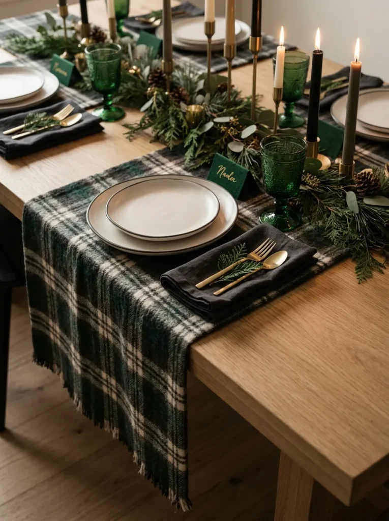
- Linens: Charcoal wool-flannel runner, 20 inches wide, with a 12-inch overhang at each end of a bare white-oak table
- Plates: Ivory stoneware with a hand-brushed charcoal rim, 10.5 inches, no charger
- Glassware: Evergreen-tinted stemmed goblets, 9 ounces
- Flatware: Brushed pewter
- Napkins: Ivory linen in a pocket-square fold, a small white peak on each plate, no ring needed
- Place cards: A 2 by 3-inch card of gray felted wool, the name in white paint pen, tucked behind each napkin peak
- Chairs: Plain white-oak chairs with charcoal wool seat pads, backs plain
- Centerpiece: Keep it low and away from the flannel; full designs are in the Christmas Table Centerpieces guide
Why this works: Wool is naturally more flame-resistant than cotton or polyester, so a flannel runner is a stylish and practical choice for a candlelit table.
Wool is naturally more flame-resistant than cotton or polyester: it ignites at a higher temperature and tends to stop burning on its own once the flame source is gone. That makes a charcoal wool-flannel runner a practical choice for a candlelit table, not just a stylish one. It also absorbs sound. Pair it with evergreen glass and ivory plates rimmed in hand-brushed charcoal and the table looks tailored, like a well-cut suit. The pocket-square napkin fold at every seat finishes the idea. Keep tapers clear of the fabric anyway, as with any runner.
My first flannel runner started as a gray suiting remnant from a fabric store, hemmed in an hour with fusible tape. Menswear flannel feels unexpected on a dinner table, and guests run a hand across it without thinking. The pocket-square napkin fold takes about thirty seconds once you’ve done three, and it makes each plate look dressed, with a small white peak against the charcoal wool. Evergreen goblets add the only strong color, and the brushed pewter flatware keeps everything quiet. It reads as formal and feels as comfortable as a favorite sweater.
13. Scarlet Poplin and Bone
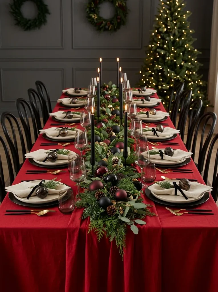
- Linens: Scarlet cotton-poplin tablecloth, pressed crisp, with a 10-inch drop
- Plates: Matte bone-white stoneware, 10.5 inches, on satin-black enameled steel chargers
- Glassware: Clear thin-walled goblets with long, slender stems, 10 ounces
- Flatware: Mirror-polished silver
- Napkins: Bone linen in a diagonal sash fold laid across the plate, tied with 1/2-inch black satin ribbon
- Place cards: A flat 2-inch bone-white porcelain ornament, the name in black ink pen, tied with black satin cord
- Chairs: Black-lacquered bentwood chairs, backs bare
- Centerpiece: Keep it low and black or white; full designs are in the Christmas Table Centerpieces guide
Why this works: A single saturated red surface looks modern when everything else is bone and black, because the neutrals frame the red instead of competing with it.
Red scared me for years. I worried a full scarlet cloth would swallow the table, so I only used it in small doses. Then I tried the opposite: one confident red surface, bone plates, and black chargers. The table finally looked like Christmas without looking like a costume. The black steel chargers sharpen the edge of every plate, and the red stays bright because nothing else competes with it. I iron the cloth slightly damp the night before and let it hang overnight, so the 10-inch drop falls straight and the creases are gone by dinner.
Poplin is a tightly woven plain-weave cotton, which is why it holds a crisp press and gives a tablecloth a clean, tailored edge. That crispness matters with a saturated red, because wrinkles read as shadows against such a strong color. Bone-white stoneware gives the red a place to rest, and the diagonal sash fold of bone linen carries that neutral across each plate. A thin black satin ribbon ties the napkin to the black chargers. Warm candlelight deepens scarlet toward garnet, so the table gradually turns richer as dinner goes on.
14. Chocolate Brown and Cream
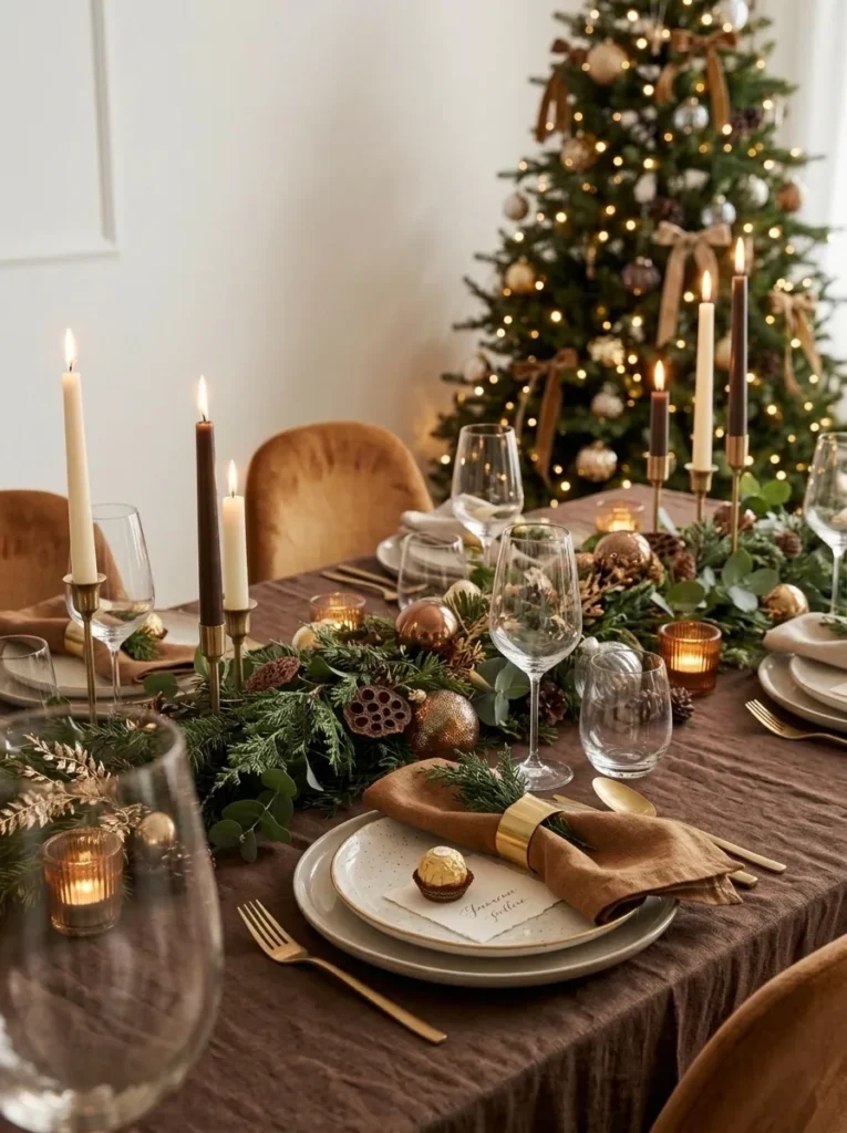
- Linens: Chocolate-brown stonewashed linen tablecloth with a 12-inch drop
- Plates: Glossy cream porcelain, 10.5 inches, rimmed in a thin cocoa-brown band, no charger
- Glassware: Taupe-tinted stemless wine glasses, 10 ounces
- Flatware: Matte champagne gold
- Napkins: Cream linen in an accordion-pleat fold, slipped through a hand-turned walnut ring
- Place cards: A 2-inch gold-foil-wrapped dark chocolate square with the name on a cream cotton tag tied on with brown thread
- Chairs: Plain walnut chairs with caramel suede seat pads, backs plain
- Centerpiece: Keep it low and cream; full designs are in the Christmas Table Centerpieces guide
Why this works: Cream looks brighter against brown than against white, so a chocolate cloth makes cream plates glow without adding a single bright color.
Cream looks brighter against brown than it does against white, a simultaneous-contrast effect designers use constantly. That’s why glossy cream plates seem to glow on a chocolate-brown cloth, even in low light. The thin cocoa band around each rim gives the plate a quiet outline, and the taupe-tinted glasses stay in the same family without matching exactly. Add caramel suede seat pads and the whole room reads as one warm, tonal composition. Nothing here is loud, which is exactly why it feels so expensive. The walnut napkin rings repeat at every seat.
I put a gold-wrapped square of dark chocolate at every seat, and the sound of foil crinkling became the soundtrack of that dinner. Guests ate theirs with coffee, which meant dessert started itself. Each square is about 2 inches wide, with the name on a cream cotton tag tied on with brown thread. Keep the squares in a cool room until the last minute, because chocolate begins to soften in the high 70s Fahrenheit, and a table full of tapers can get there. Place them right before guests sit down, not earlier.
15. Sage Windowpane Check — A Christmas Table Setting Idea with Built-In Alignment
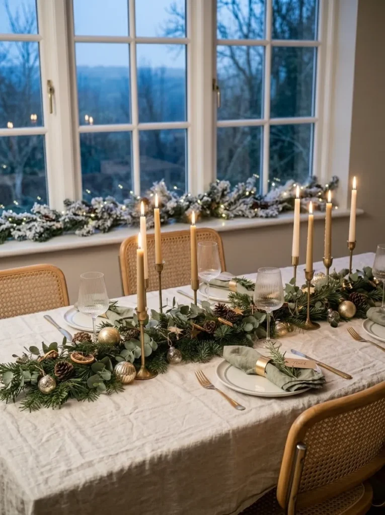
- Linens: Natural linen-cotton tablecloth with a 3-inch sage windowpane check and a 12-inch drop
- Plates: Matte white stoneware, 10.5 inches, with a slim sage glaze line at the rim, no charger
- Glassware: Clear footed goblets with a wide bowl, 10 ounces
- Flatware: Warm brushed brass
- Napkins: Sage linen in a ring-pull fold, pulled through a slim brass ring
- Place cards: A 4-inch fresh rosemary sprig tied with linen thread to a small kraft tag bearing the name, laid across each plate
- Chairs: Cane-back chairs with sage linen seat cushions tied on
- Centerpiece: Two brass candlesticks are enough; full designs are in the Christmas Table Centerpieces guide
Why this works: A windowpane check works as a built-in ruler, so every plate lands in the same spot and the whole table looks identical from seat to seat
The windowpane check is secretly a ruler. I figured that out when setting a table for ten and realized I could line every plate with the same square of the grid, so every setting sat exactly where it should. No measuring tape, no guessing. Align each plate’s center with a crossing of lines, and set each fork along the nearest line. The sage lines are fine enough to stay quiet against matte white plates, but present enough to give the cloth structure. It’s the easiest way I know to make ten settings look identical.
Rosemary, now classified as Salvia rosmarinus, releases its scent from tiny oil glands in the leaves, so the fragrance wakes up when a guest brushes the sprig. That makes it a place card that works on the nose before anyone reads the name. Cut sprigs the morning of the dinner, rinse them, and pat them dry; they stay fresh on the cloth for a few hours. The sage seat cushions and sage napkins pull the green up from the check, and the brass ring adds a small, warm gleam. It’s a quiet table that smells like Christmas.
Styling Principles for a Table That Looks Designed
Repeat three things at every seat. A Christmas table reads as designed when the napkin fold, place card style, and glass color match at every seat. Those three items sit at eye level, so guests notice repetition there first.
Choose the palette before you shop. Pick one dominant color, one supporting color, and one accent, then buy only what fits. Nothing on the table should be random, and a short list makes that easy to enforce.
Give every guest 24 inches. Allow about 24 inches of table width per guest; 20 inches is the practical minimum before elbows collide. Count the width first, then decide how many places the table can honestly hold.
Vary texture, not just color. A single-color table stays interesting when it mixes at least three textures, such as heavy linen, glossy glaze, and rippled glass. Contrast in surface does the work that extra colors usually do.
Keep flames 12 inches from fabric and paper. Set candles at least 12 inches from tablecloths, napkins, and place cards. Weighted holders and dripless tapers make that distance easier to hold.
Test one place setting first. Set a single seat the day before, photograph it, and look at the photo from across the room. I’ve noticed a photo shows what the eye skips, usually one piece too many. Fix it once, then repeat it at every seat.
FAQs
1. How much space per person do you need at a Christmas table? Allow about 24 inches of table width for each guest. Twenty inches is the practical minimum, and below that, neighbors’ elbows touch. An eight-foot table seats eight comfortably along its sides this way.
2. How many place settings should match exactly? All of them should match in the repeated elements: napkin fold, place card style, glassware, and flatware. When you mix vintage china, only the plates may vary, and they should stay within half an inch of the same diameter and in one color family.
3. Can you mix vintage and modern china on a Christmas table? Yes. Keep every plate between 10 and 10.5 inches, stay within one color family, and match the glasses, flatware, and napkins. Everything else repeating is what makes the mix look collected instead of random.
4. What are budget-friendly ways to elevate a Christmas table? Spend on one repeatable detail instead of many different ones. A clementine, a rosemary sprig, or a copper foil tag at every seat costs a few dollars and makes the whole table look planned. Solid-color fabric napkins, pressed flat, and thrifted glasses in a matching set do the rest.
5. Are cloth or paper napkins better for a formal look? Cloth. Linen and cotton poplin hold a crisp fold and drape well, which is what makes a table read as formal. Paper napkins suit casual dinners, and if you use them, choose heavy, solid-color ones.
6. How far ahead can you set a Christmas dinner table? Set the linens, plates, glasses, flatware, and napkin folds the night before. Add fresh or edible place cards on the day of the dinner, place chocolate right before guests sit down, and light the candles last.
Ready for the center of the table? Pair any of these settings with the ideas in our Christmas Table Centerpieces guide, where the full designs live.
Conclusion
A table doesn’t need a bigger budget to look unforgettable. It needs a plan, and then the discipline to repeat it at every seat. Whether you choose scarlet poplin, chocolate brown, or a sage windowpane check, the same system holds: one napkin fold, one place card style, one glass color, ten times over. I’ve seen how small, repeatable details can transform a plain dining room into the place everyone remembers.
Save this post on Pinterest to keep these Christmas table setting ideas handy, pick one setting to test this week, and share the post with a friend who’s hosting this year.