22 Cozy Boho Living Room Ideas for a Stunning Home
Have you ever walked into a living room that instantly felt like a warm hug? That’s the magic of boho style done right. If you’ve been searching for cozy boho living room ideas that feel personal, inviting, and beautifully imperfect, you’re in exactly the right place.
In my experience, the best boho spaces aren’t built overnight, they grow slowly through layered textures, warm colors, and pieces that actually mean something to you. This article brings together 22 fresh, practical ideas covering everything from bold color palettes to furniture shapes and lighting tricks that instantly transform a room. Whether you’re starting from scratch or simply want to refresh a space that feels a little flat, you’ll find ideas here that are easy to try, easy to save, and genuinely worth pinning for later.
1. Color-Drenched Cocoon
- Creates an immersive, cocoon-like feeling in the room
- Works best with warm, earthy shades rather than cool tones
- Removes visual clutter since everything blends into one palette
- Makes ceilings feel lower and rooms feel more intimate
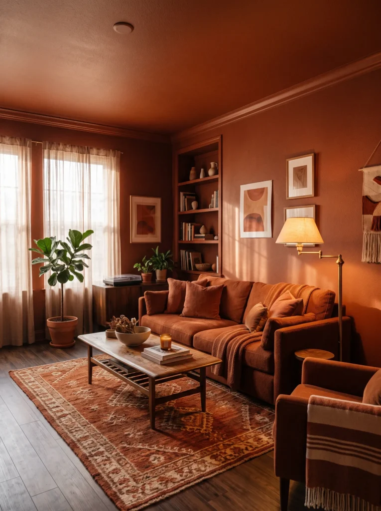
Painting a room in a single saturated color, walls, ceiling, and trim together, sounds bold, but it’s one of the most talked-about looks in interior design right now. Instead of one accent wall, the whole room becomes the statement. I’ve noticed this works especially well with warm boho tones like burnt sienna or deep olive, since the color wraps the space in warmth rather than making it feel closed in. It’s a striking departure from the neutral-everything approach that dominated for years, and it gives a small living room an unexpectedly luxurious, cocoon-like feel.
The trick to pulling this off well is sticking to one warm family of color throughout the room. Furniture in a slightly lighter or darker shade of the same tone keeps things cohesive instead of chaotic, while wood and woven textures add contrast without breaking the palette. I’ve seen this approach transform boxy, awkward rooms into spaces that feel intentional and layered. Because the color absorbs so much attention, styling stays simple, just a few textured cushions and warm lighting are enough to finish the look without needing extra decor.
You’ll Also Love:17 Cozy Scandinavian Living Room Ideas to Try Now
2. Crescent Sectional Statement
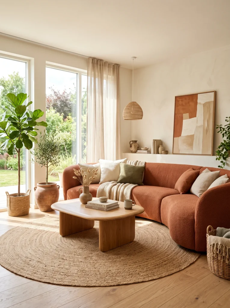
- Softens the whole room with rounded, organic lines
- Encourages a more social, face-to-face seating layout
- Works well as the anchor piece for the entire space
- Feels less rigid than traditional straight-edged sofas
Sharp corners are quietly disappearing from living rooms, and curved sectionals are taking their place. A crescent-shaped sofa doesn’t just look different, it changes how a room feels to sit in. The rounded silhouette softens the whole space and naturally draws people into a shared, conversational layout instead of a straight line facing a TV. I’ve noticed that curved furniture photographs beautifully, too, since the soft edges catch light in a way boxy furniture never does, which is part of why this shape keeps showing up across so many current living room styles.
Beyond the visual impact, a crescent sofa genuinely changes how a room functions. It encourages people to face each other, which makes the space feel warmer for hosting or simply relaxing together. Pairing it with a rounded coffee table and a few woven textures keeps the organic theme consistent throughout the room. This idea works particularly well in open-plan spaces, where the curved shape helps define a cozy seating zone without needing walls or furniture partitions. It’s a genuinely fresh way to anchor a cozy boho living room.
3. Butter Yellow Glow
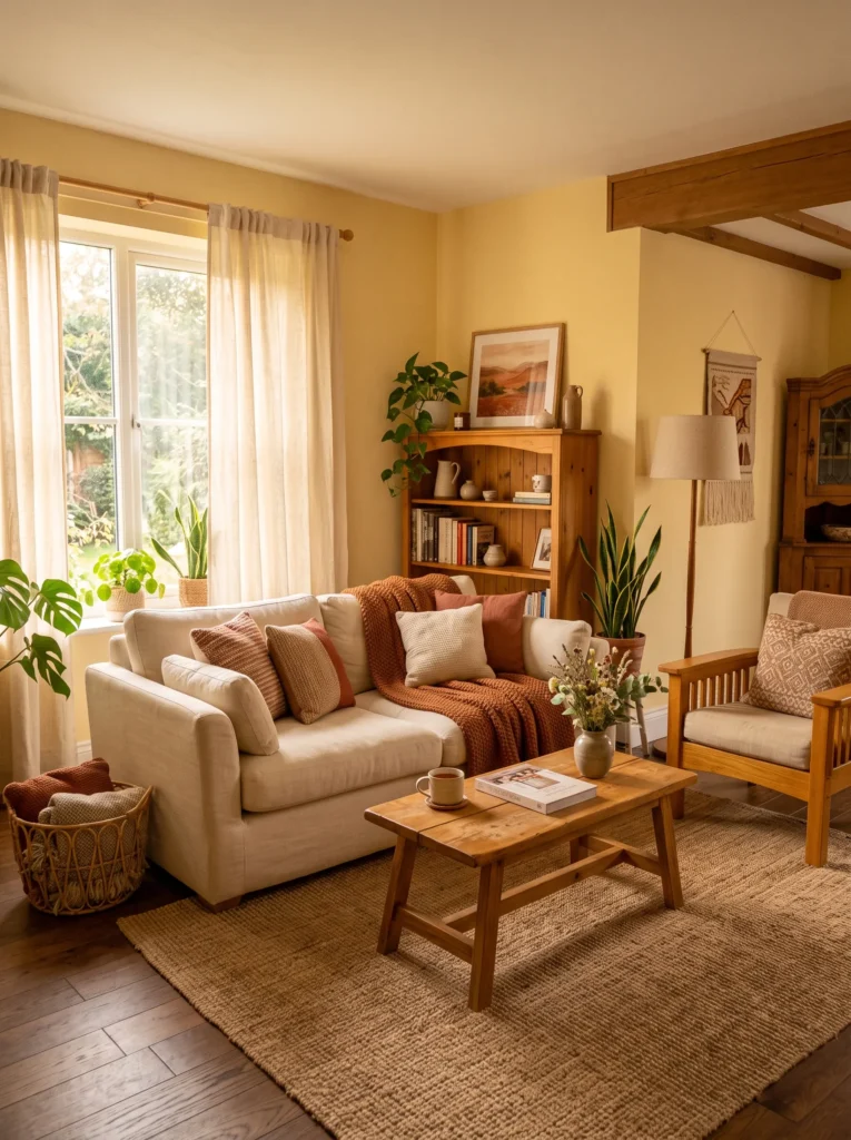
- Adds warmth without feeling overly bold or bright
- Pairs beautifully with natural wood and cream textiles
- Brightens rooms with limited natural light
- Feels nostalgic yet fresh rather than dated
Butter yellow has quietly become one of the most requested wall colors in recent months, and it’s easy to see why. Unlike bold mustard or harsh yellow, this softer, creamier tone feels like warm light itself, almost like the room is glowing even on a cloudy day. I’ve noticed it works particularly well in living rooms that don’t get much direct sunlight, since the color does the work of brightening the space without needing bold accent walls or heavy contrast. It’s warm, welcoming, and surprisingly easy to build a boho palette around.
Pairing butter yellow with honey-toned wood and cream textiles keeps a cozy boho living room feeling soft rather than saturated. Add a woven rug or a few rust-toned cushions, and the palette instantly feels layered and intentional. This color also works beautifully with brass or gold hardware, which reinforces the warm, glowing effect throughout the space. It’s a color that feels nostalgic without reading as dated, which is exactly why designers keep returning to it for boho living room ideas meant to feel calm, comforting, and quietly stylish.
4. Sage & Walnut Palette
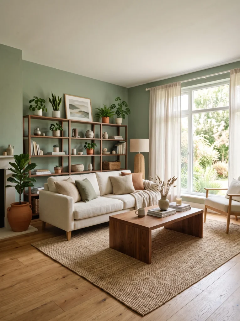
- Balances calm green with warm wood tones
- Feels fresh without leaning too bright or cold
- Works well in rooms with lots of natural light
- Pairs easily with cream, tan, or ivory textiles
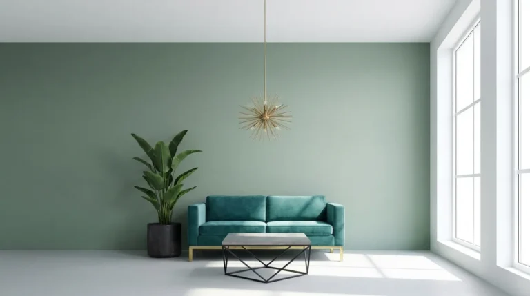
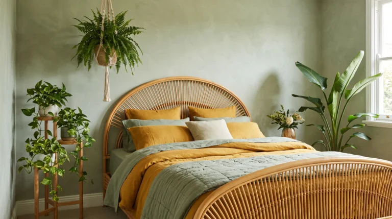
Sage green walls do something most colors can’t, they calm a room down instantly. Paired with warm walnut furniture, the combination feels grounded rather than trendy-for-a-moment, which is why it keeps showing up in warm boho color palettes that people actually stick with. I’ve noticed sage works especially well in rooms that get strong afternoon light, since the warmth of the sun keeps the green from feeling flat or cold. Add a cream sofa and a few wooden accents, and the whole space starts to feel like a quiet retreat rather than a styled showroom.
This pairing also solves a common decorating worry: choosing a color that won’t feel dated in a year. Sage sits between neutral and bold, so it ages well and adapts easily if your other decor changes down the line. Walnut furniture adds richness without competing with the wall color, which keeps the whole room feeling intentional. I’ve seen this combination work beautifully in both small apartments and larger family rooms, since the palette scales up or down without losing its calm, welcoming character. It’s a safe but genuinely stylish starting point.
5. Burnt Orange Boucle Sofa
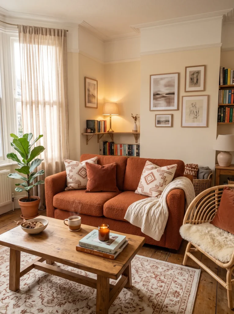
- Adds bold color without overwhelming the room
- Boucle texture keeps the look soft, not harsh
- Works as the room’s main focal point
- Easy to build the rest of the palette around
A burnt orange sofa is the kind of statement piece that instantly gives a room personality. Unlike bright orange, the burnt tone leans warm and muted, so it feels rich rather than loud. Boucle fabric softens the boldness even further, adding texture that catches the light in a way flat upholstery never does. That’s why many designers recommend starting a room’s palette with the sofa rather than the walls, since a strong anchor piece like this makes every other decision, from rugs to cushions, much easier to figure out.
Once the sofa is in place, the rest of the room almost styles itself. Cream walls let the color stand out, while wooden furniture and woven textures keep the space feeling relaxed rather than overly bold. I’ve noticed that pairing burnt orange with neutral tones, instead of competing bright colors, keeps the room from feeling chaotic. A patterned rug in soft rust or cream ties everything together nicely. This is one of those pieces that photographs beautifully too, especially in warm natural light, which makes it a strong pick for anyone building a space meant to feel both stylish and lived-in.
6. Sculptural Arc Lamp
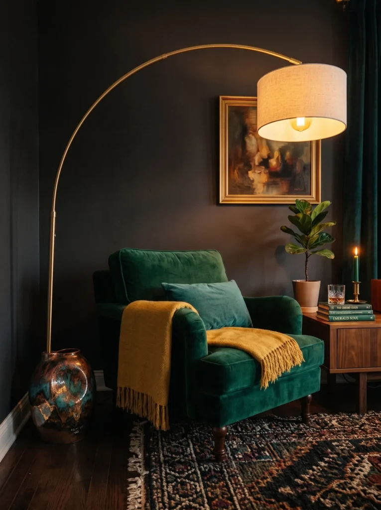
- Turns a lighting fixture into a piece of art
- Adds height and drama without extra furniture
- Creates warm, focused pools of light in the evening
- Works as a standalone statement in an otherwise simple room
Lighting used to be an afterthought, tucked into a corner and forgotten once the bulb worked. That’s changed completely. A dramatic arc lamp, especially one with a sculptural base and a bold curved arm, now functions as the room’s centerpiece rather than a background detail. I’ve noticed that placing one beside a deep-colored armchair creates an almost gallery-like moment, where the light itself becomes something worth looking at. It’s a small addition with an outsized visual impact, which is exactly why statement lighting has become such a defining feature of bold, current living rooms.
What makes this idea work so well is how much drama it adds without requiring a full room overhaul. A single arc lamp can transform a plain corner into a curated, intentional-looking space almost overnight. Pairing it with jewel-toned upholstery, like emerald or deep plum, amplifies the warm glow and makes the whole seating area feel richer. I’ve seen this trick used in small apartments especially well, since one striking lamp does more visual work than several smaller, forgettable fixtures scattered around the room.
7. Checkerboard Boho Rug
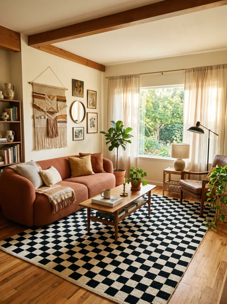
- Adds bold graphic contrast to an otherwise soft, earthy room
- Grounds the space with strong visual structure
- Works as a playful counterpoint to muted boho textures
- Photographs strikingly against neutral or warm-toned furniture
A checkerboard rug might sound too graphic for a boho space, but that contrast is exactly what makes it work so well. Dropped into a room full of soft textures, rattan, boucle, woven baskets, the bold black-and-cream pattern gives the eye somewhere sharp to land. I’ve noticed this combination keeps a room from feeling too soft or one-note, since the graphic print adds structure without needing extra furniture or color. It’s a playful, slightly unexpected choice that still feels grounded once it’s paired with warm, earthy tones around it.
The key to making this idea feel intentional rather than jarring is restraint everywhere else in the room. Keep the sofa and walls in warm neutrals, and let the rug carry the boldness on its own. I’ve seen this pairing used beautifully with a terracotta or rust-colored sofa, where the warmth softens the graphic pattern’s edge. Add a few vintage decor pieces and woven textures, and the whole room reads as curated and confident rather than mismatched, proving that bold patterns and boho warmth aren’t opposites at all.
8. Oxblood & Olive Contrast
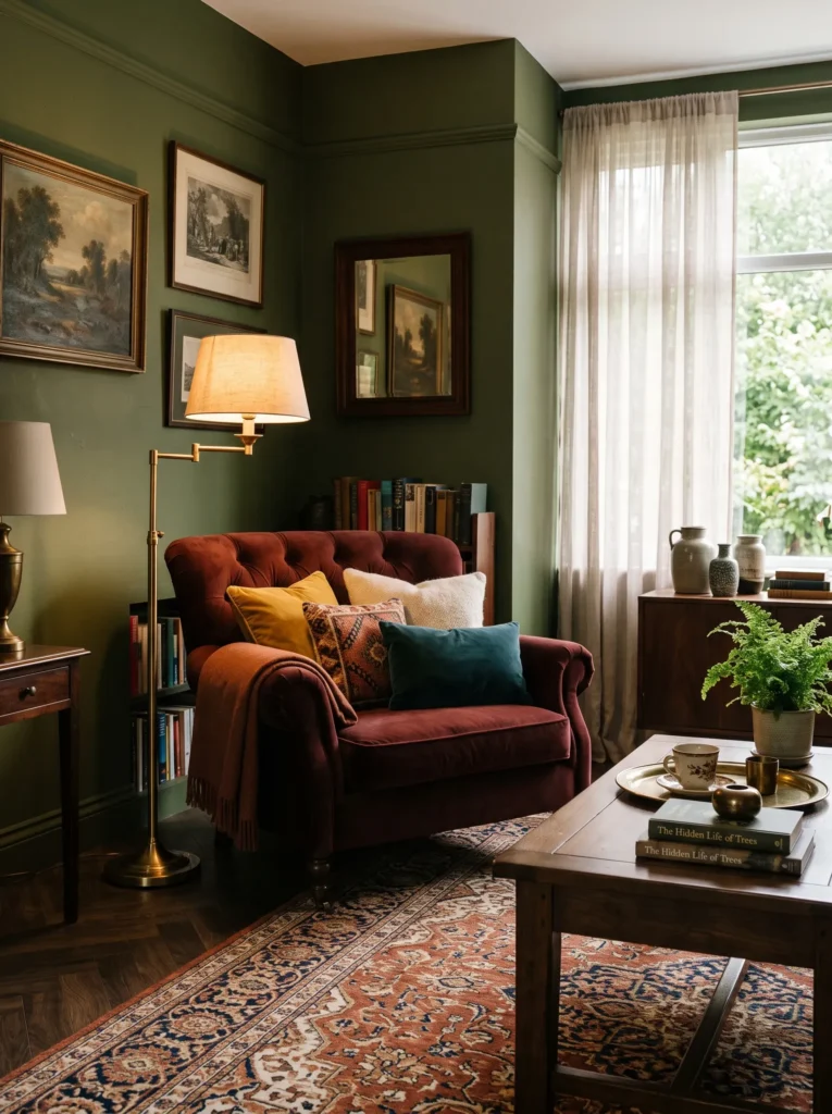
- Combines two deep, rich tones for dramatic contrast
- Feels sophisticated without losing boho warmth
- Works beautifully with brass or gold accents
- Adds depth to rooms that feel flat in all-neutral palettes
Deep, saturated colors are having a real moment, and oxblood paired with olive is one of the richest combinations showing up in current design feeds. The two tones sit close enough on the color wheel to feel cohesive, but different enough to create real depth and contrast. I’ve noticed this pairing works especially well in rooms that felt a little flat or forgettable with an all-neutral palette. Adding one oxblood chair against an olive wall instantly gives the space a sense of drama and intention that beige-on-beige rooms simply can’t match.
This combination also plays beautifully with warm metallics like brass or aged gold, which lift the darker tones and keep the room from feeling too heavy. I’ve seen this pairing used in both small reading corners and full living room walls, and it scales well either way. Layer in a patterned rug with rust or cream tones, and the room starts to feel collected rather than overly staged. It’s a bold choice, but one that reads as confident and rich rather than overwhelming, especially in spaces with warm natural light.
9. Barrel Chair Duo
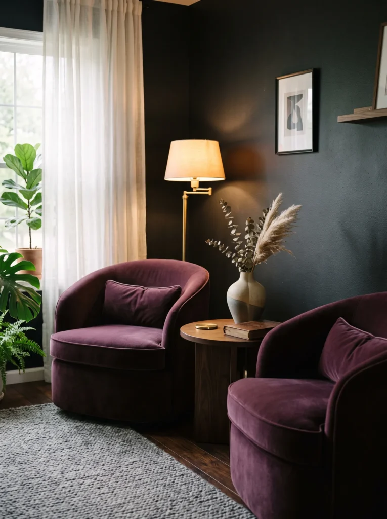
- Softens a room with rounded, comforting shapes
- Creates a striking, jewel-toned seating nook
- Works beautifully against near-black or deep charcoal walls
- Easy to angle toward each other for a dramatic focal point
Barrel chairs bring a softness that square-armed furniture just can’t match, and in a deep plum velvet, they become something far bolder than a typical accent seat. Their rounded backs wrap around you, almost like a cocoon, and against a charcoal black wall, the jewel-toned fabric practically glows. I’ve noticed this combination works especially well when the rest of the room stays fairly simple, since the chairs themselves carry all the drama. Two of them angled toward each other create an instant, striking gathering spot that pulls attention the moment you walk in.
Styling this pairing is less about adding more and more about restraint. A single brass floor lamp between the chairs, a dark wood side table, and one sculptural vase are usually enough. I’ve seen this exact formula used to transform a forgettable corner into the most photographed spot in the room. The contrast between deep plum and near-black walls creates a moody richness that feels intentional and current, proving that bold color choices can feel just as relaxed and inviting as softer, muted palettes.
10. Wall Plate Gallery
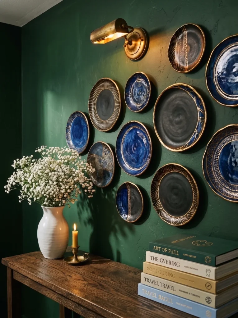
- Turns bold ceramics into a striking wall feature
- Adds handmade texture with real color impact
- Works well above consoles, shelves, or dark sofas
- Easy to expand into a larger gallery over time
Wall plates don’t have to stay safe and neutral. Arranged in bold cobalt, black, and gold-rimmed glazes against a deep forest green wall, they become a genuine style statement rather than a quiet decor filler. I’ve noticed that mixing high-contrast colors, dark bases with metallic rims, creates a display that catches the eye from across the room instead of blending into the wall. It’s a striking way to bring pattern and color into a space without needing large framed art or an expensive gallery wall setup.
This bolder version of the idea works particularly well above a dark wood console or a deep-colored sofa, where the plates stand out in sharp relief. I’ve seen this look used to turn a plain hallway wall or living room feature wall into the most talked-about detail in the whole space. Adding brass sconce lighting nearby brings warmth to the cooler tones and makes the whole arrangement feel curated rather than random. Starting with a few bold pieces and slowly building the collection keeps the display feeling personal and evolving over time.
11. Arched Mirror Feature
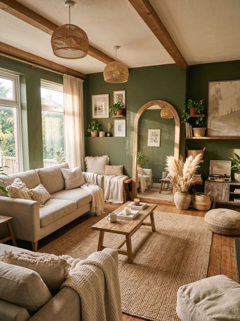
- Bounces natural light deeper into the room
- Softens the space with a rounded, organic shape
- Doubles as a functional and decorative feature
- Makes small rooms feel noticeably more open
An arched mirror does double duty in a way few other pieces can. It reflects light back into the room, which makes even a smaller or darker living room feel brighter and more open, while its soft, rounded shape breaks up all the straight lines furniture usually creates. I’ve noticed that leaning a large arched mirror against a wall, rather than hanging it, gives the room a relaxed, undone quality that feels distinctly boho. Paired with a deep wall color like olive or charcoal, the mirror’s reflection adds real depth and makes the space feel larger than it actually is.
This idea works especially well near a window or a light source, since the arch shape naturally bounces sunlight across the room throughout the day. I’ve seen this trick used to completely change how a dim corner feels, turning it from overlooked to one of the brightest spots in the room. Adding a low bench or a bit of greenery beside the mirror completes the look without crowding it. It’s a simple addition, but one that noticeably shifts how open and airy a boho living room feels.
12. Jewel-Tone Layered Lounge
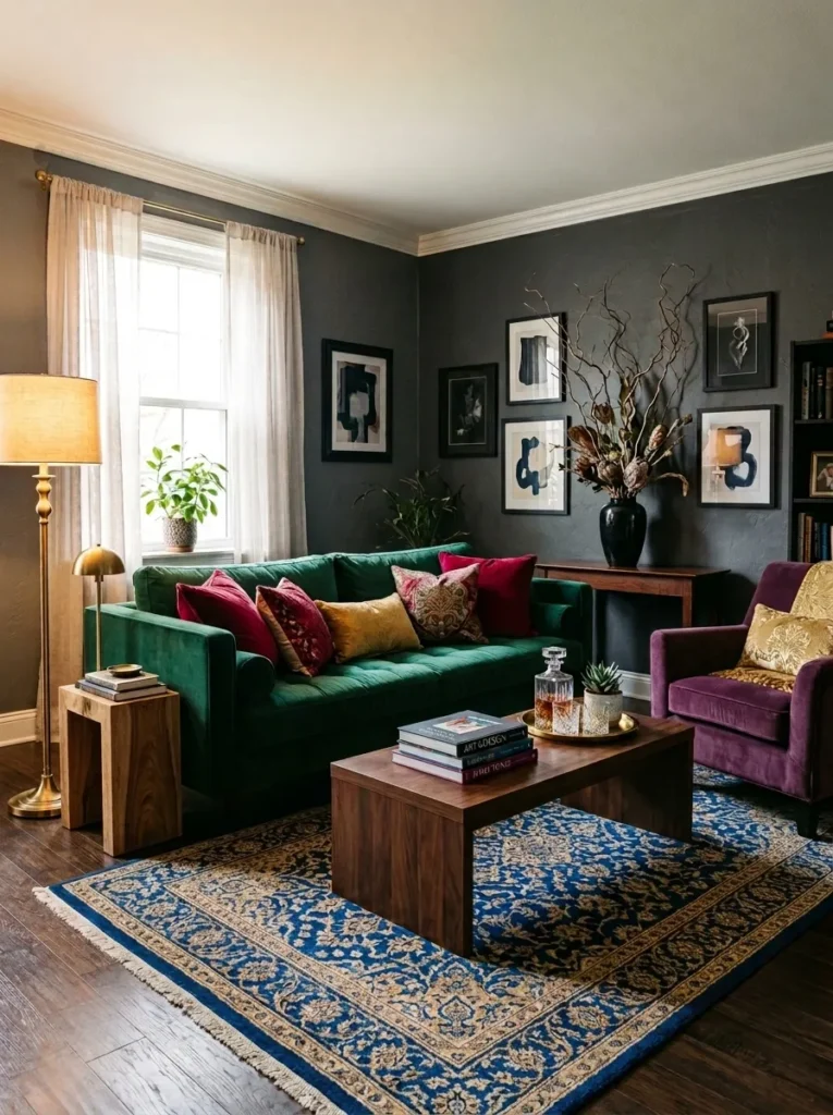
- Combines multiple deep jewel tones across the whole room
- Creates a rich, layered look instead of one accent color
- Balances boldness with warm brass and wood tones
- Feels dramatic without tipping into overwhelming or dark
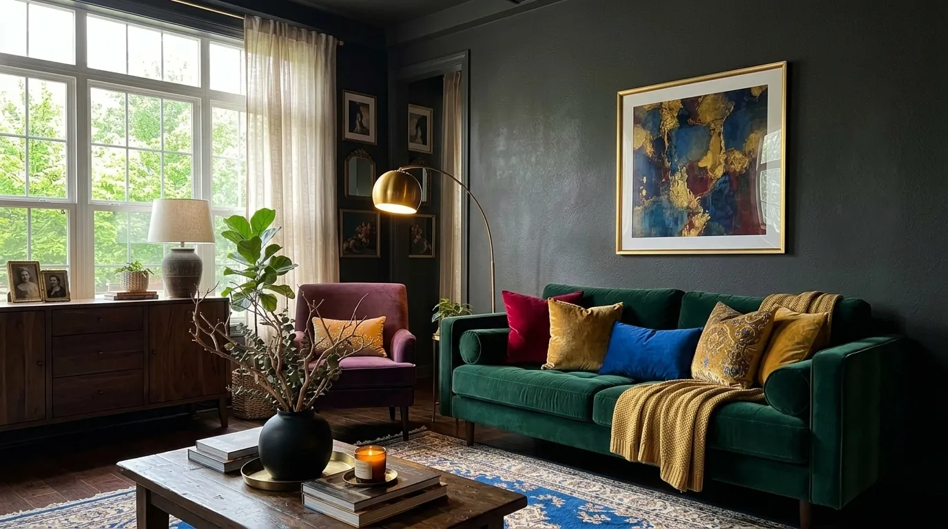
Building an entire room around jewel tones sounds risky, but done right, it creates one of the richest, most photograph-worthy living spaces around. Instead of picking one bold color, this look layers several, emerald, plum, cobalt, ruby, across the sofa, rug, chair, and cushions, so the whole room feels intentional rather than randomly colorful. I’ve noticed the key is keeping the walls and flooring darker and neutral, like charcoal or deep wood, so the jewel tones stand out as the star rather than competing with a busy background.
The result is a living room that feels like a cocoon of rich color the moment you walk in. Brass lighting and wood furniture add warmth that keeps the palette from feeling cold or overly formal, while a patterned rug ties all the individual jewel tones together into one cohesive scheme. I’ve seen this full-room approach work beautifully in spaces that get decent natural light, since sunlight keeps the deep colors from feeling heavy. It’s a bold commitment, but one that turns an entire living room into a genuinely memorable space.
13. Western Boho Living Space
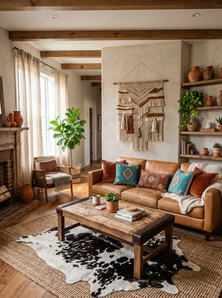
- Blends rustic leather with vibrant turquoise accents
- Creates a full-room theme through layered textiles and materials
- Works well with open shelving and handmade pottery
- Feels lived-in, personal, and distinctly different from typical boho
Western-inspired boho has been showing up everywhere lately, and it’s easy to see why. It takes the free-spirited layering of boho and grounds it with leather, turquoise, and rustic textures that feel genuinely different from the usual rattan-and-linen formula. I’ve noticed that a tan leather sofa works as a surprisingly versatile base for this whole-room look, since it pairs beautifully with both vibrant turquoise cushions and warm rust-toned textiles without clashing. Layering a cowhide rug over a woven jute base adds another texture layer that ties the whole room together.
What makes this a true full-room concept, rather than a single accent, is how consistently the theme carries through every element. Open wooden shelving styled with handmade clay pottery, a large-scale woven wall hanging, and leather-trimmed furniture all reinforce the same rustic, well-traveled feeling. I’ve seen this style work especially well in living rooms with natural wood flooring, since the warm tones amplify the earthy, sun-baked palette. It’s a full-room commitment that results in a space with genuine character and story, rather than decor that feels like an afterthought.
14. Golden Hour Lounge Setup
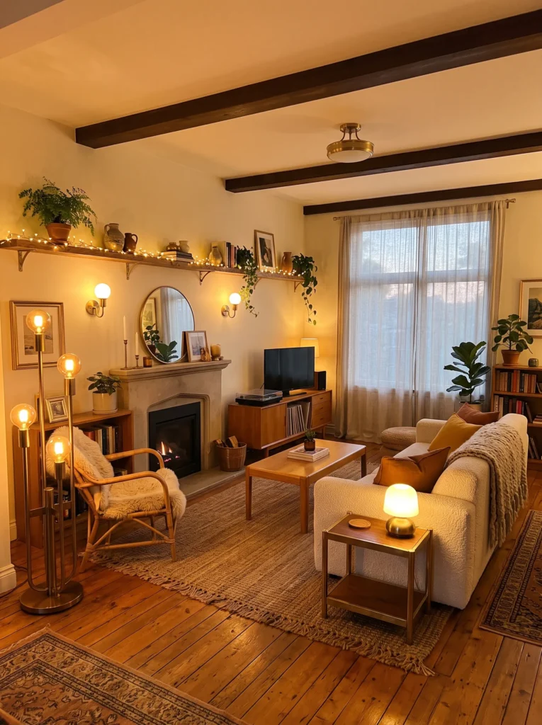
- Uses multiple light sources instead of one overhead fixture
- Creates a warm glow that shifts from day to evening
- Ties the whole room together through consistent warm tones
- Makes every corner of the room feel intentional and lit
A living room’s mood changes completely once lighting becomes the main design decision instead of an afterthought. This full-room concept layers several warm light sources, a modular floor lamp, brass table lamps, soft string lights along a shelf, so no single spot in the room feels dim or overlooked. I’ve noticed that using warm-toned bulbs throughout, rather than mixing warm and cool light, is what gives this look its signature golden hour glow, making the whole space feel inviting no matter what time of day it is.
Beyond the lighting itself, this idea works because it considers the entire room as one connected glow rather than isolated bright spots. Honey-toned wood furniture and brass accents reflect the warm light, amplifying the effect throughout the space. I’ve seen this layered lighting approach completely transform rooms that once felt flat and under-lit into spaces people want to linger in after dark. It’s a full-room styling choice that proves great lighting design can matter just as much as furniture or color when it comes to creating real atmosphere.
15. Deep Plum Velvet Living Room
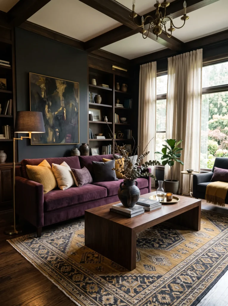
- Uses one bold anchor color to set the entire room’s mood
- Balances richness with warm brass and cream accents
- Feels luxurious without needing heavy dark walls
- Works in both small apartments and larger open spaces
A single plum velvet sofa can carry an entire living room’s personality on its own. Instead of relying on dark walls for drama, this look keeps the backdrop soft and light, cream curtains, pale walls, so the sofa becomes the clear focal point the moment you walk in. I’ve noticed that plum reads as unexpectedly versatile, pairing beautifully with warm mustard cushions, brass lighting, or cool charcoal accents depending on the mood you’re going for. It’s a color that feels rich and considered rather than trend-chasing.
Building the rest of the room around this anchor piece is refreshingly simple. A patterned rug in gold and charcoal ties the richness together, while a dark wood coffee table grounds the space without competing with the sofa’s color. I’ve seen this full-room approach work especially well in living rooms with lots of natural light, since the brightness keeps the deep velvet from feeling too heavy. It’s proof that one confident color choice, applied well, can do more for a room than a dozen smaller decor decisions combined.
16. Sculptural Curves Living Room
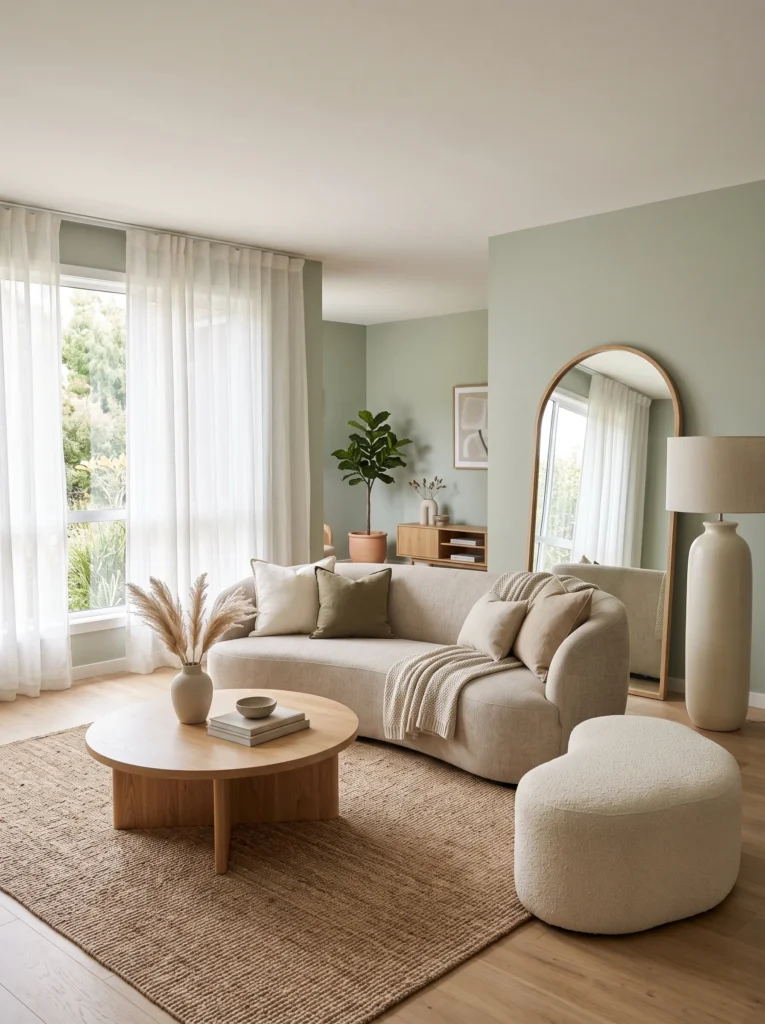
- Replaces every sharp edge with soft, organic shapes
- Creates a calming visual rhythm throughout the whole room
- Feels intentionally designed rather than randomly furnished
- Works beautifully in rooms with awkward angles or tight corners
Choosing curves over corners for an entire living room changes the whole feel of the space, not just one piece of furniture. This look commits fully: a crescent sofa, a round coffee table, an arched mirror, even a rounded lamp base, so every sightline in the room feels soft and continuous. I’ve noticed that this consistency is what makes the style feel deliberate rather than accidental. A single curved chair in an otherwise boxy room can look out of place, but when every shape follows the same rounded logic, the room reads as cohesive and calm.
This approach works particularly well in rooms with tricky layouts or awkward angles, since rounded furniture flows more naturally around obstacles than rigid, straight-edged pieces. I’ve seen this full-room styling completely change how a small or oddly shaped living room feels, making tight corners disappear into the overall soft geometry. Pairing the curves with a natural jute rug and sage walls keeps the look grounded and calm rather than overly stylized. It’s a genuinely fresh way to rethink furniture shape as a whole-room design decision.
17. Ivory & Black Contrast Room
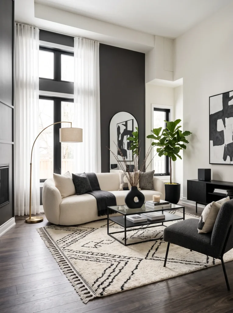
- Uses strong black-and-ivory contrast instead of an all-neutral palette
- Creates visual structure without needing bold color
- Feels bold and graphic while staying easy to live with
- Photographs strikingly in both bright and warm lighting
Not every bold room needs saturated color. This full-room look proves that black and ivory, used confidently throughout, can feel just as striking as jewel tones or deep walls. An ivory boucle sofa against black metal furniture and a black-framed mirror creates real visual tension, the kind that makes a room feel curated rather than default-neutral. I’ve noticed that this high-contrast approach photographs beautifully in almost any lighting, since the strong tonal difference reads clearly whether the room is sunlit or lit with warm lamps in the evening.
What keeps this look from feeling cold is the consistent use of texture. Boucle fabric, a woven patterned rug, and a brass lamp soften the sharp black-and-ivory contrast throughout the room. I’ve seen this full-room palette work especially well for people who want a bold, current look without committing to a dramatic wall color. Every piece, from the coffee table frame to the mirror, reinforces the same graphic contrast, which is what makes the whole room feel intentional rather than like mismatched neutral furniture thrown together.
18. Emerald & Terracotta Reversed Room
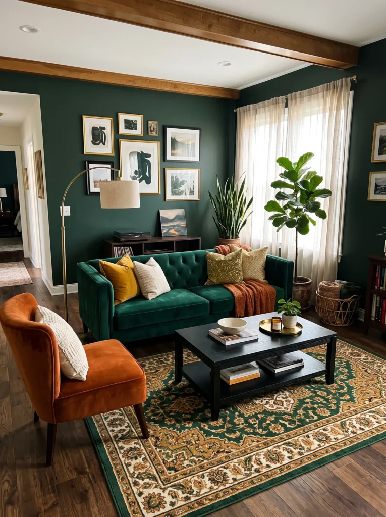
- Flips the usual formula by making the sofa the bold color instead of the accent
- Creates strong contrast between cool emerald and warm orange
- Feels rich and layered without leaning on neutral filler pieces
- Works well in rooms with strong natural light to balance the saturation
Most living rooms play it safe by keeping the sofa neutral and adding bold color through cushions or a single chair. This look flips that entirely, an emerald green sofa becomes the room’s main statement, while a burnt orange accent chair sits opposite it for real contrast. I’ve noticed that reversing the usual color hierarchy like this makes a room feel far more confident and considered, since the boldest choice isn’t hidden in a small accessory but front and center where it belongs. The gold-toned rug pulls both colors together so the contrast feels intentional rather than clashing.
Making this work as a full-room concept means committing to the contrast everywhere, not softening it halfway through. Black wood furniture grounds the brighter colors, while brass lighting and tall plants add warmth and life without diluting the bold palette. I’ve seen this reversed color approach used in rooms that once felt flat with all-neutral furniture, and the difference is dramatic. It’s a genuinely fresh way to think about which piece in the room gets to be the boldest, and the answer here is refreshingly not the usual suspect.
19. Moody Blue Velvet Living Room
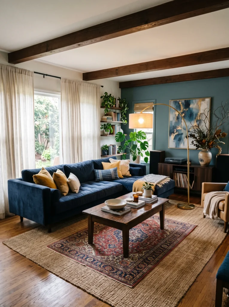
- Uses a cool, saturated blue as the room’s dominant tone
- Balances coolness with warm brass and mustard accents
- Feels dramatic and current without needing dark walls
- Works well in larger rooms that can handle a bold sectional
Indigo and deep blue velvet have been showing up across current living room trends, and for good reason, it’s a color that feels both dramatic and surprisingly livable. This full-room concept centers on a deep blue velvet sectional, then balances the coolness with warm brass lighting and mustard-toned cushions so the room doesn’t feel cold or overly formal. I’ve noticed that this warm-and-cool balancing act is what separates a genuinely stylish blue room from one that feels sterile or showroom-like.
Layering a smaller patterned rug over a natural jute base adds texture underfoot while keeping the room grounded in boho warmth despite the bold color choice. I’ve seen this combination work particularly well in larger living rooms, where a full sectional in deep blue can really stretch out and become the room’s anchor without overwhelming the space. Dried branches in a textured vase add an organic, unfussy final touch. It’s a full-room commitment to color that still feels relaxed and comfortable rather than overly designed.
20. Sun-Bleached Neutral Living Room
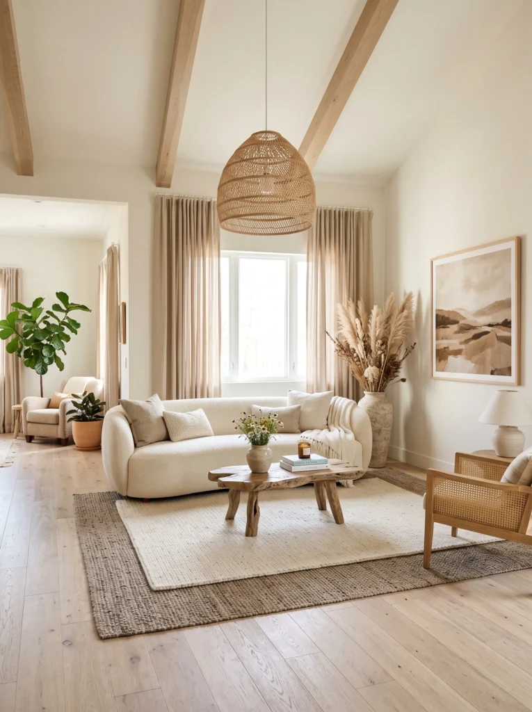
- Uses varied warm neutrals instead of one flat beige tone
- Feels airy and sun-washed rather than plain or empty
- Balances softness with natural texture throughout
- Works especially well in rooms with abundant natural light
Not every bold room needs saturated color, sometimes the boldest choice is committing fully to warm, sun-bleached neutrals instead of chasing trend colors. This full-room look layers cream, sand, and taupe tones through bouclé, linen, and natural fiber rugs, creating a space that feels sun-washed and effortless rather than plain. I’ve noticed that the key to making an all-neutral room feel intentional, rather than boring, is variety in texture and warmth of tone, never flat, matching beige throughout.
Driftwood furniture and a woven rattan pendant light add organic texture that keeps the palette from feeling empty or unfinished. I’ve seen this style used beautifully in bright, airy rooms with large windows, where the natural light amplifies every warm neutral tone in the space. Tall dried pampas grass adds height and softness without introducing new color. It’s proof that a full-room neutral palette, done with real texture and warmth, can feel just as considered and current as any bold color statement.
21. Cobalt & Copper Statement Room
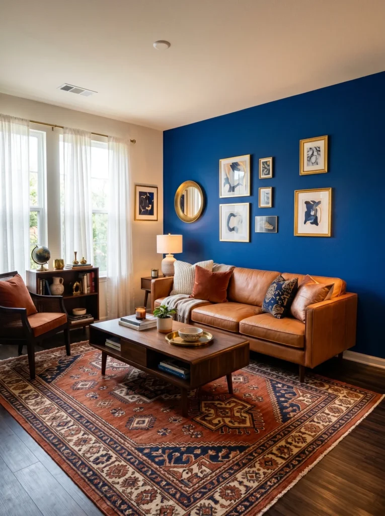
- Pairs cool cobalt with warm copper for striking metallic contrast
- Uses one bold wall to anchor the whole room’s palette
- Feels luxurious without requiring an all-dark color scheme
- Works especially well with brass or copper lighting fixtures
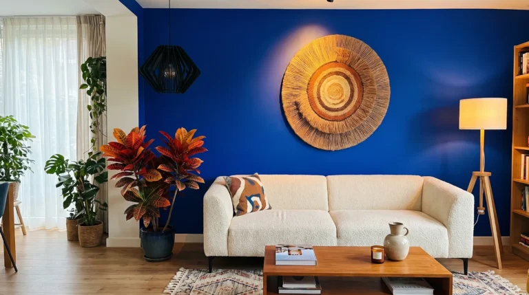
Cobalt and copper might sound like an unlikely pairing, but together they create one of the richest, most current color stories in living room design right now. A single cobalt accent wall gives the room its boldness, while a copper-toned leather sofa warms the space and keeps the cool blue from feeling stark. I’ve noticed that this specific pairing works particularly well because copper has a warmth that gold or brass alone doesn’t quite replicate, it reads as richer and slightly more unexpected, which is exactly what makes a room memorable.
Building the rest of the space around this contrast is straightforward once the wall and sofa are set. A rust-and-navy patterned rug bridges both colors, while cream cushions soften the overall richness so the room doesn’t feel too heavy. I’ve seen this palette used to transform an otherwise plain rental living room into something that looks genuinely designed. Brass or copper lighting throughout reinforces the metallic warmth, tying every element in the room back to the same confident, layered color story.
22. Charcoal & Gold Statement Room
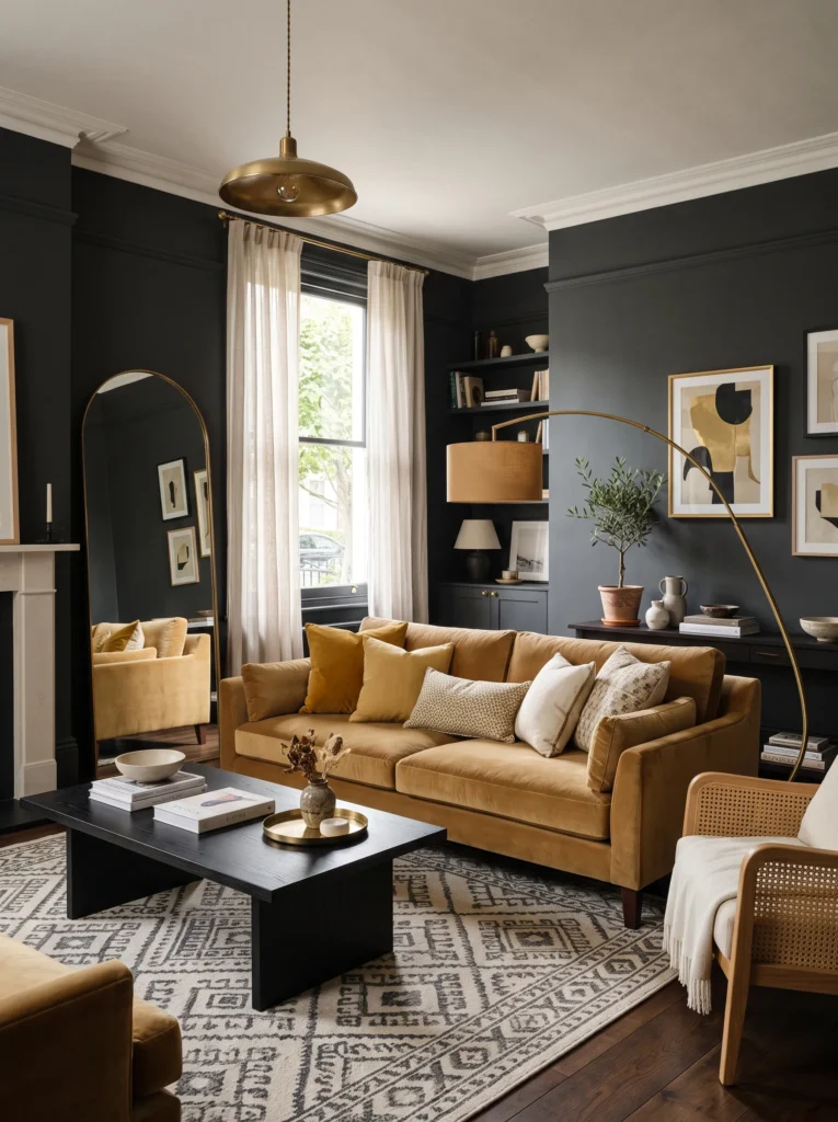
- Pairs deep charcoal with warm gold for striking luxury contrast
- Uses one bold wall color to elevate the entire room’s mood
- Feels elegant and dramatic without turning cold or sterile
- Works beautifully as a closing, statement-making room concept
Charcoal and gold together create one of the richest, most elegant color pairings a living room can have, and it works as a genuinely striking way to finish out a full room transformation. Deep charcoal walls set a dramatic, sophisticated backdrop, while a warm gold velvet sofa keeps the space from feeling cold or overly severe. I’ve noticed that this pairing tends to read as more luxurious than most other bold color combinations, since gold has a natural warmth and shine that softens even the deepest charcoal tones around it.
An arched mirror leaning against the charcoal wall bounces light back into the room, keeping the deep color from making the space feel smaller than it is. Layered mustard and ivory cushions add warmth and texture without competing with the gold sofa’s richness. I’ve seen this combination used to close out an entire living room redesign, tying together brass lighting, dark wood furniture, and patterned textiles into one final, elevated look. It’s a fitting, statement-making way to bring a whole collection of bold living room ideas to its most luxurious conclusion.
Final Thoughts
Creating a living room that feels warm, personal, and beautifully your own doesn’t happen all at once, it happens one small choice at a time. Whether you start with a bold accent chair, a layered rug, or a fresh coat of color on the walls, each of these cozy boho living room ideas brings you one step closer to a space that truly feels like home. I’ve seen how small changes like these can completely shift the energy of a room, often more than people expect. Save this post, try one idea this weekend, and share it with anyone who could use a little inspiration for their own space.