17 Cozy Scandinavian Living Room Ideas to Try Now
Imagine walking into a living room that instantly feels calm, warm, and effortlessly put together. That’s the magic of Scandinavian style, and it’s easier to achieve than most people think. If you’ve been searching for ways to create a cozy Scandinavian living room without a full renovation or a huge budget, this list is for you. In my experience, the biggest transformations often come from small, intentional changes, like a new color palette, a layered rug, or one statement piece of furniture.
This article walks through 17 practical, visually inspiring ideas you can start using today, whether you’re refreshing one corner or reimagining the entire room. Each idea is designed to be simple, achievable, and genuinely impactful, so your space feels warmer and more inviting almost immediately.
You’ll Also Love: 15 Cozy Scandinavian Bedroom Ideas That Feel Like Home
1. Warm Neutral Palette
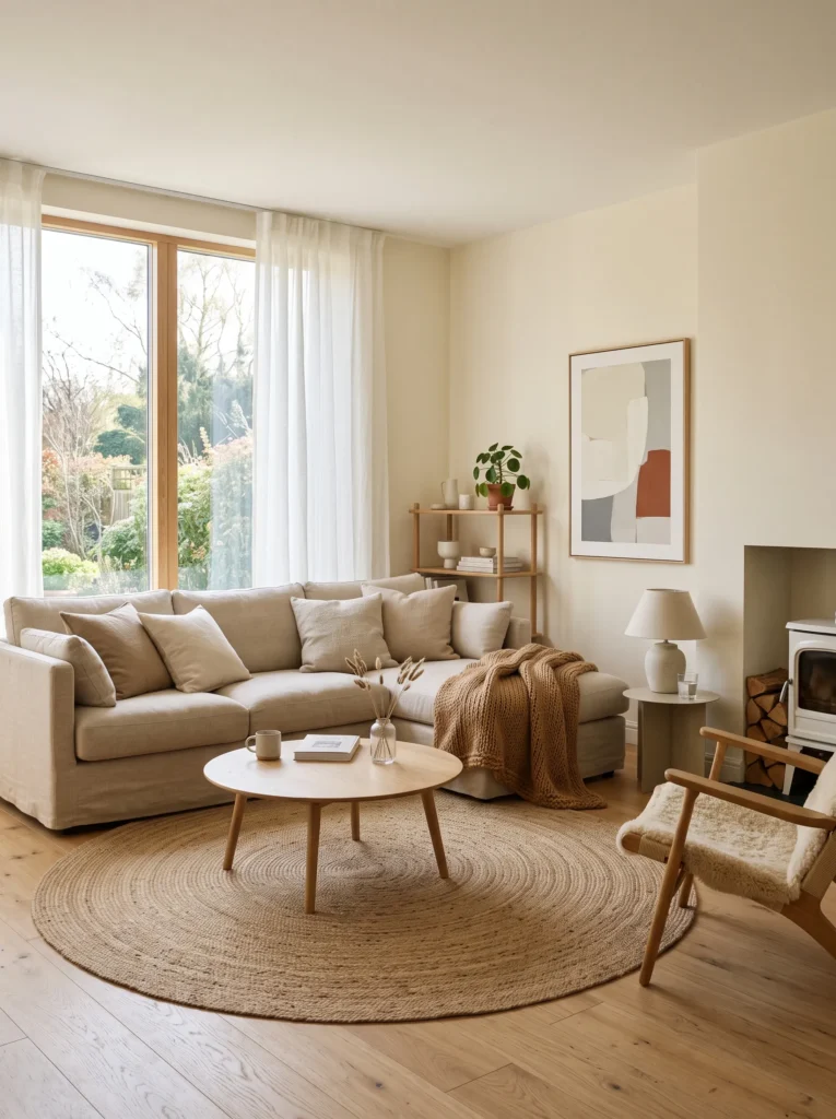
- Softens the whole room instantly without feeling flat or boring
- Works with almost any furniture style you already own
- Creates a calm backdrop that makes textures stand out more
- Easy to update seasonally with small color accents
- Feels warm even on grey, cloudy days
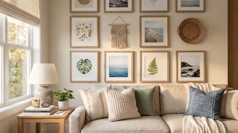
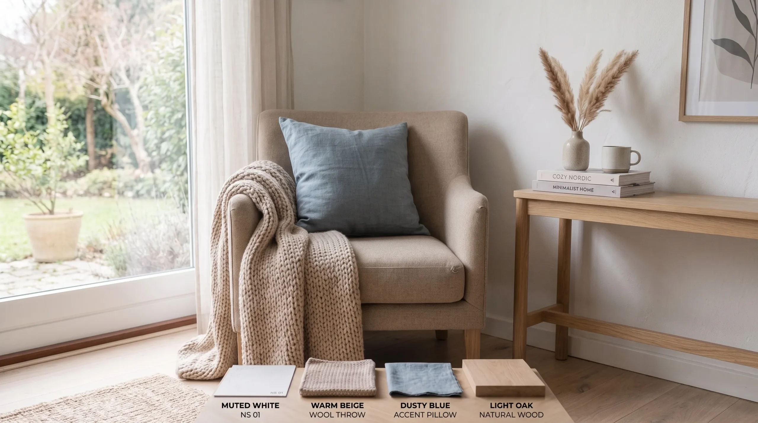
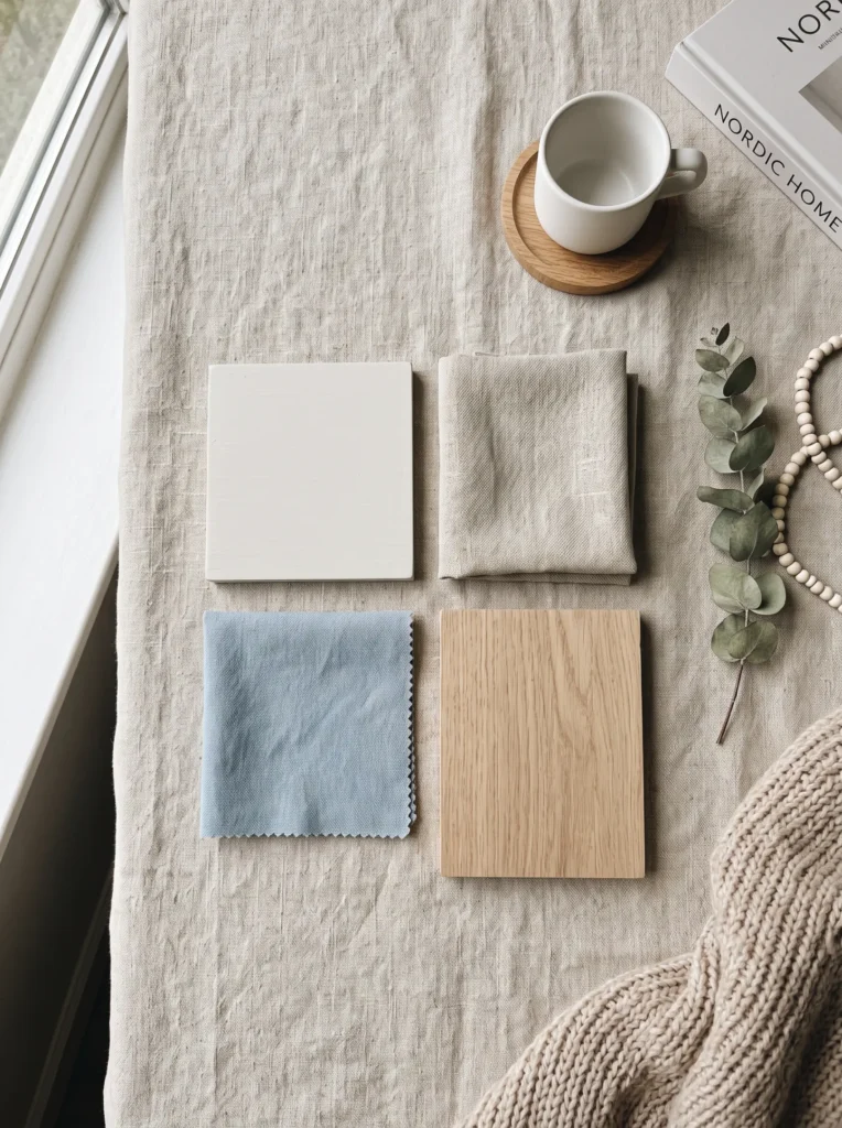
A warm neutral palette is the quiet hero of any cozy Scandinavian living room, and it’s often the first thing people notice without realizing why the space feels so calm. Instead of stark white walls, think soft cream, warm beige, or muted oatmeal tones that reflect light gently rather than harshly. In my experience, this shift alone makes small rooms feel bigger and more inviting. It’s forgiving too, since it pairs easily with wood, wool, and linen textures already common in Nordic-inspired homes, giving you a flexible base to build the rest of your design around.
What makes this palette so popular on Pinterest is how effortlessly photogenic it looks in natural light. Warm neutrals catch sunlight beautifully throughout the day, shifting subtly from soft gold in the morning to gentle grey by evening. I’ve noticed that homes using this approach rarely need bold accent walls or dramatic furniture, because the palette itself does the emotional work. It signals comfort before anyone even sits down. For anyone starting a living room refresh, this is usually the smartest and most budget-friendly first step, since paint and textiles are far cheaper than replacing furniture entirely.
2. Layered Textile Corner
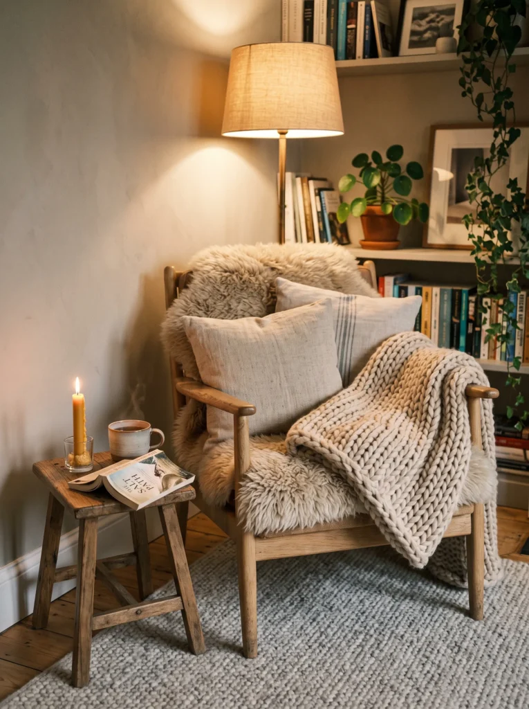
- Adds instant texture without needing new furniture
- Perfect for creating a reading or relaxing nook
- Mixes materials like wool, linen, and knit for depth
- Makes a plain chair or corner feel intentional
- Small cost, big visual and comfort payoff
Texture does more work than color in Scandinavian interiors, and a layered textile corner proves it every time. Start with one chunky knit throw, add a linen cushion, then finish with something soft underfoot like a sheepskin or wool rug. That’s why many designers recommend layering at least three textures in any seating area, since it keeps the eye interested even in a neutral space. This corner becomes the spot people naturally gravitate toward, whether for morning coffee or evening reading, simply because it looks and feels inviting from across the room.
I’ve seen this work well in many homes where budget was tight but the goal was still a cozy Scandinavian living room feel. You don’t need new furniture, just thoughtful layering of what you already have. Mix a slightly rougher knit with a smoother linen cushion for contrast, then add one warm light source nearby, like a floor lamp with a fabric shade. The result feels curated, not cluttered. It’s a small, low-effort update that photographs beautifully and genuinely improves how the space feels to sit in daily.
3. Natural Wood Accents
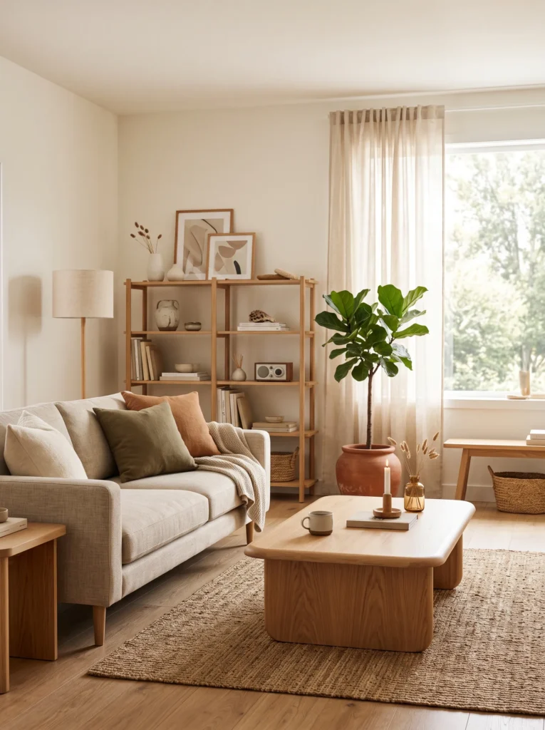
- Brings warmth without overwhelming a light color scheme
- Balances softer textiles with something sturdy and grounded
- Works for tables, shelving, floors, or small accent pieces
- Adds a natural, organic feel that never goes out of style
- Easy to mix wood tones without clashing
Wood is the backbone of Nordic design, and natural wood accents keep a room feeling grounded rather than sterile. Light oak, ash, or birch tones work especially well since they reflect light instead of absorbing it, keeping the space bright. A simple coffee table, open shelf, or wooden stool can anchor an otherwise soft, textile-heavy room. In my experience, mixing two wood tones, like a lighter floor with slightly warmer furniture, actually looks more natural than matching everything perfectly. It avoids that overly staged showroom look many people accidentally create.
This idea also solves a common problem: rooms that feel pretty but impractical. Wood furniture tends to be sturdier and more functional than all-soft, all-textile spaces, which matters for everyday living with kids, pets, or guests. A wooden coffee table holds up better than a fully upholstered one, for example. The visual payoff is just as strong, since natural grain patterns add subtle detail without needing extra decor. It’s a foundational element that supports every other cozy Scandinavian living room idea layered on top of it.
4. Curved Furniture Shapes
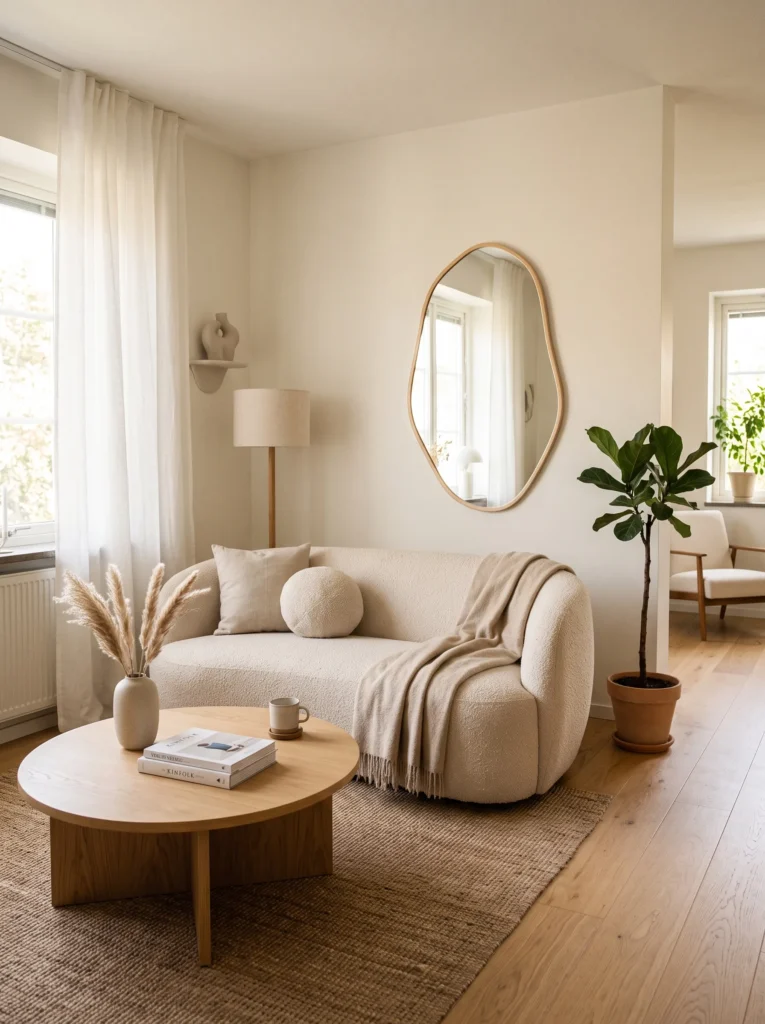
- Softens a room that feels too boxy or angular
- Curved shapes photograph beautifully from almost any angle
- Pairs well with boucle, linen, or textured fabrics
- Creates a gentle, calming flow instead of sharp lines
- Trending heavily across Pinterest home boards right now
Curved furniture has quietly taken over Scandinavian interiors, and it’s easy to see why once you notice the difference. Rounded sofas, oval tables, and arched mirrors soften a room in a way straight lines simply can’t. That’s why many designers recommend adding at least one curved piece to balance out angular walls or boxy furniture layouts. It doesn’t need to be the whole sofa either, since a round side table or curved mirror can shift the entire feel of a space. This small design choice makes rooms feel more relaxed, less rigid, and noticeably more inviting to sit in.
I’ve seen this work well in smaller apartments especially, where sharp corners can make a room feel cramped. Curved furniture creates visual breathing room without actually changing the square footage. It’s also why this trend performs so well on Pinterest, since curved shapes naturally draw the eye and photograph with softer, more flattering shadows. Pairing a curved sofa with straight-edged shelving or a rectangular rug keeps the balance right, so the room feels intentional rather than overly rounded or trend-driven without purpose.
5. Statement Woven Lighting
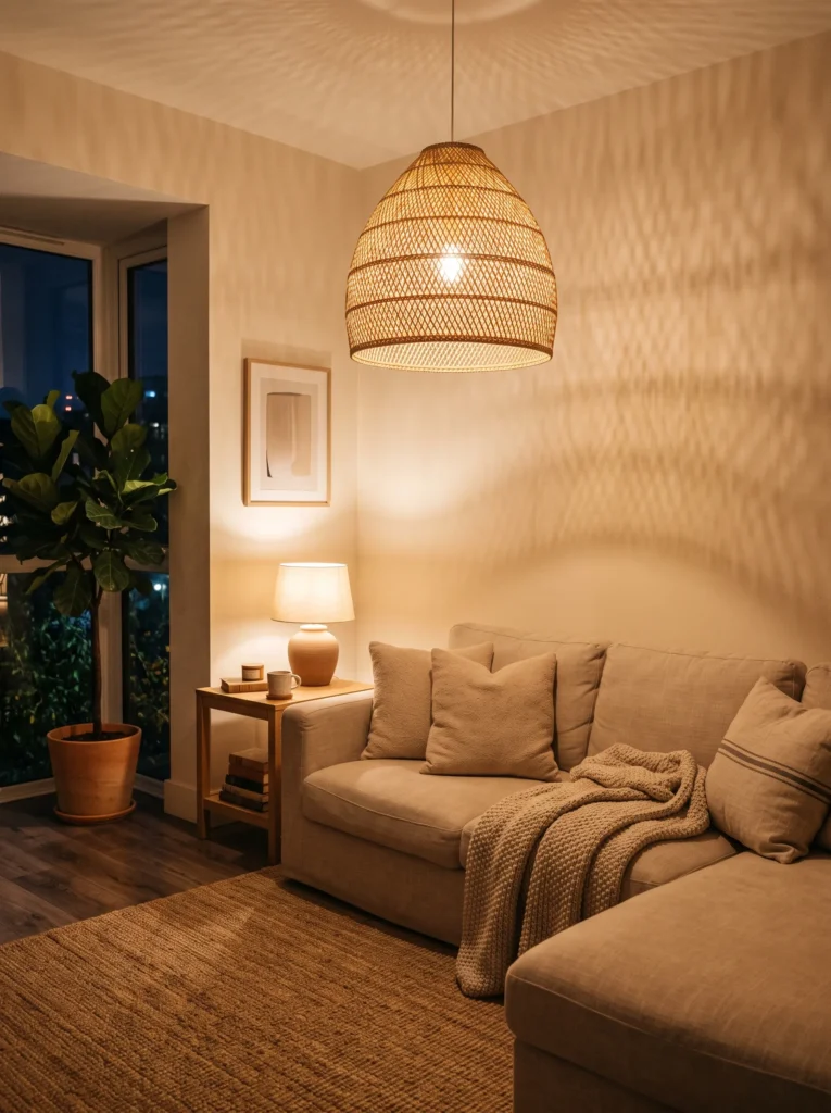
- Adds warmth and texture from the ceiling down
- Casts beautiful dappled shadows for evening ambiance
- Works as a focal point without cluttering the room
- Affordable upgrade compared to full lighting renovations
- Combines natural materials with functional lighting
Lighting rarely gets enough credit in Scandinavian design, but a statement woven lighting fixture changes everything about how a room feels after sunset. Rattan or paper pendant lights cast soft, dappled shadows across walls and ceilings, adding texture that flat overhead lighting never could. In my experience, this single fixture often becomes the most photographed detail in a cozy Scandinavian living room, simply because of how warm and layered the light looks in photos. It’s also one of the easiest upgrades, since swapping a pendant light rarely requires major electrical work or a big budget.
What makes woven lighting so effective is the balance it creates between function and atmosphere. Unlike harsh overhead bulbs, natural materials filter light gently, giving rooms that soft golden glow associated with Nordic evenings. I’ve noticed homes with this detail feel warmer even during winter months when natural daylight is limited. Pairing it with a simple linen sofa and light wood furniture keeps the focus on the fixture itself. It’s a small change with a disproportionately large visual and emotional impact on the entire room.
6. Sculptural Vase Styling
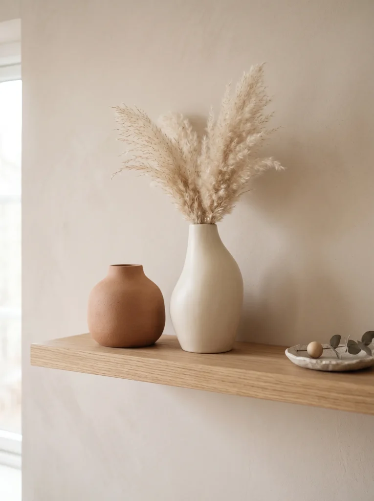
- Adds personality without cluttering open shelving
- Dried florals require zero maintenance year-round
- Works on shelves, mantels, or side tables
- Ties the whole room’s color palette together
- Instantly upgrades an empty corner or shelf
Empty shelves are one of the most common styling mistakes in Scandinavian homes, and sculptural vase styling solves this without overcomplicating things. One or two ceramic vases, paired with dried pampas grass or eucalyptus, create quiet visual interest without competing with the rest of the room. That’s why many designers recommend styling in odd numbers, usually one or three pieces, since it feels more natural than symmetrical pairs. This idea works especially well because it requires almost no upkeep, unlike fresh flowers, making it realistic for busy households still wanting that finished, curated look.
I’ve tried this approach in smaller spaces where every surface needs to earn its place, and it consistently works. A single sculptural vase on an otherwise empty shelf draws the eye without demanding attention, which is exactly the balance Scandinavian styling aims for. Choosing vases in tones already present elsewhere in the room, like terracotta or muted cream, ties everything together visually. It’s a low-cost, low-effort detail that photographs well and genuinely finishes a space that might otherwise feel unstyled or incomplete.
7. Sage Green Accent Wall
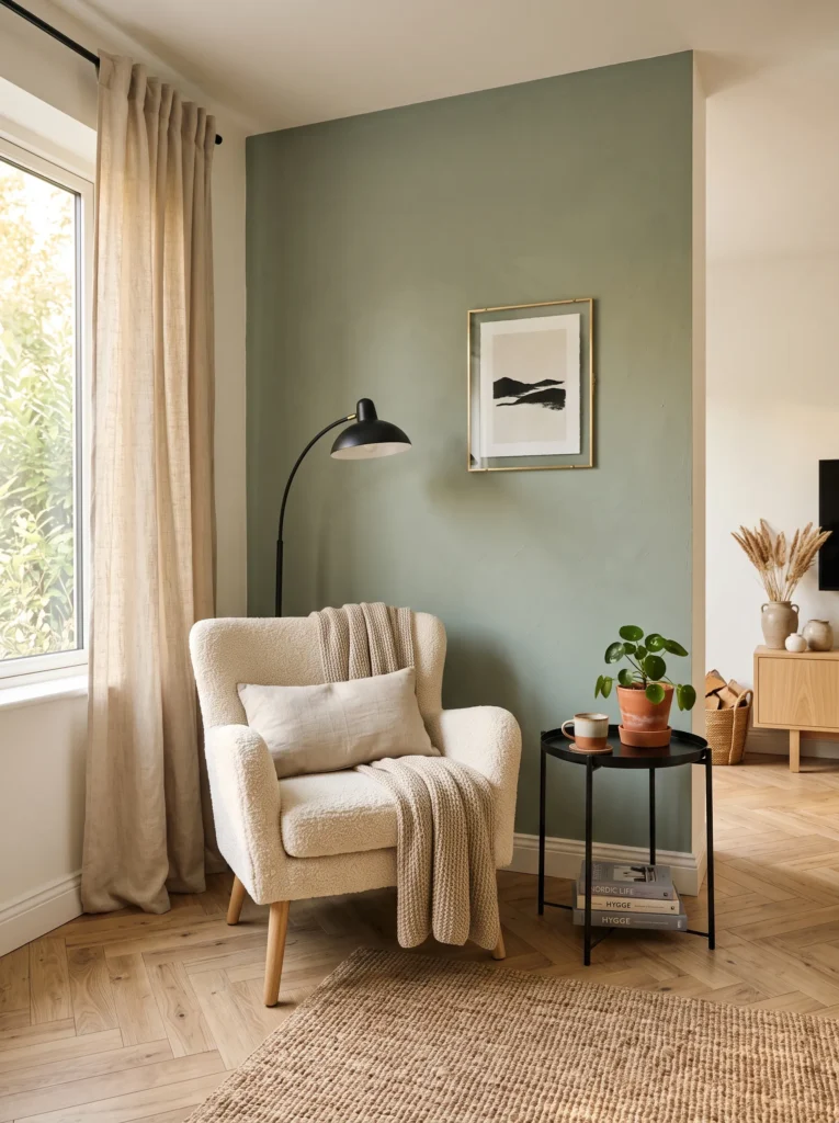
- Adds color without breaking the calm, neutral base
- Sage pairs beautifully with both wood and black accents
- Creates depth on an otherwise flat wall
- Trending shade across 2026 Pinterest interior boards
- Easy to repaint or remove if renting
Adding one sage green accent wall is an easy way to bring color into a cozy Scandinavian living room without disrupting its calm foundation. Unlike bold or saturated colors, sage sits close enough to neutral that it still feels restful, while giving the eye something more interesting than plain white. In my experience, this shade works especially well paired with black metal accents and warm wood tones, since it bridges the gap between earthy and modern. It’s also a renter-friendly option, since a single wall is far less commitment than repainting an entire room.
I’ve noticed this trend growing fast on Pinterest because it photographs beautifully in both natural and warm evening light, shifting subtly depending on the time of day. Sage green also pairs surprisingly well with brass, black, and cream accents, giving homeowners flexibility with existing decor. It avoids the flatness of all-white rooms while still keeping things soft and livable. This idea works particularly well behind a sofa or media console, where it acts as a backdrop rather than the main attraction, letting furniture and textures shine.
8. Dusty Blue Textile Mix
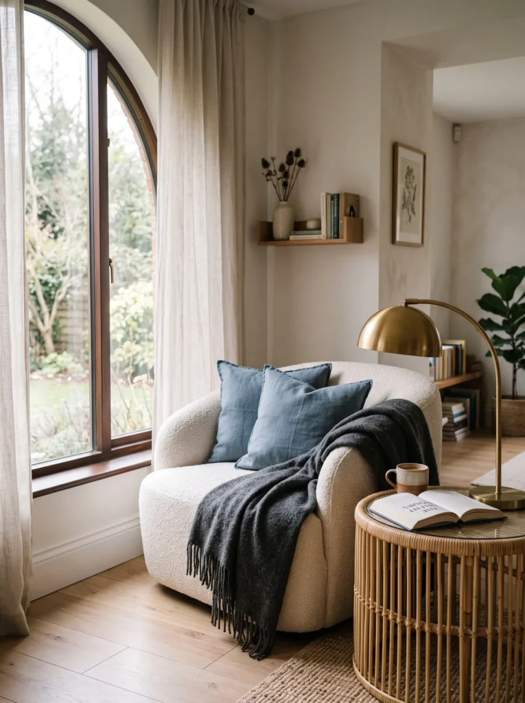
- Introduces color through fabric instead of paint
- Dusty blue feels calming, not cold like bright blue
- Pairs well with charcoal, cream, and rattan textures
- Easy to swap seasonally with different cushion covers
- Adds visual interest to an all-neutral seating area
Textiles are the safest way to experiment with color, and a dusty blue textile mix proves that beautifully in Scandinavian interiors. Unlike paint, cushions and throws can be swapped in minutes, making this idea perfect for anyone hesitant to commit to a bold wall color. That’s why many designers recommend starting here first, layering dusty blue with charcoal and cream to keep the palette grounded rather than overwhelming. The muted tone reads as calm rather than cold, which matters in a style built around comfort and warmth above all else.
I’ve seen this work well in rental apartments where painting walls isn’t an option but a fresh look is still wanted. Simply swapping neutral cushions for dusty blue ones, then adding a charcoal throw for contrast, transforms a plain seating area almost instantly. Pairing this with warm brass or rattan accents keeps the coolness of the blue balanced. It’s a flexible, low-commitment update that photographs beautifully in natural light and can be changed again easily whenever the season or mood calls for something new.
9. Terracotta Warm Accents
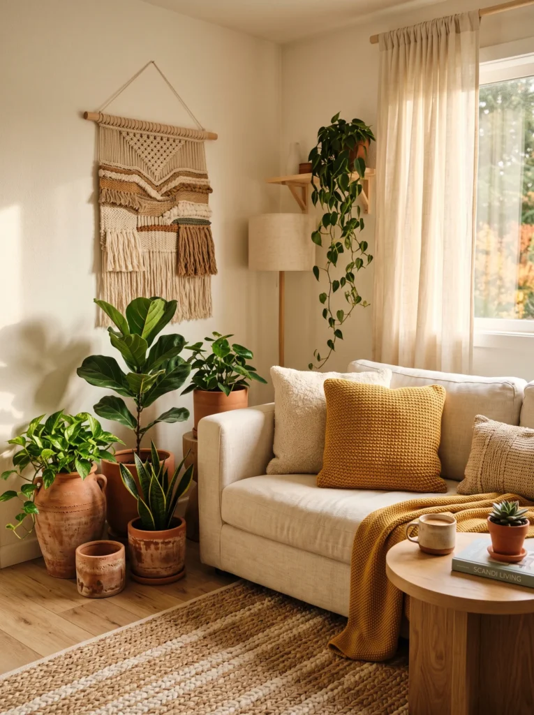
- Brings warmth through color rather than heavy decor
- Terracotta pairs beautifully with cream and mustard tones
- Works well in planters, vases, or small accent pieces
- Adds a sunny, golden-hour feel year-round
- Balances cooler neutral bases with earthy warmth
Terracotta has become one of the most popular warm accents in Scandinavian-style rooms, and it’s easy to understand why once you see it against cream and light wood. This earthy tone brings a golden, sunlit feeling into a space even on grey days, which fits perfectly with the Nordic goal of maximizing warmth despite limited daylight. In my experience, small terracotta accents, like a planter or single vase, add just enough color without overwhelming the room’s otherwise neutral base. It’s a subtle shift that makes a noticeable difference in overall mood.
This idea works especially well paired with mustard or warm yellow textiles, since both tones share the same golden undertone and feel cohesive together. I’ve noticed rooms styled this way tend to feel more lived-in and less showroom-perfect, which is exactly the relaxed warmth Scandinavian design aims for. Terracotta planters also double as a practical home for greenery, combining function with style. It’s an affordable, easy-to-source accent that instantly warms up a space without requiring any major furniture changes or renovation.
10. Charcoal & Cream Contrast
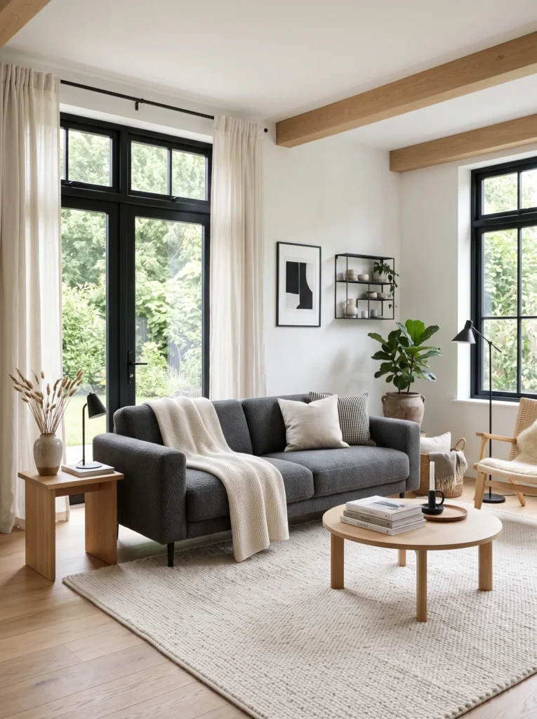
- Adds depth to all-white or all-beige rooms
- Charcoal grounds the space without feeling heavy
- Pairs beautifully with cream, white, and light wood
- Creates a modern, editorial Pinterest-style look
- Works well for both small and large living rooms
A charcoal and cream combination brings welcome contrast to Scandinavian rooms that can sometimes feel too flat or one-note. Charcoal grounds a space instantly, giving definition to furniture silhouettes that might otherwise blend into an all-neutral background. That’s why many designers recommend this pairing for open-plan living rooms, where a darker sofa or rug helps define the seating area without needing walls. In my experience, this contrast also photographs exceptionally well, since the interplay of light and dark creates natural depth that flat neutral rooms often lack in photos.
I’ve noticed this palette works particularly well for renters or minimalists who want a modern edge without straying from Scandinavian principles. Charcoal furniture paired with cream walls and light wood flooring keeps the room feeling airy rather than dark, since the lighter elements still dominate visually. Adding black metal accents, like window frames or light fixtures, ties the contrast together intentionally. It’s a versatile combination that suits both small apartments and larger family living rooms, offering a slightly more editorial, elevated take on cozy Nordic style.
11. Muted Lavender Touches
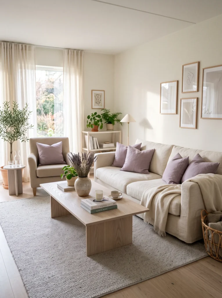
- Introduces a soft, unexpected color into neutral spaces
- Lavender feels calming and gentle, not overly bold
- Pairs beautifully with cream, grey, and ash wood tones
- Adds a fresh, spring-like feel to any season
- A subtle way to stand out on Pinterest boards
Muted lavender is an underused color in Scandinavian interiors, yet it fits the palette surprisingly well once introduced correctly. Unlike bright purple, this dusty, greyed-out version feels calm and grounded rather than loud or trend-driven. In my experience, small lavender touches, like cushions or dried stems in a vase, work best when paired with plenty of cream and light wood to keep the overall look soft rather than overpowering. This is a great option for anyone wanting their space to feel slightly different from the usual beige-and-white Scandinavian rooms flooding Pinterest right now.
I’ve seen this work well in bedrooms-turned-living-spaces or smaller apartments where a gentle, calming palette matters most. Lavender also brings a subtle seasonal freshness, feeling equally at home in spring styling and cozy winter setups. Pairing it with pale grey textiles and ash wood furniture keeps the palette cohesive without veering into overly feminine or themed territory. It’s a quiet, distinctive choice that helps a room stand out visually while still respecting the calm, uncluttered spirit of Scandinavian design.
12. Warm Mustard Layers
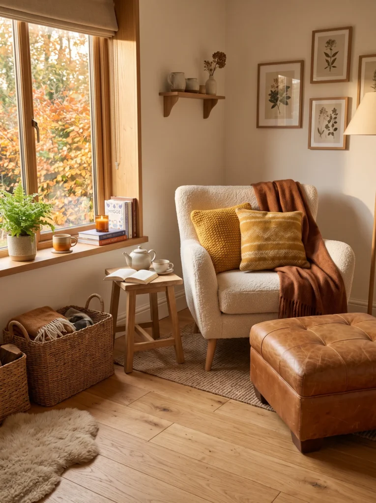
- Brings a bold pop of color into a neutral room
- Mustard pairs beautifully with caramel and rust tones
- Adds warmth during darker, colder months especially
- Easy to introduce through cushions or a single throw
- Creates a cozy, inviting focal point instantly
Mustard yellow might seem like an unexpected choice for Scandinavian interiors, but in muted, warm tones it works beautifully as a cozy accent color. Rather than bright, saturated yellow, think warm ochre or golden mustard, paired with caramel leather and rust-toned textiles for a layered, autumnal feel. That’s why many designers recommend this combination specifically for darker months, since it visually mimics warmth and sunlight even when daylight is limited outside. It’s a color that instantly makes a room feel more inviting, especially in colder climates where coziness matters most.
I’ve tried this palette in living rooms that felt a little too pale or clinical, and the shift is noticeable almost immediately. A few mustard cushions and one leather accent piece bring warmth without requiring a full redesign. Pairing these tones with light oak flooring keeps things grounded in Scandinavian simplicity rather than tipping into a completely different aesthetic. This combination photographs especially well during golden hour, making it a popular choice for Pinterest boards focused on autumn and winter interior inspiration.
13. Dusty Blue Accent Wall
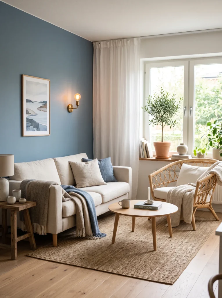
- Brings a fresh, calming color into a neutral base
- Dusty blue feels serene without turning the room cold
- Pairs beautifully with rattan, brass, and warm wood
- Different from a textile-only approach, this makes a bigger visual statement
- Trending shade for 2026 Scandinavian-coastal crossover style
A dusty blue accent wall offers a different way to bring this popular color into a room, beyond just cushions or throws. Painted on just one wall, it becomes a soft backdrop rather than an overwhelming feature, letting cream furniture and natural wood tones stand out against it. In my experience, this shade works particularly well in rooms that get plenty of natural light, since dusty blue can look flat or cool in darker spaces. Paired with brass fixtures and rattan textures, it leans slightly coastal while still staying true to core Scandinavian principles of calm, natural living.
I’ve noticed this specific combination gaining traction on Pinterest as people move away from strictly neutral rooms toward soft, livable color. Unlike bold navy or bright blue, this muted tone keeps the space feeling airy and restful rather than dramatic. Adding a potted olive tree or other greenery softens the wall further, bridging indoor and outdoor aesthetics. It’s a slightly bolder update than textile styling alone, best suited for those ready to commit to color on a larger scale while still keeping the room feeling calm.
14. Soft Blush Undertones
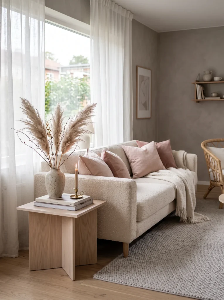
- Adds warmth through a soft, unexpected color choice
- Blush feels gentle, not overly sweet or themed
- Pairs beautifully with cream, grey, and ash wood
- Works well for smaller apartments or first homes
- A subtle, feminine twist on classic Nordic style
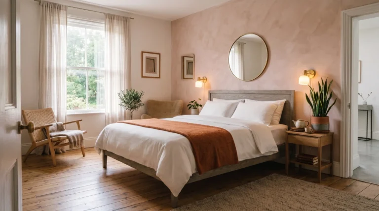
Soft blush is another underused tone that fits Scandinavian rooms better than people expect, as long as it stays muted and dusty rather than bright or candy-colored. That’s why many designers recommend pairing it with warm neutrals like cream and grey, so the overall effect feels soft and grounded instead of overly themed. In my experience, one or two blush cushions against a cream sofa create just enough warmth to make a room feel personal, without pulling focus from the natural materials that define this style in the first place.
I’ve seen this palette work particularly well in first apartments or smaller living rooms, where a gentle color can make a space feel more finished without a large budget. Blush also pairs surprisingly well with pampas grass and other dried florals, both trending heavily on Pinterest right now. Keeping the rest of the room neutral, with grey and ash wood tones, ensures the blush reads as sophisticated rather than overly sweet. It’s a soft, distinctive choice that helps a room feel warm, calm, and quietly stylish.
15. Deep Forest Green Nook
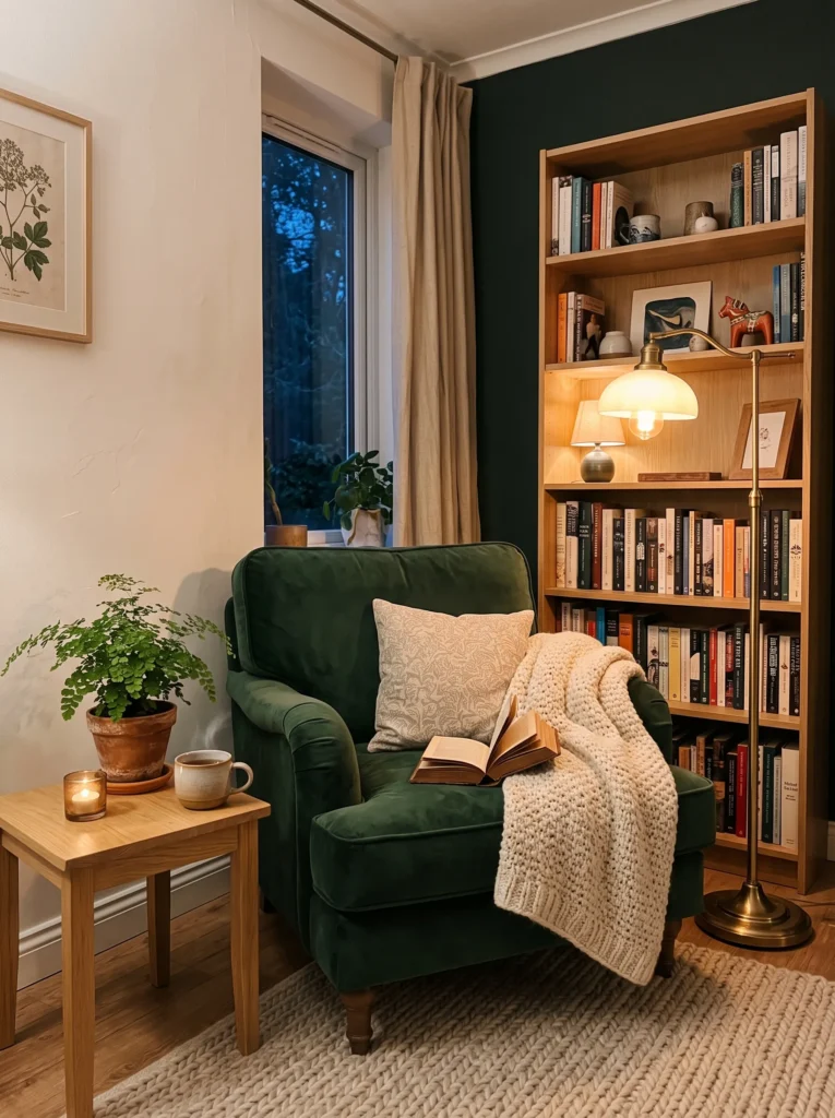
- Introduces a richer, deeper color into an otherwise light room
- Forest green feels grounding and cozy, especially in evening light
- Pairs beautifully with cream, brass, and natural wood tones
- Perfect for creating a dedicated reading or quiet corner
- Adds depth without making the space feel dark or heavy
Deep forest green might feel like a departure from typical pale Scandinavian palettes, but used sparingly, it adds welcome richness to a room. A single velvet armchair in this tone, paired with warm lamp light, creates an inviting nook that feels cozy rather than overwhelming. In my experience, darker colors like this work best in one concentrated area, such as a reading corner, rather than spread across an entire room, since it keeps the overall space feeling balanced between light and depth.
I’ve noticed this trend appearing more often on Pinterest as people look for ways to add coziness without losing the calm, uncluttered Scandinavian foundation. Forest green pairs particularly well with brass accents and warm wood tones, both of which soften the intensity of the color. Adding a potted fern nearby brings in a natural, grounded feel that complements the deep green nicely. This idea works best as one accent within a larger neutral room, giving the space a cozy focal point without sacrificing its overall brightness.
16. Warm Caramel Leather
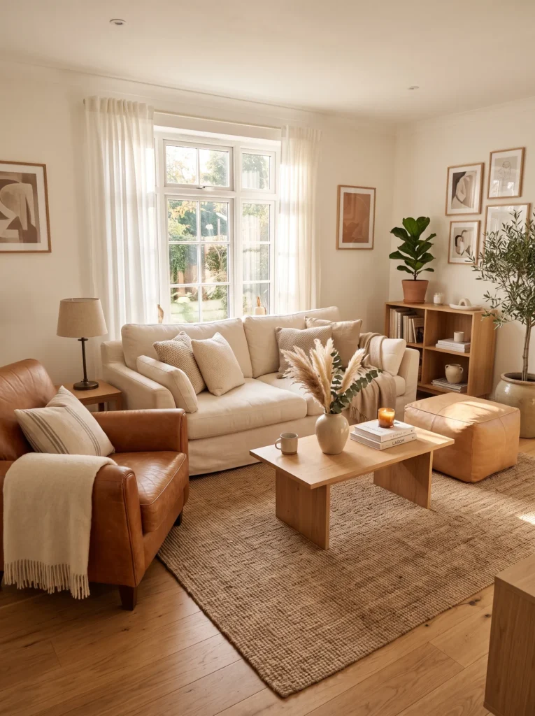
- Adds richness and warmth through material, not just color
- Caramel leather ages beautifully and adds character over time
- Pairs well with cream, jute, and brass accents
- A durable, practical choice for busy households
- Balances softness of linen with a sturdier textural contrast
Leather isn’t always associated with Scandinavian style, but in warm caramel leather or tan tones, it fits surprisingly well. Unlike cold black leather, caramel feels earthy and lived-in, especially as it develops a natural patina over time. That’s why many designers recommend leather for high-use pieces like an accent chair or ottoman, since it holds up better than fabric while still contributing warmth to the room. Paired with cream linen and light oak, it adds textural contrast that keeps an all-soft room from feeling one-dimensional.
I’ve tried recommending this combination to friends with kids or pets, and it consistently holds up better than expected while still looking stylish. Caramel leather pairs beautifully with brass fixtures and jute textures, both of which share similar warm undertones. This creates a cohesive, earthy palette that feels practical without sacrificing the calm aesthetic Scandinavian design is known for. It’s a smart choice for anyone wanting a cozy Scandinavian living room that can genuinely withstand daily life, not just look good in photos.
17. Layered Neutral Rug
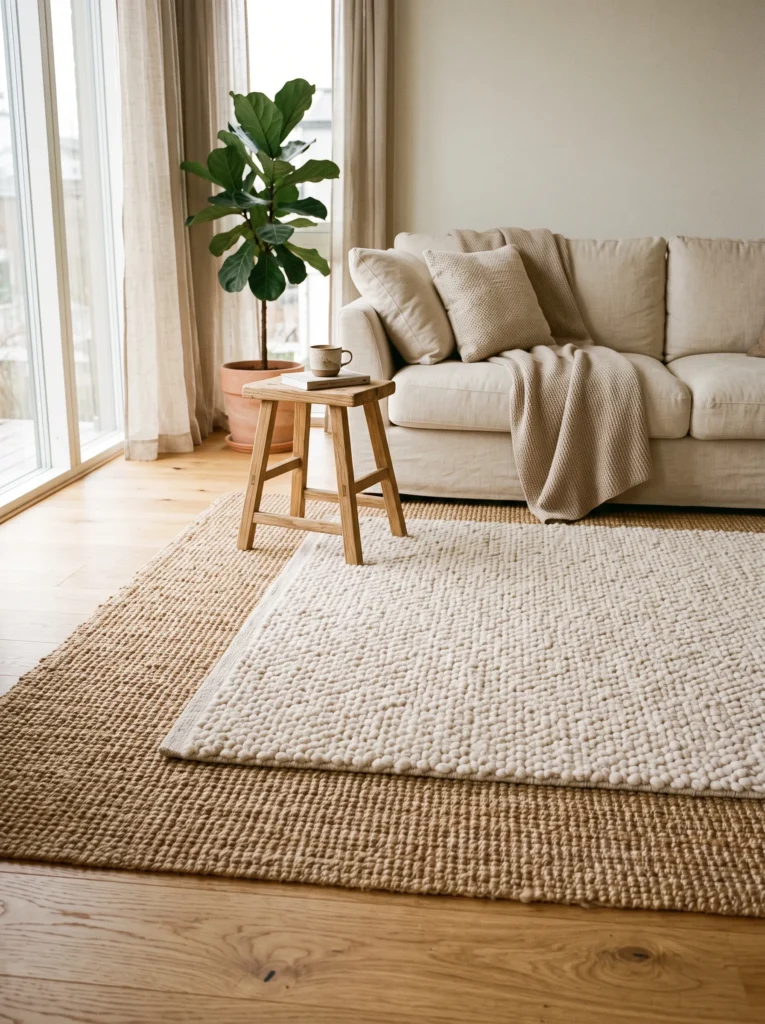
- Adds texture and definition to the floor without adding color
- Layering rugs makes a room feel more finished and intentional
- Works well for defining a seating area in open-plan spaces
- Combines durability of jute with softness of wool
- A simple, often-overlooked way to elevate the whole room
A layered neutral rug is one of the simplest updates that makes a Scandinavian living room feel complete, yet it’s often the last thing people think to add. Placing a smaller, softer wool rug on top of a larger jute or sisal one creates depth and warmth underfoot, while also helping define a seating area in open-plan homes. In my experience, this layering technique solves a common problem: rooms that look styled everywhere except the floor. It’s an easy, affordable detail that ties furniture, textiles, and wood tones together into one cohesive, grounded space.
I’ve noticed that this idea photographs particularly well for Pinterest, since the texture contrast between jute and wool adds visual interest even in a fully neutral color scheme. It also solves practical problems, since jute holds up well in high-traffic areas while the softer wool layer adds comfort where people sit or walk barefoot. This combination works in nearly any size room, from small apartments to larger family spaces. It’s a finishing touch that pulls the whole cozy Scandinavian living room together, often more effectively than adding another piece of furniture.
Final Thoughts on Your Cozy Scandinavian Living Room
Creating a cozy Scandinavian living room doesn’t require a complete overhaul, just a few thoughtful updates in the right places. From warm color palettes to layered textures and natural wood accents, each idea here offers a simple way to make your space feel calmer, warmer, and more inviting. I’ve seen how small changes like these can completely transform a room, often more than people expect. Pick one or two ideas that speak to you, try them in your own home, and notice the difference. Don’t forget to save this post on Pinterest and share it with anyone who could use a little cozy inspiration too.