18 Cozy Earthy Living Room Ideas That Feel Warm
Some rooms just feel warmer the moment you walk in — even before you notice a single piece of furniture. That’s not an accident. It’s material science working quietly in the background. These cozy earthy living room ideas are built around exactly that principle: warm-toned, tactile materials like clay, terracotta, and raw wood that absorb and reflect light differently than the cool, synthetic surfaces so many living rooms default to. I’ve noticed this firsthand in our own home — a single unglazed terracotta planter did more to warm up a corner than three throw blankets stacked on top of each other.
That’s the kind of small, practical discovery this post is built around. Whether you’re working with a full renovation or just want to shift the mood of one corner, these eighteen ideas cover real wall treatments, seating, lighting, and plants you can actually recreate — not vague inspiration, but grounded, buildable design.
Why Earthy Rooms Actually Feel Cozy
Most people think “earthy” just means adding brown and green to a room — but that’s not what actually makes a space feel warm. Coziness comes down to color temperature and material texture working together, not color choice alone. Warm-toned natural materials — unfinished wood, raw wool, hand-thrown clay, matte terracotta — absorb and reflect light differently than cool, synthetic surfaces do, which is why a room built from genuinely tactile materials feels grounded even without heavy layering or clutter.
I noticed this firsthand in our own sunroom, where a single unglazed terracotta planter did more to warm the space than three throw blankets ever did. A living room feels earthy when its materials are warm to the touch, not just warm in color. This post breaks down eighteen real, fully-styled ways to build that feeling — room by room, material by material.
1. Terracotta Plaster Retreat
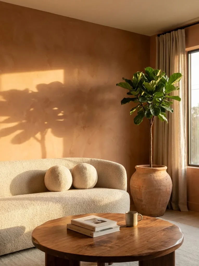
- Walls: hand-troweled lime plaster in warm terracotta, softly variegated texture
- Seating: curved bouclé sofa in oat cream, low rounded arms
- Coffee table: round live-edge walnut with a raw, unsealed edge
- Lighting: brass floor lamp with a linen shade, 2700K bulbs, plus twin wall sconces
- Rug: chunky wool rug in cream with a rust-toned fringe
- Wall decor: three hand-glazed ceramic plates in rust and umber
- Plants: fiddle leaf fig (Ficus lyrata) in an unglazed terracotta pot
- Hardware: aged brass throughout
Why this works: a hand-troweled plaster wall scatters light instead of reflecting it flatly, which is what makes a terracotta room feel warm before any furniture is even added.
Lime plaster is one of the oldest wall treatments in construction, and it’s still one of the warmest for a simple reason: its slightly uneven, hand-troweled surface catches and scatters light instead of reflecting it flatly, the way painted drywall does. That subtle texture shift is what gives a terracotta wall its warmth, even before a single piece of furniture goes in. Paired with a round, live-edge walnut table and a low bouclé sofa in soft cream, the room reads as genuinely tactile rather than staged, since rough plaster, smooth wood grain, and looped fabric each catch light in their own way.
My husband has applied lime plaster on renovation jobs where clients wanted texture without pattern, and he always tells me the same thing: the trowel marks matter as much as the color. Uneven, hand-finished plaster reads as intentional, while a flat, roller-applied terracotta paint can look more like an accent wall than a material choice. That distinction is subtle in photos but obvious in person. In our own front room, that same plaster texture is what made guests reach out and touch the wall before they even sat down — it simply feels warmer than it looks.
2. Rust Velvet Reading Nook
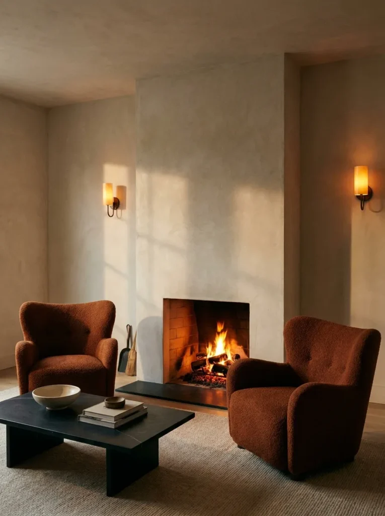
- Walls: warm taupe matte paint with a raw plaster fireplace surround
- Seating: pair of rust bouclé armchairs, camelback silhouette
- Coffee table: honed black soapstone, rectangular, low profile
- Lighting: amber-toned wall sconces plus a working fireplace for evening glow
- Rug: wool flatweave in a rust-and-cream stripe
- Wall decor: a single woven jute wall hanging, natural undyed fiber
- Plants: snake plant (Dracaena trifasciata) in an aged bronze pot
- Textiles: olive linen pillows, mohair throw in warm chocolate
- Hardware: aged bronze
Why this works: firelight and amber bulbs both sit at the warm end of the color spectrum, which is why a room with a working fireplace feels cozier at night than the exact same room lit with cool white light.
I still remember the first time I saw a rust bouclé chair pulled up next to a raw plaster fireplace surround — it was in a client’s 1970s ranch home we’d helped renovate, and the combination stopped me mid-conversation. The rounded camelback silhouette softened the boxy stone hearth, and the rust tone picked up the warm undertones already hiding in the plaster. That pairing became one of my favorite earthy combinations because it proves a room doesn’t need dozens of elements to feel finished — sometimes two strong, warm-toned pieces placed near a real light source do more work than an entire matching set.
A working or gas fireplace changes the mood of a room after dark in a way lamps alone can’t replicate, since actual flame flickers and shifts color temperature slightly as it burns. Black soapstone is a smart coffee table choice here because it’s naturally heat-resistant and won’t discolor near a hearth the way lighter woods sometimes do over years of use. Layer in a rust-and-cream striped wool flatweave rug and a single jute wall hanging, and the whole corner feels intentionally collected rather than purchased as a set — grounded, textural, and genuinely lived-in.
3. Olive and Clay Layered Corner
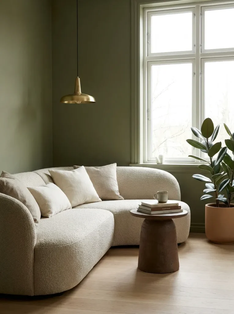
- Walls: matte olive green paint, flat finish
- Seating: curved bouclé sectional in warm oat
- Coffee table: hand-thrown clay pedestal table, matte umber glaze
- Lighting: brass pendant overhead plus soft overcast daylight from an unshaded window
- Rug: berber wool rug in warm taupe with subtle diamond weave
- Wall decor: a small gallery of botanical prints in walnut frames
- Plants: rubber plant (Ficus elastica) in a matte clay pot
- Textiles: rust bouclé pillows, umber linen throw
Why this works: pairing a cool-leaning wall color like olive with warm-toned wood, clay, and wool keeps the room from tipping into either “cold and moody” or “flat and beige.”
Olive green sits closer to the cool end of the earthy spectrum, so it needs deliberate warm-toned partners to keep a room from feeling somber rather than grounded. A hand-thrown clay pedestal table in a matte umber glaze does exactly that, adding both warmth and a slightly imperfect, handmade quality that a mass-produced table can’t match. The curved bouclé sectional in oat softens the room’s straight architectural lines, while a berber wool rug underfoot adds quiet texture without introducing another competing color. Together, these pieces balance each other rather than fighting for attention.
I’ve noticed that olive rooms often get styled with too much matching brass and end up feeling more like a showroom than a home. In this corner, I’d rather see one brass pendant doing the lighting work overhead while walnut-framed botanical prints and a matte clay pot carry the rest of the warmth. Botanicals also happen to be one of the easiest ways to reinforce an earthy palette honestly, since real plants introduce genuine, living color variation that no painted accent wall can fully replicate.
4. Sun-Baked Clay Alcove
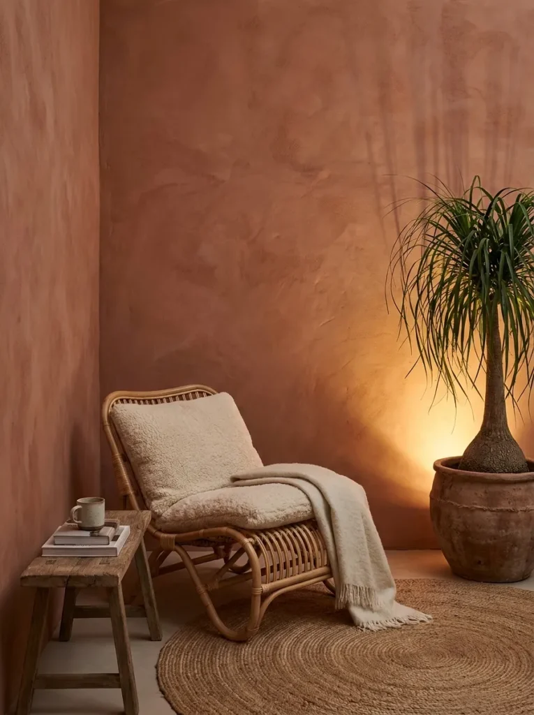
- Walls: warm limewash in sun-baked clay, subtle cloudy variegation
- Seating: natural rattan lounge chair with a chunky cream wool cushion
- Coffee table: low reclaimed teak bench-style table, worn patina
- Lighting: woven rattan pendant overhead, 2700K bulb, plus a floor-level uplight washing the wall
- Rug: jute rug in natural tan, tight herringbone weave
- Wall decor: an arched mirror in an aged bronze frame
- Plants: ponytail palm (Beaucarnea recurvata) in a raw clay pot with visible thumbprints
- Textiles: rust linen cushion, warm chocolate mohair throw
- Hardware: aged bronze
Why this works: limewash paint has a naturally uneven, chalky finish that shifts subtly with the light throughout the day, giving a clay-toned wall more visual depth than a flat matte paint ever could.
Limewash is one of the oldest natural wall finishes still used today, and its slightly chalky, breathable texture is exactly what makes it read as warmer than modern matte paint. In this alcove, that clay-colored limewash becomes the backdrop for a natural rattan chair and a low reclaimed teak table, both chosen for their worn, slightly imperfect surfaces. A floor-level uplight washing across the textured wall at night turns a simple corner into something genuinely dramatic, catching every subtle ripple in the limewash finish. It’s a small lighting trick that photographs beautifully and costs almost nothing to set up.
I’ve styled a version of this alcove for a client who wanted her reading corner to feel like a retreat, not an afterthought, and the raw clay pot with visible thumbprints ended up being the detail every visitor asked about. Handmade pottery carries small imperfections that mass-produced ceramics simply can’t replicate, and those imperfections are what make a room feel collected over time rather than bought in a single trip. Pairing that pot with a ponytail palm — a plant that thrives on genuine neglect — keeps the whole corner low-maintenance despite how intentional it looks.
5. Chocolate Leather Reading Den
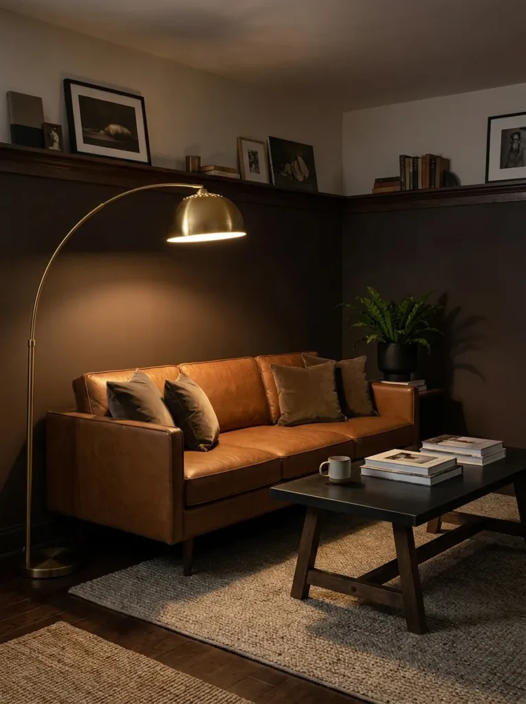
- Walls: deep warm chocolate paint, matte finish, lower third only with a picture-rail molding
- Seating: cognac leather sofa, low tuxedo silhouette
- Coffee table: blackened steel and oak trestle table
- Lighting: an oversized brass arc floor lamp, 2700K warm bulb
- Rug: flatwoven wool rug in warm rust and cream ikat pattern
- Wall decor: a large framed botanical illustration in a black frame
- Plants: bird’s nest fern (Asplenium nidus) in a matte black pot
- Textiles: olive velvet lumbar pillow, chunky cream throw
- Hardware: matte black
Why this works: a cognac leather sofa develops richer, warmer patina over years of use, which is exactly the opposite of how synthetic upholstery ages — it fades and flattens instead of deepening.
Leather is one of the few upholstery materials that genuinely improves with age, picking up small creases and a richer patina exactly where it gets used most. That quality makes a cognac leather sofa feel like an investment piece rather than a trend purchase, and it anchors this den with real substance against the deep chocolate lower walls. A blackened steel and oak trestle table adds an industrial edge that keeps the room from feeling overly soft, while the picture-rail molding gives the paint color a clean architectural stopping point instead of running wall to wall.
My husband’s crews use picture-rail molding often in older Austin homes with plaster walls, since it lets a bold color like deep chocolate stay contained to the lower portion of a wall without overwhelming the room or requiring a full repaint if the upper wall gets damaged. It’s a practical construction detail that also happens to look intentional and layered. Finished with a rust-and-cream ikat rug and a single black-framed botanical print, this den reads as confidently masculine without tipping into anything cold or sterile.
6. Rust Window Seat Nook
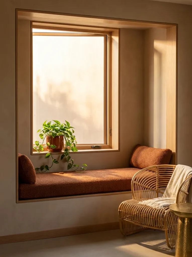
- Walls: warm taupe paint, flat finish, with a built-in window seat
- Seating: built-in bench with a rust bouclé cushion, plus one rattan accent chair
- Coffee table: small round hammered brass side table
- Lighting: natural golden-hour light through an unshaded window, plus a single rattan sconce
- Rug: wool dhurrie rug in warm rust and taupe stripes
- Wall decor: a row of three small hand-thrown bud vases on the window ledge
- Plants: trailing pothos (Epipremnum aureum) in a rust-glazed pot on the ledge
- Textiles: umber linen cushion, cream boucle lumbar pillow
- Hardware: unlacquered brass
Why this works: a built-in window seat pulls natural light down to seating level instead of letting it stay overhead, which makes even a small nook feel sun-warmed for most of the day.
A window seat does something most furniture arrangements can’t: it puts the coziest spot in the room directly in the path of natural light, rather than pushing seating against a shadowed wall. In this nook, warm taupe walls and a rust bouclé cushion pick up that daylight and hold onto its warmth even as the light shifts through the afternoon. A small hammered brass side table adds just enough texture and shine to catch stray light without competing with the window itself, and a single rattan accent chair gives the space a second seat for reading together.
I’ve noticed trailing pothos does something specific in window nooks that other plants don’t: its vines naturally drape and soften a hard window ledge edge within a few months of growth, no training or pruning required. That’s an easy win for anyone who wants their earthy nook to feel established quickly rather than freshly decorated. Paired with three small hand-thrown bud vases lined along the ledge, this corner becomes the kind of spot people gravitate toward without anyone directing them there — genuinely sun-warmed, quietly styled, and easy to recreate.
7. Curved Adobe Lounge
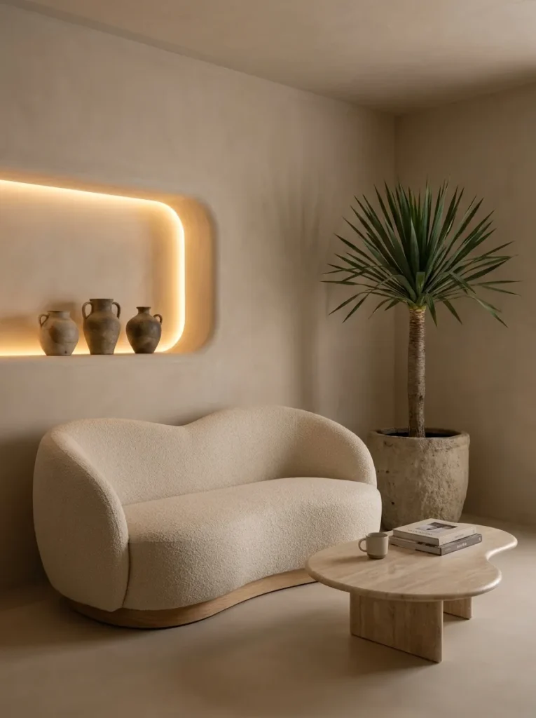
- Walls: micro-cement in warm adobe clay, smooth troweled finish with soft rounding at corners
- Seating: curved petal-shaped sofa in warm oat bouclé, no visible legs
- Coffee table: honed travertine, organic kidney shape
- Lighting: recessed cove lighting behind a plaster niche, plus a sculptural brass arc lamp, 2700K
- Rug: flatweave wool in warm sand, no pattern
- Wall decor: a single arched plaster niche housing three hand-thrown vessels
- Plants: dragon tree (Dracaena marginata) in a raw stoneware pot, cylindrical
- Textiles: rust bouclé throw pillow, single cream mohair throw
- Hardware: unlacquered brass
Why this works: rounding a room’s hard edges — walls, furniture, niches — softens how light travels across a space, which is part of why curved, organic-modern rooms read as calmer than boxy ones with the same color palette.
Curved architecture has been shown to influence how relaxed people feel in a room, since the brain processes rounded forms with less visual friction than sharp angles. That’s the quiet logic behind this lounge: the petal-shaped sofa, the kidney-shaped travertine table, and the rounded plaster niche all soften the adobe-toned walls into something that feels intentional rather than trendy. Recessed cove lighting tucked into the niche adds a soft glow at night without a single visible fixture, which keeps the whole room feeling sculptural and uncluttered — more like a quiet retreat than a styled photo set.
I designed a version of this lounge for our own reading corner last year, and the plaster niche ended up being the detail every guest commented on first. It’s a simple architectural carve-out, but it gives hand-thrown pottery a proper place to live instead of crowding a shelf. My husband’s crew built the niche with a slight radius at the top rather than a hard square cut, and that small rounding is what makes it look current instead of like a builder-grade cutout. Small structural choices like that are often what separates a genuinely modern earthy room from a dated one.
8. Cinnamon Bouclé Modular Corner
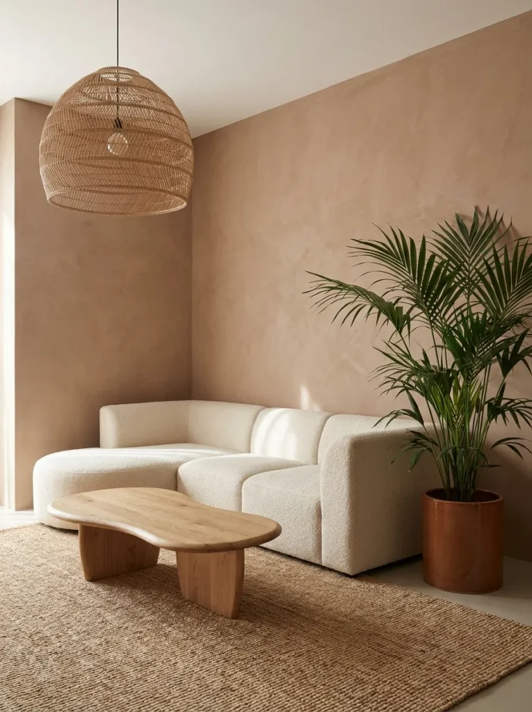
- Walls: micro-cement in warm cinnamon, ultra-smooth finish
- Seating: modular sectional in chunky cream bouclé, low and armless
- Coffee table: sculptural solid oak block, organic freeform shape
- Lighting: a single oversized paper-and-rattan pendant, warm 2700K glow
- Rug: undyed wool bouclé rug, cream, no pattern
- Wall decor: none — the cinnamon wall itself is the focal feature
- Plants: parlor palm (Chamaedorea elegans) in a matte cinnamon-glazed pot
- Textiles: warm chocolate lumbar pillow, single olive linen throw
- Hardware: brushed bronze
Why this works: an unadorned, richly colored wall reads as more current than a gallery wall, because it lets a single saturated tone do the visual work instead of competing decorative elements.
Restraint is what separates a genuinely modern earthy room from a busier, more collected look — and that’s exactly the idea behind this corner. A single cinnamon micro-cement wall, left completely bare, becomes the room’s whole personality, while the modular bouclé sectional and freeform oak coffee table stay quiet and low to let that color breathe. This is the kind of room that photographs well precisely because there’s little competing for attention: one wall, one texture, one warm neutral rug underfoot. It’s earthy minimalism rather than earthy maximalism, and it feels distinctly 2026 rather than borrowed from an older decade.
In my experience, people are often afraid to leave a bold wall color bare, assuming it needs art to feel finished. But a wall this saturated doesn’t need help — it needs space around it. The sculptural oak coffee table, left unfinished and slightly irregular in shape, adds just enough organic texture without introducing a second competing material story. A single parlor palm in a matching cinnamon-glazed pot ties the greenery back into the wall color instead of contrasting against it, which keeps the whole room feeling calm and cohesive.
9. Walnut Arch Reading Corner
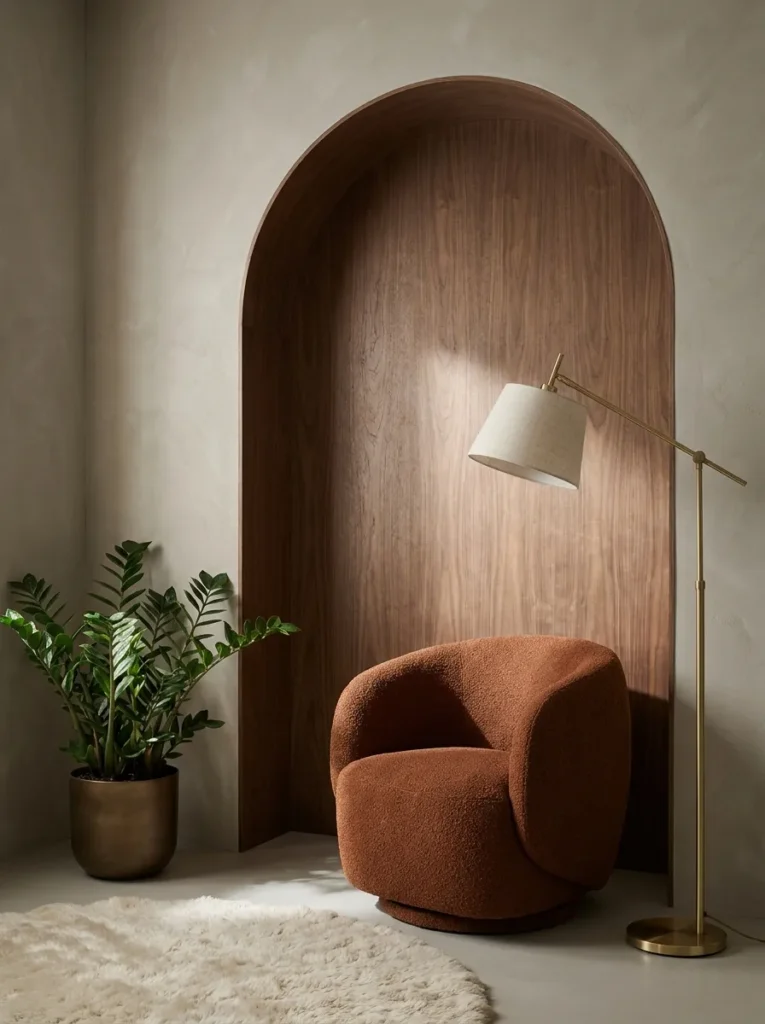
- Walls: warm greige paint, flat finish, with a full walnut wood-paneled arch built into the corner
- Seating: single sculptural bouclé lounge chair in rust, curved swivel base
- Coffee table: none — a small round brass side table instead
- Lighting: a slim brass floor lamp with a linen drum shade, 2700K
- Rug: small jute round rug, natural tan
- Wall decor: the walnut arch itself, left completely unadorned
- Plants: ZZ plant (Zamioculcas zamiifolia) in a warm bronze pot
- Textiles: single cream mohair throw draped over the chair arm
- Hardware: unlacquered brass
Why this works: a curved architectural arch built from natural wood grain does something flat drywall can’t — it changes how light and shadow move across a corner throughout the day, adding quiet dimension without any extra decor.
This corner proves a room doesn’t need many pieces to feel complete — it needs one strong architectural gesture. The walnut-paneled arch, built directly into the corner, replaces what would typically be a gallery wall or a shelf of decor, letting the wood grain itself carry the visual interest. A single rust bouclé swivel chair with a curved base sits beneath it, paired with nothing more than a slim brass floor lamp and a small round side table. The restraint here is deliberate: fewer objects, more architectural texture, and a corner that reads as considered rather than sparse.
My husband’s team has built arched wood paneling like this into a few recent renovation projects, and he always notes that the wood grain direction matters more than most homeowners expect — vertical grain running with the curve reads as calmer than grain cut against it. That’s a small technical detail, but it’s the difference between an arch that looks custom-built and one that looks like an afterthought. Left completely unadorned, this walnut arch becomes the entire personality of the corner, proving that in a genuinely modern earthy room, architecture can replace decor entirely.
10. Umber Wood-Slat Gallery Wall
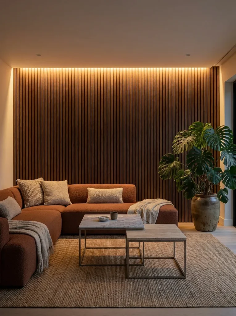
- Walls: vertical warm umber wood slats covering a full accent wall, floor to ceiling
- Seating: L-shaped sectional in warm clay bouclé, low profile
- Coffee table: nesting set of two, blackened steel frames with honed stone tops
- Lighting: integrated LED strip lighting behind the slat wall for ambient glow, plus a floor lamp with a rattan shade, 2700K
- Rug: wool rug in a subtle rust-and-umber tonal stripe
- Wall decor: the slat wall itself, plus one small framed botanical print on an adjacent wall
- Plants: monstera (Monstera deliciosa) in a large umber stoneware planter
- Textiles: olive linen pillow, rust bouclé lumbar pillow, chunky cream throw
- Hardware: blackened steel
Why this works: hidden LED lighting behind a slatted wood wall creates a soft, diffused glow rather than a direct light source, which is what gives a room genuine evening ambiance instead of flat, overhead brightness.
A slatted wood accent wall is one of the more versatile ways to add texture without committing to a bold paint color, and running LED strip lighting behind it turns a simple material choice into a genuine lighting feature after dark. That hidden glow washes softly across the room rather than pointing directly at anything, which is why slat walls photograph so well in evening shots — the light seems to come from the wall itself. Paired with a low L-shaped sectional in clay bouclé and nesting stone-topped tables, this setup covers a full living room’s seating and storage needs without feeling crowded or over-furnished.
I’ve seen this exact wood-slat treatment used in a few Austin builds my husband’s crew worked on, and the detail that consistently gets requested is warm-dimming LED strips rather than standard white ones — the difference in mood between a 2700K warm glow and a cooler 4000K strip is dramatic once the sun goes down. A large monstera in an umber stoneware planter anchors the opposite corner, its broad leaves catching that same ambient light and adding a living, ever-changing texture that no static decor piece can replicate.
You’ll Also Love: 23 Earthy Minimalist Bedroom Ideas for a Serene Space
11. Rust and Stone Open-Plan Layout
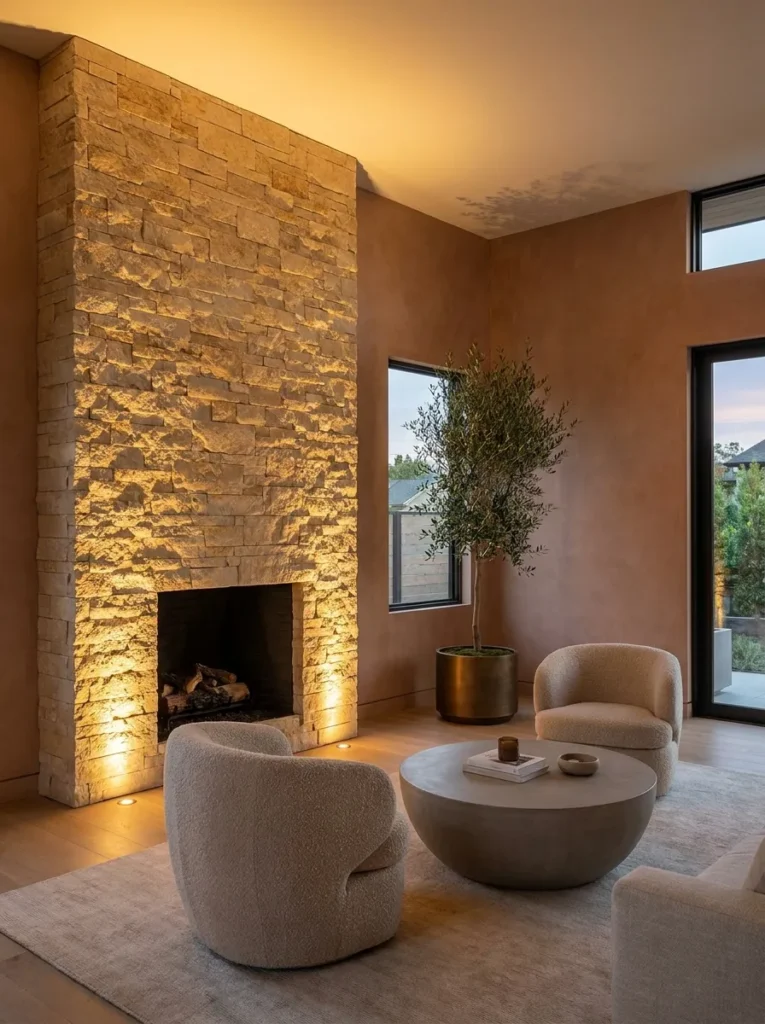
- Walls: warm limewash in soft rust, paired with a full stacked-stone fireplace surround in warm buff tones
- Seating: two facing bouclé armchairs in oat, plus a low rust velvet bench
- Coffee table: round poured-concrete table with a warm sand tint
- Lighting: a linear brass chandelier over the seating area, plus floor-level uplights along the stone surround
- Rug: large jute-wool blend rug in natural tan, layered under a smaller vintage-style rust runner
- Wall decor: a large abstract textile wall hanging in rust and cream
- Plants: olive tree (Olea europaea) in a tall bronze floor planter
- Textiles: umber linen cushions, cream bouclé lumbar pillows, wool throw in warm chocolate
- Hardware: aged brass
Why this works: choosing a warm buff-toned stacked-stone fireplace surround instead of the more common cool gray sets a warmer tone for the entire open-plan room, since that single material choice influences how every other surface around it reads.
Most stacked-stone fireplace surrounds use cool gray stone by default, but choosing a warm buff-toned stone instead is one of the simplest ways to make an entire open-plan room read as earthy rather than industrial. That single material choice sets the tone for this whole layout, letting the rust limewash walls and oat bouclé armchairs feel like a natural extension of the fireplace rather than a separate design decision. Layering a jute-wool rug under a smaller vintage-style runner adds visual depth underfoot, a trick that works especially well in larger open-plan rooms where a single flat rug can look sparse.
My husband always tells clients that stone color matters more than stone texture when warmth is the goal — a rough-cut gray stone will still read cooler than a smooth buff-toned stone, regardless of how much texture it carries. That’s a detail most homeowners don’t think to ask about until they see the wrong tone installed. A tall olive tree in a bronze floor planter softens the stone’s hard lines, and floor-level uplights along the surround turn the whole fireplace wall into a genuine evening focal point rather than something only used in winter.
12. Clay and Cane Layered Seating Wall
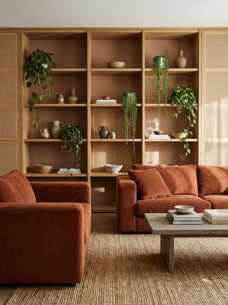
- Walls: matte clay-toned paint, with a built-in floor-to-ceiling caned-wood display shelf
- Seating: deep-seated sofa in rust corduroy, boxy modern silhouette
- Coffee table: rectangular reclaimed pine table with a driftwood-gray wash
- Lighting: shelf-integrated puck lighting plus a floor lamp with a linen shade, both 2700K
- Rug: flatweave wool rug in warm terracotta and cream checkerboard
- Wall decor: the caned shelving itself, styled with ceramics and books rather than framed art
- Plants: trailing string of pearls (Curio rowleyanus) on a high shelf, plus a birds of paradise (Strelitzia nicolai) in a clay floor pot
- Textiles: olive bouclé pillow, rust corduroy lumbar pillow
- Hardware: warm brass
Why this works: caned wood paneling lets light pass through it slightly, which softens the visual weight of a full built-in wall in a way solid wood paneling can’t.
A full floor-to-ceiling shelving wall can easily start to feel heavy in a smaller living room, which is exactly why caned wood panels — rather than solid wood — make such a difference here. The open weave lets light filter through in small dappled patterns, softening what would otherwise be a dense, closed-off feature. Styled with ceramics, books, and small trailing plants instead of framed art, this wall becomes a living, evolving display rather than a static decoration. A boxy rust corduroy sofa grounds the room with real substance, while a driftwood-gray reclaimed pine table keeps the palette from tipping too far into warm without any cooler contrast.
I’ve noticed that caned furniture and wall panels have made a real comeback recently, and it’s not just nostalgia — the material genuinely photographs beautifully because it creates natural shadow patterns that shift throughout the day. A tall birds of paradise in a clay floor pot adds architectural height next to the shelving, while a trailing string of pearls on a higher shelf softens the hard shelf lines with movement. Together, these elements make the wall feel curated over time rather than installed all at once.
13. Chocolate Bouclé Sunken Lounge
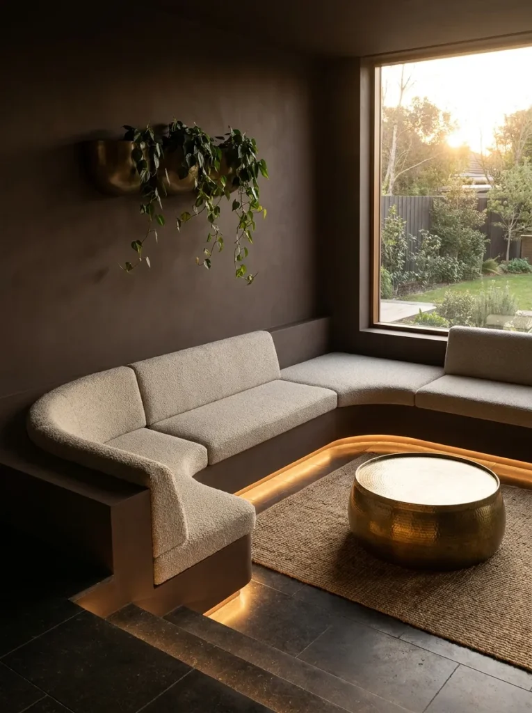
- Walls: deep chocolate matte paint on a single sunken-step wall, warm greige on remaining walls
- Seating: curved bouclé daybed-style sofa in warm oat, built into the sunken step
- Coffee table: low hammered brass drum table
- Lighting: recessed step lighting along the sunken edge, plus a brass floor lamp, 2700K
- Rug: wool bouclé rug in warm chocolate, filling the sunken area
- Wall decor: a large abstract ceramic relief sculpture in warm umber tones
- Plants: philodendron (Philodendron hederaceum) trailing from a bronze wall-mounted planter
- Textiles: rust linen pillow, cream mohair throw
- Hardware: unlacquered brass
Why this works: a sunken seating area physically lowers the eye line, which is a design trick that makes tall-ceilinged rooms feel more intimate without adding a single extra wall.
A sunken lounge step is an architectural move most homeowners never consider, but it solves a real problem in rooms with tall or vaulted ceilings that can otherwise feel cavernous. Dropping the seating area by even eight to ten inches changes the eye line enough to make the whole space feel more enclosed and intimate, without requiring a lower ceiling or an extra wall. The curved bouclé daybed built directly into that sunken step maximizes the effect, wrapping seating around the lowered floor rather than placing furniture on top of it. Recessed lighting along the step’s edge adds a subtle glow that also doubles as a safety feature after dark.
My husband has framed sunken living areas in a few custom builds, and he always flags the same consideration: proper drainage and subfloor support have to be planned before the step is framed, not after — it’s a structural decision, not just a design one. That’s a detail worth knowing if this idea inspires a renovation rather than a simple refresh. A large abstract ceramic relief sculpture on the upper wall adds sculptural texture at eye level, balancing the visual weight of the sunken step below it.
14. Warm Taupe Double-Height Reading Loft, Cozy Earthy Living Room Ideas
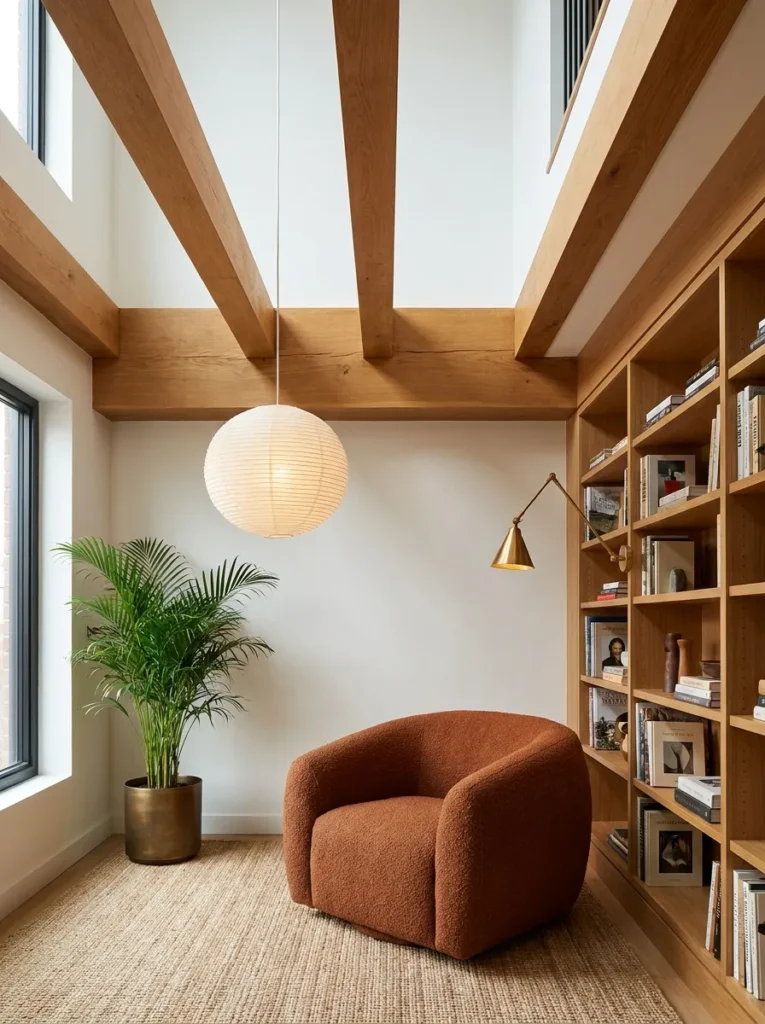
- Walls: warm taupe paint on the main level, exposed warm oak beams on the double-height ceiling
- Seating: oversized bouclé armchair in rust, plus a low floor cushion in olive linen
- Coffee table: small round rattan-and-oak side table
- Lighting: a dramatic oversized paper pendant hung low from the double-height ceiling, plus a brass reading sconce clipped to a bookshelf
- Rug: natural jute rug, round, layered under the armchair
- Wall decor: a full built-in floor-to-ceiling bookshelf in warm oak
- Plants: areca palm (Dypsis lutescens) in a tall bronze floor planter
- Textiles: cream bouclé throw, rust linen lumbar pillow
- Hardware: aged brass
Why this works: hanging one oversized pendant low in a double-height room pulls the whole space back down to a human scale without sacrificing any of the architectural drama above.
Double-height ceilings are dramatic, but they can also make a reading corner feel oddly disconnected from the room around it if the lighting stays overhead and distant. Hanging one oversized paper pendant low — well below the ceiling line, closer to where a person’s eye actually lands — pulls the whole space back down to a human scale without sacrificing any of the architectural drama above. That single lighting choice does more work here than a dozen smaller fixtures would. Paired with a floor-to-ceiling oak bookshelf and an oversized rust bouclé armchair, this loft corner feels grand and genuinely cozy at the same time.
A well-placed reading light matters more than a room’s overall brightness, since a single warm, close-range light source does more for comfort than broad overhead lighting ever can. I’ve styled a version of this corner for a friend’s home with soaring ceilings, and the brass reading sconce clipped directly to the bookshelf ended up being the most-used light in the entire house — practical, warm, and exactly where a hand reaches for it. An areca palm in a tall bronze planter fills the vertical space gracefully, softening the room’s height without competing with the exposed oak beams above.
15. Rust Boucle Conversation Pit Corner
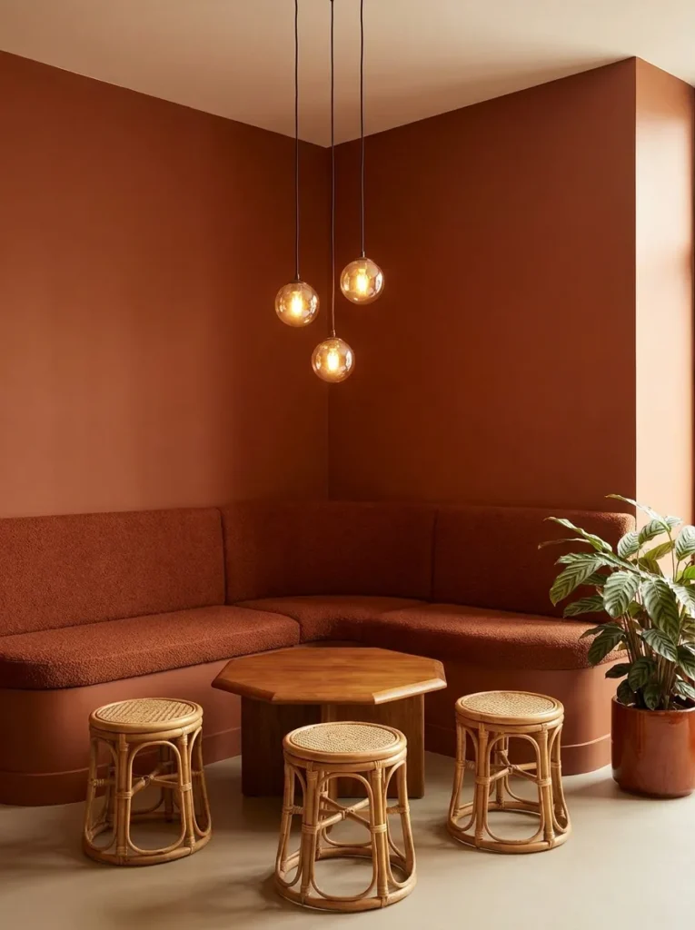
- Walls: warm rust matte paint, with a curved built-in bench seat wrapping the corner
- Seating: curved built-in bench in rust bouclé, plus two loose rattan accent stools
- Coffee table: low octagonal reclaimed teak table
- Lighting: a cluster of three small pendant lights at varying heights, warm 2700K glow
- Rug: wool rug in a warm rust-and-cream tonal check
- Wall decor: a curved rattan mirror above the bench
- Plants: calathea (Calathea orbifolia) in a matte rust-glazed pot
- Textiles: olive linen cushions along the bench, cream bouclé throw
- Hardware: brushed bronze
Why this works: a curved built-in bench that wraps a corner encourages face-to-face conversation more naturally than facing sofas do, since it removes the fixed distance a traditional sofa arrangement creates.
A curved bench built directly into a corner changes how people naturally gather in a room, since it removes the rigid, face-off arrangement that two facing sofas create. Guests tend to angle inward without thinking about it, which makes conversation feel easier and less formal. Upholstering that bench in rust bouclé keeps the whole corner soft to the touch, while a cluster of three small pendants at staggered heights adds visual interest overhead without a single large fixture dominating the space. A low octagonal teak table sits at the center, close enough to reach from any seat around the curve.
In my experience, corner benches like this one are one of the most requested layouts for smaller living rooms, since the built-in seating uses floor space more efficiently than two separate sofas ever could. A curved rattan mirror above the bench bounces light back into the room and visually extends the corner’s width, a simple trick for making a tight space read as more open. Finished with a calathea in a matte rust-glazed pot, this corner feels intimate, warm, and genuinely built for gathering rather than just for sitting.
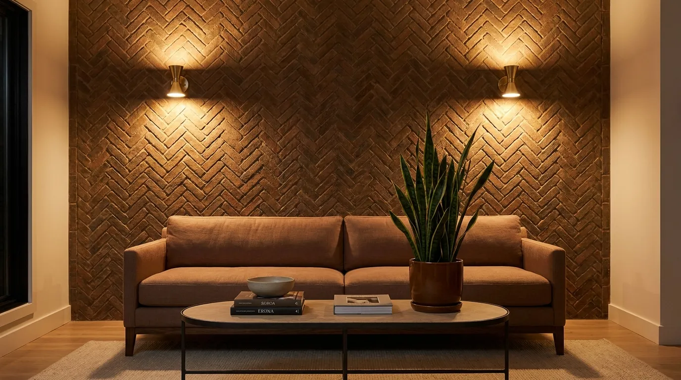
16. Umber Herringbone Brick Accent
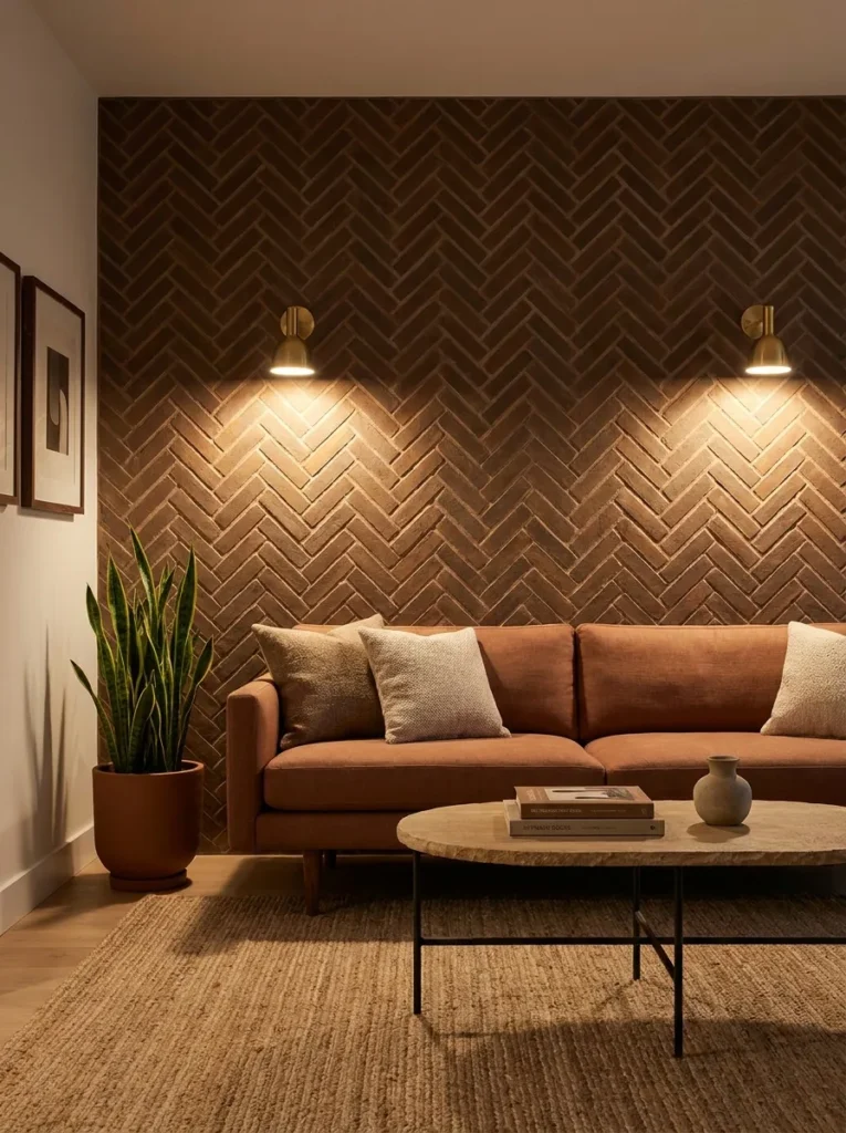
- Walls: thin herringbone-laid brick in warm umber, sealed matte, covering one full wall
- Seating: low-slung sofa in warm clay linen, tapered wood legs in walnut
- Coffee table: oval hand-forged iron table with a honed sandstone top
- Lighting: warm brass wall sconces flanking the brick wall, plus a floor lamp with a linen shade, 2700K
- Rug: wool rug in a soft rust ombré
- Wall decor: the brick wall itself, left unadorned
- Plants: snake plant (Dracaena trifasciata) in a matte umber pot, plus a small pothos on the side table
- Textiles: cream bouclé pillow, chunky olive throw
- Hardware: aged brass
Why this works: a herringbone brick pattern creates dozens of small shadow lines across a single wall, adding genuine visual texture without requiring any additional wall decor.
Thin brick veneer laid in a herringbone pattern is a material choice that does double duty: it reads as substantial and architectural, but it’s actually a lightweight veneer application that doesn’t require structural changes to install. The herringbone angle itself creates a subtle diagonal rhythm across the wall, and each small brick edge casts its own tiny shadow line, which is why this wall never needs additional art to feel finished. A low clay linen sofa with tapered walnut legs sits opposite, keeping the furniture visually light so the textured wall stays the room’s clear focal point.
My husband’s crews have installed thin brick veneer on a few recent projects, and he always notes that the mortar joint width matters as much as the brick color — wider joints read as more rustic, while tighter joints look cleaner and more current. That’s a detail worth specifying before installation begins, not after. An oval hand-forged iron table with a honed sandstone top adds another warm, handmade material into the mix, and a soft rust ombré rug ties the whole room together without introducing a competing pattern.
17. Warm Bronze and Boucle Reading Alcove
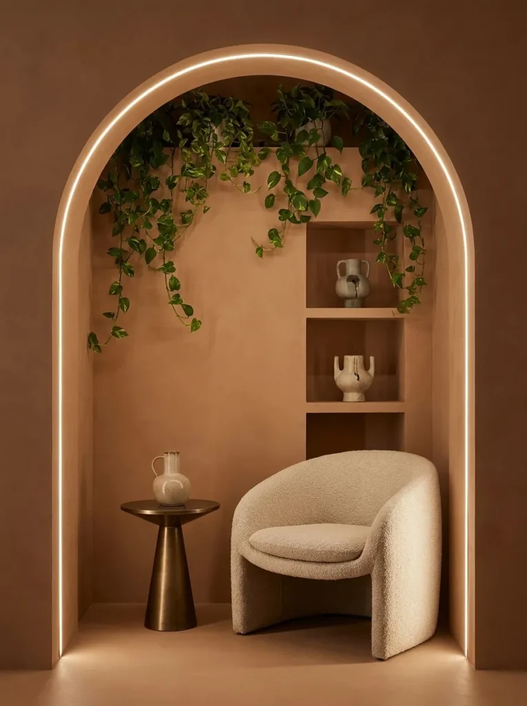
- Walls: warm sienna paint, flat finish, with a recessed arched alcove built into the wall
- Seating: single curved bouclé lounge chair in warm oat, positioned inside the alcove
- Coffee table: none — a small bronze pedestal side table instead
- Lighting: hidden LED lighting tracing the inside edge of the arch, plus a brass reading lamp clipped to the chair
- Rug: small round wool rug in rust
- Wall decor: the arched alcove itself, holding two hand-thrown ceramic vessels on integrated shelving
- Plants: trailing pothos (Epipremnum aureum) cascading from the top of the alcove
- Textiles: single umber linen cushion
- Hardware: unlacquered bronze
Why this works: a recessed arch built into a wall creates a natural frame around a single chair, giving even one piece of furniture the visual weight of a fully designed vignette.
A recessed arch does something a flat wall never can: it frames whatever sits inside it, turning a single lounge chair into a genuine focal point without needing extra furniture to fill the space around it. That’s the entire idea behind this alcove — one curved bouclé chair, one bronze side table, and a softly lit arch tracing warm LED light around its own edge. The integrated shelving inside the arch holds just two hand-thrown vessels, keeping the display minimal enough that the architecture itself stays the star rather than competing objects.
A recessed niche or arch built into an existing wall is one of the few structural upgrades that adds real value to a room without expanding its physical footprint at all. My husband has built several of these arched niches into renovation projects, and he notes that the curve at the top needs to be framed before drywall goes up — it can’t be added afterward without significant rework, which is why it’s worth planning early if a renovation includes one. Trailing pothos cascading from the top softens the arch’s hard edge with organic movement.
18. Rust and Raw Wood Split-Level Landing
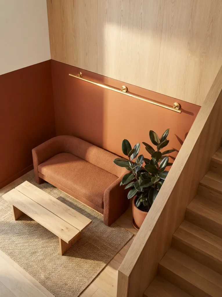
- Walls: warm rust paint on the lower half, raw white oak paneling on the upper half, divided by a simple wood reveal
- Seating: low modular daybed in warm clay bouclé, positioned at the split-level landing
- Coffee table: rectangular raw white oak bench-table, unfinished edges
- Lighting: a linear brass sconce mounted along the wood reveal line, plus recessed ceiling lights, 2700K
- Rug: natural jute-wool blend runner along the landing
- Wall decor: the material split itself, with one small framed abstract print on the oak paneling
- Plants: rubber plant (Ficus elastica) in a raw stoneware pot at the base of the stairs
- Textiles: olive bouclé cushion, rust linen throw
- Hardware: unlacquered brass
Why this works: dividing a tall wall into two distinct materials at a mid-height reveal line breaks up vertical scale, which keeps a split-level or stairwell-adjacent space from feeling like an awkward leftover area.
Split-level landings and stairwell-adjacent nooks are some of the most commonly wasted spaces in a home, often left bare simply because they’re architecturally awkward. Dividing the wall here into two distinct materials — rust paint below, raw white oak paneling above — gives the space its own clear identity instead of treating it as a hallway that happens to have a wall. A low modular daybed tucked into the landing turns unused square footage into an actual seating area, while the raw oak bench-table doubles as both a coffee table and a spot to set down a bag on the way up the stairs.
I’ve noticed that awkward transitional spaces like this one often get skipped entirely in design planning, but they’re some of the most rewarding corners to finish because the payoff is disproportionate to the effort. A linear brass sconce mounted right along the material reveal line accentuates that split intentionally, rather than leaving it as an unremarkable seam. A rubber plant at the base of the stairs adds a grounding, living element right where people naturally pass by multiple times a day.
Styling Principles for a Genuinely Cozy Earthy Living Room
Building an earthy living room isn’t about picking one brown paint color and calling it done — it’s about layering warm-toned materials that all respond to light the same way. The single biggest mistake people make is choosing warm colors but pairing them with cool, synthetic materials, which cancels out the coziness before it even has a chance to register. A terracotta wall next to a glossy black lacquer table will always feel more clashing than cohesive, no matter how well the colors technically coordinate on a swatch.
The fix is simple: build every room around natural, matte, and slightly imperfect materials — raw wood, hand-thrown clay, unlacquered metal, looped wool. These surfaces scatter and absorb light instead of bouncing it back sharply, which is the real mechanism behind why a room reads as “warm” rather than just “brown.” Vary your earthy tone room to room or zone to zone — terracotta in one corner, olive in another, rust somewhere else — but keep the material logic consistent throughout, and the whole space will feel intentional rather than accidental.
Frequently Asked Questions
What colors make a living room feel earthy? Terracotta, clay, rust, olive, warm taupe, umber, and warm chocolate are the core earthy tones. The key is choosing shades with a warm undertone rather than a cool or gray-leaning one, since warm undertones are what actually read as grounded and cozy.
What materials work best for a cozy earthy living room look? Unfinished or lightly sealed wood, wool, jute, linen, hand-thrown ceramics, and limewash or plaster wall finishes all reflect light in a softer, warmer way than synthetic or high-gloss materials, which is why they’re central to genuine earthy design.
Does earthy decor work in small living rooms? Yes — earthy tones and materials work especially well in small spaces because matte, textured surfaces don’t reflect harsh light the way glossy finishes do, which keeps a small room feeling warm and enclosed rather than sterile or cold.
What are budget-friendly ways to try an earthy living room look? Start with a single accent wall in a warm limewash or clay-toned paint, swap in one natural-fiber rug, and add a few hand-thrown or matte ceramic planters — these three changes alone shift a room’s entire mood without a full renovation.
What are the best plants for an earthy living room? Fiddle leaf figs, rubber plants, monstera, snake plants, and trailing pothos all pair well with earthy palettes, especially when potted in unglazed terracotta, matte stoneware, or bronze-toned containers that echo the room’s warm material story.
Can earthy decor feel modern instead of rustic? Yes — pairing earthy tones with clean-lined furniture, curved silhouettes, and restrained styling (rather than heavy layering or ornate details) creates a distinctly current, 2026-appropriate look rather than a dated rustic one.
Conclusion
A genuinely cozy earthy living room isn’t about matching every throw pillow to the same shade of brown — it’s about choosing materials that hold warmth honestly, whether that’s a hand-troweled plaster wall, a cognac leather sofa, or a single terracotta pot with visible thumbprints. I’ve seen how small changes like these can completely transform a space, often faster than people expect once they stop overthinking the color and start paying attention to texture.If one of these eighteen ideas caught your eye, save this post to Pinterest so it’s easy to find again, and try bringing just one warm material into your own living room this week — a plaster accent wall, a wool rug, a hand-thrown pot
. Share this with a friend who’s been wanting to warm up their space too. A cozy earthy living room is easier to build than it looks, one honest material at a time.