15 Cozy Modern Farmhouse Living Room Ideas
Farmhouse decor gets a bad reputation for feeling cluttered — one too many mason jars, one too many “Bless This Home” signs. But that’s not what farmhouse style was ever supposed to be. These 15 cozy modern farmhouse living room ideas strip the look back to what actually defines it: warm textures, black-and-white contrast, and rooms that feel gathered over time instead of bought all at once.
I’ve styled farmhouse spaces that fell flat because they leaned on trend pieces instead of principles, and I’ve seen the opposite work beautifully — a single black window grid or one exposed beam doing more for a room than a dozen accessories combined. My husband’s construction background has taught me which of these details are structural realities, not just decorating choices, and that’s shaped how I approach every idea here.
Whether you’re working with a full living room renovation or just want to swap in a few pieces, this list gives you complete, recreate-able scenes — not vague inspiration. Every idea includes the wall treatment, the furniture, the plants, and the one standout detail that makes it feel finished. Pin the ones that speak to you, and let your own space take shape one intentional choice at a time.
Why Modern Farmhouse Still Works
Most people think farmhouse style is about softness — worn wood, cozy textiles, a relaxed feel. But the real signature is contrast. The defining visual language of farmhouse design is high-contrast black-and-white, and that wasn’t a stylistic choice — it came from working farmhouses that used inexpensive white paint on wood surfaces and black iron hardware because those were simply the most durable, affordable finishes available at the time.
I noticed this firsthand when my husband retrofitted black steel window grids into a 1970s remodel — the black-and-white contrast did more to define the room than any furniture piece we brought in. Modern farmhouse design keeps that same black-and-white contrast principle but sharpens the silhouettes, trading ornate trim for cleaner lines. This post shows you how to get that warmth without the clutter.
1. Black-Framed Shiplap Wall
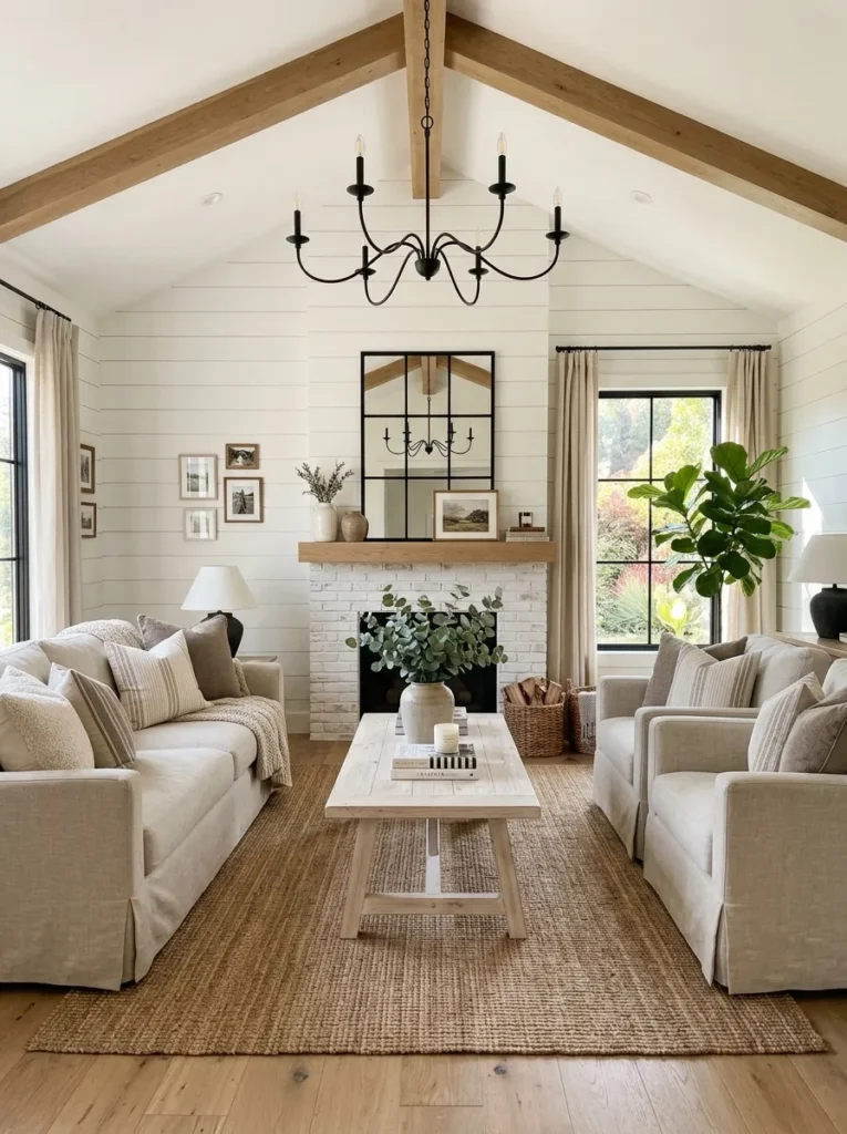
- Wall treatment: Horizontal shiplap, painted Benjamin Moore Simply White, tight tongue-and-groove reveal
- Seating: Slipcovered linen sofa in oatmeal, rolled arms, loose box cushions
- Coffee table: Whitewashed reclaimed pine trestle table, turned legs
- Lighting: Black wrought-iron chandelier, candle-style bulbs at warm 2700K
- Rug: Chunky jute rug in natural ivory, bound edges
- Wall decor: Black steel window-pane mirror mounted above the mantel as the visual anchor
- Plants: Fiddle-leaf fig (Ficus lyrata) in a matte black ceramic pot
- Textiles: Ticking-stripe pillows in navy and cream, one per cushion, not stacked
- Hardware: Black iron pulls on the console beneath the window
Why this works: The black window-pane mirror does the job an actual window would, pulling in the farmhouse’s signature black-and-white contrast without needing a structural change.
Shiplap gets used carelessly a lot — slapped on one wall without any real plan for the room around it. My husband always tells clients to leave a small expansion gap behind each board before painting, since solid wood shiplap shifts with Austin’s humidity swings and tight installs crack at the seams within a year. That detail matters more than people think. Done right, painted shiplap becomes the quiet backdrop that lets everything else — the black chandelier, the mirror, the ticking stripe — read as sharp and intentional instead of accidental.
What makes this particular room feel finished isn’t the shiplap itself, it’s the restraint around it. One black light fixture, one black mirror, one pot color — that’s the whole hardware story, repeated just enough to feel deliberate. I’ve styled shiplap walls where clients wanted to add three more black accents “for balance,” and it almost always tips into busy. The fiddle-leaf fig is the only living, changing element in the room, which is exactly why it works as well as it does against all that white.
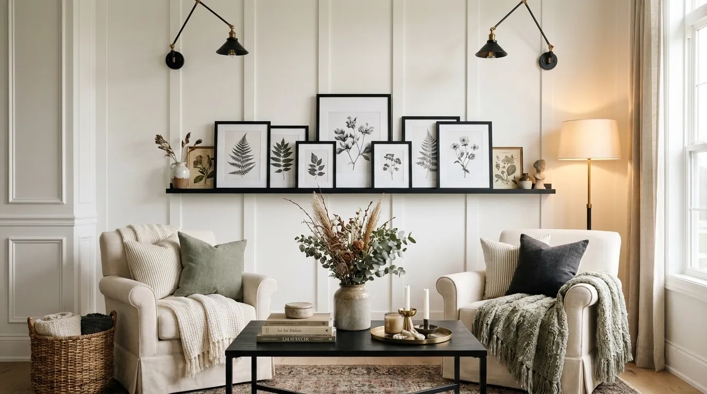
2. Open Shelving Display Wall
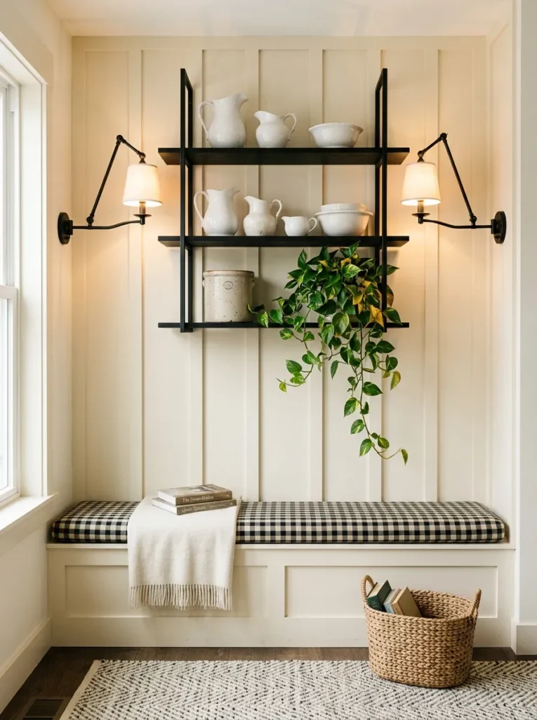
- Wall treatment: Board-and-batten, painted Farrow & Ball Wevet, batten spacing 16 inches on center
- Seating: Upholstered bench with removable cream cotton cushion, tapered black legs
- Coffee table: Round pedestal coffee table, painted matte black
- Lighting: Two black library sconces flanking the shelving, warm dimmable bulbs
- Rug: Flatwoven wool rug in oatmeal with a subtle herringbone weave
- Wall decor: Open black metal shelving styled with white ironstone pitchers and stacked linen
- Plants: Trailing pothos (Epipremnum aureum) in a vintage stoneware crock on the top shelf
- Textiles: Gingham cushion cover on the bench, used as the room’s only pattern
- Hardware: Black hinges and cup pulls on the cabinet below the shelving
Why this works: Open shelving styled with white ironstone reinforces the black-and-white contrast at eye level, so the room reads as farmhouse the moment you walk in, not just from the sofa.
Open shelving is where most farmhouse rooms go wrong, in my experience — people fill every inch with mason jars and signs until the wall looks cluttered instead of curated. The fix is simpler than it sounds: pick one material story and repeat it. Here, that’s white ironstone against black metal brackets, nothing else competing for attention. The trailing pothos softens the hard lines of the shelving without adding another color into the mix, and it’s a genuinely easy plant to keep alive in a room that gets indirect light most of the day.
Board-and-batten changes the proportions of a room in a way flat paint never does — the vertical battens draw the eye upward and make an average 8-foot ceiling feel taller than it is. Paired with a bench instead of a second sofa, this layout works especially well in a living room that also functions as an entry or reading spot. The gingham cushion is the single pattern moment in the whole space, which is exactly why it doesn’t feel busy.
You’ll Also Love:18 Cozy Earthy Living Room Ideas That Feel Warm
3. Exposed Beam Fireplace Surround
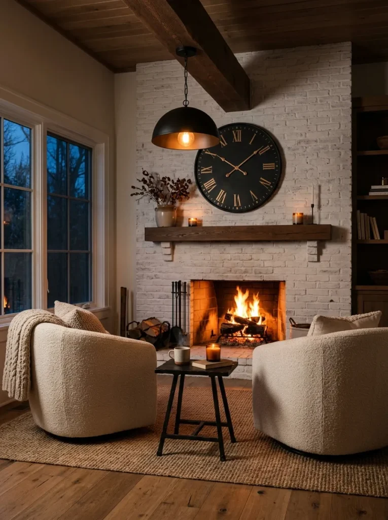
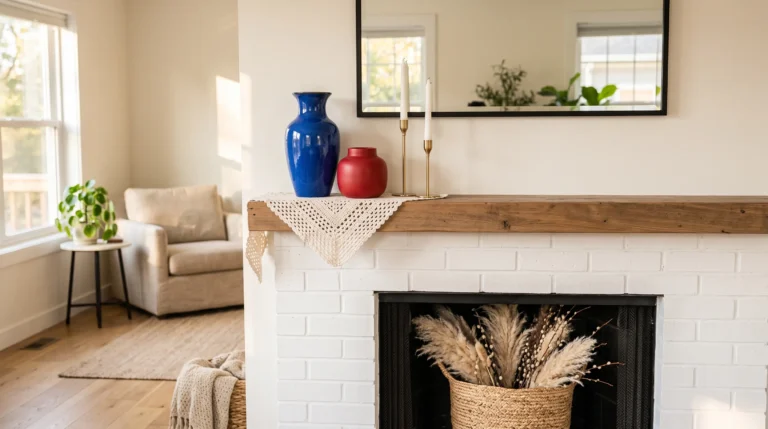
- Wall treatment: Whitewashed painted brick fireplace surround, flanking walls in flat white
- Seating: Two swivel accent chairs in cream boucle, black metal swivel base
- Coffee table: Black iron-and-wood trestle table, dark walnut top
- Lighting: Exposed structural beam overhead with a single black dome pendant
- Rug: Natural jute rug, undyed, layered under the chairs only
- Wall decor: Oversized vintage-style clock, black face, mounted above the mantel
- Plants: Snake plant (Sansevieria trifasciata) in a black cylinder pot beside the hearth
- Textiles: Cream linen throw draped over one chair arm, no pattern
- Hardware: Black iron fireplace tools, matte finish
Why this works: Exposed beams were structural before they were decorative — real farmhouses left them visible because boxing them in wasn’t worth the material or labor.
An exposed beam changes how a whole room feels, and it’s worth understanding before you commit to one. My husband has opened up more than a few dropped ceilings to find a perfectly good structural beam hiding underneath drywall, and clients are always surprised how much character it adds once it’s exposed and painted or left natural. If you’re working with a beam that’s purely decorative rather than load-bearing, it still needs proper blocking to look convincing rather than tacked-on. Either way, it gives the eye somewhere to travel besides straight ahead at the TV.
The whitewashed brick surround is doing quiet, important work here — it keeps the fireplace from becoming a red-brick focal point that fights with the black-and-white palette everywhere else in the room. Swivel chairs instead of a second sofa make the seating arrangement feel more like a real conversation nook, and they’re genuinely practical for a room where people want to face the fire one minute and each other the next. The oversized clock earns its size because nothing else on that wall competes with it.
4. Vintage Ladder Corner Vignette
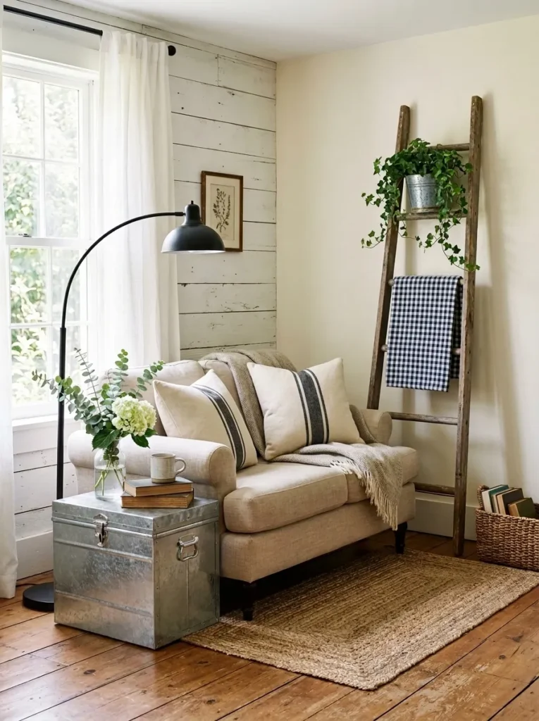
- Wall treatment: Lower half painted shiplap in soft white, upper wall in warm cream
- Seating: Slipcovered loveseat in natural linen, skirted base
- Coffee table: Galvanized metal and reclaimed wood trunk-style table
- Lighting: Black metal arc floor lamp beside the loveseat
- Rug: Chunky wool rug in undyed oatmeal
- Wall decor: Repurposed wooden ladder leaned in the corner, draped with a folded gingham blanket
- Plants: English ivy (Hedera helix) trailing from a galvanized metal bucket on the ladder’s top rung
- Textiles: Gingham throw blanket, folded rather than draped loosely
- Hardware: Black cabinet latches on the trunk-table’s hidden storage
Why this works: A repurposed ladder gives the corner height and function at once, standing in for wall art while doubling as a blanket rack — a detail lifted straight from real farmhouse practicality.
I found our own ladder at an estate sale outside Austin for twelve dollars, paint still chipping in places, and it’s been leaned in some corner of our house ever since. That’s the thing about a genuine vintage piece — it doesn’t need to be perfect to look intentional, it just needs a job to do. Here it’s holding a folded gingham blanket and a trailing ivy plant, which means it’s doing double duty as storage and as the room’s only real height element in a corner that would otherwise sit empty.
The galvanized trunk-table is the standout material choice in this room, and it’s a detail almost no one else uses well — most farmhouse coffee tables default to plain painted wood. Metal introduces a slightly industrial edge that keeps the space from feeling too soft or too sweet, especially next to the gingham. Ivy is an easy, forgiving plant for a corner that gets filtered light, and it will keep trailing further down the ladder’s rungs as it grows, which only improves the vignette over time.
5. Black Steel Window Grid Wall
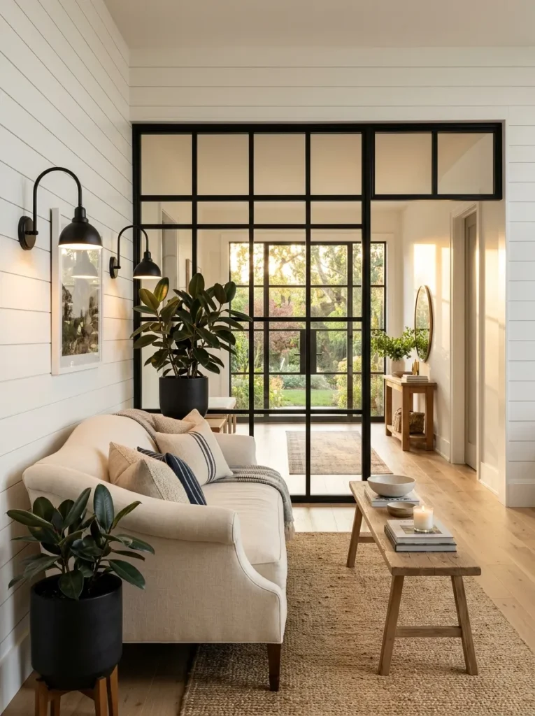
- Wall treatment: Painted white shiplap with a black steel-framed interior window grid separating the living room from an adjacent hallway
- Seating: Camelback-style sofa, cream linen slipcover, black turned wood feet
- Coffee table: Long painted white bench-style coffee table, tapered legs
- Lighting: Black gooseneck sconces mounted directly on the window grid frame
- Rug: Wool and jute blend rug, natural with a faint black stripe border
- Wall decor: The window grid itself is the decor — no additional art needed on that wall
- Plants: Rubber plant (Ficus elastica) in a black concrete pot near the window’s base
- Textiles: Cream linen throw pillows, unpatterned, kept to two per sofa end
- Hardware: Black steel mullions, matte finish, visible screws left exposed intentionally
Why this works: An interior black steel window grid brings the exact contrast principle that defines farmhouse style into a room that has no actual window to work with.
Interior window grids are one of the most requested retrofits my husband’s crew gets from farmhouse-style clients, and for good reason — they solve a real problem. A lot of open-concept homes have a living room with one solid wall and no natural light source nearby, and a steel-framed interior window lets light and sightlines pass through without sacrificing the wall for storage or art. Structurally, it needs proper header support if it’s cut into a load-bearing wall, which is worth confirming with a contractor before anyone gets attached to the idea.
Visually, this is one of the strongest black-and-white contrast moments you can build into a farmhouse living room, and it does the work of a piece of art without needing one. The exposed black mullions catch light differently throughout the day, which keeps the wall from ever looking flat or static. Pairing it with a camelback sofa instead of the more expected slipcovered rolled-arm style adds just enough shape variation to keep the room from repeating a silhouette you’ve already seen elsewhere.
6. Whitewashed Beam Ceiling Nook
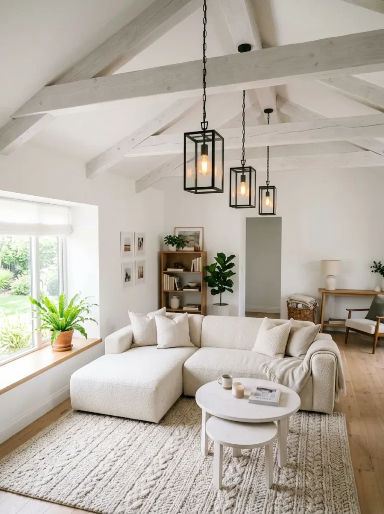
- Wall treatment: Flat painted white walls, no shiplap, letting the ceiling carry the texture
- Seating: Deep-seated cream bouclé sectional, block feet stained ebony
- Coffee table: Two round nesting tables, whitewashed oak, different heights
- Lighting: Row of three black lantern pendants strung along the exposed ceiling beams
- Rug: Oversized natural wool rug, cable-knit texture, oatmeal
- Wall decor: A single large botanical line-art print in a thin black frame
- Plants: Bird’s nest fern (Asplenium nidus) in a whitewashed wood planter box on the windowsill
- Textiles: Cream waffle-weave throw folded over the sectional’s arm, no stripe or check pattern in this room
- Hardware: Black ceiling mounts for the pendant lights, the only black hardware in the space
Why this works: Whitewashed beams read lighter and airier than stained wood beams, which is why they suit a farmhouse room built around a bright, soft palette rather than a dark, rustic one.
This is the one room in the group that leans almost entirely white and cream, with black held to a single detail — the pendant mounts — instead of spread across furniture and hardware the way it is elsewhere. I did this deliberately in a client’s sunroom-adjacent living room a couple years back, and it turned out to be one of the most photographed rooms I’ve styled, precisely because it feels calm rather than busy. Three lanterns strung along the beam line give the ceiling a rhythm that a single central fixture never could.
The bird’s nest fern is a small but intentional plant choice — its wide, ruffled leaves read as more architectural than a typical trailing plant, and it holds its shape well on a windowsill that gets bright but indirect light most of the day. Nesting tables instead of one solid coffee table give the sectional room to breathe and make the space easier to rearrange for movie nights or larger gatherings, which matters more in a lived-in home than most decor advice accounts for.
7. Black-Framed Gallery Ledge
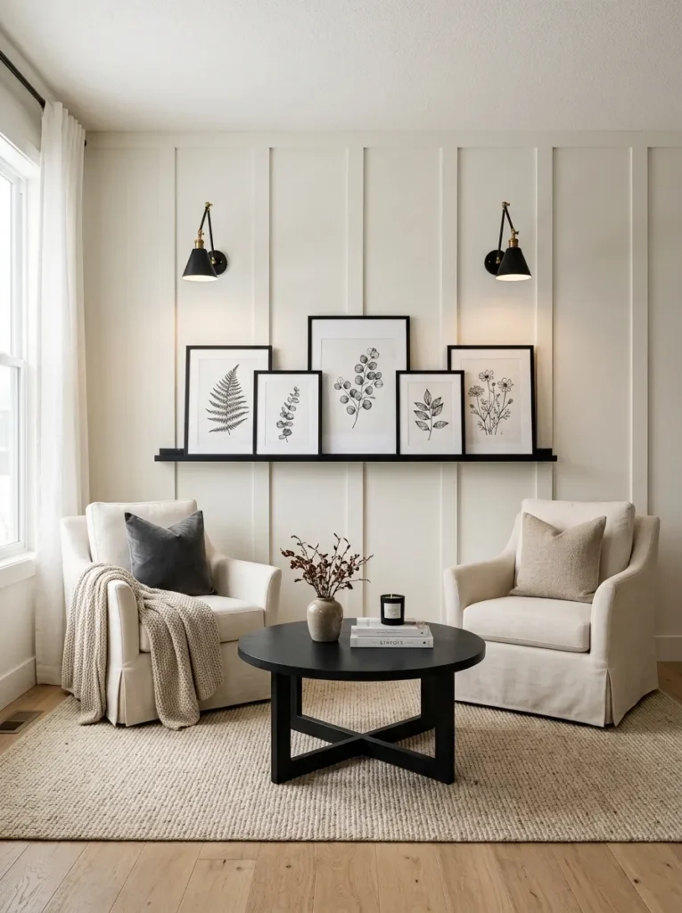
- Wall treatment: Board-and-batten painted Benjamin Moore White Dove, batten spacing wider than the Open Shelving idea, at 20 inches on center for a bolder look
- Seating: Two slipcovered armchairs in cream cotton duck canvas, skirted to the floor
- Coffee table: Square painted white coffee table with a black iron X-base
- Lighting: Black articulating wall sconce beside each armchair
- Rug: Natural sisal rug, tightly woven, neutral tone
- Wall decor: A floating black picture ledge running the width of the wall, styled with mismatched black-and-white framed botanical prints, leaned rather than hung
- Plants: Maidenhair fern (Adiantum) in a small black pot on the picture ledge
- Textiles: Black-and-white ticking stripe on one throw pillow only, everything else solid
- Hardware: Black iron X-base on the coffee table, black sconce arms
Why this works: A leaned picture ledge is easier to update seasonally than hung frames, which keeps the black-and-white gallery wall feeling current instead of frozen in place.
I switch out the prints on our own picture ledge at home probably four times a year, and it’s the single easiest styling change in the whole house — no new nail holes, no patching, just swapping frames in and out. That flexibility is worth building into a farmhouse living room, especially since black-and-white botanical prints are inexpensive and easy to source seasonally. The maidenhair fern on the end of the ledge is more finicky than most houseplants on this list, so it’s worth noting it prefers consistent humidity, which makes it a better fit near a kitchen-adjacent living room than a dry, sun-baked one.
Wider batten spacing on the board-and-batten wall gives this room a slightly bolder, more graphic quality than a tighter spacing would, and it holds up well against the busier gallery ledge above the seating. Two matching armchairs instead of a sofa change the whole feel of the room toward conversation rather than lounging, which works particularly well in a formal or secondary living space rather than the main family gathering room.
8. Statement Black Staircase Backdrop
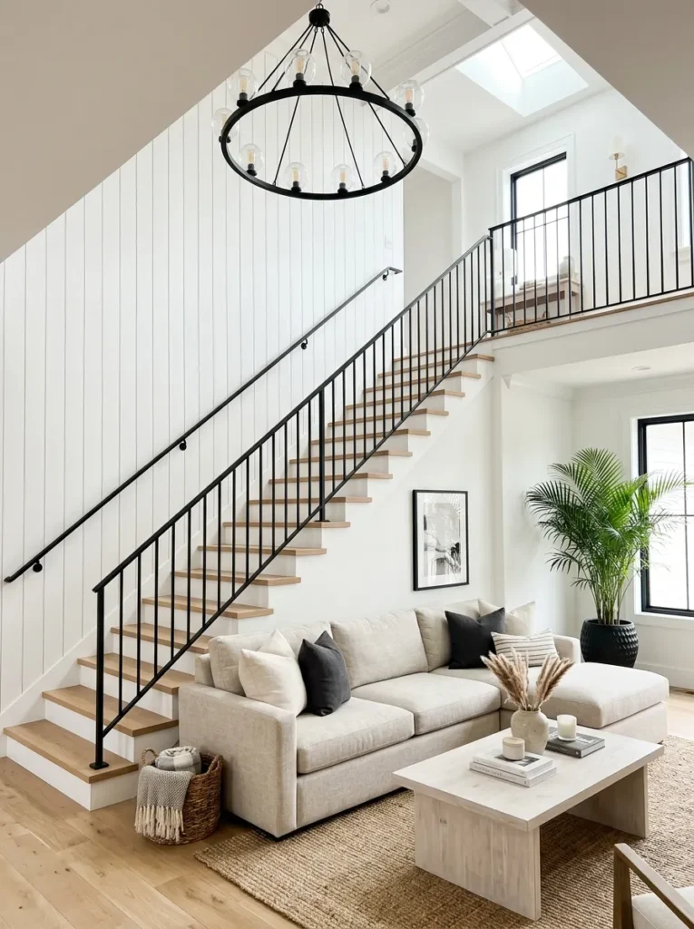
- Wall treatment: Painted white shiplap running up an open staircase wall, black iron stair railing
- Seating: L-shaped sectional in oatmeal performance linen, black tapered wood legs
- Coffee table: Long rectangular coffee table in whitewashed oak with a black iron shelf underneath
- Lighting: Black wagon-wheel-style chandelier hung at the base of the staircase, warm bulbs
- Rug: Large jute-wool blend rug, natural with subtle black flecking
- Wall decor: Black iron stair railing itself as the room’s dominant graphic line
- Plants: Areca palm (Dypsis lutescens) in a large black planter at the base of the staircase
- Textiles: Ticking stripe throw blanket draped over the sectional’s corner, one placement only
- Hardware: Black iron balusters, evenly spaced, matte finish
Why this works: A black iron stair railing against white shiplap creates a continuous line of contrast that pulls the eye through the entire room, not just across one wall.
Staircases open directly into a living room more often than most decor content accounts for, and it’s a genuine opportunity rather than a design problem to work around. My husband has installed black iron railing retrofits on more than one open-concept remodel, and the structural requirement people miss is baluster spacing — most codes require no more than four inches between balusters, which affects how heavy or delicate the railing can look. Once that’s sorted, the railing becomes a built-in piece of architecture that does more visual work than almost any single furniture piece could.
The areca palm at the staircase’s base is doing something specific here — its height and airy fronds soften the hard vertical lines of the black railing without blocking the sightline up the stairs. An L-shaped sectional makes sense in this layout because it can wrap around to face both the staircase and the room’s secondary focal point, whether that’s a television or a window, without needing a second seating group. This is a genuinely large-format idea, best suited to open floor plans with real square footage to spare.
9. Ticking Stripe Reading Corner
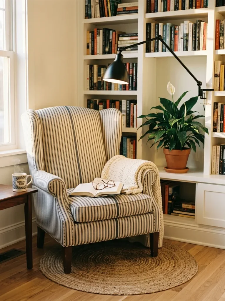
- Wall treatment: Flat painted white walls, single accent of shiplap on the back wall only, behind the reading chair
- Seating: One oversized wingback chair, ticking stripe upholstery in navy and cream, black turned legs
- Coffee table: No coffee table — a small round black iron side table instead, since this is a single-chair nook
- Lighting: Black articulating task lamp clamped to a nearby bookshelf
- Rug: Small-scale jute round rug, natural, positioned under the chair only
- Wall decor: Built-in white painted bookshelf beside the chair, styled with a mix of books and one black-framed print
- Plants: Peace lily (Spathiphyllum) in a black ceramic pot on the lower shelf
- Textiles: Ticking stripe is the upholstery itself here, so no additional pattern layered on top
- Hardware: Black hinges on the built-in bookshelf doors
Why this works: Letting the ticking stripe live on the chair itself, rather than as a throw pillow, keeps the pattern from feeling like an afterthought.
Ticking stripe gets treated as a throw-pillow pattern almost everywhere, and I think that undersells it — upholstering an entire chair in it is a much more confident, finished-looking choice, and it holds up visually even in a small nook that doesn’t have room for a full seating group. This kind of corner works especially well tucked beside a window in a larger living room, giving the space a secondary purpose beyond the main seating area. It’s a detail that photographs beautifully precisely because it doesn’t try to do too much.
Built-in shelving is worth the investment if the room’s layout allows for it, since it solves storage and display in one move without adding another freestanding furniture piece to a small footprint. The peace lily tolerates lower light better than most plants on this list, which makes it a smart choice for a reading nook that’s often set back from the room’s main window. One statement chair, one lamp, one plant — the whole vignette works because nothing in it is competing for attention.
10. Black Brick Fireplace Feature
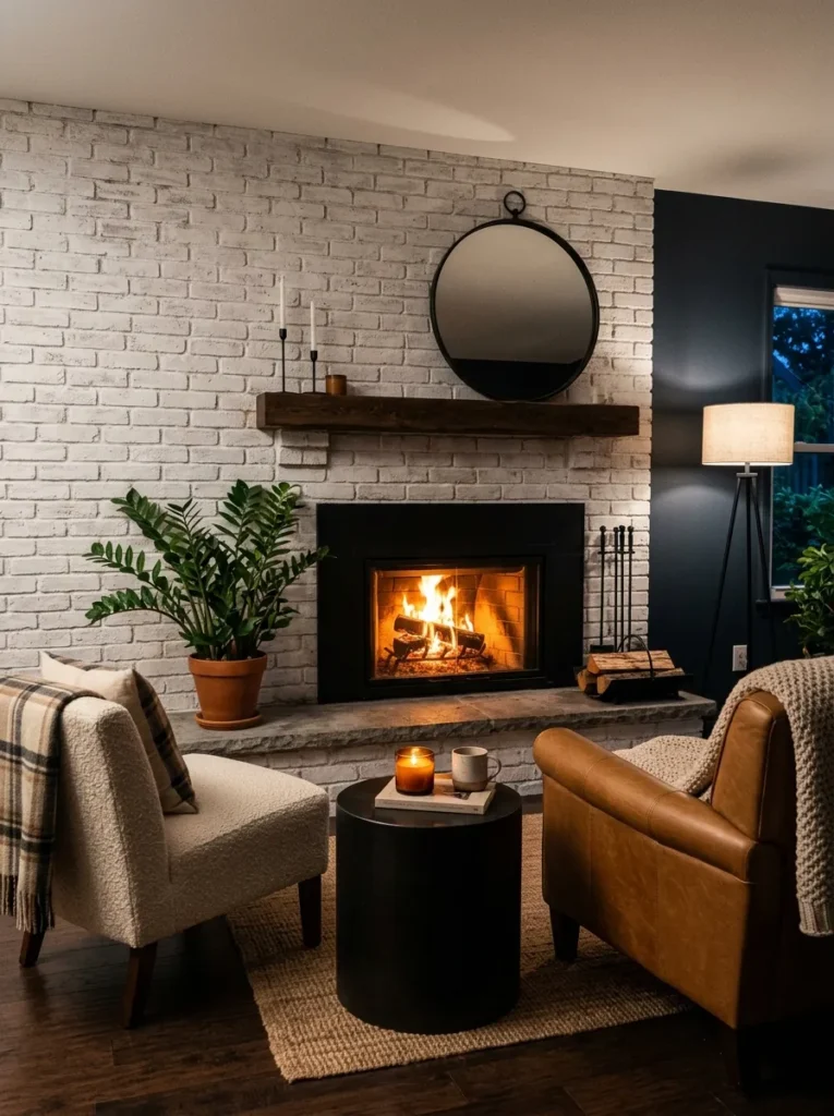
- Wall treatment: Whitewashed painted brick extending floor-to-ceiling on the fireplace wall, black-painted brick surrounding the firebox opening only
- Seating: Two mismatched slipcovered armchairs, one in cream linen, one in oatmeal cotton duck, black wood legs on both
- Coffee table: Round black iron drum-style table
- Lighting: Recessed can lighting only, no visible fixture, to let the fireplace be the light source in the evening shot
- Rug: Vintage-style jute rug with a faint black diamond pattern woven in
- Wall decor: A vertically hung vintage mirror with a black iron frame, off-center above the mantel rather than centered
- Plants: ZZ plant (Zamioculcas zamiifolia) in a black concrete cube pot beside the hearth
- Textiles: Gingham throw pillow on the cream armchair only, solid pillow on the oatmeal one
- Hardware: Black iron fireplace screen, geometric grid pattern
Why this works: Painting the brick surrounding a firebox black, rather than the entire fireplace wall, keeps the contrast concentrated where it has the most visual impact.
Most farmhouse fireplace ideas paint the whole wall one color, but isolating the black to just the firebox surround is a more restrained, editorial-feeling choice, and it lets the whitewashed brick above and around it stay soft. I’ve recommended this specific approach to more than one client hesitant about committing to an all-black fireplace wall, since it gives them the contrast principle without the visual weight of black brick reaching all the way to the ceiling. The off-center mirror above the mantel is a small deliberate break from symmetry that makes the whole wall feel more collected than staged.
Mismatched armchairs instead of a matching pair is an easy way to make a farmhouse room feel gathered over time rather than bought in a single trip, and it’s a detail I’d genuinely encourage over a perfectly matched set. The ZZ plant is about as low-maintenance as houseplants get, which makes it a practical choice for a spot that sits close to fireplace heat and gets inconsistent light depending on the season.
11. Vaulted Ceiling Beam Cross
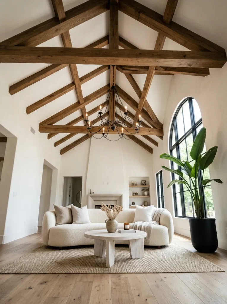
- Wall treatment: Painted white shiplap on the lower half of the vaulted wall, flat white above the beam line
- Seating: Curved boucle sofa, cream, black block feet — a 2026-forward silhouette against the traditional beam structure
- Coffee table: Organic-shaped whitewashed wood coffee table, soft rounded edges rather than a hard rectangle
- Lighting: Black iron cross-beam chandelier hung at the peak of the vaulted ceiling
- Rug: Oatmeal wool rug, subtle greek-key black border
- Wall decor: The exposed cross-beam structure itself, left unpainted in natural stained wood as the sole contrast material against all the white
- Plants: Bird of paradise (Strelitzia nicolai) in a tall black cylinder planter, positioned to echo the ceiling’s height
- Textiles: Cream bouclé throw, no pattern, kept minimal to let the curved sofa silhouette read clearly
- Hardware: Black chain suspending the chandelier, visible and intentional
Why this works: Pairing a soft, curved 2026-forward sofa silhouette with a traditional vaulted beam structure keeps the room from reading as a dated, decade-old farmhouse look.
This is the idea I’d point to if someone said modern farmhouse feels stuck in the past, because it isn’t. Swapping a boxy rolled-arm sofa for a curved bouclé silhouette instantly updates the whole room, even though every other farmhouse marker — the beams, the black iron, the shiplap — stays exactly where tradition says it should. The natural stained wood beams are the one warm material break in an otherwise white-and-black room, and leaving them unpainted rather than whitewashing them gives this particular room its own distinct identity.
A vaulted ceiling changes the proportions of every piece placed beneath it, which is why the bird of paradise earns its spot here — a shorter plant would get visually swallowed by all that overhead height. The organic, rounded coffee table softens what could otherwise be a very architectural, hard-edged room, and it’s a detail worth considering any time a space leans heavily on straight structural lines like exposed beams and iron chandeliers.
12. Galvanized and Linen Window Seat
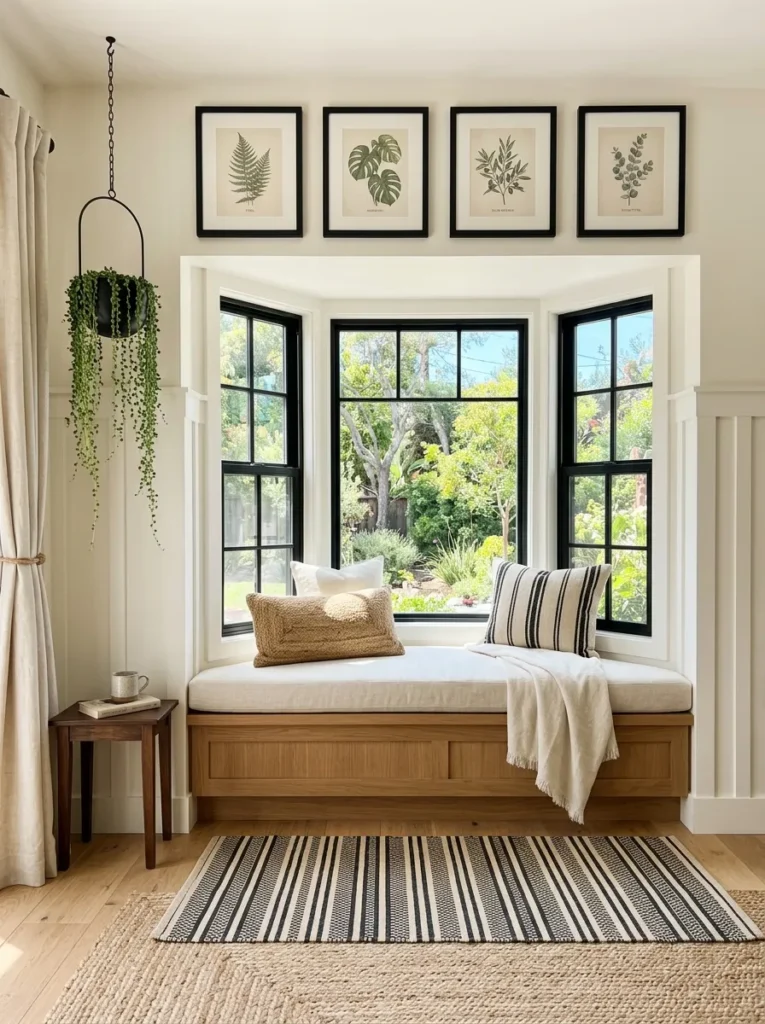
- Wall treatment: Board-and-batten painted Sherwin-Williams Alabaster, built out around a bay window seat
- Seating: Built-in window seat bench with a cream linen cushion, plus one slipcovered armchair facing it, black tapered legs
- Coffee table: Small galvanized metal drum table, low profile, positioned between the seat and chair
- Lighting: Natural daylight is the primary source here, supplemented by a single black brass picture light above the window
- Rug: Layered rug look — natural jute base rug with a smaller black-and-white striped runner on top, positioned in front of the seat
- Wall decor: A row of black-framed botanical prints above the window seat, hung in a straight horizontal line
- Plants: Trailing string of pearls (Senecio rowleyanus) in a small black hanging planter beside the window
- Textiles: Black-and-white striped runner doubles as the room’s only bold pattern moment
- Hardware: Black cabinet pulls on the built-in storage beneath the window seat
Why this works: A layered rug — a natural jute base with a smaller striped runner on top — adds pattern and texture in a farmhouse room without needing a second piece of patterned furniture.
Built-in window seats are one of those details that photograph better than almost anything else in a farmhouse living room, and they’re genuinely functional too — the storage underneath solves the perpetual problem of where blankets and board games actually live. My husband’s crew has built a handful of these into bay window nooks over the years, and the detail that makes or breaks them structurally is proper support blocking beneath the seat itself, since a flimsy base will flex and creak within a year of regular use.
Layering two rugs instead of relying on furniture or walls for pattern is a technique I don’t see used often enough in farmhouse spaces, and it’s an easy one to recreate without any construction involved. The string of pearls plant is a small, deliberate detail — its trailing tendrils catch the window light beautifully and add movement to a corner that would otherwise be static. This is a genuinely space-efficient idea, well suited to smaller living rooms that need seating without sacrificing floor space to a full second sofa.
13. Black Beam Media Wall
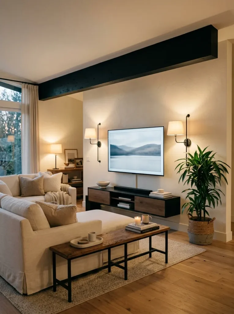
- Wall treatment: Flat painted white walls with one exposed black-painted structural beam crossing above the television
- Seating: Slipcovered sectional in cream heavyweight cotton, black block feet
- Coffee table: Long low black iron and reclaimed wood bench-style table
- Lighting: Two black wall-mounted swing-arm sconces flanking the television
- Rug: Wide-plank-look natural sisal rug, minimal texture
- Wall decor: The black beam itself, plus a single black-framed vintage map beneath it
- Plants: Corn plant (Dracaena fragrans) in a black woven-texture concrete pot in the corner
- Textiles: Solid cream throw pillows only — no pattern in this room, letting the black beam carry the contrast alone
- Hardware: Black media console pulls, matte finish
Why this works: A media wall doesn’t have to abandon the farmhouse contrast principle just because it needs to accommodate a television — a single painted black beam solves that.
Television walls are the part of a living room most decor advice skips over entirely, which is strange given how much time people actually spend facing that direction. Painting a single structural or faux beam black above the screen gives the wall a reason for the TV to be there, rather than treating it as something to hide or apologize for. I’ve used this exact trick in a client’s family room where the television genuinely couldn’t move, and the black beam did more to tie the space together than any amount of surrounding decor could have.
Keeping every textile in this room solid and pattern-free is intentional — with the black beam already doing the contrast work, adding ticking stripe or gingham on top would compete rather than complement. The corn plant is a sturdy, forgiving choice for a corner that doesn’t get much direct light, since most living rooms built around a media wall are arranged with the good natural light behind the seating rather than in front of the screen.
14. Black Door Threshold Vignette
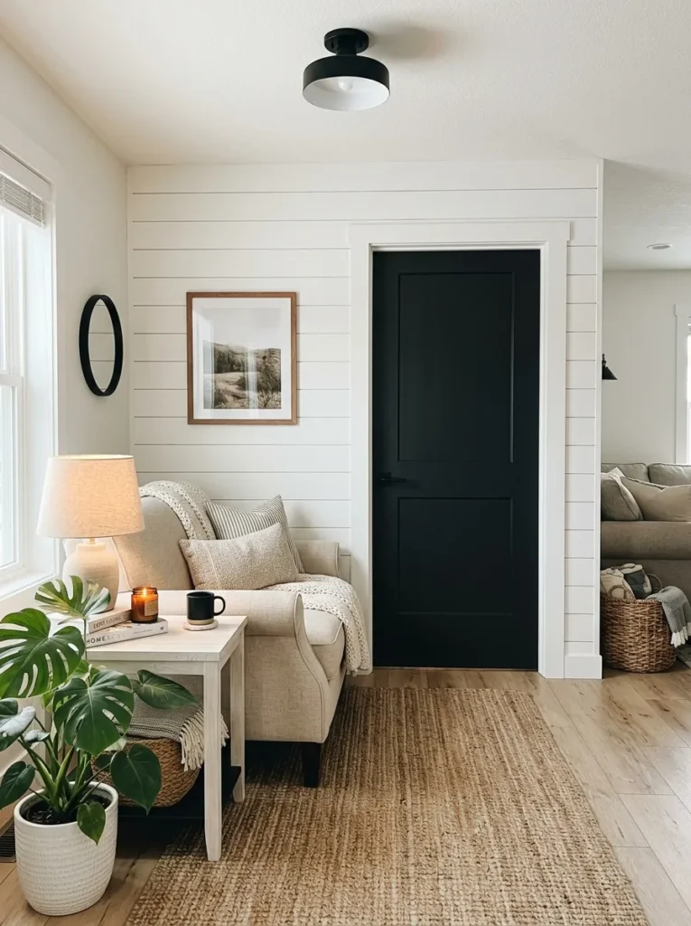
- Wall treatment: Painted white shiplap surrounding a black-painted interior door leading to a home office or reading room
- Seating: Rolled-arm loveseat in oatmeal linen, black turned wood legs
- Coffee table: Small square whitewashed oak table with a single black iron shelf beneath
- Lighting: Black flush-mount ceiling fixture with a fluted glass shade, warm bulb
- Rug: Natural jute rug, small scale, positioned to define the loveseat’s footprint
- Wall decor: The black door itself is the wall’s focal point, with a single small black-framed print beside it rather than above
- Plants: Philodendron (Philodendron hederaceum) in a black textured pot on the floor beside the loveseat
- Textiles: Gingham throw folded over the loveseat’s arm, the room’s only patterned element
- Hardware: Matte black door hardware, lever-style handle and hinges
Why this works: A black-painted interior door does the same visual job as black window trim or railing, giving a room its contrast anchor even when there’s no architectural window or beam to work with.
An interior door gets overlooked constantly as a decor opportunity, and that’s a mistake in a farmhouse living room specifically, because painting it black is one of the easiest, lowest-cost ways to bring in the contrast principle that defines the whole style. This works particularly well in a smaller living room that connects directly to another room, since the door becomes a natural focal point instead of just a passage to walk through. It’s the kind of detail that costs a can of paint and an afternoon, not a renovation budget.
A rolled-arm loveseat instead of a full sofa keeps this vignette proportionate to a smaller footprint, and it pairs well with a threshold room that’s meant to feel like a quiet corner rather than the main gathering spot. The philodendron on the floor beside it fills the visual gap between the seating and the door without crowding either one, and it’s an easy plant to keep thriving in a room with moderate, indirect light throughout the day.
15. Black Wainscoting Accent Wall
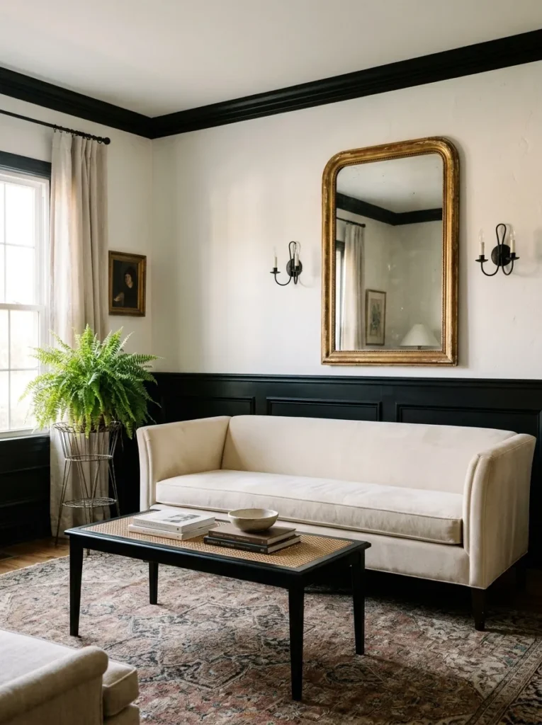
- Wall treatment: Black-painted wainscoting on the lower half of the wall, topped with a white plaster upper wall and a thin picture rail dividing the two
- Seating: Tuxedo-arm sofa in cream bouclé, black block feet
- Coffee table: Black iron frame topped with woven cane, low profile
- Lighting: Two black double-arm sconces flanking a vintage-style arched mirror above the wainscoting
- Rug: Natural jute rug with a black whipstitch edge
- Wall decor: A small vintage botanical oil painting in a thin black frame, hung just above the picture rail
- Plants: Boston fern (Nephrolepis exaltata) on a black wire plant stand beside the sofa
- Textiles: Black-and-white ticking stripe piping along the sofa’s cushion edges only, no separate throw pillow pattern
- Hardware: Black picture rail hooks, visible and functional
Why this works: Painting the wainscoting black instead of white flips the usual farmhouse formula, making the millwork itself the room’s contrast anchor rather than just a backdrop for black accents.
Most farmhouse living rooms put black in the small details and save the walls for white or cream, but this idea does the opposite, and it’s a genuinely underused move. Black wainscoting has real architectural weight — it grounds the room the way a dark floor or a stone fireplace would, without needing either. I’ve recommended this to a couple of clients nervous about “too much black,” and the trick that always reassures them is the white plaster above it, which keeps the room feeling light even with a bold lower half. The picture rail is what makes it read as intentional millwork instead of an accident feature wall.
A tuxedo-arm sofa is a quieter, more tailored silhouette than the rolled-arm or slipcovered styles used elsewhere on this list, and it suits a room built around a strong architectural statement like black wainscoting. The cane-topped coffee table adds a lightness underfoot that keeps the room from feeling heavy, since cane lets light and floor pass through it rather than blocking the view the way a solid wood top would. The Boston fern’s feathery texture softens all those straight lines without adding a second color into the room.
Styling Principles: Keeping Farmhouse Cozy, Not Cluttered
The single biggest thing separating a modern farmhouse living room from a dated or overstuffed one is discipline around contrast. Farmhouse style is built on high-contrast black and white, not on a pile of rustic accessories — the black elements (railings, window grids, fixtures, hardware) should stay consistent throughout the room while everything else stays quiet. When in doubt, count your black accents. If a room has more than three or four distinct black elements competing for attention, it starts to feel busy instead of intentional.
Pattern deserves the same restraint. Ticking stripe and gingham are farmhouse-specific textiles, but they work best used once per room — on a single chair, one throw pillow, or a runner rug — rather than layered across every surface. I’ve seen rooms with the right bones completely undone by six different plaids and stripes fighting each other. Pick one pattern, one placement, and let the black-and-white contrast do the rest of the work.
Finally, resist the instinct to fill every wall and shelf. A real, lived-in farmhouse home has empty space in it — that’s part of what makes it feel calm rather than cluttered. One meaningful vintage piece, styled with intention, beats five smaller ones grouped together out of habit.
Frequently Asked Questions
What defines modern farmhouse style? Modern farmhouse style is defined by high-contrast black-and-white surfaces, clean-lined furniture silhouettes, and painted wood — a legacy of real working farmhouses, which used affordable white paint and durable black iron hardware out of practicality, not fashion.
Is shiplap or board-and-batten better for a farmhouse living room? Shiplap gives a horizontal, cottage-like texture and works well on a single accent wall, while board-and-batten adds vertical structure and reads as slightly more architectural — either one fits the modern farmhouse look, so the choice comes down to the room’s proportions and ceiling height.
How do I get the farmhouse look on a budget? Painting a single interior door or window trim black, adding one black light fixture, and swapping in a natural jute rug are the three lowest-cost changes that bring real farmhouse contrast into a room without any construction involved.
How do I avoid a cluttered farmhouse look? Limit black accents to three or four consistent elements, use only one patterned textile per room, and choose one standout vintage piece instead of grouping several smaller decorative objects together.
What are the best black accent pieces for a farmhouse living room? A black metal light fixture, black window or door hardware, and a black-framed mirror or window grid are the most effective accent pieces, since they anchor the room’s contrast without requiring a full renovation.
Do I need exposed beams for a farmhouse living room to work? No — a single painted black beam, a black stair railing, or even black door trim can carry the same contrast principle that exposed beams provide, so the style works in homes without existing structural beams.
Conclusion
A cozy modern farmhouse living room isn’t about filling every surface — it’s about choosing the right contrast, the right textures, and letting the rest of the room breathe. Whether you’re drawn to a black steel window grid, a whitewashed beam ceiling, or a simple black-painted door, each of these ideas gives you a complete, real-world starting point rather than a scattered mood board.
I’ve seen how a few intentional changes — one black fixture, one honest material, one plant that actually thrives in the light you have — can completely transform how a room feels to live in. Save this post to Pinterest so you can come back to it while you plan, try one idea in your own space this season, and pass it along to anyone else dreaming up their own farmhouse-style living room.