15 Sage Green Living Room Ideas for a Calm, Grounded Space
Some colors need a whole design plan built around them to work. Sage green isn’t one of them — and that’s exactly why it’s become one of the most enduring choices for a living room, rather than a color that fades from style in a year or two. If you’ve been searching for sage green living room ideas that go beyond a single throw pillow or accent wall, you’re in the right place. This post walks through 15 fully styled rooms, each with its own color pairing, material story, and standout detail, so you can see exactly how the pieces come together before you commit to any of it.
In my experience helping clients plan rooms around this color, the hardest part usually isn’t choosing sage — it’s choosing what goes with it.That’s what this guide is really built to solve: not just “should I use sage green,” but which version of it, paired with what, is right for your specific space and light.
Why Sage Green Endures
Sage green didn’t become a living room staple by accident — it earns its staying power through simple color science. Unlike saturated greens, sage sits in a rare sweet spot on the color wheel: desaturated enough to behave almost like a neutral, yet retaining just enough pigment to add real depth to a room. That’s precisely why sage green pairs successfully with a wider range of secondary colors and metal finishes than nearly any other green on the spectrum.
I first noticed this while repainting my own living room — I expected to “outgrow” the color within a year, the way I had with past trends, but three years later it still feels intentional, not dated. This post breaks down 15 fully styled sage green living rooms, each with a genuinely different mood, palette, and material story.
1. Sage and Rust Velvet
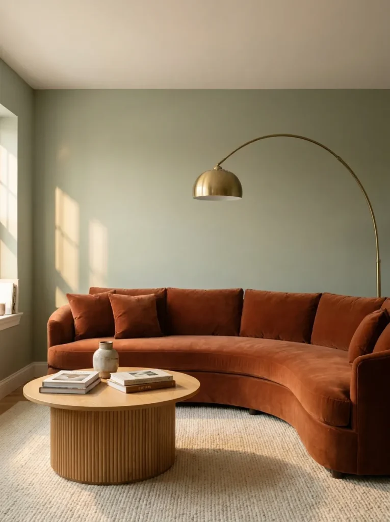
- Walls: Sherwin-Williams Clary Sage (SW 6178) in eggshell — reflects just enough light to keep a north-facing room from feeling flat
- Seating: curved rust velvet sofa, gently rounded silhouette instead of a boxy frame
- Coffee table: fluted white oak, low profile, warm grain visible under lamp light
- Lighting: brass arc floor lamp plus a pair of amber-glass table lamps for evening warmth
- Rug: flatwoven wool in cream with a faint rust fleck, grounding without competing
- Wall decor: one large, unframed abstract canvas in rust and cream tones
- Plants: a Fiddle Leaf Fig (Ficus lyrata) in a raw terracotta pot — its glossy, warm-toned leaves echo the rust accents without matching them exactly
- Textiles: burnt-orange boucle pillows paired with one solid cream linen pillow, plus a chunky cream throw
Why this works: Rust and sage sit almost opposite each other on the color wheel, so pairing them creates natural visual contrast without ever feeling jarring.
Rust and sage rarely get paired outside of fall décor spreads, but as a year-round combination, it’s quietly one of the most flattering options for a living room with warm-toned wood floors. The desaturated green keeps the rust from feeling seasonal or costume-y, while the curved velvet sofa adds a soft, current shape that reads as intentional rather than trendy. In my experience, clients who are nervous about “too much color” find this pairing reassuring — the sage does the neutral heavy lifting, so the rust can show up boldly in just one or two pieces.
Paint sheen matters more here than people expect. My husband’s crews always push eggshell over matte for living room walls that get afternoon sun, since matte finishes show scuffs and light unevenly in rooms with big windows — eggshell holds up to cleaning and reflects light more consistently across the day. That durability matters in a room this color-forward, where you want the sage reading true at 9 a.m. and 9 p.m., not shifting with every light change. It’s a small, unglamorous detail, but it’s the difference between a wall that looks intentional a year from now and one that looks tired.
2. Sage and Navy Library
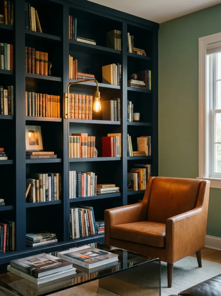
- Walls: Benjamin Moore October Mist (1495) in eggshell on three walls, with the fourth wall built out in navy shelving
- Seating: cognac leather armchair with a low, rounded back — no navy fabric on the seating itself
- Coffee table: blackened steel base with a smoked glass top, deliberately slim so it doesn’t crowd the shelving wall
- Lighting: brass swing-arm reading lamp mounted directly to the shelving, plus a floor-level picture light over the lower shelves
- Rug: vintage-style wool rug in faded navy and cream, worn-in rather than pristine
- Wall decor: none needed — the built-ins and book spines are the art
- Plants: a Bird’s Nest Fern (Asplenium nidus) on a low shelf, chosen because it tolerates the lower, indirect light this navy wall tends to create
- Hardware: brushed brass pulls on every shelving drawer, no mixed finishes on this wall
Why this works: Navy and sage share the same cool undertone, which is why built-in shelving in navy reads as an extension of the wall color rather than a competing element.
I built a version of this room for a client who swore she “didn’t want a library, just a reading corner” — and ended up with floor-to-ceiling navy shelving because once we tested the color against her sage walls, the two stopped looking like separate decisions and started looking like one plan. That’s the real value of a cool-toned secondary color: it lets you go bold with a built-in without the room feeling busy. The leather chair keeps things from tipping too cool, adding the one warm material the space needs to feel lived-in rather than staged.
Evening is when this room earns its keep. With the overhead light off and just the swing-arm lamp and picture light running, the navy shelving nearly disappears into the sage walls, leaving the book spines and leather chair glowing under warm brass fixtures. It’s a noticeably different mood than the same room at noon, when the navy reads crisp and graphic against the green. A room that looks distinctly different by day and by evening light is doing more design work than one that only has a single mood. That range is worth planning for from the start.
3. Sage, Charcoal and Brass
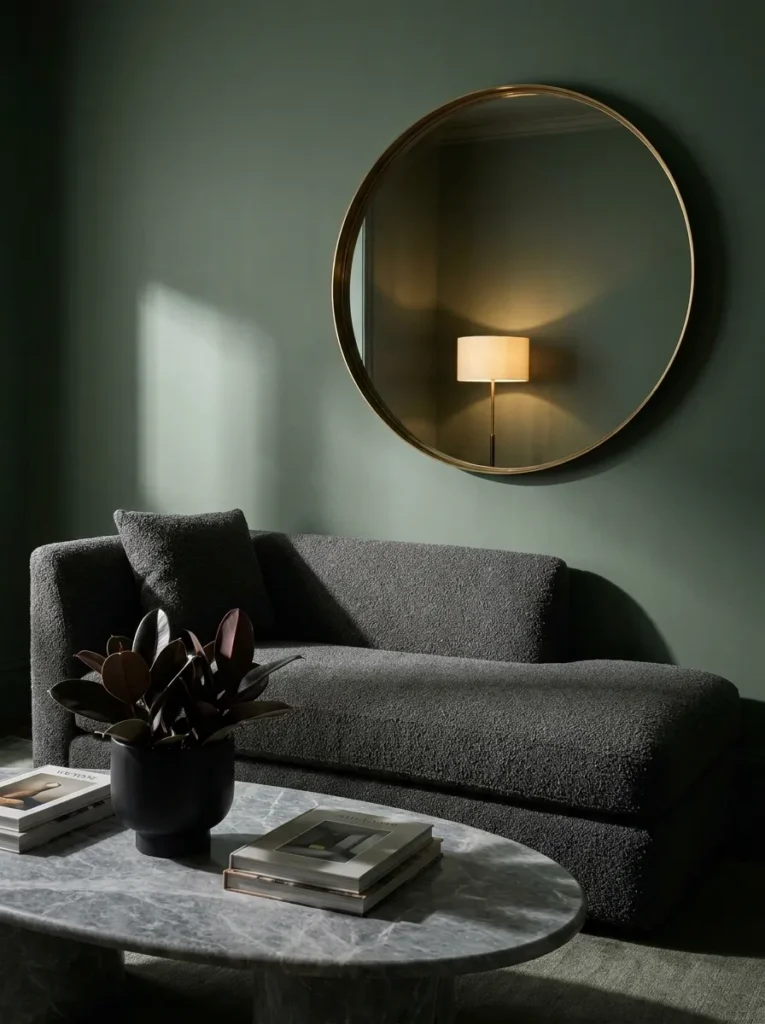
- Walls: Farrow & Ball Yeabridge Green (No. 287) in matte, chosen for its slightly deeper, more saturated cast than a typical sage
- Seating: low-slung curved chaise in charcoal bouclé, no sharp corners anywhere in the piece
- Coffee table: honed gray marble, oval, sitting low to the ground
- Lighting: brass arc floor lamp plus a single sculptural table lamp with a charcoal linen shade
- Rug: charcoal and cream abstract pattern, wool-cotton blend, placed at a slight angle to the furniture line
- Wall decor: one oversized round mirror in a thin brass frame, positioned to catch the floor lamp’s light
- Plants: a Rubber Plant (Ficus elastica ‘Burgundy’) in a matte black planter — its deep burgundy-black leaves read almost as a neutral against the charcoal
- Hardware: brass throughout, no mixed metals in this particular room
Why this works: Charcoal absorbs light the way sage reflects it, and pairing the two creates the kind of tonal depth a single neutral palette can’t achieve on its own.
This is the pairing I’d recommend to anyone who loves a moody room but doesn’t want to commit to fully dark walls. The deeper Yeabridge Green does more visual work than a paler sage would here, holding its own against the charcoal instead of washing out. Curved furniture is doing quiet but important work too — a chaise this soft-edged keeps a charcoal-and-green room from tipping into “serious study” territory and instead feels closer to a lounge. The round brass mirror is the detail that pulls the whole thing together, bouncing light back into a palette that could otherwise feel heavy.
I’ve noticed that rooms built entirely from cool tones — green, charcoal, brass — can start to feel a little clinical if every surface is smooth and hard. That’s why the bouclé chaise and linen lamp shade matter as much as the paint color does; texture is what keeps a sophisticated palette from reading as cold. Marble, brass, and matte paint all catch light differently, and layering those finishes together is what gives this room its depth at night, when the arc lamp is the only thing on and every surface takes on a slightly different glow.
4. Sage and Blush, Plaster Arch
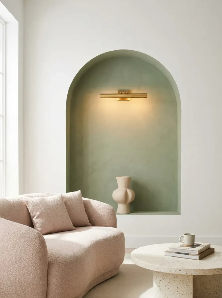
- Walls: Portola Paints’ Roman Clay in a custom sage tint, troweled for a soft, matte texture instead of flat paint
- Seating: curved blush bouclé loveseat, no sharp edges, paired with a single cognac leather accent chair
- Coffee table: round, warm gold-flecked terrazzo, low profile
- Lighting: warm gold picture light mounted above the plaster arch, plus a ceramic table lamp with a fluted base
- Rug: hand-knotted wool in blush and cream, subtle diamond pattern
- Wall decor: a built-out plaster archway niche housing a single ceramic vase — the architecture itself functions as the art
- Plants: a Calathea Orbifolia in a pale pink ceramic pot — its silver-striped leaves pick up both the blush and sage tones without matching either exactly
- Textiles: dusty rose linen pillows, one cream bouclé pillow, a waffle-knit throw in oat
- Hardware: warm gold throughout, brushed rather than polished, to keep the glow soft
Why this works: Blush and sage sit close enough in saturation that neither color dominates, which is what makes a plaster architectural detail feel like the room’s real focal point instead of the paint.
Blush gets dismissed as too delicate for a full living room, but paired with a deeper, more textured sage, it reads as soft rather than fussy. The troweled plaster wall does most of the visual heavy lifting here — its texture catches light differently throughout the day, so the arch niche looks slightly different at 10 a.m. than it does at dusk. I’ve built a version of this room where the client initially wanted a mirror in that niche, and swapped it for a single ceramic vase instead once we saw how much the plaster shadow alone added.
Terrazzo is an underused material in living rooms, mostly because people associate it with kitchens or bathrooms. Used as a coffee table top, though, it introduces subtle color variation without competing with the walls, and it holds up to daily use far better than a soft stone like marble would. The gold flecks in the terrazzo echo the brushed gold hardware just enough to tie the room together without anyone consciously noticing why it feels cohesive. That’s the kind of small material decision that separates a room that looks planned from one that looks assembled piece by piece.
5. Sage and Mustard, Cane and Bouclé
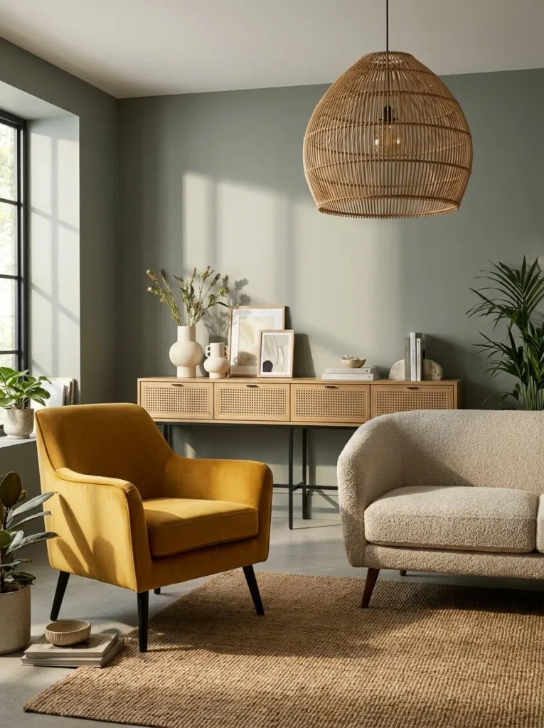
- Walls: Behr Rosemary Sprig (S420-4) in eggshell, a slightly grayer sage that keeps the mustard from feeling too saturated
- Seating: boxy bouclé sofa in oatmeal, with a mustard velvet accent chair as the color anchor
- Media console: cane-front console in natural rattan and walnut, black metal legs
- Lighting: black metal arc lamp plus a woven rattan pendant overhead
- Rug: jute-wool blend in natural tones, low pile, durable underfoot
- Wall decor: a grouping of three small woven wall hangings in mustard and cream
- Plants: a Snake Plant (Dracaena trifasciata) in a black concrete planter, chosen for its tolerance of the lower light this room’s east-facing window creates by afternoon
- Textiles: mustard velvet lumbar pillow, oatmeal bouclé pillow, a chunky cream throw draped over the sofa arm
- Hardware: matte black throughout, including the cane console’s legs and pendant fixture
Why this works: Mustard against a grayer sage avoids the retro feel that mustard alone can carry, landing closer to a current, collected look than a throwback one.
Mustard is a color people love in small doses but hesitate to commit to at sofa scale, which is exactly why an accent chair is the smarter move here. It carries the color boldly in one piece while the oatmeal sofa keeps the rest of the room easy to live with day to day. The cane console adds texture without adding visual weight, and its natural rattan tone bridges the sage walls and mustard chair instead of competing with either. In my experience, this is the palette that photographs best in late afternoon light, when the mustard velvet catches warm tones.
My husband’s crews see a lot of east-facing living rooms where afternoon sun fades fabric faster than clients expect, and mustard velvet is particularly prone to it since dye lots vary in UV resistance. A simple fix is UV-protective window film, which blocks a significant share of fading rays without noticeably dimming the room. It’s a detail nobody thinks about until a chair looks two shades lighter on one side after a year. Planning for it upfront, especially with a statement color like mustard, is far easier than replacing upholstery down the line.
6. Sage and Black, High-Contrast Modern
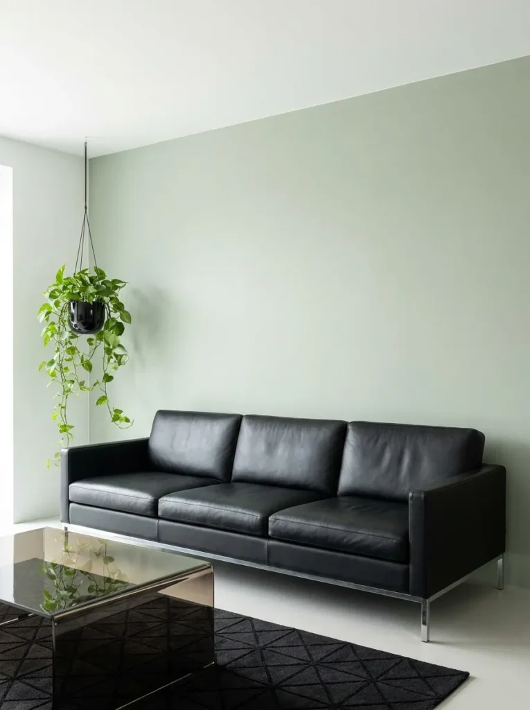
- Walls: Sherwin-Williams Sage Green Light (SW 6167) in eggshell, one of the paler, cooler sage tones in the collection
- Seating: black leather sofa with a low, architectural silhouette and exposed chrome legs
- Coffee table: smoked glass with a slim chrome base, deliberately minimal
- Lighting: a sculptural black-and-chrome floor lamp plus recessed ceiling lighting on a dimmer
- Rug: black and cream geometric wool rug, high contrast underfoot
- Wall decor: a single oversized black-and-white botanical print in a thin chrome frame
- Plants: a Pothos ‘Marble Queen’ trailing from a black ceramic hanging planter — its variegated leaves soften the room’s hard edges without adding more color
- Textiles: two solid black pillows, one cream boucle pillow, no pattern anywhere else in the room
- Hardware: chrome throughout, polished rather than brushed, to match the glass and leather
Why this works: Pairing sage with black and chrome pushes the palette toward a crisp, architectural feel that a softer secondary color couldn’t achieve.
This is the pairing for anyone who wants their sage green room to feel current and graphic rather than soft and cottage-like. The paler sage keeps things from feeling heavy against so much black, letting the color read as a backdrop rather than competing for attention. Polished chrome is doing important work too — it reflects light in a sharper, more precise way than brushed brass or matte black would, which fits the room’s overall crisp, modern intention. A cooler, paler sage paired with black and chrome creates a distinctly modern, gallery-like mood compared to warmer sage pairings.
I styled a version of this room for a client who described her taste as “minimal but not cold,” and the trailing pothos ended up being the detail that made the difference. Without a living plant, an all-black-and-chrome room can tip into feeling sterile; the pothos softens every hard edge in the space with almost no maintenance required. It’s a small addition, but it’s the one element in the room that changes slightly week to week, which keeps the space from feeling static or overly styled.
7. Sage and Cream, Curved Minimalism
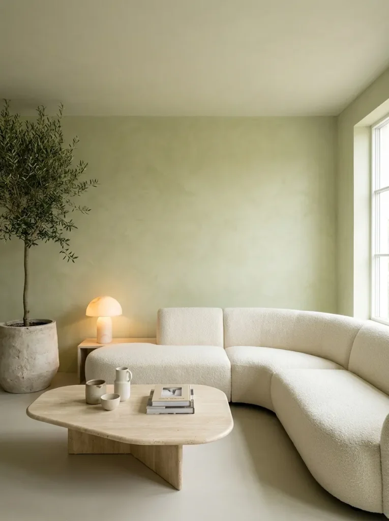
- Walls: Farrow & Ball French Gray in a sage-leaning custom mix, limewashed for subtle tonal variation instead of a flat, uniform finish
- Seating: fully curved bouclé sectional in ivory, no straight lines anywhere in the piece
- Coffee table: organic-shaped travertine, irregular edge, low to the ground
- Lighting: a sculptural mushroom-style table lamp in alabaster, plus a slim brass floor lamp with a curved arm
- Rug: undyed wool rug in natural cream, subtle texture, no pattern
- Wall decor: a single large-scale, unframed linen tapestry in cream and sage tones
- Plants: an Olive Tree (Olea europaea) in a raw plaster planter — its silvery-green leaves echo the limewashed walls without repeating the exact sage tone
- Textiles: ivory bouclé pillows, one sage linen lumbar pillow, an oversized cream throw
- Hardware: brushed brass, kept minimal and understated throughout
Why this works: Limiting a room to tonal variations of just two colors is what creates the quiet, uncluttered feel associated with current “quiet luxury” interiors.
This is the room I’d point to as proof that a limited palette can still feel rich rather than boring. Every material here — limewash, travertine, bouclé, raw plaster — has natural texture built in, so the color story stays simple while the room itself never feels flat or empty. The curved sectional is doing a lot of the modern work; a decade ago this same palette would have shown up on a boxy, tufted sofa, and the shift to soft, organic shapes is what makes it read as current rather than dated. Nothing in this room competes for attention, which is exactly the intention.
Limewash paint is a material my husband’s crews have started recommending more often for exactly this look, since it creates natural, subtle variation across the wall that flat paint simply can’t replicate. It reflects light differently depending on the time of day and your angle in the room, which is part of why this space photographs so well in changing light. Limewash finishes create visible tonal depth that flat paint cannot replicate, which is why designers increasingly favor it for minimalist, texture-forward rooms. It costs more than standard paint, but for a focal wall like this one, the difference is visible immediately.
8. Sage and Burgundy, Jewel-Toned Modern
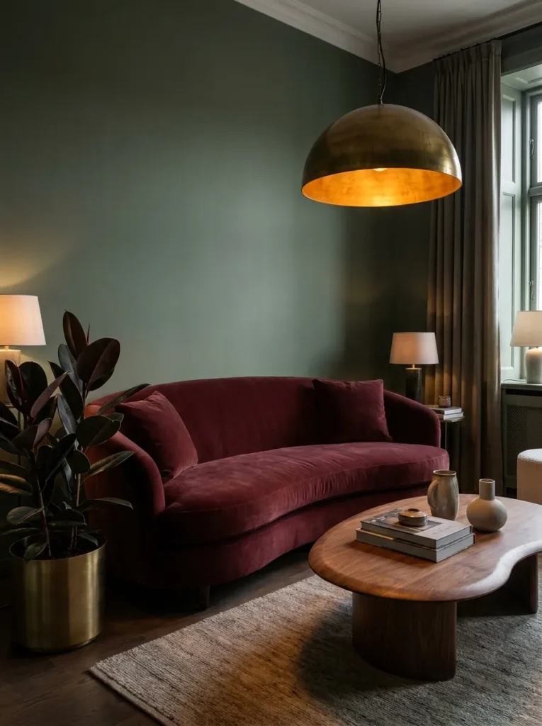
- Walls: Clare Paint’s Aloe in matte, a true cool-toned sage with slightly more depth than a pastel version
- Seating: a curved burgundy velvet sofa with a low, rounded back and no visible legs
- Coffee table: dark walnut, kidney-shaped, sitting close to the floor
- Lighting: a warm brass pendant with an amber glass shade, plus a floor lamp with a smoked glass globe
- Rug: deep burgundy and cream Moroccan-style rug, hand-knotted, high pile
- Wall decor: a grouping of small brass-framed botanical prints, hung asymmetrically
- Plants: a Burgundy Rubber Plant (Ficus elastica ‘Burgundy’) in an aged brass planter — its near-black leaves deepen the burgundy story without introducing a new color
- Textiles: burgundy velvet pillows in two shades, one cream linen pillow, a mohair throw in deep plum
- Hardware: aged brass throughout, unlacquered so it develops a natural patina over time
Why this works: Sage and burgundy sit at similar depth and saturation levels, so neither color reads as louder than the other, which is what gives the room its balanced jewel-tone feel.
Burgundy against sage is a combination I’ve seen work beautifully in rooms with almost no natural light, since both colors are deep enough to hold their own under lamp light rather than washing out. The curved sofa keeps this pairing from feeling heavy or old-fashioned the way a boxy, tufted burgundy sofa might. Unlacquered brass is the detail that makes the room feel collected over time instead of newly furnished — it darkens and shifts naturally with use, which fits a jewel-toned palette that’s meant to feel rich and lived-in rather than showroom-perfect.
I styled a version of this living room for a client with a north-facing window who worried the space would always feel dim. Deep, saturated colors actually solve that problem better than pale ones do, because a dim room in pale sage just reads as gray and flat, while the same room in this depth of green and burgundy reads as intentionally moody. Layering in warm brass lighting sources — a pendant, a floor lamp, even a small table lamp — matters more here than in a brighter room, since artificial light is doing more of the work to bring out the jewel tones after dark.
9. Sage and Dusty Blue, Coastal Modern
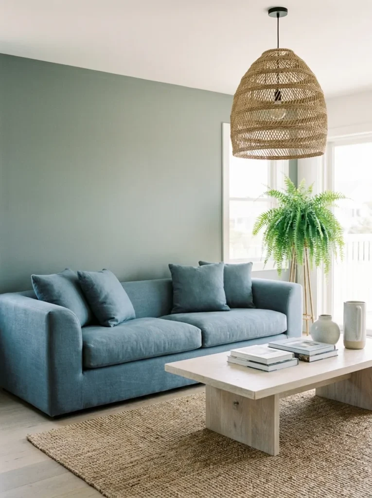
- Walls: Benjamin Moore Saybrook Sage in eggshell, a slightly grayer sage with a subtle blue undertone
- Seating: a low-profile linen sofa in dusty blue, straight-lined but with softened, rounded arms
- Coffee table: whitewashed oak, rectangular, raised on slim tapered legs
- Lighting: a woven rope pendant light, plus a ceramic table lamp in matte white
- Rug: a flatwoven cotton rug in dusty blue and cream stripe, casual and textural
- Wall decor: a single large abstract print in blue, sage, and white tones
- Plants: a Boston Fern (Nephrolepis exaltata) in a whitewashed terracotta pot, hung near the window where its humidity needs are naturally met
- Textiles: dusty blue linen pillows, one cream boucle pillow, a waffle-weave throw in white
- Hardware: brushed nickel throughout, chosen for its cooler, understated tone
Why this works: Sage and dusty blue share enough gray undertone that the pairing reads as effortlessly coordinated rather than deliberately color-matched.
This palette is the one I recommend most often for living rooms that get heavy afternoon light, since both colors are muted enough to keep the space feeling calm rather than washed out by sun. The whitewashed oak coffee table and rope pendant add texture without adding visual noise, which matters in a room built almost entirely from soft, cool tones. Straight-lined furniture with rounded arms is a small but current detail — fully boxy furniture would flatten this palette, while a bit of softness in the silhouette keeps the room feeling relaxed and current rather than stiff.
Boston Ferns need consistent humidity to thrive, which makes them a poor fit for most living rooms unless you’re near a window with some natural moisture or you mist regularly. I’ve killed more than one before understanding that a bathroom or kitchen window is almost always a better home for this plant than a dry living room corner. If you love the look of a fern here, a Bird’s Nest Fern is a far more forgiving substitute with a similar silhouette, tolerating typical living room humidity levels without the same fussy care requirements.
10. Sage and Lavender, Soft Modern

- Walls: Benjamin Moore Guilford Green in matte, a true balanced sage with neither warm nor cool bias
- Seating: a curved lavender velvet loveseat with a low, rounded silhouette, paired with a cream linen sofa as the primary seat
- Coffee table: honed white marble, rounded oval, brass inlay detail along the edge
- Side tables: two small lavender-glazed ceramic side tables, mismatched heights
- Lighting: a fluted glass table lamp with a lavender-tinted shade, plus a brass floor lamp with an adjustable arm
- Rug: hand-loomed wool rug in cream with faint lavender striping, low pile
- Wall decor: a trio of small framed botanical illustrations in lavender and sage tones
- Plants: a Lavender plant (Lavandula angustifolia) grown indoors in a bright south-facing spot, paired with a Peace Lily (Spathiphyllum) in a lower-light corner — chosen together because the real lavender’s silvery foliage and the peace lily’s deep green leaves bracket the room’s two accent tones naturally
- Textiles: lavender velvet lumbar pillow, cream boucle pillow, a waffle-knit throw in soft heather gray
- Hardware: brushed brass throughout, kept soft and unobtrusive
Why this works: Lavender and sage are both muted, low-saturation colors, which is why combining them creates a soft, cohesive palette rather than a competing one.
Lavender rarely shows up in living rooms outside of nurseries or overtly feminine spaces, but paired with a true balanced sage, it reads as genuinely sophisticated rather than sweet. The marble coffee table’s brass inlay is a small detail that elevates the whole room without adding another color into the mix — it’s a material choice, not a color choice, and that distinction matters in a palette this restrained. Two mismatched ceramic side tables in a soft lavender glaze add just enough handmade texture to keep the space from feeling too polished or showroom-like.
I’ve noticed that real lavender plants rarely thrive as houseplants long-term, since they need far more direct sun and airflow than most living rooms provide, even south-facing ones. If you want the plant itself indoors, treat it as a seasonal addition you rotate outside periodically rather than a permanent fixture, and lean on a true low-light houseplant like a peace lily to carry the room’s greenery day to day. This is exactly the kind of plant-care nuance that gets glossed over in most decor advice, and it’s worth knowing before you build a whole styling moment around a plant that won’t actually last indoors.
You’ll Also Love: 15 Cozy Modern Farmhouse Living Room Ideas
11. Sage and Chocolate Brown, Warm Modern
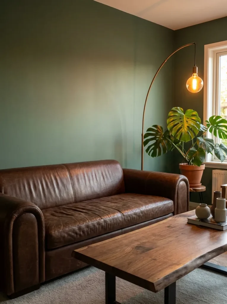
- Walls: Sherwin-Williams Retreat (SW 6207) in eggshell, a deeper, more grounded sage
- Seating: a low, wide chocolate brown leather sofa with rounded, waterfall-style arms
- Coffee table: solid walnut, thick slab top, chunky rounded legs
- Side table: a single sculptural bronze side table with a curved, organic shape
- Lighting: a bronze arc floor lamp plus a ceramic table lamp in a warm caramel glaze
- Rug: a chocolate brown and cream boucle-textured rug, thick and plush underfoot
- Wall decor: a large-scale abstract painting in brown, cream, and muted sage tones
- Plants: a Monstera Deliciosa in a bronze-glazed planter — its large, glossy leaves add scale and contrast against the leather sofa without introducing a new color
- Textiles: chocolate brown bouclé pillows, one cream linen pillow, a heavy wool throw in oatmeal
- Hardware: bronze throughout, warm and slightly matte rather than shiny
Why this works: Chocolate brown and sage are both grounded, earth-adjacent tones, which is why the pairing feels warm and enveloping rather than cold or overly styled.
This is the palette I’d recommend for a living room that needs to feel cozy through every season, not just fall. The deeper Retreat sage holds up against a full leather sofa in a way a paler sage couldn’t — it needs that extra depth to stay balanced next to so much brown. Waterfall-arm sofas are one of the more current silhouettes showing up in 2026 living rooms, trading the sharp, tailored arm of a decade ago for something rounder and more relaxed, which suits this warm, grounded color story perfectly.
That’s why many designers recommend leather in a deeper, more saturated sage room specifically — leather has a natural sheen and texture variation that flat fabric doesn’t, and it holds up better than a lighter-colored textile against a bold, dark palette like this one. The bronze hardware and lighting fixtures matter just as much; polished chrome or brass would feel too cool and formal against this much brown and green, while bronze’s warmer, slightly matte quality ties directly into the room’s overall grounded, enveloping mood without adding shine that competes with the leather.
12. Sage and Ivory, Airy Scandinavian-Modern
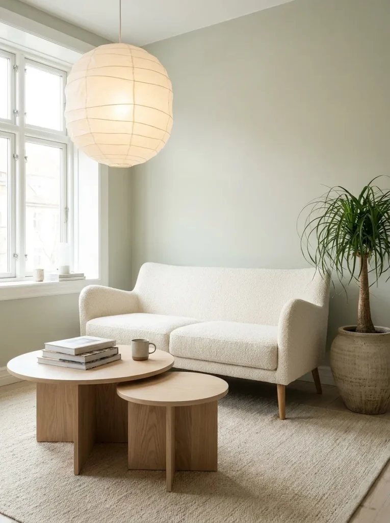
- Walls: Farrow & Ball Card Room Green in a pale, chalky finish, one of the lightest sage tones used across this whole collection
- Seating: an ivory bouclé sofa with softly rounded arms, raised on slim natural oak legs
- Coffee table: pale ash wood, nesting pair, one round and one slightly oval
- Lighting: a paper-shade pendant in warm white, plus a slim oak floor lamp with a linen shade
- Rug: an undyed wool rug in natural oatmeal, subtle woven texture, no pattern
- Wall decor: a set of two minimalist line-drawing prints in thin oak frames
- Plants: a Ponytail Palm (Beaucarnea recurvata) in a pale stoneware planter — chosen specifically because its sculptural, low-maintenance form suits a room this pared-back without adding visual clutter
- Textiles: ivory boucle pillows in two textures, one sage green linen lumbar pillow, a cream waffle-knit throw
- Hardware: natural oak and matte black mixed sparingly, kept minimal
Why this works: A pale, chalky sage paired with ivory and natural wood creates the airy, uncluttered look associated with Scandinavian-modern interiors, without relying on stark white walls.
Pale sage does something white walls can’t: it adds just enough color to keep a room from feeling clinical while still reading as bright, airy, and calm. This is the lightest palette in the whole collection, and it works because every material introduces subtle texture — bouclé, ash wood, paper, undyed wool — instead of relying on pattern or bold color to create visual interest. Nesting coffee tables are a practical, current choice here too, since they flex easily between a single surface for everyday use and two surfaces when hosting, without cluttering a small-scale, minimalist room.
I’ve seen this exact palette work especially well in smaller living rooms, where a darker sage can occasionally feel like it’s closing the walls in. The pale, chalky version of the color does the opposite — it opens the room up while still grounding it in something more considered than plain white. A pale, chalky sage functions similarly to a warm white in small rooms, adding color without visually shrinking the space. The single sage linen pillow is doing important work here too, tying the wall color back into the furniture without overwhelming an otherwise neutral, texture-driven room.
13. Sage and Teal, Bold Contemporary
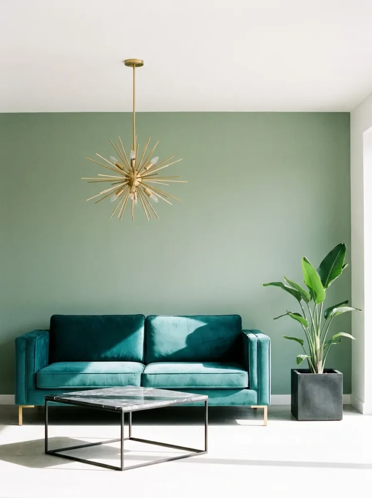
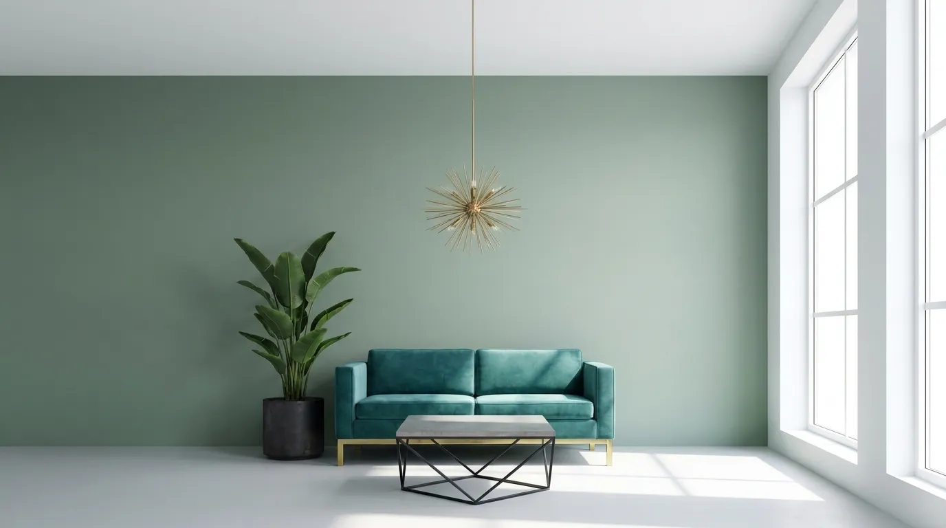
- Walls: Valspar Garden Path in matte, a true sage with just enough gray to stay grounded next to a saturated teal
- Seating: a boxy teal velvet sofa with clean, tailored lines, no skirt, exposed brass legs
- Coffee table: a sculptural black metal frame with a smoked glass top, angular rather than curved
- Side table: a single teal-glazed ceramic garden stool repurposed as a side table
- Lighting: a brass sputnik-style pendant, plus a slim black metal floor lamp with an adjustable head
- Rug: a low-pile wool rug in charcoal and cream, kept intentionally quiet against the bold sofa
- Wall decor: one large-scale photographic print in teal and sage tones, unframed and mounted flush
- Plants: a Bird of Paradise (Strelitzia nicolai) in a black concrete planter — its architectural, upright leaves add height and structure that a room this graphic needs
- Textiles: teal velvet pillows in two shades, one charcoal linen pillow, no pattern
- Hardware: brushed brass mixed with matte black, used deliberately in separate zones rather than blended
Why this works: Teal and sage are close enough on the color wheel to feel related, but different enough in saturation that the teal sofa still reads as the room’s clear focal point.
Teal is a color most people reserve for accent pillows, but used at full sofa scale against a true sage wall, it becomes the kind of bold, confident choice that photographs beautifully in any light. The boxy, tailored silhouette keeps the sofa from feeling overly dramatic, balancing the saturation of the fabric with a shape that reads as clean and current. A repurposed ceramic garden stool as a side table is the detail that makes this room feel collected rather than purchased as a matching set, adding an unexpected, slightly imperfect texture next to so much polish.
Sputnik-style pendants have shown real staying power in living rooms because their multi-directional light sources solve a common problem: a single overhead fixture rarely lights a whole seating area evenly. Positioned above the coffee table rather than centered in the room, this pendant casts warm brass-toned light across both the sofa and the garden stool, keeping shadows soft rather than harsh. It’s a lighting decision worth making early in a room this color-forward, since uneven light can make a bold teal sofa look muddy in the evening instead of rich.
14. Sage and Copper, Industrial Warm
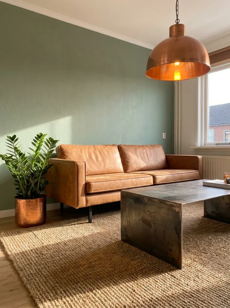
- Walls: Behr Sage Wisdom in eggshell, a mid-depth sage with a slightly warm undertone
- Seating: a tan leather sofa with exposed black metal legs, low and unfussy in silhouette
- Coffee table: raw steel with a copper-toned patina finish, industrial but low-profile
- Side table: a single copper drum table, hammered texture visible
- Lighting: a copper pendant with an exposed bulb, plus a black metal floor lamp with a copper shade lining
- Rug: a jute rug with a black overdyed pattern, durable and textural underfoot
- Wall decor: a large vintage-style map or botanical chart in a black metal frame
- Plants: a ZZ Plant (Zamioculcas zamiifolia) in a copper-glazed planter — its glossy, deep green leaves tolerate the lower light this industrial-style room often has with fewer windows
- Textiles: tan leather-adjacent linen pillows in rust and cream, a heavy wool throw in charcoal
- Hardware: copper and matte black mixed throughout, in roughly equal measure
Why this works: Copper’s warm, reflective surface keeps an industrial material palette from feeling cold, which is what makes it pair so naturally with a warm-leaning sage.
Industrial-style living rooms often lean too heavily on black and gray, which can leave a space feeling stark rather than warm. Copper solves that problem directly — its reflective, warm-toned surface catches light in a way that matte black metal simply can’t, softening the room’s overall mood without abandoning the industrial material story. The exposed-bulb pendant is doing double duty here, functioning as both a light source and a piece of sculptural decor, which matters in a room built from fewer, more deliberate objects rather than layers of smaller accessories.
Raw steel and copper both develop a natural patina over time, and that’s a detail worth knowing before you commit to this material story. My husband’s crews see this constantly with copper fixtures installed near kitchens and living areas — the metal darkens and shifts color gradually with handling and humidity, which most people either love or find frustrating if they expected it to stay bright and polished. Sealing copper pieces with a clear lacquer slows that process considerably if you want to preserve the original warm tone longer.
15. Sage and Graphite, Monochrome Modern
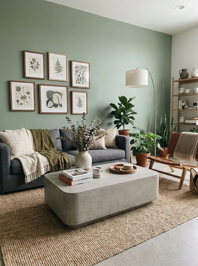
- Walls: Sherwin-Williams Sagey (SW 6178 alternate) in a matte finish, cool and slightly deeper than a pastel sage
- Seating: a graphite gray linen sofa with a low, wide silhouette and softly rounded corners
- Coffee table: poured concrete, rectangular, with rounded edges to soften its industrial material
- Side table: a single sculptural stone side table in a lighter gray
- Lighting: a matte black floor lamp with a linen drum shade, plus a small brass reading lamp as the room’s one warm accent
- Rug: a graphite and cream herringbone wool rug, textural but tonal
- Wall decor: a grid of small black-and-white photography prints, evenly spaced
- Plants: a String of Pearls (Senecio rowleyanus) trailing from a concrete hanging planter, plus a Snake Plant on the floor — paired together to add organic movement and height against so many hard, flat surfaces
- Textiles: graphite linen pillows in two textures, one cream boucle pillow, a charcoal wool throw
- Hardware: matte black throughout, with the single brass lamp as an intentional exception
Why this works: Anear-monochrome palette built from sage, graphite, and cream reads as calm and sophisticated because the eye has almost nothing competing for attention.
Building a living room around sage and graphite instead of sage and a bold accent color is a genuinely different design decision — one that photographs as quietly confident rather than loud or trend-driven. Concrete and stone as primary materials add real textural depth without introducing any additional color, which keeps the palette feeling deliberate rather than incomplete. The single brass lamp is the room’s one warm note, and it’s placed specifically for reading, giving it a functional reason to exist rather than feeling like an arbitrary metal-mixing decision.
I’ve noticed that clients drawn to an almost entirely tonal room like this one often worry it will feel boring in person, but the opposite tends to be true once the textures are layered in. Poured concrete, linen, stone, and trailing greenery all catch and hold light differently, which keeps a monochrome room from ever feeling flat, even without a single bold color anywhere in the space. A tightly limited color palette relies on material and texture variation to create visual interest, rather than on color contrast. That’s the real skill behind a room this restrained.
Choosing Your Secondary Color
Sage’s biggest advantage over other trending greens is flexibility — but that flexibility only works if you choose a secondary color based on the mood you actually want, not just what’s trending on Pinterest that week. A few things worth weighing:
Match saturation to saturation. Pale, chalky sage tones pair best with equally soft secondary colors — cream, blush, dusty blue — because a bold color against a pale wall can overpower the room instead of complementing it. Deeper, more saturated sage shades can hold their own against equally bold pairings like burgundy, teal, or chocolate brown. Mismatching saturation levels — a pale sage with a saturated jewel tone, or a deep sage with a whisper-soft pastel — is the most common reason a “good on paper” pairing feels off once it’s actually on the wall.
Consider your room’s natural light before your color scheme. A north-facing living room with limited direct sun will read cooler and grayer than the same paint color in a south-facing room flooded with afternoon light. If your room runs dim, lean toward a warmer-undertone sage and warmer metal finishes — brass, bronze, copper — rather than cool chrome and black, which can make an already dim room feel flatter and more clinical.
Metal finish sets the formality level of the whole room. Brushed brass and unlacquered bronze read as warm and slightly relaxed. Chrome and polished nickel read as crisp and modern. Matte black splits the difference, reading current without tipping too formal or too cozy. Choosing one dominant finish per room — rather than mixing three or four — is what keeps a sage green living room looking intentional instead of accumulated.
Texture matters as much as color once you’re past two tones. Nearly every idea in this list layers in at least three distinct textures — bouclé, marble, rattan, leather, plaster — specifically because a limited color palette needs texture to avoid feeling flat. This is especially true in the pared-back Scandinavian-modern and monochrome ideas above, where color contrast is intentionally minimal and texture is doing almost all the visual work.
Frequently Asked Questions
What colors pair best with sage green in a living room? Sage pairs successfully with an unusually wide range of colors because it sits close to neutral on the color wheel. Warm pairings like rust, mustard, and chocolate brown create a cozy, grounded mood, while cool pairings like navy, charcoal, and dusty blue create a crisper, more contemporary feel. Jewel tones like burgundy and teal work well against deeper sage shades specifically.
Does sage green work in a small or dark living room? Yes, but the specific shade matters more than in a larger, brighter room. Pale, chalky sage tones function similarly to a warm white in small spaces, adding color and depth without visually shrinking the room the way a deep, saturated sage can. In genuinely dark rooms, a deeper sage paired with warm lighting often reads better than a pale sage that can look gray and flat without adequate natural light.
What’s the best paint finish for sage green living room walls? Eggshell is generally the best balance for living room walls, reflecting enough light to keep the color feeling alive throughout the day while holding up to regular cleaning better than a flat or matte finish. Matte finishes work well for accent walls or rooms with less direct light exposure, though they show scuffs more readily in high-traffic living areas.
How do I try sage green without a full room renovation? Start with a single accent wall, a set of throw pillows, or a large piece of art that incorporates sage tones before committing to a full paint job. Textiles and smaller accessories let you live with the color and see how it reads in your specific lighting before making a bigger investment in wall paint or upholstered furniture.
What plants pair best with sage green walls? Plants with contrasting leaf tones tend to stand out more clearly against sage than plants in a similar green shade. Deep burgundy or near-black foliage, like a Burgundy Rubber Plant, creates strong visual contrast, while silvery-toned plants like an Olive Tree echo the wall color without matching it exactly. Low-light tolerant options like Snake Plants and ZZ Plants work well in sage rooms with limited natural light.
Is sage green a passing trend or a long-term choice? Sage green’s staying power comes from its desaturation — it behaves more like a neutral than a true, saturated color, which is why it hasn’t cycled out the way brighter trend colors typically do. Rooms built around sage tend to age well precisely because the color itself doesn’t compete for attention; it’s flexible enough to be restyled with new secondary colors and accessories without ever needing to be repainted.
Conclusion
Fifteen rooms, fifteen completely different moods — that’s the real case for sage green as a living room color. It flexes from warm and cozy to crisp and contemporary depending on what you pair it with, which is a rare quality in a single paint color. If one of these sage green living room ideas caught your eye, start small: test a swatch on your wall, live with it in different light for a few days, then build outward from there with furniture and textiles. Save this post to your Pinterest board so you can come back to it while you plan, and pass it along to anyone else who’s on the fence about this color.
I’ve seen how much a well-chosen palette can change the whole feel of a room, and sage green, done right, is one of the easiest ways to get there.