17 Vibrant Summer Mantel Ideas for a Fresh Home
Your mantel is still wearing its winter coat, and it’s dragging your whole living room down with it. That candle arrangement made sense in December. Right now, in the middle of July, it just reads as forgotten. These summer mantel ideas exist to change that — fast, cheap, and without redoing a single other thing in the room. The mantel is the highest-impact, lowest-effort update in the whole house. It’s the first thing guests see the second they walk through the door, lit fireplace or not. So skip the safe, muted “summer neutral” trend everyone else is doing.
This is cobalt, coral, marigold, and lavender — bold colors done right, styled with the same layering tricks and firebox fixes used in homes across Austin all season long. Seventeen full mantel scenes—zero boring ones. Pin your favorites now.
Why Your Mantel Still Matters in Summer
Even with no fire lit for months, the mantel doesn’t clock out for summer. It’s still the architectural anchor of the room — the one surface your eye locks onto the second you walk in, before you even register the couch or the rug. That’s not just opinion; it’s basic visual hierarchy, the same principle designers use to decide where a room’s “focal point” should live. Walking into client homes in June, the fastest way to spot a neglected living room is a mantel still dressed for December. A vibrant summer mantel refresh fixes that instantly, without touching another inch of the room.
Cobalt & Citrus Ledge: A Bold Summer Mantel Idea
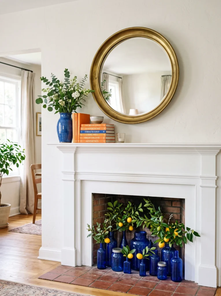
- Round convex mirror in a brushed brass frame as the anchor piece
- One tall cobalt blue ceramic vase, styled slightly off-center
- Small stack of hardcover books with citrus-orange spines for height variation
- Cluster of cobalt glass bottles filling the empty firebox, holding fresh citrus branches
- Brass pillar candle tucked to one side for evening warmth
- Optional: a single piece of raw citrine or yellow stone for texture
Why this works: Cobalt and citrus sit opposite each other on the color wheel, so together they read as deliberate contrast rather than clashing accident.
Convex mirrors have quietly become one of the easiest ways to update a mantel without a full redesign, and they earn their keep in summer especially. Because the glass curves outward, it catches and bends natural light across the room all day, which keeps the whole vignette feeling alive even when nobody’s paying it direct attention. Pair the brass frame with a single saturated cobalt vase and you get a grounded, intentional look instead of a scattered one. It’s the kind of styling move that photographs beautifully but is genuinely simple to pull off in an afternoon.
The empty firebox is usually the part people forget, and it’s exactly what makes a mantel look unfinished into summer. Filling it with a cluster of cobalt glass bottles solves that instantly — they catch the citrus branches’ color and hold their own visual weight even from across the room. At night, swap your attention to the brass candle up top; the warm flicker against cool cobalt keeps the palette from feeling flat once daylight fades. It’s a small adjustment, but it’s the difference between a mantel that looks curated and one that looks like an afterthought.
Hot Coral Statement
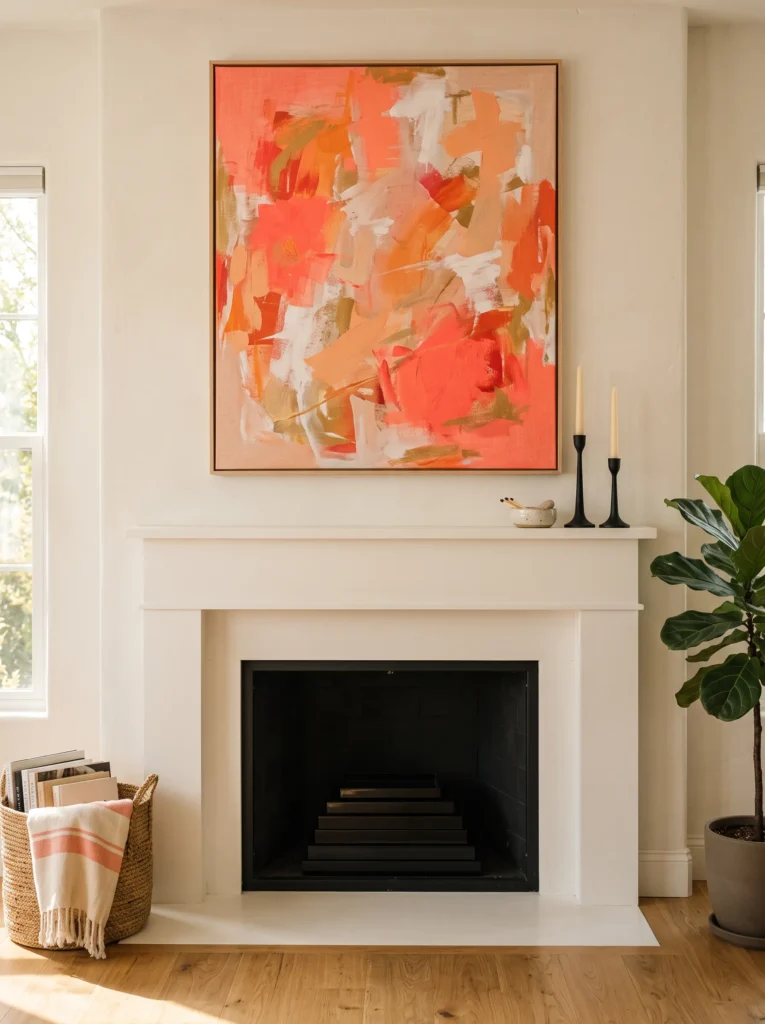
- Large abstract art canvas in hot coral tones as the anchor
- Two matte black taper candlesticks at varying heights, off-center from the art
- Small cream ceramic dish for a pop of contrast and negative space
- Matte black lacquer tray stacked flat inside the firebox for a clean base layer
- One trailing piece of greenery draped just past the mantel edge
Why this works: Warm, saturated hues like coral visually “advance” toward the eye, so the mantel feels present and finished even with the fireplace dark and unused.
A lot of people hesitate to go this bold with art above a mantel, worried it’ll feel like too much. It doesn’t, as long as everything underneath it stays restrained. That’s the trick — one loud piece, and quiet, matte-finish supporting objects around it. The black taper candlesticks at uneven heights keep your eye moving instead of landing flat, and the cream dish gives the whole grouping a breathing space. Bold abstract art like this often turns up at estate sales for under thirty dollars, which is more common than people expect.
For the empty firebox, resist the urge to fill it with anything busy. A flat stack of matte black lacquer trays gives it a finished, intentional base without competing with the coral canvas above. During the day, natural light keeps the coral fully saturated as long as the wall isn’t in direct harsh sun, which can wash warm tones out over time. In the evening, the black tapers do the real work, their flicker pulling warmth down toward the hearth level so the whole mantel feels balanced top to bottom instead of top-heavy.
You’ll Also Love: 15 Summer Front Porch Decorating Ideas Worth Stealing
Emerald Glass Grouping
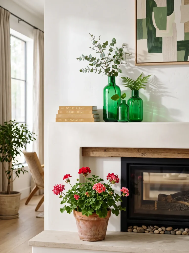
- Three emerald green glass vases clustered at varying heights
- Small stack of honey-toned linen-bound books beneath the tallest vase
- Single brass candlestick tucked slightly behind the grouping
- Terracotta pot of geraniums placed directly in the firebox
- Votive candles nestled behind the glass for evening glow
Why this works: Grouping objects in one consistent color family — here, emerald glass — is a reliable styling shortcut that makes varied shapes and sizes read as one cohesive collection instead of clutter.
Glassware groupings are one of the most underrated mantel ideas because they do double duty: texture and color, without needing a single “big” piece to anchor everything. Three emerald vases at different heights create the layering effect designers talk about, but really it’s just simple math — tall, medium, short, done. Thrifted glass in this color shows up constantly at flea markets and estate sales for a few dollars each, so this is one of the more budget-friendly ideas on this list. The honey-toned books underneath soften the green and keep it from feeling cold or sterile.
The firebox on this one is a standout detail. Geraniums genuinely thrive in a hot, sunny mantel spot most other plants would struggle with, and their coral-red blooms play beautifully against the emerald glass without competing for attention. They hold up through hot summers better than almost anything else you could put there. During the day, sunlight passes through the glass and casts faint green shadows across the mantel wall — a small, almost accidental detail that makes the whole vignette feel considered rather than staged.
Turquoise & Terracotta Cluster
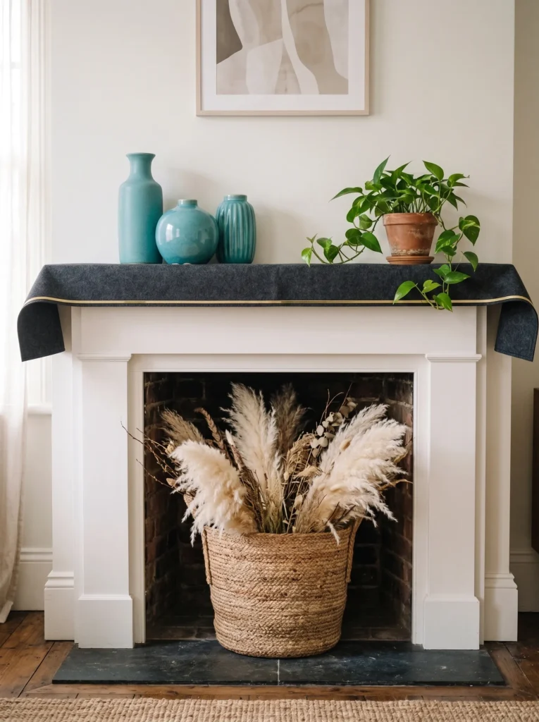
- Grouping of three turquoise ceramic vases, mismatched shapes, same finish
- Terracotta pot planter tucked into the grouping for material contrast
- Woven jute basket filling the firebox, holding dried pampas grass
- Small brass bookend anchoring one side for structure
- Cream linen runner laid flat along the mantel ledge
- Optional: a chunky raw wood slice as a base riser for the tallest vase
Why this works: Turquoise and terracotta sit on opposite temperature ends of the color spectrum, so pairing a cool glaze with a warm clay tone keeps the grouping visually balanced instead of one-note.
Terracotta’s slightly rough, porous texture reads as “warm” to people almost instinctively, even before they consciously register the color — which is exactly why it pairs so well against something as saturated as turquoise glaze. The texture does half the work. Grouping three vases of varying heights, all in the same turquoise finish but different shapes, keeps the collection cohesive without looking matchy. It’s an easy weekend project if you’re sourcing pieces secondhand.
The firebox gets the woven jute basket treatment here, which solves two problems at once: it hides the dark, empty opening, and it adds a natural texture that keeps all that saturated color from feeling too polished or precious. Dried pampas grass inside adds height without needing water or upkeep through hot months, which matters if your mantel doesn’t get much foot traffic for touch-ups. During the day, the jute’s natural fiber softens the light bouncing off the glossy ceramic glaze. In the evening, a single taper beside the grouping is really all this vignette needs.
Hot Pink Salvage
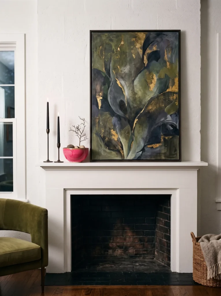
- Salvaged arched window frame, paint distressed, as the anchor piece
- Two black taper candles at uneven heights in front of the frame
- Small hot pink ceramic bowl holding a few loose blooms
- Gold-rimmed glassware stacked flat inside the firebox
- Thin brass bud vase tucked into the negative space beside the frame
Why this works: A neutral, weathered salvage piece gives a saturated color like hot pink somewhere to “land” — without it, this much color intensity can start to feel more like a paint sample than a styled room.
Salvaged architectural pieces are among the best anchor choices because they carry a kind of history a brand-new object just can’t fake. An old arched window frame, especially one with a bit of chipped paint left intact, gives hot pink something aged and neutral to rest against instead of competing with. This isn’t a color that needs more color around it — it needs contrast and restraint. The black candlesticks do exactly that, pulling the eye down and grounding the whole arrangement so it reads as curated rather than accidental or overly saturated.
For the firebox, stacking flat gold-rimmed glassware works better than anything upright — it keeps the sightline low and lets the arched frame stay the clear visual priority above. During the day, natural light catches the gold rims and throws small warm reflections across the hearth floor, a detail most people notice only after they’ve lived with it a while. At night, the two black tapers cast long shadows through the arch’s negative space, which is honestly the most dramatic this list gets after dark.
Sunshine Yellow Weave
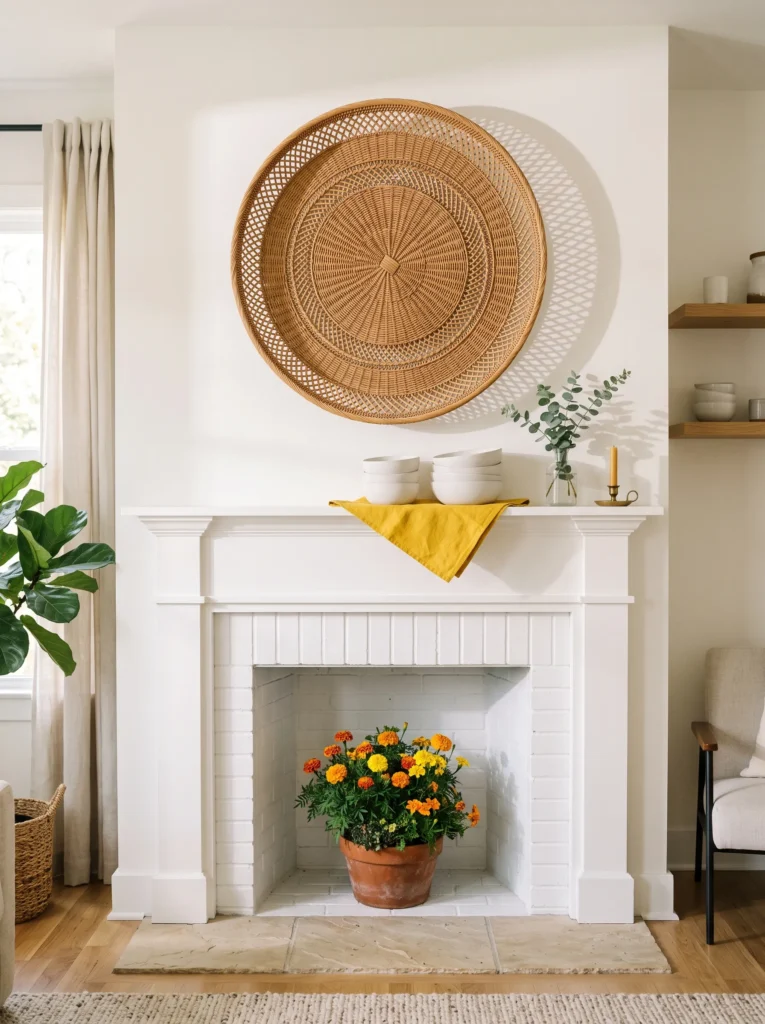
- Large woven rattan wall hanging as the anchor piece, hung slightly above mantel height
- Small stack of white ceramic bowls, graduated sizes
- Terracotta pot of marigolds placed directly in the firebox
- Thin brass taper holder tucked beside the ceramic stack
- Sunshine yellow linen napkin folded flat beneath the bowls for a color anchor
Why this works: Natural woven texture keeps a color this saturated from tipping into “loud” — the rattan’s warm, organic tone acts as a built-in neutral even though nothing else on the mantel technically is one.
Woven pieces almost never get enough credit as mantel anchors, but a large rattan hanging does something a flat art piece can’t: it adds real dimension and shadow play across the wall behind it. Hung just slightly above the mantel line, it draws the eye upward without overwhelming the ledge below. The graduated white ceramic bowls keep things simple and let the yellow linen underneath do the color work instead. This is one of the easier looks to maintain through the season, since rattan and ceramic both hold up well without much upkeep.
Marigolds are genuinely one of the best plant choices for a mantel firebox in peak summer heat — they’re heat-tolerant, bloom in exactly this saturated yellow-orange range, and don’t demand much water to keep going. Planting them directly in a terracotta pot gives the firebox real, living color instead of a static prop. During the day, the rattan casts soft woven-pattern shadows across the wall that shift as the sun moves. By evening, the single brass taper is enough — this vignette doesn’t need much artificial light to still feel complete.
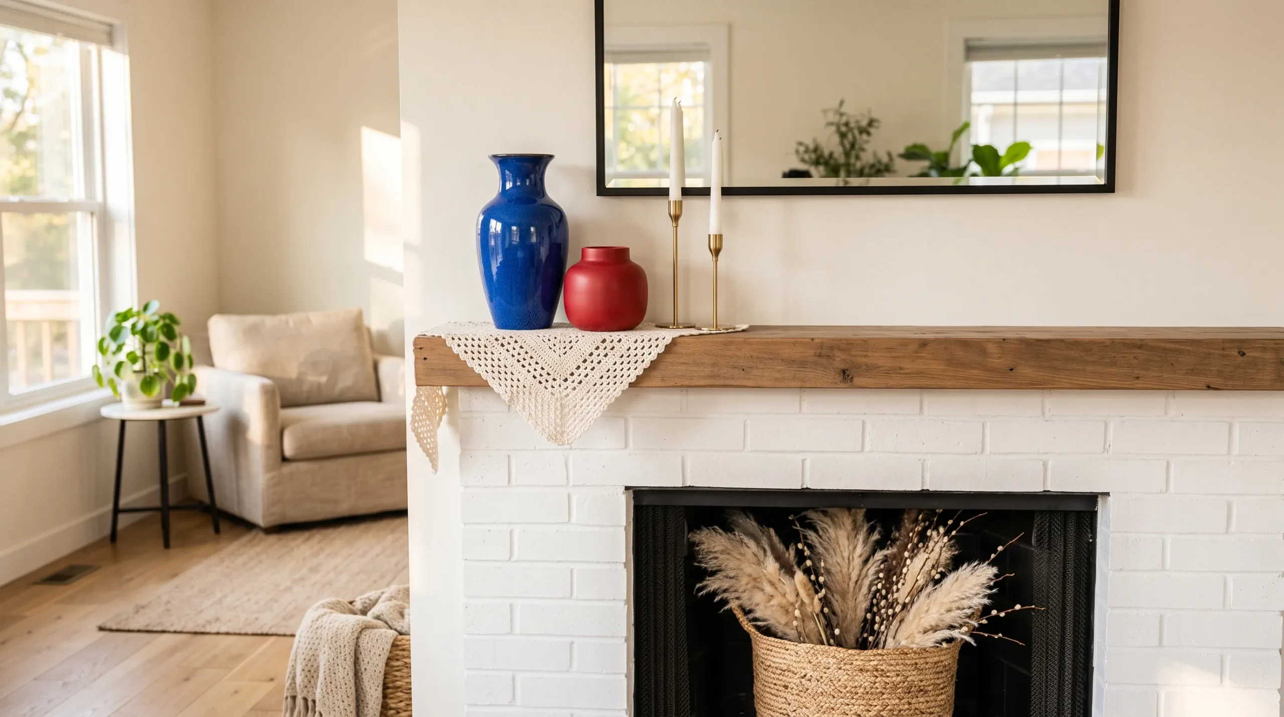
Citrus Marble Edit
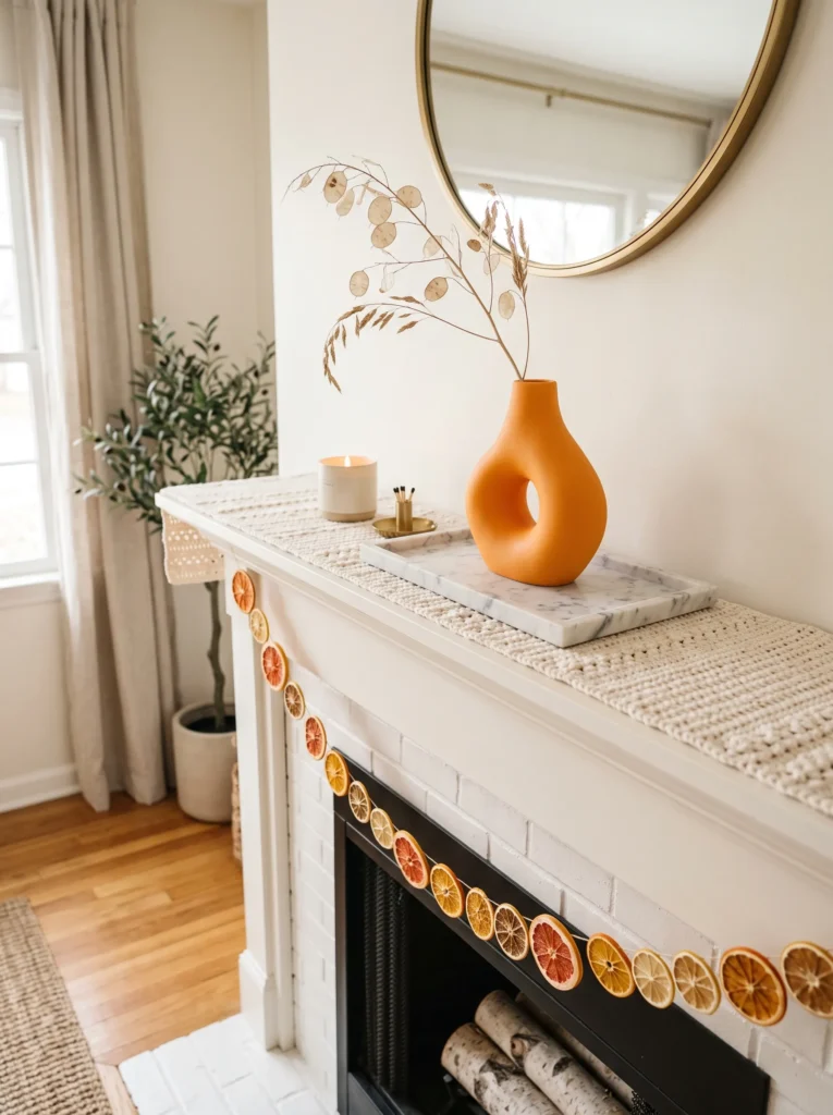
- White marble tray as a low, modern base layer
- Sculptural ceramic vase in matte citrus orange, single stem
- Hand-crocheted cream runner laid beneath the tray for texture contrast
- Small stack of white matte objects at graduated heights
- Brass matchbox holder tucked into the negative space
- Bundle of dried citrus slices strung and draped over the firebox opening
Why this works: A single saturated color against an all-white, all-matte backdrop reads as modern and deliberate — the eye has exactly one place to land instead of scanning for a focal point.
This is the pared-back option on this list, and a good starting point if you’re newer to working with bold color. One matte citrus vase does all the visual work here, which means everything else — the marble tray, the crochet runner, the white ceramic stack — can stay quiet. The crochet runner is a small detail, but it softens what would otherwise be a very hard-edged, modern grouping. Marble and crochet together sounds like an odd pairing on paper; in practice, it keeps things from feeling cold or showroom-staged.
For the firebox, skip anything upright here. A bundle of dried citrus slices strung on twine and draped loosely across the opening gives it texture and a subtle scent note without adding visual clutter to an otherwise minimal scene. During the day, the marble’s natural veining catches light differently depending on the angle, which keeps this look from feeling static even though nothing on it moves. At night, the single brass matchbox holder is really more of a finishing detail than a light source — this vignette relies on its restraint, not its glow, to hold together.
Suspended Bloom Curtain
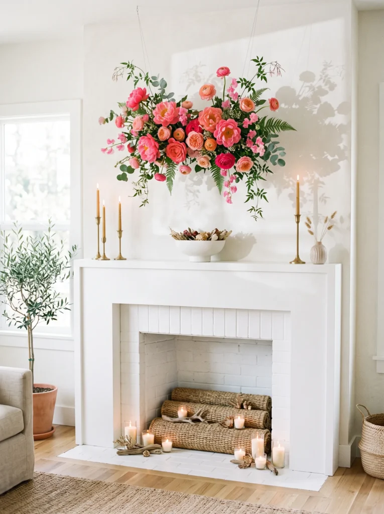
- Hanging fresh flower installation suspended just above the mantel ledge, hot pink and coral blooms
- Low, wide ceramic bowl in matte white beneath it
- Two brass candlesticks flanking the bowl at different heights
- Woven seagrass mat rolled flat inside the firebox as a base layer
- Small cluster of votive candles nestled into the seagrass for evening glow
Why this works: Suspending the color above eye level instead of stacking it on the ledge itself creates vertical movement, which is one of the simplest ways to make a mantel feel taller and more dramatic without adding height to the furniture itself.
This idea works especially well in rooms with higher ceilings, where a flat, ledge-only mantel display can start to feel a little lost. Hanging a cluster of hot pink and coral blooms from just above the mantel line fills that dead vertical space and pulls the eye upward the second you walk in. Fresh flowers work here, but so do dried or silk versions if you want something lower-maintenance through a busy summer. Keep everything below it — the bowl, the candlesticks — in matte white so the hanging blooms stay the obvious priority.
The firebox gets a simple seagrass mat rolled flat as its base, which keeps the whole look feeling natural and unfussy rather than overly styled. Nestle a small cluster of votives into it for evening, and you get a soft, flickering glow that plays well against the pink and coral overhead without competing for attention. During the day, natural light filtering through the hanging blooms casts faint colored shadows on the wall behind — a detail that photographs beautifully and genuinely surprises people the first time they notice it happening in their own room.
Cobalt Crochet Ledge

- Sculptural ceramic vase in glossy cobalt blue as the anchor
- Hand-crocheted runner in white and cobalt stripe beneath it
- Small brass bud vases clustered at one end, varying heights
- Chunky raw wood riser lifting the tallest piece
- Woven basket filled with rolled linens set inside the firebox
Why this works: Repeating one color across two different materials — glossy ceramic and soft crochet fiber — is a reliable way to make a single saturated hue feel intentional rather than like an isolated accent.
Crochet runners are a great layering piece on mantels, mostly because they solve a problem plain fabric can’t: texture. A glossy cobalt vase on bare wood or marble can look a little stark and showroom-ish. Set it on a hand-crocheted runner instead, and suddenly the whole grouping feels warmer and more collected, like it built up over time rather than arriving all at once from one store. The raw wood riser underneath the tallest vase adds another organic texture layer, which keeps this modern color story from feeling too slick or impersonal.
A raw, unfinished wood riser almost always reads as more expensive than it costs, simply because of the texture contrast against glossy ceramic. For the firebox, a woven basket loaded with rolled linens keeps things soft and practical — genuinely useful storage hiding in plain sight. During the day, the cobalt glaze catches and holds light in a way flat paint never quite manages, giving this whole ledge a subtle shimmer even without a single candle lit.
Magenta & Brass Gallery
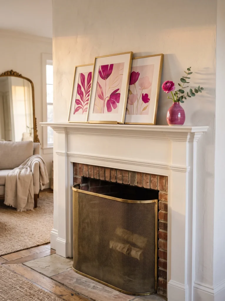
- Small gallery of three framed art prints in magenta and blush tones, leaned rather than hung
- Thin brass ledge or plate stand supporting the frames
- Single magenta ceramic bud vase with one flower stem
- Stack of blush linen napkins as a soft base layer
- Rolled brass mesh screen tucked into the firebox for texture and shine
Why this works: Leaning framed art instead of hanging it lets you adjust the arrangement seasonally without new nail holes, and the slight overlap between frames adds depth a single flat piece can’t achieve on its own.
Leaned art groupings tend to photograph better than perfectly hung single pieces, mostly because the slight overlap and uneven angles create natural shadow lines that a flat-mounted piece just doesn’t have. Magenta is a genuinely underused color on mantels — it’s bold without tipping into the neon territory hot pink can sometimes edge toward, and it pairs beautifully with warm brass instead of needing cool metals to balance it. The blush linen napkins folded flat beneath everything keep the whole grouping grounded and prevent the magenta from feeling like the only color decision in the room.
The firebox here gets a rolled brass mesh screen, which is a detail borrowed loosely from actual fireplace hardware rather than pure styling — it reads as intentional and slightly industrial against all that soft magenta and blush. During the day, the brass plate stand catches ambient light and throws faint warm reflections up onto the leaned frames. By evening, that same brass keeps doing quiet work, picking up whatever candlelight is nearby and scattering it just enough to keep the whole gallery moment from going flat once the sun’s down.
Periwinkle Grove
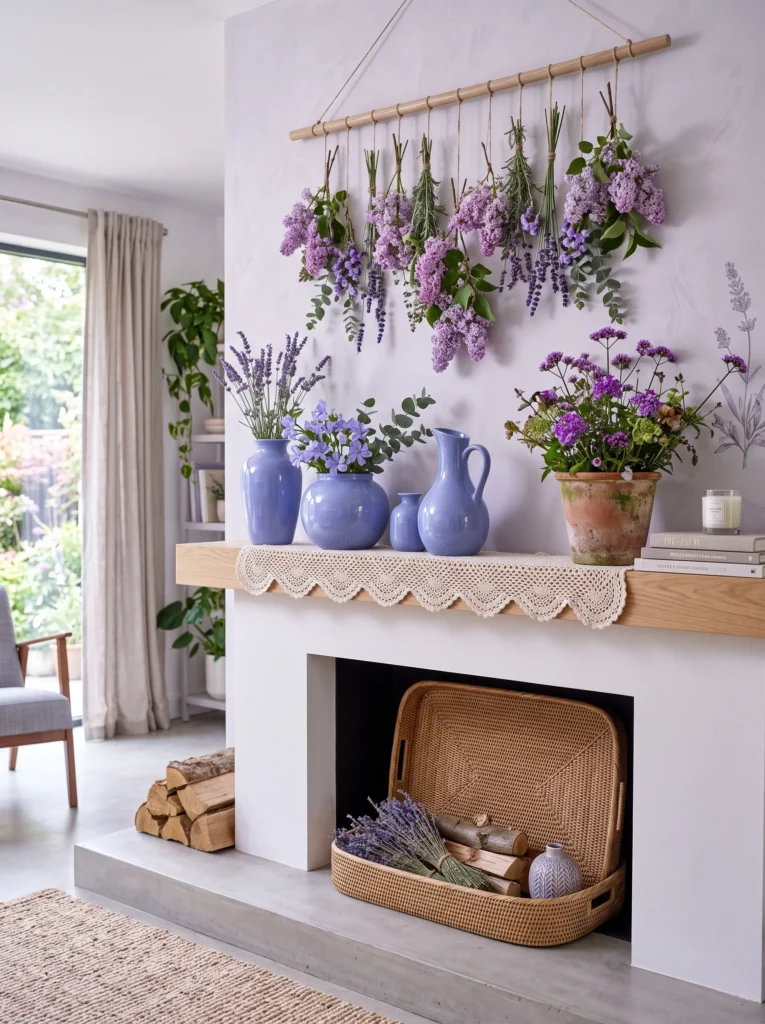
- Cluster of periwinkle-blue ceramic vessels, mismatched heights, glossy finish
- Small hanging arrangement of fresh lilac and lavender blooms suspended above the ledge
- Hand-crocheted trim runner in white with periwinkle edge stitching
- Terracotta pot of heat-tolerant verbena tucked into the grouping
- Woven rattan tray filling the firebox as a clean base
Why this works: Blue-violet tones like periwinkle sit in a genuinely rare space for mantel styling — vibrant enough to feel current, but cool enough to keep a room feeling airy rather than heavy, which matters most in a smaller or lower-light living room.
This is one of the more layered ideas on this list, but it comes together easier than it looks. Start with the glossy periwinkle vessels grouped at the center, then hang a small, loose cluster of fresh lilac and lavender blooms just above the ledge — the suspended piece pulls the eye upward while the vessels below hold everything grounded. The crocheted trim runner underneath is a subtle detail most guests won’t consciously clock, but it’s exactly the kind of texture that makes a summer mantel display feel finished rather than assembled in a rush the morning company arrives.
Verbena earns its spot in the firebox here because it genuinely tolerates the kind of heat a mantel gets in a sun-facing living room through peak summer, and its small purple-pink blooms echo the periwinkle above without matching it exactly, which keeps the whole grove-inspired scene feeling natural rather than color-matched too perfectly. During the day, light moving through the hanging blooms casts faint violet shadows across the glossy vessels below. In the evening, skip candles entirely here — the periwinkle glaze alone holds enough visual weight to carry the mantel after dark.
Tangerine & Teal Contrast
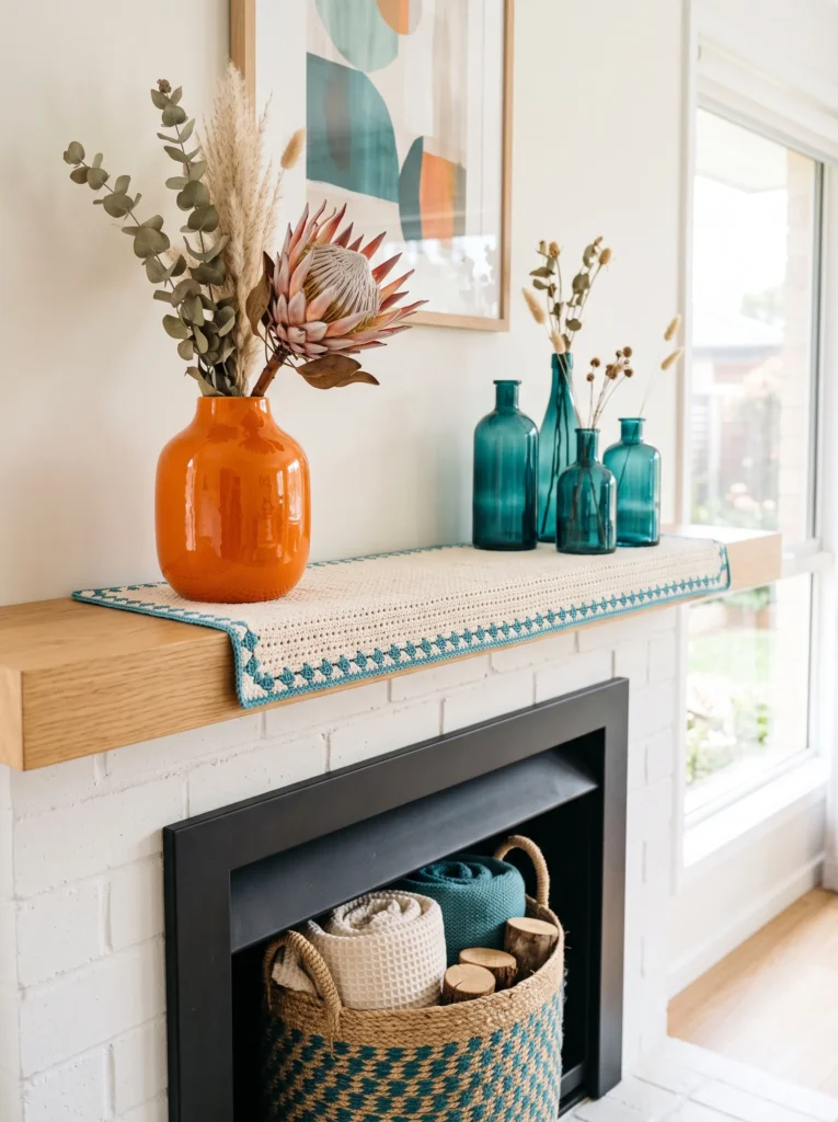
- Glossy tangerine ceramic vase as anchor, single sculptural shape
- Deep teal glass bottles clustered beside it, varying heights
- Hand-crocheted runner in cream with teal edge trim
- Small brass ring holder tucked into negative space
- Woven teal-and-natural jute basket filling the firebox
- Optional: single dried protea for an unexpected textural moment
Why this works: Tangerine and teal sit almost directly opposite each other on the color wheel, making this one of the highest-contrast pairings on the list — true complementary colors read as vibrant and confident rather than random when used in similar saturation levels.
Complementary color pairings like this one can feel intimidating on paper, but they’re actually more forgiving in practice than people expect, as long as you keep the quantities uneven. One dominant tangerine piece, then a supporting cluster of teal glass, rather than splitting the mantel fifty-fifty — that’s really the whole trick. The crocheted runner underneath softens what would otherwise be a fairly graphic, high-contrast look, and the single dried protea adds a textural surprise that keeps the eye moving instead of settling too quickly on just the two main colors.
For the firebox, the teal-and-jute woven basket carries the cooler color down into that lower space, which keeps the whole mantel display feeling balanced from top to bottom rather than color-heavy only up top. During the day, the glossy tangerine vase catches direct light and holds its saturation even in bright sun, which matters if your living room windows face west. In the evening, the teal glass bottles pick up ambient light differently than the matte tangerine does, giving the whole grouping a subtle shift in mood once the sun goes down.
Rose & Rattan Layer
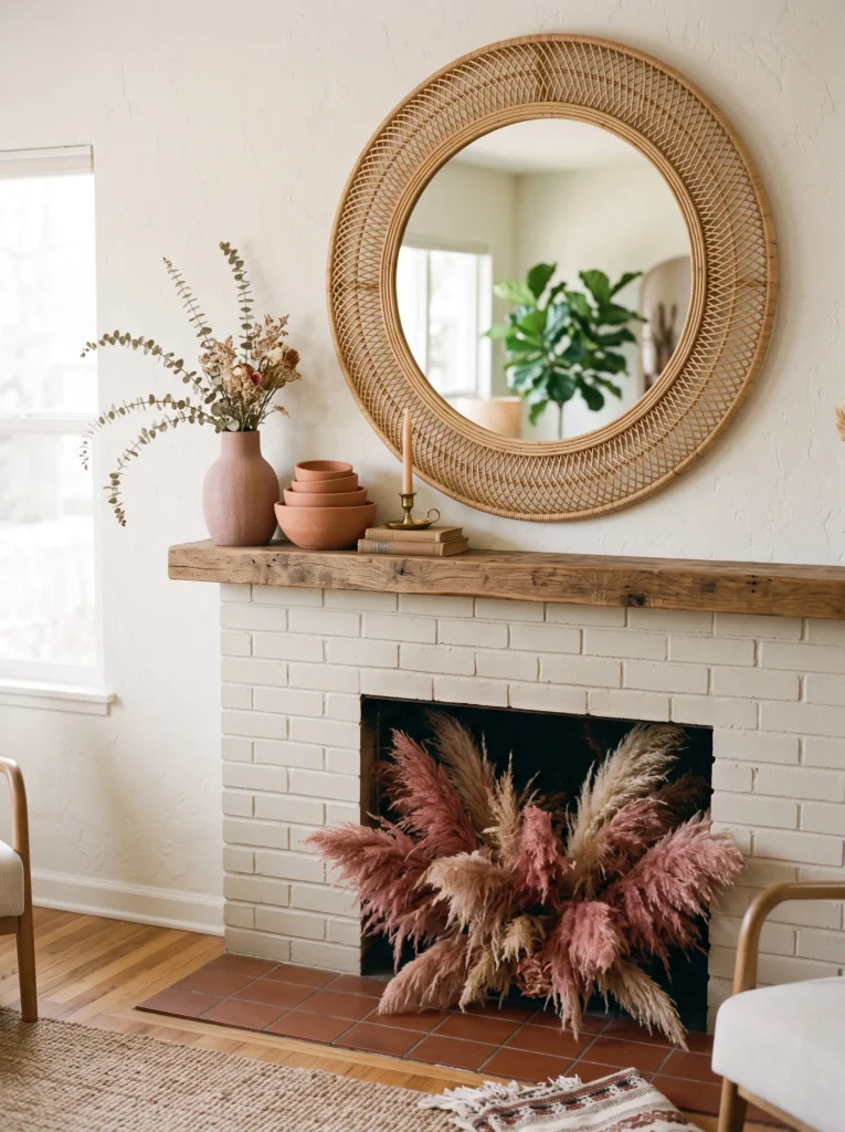
- Woven rattan mirror as the anchor piece, round shape
- Dusty rose ceramic vase with a single trailing stem
- Hand-crocheted runner in blush and cream stripe
- Small stack of terracotta bowls, graduated sizes
- Bundle of dried rose-toned pampas grass filling the firebox
- Thin brass taper for evening warmth
Why this works: Rattan’s warm, neutral texture keeps a rose-toned palette from reading as overly sweet or pastel — the natural material adds enough visual weight to make the color feel grounded and intentional.
Round rattan mirrors have been showing up more in warm-weather styling lately, and there’s a genuine reason beyond trend: the woven texture reflects and diffuses light differently than a plain glass-framed mirror does, giving the whole wall behind the mantel a softer, more textured glow. Set a dusty rose vase in front of it with one trailing stem, and you get movement without needing a full floral arrangement. The crocheted runner beneath ties the woven theme together from the mirror down to the ledge, which is a small repetition trick that makes the whole grouping feel deliberately planned rather than assembled piece by piece.
Dried pampas grass in a rose-toned dye is one of the easiest ways to bring color into a firebox without any plant maintenance at all through a hot, busy summer. It holds its shape and color for months, and it fills the empty opening with real height and softness rather than leaving it looking hollow. During the day, the rattan mirror scatters light in small warm flecks across the mantel wall. At night, one brass taper is genuinely enough — this palette relies on texture and warmth, not a lot of light, to feel complete.
Cherry Red Edit
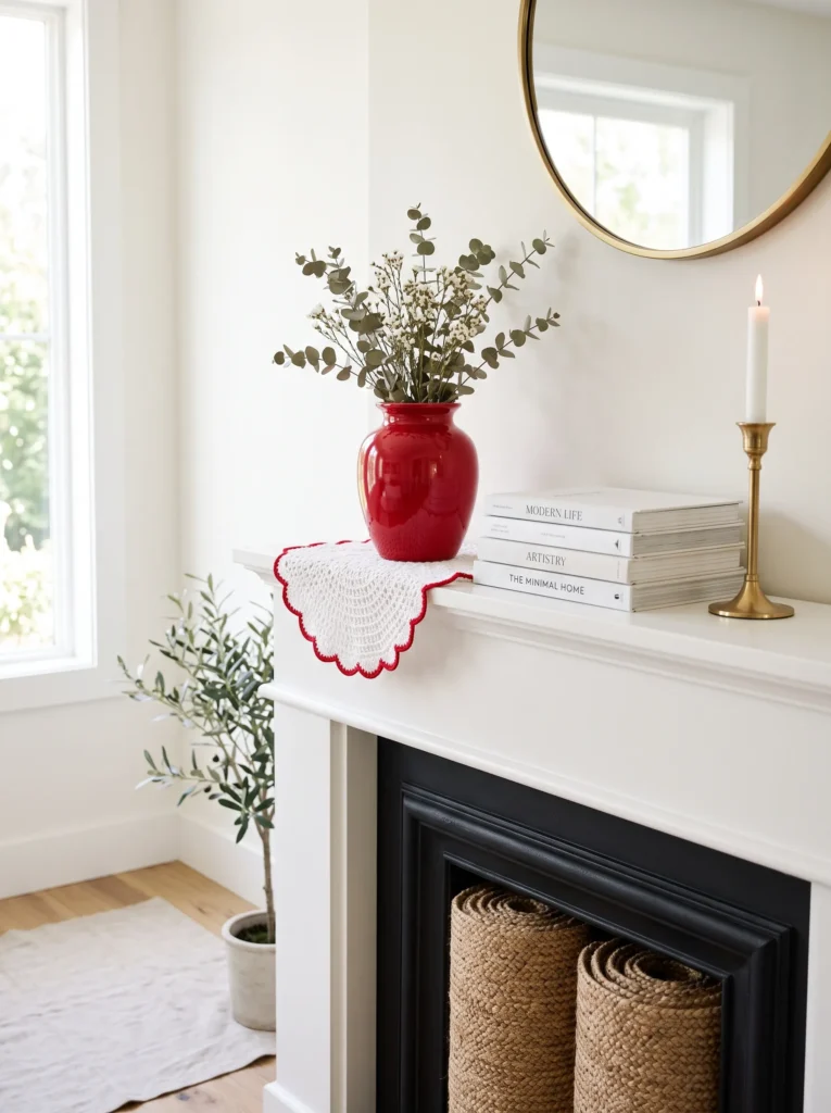
- Glossy cherry red ceramic vase, sculptural single form, as anchor
- Small stack of white matte books for height contrast
- Hand-crocheted runner in white with cherry red edge trim
- Brass matchbox holder and thin taper beside the vase
- Woven natural jute mat rolled flat inside the firebox
- Optional: single stem of red ranunculus for a fresh detail
Why this works: A single, confident red statement piece against an otherwise all-white, all-neutral backdrop is one of the most reliable modern styling formulas — it reads as curated because there’s genuinely nothing else competing for attention.
Cherry red doesn’t show up often in mantel styling, probably because it can read as more of a winter or holiday color if it’s not handled carefully. The trick is context: paired with white matte books, a plain crocheted runner, and warm brass instead of anything metallic-cool, cherry red shifts into feeling modern and current rather than seasonal in the wrong direction. One glossy vase, a single stem of ranunculus if you want a fresh detail, and genuinely nothing else competing with it — that restraint is what makes this idea feel high-end rather than like a decoration left up too long.
The firebox stays intentionally understated here, with just a rolled jute mat as a base layer, because this whole vignette relies on one strong color statement rather than layered texture to carry it. During the day, the glossy red glaze holds its saturation beautifully even in bright light, which is exactly why gloss finishes tend to photograph so well for bold single-color moments like this one. In the evening, the small brass taper beside the vase adds just enough warmth to keep the red from reading cold or flat once natural light fades from the room.
Marigold & Denim Blue
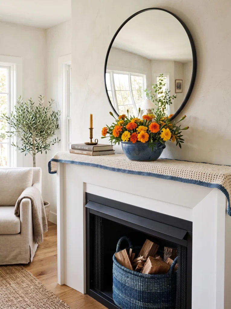
- Round convex mirror in aged brass, anchor piece
- Denim blue ceramic bowl with a cluster of fresh marigolds
- Hand-crocheted runner in cream with denim blue edging
- Small brass candle trio, uneven heights
- Woven denim-toned basket filling the firebox
- Optional: raw wood coaster stack for a grounding texture layer
Why this works: Denim blue reads as a softer, more wearable alternative to cobalt — it pairs with saturated warm colors like marigold without the higher-contrast intensity of true navy or bright blue, giving the whole grouping a slightly more relaxed, lived-in feel.
Marigolds keep earning their spot on this list for a real reason: they’re one of the most heat-tolerant, longest-blooming flowers you can put in direct summer sun, and their saturated orange-yellow tone genuinely holds up against fading the way some cut flowers won’t through a hot week. Set in a denim blue ceramic bowl rather than a plain vase, they get a wider, more casual presentation that suits an aged brass mirror better than a tall stem arrangement would. The crocheted runner beneath ties the warmth of the brass to the softness of the denim blue trim running along its edge.
For the firebox, a woven basket in a matching denim-blue tone keeps the whole display cohesive without repeating the marigold color down low, which would start to feel one-note. During the day, the aged brass mirror catches ambient light and casts a slightly warm, gold-toned reflection across the marigolds below. In the evening, the trio of brass candles at uneven heights does what a single taper can’t — it creates real shadow variation across the ledge, which keeps this grouping from ever looking flat once the sun goes down.
Fuchsia Botanical Wall
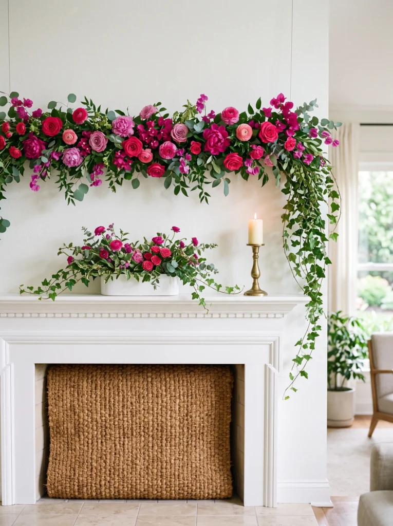
- Suspended fresh fuchsia and magenta bloom garland above the mantel
- Low white ceramic trough vase along the ledge
- Hand-crocheted runner in white with fuchsia fringe edge
- Small brass pillar candle, single and centered
- Woven natural fiber mat rolled into the firebox
- Optional: trailing ivy draped from one end of the garland
Why this works: A horizontal garland rather than a single vertical arrangement spreads color across the full width of the mantel, which makes even a narrow or small fireplace feel more substantial and complete.
This is a good option if your mantel runs narrow or feels a little underwhelming as a stand-alone architectural feature, since the horizontal garland format stretches the eye side to side rather than concentrating everything in one small cluster. A low white trough vase underneath keeps the base simple and lets the suspended blooms do the visual heavy lifting. This works particularly well above shorter mantels, where a tall vase arrangement can start to feel cramped — hanging the color above the ledge instead solves that spatial problem entirely.
The firebox stays quiet here on purpose, with just a rolled natural fiber mat as its base, because a garland this saturated and full doesn’t need competing texture below it. During the day, the fuchsia and magenta blooms cast soft pink-toned shadows on the wall as light shifts through the afternoon, an effect that’s easy to miss until you’ve actually lived with it for a few days. In the evening, one centered brass pillar candle is genuinely all this look needs — anything more starts to pull focus away from the garland itself.
Chartreuse & Charcoal Edit
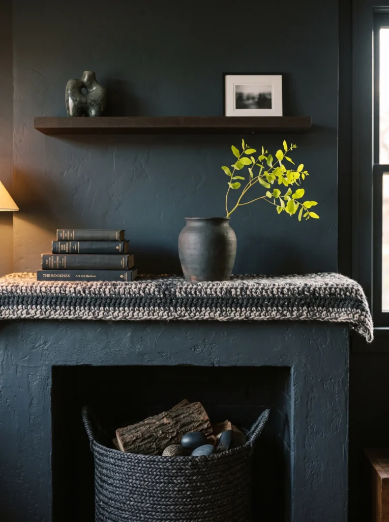
- Matte charcoal ceramic vessel as anchor, sculptural low form
- Single stem of chartreuse-green foliage or flowering branch
- Hand-crocheted runner in charcoal and cream stripe
- Small brass bud vase for a warm metal accent
- Woven charcoal basket filling the firebox
- Optional: stack of dark-spined books for grounding height
Why this works: Chartreuse is one of the few truly vibrant colors that reads as sophisticated rather than playful, specifically because of how sharply it contrasts against a deep neutral like charcoal instead of white — the dark backdrop makes the green feel rich rather than bright for brightness’s sake.
This is the moodier, more editorial option on the list, and it’s a good pick if the rest of your living room already leans light and airy and could use one deeper, richer moment. A matte charcoal vessel gives chartreuse foliage somewhere dramatic to sit, rather than the more common white-background treatment most vibrant styling defaults to. Many designers recommend pairing a truly saturated accent color with a dark neutral occasionally, instead of always defaulting to white or cream — it changes the entire mood of a vignette without changing the actual color palette much at all.
The firebox continues the charcoal story with a matching woven basket, which keeps this whole idea feeling like one cohesive dark-and-bright statement rather than scattered accents. During the day, the matte charcoal absorbs light rather than reflecting it, which makes the chartreuse stem appear even more luminous by contrast. In the evening, skip bright candlelight here — this palette actually reads best in lower, moodier lighting, letting the color contrast do the work instead of relying on extra glow to feel finished.
How to Use Bold Color in a Summer Mantel Without Looking Chaotic
Vibrant doesn’t have to mean overwhelming, and honestly, that’s the part most people get wrong when they try to move away from neutral decorating. The difference between a mantel that feels curated and one that feels like a color explosion usually comes down to three things.
Ground every bold color with a neutral. Every idea on this list pairs its saturated hue with something quiet — matte white, raw wood, brushed brass, or natural woven texture. The neutral gives your eye a place to rest, so the color feels intentional instead of loud.
Repeat the color, don’t scatter it. Pick one or two vibrant tones per mantel, then let them show up in two or three spots — the anchor piece, a smaller accent, maybe the firebox styling. Repetition reads as a decision. One color used once and never again reads as random.
Restrain the quantity, even with bold color. The mantels that photograph best and hold up longest aren’t the ones with the most objects — they’re the ones with the fewest, chosen carefully. Three to five pieces per ledge is usually the sweet spot. Bold color needs breathing room around it to actually read as bold, rather than getting lost in clutter.
Frequently Asked Questions
How do I use bold color on my mantel without it looking overdone? Stick to one dominant saturated color plus a supporting neutral, and repeat that same color in a smaller dose somewhere else on the ledge — a candle, a runner trim, a small vase. Avoid using three or more bold, unrelated colors in equal amounts; that’s usually what tips a display from vibrant into chaotic.
What do I do with the empty firebox in summer? Don’t leave it empty or dark — it reads as unfinished. A woven basket, rolled linens, a flat stack of trays, or a potted heat-tolerant plant all work well. The goal is texture and color at that lower level so the eye travels from the ledge all the way down instead of stopping short.
What are some budget-friendly vibrant mantel pieces? Thrifted colored glassware, secondhand ceramic vases, and dried florals are three of the easiest wins. Saturated glass and ceramic pieces show up constantly at estate sales and flea markets, often for a few dollars each, and dried botanicals hold their color for months without any upkeep.
How do I transition my mantel from a previous season into this vibrant summer look? Start by clearing the ledge completely rather than layering new pieces over old ones — a half-transitioned mantel is often what makes it look stale in the first place. Then rebuild with one anchor piece, a firebox solution, and two or three supporting objects, following the same layering plan used throughout this list.
What if I have a small mantel — do these ideas still work? Yes, though scale down the number of objects rather than the color intensity. A narrow mantel can actually handle a fully saturated color story better than a large one, since there’s simply less surface for it to overwhelm. Horizontal or suspended pieces, like a hanging bloom garland, also help a small mantel feel more substantial without adding clutter to the ledge itself.
Do I need real flowers, or can I use dried or faux versions? Either works well. Fresh blooms and heat-tolerant plants like marigolds, verbena, and geraniums give a mantel real texture and life, especially if it gets good sun. Dried florals and pampas grass are the lower-maintenance route and hold their color for months, which matters if your mantel isn’t somewhere you’re tending to daily through a busy summer.
Conclusion
A stale mantel doesn’t just look unfinished — it quietly makes the whole room feel unfinished with it. These summer mantel ideas hand you seventeen ways to fix that, with real color, real texture, and a firebox that finally looks intentional instead of empty.
One small ledge, restyled with a little courage and the right color pairing, can completely change how a whole room feels. So don’t just scroll past this one. Pin it, pick your favorite idea, try it this weekend, and send it to the one friend whose mantel has been begging for a refresh since spring.