15 Moody Farmhouse Kitchen Ideas for a Rich Cook Space
Most kitchens default to bright white because we’ve been taught that white feels clean. But a working kitchen tells a different story by the end of the week. These moody farmhouse kitchen ideas exist because dark cabinetry genuinely hides grease marks, water spots, and fingerprints better than white ever will — it’s not just a look, it’s a practical choice professional designers reach for again and again.
In my own kitchen, I learned this after years of wiping down white cabinets near the stove that showed every splatter within days. This roundup covers fifteen full, richly detailed moody farmhouse kitchen ideas — real colors, real materials, real lighting layouts — so you can borrow a palette, a countertop pairing, or a single bold detail and know it’ll hold up to actual daily cooking, not just photographs.
Why Moody Farmhouse Kitchen Colors Work So Well
Dark cabinetry actually hides everyday kitchen wear — grease marks, water spots, fingerprints — far better than white does, which is part of why professional kitchen designers increasingly reach for deep tones in high-use spaces, not just for the look, but for the practicality. I learned this the hard way in our own kitchen, where a white cabinet run near the stove showed every splatter within a week. This post solves the real question nobody answers: how to get the moody farmhouse look without sacrificing a kitchen’s daily function.
1. Espresso Shaker Statement: A Timeless Dark-Cabinet Classic
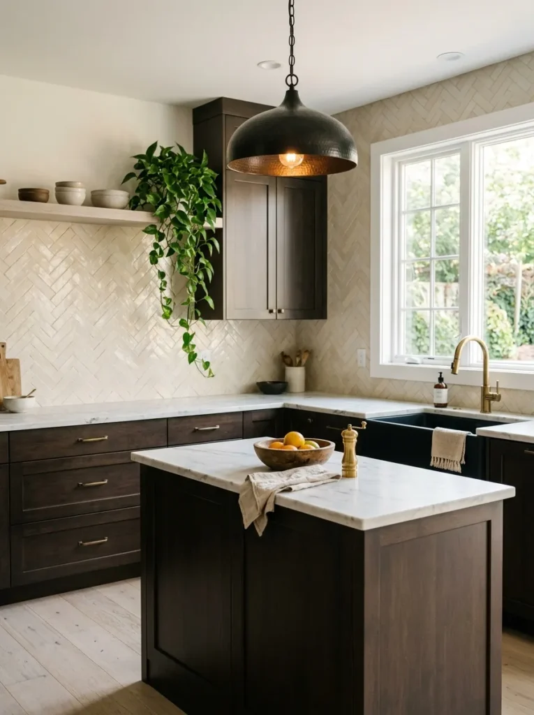
- Espresso-stained shaker cabinets (a deep, near-black brown, not true black) run floor to ceiling
- Honed white Carrara marble countertops with a simple eased edge break up the dark cabinetry
- A herringbone zellige tile backsplash in warm ivory adds texture without competing
- Aged brass bin pulls and cup pulls warm up the cool marble
- Blackened bronze pendants hang over the island, paired with under-cabinet LED task lighting and a single brass sconce for evening ambiance
- A wide matte black farmhouse sink with a brushed brass gooseneck faucet anchors the window wall
- Whitewashed white oak flooring keeps the room from feeling heavy
- A trailing pothos in a stoneware pot sits on the open end shelf near the window
Why this works: Pairing near-black cabinetry with warm-toned marble and brass keeps a dark kitchen from feeling cold or cave-like.
My husband, who’s spent two decades installing kitchen cabinetry, steers clients away from high-gloss lacquer on dark cabinets — it shows every fingerprint and water spot within days. A satin or matte conversion varnish finish, like the one on these espresso shaker doors, hides daily smudges far better while still wiping clean easily. That durability matters as much as color choice. Combined with honed marble counters, which resist the glare polished stone throws under pendant lighting, this pairing delivers the moody farmhouse look without the maintenance headaches that scare people away from dark cabinetry.
The espresso shaker style keeps the doors simple enough that the room reads current rather than dated, even with all that dark color. White oak floors and the ivory zellige backsplash add warmth so the kitchen never tips into feeling like a cave, and the brass hardware catches just enough light to keep the eye moving. At night, under-cabinet lighting handles prep work while the single brass sconce near the sink adds a soft glow for cleanup. It’s a kitchen built for actual cooking, not just photographs — durable, warm, and quietly dramatic in equal measure.
2. Forest Green Arched Hood: An Architectural Focal Point
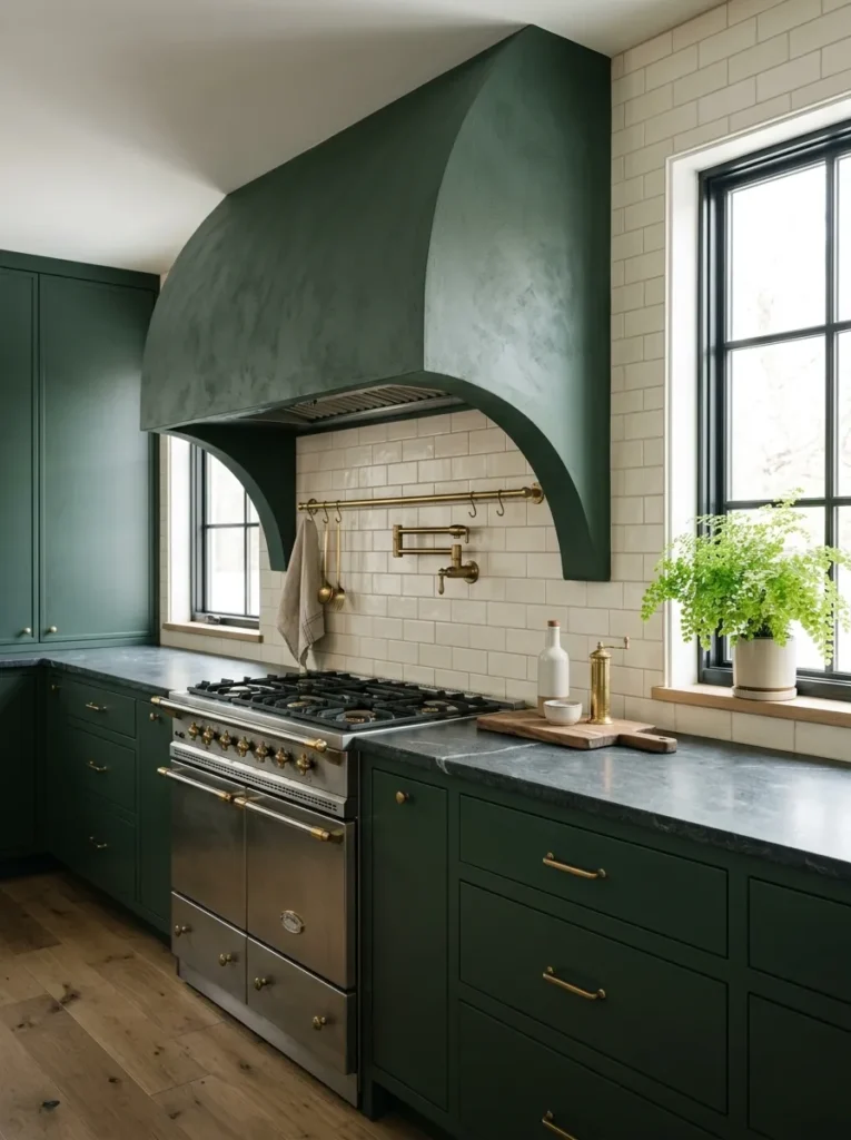
- Flat-panel cabinetry in a deep forest green (think Sherwin-Williams “Rosemary” territory) runs the perimeter
- A plastered, arched hood vent in the same green sits above the range as the room’s architectural focal point
- Honed soapstone countertops with a soft gray-black cast pair naturally with the green
- A hand-glazed cream subway backsplash, laid in a running bond, keeps the wall from feeling too heavy
- Unlacquered brass hardware and a brass utensil rail flank the range
- An aged-brass chandelier with linen shades hangs over a small round breakfast table near the window
- Under-cabinet LED strips handle task lighting, while the chandelier and hood alcove lighting create evening ambiance
- A woven jute runner and a pair of ferns on the windowsill soften the architectural lines
Why this works: An arched hood vent gives a kitchen an architectural focal point most dark kitchens lack, so the eye has somewhere intentional to land.
Arched forms have made a real comeback in kitchen design because they soften a room full of hard right angles — cabinets, countertops, and appliances are all straight lines, and a single curve gives the eye somewhere to rest. Positioning that curve above the range, as a plastered hood vent, turns the cooking zone into the room’s architectural focal point rather than an afterthought. Painting the hood the same forest green as the cabinetry keeps the shape from feeling like a separate add-on. It reads as part of the room’s structure, which gives a moody kitchen real intention.
Soapstone counters complete the look with a soft, matte gray-black surface that never competes with the green cabinetry, and unlike marble, soapstone actually deepens in color over time as it absorbs the mineral oil used to maintain it — a detail most kitchen articles skip entirely. The cream running-bond backsplash keeps the wall from reading too dark, while unlacquered brass hardware will develop a natural patina with use rather than staying stiffly polished. Together, these choices create a kitchen that feels grounded and considered, with texture and material doing the visual work instead of relying on color alone.
3. Charcoal & Concrete Loft: Industrial Farmhouse Edge
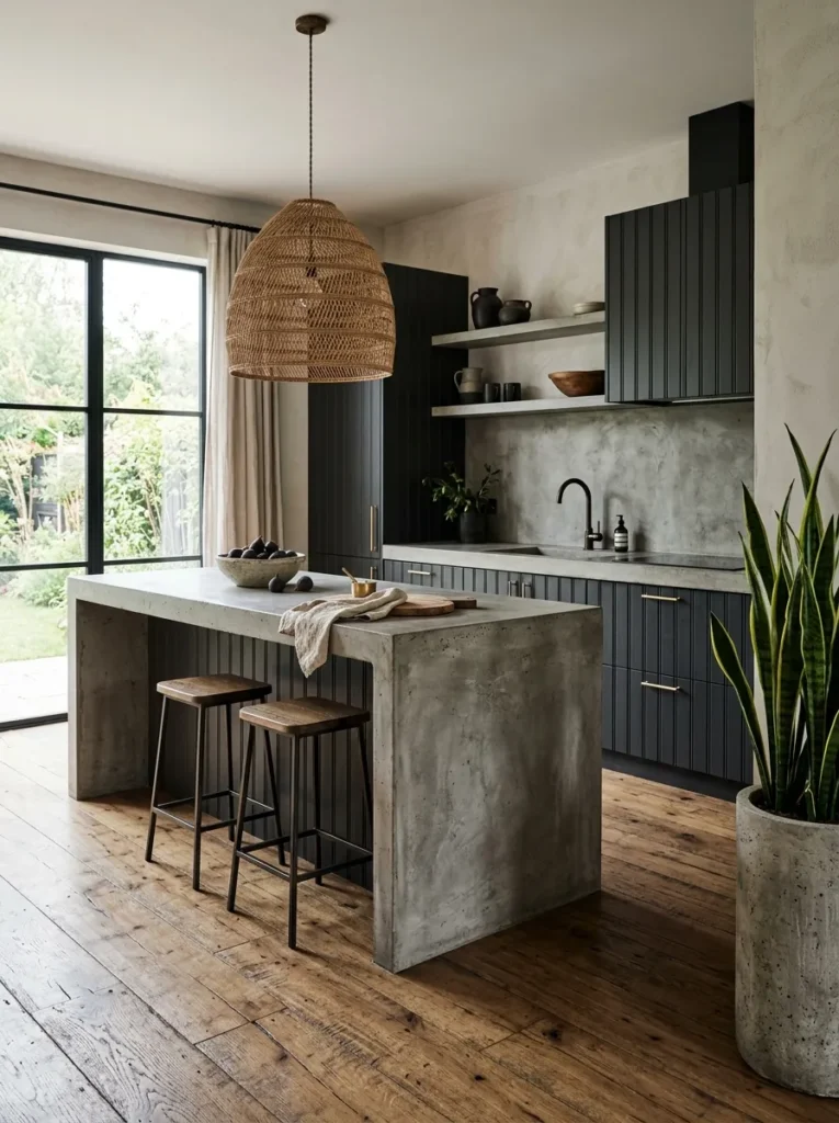
- Charcoal beadboard cabinetry (a soft charcoal, not true black) brings texture through the vertical grooves
- Raw, hand-troweled concrete countertops give the kitchen an industrial-farmhouse edge
- A single continuous concrete slab extends up as a waterfall edge on the island
- Antique brass cup pulls, slightly warmer than usual, keep the concrete and charcoal from feeling cold
- Open shelving on one wall displays stoneware crocks and a row of cookbooks
- A woven rattan pendant hangs low over the island, paired with a slim brass task light and under-cabinet strips
- Wide reclaimed oak flooring with visible saw marks
- A large snake plant in a concrete planter sits near the window, chosen because it tolerates the kitchen’s temperature swings
Why this works: Pairing raw concrete with beadboard texture gives a dark kitchen depth without leaning on color contrast alone.
I redid a friend’s kitchen two summers ago and she was terrified concrete counters would feel cold and unfinished — until we paired them with charcoal beadboard cabinetry and warm brass hardware, and the whole room suddenly felt collected instead of stark. That’s the trick with concrete: it needs a texture partner. The vertical grooves in beadboard catch light in a way flat cabinetry doesn’t, so even in a moody charcoal tone, the wall never reads flat or heavy. By the time we filled the open shelf with her grandmother’s stoneware, the kitchen felt like it had always belonged to her.
That waterfall edge on the island does real visual work too — running the same concrete slab down the side instead of stopping at the counter’s edge makes the whole piece feel sculptural rather than assembled. Reclaimed oak floors with visible saw marks keep the industrial elements from feeling cold, and the snake plant in the corner adds the one living, growing element the room needs. I’ve noticed kitchens like this photograph well because nothing in them tries too hard — raw material, texture, and a few warm details doing the talking, which is the heart of moody farmhouse style.
4. Navy Glass-Front Pantry Wall: Depth Without Feeling Boxed In
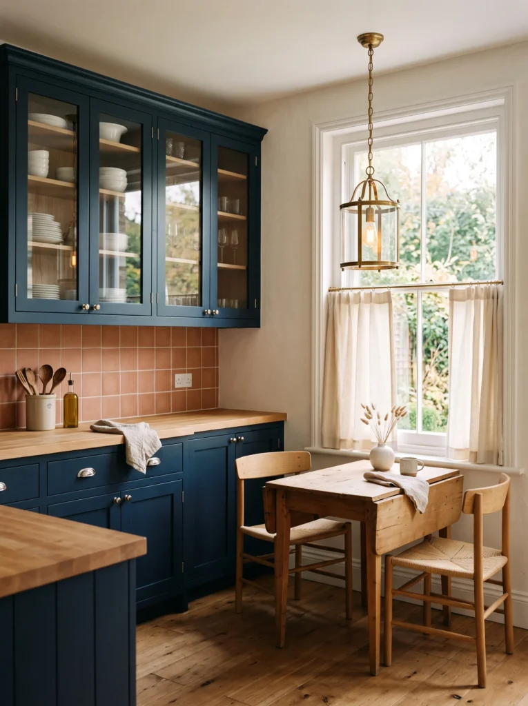
- Deep navy (a true indigo-navy, not navy-black) glass-front upper cabinets line one full wall, showing off dishware inside
- Lower cabinets in the same navy stay solid-door for contrast in transparency, not color
- Thick butcher block countertops in warm maple bring the only wood tone in the room
- Handmade terracotta-look ceramic tile backsplash, laid in a simple grid, adds warmth against the cool navy
- Polished nickel hardware, a departure from brass, keeps the palette cooler and more tailored
- A woven café curtain in undyed linen covers the lower half of the window for privacy without blocking light
- A brass-and-glass lantern pendant hangs over a small drop-leaf table tucked into the pantry wall’s corner
- Under-cabinet lighting plus a plug-in sconce beside the glass doors highlight the displayed dishware at night
Why this works: Glass-front cabinetry keeps a saturated navy wall from feeling like a solid block of color, since the eye reads texture and depth instead of flat paint.
Glass-front cabinets get dismissed as high-maintenance, but in my experience, they solve a specific problem in dark kitchens: a full wall of solid navy cabinetry can start to feel like a monolith by evening. Swapping the uppers to glass breaks that up, letting the dishware inside add pattern and light without adding another color to the room. Butcher block counters play a real role here too, since navy paired with cool nickel hardware can tip cold fast, and warm maple wood grounds the whole wall in something organic and touchable.
Nickel hardware instead of the expected brass gives this kitchen a more tailored, slightly formal edge that separates it from other moody spaces, while the terracotta-toned backsplash keeps things from feeling like a ship’s galley. The little drop-leaf table under the lantern pendant turns an awkward corner into genuine seating for coffee or a quick meal. Together, the glass, wood, and warm tile prove a navy kitchen doesn’t need to lean dramatic and cold — it can feel collected, layered, and genuinely lived-in instead.
5. Oxblood & Brass Drama: The Boldest Color on the List
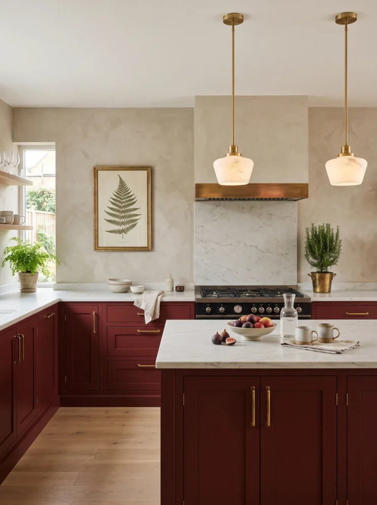
- Deep oxblood-red shaker cabinets (closer to aged wine than true red) wrap the perimeter
- Honed white quartzite countertops, chosen for quartzite’s resistance to staining and etching, offset the bold cabinet color
- A plain plaster backsplash in warm greige, left intentionally simple, lets the oxblood cabinetry stay the star
- Aged brass hardware in an elongated bar pull style runs the full cabinet line
- A pair of brass-framed botanical prints hangs on the one open wall, the kitchen’s only wall art
- A brass and alabaster pendant duo hangs over the island, with under-cabinet task lighting and a plug-in picture light over the art
- Wide-plank white oak flooring, whitewashed to stay light against the dark cabinetry
- A rosemary topiary in a brass pot sits on the counter near the range, chosen for both scent and heat tolerance
Why this works: Oxblood reads as a warm, sophisticated neutral in kitchen lighting rather than a jarring accent, which is why it wears better over time than colors that lean cooler.
Oxblood is the boldest color choice in a moody farmhouse kitchen, and it earns its place because it reads warmer and more sophisticated in a working kitchen than either black or navy — it has enough red undertone to stay inviting under both daylight and evening lighting. Quartzite countertops matter here specifically: unlike marble, quartzite resists etching from acidic spills like lemon juice or wine, which makes it a genuinely practical choice for a kitchen this color-forward. A dramatic cabinet color still needs a countertop that can handle daily cooking without staining or dulling within a year.
The plaster backsplash keeps the whole look from feeling busy, giving the oxblood cabinetry room to breathe instead of competing with pattern or tile grout lines. Brass-framed botanical prints add the kitchen’s one piece of intentional wall art, tying back to a plant-focused design sensibility without adding actual greenery to an already color-saturated room. Whitewashed oak floors keep the space from feeling heavy underfoot, and the rosemary topiary near the range adds a living, fragrant element that works especially well in a cooking space. It’s a dramatic kitchen that still functions like one.
6. True Black Open Shelving: The Boldest Moody Farmhouse Kitchen Look
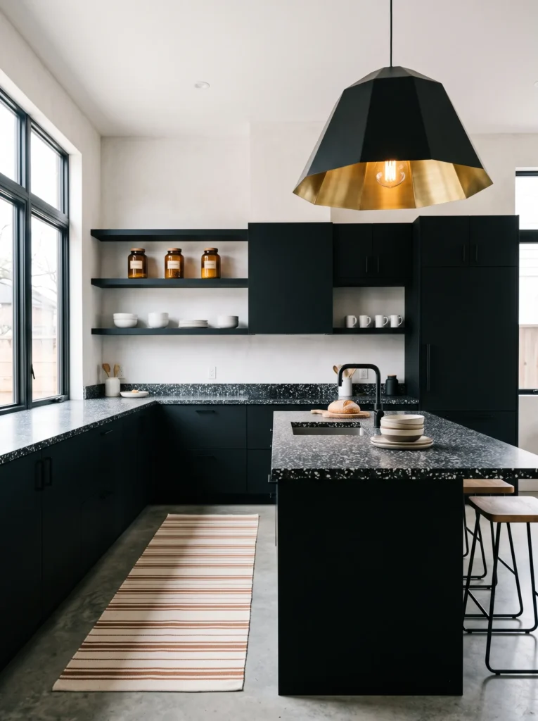
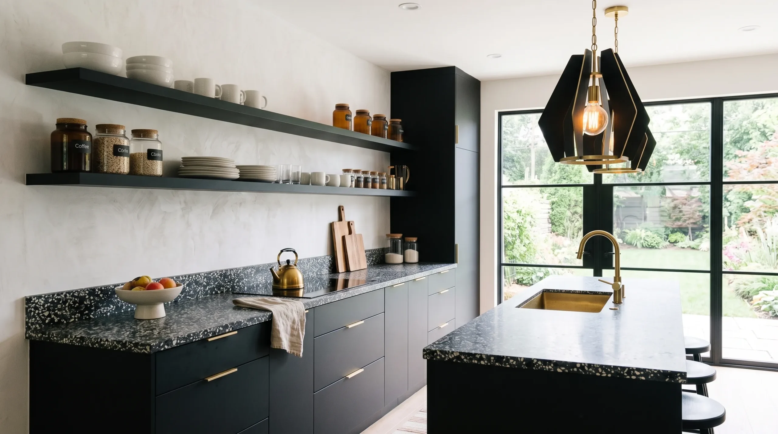
- True matte black cabinetry, the darkest tone in the entire cluster of moody posts, wraps three walls with no upper doors — open shelving instead
- Honed black-and-white terrazzo countertops add movement and pattern against the flat black cabinet fronts
- A plain white plaster backsplash creates deliberate contrast, the lightest backsplash choice in the whole article
- Brushed brass hardware on the lower cabinets only, since the open shelving needs no pulls
- Open shelves display a curated mix of white stoneware, a few amber glass jars, and stacked linen napkins
- A woven cotton runner in cream and rust stripes lines the floor in front of the sink
- A single oversized black pendant with a brass interior hangs over the island, paired with under-shelf LED strips lighting the open shelving itself
- A row of small potted herbs sits along the open shelf nearest the window for easy reach while cooking
Why this works: Removing upper cabinet doors on the darkest color in a kitchen lets ambient light bounce further into the room instead of stopping at another solid surface.
I’ve seen homeowners hesitate on true black cabinetry because they worry it’ll feel like a cave, and open shelving is the fix nobody talks about. Removing the upper doors entirely lets light bounce off the white plaster backsplash and terrazzo counters instead of stopping at another dark surface, which keeps the room from closing in visually. It also solves a practical problem: everyday dishes stay in reach without adding another matte black surface to wipe down. This is the boldest, darkest idea in the collection, and the open shelving is exactly what keeps it from feeling heavy.
Terrazzo countertops bring genuine movement to a kitchen this dark, with flecks of white, gray, and black breaking up what would otherwise be a very flat, monochrome surface. The under-shelf LED strips do double duty as both task lighting for grabbing dishes and a soft glow that highlights the open shelving styling at night, which matters more in an all-black kitchen than almost any other layout. Potted herbs along the shelf nearest the window bring in a living element for both scent and function while cooking. It’s dramatic, but every choice inside it still serves daily use.
7. Deep Teal Board-and-Batten: A Color That’s Easy to Get Wrong
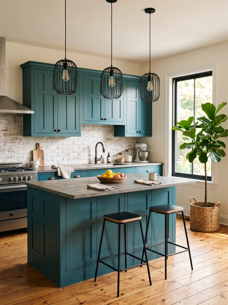
- Board-and-batten style cabinet doors (vertical planks with a raised center panel) in a rich deep teal, closer to a peacock blue-green than true teal
- Leathered granite countertops in a warm gray-brown add texture without shine, since leathered stone has a matte, slightly textured finish unlike polished granite
- A raw brick backsplash, whitewashed to soften the red tone, brings in the only masonry material used anywhere in this cluster of moody kitchens
- Oil-rubbed bronze hardware, darker and less shiny than brass, keeps the palette moody rather than glam
- A vintage-style plate rack shelf holds a small collection of blue-and-white transferware plates
- A pair of black metal cage pendants hangs over the island, with a warm-white LED strip under the upper cabinets for task lighting
- Wide reclaimed pine flooring with a honey-brown tone warms up the cool teal
- A large fiddle-leaf fig in a woven basket planter fills the corner near the window, chosen for its bold leaf shape against the busy brick texture
Why this works: Board-and-batten doors bring dimensional texture to painted cabinetry, so a bold color like teal reads as intentional millwork rather than flat paint.
Teal is the trickiest moody color to get right because it can swing cold and clinical fast, especially under bright task lighting. The fix is texture: board-and-batten doors catch shadow along their raised panels, and leathered granite counters diffuse light instead of bouncing it back sharply the way polished stone does. That combination softens teal into something that reads more like a deep forest lake than a swimming pool tile. Whitewashed brick adds another textural layer, and together these choices keep a genuinely bold color from feeling like a design gimmick.
Oil-rubbed bronze hardware pulls the whole palette darker and more grounded than brass would, which matters when the cabinet color is already this saturated — too much brass shine competes with the teal instead of supporting it. Reclaimed pine floors in a honey tone are the warmest wood used across this entire collection, chosen specifically to balance teal’s cool undertone. I’ve noticed kitchens with this much blue-green benefit from one warm, oversized plant in the corner, and a fiddle-leaf fig’s broad leaves hold their own against the brick’s busy texture without disappearing into it.
8. Warm Walnut Stained Shaker: Wood Grain Meets Moody Drama
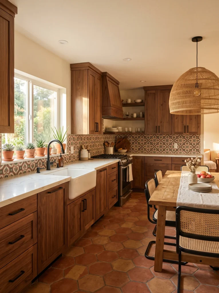
- Natural stained walnut shaker cabinets, the only unpainted wood-tone cabinetry in this entire collection, bring genuine wood grain into a moody palette
- Marble-look quartz countertops in a soft warm white give the durability of quartz with the visual softness of marble, without the maintenance
- A hand-painted encaustic cement tile backsplash in a small-scale geometric pattern, mixing cream, rust, and charcoal
- Matte black hardware, chosen deliberately to contrast the warm wood rather than blend into it
- A built-in open hutch at one end of the run displays stacked ceramic bowls and a row of glass canisters
- A single oversized rattan pendant hangs low over a farmhouse dining table tucked at the room’s end, paired with brass picture lights over the hutch and under-cabinet LED task strips
- Terracotta hexagon floor tile, sealed to a matte finish, grounds the room in warmth
- A row of small potted succulents lines the windowsill above the sink, chosen for their tolerance of the kitchen’s fluctuating humidity
Why this works: Stained wood cabinetry shifts visual tone with changing daylight in a way flat paint cannot, giving the room natural depth without added color.
Walnut is the one wood tone I keep coming back to for clients who want moody drama but aren’t ready to commit to painted cabinetry, and it earns its place here because stained wood grain does something flat paint simply can’t: it shifts in tone throughout the day as light moves across it. That variation gives the kitchen a living, textured quality that a single painted color, however dark, doesn’t have on its own. Paired with the encaustic tile’s rust and charcoal pattern, the room reads collected and layered rather than like one uniform design decision.
Matte black hardware against warm walnut is a deliberate contrast choice — too many stained-wood kitchens default to brass or nickel, but black hardware reads more current and keeps the wood from tipping into a dated, honey-oak feeling. The terracotta hexagon floor and open hutch styling add real farmhouse character, while marble-look quartz solves the practical problem: it won’t etch from citrus or wine the way real marble can, so the counter stays as good as new for years of daily cooking and cleanup.
9. Slate Gray Raised Panel: Restraint Over Saturated Color
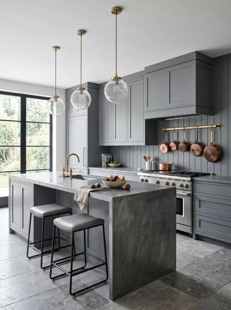
- Traditional raised-panel cabinet doors in a cool slate gray (not blue-gray, a true stone gray) bring classic farmhouse detailing to the collection
- A waterfall-edge zinc countertop on the island, hand-patinaed to a soft blue-gray sheen, is the only metal countertop used anywhere in this article
- Perimeter counters stay honed Calacatta-style quartz for contrast against the zinc island
- A vertical shiplap backsplash, painted the same slate gray as the cabinets, creates a monochrome wall that lets material and light do the visual work instead of color contrast
- Polished chrome hardware, cooler and brighter than any other metal used in this collection, matches the zinc island’s tone
- A wall-mounted pot rack near the range holds copper cookware, the article’s one warm metal accent
- A trio of glass globe pendants with exposed brass fittings hangs over the zinc island, with recessed ceiling lighting for ambient fill and under-cabinet LED strips for prep work
- Large-format gray limestone floor tiles, laid in a running bond, complete the monochrome effect
Why this works: A monochrome gray palette across walls, cabinetry, and metal lets texture and material variation carry the room’s visual interest instead of color contrast.
Zinc is a material my husband’s crew installs on commercial kitchen counters far more often than residential ones, but it has a real place in a farmhouse kitchen — it develops a soft, watery patina with use that most homeowners actually want rather than fight. Unlike stainless steel, zinc isn’t harshly reflective, so it fits a moody palette instead of fighting it, and its slightly imperfect surface only improves with age and daily use. Pairing it with a slate gray shiplap backsplash creates a kitchen where color, material, and metal are all working in one tonal family instead of competing for attention.
Copper cookware hanging on the pot rack becomes the room’s one deliberate warm note against all that cool gray, and it’s a detail with real function, not just styling — a working farmhouse kitchen genuinely benefits from pots within reach of the range. Chrome hardware and the zinc island tie together so the metals feel intentional rather than mismatched, and the limestone floor’s soft gray tone keeps the whole room from feeling like a single flat surface. It’s the most architecturally restrained idea in the collection, proving moody doesn’t always mean saturated color.
10. Aubergine Cane-Front Cabinetry: A Jewel Tone That Wears Like a Neutral
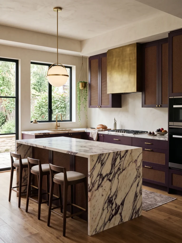
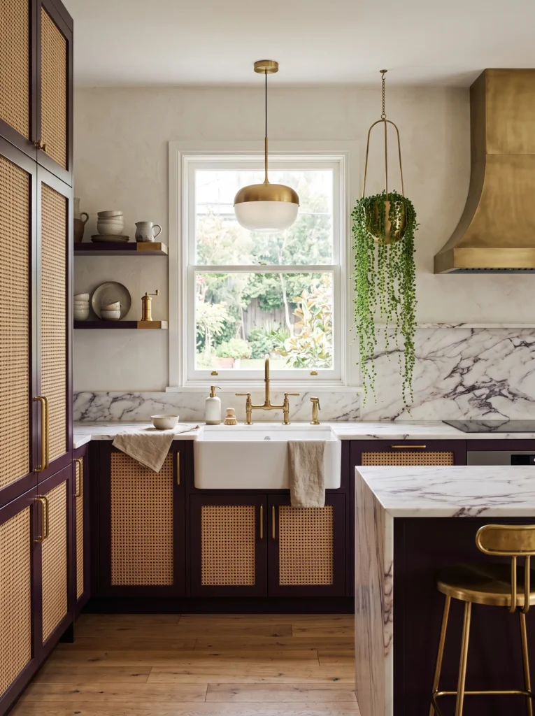
- Deep aubergine (a plum so dark it reads near-black in low light, but shows true purple in daylight) covers cane-front upper cabinets, with solid-door lowers in the same tone
- Woven natural cane panels replace glass in the uppers, adding texture and softening the saturated color
- Honed Calacatta Viola marble countertops, with subtle purple-gray veining that echoes the cabinetry, tie the palette together without matching exactly
- A plain ivory plaster backsplash keeps the wall quiet against the boldest cabinet color in the collection
- Aged unlacquered brass hardware in a slim knob style, left to patina naturally over time
- A woven rattan and brass bar cart tucked at the end of the counter run doubles as extra storage and display
- A single brass and frosted-glass pendant hangs over the sink, with under-cabinet LED strips for prep light and a plug-in sconce by the bar cart for evening glow
- A trailing string-of-pearls plant in a brass hanging planter sits near the window, chosen for its unusual, textural silhouette
Why this works: Cane paneling breaks up a saturated cabinet color the same way glass does, but adds warmth and handwoven texture instead of cool transparency.
Aubergine is a color most homeowners wouldn’t consider for a kitchen, and that’s exactly why it earns a spot here — it photographs like a jewel tone but lives more like a neutral once it’s paired with warm materials. Cane paneling is the detail that makes it work in a farmhouse context rather than a formal dining room; the woven texture keeps the deep purple from feeling precious or overly polished. Calacatta Viola marble’s faint purple veining ties the countertop back to the cabinetry without ever matching it outright, which is the kind of subtle coordination that separates a considered kitchen from a matchy one.
The ivory plaster backsplash is doing quiet, important work here, giving the eye a place to rest between two fairly busy elements. Unlacquered brass hardware will darken and spot with age, and I’ve noticed that homeowners who choose it end up loving the change rather than fighting it — it makes the kitchen feel like it’s aging the way a well-loved farmhouse should. The string-of-pearls plant adds one unexpected organic shape near the window, proving that a bold, unusual cabinet color doesn’t need to be tempered with an equally safe plant choice.
11. Rust Terracotta Angled-Panel: Modern Millwork Meets Warm Color
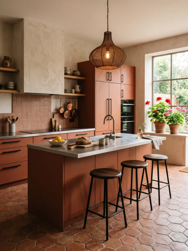
- Angled, diagonal-panel cabinet doors (a modern farmhouse detail, not traditional shaker) in a warm rust terracotta bring genuine architectural interest to flat cabinetry
- Brushed stainless steel countertops, uncommon in a farmhouse kitchen but increasingly used for its durability and heat resistance, run the full perimeter
- A raw plaster hood vent, left unpainted in its natural warm gray, is the room’s sculptural centerpiece above the range
- Handmade terracotta tile floors in a large hexagon shape ground the room and echo the cabinet color without matching it exactly
- Blackened steel hardware in a simple bar pull keeps the warm cabinet tone from feeling too soft or precious
- Open shelving on one end holds a curated mix of amber and clear glassware, catching light throughout the day
- A woven iron and rattan pendant hangs over the island, paired with recessed lighting for ambient fill and integrated LED strips under the shelving
- A row of potted geraniums lines the windowsill, a nod to Emily’s plant background and a plant that thrives in bright kitchen windows
Why this works: Brushed stainless steel resists heat and staining better than stone, making it a genuinely practical counter choice for a kitchen this color-forward.
Stainless steel countertops get dismissed as too commercial for a farmhouse kitchen, but that reputation misses what the material actually does well: it’s heat-resistant enough to set a hot pan directly on it, resists staining completely, and develops a soft brushed patina with use rather than showing every scratch the way polished versions do. Paired with warm rust cabinetry and a raw plaster hood, the steel reads more like a considered material contrast than a cold commercial choice. It’s the kind of pairing that looks intentional in photos and performs even better in daily use, which is the real test of any kitchen material.
The angled panel doors are the standout architectural detail here, catching shadow differently than a flat or raised panel would and giving the rust color visual movement throughout the day. Terracotta hexagon flooring echoes the cabinet tone loosely rather than matching it, which keeps the room from feeling like a single flat color block. Blackened steel hardware and the raw plaster hood add enough contrast in texture and tone that the warm rust never tips into feeling overly sweet or one-note, keeping the whole kitchen grounded and current.
12. Sage Olive Louvered Doors: The Quietest Moody Color Story
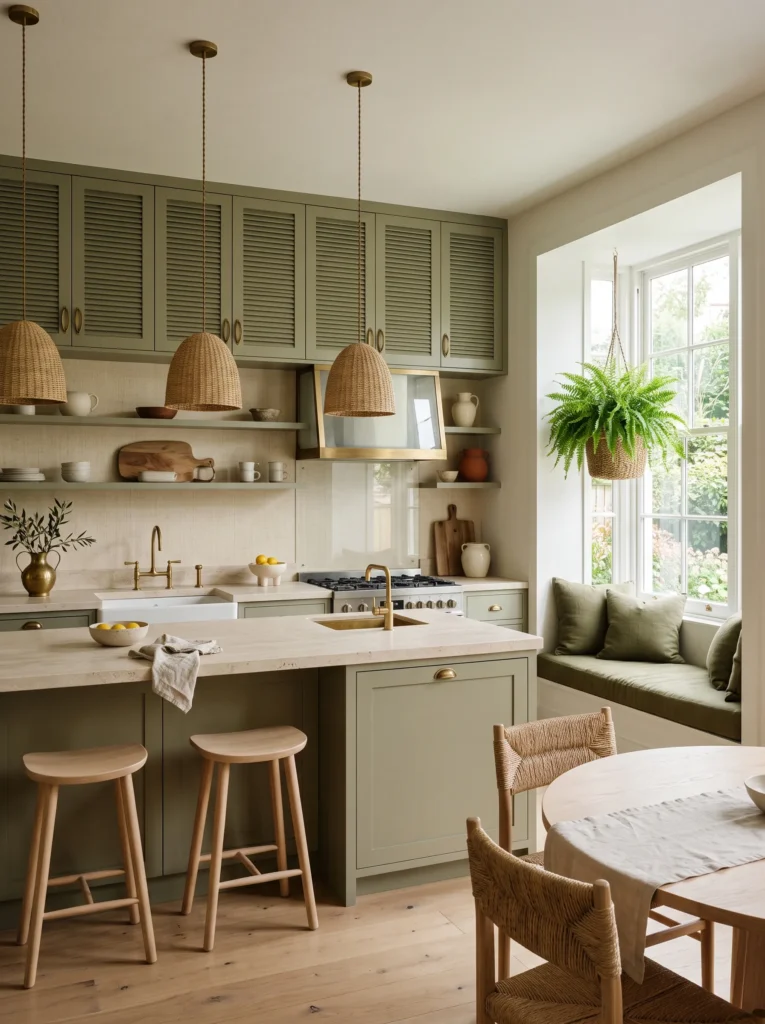
- Louvered cabinet doors (horizontal slatted panels, a detail borrowed from vintage furniture) in a muted sage-olive green, distinctly grayer and more muted than the forest green used earlier in this collection
- Honed travertine countertops in a warm ivory tone bring natural pitting and texture, a departure from the polished stones used elsewhere
- A woven raffia-textured wallpaper, in a tone-on-tone cream, covers the backsplash wall instead of tile
- Antique brass hardware in a simple oval pull, slightly darker and more matte than the brass used in earlier ideas
- A built-in banquette with olive-green cushions and a small round table fills the kitchen’s window nook
- A pair of woven abaca pendant lights hangs over the island, with a picture light over the open shelf and under-cabinet LEDs for task lighting
- Wide European white oak flooring, left raw and unstained, keeps the room feeling light
- A large Boston fern in a woven basket sits in the banquette nook, chosen for its tolerance of the room’s natural humidity near the window
Why this works: Louvered doors bring visible depth and shadow to flat cabinetry, so a muted color like sage-olive avoids reading flat or washed out.
Sage-olive is a quieter color choice than most of the tones in this collection, and it earns its place because muted, grayed-down greens are trending away from the brighter sage that’s been everywhere for the past few years — this deeper, more olive-leaning version feels more current and considered. Louvered doors matter here specifically: a flat cabinet front in a muted color can read washed out under bright kitchen lighting, but the slatted texture of louvered panels catches shadow in every groove, giving the color real depth. That small millwork choice keeps a quiet color from disappearing into the room.
Travertine’s natural pitting and texture pair beautifully with this softer palette, since its irregular surface echoes the organic, imperfect feel the whole kitchen is going for. The raffia-textured wallpaper adds another layer of natural texture without introducing pattern or additional color, and I’ve found this kind of tone-on-tone texture layering photographs even better than it looks in person, since the shadows read as gentle depth rather than flat color. The banquette nook turns an underused corner into the kitchen’s most inviting seat.
13. Cognac Brown Tongue-and-Groove: A Tailored Take on Warm Wood Tones
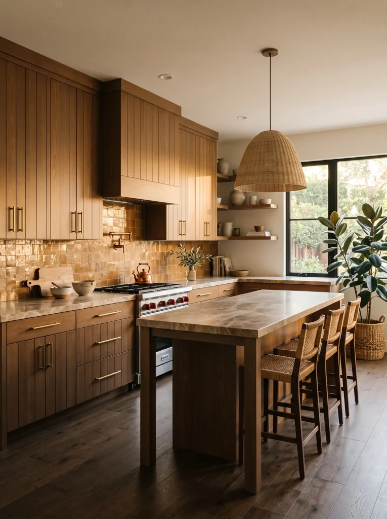
- Tongue-and-groove paneled cabinet doors (tight, narrow vertical planks with almost no gap) in a warm cognac brown, closer to leather than wood-stain
- Honed Emperador marble countertops, with warm brown veining that echoes the cabinet tone in a completely different material
- A handmade zellige tile backsplash in a warm caramel glaze, laid in a simple stacked pattern
- Aged brass hardware in a long, substantial bar pull style, chosen deliberately heavier than the hardware used elsewhere
- A built-in wine and glassware nook with open shelving sits at one end, framed in the same cognac tone
- A single oversized woven-shade pendant hangs over the island, paired with brass picture lights over the wine nook and under-cabinet LED task strips
- Rich, dark-stained white oak flooring, several shades darker than the other wood floors in this collection
- A large rubber plant in a woven basket fills the corner, its glossy leaves catching the pendant light
Why this works: Tongue-and-groove paneling reads more tailored and less rustic than standard shaker, which lets a warm cabinet color feel current instead of dated.
Cognac is a tricky brown to place in a kitchen because it can slide into looking like a dated 1990s stained-oak kitchen if the door style isn’t right. Tongue-and-groove paneling solves that: the tight, narrow reveal between planks reads far more tailored than a wide raised panel, which keeps the whole cabinet run feeling current even in a genuinely warm, traditional color. Pairing it with honed Emperador marble, rather than a lighter stone, lets the countertop echo the cabinet tone instead of contrasting against it, giving the kitchen a cohesive, monochromatic warmth that’s rare in this collection.
The dark-stained oak floor is a deliberate choice to ground the room, since a lighter floor would have made the cognac cabinetry feel like the only dark element in an otherwise pale space. Heavy brass bar pulls add visual weight that matches the substantial feel of the tongue-and-groove doors, and the built-in wine nook turns unused end space into a genuinely useful feature. I’ve noticed rooms this warm-toned benefit from one glossy-leafed plant like a rubber plant, since its shine keeps the space from feeling too matte and flat overall.
14. Dusty Steel Blue Recessed Panel: Moody Without the Weight
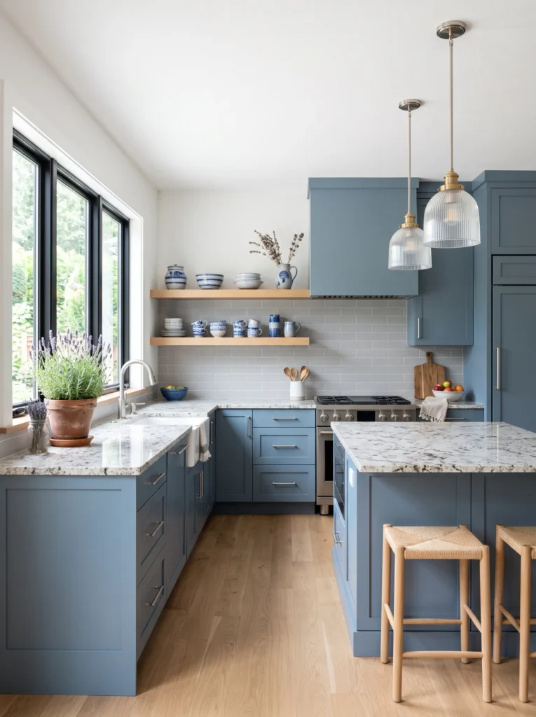
- Recessed-panel cabinet doors (a flat center panel set back from the frame, cleaner than raised panel) in a dusty, muted steel blue — cooler and grayer than the indigo-navy used earlier
- Honed Bianco Antico granite countertops bring subtle gray-gold flecking against the cool cabinetry
- A large-format matte porcelain tile backsplash in a soft dove gray, cut to look like limestone, keeps the wall quiet and modern
- Brushed nickel hardware in a slim, minimal bar pull matches the room’s cooler, more restrained mood
- A floating open shelf in white oak breaks up the cabinet run and displays a small collection of blue-and-white stoneware
- A pair of fluted glass pendant lights hangs over the island, with recessed can lighting overhead and under-cabinet LEDs for prep work
- Pale European white oak flooring, nearly the lightest wood tone in the collection, keeps the steel blue from feeling heavy
- A row of small potted lavender sits on the windowsill, chosen for its dusty color echo and its ability to tolerate a sunny kitchen window
Why this works: A muted, grayed-down blue can register as genuinely moody without the visual weight of deeply saturated color, which works especially well in smaller kitchens.
Dusty steel blue is the most restrained, quiet color in this entire collection, and it proves moody farmhouse doesn’t require deep, saturated tones to feel dramatic. A muted blue-gray still reads as moody because it’s darker and more complex than a standard white kitchen, but it stays light enough to keep the room from feeling closed in. Recessed-panel doors support that restraint — the clean, flat center panel has none of the ornamentation of raised or louvered styles, which fits a color this quiet and lets the material choices carry the visual interest instead.
Floating open shelving breaks up what would otherwise be a long, uninterrupted run of cabinetry, and displaying blue-and-white stoneware on it ties back to the wall color without repeating it exactly. Bianco Antico granite’s subtle gold flecking is the only warm note in an otherwise cool palette, keeping the kitchen from feeling sterile. Pale oak floors and potted lavender on the sill round out a kitchen that whispers rather than shouts, proving that restraint and drama aren’t opposites in farmhouse design.
15. Blackberry Beadboard & Brass: The Moodiest Kitchen in the Collection
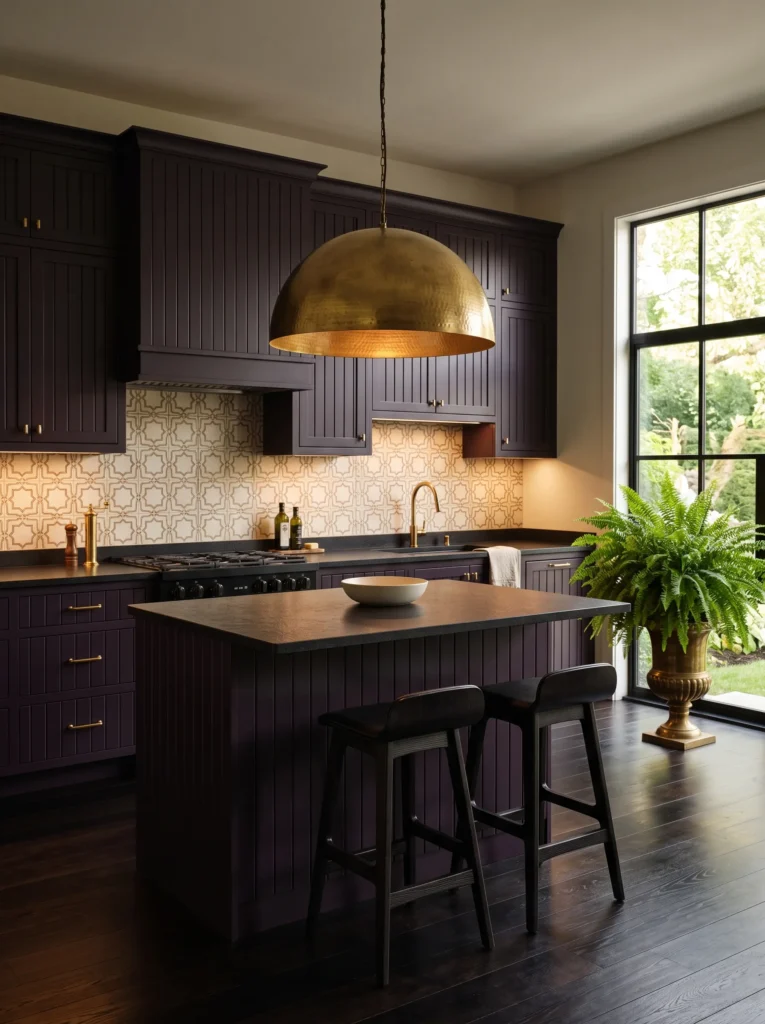
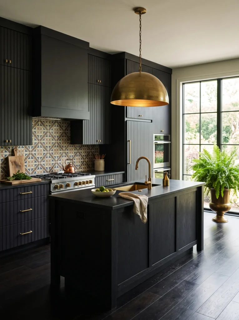
- Beadboard cabinet doors (narrow, evenly spaced vertical grooves) in a near-black blackberry tone — a muted plum-brown distinctly darker and less purple than the aubergine used earlier
- Leathered black granite countertops, matte and textured, keep the surface from reflecting too much light in an already dark room
- A hand-painted Moroccan-style cement tile backsplash mixes cream, blackberry, and warm brass tones in a small repeating pattern
- Warm brass hardware in a classic ring-pull style, the roundest hardware shape used in this collection
- A built-in plate rack above the sink displays a mix of cream and blackberry-rimmed stoneware
- A dramatic oversized brass dome pendant hangs low over the island, paired with brass sconces flanking the range hood and under-cabinet LED task lighting
- Rich, dark ebonized oak flooring completes the moodiest, most saturated palette in the entire collection
- A large fern in a brass urn sits near the window, the deep green fronds standing out sharply against the dark tones surrounding it
Why this works: Leathered stone diffuses light instead of reflecting it, which keeps the darkest cabinet colors in a kitchen from looking flat or one-dimensional under pendant lighting.
This is the boldest, moodiest idea in the entire collection, and it works because every material chosen serves a functional purpose alongside the drama. Leathered granite has a texture you can actually feel, and that texture scatters light across the surface instead of bouncing it back in a single glare point, which matters enormously in a kitchen this dark. Beadboard cabinetry adds the same kind of light-scattering texture vertically along the doors, so even blackberry, one of the darkest tones used here, never reads as a flat, lifeless wall of color under the room’s mixed lighting.
The Moroccan cement tile backsplash is the only patterned tile in this entire collection, and it earns that spot by tying together the cabinet color, brass hardware, and cream accents into one cohesive story. That oversized brass dome pendant isn’t just decorative — in a kitchen this dark, a single large fixture with genuine presence keeps the room from feeling underlit or gloomy. Paired with sconces and task lighting, this kitchen proves that even the moodiest, most saturated color story can still function beautifully for everyday cooking.
Styling Principles for a Moody Farmhouse Kitchen
The real challenge in a moody kitchen isn’t picking a color — it’s balancing task lighting with ambient mood lighting so the room stays genuinely usable after dark. A kitchen needs at least three lighting layers to work: task lighting under cabinets and over the island, ambient lighting from ceiling fixtures or recessed cans, and one warm accent light, like a sconce, for evening atmosphere. Skip any one of these and a dark kitchen either feels too dim to cook in or too flat and shadowless to feel moody at all.
Cabinet finish matters just as much as color. A high-gloss lacquer finish shows fingerprints, water spots, and grease within days on dark cabinetry, while a satin or matte conversion varnish hides daily wear while still wiping clean. If you’re choosing a finish for a working kitchen rather than a showpiece, matte or satin will hold up far better over years of actual use.
Finally, pick one warm material — brass, wood, or a warm stone — to run through the whole space. Moody kitchens fail when every material is cool and dark at once; the warmth is what keeps the room feeling collected instead of closed in.
Frequently Asked Questions
Is a dark kitchen hard to keep clean? Not necessarily — dark cabinetry actually hides everyday grease marks, water spots, and fingerprints better than white does, which is one reason professional kitchen designers use deep tones in high-use spaces.
What’s the best cabinet finish for dark colors? A satin or matte conversion varnish finish hides smudges and water spots far better than high-gloss lacquer, which shows every fingerprint within days of daily use.
What’s the best lighting layout for a moody kitchen? A moody kitchen needs three layers: under-cabinet and over-island task lighting for cooking, ambient ceiling or recessed lighting for overall fill, and one warm accent fixture, like a sconce, for evening atmosphere.
How can I try this look on a budget? Start with one bold element instead of a full renovation — painting an island a deep, saturated color, swapping hardware to aged or unlacquered brass, or adding a single statement pendant light delivers moody impact without a full remodel.
Can a small kitchen handle a dark, moody palette? Yes — pairing dark cabinetry with a lighter countertop, backsplash, or floor, and adding open shelving instead of solid upper doors, keeps a small moody kitchen from feeling closed in.
What countertop material works best with dark cabinets? Quartzite and honed granite are both practical choices, since they resist staining and etching from everyday cooking spills better than polished marble, while still complementing dark cabinetry.
Conclusion
A moody farmhouse kitchen isn’t about chasing drama for its own sake — it’s about choosing colors and materials that look beautiful and genuinely work for how you cook and live. From espresso shaker cabinetry to a dramatic blackberry beadboard wall, each of these fifteen ideas proves that dark, rich tones can be just as practical as they are striking.
I’ve seen how a single bold choice — a repainted island, a swap to unlacquered brass, one statement pendant — can shift an entire kitchen’s mood without a full renovation. Save this post to Pinterest, pick the idea that speaks to you, and share it with anyone dreaming of a kitchen with real depth and character.