15 Purple and Gray Bedroom Ideas for a Cool, Sophisticated Retreat
Purple bedrooms have a reputation problem, and it’s not really about the color — it’s about what it’s paired with. Done wrong, purple can feel sweet, dated, or a little too much. Done right, paired deliberately with the right gray, it reads as moody, current, and genuinely sophisticated. These 15 purple and gray bedroom ideas show exactly how that balance works, from soft dove-gray-and-plum combinations perfect for small rooms to bold onyx-trimmed spaces built around a single dramatic violet statement.
I’ve styled enough of these rooms myself to know the difference usually comes down to undertone, not boldness. Each idea here includes the full palette, furniture, and plant choices you’d need to actually recreate the room, not just admire it.
Why Purple and Gray Works
Purple gets blamed for looking dated long before the color itself is the problem. The real issue is usually saturation — a purple bedroom done in bright violet or head-to-toe lilac reads sweet, even young, no matter how nice the furniture is. Gray fixes that. In color theory, gray is a neutralizing tone — it desaturates and calms whatever sits next to it, which is why pairing purple with the right gray strips away the “overly sweet” association and lets the purple read as moody and deliberate instead. I’ve painted enough accent walls to notice this firsthand: the exact same violet that felt girlish next to white trim looked genuinely sophisticated once I swapped in a charcoal-gray headboard.
Gray works as a visual buffer for purple, which is why the combination reads as sophisticated rather than dated. This post solves that gap — 15 full-room ideas that actually use both colors with intention, not just purple with gray as an afterthought.
1. Slate & Amethyst Layers
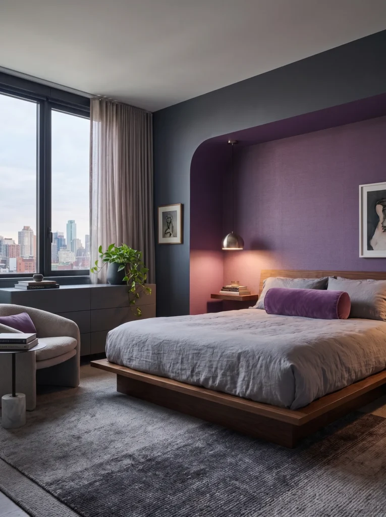
- Walls: Slate-gray (a deep, blue-leaning charcoal) on three walls, semi-gloss trim; the fourth wall in a soft amethyst as a color-drenched nook behind the bed
- Bedding: Washed linen duvet in dove gray, layered with amethyst velvet throw pillows and a charcoal knit throw at the foot
- Wall Decor: One large abstract canvas — loose brushstrokes of amethyst and slate against a raw canvas ground, hung slightly left of center above the headboard
- Plants: A trailing pothos (Epipremnum aureum) in a matte charcoal ceramic pot on the dresser — tolerant of lower bedroom light, so it actually survives
- Hanging Element: A single brushed-nickel pendant with a smoked-glass shade, hung low on the amethyst wall instead of centered on the ceiling
- Rug: Hand-knotted wool rug in charcoal with a faint amethyst diamond pattern woven through
- Curtains: Floor-length linen curtains in dove gray, hung just above the window frame to add height
- Furniture/Hardware: Walnut bed frame with a low, gently curved headboard; brushed-nickel drawer pulls on the nightstands
Why this works: Anchoring the room in slate gray first and letting amethyst appear only on one wall keeps the palette from tipping sweet, since gray does the visual work of calming the purple down.
Color-drenching a single wall is one of the more effective ways to introduce a strong purple without it taking over the whole room. When only one plane carries the amethyst, your eye reads it as a deliberate design choice rather than a “purple bedroom” theme, and the slate gray on the remaining walls gives the color somewhere to rest. This kind of restraint is what separates a room that photographs well from one that just has a lot of purple in it. The brushed-nickel finishes throughout keep the whole look feeling current rather than nostalgic.
I switched a client’s amethyst accent wall from a warm eggplant to this cooler, slate-adjacent purple and the room read ten years newer overnight. Nothing else in the space changed — same furniture, same rug — but the temperature shift alone did it. That’s the part people underestimate: it’s not the amount of purple in a room that dates it, it’s whether the undertone leans warm or cool. Pulling the amethyst toward blue instead of red is what let it sit comfortably next to slate gray without competing.
2. Dove Gray & Dusty Plum
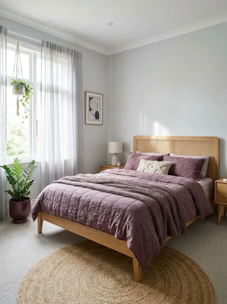
- Walls: Dove gray, eggshell finish, on all four walls — a lighter, warmer gray than typical “greige” that still reads cool
- Bedding: Quilted cotton coverlet in dusty plum with dove-gray Euro shams and a small charcoal lumbar pillow
- Wall Decor: A grid of three small botanical prints in dusty-plum and gray tones, hung above the nightstand instead of the bed
- Plants: A ZZ plant (Zamioculcas zamiifolia) in a dusty-plum glazed pot — nearly indestructible, which matters more than people admit
- Hanging Element: A woven gray macramé plant hanger suspending a second, smaller plant near the window
- Rug: A flatweave cotton rug in a soft plum-and-gray stripe
- Curtains: Sheer dove-gray curtains layered under a solid plum valance for softness without heaviness
- Furniture/Hardware: Cane-back bed frame in a light oak tone, with matte black hardware for contrast
Why this works: Dove gray is light enough to keep a small room from feeling closed in, while dusty plum adds warmth without pulling the palette toward pink.
I did my own guest room in almost this exact combination, and the thing that surprised me was how much lighter it felt than my original all-charcoal mockup. Dove gray has a soft, almost warm quality that doesn’t fight natural light the way true cool grays sometimes do, and dusty plum — being more brown-adjacent than true purple — reads as grown-up rather than girly. It’s the pairing I recommend most often for smaller bedrooms or rooms with limited natural light, since neither color demands the space work around it.
Dusty plum sits in an unusual spot on the color wheel — it has enough gray mixed into the purple that it behaves almost like a neutral itself. That’s why it layers so easily with an actual gray without the two colors visually competing for attention. Most purple shades need gray to tone them down; dusty plum arrives halfway there already. Pairing it with a lighter dove gray instead of charcoal keeps the whole room from feeling heavy, which is worth knowing if you’re working with a smaller footprint or a room that gets limited direct sun.
3. Charcoal & Wisteria Glow
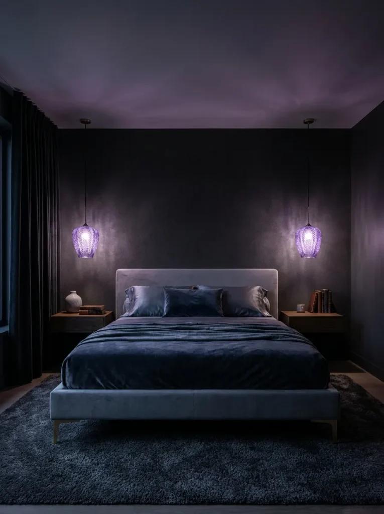
- Walls: Deep charcoal (near-black gray) on the wall behind the bed, matte finish; remaining walls in a lighter mist-gray
- Bedding: White waffle-weave duvet as a base, layered with a wisteria-purple silk-blend throw and two charcoal bolster pillows
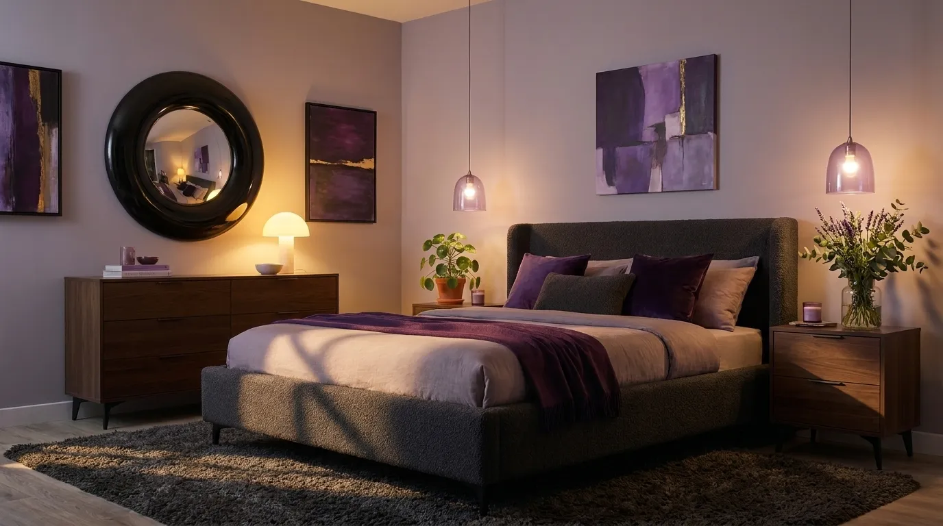
- Wall Decor: A large round mirror with a thin brushed-brass frame, positioned to catch the pendant light at night
- Plants: A snake plant (Dracaena trifasciata) in a mist-gray concrete pot in the corner — upright form suits the room’s vertical lines
- Hanging Element: Two small wisteria-glass pendant lights flanking the bed instead of matching lamps
- Rug: A plush charcoal shag rug, deliberately textural against the smoother walls
- Curtains: Floor-to-ceiling charcoal blackout curtains for genuine evening darkness
- Furniture/Hardware: Upholstered bed frame in mist-gray boucle, brushed-brass legs and pulls
Why this works: Warm brass against cool charcoal and wisteria keeps a very dark palette from feeling cold, since the metal tone adds the one warm note the room needs.
This is the room to try if you actually sleep better in near-total darkness — the charcoal accent wall and blackout curtains aren’t just aesthetic here, they’re functional. What keeps it from feeling like a cave is the wisteria glass in the pendant lights; lit at night, they throw a soft violet glow across the ceiling that a lamp on a nightstand simply can’t replicate. Brass legs on the bed frame add just enough warmth to stop the whole palette from reading as cold or clinical, which is the risk anytime you lean this dark.
In my experience, people are more hesitant about dark bedrooms than they need to be — they picture a small, closed-in space, but a charcoal accent wall paired with a lighter mist-gray on the remaining walls actually reads as intentional rather than cramped. The contrast does the work: your eye clocks the depth on one wall and the openness on the others, so the room doesn’t feel like it’s closing in on you. It’s a very different effect from painting all four walls the same dark tone.
4. Greige & Deep Violet Nook
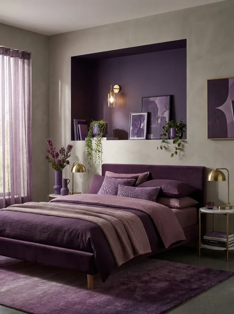
- Walls: Greige (a balanced gray-beige) as the dominant wall color, flat finish; a built-in reading nook painted deep violet
- Bedding: Ribbed cotton knit duvet in greige, with a deep-violet velvet accent pillow and a thin gray piped edge
- Wall Decor: A single ceramic wall sconce in matte black mounted inside the violet nook, functioning as both light and art
- Plants: A trailing string of pearls (Curio rowleyanus) in a small violet ceramic pot on the built-in shelf — suits the tighter, drier microclimate near a reading nook
- Hanging Element: A woven gray pendant lampshade over the main bed, textural rather than glossy
- Rug: A low-pile wool rug in greige with a subtle violet border
- Curtains: Linen curtains in a warm greige, left unlined to soften daylight rather than block it
- Furniture/Hardware: Platform bed frame in white oak, matte black hardware throughout
Why this works: Confining the deep violet to one architectural nook rather than a full wall gives the color a defined role instead of asking it to carry the whole room.
A built-in nook is one of the more underused features in a lot of bedrooms, and painting it a different color than the rest of the room is a simple way to give it a purpose. Deep violet inside the nook, greige everywhere else — the effect is that the nook reads as its own quiet corner, somewhere to sit with a book rather than a corner that got left out of the color scheme. It’s a smaller commitment than a full accent wall, so it’s worth trying if you’re not sure how much purple you actually want to live with.
My husband framed a nook almost identical to this for a client last year, and one thing he always mentions is that built-ins like this need proper blocking behind the drywall before you can mount a sconce or shelf securely — it’s not something you want to retrofit after the paint’s dry. If you’re planning a nook from scratch, that structural detail should get decided before color does. Worth asking your contractor about early, since moving it later means patching and repainting.
5. Pewter & Mauve Velvet
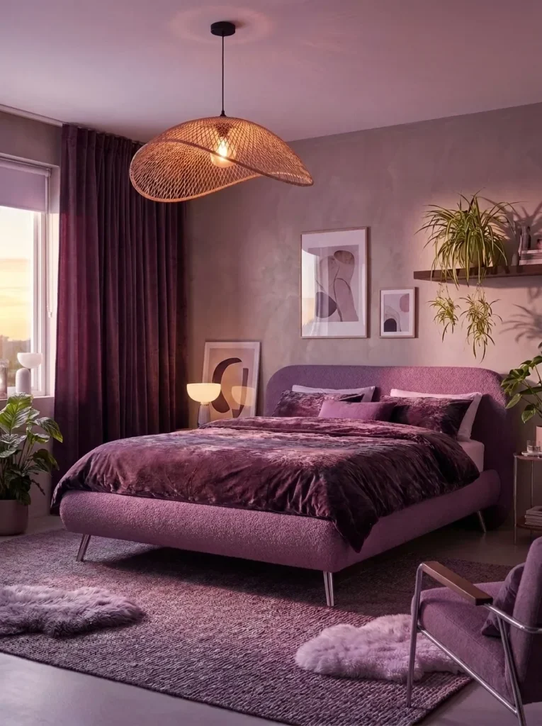
- Walls: Pewter-gray (a slightly warmer mid-tone gray with a soft sheen) as the dominant wall color, eggshell finish
- Bedding: Mauve velvet duvet cover, paired with pewter-gray linen sheets and a single blush-adjacent mauve bolster
- Wall Decor: A woven textile wall hanging in mauve and pewter tones, oversized, hung above the headboard in place of framed art
- Plants: A spider plant (Chlorophytum comosum) in a pewter-glazed pot on a floating shelf — easy propagation, so one plant becomes several over time
- Hanging Element: A woven rattan pendant light with a warm bulb, softening the cooler wall tone at night
- Rug: A chunky wool-blend rug in pewter with mauve fringe detailing
- Curtains: Mauve velvet curtains, floor-length, adding both color and acoustic softness to the room
- Furniture/Hardware: Curved upholstered bed frame in pewter boucle, chrome legs and drawer pulls
Why this works: Velvet reflects light differently than matte fabrics, which is why a mauve velvet duvet reads richer and less “pink” than the same color in cotton would.
Texture does more heavy lifting in a purple-and-gray room than most people expect. Velvet catches light in a way that deepens the color, so a mauve that might look soft or pastel in cotton reads as genuinely rich and saturated in velvet — closer to a wine tone than a blush one. That shift matters if you’re worried about the room skewing too sweet. Pairing it with pewter, which has just enough warmth to keep the room from feeling cold, gives you a palette that photographs beautifully in both daylight and lamp light without needing much else.
The rattan pendant is doing more than adding texture — natural woven materials tend to soften cooler color palettes in a way that smooth, glossy fixtures don’t. I’ve swapped a sleek metal pendant for a woven one in rooms that felt slightly sterile, and the change alone warmed the whole space up. If your gray-and-purple bedroom is starting to feel a little flat or showroom-like, the fixture is often the easiest, cheapest place to introduce that missing warmth.
6. Iris & Fog Gray
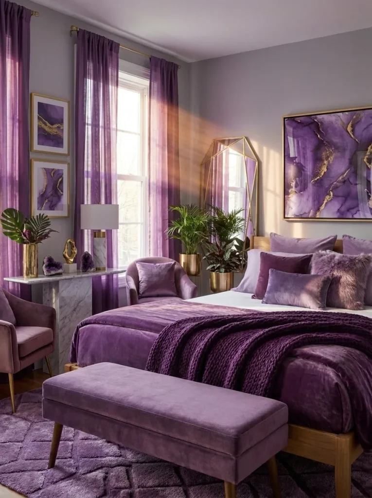
- Walls: Fog-gray (a pale, almost misty gray-blue) on all walls, matte finish, for a soft backdrop
- Bedding: White linen duvet as the base, layered with an iris-purple quilted throw and two fog-gray shams
- Wall Decor: A set of unframed botanical prints in iris and gray watercolor tones, clipped to a thin brass rail above the bed
- Plants: A philodendron (Philodendron hederaceum) trailing from a fog-gray hanging pot — its heart-shaped leaves echo the softness of the room without adding visual weight
- Hanging Element: The philodendron itself serves as the hanging element, suspended from a slim brass hook near the window
- Rug: A jute-and-wool blend rug in natural fog tones, adding texture underfoot
- Curtains: Sheer iris-tinted curtains that shift color subtly depending on the light
- Furniture/Hardware: Simple oak bed frame, no headboard upholstery, thin brass hardware
Why this works: Keeping the walls in a pale, almost neutral gray-blue lets the iris purple appear only in soft, movable layers, so the whole room can be re-toned just by changing the throw or curtains.
I painted a fog-gray like this in my own reading corner a few years back, thinking it would feel plain without more color on the walls, and I was wrong — it turned out to be the most flexible backdrop I’ve worked with. Because the wall color barely registers as gray or blue depending on the light, it lets the iris purple do all the visual work in movable pieces. That’s genuinely useful if your taste changes or you just want to refresh a room without repainting. Swap the throw, swap the mood.
Sheer curtains in a tinted color behave differently than sheers in white or cream — they filter daylight through that color, so the whole room takes on a faint iris cast in the afternoon without you doing anything else. It’s a subtle effect, easy to miss in photos but very noticeable in person. If you want a purple-and-gray room that shifts mood throughout the day, tinted sheers are a low-effort way to get there.
7. Graphite & Orchid Accent
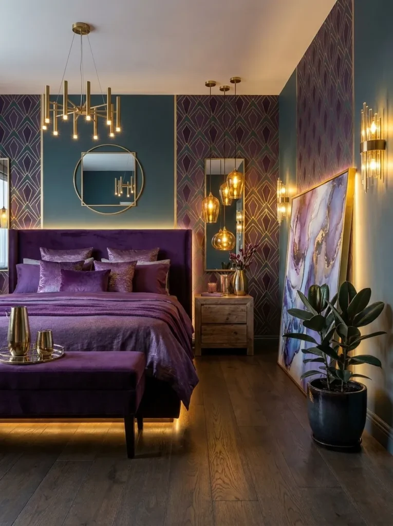
- Walls: Graphite gray (darker and cooler than charcoal, almost blue-black) on the headboard wall, satin finish; remaining walls in soft stone-gray
- Bedding: Charcoal linen duvet with a single orchid-purple throw pillow as the only saturated color in the bedding
- Wall Decor: A tall, narrow abstract print in graphite and orchid tones, hung vertically beside the bed rather than centered above it
- Plants: A real orchid (Phalaenopsis) in a graphite ceramic pot on the nightstand — the one plant in this list chosen to echo the accent color directly, not just complement it
- Hanging Element: A slim brass reading sconce mounted above the nightstand, angled toward the bed
- Rug: A low-pile rug in stone-gray with no pattern, letting the walls carry the visual interest
- Curtains: Solid stone-gray curtains, minimal and unfussy
- Furniture/Hardware: Low-profile platform bed in dark walnut, brass hardware
Why this works: Using orchid purple in exactly one place — the pillow and the plant — makes it read as a deliberate accent color rather than a competing wall tone.
Sometimes the most sophisticated version of a color story is the most restrained one. This room uses purple in exactly two places: a single throw pillow and a live orchid, and that restraint is what makes it feel curated rather than themed. Graphite and stone-gray do almost all the work, and the orchid purple gets to feel special because it isn’t repeated everywhere. It’s a good direction if you love purple but don’t want a bedroom that reads as “the purple room” to anyone who walks in.
That’s why many designers recommend picking one true accent color and repeating it in just two or three spots rather than spreading it thin across a room — it reads as more intentional than scattering small purple touches everywhere. Here, the live orchid does double duty: it’s a plant that needs almost no bedroom-appropriate light to bloom, and its color directly answers the pillow across the room. That kind of small, deliberate echo is what makes a space feel planned rather than assembled from separate purchases.
8. Storm Gray & Aubergine Depth
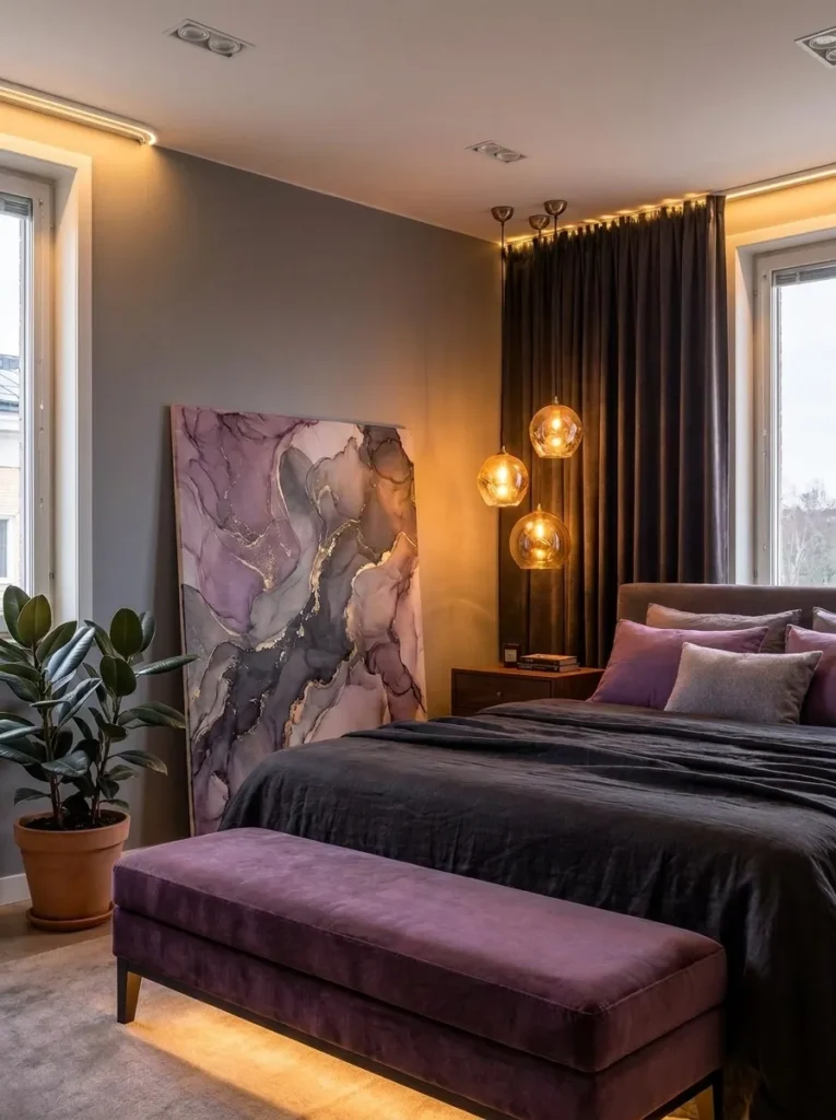
- Walls: Storm-gray (a dark, blue-toned gray, deeper than dove but not quite charcoal) on all four walls, matte finish
- Bedding: Aubergine quilted coverlet with storm-gray pillowcases and one cream linen lumbar pillow for contrast
- Wall Decor: A large, unframed canvas in abstract aubergine brushwork, leaned against the wall rather than hung — casual, gallery-style
- Plants: A rubber plant (Ficus elastica) in a storm-gray textured pot on the floor beside the dresser — its glossy dark leaves echo the aubergine without adding another color
- Hanging Element: A cluster of three small glass pendants at varying heights above the nightstand, brushed-nickel fittings
- Rug: A dense wool rug in storm-gray with a subtle aubergine geometric pattern
- Curtains: Storm-gray linen curtains with a slight sheen, floor-length
- Furniture/Hardware: Upholstered aubergine velvet bench at the foot of the bed, brushed-nickel bed frame legs
Why this works: A single leaned canvas instead of a hung one softens a very saturated color story and keeps the room from feeling overly formal.
Storm gray and aubergine together lean darker and moodier than most of the pairings on this list, which makes them a good fit for a primary bedroom that gets plenty of natural light during the day — the depth reads as cozy rather than dim. Leaning the canvas against the wall instead of hanging it is a small styling trick that keeps a dark, saturated room from feeling too staged or formal. It’s the kind of detail that photographs well precisely because it looks slightly unplanned, even though it isn’t.
I’ve noticed that clustered pendant lights at different heights do more to make a room feel custom-designed than almost any other single fixture choice. A matched pair of lamps says “matching set from a catalog.” Three glass pendants at uneven heights says someone thought about the composition. It’s a small swap — same wiring, same basic fixture type — but the visual result is noticeably more editorial, especially in a room this saturated with color.
9. Silver Sage & Periwinkle Whisper
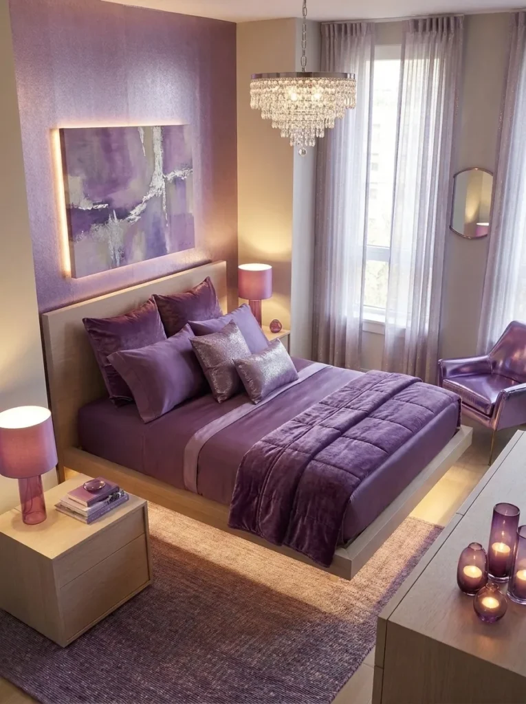
- Walls: Silver-sage gray (a cool gray with the faintest green undertone) on the walls, flat finish
- Bedding: White cotton percale sheets, layered with a periwinkle-purple quilt folded at the foot of the bed, not covering the whole surface
- Wall Decor: A small collection of ceramic wall vases in silver-sage and periwinkle, mounted at staggered heights and left empty or with single dried stems
- Plants: A maidenhair fern (Adiantum raddianum) in a silver-sage pot — a plant that genuinely needs consistent humidity, so it’s paired here with a small tabletop humidifier as a practical note
- Hanging Element: A single woven periwinkle textile hanging beside the window, more art than function
- Rug: A pale silver-sage bouclé rug, soft underfoot
- Curtains: Sheer white curtains with a thin periwinkle trim along the edge
- Furniture/Hardware: White oak bed frame, chrome hardware, low and minimal in profile
Why this works: A pale, green-cast gray paired with a blue-leaning periwinkle keeps this room feeling fresh and light rather than heavy, since neither color pulls toward true saturated purple.
This is the lightest, most delicate pairing on the list, and it’s the one I’d recommend for a room that gets strong morning light and needs a palette that won’t feel oppressive by midday. Silver-sage gray has just enough green in it to feel organic rather than cold, and periwinkle — being closer to blue than true violet — keeps the whole room feeling fresh instead of heavy. Folding the quilt at the foot of the bed rather than covering it fully lets the white sheets breathe visually, which matters more in a pale room than a dark one.
I’ll be honest about the maidenhair fern: it’s a beautiful plant and a genuinely difficult one for a bedroom, since most bedrooms run drier than a fern wants. I only recommend it here because a small tabletop humidifier solves the problem completely and does double duty for anyone who sleeps better with a bit of ambient moisture in the air. If that feels like too much upkeep, a peperomia in the same pot gives you a similar soft, rounded leaf shape with far less fuss.
10. Charcoal Boucle & Lilac Grey
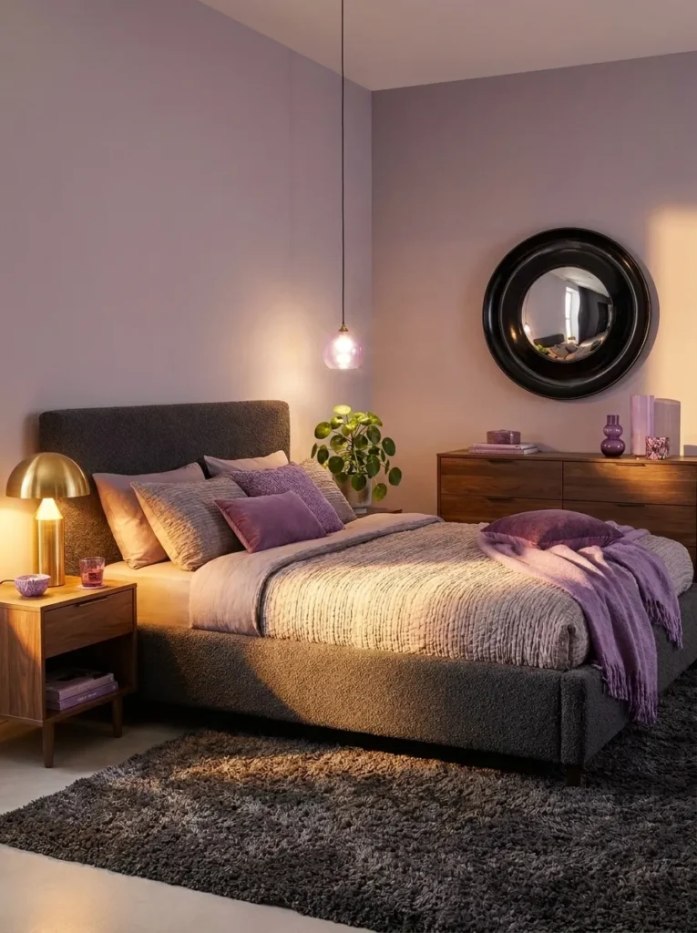
- Walls: Lilac-gray (a genuinely balanced fifty-fifty blend, neither reading as clearly purple nor clearly gray) on all walls, eggshell finish
- Bedding: Charcoal boucle-textured coverlet, with lilac-gray pillowcases and a thin white piped trim
- Wall Decor: A round convex mirror in a matte black frame, hung slightly off-center above the dresser rather than the bed
- Plants: A pilea (Pilea peperomioides) in a charcoal pot on the nightstand — its round, coin-shaped leaves add a graphic note without competing with the wall color
- Hanging Element: A charcoal-corded pendant light with a small lilac-gray glass shade
- Rug: A charcoal shag rug with long pile for tactile contrast against the smoother wall
- Curtains: Lilac-gray linen curtains, unlined, allowing filtered light through
- Furniture/Hardware: Boucle-upholstered bed frame in charcoal, matte black legs and pulls
Why this works: A wall color that sits exactly between purple and gray removes the guesswork of choosing which one should dominate, since the wall itself already blends them.
Lilac-gray is the pairing I recommend when someone tells me they like both colors equally and can’t decide which should lead — the wall color does that decision for you by blending them into one tone. It reads differently depending on the light: warmer and more purple in lamplight, cooler and more gray under daylight. That shift alone gives the room two distinct moods without changing a single piece of furniture, which is a low-effort way to get more visual variety out of one paint color.
Boucle has become one of the most requested upholstery textures in bedrooms my husband’s crews have worked on recently, and it’s easy to see why here — the nubby texture reads as soft and tactile against a smooth, flat wall color, adding depth without adding another color to track. Charcoal boucle specifically keeps the texture from reading as too soft or too feminine, which matters if you want the room to feel grounded rather than fluffy.
11. Concrete Grey & Heliotrope Pop
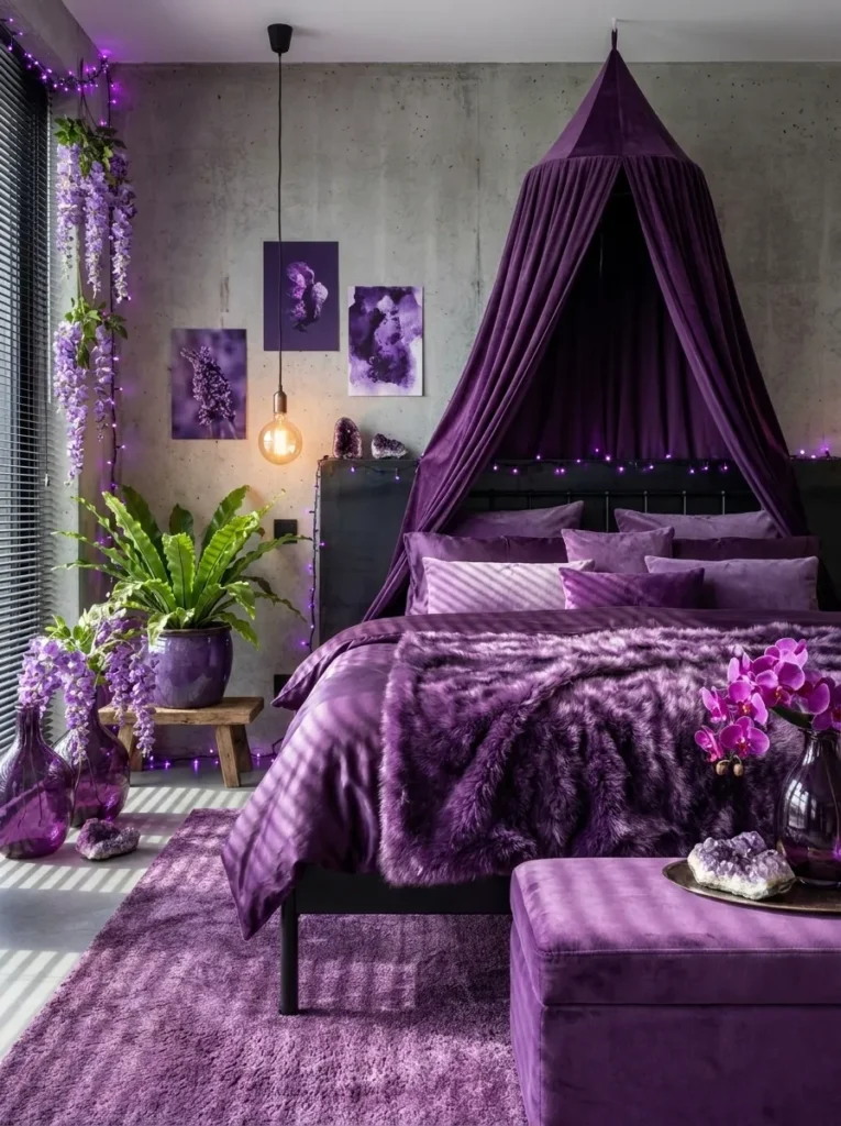
- Walls: Concrete-gray (an industrial, slightly cool mid-gray with a matte, almost raw texture) on all walls
- Bedding: Ivory linen duvet base with a heliotrope-purple (a vivid, blue-leaning purple) folded throw and matching piped edge on one pillow
- Wall Decor: A large, framed botanical photograph in black and white, hung above the bed — deliberately colorless to let the heliotrope throw stand out as the room’s only true color note
- Plants: A bird’s nest fern (Asplenium nidus) in a concrete-textured pot on a low stool beside the bed — its ruffled fronds add organic texture against the industrial wall
- Hanging Element: An exposed-bulb pendant with a black cord, industrial in character, hung off-center
- Rug: A flatweave rug in raw jute with a thin heliotrope stripe running through it
- Curtains: No curtains — a matte black metal blind instead, keeping the industrial thread consistent
- Furniture/Hardware: Steel-frame bed with a low platform base, matte black hardware throughout
Why this works: Pairing an industrial gray backdrop with a single vivid purple accent creates more visual contrast than a softer gray would, making the purple feel bolder rather than washed out.
This is the boldest, most modern room in the group, and it’s built on contrast rather than blending. Concrete-gray has almost no warmth to it, which is exactly what makes the heliotrope throw pop instead of blend in — a softer, warmer gray would have absorbed some of that color’s intensity. It’s a good fit for anyone drawn to a more industrial or loft-style aesthetic who still wants a genuine purple moment in the room, rather than purple that’s been diluted down to a muted accent.
My husband’s crews install a fair number of exposed steel bed frames and matte black blinds in newer builds around Austin, and one thing worth knowing: metal blinds block light more completely than most fabric curtains, which matters if your bedroom faces east and mornings currently wake you up earlier than you’d like. It’s a practical upgrade that happens to suit this palette perfectly, since the blind’s flat black finish echoes the hardware throughout the rest of the room.
12. Ash Gray & Amaranth Velvet
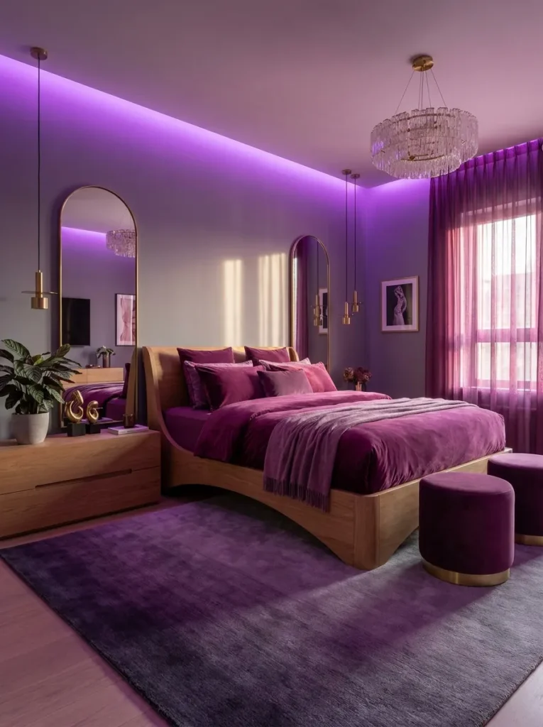
- Walls: Ash-gray (a light, slightly warm gray with soft undertones) on all walls, matte finish
- Bedding: Amaranth-purple velvet duvet (a deep, rosy purple, warmer than amethyst) with ash-gray linen shams and a cream knit throw
- Wall Decor: A pair of matching arched mirrors in brushed brass, flanking the bed instead of a single centered piece
- Plants: A calathea (Calathea orbifolia) in an ash-gray pot on the dresser — its striped, patterned leaves add visual texture that echoes the room’s mix of matte and velvet finishes
- Hanging Element: A brass-and-glass bubble pendant, hung centrally, adding a soft sculptural note overhead
- Rug: A plush amaranth-and-gray ombré rug, transitioning from deep purple at the edges to pale gray toward the center
- Curtains: Ash-gray velvet curtains, floor-length, matching the duvet’s fabric weight
- Furniture/Hardware: Curved wood bed frame in a warm oak tone, brass hardware
Why this works: Matching the curtain and duvet fabric weight — both velvet — creates a cohesive, tailored look without needing to match their exact colors.
Amaranth is a warmer, rosier purple than most of the shades used elsewhere on this list, and it pairs surprisingly well with ash gray because both colors carry a bit of warmth rather than reading as strictly cool-toned. The result feels inviting rather than austere, which makes this a strong option for anyone who wants the sophistication of a purple and gray bedroom without it feeling chilly or overly modern. The paired arched mirrors are doing subtle work here too — symmetry on either side of a bed reads as more intentional and calming than a single off-center piece.
I’ve noticed that ombré rugs get overlooked in a lot of bedroom styling, probably because they can look busy in a small photo, but in person they add genuine depth underfoot without introducing a fourth or fifth color into the room. This one transitions from deep amaranth to pale gray, essentially echoing the wall-and-bedding relationship in a single object. It’s a good trick if you want visual richness without adding more decor pieces to track.
13. Cement Gray & Thistle Softness
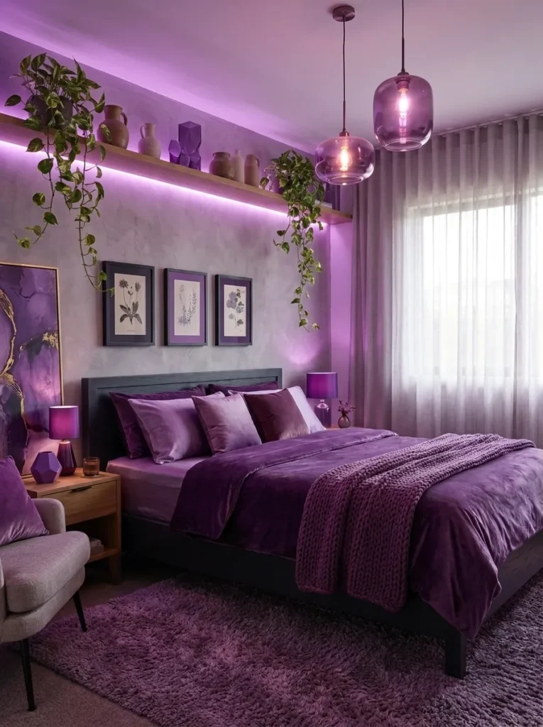
- Walls: Cement-gray (a cool, slightly blue mid-gray, flatter and less industrial than concrete) on the wall behind the bed; remaining walls in a lighter dove tone
- Bedding: Thistle-purple (a pale, dusty lavender-gray purple) waffle-weave duvet, paired with cement-gray pillowcases and a white knit throw
- Wall Decor: A trio of small framed pressed botanicals in thistle and gray tones, arranged in a horizontal line above the nightstand
- Plants: A pothos ‘Marble Queen’ (Epipremnum aureum ‘Marble Queen’) in a cement-gray pot, trailing from a high shelf — the variegated leaves pick up both the wall’s gray and hints of cream
- Hanging Element: A woven paper pendant lantern in soft white, casting diffused light rather than direct glow
- Rug: A low-pile wool rug in thistle with a faint cement-gray border
- Curtains: Dove-gray linen curtains, sheer enough to let the thistle tones in the room stay visible even with them drawn
- Furniture/Hardware: Simple painted wood bed frame in cement-gray, brushed-nickel hardware
Why this works: Thistle sits close enough to gray on the color wheel that it functions almost as a near-neutral, which is why this pairing feels quiet and forgiving rather than demanding a bold design statement.
This is a quieter room than most on this list, built around the idea that not every gray and purple bedroom needs a strong contrast moment to feel intentional. Thistle is subtle enough that it almost reads as a warm gray rather than a purple, which makes this pairing especially forgiving if you’re nervous about committing to a bolder shade. The horizontal line of small framed botanicals above the nightstand — rather than a single large piece above the bed — adds visual interest at a height that’s easy to actually notice while getting dressed or reading in bed.
That’s the kind of detail I think gets overlooked in room styling generally: art doesn’t have to hang above the headboard to matter. Placing it near where you’ll actually be sitting or standing — beside the nightstand, at eye level — means you notice it daily instead of only when you’re lying flat in bed looking up. In a room this soft and low-contrast, small deliberate placement choices like that carry more weight than they would in a bolder space.
14. Onyx Trim & Violet Statement
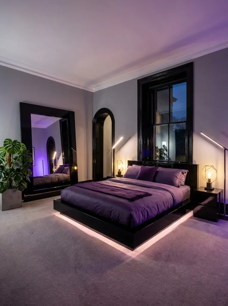
- Walls: Soft dove-gray as the base wall color, with glossy onyx-black trim and door casing — the one idea in this list using black as the grounding neutral alongside gray
- Bedding: Deep violet sateen duvet, quite saturated, paired with dove-gray pillowcases and a single black velvet lumbar pillow
- Wall Decor: An oversized black-framed mirror leaned on the floor against the wall, reflecting the violet bedding back into the room
- Plants: A monstera (Monstera deliciosa) in a glossy black pot in the corner — its large leaves suit the room’s bolder scale
- Hanging Element: A sculptural black metal pendant with an asymmetric shade, hung slightly off-center above the bed
- Rug: A deep violet rug with a subtle onyx-black geometric border
- Curtains: Floor-length dove-gray curtains with black metal grommets, adding a hardware detail rather than a rod pocket
- Furniture/Hardware: Black lacquered bed frame with a low, angular headboard, matte black hardware throughout
Why this works: Glossy black trim against a matte gray wall adds architectural definition that plain painted trim can’t, giving the violet bedding a more defined frame to sit within.
Trim color is one of the most overlooked decisions in a bedroom, and it’s usually painted the same white as every other room in the house by default. Glossy black trim against dove-gray walls does something a plain white trim simply can’t — it frames the room the way a mat frames a piece of art, and it makes the deep violet bedding read as a genuine focal point instead of just one more colorful element floating in the space. This is the boldest, most saturated room on the list, and the black trim is what keeps it from feeling overwhelming rather than adding to the intensity.
My husband always tells clients that glossy trim paint shows every imperfection in the underlying woodwork far more than a matte or eggshell finish would, so it’s worth having any dinged or uneven trim properly sanded and filled before painting it black and glossy. It’s a small extra step, but skipping it means the flaws end up more visible than they were with the original white paint, not less.
15. Fluted Pebble & Foxglove Violet
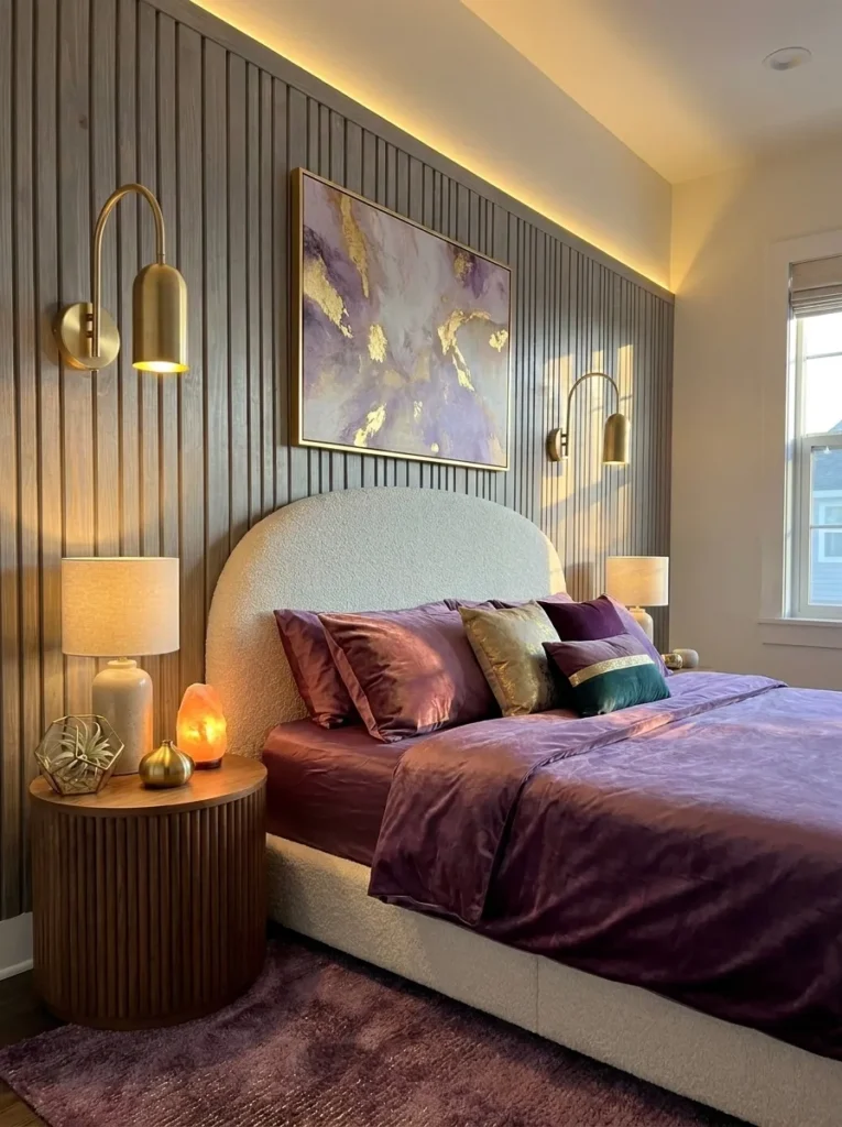
- Walls: Pebble-gray (a warm, light neutral gray) as the base, with vertical fluted wood paneling in a matching gray-washed finish behind the bed — a textured architectural moment rather than flat paint
- Bedding: Foxglove-purple (a saturated, slightly pink-leaning violet) linen duvet, paired with pebble-gray shams and a cream boucle lumbar pillow
- Wall Decor: No traditional art — the fluted paneling itself serves as the wall’s visual interest, left unadorned to let the texture speak
- Plants: An air plant (Tillandsia xerographica) displayed in a glass terrarium on the nightstand, no soil or pot needed — a genuinely different plant style than anything else in this list
- Hanging Element: A slim, curved brass wall sconce mounted directly onto the fluted panel, integrated into the architecture rather than added on top of it
- Rug: A foxglove-purple rug with subtle pebble-gray flecks, wool-blend, low pile
- Curtains: Pebble-gray curtains in a slightly nubby linen-cotton blend, unlined for soft daylight filtering
- Furniture/Hardware: Curved, low-profile upholstered bed frame in cream boucle, brushed-brass legs
Why this works: Fluted paneling adds dimension and shadow play that flat paint can’t, giving a neutral gray wall genuine visual weight without needing another color.
Fluted paneling has become one of the defining architectural details of current bedroom design, and it solves a real problem: a plain gray wall can feel flat, especially in a room without much other texture. The vertical grooves catch light differently throughout the day, so the wall itself shifts in appearance from morning to evening without you changing a single thing. Paired with a saturated foxglove-purple duvet, the effect feels current and considered rather than trend-chasing, since the texture is doing structural work, not just decorative work.
I’d never really given air plants much thought for bedrooms until a client asked about low-maintenance options for a nightstand with almost no direct light, and Tillandsia solved it completely — no soil, no pot, just an occasional soak in water once a week. It’s a small, easy way to bring in a genuine plant element without worrying about drainage or humidity, which matters if your bedroom windows don’t get much direct sun. The glass terrarium keeps it tidy and adds its own quiet sculptural note beside the bed.
Styling Principles: Balancing Purple and Gray
The biggest decision in a purple and gray bedroom is which color leads. There’s no universal right answer, but room size and light exposure are the two factors worth weighing first.
Let gray dominate in smaller or darker rooms. A room with limited natural light or under roughly 120 square feet generally reads better with gray as the primary wall color and purple confined to bedding, art, or a single accent wall. This keeps the space feeling open rather than closed in.
Let purple dominate in larger rooms with strong natural light. A bedroom that gets consistent daylight can handle a deeper, more saturated purple as the primary color without feeling heavy, since the light offsets the intensity.
Match your gray’s undertone to your purple’s undertone. A blue-leaning gray (like slate or storm) pairs most naturally with a blue-leaning purple (like amethyst or iris). A warmer gray (like greige or pebble) pairs best with a warmer, rosier purple (like amaranth or thistle). Mismatched undertones are the most common reason a purple-gray room feels slightly off without an obvious explanation.
Choose one metal finish and repeat it. Brass, brushed nickel, chrome, or matte black — pick one and use it for hardware, light fixtures, and mirror frames throughout the room, rather than mixing several.
Frequently Asked Questions
Is purple and gray a good color combination for a bedroom? Yes. Gray functions as a color-theory neutralizer, which means it desaturates and calms purple’s intensity, letting the combination read as sophisticated and intentional rather than overly sweet or dated.
What’s the best shade of gray to pair with purple? It depends on your purple’s undertone. Cool, blue-leaning purples like amethyst or iris pair best with cool grays like slate or storm gray, while warmer purples like amaranth or thistle pair better with warmer grays like greige or pebble.
Does a purple and gray color scheme work in a small bedroom? Yes, as long as gray takes the dominant role on the walls and purple stays confined to bedding, art, or one accent wall. A small room painted entirely in a deep, saturated purple can feel closed in regardless of the gray pairing.
What’s a budget-friendly way to try a purple and gray bedroom? Start with bedding and a single purple accent wall rather than repainting the entire room, then add one plant and one metal-finish light fixture to complete the look before committing further.
What metal accents work best with purple and gray? Brushed nickel, chrome, and matte black suit cooler purple-gray palettes, while brass and warm gold-toned finishes suit warmer, rosier purple pairings like amaranth or thistle.
Can purple and gray work in a bedroom with limited natural light? Yes, if you lean lighter on both colors — dove gray or fog gray paired with a lighter purple like periwinkle or lilac-gray — rather than choosing deeply saturated tones that can make a dim room feel darker.
Conclusion
A purple and gray bedroom doesn’t have to feel like a compromise between the two colors — done thoughtfully, it becomes something more sophisticated than either shade alone. Whether you’re drawn to the soft, forgiving pairing of dove gray and dusty plum or the bold contrast of onyx trim against deep violet, there’s a version here suited to your room’s size, light, and personality.
I’ve seen how small changes like a single accent wall or the right pendant light can completely shift how a bedroom feels, and this palette is one of the more rewarding ones to experiment with. Save this post, pick one idea to try first, and share it with anyone else planning a bedroom refresh.