15 Boho Maximalist Bedroom Ideas for Fearless Pattern and Color Lovers
Some bedrooms feel like they were shopped for in one afternoon. Others feel like they were gathered over a lifetime. If you’ve ever wondered why some maximalist rooms feel curated while others feel chaotic, the answer isn’t about how much is in the room — it’s about what repeats. This collection of boho maximalist bedroom ideas is built around that exact principle: real pattern-on-pattern layering, genuine plant density, and a “collected over years” feeling, all held together by 2-3 anchor colors running through every layer.
In my experience styling dense, pattern-heavy rooms for clients who love color, the fear is almost always the same — that going bold will tip into overwhelming. It rarely does, as long as the room has a thread to follow. Whether you’re drawn to jewel tones, earthy terracotta, or moody charcoal, these fifteen ideas show you exactly how to build genuine boho density that still feels intentional, personal, and entirely yours.
What Makes a Room Feel Curated, Not Cluttered
Most people think “maximalist” means “no rules.” It’s actually the opposite. In my years styling rooms for clients who love color and pattern, I’ve noticed the rooms that read as curated rather than cluttered almost always share one thing: a repeating thread. The real difference between boho maximalism and a genuinely cluttered room comes down to intentional repetition — spaces that repeat 2–3 colors or patterns across multiple objects give the eye an anchor point even amid heavy visual density, while truly cluttered rooms have no repeating thread to follow.
I saw this firsthand in a client’s guest room last spring — swap the anchor color, and instant chaos. This post shows you how to build genuine, fearless boho density without losing that thread.
1. Kantha Quilt Layers
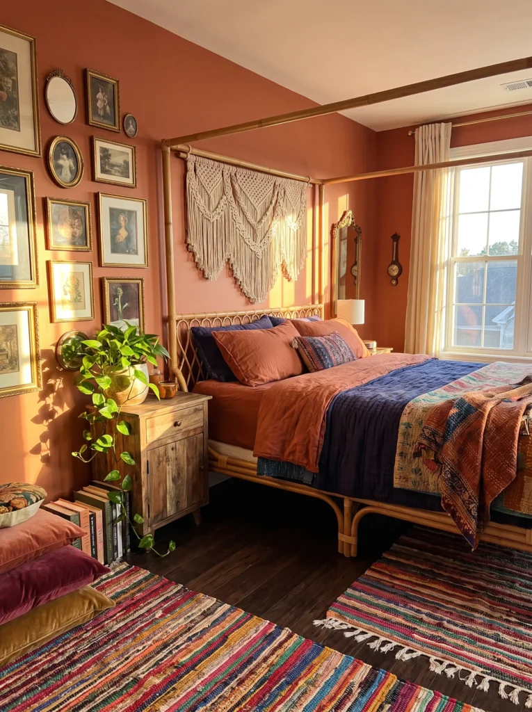
- Walls: Deep terracotta (Sherwin-Williams “Cavern Clay” family) painted to picture-rail height, with the top foot left in raw plaster texture
- Bedding: Three overlapping vintage kantha quilts in rust, mustard, and faded indigo, topped with a block-print cotton throw in a chili-red paisley
- Wall decor: Dense gallery of 14 small brass and wood-framed botanical prints, hung salon-style in an asymmetrical cluster
- Plants: A trailing pothos in a rust-glazed pot on the nightstand, a mature snake plant in woven seagrass by the window, a string of hearts cascading from a wall shelf, and a fiddle leaf fig in the corner — all chosen because they tolerate the room’s low-morning, bright-afternoon light pattern
- Hanging elements: A large diamond-weave macrame wall hanging in natural jute above the headboard
- Rug: A flatweave dhurrie in rust and cream layered under a smaller overdyed Persian rug in faded indigo
- Curtains: Mustard linen with a subtle ikat stripe, pooling slightly on the floor
- Furniture: Rattan four-poster bed frame, plus a carved wooden trunk at the foot of the bed for extra textile storage
Why this works: Repeating rust and mustard across the quilts, prints, and rug gives fourteen different objects one shared visual thread, which is what keeps this room from tipping into chaos.
Terracotta walls do something a lot of neutral bedrooms miss out on — they make every warm-toned object in the room feel intentional instead of random. I’ve styled this exact palette for a client whose room used to feel like a storage unit for pretty things, and the moment we picked one anchor tone and repeated it through the quilts, the trunk, and the pot glazes, the whole space clicked into place. It stopped looking busy and started looking like it belonged together, even with four plants and fourteen frames doing a lot of visual work in one room.
Layering kantha quilts isn’t just a styling trick, either — it’s functionally smart for anyone in a climate with real temperature swings, since you can peel back a layer without stripping the bed. That’s the kind of detail that matters more than people expect. The rattan bed frame keeps the furniture itself light and airy so the pattern density has room to breathe instead of competing with heavy wood. Add the macrame hanging above the headboard, and your eye has a clear vertical anchor point even in a room this rich with texture and color.
2. Batik Blue Sanctuary
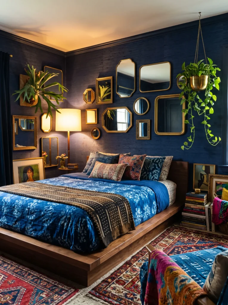
I once painted a client’s bedroom in a blue so deep it looked black at night and honey-gold by morning — that shift is exactly what makes this idea work.
- Walls: Indigo-blue grasscloth wallpaper (a textured, woven look, not flat paint) on the headboard wall only
- Bedding: Batik-print duvet in cobalt and white, layered with a mudcloth-style throw in charcoal and cream, plus two bolster pillows in a small-scale indigo shibori print
- Wall decor: A dense cluster of vintage brass mirrors in varying sizes and shapes, mixed with two framed batik textile scraps
- Plants: A staghorn fern mounted directly on the grasscloth wall, a ZZ plant in a cobalt ceramic pot, and a pothos trailing from a hanging brass planter — all low-to-moderate light plants suited to a north-facing room
- Hanging elements: A brass and glass bead curtain partition near the closet entry
- Rug: A vintage blue-and-cream Moroccan Beni Ourain layered over a jute base rug
- Curtains: Sheer indigo-dyed linen that shifts color with the light
- Furniture: Low platform bed in dark walnut, plus a curved rattan bench at the foot
Why this works: Every textile and finish returns to the same indigo-and-brass thread, so even the mixed mirror shapes and mounted fern read as chosen, not scattered.
The staghorn fern mounted straight onto the wall is the detail that makes this room feel gathered rather than shopped-for-in-a-day. Mounted ferns need bright, indirect light and a weekly soak rather than regular watering, which makes them a genuinely different visual texture than a potted plant — something most bedroom plant guides skip entirely. Pairing that organic shape against the smooth brass mirrors creates real contrast without breaking the room’s color logic. This is the kind of layering that photographs beautifully because it has depth: hard metal, soft fern, woven rug, dyed linen, all speaking the same indigo language.
My husband, who’s spent two decades in construction, always flags one thing when clients want a dense mirror gallery like this: uneven wall studs are common in older homes, so anything heavier than a poster needs proper anchors, not just a nail. It’s a small detail, but it’s the difference between a gallery wall that lasts and one that ends up in a pile on the floor. Budget for real picture-hanging hardware here — it’s worth it for a wall doing this much visual heavy lifting.
You’ll Also Love:25 Small Maximalist Bedroom Ideas (Bold, Not Cluttered)
3. Ikat Jewel Box
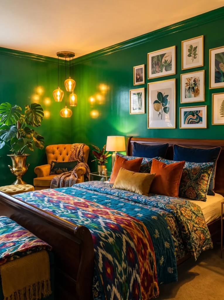
Ikat is one of the hardest patterns to mix well, and that’s exactly why it makes such a strong anchor for a truly maximalist room.
- Walls: Emerald-green paint (Farrow & Ball “Studio Green” family — verify against current deck) on all four walls, high-gloss finish to catch light
- Bedding: Ikat-print duvet in emerald and gold, layered with a quilted velvet coverlet in deep plum, topped with three mismatched jewel-toned lumbar pillows in ruby, amber, and teal
- Wall decor: A dense arrangement of vintage tapestry fragments and small oil paintings in ornate gold frames, filling the entire wall above the headboard
- Plants: A mature monstera in a brass urn, a peperomia trio on a bookshelf, and a hanging string of pearls in a ceramic hanging pot — grouped for their shared preference for bright, indirect light
- Hanging elements: A beaded chandelier-style pendant in amber glass over the reading nook
- Rug: A jewel-toned overdyed Persian rug layered atop a solid charcoal wool base
- Curtains: Emerald velvet with gold trim, floor-length and fully lined
- Furniture: Dark carved wood sleigh bed, plus a tufted velvet reading chair in the corner nook
Why this works: Gold shows up in the frames, the pendant, the trim, and the pot, giving this jewel-toned room one consistent metal thread that holds all the color together.
Glossy emerald walls change how every other color in this room behaves, which is something I didn’t fully appreciate until I saw it done in person. The sheen bounces the amber pendant light around the whole space, so even the darker plum and charcoal pieces feel lit from within rather than heavy or dim. That’s the trick with jewel-tone maximalism — it needs light bouncing off surfaces to stay alive instead of sinking into itself. Pairing a glossy wall with velvet, wool, and tapestry textures gives the eye somewhere different to land every few feet, which is exactly the density this style calls for.
A tufted velvet reading chair earns its place here as more than decoration — it gives the room a second gathering point beyond the bed, which matters in a space this visually rich, since you need somewhere to actually rest your eyes between all the pattern and color. The monstera’s broad leaves do something similar structurally: their large, simple shape breaks up the smaller busy patterns nearby. That contrast between big-leaf simplicity and tiny-print density is a trick worth remembering for any maximalist plant styling.
4. Sunset Suzani Curve
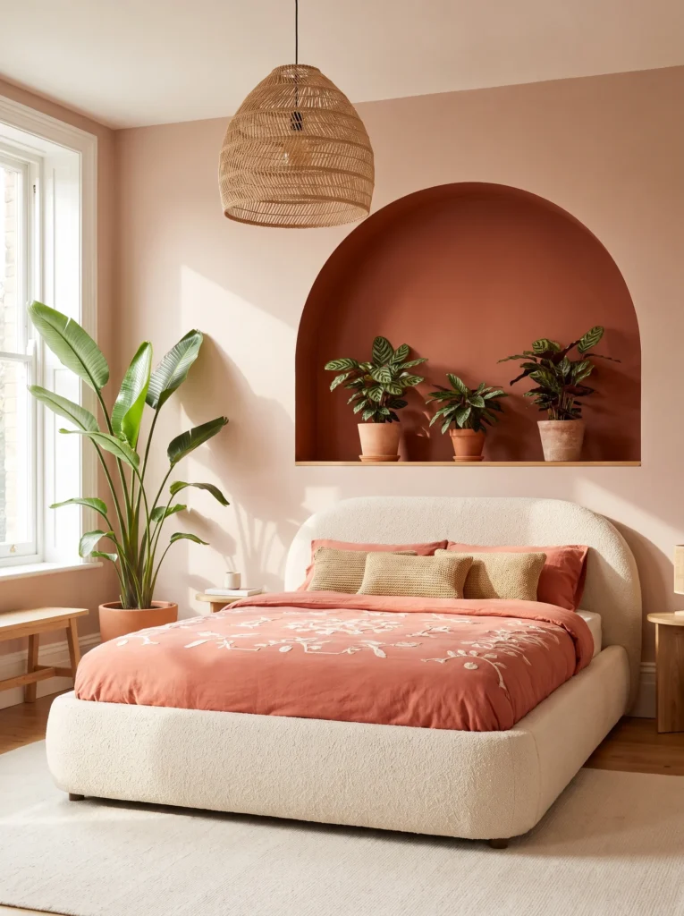
A curved arch headboard is the single easiest way to make a boho maximalist room feel current instead of dated — it softens all that pattern density into something intentional rather than chaotic.
- Walls: Warm blush-clay paint (Benjamin Moore “Bewitched” family — verify against current deck) with a hand-painted plaster arch niche behind the bed in a deeper terracotta
- Bedding: Suzani-embroidered duvet in coral, burnt orange, and cream, layered with a ribbed burnt-orange velvet coverlet and two block-print bolsters in a small ochre diamond pattern
- Wall decor: An asymmetrical cluster of ceramic sun-shaped wall hangings in varying clay tones, mixed with three small framed botanical sketches
- Plants: A bird of paradise in a black textured pot by the window, a calathea trio grouped on a low shelf, and a hoya trailing from the arch niche — grouped for their shared humidity and bright-indirect light needs
- Hanging elements: A woven raffia pendant lamp with a curved, organic silhouette over the reading corner
- Rug: A hand-knotted coral and cream Moroccan-style rug layered over a natural jute base
- Curtains: Burnt-orange linen with a subtle woven texture, hung on a curved black metal rod
- Furniture: Curved, upholstered bouclé bed frame in cream, plus a black powder-coated metal accent table
Why this works: Coral and burnt orange repeat through the suzani, the bolsters, and the curtains, so the room’s curved, modern shapes never feel disconnected from its boho pattern layering.
Curved furniture does something flat-fronted pieces can’t in a maximalist room — it gives your eye a soft place to land between all the busy textiles. I styled a version of this for a client who worried dense pattern would feel overwhelming in a small room, and the bouclé bed frame’s rounded shape completely changed how the space felt, even with a fully patterned suzani and layered bolsters on top. It reads as 2026-current rather than a decade-old boho mood board, which is exactly the shift a lot of maximalist bedrooms need to avoid looking dated.
The plaster arch niche behind the bed is a detail worth the extra effort, and it’s one my husband’s crew has built into a handful of client renovations — it’s a relatively simple drywall-and-joint-compound build that adds real architectural interest without structural changes. Grouping the calathea trio inside that niche gives the plants a defined home instead of scattering them randomly, which keeps the density feeling curated. That’s the difference between “a lot of plants” and “an intentional plant collection.”
5. Teal & Black Jungle Curve
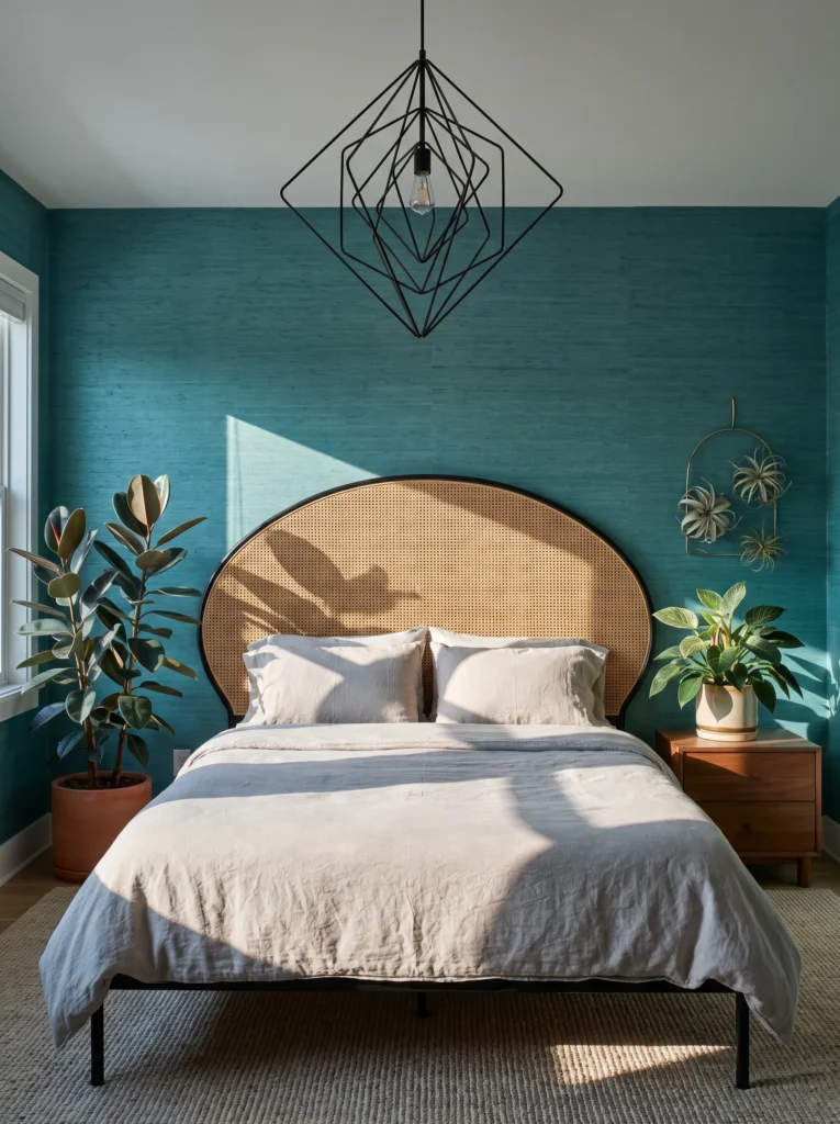
Deep teal is an underused anchor in boho bedrooms, and paired with black metal instead of the usual brass, it reads noticeably more modern.
- Walls: Deep teal grasscloth wallpaper with a subtle woven palm-frond texture, covering all four walls
- Bedding: Block-print duvet in teal and cream, layered with a black ribbed velvet throw and two mudcloth-inspired lumbar pillows in charcoal and white
- Wall decor: A dense cluster of black-framed botanical prints mixed with two round rattan wall discs, arranged in an organic curved formation rather than a strict grid
- Plants: A rubber plant in a matte black planter, a philodendron birkin on the nightstand, and a trio of air plants tucked into a curved wall-mounted ceramic holder — chosen for their tolerance of the room’s moderate, filtered light
- Hanging elements: A curved black metal pendant light with an open, sculptural silhouette
- Rug: A teal and cream flatweave layered over a black jute base rug
- Curtains: Cream linen with a woven teal stripe, hung on a curved black rod
- Furniture: Curved rattan headboard with black metal legs, plus a black metal-and-cane bench at the foot
Why this works: Black metal repeats through the pendant, frames, and furniture legs, giving this jungle-toned room a consistent modern thread that keeps the density from tipping into busy.
Teal grasscloth on all four walls is a bigger commitment than most people expect, but it’s what makes this room feel enveloping instead of just decorated. I’ve noticed that clients who hesitate on full-wall wallpaper almost always regret the smaller, safer choice once they see a fully wrapped room in person — the texture and depth you get from all four walls is genuinely different from just one accent wall. The rubber plant’s broad, glossy leaves do real visual work against that woven texture, giving the eye a smooth, simple shape to rest on between the busy print pillows and the dense black-framed gallery.
Curved rattan on the headboard paired with black metal legs is a combination that didn’t exist much in boho decor a few years back, but it’s become one of the clearest signals of current, modern boho styling. The organic curve of the rattan softens the black metal’s edge, and that same softening happens again in the sculptural pendant light overhead. Pairing round, natural shapes with matte black hardware throughout the room is what keeps this jungle-dense space feeling fresh instead of like a repeat of the last decade’s boho trends.
6. Dusty Rose Arch Retreat
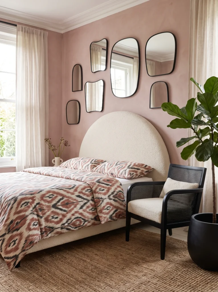
Not every boho maximalist room needs saturated jewel tones — dusty rose and black is a softer palette that still delivers genuine visual density.
- Walls: Dusty rose limewash paint with visible brushstroke texture, plus a curved arch mirror inset built into the headboard wall
- Bedding: Dusty rose and cream ikat duvet, layered with a black bouclé throw and three mismatched pillows in blush velvet, cream linen, and a small-scale rust print
- Wall decor: A dense curved gallery of round and arch-shaped mirrors in black metal frames, varying in size
- Plants: A fiddle leaf fig in a curved black ceramic pot, a pothos trailing from a wall shelf, and a cluster of three small echeveria succulents on the nightstand — grouped by their shared need for bright light near the window
- Hanging elements: A curved rattan pendant with a soft, rounded silhouette
- Rug: A blush and cream Moroccan-style rug layered over a natural jute base
- Curtains: Cream bouclé-textured fabric on a curved black rod
- Furniture: Curved bouclé headboard in dusty rose, plus a black metal and cane accent chair
Why this works: Curved shapes repeat through the mirrors, the headboard, and the pendant, so even a softer color palette still reads as densely, intentionally styled rather than sparse.
That built-in arch mirror inset is the kind of detail my husband’s team gets asked about more than almost anything else — it takes real planning during framing, not something you can add after drywall goes up. In my experience, it’s worth requesting early in any renovation conversation, because the payoff is a headboard wall that looks custom-built rather than store-bought. The curved mirror gallery surrounding it multiplies light around the room, which matters in a maximalist space this dense with texture; without that extra brightness, a heavily layered room can start to feel closed-in rather than cozy.
Dusty rose is a genuinely versatile anchor because it reads warm without competing with black hardware, cream linen, or the small rust accent pillow. The fiddle leaf fig’s large leaves give this softer palette the same visual anchoring trick used in bolder rooms — one big, simple shape holding its own against smaller busy textiles nearby. This idea proves maximalist boho doesn’t require saturated color to feel rich; it just requires genuine repetition of shape and texture throughout the space.
7. Burgundy & Brass Botanical
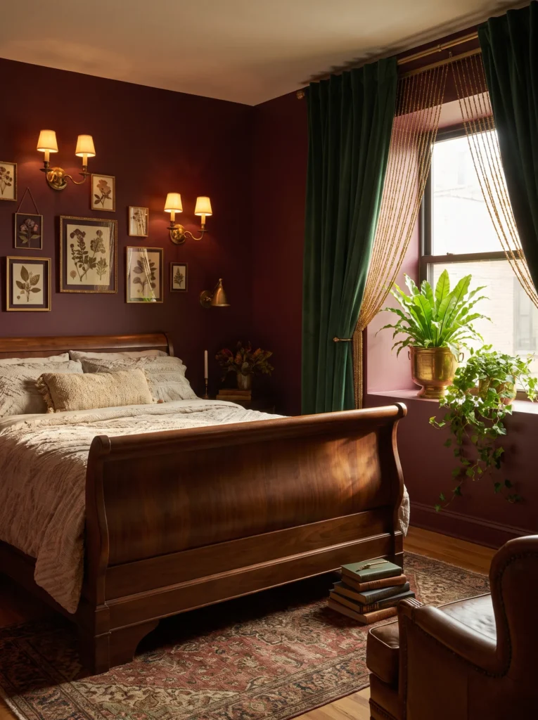
Burgundy is a color most boho bedrooms overlook entirely, but layered against brass and deep green, it creates one of the richest palettes in this whole collection.
- Walls: Deep burgundy paint (Farrow & Ball “Preference Red” family — verify against current deck) on all four walls, matte finish
- Bedding: Paisley-print duvet in burgundy and forest green, layered with a quilted velvet coverlet in deep olive and topped with two brass-button tufted bolsters in cream linen
- Wall decor: A dense cluster of vintage brass sconces (unwired, purely decorative) mixed with framed pressed botanical specimens, arranged in a loose curved sweep above the headboard
- Plants: A large bird’s nest fern in a brass footed planter, a trailing English ivy along the windowsill, and a cluster of three maidenhair ferns on a low bench — grouped for their shared preference for humidity and filtered light
- Hanging elements: A brass and amber glass bead curtain framing the window
- Rug: A burgundy and olive vintage-style rug layered over a natural jute base
- Curtains: Forest green velvet, floor-length, hung on an unlacquered brass rod
- Furniture: Dark walnut sleigh bed, plus a burgundy velvet bench at the foot
Why this works: Brass repeats through the sconces, bead curtain, planter, and rod, so a deep, moody color palette still feels anchored and deliberate rather than heavy or dark.
Deep burgundy walls are a color choice that scares a lot of people off, but I’ve noticed they’re one of the most forgiving backdrops for a maximalist room, since nearly every other jewel tone and metal reads warmer and richer against it. Pressed botanical specimens framed in a loose gallery cluster give this room a genuine plant-science thread beyond the live plants themselves — actual preserved leaves and ferns behind glass, which is a detail almost no other maximalist bedroom guide mentions. That layering of real and framed botanicals is what makes this room feel collected rather than staged in an afternoon.
Unlacquered brass is worth calling out specifically here, because it ages and develops a soft patina over time rather than staying shiny — which actually suits a maximalist boho room better than polished brass, since the whole aesthetic leans into things looking gathered and lived-in rather than brand new. Grouping three humidity-loving ferns together on one bench, rather than scattering them room-wide, also happens to make their care genuinely easier, since misting one cluster covers all three at once.
8. Chocolate & Turquoise Mosaic
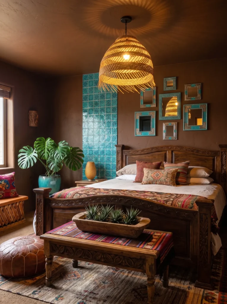
Chocolate brown and turquoise is a combination pulled straight from Moroccan and Mexican textile traditions, and it’s bold enough to anchor serious pattern density without ever feeling muddy.
- Walls: Deep chocolate-brown clay paint on three walls, with the headboard wall covered in hand-painted turquoise and white talavera-style tile decals from floor to picture-rail height
- Bedding: Turquoise and white geometric-print duvet, layered with a chocolate-brown ribbed velvet coverlet and three mismatched pillows in mustard, rust, and cream stripe
- Wall decor: A dense curved arrangement of small round mirrors framed in turquoise-painted wood, mixed with woven palm-leaf fans
- Plants: A split-leaf philodendron in a turquoise ceramic pot, a pothos trailing from a macrame hanger, and a cluster of haworthia succulents in a low terracotta trough — grouped for their tolerance of the room’s warm, moderate-light conditions
- Hanging elements: A large woven palm pendant light with an open, textural weave
- Rug: A turquoise and cream geometric Moroccan-style rug layered over a chocolate-brown flatweave base
- Curtains: Mustard linen with a subtle woven stripe, hung on a turquoise-painted wooden rod
- Furniture: Chocolate-brown carved wood bed frame, plus a turquoise-painted vintage cane chair in the corner
Why this works: Turquoise repeats through the tile wall, mirrors, pot, and rod, giving this deeply saturated, pattern-heavy room one clear color to follow no matter where the eye lands.
That talavera-tile headboard wall is the standout detail here, and it’s easier to achieve than people assume — quality peel-and-stick tile decals can replicate the hand-painted look convincingly at a fraction of real tile’s cost and installation time. I’ve used this trick in a client’s guest room where a full tile install wasn’t in the budget, and from a few feet away, no one could tell the difference. It gives the room a genuine focal point strong enough to hold its own against everything else happening in the space — the striped pillows, the woven fans, the mirror cluster.
Chocolate brown as a base color does something I think is underrated in maximalist styling: it grounds bright turquoise and mustard so they read as vivid rather than garish. The split-leaf philodendron’s dramatic, perforated leaves echo the geometric pattern in the tile and rug without repeating it exactly, which is the kind of subtle visual rhyme that separates a genuinely curated room from one that just has a lot of stuff in it.
9. Amber Glow Textile Wall
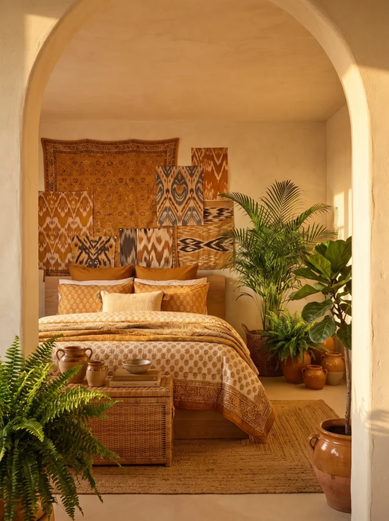
A fully textile-covered wall — not wallpaper, actual layered fabric — is one of the boldest, most save-worthy moves in maximalist boho, and it’s rarely done right.
- Walls: Warm cream plaster on three walls, with the headboard wall entirely covered in layered vintage textiles (a large overdyed amber tapestry as the base, with two smaller ikat panels pinned on top in an asymmetrical overlap)
- Bedding: Amber and rust block-print duvet, layered with a mustard bouclé throw and two olive velvet lumbar pillows
- Wall decor: A small curated cluster of brass wall hooks holding woven baskets and a straw sun hat, positioned beside the textile wall rather than competing with it
- Plants: A mature areca palm in a woven rattan basket, a golden pothos trailing from a high shelf, and a cluster of three amber-glazed pots holding peperomia — grouped for their shared bright, indirect light needs near the window
- Hanging elements: A large woven amber and cream tapestry-style wall hanging on the opposite wall, balancing the textile headboard
- Rug: An amber and cream vintage kilim layered over a jute base rug
- Curtains: Rust linen with a subtle woven texture, hung on a matte black rod
- Furniture: Low platform bed in natural oak, plus a woven rattan storage trunk at the foot
Why this works: Amber repeats through the tapestry wall, the glazed pots, and the kilim, so a room built almost entirely from layered fabric still has one clear thread holding the density together.
A textile-covered wall changes the entire acoustic feel of a room, not just the look — fabric absorbs sound the way hard plaster and paint never can, so this idea actually makes a bedroom quieter and cozier, which is a functional bonus most people don’t expect from a decor choice. I’ve seen this work especially well in older homes with hard plaster walls, where the added softness makes a real difference in how the room feels to sit in, not just how it photographs. Pinning smaller ikat panels over a larger tapestry base, rather than hanging one single piece, is what gives this wall its genuine layered depth.
Golden light plays beautifully off amber-glazed pots and warm textiles, which is exactly why this idea leans into a late-afternoon mood rather than the cooler daylight of some of the other rooms in this collection. The areca palm’s tall, airy fronds keep the space from feeling too heavy despite the dense textile wall, giving the room vertical movement that draws the eye upward and away from all that concentrated pattern at headboard height.
10. Cobalt & White Global Eclectic
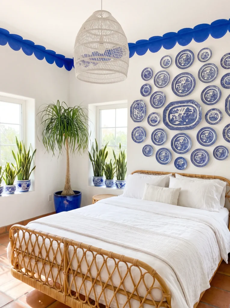
Cobalt blue and white is a palette borrowed from Portuguese azulejo tile and Greek island textiles, and it’s one of the crispest, most modern-reading combinations in true maximalist boho.
- Walls: Crisp white plaster walls with a hand-painted cobalt blue scalloped border running along the ceiling line, echoing tile-edge patterns
- Bedding: Cobalt and white block-print duvet, layered with a white waffle-weave coverlet and three mismatched pillows in cobalt stripe, white eyelet, and a small indigo paisley
- Wall decor: A dense curved gallery of blue-and-white ceramic plates mounted directly on the wall above the headboard, mixed with two framed botanical line drawings
- Plants: A ponytail palm in a cobalt-glazed pot, a trailing string of pearls in a white ceramic hanging planter, and a cluster of three snake plants in graduated white pots — chosen for their shared tolerance of bright, direct window light
- Hanging elements: A white woven rattan pendant light with a rounded, lantern-like silhouette
- Rug: A cobalt and white flatweave rug layered over a natural jute base
- Curtains: Crisp white linen with a subtle cobalt stripe, hung on a matte black rod
- Furniture: White-washed rattan bed frame, plus a cobalt-painted vintage cane bench at the foot
Why this works: Mounted plates repeat the cobalt-and-white thread at a scale nothing else in the room matches, giving even a dense gallery wall a single, easy-to-follow color story.
Mounting ceramic plates directly on a wall is a genuinely underused gallery technique, and it reads as far more collected and intentional than framed prints alone — it’s the kind of detail that stops guests at the doorway. I styled a version of this for my own guest room using plates picked up from three different trips, and what struck me was how naturally they worked together once they shared that same cobalt-and-white color logic, even though no two patterns matched exactly. That’s the repetition principle at its clearest: pattern can vary wildly as long as color holds the room together.
White as a dominant tone is a smart choice for anyone nervous about going full maximalist, since it keeps this room feeling bright and current even with a dense mounted-plate gallery and layered bedding patterns. The ponytail palm’s sculptural, spiky silhouette adds a graphic shape that plays well against the plates’ curves, and snake plants in graduated pot sizes give the windowsill a tidy, rhythmic structure that photographs beautifully in bright daylight.
11. Plum & Copper Velvet Den
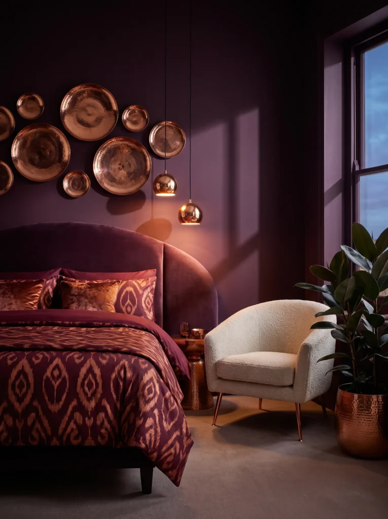
Plum paired with copper, rather than the more expected gold or brass, gives this room a genuinely unexpected metallic edge most maximalist bedrooms don’t reach for.
- Walls: Deep plum paint (Benjamin Moore “Exotic Purple” family — verify against current deck) on all four walls, matte finish
- Bedding: Ikat-print duvet in plum and copper, layered with a ribbed copper-toned velvet coverlet and two tasseled bolsters in cream linen with copper thread embroidery
- Wall decor: A dense arrangement of hammered copper wall discs in varying sizes, mixed with two framed vintage botanical etchings
- Plants: A rubber plant in a hammered copper planter, a philodendron micans trailing from a wall-mounted copper hook, and three small copper-glazed pots holding hoya kerrii on the windowsill — grouped for their shared bright, indirect light needs
- Hanging elements: A copper and smoked-glass pendant light with a faceted, sculptural shape
- Rug: A plum and cream vintage-style rug layered over a charcoal wool base
- Curtains: Copper-toned velvet, floor-length, hung on a matte black rod
- Furniture: Curved velvet headboard in deep plum, plus a copper-legged accent chair upholstered in cream bouclé
Why this works: Copper repeats through the discs, planter, pendant, and chair legs, giving this jewel-toned room a warm metallic thread that reads as fresh rather than a repeat of the usual brass-and-boho formula.
Copper tarnishes differently than brass, developing a deeper, almost rose-toned patina rather than brass’s classic warm gold — and I think that shift is part of why this pairing feels so current right now, since it sidesteps the exact metallic finish that’s shown up in nearly every boho bedroom for the last several years. Hammered copper wall discs, arranged in a loose organic cluster rather than a strict grid, give this gallery a handmade quality that flat framed prints alone can’t match. That textural variation matters in a room already this saturated with pattern and color.
A curved velvet headboard in deep plum anchors the whole room in one confident, unmissable shape, which matters when everything around it — the ikat duvet, the copper discs, the faceted pendant — is competing for attention. In my experience, one strong curved anchor piece is what lets a maximalist room hold dense pattern without feeling scattered, since the eye always has that one clear shape to return to.
12. Mustard & Sage Garden Room
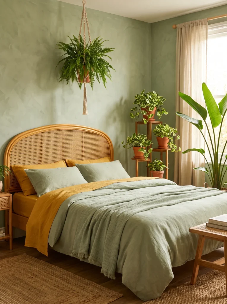
Mustard and sage together create one of the most nature-inspired palettes in this whole collection, and it leans directly into a genuine plant-forward maximalist identity.
- Walls: Sage green limewash paint with visible brushstroke texture on all four walls
- Bedding: Mustard and sage block-print duvet, layered with a rust-toned quilted coverlet and three mismatched pillows in olive velvet, mustard linen, and a small cream floral print
- Wall decor: A dense curved gallery of pressed botanical prints and small woven wall baskets, arranged above the headboard in an organic sweeping shape
- Plants: A mature Boston fern in a hanging macrame sling, a cluster of three trailing pothos varieties (golden, marble queen, and neon) in graduated ceramic pots on a plant stand, and a large bird of paradise in a woven basket by the window — deliberately grouped to show how varying humidity and light tolerance within one species family can still work in a single grouping
- Hanging elements: A large macrame wall hanging in natural jute above the reading nook
- Rug: A mustard and cream vintage-style rug layered over a sage green flatweave base
- Curtains: Sage linen with a subtle woven texture, hung on a natural wood rod
- Furniture: Curved rattan bed frame in a honey finish, plus a mustard velvet bench at the foot
Why this works: Sage and mustard repeat through nearly every textile and pot in the room, so a heavily plant-filled space still reads as one cohesive garden-inspired story rather than a random collection of greenery.
My plant-science background makes this the idea I’m most excited about in this whole collection, because the pothos trio is a genuine lesson in variety within unity — three different pothos cultivars share nearly identical care needs, but their leaf patterns range from solid gold to marbled cream to speckled neon, giving you real visual variation without any added care complexity. That’s a detail worth remembering for anyone nervous about mixing “too many” plants: shared care needs make dense plant groupings far more sustainable than people assume.
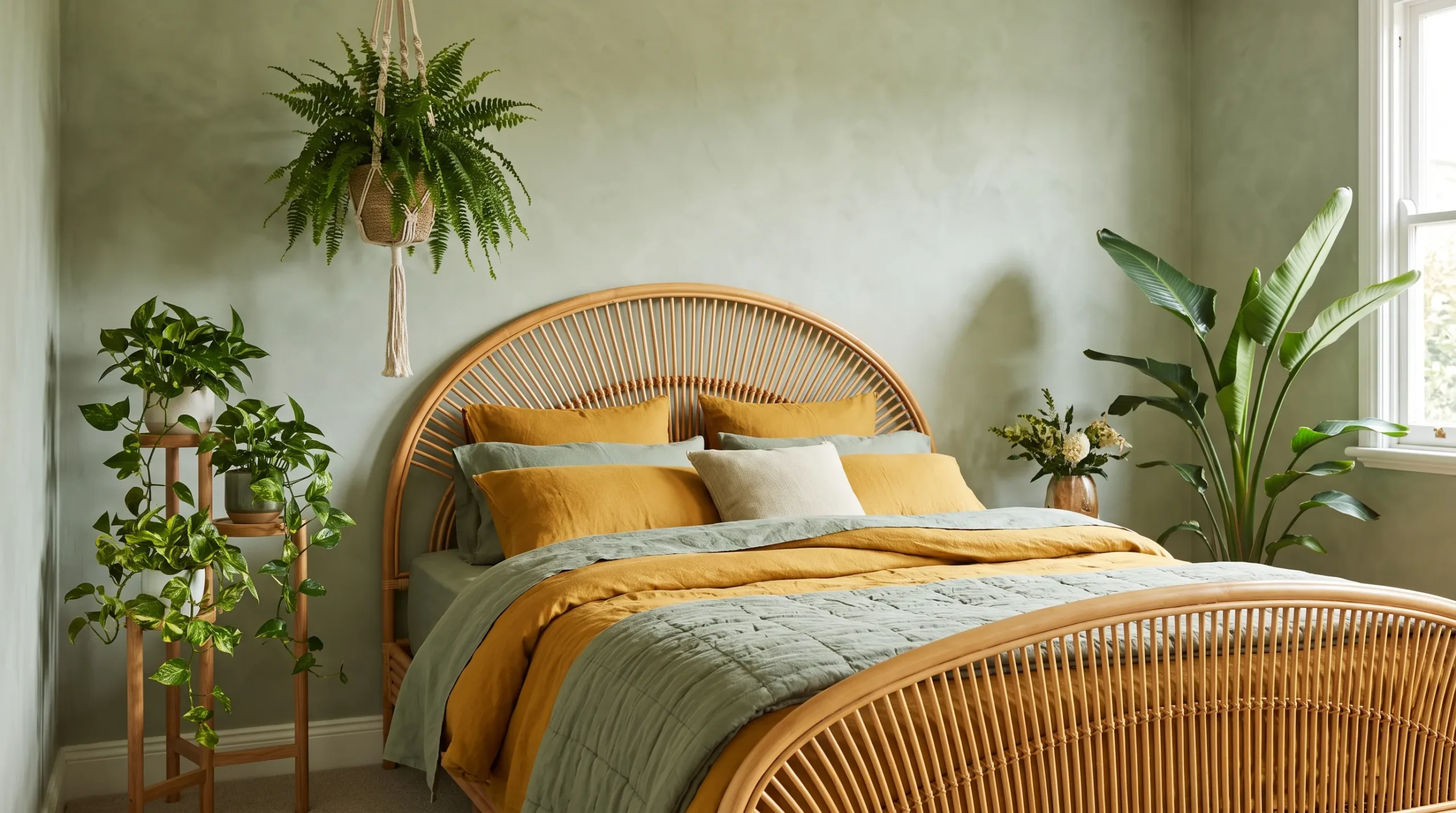
A honey-finished rattan bed frame ties directly into the room’s warm mustard tones without repeating them exactly, which keeps the furniture from disappearing into the bedding. The Boston fern’s cascading, feathery shape softens the whole headboard wall, and hanging it in a macrame sling rather than a shelf pot adds genuine vertical layering that a single potted fern on a surface never achieves. This is maximalist boho at its most literally garden-inspired.
13. Rust & Charcoal Eclipse, Dreamy Boho Maximalist Bedroom Ideas
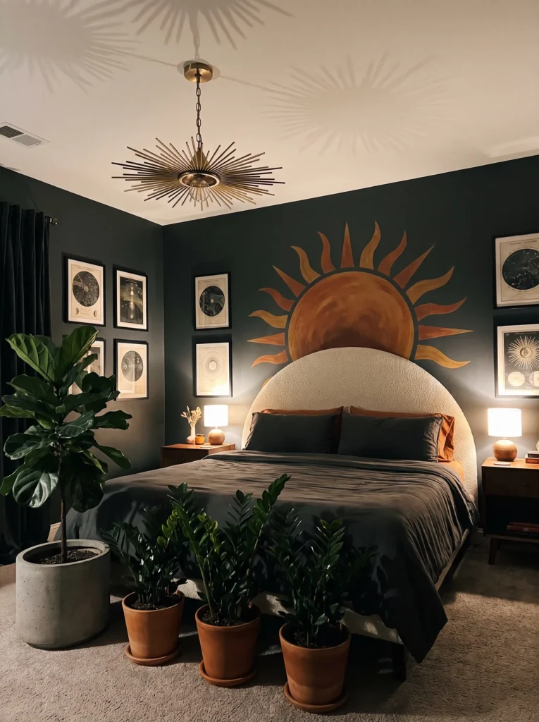
Rust and charcoal is a deliberately moody departure from the brighter palettes so far — proof that maximalist boho can go dark and dramatic without losing its collected, layered soul.
- Walls: Charcoal matte paint on all four walls, with a large hand-painted rust-toned sun motif on the headboard wall as a subtle mural
- Bedding: Rust and charcoal ikat-print duvet, layered with a boucle throw in deep charcoal and two burnt-orange velvet bolsters with tassel trim
- Wall decor: A dense cluster of small brass sun and moon wall sculptures mixed with framed vintage astronomical prints, arranged in a loose curved sweep
- Plants: A large fiddle leaf fig in a charcoal concrete planter, a trailing pothos from a black wall-mounted hook, and a cluster of three black ceramic pots holding zz plants — grouped for their shared tolerance of the room’s lower ambient light
- Hanging elements: A brass and black iron pendant light with a sculptural sunburst silhouette
- Rug: A rust and charcoal vintage-style rug layered over a black jute base
- Curtains: Charcoal linen with a subtle woven rust stripe, hung on a matte black rod
- Furniture: Curved boucle headboard in deep charcoal, plus a rust velvet accent chair in the corner
Why this works: Brass repeats through the sculptures, pendant, and hardware, giving this darker, moodier room the same organizing thread as its brighter counterparts, just against a completely different backdrop.
Dark walls get an unfair reputation for making rooms feel smaller, but I’ve noticed the opposite happens when you pair charcoal with warm brass accents and good layered lighting — the room feels enveloping and cocoon-like rather than cramped, especially in the evening. The hand-painted sun mural is a detail that takes real confidence to commit to, but it gives the headboard wall a focal point strong enough to anchor everything else happening around it, from the astronomical print gallery to the ikat bedding.
ZZ plants earn their spot in this particular room because they’re genuinely one of the most forgiving plants for lower ambient light, which matters when your walls are this deep in tone. ZZ plants tolerate low to moderate indirect light and irregular watering better than almost any other common houseplant, making them a practical, science-backed choice for darker rooms. Grouped in matching black pots, they read as intentional rather than like an afterthought squeezed into a shadowy corner.
14. Coral & Mint Retro Bazaar
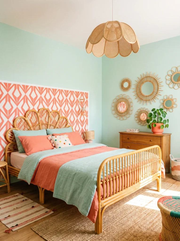
Coral and mint is a genuinely unexpected pairing in boho maximalism — playful, retro-leaning, and one of the most Pinterest-scroll-stopping combinations in this collection.
- Walls: Soft mint green paint on three walls, with the headboard wall covered in a bold coral and cream geometric wallpaper
- Bedding: Coral and mint striped duvet, layered with a cream tufted bedspread and three mismatched pillows in coral velvet, mint linen, and a small vintage floral print
- Wall decor: A dense curved gallery of round rattan sun mirrors mixed with small framed retro botanical postcards, clustered above a low dresser rather than the headboard
- Plants: A mature Chinese money plant in a coral ceramic pot, a trailing string of bananas in a mint hanging planter, and a cluster of three peperomia varieties on the windowsill — grouped for their shared preference for bright, filtered light
- Hanging elements: A woven rattan pendant light with a scalloped, sun-shaped silhouette
- Rug: A coral and cream vintage-style rug layered over a mint flatweave base
- Curtains: Cream linen with a subtle coral stripe, hung on a natural wood rod
- Furniture: Curved rattan bed frame in a light honey finish, plus a mint velvet accent bench at the foot
Why this works: Coral repeats through the wallpaper, pot, pillows, and rug, so a genuinely playful, unexpected color pairing still reads as deliberately styled rather than random.
Mint and coral together sound risky on paper, but I’ve found that pairing them at different saturation levels — a soft, muted mint on the walls against a bolder, more saturated coral in the accents — keeps the combination feeling sophisticated rather than juvenile. That’s a principle worth applying to any unusual color pairing in maximalist design: let one tone stay soft while the other carries the boldness, rather than pushing both to full saturation at once.
The Chinese money plant’s round, coin-shaped leaves add a genuinely playful visual echo to this room’s retro, sun-motif styling, from the scalloped pendant light to the rattan sun mirrors. Clustering the mirror-and-postcard gallery above a low dresser rather than the headboard is an intentional choice, too — it gives the bedding pattern room to be the star near the pillows while still building real visual density elsewhere in the room, which is exactly the kind of spatial thinking that separates a considered maximalist layout from a room where everything competes at once.
15. Ochre & Indigo Traveler’s Nook
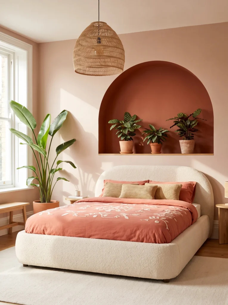
This final idea pulls together the most globally eclectic elements of the whole collection — genuine collected-over-years travel pieces rather than a single cohesive “set.”
- Walls: Warm ochre clay paint on three walls, with the headboard wall in a deep indigo hand-blocked wallpaper
- Bedding: Indigo shibori-print duvet, layered with an ochre quilted coverlet and four genuinely mismatched pillows in block-print, kantha, mudcloth, and plain linen
- Wall decor: A dense, deliberately asymmetrical gallery mixing small textile fragments, brass hooks holding a straw bag, a woven fan, and two small framed maps, spanning the full headboard wall width
- Plants: A large parlor palm in a woven basket, a trailing pothos from a vintage brass hook, and a cluster of three terracotta pots holding a mix of succulents and a small aloe — grouped for their shared bright, indirect light tolerance near the window
- Hanging elements: A large vintage textile tapestry hung on the wall opposite the bed, doubling as a second focal point
- Rug: An indigo and ochre vintage kilim layered over a natural jute base rug
- Curtains: Ochre linen with a subtle indigo woven border, hung on a natural wood rod
- Furniture: Low platform bed in reclaimed teak, plus a vintage steamer-style trunk at the foot
Why this works: Indigo and ochre repeat through nearly every genuinely different object in this deliberately eclectic room, proving that a “gathered from everywhere” aesthetic still needs one consistent color thread to avoid reading as random.
This is the room that best captures what genuine boho maximalism means to me — not a matched set from one store, but pieces that actually look like they were picked up in different places over different years, which is a feeling that’s almost impossible to fake convincingly. The trick, and the one thread running through this entire article, is that even wildly different objects — a straw bag, framed maps, a woven fan, four mismatched pillows — hold together visually as long as they keep returning to the same two colors. Indigo and ochre do that work here.
A reclaimed teak platform bed grounds the whole eclectic mix in something solid and low to the ground, which matters when the walls and gallery above are carrying this much visual information. The vintage steamer trunk at the foot of the bed isn’t just decorative, either — it’s genuinely useful for extra textile storage in a room already this layered, giving you somewhere to rotate throws and pillows seasonally without the room ever looking sparse in between.
Styling Principles: Curated vs. Cluttered
The single biggest mistake in maximalist boho decorating isn’t having too much — it’s having too much without a thread to follow. Every idea in this collection anchors on 2-3 repeating colors or one recurring metal finish, no matter how many patterns, plants, or objects are layered into the room. Before adding anything new to a maximalist bedroom, ask whether it echoes a color or material already present. If it doesn’t connect to anything else in the room, it will read as clutter, even if it’s beautiful on its own.
The line between curated maximalism and a cluttered room is almost entirely about intentional repetition, not about how much or how little you own. Start with your anchor palette first, then collect toward it — not the other way around.
Frequently Asked Questions
How do I do maximalist boho without it looking messy? Pick 2-3 colors or one consistent metal finish and repeat that thread through every layer — bedding, wall decor, plants, and furniture. Density isn’t the problem; a lack of repetition is what makes a room feel cluttered instead of curated.
How many patterns can you mix in a boho bedroom? There’s no fixed number, but patterns hold together best when they share a color palette. Three to five patterns across bedding, pillows, and rugs is a reliable range, as long as they all pull from the same 2-3 anchor colors.
How many plants is too many for a bedroom? There’s no universal limit, but grouping plants by shared light and humidity needs makes larger collections easier to care for and more visually cohesive. Five to eight plants is common in a genuinely maximalist boho bedroom, provided they’re grouped intentionally rather than scattered randomly.
What’s a budget-friendly way to build this look? Start with layered textiles — vintage quilts, block-print pillow covers, and thrifted throws are inexpensive and instantly add pattern density. Add plants gradually, since cuttings and small starter plants cost far less than mature specimens and fill in over time.
Does maximalist boho work in small bedrooms? Yes — a consistent color anchor actually helps small rooms feel intentional rather than cramped, since the eye follows one thread instead of bouncing between unrelated colors. Layering rugs and using vertical space with hanging plants and pendant lighting keeps floor space open even in a dense room.
What’s the difference between boho maximalism and general maximalism? Boho maximalism specifically draws on global, handcrafted, and collected-over-time pieces — ikat, block print, macrame, rattan — while general maximalism can pull from any style, including modern or glam. The boho version leans on texture, pattern-on-pattern layering, and visible plant density as its core identity.
Conclusion
Maximalist boho isn’t about restraint, and it was never meant to be. It’s about layering the patterns, plants, and pieces you genuinely love until your bedroom feels unmistakably yours — as long as you let a few repeating colors carry that density through every corner. I’ve seen how much more alive a room feels once that thread is in place, turning what could read as clutter into something that feels gathered, warm, and deeply personal.
Whichever boho maximalist bedroom ideas speaks to you, save it, start with one or two elements, and build from there. And if a friend has been hesitating to go bold in their own space, send this one their way — sometimes all it takes is seeing it done well.