15 Moody Bathroom Ideas for a Spa-Like Retreat
Not every beautiful bathroom is bright and white. Some of the best moody bathroom ideas lean into deep color, warm brass, and lighting that feels like evening instead of noon — and they work just as well in a small guest bath as they do in a primary suite. This list goes further than a single dark accent wall. Every idea includes the full room: wall treatment, vanity, mirror, layered lighting, fixtures, flooring, and the material details that keep a saturated, dramatic color holding up in a space that deals with steam and splashing every single day.
Whether you’re planning a full renovation or just testing the look with a can of paint, there’s a version here built for your space, your style, and your budget.
Why the Bathroom Actually Works Well Dark
Here’s an idea that runs against the usual bathroom advice: the room everyone insists on painting white is actually one of the best rooms in the house to go dark. Bathrooms are used in short, functional bursts, not lived in all day the way a bedroom or living room is, and most bathroom lighting is already task-focused — vanity bulbs, shower fixtures — rather than ambient room light. That means dark walls don’t compromise function the way they might elsewhere; the real requirement is layering task lighting correctly, not avoiding color. I noticed this firsthand when I painted our powder bath in a deep charcoal — it reads more like a jewel box at night than a cave.
This post solves both sides: real moody bathroom ideas, plus the material and ventilation logic that makes them actually work in a humid space.
1. Forest Green Envelope
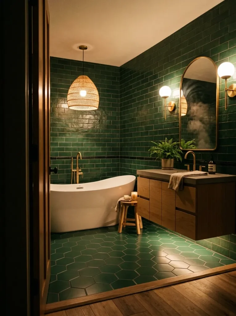
- Walls: Deep forest green ceramic subway tile floor-to-ceiling in the shower and tub surround, with matching dark grout so the pattern reads as one solid plane; satin-finish paint in the same hunter green tone on the dry walls (satin or semi-gloss only — flat paint won’t hold up to bathroom humidity)
- Vanity: White oak floating vanity with a waterfall edge and slim brass legs
- Mirror: Arched brass-framed mirror, hung slightly off-center above the sink
- Lighting: Brass sconces flanking the mirror for task light (warm 2700K bulbs), a small brass flush-mount overhead for ambient fill, and a woven rattan pendant hung low over the tub as the statement piece
- Fixtures & hardware: Unlacquered brass faucet, towel bar, and drawer pulls that develop a soft patina over time
- Flooring: Dark green hexagon mosaic tile, wall-to-wall
- Textiles & plant: Cream waffle-weave towels, a jute bath mat, and a Bird’s Nest Fern in a terra cotta pot on a brass plant stand — this fern genuinely tolerates low light and high humidity, one of the few plants that actually lasts in a windowless bathroom
- Standout detail: A shallow shower niche cut into the tiled wall, lit from inside with a slim LED strip
Why this works: Deep, saturated tile in a wet zone reads as intentional rather than heavy, because glossy tile bounces light in a way flat paint never can.
Forest green is one of the few dark colors that photographs beautifully under warm brass light, because the undertone shifts from almost black in shadow to a rich, glowing emerald wherever the sconces hit it. That shift is what keeps a fully tiled dark bathroom from feeling like a cave. Ceramic tile also solves the moisture problem paint can’t: it’s fully waterproof in the shower and tub surround, where painted drywall would eventually blister or peel no matter how many coats of primer go on first. The dry walls can still carry the same color in a satin paint finish.
Walk into this bathroom at night and the brass fixtures genuinely glow against the tile, which is the effect most dark bathroom photos are trying to fake with editing. In real homes, this pairing works because brass warms up a cool dark green instead of competing with it — pair the same tile with chrome and the room reads colder and flatter. The floating vanity keeps the floor visible, which matters more in a fully tiled room than people expect, since an all-tile bathroom can feel heavy when the furniture sits flush against the floor instead of floating above it.
You’ll Also Love: 20 Japandi Bathroom Design Ideas for a Luxurious Look
2. Ink Black Plaster Walls
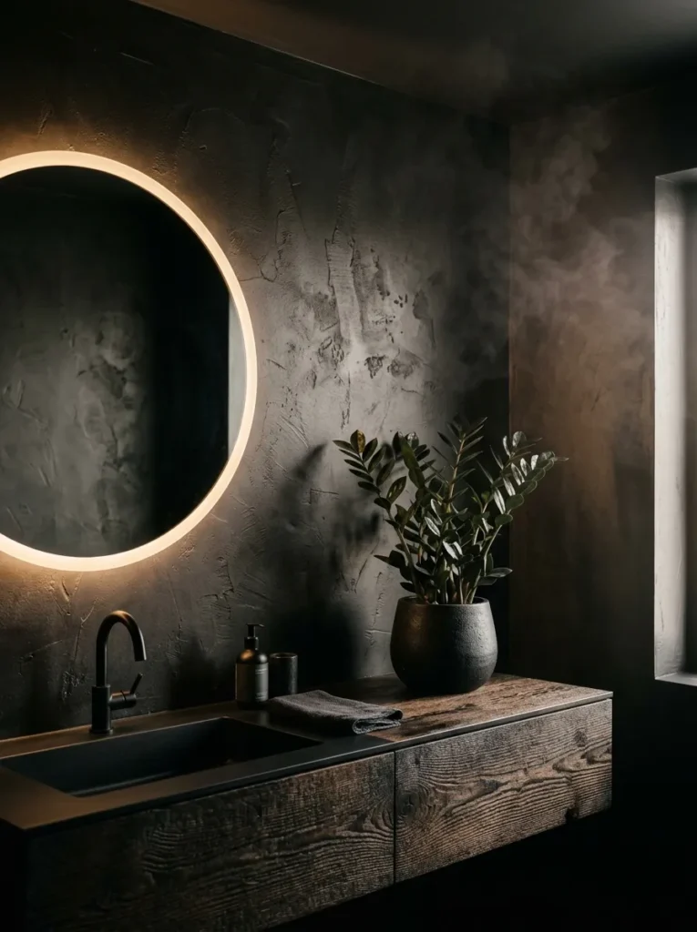
- Walls: Ink black Venetian plaster (troweled, subtly textured) on the dry walls; the wet zone uses large-format matte black porcelain slab tile instead, since plaster can’t handle direct water contact
- Vanity: Charred (shou sugi ban) oak vanity, wall-mounted with no visible legs
- Mirror: Backlit round mirror with a soft halo of light around the edge
- Lighting: LED backlit mirror for task light, two small brass picture lights for ambient wall wash, and a sculptural black metal wall sconce as the statement piece
- Fixtures & hardware: Matte black faucet and hardware, kept minimal
- Flooring: Poured concrete-look large-format tile
- Textiles & plant: Charcoal linen towels, a plain black bath mat, and a ZZ plant in a black stoneware pot — one of the few plants that actually tolerates a windowless, low-light bathroom without rotting
- Construction note: My husband always sizes the exhaust fan to the room’s square footage rather than grabbing whatever’s cheapest — a fan rated too small won’t clear humidity fast enough, and trapped moisture is what actually causes mold, not the color on the wall
- Standout detail: A shallow domed plaster ceiling above the tub, lit from a hidden cove for an intimate, cocoon-like glow
Why this works: Venetian plaster catches light in a way flat paint can’t, so a fully black room still has visible texture and depth instead of looking like a void.
I talked a client out of black paint for this exact room and pushed her toward plaster instead, because paint would have gone flat and lifeless under the bathroom’s limited light. Plaster has a soft, hand-troweled texture that catches every bit of light differently depending on where you’re standing, so the walls never read as one flat black block. It’s also more forgiving with small imperfections than a painted wall, which matters in an older home where the drywall underneath isn’t perfectly smooth. The result felt less like a dark room and more like a piece of carved stone.
Plaster this dark only works long-term if the room can actually dry out between uses, which is where ventilation stops being optional. An exhaust fan sized correctly for the square footage pulls steam out fast enough that it never has a chance to settle into the walls, and that’s the difference between plaster that lasts for years and plaster that develops water spots within months. Pair that with the matte black slab tile in the shower, which handles direct water the plaster can’t, and the room reads as one dark material while actually combining two very different ones.
3. Oxblood Grasscloth & Curved Archway
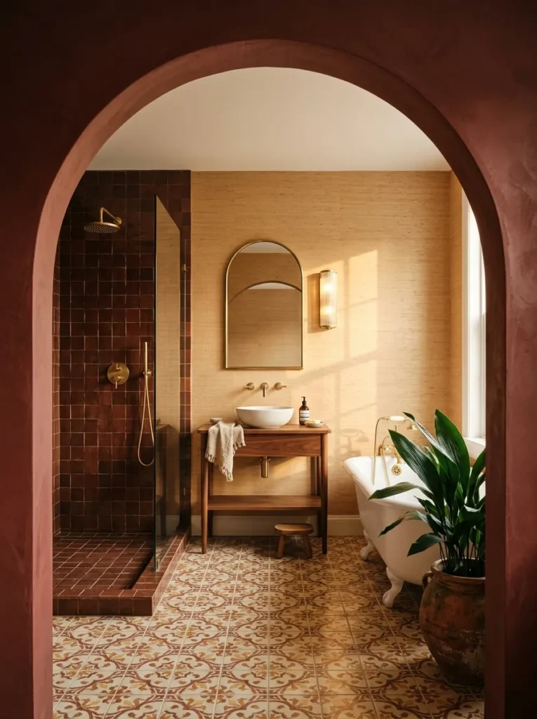
- Walls: Oxblood grasscloth wallpaper (vinyl-backed, moisture-resistant) on the dry walls above a tile wainscot; below the wainscot line, oxblood zellige-style tile in the wet zone
- Vanity: Freestanding walnut washstand with a vessel sink, brushed nickel legs
- Mirror: Tall leaned mirror in a slim brass frame, propped against the wall rather than mounted
- Lighting: Brass task sconces at the mirror, a small flush-mount for ambient fill, and a fluted glass wall light beside the tub as the statement piece
- Fixtures & hardware: Brushed nickel faucet and towel hooks — a cooler metal chosen to keep the deep red from feeling too warm
- Flooring: Warm white oak-look porcelain plank
- Textiles & plant: Rust-colored linen towels, a natural fiber runner, and a Cast Iron Plant in a raw clay pot — nearly indestructible in low light and humidity
- Standout detail: A curved plaster archway framing the shower entrance, painted the same oxblood as the walls
Why this works: Grasscloth wallpaper works in a bathroom only when it’s kept out of direct water contact and paired with a tiled wainscot doing the actual waterproofing.
Deep red is the color most people are too nervous to try in a bathroom, which is exactly why it photographs so well when someone finally does. Oxblood grasscloth adds a woven, slightly nubby texture that flat paint can’t fake, and the curved archway leading into the shower softens the whole room instead of letting it feel boxy. I’ve used arched openings in several projects because they read as intentional architecture rather than an afterthought, and they pull attention toward the shower as a feature instead of hiding it behind a plain door.
The wallpaper only stays out of trouble because it stops at the wainscot line, where zellige tile takes over and does the actual waterproofing in the wet zone — a detail worth copying if you love pattern but don’t want it anywhere near a shower. Below the knee wall, everything is fully tileable and washable; above it, the grasscloth adds texture where it’s safe from splashing. The vessel sink and freestanding washstand keep the floor open beneath them, which matters in a smaller bathroom, since visible flooring makes a dark, saturated color scheme feel grounded rather than closed in.
4. Navy Herringbone & Step-Down Tub
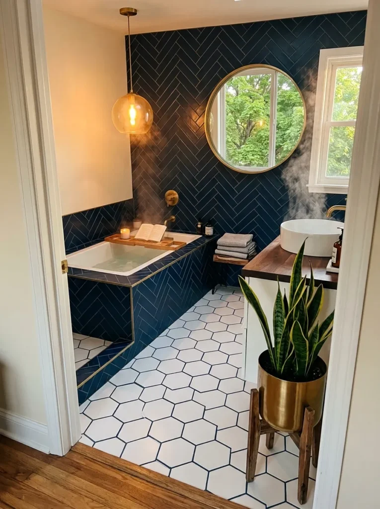
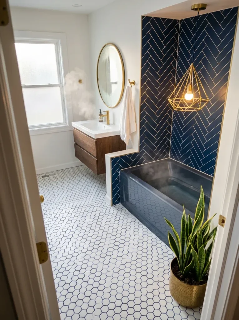
- Walls: Navy glazed subway tile in a herringbone pattern floor-to-ceiling in the wet zone; satin navy paint on the dry walls, same undertone
- Vanity: Matte navy lacquered cabinetry with brass hardware, furniture-style legs
- Mirror: Round mirror in a slim brass ring, centered above the sink
- Lighting: Brass sconces at the mirror for task light, recessed cans on a dimmer for ambient fill, and a linear brass pendant suspended low over the sunken tub as the statement fixture
- Fixtures & hardware: Polished brass faucet, towel bar, and cabinet pulls
- Flooring: Small white hex tile with navy grout, stepping down two inches into the tub area
- Textiles & plant: White waffle towels with a navy stripe, a flat-weave navy and cream runner, and a Snake Plant in a brass planter — one of the most humidity- and neglect-tolerant options for a bathroom with limited natural light
- Construction note: My husband always flags that a step-down tub area needs a proper vapor barrier and correctly sloped subfloor before any tile goes down, since trapped moisture under a sunken section is much harder to catch early than moisture on a flat floor
Why this works: A herringbone pattern in one saturated color reads as texture rather than busy pattern, which keeps a fully tiled dark bathroom feeling calm instead of chaotic.
Herringbone laid in one solid navy tone does something flat-laid tile can’t: it catches light differently on every plane, so the walls have visible movement even though there’s only one color in the room. That visual texture is part of why a monochromatic dark bathroom photographs as dramatic rather than dull. The step-down tub area adds a second layer of architectural interest, dropping the floor by two inches so the tub reads as a defined zone rather than an object pushed against the wall. Brass hardware against the cool navy keeps the room from feeling cold or clinical.
A step-down tub looks stunning in photos, but it only holds up structurally if the subfloor underneath is sloped correctly and sealed with a proper vapor barrier before any tile goes down. My husband treats that step as its own small project, not an afterthought tacked onto the tile job, because trapped moisture under a sunken area is far harder to catch early than moisture on a flat floor where a stain would show right away. Skip that step and you’re not risking the color — you’re risking the subfloor. Get it right, and the sunken tub becomes the showpiece.
5. Charcoal Board-and-Batten with a Clawfoot Tub
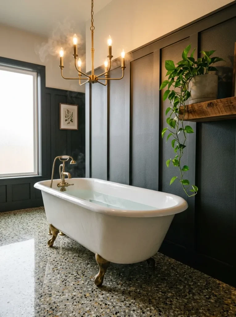
- Walls: Charcoal board-and-batten paneling (moisture-sealed poplar, painted in a deep charcoal semi-gloss) on the dry walls; charcoal terrazzo slab tile in the wet zone, with matching grout so the flecks read as texture, not pattern
- Vanity: Poured concrete vanity with an integrated trough sink and blackened steel legs
- Mirror: Rectangular mirror in a slim blackened steel frame, mounted flush to the wall
- Lighting: Blackened steel task sconces at the mirror, recessed ambient lighting on a dimmer, and a vintage-style brass chandelier hung low and off-center over a cast iron clawfoot tub as the statement piece
- Fixtures & hardware: Unlacquered brass tub fixtures paired deliberately against blackened steel elsewhere — a mixed-metal pairing, not one finish throughout
- Flooring: Charcoal terrazzo slab, continuous from the vanity into the wet zone
- Textiles & plant: White waffle towels, a charcoal linen bath mat, and a trailing Pothos in a raw concrete pot on a floating walnut shelf — Pothos tolerates the humidity swings of a working exhaust fan better than most trailing plants
- Construction note: My husband always specifies a vapor barrier behind board-and-batten paneling in a bathroom — even moisture-sealed wood needs that extra layer, or it can warp behind the boards where you won’t notice until real damage is already done
- Standout detail: The brass chandelier hung off-center above a freestanding clawfoot tub, rather than dead-center
Why this works: Pairing warm brass with cool blackened steel keeps an all-charcoal room from reading as one flat block of color, because a monochrome shell needs contrasting metal to hold visual interest.
A clawfoot tub under a brass chandelier is the kind of detail that stops a scroll, and hanging the fixture slightly off-center rather than perfectly centered is what makes it look designed instead of default. Terrazzo flooring running continuously from the vanity into the shower keeps the charcoal room feeling larger than its square footage, since there’s no visual break where one material stops and another starts. The poured concrete vanity adds a raw, architectural edge that softer materials like oak or lacquer can’t, grounding the whole space without adding more dark color to the walls.
Board-and-batten paneling brings warmth and texture that flat charcoal paint alone can’t deliver, but it comes with a real requirement most decor advice skips entirely. Painted wood paneling in a humid room needs a proper vapor barrier behind it, not just moisture-sealed primer on the surface, because trapped humidity works its way in from behind long before it shows on the front. Get that step right during installation and the paneling holds up for years; skip it, and you’re looking at warped boards within a couple of humid Austin summers, hidden until the damage is already done.
6. Aubergine Zellige & Sunburst Mirror
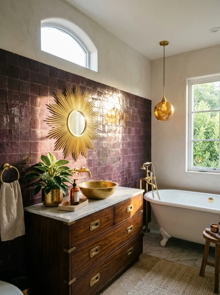
- Walls: Deep aubergine zellige tile, hand-glazed with visible variation, floor-to-ceiling in the wet zone; matte aubergine limewash on the dry walls for a chalky, softly textured finish
- Vanity: Repurposed vintage brass campaign dresser, converted with a drop-in vessel sink
- Mirror: Brass sunburst mirror hung above the vanity as a secondary decorative piece, paired with a smaller functional round mirror for actual grooming light
- Lighting: Brass articulating task sconces at the functional mirror, a small flush-mount for ambient fill, and a fluted amber glass pendant over the tub as the statement fixture
- Fixtures & hardware: Aged brass faucet and campaign-style hardware left on the original dresser drawers
- Flooring: Warm terracotta hexagon tile, chosen to keep the room from tipping too cool
- Textiles & plant: Plum-toned linen towels, a vintage-style woven runner, and a Philodendron Birkin in a brass campaign-style planter — its bright variegated leaves catch light beautifully against the dark tile
- Standout detail: A small arched clerestory window above the tub, left uncovered to let morning light wash across the zellige without compromising privacy
Why this works: Hand-glazed zellige tile has natural color variation from tile to tile, which gives a fully aubergine room visible depth instead of the flat, uniform look of machine-made tile.
Zellige tile has a slightly irregular, hand-finished quality that machine-pressed tile can’t replicate, so even a wall covered entirely in one deep aubergine tone has movement and dimension when light hits it. Pairing a decorative sunburst mirror with a smaller functional one solves a problem I see constantly: statement mirrors rarely sit at the right height or angle for actual grooming light. Letting the sunburst be purely decorative and adding a second practical mirror means the room gets both the visual moment and the function, without asking one object to do two conflicting jobs.
A converted vintage dresser as a vanity brings a lived-in, collected quality that new furniture rarely achieves, and it’s a trick I’ve used in several client bathrooms when they want the room to feel less like a builder-grade install. The key is sealing the wood properly before it goes anywhere near a sink, since untreated vintage furniture wasn’t built for constant splashing. The small arched clerestory window above the tub adds natural light without sacrificing privacy, which matters in a fully tiled, windowless-feeling room — even a narrow strip of daylight changes how the aubergine tone reads throughout the day.
7. Espresso Limewash & Built-In Bench
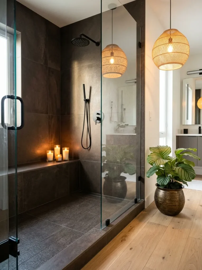
- Walls: Espresso brown limewash plaster on the dry walls, troweled for a soft cloud-like texture; large-format espresso porcelain slab tile in the shower, extending onto a built-in tiled bench
- Vanity: Smoked oak vanity with a single integrated basin, no visible hardware — push-to-open drawers
- Mirror: Wide horizontal mirror with a thin bronze frame, spanning most of the vanity width
- Lighting: Bronze linear task lighting mounted above the mirror, a warm flush-mount for ambient fill, and a woven wood pendant over the built-in bench as the statement piece
- Fixtures & hardware: Bronze faucet and minimal bronze accents throughout, kept deliberately sparse
- Flooring: Wide-plank warm oak-look porcelain tile, laid in a running bond pattern
- Textiles & plant: Camel-toned waffle towels, a natural jute bath mat, and a Rattlesnake Plant (Calathea) in a bronze-toned pot — tolerant of the humidity a shower generates, though it prefers indirect light rather than direct sun
- Standout detail: A built-in tiled bench inside the shower, wide enough to sit on, with a small tiled ledge above it for candles or bath products
Why this works: A built-in shower bench turns a purely functional shower into a spa-style feature, and it’s one of the few upgrades that adds both visual interest and everyday usability at the same time.
Espresso brown reads warmer and more livable than most dark tones, which is exactly why it works so well for someone who wants a moody bathroom without the room feeling cold or severe. The built-in bench is the real showpiece here — it photographs as a deliberate architectural moment, not an accessory, and it solves a genuine daily annoyance for anyone who’s ever balanced a razor or shampoo bottle on a slippery shower floor. The woven wood pendant above it softens the espresso tile with natural texture, keeping the room from feeling like one continuous slab of color.
A built-in bench sounds simple, but it needs to be framed and waterproofed as part of the shower pan itself, not tiled onto an existing wall as an afterthought — otherwise water pools at the seam and eventually finds its way behind the tile. My husband treats it as its own waterproofing detail during the shower build, sloping the bench surface slightly so water runs off instead of sitting. Get that step right and the bench lasts as long as the rest of the shower; skip it, and it’s often the first place a leak shows up.
8. Deep Plum Fluted Cabinetry
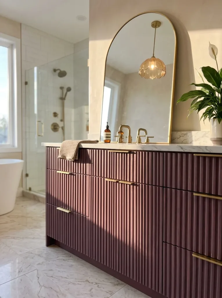
- Walls: Deep plum semi-gloss paint on the dry walls; deep plum glass subway tile in the wet zone, chosen for its slight reflectivity in a room with limited natural light
- Vanity: Fluted plum-lacquered cabinetry with a marble-look quartz countertop and brushed brass pulls
- Mirror: Tall arched mirror leaned against the wall, angled slightly for a candid, unstaged feel
- Lighting: Brushed brass task sconces at the mirror, a small ambient flush-mount, and a scalloped glass pendant with a warm amber glow as the statement fixture
- Fixtures & hardware: Brushed brass faucet and cabinet pulls, softer and less yellow than polished brass
- Flooring: Pale gray-veined marble-look tile, chosen to keep the floor from disappearing into the dark walls
- Textiles & plant: Dusty rose towels, a cream boucle bath mat, and a Peace Lily in a matte cream pot — it signals with visible drooping when it needs water, which makes it an easy, low-guesswork option for a bathroom that doesn’t get checked on daily
- Standout detail: The fluted cabinetry doors catch light along each groove, creating a subtle ribbed shadow pattern across the vanity front that shifts throughout the day
Why this works: Glass tile reflects available light instead of absorbing it the way matte tile does, which keeps a deep plum wet zone from reading as dark and flat under limited bathroom lighting.
Fluted cabinetry is one of those details that photographs completely differently depending on the light, and that’s exactly what makes it worth the extra cost over flat-front doors. Each groove catches a sliver of shadow, so the vanity front has visible texture and movement rather than sitting as one smooth plum-colored block. The glass subway tile behind it does something similar in the shower, bouncing available light back into the room instead of soaking it up the way matte tile would. Together, they keep an intensely saturated color scheme from tipping into feeling heavy or closed-in.
The pale marble-look floor is a deliberate contrast choice, not an accident — in a fully dark-walled bathroom, a light floor keeps the eye from feeling boxed in on every side. I’ve seen bathrooms with this much saturated color go wrong when the designer also darkens the floor, and the room ends up feeling smaller rather than dramatic. Keeping the floor pale, letting the glass tile bounce light, and adding brushed brass instead of polished brass all work together to keep deep plum feeling rich and inviting rather than overwhelming in a smaller room.
9. Deep Teal Fluted Glass Shower
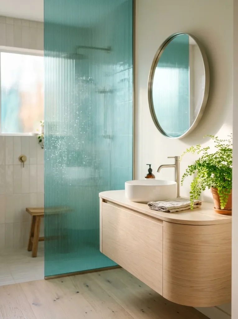
- Walls: Deep teal semi-gloss paint on the dry walls; matching teal ribbed glass panels enclosing the shower instead of tile, paired with small teal mosaic tile on the shower floor
- Vanity: Curved white oak vanity with rounded corners, brushed nickel legs
- Mirror: Oval mirror in a slim brushed nickel frame, hung slightly tilted
- Lighting: Brushed nickel task sconces at the mirror, a small ambient flush-mount, and a glass bubble pendant hung over the tub as the statement fixture
- Fixtures & hardware: Brushed nickel faucet and towel bar — a cooler metal that keeps teal from reading too tropical
- Flooring: Pale bleached oak-look porcelain plank
- Textiles & plant: White waffle towels with a thin teal stripe, a cream boucle bath mat, and a Maidenhair Fern in a white ceramic pot — it thrives on the humidity a shower produces, though it needs consistent moisture and will droop quickly if the room dries out between uses
- Standout detail: Ribbed glass shower panels instead of solid tile, which blur the shower interior into soft color and light rather than a hard visual line
Why this works: Ribbed glass diffuses light and color into a soft gradient instead of a hard edge, which is what keeps this teal bathroom feeling airy rather than closed-in like a fully tiled version would.
Ribbed glass is an unusual swap for a shower enclosure, and it’s the detail that makes this room feel different from every other tiled teal bathroom on Pinterest. Instead of a hard line where tile stops and open room begins, the glass blurs the teal color into a soft wash of light, so the whole space feels like it’s glowing rather than boxed off. The curved vanity edges echo that same soft, rounded quality, which keeps the room feeling calm instead of sharp-edged. Paired with a pale bleached oak floor, the teal reads as fresh and coastal rather than heavy.
I steered a client toward ribbed glass over subway tile in a shower this size specifically because the room had almost no natural light, and solid tile all the way around would have made it feel like standing inside a closed box. The glass lets ambient light travel through instead of stopping at a hard tiled wall, so the teal color shifts and glows depending on where the light source sits. It’s a small material change, but it completely altered how the finished room photographed — softer, brighter, and far less closed-in than the tiled version we’d originally planned.
10. Olive Moss Limewash & Wicker Accents
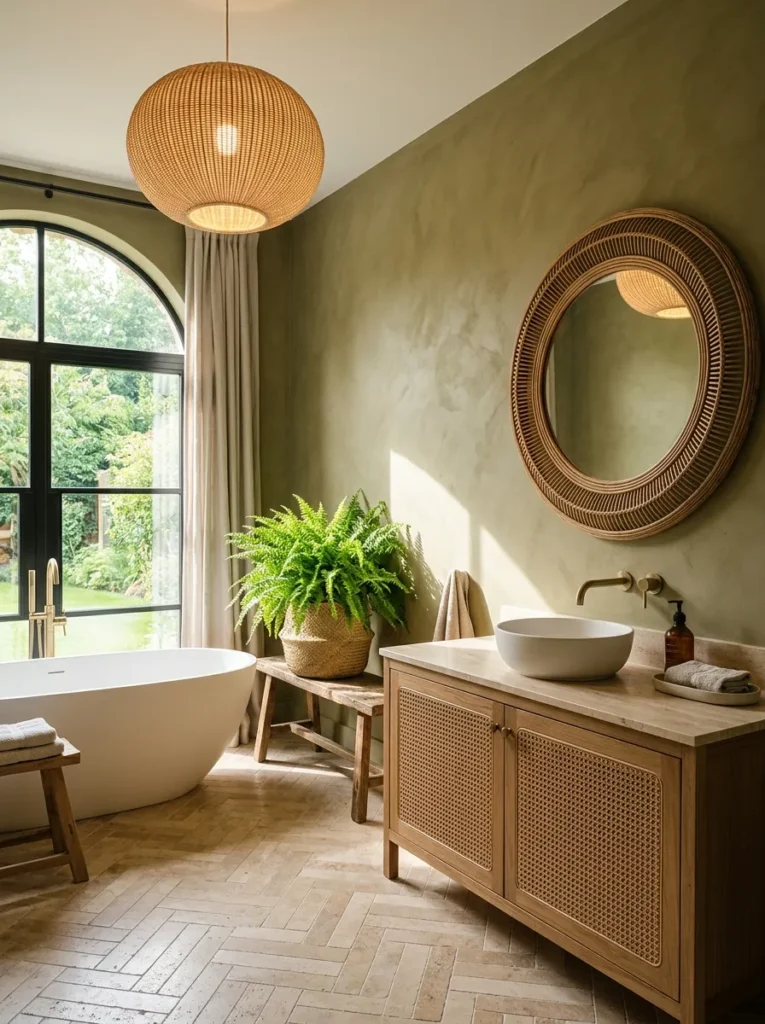
- Walls: Muted olive-moss limewash plaster on the dry walls, troweled for texture; matching olive zellige tile in the wet zone with a slightly darker grout
- Vanity: Rattan-fronted vanity cabinet with a wood top and antique brass legs
- Mirror: Round mirror in a woven rattan frame, hung centered above the sink
- Lighting: Antique brass task sconces at the mirror, a small ambient flush-mount, and a woven rattan pendant over the tub as the statement fixture
- Fixtures & hardware: Antique unlacquered brass faucet and hardware, chosen to age alongside the plaster
- Flooring: Warm travertine tile in a herringbone layout
- Textiles & plant: Sage green waffle towels, a natural jute runner, and a Boston Fern in a woven seagrass basket — it needs consistently high humidity to thrive, so it genuinely belongs in a well-ventilated bathroom rather than a drier room of the house
- Standout detail: A woven rattan pendant and matching mirror frame, an unusual pairing that gives the room an earthy, botanical feel most moody bathrooms skip entirely
Why this works: Muted, grayed-down greens read as calming rather than dark, because lowering a color’s saturation keeps it from feeling as heavy as a truer jewel-tone green.
Olive is a color most people overlook for bathrooms because it doesn’t photograph as dramatically as jewel tones like emerald or navy, but that quieter quality is exactly its strength. It reads as grounded and calming rather than moody in the dramatic sense, which makes it a good fit for someone who wants a rich color without a room that feels intense. The woven rattan mirror and pendant lean into that earthy feeling, pulling in a texture most dark bathrooms don’t touch. Travertine flooring in herringbone adds warmth underfoot and keeps the whole room from tipping too cool.
I’ve noticed olive tends to work especially well in smaller powder bathrooms, where a truer, more saturated green can feel overwhelming in a tight space. The grayed-down undertone softens the color enough that it doesn’t shrink the room the way a brighter or darker green sometimes can. Pairing it with natural materials like rattan and travertine instead of polished brass and glossy tile pushes the whole look further into a relaxed, botanical direction — proof that a moody bathroom doesn’t have to mean glossy and dramatic to feel genuinely special.
11. Slate Blue-Gray Board-Formed Concrete
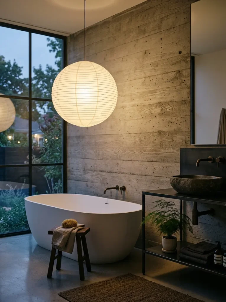
- Walls: Slate blue-gray board-formed concrete panels (real wood-grain-textured concrete) on the dry walls; matching slate gray large-format tile in the wet zone
- Vanity: Blackened steel vanity frame with an open shelf and a single stone vessel basin
- Mirror: Square mirror in a thin blackened steel frame, mounted flush
- Lighting: Blackened steel task sconces at the mirror, recessed ambient lighting on a dimmer, and an oversized paper lantern-style pendant over the tub as the unexpected statement piece
- Fixtures & hardware: Matte black faucet and hardware throughout
- Flooring: Poured concrete floor, sealed and slightly polished
- Textiles & plant: Stone-gray linen towels, a black bath mat, and an Asparagus Fern in a raw concrete pot on the open vanity shelf — it tolerates the fluctuating humidity of a well-ventilated bathroom better than most delicate ferns
- Standout detail: A paper lantern-style pendant, an unexpectedly soft object inside an otherwise industrial concrete room
Why this works: Board-formed concrete keeps its wood-grain texture visible even after casting, which gives an industrial material genuine warmth instead of a cold, sterile finish.
Concrete is a material most people associate with cold, minimal spaces, but board-formed concrete carries the actual grain of the wood forms it was poured against, so the texture reads as organic rather than industrial once it’s finished. That texture is what keeps this slate blue-gray room from feeling sterile despite the material choice. Hanging a soft paper lantern pendant above the tub is a deliberate contrast — it’s the one object in the room that isn’t hard or structural, and it softens the whole space the moment it’s lit in the evening.
Concrete panels need to be sealed properly before installation in a bathroom, since raw concrete is porous and will absorb moisture and stain over time if it’s left untreated. My husband treats the sealing step as non-negotiable on any concrete bathroom surface, floor or wall, because an unsealed panel can develop water rings and discoloration within the first year of regular use. Sealed correctly, though, concrete holds up beautifully in a humid room and only gets more character over time, which is part of why it’s worth the extra step during installation.
12. Deep Indigo Scalloped Tile
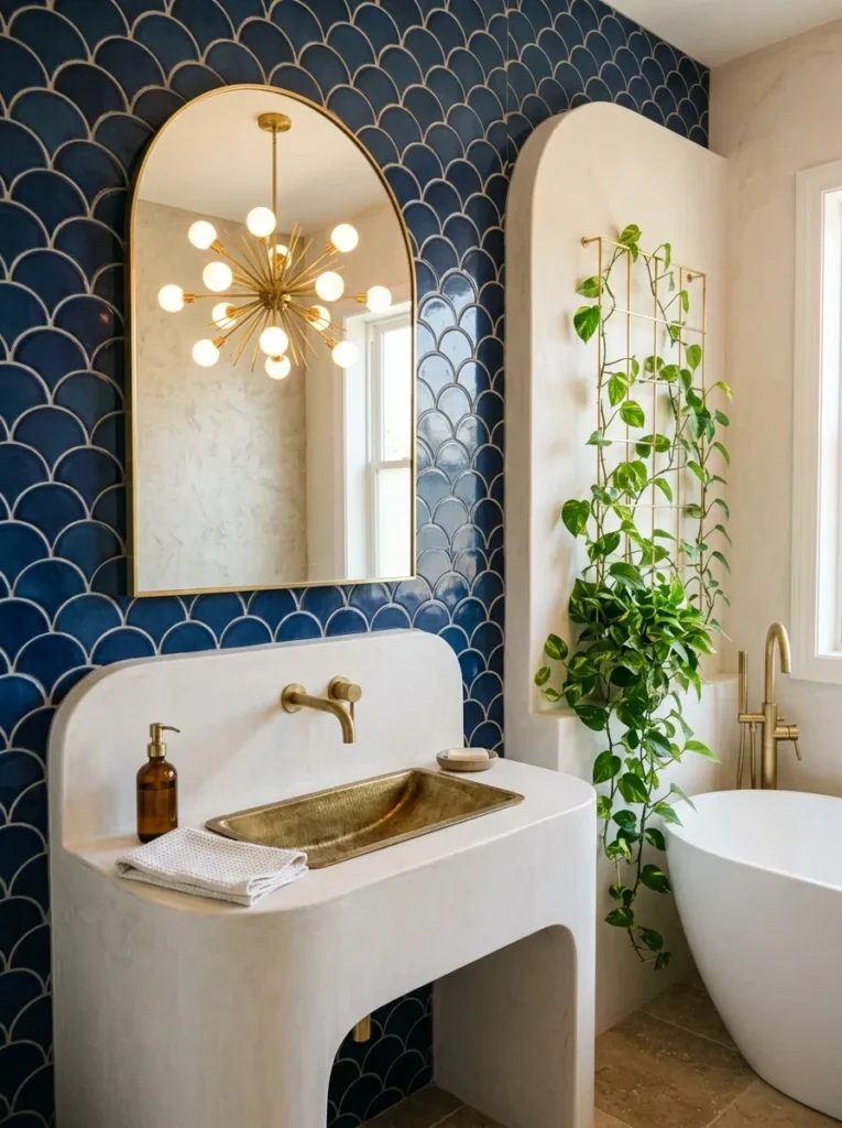
- Walls: Deep indigo scalloped (fish-scale) ceramic tile floor-to-ceiling in the wet zone; matte indigo paint on the dry walls, same undertone
- Vanity: Curved plaster vanity console (integrated, poured in place) with a brass trough sink
- Mirror: Tall arched mirror mounted flush, spanning nearly floor to ceiling beside the vanity
- Lighting: Brass task sconces flanking the arched mirror, a small ambient flush-mount, and a starburst brass flush pendant over the tub as the statement piece
- Fixtures & hardware: Polished brass faucet and hardware, kept bright against the deep indigo
- Flooring: Cream terrazzo tile with brass fleck inlay
- Textiles & plant: Cream and indigo striped towels, a flat-weave cream runner, and a Golden Pothos trained up a small brass trellis beside the tub — an unusual styling choice that turns the plant into a vertical design element rather than a tabletop accessory
- Standout detail: The scalloped tile pattern catches shadow along each curved edge, giving the wall a rippled, almost aquatic texture across the whole surface
Why this works: A scalloped tile shape creates its own shadow pattern across a flat wall, which is what makes a single-color tile job read as textured and dimensional instead of flat.
Scalloped tile is one of the more distinctive shapes available right now, and laying it in one saturated indigo tone turns a whole wall into a single rippling texture rather than a flat block of color. Every curved edge catches a sliver of shadow, so the wall shifts subtly depending on the light and the angle you’re viewing it from. Training a pothos vine up a small brass trellis beside the tub is an unusual move that treats the plant as vertical architecture instead of a plant sitting in a corner, echoing the tile’s rippled movement in a living, growing form.
The poured plaster vanity console is a genuinely unexpected choice in a room built around tile, and it works because the smooth, curved plaster surface contrasts directly against the scalloped tile’s texture instead of competing with it. Terrazzo flooring with visible brass flecks ties the two materials together and picks up the same brass tone used throughout the fixtures and lighting. It’s a room built on contrast — smooth against textured, curved against rippled — which is part of why it photographs as far more dimensional than a single-material bathroom ever could.
13. Deep Chocolate Venetian Plaster & Sunken Reading Nook
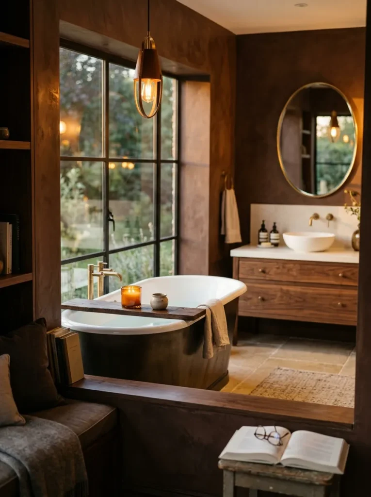
- Walls: Deep chocolate brown Venetian plaster (troweled, polished finish) on the dry walls; matching chocolate brown zellige tile in the wet zone
- Vanity: Walnut vanity with a bowed front and antique brass hardware
- Mirror: Oval mirror in a slim antique brass frame, hung with a leather strap detail
- Lighting: Antique brass task sconces at the mirror, a small ambient flush-mount, and a woven leather-and-brass pendant over the tub as the statement piece
- Fixtures & hardware: Antique brass faucet and hardware, warm and slightly aged
- Flooring: Warm walnut-look porcelain plank, matching the vanity tone
- Textiles & plant: Camel-toned towels, a cream boucle bath mat, and a Chinese Evergreen in a brass planter — one of the more forgiving low-light plants for a bathroom that only gets a few hours of artificial light a day
- Standout detail: A small sunken reading nook beside the tub, one step down, with a built-in ledge wide enough for a book and a candle
Why this works: Polished plaster reflects light in a soft sheen rather than a hard gloss, which gives a fully brown room warmth instead of flatness.
A sunken reading nook beside the tub is the kind of detail nobody expects in a bathroom, which is exactly why it stops people mid-scroll. It’s a small step down, no bigger than a window seat, but it turns the room from purely functional into somewhere you’d actually want to linger. Polished Venetian plaster on the surrounding walls picks up soft highlights wherever light hits the slightly glossy surface, so the deep chocolate tone never reads as one flat block of brown. Paired with warm walnut flooring, the whole room feels closer to a study than a typical bathroom.
I built a version of this nook into a client’s primary bathroom last year, and it became the first thing every guest asked about. The step down needs to be framed and waterproofed the same way a shower pan would be, since it sits close enough to the tub to catch splashes, and skipping that detail is how a beautiful feature turns into a moisture problem within a year. Done correctly, though, it’s one of the lowest-cost architectural upgrades in this entire list relative to how much visual impact it adds to the finished room.
14. Smoky Amethyst Tadelakt & Curved Niche
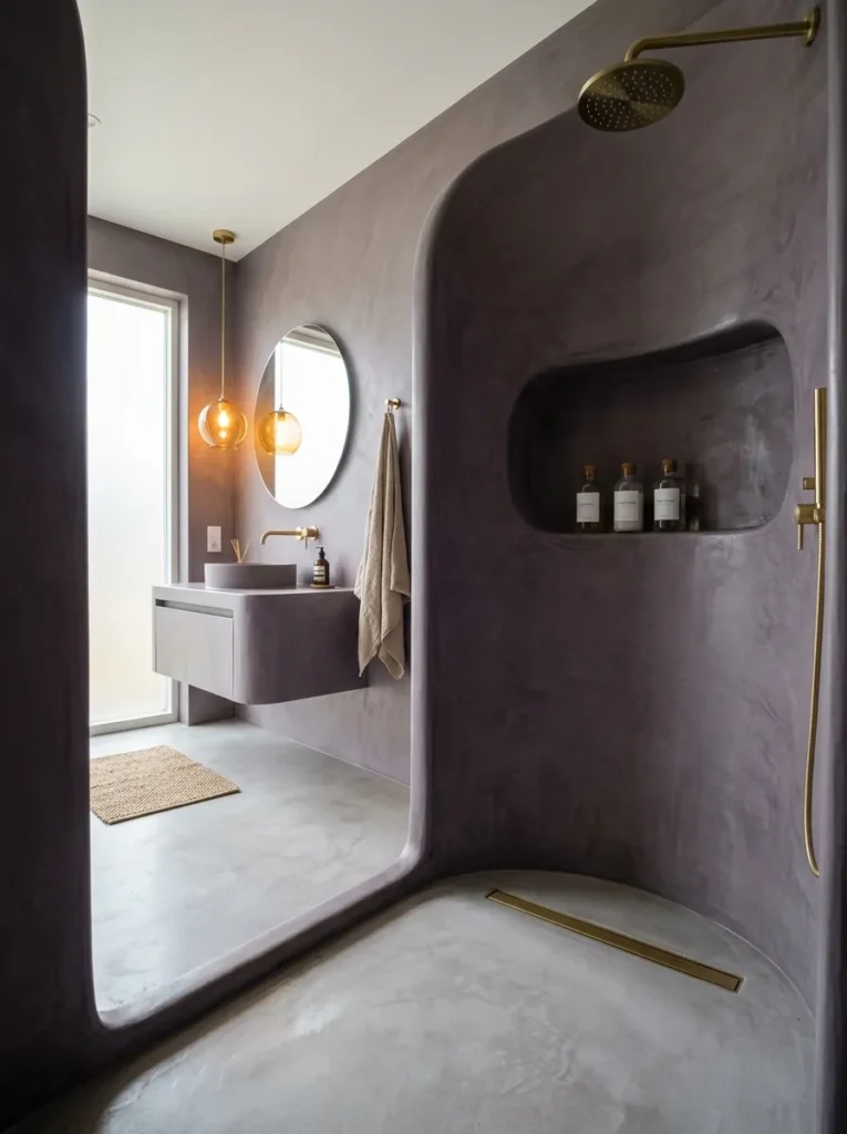
- Walls: Smoky amethyst tadelakt plaster (a naturally waterproof Moroccan lime plaster, polished to a soft sheen) used floor-to-ceiling in the entire wet zone, eliminating grout lines completely
- Vanity: Curved concrete vanity in a matching smoky amethyst pigment, integrated basin
- Mirror: Round mirror in a thin brushed brass frame, hung low and centered
- Lighting: Brushed brass task sconces at the mirror, a small ambient flush-mount, and a hand-blown amber glass pendant over the tub as the statement piece
- Fixtures & hardware: Brushed brass faucet and minimal hardware
- Flooring: Pale ash-gray micro-cement flooring, poured seamlessly with the walls
- Textiles & plant: Lavender-gray linen towels, a cream bath mat, and a Prayer Plant in a matte gray pot — its leaves fold up at night, which is a small detail guests genuinely notice in a room this considered
- Standout detail: A curved wall niche in the shower, plastered in the same tadelakt finish with no visible edge or seam, holding bottles like sculpted shelving.
Tadelakt is a genuinely different material choice most bathroom content never mentions — a naturally waterproof lime plaster that’s been used in Moroccan hammams for centuries specifically because it handles constant water exposure without tile or grout at all.
Why this works: Tadelakt eliminates grout lines entirely in a wet zone, which is the main reason it reads as sculptural rather than tiled, since grout lines are usually what visually break up a shower surface into segments.
Tadelakt plaster is naturally waterproof and can be used directly in a shower without any tile, which is not true of standard Venetian plaster or limewash. It’s applied in thin layers and burnished with a stone, then sealed with a soap-based treatment that reacts with the lime to create a water-resistant surface. The seamless finish is what makes the curved niche possible without a single visible grout line, giving the whole shower a sculpted, poured-in-place look most tiled showers can’t achieve.
Because tadelakt is a specialized application most tile installers haven’t worked with, it’s worth budgeting for a plasterer specifically experienced in the technique rather than treating it as a standard paint or tile substitution — the burnishing and sealing steps are what make it waterproof, and skipping them defeats the entire point of the material. Done correctly, it needs almost no maintenance beyond an occasional reseal every few years. The payoff is a shower that looks and feels like one continuous sculpted surface, curved niche included, rather than a room built from separate tiled panels.
15. Burnt Terracotta & Arched Skylight
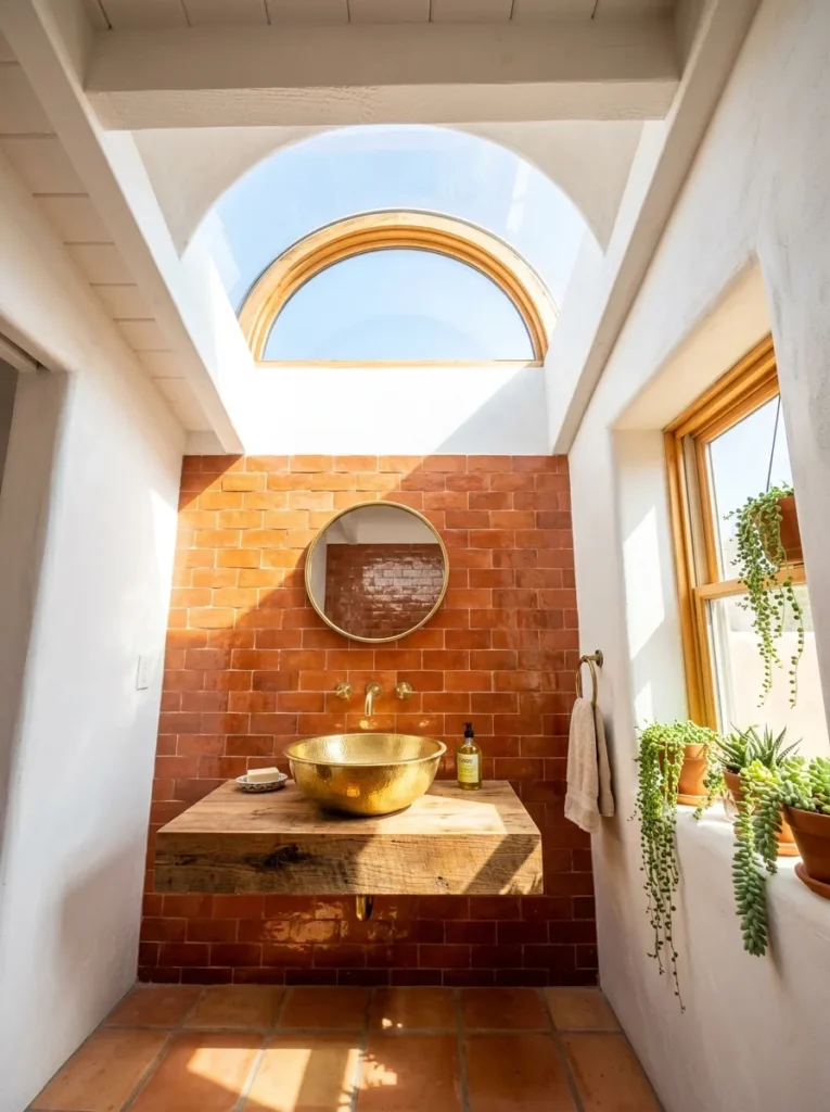
- Walls: Burnt terracotta limewash on the dry walls, chalky and matte; matching burnt terracotta zellige tile in the wet zone with a slightly deeper grout for contrast
- Vanity: White oak vanity with turned wood legs and a hammered brass vessel basin
- Mirror: Small round mirror in an unlacquered brass frame, hung above the basin
- Lighting: Unlacquered brass task sconces at the mirror and a small ambient flush-mount — the room relies on the skylight for most daytime light, so evening lighting is kept intentionally soft and minimal rather than trying to replicate daylight
- Fixtures & hardware: Unlacquered brass faucet and hardware, left to age naturally over time
- Flooring: Terracotta clay tile, unglazed, in a running bond pattern
- Textiles & plant: Rust and cream striped towels, a jute bath mat, and a small collection of trailing succulents in unglazed terracotta pots along the windowsill — most true succulents actually struggle in constant bathroom humidity, so these need a spot with real airflow and shouldn’t sit directly under the shower’s steam path
- Standout detail: An arched skylight cut into the ceiling above the tub, the one place in this entire cluster of ideas where natural daylight becomes the room’s defining feature
Why this works: An arched skylight above a saturated terracotta room lets the color shift naturally throughout the day, from soft and dusty in the morning to warm and glowing by late afternoon, without a single artificial bulb involved.
Most moody bathroom ideas lean entirely on artificial lighting to create atmosphere, but this one flips that formula by building the drama around a single arched skylight instead. Morning light through the opening washes the terracotta walls in a soft, almost dusty version of the color, and by late afternoon the same walls glow warm and saturated as the sun angle shifts. That daily transformation is something no pendant light or sconce can replicate, and it’s part of why this room photographs differently every time, depending on when the picture is taken.
I’d caution against relying on a skylight alone if the bathroom doesn’t already have good structural bones for one — cutting through a roofline for a skylight is a real construction project, not a decor add-on, and it needs proper flashing and insulation around the opening to avoid leaks. My husband treats skylight installs as roofing work first and design feature second. Done right, though, it turns an ordinary bathroom into the kind of room people describe as their favorite part of the whole house.
Styling Principles
Two things separate a moody bathroom that actually works from one that just looks good in a photo: correct lighting layering, and choosing a material that can handle water in the first place.
Lighting layering: every dark bathroom needs three distinct light sources — task lighting at the mirror (warm 2700–3000K bulbs, close enough to actually light your face), ambient fill from a recessed can or flush-mount on a dimmer, and one statement fixture that gives the room its mood. Skip any one of the three and the room either feels too dim to function or loses its atmosphere entirely.
Material choice: paint alone is never enough in a wet zone. Anything that gets direct water contact — the shower surround, the tub deck — needs tile, glass, or a genuinely waterproof plaster like tadelakt. Dry walls can carry paint or limewash, but always in a satin or semi-gloss finish, never flat, since flat paint has no moisture resistance and will show water spots and peeling within a year in a humid room.
Frequently Asked Questions
Does dark paint actually work in a humid bathroom? Yes, as long as it’s a satin or semi-gloss finish rather than flat or matte paint. The sheen in satin and semi-gloss finishes creates a slightly harder surface that resists moisture absorption, where flat paint has no such protection and will peel or stain over time.
What’s the best paint finish for a bathroom? Satin and semi-gloss are the standard for bathroom walls, with semi-gloss holding up best in high-splash zones like around the sink and tub deck. Flat and matte finishes should be avoided entirely in a bathroom, regardless of color.
Does a moody bathroom need more ventilation than a light one? The color on the walls doesn’t change ventilation needs — what matters is the exhaust fan being sized correctly for the room’s square footage in the first place. A fan rated too small for the space won’t clear humidity fast enough, and trapped moisture, not wall color, is what actually leads to mold.
What’s the most budget-friendly way to try a moody bathroom look? Paint is the lowest-cost entry point. Repainting the dry walls in a deep, saturated color with a satin finish, swapping hardware to a warm metal like brass, and adding one statement light fixture can transform the room’s mood without touching tile or plumbing.
What’s the best lighting for a dark bathroom? A dark bathroom needs warm-toned bulbs (2700–3000K) layered across three sources: task lighting at the mirror, ambient fill on a dimmer, and one statement fixture. Cool white bulbs tend to make dark colors look flat and gray rather than rich.
Can I do a moody bathroom in a small or windowless space? Yes — dark color often works better in a small bathroom than people expect, since it stops the eye from noticing the room’s actual size. The key is layering enough artificial light, since a windowless dark room has no daylight to rely on for balance.
Conclusion
Fifteen rooms, fifteen colors, and not one repeated detail — that’s the real proof that moody bathroom ideas don’t have to mean the same dark tile everyone else is using. Pick the version that fits your space, whether that’s a full tadelakt shower or just a fresh coat of satin paint and a brass mirror. I’ve seen how much a single color change can shift the entire feel of a room, turning a purely functional bathroom into the one guests actually comment on.
Save this post for when you’re ready to start, share it with anyone planning a renovation, and try one idea in your own space first — you can always build from there.