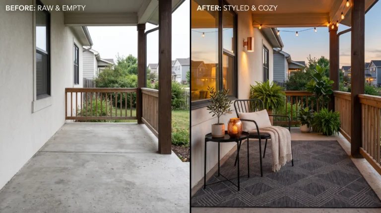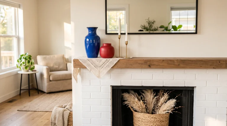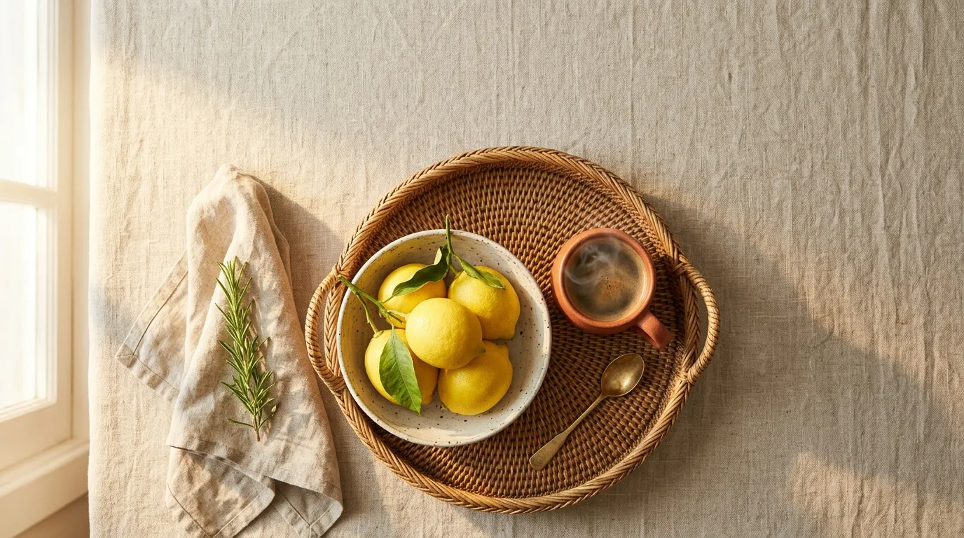
16 Summer Decorations for Home, No Renovation Needed
Your home shouldn’t feel the same in July as it did in February. If your rooms are starting to feel a little stale or too heavy for the heat, it might be time for a few honest changes- not a renovation, just the right seasonal shift. These summer decorations for home are built around exactly that idea: small, intentional swaps that change how a room feels without demanding a full redo.
I’ve styled through enough summers, and lived through enough of my husband’s construction projects, to know that the best seasonal changes are usually the simplest ones. A lighter runner. A cooler-toned stone tray. A single bold color moment in an otherwise quiet room. In my experience, these small shifts do more for a space than people expect, and they’re far easier to commit to than a full style overhaul. This list covers 16 of them, room by room, so you can pick what actually fits your home instead of copying someone else’s.
1. Terracotta-and-Olive Table Runner: A Warm Dining Table Refresh
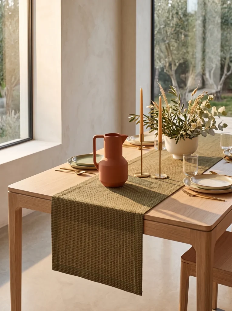
- Swap your table linens for a runner in warm terracotta paired with muted olive green
- Works especially well on wood tables with visible grain — the tones play off natural warmth instead of fighting it
- Layer in unglazed clay pitchers or a single stoneware bowl for texture
- Skip floral centerpieces here; let the color do the work
- Pairs nicely with brass or aged-iron candlesticks instead of anything glossy
Blue and white gets all the attention in summer styling, but terracotta and olive read just as warm-weather without feeling predictable. These tones also hide everyday wear — pollen dust, water rings, the stuff that happens when a table actually gets used.
The dining table takes more visual punishment in summer than people expect — open windows, extra pollen, more meals eaten at odd hours. In my experience, a terracotta-and-olive runner hides that low-level chaos far better than crisp white ever did. It also photographs beautifully in early evening light, when the clay tones pick up a slight glow instead of going flat. This is one of those swaps that costs very little but changes how the whole room reads, especially once you add a stoneware pitcher or two.
2. Windowsill Herb Ledge: Functional Summer Decorations for Home in the Kitchen
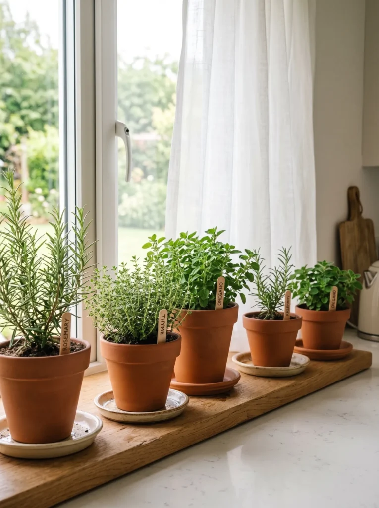
- Line a kitchen or bathroom windowsill with 3–4 small terracotta pots of heat-tolerant herbs
- Rosemary, thyme, and oregano handle direct summer sun far better than basil, which scorches fast on south-facing sills
- Use mismatched pot heights for visual rhythm instead of a uniform row
- Trim herbs weekly — it keeps the ledge looking intentional, not overgrown
- A small ceramic saucer under each pot protects wood sills from heat-warped water rings
Windowsills get the most direct summer light in the house, and most houseplants people already own weren’t chosen with that in mind. Heat-tolerant herbs actually want that exposure, so the sill becomes useful instead of just decorative.
I’ve killed more basil on a bright windowsill than I’d like to admit — it looks like it wants full sun, but by July it scorches within days. Rosemary and thyme, on the other hand, genuinely thrive in that harsh light. I’ve noticed the difference isn’t just visual; a working herb ledge gets touched, trimmed, and used, so it never falls into that stale “decor plant” territory. It’s a small detail, but it makes a kitchen feel lived-in rather than staged.
3. Woven Grass Wind Chime for a Breezy Porch Entry
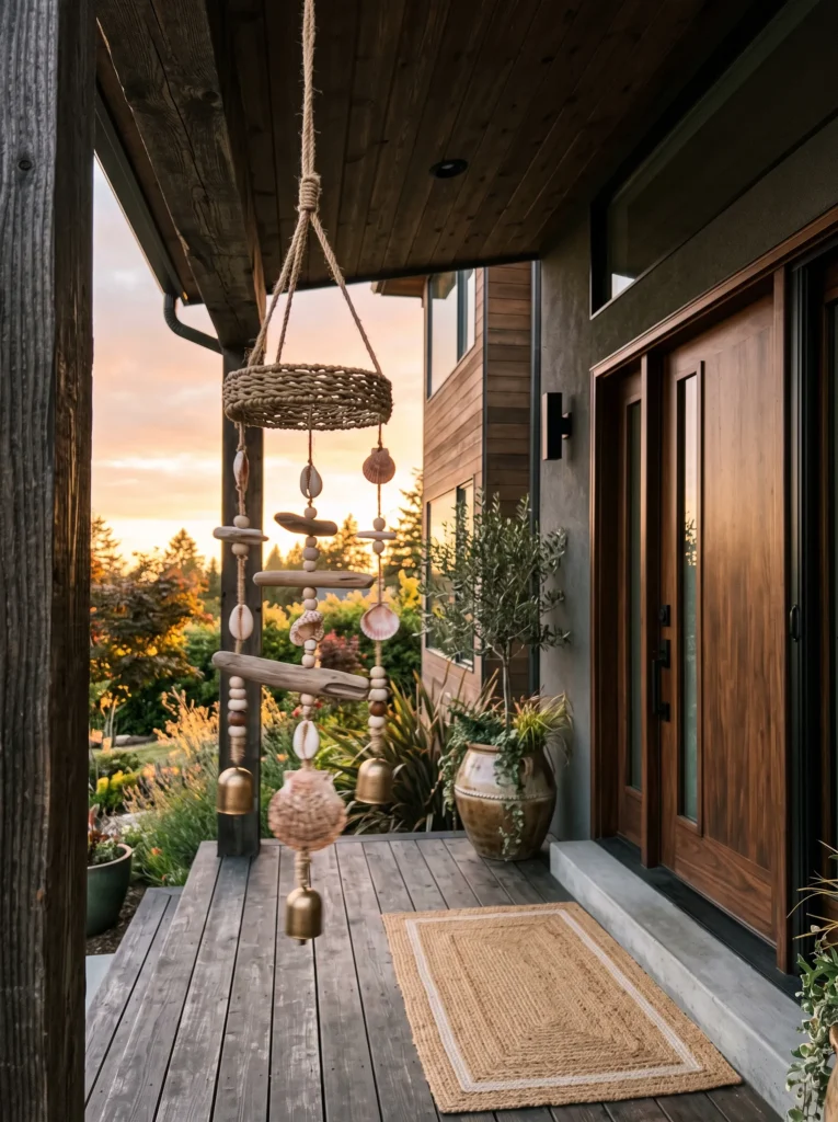
- Hang a handwoven grass or seagrass wind chime near a porch entry or open bedroom window
- Choose one with a low, wooden clacking tone rather than metal — it reads warmer and less jarring
- Position it where a cross-breeze naturally passes through, not just anywhere on the porch
- Pair with a jute or sisal doormat for textural consistency at the entry
- Avoid oversized chimes on small porches — proportion matters more than statement pieces
Summer decorating usually stops at what a room looks like, but sound changes how a space feels just as much. A soft wooden chime near an open window adds a sensory cue that it’s warm-weather season, without adding a single new object to look at.
My husband’s spent enough time on porches mid-build to have opinions about airflow, and he’s right that most people hang chimes in spots with barely any breeze. Find where the air actually moves — often near a doorway or stairwell gap — and hang it there instead. I’ve noticed guests comment on porch sound before they comment on porch decor, which tells you something about how underused this idea is. It’s subtle, but it’s one of the first things people register.
You May Also Love: 30+ Spring Table Decor Ideas You’ll Want to Save
4. Sun-Bleached Rattan Bench Cushions for a Forgiving Entryway
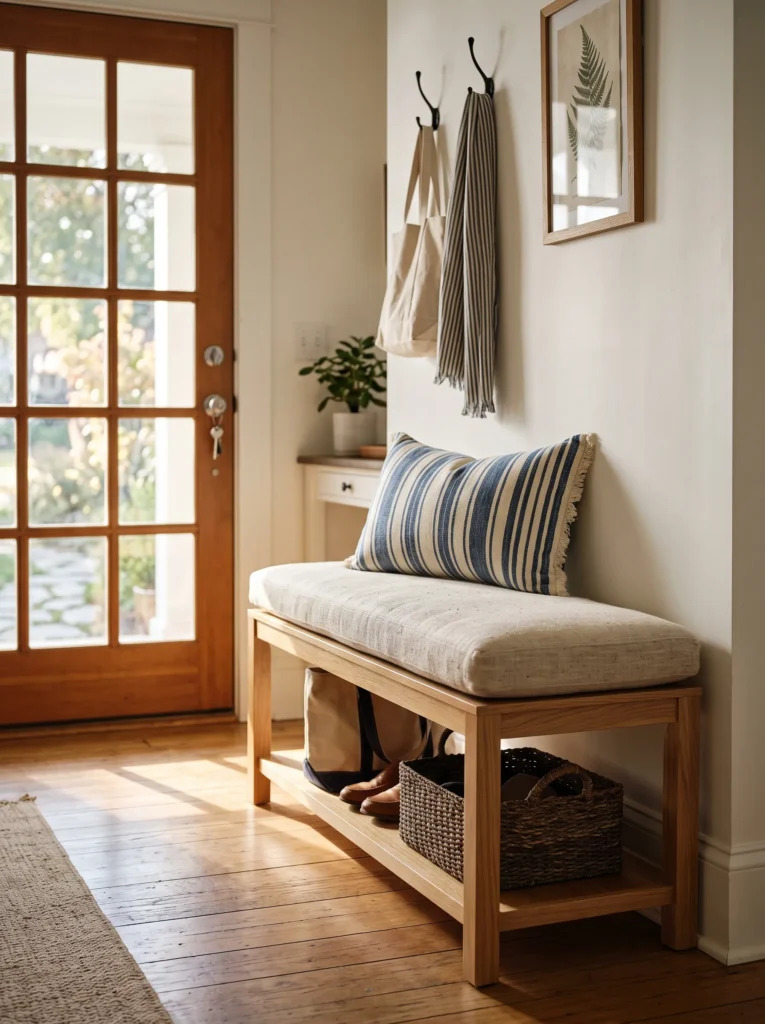
- Replace entryway bench cushions with a sun-bleached, nubby linen-cotton blend in pale flax
- Choose a weave with visible slub texture — it hides shoe scuffs and bag drops far better than smooth fabric
- Add one small lumbar pillow in a contrasting stripe, not a solid match
- Machine-washable covers matter more here than anywhere else in the house
- Keep the bench itself uncluttered — one cushion, one pillow, nothing stacked
An entryway takes the most direct abuse of any room in summer — wet shoes, sunscreen, sand, dropped bags. A textured, washable cushion in a pale, forgiving tone solves a real problem instead of just looking seasonal.
My husband’s crews track more debris through a job-site entry in July than any other month, and I’ve applied that same logic at home — anywhere people enter and exit constantly needs fabric that forgives mess, not fabric that shows it. A slubby linen-cotton blend does exactly that. I’ve noticed pale flax tones actually camouflage light stains better than crisp white, which surprises people until they’ve lived with both through one full summer.
5. Cobalt Blue Bar Nook for a Bold Color Moment
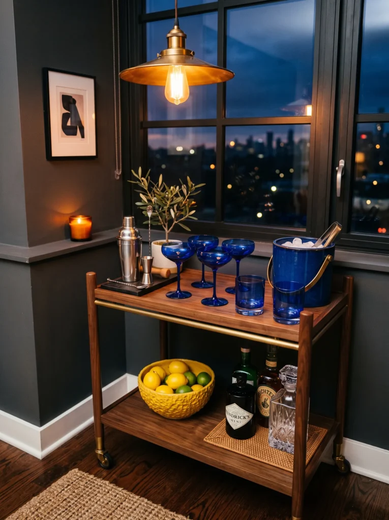
- Dedicate a small kitchen counter or bar cart corner to deep cobalt blue glassware and a matching ceramic ice bucket
- Choose one bold anchor color and keep everything else neutral — wood tray, plain glass pitcher
- Cobalt reads richer under evening light than daytime, so place this near a lamp or pendant, not a window
- A single citrus-yellow lemon bowl nearby gives the cobalt something to react against
- Avoid pastels here — the whole point is contrast, not softness
Most summer palettes lean pale and washed out, so a saturated cobalt corner stands out precisely because it breaks that pattern. Bold color in a small, contained zone reads as intentional rather than overwhelming.
I used to assume bold color only worked in large doses, but a bar nook taught me otherwise. In my experience, cobalt glassware catches evening light in a way pale tones simply can’t — it deepens instead of fading. Keeping the surrounding surfaces neutral lets that one saturated moment carry the whole corner. It’s a small footprint with outsized visual payoff, and it photographs particularly well once the sun starts to set.
6. Lantana Railing Planters That Survive the Heat
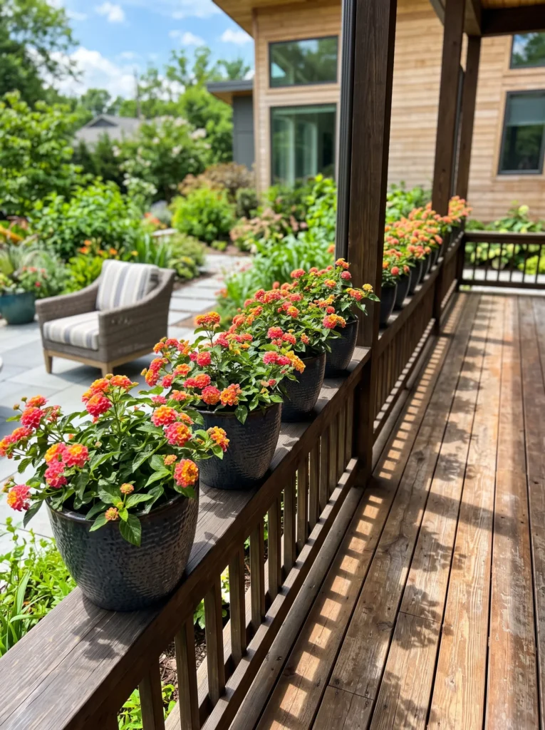
- Line a porch or balcony railing with lantana in mixed coral-and-yellow blooms, planted in dark charcoal-glazed pots
- Lantana tolerates full sun and heat far better than most flowering annuals, and keeps blooming through peak summer
- Space pots evenly, roughly 18 inches apart, so the railing reads as a rhythm, not a cluster
- Deadhead spent blooms weekly to keep color consistent through the season
- Charcoal glaze keeps the planters from visually competing with the flowers
Flowering plants often get abandoned by midsummer once heat stress sets in, but lantana is bred for exactly this stretch of the year. Choosing a heat-tolerant bloomer means the color actually holds instead of fading by July.
Most people default to petunias for railing color, and most people watch them collapse by the first real heat wave. Lantana doesn’t have that problem — it’s one of the few flowering annuals that genuinely performs better as temperatures climb. I’ve grown both side by side, and the difference in July is stark. The coral-and-yellow blend also avoids the blue-and-white default most porches lean on, which keeps the whole railing feeling fresh rather than expected.
7. Linen-Weight Bedding Swap for Cooler Summer Nights
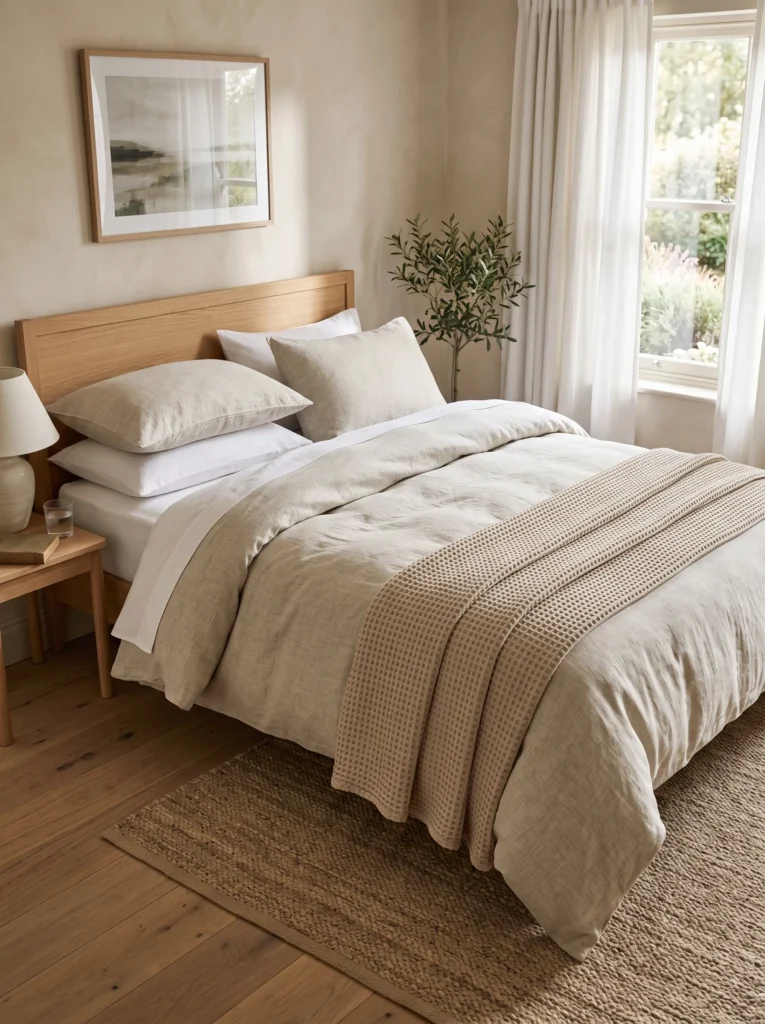
- Swap heavier quilts for a lightweight linen-cotton duvet in oat and stone white
- Choose a lower thread count woven linen — it breathes better than high-thread-count cotton in humid heat
- Layer with one waffle-weave throw at the foot of the bed instead of a heavy quilt
- Skip matching shams; mix in one plain stone-white pillow for contrast
- Wash before first use — linen softens and drapes better after one cycle
Heavier bedding traps heat overnight, and most people don’t realize a lower thread count fabric can actually feel cooler than a “premium” high thread count sheet.
Bedding is the one summer swap most people skip, but it’s the one that affects sleep the most. Heavy quilts trap heat overnight in a way most people don’t notice until they wake up sweating at 3 a.m. A lightweight linen-cotton duvet in oat and stone white solves this without sacrificing how the bed looks. Linen’s loose weave lets air move through it, which matters more than thread count will in a humid summer bedroom. The visual payoff is a bonus — pale, textured bedding photographs beautifully in morning light, and it looks intentionally relaxed rather than unfinished or unmade.
In my experience, thread count gets far more credit than it deserves. I switched to a lower thread count linen blend two summers ago expecting a downgrade, and instead I slept cooler within the first week. The looser weave breathes in a way tightly woven cotton simply can’t, no matter how high the number on the label. I’ve noticed guests comment on how the bed looks more than how it performs, but performance is the point. If you only make one seasonal swap in the bedroom, this is the one that changes how you sleep, not how the room looks.
8. Dried Wheat Mantel Display That Never Wilts
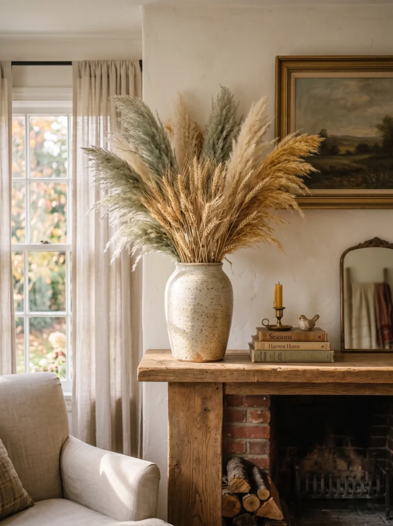
- Fill a tall glass or ceramic vessel with dried wheat stalks and pampas grass in muted wheat-gold and dusty sage
- Skip fresh-cut flowers on the mantel in peak summer — heat wilts them within a day
- Vary stem heights for movement; don’t trim everything level
- Place near an open window so the grasses catch subtle motion and rustle
- Dust lightly every couple weeks — dried arrangements collect more than people expect
Fresh flowers demand constant upkeep in summer heat, while dried grasses hold their color and shape for months and add movement without a single moving part.
Fresh flowers look beautiful on a mantel for about two days in summer heat before they wilt, and most people replace them out of guilt rather than choice. Dried wheat stalks and pampas grass skip that problem entirely. Arranged in muted wheat-gold and dusty sage tones, they bring warmth and texture without demanding water changes or trimmed stems. Placed near an open window, the grasses catch small movements from passing air, giving the mantel a subtle sense of motion that fresh flowers in a closed room never had. It’s a low-maintenance choice that still reads as considered, not neglected.
I’ve tried keeping fresh arrangements going through July, and it’s a losing battle no matter how often you change the water. Dried grasses solved that for good. What surprised me most was how much movement they add near a window — a slight rustle catches your eye the same way a candle flicker does, just quieter. Wheat-gold and sage also sidestep the blue-and-white palette most mantels default to in summer, which keeps the room from blending into every other seasonal display. This is one of those swaps that looks effortless but genuinely holds up for the entire season.
9. Soapstone Bathroom Tray: Cool, Practical Summer Decorations for Home
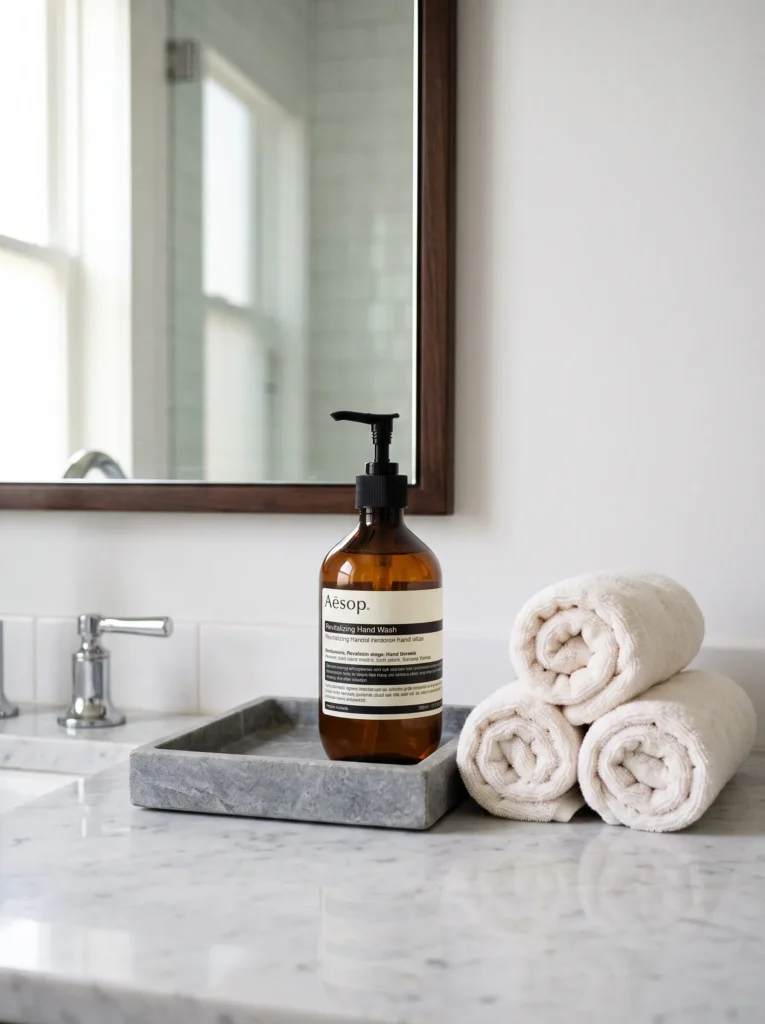
- Style bathroom counters with a grey soapstone tray holding a single amber glass bottle and rolled white towels
- Soapstone stays cool to the touch even in direct summer sun — a real advantage on a bright counter
- Skip multiple small objects; one tray, one bottle, two towels is enough
- Choose towels in warm white rather than stark white — softer under bathroom lighting
- Refresh the amber bottle with a light citrus or herbal oil for scent, swapped monthly
Bathrooms heat up fast in direct sun, and material choice matters as much as styling — stone stays cool where ceramic or wood can feel warm to the touch by midafternoon.
Bathroom counters get more direct sun exposure than people expect, and by midafternoon in summer, surfaces can genuinely feel warm underfoot or under your hand. A grey soapstone tray solves this in a way most styling tips ignore — it stays noticeably cooler than wood or ceramic, even on a bright counter. Paired with a single amber glass bottle and two rolled warm-white towels, the vignette looks minimal but purposeful. Warm white towels soften under bathroom lighting in a way stark white can look clinical under. This is styling with a practical edge, not just a look assembled for a photo.
My husband’s spent years choosing materials for bathrooms that hold up in heat and humidity, and soapstone comes up constantly for exactly this reason — it resists both heat and moisture better than most surfaces people default to. I’ve noticed the same logic applies at small scale, on a countertop tray rather than a whole shower surround. It’s a detail most guests won’t consciously register, but they’ll feel it when they set a hand down on a cool surface instead of a warm one. Small material choices like this are where real comfort quietly lives in a home.
10. Curved Bouclé Lounge Chair for an Underused Corner
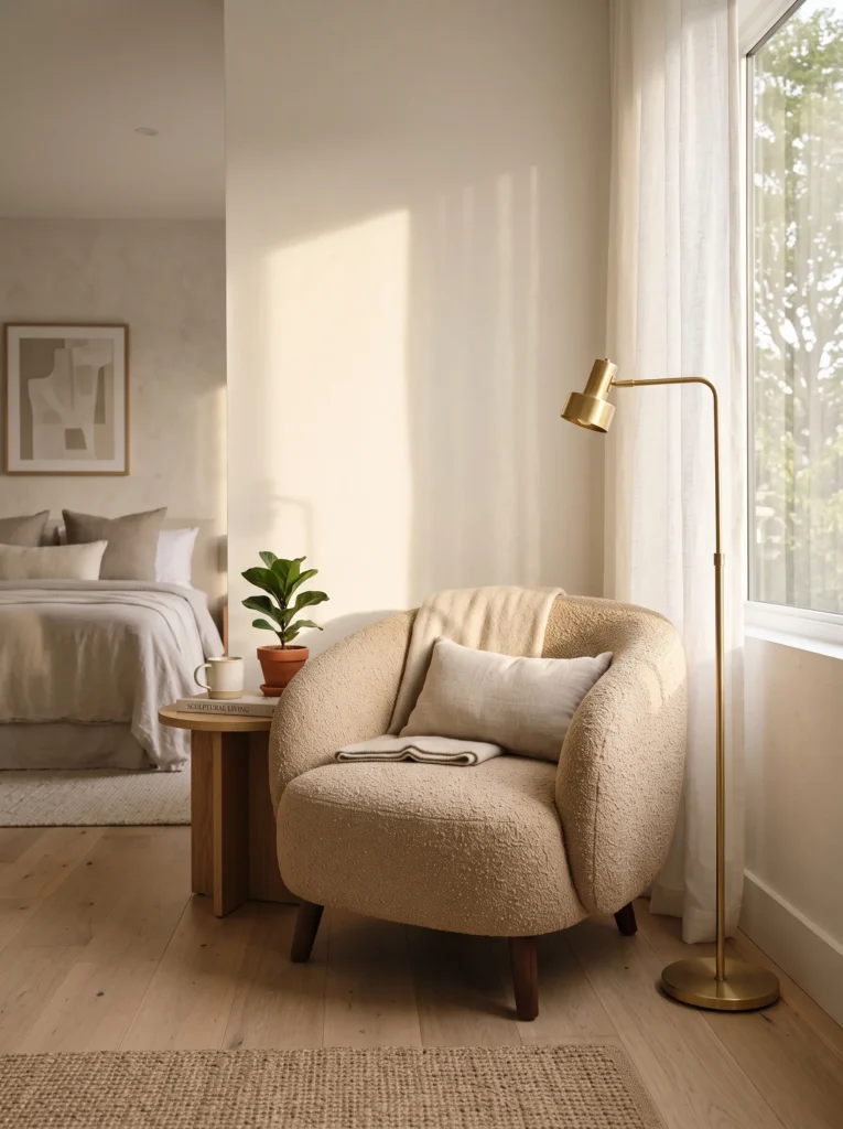
- Bring in a curved bouclé lounge chair in warm sand or oatmeal tone as a standalone summer accent piece
- Position it in an underused corner — bedroom nook, hallway landing, or beside a window — rather than centering it
- Pair with a single brass floor lamp with a fabric shade for warmth without visual clutter
- Skip throw pillows on this piece; let the curved silhouette stand alone
- Choose a chair with removable, washable covers if the space gets direct sun exposure
Curved furniture reads as inherently softer and more current than boxy silhouettes, and one statement piece in an empty corner does more for a room than a full furniture rearrangement.
A single curved chair can change how an entire room feels, and summer is the right season to prove it. Most homes have one underused corner — a bedroom nook, a stair landing, a spot by a window — that never gets furnished because it feels too small to matter. A bouclé lounge chair in warm sand tone fills that gap without crowding it. The rounded silhouette softens a room that might otherwise feel boxy, and the light, nubby texture reads as current without chasing a trend. Paired with a brass floor lamp, the corner becomes a place people want to sit.
In my experience, empty corners get ignored precisely because they feel too awkward to furnish, and that’s exactly where a single striking piece works best. I’ve noticed guests gravitate toward a curved chair before they even sit in the main seating area — there’s something about the rounded shape that reads as inviting rather than formal. Washable bouclé covers matter more than people expect once a chair sits near a sunny window; light fading and occasional spills happen faster in summer months. This one piece does more visual work than most people assume in a home with straight-lined furniture.
11. Fluted Glass Pendant Swap for a Warmer Dining Mood
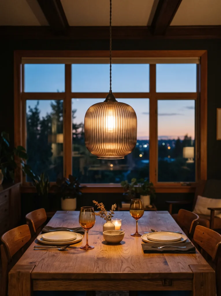
- Swap a heavy dining pendant for a fluted amber or smoked glass fixture with a slimmer profile
- Choose a pendant with a warm-toned bulb (2700K) rather than cool white — it changes the whole evening mood of the table
- Hire an electrician or handy family member for rewiring if the fixture height changes — don’t eyeball it
- Position the new pendant 30–34 inches above the table surface for proper scale
- Pair with unlacquered brass hardware elsewhere in the room for a cohesive metal tone
Lighting fixtures rarely get treated as seasonal decor, but a fixture swap changes the entire mood of a room after dark in a way styling alone can’t.
Most people update dining rooms with linens and centerpieces and forget the ceiling entirely. A fluted glass pendant does something a tablecloth never can — it changes how the whole room glows once the sun goes down. Smoked or amber glass diffuses light unevenly, throwing soft shadows across the table instead of one flat pool of brightness. Swapping to a warmer bulb temperature makes the shift even more noticeable, especially for summer dinners that run late into a lingering evening. It is a bigger project than most ideas on this list, but the payoff shows up every single night.
My husband’s crews rewire light fixtures constantly, and his one rule is non-negotiable: never eyeball pendant height over a table. Thirty to thirty-four inches above the surface is the range that keeps light functional without forcing anyone to duck or squint past the fixture. I’ve seen plenty of beautiful pendants hung too low, and it ruins the effect instantly. If your fixture requires rewiring or a junction box move, it’s worth hiring an electrician rather than guessing — a few extra dollars now prevents a fixture that looks stunning but sits at the wrong height for years to come.
12. Floating Shelf Burro’s Tail Trail for Heat-Proof Greenery
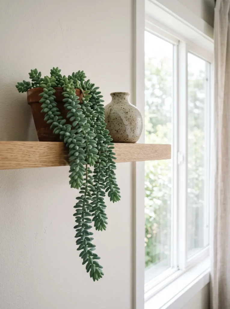
- Mount a slim floating oak shelf near a bright window and let a burro’s tail succulent trail over the edge
- Burro’s tail handles intense summer heat and dry air better than most trailing houseplants, including pothos
- Water sparingly — overwatering is the most common way people lose this plant in summer, not underwatering
- Pair the shelf with one small stoneware vase, kept mostly empty, so the trailing plant stays the focal point
- Choose a shelf depth of at least 6 inches so trailing stems have room to hang freely without crowding
Trailing plants aren’t interchangeable — some genuinely struggle in intense summer heat while others are built for it, and choosing correctly means the difference between a plant that thrives and one that limps through July.
Trailing plants get treated as one category, but they don’t all handle summer heat the same way. Burro’s tail is built for exactly this kind of stress — thick, water-storing leaves that shrug off dry air and direct sun better than almost anything else people hang near a window. A slim floating oak shelf gives it room to spill downward without competing for space on a crowded surface. Keep the styling around it minimal, one small vase at most, so the trailing stems stay the visual focus rather than getting lost among other objects on the shelf.
I studied plant science before I ever styled a shelf, and burro’s tail still surprises me every summer. Its thick, dusty-blue leaves are actually built to store water, which means it thrives on neglect during the hottest stretch of the year — the opposite of most houseplants people default to. I’ve tried it on both bright and moderately lit shelves, and it consistently outperforms trailing pothos once real heat sets in. The leaves do bruise easily if handled too much, so mount the shelf somewhere it won’t get brushed against daily, and let it hang undisturbed.
13. Rounded Travertine Side Table for Tactile Warmth
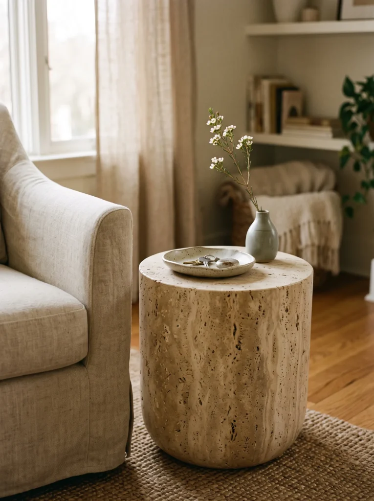
- Bring in a rounded travertine side table with a raw, honed finish beside a reading chair or sofa end
- Choose travertine over marble for a warmer, more matte summer look — marble reads colder and more formal
- Style the top with one ceramic dish and a single stem in a bud vase, nothing more
- Pair with a linen throw draped loosely over the nearby chair arm for textural contrast
- Keep surrounding furniture low-profile so the table’s sculptural shape stays visible
Travertine’s uneven, porous texture catches summer light differently than polished stone, giving a room warmth and depth without adding color or pattern.
Side tables get overlooked in most seasonal styling, treated as pure function rather than a chance to add real texture. A rounded travertine table changes that. Its raw, honed surface has natural pitting and variation that polished marble simply doesn’t, which means it catches afternoon light in small, shifting ways throughout the day. Paired with a single ceramic dish and one flower in a bud vase, the table feels sculptural rather than styled. It’s a quiet piece, but it adds the kind of tactile warmth that a glass or lacquered table never could in summer light.
In my experience, people default to marble because it photographs well, but travertine actually performs better in a lived-in summer room. Marble can look almost too polished under bright natural light, while travertine’s texture softens the same light instead of bouncing it back sharply. I’ve noticed guests touch this table more than any other piece in the room — something about the uneven surface invites a hand to rest on it. It’s a small furniture choice, but it changes the tactile feel of a whole seating area.
14. Arched Cane Headboard for a Softer Bedroom Silhouette
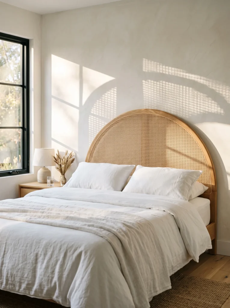
- Swap a flat, upholstered headboard for an arched cane-and-oak-frame headboard in a bedroom
- Choose natural, unstained cane for a lighter look, or a light honey stain if you want more warmth
- Pair with plain stone-white bedding so the headboard’s woven texture stays the visual focus
- Position the bed so morning light hits the cane at an angle, casting subtle shadow patterns on the wall
- Avoid hanging art directly above an arched headboard — let the shape stand on its own
An arched silhouette breaks up the boxiness most bedroom furniture defaults to, and cane’s open weave lets shadow and light move through it in a way solid wood or upholstery never can.
A headboard is one of the few furniture pieces that shapes an entire room’s silhouette, and most people never think to change it seasonally. An arched cane-and-oak frame does something upholstery can’t — it lets light pass through in a woven pattern rather than blocking it entirely. Positioned so morning sun hits it at an angle, the cane casts soft, shifting shadows across the nearby wall as the light moves through the day. Paired with plain stone-white bedding, the headboard becomes the room’s quiet focal point without needing anything else layered on top.
I’ve noticed cane furniture gets treated as a passing trend, but its function is what makes it worth keeping past a single season. The open weave genuinely changes how light behaves in a room, something a solid upholstered headboard simply can’t replicate. I’ve tried positioning beds both directly facing a window and at an angle to it, and the angled placement creates far more interesting shadow movement throughout the morning. It’s a bigger investment than most ideas here, but it reshapes the whole room’s character, not just its color palette.
15. Olive-Green Bouclé Ottoman Cluster for Flexible Seating
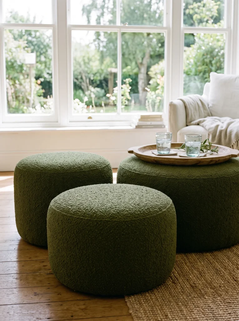
- Group two or three low, round boucle ottomans in deep olive green as flexible extra seating near a window or fireplace
- Vary ottoman heights slightly so the cluster reads as arranged, not matched
- Use them as a coffee table alternative in small living rooms — top one with a wide wooden tray for drinks
- Choose boucle with a slightly looser weave for a more relaxed, less formal texture
- Keep surrounding cushions and throws in neutral tones so the olive green stays the standout element
A cluster of low, rounded ottomans in a bold color does what a single piece of furniture can’t — it adds flexible seating and a strong color moment at the same time, without committing to a full reupholster.
Small living rooms rarely have room for extra seating, which is exactly where a cluster of low ottomans earns its place. Grouped in deep olive green, two or three round ottomans provide flexible, movable seating that a fixed coffee table never could. Slightly varied heights within the cluster keep it from looking like a matched set bought off a showroom floor. Topped with a wide wooden tray, the group doubles as a coffee table for everyday use. It’s a color-forward choice that still solves a real, practical space problem most small rooms face.
I’ve rearranged this exact ottoman cluster more times than I can count, and that flexibility is the whole point. Unlike a fixed coffee table, the ottomans shift easily for extra guests, a movie night, or simply a different traffic flow through the room. In my experience, olive green holds up better than most bold color choices over time — it doesn’t feel trend-driven the way brighter jewel tones sometimes do a few years later. Keeping everything else in the room neutral lets this one grouped element carry real visual weight without overwhelming a small space.
16. Rattan Pendant Light Cluster for a Kitchen Island
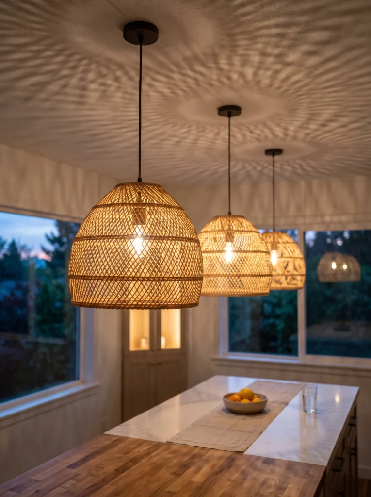
- Hang three small rattan pendant shades at staggered heights over a kitchen island or breakfast nook
- Vary drop lengths by 4–6 inches between each shade for visual rhythm, not a straight matched row
- Choose open-weave rattan shades so light filters through in a dappled pattern rather than glowing flat
- Pair with a warm-toned bulb (2700K) to complement the natural fiber tone
- Keep the island or table below simply styled — one runner, no clutter — so the pendant shadows become the visual interest
Staggered pendant heights break up the visual monotony of a straight fixture row, and open-weave shades cast moving, dappled light patterns that a solid shade never produces.
Kitchen lighting almost always gets installed as a uniform row, evenly spaced and identical in height, which looks tidy but rarely feels interesting. Staggering three rattan pendants at slightly different drop lengths changes that instantly. Open-weave shades let light escape in small, scattered patterns rather than one flat glow, so the ceiling and counter below pick up subtle texture once the sun goes down. Paired with warm-toned bulbs, the natural fiber reads even richer against the light. It’s a fixture choice that does double duty — functional task lighting during the day, atmospheric texture once evening settles in.
My husband’s installed enough kitchen lighting to know that most clients default to a perfectly even row without ever considering the alternative. I pushed for staggered heights in our own kitchen, and the shadow pattern it throws across the ceiling at night still catches my eye months later. I’ve noticed open-weave rattan shades especially reward a warmer bulb — cool white light flattens the fiber’s texture, while warm light makes it glow. It’s a small deviation from the expected symmetrical layout, but it adds far more character than a straight, matched row ever could.
Final Thoughts on Summer Decorations for Home
A home doesn’t need a full makeover to feel ready for summer — it just needs a few honest, well-chosen changes. Whether it’s a bold cobalt corner, a cooler linen swap, or a heat-tolerant plant in the right spot, these summer decorations for home are meant to be practical as much as pretty.
I’ve seen how small changes like these can completely shift how a room feels, sometimes more than a big renovation ever could. Save this post before you lose it in your feed, try one or two ideas this week, and pass it along to anyone else whose home could use a little seasonal warmth right now.
FAQs
1. What are the most budget-friendly summer decorations for home? A table runner, a dried grass arrangement, or a windowsill herb ledge cost very little but change how a room feels almost instantly.
2. Which plants hold up best in summer heat indoors and outdoors? Heat-tolerant options like rosemary, thyme, burro’s tail succulent, and lantana handle direct sun and dry air far better than delicate houseplants or petunias.
3. How can I make my bedroom feel cooler in summer without AC changes? Swap heavy quilts for a lightweight linen-cotton duvet with a lower thread count — the looser weave breathes better and helps you sleep cooler overnight.
4. What colors work best for summer home decor? Warm, earthy tones like terracotta, olive, and wheat-gold, along with one bold contrast color like cobalt blue, read as fresh without leaning on the expected blue-and-white palette.
5. How do I add summer style to a small living room? Flexible pieces like a cluster of low ottomans or a single curved accent chair add seating and color without crowding a small footprint.
6. Do I need to redecorate every season to keep a home feeling fresh? No — a handful of targeted swaps in high-traffic or high-light areas, like the entryway, dining table, or bedroom, is usually enough to shift the whole home’s feel.