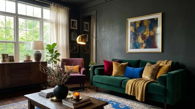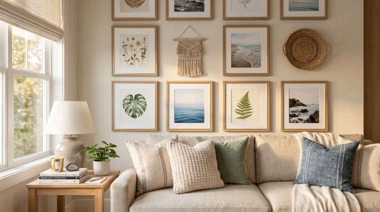
15 Moody Living Room Ideas That Feel Editorial
Most “moody” living rooms end up looking like someone just turned off half the lights. That’s not what moody actually means, and it’s not what makes a room feel editorial. These moody living room ideas are built on real color stories, layered lighting, and texture contrast — not just dark paint and dim bulbs. I’ve styled enough of these rooms to know the difference between a space that photographs beautifully and one that just reads as underlit, and it almost always comes down to the details most articles skip. This post walks through fifteen genuinely distinct color palettes, from oxblood to cobalt to golden ochre, each one specified down to the finish, the furniture, and the plants, so you can actually recreate the look in your own home instead of just admiring it.
Why a Moody Living Room Doesn’t Have to Feel Like a Cave
Most people assume a moody living room just means darker paint. That’s not quite the mechanism at work.
The real difference between a room that just looks dark and one that reads as editorial and moody comes down to one design principle: tone-on-tone. When trim, doors, and millwork are painted the exact same color as the walls, there’s no visual break for your eye to catch on — no white trim shouting against a charcoal wall. That missing contrast is what makes a space feel quiet and enveloping instead of patchy. I noticed this firsthand when we matched our own trim to the wall color instead of keeping it white — the room instantly felt intentional. This post shows you how to build that effect without losing the light.
1. Oxblood Velvet Statement — A Moody Living Room Idea
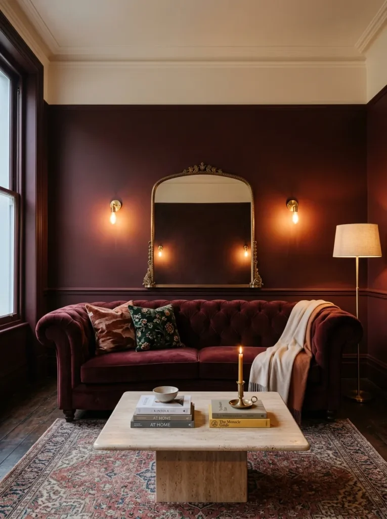
- Walls and trim color-drenched in a deep oxblood (Sherwin-Williams Rookwood Red works beautifully here), so the room reads as one continuous surface
- Tufted oxblood velvet Chesterfield sofa with a low, curved back — softer than the traditional roll-arm version
- Honed travertine coffee table with a rounded edge, warm and matte against the velvet
- Brass wall sconces flanking a vintage arched mirror, plus a tall floor lamp with a linen drum shade for evening warmth
- Cream wool bouclé rug, thick pile, anchoring the seating area
- Bronze linen curtains hung floor-to-ceiling on slim brass rods
- Narrow brass-framed botanical prints grouped in a tight cluster above the console
- A trailing pothos in a raw stone planter, positioned to catch light near the window
Why this works: Oxblood carries enough warmth in its undertone that it never reads as stark, even without much daylight in the room.
I styled a client’s living room in this exact oxblood last spring, and the moment we matched the trim to the wall color, the whole space photographed and felt completely different — cohesive instead of segmented. Oxblood has a warmth that pure black or true red doesn’t carry, so the room never tips into starkness once the sun goes down. The tufted velvet on the sofa also catches ambient light in a way flat paint can’t, which means the seating itself becomes part of the room’s glow rather than just sitting inside it.
Pair the brass sconces with a floor lamp instead of relying on a single overhead fixture, since one light source is almost always what makes a dark room feel flat. Brass hardware throughout, from the curtain rods to the picture frames, keeps the metal story consistent instead of scattered. My husband, who’s spent two decades in construction, always tells clients that a deep, saturated color like this needs a satin or eggshell finish on the walls rather than flat matte — flat paint on a large wall shows every roller mark under sconce light, and satin hides that while still reading as soft.
2. Charcoal Color-Drench
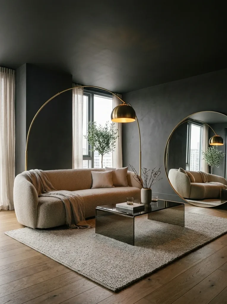
A muted charcoal ceiling paired with matching walls is one of the fastest ways to make a living room feel architecturally intentional rather than accidentally dark — the trick is keeping every surface, including the ceiling, in the same sheen so light travels across the room instead of stopping at a hard edge.
- Ceiling and walls both painted in a soft charcoal (Farrow & Ball’s Down Pipe or similar), same finish throughout
- Curved bouclé sofa in warm oatmeal, a deliberate contrast against the dark envelope
- Smoked glass coffee table with a slim brushed-nickel base
- A sculptural brass arc floor lamp arching over the seating area
- Recessed ceiling lights on a dimmer, supplemented by a single table lamp with an amber-toned shade
- Charcoal and cream striped kilim rug, laid at an angle beneath the sofa
- Oversized round mirror leaning against the wall instead of hung, to bounce window light
- A fiddle-leaf fig positioned near the window, the one plant in the room that needs the most direct light
Why this works: A dark ceiling removes the visual “lid” your eye expects, which is what actually makes the room feel taller instead of smaller.
Color-draining a ceiling sounds counterintuitive, since most people are taught that dark ceilings shrink a room. In practice, the opposite happens when the walls match — the eye stops registering where the wall ends and the ceiling begins, so the room reads as one continuous volume instead of a boxed-in space with a lid on it. This only works with a matte or flat finish on the ceiling specifically, since gloss up there will bounce light unevenly and draw attention to every imperfection in the drywall. The oatmeal bouclé sofa is what keeps the whole look from feeling heavy.
A single overhead source in a fully charcoal room will always look flat and a little clinical, which is why the arced floor lamp and the amber table lamp matter as much as the ceiling color itself. Layer them on separate switches so you can shift the mood from daytime bright to evening low without repainting anything. The leaning mirror does real work here too — it catches whatever window light is available and redirects it back into the room, which a hung mirror at eye level rarely does as effectively.
3. Aubergine & Stone Contrast
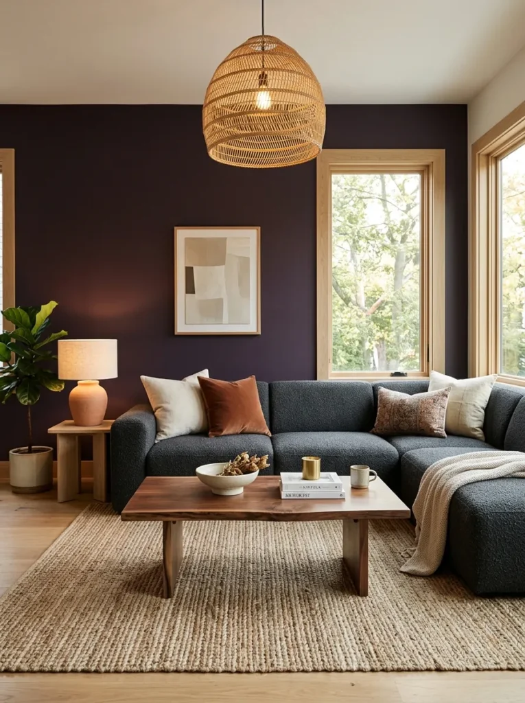
- Deep aubergine walls (a plum-leaning purple, not lavender) with white oak trim left unpainted for contrast
- Low-profile modern sectional in charcoal boucle, no skirting, exposed matte-black legs
- Live-edge walnut coffee table with a raw, unfinished edge
- Woven rattan pendant light as the primary overhead fixture, paired with a pair of ceramic table lamps in a muted terracotta
- Handwoven jute-and-wool blend rug, natural fiber texture against the smooth sectional
- Sheer linen curtains in a soft dove gray, layered under a solid aubergine blackout panel
- A row of trailing string-of-pearls plants on an open floating shelf, staggered at different lengths
- Matte black hardware throughout, from the pendant chain to the shelf brackets
Why this works: Pairing a saturated wall color with raw, natural materials like live-edge wood and jute keeps a bold palette from tipping into something that feels styled rather than lived-in.
Aubergine is one of the more forgiving deep colors to work with because it holds warmth in daylight and depth in the evening without shifting the way true black or navy can under artificial light. I’ve noticed clients hesitate on purple more than any other moody tone, worried it’ll feel dated, but the version that works here leans closer to plum than lavender, which keeps it feeling current rather than nostalgic. Leaving the trim in natural white oak instead of painting it aubergine gives the eye one clean architectural line to rest on, which keeps the room from feeling like a single flat block of color.
The live-edge walnut table and the jute rug do a lot of quiet work in this room, since natural, imperfect materials next to a saturated paint color keep the whole space from reading as too polished or showroom-like. My husband’s crew installs a lot of white oak trim in older Austin homes, and he always notes that unfinished or lightly oiled oak actually deepens in tone over the first year, so the contrast against the aubergine walls will soften naturally rather than staying stark.
4. Deep Emerald Drench
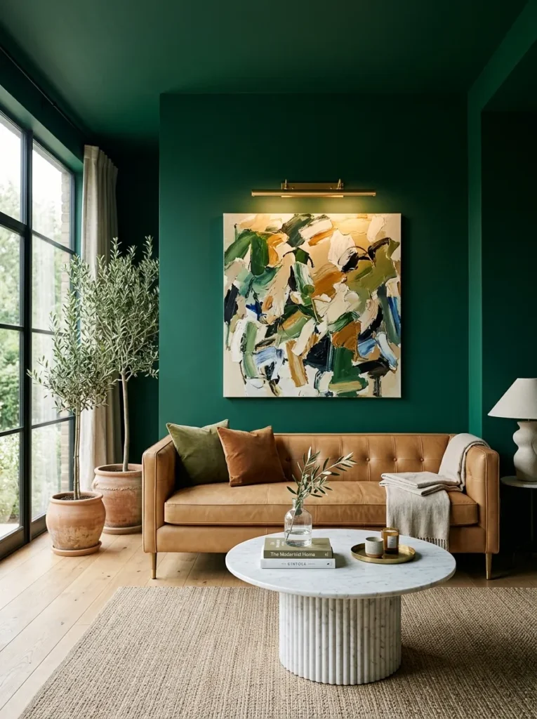
A saturated green like this photographs completely differently depending on the time of day, and that’s exactly the point — it shifts from mossy and enveloping at night to almost jewel-toned when morning light hits it, which is what keeps a color-drenched room from feeling static.
- Walls, trim, and ceiling all painted in a deep emerald-forest green (Benjamin Moore’s Essex Green or similar), single sheen throughout
- Tuxedo sofa in camel leather, clean square arms, brass nailhead trim along the base only
- Fluted marble pedestal coffee table, cream-veined stone, rounded top
- Brass picture-light sconce mounted above a single large abstract canvas instead of a gallery wall
- Woven wool rug in a deep rust and cream stripe, adding warmth against the green
- A pair of tall potted olive trees flanking the window, chosen for their gray-green leaves that echo the wall color without matching it exactly
- Vintage brass floor lamp with an adjustable arm, positioned to read beside the sofa in the evening
- Linen throw pillows in rust and cream, no pattern, just solid color blocking
Why this works: Green is the one moody tone that reads as calming rather than heavy, which is why it works especially well in a living room people actually want to relax in.
The camel leather tuxedo sofa is doing more work in this room than it might seem — leather reflects light differently than fabric does, so even in a fully drenched green room, the sofa itself stays visually bright and keeps the space from tipping into gloom. I chose olive trees here specifically because their foliage has a gray undertone rather than a true green, which means they complement the wall color instead of disappearing into it. That’s a small plant-science detail that makes a bigger visual difference than people expect. The fluted marble table adds just enough shine to keep the room from feeling entirely matte and flat.
One brass picture light over a single statement canvas does more for this room than a full gallery wall would, since a color-drenched space needs fewer competing focal points, not more. I’ve noticed that clients who go dark and bold on the walls often still want to fill every inch with art, and it almost always backfires — the eye needs somewhere to land. Keep the walls as the backdrop and let one piece, one light source, and the marble table carry the visual weight instead.
5. Espresso & Vintage Mix
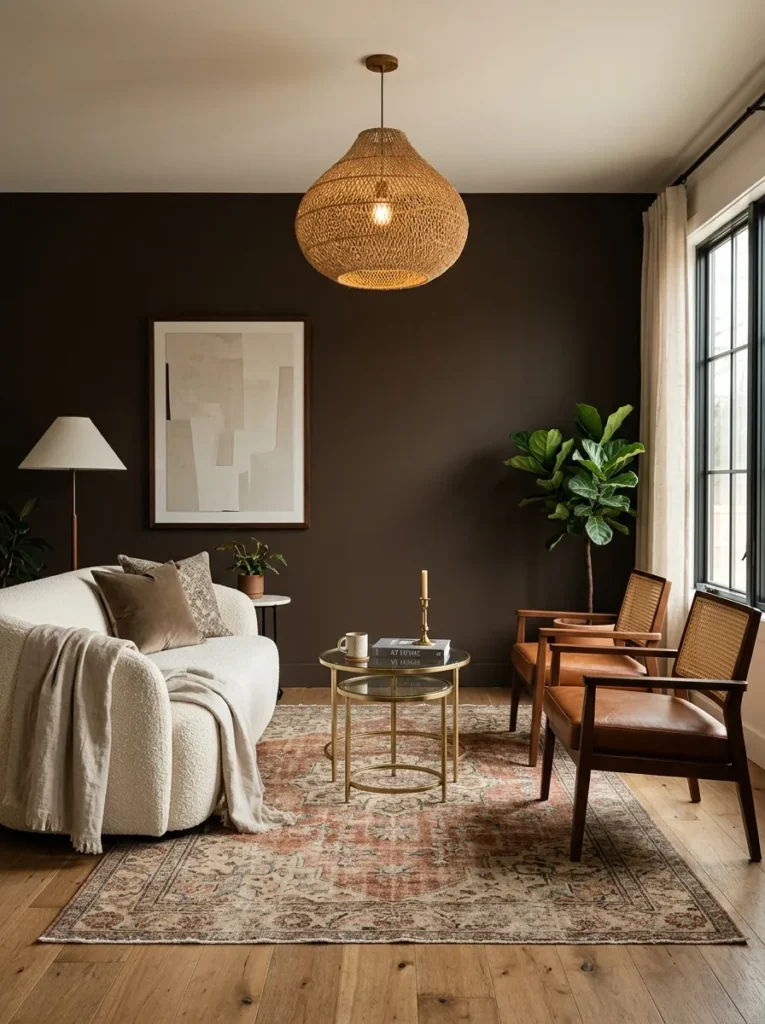
- Deep espresso-brown walls (a near-black brown, not true black) with a warm undertone, high-gloss finish on trim only
- Mixed vintage seating: a curved 1970s-style boucle loveseat in ivory paired with two leather-and-cane accent chairs in cognac
- Round brass-and-glass nesting tables instead of one single coffee table
- A large woven raffia pendant as the primary light, plus a pair of ceramic mushroom lamps on the side tables
- Vintage Moroccan rug in cream, rust, and black, worn-in pattern, layered slightly under the loveseat
- Floor-to-ceiling café curtains in unbleached linen, hung on a slim black rod
- A gallery of small vintage botanical illustrations in mismatched thrifted frames
- A large snake plant in a woven basket, tucked into the corner where light is lowest
Why this works: Mixing seating styles instead of matching a full sofa-and-chairs set is what keeps an espresso room from reading as a furniture showroom.
Espresso brown gets overlooked in moody design conversations because people assume it just means “safe dark brown,” but the warm undertone here is what separates it from something flatter like a true charcoal. I’ve noticed this is the color that skeptical clients — the ones who think they want a moody room but are nervous about full black or navy — end up choosing most often, because it still feels approachable. The high-gloss trim against the matte wall adds a subtle sheen without needing a single reflective surface anywhere else in the room, which keeps the overall look calm instead of busy.
Mismatched vintage seating is doing the real styling work in this space, since a matched sofa-and-loveseat set in a dark room can start to feel formal or showroom-like fast. The cane-and-leather chairs bring texture that fabric alone can’t, and the round nesting tables mean the seating area never feels boxed in by one large rectangular surface. A snake plant tolerates low light better than almost anything else on the market, which makes it the right choice for the dimmest corner of a color-drenched room like this one — most other houseplants would struggle there.
6. Navy Lacquer Contrast
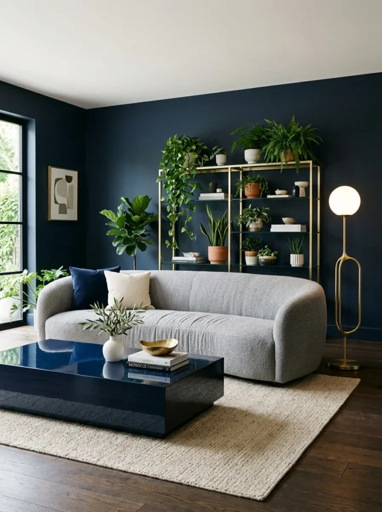
- Deep navy walls in a matte finish, paired with a high-gloss navy lacquered coffee table for a deliberate sheen contrast
- Curved channel-tufted sofa in a soft dove-gray boucle, rounded arms, no exposed legs
- Brass and glass etagere shelving unit in place of a traditional media console
- A sculptural brass floor lamp with a marble base, positioned in the reading corner
- Wool-silk blend rug in navy and ivory, subtle geometric pattern, low pile
- Ivory linen roman shades instead of curtains, keeping the window line clean
- A cluster of trailing pothos and a single large monstera on the etagere shelves, mixing leaf shapes and sizes
- Polished brass hardware throughout, from the shelving frame to the lamp base
Why this works: Navy paired with a lacquered finish on just one piece is one of the simplest ways to add drama to a moody room without introducing a second wall color.
Navy has a reputation for being the “safe” moody color, which is fair, but the lacquered coffee table is what keeps this version from feeling predictable. High-gloss lacquer reflects the room back at itself, so even a single piece of furniture in that finish adds a sense of depth and movement that flat navy walls alone can’t create. The curved sofa softens what could otherwise feel like a very geometric, hard-edged room, and the dove-gray boucle keeps enough lightness in the seating that the space never tips into feeling somber, even on an overcast Austin afternoon.
I mixed pothos and monstera on the same shelving unit deliberately, since varying leaf size and shape reads as more intentional than a uniform row of identical plants — it’s a small styling trick that comes straight from my plant-science background, and it makes even simple greenery feel curated rather than default. The brass etagere also solves a real functional gap in dark rooms: open shelving with a light metal frame doesn’t absorb visual weight the way a solid wood media console would, so the room keeps breathing room even with storage built in.
7. Ink Black Minimalism
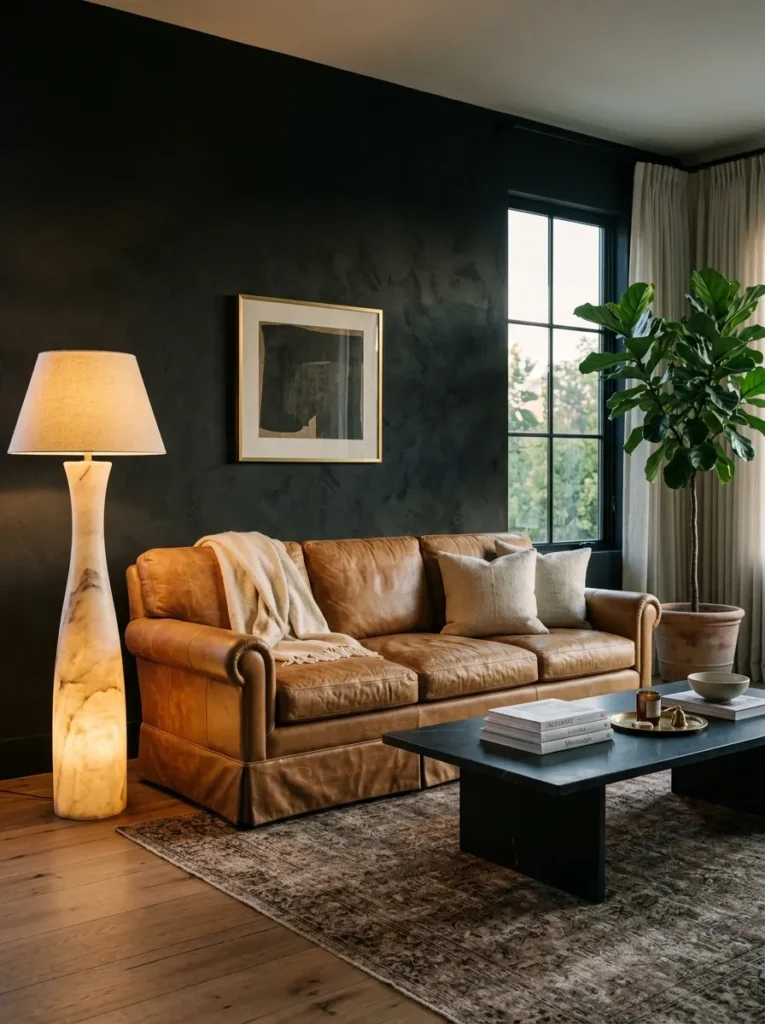
True black walls sound extreme until you see them paired with enough texture and warmth in the furnishings — the color itself recedes, and everything placed against it becomes the visual focus instead.
- Matte black walls (Benjamin Moore’s Black Panther or similar) with a soft black plaster ceiling for a slightly textured, non-flat finish
- English roll-arm sofa in a warm camel leather, traditional silhouette softened by a lower back height
- Black soapstone coffee table, honed and slightly irregular in shape
- A single oversized alabaster floor lamp, its warm glow reading almost golden against the black
- Chunky, undyed wool rug in natural cream, unbleached and nubby underfoot
- Linen curtains in a warm ivory, hung high and wide to maximize the window opening
- One large-scale black-and-white photograph, framed in unfinished oak, as the sole wall art
- A single mature fiddle-leaf fig, no other greenery, positioned as the room’s one living focal point
Why this works: A true black room only reads as sophisticated instead of oppressive when the furnishings bring in enough warmth and texture to counter it.
Black walls are the one choice in this whole list I’d tell a nervous client to test with paint samples over several days before committing, since the color shifts dramatically between morning and evening light. The soft plaster ceiling texture matters more than people expect — a flat black ceiling can feel like a lid pressing down, but the same color with visible texture reads as intentional and architectural instead. The camel leather sofa is really the anchor of the entire room; without that warmth, black walls alone can tip cold fast.
I kept the styling in this room deliberately sparse, with one lamp, one plant, and one photograph, because a true black backdrop doesn’t need competing focal points the way a lighter room might. My husband’s team has poured black soapstone counters in a few kitchen remodels, and the same material works beautifully as a coffee table surface here — it’s naturally matte, resists fingerprints better than marble, and has a warmth to its dark tone that glass or lacquer can’t replicate.
8. Deep Teal Jewel Tone
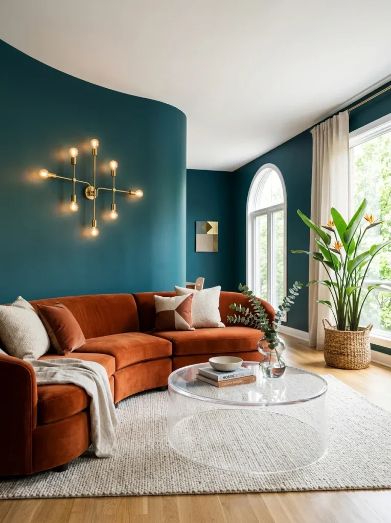
- Deep teal walls with a slight blue undertone (Farrow & Ball’s Inchyra Blue leans close), eggshell finish for subtle sheen
- Curved wraparound sectional in a rich burnt-orange velvet, the one true color-pop piece in the room
- Lucite coffee table with rounded edges, chosen specifically to keep the floor space feeling open
- A dramatic multi-arm brass sconce cluster mounted above the sectional instead of a single fixture
- Vintage Persian-style rug in teal, rust, and cream, worn-in and slightly faded
- Bamboo roman shades layered under sheer ivory curtain panels
- A gallery of small framed botanical sketches, hung in a tight grid rather than scattered
- A large bird-of-paradise plant in a woven seagrass basket, its broad leaves echoing the room’s curved lines
Why this works: Teal and burnt orange sit almost opposite each other on the color wheel, which is what gives this room its visual charge without needing a single patterned textile.
Teal is often treated as a safer, more neutral cousin of navy, but the version here leans bold on purpose, and the burnt-orange sectional is what makes that commitment pay off. Complementary color pairings like this one create genuine visual energy in a way that tone-on-tone neutrals never quite can, which matters in a room this size where the sectional itself becomes the focal point. The lucite table was a deliberate choice to counter how visually heavy a curved sectional this large can feel — a solid wood or stone table here would have crowded the floor plan.
I’ve seen this exact teal-and-orange pairing intimidate people on a paint chip, and then completely win them over once the rug and curtains soften the contrast in person. The multi-arm brass sconce cluster solves a real lighting gap that a single flush-mount fixture leaves in rooms with a large sectional, since it throws light across a wider span of the seating area instead of pooling in the center. Bamboo shades layered under sheer curtains also let in daytime light without washing out the wall color.
9. Cognac & Cocoa Layering
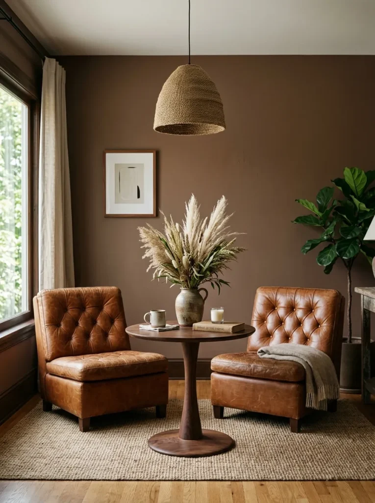
- Warm cocoa-brown walls (a lighter, more caramel-leaning brown than the espresso room, closer to Sherwin-Williams Cavern Clay’s darker cousin), flat matte finish
- Pair of oversized cognac leather slipper chairs facing each other instead of a traditional sofa-and-chairs layout
- Round pedestal table in warm walnut, positioned between the two chairs as a shared surface
- A large woven pendant in natural jute, hung low over the seating cluster
- Vintage kilim runner layered beneath the chairs, geometric pattern in rust, cream, and cocoa
- Café curtains in unbleached linen, hung at window height only to keep the architectural trim visible
- A tall dried pampas arrangement in a stoneware vessel, chosen for texture over color
- Aged brass hardware, slightly unlacquered, on every fixture for a warmer patina than polished brass
Why this works: Two facing chairs instead of a sofa changes the entire feel of a room, making it read as a space for conversation rather than passive TV-watching.
Skipping the sofa entirely is a choice I don’t recommend for every living room, but in a smaller space, or a second sitting room off the main living area, two substantial chairs facing each other creates a completely different social dynamic. It signals that the room is for actual conversation, not just facing a television, and cognac leather ages beautifully over time in a way that fabric upholstery simply doesn’t. The cocoa wall color reads noticeably lighter than a true espresso or black, which makes this layout feel intimate rather than cave-like even without much furniture filling the floor.
The dried pampas arrangement is doing more textural work here than a fresh plant would, since its pale, feathery texture is the only light-value element in an otherwise deeply warm-toned room, and it needs zero maintenance. I’ve noticed unlacquered brass hardware is a detail most people skip, assuming polished brass is the only option, but the unlacquered finish develops a soft, uneven patina within months that suits a room built around aged leather and vintage textiles far better than anything shiny would.
10. Golden Ochre Drench
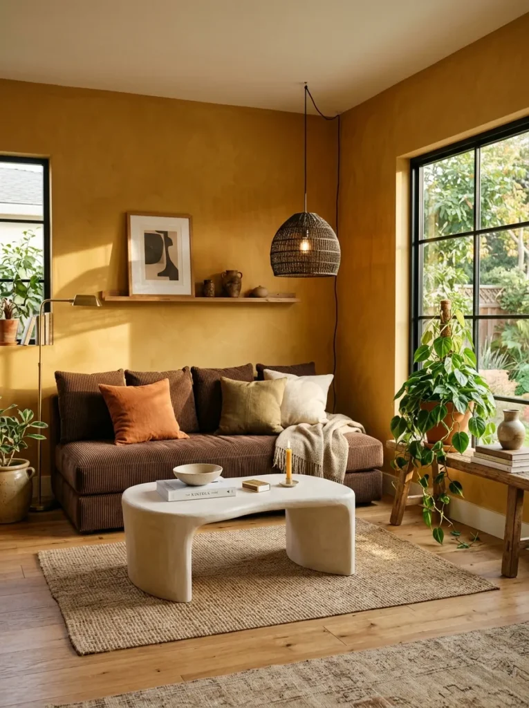
Ochre is the color skeptics come around to fastest, since it holds enough gold undertone to feel sunlit even in a room with limited natural light — it’s warm in a way that reads as inviting rather than heavy.
- Walls and trim color-drenched in a deep golden ochre (Farrow & Ball’s India Yellow leans close, though slightly muted here), matte finish throughout
- Low, wide platform sofa in chocolate-brown corduroy, deep-seated and skirtless
- Rounded plaster coffee table in warm white, hand-finished with visible trowel texture
- A single large woven pendant in dark rattan, hung low, paired with a floor-level uplighter in the corner
- Vintage Turkish rug in ochre, brick, and cream, faded and irregular
- Unlined linen curtains in a warm cream, left slightly loose rather than tailored
- A grid of small unframed botanical prints, pinned directly to the wall with brass clips
- A cluster of trailing philodendron in terracotta pots, staggered on a low wooden bench near the window
Why this works: Ochre carries a gold undertone that reflects warm light back into the room, which is why it’s one of the few deep colors that can work in a space with only moderate natural daylight.
I recommended ochre to a client who was nervous about anything darker than beige, and it ended up being the color that convinced her the whole moody-room approach could work in her space. Unlike navy or charcoal, ochre doesn’t cool down a room as the light fades in the evening — it actually holds its warmth, which matters if your living room doesn’t get strong afternoon sun. The plaster coffee table’s hand-finished texture keeps the whole look from feeling too polished, since a smooth lacquered surface would fight with the corduroy sofa’s texture instead of complementing it.
Pinning unframed prints directly to the wall instead of hanging framed art is a small detail that keeps this room feeling collected rather than decorated, and it’s inexpensive enough to change seasonally if you want to. The floor-level uplighter in the corner does real work here, throwing light up the wall to soften any shadow the rattan pendant leaves behind. A room with only one overhead source almost always needs a second light at a completely different height to avoid feeling flat.
11. Warm Greige Layering
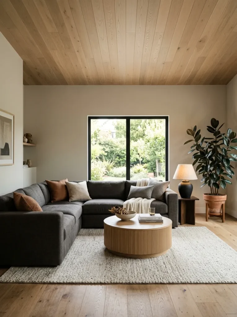
A soft, warm greige can carry just as much mood as a true black or navy when the layering is right — the depth here comes from texture and contrast rather than a saturated pigment, which makes it the most approachable entry point into moody design for anyone new to the look.
- Walls in a warm greige with a taupe undertone (Sherwin-Williams Balanced Beige’s deeper, dustier cousin), flat finish, paired with a stained white oak ceiling treatment overhead
- Deep-seated modular sectional in charcoal linen, low back, no visible legs
- Fluted oak coffee table with a rounded top, echoing the ceiling’s wood tone
- Sculptural ceramic table lamp in a matte black glaze, paired with recessed ceiling lights on a warm dimmer
- Chunky wool rug in oatmeal and charcoal, undyed and nubby
- Woven wood blinds instead of curtains, left mostly raised to keep the window line open
- A large abstract textile wall hanging in cream and charcoal, unframed
- A mature rubber plant in a matte black planter, its glossy leaves the one high-shine element in the room
Why this works: Contrast between a matte greige wall and a warm wood ceiling does the visual work that a bolder wall color would otherwise have to carry alone.
Greige gets dismissed as too safe for a moody room, but the stained oak ceiling is what changes the equation entirely — it introduces warmth and depth overhead, which most rooms never use as a design surface at all. I’ve noticed that clients hesitant about committing to a fully saturated wall color often land here instead, and the room still reads as intentional and layered rather than default-neutral. The charcoal sectional grounds the space visually, giving it enough weight that the lighter wall color doesn’t feel washed out or indecisive next to it.
The rubber plant’s glossy leaves matter more than they might seem, since almost everything else in this room is intentionally matte, and a single reflective surface keeps the whole space from feeling flat under the recessed lighting. My husband’s crew has installed stained wood ceilings in a handful of Austin remodels, and he always notes that a warm stain reads dramatically differently under morning light versus lamp light, so it’s worth viewing samples at both times of day before committing to the full ceiling treatment.
12. Indigo & Brass Depth
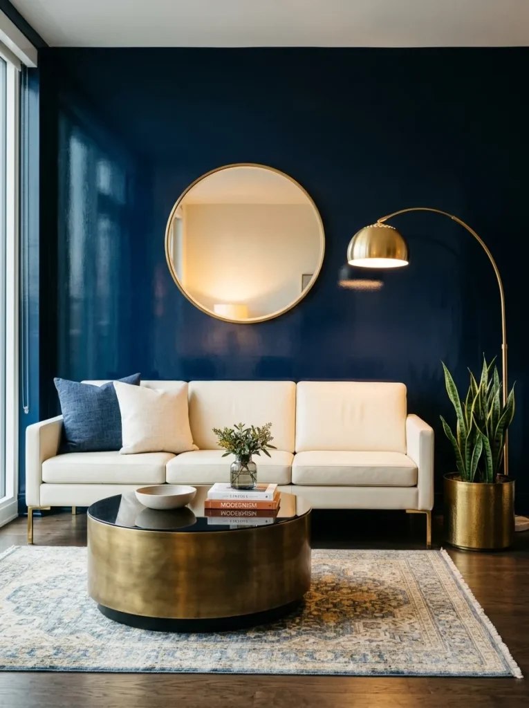
Indigo sits deeper and more violet than navy, which gives it a richness that reads as more editorial and less predictable than the moody blue most people default to first.
- Deep indigo walls (a blue leaning noticeably toward violet, distinct from a standard navy), high-gloss lacquer finish for maximum depth and reflection
- Curved bench-style sofa in ivory boot-cut leather, no visible seams, rounded arm detail
- Antique brass drum coffee table with a smoked glass top
- An oversized brass arc floor lamp paired with a pair of small brass wall sconces flanking a large round mirror
- Silk-wool blend rug in indigo and ivory, subtle ombré pattern, low pile
- Floor-to-ceiling ivory velvet curtains, pooling slightly at the floor
- A single large-scale abstract painting in indigo, cream, and brass tones, unframed canvas
- A mature snake plant in a polished brass planter, positioned to catch light near the sconces
Why this works: A high-gloss finish on a deep indigo wall multiplies whatever light exists in the room, which is what keeps a violet-leaning blue like this from reading as cold or flat.
Indigo is the color I reach for when a client wants the drama of navy but doesn’t want their living room to look like every other moody-blue room they’ve seen on Pinterest. The violet undertone shifts how the color behaves entirely — it warms up under lamp light in a way standard navy doesn’t, which matters enormously once the sun goes down. The high-gloss lacquer finish on the walls was a deliberate choice here, since a flat finish on a color this saturated can feel almost too serious, while the gloss keeps bouncing light around the room throughout the day.
Brass is the anchor metal in this room, appearing on the coffee table, the lamp, the sconces, and even the planter, and that consistency is what keeps a room with this many reflective surfaces from feeling chaotic. The pooling velvet curtains add a formal, tailored note that balances the curved, casual sofa shape. I’ve noticed rooms with a single dominant metal finish photograph more cohesively than ones mixing brass, nickel, and black hardware, even when each piece is beautiful on its own.
13. Saffron Mustard Statement
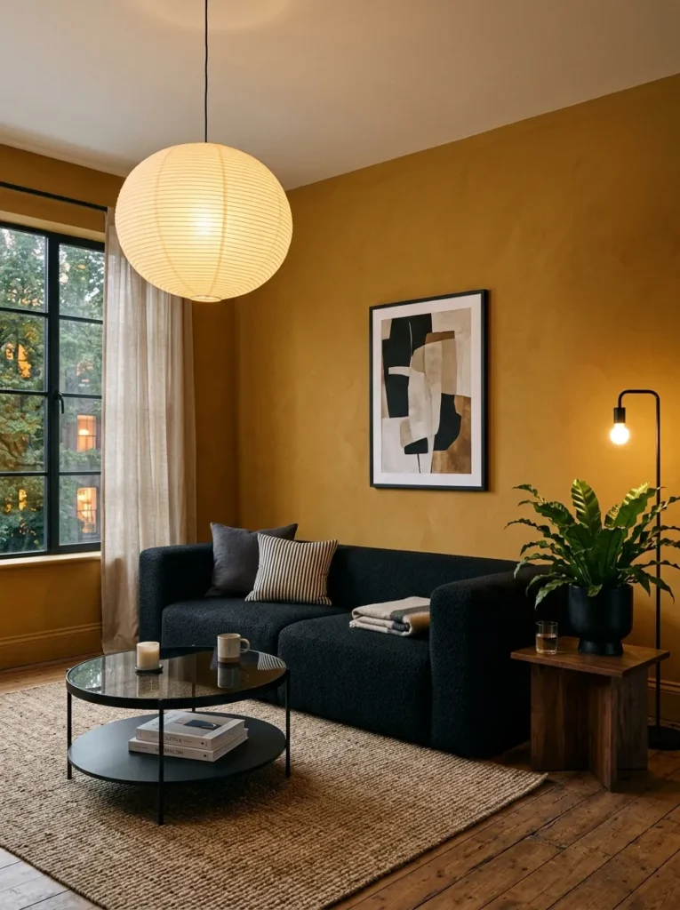
Mustard yellow rarely shows up in moody design because people assume yellow can only read as bright and cheerful, but a deep, dusty saffron leans warm enough to hold its own alongside black, brass, and deep wood tones.
- Deep saffron-mustard walls (a dusty, muted yellow — closer to Farrow & Ball’s India Yellow’s warmer, deeper cousin than a true bright yellow), matte finish
- Boxy, low-profile sofa in black bouclé, square arms, no visible legs
- Round black iron coffee table with a smoked glass top, minimal and slightly industrial
- A single oversized paper-and-bamboo pendant light, warm and diffused, paired with a black metal floor lamp with an adjustable arm
- Flatweave rug in mustard, black, and cream, geometric block pattern
- Unlined linen curtains in deep charcoal, hung floor to ceiling for contrast against the warm wall
- A large black-and-white abstract print, framed in thin black metal
- A mature bird’s nest fern in a black ceramic pot, chosen for its compact shape against the bold wall color
Why this works: Pairing a warm saturated yellow with black furnishings keeps the color from tipping into anything precious or overly sweet, giving it real editorial weight.
Mustard is the color I get the most pushback on before a client sees it in person, since it carries associations with dated 1970s interiors that have nothing to do with how it actually reads at this depth and saturation. The black furniture and hardware throughout are doing the heavy lifting here, grounding the warmth of the walls so the room feels bold and current rather than nostalgic. Charcoal curtains instead of anything cream or white were a deliberate choice too, since a lighter curtain would soften the contrast this room depends on to feel intentional rather than accidental.
I’ve noticed that a fully saturated yellow room needs fewer decorative objects than almost any other color story on this list, since the wall itself is doing so much visual work that anything extra starts to compete rather than complement. The paper pendant’s diffused glow keeps the mustard from looking flat or one-dimensional at night, while the adjustable black floor lamp lets you redirect light exactly where you’re reading or working without adding a second fixture to the ceiling.
14. Cobalt Blue Drama
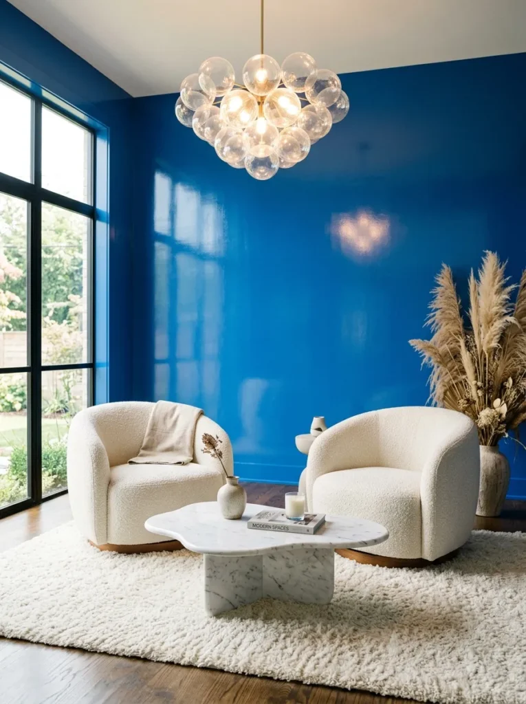
Cobalt sits far brighter and more saturated than navy or indigo, which makes it the boldest blue on this list and the one best suited to a room that wants genuine visual energy rather than quiet restraint.
- Deep cobalt-blue walls (a true, saturated blue — distinctly brighter than navy, closer to Benjamin Moore’s Blue Danube at full strength), high-gloss finish
- Curved barrel-back chairs in pairs, upholstered in natural boucle, no traditional sofa in this layout
- Sculptural white marble coffee table with a freeform, organic edge
- A dramatic glass bubble chandelier as the primary fixture, paired with slim brass reading lamps beside each chair
- Ivory shag rug, deep pile, anchoring the seating cluster
- White linen roman shades, kept simple against the saturated wall
- A single large ceramic vase with dried bunny tail grasses, no wall art in this room at all
- A pair of trailing pothos in white ceramic pots, positioned symmetrically on either side of the window
Why this works: A fully saturated blue this bright needs almost no other color competing for attention, which is why the palette here stays deliberately restrained to white, ivory, and brass.
Cobalt is the boldest color choice in this entire collection, and it’s not one I’d recommend for a first-time moody room, but for someone ready to commit, it delivers a level of drama that softer blues simply can’t match. The high-gloss finish is essential here, since a flat or matte cobalt this saturated can start to feel almost overwhelming in a large room, while the gloss keeps the color feeling alive and reflective rather than heavy. Skipping wall art entirely was intentional, letting the wall color itself function as the room’s primary visual statement.
The white marble coffee table and ivory shag rug are doing critical work in this space, since without that lightness underfoot and at eye level, the cobalt could easily tip into feeling like a showroom stunt rather than a livable room. I’ve seen this exact blue used in a sunroom conversion, and the way it shifted from almost teal in morning light to a deep, true cobalt by evening was one of the most dramatic color transformations I’ve styled — worth knowing before you commit to a north-facing versus south-facing room.
15. Amethyst Velvet Depth
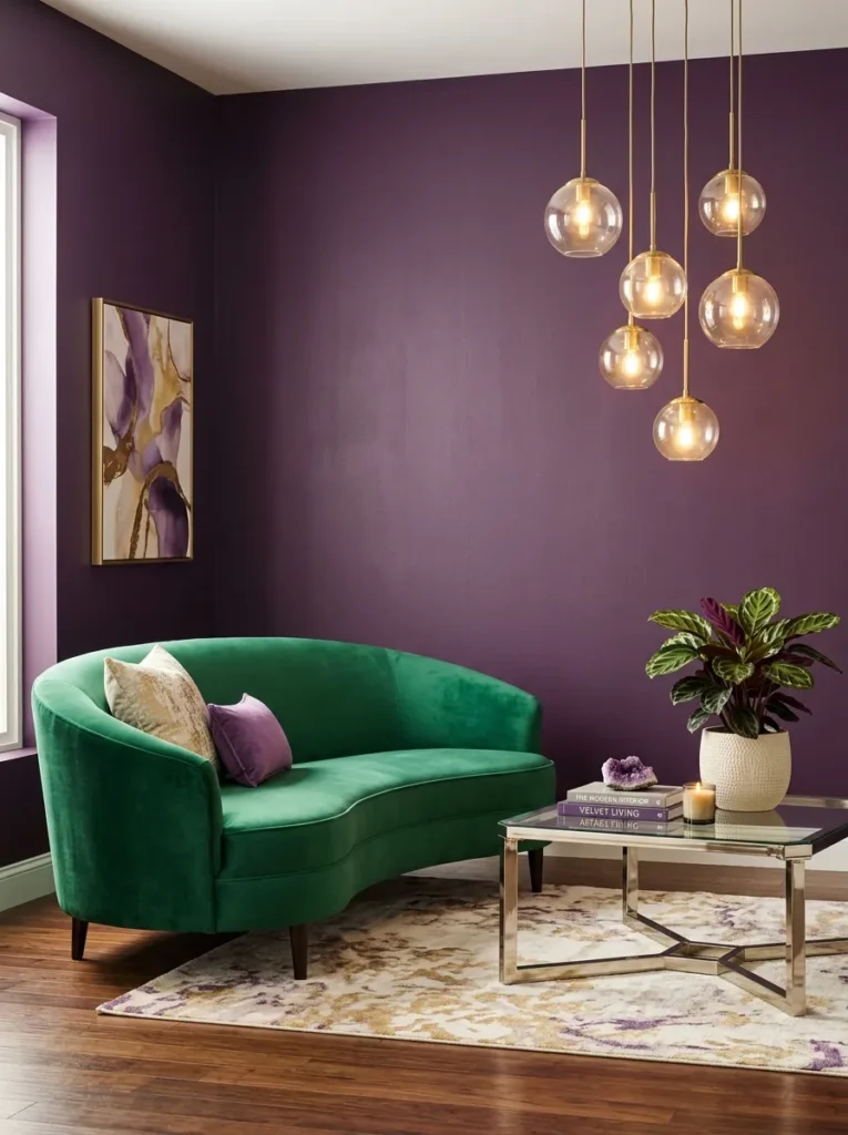
This amethyst leans brighter and more violet than the aubergine used earlier in this list, sitting closer to a true jewel-toned purple rather than a muted plum, which gives it a distinctly different energy in the room.
- Deep amethyst-purple walls (a true violet-purple, brighter and more saturated than aubergine), eggshell finish
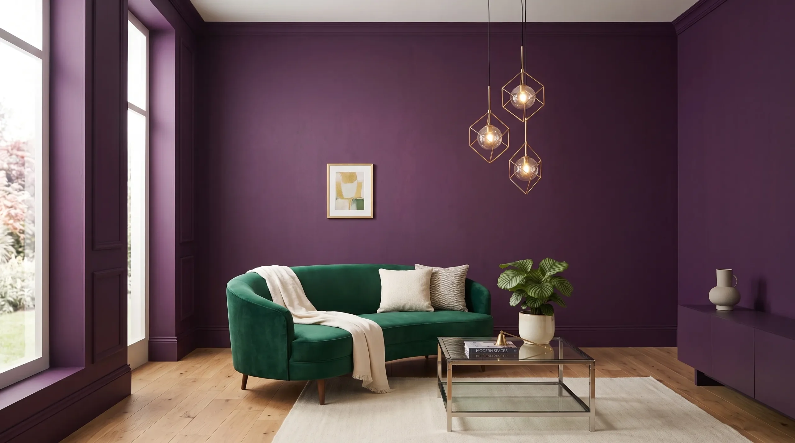
- Curved settee in emerald-green velvet, positioned as an unexpected color pairing rather than a matching sofa
- Polished nickel and glass coffee table, cylindrical base, kept simple against the bold palette
- A cluster of small brass pendant lights at varying heights above the settee, plus a single tall reading lamp in the corner
- Cream wool rug with a subtle diamond pattern, low pile
- Sheer blush-toned curtains layered under solid amethyst blackout panels
- A gallery of small round mirrors in mixed brass and nickel frames, clustered asymmetrically
- A large calathea plant in a cream ceramic pot, its patterned leaves echoing the room’s jewel-tone energy
Why this works: Purple and green sit next to each other on the color wheel, which creates a softer, more harmonious contrast than a true complementary pairing while still feeling unexpected.
Amethyst is a purple I’d steer a client toward if they loved the idea of aubergine but wanted something with more energy and less earthiness — the two colors read as completely different moods despite both technically being purple. Pairing it with emerald velvet instead of a more predictable neutral sofa was a choice built around how close the two colors sit on the color wheel, which keeps the combination feeling cohesive rather than jarring. The clustered brass pendants above the settee replace what would typically be a single overhead fixture, spreading light more evenly across a room where every surface carries color.
I styled a reading nook in this exact combination for a client who described herself as someone who “hates beige,” and the round mirror gallery ended up being the detail everyone asked about first, since it bounces both the amethyst and the emerald back into each other in a way flat art never could. The calathea’s patterned leaves were chosen specifically to tie the two dominant colors together visually without needing another accent piece to do that work.
Styling Principles: How to Layer a Moody Living Room Without It Feeling Like a Cave
The single biggest mistake I see when someone tries this look for the first time is treating “moody” as just “dark paint.” Real moody design rests on three techniques working together, not one bold wall color doing all the work alone.
Tone-on-tone first. Painting trim, doors, and millwork the exact same color as the walls removes the visual break that would otherwise read as brightness contrast. That missing break is what makes a room feel enveloping instead of patchy — it’s the single most important technique on this whole list, and it’s also the one most people skip because it feels counterintuitive to paint trim anything but white.
Texture contrast second. A room that’s one saturated color needs at least three different textures to avoid feeling flat: something soft (velvet, bouclé, wool), something hard and reflective (marble, glass, lacquer), and something raw or natural (rattan, jute, unfinished wood). Velvet against stone, matte plaster against polished brass — that friction between textures is what separates an editorial room from one that just looks dim.
Light layering third, and most underexplained. A single overhead fixture is almost never enough in a dark-walled room. Plan for at least three light sources at three different heights — overhead, lamp height, and floor or accent height — each on its own switch or dimmer if possible. This is the detail that determines whether a moody room feels curated or just poorly lit after sunset.
On the material side: for large saturated wall areas, a satin or eggshell finish holds up better than flat matte, since flat paint shows every roller mark and imperfection under lamp light, while a slight sheen hides those flaws while still reading as soft. My husband’s crew sees this mistake constantly on repaint jobs — clients choosing flat finish for drama, then complaining the wall looks patchy once furniture and lighting go in.
Frequently Asked Questions About Moody Living Room Ideas
Is a moody living room too dark for everyday use? Not if lighting is planned in layers. A room with three light sources at different heights — overhead, lamp, and floor or accent lighting — functions just as well for daily use as any lighter room, and can be dimmed for evening or brightened for daytime tasks.
What’s the best paint finish for dark living room walls? Satin or eggshell is generally the better choice over flat matte for large wall areas, since it hides minor imperfections and roller marks while still reading as soft rather than shiny. Reserve high-gloss for smaller accent areas like trim or a single furniture piece.
How do you keep a moody room from feeling too dark or cave-like? Layer at least three light sources at varying heights, choose one wall finish with slight sheen rather than flat matte, and include at least one high-reflectivity object — a mirror, glass, or polished metal — to bounce available light back into the room.
What’s a budget-friendly way to try the moody living room trend? Start with a single accent wall in a saturated tone, add one warm-toned lamp instead of relying on overhead lighting alone, and layer in texture through an affordable vintage or natural-fiber rug rather than repainting an entire room at once.
Can a small living room handle a fully moody color palette? Yes — color-draining a small room in one continuous tone, including the ceiling and trim, often makes it feel larger and more intentional than painting it a light, “safe” color, since it removes the visual stopping points that make a small room feel choppy.
Does a moody living room work in a space with limited natural light? Warmer moody tones — deep ochre, cognac, cocoa, or oxblood — perform better in low-light rooms than cooler tones like charcoal or true black, since their warm undertones reflect available light rather than absorbing it.
Conclusion
A moody living room isn’t about turning down the lights — it’s about building a room with real depth, warmth, and intention, one texture and one light source at a time. Whichever of these fifteen moody living room ideas speaks to you, whether it’s the drama of cobalt or the quiet warmth of cocoa and cognac, the same principles apply: match your trim to your walls, layer your lighting, and let texture do the work color alone can’t.
I’ve seen how much a few of these changes can transform a space from flat to genuinely striking. Save this post to Pinterest, pick one idea to try first, and share it with anyone who’s been afraid to go bold.