15 Dark Blue and Gold Bedroom Ideas for a Regal, Modern Retreat
A dark blue and gold bedroom is one of those looks that photographs beautifully but somehow feels impossible to pull off yourself — until you understand what’s actually happening in the rooms that work. This isn’t about picking any navy paint and adding a gold mirror. It’s about undertone, finish, and full-room commitment, and that’s exactly what most decor roundups skip. I’ve painted more than one bedroom in my own home chasing this exact palette, and I’ve learned the difference between a room that looks staged for a single photo and one that feels genuinely finished, every surface considered, nothing left to chance.
Dark blue and gold bedroom ideas tend to outlast most “moody bedroom” trends, and there’s a real reason for that. Deep blue’s psychological association with depth and calm, combined with gold’s warm reflectivity, creates a natural warm-cool contrast that’s been used in royal and ecclesiastical design for centuries — long before “moody decor” became a hashtag. I noticed it firsthand repainting our guest room: the same navy that felt heavy under plain white trim turned genuinely elegant the moment we swapped in brushed brass hardware. That’s exactly what this post solves — fifteen ways to build that contrast properly, undertone by undertone, finish by finish.
True Navy & Brushed Brass
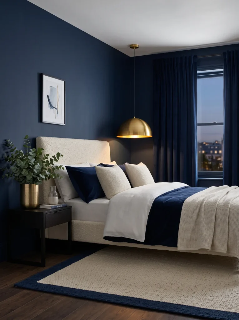
- Walls: True navy, no green or violet cast, painted in a soft eggshell finish that holds a gentle sheen under lamp light
- Bedding: Navy velvet duvet layered under an ivory linen coverlet folded back at the foot, brushed brass-toned piping along the pillow edges
- Wall decor: One oversized abstract canvas in navy and gold-leaf brushstrokes, hung slightly off-center above the headboard
- Plants: Eucalyptus in a brushed brass planter — its silvery-blue leaves echo the wall color instead of fighting it
- Hanging element: A dome-shaped brass pendant with a warm 2700K bulb, hung low over one nightstand
- Rug: Ivory wool rug with a woven navy border
- Curtains: Floor-length navy velvet, hung close to the ceiling to draw the eye upward
- Furniture: Curved boucle headboard in warm white, walnut nightstands with brushed brass pulls
Why this works: A true navy with zero undertone reads consistently rich at every hour of the day, which is what keeps a dark bedroom from feeling flat.*
True navy earns its name because it holds no visible undertone — not violet, not green, just pure saturated blue — and that clarity is what makes it feel formal rather than moody. Paint retailers often mislabel deep blues as “navy” when they’re actually indigo or petrol underneath, and that mismatch is why so many navy bedrooms look flat under lamp light. A genuine true navy, tested in both daylight and evening glow before you commit to a gallon, reads consistently rich at every hour. That reliability is rare in dark colors, which is exactly why designers reach for it first.
Brushed brass is the quieter of the gold finishes, and that’s precisely why it pairs so well here — the navy is already doing the dramatic work across walls, curtains, and bedding. I’ve noticed that homeowners who commit to navy on every surface often panic halfway through and add a neutral color to “break it up,” which actually weakens the whole effect. Keeping every layer in the same blue family, from velvet drapery to duvet, is what makes a room photograph like a single cohesive scene instead of a mismatched collection. Brushed brass simply catches the light across it.
Indigo Nights
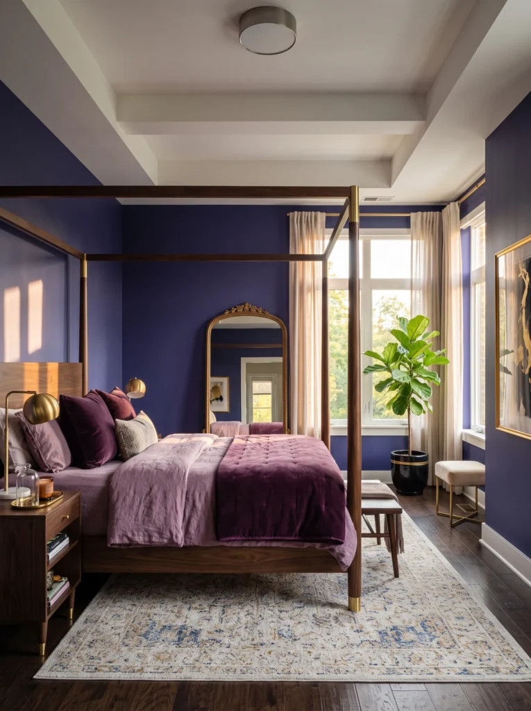
I painted my sister’s guest room in what she swore was “navy” and it turned violet the second the sun went down — that’s indigo doing what indigo does. Indigo carries a genuine violet-blue undertone, which makes it the warmest-reading of the deep blues once the light shifts to evening, and it’s the one I recommend most for bedrooms that get heavy afternoon sun.
- Walls: Indigo with a visible violet-blue cast, matte finish to keep the color soft rather than glassy
- Bedding: Indigo linen sheets layered with a deep-blue velvet coverlet folded at the foot
- Wall decor: A leaned, arched mirror in antique gold, propped against the wall rather than hung
- Plants: Fiddle leaf fig in a matte indigo-and-gold ceramic pot, positioned to catch afternoon light
- Hanging element: A trio of small brass sconces flanking the mirror instead of a pendant
- Rug: Indigo flatweave rug with a thin gold thread border, low pile
- Curtains: Indigo velvet drapery, pooling slightly at the floor
- Furniture: Four-poster bed in dark walnut with antique gold cap details on each post
Why this works: Indigo’s violet undertone reads warmest of all the deep blues at sunset, which makes it the better choice for west-facing bedrooms.*
Violet-leaning walls sound risky until you see them at 7 p.m., when the whole room turns a deeper, glowing blue that no true navy can replicate. That shift is a real optical effect, not decorating folklore — indigo pigments scatter warmer light differently than true blues, which is why the color feels alive rather than static across a day. In a west-facing room especially, indigo avoids the flat, almost gray look that navy can take on once direct sun hits it. Keeping bedding, curtains, and rug all within the same indigo family lets that shift read across the entire room, not just one wall.
The four-poster brings a formality that indigo can carry without tipping into costume-drama territory, especially with the antique gold kept to the post caps rather than spread across the whole frame. My husband, who’s built more four-posters into custom homes than he can count, always tells clients to leave the top open rather than adding a canopy in a room this dark — a full canopy blocks too much of the ceiling light and makes a violet-leaning wall feel like it’s closing in. Open posts keep the drama without the heaviness.
Petrol & Antique Gold
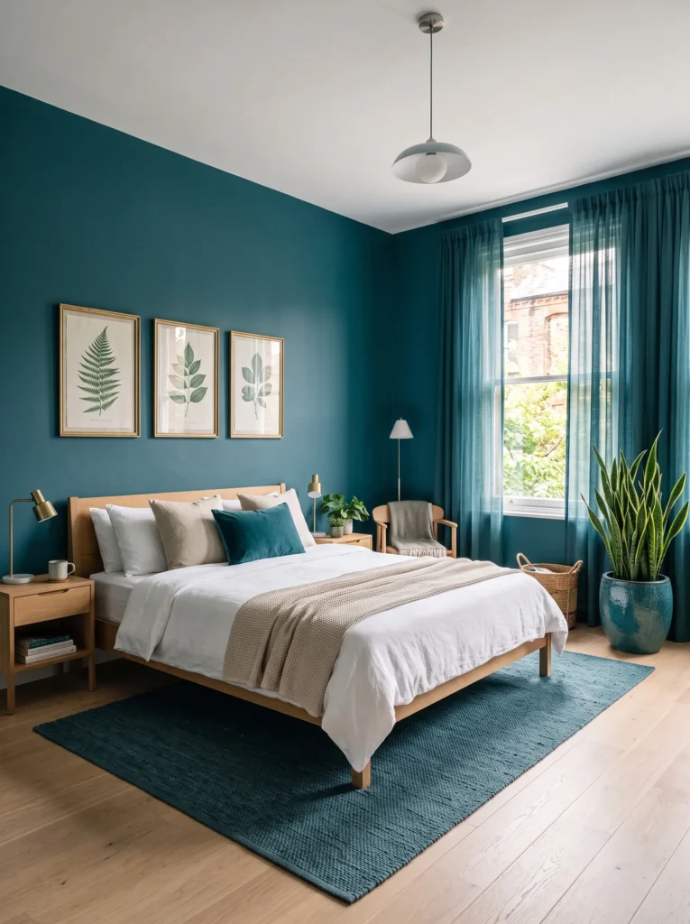
- Walls: Teal-leaning petrol, a blue with genuine green undertone, in a low-sheen satin finish
- Bedding: Petrol-blue linen duvet with a single brass-toned pillow for contrast
- Wall decor: A gallery of three small navy-toned botanical prints in slim antique gold frames
- Plants: Snake plant in a fluted ceramic pot glazed in deep petrol, chosen for its upright, architectural line
- Hanging element: A woven rattan pendant with brass fittings, adding texture against the smooth wall
- Rug: Petrol-blue flatweave rug with a subtle tonal pattern
- Curtains: Sheer petrol-toned linen, letting filtered daylight soften the wall at midday
- Furniture: Low platform bed in white oak, antique gold drawer pulls on the nightstands
Why this works: Petrol’s green undertone is the deep blue that reads best alongside natural materials like jute and rattan, since it shares warmth with wood tones that true navy doesn’t.*
Petrol is the deep blue most people don’t think to try, and that’s a mistake, because its green undertone bridges naturally with wood, rattan, and jute in a way true navy simply can’t. A room built entirely on stark navy and metal can start to feel sterile by year three; petrol avoids that by pulling warmth from the same family as your oak floors and woven textures, while every soft surface — bedding, rug, curtains — still stays firmly within the blue palette. The result is a bedroom that feels grounded and cohesive rather than showy. It’s the version of this palette I’d recommend to someone nervous about going “too cold” with an all-over dark blue room.
Antique gold earns its keep here because polished or brushed brass would fight the matte, earthy quality of the jute and rattan. The slightly darkened, worn look of antique gold instead sits alongside those natural textures like it’s always belonged there. I’ve seen this pairing work especially well in older homes with existing wood trim, since antique gold doesn’t compete with honey-toned floors the way a bright polished finish can. It’s a subtler, more collected look — closer to something inherited than something bought.
Midnight Ink Retreat
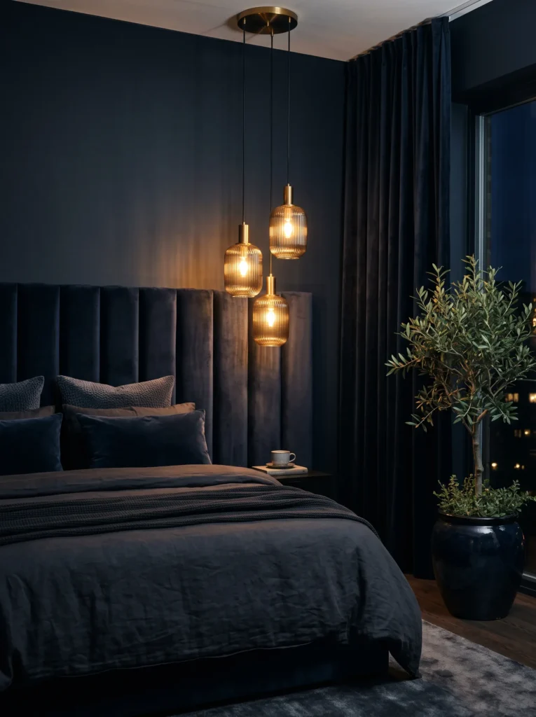
Midnight blue sits so close to black that most people assume it needs bright, high-shine gold to keep it from disappearing into a cave — but the opposite is usually true.
- Walls: Midnight ink, a near-black blue with a warm undertone, painted in a soft matte to avoid flashing under light
- Bedding: Midnight-blue linen with a champagne-gold quilted throw
- Wall decor: A single large round mirror in burnished gold, mounted off-center
- Plants: Olive tree in a tall midnight-blue glazed pot, its silvery-green leaves standing out sharply against the dark wall
- Hanging element: A cluster of three small hanging glass pendants with burnished gold hardware
- Rug: Midnight-blue bouclé rug, dense pile for warmth underfoot
- Curtains: Blackout linen in matching midnight ink, nearly disappearing into the wall
- Furniture: Channel-tufted wingback headboard in midnight-blue velvet, burnished gold legs on both nightstands
Why this works: A near-black wall paired with warm, low-shine gold creates depth instead of gloom, because matte finishes absorb light while gold reflects it selectively.*
A near-black wall reads as dramatic, not oppressive, the moment you introduce a light source with real warmth behind it — which is why the pendant cluster matters more here than in almost any other idea in this list. Midnight ink absorbs so much ambient light that a cold white bulb will flatten the whole room, but a warm 2700K glow bouncing off burnished gold hardware creates pockets of depth instead. Because the headboard, curtains, and rug all stay within the same near-black blue, the room reads as one continuous, enveloping space rather than a patchwork of dark and light zones. It’s the boldest idea here, and also the coziest once it’s lit correctly.
My husband always flags matte finish as non-negotiable for a color this dark, and he’s right for a reason most decor advice skips entirely: a satin or eggshell sheen on near-black paint bounces light unevenly and shows every roller mark and wall imperfection under lamp light. Matte absorbs those inconsistencies instead of highlighting them, which matters even more in a low-light bedroom where you’re often viewing the wall from a bed at an angle. It’s a small technical detail that makes the difference between a wall that looks intentional and one that looks like a paint mistake.
You’ll Also Love:15 Lavender & Purple Bedroom Ideas to Love
Slate-Blue Serenity
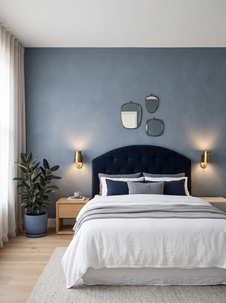
- Walls: Soft slate-blue, a muted dark blue with a gray undertone, painted in a chalky matte finish for a quiet, contemplative feel
- Bedding: Slate-blue linen duvet layered with a deeper navy throw blanket folded diagonally across the foot
- Wall decor: A trio of small round mirrors in aged brass, clustered asymmetrically above the headboard
- Plants: Rubber plant in a tall slate-blue ceramic pot, its glossy dark green leaves adding depth without introducing a new color
- Hanging element: A slim brass reading sconce mounted on each side of the bed instead of table lamps
- Rug: Slate-blue wool rug with a subtle ribbed texture, low pile
- Curtains: Floor-length slate-blue linen with a faint sheen, hung on slim brass rods
- Furniture: Upholstered arched headboard in navy velvet, aged brass legs on both nightstands
Why this works: A gray-leaning blue reads as calm rather than dramatic, which makes it the easiest dark blue to live with long-term in a primary bedroom.*
Slate-blue is the deep blue for people who love the moody-bedroom look but worry about it feeling too intense every single morning. The gray undertone softens the saturation just enough that the room reads restful rather than theatrical, especially with matte walls absorbing rather than bouncing light. I’ve noticed this is the shade most guests ask about, because it photographs as dramatic but feels genuinely calming to actually sleep in. Aged brass, rather than anything polished, keeps the whole room from tipping into anything too glossy or showroom-bright.
The arched headboard softens the room’s geometry, which matters more than people expect in a space this saturated — hard, square lines against an all-over dark color can start to feel boxy by the second year. A curved silhouette breaks that up without introducing a single new color into the palette. The brass sconces mounted directly on the wall, rather than table lamps, also free up nightstand space and keep the surfaces feeling uncluttered. It’s a small functional choice that ends up doing real visual work too.
Cobalt Statement Wall
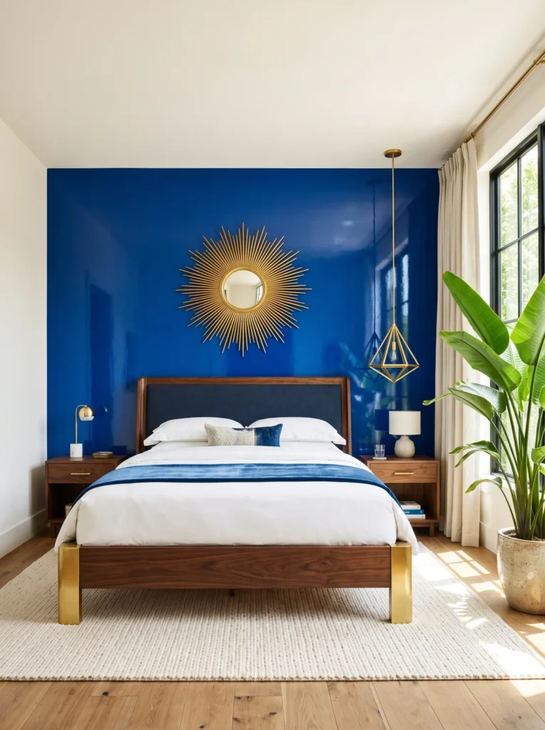
Most people go dark and moody with every wall in the room, but a single saturated cobalt accent wall can carry the entire palette on its own — and it’s less commitment than you’d think.
- Walls: Cobalt blue on one accent wall behind the bed, remaining walls in a soft warm white, cobalt in a high-gloss finish for maximum saturation
- Bedding: Warm white linen duvet with a cobalt-blue piped edge and one cobalt velvet lumbar pillow
- Wall decor: A single oversized sunburst mirror in polished gold, centered above the headboard
- Plants: Bird of paradise in a tall polished gold planter, its broad leaves creating dramatic height beside the cobalt wall
- Hanging element: A sculptural gold pendant with an angular, geometric shape, hung slightly off-center
- Rug: Warm white flatweave rug with a thin cobalt border
- Curtains: Warm white linen with a cobalt-blue trim along the leading edge
- Furniture: Sleigh bed in dark walnut with polished gold cap details on the footboard
Why this works: A single high-gloss cobalt wall creates more visual drama per square foot than four matte navy walls, because gloss finishes amplify saturated color under any light source.*
A single cobalt wall works harder than an entire room of navy because gloss finish amplifies color saturation in a way matte paint physically can’t — light bounces off a glossy surface and intensifies the blue instead of absorbing it. That’s why one wall of high-gloss cobalt behind the bed can feel just as bold as four walls of a flatter, darker blue, while leaving the rest of the room in warm white to keep things from feeling closed in. It’s the approach I recommend most for smaller bedrooms, where four dark walls can genuinely shrink a space that a single accent wall won’t.
Polished gold is the right finish here because a high-gloss wall needs an equally reflective metal to feel intentional rather than mismatched. The sunburst mirror and the angular pendant both catch and scatter light across the glossy cobalt in a way brushed or antique gold simply wouldn’t. I’ve seen homeowners try to soften this look with a matte gold finish, and it ends up making the whole wall look like an unfinished mistake rather than a deliberate contrast. Keep the shine levels matched, and the drama reads as designed.
Sapphire Depths
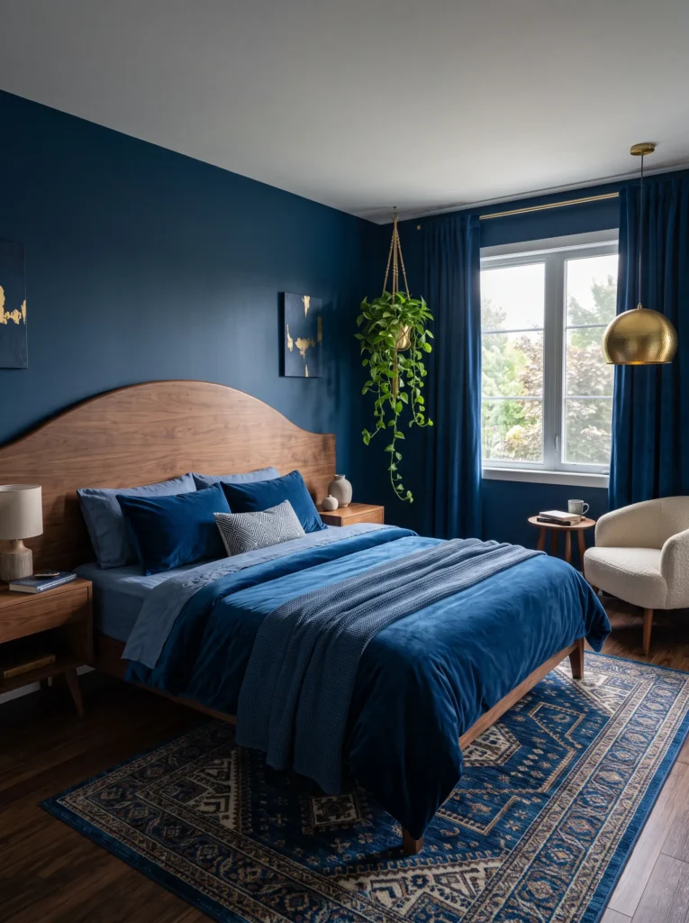
I once used this exact sapphire-blue in a client’s north-facing bedroom because she was terrified a dark color would make the room feel like a cave — it did the opposite, and it’s become my go-to recommendation for rooms that don’t get much sun.
- Walls: Deep sapphire blue, a jewel-toned blue with just a whisper of purple, painted in a soft satin finish that catches available light without glare
- Bedding: Sapphire velvet duvet with a deep-blue linen sheet set underneath, no contrasting neutral layer
- Wall decor: A tall, narrow leaned art piece featuring abstract gold brushwork on a sapphire ground
- Plants: Pothos trailing from a hanging brass macramé holder near the window, its vines softening the room’s straight lines
- Hanging element: The trailing pothos itself, alongside a single hammered gold pendant over the reading nook
- Rug: Sapphire-blue Moroccan-style rug with a raised pile texture
- Curtains: Sapphire velvet drapery, floor-length and fully lined for a formal, enveloping effect
- Furniture: Curved wood headboard stained dark walnut, hammered gold hardware on the dresser
Why this works: A saturated jewel-toned blue with a satin finish reflects more available light than a flat matte color, which is why it performs better than expected in low-light, north-facing rooms.*
North-facing bedrooms get consistent, cool, indirect light all day, and that’s exactly the condition a deep sapphire thrives in — the satin finish catches what little direct light there is and reflects it back into the room, rather than absorbing it the way a flat matte navy would. Homeowners nervous about “going too dark” in a room with limited sun almost always default to pale gray instead, but that choice often reads as dull and lifeless under consistently flat light. Sapphire, by contrast, holds its saturation and richness even without direct sun hitting it, which is exactly why it photographs so well in these rooms.
Hammered gold brings texture into a room that’s otherwise built on smooth velvet and glossy satin walls, which keeps the whole space from feeling one-dimensional. I like it paired with trailing pothos specifically because the plant’s cascading vines soften every hard edge in the room — the headboard’s curve, the pendant’s geometry, the rug’s border. That combination of a textured metal and a trailing plant is what keeps an all-blue room from reading as flat or overly matched, even though every surface stays firmly within the same jewel-toned family.
Prussian Blue Library Corner
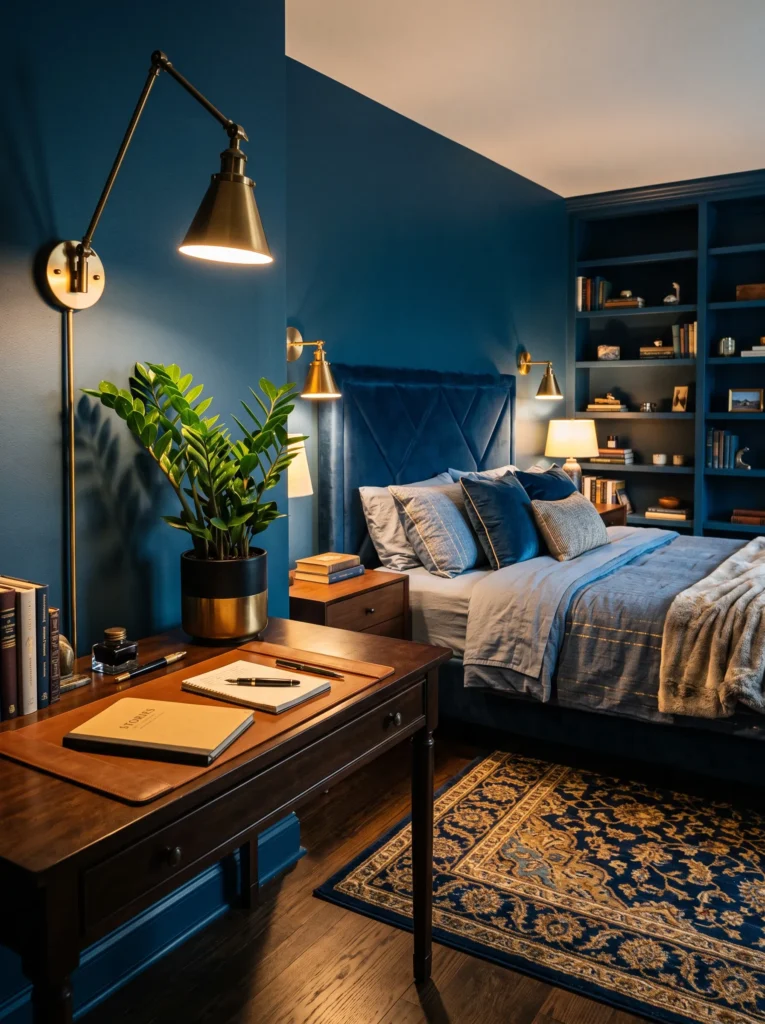
- Walls: Prussian blue, a deep, ink-rich blue with a slightly green-black depth, painted in a soft matte finish across all four walls
- Bedding: Prussian-blue linen duvet with a subtle gold-thread embroidered edge, kept minimal and unfussy
- Wall decor: Built-in floor-to-ceiling shelving painted to match the walls, with brass book-edge trim on each shelf
- Plants: ZZ plant in a matte black-and-gold ceramic pot, chosen for its glossy, deep green leaves that hold up in lower light
- Hanging element: A brass library sconce with an adjustable arm, mounted beside the headboard for reading
- Rug: Prussian-blue Persian-style rug with fine gold detailing woven through the pattern
- Curtains: Prussian-blue velvet, floor-length, with a slim gold tieback
- Furniture: Upholstered panel headboard in matching Prussian-blue velvet, brass hardware on a vintage-style writing desk in the corner
Why this works: Matching the built-in shelving to the wall color rather than painting it white removes visual breaks in the room, making a small bedroom feel larger and more intentional.*
Prussian blue has a depth that reads almost bottomless, especially once you commit to painting built-in shelving the exact same color as the walls instead of the standard white trim. That continuity removes the visual interruption a white bookshelf creates against a dark wall, which is a trick I picked up from staging smaller bedrooms where every break in color made the room feel choppier and smaller than it actually was. The gold book-edge trim and brass sconce then become the only bright notes in the room, which makes them stand out far more than they would against a busier, multi-toned wall.
A reading corner works especially well in this palette because Prussian blue has historically been associated with ink, libraries, and old-world scholarship, so the mood already leans studious before you add a single book. The vintage-style writing desk in the corner reinforces that without needing any additional color — its brass hardware simply echoes the sconce and the shelf trim. This is the idea I’d point to for anyone who wants a bedroom that also functions as a quiet workspace, without breaking the all-blue-and-gold rule anywhere in the room.
Denim Steel & Matte Gold
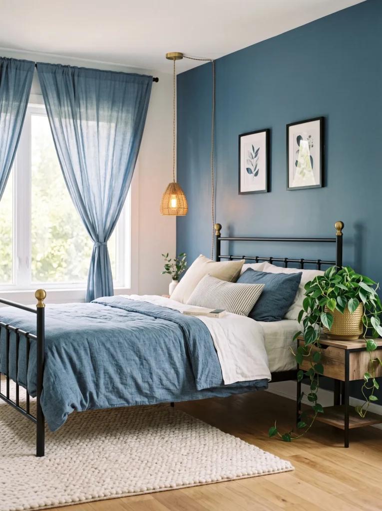
A dark blue bedroom doesn’t have to feel formal — steel-toned denim blue is the version that reads relaxed and lived-in rather than polished, and it’s the one I’d choose for a teenager’s room or a casual guest space.
- Walls: Denim-steel blue, a dark blue with a soft gray-blue cast reminiscent of raw denim, painted in an eggshell finish
- Bedding: Denim-blue washed linen duvet, deliberately relaxed and slightly rumpled rather than crisply pressed
- Wall decor: A row of small framed botanical sketches in slim matte gold frames, hung in a straight horizontal line
- Plants: Philodendron in a matte gold hammered-texture pot, its heart-shaped leaves trailing casually over the pot’s edge
- Hanging element: A woven cord pendant light with a matte gold canopy, hung centrally
- Rug: Denim-blue chunky knit rug, casual and textural underfoot
- Curtains: Denim-blue cotton-linen blend, unlined for a softer, more casual drape
- Furniture: Low iron bed frame in matte black with matte gold finial details on each corner
Why this works: A soft, gray-cast denim blue with matte gold reads casual rather than formal, proving this palette works for relaxed spaces, not just formal primary bedrooms.*
Denim-steel blue takes the same dark, saturated logic as navy or sapphire but softens it with a visible gray cast that keeps the room from feeling formal. That distinction matters because most dark blue bedroom advice assumes every reader wants a grand, hotel-suite look, when plenty of people want the richness of a dark palette in a room that still feels casual enough for everyday life. The unlined cotton-linen curtains and chunky knit rug reinforce that relaxed feeling, while the iron bed frame keeps the furniture from reading as too precious or ornate.
Matte gold is the finish that makes this idea work, because anything polished or high-shine would immediately push the room back toward formal territory. I’ve noticed matte gold gets overlooked in a lot of dark blue rooms simply because it’s less flashy in photos, but it’s actually the finish that reads most current in 2026 interiors — quieter, more architectural, less obviously “glam.” Paired with the philodendron’s casual trailing leaves, the whole room feels collected over time rather than staged in a single afternoon.
Ultramarine Evening Glow
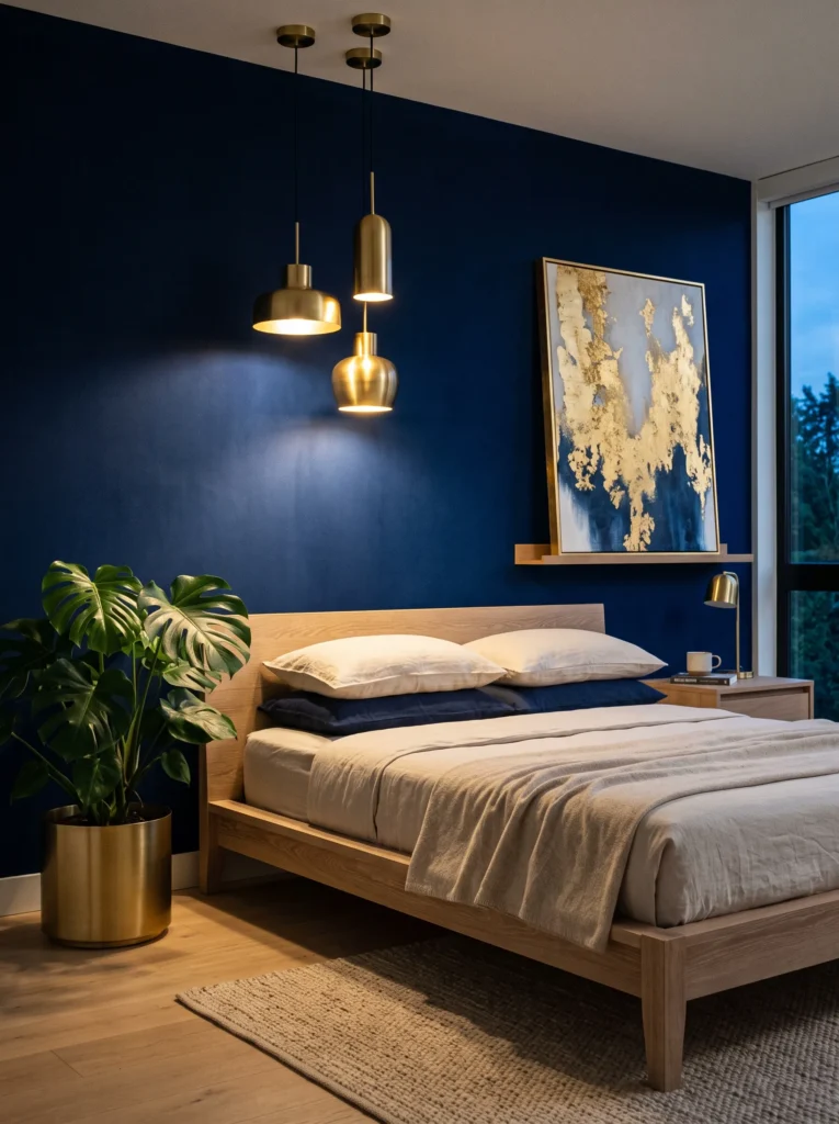
- Walls: Ultramarine blue, a vivid, saturated dark blue with a true cool cast, painted in a soft velvet-matte finish for depth without glare
- Bedding: Ultramarine linen duvet layered with a warm white waffle-weave throw folded at the foot
- Wall decor: A large-scale abstract art piece in gold leaf and ultramarine tones, unframed and leaned directly against the wall
- Plants: Monstera in a tall brushed gold cylinder planter, its dramatic split leaves adding sculptural height beside the bed
- Hanging element: A cluster of three staggered brass pendant lights at varying heights, hung above the nightstand
- Rug: Ultramarine flatweave rug with a hand-knotted fringe edge
- Curtains: Ultramarine linen with a subtle brass grommet detail along the top edge
- Furniture: Curved, low-profile platform bed in bleached oak, brushed gold legs
Why this works: Staggering pendant heights rather than using a single fixture creates layered evening light that flatters a saturated wall color the way one flat overhead source never can.*
Ultramarine is the most saturated, true-cool blue in this entire lineup, and it needs layered light to look its best rather than a single overhead fixture doing all the work. The staggered brass pendant cluster creates pools of warm light at different heights across the wall, which catches the paint’s velvet-matte finish and reveals depth that flat lighting would flatten completely. This is a detail most decor advice skips entirely, focused instead on paint color alone, but lighting placement genuinely changes how saturated a dark blue wall reads at night versus during the day.
The bleached oak platform bed is a deliberate contrast against how intense the wall color is — a dark wood frame here would have pushed the room toward feeling heavier than it needs to. Instead, the pale, curved bed frame lets the ultramarine walls stay the star of the room while the monstera’s split leaves add organic movement against all that saturated color. I’ve found this combination photographs particularly well at dusk, when the staggered pendants are lit but daylight is still faintly visible through the curtains.
Steel Blue & Hammered Gold
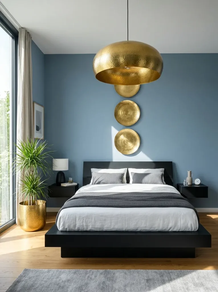
- Walls: Steel blue, a dark blue with a cool metallic cast, painted in a matte finish that reads almost like brushed metal from a distance
- Bedding: Steel-blue linen duvet with a hammered gold-toned trim along the pillow edges, kept crisp and tailored
- Wall decor: A large circular hammered gold disc mounted directly on the wall, functioning as sculptural art rather than a mirror
- Plants: Dracaena in a tall hammered gold cylinder pot, its narrow upright leaves reinforcing the room’s clean vertical lines
- Hanging element: A single oversized brass hammered pendant, hung low and centered over the bed
- Rug: Steel-blue wool rug with a subtle geometric weave
- Curtains: Steel-blue linen, tailored and structured rather than flowing, hung just above the window frame
- Furniture: Angular platform bed in matte black steel, hammered gold hardware on floating nightstands
Why this works: Hammered gold’s uneven, textured surface catches light unpredictably across a matte wall, adding visual movement to a palette that could otherwise feel too flat and uniform.*
Steel blue is the coolest, most architectural version of dark blue in this entire lineup, and it needs a metal finish with genuine texture to keep the room from feeling sterile. Hammered gold solves that instantly — its uneven surface catches and scatters light unpredictably, which creates movement across an otherwise flat, matte wall. This is the idea I’d point to for anyone drawn to a more minimalist, architectural bedroom rather than a soft or romantic one. The floating nightstands and angular steel bed frame reinforce that same clean, structural feeling throughout the room.
I’ve noticed that steel blue rooms can start to feel cold if every metal surface is smooth and polished, which is exactly why hammered gold matters here more than in almost any other idea. Its texture does the warming work that a softer color palette would normally handle. The oversized pendant, hung low and centered, becomes a genuine focal point rather than just a light source, and the dracaena’s narrow vertical leaves echo the room’s overall geometric restraint without adding any new color.
Twilight Blue Canopy
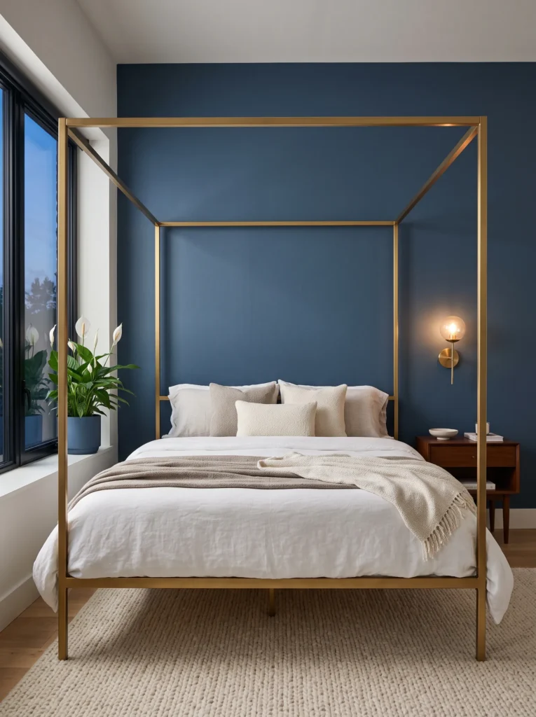
Open canopy frames get dismissed as fussy or old-fashioned, but strip away the heavy fabric and keep just the iron structure, and a canopy bed becomes one of the most striking things you can do in a dark blue room.
- Walls: Twilight blue, a dark blue with the faintest violet-gray dusk quality, painted in a soft matte finish
- Bedding: Twilight-blue linen duvet, layered simply with no additional throw to keep focus on the frame above
- Wall decor: Minimal — a single small brass sconce beside the bed rather than art, letting the canopy be the room’s focal point
- Plants: Peace lily in a tall twilight-blue glazed pot near the window, its dark green leaves and white blooms offering subtle contrast
- Hanging element: The open iron canopy itself, finished in brushed gold, with nothing draped across it
- Rug: Twilight-blue bouclé rug, soft and dense underfoot
- Curtains: Twilight-blue linen, floor-length, hung just outside the canopy’s footprint so the two don’t visually compete
- Furniture: Open four-poster canopy frame in brushed gold iron, matching brushed gold nightstands
Why this works: An open, undraped canopy frame reads as architectural sculpture rather than dated bedroom fussiness, giving a dark blue room a strong focal point without adding fabric or clutter.*
Most people picture heavy drapery the moment they hear “canopy bed,” which is exactly why this version feels so unexpected — strip the fabric away entirely and what’s left is a striking brushed gold iron structure that functions more like sculpture than bedding. Against twilight blue’s soft, dusk-toned walls, the open frame becomes the clear focal point of the room without needing a single piece of hanging fabric. That restraint is what keeps the whole space feeling current rather than like a dated bedroom set. It’s a genuinely surprising way to use a canopy frame that most dark blue bedroom guides never mention.
Twilight blue itself sits between true navy and a soft violet-gray, giving it a quality that shifts depending on the time of day — brighter and cooler at noon, softer and almost lavender-adjacent at dusk. That subtle shift pairs naturally with the room’s minimal styling, since there’s little else competing for attention besides the canopy frame and a single sconce. The peace lily’s white blooms become the only non-blue, non-gold element in the entire room, and even that stays close enough to white and green to feel intentional rather than like a color departure.
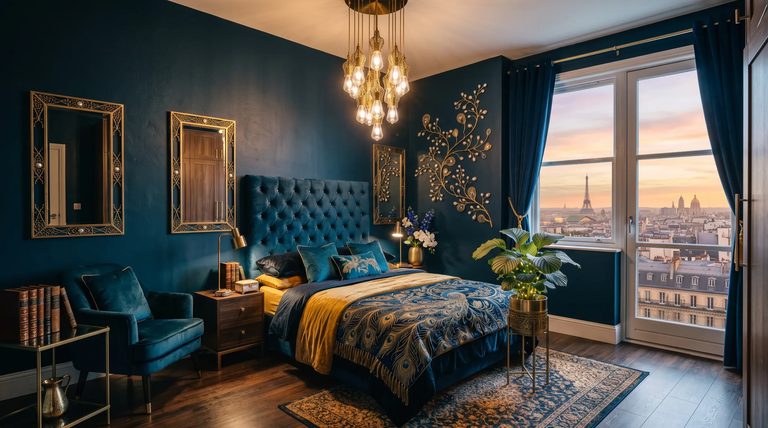
Peacock Blue-Black Drama
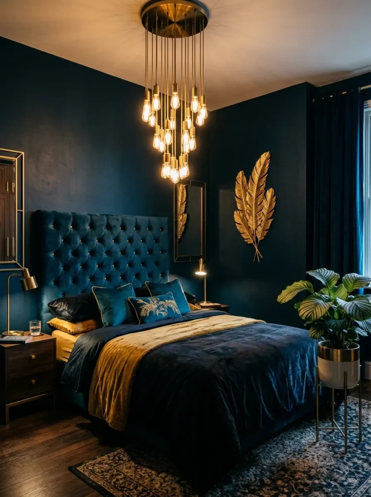
- Walls: Peacock blue-black, the darkest and most saturated blue in this collection, with a subtle iridescent undertone, painted in a low-sheen finish
- Bedding: Peacock-blue velvet duvet, richly textured, with no additional patterned layer needed
- Wall decor: A single large gold-leafed feather-motif art piece, echoing the “peacock” name without being literal or kitschy
- Plants: Calathea in a small gold-rimmed black ceramic pot, its patterned leaves adding subtle organic detail against the intense wall
- Hanging element: A cascading brass chandelier-style fixture with multiple small bulbs, hung centered above the bed
- Rug: Peacock-blue velvet-pile rug, plush and deep underfoot
- Curtains: Peacock-blue velvet, floor-length and fully lined, pooling generously at the floor
- Furniture: Diamond-tufted upholstered headboard in peacock-blue velvet, gold-capped bun feet on the bed frame
Why this works: The most saturated blue in a palette should always carry the least busy decor around it, since intensity needs visual quiet to avoid overwhelming the room.*
Peacock blue-black is as deep and saturated as this palette gets, sitting right at the edge of appearing black in low light and revealing its iridescent blue quality only when light hits it directly. That intensity is exactly why this room needs the least busy decor of anywhere in this collection — one art piece, one plant, one light fixture, nothing competing for attention. The diamond-tufted headboard adds texture without adding visual noise, since it stays within the same velvet and same color as everything else in the room. This is the idea for someone who wants maximum drama and isn’t afraid of full commitment.
The cascading brass fixture earns its place as the room’s single ornamental gesture, catching light across its small bulbs and scattering warm glints across the velvet curtains and rug below. I’ve found that a room this saturated actually looks more expensive with fewer objects in it, not more — every additional piece competes with a wall color this rich instead of complementing it. The calathea’s patterned leaves are the only textural detail allowed to break the smooth velvet surfaces, and even that stays small and contained in a single corner.
Storm Blue Reading Nook
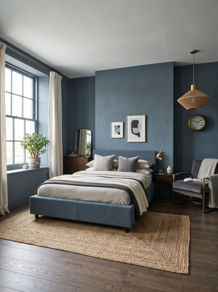
Rainy days made me realize storm blue is underused in bedrooms — it’s the one dark blue that photographs beautifully even under flat, overcast light, which is exactly the condition most bedrooms actually get.
- Walls: Storm blue, a dark blue-gray with a stormy, atmospheric quality, painted in a chalky matte finish
- Bedding: Storm-blue washed linen duvet, deliberately textured and relaxed rather than crisp
- Wall decor: A weathered brass ship’s clock mounted on the wall, a small nod to nautical heritage without leaning into a full theme
- Plants: Jade plant in a small weathered gold-rimmed pot on the windowsill, chosen for its resilience in lower-light corners
- Hanging element: A woven jute-and-brass pendant hung over a small armchair reading nook in the corner
- Rug: Storm-blue flatweave rug beneath the reading nook, layered over a larger storm-blue bouclé rug covering the room
- Curtains: Storm-blue linen, unlined, letting soft gray daylight filter through even on overcast days
- Furniture: Low, bench-style upholstered bed frame in storm-blue boucle, weathered brass legs on the reading armchair
Why this works: A gray-cast storm blue is the one dark blue that doesn’t rely on bright direct sunlight to look good, which makes it the most forgiving choice for rooms with inconsistent natural light.*
Storm blue is the most forgiving dark blue in this entire collection because it doesn’t depend on bright, direct sunlight to look its best — the gray undertone actually holds up better under flat, overcast conditions than brighter blues like cobalt or ultramarine do. That’s a real practical advantage for anyone in a climate with a lot of cloudy days, since so much decor advice assumes ideal golden-hour lighting that most bedrooms simply don’t get. The reading nook in the corner leans into that atmospheric, contemplative quality rather than fighting it, giving the room a genuine everyday function beyond just sleeping.
The weathered brass ship’s clock is a small, specific detail that nods to storm blue’s nautical undertone without turning the whole room into a theme. I’ve found that one well-chosen weathered object does more for a room’s character than several matching brass pieces would, since it reads as collected rather than coordinated. The jute-and-brass pendant over the armchair adds warmth and texture to the nook specifically, separating it slightly from the bed area while keeping the entire room within the same storm-blue and gold family.
Royal Blue Velvet Suite
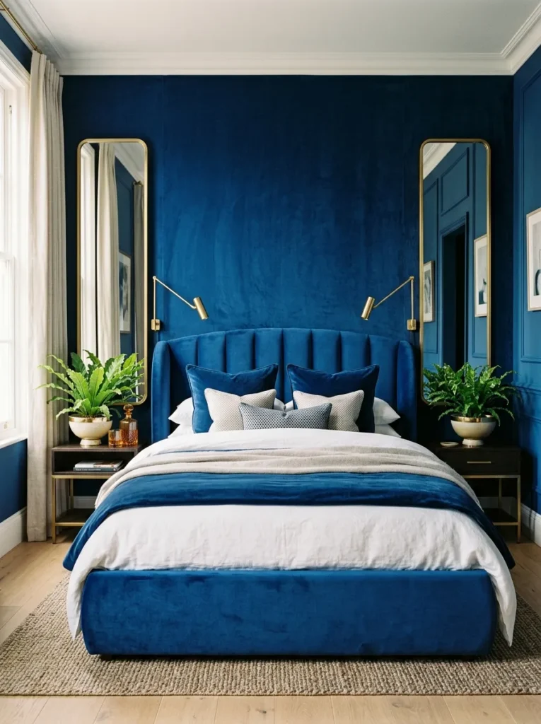
The most obvious choice for a “regal” bedroom is also the one most articles get wrong — they reach for royal blue and then bury it under so many competing textures that the color itself barely registers.
- Walls: Royal blue, a vivid, true jewel-toned blue with balanced saturation, painted in a soft satin finish for gentle reflectivity
- Bedding: Royal-blue velvet duvet as the anchor layer, no additional pattern or contrasting throw layered on top
- Wall decor: A single tall, narrow gold-framed mirror positioned beside the bed rather than centered above it
- Plants: Bird’s nest fern in a round gold-rimmed ceramic bowl planter on the nightstand, its ruffled leaves adding softness at a small scale
- Hanging element: A slim brass reading lamp mounted on an articulating arm, positioned to swing over the pillow
- Rug: Royal-blue velvet-pile rug with a subtle sheen that catches light differently than the matte walls
- Curtains: Royal-blue velvet, floor-length, with a single brass tieback holding the fabric in a soft curve
- Furniture: Rounded, curved-edge upholstered bed frame in royal-blue velvet, slim brass legs
Why this works: Letting one saturated color carry the entire room, without competing patterns or secondary hues, is what makes a bold blue feel curated rather than chaotic.*
Royal blue is the most obviously “regal” choice in this entire collection, which is exactly why it needs the most restraint to avoid looking like a costume rather than a considered room. Every surface here — walls, bedding, curtains, rug — stays within the same saturated blue family, with gold appearing only in small, functional pieces rather than large decorative statements. That restraint is what separates a genuinely elegant royal blue bedroom from one that feels overdone. The satin wall finish adds just enough reflectivity to keep the room from feeling flat, without tipping into the high drama of a glossy finish.
I’ve styled this exact combination for a client who initially wanted patterned bedding and multiple accent colors layered on top, and talking her out of it made the room immeasurably better. A single saturated color, kept consistent across every soft surface, reads as intentional and confident in a way that a busier, more “decorated” room rarely does. The curved bed frame and single tall mirror keep the furniture soft and simple, letting the color itself remain the star of the room rather than competing with ornate silhouettes.
Styling Principles: Getting the Blue-and-Gold Balance Right
Choosing a dark blue for your bedroom starts with undertone, not shade name. True navy holds no visible undertone, indigo leans violet, petrol leans green, and slate or storm blue lean gray — and each one shifts differently as daylight changes throughout the day. Test your paint chip in the room at both 9 a.m. and 7 p.m. before committing, since a color that looks perfect at noon can turn muddy or overly cool by evening.
Gold finish should follow the mood you’re after, not the other way around. Polished and burnished golds suit high-contrast, formal rooms like a royal blue or cobalt accent wall. Brushed and antique golds soften a room and pair naturally with true navy or petrol. Hammered and matte golds add texture to cooler, more architectural blues like steel or denim. Matching your metal finish’s shine level to your wall finish’s shine level — gloss with gloss, matte with matte — keeps the whole room feeling deliberate rather than mismatched.
Finally, commit to the color beyond the walls. A dark blue bedroom that stops at the accent wall and switches to neutral bedding, curtains, and rug rarely reads as cohesive. The rooms that photograph best, and the ones that actually feel finished in person, carry the same blue family across every soft surface, reserving gold for hardware, lighting, and small accents rather than large blocks of color.
FAQ
What’s the best gold finish to pair with navy walls? Brushed brass is the most versatile pairing for true navy, since its softer, low-glare finish complements navy’s clean saturation without competing with it. Antique gold works nearly as well and adds a slightly warmer, more collected feel.
Is dark blue too dark for a small bedroom? No — a single accent wall in high-gloss dark blue, like cobalt, can make a small room feel more dramatic without shrinking it, since the reflective finish bounces light rather than absorbing it. For an all-over dark blue look in a small room, choose a satin or eggshell finish over flat matte to preserve brightness.
What paint sheen works best for a dark blue bedroom? Matte or chalky matte finishes work best in bedrooms with strong direct light, since they absorb glare and prevent flashing. Satin finishes are better suited to rooms with limited natural light, since they reflect what little light is available.
What are the best plants for a dark blue bedroom? Plants with silvery, deep green, or glossy foliage read best against dark blue walls. Eucalyptus, snake plant, ZZ plant, and rubber plant all hold up well in lower light and provide strong visual contrast without introducing a competing color.
How can I try this look on a budget? Start with a single accent wall instead of painting the entire room, and introduce gold through swappable pieces like a mirror, pendant light, or drawer pulls rather than full furniture replacement. These smaller changes deliver much of the visual impact at a fraction of the cost.
Does dark blue make a room feel colder? It can, depending on undertone — true blues and cool grays like steel or slate can read cold without warm lighting. Choosing a blue with a warmer undertone, like indigo or petrol, and layering in warm-toned gold lighting counteracts that effect.
Conclusion
A great dark blue and gold bedroom isn’t about finding the “right” blue — it’s about committing to one undertone, matching your gold finish to the mood you want, and carrying that palette across every surface in the room instead of stopping at the walls. I’ve seen how much of a difference that full commitment makes, turning a room from pleasant into genuinely striking.
Whichever version speaks to you, whether it’s the quiet confidence of slate-blue serenity or the full drama of peacock blue-black, start with one wall or one piece of gold hardware and build from there. Save this post, pick your favorite idea, and try it in your own space — then share it with anyone else dreaming of a moodier bedroom.