15 Moody Home Office Ideas That Still Work for Video Calls
A dark office sounds like a video-call nightmare — until you see it done right. That fear is exactly why so many people stick to safe white walls, missing out on some of the most striking moody home office ideas out there. The truth is, a deep, saturated wall color doesn’t hurt your on-camera presence at all. What actually matters is lighting, layered deliberately, not left to chance. I’ve styled several of these rooms myself, and the ones that photograph beautifully and work on Zoom always share the same secret: a dedicated front-facing light source, planned before the paint goes on the wall
This guide walks through 15 fully styled rooms — every wall color, material, and lighting setup included — so you can recreate a space that’s both gorgeous and genuinely functional.
Why This Works: The Real Risk Behind a Moody Office
Most people think a moody home office is a style risk. It isn’t — it’s a lighting risk. Color psychology research consistently shows that deep, saturated wall colors lower visual noise and support sustained focus better than stark white walls, which is part of why moody offices have become such a popular work-from-home choice. But dark walls absorb ambient light instead of bouncing it around the room, and if you don’t plan a dedicated front-facing light source, your face reads shadowed and flat on every video call. I learned this the hard way styling a client’s ink-black office that looked stunning in photos and terrible on Zoom.
A moody home office only works on camera when the wall color and the lighting plan are designed together, not separately. This post solves that — 15 fully styled, camera-ready moody office ideas, each with the exact lighting setup that makes the dark palette work instead of working against you.
1. Charcoal Curve Nook
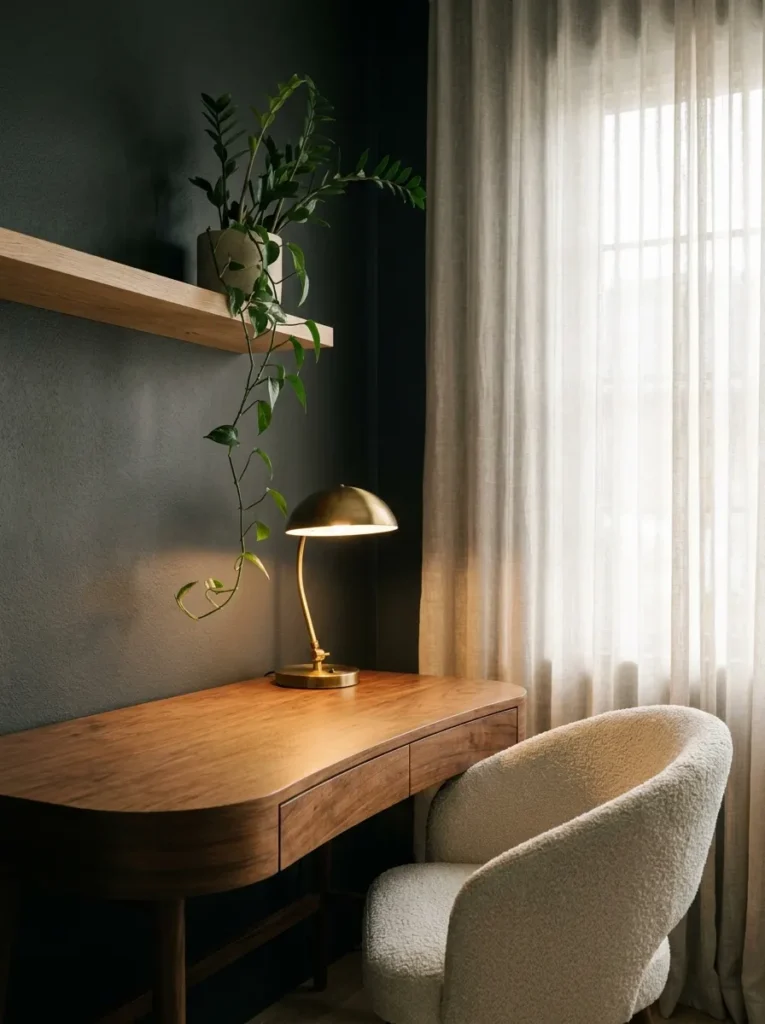
- Wall treatment: Deep warm charcoal (verify exact match against the current Benjamin Moore deck before ordering — tones like this shift under different lighting) in a low-sheen eggshell finish, which keeps screen glare down during calls
- Desk: Curved walnut desk with a rounded front edge — organic modern shape, no hard corners
- Chair: Ivory boucle armchair on slim brass legs
- Video-call lighting: Desk faces a north-facing window for steady daylight; a warm-white (3000K) LED task lamp clips to the desk edge and angles up toward the face to fill in shadow once the light shifts in the afternoon
- Shelving: Floating white oak shelves holding stacked books and one trailing plant
- Rug: Chunky oatmeal wool rug, layered under the desk
- Window treatment: Unlined linen curtains in warm white
- Wall art: One framed botanical print in a thin black frame
- Plant: ZZ plant in a matte cream ceramic pot — one of the most forgiving low-light plants for a dark room
- Hardware: Brushed brass pulls on shelf hardware
Why this works: A warm-toned charcoal paired with a directional fill light keeps the room dramatic without ever letting your face disappear into the wall behind you on a call.
Charcoal gets written off as cold, but the right undertone changes everything. A charcoal with warm brown or red undertones — rather than a blue-black gray — reads soft and enveloping instead of clinical, especially once daylight hits it. The curved desk softens the room further, breaking up all the straight lines a home office usually collects. Paired with the boucle chair, the whole setup feels more like a reading nook that happens to hold a laptop. That’s the real goal with a moody office: it should feel like a room you want to sit in, not a space you’re stuck in for eight hours.
The lighting setup here does double duty. During the day, the north-facing window gives soft, even light with no harsh shadows — ideal for calls without any extra equipment. But by late afternoon in Austin, that light drops fast, and a warm desk lamp becomes essential rather than optional. I’ve noticed most people buy a lamp for ambiance and forget to check its color temperature. A cool white bulb next to warm charcoal walls looks harsh and clinical on camera. Stick to 2700–3000K, and angle the lamp slightly above eye level so it fills shadows without creating glare on your screen.
2. Forest Ceiling Drench
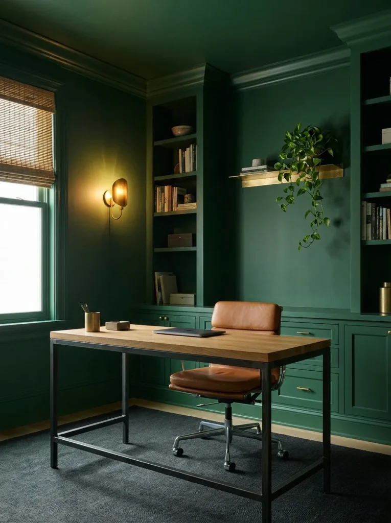
I once color-drenched a client’s ceiling before I told her husband, and his first reaction was “we’re not painting the ceiling black, right?” It wasn’t black — it was a deep forest green — and by the time we finished, he was the one asking if we could do it in the bedroom too. That reaction is common. Ceilings feel like the one surface people are afraid to touch, but a color-drenched ceiling is what turns a dark office from “pretty room” into a genuinely enveloping space, and it reads incredibly well on camera once the lighting is set up right.
- Wall + ceiling treatment: Deep forest green, fully color-drenched wall-to-ceiling in a matte finish to avoid ceiling-light hot spots on camera
- Desk: Steel-frame desk with a raw white oak top — industrial-modern mix
- Chair: Cognac leather sled chair, low profile
- Video-call lighting: A brass wall sconce mounted directly behind the laptop position, fitted with a 3000K bulb, throws consistent front-facing light that doesn’t shift with the weather outside — critical in a fully drenched room where even the ceiling absorbs light instead of bouncing it
- Shelving: Slim brass wall-mounted shelf with three curated objects, nothing crowded
- Rug: Flatweave rug in rust and cream stripe
- Window treatment: Bamboo roman shade, half-raised
- Wall art: Small oil-style landscape in a gold frame
- Plant: Pothos in a fluted terracotta pot, trailing from the brass shelf
- Hardware: Aged brass throughout, unlacquered so it develops patina
Why this works: Color-drenching the ceiling removes the visual “stopping point” a white ceiling creates, so the whole room reads as one continuous, immersive color instead of a dark box with a white lid.
A fully drenched room is the boldest move on this list, and it’s also the one where lighting stops being optional. Since the ceiling no longer bounces light back down into the room, natural daylight alone won’t cut it once the sun moves. That’s exactly why the sconce sits at eye level behind the laptop rather than overhead — overhead light in a drenched room casts shadows down across the face, which looks worse on video than almost any other setup mistake. Positioned at eye level instead, it mimics the fill light a photographer would use, keeping your face lit evenly no matter what the ceiling is doing.
3. Aubergine Built-In Corner
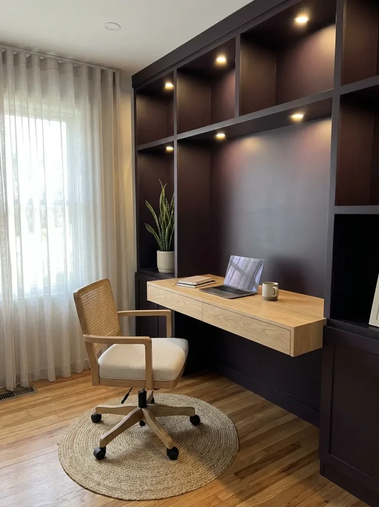
Standout tip from Emily’s husband, a builder: built-in shelving in a dark room needs recessed puck lighting inside each cubby, wired on its own switch — otherwise the shelves just become dark holes swallowing whatever’s displayed in them, no matter how good the wall color looks.
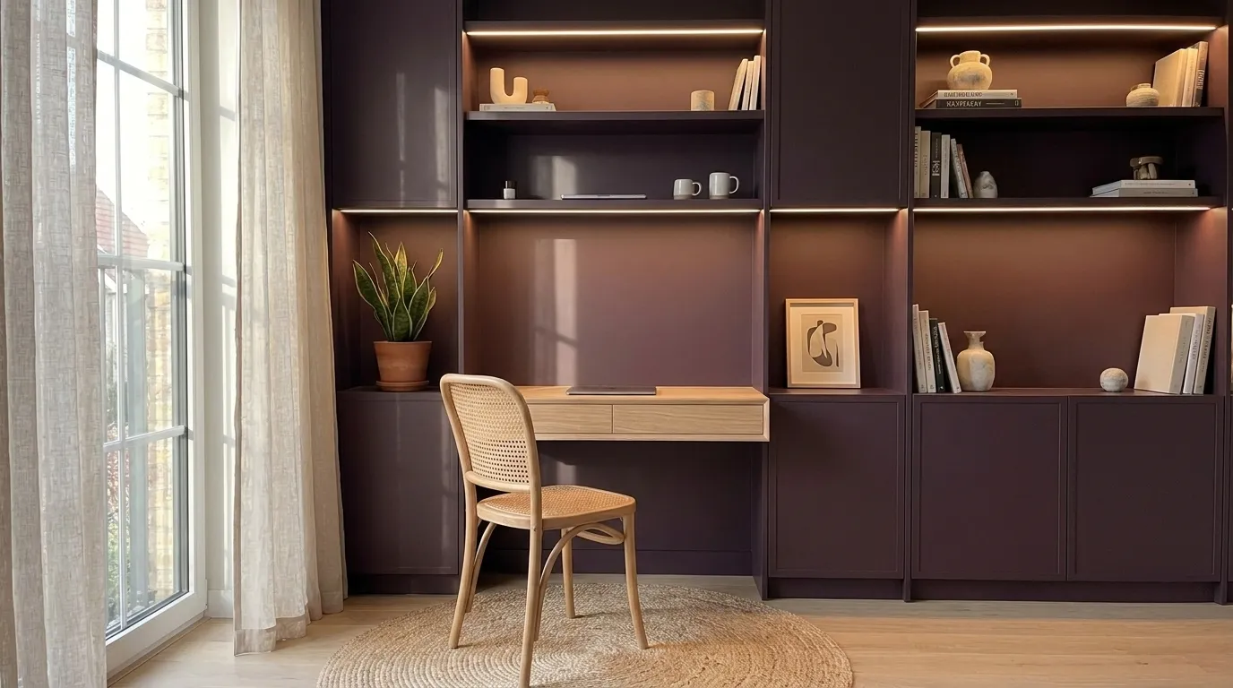
- Wall treatment: Deep aubergine (plum-toned, not blue-purple) in matte finish
- Desk: Built-in floating desk in white oak, wall-mounted with hidden bracket supports
- Chair: Woven cane-back chair with black metal frame
- Video-call lighting: Desk sits directly under a window with sheer white curtains for soft daylight fill, plus a small brass gooseneck lamp mounted to the underside of the shelf above, angled down and slightly forward — positioned so it lights the face without washing out the aubergine wall behind
- Shelving/storage: Built-in aubergine shelving flanking the desk, lit internally with warm recessed pucks, displaying ceramics and books
- Rug: Small jute rug beneath the desk chair
- Window treatment: Sheer white linen panels
- Wall art: None — the built-ins replace the need for hung art
- Plant: Snake plant in a fluted black pot, tucked into one built-in cubby — one of the most tolerant species for a corner with limited direct light
- Hardware: Matte black pulls on any built-in drawers
Why this works: Internally lit built-ins solve the biggest problem with dark shelving — they turn a wall of storage into a wall of visible, styled detail instead of a shadowed gap.
Built-ins are where a lot of moody offices fall apart, because a dark shelf without its own light source just disappears into the wall. That’s a construction detail most decor content skips entirely. Wiring each cubby with a small recessed puck light, on a separate switch from the room’s main lighting, means you can dim the shelves down for calls or brighten them up for photos, without touching the desk lamp. It’s a small addition during a build-out, but it’s the difference between shelving that photographs beautifully and shelving that just reads as a dark blur behind you.
The floating desk keeps this corner feeling light despite the saturated wall color, since there’s no visible desk leg or bulky frame taking up floor space. Aubergine leans warmer than most people expect, especially next to white oak and black metal, and it photographs far richer than a flat purple. The gooseneck lamp mounted underneath the upper shelf solves the trickiest lighting problem in a built-in setup — most overhead cubby lighting throws shadows straight down onto the face, but this angle comes from slightly above and in front, which is the same principle photographers use for flattering portrait lighting.
You’ll Also Love: 15 Masculine Home Office Ideas That Boost Your Focus
4. Ink Black Arch Nook
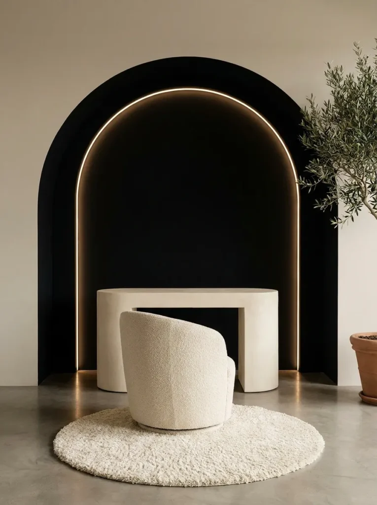
- Wall treatment: True ink black, painted into a built-in arched niche shape (drywall-framed arch, not wallpaper) in a matte finish — the arch itself is the standout architectural detail
- Desk: Curved pill-shaped desk in cream lacquer, no visible legs (pedestal base)
- Chair: Sculptural bouclé swivel chair in warm oatmeal, no arms — modern, gallery-piece silhouette
- Video-call lighting: A slim LED light bar mounted along the inside curve of the arch, warm white (2700K), diffused so it wraps light evenly around the face instead of hitting from one direction — this is the single most important element in an all-black nook, since black absorbs nearly all ambient light
- Shelving: None — the arch stays intentionally empty except for the desk, keeping the “wow” moment uncluttered
- Rug: Round ivory shag rug, positioned to soften the hard geometry of the arch
- Window treatment: None visible in this vignette — the arch sits on an interior wall, light comes entirely from the LED bar and a floor lamp just outside the frame
- Wall art: None — the arch shape functions as the art
- Plant: Small olive tree in a cream fluted planter, placed just outside the arch’s edge for contrast
- Hardware: Brushed nickel, minimal and hidden
Why this works: An architectural arch in true black creates a Pinterest-scroll-stopping focal point precisely because it’s shaped, not just painted — and the wraparound LED lighting is what keeps a face lit evenly inside a shape that would otherwise swallow light from every angle.
This is the idea to reach for when you want the room itself to look like the art. True black is intense, so architecture does the softening here instead of color choice — the curve of the arch, the curve of the desk, the curve of the chair. Nothing in the room is a hard rectangle, which keeps an all-black space from feeling heavy or severe. I’ve styled a version of this for a client who works entirely on video calls, and the arch became the single most complimented detail on every meeting she took for months. It photographs like a gallery installation, not a workstation.
The lighting here is non-negotiable, and it’s different from every other idea on this list. A single lamp isn’t enough inside true black — you need light that wraps around the curve rather than hitting one side. That’s why the LED bar runs along the interior edge of the arch itself instead of sitting on the desk. It throws soft, even light forward onto the face from multiple points at once, which eliminates the harsh one-sided shadow you’d get from a single lamp against black walls. Set it to 2700K; anything cooler turns skin tones gray on camera.
5. Espresso Gallery Wall Office
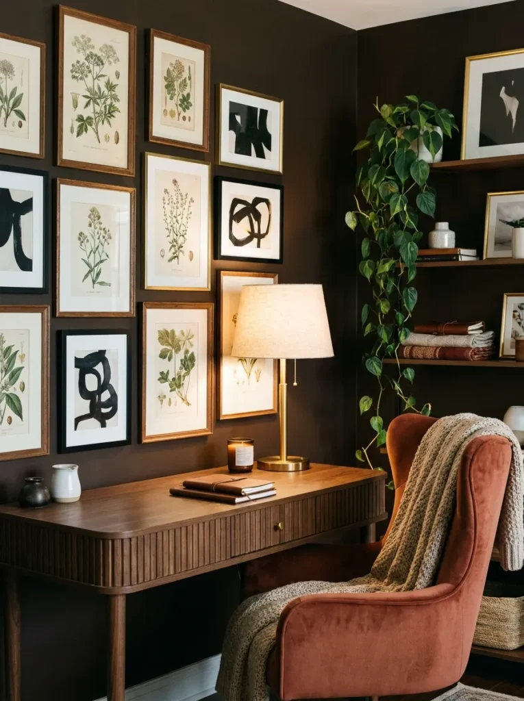
- Wall treatment: Rich espresso brown (warm, not muddy) in a soft matte finish
- Desk: Rectangular fluted-wood desk with a scalloped edge detail — modern take on a traditional shape
- Chair: Terracotta velvet chair with a curved wingback silhouette, updated proportions
- Video-call lighting: Desk lamp with a warm alabaster glass shade, positioned front-left of the laptop at roughly a 45-degree angle — glass diffuses the light so it doesn’t create a hard-edged glare on camera, and the angle avoids lighting one side of the face more than the other
- Shelving: None — a curated gallery wall replaces shelving entirely
- Rug: Vintage-style rug in rust, cream, and deep green
- Window treatment: Café curtains, warm cream linen, covering only the lower half of the window for privacy without blocking light
- Wall art: A gallery wall of 7-9 mixed frames — botanical prints, abstract line art, one small mirror — asymmetrically arranged
- Plant: Trailing philodendron in a rust-glazed pot on the desk corner
- Hardware: Warm brass on desk drawer pulls
Why this works: An asymmetrical gallery wall against espresso brown gives the camera view genuine depth and personality, breaking up the flatness dark paint can create on video.
In my experience, gallery walls get skipped in home offices because people assume they’re too busy for a work space, but an asymmetrical mix against a dark wall reads as curated, not cluttered — it’s one of the fastest ways to make a moody office feel personal rather than staged. Espresso brown is one of the most underused dark tones in home offices, and that’s exactly what makes it feel fresh against a sea of charcoal and navy content. It has a warmth that reads more like a study than a corporate space, especially with terracotta and rust woven through the rug and chair. The scalloped desk edge is the kind of detail that photographs beautifully in a flat-lay or straight-on shot, giving the whole room a slightly more collected, less mass-produced feel.
The gallery wall does more than fill space — it gives the front-facing camera view genuine depth and personality instead of a flat dark backdrop. Mixed frame sizes and finishes catch light differently across the wall, which actually helps break up the flatness dark paint can create on video. The mirror in the mix adds one more layer, bouncing a little extra ambient light back toward the desk during the day. Paired with the angled alabaster lamp, the setup stays flattering on camera from morning meetings through evening calls without needing to be adjusted.
6. Navy Lacquer Statement Desk
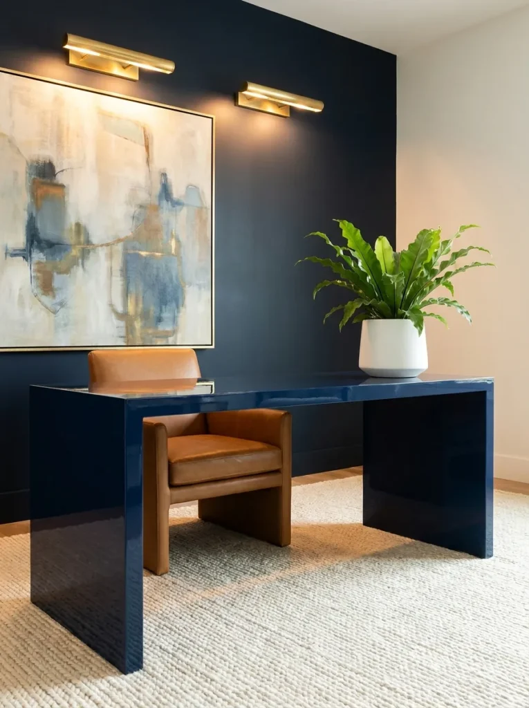
- Wall treatment: Deep navy in a soft matte finish, painted only on the desk-facing wall (the other walls stay a warm off-white to bounce extra light into the room)
- Desk: High-gloss navy lacquer desk with a waterfall edge — the desk itself is the standout detail, not the wall
- Chair: Camel leather task chair, low-profile modern silhouette with a slim metal frame
- Video-call lighting: A pair of small brass picture lights mounted above the desk, angled down and slightly forward, positioned specifically to catch the face rather than the wall — this dual-light setup is what makes a single dark accent wall (versus a fully drenched room) easier to light evenly
- Shelving: Open brass and glass bookshelf against the off-white wall, out of camera frame but visible in wider shots
- Rug: Solid cream wool rug, kept simple against the busier desk finish
- Window treatment: Motorized cream roller shade for consistent, adjustable daylight control during calls
- Wall art: One oversized abstract canvas in navy, cream, and rust tones, hung above the desk
- Plant: Bird’s nest fern in a glossy white pot — tolerates lower light well and adds a soft textural contrast to all the lacquer and metal
- Hardware: Polished brass throughout
Why this works: Confining navy to a single accent wall, with the rest of the room left off-white, means the ambient walls do most of the light-bouncing work for you, making this one of the easier setups on this list to get right on camera.
A high-gloss lacquer desk is the kind of detail that reads as genuinely custom rather than store-bought, and pairing it with just one navy wall — instead of drenching the whole room — is a deliberate choice for anyone who wants moody drama without losing all their ambient daylight. The waterfall edge catches light beautifully whether it’s morning sun or an evening lamp, giving the desk a reflective quality that photographs like a showroom piece. Keeping the remaining walls off-white means the room stays brighter overall, which is worth knowing if your space gets limited natural light to begin with.
That single-wall approach also solves a lighting problem before it starts. Because only one wall absorbs light instead of four, a moody accent wall is genuinely one of the easier setups on this list to get right for video calls — the off-white walls do a lot of the ambient bouncing for you. The two brass picture lights above the desk add a final, focused layer aimed directly at face height, which keeps the lighting intentional rather than accidental. It’s a setup that looks equally polished whether you’re on camera or the desk is simply catching afternoon light.
7. Teal Grasscloth Corner
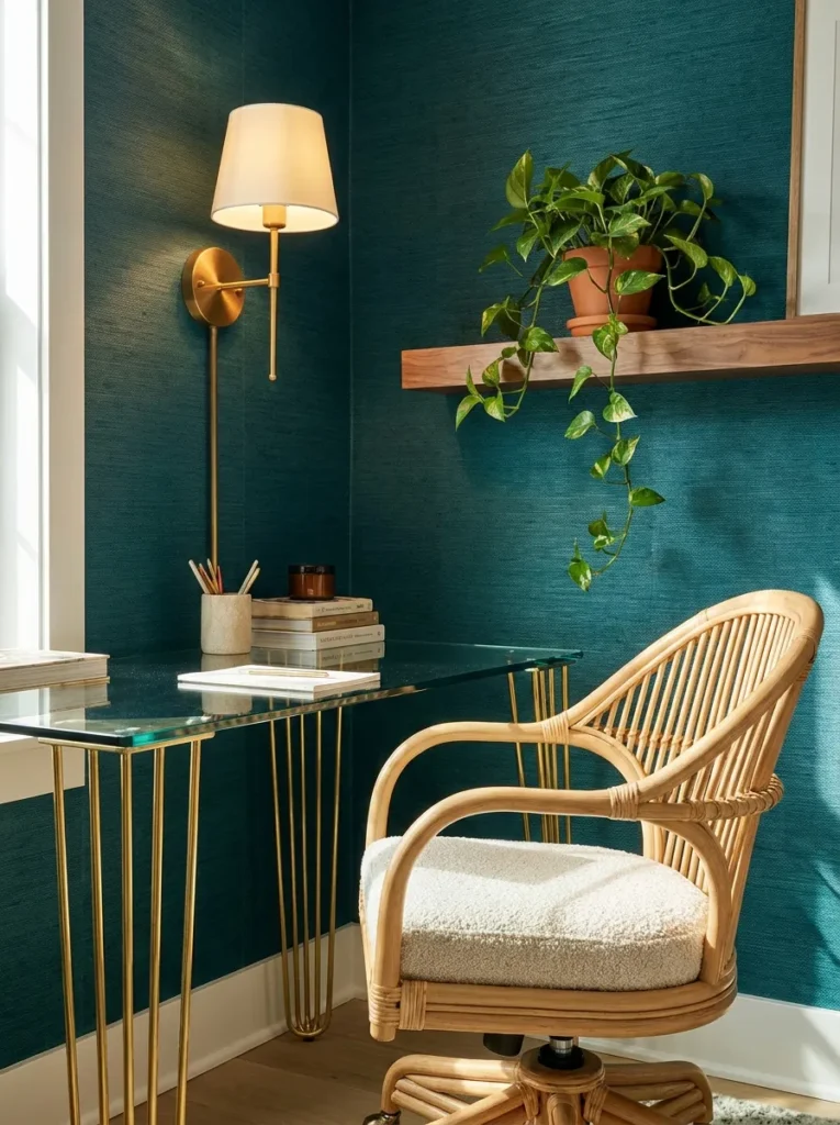
- Wall treatment: Deep peacock teal grasscloth wallpaper, adding visible woven texture instead of flat paint — a good option for anyone who wants moody color without a full repaint
- Desk: Slim glass-top desk with brushed brass legs, nearly invisible from a distance
- Chair: Natural rattan swivel chair with a cream cushion seat
- Video-call lighting: Desk positioned perpendicular to a window (not facing it directly, which would silhouette the face) with a brass articulating wall lamp mounted beside the desk, bent forward at chin height — the glass desktop also bounces a small amount of extra light upward, softening shadows under the chin
- Shelving: Two thin brass ledges holding small framed prints and one trailing plant
- Rug: Ivory and teal geometric flatweave rug
- Window treatment: Bamboo shade, fully raised during work hours
- Wall art: Small framed botanical sketches on the brass ledges, leaned rather than hung
- Plant: Golden pothos in a scalloped ceramic pot on the ledge — a fast, forgiving grower that tolerates the lower light typical of teal-toned rooms
- Hardware: Brushed brass throughout
Why this works: Grasscloth wallpaper adds dimension a flat paint color can’t, catching light differently depending on the time of day, which keeps a small teal corner from ever feeling static on camera.
Texture is the detail most moody offices skip entirely, and it’s the reason this corner reads as considerably more expensive than a simple paint job. Grasscloth has a natural grain that shifts subtly as light moves across it throughout the day, so the wall behind you never looks flat or one-note on a video call. The glass desk keeps the footprint visually light, which matters in a smaller corner setup where a bulky desk would compete with the wallpaper for attention. Paired with rattan and brass, the whole look leans organic modern rather than heavy or dark.
8. Wine Fluted Panel Studio
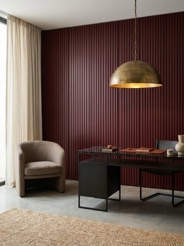
Standout tip from my husband, a builder: vertical fluted wood paneling on a dark accent wall needs to run floor-to-ceiling in one continuous piece rather than stopped at desk height — stopping it partway makes a small office look shorter and cuts the moody effect in half.
- Wall treatment: Deep wine burgundy, applied as vertical fluted wood paneling floor-to-ceiling, stained rather than painted for a richer grain
- Desk: Black steel-frame desk with a smoked glass top
- Chair: Bouclé task chair in warm taupe, on discreet casters for easy movement
- Video-call lighting: A single dome pendant in aged brass hangs directly above and slightly in front of the desk, fitted with a 3000K bulb — pendant height matters here, hung low enough to sit just above eye line so light falls forward onto the face rather than straight down onto the desk
- Shelving: None — the fluted paneling itself is the visual statement, kept clear of clutter
- Rug: Deep cream bouclé-texture rug
- Window treatment: Cream linen curtains, floor-length
- Wall art: None needed — the paneling functions as the art
- Plant: Rubber plant in a fluted black ceramic pot, echoing the wall’s vertical lines
- Hardware: Matte black on all visible metal
Why this works: Running fluted paneling floor-to-ceiling elongates the wall and gives a low-hung pendant a clear, uncluttered surface to wash light down, keeping both the architecture and the face lit on camera.
Wine burgundy is a color most people associate with dining rooms, not offices, which is exactly why it stands out in a saved-ideas feed full of the usual charcoal and navy. Running the fluted paneling floor-to-ceiling elongates the entire wall, making even a modest-sized room photograph taller and more architectural than it actually is. The smoked glass desktop keeps the black steel frame from feeling heavy, letting the wall grain stay the focal point instead of competing with a solid desk surface. It’s a combination that reads distinctly high-end without relying on any single expensive piece.
I’ve noticed pendant lighting gets overlooked in home offices because people default to lamps, but a well-placed pendant solves the lighting problem more elegantly here than a desk lamp ever could. Hung low and slightly forward of the desk, this fixture puts light exactly where the face needs it during a call, while still washing enough glow down the fluted paneling to keep that texture visible on camera. The taupe bouclé chair softens the sharper lines of the steel desk, keeping the whole studio feeling warm rather than austere.
9. Olive Pipe-Leg Workshop Desk
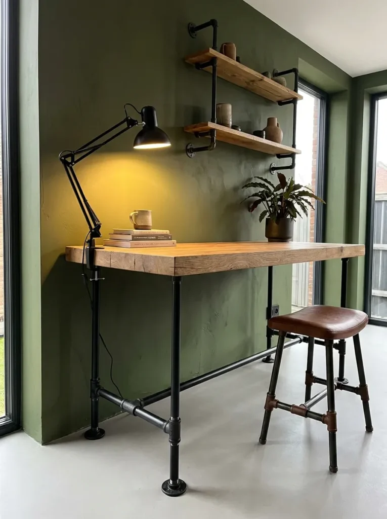
- Wall treatment: Deep olive green in a matte finish, warm rather than khaki-toned
- Desk: Reclaimed oak plank desktop on matte black iron pipe legs — an industrial-modern hybrid
- Chair: Black leather saddle stool with a low backrest
- Video-call lighting: A gooseneck clamp lamp with a black metal shade, clipped directly to the desk edge and angled up at roughly 45 degrees, fitted with a warm 2700K bulb — the clamp style keeps the light source close and adjustable, useful in a workshop-style desk where a lamp base would clutter the surface
- Shelving: Black iron pipe shelving unit, matching the desk legs, holding books and small potted plants
- Rug: Vintage-style runner rug in rust, cream, and olive
- Window treatment: Roman shade in undyed linen
- Wall art: A small collection of botanical pressings in thin black frames
- Plant: Cast iron plant in a matte black pot on the pipe shelving — one of the most durable low-light plants available, fitting for a room that leans on artificial lighting more than daylight
- Hardware: Matte black, unified across desk, shelving, and lamp
Why this works: Matching iron hardware across the desk, shelving, and lighting ties the whole workshop aesthetic together, so the room reads as one intentional design instead of separately chosen pieces.
Olive green photographs beautifully against reclaimed wood and black iron because none of the materials fight each other for attention — everything sits in the same earthy, slightly industrial family. This is a strong option for anyone drawn to a workshop or studio feel rather than a polished, furniture-store look. The pipe-leg desk and matching shelving unit give the room a sense of having been built rather than bought, which tends to photograph as more personal and lived-in. That consistency across materials is what keeps a bold wall color like olive from tipping into feeling too dark or heavy.
The clamp lamp is a small but deliberate choice for this kind of setup. Because the desk surface is meant to feel a little raw and utilitarian, a bulky lamp base would clutter the look, so a clamp-mounted light keeps the desktop clear while still delivering direct, adjustable light exactly where the face needs it. Angled at 45 degrees, it avoids the flat, washed-out look that comes from lighting straight-on, giving the face some natural dimension on camera instead of a flat glow.
10. Graphite Skylight Loft
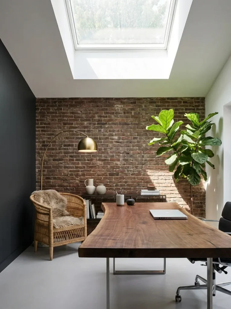
- Wall treatment: Deep graphite blue-gray in matte finish, on three walls, with the fourth left as exposed white brick for contrast
- Desk: Live-edge walnut slab desk on simple black metal trestle legs
- Chair: Woven wicker chair with black metal frame and a cream cushion
- Video-call lighting: Positioned beneath a skylight for strong, even overhead daylight during work hours, plus a warm brass floor lamp with a linen drum shade placed just behind the camera position for evening calls — the floor lamp’s height is set to shoulder level so light angles slightly downward onto the face without casting harsh shadows
- Shelving: A single vintage ladder shelf leaned against the brick wall, holding books and a small collection of ceramics
- Rug: Faded vintage-style rug in blue-gray and rust tones
- Window treatment: None on the skylight; a simple linen panel on the side window
- Wall art: One large black-and-white photograph, framed simply in black
- Plant: Fiddle leaf fig in a woven basket planter, positioned to catch the skylight’s daylight
- Hardware: Matte black throughout
Why this works: A skylight positioned directly above or slightly behind a desk gives more even, shadow-free daylight than a side window ever can, and a shoulder-height floor lamp mimics that same overhead quality once the sun goes down.
Exposed brick and graphite walls together give this loft-style office a slightly weathered, collected character that a fully painted room can’t replicate. Leaving one wall as raw brick keeps the space from feeling too uniformly dark, and it adds a textural contrast that photographs particularly well in natural light. The live-edge desk plays into that same raw, unpolished feel, its irregular edge catching shadow and highlight differently depending on the time of day. This is a strong direction for a converted attic space, a loft apartment, or any room with an unusual architectural feature worth showing off rather than hiding.
That said, skylight-dependent lighting has one real limitation worth knowing before you commit to it: it disappears completely after sundown. That’s exactly why the brass floor lamp matters here — it’s not a backup, it’s a planned second lighting layer for evening calls. Set at shoulder height and placed just behind the camera, it mimics the same soft, slightly overhead quality the skylight provides during the day, so the room looks consistent on camera whether it’s 10 a.m. or 8 p.m.
11. Slate Blue Curved Alcove
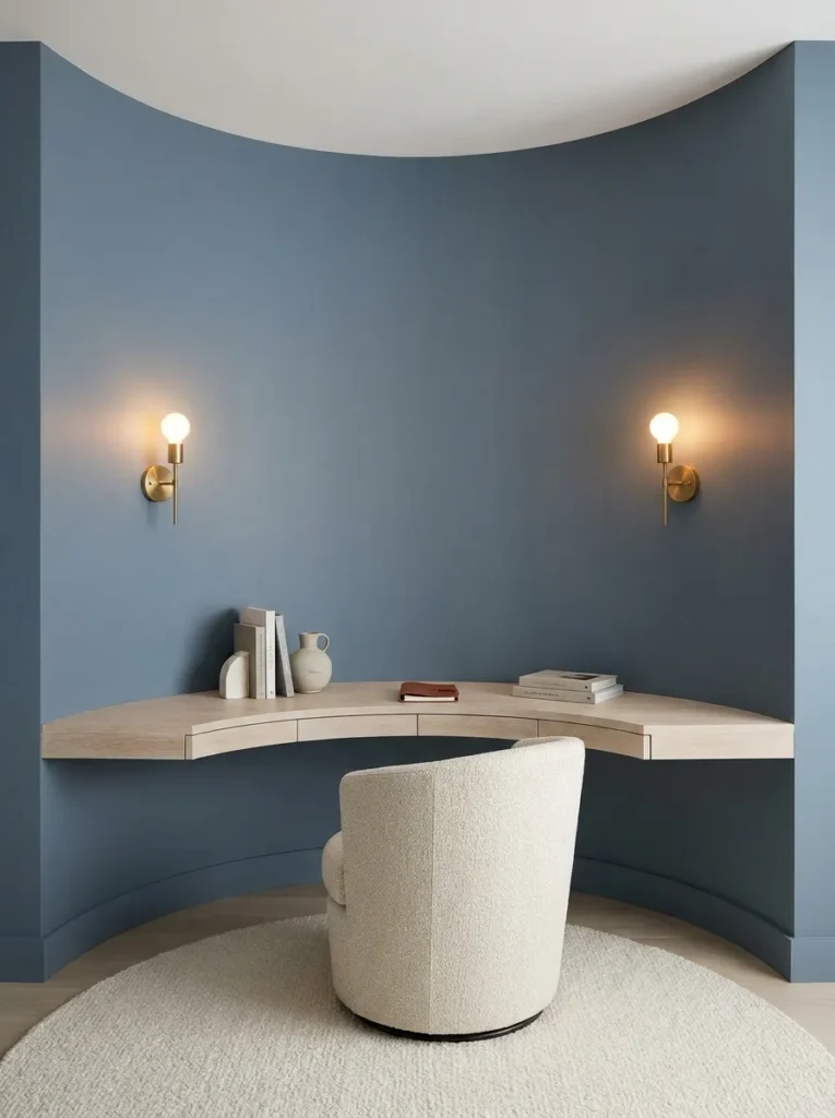
- Wall treatment: Deep slate blue in a soft matte finish, painted into a curved (bump-out) alcove built specifically for the desk — a rounded architectural niche rather than a flat wall
- Desk: Custom-fit curved white oak desk built to match the alcove’s radius, floating with no visible legs
- Chair: Cream tweed-upholstered swivel chair with a rounded barrel back
- Video-call lighting: Two small brass wall sconces mounted on either side of the curved alcove at shoulder height, each warm 2700K, creating symmetrical front light that wraps around the face from both sides — critical in a curved space, since a single light source would leave one side of the alcove noticeably darker than the other
- Shelving: None built in — the curve itself is left clean, with only a single small shelf below the desk for a printer or files, tucked out of camera view
- Rug: Round cream boucle rug, matching the alcove’s curve
- Window treatment: None — the alcove sits on an interior wall
- Wall art: None — the curved architecture is the visual statement
- Plant: Small trailing string of pearls on the desk corner, in a matte cream pot
- Hardware: Brushed brass, minimal
Why this works: Symmetrical sconce lighting is the only setup on this list built specifically for curved walls, and it solves a lighting problem straight walls don’t have — uneven light distribution across a rounded surface.
A built alcove is a bigger investment than paint, but it’s also the single most Pinterest-scroll-stopping idea in this whole list, because nothing about it reads as a standard rectangular office. The curve softens the entire room instantly, and pairing it with a custom-fit floating desk means there’s zero visual clutter of legs or brackets breaking up that shape. Slate blue leans just cool enough to feel calm rather than cold, especially with cream and brass warming it up. This is the kind of detail that turns a small, awkward nook into the most photographed corner of the whole house.
Two sconces instead of one might seem like overkill until you actually sit in a curved space and notice how light behaves differently there. A single lamp on one side leaves the far edge of the alcove in shadow, which is far more noticeable on a video call than in person, since the camera flattens depth and exaggerates uneven lighting. Mounting a sconce on each side balances that out completely, giving consistent, shadow-free light across the whole curve no matter which way you’re angled toward the screen.
12. Chocolate Brown Library Office
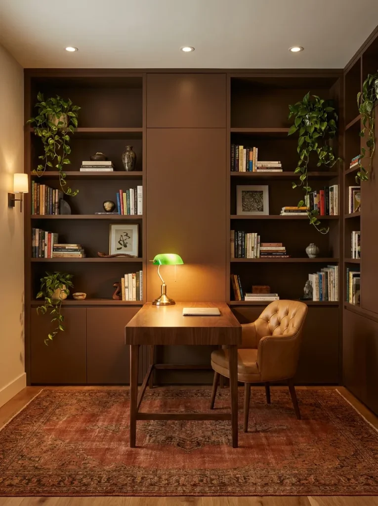
I styled a version of this for a friend who works in publishing, and her first comment on the finished room was that it finally felt like her books belonged somewhere — not stacked on the floor, but actually part of the design.
- Wall treatment: Deep chocolate brown in matte finish, floor-to-ceiling built-in bookshelves flanking the desk on both sides
- Desk: Traditional-leaning writing desk reimagined with a clean, unfussy silhouette in dark walnut, slightly tapered legs
- Chair: Camel leather chair with a low, modern profile — no tufting, no ornate detailing
- Video-call lighting: A picture light mounted above the desk, angled down, plus a brass banker’s-style lamp with a green glass shade on the desk itself — the banker’s lamp is angled slightly toward the face rather than straight down onto the desk surface, which is the adjustment most people miss
- Shelving: Floor-to-ceiling built-ins on both sides, styled with books grouped by color and a few ceramic bookends
- Rug: Deep rust and cream Persian-style rug
- Window treatment: Cream linen curtains, floor-length
- Wall art: None needed — the built-in books provide the visual texture
- Plant: Trailing pothos woven along the top shelf, in a small brass pot
- Hardware: Warm brass on all built-in and desk hardware
Why this works: Pairing a picture light for the room with a banker’s lamp angled toward the face gives this library office two distinct light layers, so the built-in wall stays visible on camera without leaving the face underlit.
Chocolate brown has quietly become one of the most requested dark tones in home offices, and it’s easy to see why once you see it against a wall of books — it reads warm, intelligent, and collected rather than heavy or somber. This is a strong option for anyone who already owns a meaningful book collection and wants a design that actually shows it off instead of hiding it in another room. The floor-to-ceiling built-ins do the visual heavy lifting here, so the desk and chair can stay relatively simple without the room feeling underdesigned. Grouping the books loosely by color, rather than alphabetizing them, is what keeps the whole wall looking curated instead of chaotic.
The banker’s lamp is doing more work in this room than its classic look suggests. Angled toward the face rather than straight down, it fills in the shadow a picture light alone would leave, since picture lights are designed to illuminate the wall and shelves rather than the person sitting at the desk. That combination — one fixture lighting the room, one lighting the face — is the layering approach that keeps a fully built-in dark library office from looking flat or underlit on camera, no matter what time of day the call happens.
13. Black Cherry Curved Vanity Desk
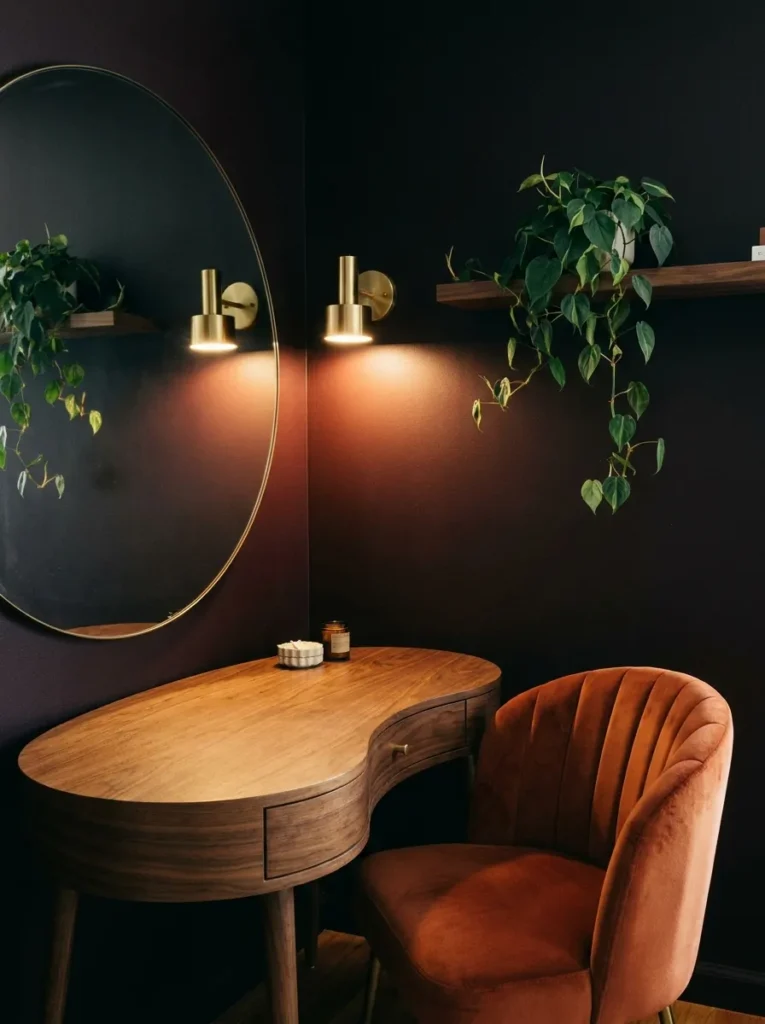
- Wall treatment: Deep black cherry (a red-brown so dark it reads nearly black in low light, warm in direct light) in a matte finish
- Desk: Curved kidney-shaped desk in a warm walnut veneer — a nod to mid-century shapes updated with a slimmer modern profile
- Chair: Burnt orange velvet chair with a channel-tufted back, brass caster wheels
- Video-call lighting: A pair of slim brass sconces mounted directly beside a round mirror positioned behind the camera setup, angled to bounce soft light forward onto the face — the mirror adds a second layer, reflecting the sconce light back into the room rather than letting it absorb into the dark wall
- Shelving: A single floating walnut shelf below the mirror, holding a small stack of books and a ceramic dish
- Rug: Vintage-style rug in burnt orange, cream, and deep brown
- Window treatment: Café curtains in warm cream linen
- Wall art: The round mirror doubles as the room’s main wall feature
- Plant: Small heartleaf philodendron trailing from the floating shelf, in a black cherry-glazed pot that echoes the wall color
- Hardware: Brushed brass throughout
Why this works: Positioning a mirror behind the desk to reflect the sconce light back into the room is a simple trick that meaningfully brightens a dark space without adding a single extra light fixture.
Black cherry is one of the richest, least common wall colors in home office design, and it has a warmth that reads completely different from a true black or navy — almost like a deep wine that shifts with the light throughout the day. The curved kidney desk gives the whole room a softer, more retro-modern feel, especially paired with the burnt orange velvet chair, which keeps the palette from leaning too serious. It’s proof that a moody office doesn’t have to mean cool tones and hard edges; this room feels genuinely inviting, almost more like a study nook than a workstation.
The mirror trick here solves a lighting problem in a way most people don’t think to try. Instead of adding a third light source to compensate for the dark wall, the round mirror behind the desk setup reflects the two sconces’ warm light back across the room, effectively doubling their reach without any extra wiring or fixtures. It’s a simple, budget-friendly move that works especially well in a smaller office, where every extra lamp starts to compete for desk space.
14. Deep Plum Arched Bookcase Studio
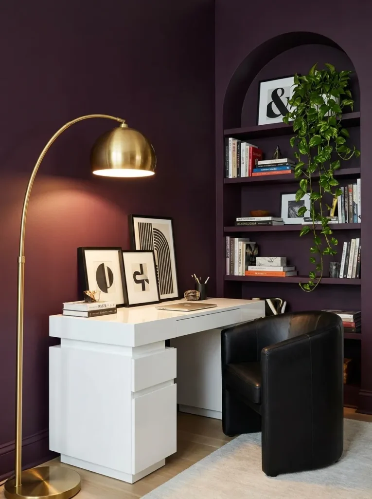
- Wall treatment: Deep plum (cooler and more muted than the earlier wine burgundy — closer to eggplant) in matte finish
- Desk: Rounded pedestal desk in white lacquer, contrasting sharply against the dark wall
- Chair: Black leather barrel chair, low back, on a swivel base
- Video-call lighting: An arched brass floor lamp curves over the desk from the side, positioned so the light source hangs just above and slightly in front of face height — the arch shape lets the lamp deliver front lighting without a visible base or cord cluttering the desk surface itself
- Shelving: Arched built-in bookcase behind the desk chair, painted the same plum as the walls so it reads as one continuous shape rather than a separate piece
- Rug: Cream and plum abstract-pattern rug
- Window treatment: Sheer ivory curtains
- Wall art: None — the arched bookcase is the focal architectural detail
- Plant: Trailing pothos on the top shelf of the arched bookcase, in a white ceramic pot
- Hardware: Brushed brass on the bookcase and desk pulls
Why this works: Painting the built-in bookcase the same plum as the walls makes it read as architecture rather than furniture, while the white lacquer desk gives the whole room a sharp, graphic contrast point.
The contrast between the white lacquer desk and the deep plum wall is what makes this idea feel distinctly modern rather than traditionally moody. Most dark offices lean into dark furniture too, but pairing a bright white desk against a saturated wall creates a sharper, more graphic look that reads beautifully in a photo and feels less heavy in person than an all-dark room. The arched bookcase behind the chair, painted to match the wall, disappears into the color story during the day and becomes a soft silhouette once the lamp is on in the evening — two very different but equally striking looks from the same setup.
The arched floor lamp is a genuinely practical choice for anyone who wants front-facing light without a lamp base eating up desk space. Because the arm curves over from the side, the light source ends up positioned almost exactly where a photographer would place a key light — slightly above and in front of the face. That’s a meaningfully different result than a straight desk lamp, which usually sits too low and casts light upward in a way that looks unnatural on camera.
15. Midnight Blue Textured Plaster Studio
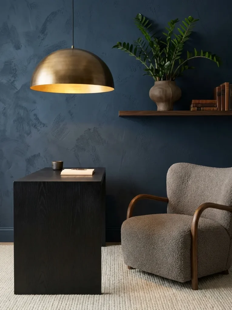
Standout tip from Emily’s husband, a builder: limewash or Venetian plaster finishes on a dark wall need a slightly rougher trowel technique near any light fixture — a perfectly smooth finish there actually creates glare and hot spots on camera, while a subtly textured patch diffuses the light instead.
- Wall treatment: Deep midnight blue limewash plaster, applied with visible brush and trowel texture rather than a flat roller finish
- Desk: Black oak desk with a subtle waterfall edge, understated compared to the wall’s texture
- Chair: Warm gray bouclé chair with a rounded, armless silhouette
- Video-call lighting: A single oversized dome pendant in brushed brass hangs low and slightly forward of the desk, fitted with a warm 2700K bulb — the plaster’s texture near the fixture is intentionally left slightly rougher to diffuse the light and avoid a glare hot spot on the wall behind the face
- Shelving: A single narrow floating shelf, holding one ceramic vase and a small stack of books
- Rug: Deep cream flatweave rug, kept simple against the textured wall
- Window treatment: Unlined linen curtains, warm white
- Wall art: None — the plaster’s texture and color variation function as the art
- Plant: ZZ plant in a matte navy pot, positioned on the floating shelf
- Hardware: Brushed brass, minimal
Why this works: Textured plaster catches and scatters light instead of reflecting it in one hard spot, which is exactly what keeps a dark wall from creating harsh glare behind you on camera.
Limewash plaster is having a real moment in home design, and a home office is actually one of the smartest places to use it, since the texture does something flat paint can’t — it changes appearance depending on the light hitting it, giving depth to a wall that would otherwise read as a single flat block of midnight blue. That variation is part of what makes this idea feel genuinely current rather than like a decade-old dark accent wall. The black oak desk stays intentionally simple so the wall gets to be the star, and the warm gray chair keeps the whole room from tipping into feeling cold despite the deep blue base tone.
That same texture solves a lighting problem specific to smooth dark walls: glare. A perfectly smooth painted wall near a bright pendant can create a distracting hot spot directly behind the face on camera, but plaster’s uneven surface scatters that same light more softly across a wider area. It’s a subtle construction detail, but it’s the reason this room looks polished on a video call instead of washed out in one spot and dark everywhere else.
Styling Principles for a Moody Home Office That Still Works on Camera
A dark office lives or dies on its lighting plan, not its paint color. Before choosing a wall color, map out where your desk sits relative to natural light, and commit to at least one dedicated front-facing light source that doesn’t depend on the sun. The single biggest mistake in moody office design is treating lighting as decoration instead of infrastructure — it has to be planned before the color, not after.
Stick to warm bulb temperatures, ideally 2700–3000K, anywhere near your face on camera. Cooler bulbs read gray and flat against dark walls, undoing all the warmth a deep color is supposed to add.
Vary your light sources rather than relying on one. A sconce or pendant for ambient warmth, plus a desk lamp or picture light angled specifically at face height, gives a layered look that holds up whether it’s 9 a.m. or 7 p.m.
Finally, don’t be afraid of texture — grasscloth, plaster, and fluted paneling all catch and scatter light in ways flat paint can’t, which softens a dark room instead of letting it feel flat or heavy.
Frequently Asked Questions
How do I look good on video calls in a dark home office? Position a warm-toned light source (2700–3000K) at face height, slightly in front of and above your camera, rather than relying only on overhead or ambient light. Dark walls absorb light instead of reflecting it, so a dedicated front-facing source is what keeps your face visible instead of shadowed.
What are the best paint colors for a moody office? Warm-toned dark colors — charcoal with brown undertones, espresso, wine, or black cherry — tend to photograph better on camera than cool blue-blacks or true black, since warm undertones soften harsh shadows and read more flattering in video lighting.
Does a moody office hurt productivity? No — research on color psychology suggests deeper, more saturated tones can actually reduce visual distraction and support focus better than stark white walls, as long as the room has enough intentional lighting to avoid feeling dim or gloomy.
What’s a budget-friendly way to try a moody office look? Paint one accent wall instead of the whole room, and add a single warm desk lamp or clip light angled toward your face. This mimics the layered lighting effect of a full room makeover without the cost of built-ins or a full repaint.
What’s the best lighting setup for remote work in a dark room? A two-layer setup works best: one ambient fixture (pendant, sconce, or floor lamp) for the room, and one closer, adjustable light source aimed directly at face height for calls. Relying on a single overhead light almost always creates shadows under the eyes and chin.
Do plants work in a moody, low-light home office? Yes, if you choose the right species. ZZ plants, snake plants, pothos, and cast iron plants all tolerate lower light levels well, making them reliable choices for a dark-walled office that doesn’t get strong direct sun.
Conclusion
A moody home office isn’t a trade-off between beautiful and functional — with the right lighting layered in from the start, it can be both. Whether you’re drawn to a fully drenched forest-green room, a textured plaster studio, or a single bold accent wall, these ideas prove that dark, saturated color and clear video calls aren’t mutually exclusive. I’ve seen how a well-lit dark room can completely change how someone feels about the hours they spend working from home — it stops feeling like a corner you’re stuck in and starts feeling like a space you actually chose.
Save this post, pick the idea that fits your space, and give it a try. And if a friend’s been eyeing a moody office of their own, send this their way.