15 Winter Mantel Decorating Ideas to Love Long After Christmas
Take the ornaments down, and most mantels go straight from festive to forgotten. That’s the gap these winter mantel decorating ideas are built to fill — a full season’s worth of styling that has nothing to do with Christmas and everything to do with the long, dark stretch that follows it. Christmas decor typically comes down within the first two weeks of January, but winter itself lingers for another two full months, cold and short on daylight. A mantel styled only for the holidays leaves a room looking unfinished right when it needs to feel warmest.
These fifteen ideas are built to carry your living room from December through late February, no holiday required.
Why a Winter Mantel Needs to Outlast Christmas
Most people take their Christmas decor down within the first two weeks of January — but winter doesn’t end there. It lingers, cold and dark, for another two full months. A mantel styled only for the holidays leaves a room looking bare and unfinished right when you need it to feel warmest. A genuine winter mantel is designed to carry a room from December through late February, holiday elements aside.
I learned this the hard way in my own living room a few years back — I pulled the ornaments down on January 2nd and stared at an empty mantel for the rest of the season, wondering why the room suddenly felt cold. This post solves that: fifteen ideas built for winter itself, not leftover holiday decor.
1. Frosted Mirror & Birch
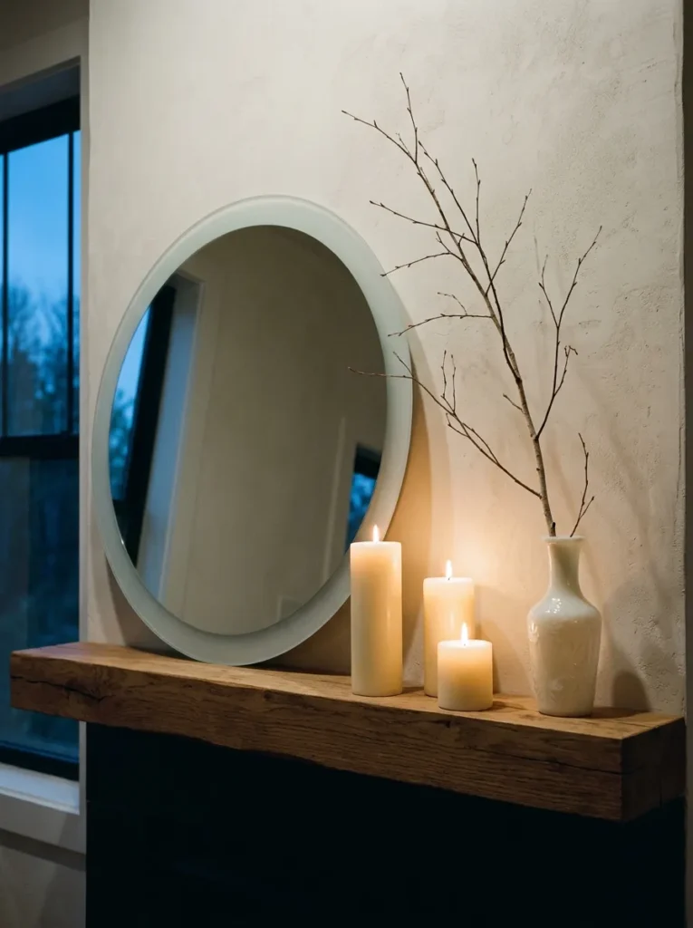
- Anchor piece: an oversized round mirror with a softly frosted, sandblasted edge
- Color and material palette: icy blue-white, brushed nickel, pale birch bark, milk glass
- Layering plan: mirror leaned high against the wall as the back layer; bare birch branches in a tall milk-glass vase anchor the left side; staggered pillar candles in ascending heights fill the right
- Lighting: candlelit evening mood — the frosted edge catches and diffuses the flame into a soft halo instead of a sharp reflection
- Botanical elements: bare white birch branches, no evergreen — the pale wood keeps the palette icy rather than woodsy
- Standout detail: the sandblasted mirror edge, which reads as a gentle glow at dusk rather than a hard reflective line
- Construction note: my husband always tells clients to keep candle wicks at least 3 inches back from the mantel’s front edge — with a working fireplace running underneath through the coldest months, rising heat can warp glass vases or scorch branch tips faster than people expect
Why this works: A frosted, light-diffusing surface does more to brighten a short winter afternoon than a dozen candles placed against plain wood ever could.
A frosted mirror does something candles alone can’t — it multiplies the light instead of just producing it. In a room that only gets a few real hours of daylight this time of year, that matters more than people realize. I styled a version of this for a client’s living room last January, and she texted me two weeks later saying it was the first time her mantel felt “finished” without a single Christmas item on it. The bare birch keeps things architectural, not sparse, and the sandblasted edge softens every flame into something closer to candlelight bouncing off frost on a window.
Skip the polished, high-shine mirror finish here — it throws a hard glare once candles are lit, which fights the mood instead of building it. A frosted or lightly antiqued edge absorbs light and releases it slowly, which is exactly what a dim winter room needs. Group your pillar candles in odd numbers (three or five) at varying heights, never a single uniform row — it reads as intentional rather than default. This is a mantel built for the 4 p.m. dusk, when most winter rooms start to feel flat, and it holds its own straight through February.
2. Asymmetrical Evergreen Sweep
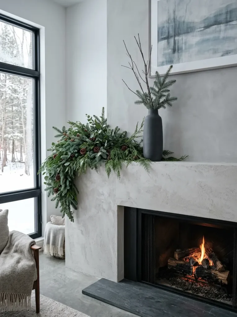
Deep evergreen is the anchor color here — cedar, blue spruce, and eucalyptus laid in a loose, off-center sweep rather than a symmetrical garland.
- Anchor piece: a large-scale botanical arrangement, not a garland — think a loose evergreen “sweep” gathered at one end
- Color and material palette: deep cedar green, blue-gray spruce, matte charcoal, aged brass
- Layering plan: greenery piles thick and low on the left third of the mantel, tapering to almost nothing by the right third, with one tall charcoal ceramic vase breaking the horizontal line
- Lighting: crisp winter daylight — this idea photographs best in the flat, bright light of a clear cold morning
- Botanical elements: blue spruce, cedar, and silver-dollar eucalyptus, all of which hold their color and needles for 6-8 weeks indoors, far longer than fir
- Standout detail: the deliberate asymmetry — all the visual weight on one side, which is a harder look to get right than a centered garland but reads as far more current
- Construction note: if you’re mounting anything heavier than the greenery itself (a piece of art, a sconce) above a working firebox, my husband always checks for the header beam location first — most older Austin homes have it centered above the opening, and a stud finder alone can miss it
Why this works: An asymmetrical arrangement forces the eye to travel across the mantel instead of stopping in the middle, which is the same principle photographers use when they frame a shot off-center.
I’ll be honest — my first attempt at an asymmetrical mantel sweep looked unfinished, not intentional, and it took me two tries to understand why. The trick is committing fully to the imbalance instead of hedging toward the center. Blue spruce and cedar work better here than the fir most people default to, because they hold their blue-green cast and don’t drop needles by week three. Piled thick on one end and trailing to almost nothing on the other, the arrangement reads as gathered from the yard that morning rather than store-bought and centered, which is exactly the lived-in feeling a winter mantel should have.
Symmetry is easy. Asymmetry takes restraint, because the temptation is always to add “just a little” greenery to the empty side to balance things out — resist it. The imbalance is the point. Choose one tall object, like a matte charcoal vase, to interrupt the horizontal sweep and give the eye somewhere to land. This idea leans on natural materials that actually improve with a few weeks of drying, so it only gets better looking from December into February, long after a fresh-cut garland would have browned and dropped.
3. Sculptural Object & Silver
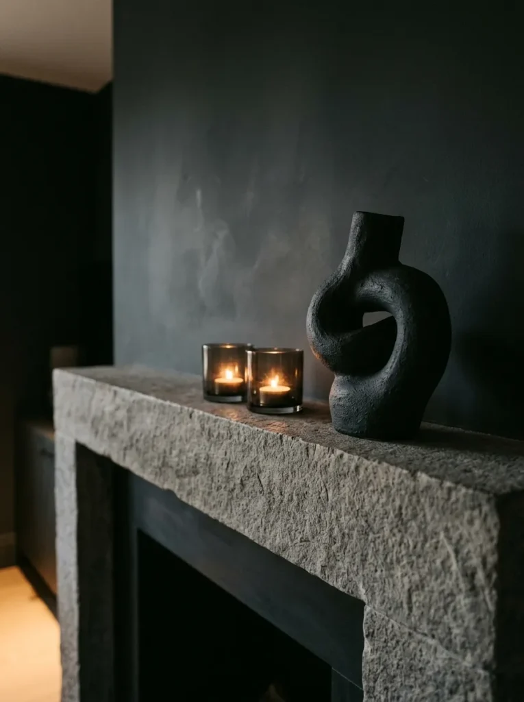
- Anchor piece: a single large sculptural object — a matte ceramic or plaster form, abstract rather than representational
- Color and material palette: charcoal, brushed silver, unglazed stoneware, smoked glass
- Layering plan: the sculpture sits slightly off-center as the tallest point, with two low smoked-glass votives in front and nothing else — negative space is doing most of the work
- Lighting: candlelit evening, low and moody, letting shadow define the sculpture’s form rather than flooding it with light
- Botanical elements: none — this idea is deliberately botanical-free, which is rare enough in mantel styling to feel fresh on its own
- Standout detail: the restraint itself; most winter mantels over-layer, and this one proves a single striking object outperforms five smaller ones
- Construction note: for anything freestanding and heavy on a mantel shelf, check that the shelf depth actually supports the object’s full footprint — my husband has re-set more than one client’s mantel shelf after a piece was set too close to the front edge and eventually tipped
Why this works: A single well-chosen object photographs better at thumbnail size than a crowded vignette ever will, because the eye has only one thing to focus on.
I’ve noticed that the mantels people save most often on Pinterest aren’t the busiest ones — they’re the ones with a single strong piece and a lot of breathing room around it. This idea tests that theory directly. A matte, unglazed sculptural form in charcoal or bone white reads as intentional in a way that a shelf full of smaller objects rarely does, especially once you photograph it. The two low smoked-glass votives in front don’t compete with the sculpture; they just add a flicker of warmth at eye level while the real visual weight stays up top, unmoving and quiet.
This is the idea I’d recommend to anyone who feels like their mantel always looks cluttered no matter what they try. Pick one object with real presence — height, texture, an interesting silhouette — and then stop. Resist adding a candle here, a branch there. The negative space around the sculpture is what makes it read as deliberate rather than sparse. It’s also the lowest-maintenance idea on this list: nothing to water, nothing that wilts, nothing to replace as the season goes on.
4. Vintage Brass & Amber Glow
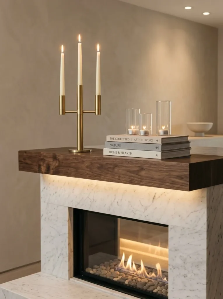
- Anchor piece: a tall, multi-arm vintage brass candelabra, unpolished so the patina shows
- Color and material palette: amber-gold, aged brass, cream, warm walnut
- Layering plan: candelabra centered as the tallest point, a low stack of three linen-bound books to its left, three squat amber glass votives scattered to the right at uneven spacing
- Lighting: candlelit evening — this is the warmest, most golden idea in the whole lineup, meant for after dark
- Botanical elements: none — the warmth here comes entirely from metal and flame, not greenery
- Standout detail: the deliberately unpolished brass finish, which catches candlelight in a soft, uneven glow that a chrome or lacquered piece never would
- Construction note: my husband flags this one often — a multi-arm candelabra dripping wax onto a wood mantel surface is one of the most common damage calls he gets in winter, so a slim glass or brass drip tray under each arm is worth the $8 it costs
Why this works: Unpolished brass reflects candlelight in soft, broken pools instead of one sharp glare, which is why aged metal photographs warmer than anything freshly lacquered.
This is the idea I reach for when a room feels too cool and needs an infusion of warmth without adding a single string of lights. Amber glass, aged brass, and warm walnut tones all bounce candlelight around rather than absorbing it, so even a modest three or four candles make the whole mantel glow. I’ve noticed guests always comment on this one first when they walk in on a dark evening — it reads as effortless, even though it’s really just about choosing materials that respond well to low light. It’s also the easiest idea here to build from things already sitting in a closet.
Keep the candelabra slightly off-center rather than dead-middle — it reads as found and collected, not staged. The uneven votive spacing matters more than people expect; three candles set at identical distances look mass-produced, while three set at slightly different heights and gaps look gathered over time. This palette also happens to be the most forgiving one on this list for a room with warm-toned wood floors or trim, since amber and walnut won’t fight existing undertones the way a cooler navy or icy blue-white might in the same space.
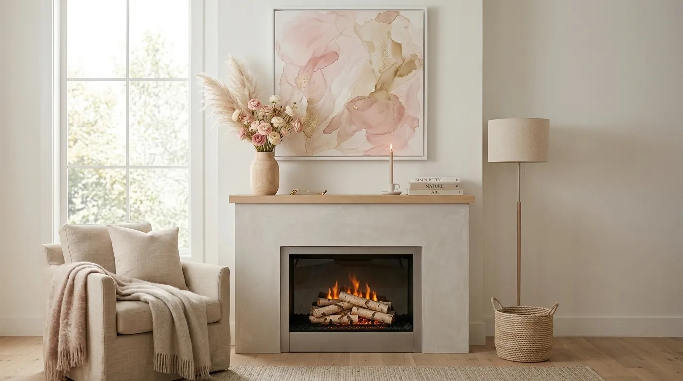
5. Blush Ranunculus & Bleached Branch
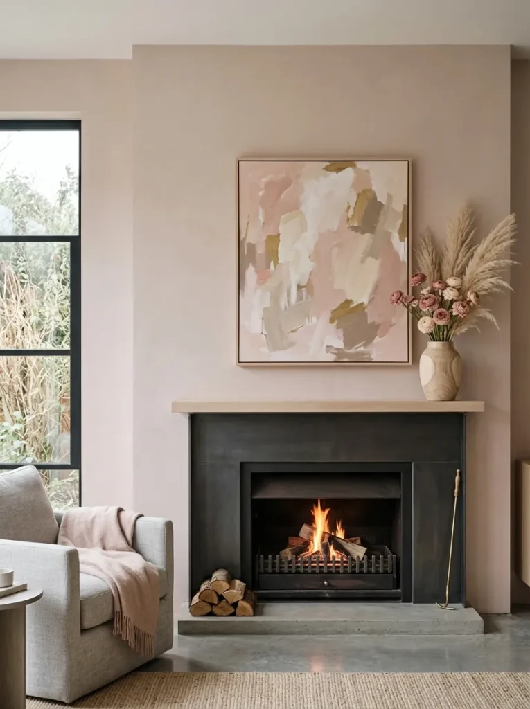
Soft pink doesn’t get much airtime in winter styling, which is exactly why it stands out here — most winter content defaults to icy or evergreen tones and skips warmth-with-softness entirely.
- Anchor piece: a large abstract art print in a frame painted to match the wall color exactly
- Color and material palette: blush pink, warm white, bleached oak, brushed gold
- Layering plan: the color-matched frame leans high at the back; a bleached-oak vase with dried ranunculus and pampas grass sits low in front, angled slightly toward the room
- Lighting: soft overcast daylight — this palette needs diffused, even light to avoid looking too saccharine
- Botanical elements: dried blush ranunculus and natural (undyed) pampas grass, both of which hold their color for months once fully dried
- Standout detail: the “color-drenched” frame — painting the art frame the exact wall color so the art appears to float, a technique borrowed straight from 2026 gallery styling
- Construction note: none for this idea
Why this works: A frame painted to match its wall removes the visual break between art and surface, making the piece look built-in rather than hung on.
I tried this frame technique in my own hallway before bringing it to a mantel, mostly out of curiosity, and I was surprised how much more expensive the art looked once the frame disappeared into the wall. Blush pink reads as soft rather than sweet when it’s paired with bleached wood and brushed gold instead of anything shiny or saturated. Dried ranunculus holds its shape and color for months, which makes this one of the lowest-maintenance botanical ideas on the list. It photographs best in flat daylight, when the pink stays true instead of shifting warm or orange under artificial light.
This palette works especially well in a room that already leans neutral and could use one confident color note without going bold. The trick is restraint elsewhere — if the frame and wall match, keep every other surface (the vase, the mantel itself) in a quiet neutral so the blush has room to read clearly. Avoid mixing in silver accents here; brushed gold is the only metal that keeps this palette feeling warm rather than cold. This is a mantel built for a bright, overcast February afternoon as much as a December evening.
6. Vintage Skates & Wool Throw
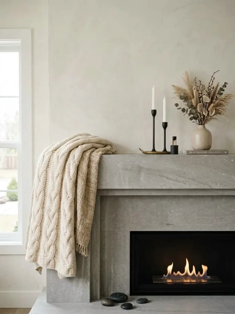
- Anchor piece: a pair of vintage leather ice skates, laces knotted and hung from two iron wall hooks
- Color and material palette: charcoal, weathered black iron, cream wool, aged cognac leather
- Layering plan: skates hung centered and slightly above the mantel line; a chunky cream wool throw draped loosely along the mantel’s front edge, cascading a few inches down the surround; two matte iron candle holders set low on either side
- Lighting: crisp winter daylight, slightly overcast — this idea is tactile more than glowing, and flat daylight shows the wool texture best
- Botanical elements: none
- Standout detail: the draped wool throw spilling over the mantel’s front lip, which adds a soft, tactile layer most mantels skip entirely in favor of only hard materials
- Construction note: none for this idea
Why this works: Genuine vintage objects with real wear — scuffed leather, worn iron — photograph with more texture and story than anything bought new, which is a big part of what makes a mantel feel collected instead of styled.
I found a pair of skates almost identical to these at a Round Top antiques weekend a couple of years ago, and I still think about how much life a single well-worn object can bring to a mantel. This idea leans entirely on texture instead of color drama — the roughness of aged leather, the softness of chunky wool, the cold matte finish of iron. Together they read as distinctly winter without a single sprig of greenery or drop of holiday red. It’s the idea I’d recommend to anyone whose mantel currently feels too polished or too new.
Texture does the heavy lifting here, so resist the urge to add anything glossy or reflective — a shiny brass hook or a glass vase would undercut the whole point. Let the wool throw drape unevenly rather than folding it into a neat rectangle; a slightly rumpled cascade looks lived-in, while a crisp fold looks staged. If you can’t find vintage skates specifically, any well-worn leather-and-metal object with an obvious winter or outdoor association works the same way — the goal is genuine texture and age, not a specific object.
7. Navy Velvet & Frosted Spheres
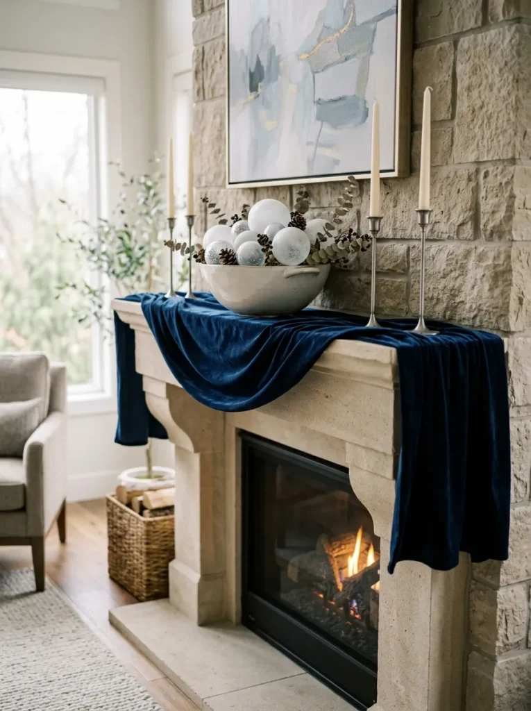
- Anchor piece: a wide, shallow ceramic bowl filled with oversized hand-blown frosted glass spheres, unadorned and matte
- Color and material palette: deep navy, frosted white glass, brushed pewter, cream
- Layering plan: a navy velvet table runner draped along the full mantel edge, cascading slightly over the front lip; the glass-sphere bowl centered; two slim pewter taper candlesticks flanking at equal height
- Lighting: soft overcast daylight for the velvet’s texture, with the option to relight in the evening for a moodier navy-on-candlelight version
- Botanical elements: none
- Standout detail: the velvet runner cascading over the mantel’s front edge instead of sitting flat on top — a small styling move that adds real dimension in photos
- Construction note: none for this idea
Why this works: A matte or velvet texture keeps deep navy feeling current rather than heavy or dated, which is the risk a glossy version of the same color runs into.
Winter’s darkest color stories work best against a matte finish; a glossy navy surface tends to read as heavy or dated by comparison, while a matte or velvet texture keeps deep color feeling current. Deep navy is the boldest palette on this list, and it’s the one I’d steer people toward if their current mantel setup feels too safe. The velvet runner is doing most of the work — it introduces color and softness at the same time, which most winter mantels only manage with paint or greenery. Frosted glass spheres in a shallow bowl add just enough sparkle to catch the light without tipping into anything that reads as a holiday ornament.
Choose a velvet runner with real weight to it; a thin or synthetic fabric won’t drape with the same soft folds over the mantel’s edge, and that cascading detail is what separates this from a flat table-runner look. Keep the pewter candlesticks slim and unadorned so they don’t compete with the navy for attention. This palette photographs beautifully in both daylight and candlelight, which makes it one of the more versatile ideas here — equally at home on a bright Tuesday afternoon or a dark Saturday evening in late January.
You’ll Also Love:15 Winter Porch Decor Ideas That Survive the Cold
8. Charred Wood & Copper
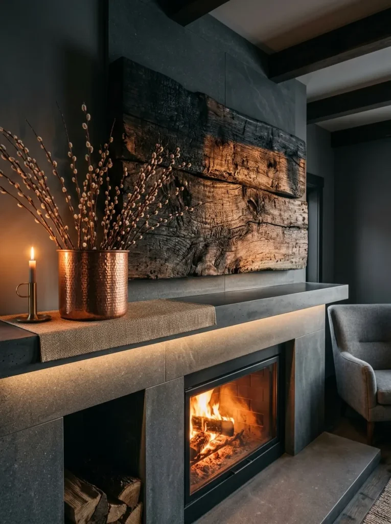
Reclaimed, deliberately charred wood is having a real moment in 2026 interiors, and it hasn’t shown up in mantel styling content yet the way it has in furniture and paneling — most “winter mantel” articles still default to whitewashed or natural wood tones.
- Anchor piece: a single slab of shou sugi ban (charred) wood, mounted as a floating shelf accent above the existing mantel line
- Color and material palette: deep charred black-brown, aged copper, warm cream, natural jute
- Layering plan: the charred wood slab sits as the highest visual point; a hammered copper vessel with bare pussy willow branches sits low and slightly left; a rolled jute-fiber mat layer underneath the vessel adds texture at the base
- Lighting: candlelit evening — the charred texture needs warm, raking light to show its grain
- Botanical elements: bare pussy willow branches, which hold their soft catkin texture through the whole winter without dropping or wilting
- Standout detail: the charred wood’s texture itself, which catches candlelight in a way that reads almost like stone at a glance, until you notice the visible wood grain
- Construction note: my husband’s crews use shou sugi ban on exterior siding more than interiors, and his one rule carries over here — charred wood needs a clear sealant coat before it goes anywhere near a mantel, or the surface will transfer soot onto anything (or anyone) that brushes against it
Why this works: Charred wood absorbs light instead of reflecting it, which creates a depth and richness that flat-painted black surfaces can’t match.
I’ll admit this idea took me the longest to get right, mostly because charred wood reads very differently depending on the light hitting it. In flat daylight it can look almost matte-black and a little flat, but under candlelight the grain suddenly shows through in warm, coppery streaks — which is exactly why I paired it with an actual copper vessel instead of brass or iron. The two materials talk to each other in a way that feels intentional rather than accidental. Bare pussy willow branches add just enough softness to keep the whole look from feeling too austere or industrial.
This is the idea for anyone who wants their mantel to feel a little unexpected, not just seasonal. Charred wood isn’t cheap or always easy to source locally, but a smaller accent piece — even a single charred picture frame or vase — gets you most of the effect without redoing the whole mantel surface. Keep the surrounding materials warm (copper, jute, cream) rather than cool; charred wood next to anything icy or silver reads as harsh instead of rich. This palette holds its mood equally well from December straight through the darkest weeks of February.
9. Ice-Blue Ceramics & Glass Icicles
Cold color palettes actually read as more restful to the eye than warm ones under low light — a well-documented effect of how the human eye’s rod cells (active in dim conditions) are more sensitive to blue-green wavelengths than red or amber ones, which is part of why a blue-toned room can feel calmer at dusk than a warm one of equal brightness.
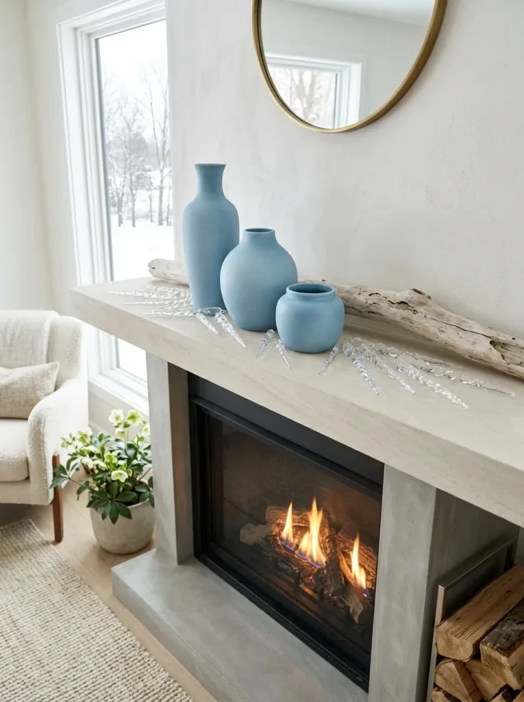
- Anchor piece: three graduated ice-blue ceramic vessels, matte-glazed, clustered rather than lined up
- Color and material palette: pale ice blue, frosted clear glass, driftwood gray, brushed silver
- Layering plan: the three ceramic vessels cluster off-center at varying heights; six hand-blown glass icicle ornaments (unhooked, laid flat rather than hung) rest along the mantel surface in a loose scatter; one piece of bleached driftwood lies horizontal along the back
- Lighting: crisp winter daylight — this palette is built for bright, cold-morning light rather than evening warmth
- Botanical elements: none
- Standout detail: the glass icicles laid flat and scattered rather than hung from the mantel edge, which avoids reading as a leftover Christmas ornament while keeping the icy motif
- Construction note: none for this idea
Why this works: A truly cold-toned winter palette photographs best in natural daylight, not artificial or candlelight, because warm bulb light shifts blue tones toward gray and mutes the effect.
I’ve styled a version of this in a client’s dining room that had almost no direct sun, and it taught me something useful: pale blue only works if the room actually gets real daylight at some point in the day, otherwise it reads as flat and cold rather than fresh and icy. In a bright room, though, this palette is one of the most restful on the list — the graduated ceramic heights create movement without needing a single piece of greenery, and the scattered glass icicles catch daylight in small, scattered glints rather than one obvious sparkle point.
If your mantel gets mostly indirect or north-facing light, I’d steer toward a warmer idea instead — this one needs the sun to do its job. Cluster the ceramic vessels in odd numbers and vary their heights noticeably; three identical heights in a row looks like a factory set, while a clear tallest-to-shortest progression looks curated. The driftwood adds a neutral gray note that keeps the blue from feeling too saccharine or nursery-like, which is the biggest risk with pale color palettes in general.
10. Boucle & Antique Brass Sconces
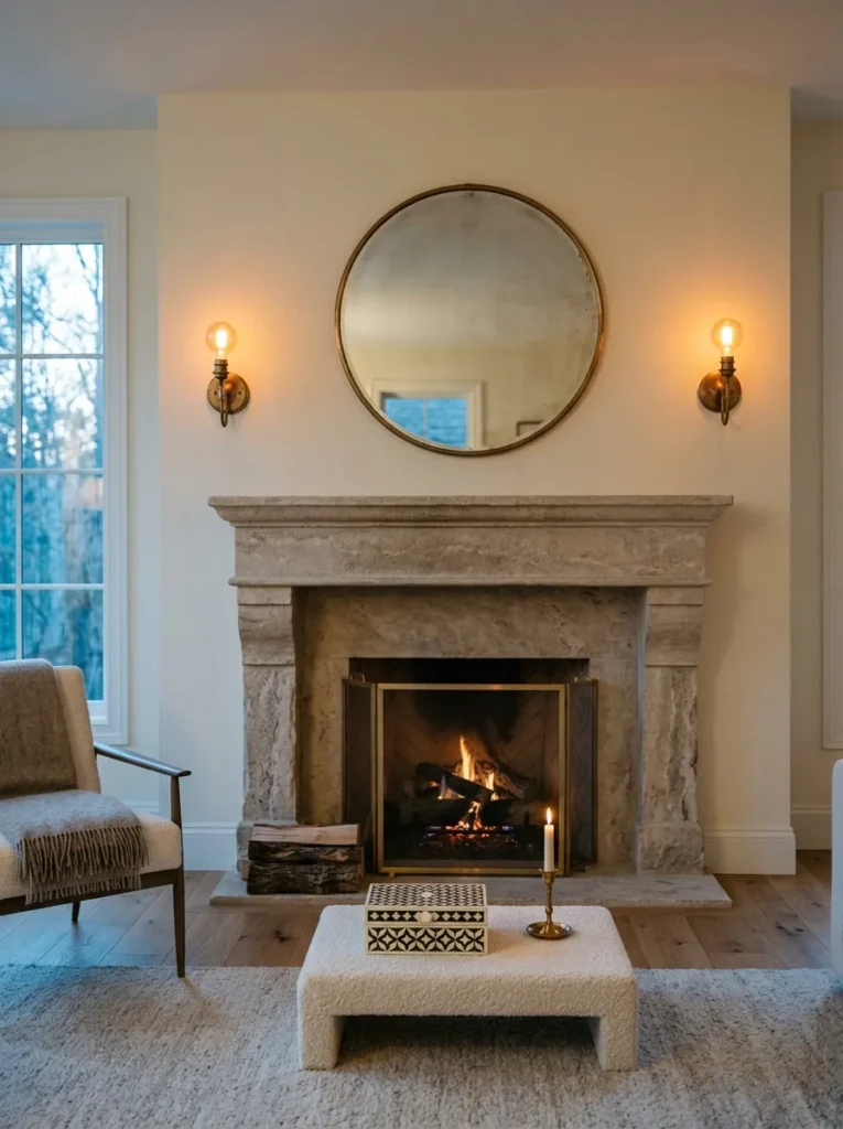
- Anchor piece: a pair of vintage brass wall sconces flanking the mantel, mounted directly above rather than an object sitting on the shelf
- Color and material palette: cream boucle, warm aged brass, oatmeal linen, natural bone
- Layering plan: sconces mounted high on either side as the frame; a boucle-wrapped low stool or plinth object centered on the mantel itself (used as a textural riser, not seating); one small bone-inlay box set beside it
- Lighting: both — the sconces provide ambient evening light, while the palette holds up equally well under daytime light, making this the most flexible lighting idea on the list
- Botanical elements: none
- Standout detail: using architectural lighting (wall sconces) as the anchor instead of a tabletop object — most mantel styling ignores the wall space directly above and around the shelf
- Construction note: mounting sconces on either side of a mantel means running wiring through masonry or an existing chase, and my husband always tells clients to have an electrician confirm there’s an accessible path before falling in love with a specific placement — retrofitting brick or stone after the fact is a much bigger job than most people expect
Why this works: Wall-mounted ambient light does something no candle or lamp can — it stays on all evening without upkeep, which matters most during winter’s longest, darkest stretch of the year.
This is the idea I’d point to for anyone whose winter evenings feel dim no matter how many lamps they turn on. Sconces flanking the mantel add real, reliable light exactly where a room needs it most from 5 p.m. onward, and they free up the mantel surface itself for texture instead of light sources. The boucle-wrapped riser adds a soft, tactile note that photographs beautifully next to the warm brass — nubby texture next to smooth metal is a pairing I keep coming back to in my own projects, because it reads as considered without trying too hard.
If a full sconce installation isn’t realistic right now, this idea still works with plug-in sconces or a pair of brass wall lights on a cord, mounted the same way. The core principle — using wall-level lighting instead of relying only on the mantel surface — is what carries the look, not the specific hardware. Keep everything else on the mantel itself minimal, since the sconces are already doing the visual and functional heavy lifting for the whole vignette.
11. Raw Plaster Relief & Pewter
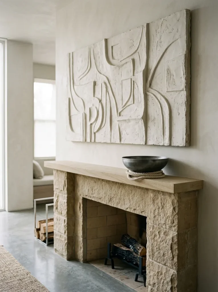
- Anchor piece: a large-scale raw plaster wall relief — an abstract, sculptural textured panel rather than a framed print
- Color and material palette: warm oatmeal, raw plaster white, aged pewter, unbleached linen
- Layering plan: the plaster relief mounted directly above the mantel as the dominant visual layer; a single wide pewter bowl centered below, holding nothing but a loose coil of raw linen cord; negative space fills the rest of the shelf
- Lighting: soft overcast daylight — raking, low-angle light is what makes the plaster’s texture actually visible
- Botanical elements: none
- Standout detail: the plaster relief’s hand-worked texture, which changes appearance dramatically depending on the light angle — nearly flat at midday, deeply shadowed at dusk
- Construction note: none for this idea
Why this works: Textured plaster catches and holds shadow in a way flat-painted art never can, which means the same piece looks genuinely different morning to evening — a kind of built-in visual interest most mantel decor can’t offer.
I’d never noticed how much a room’s light changes throughout a winter day until I lived with a plaster piece like this one in my own hallway. At noon it looked almost architectural and quiet; by 4 p.m., raking light caught every ridge and turned it into something with real depth and shadow. That shift is the whole point of this idea — it rewards a room that gets decent natural light at more than one time of day. The pewter bowl below stays intentionally empty, letting the relief do all the visual work without competing for attention.
This is the most minimal idea on the entire list, and it’s not for every room — a mantel that’s usually busy with framed photos or collected objects will feel bare here at first. But in a space that already leans quiet or neutral, raw plaster adds texture without adding clutter, which is a distinction I think gets lost in a lot of winter styling. Keep everything else on the shelf matte and low-contrast; anything glossy nearby will pull focus away from the plaster’s subtle shadow play.
12. Antique Ironstone Collection
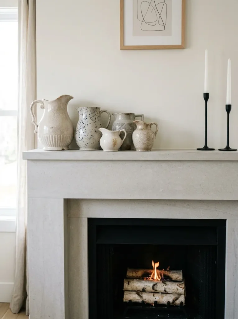
- Anchor piece: a clustered collection of antique white ironstone pitchers and jugs, mismatched shapes and sizes, genuinely old rather than reproduction
- Color and material palette: aged ivory-white, deep charcoal, black iron, natural cream
- Layering plan: five to seven ironstone pieces clustered tightly at the mantel’s left end, tallest pieces toward the back; two black iron taper holders anchor the empty right side; nothing else on the shelf
- Lighting: crisp winter daylight — the ironstone’s subtle glaze crazing and imperfections show best in bright, direct light
- Botanical elements: none
- Standout detail: the visible age on the ironstone itself — hairline crazing, slightly uneven glaze, mismatched maker’s marks — which no new ceramic piece can replicate
- Construction note: none for this idea
Why this works: Visible age — hairline crazing, uneven glaze, mismatched maker’s marks — is exactly what separates a genuinely old piece from a modern reproduction meant to look aged.
Antique ironstone almost always shows fine surface crazing under close light, and that imperfection is exactly what separates a genuinely old piece from a modern reproduction meant to look aged. I started collecting ironstone almost by accident, picking up a single pitcher at an estate sale because I liked its shape, and now I have close to twenty pieces I rotate through different rooms. What I’ve noticed is that a cluster like this photographs completely differently than a matched set ever could — the slight variation in white tones and shapes is what makes it read as gathered over years, not bought in an afternoon.
If you don’t already have a collection, a few well-chosen secondhand pieces from an antique mall or estate sale will get you most of the way there — resist buying a matched set from a home store, since uniformity is exactly what undercuts the look. Cluster pieces tightly rather than spacing them evenly; a loose, casual grouping reads as collected, while evenly spaced pieces read as staged. This palette is quietly one of the most versatile on the list, working equally well against a white, gray, or wood-toned wall.
13. Silver-Leafed Branches & Smoked Glass
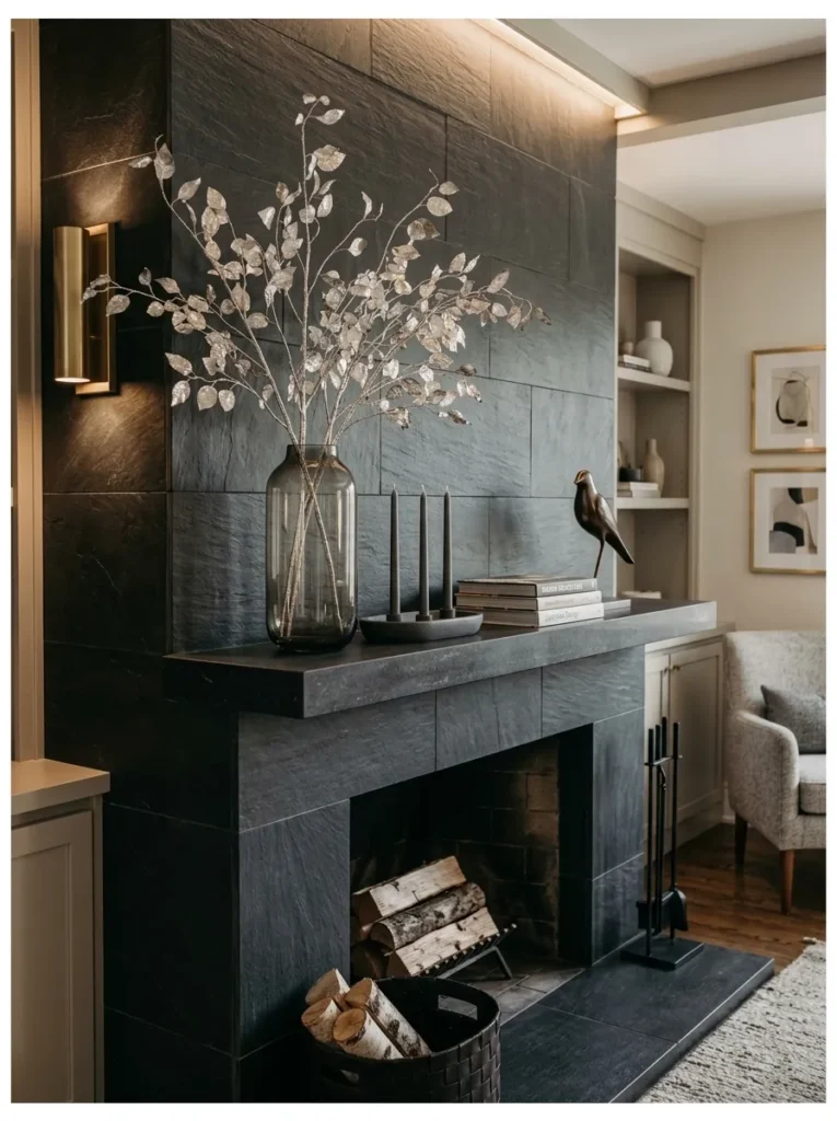
- Anchor piece: a tall smoked-glass cylinder vase filled with silver-leafed branches (metallic-painted natural branches, not artificial stems)
- Color and material palette: smoked charcoal glass, brushed silver, deep graphite, warm white
- Layering plan: the branch arrangement sits off-center as the tallest element; a low graphite ceramic dish with three unlit silver taper candles sits in front; the rest of the mantel stays empty
- Lighting: candlelit evening, but photographed with the tapers unlit to emphasize the metallic branch texture against soft ambient light
- Botanical elements: real branches (birch or dogwood work well), hand-finished with a light silver leaf or metallic wax rather than spray paint, which keeps the finish from looking plastic
- Standout detail: the branches’ hand-applied metallic finish, uneven and slightly imperfect on purpose, versus a uniform sprayed look
- Construction note: none for this idea
Why this works: An uneven, hand-applied metallic finish catches light in scattered glints rather than one flat sheen, which reads as considerably more expensive than a uniformly sprayed finish, even when the materials cost the same.
I tried spray-painting branches silver once, years ago, and the result looked exactly like what it was — a craft project. What actually works is rubbing metallic wax or leaf onto real branches by hand, leaving bare wood showing through in places. The imperfection is what sells it. Set against smoked glass, which already has a soft, moody tint built in, the branches read as sculptural rather than seasonal-craft. This is a palette that leans cool and a little dramatic without tipping into anything icy or pastel, which makes it a good fit for a room with darker walls or moodier existing furniture.
This idea works best in a room that already has some black, charcoal, or deep gray elements elsewhere, since the smoked glass and graphite dish need something to relate to. In an all-white or heavily neutral room, this palette can feel like an unrelated dark note rather than an intentional one. Keep the branch arrangement asymmetrical and a little wild-looking rather than trimmed and tidy — the natural, slightly unruly shape is part of what keeps this from reading as a store-bought centerpiece.
14. Wool Pom Garland & Slate
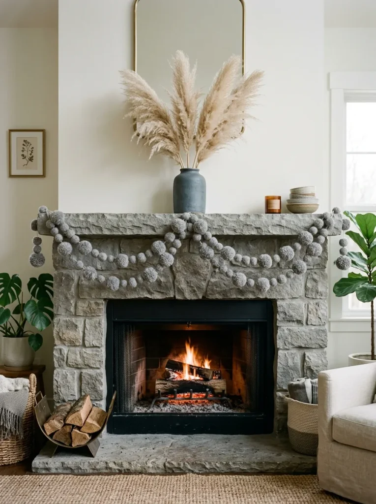
Most winter mantels that use a garland default to evergreen without exception — this idea swaps that material entirely for something almost nobody covers: a hand-felted wool pom garland, styled as a genuine winter textile piece rather than a holiday stand-in.
- Anchor piece: a long hand-felted wool pom garland in graduated gray tones, draped rather than a botanical garland
- Color and material palette: slate gray, dove gray, charcoal wool, warm white
- Layering plan: the pom garland drapes in two soft swags across the mantel’s front edge; a single slate-gray stoneware vase with dried pampas sits centered behind it; nothing else added
- Lighting: soft overcast daylight, which keeps the wool’s texture visible without harsh shadow
- Botanical elements: dried natural pampas grass only, kept minimal so the garland stays the clear focal point
- Standout detail: using a felted wool garland instead of any greenery at all — a genuinely uncommon swap that still reads as fully wintery and tactile
- Construction note: none for this idea
Why this works: A garland doesn’t have to be botanical to read as seasonal — texture and color can carry the same visual weight that greenery usually provides.
I came across a felted wool garland like this at a craft market a couple of winters ago and almost didn’t buy it, assuming it would look more like a kid’s craft project than a design piece. It didn’t. Draped in soft, uneven swags across a mantel, graduated gray wool poms read as genuinely tactile and current, closer to a textile art piece than a garland in the traditional sense. It also solves a real problem: greenery eventually dries out, browns, or needs replacing partway through the season, while wool holds its color and shape from December straight through February without any upkeep at all.
This idea is worth trying specifically because it sidesteps the most predictable choice most winter mantels make. Drape the garland in two soft dips rather than one straight line across the mantel — a single taut line looks more like bunting than a considered swag. Keep the surrounding objects minimal and matte; the wool’s texture is already doing the visual work, and anything glossy nearby competes with it rather than supporting it. It’s also one of the most reusable ideas here, since the garland itself has no seasonal expiration.
15. Antique Globe & Terracotta, Winter Mantel Decorating Ideas
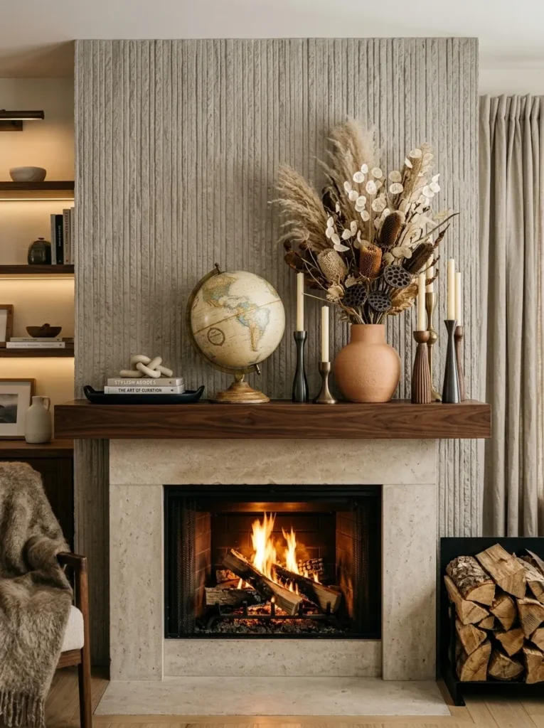
- Anchor piece: a vintage terrestrial globe on its original wood or brass stand, genuinely old rather than a reproduction
- Color and material palette: deep terracotta, aged brass, cream linen, black walnut
- Layering plan: the globe sits centered on the mantel as the clear focal point; a low terracotta vase with dried oat grass sits just behind and to the left; two black walnut candlesticks flank at equal height
- Lighting: crisp winter daylight — the globe’s aged paper surface and faded ink lines show best in bright, direct light
- Botanical elements: dried natural oat grass, which holds its soft golden-cream color through the entire winter without any treatment needed
- Standout detail: the globe itself — a genuinely unexpected object for mantel styling that most winter decor content never considers, and one that reads as collected rather than decorated
- Construction note: none for this idea
Why this works: An object with an obvious history — worn edges, faded ink, visible age — gives a room a sense of having been lived in for years, which no newly manufactured decor piece can fake.
I picked up a globe almost identical to this one at an antique shop off South Congress a few years back, mostly because I liked the color the aged paper had turned, somewhere between cream and rust. It’s become one of my favorite mantel objects precisely because it doesn’t look seasonal at all — it looks collected, like something that’s simply always been there. Paired with warm terracotta and black walnut, it grounds a room in a way that feels intellectual and warm at once, without leaning on a single traditional winter motif.
This idea is worth trying if your mantel currently relies entirely on candles or greenery and could use one genuinely unexpected object instead. A globe is an easy find secondhand — antique malls, estate sales, and online marketplaces all turn them up regularly, usually for less than a new decorative object would cost. Keep the surrounding pieces quiet and low-contrast so the globe stays the clear focal point; this is an idea built around one strong object doing most of the work, not a fully layered vignette.
Styling Principles: From Christmas to a Standalone Winter Look
Taking down Christmas decor doesn’t have to mean starting over from a bare mantel. The transition works best when you treat it as an edit, not a demolition: pull anything explicitly holiday-specific — ornaments, stockings, red and green combinations — and take an honest look at what’s left. Botanical elements, candles, and any neutral-toned objects can often stay in place as the foundation for a winter look, saving you from rebuilding the entire vignette from scratch in the first week of January.
Lighting deserves more attention in winter styling than it usually gets, mostly because the days themselves are working against you. Sunset in most of the country falls before 6 p.m. through January, which means a mantel needs to hold its own under artificial and candlelight for a good six or seven months’ worth of evenings combined with the shorter winter stretch. Layer at least two light sources into any winter mantel — a candle grouping plus one ambient source, like a sconce or a lamp nearby — rather than relying on a single light to carry the whole vignette after dark.
Frequently Asked Questions
When should I take down Christmas decor and switch to a winter mantel look? Most people take Christmas decor down within the first two weeks of January, and that’s a good target for the switch. Waiting longer tends to make a room feel dated rather than festive, while switching to a dedicated winter look right after keeps the mantel feeling current through the rest of the cold season.
What evergreen materials actually last through the winter without drying out? Blue spruce and cedar hold their color and needles for 6 to 8 weeks indoors, considerably longer than fir, which tends to drop needles within a few weeks of being cut. If you want greenery to last from January into February, spruce and cedar are the more reliable choices.
What’s a budget-friendly way to try a winter mantel look? Antique ironstone, a single vintage object like a globe or candelabra, and dried botanicals like pampas grass or oat grass are all inexpensive and available secondhand. A collection built slowly over a few estate sales or antique mall visits often costs less than one new statement piece from a home store.
Is it safe to have candles on a mantel above a working fireplace in winter? Keep candle wicks at least 3 inches back from the mantel’s front edge, since rising heat from a working firebox can warp glass vases or scorch nearby branches faster than most people expect. A slim glass or brass drip tray under any taper or candelabra also protects the mantel surface from wax damage.
How long can winter mantel decor stay up? A genuine winter mantel, styled without holiday-specific pieces, works comfortably from early January straight through late February — roughly two months longer than most Christmas decor stays up. Materials like dried botanicals, felted wool, and ceramics hold their look for the entire stretch without needing any refresh.
Do I need greenery for a mantel to read as “winter”? No — several ideas here use no botanicals at all, relying instead on texture, color, and materials like brass, plaster, or wool to signal the season. Greenery is one option among many, not a requirement, for a mantel to feel genuinely wintery.
Conclusion
A mantel doesn’t have to go quiet once the ornaments come down. These fifteen ideas prove there’s a whole season of styling left to explore between the holidays and spring — icy palettes for bright mornings, candlelit warmth for dark evenings, and textures that hold up for months without a single refresh. I’ve seen how much a well-styled mantel changes the feel of a room during winter’s darkest stretch, and it rarely takes more than one or two intentional swaps to get there.
Save this post to Pinterest, try one idea in your own space this week, and pass it along to anyone whose mantel could use a little winter identity of its own.