15 Winter Centerpiece Ideas for Cozy Gatherings
There’s nothing quite like walking past a beautifully set winter table — candlelight flickering, evergreen trailing across the linen, the whole room feeling warmer just from looking at it. If your table usually goes bare the moment the Christmas decorations come down, you’re not alone, and it’s an easy fix. These winter centerpiece ideas are built specifically for the season itself, not a single holiday, so they work just as well for a New Year’s dinner as they do for a quiet Tuesday night in February.
In my experience, a table that still feels intentional in the dead of winter makes the whole house feel more lived-in. Below, you’ll find 15 fully styled ideas — each with its own palette, lighting plan, and standout detail — ready to recreate in your own home.
Why Your Table Needs a Centerpiece That Isn’t Tied to a Holiday
Here’s something most decor guides skip: a centerpiece built for one single holiday has an expiration date. Pack away the ornaments and ribbon on January 2nd, and your table sits bare for the two darkest, coldest months still ahead. A genuinely seasonal arrangement — built around evergreen, candlelight, and texture instead of holiday symbols — can stay exactly where it is from December straight through February without ever looking out of place or out of season.
I learned this the hard way after tossing a poinsettia arrangement the first week of January, then staring at an empty table for six weeks straight. A centerpiece rooted in winter itself, rather than a single holiday, stays relevant for the entire coldest stretch of the year. That’s exactly what these 15 winter centerpiece ideas are built to do.
1. Frosted Glass & Ice
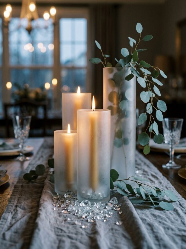
- Vessel/base: a trio of frosted glass cylinder vases in graduated heights (5″, 8″, 11″) with an etched, permanently-frosted surface
- Color/material palette: icy blue-white, brushed silver, pale eucalyptus green, soft dove gray
- Height/proportion: tallest vessel tops out at 11 inches, keeping sightlines open across the table
- Candle/lighting plan: slim silver taper candles at mismatched heights (6″, 9″, 12″) nestled between the vases, doubling in the frosted glass at dusk
- Botanical elements: silver-dollar eucalyptus and a few sprigs of blue spruce, chosen for their blue-gray cast under evening light
- Textile/runner: brushed pale-gray linen, left slightly rumpled rather than pressed flat
- Standout detail: crushed glass “ice” scattered at the vessels’ bases, catching candlelight like real frost
Why this works: Frosted glass reflects candlelight instead of absorbing it, which makes a small flame source read as much brighter across a long winter table.
Frosted glass does something plain glass can’t: it scatters candlelight instead of letting it pass straight through, so a single taper looks like it’s doing the work of three. That’s a real advantage once winter evenings start at 5 p.m. and a table needs to hold its glow for hours. Grouping vessels at three different heights also keeps the eye moving instead of landing flat, which is what makes a centerpiece feel considered rather than assembled in a hurry. Pair that height variation with cool blue-gray tones and the whole arrangement reads crisp and current, not like leftover holiday decor.
I’ve used this exact icy-blue palette on a client’s dining table in early January, right after her Christmas decor came down, and it completely changed how the room felt. Instead of looking stripped bare, the table felt intentional again — cool, clean, almost gallery-like. The crushed glass at the base was the detail guests kept mentioning; it catches every bit of candlelight and genuinely looks like frost forming on the table itself. If your dining room gets afternoon sun, this palette also holds its own in daylight, which not every winter centerpiece is designed to do.
2. Curved Stoneware Bowl
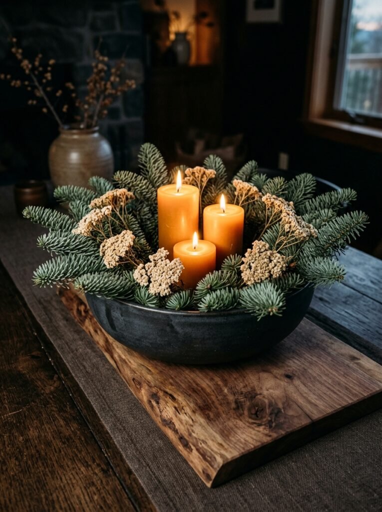
- Vessel/base: a low, hand-thrown stoneware bowl with an organic curved lip, glazed in matte charcoal
- Color/material palette: deep evergreen, matte charcoal, warm amber, raw walnut wood
- Height/proportion: bowl sits at 4 inches, candle height topping out around 10 inches
- Candle/lighting plan: three amber beeswax pillar candles at stepped heights (6″, 8″, 10″) set directly into the greenery
- Botanical elements: fresh noble fir and dried yarrow — noble fir chosen for how long its needles stay put indoors compared to other pines
- Textile/runner: a raw walnut wood board used in place of fabric, grain left visible
- Standout detail: candles set unevenly into the greenery rather than centered, giving the piece a just-gathered look
Why this works: A low, curved vessel keeps the visual weight close to the table, so guests can see and talk across it even when it’s packed with dense evergreen.
Noble fir holds its shape and deep green color longer indoors than most other evergreens, which matters when a centerpiece needs to survive weeks of dry, heated air. That’s the kind of detail that separates a display that looks fresh through February from one that’s browning by New Year’s. The organic curve of a hand-thrown bowl also softens what could otherwise feel like a stiff, symmetrical arrangement — the irregular lip catches light differently depending on where you’re sitting, which gives the tablescape more visual movement than a straight-sided vessel ever could.
My husband built our dining table from a single walnut slab, so I’m always looking for ways to let that wood grain actually show instead of covering it with a runner. Using a walnut board as the base for this arrangement does exactly that — it grounds the deep greens and amber candlelight in something warm and tactile. I’ve noticed guests almost always reach out and touch the wood before they touch anything else on the table. If you don’t have a spare board, a wide walnut charcuterie board works just as well and costs under thirty dollars.
3. Sculptural Black & Silver
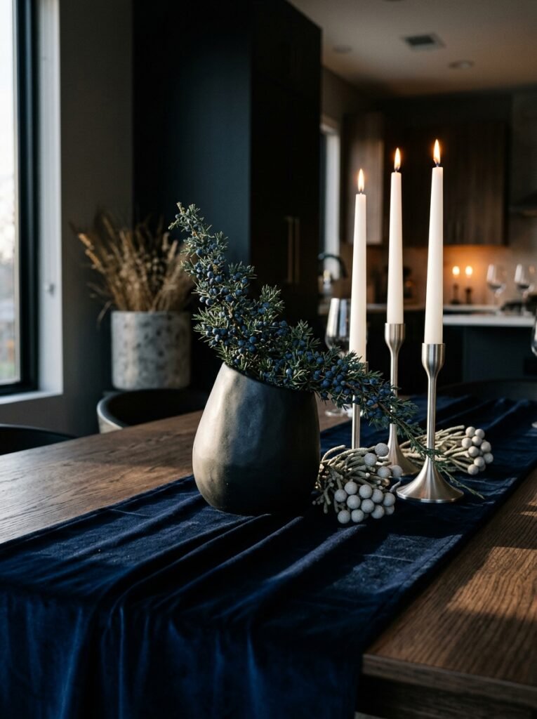
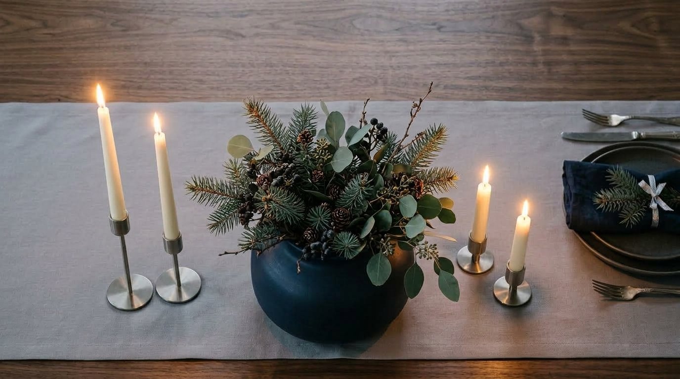
- Vessel/base: a matte black ceramic vessel with a sculptural, asymmetric curved silhouette
- Color/material palette: navy, matte black, brushed silver, icy white
- Height/proportion: vessel itself is 7 inches; tallest branch reaches just under 13 inches
- Candle/lighting plan: mixed-height brushed silver candlesticks holding white taper candles, clustered off-center
- Botanical elements: blue juniper branches and silver brunia (“mushroom flower”) for texture
- Textile/runner: deep navy velvet, chosen because velvet holds candlelight differently than matte cotton
- Standout detail: the vessel’s asymmetric shape lets the arrangement lean dramatically to one side instead of sitting centered
Why this works: An asymmetric vessel breaks the predictable center-of-table symmetry most centerpieces default to, which is exactly what makes it photograph and read as more modern.
Most centerpieces default to a symmetrical, centered shape because it’s the safest option — but safe is rarely what gets a table saved and shared. An asymmetric black vessel with branches leaning to one side reads as sculpture rather than a standard arrangement, and it photographs beautifully because the eye has somewhere specific to land. Silver brunia adds texture without adding more color to an already restrained palette, which keeps the look feeling curated rather than cluttered. Velvet, unlike cotton or linen, holds a slight sheen that catches candlelight and reflects it back across the table.
I styled a version of this for a New Year’s Eve dinner at our house last year, and it’s still the centerpiece I get the most questions about. The lean of the branches makes it feel like it just happened naturally, even though every stem is placed with real intention. That’s the whole philosophy behind a good winter centerpiece: nothing should look random, but it shouldn’t look stiff either. If you’re nervous about asymmetry, start with just one or two branches leaning out past the vessel’s edge — you don’t need a dramatic tilt to get the effect.
4. Brass Compote & Amber Glow
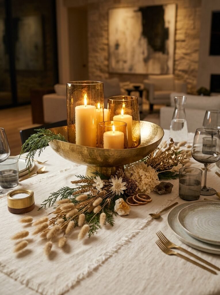
- Vessel/base: a low brass compote dish with a hammered, slightly tarnished finish (not polished)
- Color/material palette: warm amber-gold, aged brass, cream, deep cedar green
- Height/proportion: compote sits at 3 inches, tallest candle reaches 9 inches
- Candle/lighting plan: amber-tinted glass hurricane holders over cream pillar candles, casting a warm gold wash across the table
- Botanical elements: cedar sprigs and dried bunny-tail grass, chosen for cedar’s resinous scent as it warms near the candles
- Textile/runner: unbleached cream linen with visible slub texture
- Standout detail: the amber glass hurricanes tint the candlelight itself gold, rather than relying on gold-colored objects to create the effect
Why this works: Colored glass changes the actual color of the light it casts, which creates a warmer glow than gold-toned decor objects can achieve on their own.
A hammered brass compote with a slightly tarnished, unpolished finish avoids the overly shiny, almost plastic look that new brass hardware can have straight out of the box. That worn-in quality is what makes it feel collected rather than purchased for the occasion. The real trick in this idea is the amber glass hurricanes — because they tint the candlelight gold as it passes through, the whole tabletop takes on a warm cast that a plain glass holder simply can’t replicate. Cedar adds a resinous, almost woodsy scent as it sits near the heat of the candles, which most evergreens don’t offer.
In my experience, cedar is one of the most underused winter botanicals — most people reach straight for pine or fir without realizing cedar holds its shape and color exceptionally well in a dry, heated house. I’ve kept cedar sprigs looking fresh on a table for close to five weeks with just an occasional misting. Unbleached linen underneath keeps the amber and gold tones from feeling too formal or holiday-specific; it reads more like a warm winter dinner than a Christmas table, which is exactly the line this idea is meant to walk.
5. Cranberry Glaze & Winterberry
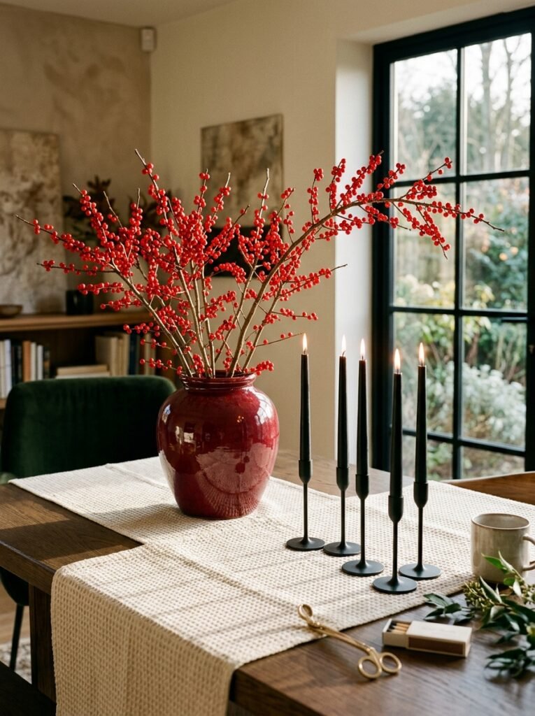
- Vessel/base: a rounded ceramic urn in a deep cranberry glaze with a glossy, slightly uneven finish
- Color/material palette: deep cranberry, matte black, silver-gray, cream
- Height/proportion: urn stands 6 inches, winterberry stems reaching to 12 inches
- Candle/lighting plan: matte black taper candles in slim silver holders, positioned in a loose diagonal line rather than a cluster
- Botanical elements: fresh winterberry (Ilex verticillata) for its bright red berries that persist through winter without any foliage to wilt
- Textile/runner: cream waffle-weave cotton for texture contrast against the glossy urn
- Standout detail: the deep cranberry glaze pools unevenly on the ceramic surface, so no two urns look exactly alike
Why this works: Winterberry keeps its color for weeks because it’s a berry, not a bloom — it has no petals to wilt, which makes it one of the lowest-maintenance winter botanicals available.
Winterberry is a genuine gardener’s secret for winter centerpieces: because it’s technically a berry-bearing branch rather than a flowering stem, it has none of the delicate petals that cause most winter blooms to droop within days. The bright cranberry-red against a glossy, deep-cranberry ceramic urn creates a tonal, almost monochromatic moment that still reads as vivid rather than flat. Positioning the black taper candles in a loose diagonal line, instead of a tidy cluster, keeps the eye moving down the length of the table instead of stopping in one spot — a small styling choice that makes a big visual difference.
I first used winterberry on a client’s table in late January, well past when most seasonal branches had been tossed out, and it still looked as fresh as the day it was cut. That staying power is exactly why I keep coming back to it for anything meant to last the whole winter stretch, not just one event. If you can’t find fresh stems locally, a well-made faux winterberry pick from a craft store holds up surprisingly well and is nearly indistinguishable once it’s tucked into an arrangement.
You’ll Also Love:15 Winter Mantel Decorating Ideas to Love Long After Christmas
6. Plaster Trough & Frosted Neutrals
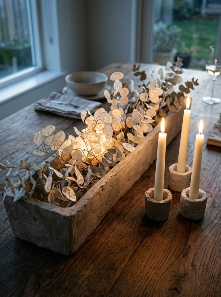
- Vessel/base: a long, narrow plaster trough with a raw, hand-troweled texture and pale putty-gray finish
- Color/material palette: frosted neutral, putty gray, bone white, muted sage
- Height/proportion: trough sits at 3 inches, tallest stem reaching 10 inches
- Candle/lighting plan: ivory taper candles in mismatched raw-plaster candle cups, echoing the trough’s texture
- Botanical elements: dried lunaria (“silver dollar” seed pods) and pale eucalyptus for a bleached, frosted look without any real frost required
- Textile/runner: left bare on a raw wood or stone table rather than dressed with a runner
- Standout detail: the translucent, papery lunaria pods catch and diffuse candlelight rather than reflecting it directly
Why this works: Pairing raw, matte plaster with translucent botanicals creates two different kinds of light behavior on the same table — one absorbs light, the other lets it pass through.
A hand-troweled plaster trough brings genuine texture to a tabletop in a way smooth ceramic or glass never can — the uneven surface catches shadow differently depending on the angle of the light, which gives it a quiet, almost architectural presence. Dried lunaria is the real standout here: its papery, translucent seed pods let candlelight pass straight through them, creating a soft, diffused glow instead of a sharp point of light. That contrast between matte, light-absorbing plaster and glowing, light-diffusing botanicals is what makes this arrangement feel genuinely different from a typical greenery-and-candle setup.
Leaving the tabletop bare underneath, rather than dressing it with a runner, is a choice I’d only make on a table with real wood grain or natural stone worth showing off — my husband would tell you that’s the whole point of using good materials in a build, and I feel the same way about a table. This pairing works especially well for a smaller winter dinner party where guests are seated close enough to actually notice the texture, rather than viewing the table from across a large room.
7. Poured Concrete & Copper
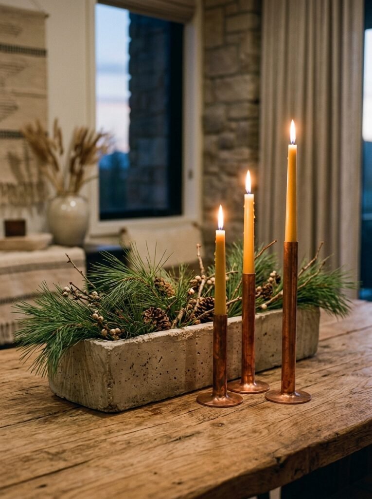
- Vessel/base: a poured concrete trough with a raw, slightly pitted industrial finish
- Color/material palette: charcoal concrete, aged copper, cream, deep pine green
- Height/proportion: trough sits at 3 inches, tallest pine sprig reaching 11 inches
- Candle/lighting plan: slim copper taper holders in varying heights (7″, 9″, 11″), the metal picking up warm reflections as the candles burn
- Botanical elements: fresh white pine, chosen for its long, soft needles and looser, less formal silhouette than fir or spruce
- Textile/runner: left bare against a wood table, or a single strip of raw cotton canvas for texture
- Standout detail: copper taper holders left unlacquered so they’ll patina and darken slightly over the season, changing subtly week to week
Why this works: Unlacquered copper develops a natural patina over time, which means this centerpiece actually looks more interesting the longer it stays on the table.
Concrete is a material most people associate with outdoor spaces, not a dinner table, which is exactly why it stands out here — its raw, industrial texture against soft white pine needles creates a genuine contrast in materials rather than color. Copper taper holders left unlacquered will darken and develop a natural patina as the weeks go on, which means the arrangement isn’t static; it actually shifts in appearance from early December through late February. White pine’s loose, soft needles also give this idea a relaxed, almost gathered-from-the-yard feeling that a tighter, clipped evergreen can’t match.
My husband pours concrete for outdoor patios and planters constantly, and I’ve always thought it was underused indoors — it has this cool, grounding weight that softer materials just don’t. A poured concrete trough (or a concrete planter repurposed from the garden section) brings that same weight to a dinner table without feeling cold, especially once the copper and pine warm it up. I’ve noticed this pairing works particularly well in a room with a lot of wood tones already, since the concrete gives the eye somewhere neutral to rest.
8. Woven Rattan & Bleached Botanicals
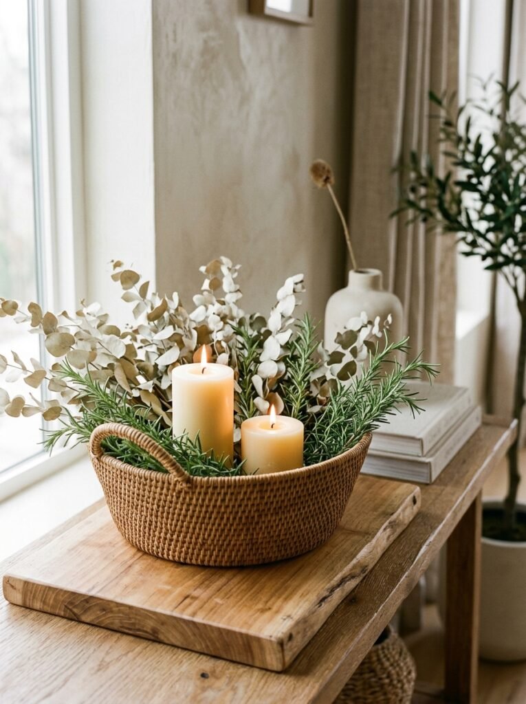
- Vessel/base: a low, tightly woven rattan basket lined with a waterproof liner
- Color/material palette: warm camel, bleached cream, sage green, honey-toned wood
- Height/proportion: basket sits at 5 inches, bleached branches reaching 12 inches
- Candle/lighting plan: cream beeswax pillar candles nestled directly into the greenery at two heights (7″ and 9″)
- Botanical elements: bleached preserved eucalyptus paired with fresh rosemary sprigs, rosemary chosen for scent as much as look
- Textile/runner: honey-toned wood slab riser instead of fabric, basket sitting directly on top
- Standout detail: fresh rosemary tucked in among the bleached eucalyptus releases a faint herbal scent whenever someone reaches across the table
Why this works: Adding a fragrant herb like rosemary alongside visual botanicals engages a sense most centerpieces ignore entirely, which makes the table memorable in a way photographs alone can’t capture.
Most winter centerpieces focus entirely on how a table looks, but scent is just as powerful a memory trigger — and rosemary, tucked into an arrangement rather than left on a plate, does exactly that every time someone leans in. Bleached eucalyptus keeps the palette soft and warm rather than icy, which makes this idea feel more like an easy Sunday dinner than a formal event. A tightly woven rattan basket also brings genuine warmth and texture to the table without adding another color, letting the honey-toned wood riser beneath it tie the whole arrangement back to natural materials.
I started tucking rosemary into winter arrangements almost by accident — I had extra from the garden and didn’t want it to go to waste — and it’s become one of my most-requested details ever since. Guests almost always ask what the scent is. It’s a small, low-cost addition, usually just a dollar or two for a few extra sprigs, but it does more for how a table is remembered than almost anything else on this list. Rattan also holds up well through a full season of regular use, unlike more delicate vessels.
9. Mercury Glass & Deep Plum
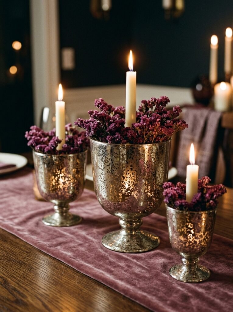
- Vessel/base: a cluster of three antiqued mercury glass compotes in graduated sizes
- Color/material palette: deep plum/eggplant, mercury silver, ivory, dusty mauve
- Height/proportion: compotes range from 4 to 7 inches, candle flames capping at 10 inches
- Candle/lighting plan: ivory taper candles set into each compote, the mercury glass fragmenting the flame into scattered points of light across its mottled surface
- Botanical elements: dried plum-toned statice and preserved dusty miller for its soft, silvery-gray foliage
- Textile/runner: dusty mauve velvet runner, chosen to echo the plum tones without matching them exactly
- Standout detail: the mercury glass’s naturally mottled, imperfect antiquing means candlelight scatters unevenly rather than reflecting in one clean line
Why this works: Antiqued mercury glass has an uneven, mottled surface by design, so it scatters candlelight into dozens of small points instead of one clean reflection — a visual effect a plain mirror or smooth silver can’t produce.
Mercury glass earns its name from how it was originally made — a thin layer of silvering applied unevenly by hand — and that imperfection is exactly what makes it valuable here. Instead of one clean reflective surface, candlelight scatters into dozens of small, uneven points across the mottled glass, giving the whole cluster a shimmering, almost candlelit-snow quality. Deep plum and dusty mauve are colors that show up far less often in winter tablescapes than the usual reds and greens, which makes this idea feel fresh and distinctly modern rather than tied to any single holiday.
I keep a small collection of mismatched mercury glass compotes I’ve picked up at estate sales over the years, and grouping three different sizes together is genuinely more effective than buying a matched set — the slight variation in tone and age reads as collected, not staged. Dusty miller’s silvery foliage bridges the gap between the plum tones and the mercury glass beautifully, softening what could otherwise feel like a heavy, dark palette. This is one of my favorite ideas for a smaller, more intimate winter dinner.
10. Salt-Fired Ceramic & Blue Spruce
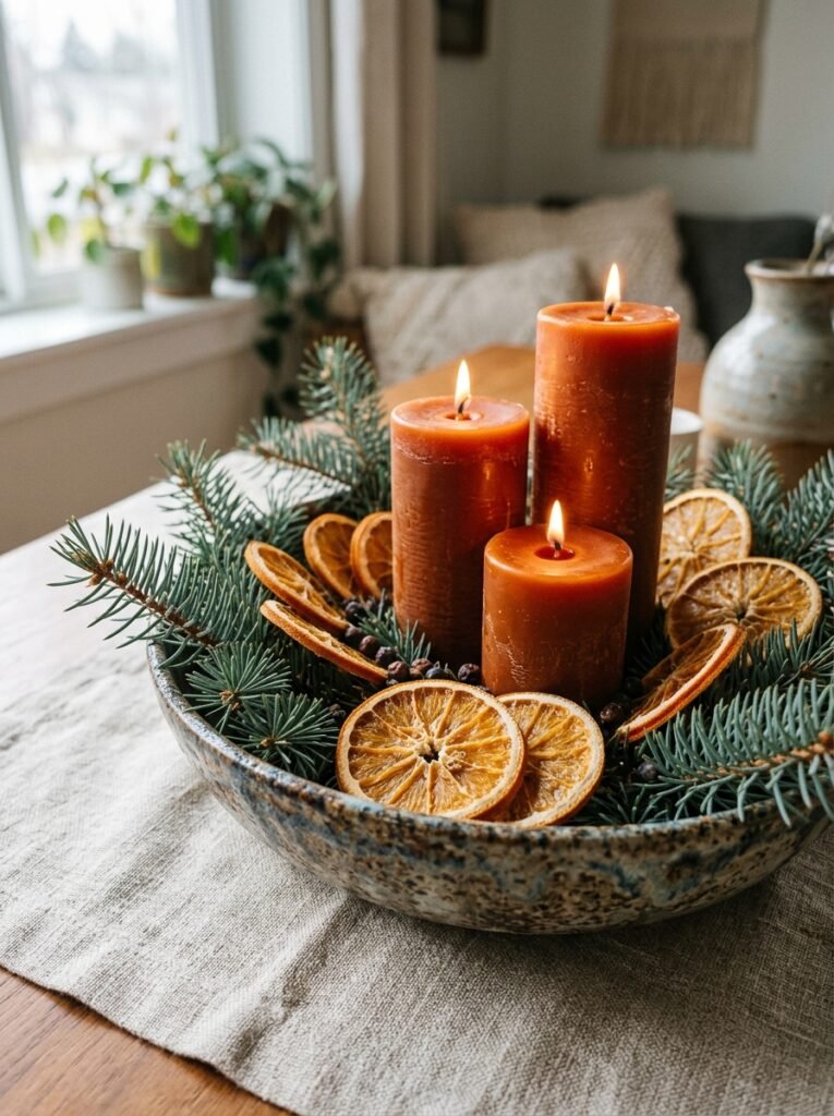
- Vessel/base: a wide, shallow salt-fired ceramic bowl with a naturally speckled, warm-toned glaze
- Color/material palette: oatmeal/speckled cream, dusty blue-green, rust orange, warm terracotta
- Height/proportion: bowl sits at 3 inches, tallest spruce branch reaching 9 inches
- Candle/lighting plan: three rust-orange beeswax candles of varying heights, set slightly off-center within the greenery
- Botanical elements: blue spruce for its distinctive blue-gray needles, paired with dried orange slices for a warm, citrus contrast
- Textile/runner: oatmeal linen with a subtle woven texture, echoing the ceramic’s speckled surface
- Standout detail: dried orange slices tucked among the spruce add an unexpected pop of warm color rarely seen in winter arrangements
Why this works: Pairing cool blue spruce with warm dried citrus creates a genuine temperature contrast on the table, which reads as far more dynamic than a single-tone palette.
Blue spruce has a distinctive blue-gray cast that most people associate with Christmas trees, but used sparingly in a low arrangement, it reads as sophisticated rather than holiday-specific. What makes this idea stand out is the dried orange slices tucked throughout — an unexpected pairing that most winter centerpieces skip entirely, since citrus tends to get associated with fall or spring rather than the coldest months. That warm-cool contrast between blue-gray needles and rust-orange fruit gives the whole arrangement more visual tension than a single-palette design, and it photographs with a richness that flat, monochromatic centerpieces often lack.
I started drying my own orange slices in a low oven a couple winters ago, mostly to use up citrus before it went bad, and I’ve kept doing it every year since because the color they bring to a table is genuinely hard to replicate with anything else. They take about three hours at a low temperature and last for weeks once fully dried. Salt-fired ceramic’s natural speckling also means no two bowls glaze exactly the same way, so this arrangement always has a slightly one-of-a-kind quality to it.
11. Marble Slab & Silver Birch
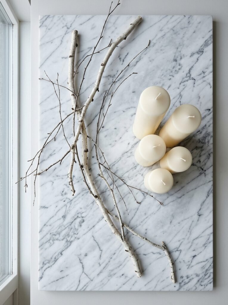
- Vessel/base: no vessel at all — a rectangular Carrara marble slab used as the base, with candles and botanicals arranged directly on top
- Color/material palette: white-and-gray marble veining, silver birch bark, ivory, soft sage
- Height/proportion: cut birch branches lie mostly flat, tallest upright stem reaching 10 inches
- Candle/lighting plan: ivory pillar candles of mixed diameters and heights grouped at one end of the slab, unlit birch branches trailing toward the other
- Botanical elements: cut silver birch branches, chosen specifically for their pale, papery bark texture rather than foliage
- Textile/runner: none — the marble itself functions as the runner
- Standout detail: birch bark’s natural white-and-gray coloring nearly matches the marble veining, making the branches look almost like an extension of the stone
Why this works: Using a material like marble as the base itself, instead of setting a vessel on top of a runner, removes a full layer of visual clutter and lets the botanicals feel intentional rather than staged.
A marble slab used as the base — rather than a vessel sitting on top of a separate runner — is a genuinely modern styling choice that most winter centerpiece ideas overlook entirely. It removes an entire layer of visual noise, letting the veining in the stone do quiet decorative work on its own. Silver birch branches were chosen deliberately here for their pale, papery bark rather than any foliage, since the bark’s white-and-gray tones echo the marble’s natural veining almost perfectly. That subtle material-to-material connection is what makes this idea feel considered rather than simply assembled from whatever was on hand.
This is one of the more minimal ideas on this list, and it works best on a table that’s already doing a lot of the visual work through good materials — a nice wood table, or one with an interesting base. My husband always says good materials don’t need much dressing up, and this arrangement is basically that idea applied to a centerpiece. If your dining table doesn’t have a marble surface built in, a large marble serving board or pastry slab from a kitchen store works just as well and costs far less than a custom-cut piece.
12. Iron Lantern & Smoked Glass
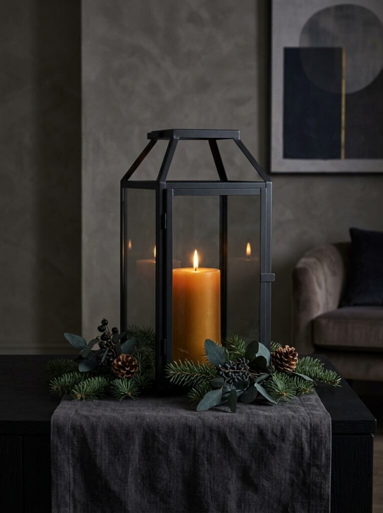
- Vessel/base: a single oversized black iron lantern with smoked glass panels, used as a centerpiece rather than a side accent
- Color/material palette: matte black iron, smoked charcoal glass, deep pine green, warm amber
- Height/proportion: lantern stands 13 inches, right at the upper edge of the sightline guideline
- Candle/lighting plan: one large amber pillar candle inside the lantern, its light diffused and warmed by the smoked glass panels
- Botanical elements: fresh Fraser fir sprigs tucked around the lantern’s base, chosen for its stiff branches that hold their shape without drooping
- Textile/runner: charcoal linen runner beneath, keeping the palette cohesive
- Standout detail: the smoked glass diffuses the candlelight into a soft, hazy glow rather than a sharp point of flame, visible even before the candle is lit
Why this works: An oversized lantern used alone, without smaller supporting pieces, keeps a table’s visual weight anchored in one spot — useful for tables that are used for everyday meals as much as gatherings, since it’s easy to move for extra place settings.
Using a single oversized lantern as a centerpiece, rather than a cluster of smaller pieces, is a deliberate departure from how most winter centerpieces are built — and it happens to be one of the most practical ideas here too. Because it’s one contained object, it’s simple to shift down the table or move entirely when a family needs the extra space for a big Sunday dinner. Smoked glass panels diffuse the amber candlelight into a soft, hazy glow rather than a sharp flame point, which gives the whole piece a moody, atmospheric quality even before it’s lit. Fraser fir holds its structure well, so the greenery tucked around the base stays tidy for weeks.
My husband builds a version of these lanterns from scrap iron for a few clients each winter, and it’s become one of his most requested small projects — people want something substantial enough to anchor a table on its own, without a dozen smaller pieces to manage. If you’re buying rather than building, look for one with real glass panels rather than plastic; the way smoked glass diffuses light is genuinely different, and it’s worth the difference in price for how much warmer the glow looks by evening.
13. White Ceramic Trees & Linen
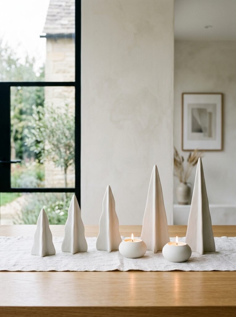
- Vessel/base: no vessel — a set of five matte white ceramic “tree” forms (turned, not glazed glossy) in graduated heights
- Color/material palette: matte white, bone, pale gray, silver
- Height/proportion: trees range from 4 to 12 inches, staying just under the sightline threshold
- Candle/lighting plan: two low votive candles in clear glass holders tucked between the trees rather than tall tapers
- Botanical elements: none — this idea is sculptural and object-based rather than botanical, a deliberate contrast to the greenery-heavy ideas elsewhere on this list
- Textile/runner: raw white linen with visible texture, unpressed
- Standout detail: the matte, unglazed ceramic finish absorbs light instead of reflecting it, giving the trees a soft, chalky look rather than a shiny one
Why this works: Skipping fresh botanicals entirely in favor of sculptural ceramic forms means this centerpiece needs zero maintenance and looks exactly the same in February as it did in December.
Every other idea on this list relies on fresh or dried botanicals that need occasional attention — misting, trimming, replacing a wilted stem. This one doesn’t, which makes it a genuinely practical option for a table used every single day through winter, not just for special gatherings. Matte, unglazed ceramic has a chalky, light-absorbing quality that glossy ceramic doesn’t, giving the tree forms a soft, almost snow-covered look without a single fleck of glitter or faux snow anywhere in sight. Grouping five trees at varied heights, rather than three, gives this arrangement a fuller silhouette while still keeping the low votive candles visible between them.
I keep a set of these on our own table from the day after New Year’s until the first hint of spring, mostly because I don’t have the bandwidth in January to keep swapping out fresh greenery. That’s really the appeal here — it’s beautiful without asking anything of you. If you want a little more visual interest, mix in one or two trees from a different (but complementary) white or gray finish; a perfectly matched set can occasionally look more like a store display than a considered tablescape.
14. Slate Board & Dried Pampas
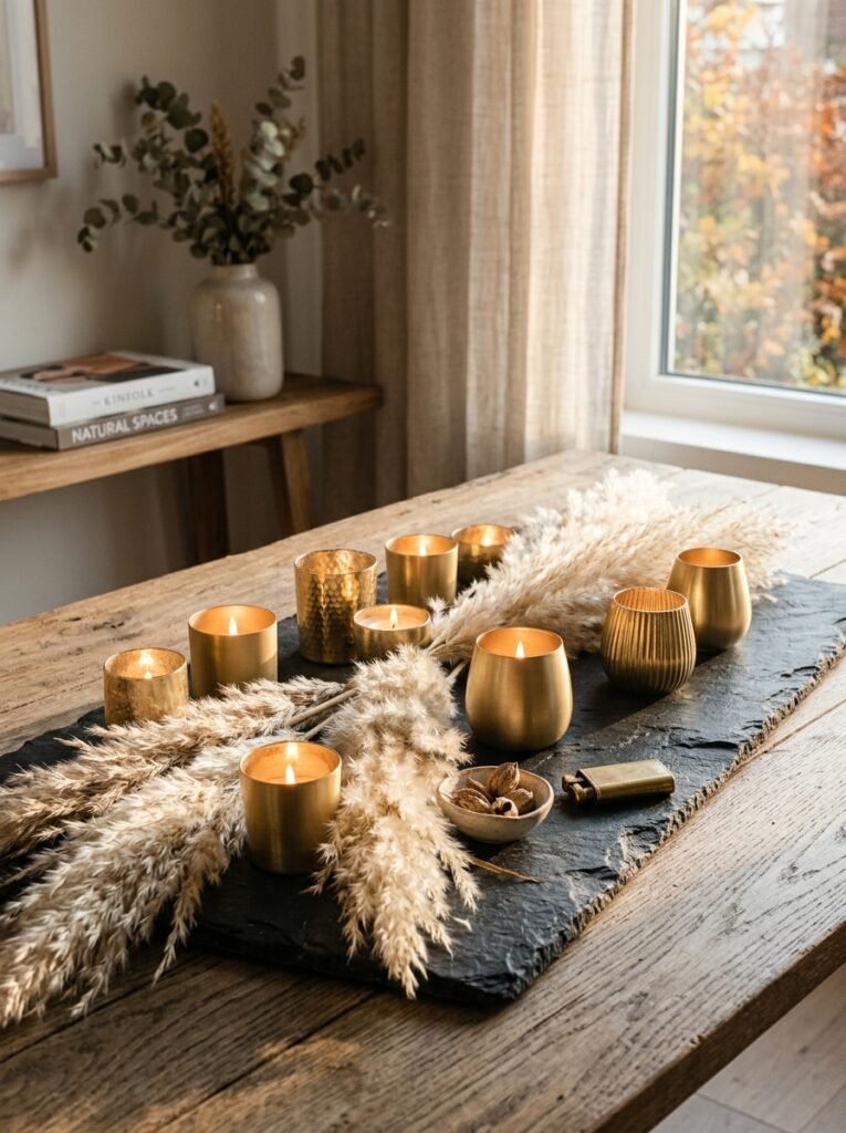
- Vessel/base: a large, irregularly shaped slate serving board used as a flat base
- Color/material palette: charcoal slate, warm beige pampas, brushed gold, soft cream
- Height/proportion: pampas plumes reach 12–13 inches at their tallest, right at the sightline edge, but their airy structure keeps the table feeling open
- Candle/lighting plan: small brushed-gold votive holders scattered asymmetrically across the slate, rather than lined up
- Botanical elements: dried pampas grass, chosen for how its feathery plumes diffuse light and add height without visual density
- Textile/runner: none — slate serves as its own base and runner
- Standout detail: the pampas plumes are arranged loosely, almost windswept, rather than gathered into a tight, uniform bundle
Why this works: Because dried pampas grass is airy rather than dense, it adds real height to a table without blocking sightlines the way a tall, tightly-packed floral arrangement would.
Pampas grass gets used constantly in boho-style decor, but arranged sparingly on a dark slate base with brushed-gold accents, it reads as considerably more refined and current. Its airy, feathery structure is really the key advantage here: it adds genuine height and softness to the table without creating the visual wall that a dense, tightly-bundled arrangement would. Scattering the gold votive holders asymmetrically across the slate, instead of centering them, keeps the whole composition feeling loose and gathered rather than formally arranged, which suits pampas grass’s naturally windswept character far better than a stiff, symmetrical layout would.
Slate is a material I’d never really considered for a tablescape until I saw my husband use offcuts from a client’s patio project as coasters — the color and texture translated beautifully indoors. A slate board brings that same cool, matte quality to a dinner table, and because it has no fabric or glaze to worry about, it holds up well through repeated use all winter long. If pampas sheds more than you’d like, a light spray of clear hairspray or matte sealant will hold the plumes in place for weeks without changing their look.
15. Navy Ceramic & Silver Eucalyptus
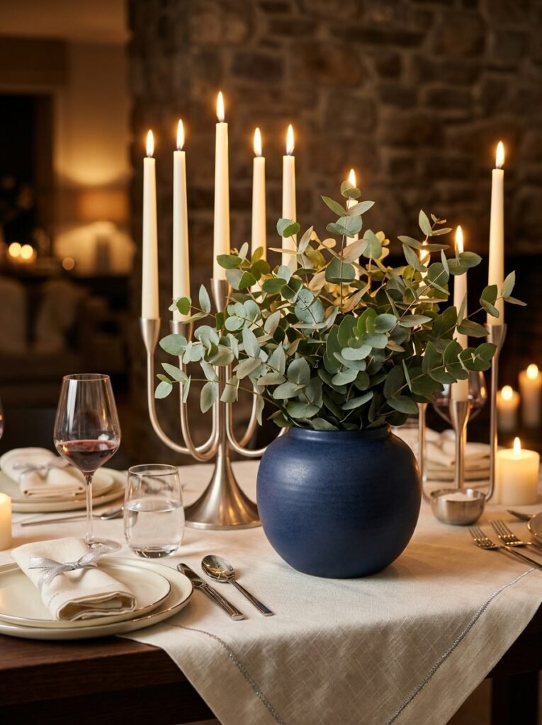
- Vessel/base: a deep navy matte ceramic urn with a rounded, full silhouette
- Color/material palette: deep navy, silver-dollar eucalyptus green, brushed silver, ivory
- Height/proportion: urn stands 7 inches, eucalyptus stems reaching 12 inches
- Candle/lighting plan: brushed silver candelabra holding three ivory tapers at slightly uneven heights, positioned just behind the urn rather than beside it
- Botanical elements: silver-dollar eucalyptus for its round, coin-shaped leaves and cool silvery undertone
- Textile/runner: ivory linen with a narrow silver thread woven through the edge
- Standout detail: the candelabra sits slightly behind the urn instead of flanking it symmetrically, creating layered depth rather than a flat, side-by-side arrangement
Why this works: Layering a candelabra behind, rather than beside, a floral vessel creates visible depth on a flat table surface — something most centerpieces flatten out by placing every element in a single line.
Most centerpieces line their elements up in a single row across the table, which can look tidy but tends to read as flat from a seated guest’s eye level. Positioning the candelabra just behind the navy urn instead creates real depth — the candlelight and eucalyptus overlap slightly from most seated angles, giving the arrangement dimension a side-by-side layout can’t achieve. Silver-dollar eucalyptus’s round, coin-shaped leaves also catch light differently than pointed evergreen needles do, adding a subtle shimmer as the candles flicker nearby. Deep navy is a color still underused in winter tablescapes, and it holds up beautifully against both warm and cool lighting.
Navy is one of my favorite colors to work with in winter because it reads completely differently depending on the light in the room — cooler and almost black in daylight, then warmer and richer once the candles are lit in the evening. That shift is genuinely part of the appeal; the same centerpiece can feel like two different arrangements depending on the time of day you’re seated at the table. This is a strong idea to close on if you want a winter centerpiece with real staying power through New Year’s dinners and every quiet Sunday meal that follows.
Styling Principles for a Winter Table That Lasts
A few rules make the difference between a centerpiece that looks styled and one that looks thrown together.
Respect the sightline. Anything on the table should stay under about 14 inches so guests can see and talk across it comfortably — this is especially important for tapers and tall branches, which are easy to let get away from you.
Plan your candlelight in layers, not a single height. Mixed candle heights create movement and shadow across a table in a way that a single row of matching candles can’t. In low winter evening light, that variation is what actually makes a centerpiece glow rather than just sit there lit.
Choose evergreen for longevity, not just looks. Noble fir, cedar, and Fraser fir all hold their needles and color significantly longer indoors than softer evergreens like white pine or eastern hemlock, which matters when a centerpiece needs to survive weeks of dry, heated air rather than a single event.
Vary your material temperature. Pairing something cool — glass, marble, mercury silver — with something warm, like brass, copper, or amber candlelight, keeps a winter palette from tipping into feeling cold or sterile.
Frequently Asked Questions
How long does fresh evergreen last as a centerpiece? Sturdier evergreens like noble fir, Fraser fir, and cedar typically hold their color and needles for four to six weeks indoors with occasional misting, while softer greenery like white pine may need refreshing after two to three weeks.
What’s a budget-friendly way to elevate a winter table? Mixed-height candles are the single most impactful low-cost upgrade — a few taper candles at different heights, even in holders you already own, add more visual interest than almost any single decor purchase.
Is real or faux winter greenery better for a centerpiece? Fresh greenery offers genuine scent and a more natural, varied shape, while good-quality faux greenery is a practical choice for anyone wanting zero maintenance through a long winter season — both are valid depending on how hands-on you want to be.
How tall should a winter centerpiece be? A centerpiece should generally stay under 14 inches at its tallest point so seated guests can see and talk across the table without obstruction.
What’s a good small-table centerpiece option? Low, single-vessel ideas — like a compact stoneware bowl or a cluster of mercury glass votives — work best on small tables, since they add detail without consuming limited surface space.
Can a winter centerpiece work for both New Year’s and everyday dinners? Yes — arrangements built around evergreen, candlelight, and texture rather than holiday-specific symbols are designed to move seamlessly between a formal New Year’s dinner and an ordinary Tuesday night meal.
Conclusion
A great winter table doesn’t have to come down with the holiday decorations. These 15 winter centerpiece ideas are built to carry your table through the entire coldest stretch of the year, from a candlelit New Year’s dinner to a quiet Sunday meal in February — no ornaments or gourds required. I’ve seen how much a small, intentional change like this can shift the whole feeling of a room, long after the tree comes down.
Pick one idea that fits your table and your style, give it a try this week, and save this post on Pinterest so you can come back to the rest all season long.