18 Winter Chalkboard Ideas for a Cozy Home
The tree is down. The lights are packed away. And somehow, your house still looks a little bare. If that January flatness sounds familiar, these winter chalkboard ideas are the easiest fix I know — no shopping trip, no storage bin, just a piece of chalk and twenty quiet minutes. I’ve watched this exact gap trip up client after client every year, right after the holidays, and it’s rarely about lacking decor ideas. It’s about not having one flexible piece that can carry a whole season on its own.
From a frosted branch above the kitchen shelves to a glowing string-light frame on the staircase, these fifteen ideas are built to fill that stretch with something genuinely worth saving — cozy, current, and entirely un-Christmas.
Why This Matters
Most homes go decor-dark for nearly two months every year, and almost nobody notices why. Christmas comes down in the first week of January, but spring decor doesn’t typically show up until March — that’s close to eight weeks with nothing seasonal on the walls at all. A chalkboard fixes this better than almost any other decor piece because it’s infinitely adjustable: no new purchase, no storage bin, just a fresh design in twenty minutes. I noticed this gap firsthand the January after we moved into our Austin house — the mantel looked stripped and sad for weeks until I finally chalked a simple frost pattern above it.
A winter chalkboard is the only decor element flexible enough to carry an entire home through the quiet stretch between the holidays and spring. This post solves that stretch, with fifteen genuinely distinct ways to fill it.
1. Frosted Windowpane Lines
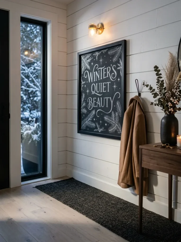
- Chalkboard size/frame: 24×36-inch board in a slim black wood frame, sized to read as functional art rather than a message board
- Design concept: geometric snowflake and frost-line pattern, drawn as repeating angular branches radiating from three or four points across the board — no words at all
- Function: purely decorative; this one isn’t meant to be updated week to week
- Color approach: silver metallic chalk marker only, kept to one tone so the pattern reads crisp against the black surface instead of busy
- Technique: a chalk marker, not traditional chalk, is the right call here — traditional chalk smudges on fine geometric lines, while a marker holds a hairline edge for hours of handling near a doorway
- Legibility tip: mark your radiating points lightly with washi tape first, then draw outward in one continuous stroke per line so the pattern stays symmetrical
- Placement: entryway wall, hung at eye level beside the coat hooks
- Construction note: my husband always tells clients hanging anything in an entry to skip the single center hook — with boots and coats brushing past daily, a two-point mount (French cleat or two D-rings) keeps a board from swinging crooked within a week
Why this works: Fine metallic linework reads as intentional art rather than seasonal clutter, which is exactly what a two-month entryway display needs.
Geometric frost patterns work because they borrow directly from real ice-crystal structure, a six-fold symmetry the eye reads as naturally pleasing at a glance. That familiarity is exactly why this design holds up in a busy entryway for eight straight weeks without ever feeling stale, unlike a written quote that guests read once and mentally file away. Keep the pattern loose between the three or four points rather than mirroring every line, since real frost never repeats perfectly. A slightly imperfect version reads as hand-drawn rather than stenciled — exactly the effect good chalk art should have.
This is one of my favorite winter pieces because it solves a real problem: entryways look bare the moment the holiday wreath comes down. A geometric frost design fills that gap without competing with coats, boots, or a busy console table beneath it — the thin metallic lines stay quiet from a distance and only reveal their detail up close. Guests notice it on their way out more often than coming in, which means it earns a second look instead of fading into the wall. Pair it with a black boot tray and one stoneware vase, and the entry reads finished.
2. Hygge Corner Script
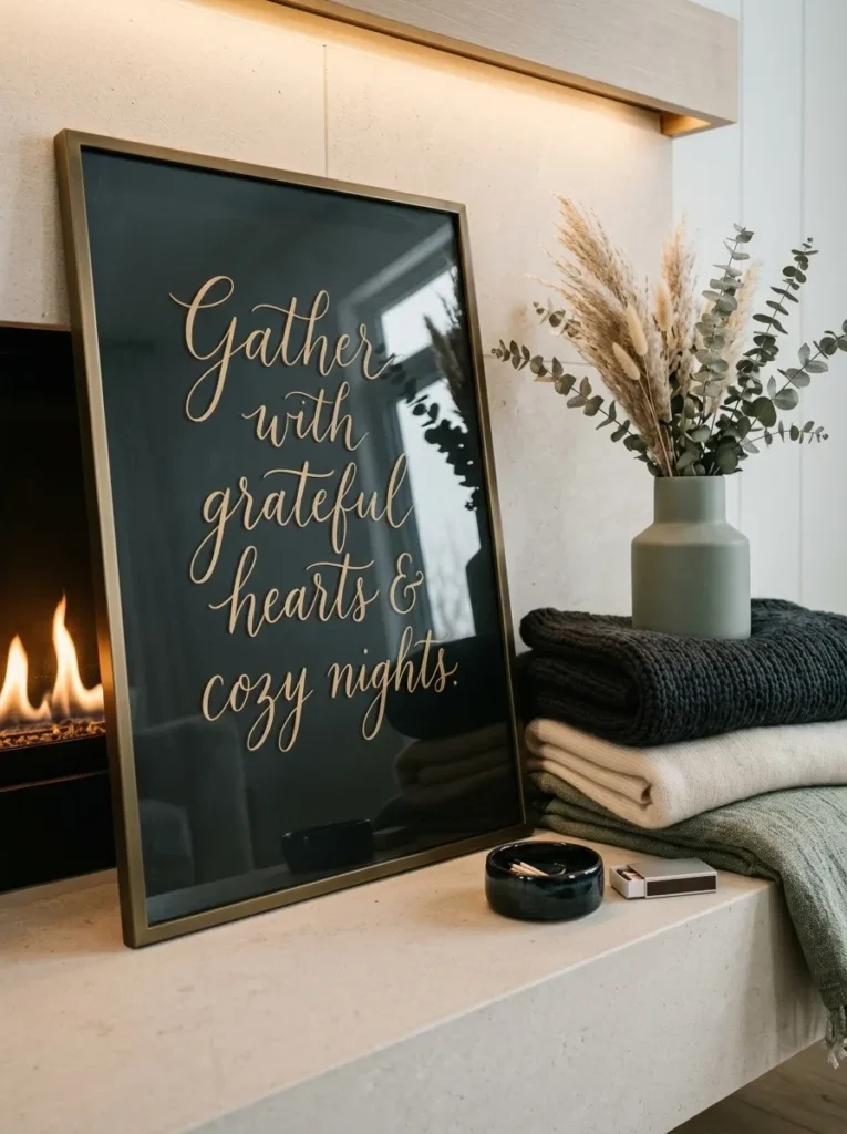
- Chalkboard size/frame: smaller 16×20 board in a simple whitewashed wood frame
- Design concept: a short cozy-season phrase in flowing script — “slow mornings, warm socks,” never a Christmas phrase — lettered with an oversized cursive main line and small caps beneath
- Function: decorative; may get refreshed once mid-season, but mostly stays put
- Color approach: soft white chalk only, kept slightly blended rather than crisp for a dreamy, hand-touched look
- Technique: traditional chalk (not a marker) is actually the right tool here — its natural softness suits a relaxed script, and lightly blending the down-strokes with a barely damp cloth adds gentle shadow
- Legibility tip: keep the main phrase to four or five words max at this size, oversized and centered, so it reads instantly from across the room
- Placement: leaning on the mantel or hung just above it, angled slightly instead of perfectly level for a relaxed, lived-in feel
- Integration: pairs with a stack of ivory wool throws and dried eucalyptus in a stoneware vase beside it
Why this works: A short, oversized script phrase reads instantly from across a room, which matters far more for a mantel piece than for one you read up close.
I styled a version of this board for a client’s living room two winters ago, and it became the one thing every guest photographed at her New Year’s gathering. The trick was restraint — just five words, “slow mornings, warm socks,” in oversized script with nothing else competing for attention. A mantel already holds a lot visually: candles, greenery, maybe a mirror above it, so a chalkboard here needs to say less, not more. Softening the strokes with a lightly damp cloth gave the lettering a hand-touched quality — warm rather than sharp, which matters in a room meant for relaxing.
A hand-lettered quote works especially well on a mantel because the eye naturally rests there first when entering a living room — it’s the focal point in most American homes, chalkboard or not. That built-in attention means even a small, softly lettered board gets noticed without needing bold color or size to compete for it. Angling the board slightly instead of hanging it perfectly straight adds to the relaxed, unstaged feeling that hygge styling depends on. The result is a mantel that feels intentionally calm rather than empty, filling the visual quiet left behind once the holiday garland comes down.
3. Bare Branch Botanical
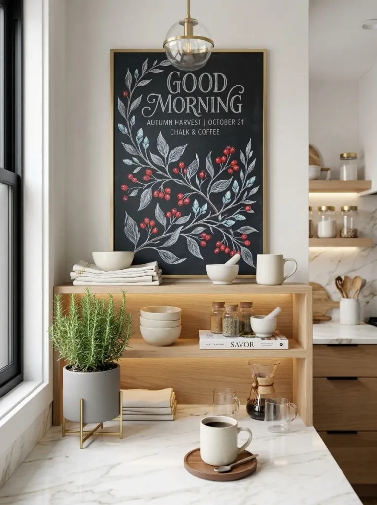
- Chalkboard size/frame: medium 18×24 unframed slate panel with a raw, exposed edge, mounted directly to the wall with no visible hardware
- Design concept: a single illustrated winter branch — bare, no leaves — running diagonally from one corner, with three or four dogwood-red berries as the only warm accent
- Function: purely decorative botanical art, not intended to be erased or updated
- Color approach: mixed cool-tone chalk markers — icy blue, silver-gray, and soft white for the branch — with one dogwood-red marker reserved only for the berries
- Technique: from a plant-science standpoint, irregular node spacing and asymmetrical twig angles are what sell the illusion — real branches never fork at even intervals, and a too-symmetrical drawing reads as clip art instead of botanical
- Legibility tip: work top to bottom in one pass and resist adding extra twigs afterward; overworked branch illustrations lose the clean line that reads well from across a kitchen
- Placement: above open shelving or a coffee station, in the patch of blank wall that’s usually left between cabinets
- Integration: pairs naturally with real dried branches or a small potted rosemary on the counter below, echoing the illustration in three dimensions
Why this works: An illustrated branch with irregular, asymmetrical node spacing reads as genuinely botanical instead of decorative clip art — a detail plant science makes obvious and most decor guides miss entirely.
Real winter branches almost never fork at even intervals, which is exactly the detail most illustrated chalkboard designs get wrong. Botanically, side branches emerge at irregular spacing determined by where the tree’s growth buds happened to form the previous season, so evenly spaced twigs immediately read as artificial to anyone who spends time looking closely at plants. Drawing three or four berries in warm red against a cool-toned branch mimics how dogwood and winterberry actually hold color through the coldest months, long after the leaves drop. That single accurate detail is what separates a botanical illustration from generic clip art.
I keep coming back to branch illustrations for kitchens because they hold up through the entire winter without ever looking like decor that’s overstayed its welcome — unlike a quote board, there’s no text to grow tired of reading. The cool blue and silver palette also does real work here, balancing the warm wood tones and stainless appliances most American kitchens have. Mounted above open shelving, the illustration draws the eye upward and makes a narrow wall gap feel deliberate instead of leftover. Pair it with one real potted plant below, and the vignette feels grounded rather than purely decorative.
4. New Year Goal Grid
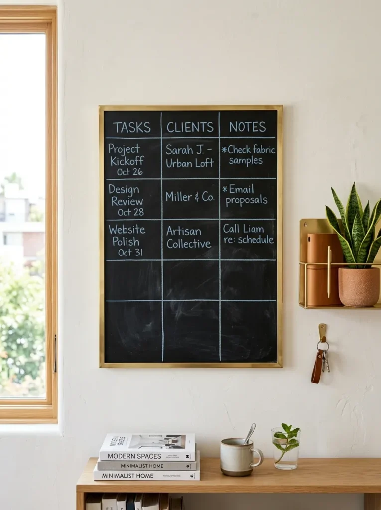
- Chalkboard size/frame: large 24×30 board in a slim brass-toned metal frame — no wood, for a sleeker, more current look
- Design concept: a minimalist three-column grid labeled “Try / Learn / Let Go,” meant to be filled in by hand as an interactive family goal-setting board
- Function: fully interactive — designed to change weekly through January and February
- Color approach: white chalk marker for the grid lines and headers, with a single dusty-blue marker reserved for filled-in entries, so the board stays visually calm even when full
- Technique: rule the grid with a metal ruler and marker rather than freehand — a slightly imperfect script phrase reads charming, but crooked grid lines read sloppy on an organizational piece
- Legibility tip: leave generous white space between rows; a goal board that’s too tightly packed becomes visually exhausting rather than motivating
- Placement: home office or a hallway command-center wall, at seated eye height if it’s going in an office
- Integration: pairs with a brass wall organizer and a small potted snake plant beside it for a clean, modern-office feel
Why this works: A structured grid format gives a chalkboard genuine daily function past New Year’s Day, which is exactly what keeps a seasonal board from going stale by February.
Most New Year chalkboard ideas default to a single resolution written once and forgotten by the second week of January — this one solves that by design. Splitting the board into three ongoing categories instead of one static list means it never looks “finished” or outdated; there’s always a blank cell inviting a new entry. The brass frame and dusty-blue accent give it a current, editorial look rather than the folksy chalkboard aesthetic most people picture, so it reads as legitimate office decor rather than a kid’s homework chart. That distinction matters if it’s going in a shared workspace.
I’ve watched this exact format work in my own office longer than almost any other chalkboard idea I’ve tried, mostly because it never asks to be perfect. A goal grid with visible crossed-out entries and new ones added weekly actually looks more alive than a pristine, untouched board — it signals a home in use, not staged for a photo. The brass frame keeps it from reading as juvenile, which matters if it’s hanging somewhere a guest might see it. By February, when most seasonal decor starts to feel tired, this one is just getting interesting.
5. Curved Frost Arch
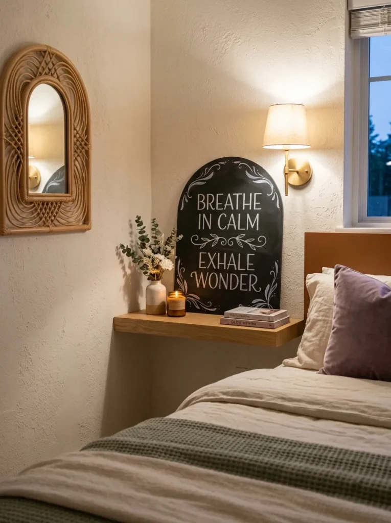
- Chalkboard size/frame: custom-cut arched chalkboard panel, no frame — the arch shape itself is the design statement, following the curved-silhouette trend showing up in mirrors and cabinetry this year
- Design concept: a soft frost pattern that follows the curve of the arch, denser at the top and thinning toward the bottom, rather than a symmetrical center pattern
- Function: decorative, occasional light refresh
- Color approach: two-tone — pearl-white chalk marker for the dense upper frost, and a single icy-lilac marker as a subtle unexpected accent through the thinning strokes
- Technique: work the density downward in short, layered strokes rather than one continuous line; the gradient effect is what makes an arched shape feel intentional instead of like a rectangle that got trimmed
- Legibility tip: since there’s no text here, “legibility” means restraint — stop adding frost strokes once the lower third of the arch feels appropriately sparse
- Placement: bedroom, leaning against the wall on a floating shelf rather than hung, echoing the soft, curved furniture already trending in bedrooms
- Integration: pairs with a curved rattan mirror or an arched headboard nearby to double down on the silhouette
Why this works: An arched silhouette immediately reads as more current than a rectangular board, since curved forms are the defining shape shift in home decor for 2026.
Curved and arched shapes have moved from a niche detail to the dominant silhouette across mirrors, headboards, and cabinetry this year, which makes an arched chalkboard feel noticeably more current than a standard rectangle. Frost density that thins toward the bottom of the arch, rather than sitting centered and symmetrical, mimics how actual window frost naturally builds heaviest where cold air collects. The unexpected lilac accent running through the lower strokes keeps the piece from reading purely monochrome, adding just enough color interest without disrupting the icy, wintry mood the design is built around.
An arched piece does something a rectangular chalkboard simply can’t in a bedroom — it softens a room full of straight lines and hard edges. I leaned into this shape in my own reading nook last winter, and it changed how the whole corner felt, not just that one wall. The lilac accent was almost an accident, a leftover marker I tested in one corner, but it ended up being the detail everyone asked about. Set on a floating shelf instead of hung, it also feels more like styled art than fixed decor, which makes it easy to swap out once spring arrives.
6. Mixed-Metal Menu Board
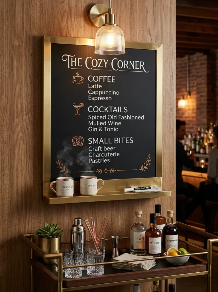
- Chalkboard size/frame: 20×20 square board in a thin brushed-brass frame with a matching brass ledge shelf mounted just below it for chalk and mugs
- Design concept: a functional hot cocoa and mulled cider drink menu, three or four options listed with small illustrated icons (a mug, a cinnamon stick, a star anise) beside each
- Function: fully interactive and functional — meant to be used, not just looked at, especially for guests during winter gatherings
- Color approach: black chalk marker on the brass-adjacent warm-white board surface for crisp legibility, with copper marker reserved for the small icons only
- Technique: a chalk marker is non-negotiable here since this board gets handled and wiped clean often; traditional chalk smudges too easily under repeated use
- Legibility tip: left-align the menu items in a simple list rather than centering them — centered menu text is harder to scan quickly, and guests should be able to read it at a glance while pouring a drink
- Placement: kitchen, directly above a coffee station or bar cart
- Construction note: my husband’s crews always recommend a French cleat mount for anything with a ledge shelf attached — the added weight and the temptation to lean on the shelf while pouring drinks means a single center hook won’t hold securely over a season of use
Why this works: A board built around an actual function — pouring drinks — gets read and used far more often through the season than a purely decorative piece, which is exactly the kind of “extra effort” detail that makes it feel genuinely current rather than trend-chasing.
A functional menu board earns its wall space in a way decorative pieces sometimes don’t, since it gets a fresh glance every time someone reaches for a mug. Brushed brass hardware paired with a warm-white board surface reads as considerably more current than the traditional black-and-white chalkboard pairing, closer to what’s showing up in new-build kitchens right now than a rustic farmhouse look. Small copper icons beside each drink option add just enough visual interest without cluttering the list, and the attached ledge shelf solves the small, constant annoyance of chalk markers rolling off a counter.
I added a version of this to our own kitchen two winters ago, mostly out of laziness — I was tired of explaining where the cinnamon sticks were every time we had people over. It ended up being the most-used chalkboard we’ve ever owned, precisely because it does something. Guests read it, pick a drink, and pour it themselves, which takes a small task off the host during a gathering. The brass ledge shelf turned out to be the detail people ask about most, since it solves a problem most chalkboard setups never bother addressing.
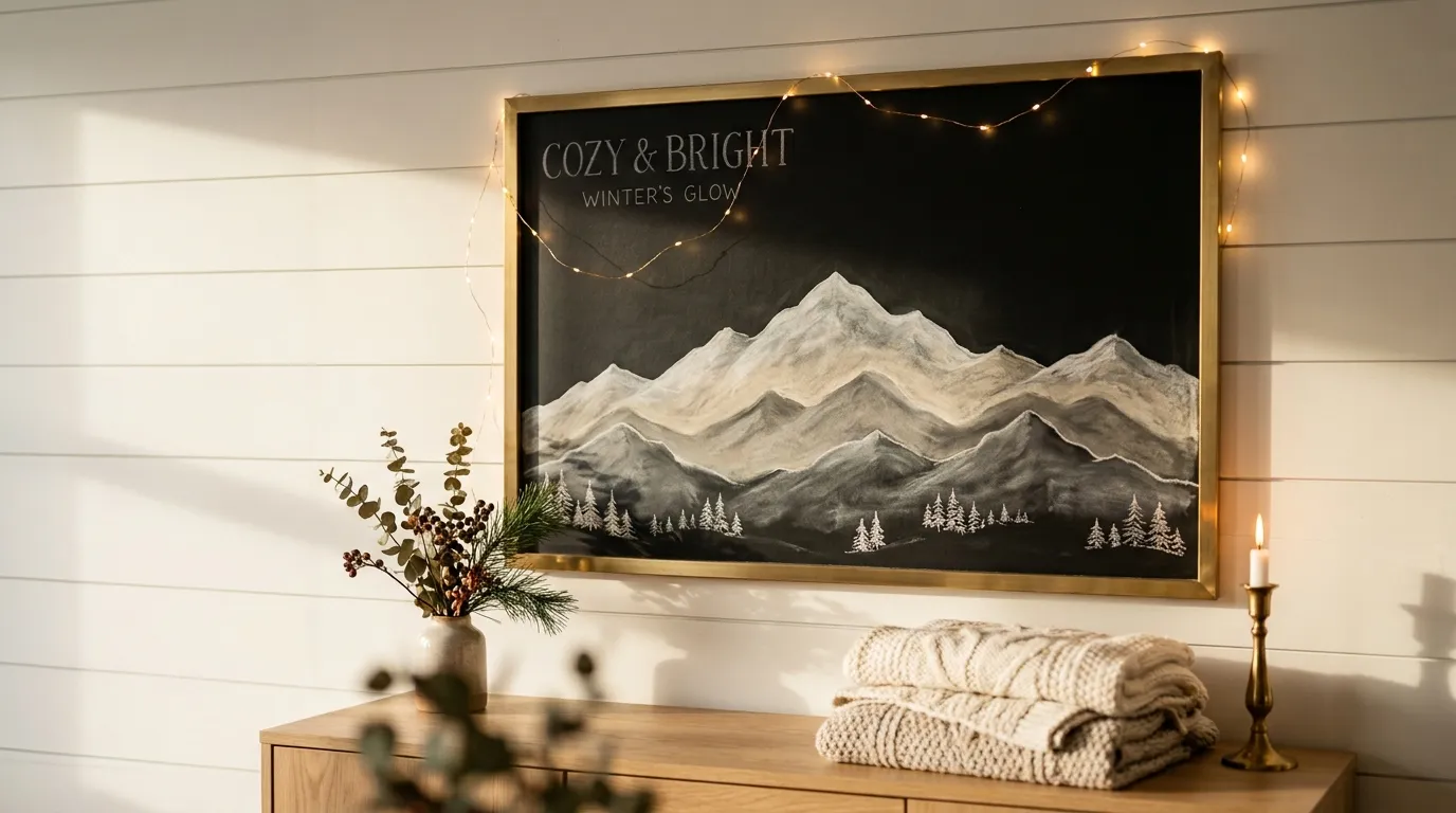
7. Snow-Capped Peaks Silhouette
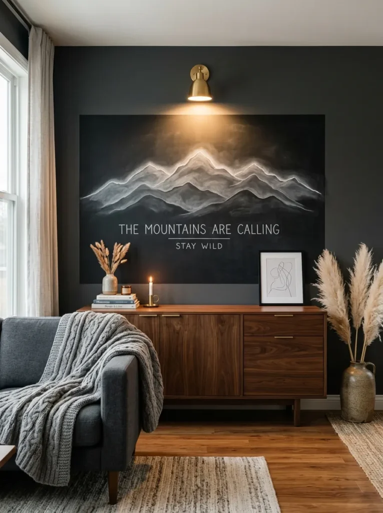
- Chalkboard size/frame: oversized 30×40 board with no visible frame — mounted flush to the wall so the black surface reads as a continuous plane, not a “framed” piece
- Design concept: a layered mountain range silhouette spanning the full width of the board, three overlapping ridgelines in decreasing shades of gray-white, with a scattering of tiny pine trees along the base
- Function: purely decorative; a statement piece meant to anchor the room, not be updated
- Color approach: three tonal values of white-to-gray chalk marker for the ridgelines, plus a single deep charcoal marker for the pine silhouettes at the base
- Technique: build the back ridgeline first in the lightest tone, then layer each closer ridge slightly darker and lower — this creates real depth instead of a flat, single-plane mountain shape
- Legibility tip: keep the pine trees small and clustered rather than evenly spaced across the whole base; real treelines bunch up in some spots and thin out in others
- Placement: living room, mounted above a low credenza or media console, opposite the seating area so it’s the first thing you see entering the room
- Integration: pairs with a chunky knit throw in stone gray and one large stoneware vessel with dried pampas or bunny tail grass
Why this works: Layered, overlapping silhouettes in decreasing tonal values create genuine visual depth on a flat surface, which is what separates a statement mountain illustration from a simple stenciled shape.
An oversized, frameless board reads more like architectural wall art than traditional chalkboard decor, which is exactly the shift a modern living room needs from this kind of piece. The tonal layering technique — lightest ridge furthest back, darkest closest — mimics real atmospheric perspective, the same visual effect that makes distant mountains look hazier than near ones in actual landscapes. That single technique is what makes this design feel intentional rather than like clip art scaled up. Left unframed, the black board also blends into a dark accent wall instead of competing with it, letting the white ridgelines do all the visual work.
I talked a client out of a framed version of this exact design last winter, and it was the right call — without the frame, the board reads as a continuous dark plane rather than a “picture” hung on the wall, which suits the oversized scale so much better. It’s become one of the pieces I recommend most for living rooms that already lean moody or dark-toned, since the pale ridgelines provide contrast without introducing a whole new color story. It’s substantial enough to anchor a room on its own, which most seasonal chalkboard pieces simply can’t do.
8. Single Giant Snowflake
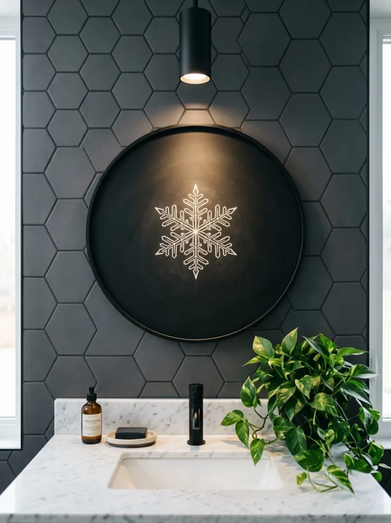
- Chalkboard size/frame: 20-inch round chalkboard, no frame — the circular shape itself is the modern departure from a standard rectangle
- Design concept: one oversized, precise geometric snowflake centered on the board, six-point symmetry with clean straight lines rather than the softer, sketchy snowflakes typically seen in seasonal decor
- Function: purely decorative; genuinely minimalist, meant to be left alone for the full season
- Color approach: white chalk marker only — no secondary color at all, which is what keeps this design feeling sleek rather than crafty
- Technique: draw with a ruler or straightedge for all six arms rather than freehand; this is one design where mathematical precision matters more than a hand-drawn look
- Legibility tip: leave roughly a third of the board as empty black space around the snowflake — crowding the design to fill the round shape undermines the minimalist effect entirely
- Placement: bathroom, hung on the wall opposite the vanity mirror at eye level
- Integration: pairs with matte black fixtures and a single dark green trailing pothos on the counter for contrast
Why this works: Precise, ruler-drawn geometric symmetry reads as intentional minimalism, while a freehand sketchy version of the same shape reads as an afterthought — the execution method is the entire difference.
A round chalkboard is still uncommon enough in most homes that it registers as a deliberate design choice the moment someone walks in, which matters in a bathroom where wall space is usually an afterthought. Restricting the palette to a single white marker on black keeps the piece from competing with tile, fixtures, or a vanity mirror frame, all of which already carry their own visual weight in most bathrooms. The generous negative space around the snowflake is doing real work here too — a fully filled circular board would feel busy in a room this size, while empty space around a small, precise motif reads as confident rather than sparse.
This is one of the simplest chalkboard ideas in the whole lineup, and that’s exactly the point — a bathroom rarely needs more visual noise, especially one with black hex tile or dark grout already doing a lot of work. My husband’s crews see this constantly on renovation jobs: small rooms get over-decorated because homeowners feel like every wall needs something substantial. A single graphic motif proves the opposite. It reads as considered, not empty, and it takes under ten minutes to draw with a straightedge and a steady hand.
You’ll Also Love: 15 Winter Centerpiece Ideas for Cozy Gatherings
9. Fireside Pairing Notes
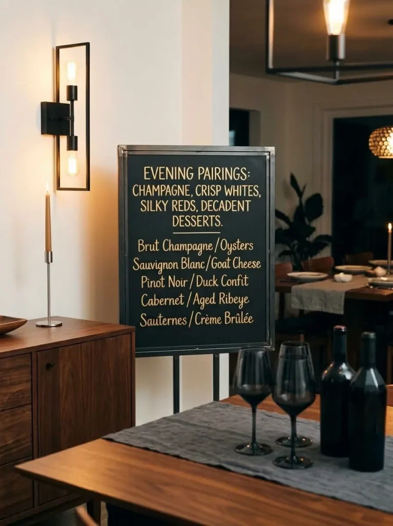
- Chalkboard size/frame: 18×24 board in a slim blackened-steel frame, a cooler, more industrial-modern material than the traditional wood chalkboard frame
- Design concept: a rotating winter pairing list — wine and cheese, or mulled cider and dessert combinations for entertaining — written as an elegant two-column list rather than a casual menu
- Function: interactive and functional, intended to be updated for each dinner party or gathering through the season
- Color approach: soft gold chalk marker on black, a warmer metallic tone than the icy silvers and whites used elsewhere in this lineup, suited to a dining room’s evening ambiance
- Technique: letter the two columns with a light guideline ruled in first, then go over freehand in gold — this keeps the columns aligned without looking mechanically perfect
- Legibility tip: limit each column to three pairings maximum; a longer list stops reading as curated and starts looking like a printed menu, which undercuts the handmade feel
- Placement: dining room, hung on the wall nearest the sideboard or bar cart, at a height easily read while seated
- Integration: pairs with a blackened-steel candle sconce nearby and a runner in deep charcoal linen
Why this works: A short, curated two-item list reads as thoughtfully hosted, while a longer printed-style menu reads as generic — restraint is what makes a pairing board feel like a personal touch instead of restaurant signage.
Gold on black is a warmer combination than the icy metallics that suit an entry or bedroom, which is exactly why it works better in a dining room meant for evening gatherings rather than daytime rooms. The blackened-steel frame leans into current dining room trends, where matte black and warm brass or gold hardware are increasingly paired together instead of kept in separate metal families. Limiting the list to three pairings per column keeps the board feeling like a genuine host’s note rather than a printed restaurant menu, which is the detail that actually makes guests stop and read it before they sit down.
I started doing a version of this for our own dinner parties a couple years ago, mostly because guests kept asking what was actually in the mulled cider. It turned into something people expect now, and updating it has become part of getting ready to host. The blackened-steel frame was a deliberate choice over wood — dining rooms in newer Austin builds lean cooler and more architectural these days, and a warm wood frame felt slightly out of step with that. Gold lettering against black steel splits the difference nicely.
10. Icicle Drip Edge
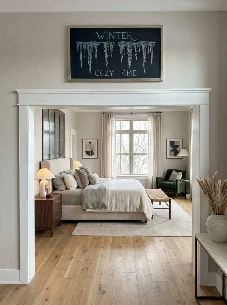
- Chalkboard size/frame: long, narrow 12×36 board in a brushed-nickel frame, sized specifically to run along the top of a doorway or window casing rather than sit as a standalone piece
- Design concept: a row of illustrated icicles “dripping” down from the top edge of the board in varying lengths, with the bottom portion of the board left completely bare
- Function: purely decorative, architectural in feel rather than a display piece
- Color approach: pale blue-white chalk marker only, with subtle vertical shading on the thicker icicles to suggest dimension
- Technique: vary icicle length and thickness noticeably — three or four long ones, several short ones scattered between — since perfectly even icicles read as a printed pattern rather than an illustration
- Legibility tip: anchor the icicles only to the top third of the board and resist the urge to fill the remaining space; the bare lower two-thirds is what makes the piece feel architectural instead of cluttered
- Placement: mounted horizontally above a doorway or wide window casing, functioning almost like a header trim piece
- Construction note: my husband’s crews always check for stud placement before mounting anything this long and narrow — a board this shape needs at least two anchor points spaced well apart, or the far end sags visibly within a few weeks
Why this works: Mounting a chalkboard horizontally above an opening, rather than as a standalone wall piece, turns it into an architectural detail instead of decor — a placement almost nobody else is using.
A narrow, horizontally mounted board reads as part of the room’s architecture rather than an added decoration, which is a genuinely uncommon use of a chalkboard most people only picture as a square or rectangle hung mid-wall. Leaving two-thirds of the board bare beneath the icicle row isn’t a design shortcut — it’s what makes the illustrated portion register as intentional trim rather than an unfinished drawing. Varying icicle length and thickness mimics how real ice actually forms, thickest where water pools longest and thinnest where it drips fastest, a detail that makes the row feel observed rather than invented.
This is one of the more unexpected placements in the whole lineup, and it’s become one of my favorites precisely because almost nobody thinks to use a chalkboard this way. Running it above a doorway instead of hanging it flat on open wall space solves a real problem — most homes don’t actually have a good blank wall waiting for art, but door and window casings are underused real estate in nearly every room. The pale blue-white palette keeps it subtle enough to read as trim from a distance, revealing the icicle detail only once you’re close.
11. Reading Nook Weather Log
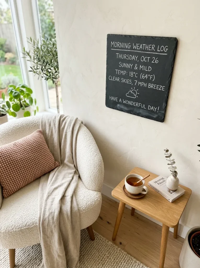
- Chalkboard size/frame: small 14×14 square board, unframed, mounted on a section of exposed plaster or venetian-plaster-textured wall
- Design concept: a simple daily weather log format — temperature, a one-word mood, and a tiny illustrated icon (sun, cloud, snowflake) — meant to be updated each morning
- Function: fully interactive, a small daily ritual piece rather than a seasonal statement
- Color approach: single stick of white chalk, deliberately soft and slightly smudged rather than crisp chalk-marker lines, to suit a cozy, tactile reading corner
- Technique: traditional chalk (not a marker) is the right choice here specifically because the board gets erased and rewritten daily — chalk marker ink builds up and becomes difficult to fully erase after repeated use, while dust-off chalk wipes clean every time
- Legibility tip: keep the format identical every day (same three lines, same order) so filling it in becomes quick and effortless rather than a small chore
- Placement: reading nook or window seat, at arm’s reach from a favorite chair
- Integration: pairs with a plaster-finish wall, a low bouclé armchair, and a small side table for tea
Why this works: Choosing traditional chalk over a chalk marker specifically because the board is erased daily is a small technical decision that determines whether a functional board stays easy to use or becomes a maintenance headache within weeks.
A tiny, ritual-based chalkboard works in a reading nook precisely because the space is already built around slowing down, and filling in three quick lines each morning fits that pace rather than disrupting it. The unframed board against a textured plaster wall keeps the whole vignette feeling tactile and handmade, which suits a nook meant for curling up rather than showcasing. Soft, slightly smudged chalk lines reinforce that same feeling — a crisp chalk-marker line would read too polished for a corner meant to feel lived-in and personal rather than styled for company.
I added a version of this to my own reading nook a few winters back almost as an experiment, and it’s the one chalkboard idea in this entire list that’s genuinely outlasted the season it was made for. There’s something about a small daily task — one line for temperature, one word for mood — that makes a corner feel used rather than merely decorated. It’s the smallest board in this lineup by far, but it gets more daily attention than any of the larger statement pieces, simply because it asks something small of you each morning.
12. Vertical Pantry Inventory
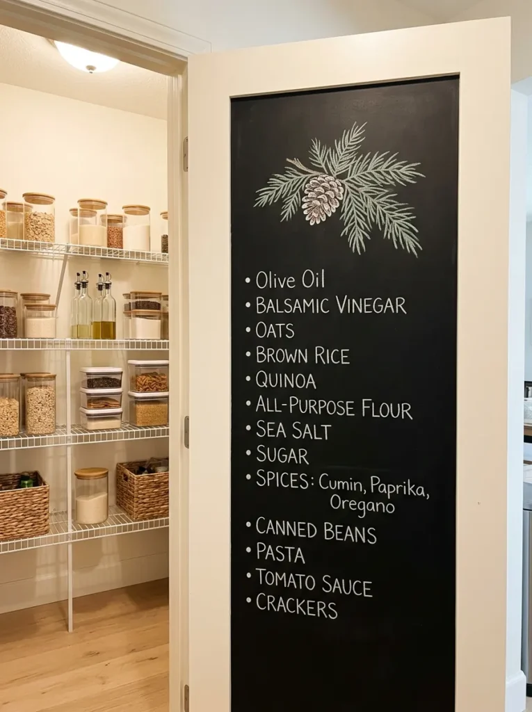
- Chalkboard size/frame: tall, narrow 12×24 board with no frame, mounted vertically rather than the usual horizontal orientation
- Design concept: a running pantry or freezer inventory list — “low on,” “stock up,” “in season now” — formatted as a functional kitchen tool rather than a design piece
- Function: fully interactive and practical, meant for frequent daily use inside or beside a pantry
- Color approach: black chalk marker for a crisp, easy-to-read list, with one small illustrated pinecone or winter herb sprig in a muted sage marker at the top as the only decorative touch
- Technique: chalk marker again, non-negotiable for a board that gets read and updated multiple times a week — legibility matters more here than aesthetic softness
- Legibility tip: use simple bullet points rather than full sentences, and leave a visible blank line between categories so the list stays scannable at a glance while someone’s hands are full of groceries
- Placement: inside a pantry door, or on the wall directly beside it
- Integration: pairs with open wire shelving and labeled glass jars, echoing the same clean, functional aesthetic
Why this works: A board placed on the inside of a pantry door rather than an open wall turns an ordinary storage space into functional decor without using any additional square footage — a placement most kitchen chalkboard ideas overlook entirely.
Mounting a chalkboard on the inside of a pantry door solves a real space problem that open-wall placements don’t: most kitchens simply don’t have extra wall real estate to spare, but a pantry door is functional space that’s otherwise wasted the moment it’s closed. The vertical orientation also suits a narrow door far better than a standard horizontal board would, making use of the door’s actual proportions instead of fighting them. A single small illustrated sprig at the top keeps the piece from feeling purely utilitarian, a small nod to seasonal decor without slowing down its actual function as a working list.
This is the most practical board in the entire lineup, and it’s the one I genuinely couldn’t run a kitchen without anymore. Being able to jot “low on chicken broth” the moment I notice it, rather than trying to remember it later at the store, has changed how efficiently we restock through the colder months when we’re cooking more and going out less. It doesn’t need to be beautiful to earn its wall space — though the small sage sprig at the top keeps it from feeling purely like an office supply. Function first, decoration second, and it still looks intentional.
13. Powder Room Constellation
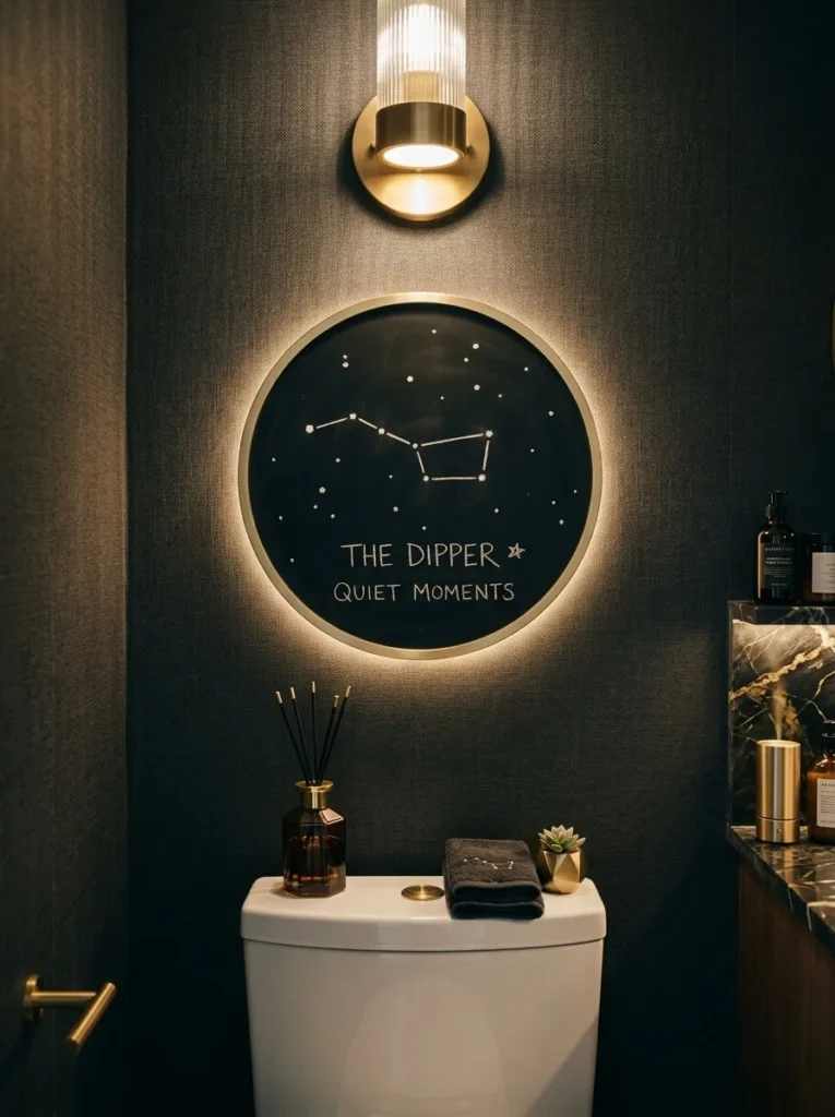
- Chalkboard size/frame: small 12-inch round board, unframed, mounted in an unexpected spot — above the toilet tank rather than beside the mirror
- Design concept: a minimalist winter night-sky illustration — Orion’s belt and a scattering of small dot-stars, referencing the long winter nights rather than any snow or holiday imagery at all
- Function: purely decorative, a quiet surprise detail rather than a focal piece
- Color approach: single white chalk marker, dots and lines kept deliberately sparse
- Technique: map out star positions loosely with light pencil dots first if precision matters to you, then connect with a chalk marker in one confident pass; hesitant, retraced lines read messier on a design this minimal than on a busier one
- Legibility tip: fewer stars than feels sufficient is usually the right call — a powder room is a small space, and an overcrowded night sky competes with everything else in the room rather than adding a quiet detail
- Placement: above the toilet tank or on a narrow accent wall, in a spot most homes leave entirely bare
- Integration: pairs with a dark, moody wallpaper or paint color already common in powder room design, letting the white chalk stand out against it
Why this works: A constellation motif ties directly to winter’s actual defining trait — the longest, darkest nights of the year — rather than borrowing generic snow or holiday imagery the way most winter decor defaults to.
A powder room is one of the few rooms in a home where a small, unexpected detail gets guaranteed close attention, since it’s typically the one space every guest visits alone and has a quiet moment to actually look around. A constellation motif taps into what winter genuinely is astronomically — the year’s longest nights, when Orion is at its most visible from most of the continental US — rather than relying on borrowed snow or holiday imagery the way so much seasonal decor defaults to by habit. Kept sparse, a handful of white dots and simple connecting lines reads as considered rather than an afterthought sketched in.
Powder rooms get overlooked constantly in seasonal decorating, mostly because people assume the space is too small to bother with. I disagree, and this is exactly the kind of idea that proves why — it takes almost no space and barely any chalk, but it’s consistently the detail guests mention on their way out. Placing it above the toilet tank instead of beside the mirror also means it doesn’t compete with anything functional; nobody’s trying to check their reflection against a starry sky. It’s a small, confident choice that rewards someone for actually looking.
14. Fairy-Light Frost Halo
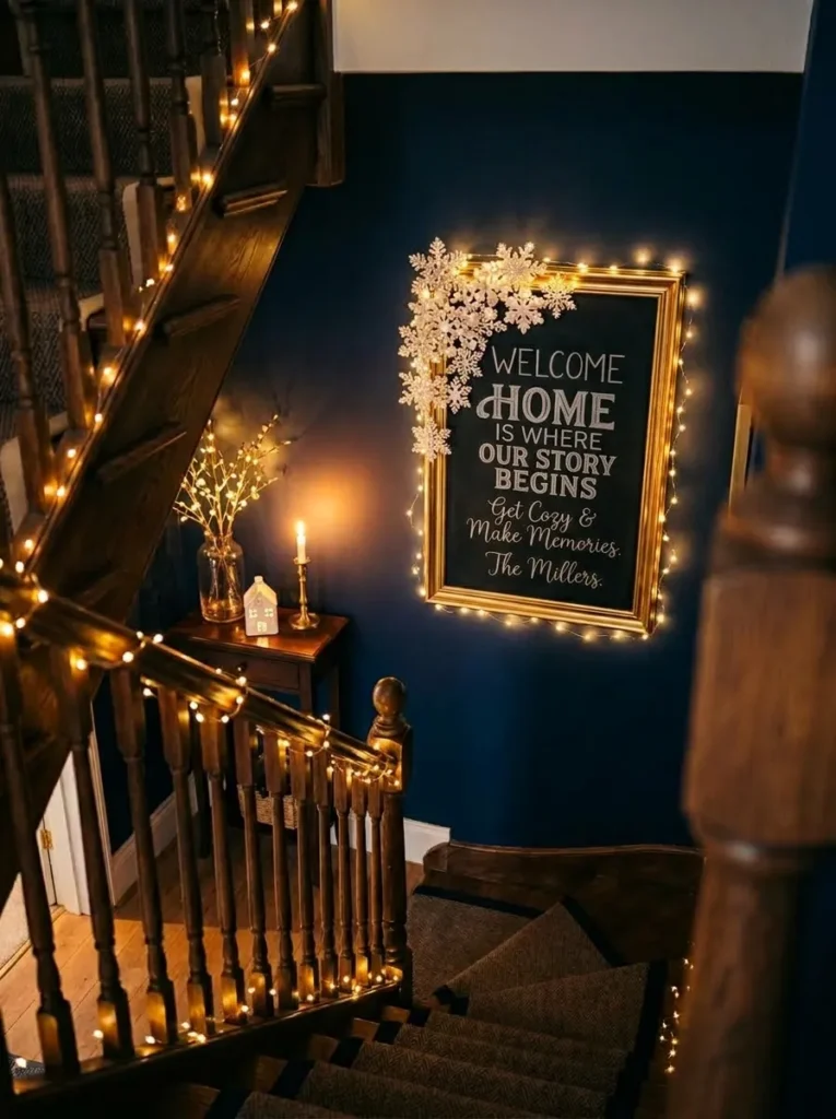
- Chalkboard size/frame: 22×22 square board in a thin warm-brass frame, with a single strand of warm-white micro fairy lights woven loosely behind the top edge of the frame so the glow spills down over the design
- Design concept: a soft frost halo — a loose ring of small, varied snowflake shapes clustered densely at the top where the lights sit, thinning toward the bottom — designed specifically so the illustrated frost catches and scatters the light behind it
- Function: decorative, but with genuine functional lighting built in, making it double as a small accent light source in the evening
- Color approach: pearl-white chalk marker, chosen specifically because white reflects warm light more visibly than gray or silver would against the black board
- Technique: draw the densest cluster of snowflakes directly where the light strand sits, since that’s where the glow will actually catch texture — a sparse area behind the lights wastes the effect entirely
- Legibility tip: test the lighting before finalizing the design; battery-pack fairy lights read dimmer than plug-in strands, so adjust snowflake density accordingly once the lights are actually running
- Placement: staircase landing, where a small accent light genuinely earns its keep in a spot most homes leave dim
- Construction note: my husband’s crews always route any wire, even a thin battery-pack fairy light lead, along the frame’s back edge with adhesive clips rather than letting it hang loose — a visible wire is the one thing that turns a clever detail into a sloppy one
Why this works: Weaving actual light into the design rather than just illustrating brightness gives this board a genuine glow at night that no amount of clever chalk shading alone can replicate.
Most winter chalkboard designs try to suggest light and shimmer using chalk alone, but there’s a real limit to how much shine a flat matte surface can actually convey. Weaving a strand of warm micro fairy lights behind the frame solves that limitation directly, giving the illustrated frost something real to catch and scatter rather than asking chalk dust to do all the work. Positioning the densest snowflake cluster exactly where the light sits isn’t decorative guesswork — it’s where the physical glow will actually interact with the drawn texture, which is the entire point of pairing the two elements.
Staircase landings are consistently the dimmest, most overlooked spot in a home, and I’ve started treating them as one of the best places for a small lit accent piece rather than another framed print nobody stops to look at. This board gets noticed specifically at night, which is unusual for a chalkboard — most of them are daytime pieces by default. Guests heading up or down a staircase catch the warm glow from an angle nobody else in the house usually sees, which makes it feel like a genuine discovery rather than another wall decoration doing the expected thing.
15. Champagne Shimmer Welcome
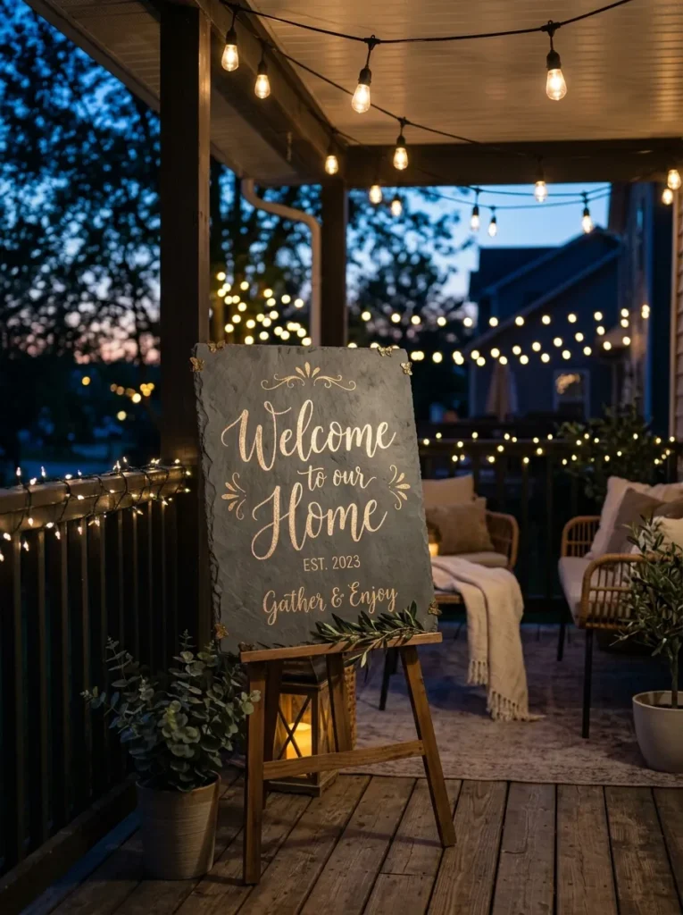
- Chalkboard size/frame: 20×30 board with no frame, mounted flush on a covered porch or patio wall, weatherproof sealed finish specifically for outdoor use
- Design concept: a single elegant word — “Welcome” — in oversized, slightly metallic-looking script, with a scattering of small shimmer dots trailing off the final letter like light catching frost
- Function: decorative, greeting guests arriving for winter gatherings, refreshed occasionally through the season
- Color approach: champagne-gold chalk marker exclusively, chosen because gold catches string-light glow far more visibly at dusk than white or silver does against a dark outdoor wall
- Technique: letter the main word first in one confident, unhurried stroke, then add the trailing shimmer dots last in varying sizes, larger near the letter and smaller as they scatter outward, mimicking how light naturally falls off rather than stopping abruptly
- Legibility tip: oversized script needs breathing room — this only works on a board with generous blank space on either side, so resist the urge to add anything else around the word
- Placement: covered porch or patio wall, near the entrance where arriving guests pass directly beneath warm string lights
- Construction note: an outdoor board needs a genuinely weatherproof sealant over the chalk, not just a porch overhang for protection — my husband’s crews have seen plenty of “covered” outdoor chalk pieces still get ruined by blowing rain or Austin’s humidity swings if the surface isn’t properly sealed
Why this works: Gold reflects warm string-light glow far more visibly than white or silver chalk does against a dark outdoor wall at dusk, which is the actual reason this design reads as shimmering rather than just being described that way.
An outdoor chalkboard has to work under a completely different kind of lighting than an indoor one — string lights, porch sconces, and dusk’s fading natural light, none of which flatter chalk the way a warm interior lamp does. Champagne-gold chalk solves that specific problem, catching and reflecting ambient light in a way flat white simply doesn’t outdoors. Central Texas’s mild winters also mean porches stay genuinely usable for gatherings well into the season, unlike colder climates where outdoor decor gets buried under snow by December, which makes an outdoor board a far more practical choice here than in most parts of the country.
I added a version of this to our own covered patio last winter, mostly on a whim, and it ended up being the first thing guests saw arriving after dark for a small gathering we hosted. The gold catching the string lights overhead genuinely does look like it’s shimmering, not just decoratively described that way — it’s a real optical effect, not a stretch. Properly sealed against Austin’s humidity swings, it’s held up through an entire season outdoors without a single touch-up, which surprised me more than it probably should have.
16. Moonlit Library Glow
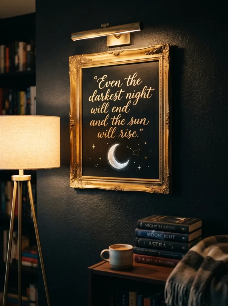
- Chalkboard size/frame: 18×26 board in a slim antique-brass frame, mounted with a small picture light fixed just above it, angled downward
- Design concept: a quiet illustrated crescent moon and three or four scattered stars in the upper corner, with a short favorite winter reading quote lettered beneath in fine script
- Function: decorative, refreshed occasionally when the quote changes with a new book
- Color approach: soft silver-white chalk marker throughout, kept monochrome so the picture light does the work of adding warmth rather than competing colors
- Technique: letter the quote in a smaller, tighter script than usual, since a picture light concentrates brightness in a narrow band — oversized lettering outside that band reads dim by comparison
- Legibility tip: position the moon and stars within the light’s actual beam, not just near it; test the fixture before finalizing placement so nothing important falls into shadow
- Placement: home library or a reading wall, mounted at eye level beside a favorite armchair
- Integration: pairs with a brass floor lamp and a stack of well-worn hardcovers on a side table below
Why this works: Mounting a real picture light above a chalkboard, rather than relying on ambient room lighting, guarantees the design reads clearly every evening regardless of the room’s other lighting.
A dedicated picture light solves a problem most decorative chalkboards quietly have — they depend entirely on whatever ambient light happens to be in the room, which shifts throughout the day and often fades exactly when a piece is meant to be enjoyed most, in the evening. Fixing a small brass light directly above the board removes that variability entirely, concentrating warm illumination exactly where the moon, stars, and quote sit. Keeping the palette to a single silver-white tone matters here too, since a busier color story would fight the light rather than let it do the highlighting work on its own.
I added a picture light to a library-nook chalkboard for a client last year almost as an afterthought, and it changed how often she noticed the piece entirely. Before the light, it blended into the wall by early evening; after, it became the actual focal point of that corner once the sun went down. It’s a small addition, but it’s the difference between decor that works all day and decor that only works in daylight, which matters more than people expect once winter’s shorter days set in.
17. Backlit Vanity Frost
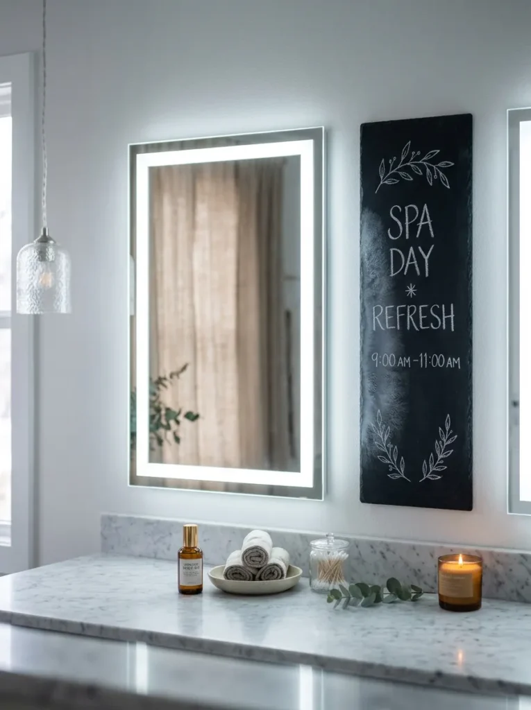
- Chalkboard size/frame: narrow 10×20 board with no frame, mounted flush beside a backlit LED bathroom mirror so the mirror’s ambient glow spills onto the board’s edge
- Design concept: a delicate frosted-glass-effect pattern along one edge only, fading from dense at the mirror side to bare on the opposite end, mimicking condensation catching light
- Function: purely decorative, a quiet complement to the mirror rather than a competing feature
- Color approach: cool white chalk marker exclusively, chosen to echo the mirror’s LED color temperature rather than clash with it
- Technique: blend the densest frost strokes right at the edge nearest the mirror using a barely damp fingertip, softening the line so it looks like the glow is genuinely diffusing outward rather than stopping at a hard edge
- Legibility tip: match your chalk marker’s white to the mirror’s light temperature as closely as possible — a warm-white marker beside a cool LED mirror looks visibly mismatched rather than intentional
- Placement: primary bathroom, mounted directly beside a backlit vanity mirror
- Construction note: my husband’s crews always confirm the LED mirror’s actual color temperature before any nearby finish gets chosen — cool (5000K+) and warm (2700-3000K) LED light reads dramatically different against white chalk, and guessing wrong is an easy, avoidable mistake
Why this works: Matching the chalk marker’s white tone to the mirror’s actual LED color temperature is a small technical detail most people skip, and it’s the entire reason this pairing looks intentional instead of accidentally mismatched.
Backlit LED mirrors have become standard in newer primary bathroom renovations, which makes the wall space directly beside them genuinely underused — most homeowners either leave it bare or hang something entirely unrelated to the mirror’s glow. A frost pattern that fades toward the light source, rather than sitting as a separate, self-contained design, treats the mirror’s illumination as part of the composition instead of ignoring it. That distinction, matching a chalk white to an LED’s actual color temperature, is a detail most people never think to check, yet it’s the difference between a pairing that looks planned and one that looks like an afterthought.
This is a smaller, quieter idea than most of the others in this lineup, and that’s intentional — a primary bathroom with a strong architectural feature like a backlit mirror doesn’t need a competing statement piece beside it. It needs something that acknowledges the light already there and works with it. I’ve recommended this pairing specifically for newer Austin builds with this mirror style, and it consistently reads as far more finished than an unrelated piece of art would in the same spot.
18. Closet Shimmer Strip

- Chalkboard size/frame: slim 8×24 board with no frame, mounted low along a walk-in closet’s back wall, paired with a warm LED strip light tucked beneath the shelf directly above it
- Design concept: a simple, elegant capsule-wardrobe reminder — “layer, neutral, one statement” — lettered in a clean, minimal sans-serif style rather than script, functioning as a quick styling prompt while dressing
- Function: interactive in spirit, meant to be glanced at rather than physically updated often
- Color approach: warm-gold chalk marker, chosen to pick up and echo the warm LED strip light glowing just above it rather than reading as a separate cool-toned element
- Technique: use a straightedge for the sans-serif letterforms rather than freehand cursive — clean block lettering under warm strip lighting reads considerably more polished than script does in this context
- Legibility tip: keep it to three words maximum, generously spaced; a closet is a functional, fast-moving space, and a longer message simply won’t get read while someone’s getting dressed
- Placement: walk-in closet, low on the back wall beneath an existing shelf with strip lighting
- Integration: pairs with matte-black closet hardware and open wood shelving, letting the warm strip light be the room’s main glow source
Why this works: A three-word prompt lettered in clean block type, lit from directly above by warm strip lighting, gets read in the few seconds someone actually spends glancing at it while dressing — anything longer or more decorative simply wouldn’t.
Closets are one of the last rooms most people think to decorate at all, let alone with something as specific as a chalkboard, which makes this one of the more genuinely unexpected placements in the entire lineup. Warm LED strip lighting has become increasingly common under closet shelving in newer builds, and pairing gold chalk lettering directly beneath it means the board actually gets illuminated as part of the closet’s existing light plan rather than needing its own separate fixture. Keeping the message to three simple words respects how a closet actually gets used — quickly, and usually while multitasking — rather than treating it like a space meant for lingering.
I added something similar to my own closet purely as a practical nudge, not really expecting it to matter much, but it’s become a small daily prompt I actually notice most mornings getting dressed for the day. The warm strip lighting above genuinely makes the gold lettering glow rather than just sit there, which surprised me the first time I saw it lit at night. It’s proof that even the most overlooked, purely functional room in a house can hold one small, intentional detail without needing to become a design project.
Keeping Your Winter Board Fresh for Two Full Months
A winter chalkboard has to work harder than most seasonal decor — it’s covering nearly eight weeks with no built-in refresh point the way Christmas or Thanksgiving decor has. A few principles keep it from going stale before spring arrives.
Split your boards into two categories: decorative and interactive. A purely illustrated piece — a mountain silhouette, a constellation, a frost pattern — doesn’t need touching for the entire season, and shouldn’t be treated as a chore to update. An interactive board — a goal grid, a pantry list, a drink menu — is designed to change constantly, which is exactly what keeps it feeling alive rather than neglected. Trying to make every board interactive is what leads to abandoned, half-erased chalkboards by late January.
Vary your color temperature by room, not by habit. Icy silvers and whites suit entries, bathrooms, and bedrooms — quieter, cooler spaces. Warmer golds and champagne tones suit dining rooms, kitchens, and anywhere gatherings happen in the evening. Matching the chalk tone to the room’s existing light, rather than defaulting to white everywhere, is what makes each board feel considered instead of interchangeable.
Let lighting do real work, not just decorative work. A board positioned near a picture light, a strip light, or even warm string lights genuinely gets noticed more often through winter’s shorter, darker days than one relying on daytime sun alone.
Don’t fear negative space. The boards that hold up best over eight weeks are rarely the busiest ones — restraint reads as intentional far longer than a crowded design does.
Frequently Asked Questions
Should I use chalk or a chalk marker for winter designs? It depends on how often the board changes. Traditional chalk is better for boards erased and rewritten frequently, like a daily weather log, since it wipes clean completely every time. Chalk markers hold crisp, precise lines far longer and won’t smudge under regular handling, making them the better choice for detailed illustrations, fine script, or any board mounted somewhere it’ll get bumped, like an entryway.
What’s the easiest lettering style for a beginner? Simple block or sans-serif lettering, drawn with a straightedge, is far more forgiving than cursive script. Script requires consistent pressure and a steady hand to look intentional rather than shaky, while ruled block letters look clean and confident even on a first attempt.
What are some budget-friendly chalkboard options for this? An unframed slate panel or a plain black-painted plywood board, both available at most hardware and craft stores for under $20, work just as well as a framed version. The frame adds polish, but the chalk design itself is what actually carries a winter look.
How do I seal or preserve a chalkboard design I want to keep? A light, even coat of clear matte sealant spray, applied from about a foot away in thin layers, will lock a finished chalk or chalk-marker design in place without smudging it. Always test on a scrap corner first, since some sealants can slightly dull chalk marker colors.
How do I transition from a Christmas chalkboard to a standalone winter look? Simply wipe the board completely clean rather than trying to adapt a Christmas design. Winter chalkboard art works best without any holiday-specific imagery at all — snowflakes, frost patterns, mountain silhouettes, and cozy quotes all read as purely seasonal rather than tied to any one holiday, which is exactly what lets the piece stay up comfortably through February.
Can a winter chalkboard work in a small apartment with limited wall space? Yes — several ideas in this list, like the powder room constellation or the closet shimmer strip, were designed specifically for small, overlooked spaces rather than large open walls. A tall, narrow board or a small round one can fit places a full-size piece never would.
Conclusion
Winter doesn’t have to mean bare walls until spring finally shows up. Whether you’re drawn to the quiet elegance of a frosted arch, the warm glow of a lit chalkboard on a staircase landing, or a simple daily ritual by a reading chair, these winter chalkboard ideas are built to make that long, quiet stretch feel just as intentional as any other season. I’ve seen how one small, well-placed board can change the whole mood of a room without a single new purchase — it’s one of the simplest transformations I recommend to clients every year.
Save this for later, try one idea this week, and pass it along to anyone whose house is feeling a little bare right now too.