15 Popular Interior Design Styles Explained (And How to Get Each Look)
Ever pinned a room and thought, “I want exactly this,” but couldn’t say what this was? That gap is where most decorating budgets get wasted. Learning the names of popular interior design styles gives you a shortcut: a clear word for the look you love, plus a plan for getting it.
In this guide, I walk you through 15 popular styles, from Scandinavian and Japandi to Art Deco and cottagecore. Each one comes with its defining traits and one fresh room idea you can borrow. I’ve watched friends and clients go from overwhelmed to decisive once they could name their style. Save this guide, scroll slowly, and notice which rooms pull you in.
Most people who say they “can’t decorate” don’t have a taste problem. They have a vocabulary problem. Choice-overload research shows that people facing too many options decide less often and feel less satisfied with what they pick, and a style name narrows the field before you ever open a shopping tab. A friend of mine once spent a year hating her living room before realizing she wanted Japandi and had been buying Boho. An interior design style is a repeatable set of colors, materials, and shapes that makes a room look planned. A style name is the shortest complete answer to “what do I want this room to feel like?” This guide gives you fifteen names, what defines each, and one fresh room to try.
1. Boho Style: Collected Layers — One of the Most Popular Interior Design Styles for Texture Lovers
- Layered rugs, quilts, and cushions in mixed handmade patterns
- Natural materials: rattan, jute, clay, and raw wood
- Warm, sun-baked palette with one saturated accent
- Trailing and leafy plants that soften hard edges
- Objects that look gathered over time, not bought in a set
Why this works: Boho succeeds when every object has a different story but shares the same warm, earthy color temperature.
Boho is the style of looking collected, not purchased. The word traces back to 19th-century bohemians, artists and writers in Paris who lived outside convention, and the look still rewards personal history over matching sets. The test: if you could swap every object for a catalog twin without losing anything, it isn’t Boho yet. Pattern comes from many small sources, like a kilim, a block-printed quilt, and a hand-thrown vase, held together by one shared warmth in color. Texture does the heavy lifting, so every surface should feel different under your hand, from nubby jute to smooth, oiled wood.
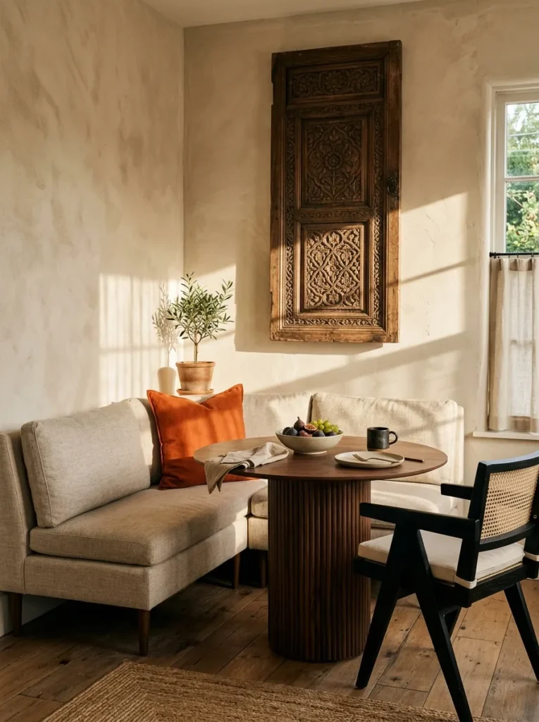
For something fresh, skip the living room, which our Boho Living Room guide already covers, and style a breakfast nook. Limewash the walls in sand, upholster a built-in banquette in oatmeal linen, and set a round walnut pedestal table in front of it. Then add the surprise: an antique carved door panel mounted behind the seat as a backrest. By day, light rakes across the limewash; at night, a pleated paper pendant and beeswax tapers give a warm amber glow. Two burnt-orange block-print cushions and one trailing hoya complete the palette: sand, oatmeal, walnut, and burnt orange.
2. Scandinavian Style: Daylight First
- Pale, light-reflecting walls and floors: whitewashed oak, soft white, light gray
- Clean-lined furniture with tapered legs and visible joinery
- Functional pieces over decorative clutter
- Layered, low-glare lighting for long winters
- Sheepskin, wool, and linen for warmth
Why this works: Scandinavian design uses pale surfaces and low-glare lighting to make small amounts of winter daylight go further.
The first time I styled a Scandinavian room for a client in Austin, I made a mistake: I used cool white and the room felt like a dentist’s office. Scandinavian design grew out of Nordic winters, where Stockholm gets roughly six hours of daylight in December, so every choice bounces light around. That is why walls, floors, and textiles lean pale, and why warmth comes from texture instead of color. Look for light oak or ash, wool throws, and silhouettes with tapered legs. The goal is lagom, a Swedish word meaning just the right amount: enough comfort, no excess.
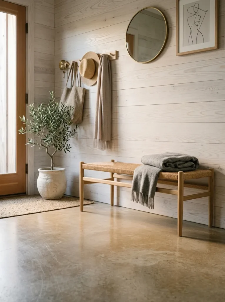
Skip the living room, which our Scandinavian Living Room guide already covers, and try an entryway instead. Whitewash an ash plank wall, mount a simple peg rail, and tuck a bench with a natural Danish paper-cord seat beneath it. The palette is whitewashed ash, chalk white, dove-gray wool throw, and one unlacquered brass hook. Morning light bounces off the pale planks and brightens the whole hall, while a single paper-shade pendant keeps evenings soft. The cord seat is the quiet standout: it breathes, wears in gracefully, and never feels cold to sit on in January.
3. Japandi Style: Quiet Craft
- Low-profile furniture set close to the floor
- Muted, earthy palette: oatmeal, clay, charcoal, pale oak
- Handmade, imperfect pieces like stoneware and hand-woven fabric
- Strict editing, with negative space treated as part of the design
- Natural materials with visible grain and texture
Why this works: Japandi pairs Japanese minimalism with Scandinavian comfort, so a room stays calm without feeling cold.
Japandi is what happens when Japanese restraint meets Scandinavian warmth. Both traditions value craft and simplicity, which is why the blend feels so natural. Japanese design brings wabi-sabi, the beauty of imperfect and aged things. Scandinavian design adds coziness and function. The result is a room with fewer objects, each chosen with care. In my experience, the biggest mistake is going too bare. Japandi isn’t empty; it is edited. Keep a few handmade pieces, leave breathing room around them, and let wood grain, plaster, and linen carry the visual interest instead of pattern.
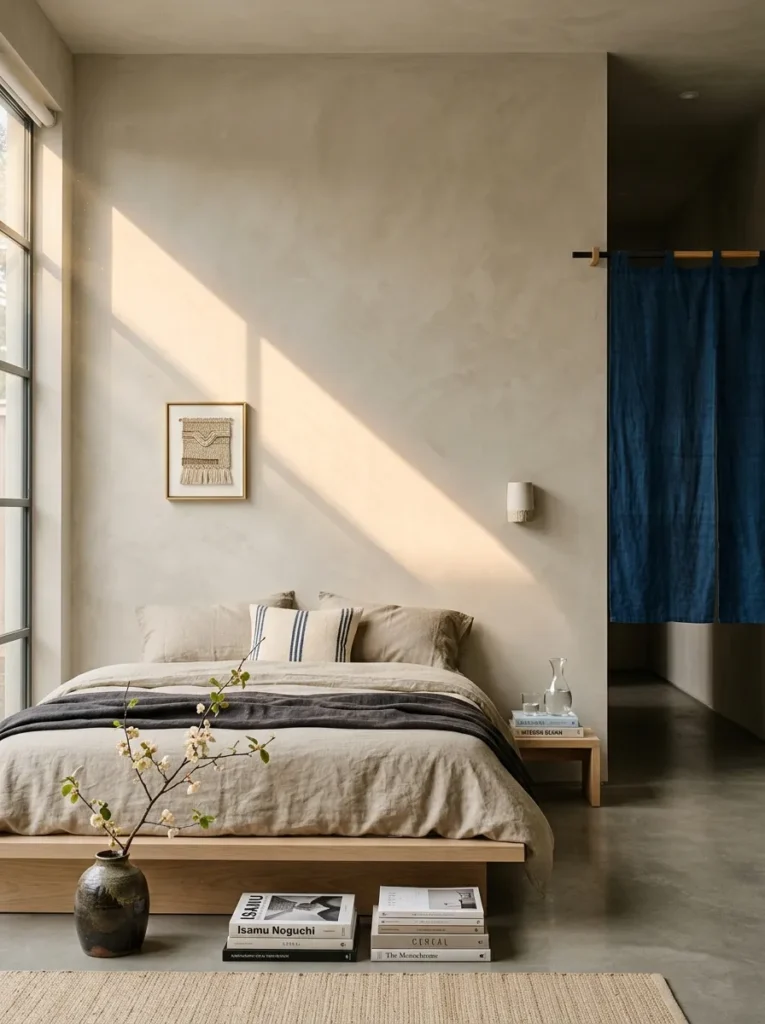
Fresh idea: a Japandi bedroom, a calm cousin of the style in our Japandi Bathroom guide. Wrap the walls in warm greige plaster, set a low pale-oak platform bed against them, and dress it in off-white washed linen. Hang an indigo noren curtain over the closet opening; it hides clutter and gives the room its single dark note. Add one forced quince branch in a stoneware vase, a trick I use every February. A rice-paper floor lantern glows at night, while morning light stays soft and even. Leave the wall above the bed completely empty.
4. Modern Farmhouse Style: Honest Materials
- Board-and-batten or shiplap walls in warm white
- Matte black hardware, window frames, and lighting
- Reclaimed or lightly finished wood with visible grain
- Clean-lined, practical furniture with simple forms
- Durable, washable finishes made for real family life
Why this works: Modern farmhouse works when rustic materials stay honest and the lines around them stay clean.
Modern farmhouse keeps the warmth of a working farm home and drops the clutter. Think clean-lined rooms with a few honest materials: painted board-and-batten, matte black metal, and wood that still shows its grain. My husband builds homes for a living, and he says the most common failure he sees in wall paneling is battens nailed only into drywall, which loosen and gap over time. Hit the studs, usually 16 inches apart, and the look lasts. Keep the palette simple, the hardware black, and the shapes plain so the texture does the talking.
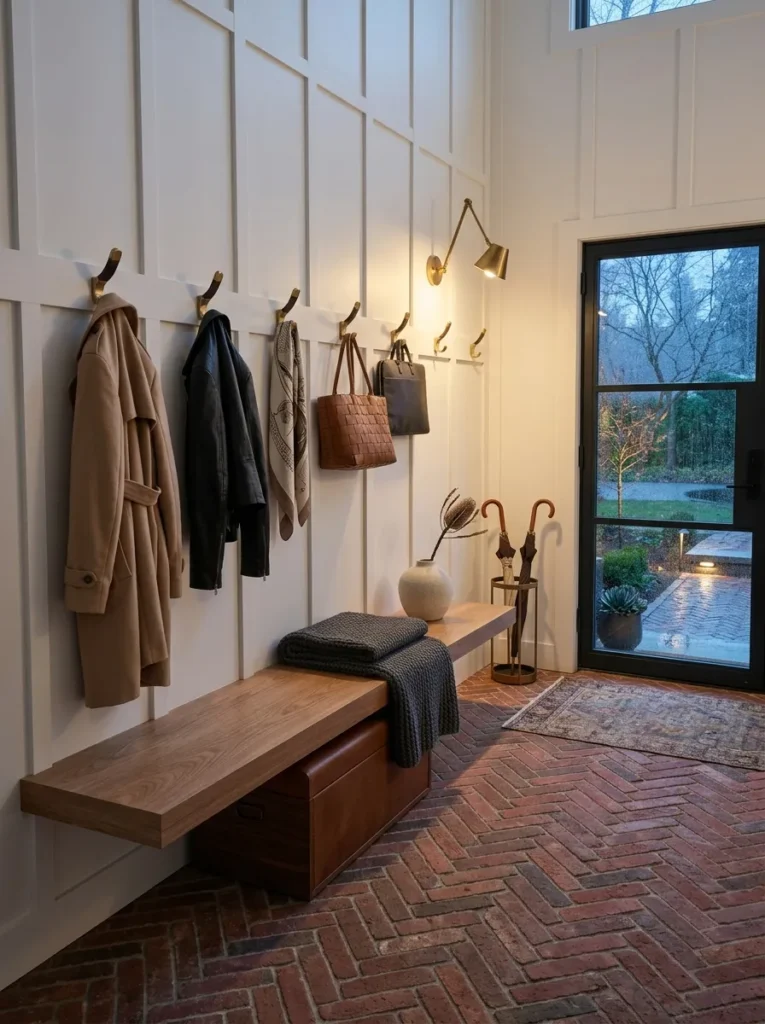
Skip the living room and try a mudroom. Paint tall board-and-batten chalk white, add a white oak bench, and line up matte black hooks above it. The surprise is underfoot: a herringbone floor of reclaimed red brick pavers, sealed with penetrating sealer so muddy boots wipe clean. A half-glass door floods the room with daylight, and at night a single black gooseneck sconce throws a warm, focused pool onto the bench. Palette: chalk white, matte black, white oak, and brick red. It’s hardworking, handsome, and unbothered by wet dogs and dripping umbrellas.
5. Coastal Style: Salt-Washed Calm
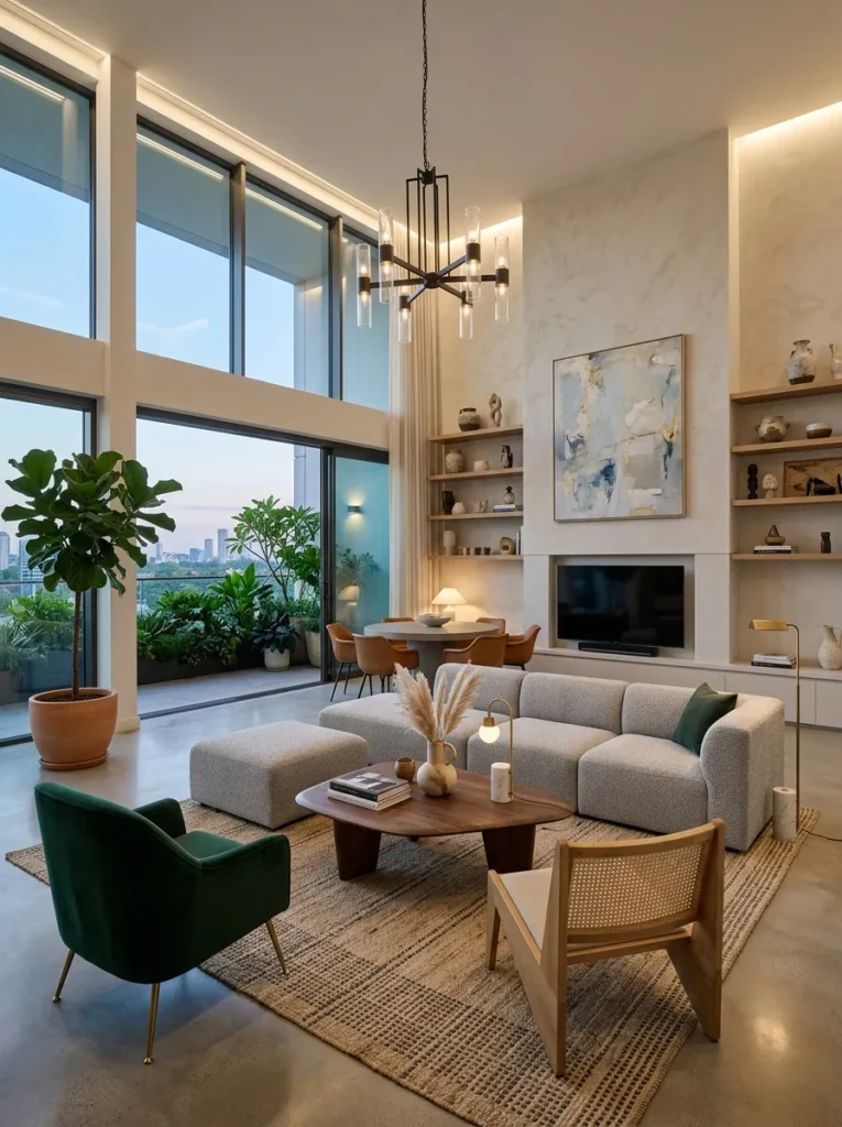
- Airy, light-filled rooms in a bleached-white and shallow-water-blue palette
- Driftwood-toned wood and woven textures like seagrass and rattan
- Relaxed linen and cotton in place of fussy fabrics
- Nautical references kept subtle: rope, glass floats, nickel
- Easy, durable finishes that handle sand and humidity
Why this works: Coastal style pairs sun-bleached surfaces with weathered natural textures so a room feels bright, relaxed, and effortless to live in.
Coastal style borrows from the shoreline: light, air, and surfaces that look weathered rather than new. The palette starts with sun-bleached whites and the soft blues of shallow water, then adds driftwood-toned wood and woven textures like seagrass and rope. Restraint matters here. A rope handle or a glass float reads as coastal; an anchor print reads as a theme park. Function matters too. Salt air corrodes cheap metal, so builders near the water specify 316 stainless steel, which resists salt spray better than standard hardware. Choose finishes that age gracefully, and the room looks relaxed instead of staged.
Skip the living room, which our Coastal Living Room guide already covers, and try a kitchen. Paint the lower cabinets fog blue, shape a curved plaster range hood in salt white, and float bleached white-oak shelves above a sealed, honed limestone counter. The standout is one oversized hand-blown glass orb pendant, which catches morning sun like a bubble and glows amber after dark. Polished nickel faucets and seagrass counter stools finish the scene. The palette is salt white, fog blue, bleached oak, and polished nickel, so everything reads bright, cool, and calm.
6. Dark Academia: Espresso and Oak
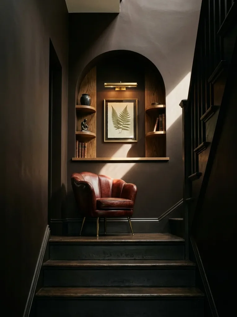
- Dark, saturated walls in espresso, ink, or deep green
- Wood paneling, leather, and aged brass
- Books treated as décor, shelved from floor to ceiling
- Antique finds: globes, busts, framed botanical prints
- Layered, low lighting from lamps and candles
Why this works: Dark academia works because saturated, light-absorbing walls turn lamps into warm pools of light and make books the focal point.
I resisted dark walls for years because I was sure they would shrink a room. Then I painted my own study espresso brown and noticed the opposite: edges vanished and the space felt deeper. Dark academia borrows from old university libraries: saturated walls, wood paneling, leather, and books used as décor rather than hidden. The key is layered lighting. Dark surfaces absorb light, so a lamp makes a warm pool instead of flat brightness. Use three light sources at different heights, keep finishes matte, and choose antique brass over shiny chrome for a patina that looks earned.
Try a staircase landing library, a spot most homes waste. Paint the walls espresso brown and recess a shallow arched niche lined in aged oak shelves. Add a single oxblood leather chair with a curved shell back, and aim an antique brass picture light at a framed pressed fern. By day, a small window throws a single bright stripe across the wall; at night, the brass light and one ivory taper carry the whole mood. The palette is espresso, aged oak, oxblood, and antique brass, with bone-white book spines for contrast.
7. Maximalist Style: Curated Abundance
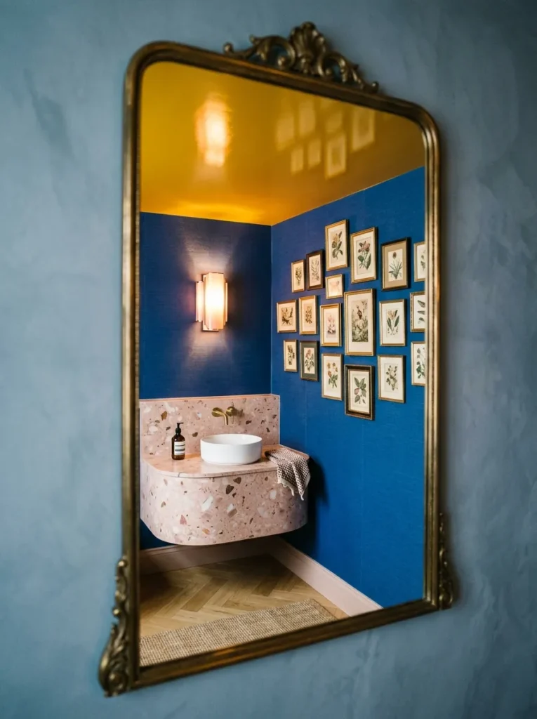
- Bold, saturated color and pattern mixed on purpose
- Walls used to the ceiling, with gallery clusters and lacquered finishes
- A mix of eras, textures, and materials
- Two or three repeating color threads that hold everything together
- Personal collections displayed like art
Why this works: Maximalism works when a few colors repeat at different scales, turning abundance into a deliberate pattern instead of clutter.
Maximalism is not clutter. It is curation with a repeating thread, and that thread is what separates a layered room from a messy one. My rule: pick two or three colors and repeat each at least three times, once large, once medium, once small. Bold wallpaper, a lacquered ceiling, and a wall of framed art all work when that repetition holds the room together. My husband adds one practical note from his job sites: any wallpapered bathroom needs a working exhaust fan, or humidity eventually lifts the seams. Go bold, but ventilate.
Try a powder room, the safest place in the house to be fearless. Lacquer the ceiling saffron, cover the walls in cobalt wallpaper, and install a curved blush terrazzo vanity with a polished brass faucet. Cluster nine small framed vintage botanical prints in a loose cloud above it, which is the standout. Two scalloped glass sconces glow rose-gold at night, and a frosted transom window gives gentle daylight. The palette is cobalt, saffron, blush, and brass, and each color repeats exactly three times, so the room feels thrilling instead of chaotic.
8. Minimalist Style: Quiet Subtraction
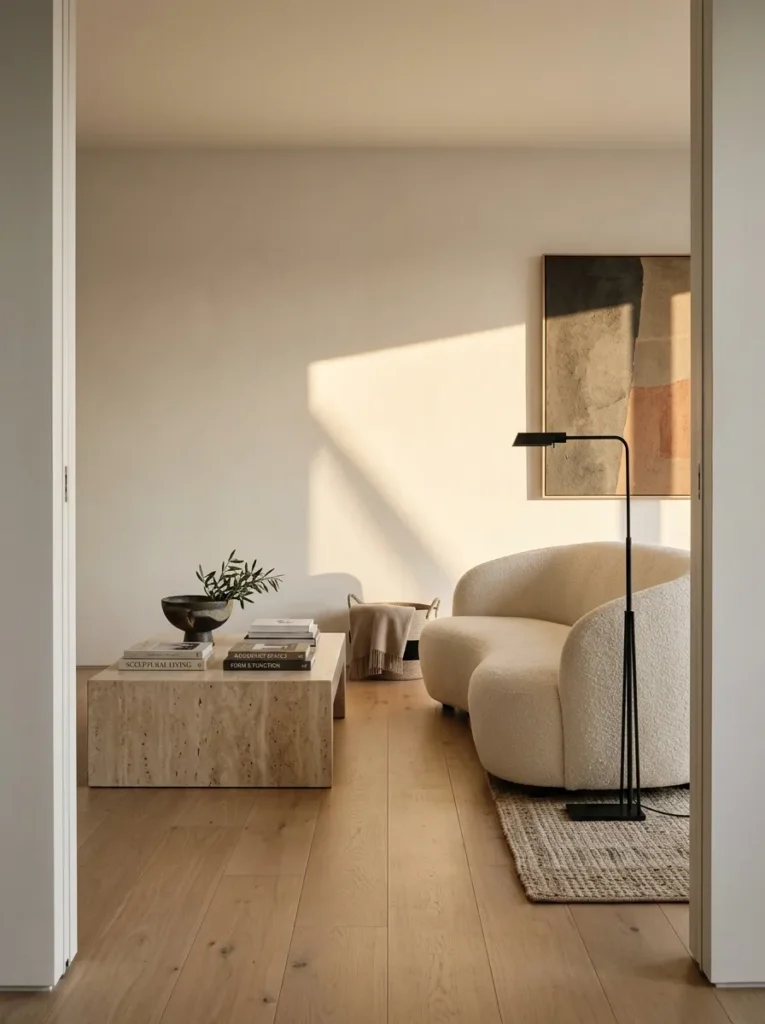
- Few, carefully chosen pieces with generous empty space
- Clean lines and unfussy forms with no ornament
- A restrained palette of three tones or fewer
- Hidden storage so surfaces stay clear
- Texture instead of pattern for depth
Why this works: Minimalism works because removing visual clutter lets a few well-made pieces and good light carry the whole room.
Minimalism is a design approach where every object earns its place and empty space counts as part of the room. The phrase “less is more” is tied to architect Ludwig Mies van der Rohe, and it still holds: removing one object often improves a room more than adding three. Cognitive research suggests visual clutter competes for attention, making a space harder to relax in. Minimalism isn’t about owning little; it’s about hiding what you use daily and displaying what you love. Three tones, one texture story, and clear surfaces create calm.
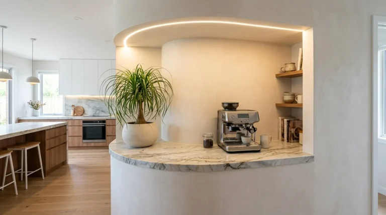
Try a living room built around subtraction. Pick a curved ivory bouclé sofa, a monolithic travertine coffee table, and one smoked-oak console. Keep the walls smooth plaster and the floor a wide-plank, matte oak. Replace baseboards with recessed shadow gaps; my husband warns these demand dead-straight drywall, since the gap exposes every flaw. A slim blackened steel floor lamp and one brushed bronze vase mix metals quietly. Daylight washes the plaster evenly, and a single dimmable lamp handles evenings. The palette is ivory, travertine, smoked oak, and blackened steel, with nothing else on the surfaces.
9. Mid-Century Modern: Curve and Teak
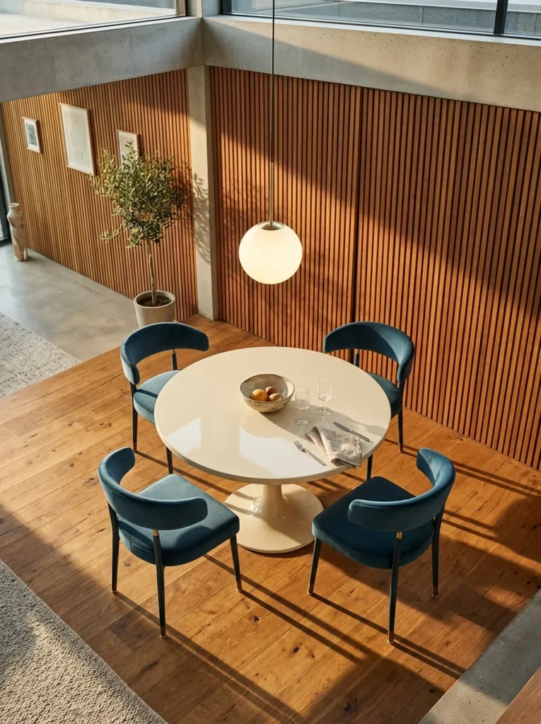
- Organic curves set against long, clean horizontal lines
- Warm teak and walnut with visible grain
- Low, light-looking furniture on tapered legs
- One saturated accent color against calm neutrals
- Floor-to-ceiling glass that pulls the garden indoors
Why this works: Mid-century modern pairs curved, low-slung furniture with clean architecture, so rooms feel warm without feeling heavy.
Mid-century modern is the design language of roughly 1945 to 1969, shaped by the postwar housing boom and new materials like molded plywood and tubular steel. Its signature is the organic curve against a clean line: a rounded chair back, a tapered leg, a long low sideboard. Those pieces were made for open-plan homes with big windows, so they still suit modern rooms. Look for warm teak or walnut, restrained hardware, and one confident accent color. Authenticity lives in proportion, so choose pieces that sit low, show their joinery, and leave plenty of floor visible.
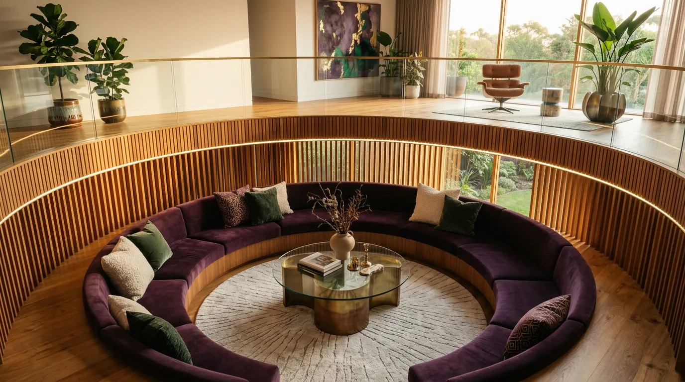
Try a sunken lounge, the most iconic mid-century move. Step the floor down 16 inches, wrap the edge in a curved bench upholstered in aubergine velvet, and lay a cream wool rug. Clad one wall in vertical teak slats and add a round table in polished chrome. Floor-to-ceiling glass floods the pit with daylight; at night, a low-hung opal glass pendant glows like a moon. My husband notes that on a concrete slab, common in Austin homes, the step can be cut in, while wood framing means reworking joists. The palette is teak, aubergine, cream, and chrome.
10. Industrial Style: Raw and Refined
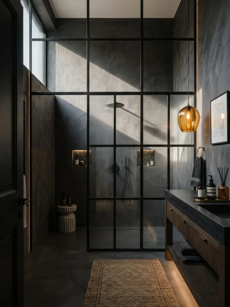
- Exposed structure: brick, concrete, ductwork, and steel beams
- Raw metal and unfinished wood left honest
- A palette of concrete gray, steel, and rust-warm wood
- Utilitarian lighting: factory pendants and cage fixtures
- Big grid windows and high ceilings that make space feel open
Why this works: Industrial style works when hard, raw materials are balanced with one soft layer, so the room feels intentional instead of cold.
The first time my husband walked me through a bare concrete slab on a job site, I thought it looked cold. Then afternoon sun crossed it and I understood the appeal. Industrial style grew from artists converting old factory lofts in the mid-20th century, and it keeps that raw honesty: exposed brick, steel, concrete, and unfinished wood. The catch is balance. Too many hard surfaces and a room feels like a parking garage. I always add one soft layer, like a wool rug or a leather chair, so the toughness reads as a choice, not a leftover.
Try a bathroom with sculptural, factory-born bones. Shape a freestanding oval tub in cast concrete, then frame the shower in a hot-rolled steel grid of glass panes that echoes old warehouse windows. Add a reclaimed elm vanity with a trough sink and wall-mounted taps. A single amber glass pendant warms the room at night, while a high clerestory window rakes cool daylight across the concrete. Check the floor framing first, since a cast concrete tub can weigh several hundred pounds, which surprises most people. The palette is concrete gray, hot-rolled steel, elm, and amber.
11. Traditional Style: Quiet Heritage
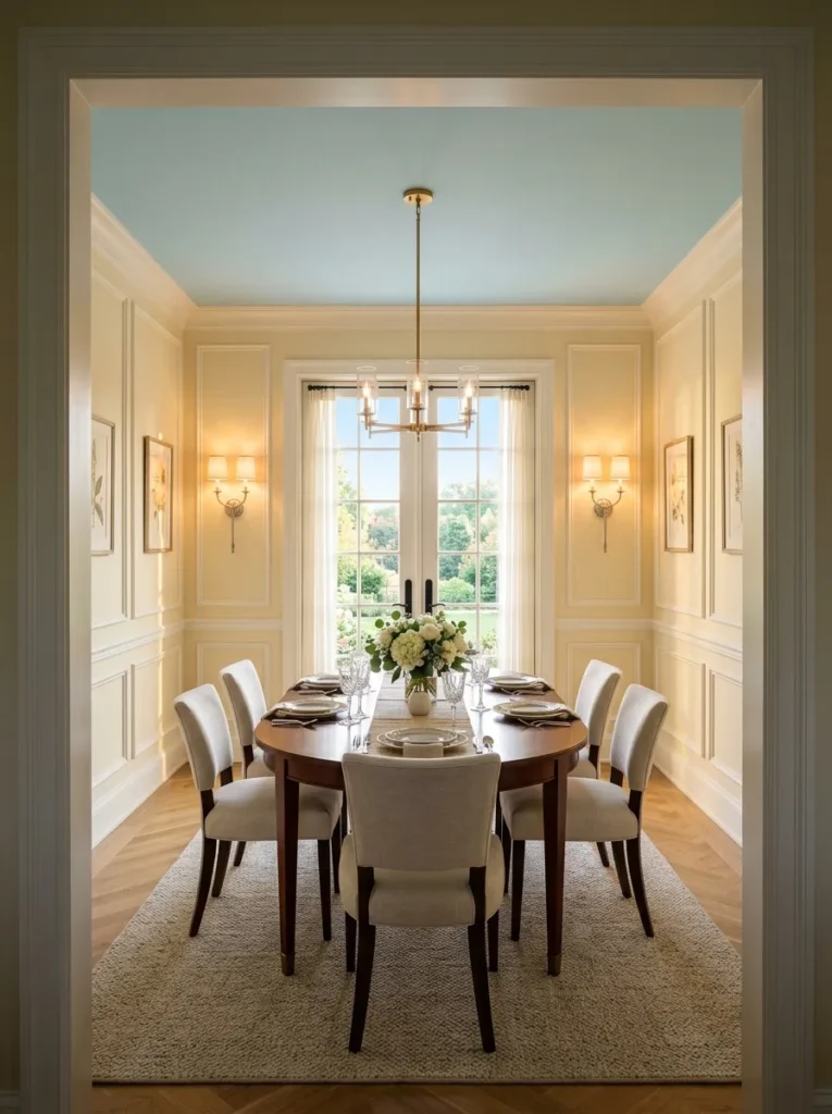
- Symmetry and balanced furniture arrangements
- Classic silhouettes: camelback sofas, rolled arms, turned legs
- Rich wood finishes and millwork like crown molding and chair rail
- Layered, muted color with classic patterns such as stripes and plaid
- Matched pairs of lamps with tailored shades
Why this works: Traditional style works because symmetry, quality millwork, and classic proportions create calm, balanced rooms that don’t date quickly.
Traditional style isn’t dusty. At its best, it is about symmetry, proportion, and craft. The look draws on 18th-century English and French interiors, where rooms were arranged in balanced pairs and walls were framed with molding. A useful rule from that tradition: a chair rail typically sits about one-third of the way up the wall, which keeps the proportions pleasing. Pair that with crown molding, matched lamps, and furniture with turned legs or rolled arms. Keep the shapes classic and the pattern edited, and the room reads as timeless instead of inherited.
Try a dining room with a quiet-luxury edge. Paint the walls butter yellow, trim them with white picture-frame molding, and wash the ceiling pale sky blue, the surprise that makes the room feel lifted. Center an oval mahogany table, surround it with six chairs in oyster linen, and flank a tall mirror with a pair of aged silver sconces. Daylight turns the walls warm cream; at night, sconces and tapers keep the glow low and symmetrical. The palette is butter yellow, mahogany, aged silver, and sky blue, and every element repeats in pairs.
12. Transitional Style: Soft Contrast
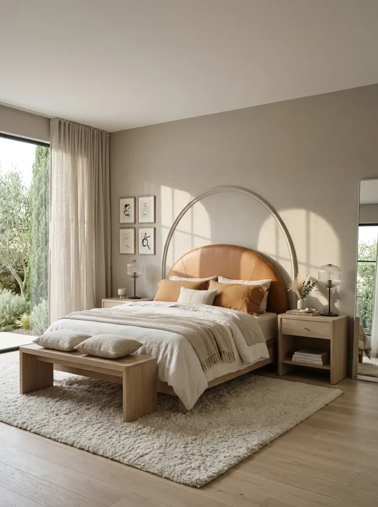
- A balance of classic and contemporary pieces
- Neutral base with subtle contrast and rich texture
- Clean lines softened by curves
- Fewer accessories and no heavy ornament
- Mixed metals and materials in measured doses
Why this works: Transitional style pairs classic shapes with contemporary restraint, so a room feels both timeless and current.
Transitional is the easy answer when you love classic comfort but not classic fuss. I’ve noticed that couples who disagree on style often land here, because it gives each person something to love. The formula is roughly half and half: one traditional anchor, like paneled walls, one contemporary anchor, like a sleek lamp, and a quiet neutral story tying them together. Keep contrast gentle, texture rich, and metals to two finishes. Nothing should shout. Every piece should join the same low, steady conversation, which is exactly why the room feels calm.
Try a primary bedroom that splits the difference. Trim the wall behind the bed with shallow arched picture-frame molding, painted tone-on-tone in mushroom plaster so the classic detail whispers. Upholster a curved headboard in caramel leather, add limed oak nightstands, and top them with ribbed glass lamps on black iron bases. Keep the bedding tonal, in layered linen and wool, and leave the rest of the wall bare. Morning light skims the molding into thin arched shadows; at night, the lamps throw a low amber glow. The palette is mushroom, caramel, limed oak, and black iron.
13. Art Deco: Jewel Box Glamour
- Bold geometry: fans, chevrons, stepped edges, and fluting
- Strict symmetry and balanced layouts
- Glamorous materials: lacquer, mirrored glass, marble, and brass
- Rich jewel tones set against deep neutrals
- Curved, streamlined furniture with polished finishes
Why this works: Art Deco works when one repeated geometric motif meets luxurious materials, giving a room glamour without clutter.
Art Deco takes its name from the 1925 Exposition des Arts Décoratifs et Industriels Modernes in Paris, and its look is unmistakable: bold geometry, strict symmetry, and glamorous materials like lacquer, brass, and mirrored glass. Stepped shapes, fans, and sunbursts echo the era’s love of skyscrapers and machines. Done well today, Deco is about restraint within richness. Choose one or two geometric motifs, such as fluting or a stepped edge, and let luxurious materials carry the rest. Too many patterns turn glamour into costume, so repeat one shape confidently and keep the remaining surfaces smooth.
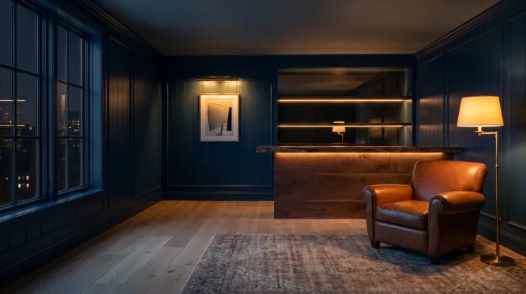
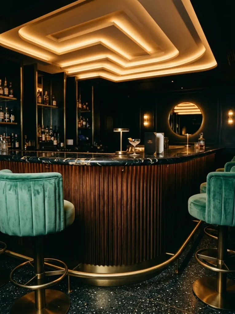
Try a home bar that feels like a jewel box. Build a curved, fluted ebonized walnut bar front, top it with black marble with white veining, and add two barrel-backed stools in jade velvet. The standout is a stepped ceiling soffit with a hidden LED strip, which washes the walls in soft light. My husband says that detail must be planned before drywall goes up, since the wiring and framing are nearly impossible to retrofit. Satin brass rail and shelf edges catch the glow at night. The palette is ebonized walnut, black marble, jade, and satin brass.
14. Cottagecore Style: Garden Room Calm
- Soft, faded color: lavender, muslin, and creamy whites
- Natural, handmade materials: linen, zinc, cherrywood, and clay
- Living plants and seed trays treated as décor
- Vintage-inspired pieces with simple, real function
- Gentle florals or gingham used once, not everywhere
Why this works: Cottagecore works when handmade, natural materials and living plants earn their place, so a room feels lived-in instead of themed.
A client once told me she wanted cottagecore but not the costume. I understood immediately. Cottagecore celebrates slow, handmade, garden-centered living, and it goes wrong when it becomes a pile of ruffles and printed signs. The modern version keeps the soul and edits the props: unbleached linen, patinaed metal, real wood, and living plants instead of fake florals. Choose one soft floral or gingham, then let texture do the rest. If a plant, a handmade object, or a natural material isn’t earning its place, leave it out. Fewer, better pieces make a cottage feel lived-in rather than staged.
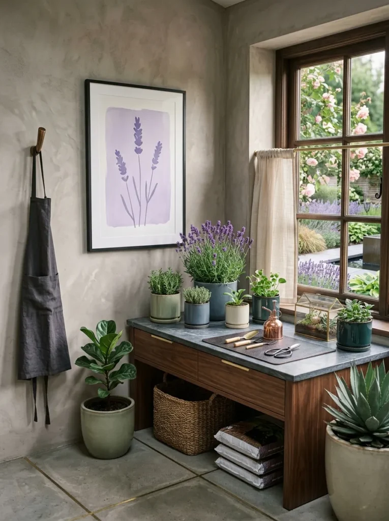
Try a garden room that works as hard as it looks. Wash the walls in faded lavender limewash, add a zinc-topped potting bench in cherrywood, and mount a seed-starting shelf with a full-spectrum grow light above it. Many vegetable and herb seeds sprout best near 70 to 75 degrees Fahrenheit, so a seedling heat mat on the bench is worth having. Hang unbleached muslin café curtains, which soften the light without blocking it. At night, a warm sconce above the bench glows like lantern light. The palette is faded lavender, muslin, weathered zinc, and cherrywood.
15. Modern Rustic: Cedar and Stone — A Favorite Among Popular Interior Design Styles for Lodge-Inspired Homes
- Natural materials: timber, stone, and charred wood in clean shapes
- A restrained, earthy palette with matte black or bronze metal
- One textured feature, like a beam or stone floor, as the rustic statement
- Simple, uncluttered furniture with honest construction
- Warm, layered lighting that makes texture glow
Why this works: Modern rustic works when two or three natural materials carry the character and everything else stays smooth and quiet.
Modern rustic keeps the honesty of a lodge and drops the heaviness. Think natural materials in clean-lined forms: timber, stone, and black or bronze metal, with far less clutter than the cabin look of the past. My husband puts it simply: let the material do the decorating. A beam, a stone floor, or a charred wood door needs almost no styling. The trick is to limit the rustic elements to just two or three, and keep everything else smooth, quiet, and simple so the room reads clearly modern instead of themed.
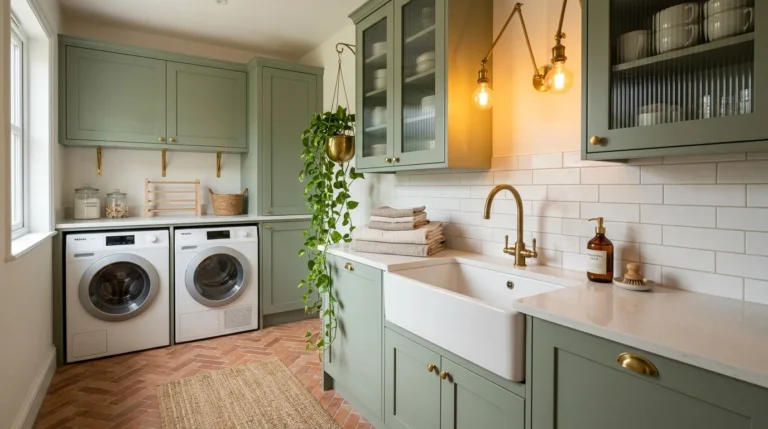
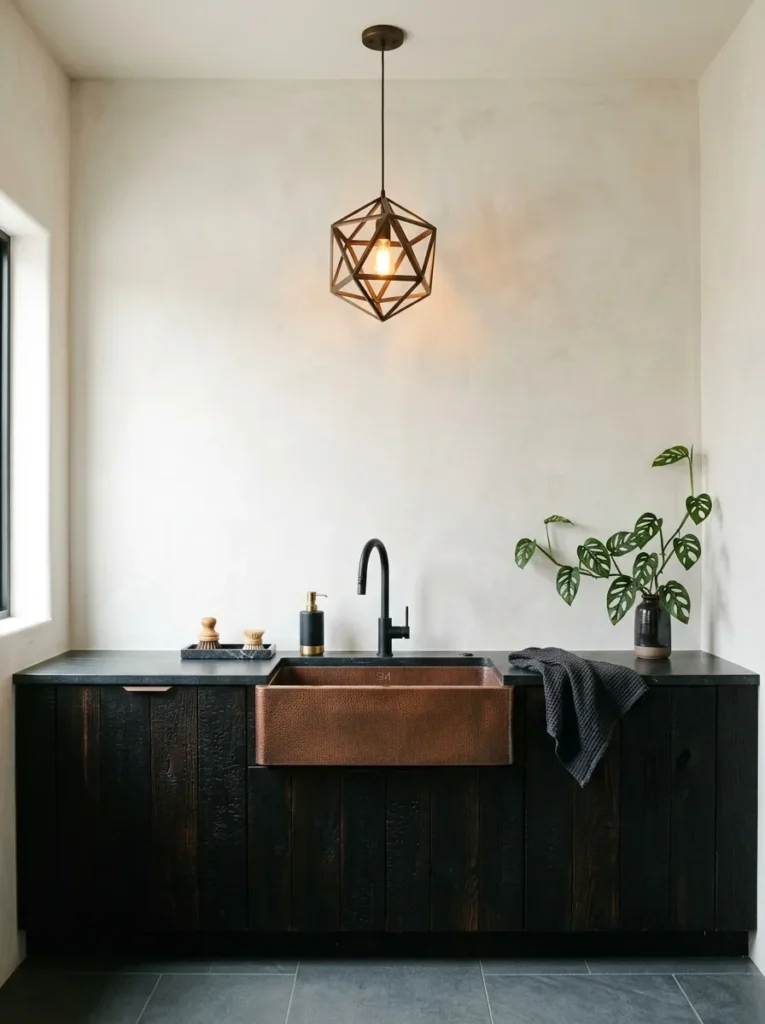
Try a laundry room, an overlooked spot for modern rustic. Clad the cabinet fronts in charred cedar, lay a tumbled bluestone floor, and limewash the walls in bone. A hammered copper sink adds the mixed-metal note beside matte black fixtures. Window light shows off the cedar’s deep char by day; a single bronze pendant warms it at night. Our Modern Rustic Living Room guide covers the main room; this is its hardworking cousin. Never skip a waterproof membrane under stone in a laundry room, since leaks are common there. The palette is charred cedar, bluestone, bone, and copper.
Styling Principles
The hardest part of any style is not choosing it. It is keeping it consistent once real life, hand-me-downs, and gifts enter the room. These principles keep a room intentional, whether you stay loyal to one look or mix several.
Follow the 70/30 rule. Give one lead style roughly 70 percent of the room and a supporting style the other 30 percent. A Japandi room with a mid-century chair feels planned. Three equal styles feel random.
Hold one thread constant. Keep the wood tone, the color temperature, or the metal finish the same across every piece. That single repeated thread is what makes mixed styles read as one room.
Limit metals to two finishes. Brass with black iron works. Brass, chrome, copper, and nickel together fight for attention.
Repeat one shape. A curved sofa, an arched mirror, and a round table link a farmhouse piece to a Deco one without any extra effort.
Edit before you add. Before buying anything new, remove one object. Rooms are rarely improved by the fifth accessory.
FAQs
1. What are the most popular interior design styles? The most widely recognized interior design styles include Scandinavian, Japandi, modern farmhouse, boho, coastal, mid-century modern, industrial, minimalist, traditional, and transitional. Each is defined by a consistent set of colors, materials, and shapes rather than by a single piece of furniture.
2. How do I find my interior design style? Save 20 photos of rooms you love, then look for repeating colors, materials, and shapes. The style name that matches most of those repeats is your starting point. Notice what you keep choosing, not what you think you should like.
3. Can you mix interior design styles? Yes, you can mix styles successfully by using one lead style for about 70 percent of the room and a second for the rest. Tie them together with one repeated color, wood tone, or metal finish so the room still feels cohesive.
4. What is the difference between modern and contemporary design? Modern design refers to a specific movement from the early to mid 20th century, defined by clean lines and minimal ornament. Contemporary design describes whatever is current, so it changes over time and often borrows from several styles.
5. What is the difference between Japandi and Scandinavian style? Scandinavian style focuses on bright, light-filled coziness with pale woods and soft textiles. Japandi blends that warmth with Japanese restraint, adding darker accents, handmade pieces, lower furniture, and more empty space.
6. What is the difference between modern farmhouse and modern rustic? Modern farmhouse is lighter and cleaner, with white painted walls, board-and-batten, and black accents. Modern rustic leans heavier and earthier, with raw timber, stone, and charred wood that give rooms a more lodge-like feel.
Conclusion
Your home doesn’t need to match a catalog. It needs a plan. Once you know the vocabulary of interior design styles, every choice gets easier, from the paint color to the lamp. Start small: pick one idea from this guide, such as the arched molding or the zinc potting bench, and try it in a single corner. I’ve seen how small, intentional changes can transform a space.
Save this post on Pinterest so you can come back to it while you shop, and share it with a friend who keeps saying she doesn’t know her style. You already have more taste than you think.