15 Fall Mantel Decor Ideas That Actually Feel Designed
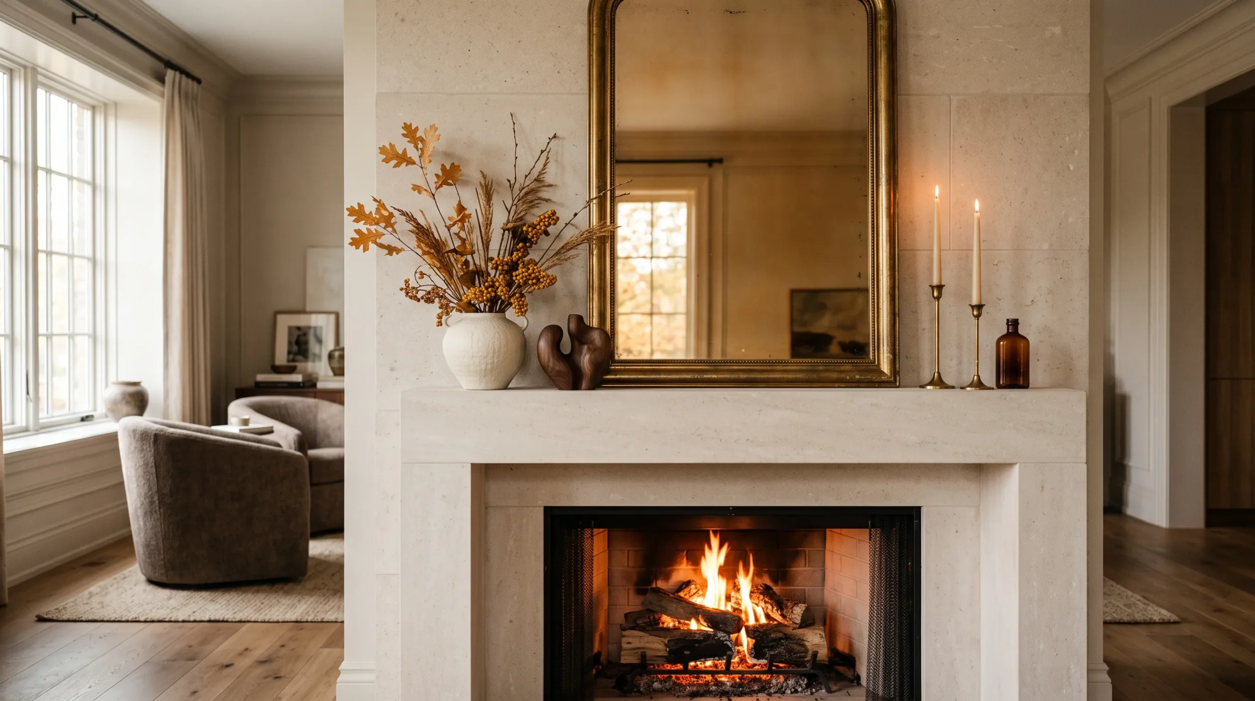
Fall decorating can be beautiful without turning your fireplace into a shelf of pumpkins. These fall mantel decor ideas show how to create a warm, sophisticated display using mirrors, artwork, ceramics, dried branches, vintage pieces, and rich autumn colors. Because the mantel is one of the room’s strongest focal points, the right combination of scale, height, texture, and negative space can make the entire fireplace feel more intentional.
I’ve noticed this especially in homes where the mantel has beautiful proportions but the decoration ignores them. Instead of filling every inch with seasonal accessories, I prefer to treat the mantel like a composition: one strong anchor, controlled height, deliberate layering, and a defined fall palette. The best fall mantel decor ideas use the fireplace as architecture, not simply as a place to display seasonal decorations. From amber glass and walnut to burnt sienna and aged brass, these ideas offer ways to make your mantel feel collected, elegant, and distinctly autumnal without looking predictable.
What Makes a Fall Mantel Look Designed?
A designed fall mantel starts with composition, not decoration. Choose one dominant anchor, establish three distinct heights, and layer smaller pieces in front of the main element rather than placing everything in a single row. A controlled palette of three to four colors also creates more visual cohesion than mixing every traditional autumn shade.
A mantel looks more designer when height, depth, color, and negative space are planned before seasonal accessories are added.
The best autumn mantel styling also considers how the display works throughout the day. Reflective materials such as amber glass and aged brass catch natural light, while textured ceramics, walnut, woven fibers, and artwork create stronger shadows and depth in the evening. For a working fireplace, decorative materials must also remain within the fireplace manufacturer’s required safety clearances.
1. Amber Glass Mirror
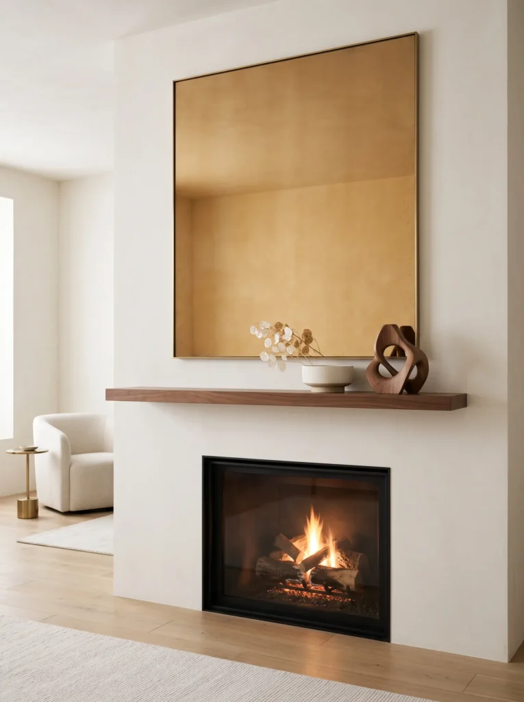
- Anchor piece: Oversized antiqued amber-glass mirror with a slim aged-brass frame.
- Palette: Warm amber, cream, walnut brown, aged brass.
- Layering plan: Center the mirror at the back; place two low walnut objects slightly forward; add a narrow cream vessel in front to create three distinct depth levels.
- Height variation: Keep the mirror dominant, with the supporting objects at roughly one-third and one-half of its height.
- Lighting: Use soft ambient room lighting during the day; add two small flameless lights nearby for an evening glow.
- Standout detail: The amber glass reflects firelight without introducing the predictable orange-pumpkin look.
- Construction note: For a working fireplace, keep decorative materials and lighting components positioned according to the fireplace manufacturer’s required clearance.
Why this works: A reflective vertical anchor gives a long mantel structure while amber glass introduces fall color without visual clutter.
The first thing I would establish here is the mirror’s scale. A mantel needs something tall enough to visually connect the horizontal shelf with the wall above it, otherwise the display can look like several unrelated objects lined up in a row. The amber mirror solves that immediately. Its muted reflection also changes throughout the day, which makes the arrangement feel more dimensional in photographs and in person. I prefer walnut accessories rather than lighter wood because the darker grain gives the amber and cream palette enough contrast without pulling the design toward rustic cabin territory.
I also like keeping the lower objects intentionally quiet. A small cream vessel does not compete with the mirror; instead, it creates a foreground layer that makes the composition easier to read. My husband often reminds me that anything placed around a working fireplace needs to be considered from a construction and safety perspective, not just visually. That is particularly important with seasonal textiles, dried materials, and candles. For this arrangement, the safest approach is to follow the fireplace manufacturer’s clearance requirements and favor flameless lighting when the mantel is close to active heat.
2. Burnt Sienna Landscape Art
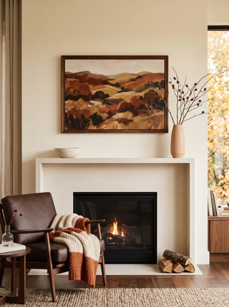
- Anchor piece: Large horizontal landscape painting in a slim dark-walnut frame.
- Palette: Burnt sienna, parchment cream, chocolate brown, muted peach.
- Layering plan: Hang the artwork slightly above the mantel; place one shallow ceramic bowl directly beneath it and a taller vessel offset to the right.
- Height variation: Use the landscape as the main horizontal line, with the vessel providing the secondary vertical lift.
- Lighting: Daylight should illuminate the painting naturally; use warm picture lighting or nearby ambient lamps after sunset.
- Standout detail: A narrow strip of exposed walnut beneath the artwork visually connects the frame to the mantel.
- Styling logic: The three-object arrangement creates an odd-numbered grouping while the painting provides the visual center of gravity.
Why this works: A horizontal artwork anchor reinforces the mantel’s length while a single vertical vessel prevents the composition from becoming flat.
A landscape painting is particularly effective when the fireplace itself already has strong architectural lines. Rather than fighting those lines with a collection of small seasonal decorations, the artwork reinforces them. The key is choosing a painting where burnt sienna appears as a controlled accent rather than a field of intense orange. Parchment cream keeps the palette sophisticated, while chocolate brown adds enough visual weight to make the composition feel grounded. The result reads as seasonal without relying on literal harvest symbols.
When I style a long mantel like this, I think in terms of a visual triangle rather than equal spacing. The artwork creates the broad base, the taller ceramic vessel establishes one upper point, and the lower bowl creates the opposing point. That slight asymmetry is what keeps the display from feeling staged by a ruler. It is also a useful trick for photographs: overlapping objects from front to back creates depth, while leaving some open mantel surface gives the eye a place to rest.
You’ll Also Love: 15 Modern Fall Bookshelf Styling Ideas for a Rich Look
3. Dried Sienna Branches
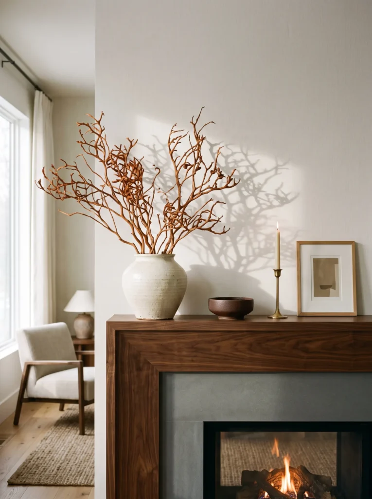
- Anchor piece: Tall sculptural arrangement of dried branches in a wide handmade ceramic vessel.
- Palette: Burnt sienna, natural wheat, deep gold, chocolate brown.
- Layering plan: Place the branch arrangement toward one side; add a low chocolate-brown object at the opposite end and a thin brass element in the foreground.
- Height variation: Let the branches rise well above the mantel while keeping the opposite accessories low and elongated.
- Lighting: Rely on natural window light during the day; use warm ambient lighting from the room at night rather than lights woven through the dried branches.
- Standout detail: The irregular branch silhouettes create a sculptural shadow pattern across the wall.
- Construction note: Lightweight dried branches are preferable to heavy seasonal objects when the wall above the mantel has limited hanging capacity.
- Depth strategy: Keep the tallest branches behind everything else, with the low accessories several inches forward.
Why this works: Strong vertical branches balance a horizontal mantel by creating height, movement, and negative space without filling every inch of the shelf.
There is something especially effective about using dried branches when the goal is a designer-looking fall display rather than a literal harvest vignette. Their irregular silhouettes introduce movement, and the open spaces between the stems allow the wall behind them to remain visible. That negative space matters. A mantel does not become more sophisticated because every inch is decorated; it becomes sophisticated when the occupied and unoccupied areas feel intentional. The wheat tones also soften burnt sienna, while deep gold provides a subtle metallic note that catches light without becoming shiny or overly formal.
The vessel is just as important as the branches. I would choose a handmade ceramic form with enough visual weight to hold the arrangement securely, but not one so oversized that it dominates the entire shelf. My husband’s construction background has made me much more conscious of weight distribution above fireplaces. Heavy artwork, large ceramics, and substantial seasonal pieces need appropriate support rather than simply being balanced on a narrow ledge. For a lighter installation, dried branches offer height without requiring the structural commitment of a large wall-hung object.
4. Walnut Sunburst Mirror
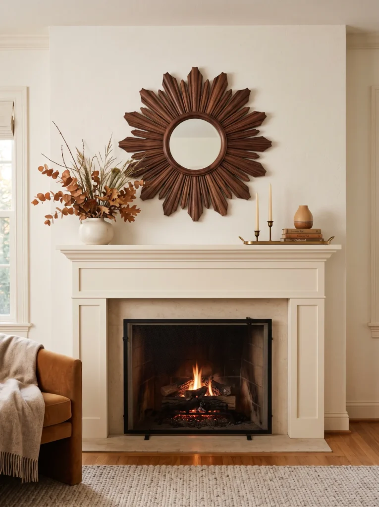
- Anchor piece: Sculptural walnut sunburst mirror with a low-profile carved frame.
- Palette: Walnut brown, antique gold, ivory, toasted caramel.
- Layering plan: Mount the mirror centrally; place a low ivory stoneware vessel slightly off-center and a narrow antique-gold tray in front.
- Height variation: The mirror provides the dominant vertical element while the vessel and tray stay deliberately low.
- Lighting: Use natural daylight to emphasize the walnut grain; switch to warm room lighting in the evening for softer reflections.
- Standout detail: The carved walnut rays create a subtle radial pattern that echoes the circular glow of a fire.
- Styling logic: Keep the lower accessories asymmetrical so the strong central mirror does not make the entire arrangement feel rigid.
Why this works: A radial mirror adds architectural movement to a mantel while the restrained lower layers keep the composition visually balanced.
A sunburst mirror can make a mantel feel considered without requiring a large collection of seasonal objects. The important distinction is choosing one with enough material presence to function as the anchor. Walnut works particularly well for fall because its natural brown undertones connect beautifully with autumn without relying on conventional orange. I would pair it with ivory rather than bright white because the softer neutral keeps the composition visually warm. The antique-gold accent then becomes a small reflective punctuation mark rather than another competing focal point.
This is also one of those arrangements where restraint makes the individual pieces look more expensive. I would resist adding a row of small accessories underneath the mirror. Instead, the low stoneware vessel and slim tray establish a foreground layer while preserving open mantel space. When my husband and I look at fireplace installations, we both notice how easily a mantel can become visually heavy when too many objects are concentrated in the center. Leaving breathing room around the mirror gives its silhouette room to work.
5. Harvest Botanical Artwork
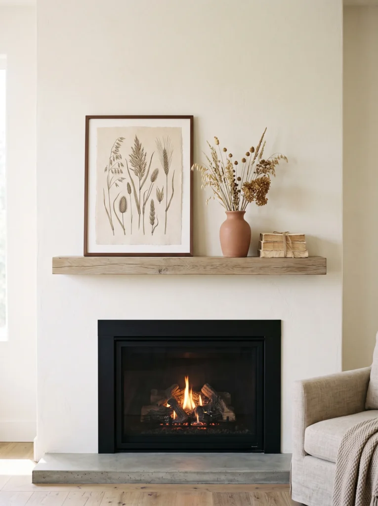
- Anchor piece: Framed botanical illustration featuring dried grasses and seed heads.
- Palette: Parchment, warm amber, chocolate brown, muted terracotta.
- Layering plan: Lean the artwork against the wall; position a narrow terracotta ceramic vase in front at one side and a small parchment-toned book stack beneath the opposite edge.
- Height variation: Artwork establishes the highest plane, while the vase reaches approximately halfway up its frame.
- Lighting: Bright indirect daylight works best for the botanical details; use warm ambient lamps in the evening.
- Standout detail: The botanical illustration introduces recognizable fall texture without using literal seasonal ornaments.
- Layering principle: Slightly overlap the book stack with the artwork frame to create a deliberate front-to-back relationship.
Why this works: Layering an artwork, vessel, and low object across different depths creates dimension without overcrowding the mantel.
Botanical artwork is one of my favorite ways to bring seasonal character indoors because it connects naturally with my plant-science background. Instead of decorating around the idea of fall, the artwork can actually show the structures that make the season visually interesting: seed heads, dried grasses, stems, and changing foliage. A parchment background gives the piece an aged quality, while amber and muted terracotta introduce warmth without drifting into the stronger rust-and-mustard combinations that can make autumn displays feel predictable.
The composition works because every object occupies a different visual plane. The artwork sits at the back, the vase moves forward, and the book stack becomes the lowest layer. That front-to-back progression is especially valuable when photographing a mantel because overlapping edges help create depth on a two-dimensional screen. In person, the same principle prevents the arrangement from looking like objects simply placed beside one another. I would keep the books neutral and understated so the botanical artwork remains the unmistakable focal point.
6. Aged Brass Candelabra
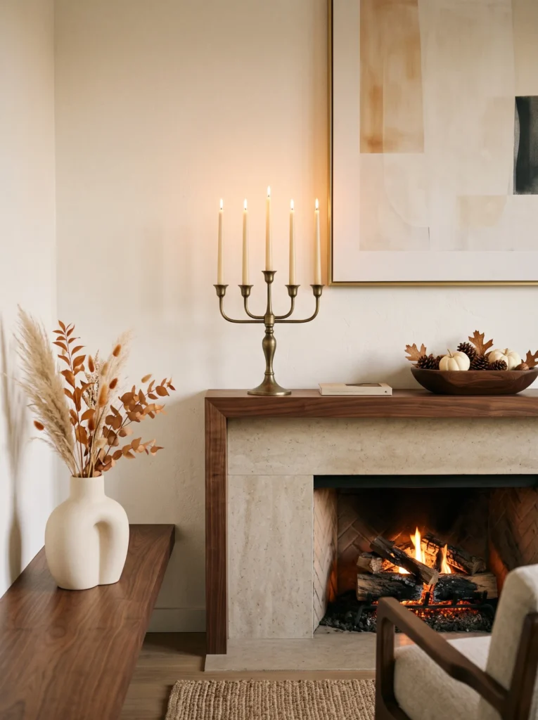
- Anchor piece: Sculptural aged-brass five-arm candelabra with an elongated silhouette.
- Palette: Aged brass, cream, walnut brown, soft caramel.
- Layering plan: Place the candelabra slightly off-center; position a low walnut bowl on one side and a cream ceramic object farther forward.
- Height variation: The candelabra provides the tallest point, while the bowl and ceramic piece form two progressively lower levels.
- Lighting: During the day, let natural light reveal the brass patina; in the evening, use flameless candles to create a controlled glow.
- Standout detail: Uneven candle heights create a naturally varied skyline across the mantel.
- Safety insight: A working fireplace requires careful candle placement and clearance; flameless candles are the safer choice when heat or flame exposure is a concern.
- Styling logic: The three-part grouping follows an intentional visual triangle rather than distributing objects evenly from end to end.
Why this works: Varying the heights of one sculptural anchor and two low companions creates a clear visual triangle across the mantel.
Aged brass gives this mantel a completely different fall identity because it introduces warmth through material rather than saturated color. I particularly like it with cream and walnut: the cream prevents the brass from becoming overly formal, while walnut gives the arrangement enough depth to feel grounded. The candelabra should not be perfectly centered if the fireplace architecture allows some flexibility. Slight asymmetry makes the eye travel between the tall brass form and the two lower objects rather than stopping immediately at the middle.
There is a practical reason I am conservative with real flames around fireplaces. My husband has spent years dealing with construction details, and heat clearance is one of those things that should never be treated as a styling afterthought. Manufacturer requirements vary by fireplace, so decorative candles, dried materials, and garlands should always be kept within the specified safe zone. For this reason, I would use flameless candles here, particularly on a mantel above an active fire. You still get the layered evening glow without adding unnecessary heat to the display.
7. Vintage Walnut Clock
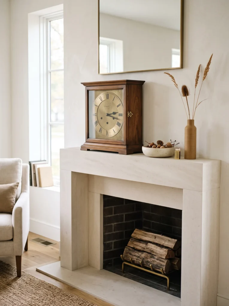
- Anchor piece: Large vintage walnut mantel clock with a softly aged brass face.
- Palette: Walnut brown, aged brass, cream, toasted tan.
- Layering plan: Position the clock slightly left of center; place a low cream pottery dish in front and a narrow tan object several inches behind it.
- Height variation: Let the clock create the main vertical point while the pottery remains deliberately below its midpoint.
- Lighting: Use daylight to reveal the clock’s wood grain; add soft ambient lighting after sunset rather than direct illumination.
- Standout detail: The aged brass clock face introduces a small circular reflective element against the darker walnut.
- Styling logic: A three-piece grouping keeps the display edited, with the clock carrying most of the visual weight.
- Depth strategy: Allow the pottery dish to overlap the clock’s lower edge slightly so the pieces read as one composition.
Why this works: A substantial vintage clock gives a mantel both vertical scale and collected character without relying on seasonal decorations.
Vintage pieces can make a seasonal display feel much more personal because they suggest a home that has evolved rather than been decorated for one specific holiday. A walnut clock is especially useful on a mantel because its proportions naturally suit the architecture of a fireplace. The dark wood also gives the fall palette a deeper foundation. Instead of adding several brown accessories, I would let the clock provide nearly all of that visual weight and use cream pottery to soften the arrangement.
The slight overlap is important here. When objects sit completely apart from one another, the eye tends to read them as separate purchases. Bringing the dish forward so that it partially intersects the clock creates a visual relationship. I have found that this small adjustment often makes a mantel look considerably more intentional without requiring additional pieces. The aged brass face adds just enough reflection to catch evening light, while the otherwise matte materials prevent the arrangement from becoming overly shiny.
8. Sculptural Amber Vessel
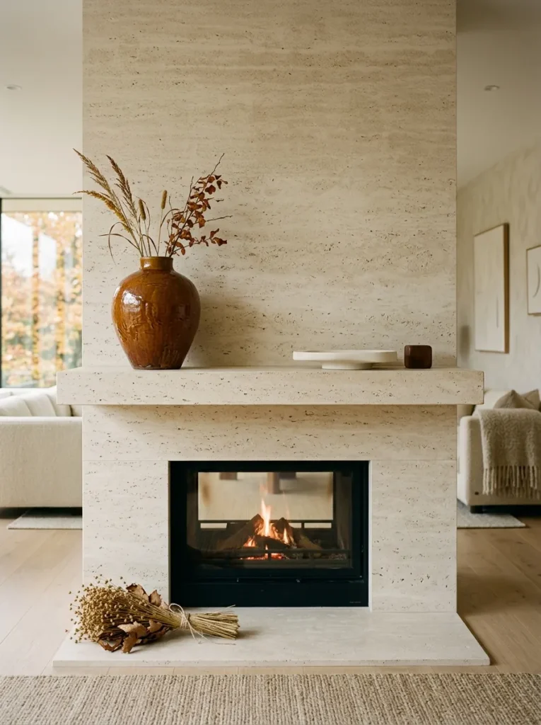
- Anchor piece: Oversized hand-thrown amber ceramic vessel with an irregular sculptural opening.
- Palette: Deep amber, ivory, chocolate brown, natural flax.
- Layering plan: Place the vessel toward one side; add a flat ivory stone object at the opposite end and a small flax-textured accent in the foreground.
- Height variation: The vessel provides a strong vertical silhouette while the other pieces remain low and elongated.
- Lighting: Position near natural daylight where the ceramic glaze can show tonal variation; use warm ambient lighting in the evening.
- Standout detail: The uneven hand-shaped rim gives the display an artisanal quality.
- Styling logic: One dominant sculptural object is more effective here than several competing accessories.
- Depth strategy: Keep the flat stone piece several inches behind the foreground accent to establish three visual planes.
Why this works: One oversized sculptural vessel can create stronger visual hierarchy than a collection of small seasonal objects.
This is the kind of mantel I would choose when the fireplace already has beautiful architecture and does not need much decoration. The oversized amber vessel becomes the entire story. Its color has enough fall association to feel seasonal, but because the form is sculptural rather than explicitly autumnal, it can remain in place long after the leaves disappear. Ivory and chocolate brown support the vessel without competing with its irregular silhouette, while flax adds a subtle textural note.
The mistake with a large object is usually trying to compensate for its size by adding too many things around it. Instead, I would deliberately leave much of the mantel empty. That negative space is part of the design. In a photograph, it allows the vessel’s silhouette to remain recognizable; in person, it gives the eye a visual pause. This approach is particularly useful for contemporary fireplaces where a crowded mantel can undermine the clean architectural lines that make the room interesting in the first place.
9. Deep Gold Art Frame
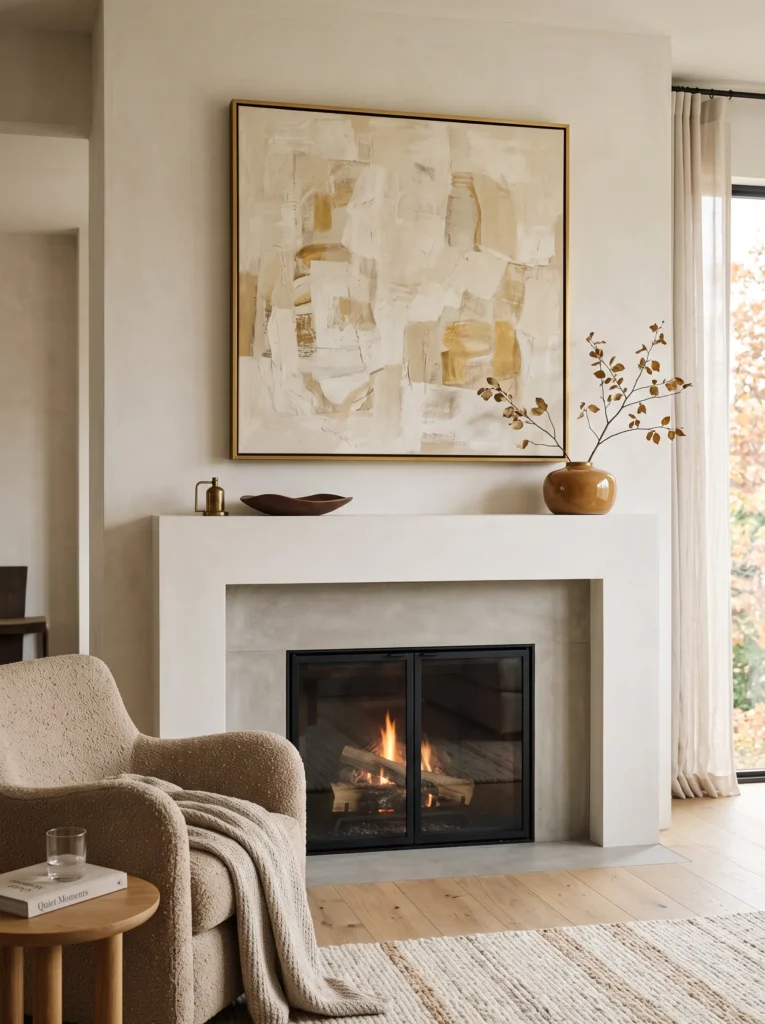
- Anchor piece: Oversized abstract artwork in a thin deep-gold frame.
- Palette: Deep gold, warm cream, chocolate, muted caramel.
- Layering plan: Center the artwork; place one narrow caramel ceramic vessel in front of one lower corner and a shallow chocolate object offset on the opposite side.
- Height variation: Artwork dominates vertically, while both accessories stay below one-half of its height.
- Lighting: Use indirect daylight to reveal subtle artwork texture; add warm wall or room lighting in the evening.
- Standout detail: The deep-gold frame catches small amounts of light without looking polished or overly bright.
- Styling logic: The asymmetrical lower pieces counterbalance the centered artwork and prevent a formal, symmetrical arrangement.
- Construction note: A substantial framed artwork should be secured according to its weight and the wall construction rather than simply leaned precariously on a narrow mantel.
Why this works: A restrained metallic frame can introduce fall richness while keeping the artwork, rather than the accessories, as the focal point.
Deep gold is one of the easiest ways to make autumn styling feel sophisticated without reaching for traditional orange. I would look for an abstract artwork where cream dominates and caramel or chocolate appears in smaller passages. The frame then connects those tones without requiring additional metallic accessories throughout the mantel. This is a good example of letting one material carry a color story. Repeating the same gold in several small objects would make the arrangement feel more decorative; using it once makes it feel architectural.
My husband has also made me more cautious about the practical side of oversized artwork. A heavy frame above a fireplace is not simply a styling decision—it is a mounting decision. The attachment needs to suit the wall construction and the weight of the artwork, particularly in homes where the mantel is narrow or the wall receives vibration from doors and everyday activity. Once that is properly handled, the styling can stay remarkably simple: one strong picture, two low objects, and enough empty space to let the composition breathe.
10. Walnut Pedestal Sculpture
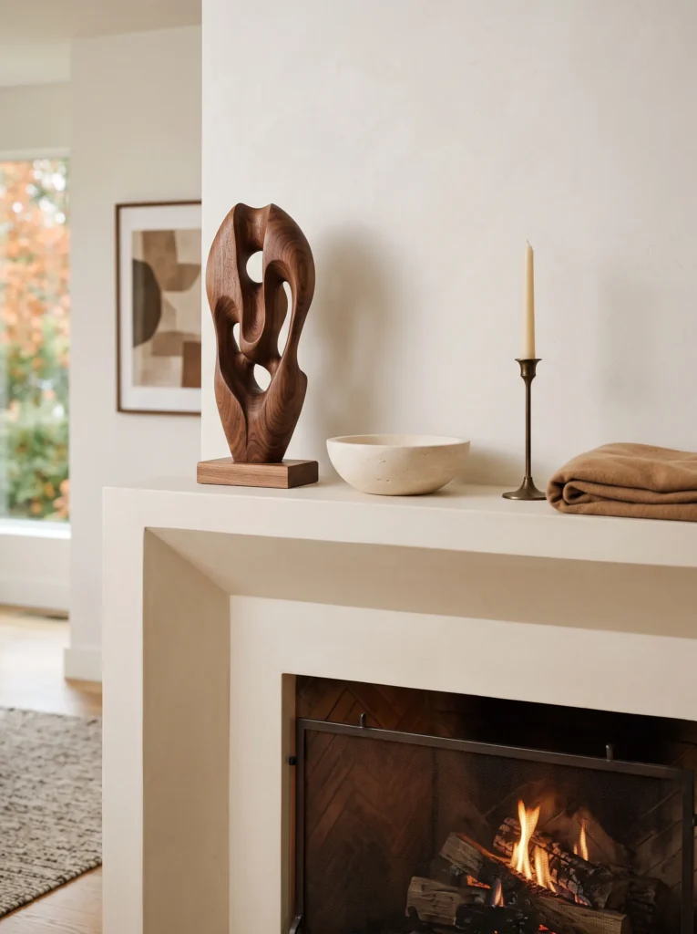
- Anchor piece: Carved walnut pedestal sculpture with an abstract organic silhouette.
- Palette: Walnut brown, ivory, antique bronze, soft camel.
- Layering plan: Set the sculpture toward the center-left; place a low ivory stone bowl in front and a slim bronze object farther back on the opposite side.
- Height variation: The sculpture creates the dominant vertical point, while the bowl and bronze accent form progressively lower levels.
- Lighting: Use natural side light during the day; introduce soft ambient lamps in the evening to emphasize the sculpture’s contours.
- Standout detail: The hand-carved walnut grain remains visible rather than being hidden beneath a glossy finish.
- Styling logic: The arrangement uses one tall, one medium, and one low element to establish a deliberate visual triangle.
- Construction note: A heavy solid-wood sculpture should sit securely on a mantel with enough depth and load capacity to support it.
Why this works: A sculptural anchor creates visual interest through shape and proportion rather than relying on a collection of seasonal objects.
Sculptural objects are particularly useful when you want fall decorating to feel contemporary rather than themed. The walnut sculpture carries the seasonal color story almost by itself, so there is no need to add obvious harvest motifs around it. I would choose an organic form with a slightly imperfect silhouette because the curves soften the strong geometry of a fireplace. Ivory then provides a light counterweight, while antique bronze introduces a quiet metallic note that feels related to fall without becoming shiny or decorative.
The visual triangle is doing most of the work in this arrangement. The sculpture establishes the highest point, the stone bowl creates a middle level, and the bronze object becomes the lowest point. Because those three heights are different, the eye naturally moves through the display rather than scanning across a flat row. I also pay attention to weight distribution here. My husband would never recommend placing a substantial object on a mantel without considering the shelf construction and its load capacity first. Good styling should work with the architecture, not challenge it.
11. Cream Ceramic Trio
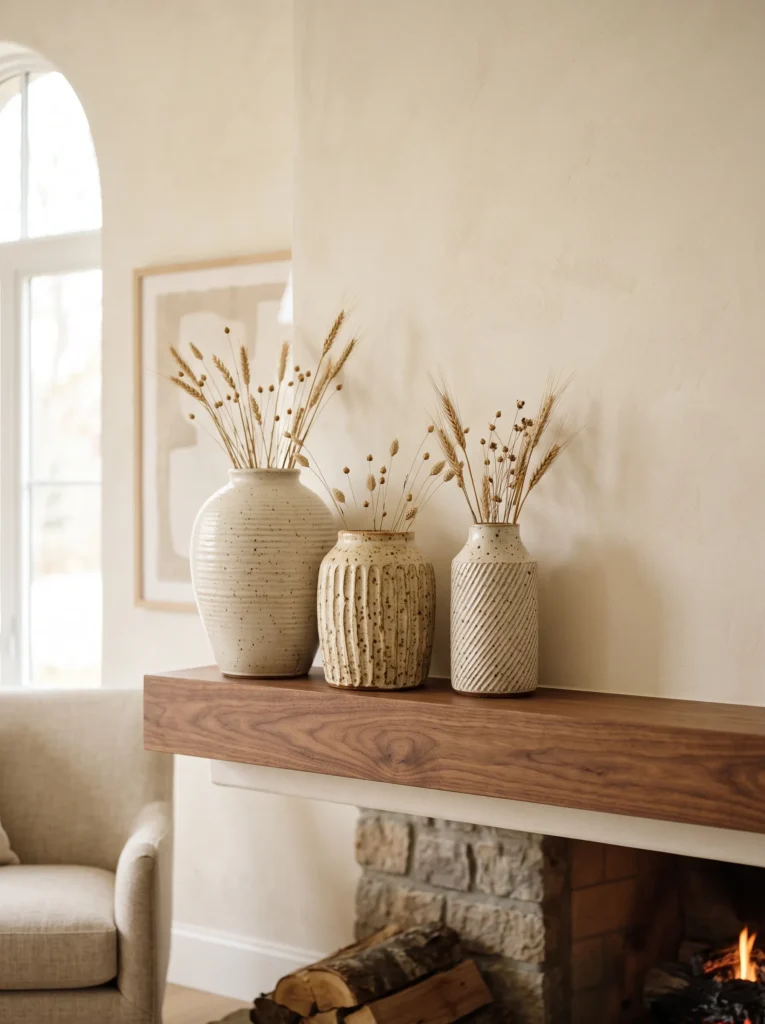
- Anchor piece: Three oversized handmade cream ceramic vessels with distinctly different silhouettes.
- Palette: Ivory cream, warm beige, deep caramel, dark chocolate.
- Layering plan: Arrange the tallest vessel at the back, medium vessel slightly forward, and smallest vessel farther toward the viewer.
- Height variation: Use clearly graduated heights rather than three equal forms.
- Lighting: Let daylight emphasize the ceramic texture; use warm ambient lighting after sunset to create soft shadows between the vessels.
- Standout detail: Each vessel has a different handmade surface—ribbed, matte, and lightly speckled.
- Styling logic: Repetition works because the forms share a material but differ in height, shape, and texture.
- Depth strategy: Offset each vessel slightly rather than placing them in a straight line.
- Seasonal detail: Add only a few dried wheat stems to the smallest vessel rather than filling every opening.
Why this works: Repeating one material while changing shape and height creates cohesion without making a mantel look mass-produced.
There is a difference between repetition and duplication. Three identical vases lined up evenly can look more like a showroom display than a home, but three related ceramic forms can create a beautifully controlled composition. The trick is to vary their silhouettes and elevations. I would keep the vessels within the same cream family so they read as one group, then use caramel and chocolate only in very small amounts around them. The palette feels distinctly autumnal because of its depth, even though none of the objects announces the season literally.
This is also an easy arrangement to adjust throughout the season. If the display feels too static, move the smallest vessel slightly forward or rotate one of the larger pieces until the openings overlap differently. Those tiny changes alter the negative space between the forms. I have found this especially helpful when photographing a room because ceramic surfaces respond beautifully to side lighting. The shadows become part of the composition, giving an otherwise simple mantel much more dimensional character without adding more decoration.
12. Amber Candle Lantern
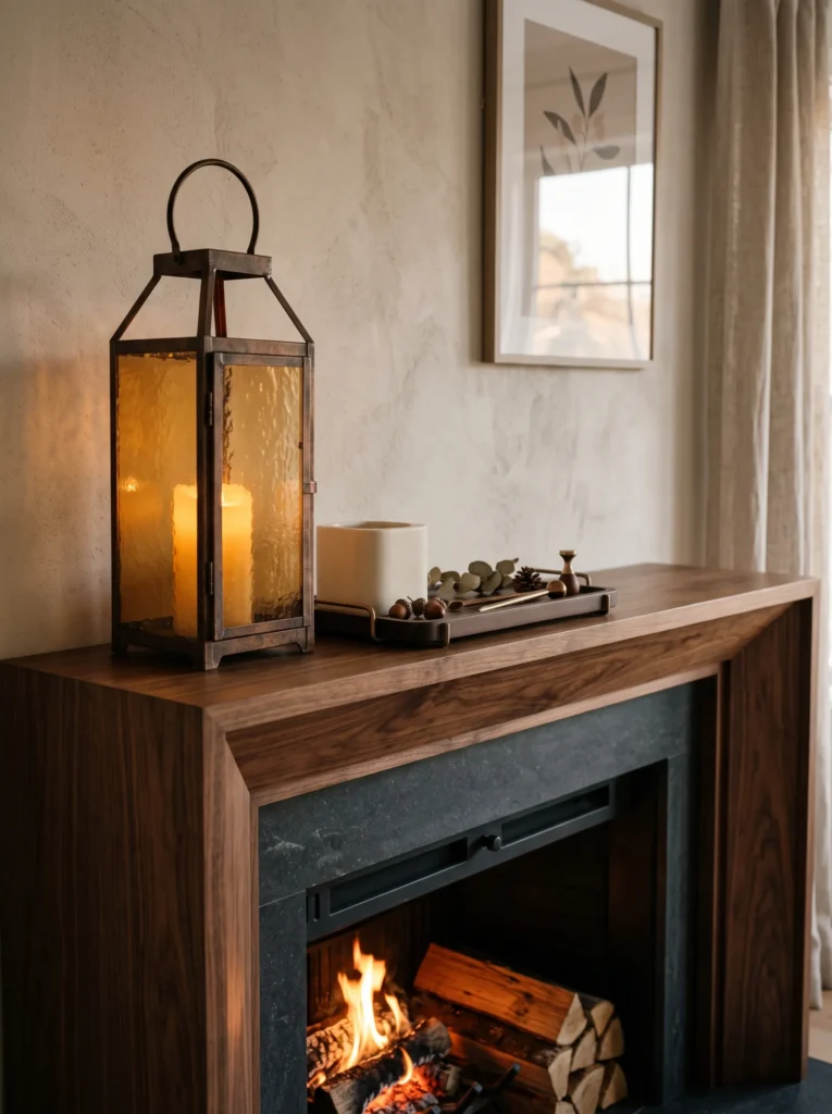
- Anchor piece: Tall amber glass lantern with a simple aged-metal frame.
- Palette: Amber glass, chocolate brown, ivory, brushed bronze.
- Layering plan: Place the lantern at one end; add a low ivory ceramic block near the center and a shallow chocolate tray toward the opposite side.
- Height variation: The lantern creates the high point, while the ceramic block and tray step downward across the mantel.
- Lighting: During the day, natural light should pass through the amber glass; after sunset, use a flameless LED candle inside the lantern.
- Standout detail: The amber glass casts a subtle honey-colored glow onto the wall when illuminated.
- Safety insight: An enclosed flameless light provides the visual effect of candlelight without introducing an open flame near a working fireplace.
- Depth strategy: Keep the lantern several inches behind the ceramic block so its glow remains visible above the foreground layer.
Why this works: A single illuminated amber lantern introduces seasonal color, height, and evening atmosphere while keeping the rest of the mantel intentionally restrained.
An amber lantern can completely change after dark, which is why I would treat lighting as part of the design rather than an afterthought. In daylight, the glass reads as a warm architectural accent; in the evening, it becomes a softly glowing object. The brushed bronze frame supports the amber without competing with it, while ivory and chocolate provide the quiet contrast needed to keep the display sophisticated. Unlike a row of candles, the lantern gives you one concentrated light source and a much clearer focal point.
Safety is especially important with any fireplace-adjacent lighting. If the fireplace is operational, I prefer a flameless LED candle inside the lantern rather than an open flame. Heat can affect nearby materials, and fireplace manufacturers specify different clearance requirements depending on the installation. My husband’s construction perspective has taught me that the prettiest arrangement is still the wrong arrangement if it ignores those practical limits. Keeping the lantern appropriately positioned, using a stable base, and choosing a flameless light makes this look both visually effective and easier to live with.
13. Woven Textile Panel
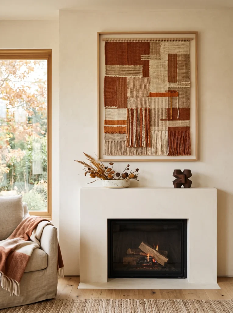
- Anchor piece: Oversized handwoven textile panel in a simple natural-wood frame.
- Palette: Cinnamon clay, oatmeal, warm ivory, espresso brown.
- Layering plan: Hang the textile slightly above the mantel; place a low ivory stoneware dish in front and a small espresso-brown wooden object several inches to the side.
- Height variation: The textile provides the dominant vertical plane while the dish and wooden object create two low supporting levels.
- Lighting: Use soft daylight to reveal the woven fibers; in the evening, rely on warm ambient lamps for gentle texture and shadow.
- Standout detail: Raised woven bands create a subtle three-dimensional pattern across the artwork.
- Styling logic: The textile introduces softness against hard fireplace materials while its horizontal weave visually relates to the mantel shelf.
- Depth strategy: Keep the textile completely behind the accessories, with the stoneware dish positioned several inches forward to create separation.
Why this works: A tactile textile anchor brings fall warmth through texture rather than predictable seasonal objects or bright color.
I love using textile art when a mantel needs softness without becoming traditionally decorated. The woven surface introduces movement that a flat painting cannot, while cinnamon clay and oatmeal create a restrained autumn palette. The espresso accent gives the composition enough depth to keep the lighter textile from disappearing against a pale wall. Because the artwork itself carries texture, there is no need to add garland, foliage, or multiple decorative layers. The result feels seasonal through material and color rather than through recognizable fall symbols.
The proportions matter here. A textile that is too small will look disconnected from the fireplace, while one that nearly fills the wall can overpower the mantel. I would look for a piece that leaves visible wall space around all four sides. The low stoneware dish then creates the first foreground layer, and the wooden object provides a small counterweight. If the textile is unusually heavy, use mounting hardware appropriate to its actual weight and wall construction rather than relying on the mantel for support.
14. Antique Landscape Frame
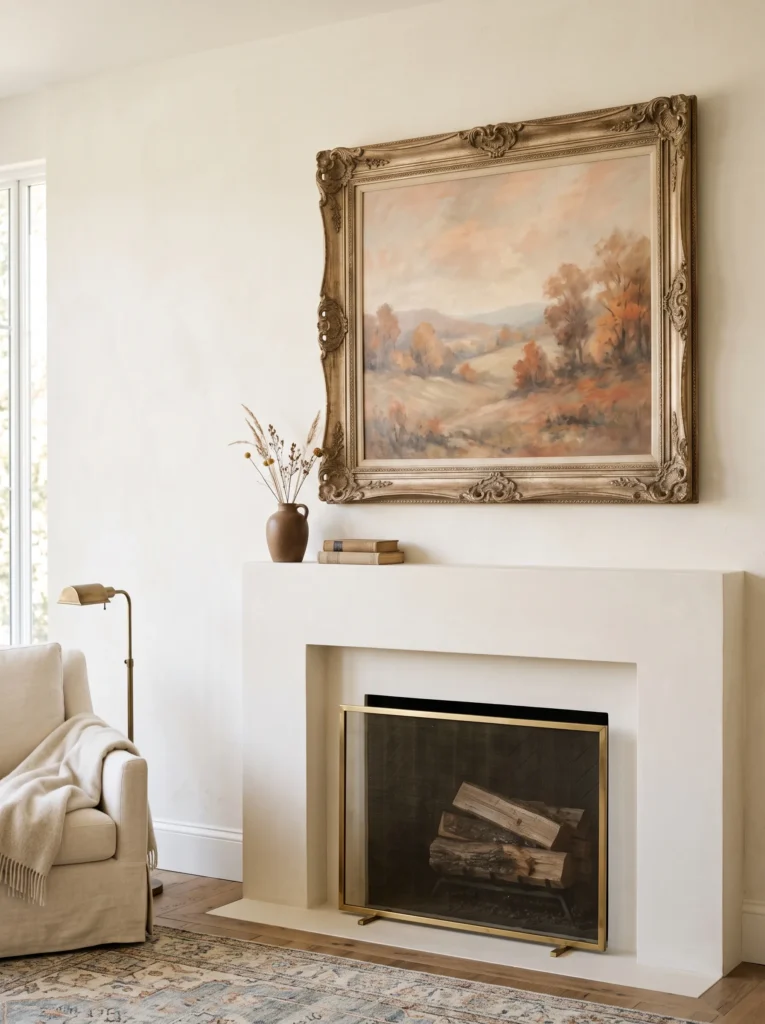
- Anchor piece: Oversized antique landscape frame with a softly distressed champagne-bronze finish.
- Palette: Soft peach, antique champagne, cream, coffee brown.
- Layering plan: Lean the frame against the wall; place a thin cream picture ledge beneath one corner and a small coffee-brown ceramic object several inches forward.
- Height variation: The frame supplies the main height while the ledge and ceramic object remain deliberately low.
- Lighting: Use late-afternoon natural light to bring out the frame’s aged finish; use warm picture lighting or room illumination after sunset.
- Standout detail: The artwork depicts a hazy autumn landscape rather than a literal harvest scene.
- Styling logic: The large frame creates a single visual field, allowing the mantel surface to remain mostly open.
- Depth strategy: Lean the artwork slightly backward while keeping the lower accessories clearly in front of the frame.
Why this works: A softly aged landscape can suggest autumn through atmosphere while keeping the mantel sophisticated and visually quiet.
For a more collected look, I would choose an old landscape rather than newly printed seasonal artwork. Look for hazy hills, pale skies, distant trees, or muted fields where the season is suggested rather than announced. Soft peach gives the palette an unexpected warmth, while champagne-bronze adds a restrained metallic note. Cream keeps the frame from becoming too heavy, and coffee brown anchors the lower portion of the composition. This approach feels especially appropriate in traditional or transitional rooms where the fireplace already has architectural character.
The beauty of this arrangement is how little it needs. The artwork establishes the main visual field, so the mantel can remain intentionally sparse. I would avoid placing objects directly in front of the center of the painting because that interrupts the image and makes the arrangement feel busier. Instead, use one low object near a corner and allow the artwork to remain readable. In a home with a working fireplace, the frame should also be properly secured if it is heavy or positioned where vibration could cause it to shift.
15. Amber Book Stack
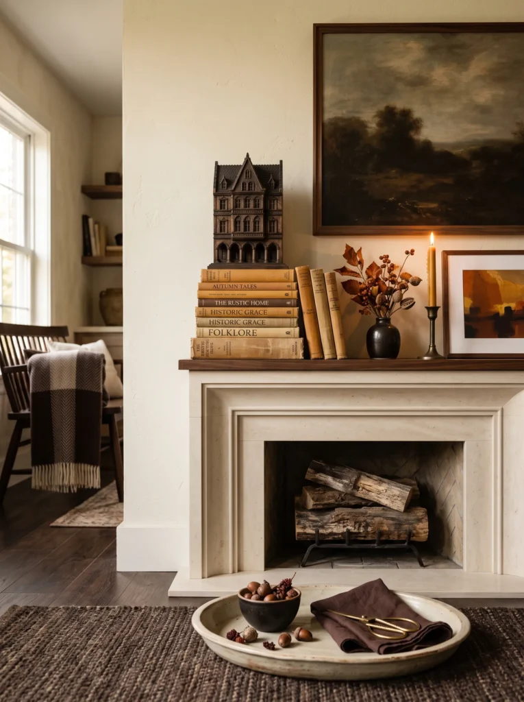
- Anchor piece: Oversized vintage art book stack topped with a small carved architectural model.
- Palette: Honey amber, parchment, dark cocoa, aged cream.
- Layering plan: Place the books toward one side of the mantel; position the architectural object on top and a shallow aged-cream tray several inches forward.
- Height variation: The stacked books create a medium-height platform while the architectural model becomes the highest point.
- Lighting: Use natural side light during the day; add warm ambient lighting at night to emphasize the book edges and sculptural silhouette.
- Standout detail: The exposed amber book spines create a rich seasonal color block without using traditional fall decorations.
- Styling logic: Stacking creates vertical height from otherwise horizontal objects while giving the display an intentionally collected appearance.
- Depth strategy: Keep the book stack toward the back and place the shallow tray in the foreground, creating two distinct planes.
- Personal touch: This is the type of arrangement I like when a mantel should feel connected to the home rather than decorated exclusively for the season.
Why this works: Stacked books turn horizontal layers into architectural height while introducing fall color through patinated paper and cloth.
Books are one of my favorite ways to make seasonal decorating feel personal. Instead of purchasing several objects that will only work for one month, I would choose books whose covers and spines already belong to the room’s color story. Honey amber and parchment immediately bring warmth, while dark cocoa provides contrast. The small architectural model adds height and connects naturally with the fireplace itself, almost as though the mantel is displaying a miniature piece of the home’s architecture rather than a seasonal ornament.
The important trick is to treat the stack as one object rather than three separate books. Keep their edges aligned loosely, then place the model slightly off-center on top. The shallow tray in front creates another depth plane without competing for attention. I especially like this arrangement for homes with smaller mantels because the books provide verticality without requiring a large mirror or oversized artwork. Just make sure the stack is stable and well away from any heat source, particularly when the fireplace is actively operating.
Styling Principles for a Designed Fall Mantel
A beautiful seasonal mantel is ultimately about composition before decoration. Before adding anything, look at the fireplace as a long architectural line and decide where the eye should land first.
Start With One Strong Anchor
Choose one dominant element—a mirror, artwork, textile, sculpture, or substantial object—and let it establish the visual hierarchy. The anchor should be noticeably taller or more visually substantial than the pieces around it.
Build a Visual Triangle
Use three different heights rather than arranging everything along one horizontal line. A tall anchor, medium supporting object, and low foreground piece naturally guide the eye across the mantel.
A visual triangle gives a mantel movement without requiring more decoration.
Layer From Back to Front
Place the primary anchor closest to the wall, then bring smaller pieces forward. Slight overlaps are useful because they create depth and prevent every object from looking like an isolated item.
For photographs, front-to-back layering is especially important because it gives a flat image a stronger sense of dimension.
Keep Some Space Empty
Negative space is part of the composition. You do not need to cover the entire mantel. Leaving roughly a quarter to a third of the shelf visually quiet can make the remaining objects feel more intentional.
Choose a Distinct Fall Palette
Instead of automatically reaching for pumpkin orange, build your own autumn color story. Warm amber, burnt sienna, deep gold, walnut brown, cream, chocolate, parchment, and aged metallics offer plenty of seasonal warmth without repeating the same orange-and-green combination found everywhere.
The most distinctive autumn interiors often use fall-inspired materials and undertones rather than literal fall colors.
Repeat Materials Carefully
Repeating one material can create cohesion, but repeating the exact same object can make a mantel look predictable. Try pairing walnut with aged brass, cream ceramics with amber glass, or parchment artwork with chocolate accents.
Consider Day and Night
A mantel should work in both lighting conditions. Ask how reflective materials look in daylight, how shadows fall in the afternoon, and whether the arrangement still has a focal point after dark.
Respect Fireplace Safety
Styling comes after construction and safety. Keep candles, dried botanicals, textiles, paper, and other combustible materials outside the clearance area specified for your fireplace. Heavy artwork and objects should also be mounted or positioned according to their weight and the wall or mantel’s structural capacity.
A beautiful mantel should never compromise the safety requirements of the fireplace beneath it.
Frequently Asked Questions About Fall Mantel Decor
How do I make a fall mantel look designer instead of basic?
Start with one substantial anchor rather than several small seasonal decorations. Use a controlled palette of three or four tones, vary object heights, and layer pieces from back to front. Avoid filling every inch of the shelf. The goal is to create hierarchy, not simply add more fall decorations.
What colors work best for a sophisticated fall mantel?
Try warm amber, cream, walnut brown, burnt sienna, deep gold, parchment, chocolate, or aged bronze. Choose three or four rather than combining every autumn shade. A restrained palette makes texture, shape, and material more noticeable.
Can I use real candles on a mantel above a fireplace?
Only if the fireplace installation allows it and the candles can remain safely outside the required clearance area. Because requirements vary by fireplace, follow the manufacturer’s specifications. Flameless LED candles are a practical alternative when an open flame would be too close to heat or combustible materials.
How can I decorate a small mantel?
Use one strong vertical anchor and just two supporting pieces. Keep the supporting objects low, create a small amount of overlap, and leave open space around the composition. Avoid multiple tall objects because they can make a narrow mantel feel crowded.
What are inexpensive ways to create a designer fall mantel?
Shop your home first. Stack existing books, reuse a neutral ceramic vessel, frame a botanical print, or move a vintage object from another room. Then add one seasonal material, such as amber glass, dried seed pods, or a warm-toned textile. Changing the arrangement can have as much impact as buying new decor.
How do I transition my mantel from fall to Thanksgiving?
Keep the main anchor, neutral vessels, books, artwork, or sculpture in place and change only one or two seasonal elements. For example, replace a simple dried arrangement with fuller harvest stems or add a deeper natural texture. This keeps the mantel cohesive rather than turning it into a completely different display.
Final Thoughts
The best fall mantel decor ideas do not depend on how many pumpkins, garlands, or candles you can fit onto a shelf. They work because the proportions are intentional, the materials have contrast, and the colors feel connected to the season without becoming predictable.
For me, the most successful autumn mantels are the ones that could stay in the room even after Thanksgiving. A walnut sculpture, amber glass piece, vintage artwork, woven textile, or beautiful ceramic vessel can carry the feeling of fall without announcing a specific holiday.
Your fireplace already gives the room a natural focal point. The decoration should simply help that architecture look its best.
A thoughtfully styled mantel does not need more seasonal decoration—it needs better visual decisions.