10 Fall Chalkboard Ideas Worth Copying
A fall chalkboard works because it responds to the season rather than merely announcing it. Unlike a printed seasonal sign, chalk art can be adjusted when afternoon light changes, guests arrive, a dinner menu shifts, or a quote suddenly feels more fitting in October. That flexibility makes the board feel active rather than fixed. I noticed this in our own entryway one October: a simple botanical sketch looked right during a bright week, then needed less detail as the room grew darker earlier. A fall chalkboard ideas is one of the few seasonal decorations that can change with your home and the season around it.
These ideas solve the challenge of making chalkboard decor feel personal, sophisticated, and connected to every room rather than limited to the kitchen or entryway.
Welcome Fall
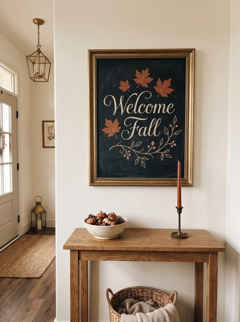
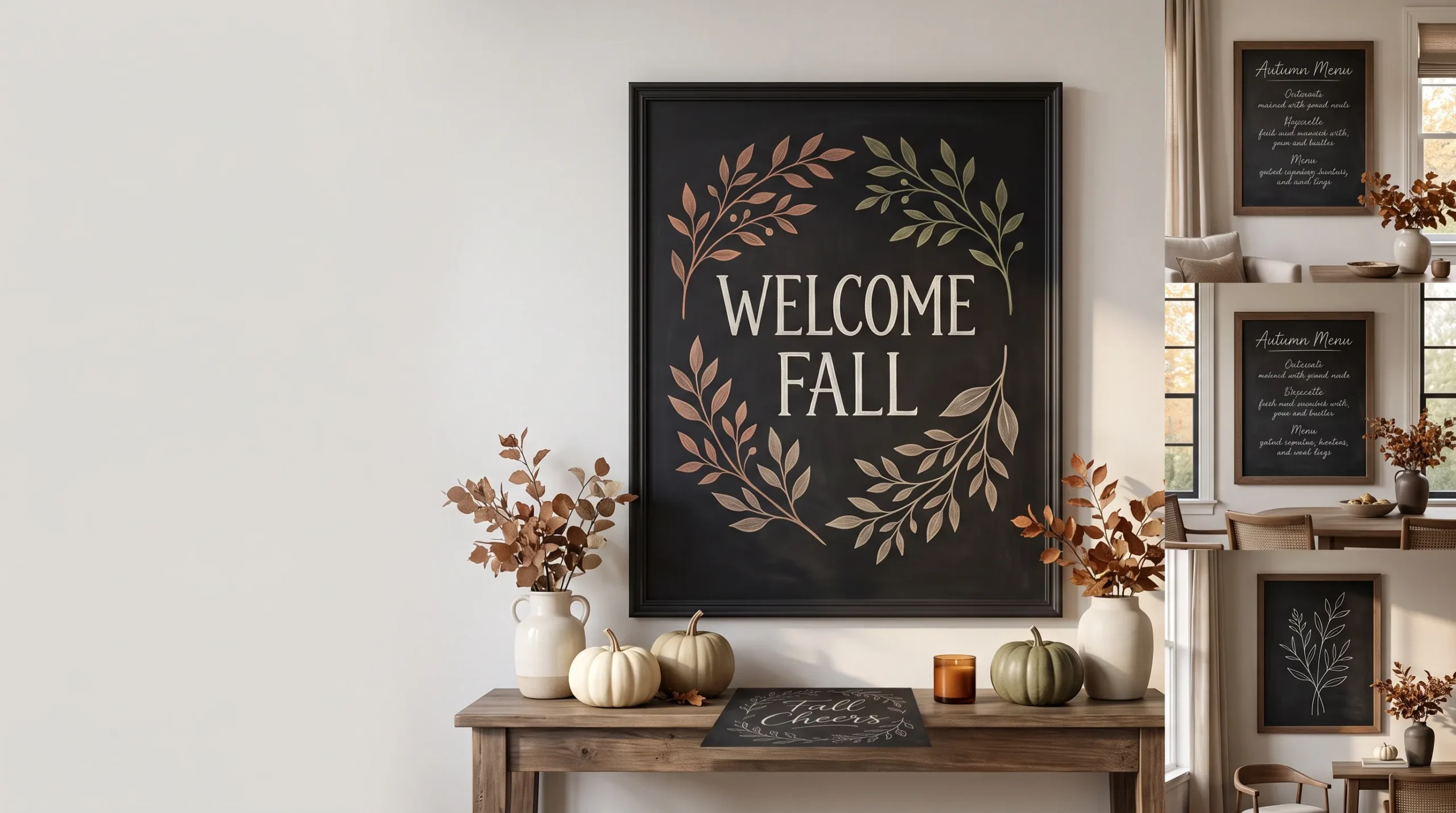
- Design concept: Create an elegant “Welcome Fall” composition with oversized serif lettering and a delicate trailing vine.
- Board: Use an 18-by-24-inch blackboard with a thin antique-gold frame.
- Palette: Keep the lettering ivory-white, with a restrained clay-rust accent on three leaves.
- Technique: Draw the lettering as outlined serif capitals, then fill only the thicker strokes.
- Placement: Hang the board in the foyer where it greets guests immediately.
- Decor connection: Pair it with a narrow oak console, cream ceramic bowl, and one rust-colored taper.
- Finish: Photograph or carefully wipe around the lettering rather than rubbing directly across it.
Why this works: Oversized typography makes a simple seasonal greeting feel more like considered artwork than a craft project.
“Welcome Fall” works particularly well when the lettering is treated as typography rather than handwriting. On an 18-by-24-inch board, use large ivory serif capitals with generous spacing, then draw a thin vine that slips between only a few letters. Clay-rust leaves can be added sparingly with a chalk marker. For beginners, outline each letter first instead of trying to write it in one continuous stroke. This makes proportions easier to control and gives the finished board a polished editorial quality. Keep the vine asymmetrical so the design feels drawn rather than mechanically arranged.
I like this approach for a foyer because the greeting can be read from several feet away without filling the entire wall. Place the board above a narrow oak console with a cream ceramic bowl and one rust-colored taper, leaving plenty of open space around it. If you use traditional chalk, expect softer edges and occasional dust; a liquid chalk marker gives sharper lines but is less convenient to change frequently. The key is restraint: the greeting should occupy about two-thirds of the board, while the remaining area stays intentionally quiet.
You’ll Also Love: 10 Front Porch Fall Decor Ideas That Hold Up All Season
Fall Cheers
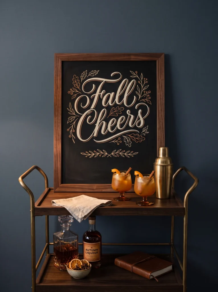
- Design concept: Design the board like a sophisticated cocktail-bar sign reading “Fall Cheers” with a small botanical border.
- Board: Choose a 16-by-20-inch deep-black board with a dark walnut frame.
- Palette: Use ivory liquid chalk marker with muted amber lettering for the word “Cheers.”
- Technique: Create a simple baseline with painter’s tape, then remove it before adding the decorative border.
- Placement: Set it on a bar cart or beverage station in the living room.
- Decor connection: Repeat amber through glassware rather than adding more seasonal objects.
- Detail: Use tiny leaf outlines instead of filled pumpkins or large autumn illustrations.
Why this works: A restrained beverage-inspired message connects fall styling to how the room is actually used.
A “Fall Cheers” board feels more sophisticated when it borrows the visual language of a classic cocktail menu. Choose a 16-by-20-inch deep-black board in a dark walnut frame, then write “Fall” in narrow ivory capitals and “Cheers” in a slightly larger muted-amber script. A liquid chalk marker is useful here because the lettering needs crisp edges. Before writing, place a strip of painter’s tape across the bottom as a temporary baseline. Remove it only after the lettering dries, then add a few fine botanical outlines around the perimeter.
Set the finished board on a living-room bar cart rather than treating it as wall art. Clear coupe glasses, amber-tinted glassware, and one brushed-brass cocktail shaker can reinforce the color story without introducing pumpkins or additional signs. I once used a similar lettering trick for a small entertaining corner when I wanted the seasonal styling to feel grown-up rather than themed. The important detail was keeping the amber limited to the word “Cheers” and the glassware. That repetition was enough to make the board belong to the room without making every object look autumnal.
Golden Hour
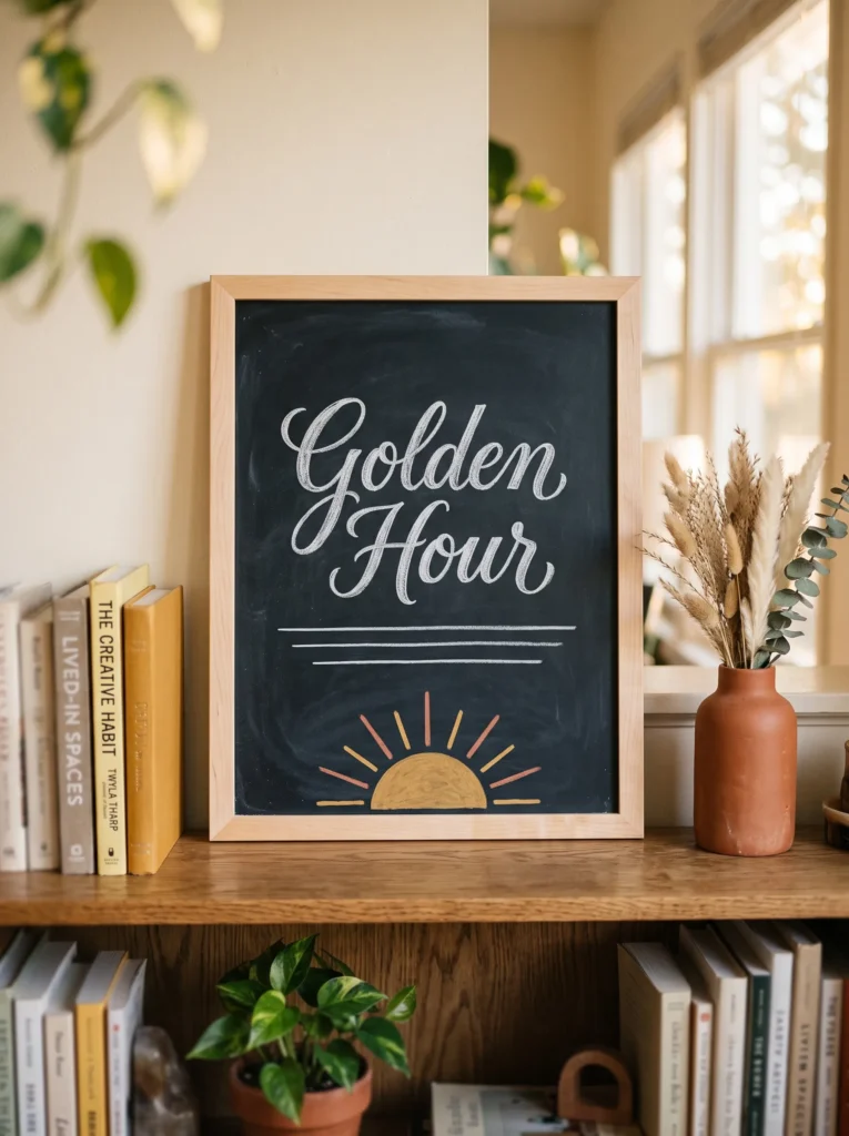
- Design concept: Use a sunset-inspired chalkboard featuring horizontal lines, a low sun, and the words “Golden Hour.”
- Board: Select a 14-by-18-inch rectangular board with a natural maple frame.
- Palette: Combine white chalk with soft mustard and muted terracotta marker accents.
- Technique: Layer thin horizontal lines first, then add the sun and lettering over them.
- Placement: Position it on a home-office bookshelf.
- Decor connection: Repeat mustard through one book spine and terracotta through a small ceramic object.
- Balance: Keep the sun small so the lettering remains the visual anchor.
Why this works: A limited sunset palette brings autumn color into a workspace without turning the desk into seasonal clutter.
“Golden Hour” is an especially good fall phrase for a home office because it references the changing light of the season without requiring obvious autumn imagery. Use a 14-by-18-inch maple-framed board and create five or six fine horizontal chalk lines across the lower half. Add a small mustard sun near one edge, followed by muted terracotta rays and clean white lettering. The easiest technique is to establish the horizon first, then work upward so the composition stays balanced. Leave at least one-third of the board completely untouched for breathing room.
Place the board on a bookshelf rather than beside the computer screen, where another rectangle could make the workspace feel visually busy. A mustard-colored book spine and one small terracotta ceramic vessel can echo the artwork without matching it exactly. From a plant-science perspective, I especially like using seasonal light as the inspiration here because fall changes how rooms are perceived as daylight shortens. The board acknowledges that shift without pretending the room needs a complete seasonal makeover. It becomes a small visual marker of the season while the office remains functional.
Autumn Apothecary
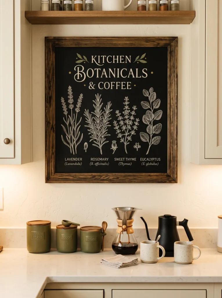
- Design concept: Create a vintage apothecary-style board featuring delicate illustrated stems with small labels such as “Cinnamon,” “Clove,” and “Sage.”
- Board: Use a 20-by-24-inch blackboard with a distressed dark-oak frame.
- Palette: Ivory chalk, muted olive-green marker, and a tiny amount of antique-gold marker.
- Technique: Use fine-line botanical sketches and small-cap lettering, keeping every label understated.
- Placement: Display it above a kitchen coffee station or open shelving.
- Decor connection: Repeat olive through ceramic vessels and antique gold through hardware.
- Balance: Leave the center area open so the botanical illustrations never become visually crowded.
Why this works: Botanical labeling gives seasonal chalk art a collected, old-world appearance without relying on conventional fall symbols.
A kitchen chalkboard can look surprisingly sophisticated when it borrows from an old apothecary label instead of a holiday sign. Use a 20-by-24-inch board with a distressed dark-oak frame, then draw three delicate stems labeled “Cinnamon,” “Clove,” and “Sage” in small ivory capitals. Muted olive-green marker can define a few leaves, while tiny antique-gold details highlight only the lettering separators. Keep the illustrations thin and slightly irregular, as though they were sketched by hand. The generous empty center keeps the composition airy and prevents the board from becoming a crowded botanical catalog.
Mount it above a coffee station or open kitchen shelving, where the subject matter feels naturally connected to everyday ingredients. Olive ceramic vessels, aged-brass hardware, and cream stoneware can quietly repeat the board’s palette. For the finest botanical lines, a liquid chalk marker with a narrow tip is easier to control than a traditional chalk stick. Test it on a hidden corner first, especially if the board has a porous surface. Once dry, avoid placing anything directly against the artwork, because friction can still disturb liquid chalk even after it has set.
First Frost
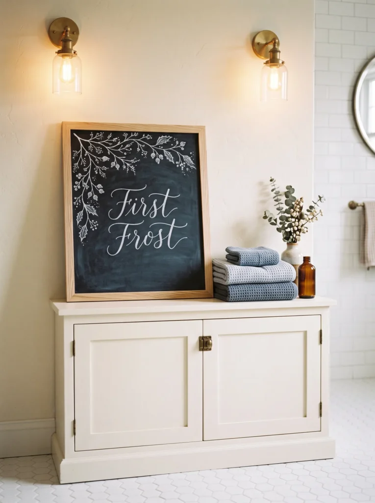
- Design concept: Create a minimalist “First Frost” scene using fine white branches, tiny dots, and understated lettering.
- Board: Choose a 16-by-20-inch vertical charcoal board with a natural ash frame.
- Palette: Primarily soft white chalk with one pale blue-gray accent.
- Technique: Use a white chalk pencil for delicate branches and a blending stump or cotton swab for softened dots.
- Placement: Lean the board on a bathroom vanity or linen cabinet.
- Decor connection: Echo the blue-gray through folded towels and keep surrounding finishes ivory and brushed nickel.
- Composition: Concentrate the illustration along one edge, leaving most of the board untouched.
Why this works: A first-frost motif introduces late-fall atmosphere through texture and restraint rather than bright seasonal color.
The earliest cold mornings of fall can inspire something quieter than leaves and harvest baskets. On a 16-by-20-inch vertical charcoal board, draw the words “First Frost” near the upper third and let a thin branch travel vertically along one edge. Soft white chalk creates the main drawing, while a pale blue-gray marker adds a few tiny buds. A chalk pencil is useful for fine branches because its narrower point gives better control than a standard stick. Add small dots around the branch with a cotton swab to create a soft, frosted effect.
I would use this design in a bathroom or on a linen cabinet, especially when the room already has clean architectural finishes. Ivory towels, brushed-nickel hardware, and blue-gray textiles give the board a natural connection without introducing another decorative collection. The beauty is in what you leave out: no pumpkins, baskets, or large lettering are necessary. If the board will remain untouched for several weeks, photograph the completed artwork before sealing it with a compatible matte fixative, following the product instructions and testing first because sealants can alter chalk color.
Gather Here,Fall Chalkboard Ideas
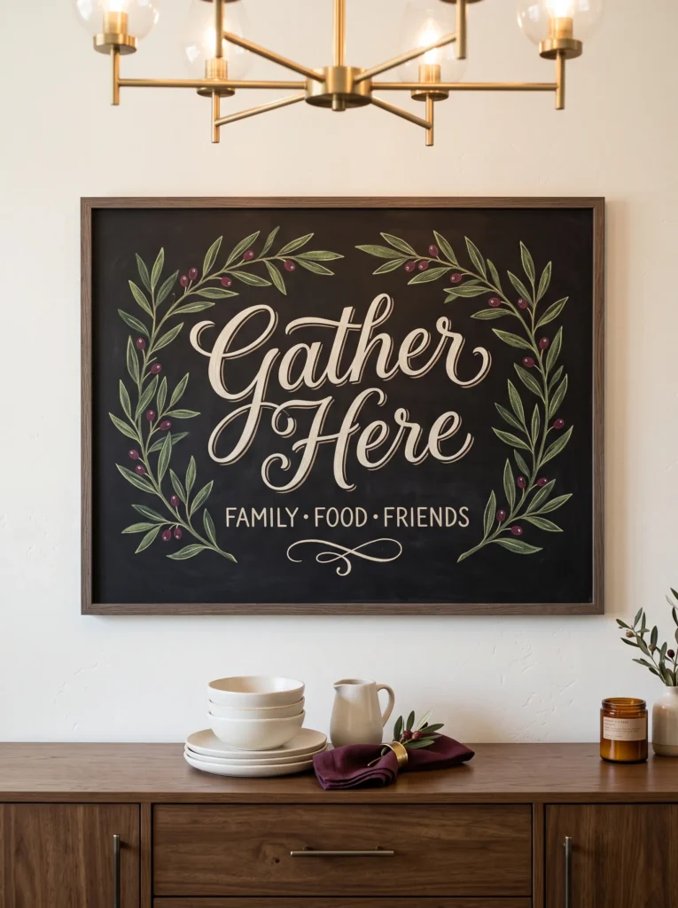
- Design concept: Use oversized curved lettering for “Gather Here,” framed by two elegant olive branches rather than autumn illustrations.
- Board: Select a 24-by-30-inch horizontal board with a slim smoked-oak frame.
- Palette: Warm white chalk with deep wine-colored marker used only on the tiny berries.
- Technique: Sketch the lettering with a ruler and chalk guidelines, then soften the guide marks before finishing.
- Placement: Hang it above a dining-room buffet or serving cabinet.
- Decor connection: Repeat the wine tone through napkins or one ceramic serving piece.
- Spacing: Keep the words centered with unusually generous margins.
Why this works: Large-scale lettering turns a familiar gathering phrase into restrained graphic art.
“Gather Here” deserves more breathing room than most chalkboard greetings, especially when the board hangs in a dining room. Choose a 24-by-30-inch horizontal board with a slim smoked-oak frame and write the phrase in oversized curved capitals, centered with generous margins. Two narrow olive branches can frame the lettering, while tiny wine-colored berries provide the only saturated accent. Use a ruler to establish light horizontal guidelines before lettering, then soften those marks with a dry cloth or soft eraser before adding the final strokes. The result should feel architectural rather than decorative.
Hang the board above a buffet or serving cabinet where its proportions relate naturally to a larger dining wall. Ivory ceramics, flax textiles, and a single wine-colored napkin can repeat the board’s palette without creating a matching set. A useful trick for beginners is to print the phrase in the desired typeface, place transfer paper behind it, and trace the basic letter shapes onto the board before filling them with chalk. This is not cheating; it is simply a way to control spacing and proportions. Once the guides are removed, the finished lettering still reads as handmade.
Quiet Harvest
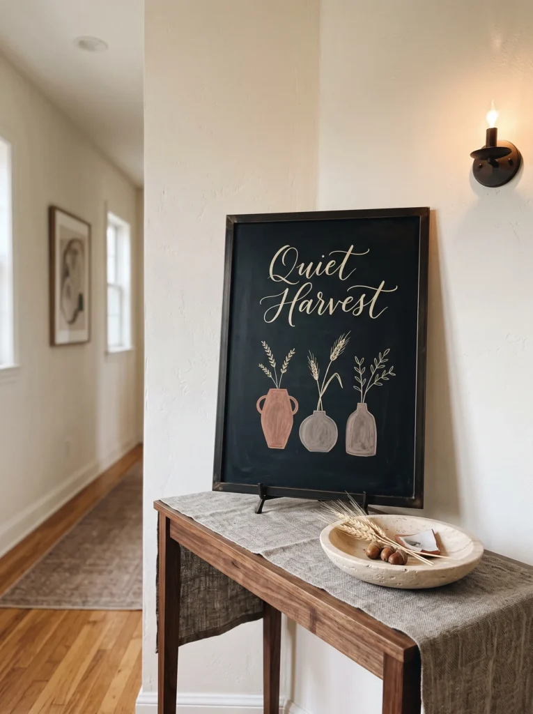
- Design concept: Create an abstract harvest composition using three curved vessels, fine stems, and the words “Quiet Harvest.”
- Board: Use an 18-by-24-inch board with a thin blackened-bronze frame.
- Palette: Ivory chalk, muted terracotta, and soft mushroom-gray marker.
- Technique: Draw each vessel as a simple continuous outline, then add only a few stems inside.
- Placement: Position it in a hallway or transitional passage.
- Decor connection: Pair it with a narrow console, travertine bowl, and mushroom-colored runner.
- Negative space: Keep the vessels clustered low on one side with the title floating above.
Why this works: Abstract vessels suggest the harvest season while keeping the artwork compatible with sophisticated neutral interiors.
A hallway board can carry fall into the less obvious parts of a house, where seasonal decorating is often forgotten. Use an 18-by-24-inch board with a blackened-bronze frame and draw three simple curved vessels along the lower left corner. Fill them with only a few fine stems, using ivory chalk for the outlines, muted terracotta for two stems, and mushroom-gray marker for tiny details. Place “Quiet Harvest” above the cluster in restrained lettering. The trick is to treat the vessels as abstract shapes rather than recognizable pumpkins, pitchers, or baskets.
Set the board on a narrow hallway console with a shallow travertine bowl and mushroom-colored runner beneath it. This keeps the artwork connected to the home’s existing materials instead of creating a separate seasonal vignette. When I want a chalkboard to feel expensive rather than crafty, I usually remove at least one decorative element I initially planned to add. The same principle works here: three vessels, a few stems, and carefully spaced words are enough. Traditional chalk is ideal for this softer drawing style because its slightly imperfect edges make the simple forms feel hand-rendered.
Harvest Menu
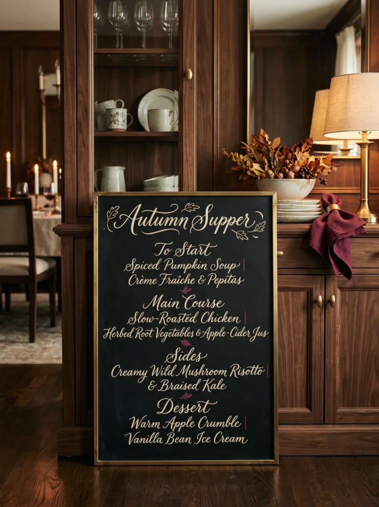
- Design concept: Create a refined handwritten dinner menu headed “Autumn Supper,” followed by three simple seasonal courses.
- Board: Use an 18-by-24-inch vertical board with a slim aged-brass frame.
- Palette: Ivory chalk with muted burgundy marker for tiny separators.
- Technique: Write the heading in loose script and the menu in neat small capitals using faint pencil guidelines.
- Placement: Display it beside a dining-room doorway or on a serving cabinet.
- Decor connection: Echo burgundy through linen napkins and use cream stoneware nearby.
- Detail: Keep the menu short so the board reads as artwork rather than a restaurant notice.
Why this works: A seasonal menu gives the chalkboard a genuine purpose while making ordinary fall entertaining feel more intentional.
A chalkboard becomes far more interesting when it records something that actually happens in the house. For an autumn dinner, use an 18-by-24-inch vertical board with a slim aged-brass frame and write “Autumn Supper” at the top in relaxed ivory script. Below it, list three courses in small capitals, separated by tiny burgundy dots or horizontal rules. Use faint pencil guidelines to keep the menu aligned before tracing the final lettering. Keep the wording short; excessive text quickly turns an elegant dining display into a noticeboard rather than a piece of seasonal artwork.
Place the board beside the dining-room doorway or on a serving cabinet where guests can read it before sitting down. Cream stoneware, burgundy linen napkins, and one aged-brass serving piece can quietly repeat its palette. I like this idea because the artwork changes naturally with the meal, giving the chalkboard a reason to exist beyond decoration. Traditional chalk works particularly well if you expect to erase the menu after dinner. For sharper lettering that photographs beautifully, use a fine liquid chalk marker, but test removal on the board first because surfaces react differently.
Harvest Moon
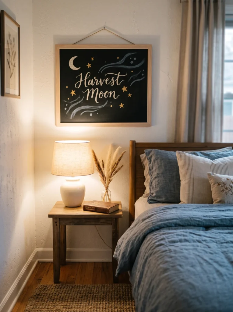
- Design concept: Create a minimalist crescent-moon composition with “Harvest Moon” in elegant narrow lettering.
- Board: Choose a 16-by-20-inch blackboard with a pale oak frame.
- Palette: Soft ivory chalk with muted ochre and smoky blue-gray accents.
- Technique: Draw the crescent using a circular template, then add fine radiating lines by hand.
- Placement: Hang it in a guest bedroom above a small nightstand.
- Decor connection: Repeat smoky blue-gray through bedding and pale oak through the furniture.
- Composition: Keep the moon toward one upper corner rather than centering the illustration.
Why this works: A moon motif brings autumn atmosphere into a bedroom without relying on conventional harvest imagery.
A guest bedroom deserves seasonal artwork that feels quieter than the decorations usually placed in kitchens and entryways. On a 16-by-20-inch blackboard with a pale-oak frame, draw a small crescent moon toward the upper right corner and write “Harvest Moon” beneath it in narrow ivory capitals. Use muted ochre for a few tiny stars and smoky blue-gray for barely visible radiating lines. A circular template makes the crescent easier to shape accurately. Keep most of the board untouched so the design feels atmospheric instead of busy, especially against a bedroom wall with limited visual distractions.
Hang the board above a small nightstand where it can be seen without competing with the bed. Linen bedding in soft blue-gray, pale-oak furniture, and one ivory ceramic lamp can connect naturally with the artwork. The seasonal reference is subtle enough to remain attractive after the first weeks of fall, which matters in a guest room that may not be restyled frequently. If using traditional chalk, lightly buff the edges of the moon with a dry cotton cloth for a softer glow. Avoid placing the board where pillows or bedding can repeatedly rub against its surface.
Thankful Notes
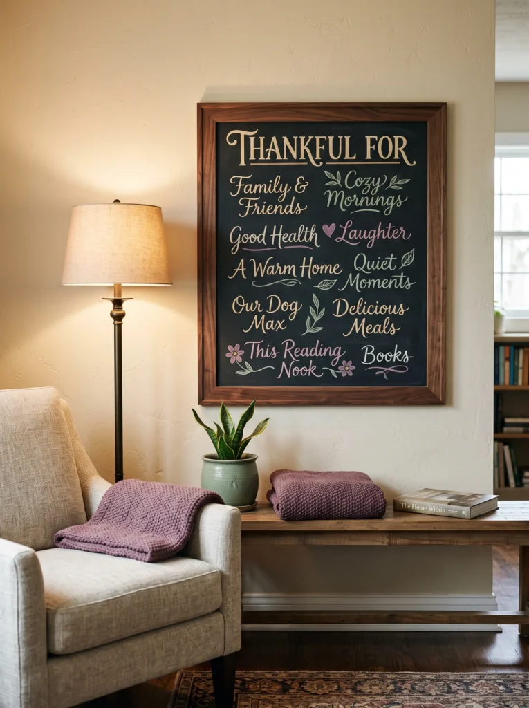
- Design concept: Create a refined gratitude board with “Thankful For” at the top and several short handwritten notes underneath.
- Board: Use a 20-by-24-inch board with a slim natural walnut frame.
- Palette: White chalk with muted sage-green and soft plum accents.
- Technique: Write the heading first, then leave deliberately uneven spaces for individual family notes.
- Placement: Position it in a family room near a reading chair or side table.
- Decor connection: Repeat sage through a plant pot and plum through one folded throw.
- Interaction: Let family members add or erase notes throughout November.
Why this works: Interactive chalk art turns seasonal decoration into something the household actually participates in.
A gratitude board becomes more meaningful when it looks intentionally unfinished. Use a 20-by-24-inch blackboard in a slim walnut frame and write “Thankful For” across the upper third in clean ivory lettering. Beneath it, leave several open areas for short handwritten notes, using muted sage and soft plum only for occasional words or tiny marks. Do not create perfectly measured rows; slight differences make the board feel lived in. For consistent lettering, establish only one faint horizontal guideline beneath the heading, then let each contributor write naturally.
This is one of the few designs I would deliberately place where everyone can reach it. A family room near a reading chair or side table works well because the board can evolve throughout November rather than becoming finished artwork on day one. A sage ceramic planter and plum throw can connect the colors to the rest of the room without adding more seasonal accessories. Traditional chalk is the practical choice for an interactive board because notes can be removed easily. Keep a small microfiber cloth nearby so the board can be refreshed without disturbing the surrounding decor.
Fall Chalkboard Styling Principles
Beautiful seasonal chalk art depends more on restraint than complexity. A board can contain detailed botanical work or only a few words, but the surrounding space needs room to breathe. These principles keep the finished piece sophisticated rather than overly themed:
- Lettering balance: Combine one expressive lettering style with one simpler style. If the main phrase is decorative, keep supporting text in clean capitals.
- Negative space: Leave roughly one-third of the board visually quiet whenever possible. Empty space gives the lettering and artwork room to read.
- Color restraint: Start with white or ivory chalk, then introduce only one or two fall colors such as muted terracotta, olive, ochre, or burgundy.
- Scale: Match the board to the room. A 24-by-30-inch board can anchor a dining wall, while an 11-by-14-inch piece works better on a dresser or shelf.
- Material connection: Repeat a chalkboard accent through nearby materials rather than matching every object. A walnut frame might connect with furniture, while an ochre mark can echo one textile.
- Technique: Use traditional chalk for soft, changeable artwork and liquid chalk markers when you need crisp lettering and stronger color.
- Placement: Consider what the room actually does. A menu belongs near a dining area, a welcome message suits an entry, and a botanical composition can work beautifully in a bedroom.
- Seasonal restraint: Fall decor does not require pumpkins, orange leaves, or repeated harvest symbols. Botanical lines, atmospheric phrases, menus, and abstract forms can communicate the season just as effectively.
FAQ
Is chalk or chalk marker better for fall chalkboards?
Traditional chalk is better for soft illustrations, easy changes, and a hand-drawn appearance. Liquid chalk markers create brighter, sharper lettering and are useful for detailed typography, but they generally require a damp cloth for removal and should be tested on the board first.
How do you keep chalkboard art from smudging?
Keep the finished board away from direct contact and avoid brushing against the surface. For artwork you want to preserve, photograph it before applying a compatible chalk-art fixative according to the manufacturer’s instructions, and always test the product first because some sealants can change the appearance of chalk.
What lettering style is easiest for beginners?
Simple block capitals are usually the easiest starting point because they depend more on consistent spacing and straight strokes than complicated handwriting. Light guide lines can help keep letters aligned before the final chalk is applied.
What is a budget-friendly chalkboard option?
A framed thrift-store blackboard, inexpensive blackboard panel, or painted wood board can work well for seasonal decor. A basic 16-by-20-inch board is large enough for most lettering projects without requiring a substantial wall commitment.
Can you use regular chalk on a chalkboard?
Yes. Regular chalk works well for temporary chalkboard art and is particularly useful when you expect to change the design during the season. It generally produces softer, less saturated lines than liquid chalk markers.
How do you preserve chalkboard art permanently?
Photograph the finished artwork for the safest record, then use a fixative specifically compatible with chalkboard art if you need the physical piece preserved. Apply it according to the manufacturer’s directions and test it on an inconspicuous area first, since spraying can alter the color, sheen, or texture of the surface.
How often should fall chalkboard art be changed?
There is no required schedule. Changing the design every few weeks can keep the board connected to the season, but a single carefully designed composition can remain throughout fall if it complements the room and does not become visually repetitive.
Final Thought
Fall decorating does not have to mean filling every surface with pumpkins, leaves, and orange accents. A thoughtfully designed Fall chalkboard ideas can bring the season into your home with far less visual clutter while giving you something most seasonal decor cannot: the freedom to change it. Try one strong phrase, a restrained color combination, or a delicate botanical drawing, then let the room around it do the rest.
When the board feels connected to your furniture, materials, lighting, and everyday routines, it stops looking like a temporary craft and starts feeling like a natural part of your home.