20 Modern Moody Fall Decor Ideas for an Elegant Home
Fall decorating does not have to mean orange pumpkins, beige blankets, and the same seasonal accents every year. If your home leans modern, traditional, or quietly luxurious, a deeper autumn palette can feel much more natural. Think burgundy velvet, rust linen, chocolate brown, aubergine ceramics, deep amber glass, mustard textiles, and charcoal accents layered with wood, brass, leather, and warm lighting.
The beauty of this approach is that you don’t need to redecorate an entire room. A single richly colored textile, handmade botanical display, painted vessel, or carefully positioned lamp can shift the atmosphere of an existing space. These 20 moody fall decor ideas move throughout the home—from the entryway and kitchen to the dining room, bedroom, mantel, coffee table, and porch—so you can create an autumn palette that feels collected rather than themed.
Why Moody Colors Suit Fall
As autumn daylight shortens and the sun sits lower, natural light becomes warmer and more directional. Deeply saturated colors such as burgundy, oxblood, rust, chocolate brown, and aubergine interact with that golden light differently than pale neutrals, absorbing some wavelengths and creating the visual depth we associate with fall. I notice this especially in our Austin home: a burgundy textile can look almost dramatic in summer, then suddenly feel perfectly balanced when afternoon light turns amber. Moody fall decor works because autumn’s lower, warmer light gives saturated colors the visual depth that makes them feel naturally seasonal. These ideas solve the problem of creating a genuinely autumnal home without relying on beige pumpkins, orange overload, or generic seasonal accessories.
1. Oxblood Velvet Console for Moody Fall Decor
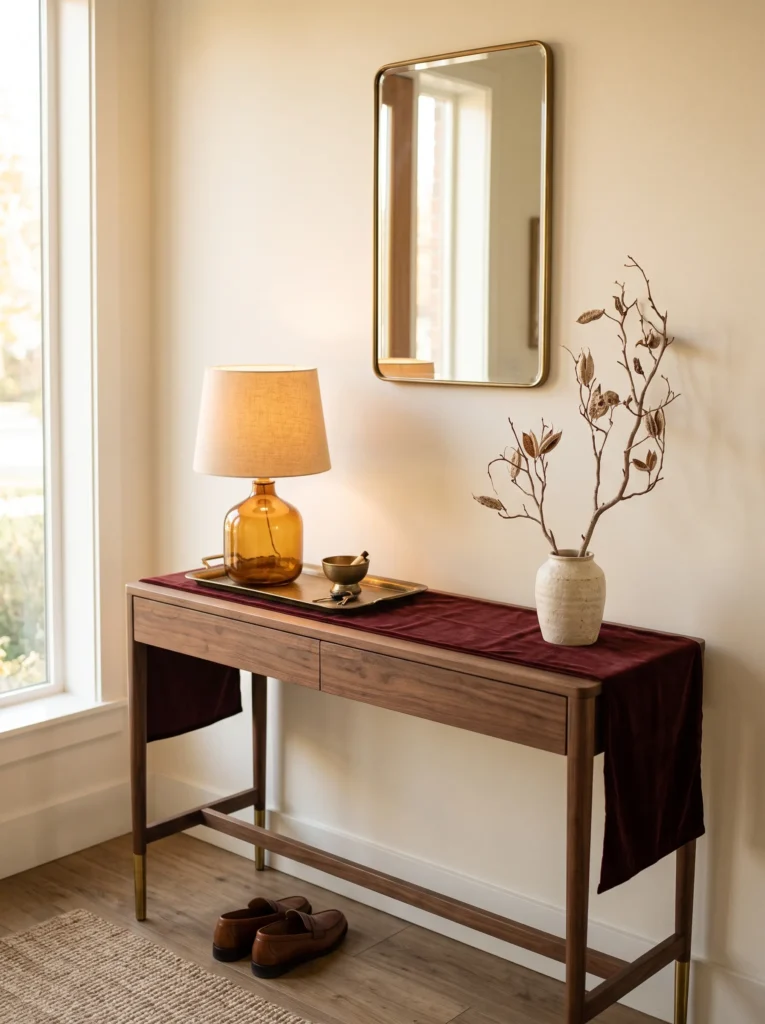
- Palette: Oxblood velvet, aged brass, walnut, and warm ivory.
- Placement: Style a narrow entryway console rather than filling the floor with seasonal objects.
- Materials: Velvet runner, brass tray, ceramic vessel, and one sculptural branch arrangement.
- Lighting: Use a small amber-glass table lamp with a warm 2700K bulb.
- Textiles: Let the velvet runner provide the only soft, saturated surface.
- Construction note: If the console is narrow, secure the lamp cord along the rear edge so it cannot snag when coats or bags are dropped nearby.
- Integration: Keep existing artwork and architectural finishes unchanged; repeat walnut or brass already present elsewhere.
Why this works: Oxblood looks especially sophisticated when its saturation is concentrated in one substantial textile rather than scattered across many accessories.
The entryway is where I prefer to introduce the deepest fall color first because it establishes the mood without committing the entire room to a new palette. Oxblood velvet has enough brown underneath its red base to feel grounded beside walnut, while aged brass prevents the combination from becoming visually heavy. I would use a 2700K bulb rather than a cool white lamp here; warmer illumination makes the velvet appear more dimensional after sunset. Keep the surrounding walls relatively quiet—warm ivory, mushroom, or existing neutral paint gives the console enough negative space to read intentionally.
My husband is always reminding me that the prettiest lighting arrangement is still a practical one. For a console lamp, I like routing the cord neatly behind the furniture and using a low-profile cord cover where necessary rather than allowing a cable to trail across a walkway. That tiny construction-minded decision makes seasonal styling feel built into the home instead of temporarily placed there. A walnut bowl can hold keys, while one aged-brass object repeats the finish used on cabinet hardware or picture frames. The result feels like an actual entry composition, not a collection of fall decorations.
2. Hand-Dyed Rust Linens
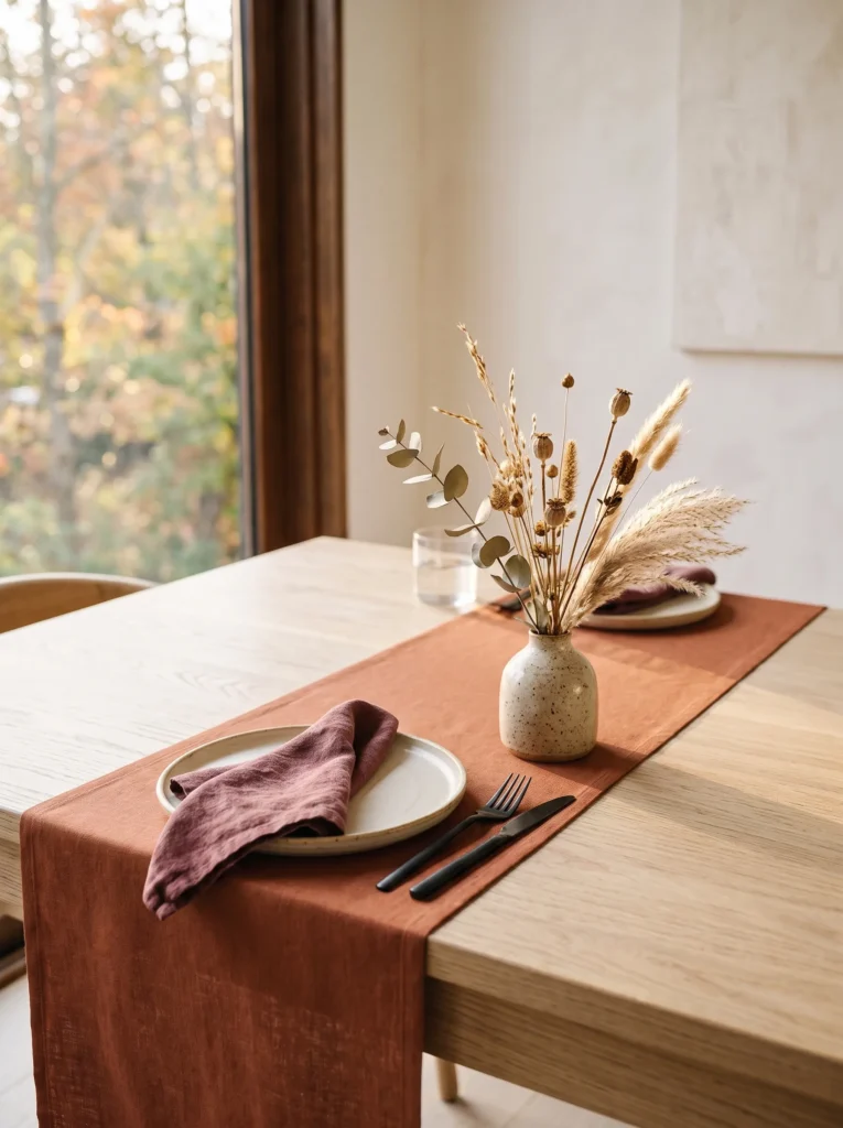
- Palette: Terracotta rust, muted burgundy, natural flax, and soft cream.
- Placement: Use the finished textiles on a dining table, kitchen breakfast nook, or sideboard.
- Materials: Plain cotton napkins or linen runners, fiber-reactive or fabric dye, gloves, salt or dye activator as directed.
- Process: Prewash fabric, prepare the dye bath, dip evenly, agitate regularly, then rinse until the water runs clear.
- Time: About 60–90 minutes of active work, plus drying time.
- Difficulty: Easy.
- Integration: Pair the dyed textile with existing cream ceramics and wood rather than adding matching seasonal accessories.
Why this works: A single handmade rust textile can shift an everyday table toward fall without making the room look themed.
I like this project because it changes the color story without asking you to buy an entire seasonal tablescape. A plain flax-colored linen runner dyed in a muted rust tone can become the visual bridge between summer neutrals and deeper autumn colors. For an especially nuanced result, I would avoid perfectly uniform saturation and instead create a subtle tonal variation by lifting the fabric slightly earlier from the dye bath. The finished textile works beautifully against pale oak, walnut, cream stoneware, or an existing wood dining table. Keep the centerpiece restrained so the hand-dyed fabric remains the recognizable seasonal element.
Before dyeing, wash the linen according to its care instructions so manufacturing finishes do not interfere with absorption. Wearing gloves, prepare the dye bath according to the manufacturer’s directions, fully wet the fabric, and immerse it while gently agitating to avoid harsh streaks. Rinse progressively in cooler water until the water is clear, then wash separately before using it on the table. I once made a similar color shift with leftover fabric rather than purchasing new seasonal linens, and the difference was surprisingly substantial. The best part is that the same runner can later be redyed darker for another room or season.
3. Chocolate Layered Coffee Table
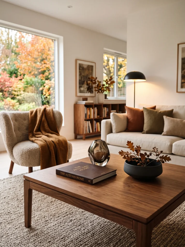
- Palette: Dark chocolate brown, caramel, parchment, and smoked glass.
- Placement: Center the arrangement on a living-room coffee table.
- Materials: Leather-bound book, smoked-glass object, low ceramic bowl, and one folded caramel textile.
- Lighting: Position the table within the pool of a floor or side lamp rather than directly beneath overhead lighting.
- Textiles: Use one caramel-toned wool or cotton throw folded loosely on an adjacent chair.
- Material contrast: Combine matte ceramic, polished glass, worn leather, and natural wood.
- Integration: Repeat chocolate brown only once elsewhere, such as in a leather chair or picture frame.
Why this works: Layering dark brown through contrasting textures creates depth without requiring multiple decorative colors.
Chocolate brown is one of the easiest autumn colors to introduce when a home already contains neutral furniture. Unlike a bright seasonal orange, it behaves almost like a grounding architectural material. On a coffee table, I prefer three-dimensional differences over a large number of objects: worn leather beside matte ceramic and smoked glass creates enough visual movement on its own. The arrangement should stay low so conversation across the table remains comfortable. If the room already has beige upholstery, the chocolate tones give that lighter foundation more definition while preserving the furniture you already own.
Lighting makes this arrangement particularly effective after late afternoon. Place the coffee table within the softer reach of a floor lamp or table lamp rather than relying entirely on ceiling fixtures. The smoked glass catches a small amount of reflected light, while the leather absorbs it, producing two distinctly different brown surfaces. I have found that this kind of restrained contrast makes a room feel more considered than simply adding more fall accessories. Keep the surrounding surfaces quiet and allow wood grain, leather texture, and the coffee table itself to carry the composition.
4. Aubergine Kitchen Shelf for Moody Fall Decor
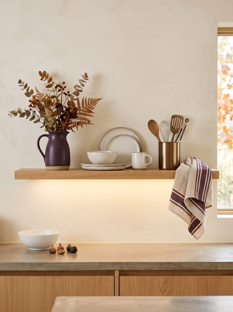
- Palette: Aubergine plum, aged ivory, dark ceramic, and brushed bronze.
- Placement: Use one open kitchen shelf or a small section of a larger shelving unit.
- Materials: Aubergine ceramic pitcher, ivory stoneware, bronze utensil holder, and plum-toned cookbook spine.
- Lighting: Let under-shelf lighting illuminate the arrangement from above.
- Textiles: Add one aubergine-striped tea towel rather than multiple matching textiles.
- Construction note: If adding shelf lighting, use an appropriate low-voltage system and keep wiring concealed rather than improvising exposed connections.
- Integration: Preserve everyday dishes and kitchen tools; replace only two or three visible pieces.
Why this works: Aubergine introduces a sophisticated autumn note while staying visually distinct from the predictable orange-and-brown combination.
Kitchen shelving can become cluttered quickly, so I would treat the fall update almost like editing a photograph. Remove two or three decorative pieces, then introduce one aubergine pitcher and one darker ceramic form among the everyday ivory dishes. The color is unexpected in a kitchen, which makes it feel seasonal without looking like a holiday display. Brushed bronze hardware or existing brass details help connect the purple-red undertone to the warmer finishes already found in many kitchens. A single plum-striped tea towel can repeat the color without turning the shelf into a coordinated set.
My husband’s construction background has influenced how I think about shelf lighting. If you want illumination beneath an open shelf, choose a properly rated low-voltage lighting system and conceal the wiring neatly rather than leaving loose cables visible. Once the lighting is handled, the shelf needs very little decoration. Under warm illumination, aubergine becomes deeper and more wine-like, while ivory ceramics keep the composition from becoming too dense. This is also an inexpensive way to test a moody autumn palette: change only a few movable objects and evaluate them at both midday and evening.
5. Hand-Dipped Amber Tapers
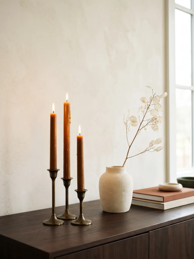
- Palette: Deep amber beeswax, antique bronze, creamy plaster, and dark walnut.
- Placement: Arrange the finished tapers in a dining-room mantelpiece or on a substantial sideboard.
- Materials: Beeswax sheets or filtered beeswax, cotton wicks, scissors, parchment paper, and a double boiler if working with melted wax.
- Process: Cut beeswax to the desired candle height, position the wick along one edge, roll tightly, and gently warm the seam to secure it. For dipped candles, repeatedly dip the wick into melted wax, allowing each layer to cool before the next.
- Time: Approximately 45–75 minutes, depending on the method.
- Difficulty: Easy to moderate; use heat-safe equipment and never leave melting wax unattended.
- Lighting: Display three different heights together so the candlelight creates vertical variation after sunset.
Why this works: Amber candlelight and naturally golden wax reinforce fall’s warmer evening light without introducing another decorative motif.
There is something wonderfully old-fashioned about making your own candles, but the finished result can look surprisingly contemporary when the color is carefully chosen. I prefer deep amber rather than bright orange because it has the translucent quality of honey and works beautifully beside walnut and aged bronze. On a dining-room sideboard, three uneven heights create a simple vertical rhythm. During dinner, the flame becomes part of the composition rather than an accessory sitting beside it. Keep the surrounding objects restrained—perhaps one ceramic vessel and a stack of books—so the handmade tapers remain visually important.
For a rolled beeswax version, cut a sheet to your preferred height, lay the cotton wick along one edge, and roll the wax firmly around it. Press the seam gently with your fingers to secure it. If you prefer traditionally dipped tapers, melt beeswax in a suitable double boiler and repeatedly dip the wick, allowing each coating to cool before adding another. I enjoy this project because imperfect edges actually make the candles feel handmade. Once finished, trim the wick to about ¼ inch before burning and place every candle in a stable, heat-resistant holder away from curtains and other combustible materials.
You’ll Also Love: 22 Neutral Fall Decor Ideas for a Cozy, Elegant Home
6. Burgundy Library Nook
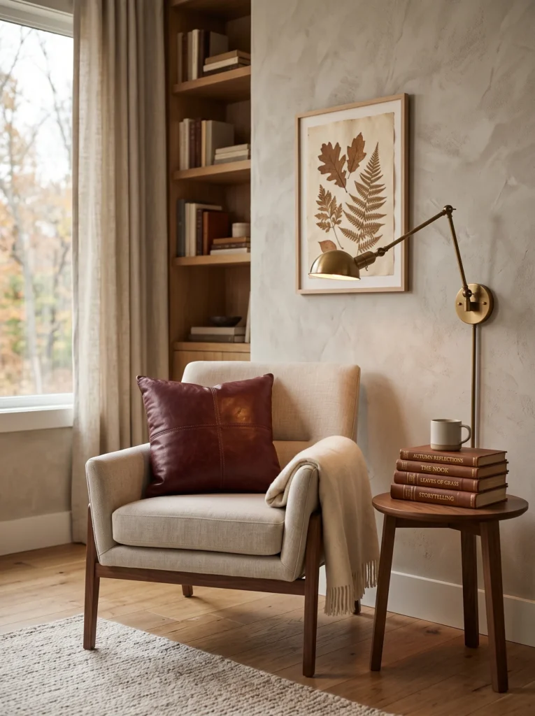
- Palette: Burgundy leather, tobacco brown, parchment, and antique brass.
- Placement: Create the arrangement beside an existing reading chair or compact home library.
- Materials: Burgundy leather lumbar cushion, vintage-style book stack, brass reading lamp, and framed botanical print.
- Lighting: Use a focused reading lamp at approximately 2700K for evening use.
- Textiles: Add a tobacco-brown wool cushion rather than another burgundy textile.
- Construction detail: A substantial wall-mounted sconce should be anchored according to the wall construction and fixture weight.
- Integration: Keep the chair and bookcase unchanged; introduce fall through the cushion, lamp finish, and artwork.
Why this works: Burgundy becomes richer beside tobacco leather and parchment tones, creating a library palette that feels seasonal without looking decorative.
When I want a room to feel different for fall without actually redecorating it, I often work with the smallest reading corner. A burgundy leather cushion against an existing neutral chair can completely change the visual temperature of the space. Add tobacco-colored leather or wood, parchment-toned pages, and a little antique brass, and the palette begins to resemble a traditional library rather than a seasonal vignette. This works particularly well in homes where the larger rooms already have quiet neutral furnishings. The fall identity comes from material and color rather than objects that announce the season.
Lighting deserves more attention here than the decorative accessories. A reading nook needs directional illumination, so a properly installed wall sconce can be both functional and architectural. My husband would always check what the wall is made from before mounting a heavier fixture; the correct anchor or attachment point matters when you are working with drywall, masonry, or studs. If hardwiring is impractical, a quality plug-in sconce can create a similar effect. The goal is a concentrated pool of warm light that makes burgundy, tobacco brown, and brass look dimensional while leaving the surrounding room slightly quieter.
7. Pressed Leaf Gallery
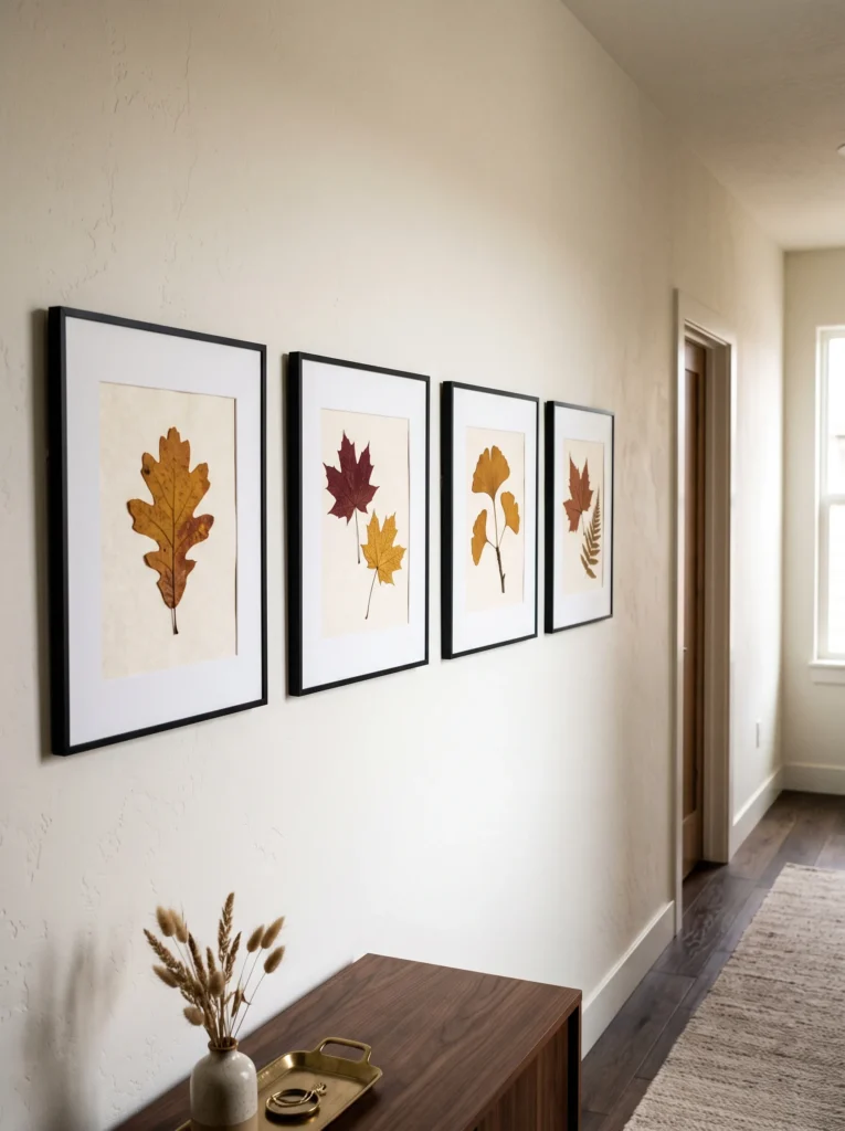
- Palette: Dried ochre, russet, muted brown, ivory, and blackened wood.
- Placement: Create a small vertical gallery on a hallway or stair landing.
- Materials: Four to six pressed leaves, archival paper, thin black frames, blotting paper, and heavy books.
- Process: Place leaves between absorbent paper, press beneath heavy books for 1–2 weeks, then mount the dried specimens on archival paper.
- Time: About 15 minutes to assemble, plus 1–2 weeks of pressing.
- Difficulty: Easy.
- Integration: Match the frames to existing black, bronze, or dark wood finishes instead of adding a new metal.
Why this works: Real botanical specimens give autumn color a natural source and make seasonal artwork feel collected rather than manufactured.
This is one of my favorite ways to bring autumn into a hallway because it uses something genuinely seasonal without resorting to illustrated pumpkins or mass-produced signs. Choose leaves in several stages of color—ochre, russet, tobacco, and muted brown—and let their natural variation become the artwork. A narrow hallway benefits from the repeated rhythm of similarly sized frames, while a larger stair landing can accommodate a more irregular arrangement. Because the palette comes directly from foliage, it can sit comfortably beside existing ivory walls, dark wood, black metal, or aged bronze.
To press the leaves, place each specimen between sheets of blotting or absorbent paper and sandwich the layers beneath several heavy books. Check them after several days and replace damp paper if necessary. After roughly one to two weeks, the leaves should be dry and flat enough to mount. Use archival paper and acid-free materials if you want the display to last. I like leaving a small amount of negative space around each leaf instead of filling the entire frame. That makes the botanical structure visible and gives this project the quiet precision of a small gallery installation.
8. Rust Ceramic Mantel
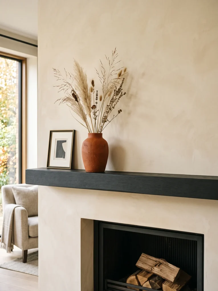
- Palette: Burnt rust, charcoal, raw clay, and warm cream.
- Placement: Center the composition on a fireplace mantel while leaving generous space around it.
- Materials: One thrifted ceramic vase, matte mineral-style paint, fine sandpaper, small natural-bristle brush, and dried grasses.
- DIY process: Clean the vase, lightly sand glossy areas, apply two thin coats of paint, allow full drying between coats, then lightly distress selected edges.
- Time: Approximately 1–2 hours including drying between coats.
- Difficulty: Easy.
- Lighting: Use existing fireplace lighting or a nearby floor lamp rather than placing candles directly beside the painted vessel.
- Integration: Repeat charcoal through one existing frame or hearth accessory.
Why this works: A matte rust vessel gives a fireplace architectural weight while its imperfect surface keeps the composition from feeling overly polished.
A thrifted vase is often more useful than a new seasonal accessory because you can alter its finish to suit the room precisely. For this project, I would choose a simple ceramic silhouette and transform it into a muted burnt-rust vessel with a chalky mineral appearance. Against a charcoal fireplace surround, the color looks earthy rather than bright. The vase can hold dried grasses, preserved seed heads, or bare branches, but I would keep the arrangement intentionally sparse. The objective is to create one strong vertical element rather than covering the mantel with a collection of seasonal objects.
Start by washing and completely drying the vase, then lightly sand any glossy areas so the paint has something to grip. Apply two thin coats of a suitable mineral or matte ceramic paint, allowing each coat to dry according to the product directions. Once cured, gently sand a few raised edges to reveal tiny hints of the original surface. I like this imperfect finish because it gives an inexpensive object the visual texture of handmade pottery. Place it slightly off-center and balance it with one existing charcoal or cream object rather than creating a symmetrical arrangement. That restraint keeps the fireplace feeling like part of the architecture.
9. Oxblood Dining Chairs
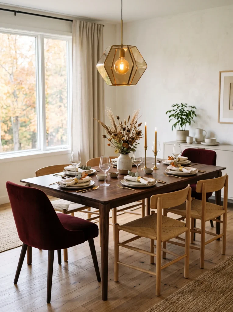
- Palette: Oxblood leather, dark walnut, antique brass, and soft ivory.
- Placement: Use the color on two dining chairs rather than every seat around the table.
- Materials: Oxblood seat cushions or removable slipcovers, walnut table, brass flatware, ivory stoneware.
- Lighting: Hang or position a warm pendant above the table, keeping the light source centered over the dining surface.
- Textiles: Use ivory linen napkins to interrupt the darker upholstery.
- Integration: Leave the remaining chairs in their original finish so the room retains visual breathing space.
- Construction detail: A heavier pendant should be attached to an appropriate ceiling junction box or structural support rather than relying on decorative hardware alone.
Why this works: Using oxblood on only part of the seating creates an intentional color rhythm instead of turning the dining room into a matching set.
I like the idea of using a strong autumn color selectively, especially around a dining table where repetition can quickly become predictable. Two oxblood chairs can frame the table visually while the remaining seating stays natural wood, woven, or upholstered in an existing neutral. The contrast makes the red-brown tone feel architectural rather than decorative. Ivory linen napkins and simple stoneware prevent the arrangement from becoming overly formal, while antique brass flatware quietly connects the warm upholstery to the room’s lighting and hardware.
If you’re changing the pendant at the same time, this is where construction details matter. My husband would never assume that a ceiling fixture can simply be attached wherever the old decorative plate happens to sit. He checks whether the junction box and support are appropriate for the fixture’s weight, particularly with larger metal or glass pendants. Once the installation is sound, choose warm illumination and position the fixture so the tabletop receives even light. The combination of walnut, oxblood upholstery, ivory textiles, and brass creates a sophisticated autumn palette that still works long after the seasonal decorations are packed away.
10. Foraged Branch Sculpture
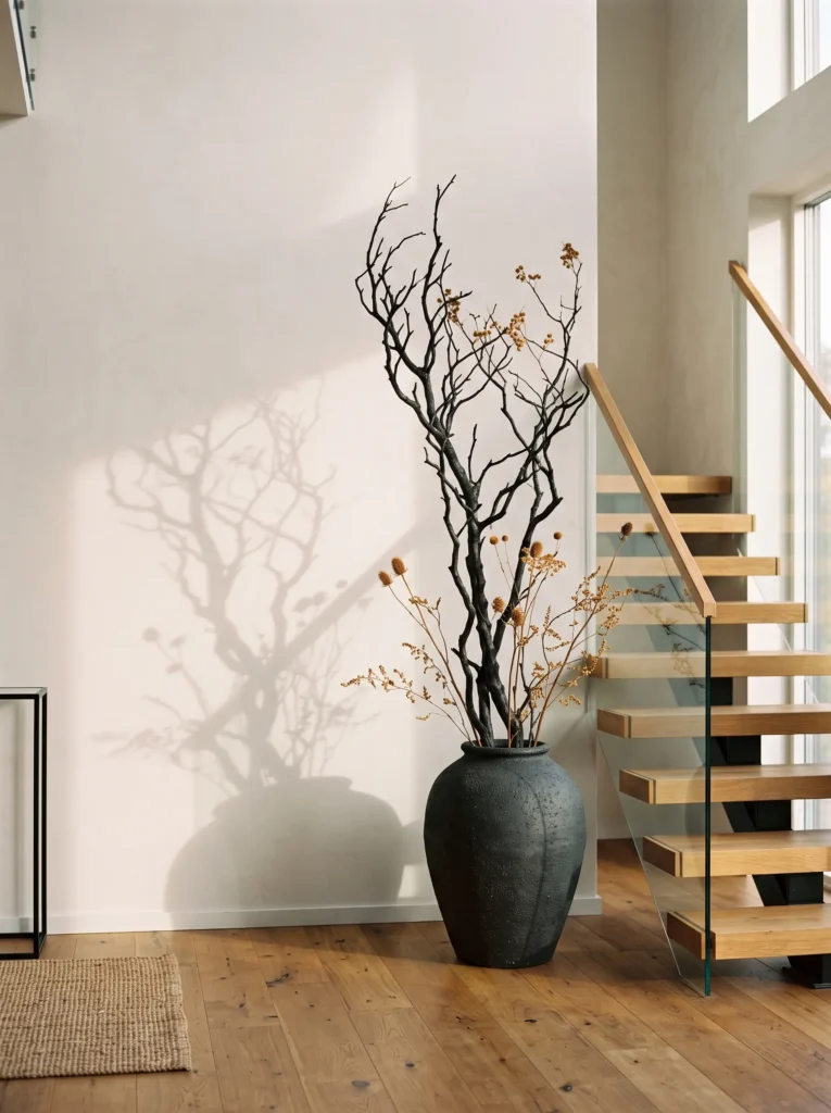
- Palette: Charcoal branches, dried tan seed heads, ochre foliage, and aged bronze.
- Placement: Position the arrangement in a tall floor vessel beside a staircase or empty living-room wall.
- Materials: Fallen branches, dried grasses or seed heads, tall ceramic vessel, floral wire, pruning shears.
- Process: Remove loose bark and debris, trim branches to varied heights, bundle small groups with floral wire, then arrange them loosely in the vessel.
- Time: Approximately 30–45 minutes.
- Difficulty: Easy.
- Lighting: Place near a window where low autumn sunlight can cast branch shadows onto the wall.
- Integration: Keep nearby furnishings simple so the silhouette becomes the focal point.
Why this works: Branches introduce vertical movement and natural structure without relying on conventional seasonal ornaments.
One of the easiest ways to make a large room feel seasonally different is to change its silhouette rather than its surfaces. A tall arrangement of bare branches can fill an awkward vertical space beside a staircase, doorway, or fireplace without visually crowding the floor. I especially like branches with small irregular offshoots because their shadows become part of the design when late-afternoon sunlight moves across the wall. Add a few dried seed heads in ochre or tan, but resist filling every opening. The irregular shape is what makes the installation interesting.
For a simple version, gather clean fallen branches from your own property or use purchased untreated branches if local collection is unsuitable. Remove loose material, trim the ends, and separate the branches into groups according to height. Use small pieces of floral wire to secure a few stems together before placing them into a weighted ceramic vessel. If the arrangement is tall or near a walkway, make sure the vessel has enough weight to resist tipping. I learned to think about this particularly carefully from watching my husband secure construction materials: beautiful vertical pieces still need a stable base. A few hidden stones or suitable filler inside the vessel can improve stability.
11. Plum Velvet Nightstand
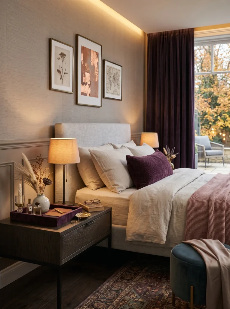
- Palette: Aubergine plum velvet, smoked oak, antique bronze, and ivory.
- Placement: Style one bedroom nightstand rather than changing the entire bedding set.
- Materials: Small plum velvet tray, antique bronze lamp, ivory ceramic vessel, and one tactile book.
- Lighting: Use a shaded bedside lamp with warm 2700K illumination.
- Textiles: Add a single plum velvet pillow or lumbar cushion across the bed.
- Integration: Keep sheets and duvet in their existing neutral color.
- Design principle: Repeat the plum only twice—on the nightstand and bed—to create a controlled visual connection.
Why this works: A restrained plum repetition makes neutral bedding feel intentionally autumnal without replacing the bedroom’s foundational palette.
Bedrooms benefit from darker color differently than public rooms because we naturally expect them to be quieter and more cocooning after sunset. Instead of buying an entirely new bedding collection, I would introduce aubergine plum through two small points: a velvet tray on the nightstand and one pillow or lumbar cushion on the bed. The rest can remain ivory, oatmeal, or natural linen. Smoked oak and antique bronze add depth without introducing another bright hue. The result is subtle enough to remain attractive when the calendar moves beyond November.
The bedside lamp is especially important because plum velvet changes considerably under different light temperatures. At around 2700K, the fabric develops a deep wine-like appearance, while cooler bulbs can make it appear flatter or more purple. I would also keep the nightstand surface relatively open: lamp, tray, book, and one small ceramic object are enough. In my own decorating, I have found that bedrooms look more luxurious when there is room around each useful object. Seasonal styling should never make the surface you actually use every night harder to live with.
12. Charcoal Porch Lanterns
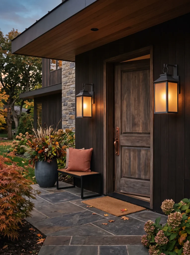
- Palette: Charcoal black, aged copper, muted amber glass, and weathered wood.
- Placement: Flank a covered front porch entry or place one substantial lantern beside the front door.
- Materials: Outdoor-rated lanterns, amber glass LED bulbs, weather-resistant planters, and natural wood accessories.
- Lighting: Choose outdoor-rated warm LEDs around 2200–2700K for a softer evening glow.
- Textiles: Add one rust-colored outdoor cushion to existing porch seating rather than seasonal blankets.
- Safety: Use fixtures and extension components specifically rated for exterior conditions.
- Integration: Repeat charcoal through the door hardware or existing exterior trim whenever possible.
Why this works: Dark lantern frames visually anchor a porch at dusk while amber light creates a restrained seasonal glow without relying on decorative props.
The front porch is often treated as an afterthought, but it is the first place where the home’s autumn palette can be introduced. I prefer charcoal lantern frames with amber glass because they work with brick, painted siding, stone, and natural wood without requiring the exterior to be redesigned. A rust cushion on an existing chair can provide the only fabric color. This keeps the porch seasonal without filling it with signs, artificial foliage, or objects that compete with the architecture. The lantern itself becomes the decoration once evening arrives.
Exterior lighting deserves practical attention because outdoor fixtures deal with moisture, temperature changes, and weather exposure. Choose fixtures specifically rated for the location and use outdoor-rated bulbs and electrical components. If you’re replacing a hardwired lantern, my husband’s construction background makes me especially cautious about treating exterior electrical work as a simple cosmetic swap. The mounting surface, weather sealing, junction box, and connections all need to be appropriate. Once those details are handled properly, the visual effect is wonderfully simple: charcoal metal disappears into the evening while amber light defines the doorway.
13. Mustard Alcove Styling
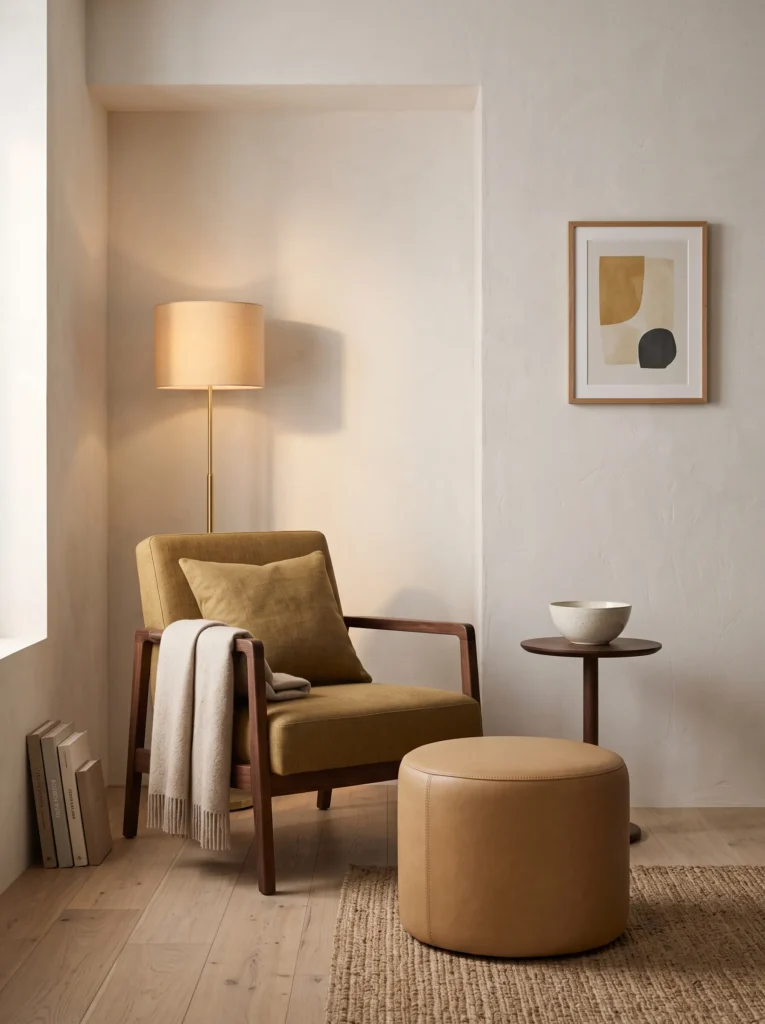
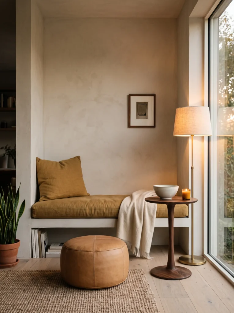
- Palette: Antique mustard, camel leather, dark walnut, and aged ivory.
- Placement: Use a small reading alcove, built-in niche, or underused corner of the living room.
- Materials: Mustard linen cushion, camel leather footstool, walnut pedestal, and ivory ceramic bowl.
- Lighting: Position a warm floor lamp so the mustard fabric receives indirect evening light.
- Textiles: Layer mustard linen over an existing neutral chair instead of replacing the upholstery.
- Integration: Repeat camel or walnut already present elsewhere in the room.
- Seasonal shift: Remove one bright summer accent and replace only that piece with the mustard textile.
Why this works: Mustard connects naturally with wood and leather, giving a neutral corner a distinctly autumnal visual temperature.
Mustard is one of those colors I used to underestimate because it can look quite strong in a paint chip. In a real room, however, the right muted mustard behaves beautifully beside walnut, camel leather, and ivory. I first noticed this relationship while working with plants and dried foliage; the yellow-brown tones found in aging leaves are much more complex than a simple bright yellow. That same complexity makes antique mustard particularly effective indoors. In a small alcove, I would use it on fabric rather than paint so the room can transition easily when winter arrives.
Start by removing one accessory that feels noticeably summery—perhaps a pale blue cushion or lightweight patterned textile—and replace it with a mustard linen cushion. Add one camel leather element and a walnut surface, but don’t introduce another seasonal color. Under a warm floor lamp, the mustard fabric takes on a softer ochre quality and feels considerably less intense than it does in daylight. I like this approach because it respects what is already working in a room. Fall decorating should be a layer added to the home’s existing design language, not a complete personality change every September.
14. Burgundy Painted Vase
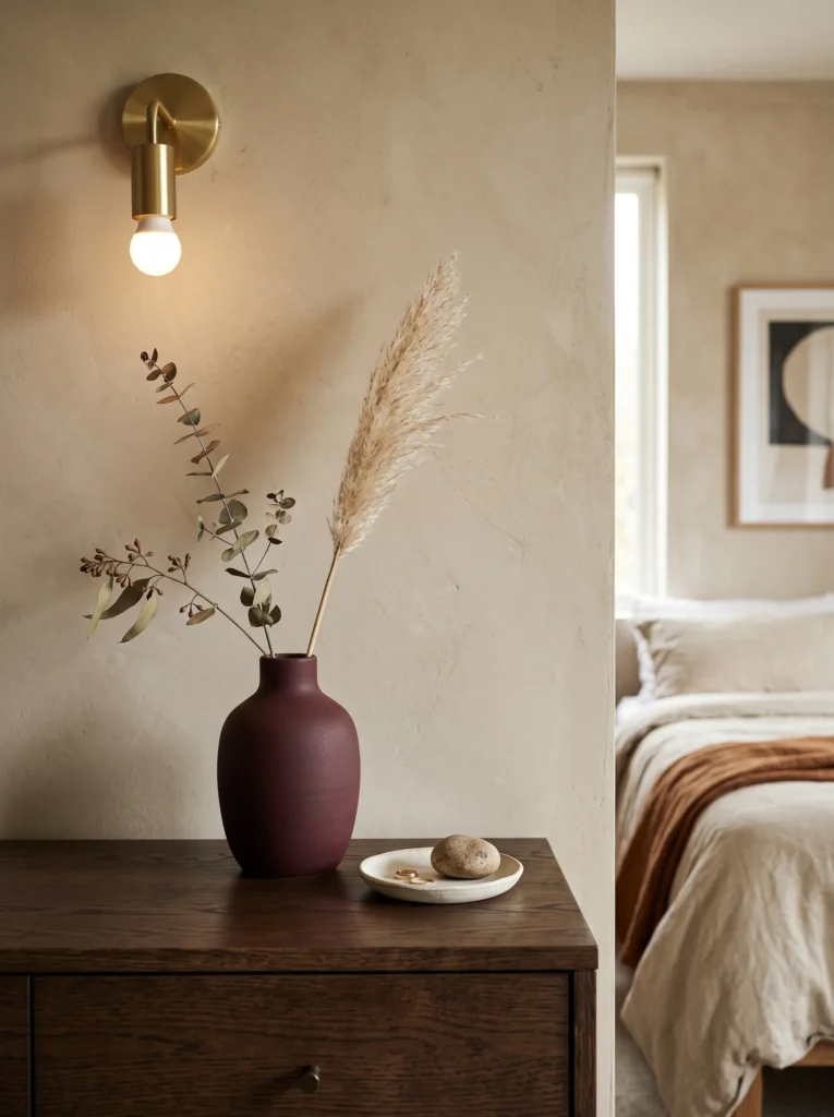
- Palette: Deep burgundy, chalky cream, natural terracotta, and dark brown.
- Placement: Use the finished vessel on a bedroom dresser or bathroom vanity.
- Materials: Plain thrifted vase, fine-grit sandpaper, bonding primer, burgundy furniture or mineral paint, clear protective finish.
- Process: Clean thoroughly, lightly sand, apply primer, add two thin coats of paint, then seal once fully cured.
- Time: Approximately 1–2 hours of active work, excluding drying.
- Difficulty: Easy.
- Lighting: Place near a warm wall lamp or window where the matte surface can show subtle texture.
- Integration: Fill it with one or two dried stems rather than a large bouquet.
Why this works: A simple painted vessel gives you concentrated burgundy color without committing an entire room to a new finish.
My plant-science background probably explains why I am drawn to small botanical arrangements rather than enormous artificial bouquets. A single dried stem can reveal shape, texture, and color much more clearly when it has room around it. For fall, I would pair that restrained botanical approach with a thrifted vase painted in deep burgundy. The color gives even an inexpensive vessel enough visual weight to become a small architectural accent. On a bedroom dresser, it works especially well beside cream ceramics and dark wood, where the red-brown undertone feels sophisticated rather than festive.
For the DIY, start with a clean, completely dry vase and lightly sand its surface. Apply a bonding primer if the original finish is glossy, followed by two thin coats of burgundy mineral or furniture paint. Allow each layer to dry fully before applying the next, then use a compatible protective finish if the piece will be handled frequently. Once cured, place only one or two dried stems inside. I prefer slightly imperfect thrifted pieces for this project because tiny variations in shape make the finished object feel collected. You can also test the paint on a hidden section first, particularly if the vase has an unusual glazed surface.
15. Amber Glass Kitchenware
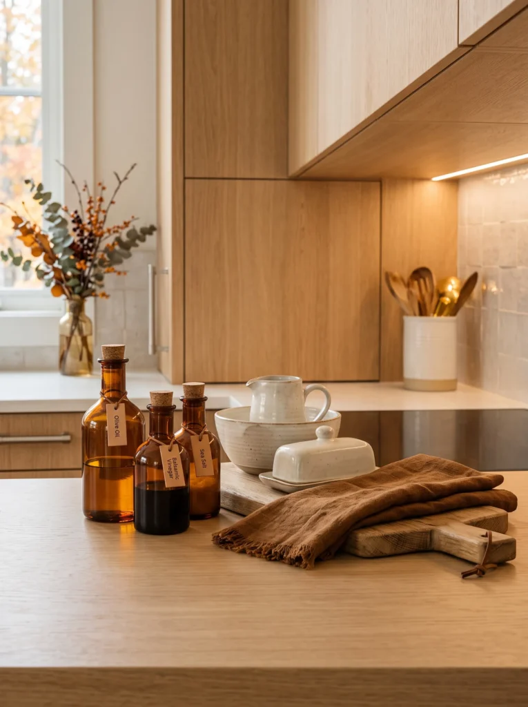
- Palette: Deep amber glass, cream, tobacco brown, and brushed nickel.
- Placement: Arrange selected amber pieces on a kitchen counter or glass-front cabinet.
- Materials: Amber tumblers, carafe, small storage jar, cream ceramics, and wooden cutting board.
- Lighting: Position the glass where under-cabinet or window light can pass through it.
- Textiles: Use a tobacco-brown linen towel as the only additional fall textile.
- Material contrast: Combine translucent glass with matte ceramic and textured wood.
- Integration: Keep the kitchen functional; use pieces that can actually serve drinks or store ingredients.
Why this works: Transparent amber glass introduces autumn color while preserving visual openness in a working kitchen.
One of the easiest ways to make a kitchen feel autumnal is to use an object that earns its place through everyday function. Amber glass does exactly that. I keep coming back to glass because, unlike an opaque decorative object, it allows the underlying counter, wall, and daylight to remain visible. A few amber tumblers or a carafe can therefore add color without making a kitchen feel crowded. The combination is especially lovely with cream stoneware and natural wood, where the translucent surface catches changing daylight throughout the afternoon.
Arrange the pieces where light can actually reach them. A glass-front cabinet is ideal, but an open counter can work if you keep the grouping small. Place the amber pieces together, then interrupt them with one cream ceramic object and a tobacco-brown linen towel. Don’t fill every available space. In our home, I’ve found that functional objects often look more intentional when grouped by material rather than scattered individually. If the kitchen already has brushed nickel or stainless-steel hardware, leave it alone; the cooler metal provides a useful counterpoint to the amber glass instead of requiring another finish.
16. Dried Floral Wall Fan
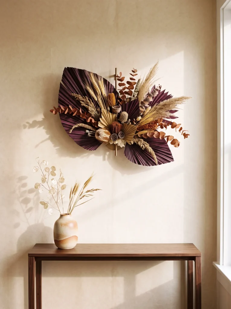
- Palette: Rust, dried wheat, aubergine plum, natural straw, and parchment.
- Placement: Hang the arrangement above a console, bed, or quiet dining-room wall.
- Materials: Dried grasses, wheat stems, rust-colored preserved flowers, floral wire, twine, and a small wall hook.
- Process: Sort stems by height, bundle them loosely, secure with floral wire, wrap the base with natural twine, then spread the stems into a fan shape.
- Time: Approximately 30–40 minutes.
- Difficulty: Easy.
- Lighting: Use side lighting rather than direct overhead light to emphasize the shadows between stems.
- Integration: Keep the wall underneath relatively bare so the organic silhouette remains dominant.
Why this works: A fan-shaped botanical arrangement creates wall-scale impact with almost no visual bulk.
I have always liked dried plants for seasonal decorating because they show exactly what time and changing conditions do to living material. Their colors become quieter, their structures become more visible, and their silhouettes can be more interesting than a fresh bouquet. For this project, I would create a broad fan from dried wheat, rust-colored preserved flowers, and a few aubergine stems. The arrangement feels almost sculptural when mounted on a wall. Unlike a wreath, it doesn’t immediately announce itself as seasonal décor, which makes it especially useful in contemporary or minimal interiors.
Begin by laying the stems on a flat surface and arranging them from shortest to longest. Secure the lower ends with floral wire, then wrap the bundle with natural twine for a finished handmade detail. Slowly spread the upper stems outward until they form a loose fan, adding small flowers between the grasses where needed. Mount the finished piece with an appropriate hook for its weight and wall type. My husband has made me much more aware of the difference between a decorative hook and a properly rated mounting point; even lightweight-looking arrangements deserve secure hardware when they are positioned above furniture or sleeping areas.
17. Charcoal Linen Bedroom for Moody Fall Decor
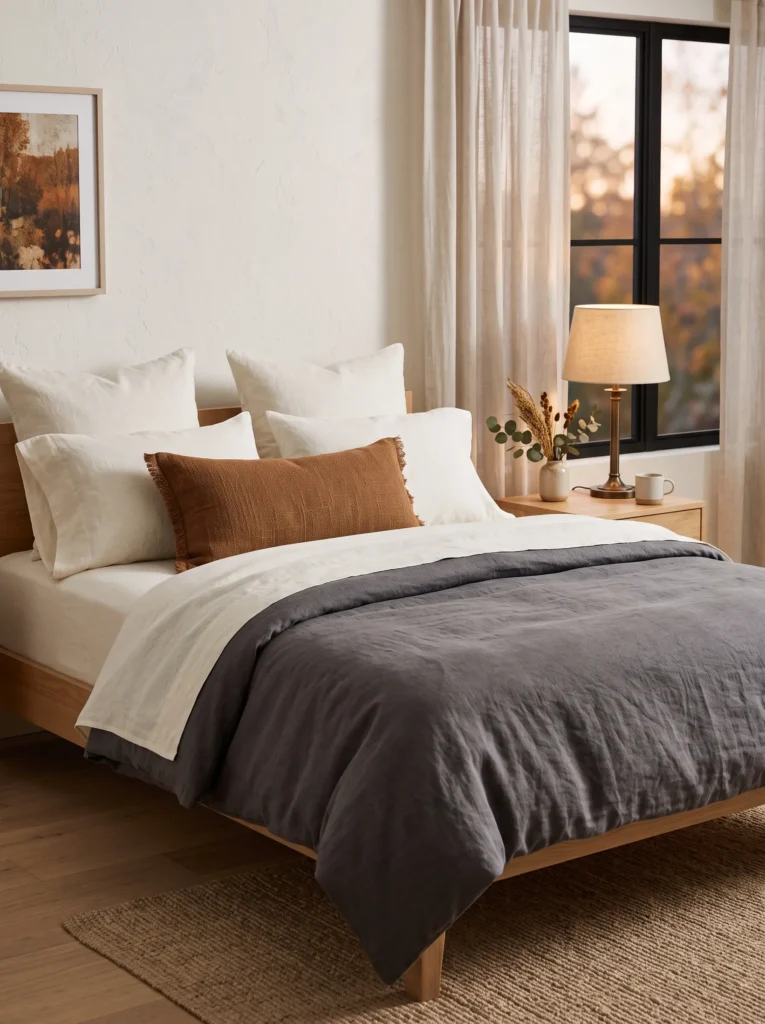
- Palette: Charcoal linen, cinnamon brown, antique ivory, and aged bronze.
- Placement: Use charcoal only on the duvet cover or top layer of the bed.
- Materials: Washed charcoal linen duvet, ivory sheets, cinnamon-brown lumbar pillow, bronze bedside lamp.
- Lighting: Keep bedside lighting warm and diffused rather than bright overhead illumination.
- Textiles: Layer linen, cotton, and a lightly textured wool pillow for tactile variation.
- Integration: Leave the walls, headboard, and larger furniture in their existing neutral finishes.
- Design tip: Fold the duvet slightly at the foot of the bed to expose the ivory bedding beneath.
Why this works: Charcoal gives autumn bedrooms depth while ivory bedding prevents the darker textile from visually shrinking the space.
After years of bringing plants and natural materials into interiors, I’ve learned that autumn rooms don’t necessarily need more objects; they often need stronger texture. Charcoal linen is a perfect example. It has the visual seriousness of a dark color but the relaxed surface of a natural fiber, so it doesn’t feel as formal as black velvet or polished fabric. I especially like it with cinnamon brown because the two colors sit on opposite sides of the warm-neutral spectrum without competing. The ivory sheets remain important because they create a narrow visual break between the darker layers.
Rather than replacing everything in the bedroom, change only the uppermost bedding layer. Wash the linen before styling it so the fabric develops the relaxed texture that makes it attractive. Fold the duvet low enough to reveal the ivory sheets, then add one cinnamon lumbar pillow and an aged-bronze lamp. At night, the warm light softens the charcoal while highlighting the folds in the linen. This is also one of the easiest seasonal updates to reverse: when spring arrives, remove the charcoal layer and the room immediately returns to its lighter foundation.
18. Rusty Window Bench
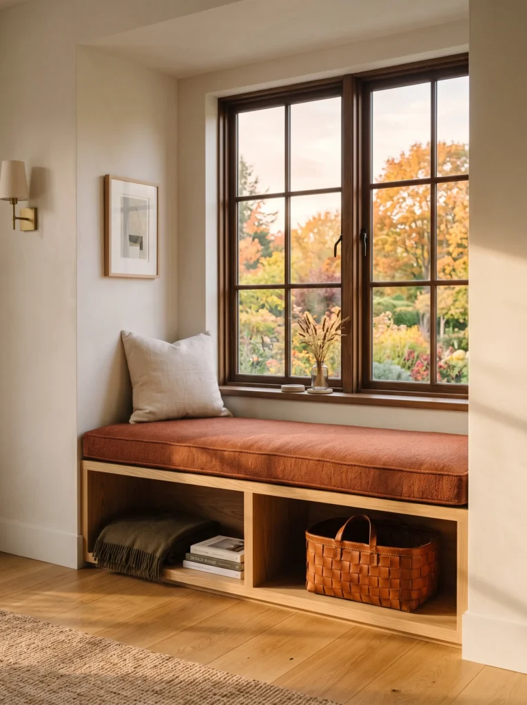
- Palette: Rust, tobacco, cream, and natural oak.
- Placement: Style a window bench or built-in seat in a living room, hallway, or bedroom.
- Materials: Rust-colored wool cushion, cream linen pillow, tobacco leather storage basket, oak surface.
- Lighting: Take advantage of low afternoon window light rather than adding decorative lighting directly to the bench.
- Textiles: Use wool for the seat and linen for the smaller pillow to avoid a flat fabric combination.
- Integration: Repeat oak or leather from existing furniture nearby.
- Design tip: Keep the bench mostly empty so it remains functional for sitting.
Why this works: A single rust wool surface captures autumn color while the surrounding natural materials keep the composition grounded.
Window seats are one of my favorite places to make a seasonal change because the light does much of the decorating for you. In Austin, late-afternoon light can move surprisingly low across a room, and a rust-colored wool cushion catches that light beautifully. The color becomes softer near sunset and more terracotta-like than it appears under overhead lighting. I would pair it with cream linen rather than another dark textile and let the oak or existing wood around the window remain visible. That combination gives the corner a distinctly autumnal identity without filling it with accessories.
The practical side matters here too. A window bench should still function as a seat, so I wouldn’t cover it with fragile decorative objects. Choose a dense wool cushion that can tolerate regular use, then add one washable linen pillow. A tobacco leather basket underneath can hide books, blankets, or seasonal items while contributing another tactile layer. When I decorate spaces like this, I try to ask whether each piece earns its footprint. If something makes the bench difficult to use, it isn’t improving the room—it is simply occupying it.
19. Plum Wax Bowl
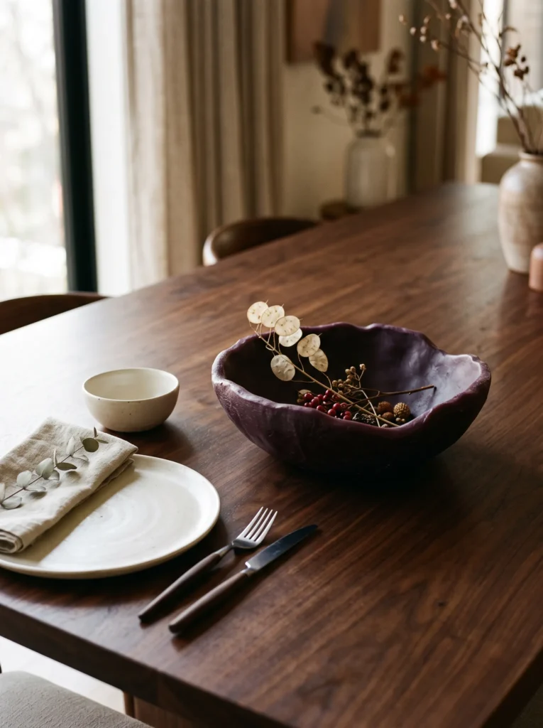
- Palette: Aubergine plum wax, ivory, dried rose, and dark brown.
- Placement: Use the finished bowl as a dining centerpiece or coffee-table accent.
- Materials: Soy or beeswax, heat-safe bowl mold, candle wick if desired, double boiler, dried petals or botanicals, thermometer.
- Process: Melt wax using a double boiler, monitor the temperature according to the wax manufacturer’s instructions, pour into the mold, then carefully arrange a small amount of dried botanical material before the surface sets.
- Time: About 45–60 minutes plus cooling.
- Difficulty: Moderate.
- Lighting: Display it beside a warm lamp rather than directly beside another open flame.
- Safety: Use only candle-safe materials and never burn decorative botanicals unless the manufacturer specifically confirms they are safe for candle use.
Why this works: A sculptural plum wax object brings handmade texture to a table while keeping the seasonal palette sophisticated.
I love fall projects that don’t look like traditional fall crafts when they’re finished. A plum wax bowl has that quality: from a distance it reads as a sculptural object, while closer inspection reveals the handmade surface. Aubergine is particularly beautiful in wax because the material softens the color and gives it a slightly translucent edge. I would use the bowl as a centerpiece on a dining table with cream ceramics and dark wood, leaving enough empty tabletop around it for the arrangement to breathe.
For a decorative version, melt suitable soy or beeswax in a double boiler and follow the manufacturer’s recommended temperature range. Pour it carefully into a heat-safe mold or vessel designed for wax projects. If adding dried botanicals, use only materials specifically confirmed safe for the intended use; decorative placement is safer than creating a burnable candle with unknown plant material. Allow the wax to cool completely before removing the form. I prefer one imperfect handmade bowl over several small seasonal crafts because the single object has enough scale to feel intentional. If you make it purely decorative, it can be reused year after year without becoming tied to one particular trend.
20. Copper Leaf Cabinet
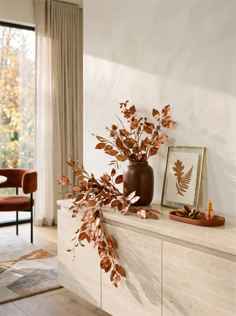
- Palette: Burnished copper, rust, tobacco, and creamy stone.
- Placement: Style the top of a kitchen cabinet, dining-room hutch, or low storage unit.
- Materials: Real or artificial copper-colored leaves, removable adhesive hooks, small framed artwork, tobacco ceramic vessel.
- Process: Arrange leaves into a loose cascading line, attach lightweight pieces with removable hooks, then position the vessel and artwork below to anchor the composition.
- Time: Approximately 30 minutes.
- Difficulty: Easy.
- Lighting: Position the arrangement where afternoon light can catch the copper surfaces.
- Integration: Repeat copper through an existing pan, handle, frame, or small hardware detail if available.
- Construction note: For heavier metal pieces, use mounting hardware rated for the material and wall/cabinet surface rather than relying on adhesive alone.
Why this works: Copper introduces a reflective autumn note that changes visibly throughout the day as natural light moves across the surface.
Copper is an underrated fall material because it gives you the glow people often try to create with dozens of small decorations. I first became interested in using metallic botanical forms after noticing how dried leaves catch sunlight differently depending on their angle. A few copper-toned leaves arranged asymmetrically can create that same effect on a cabinet or hutch. The color works especially well with rust, tobacco brown, and creamy stone because all four belong to the same warm visual family. Keep the arrangement loose rather than forming a dense garland.
Start by deciding where the strongest afternoon light falls, then place the copper leaves so their surfaces can catch it. Use removable hooks for genuinely lightweight pieces, but don’t assume adhesive is suitable for heavier metal décor. My husband’s construction background has made me cautious about mounting anything above a frequently used surface without considering its weight and the material underneath. Once the leaves are secure, add one tobacco-colored ceramic vessel and a small framed artwork below. The combination creates a layered vertical composition while preserving enough open space for the cabinet itself to remain visible.
Styling Principles for a Cohesive Moody Fall Home
- Choose one dominant autumn color: Let burgundy, rust, aubergine, mustard, chocolate, or charcoal lead rather than using every fall color equally.
- Repeat colors strategically: A color usually feels intentional when it appears two or three times across connected rooms, but avoid placing identical objects together.
- Work with existing finishes: Walnut, oak, leather, bronze, copper, stone, and aged brass naturally support darker autumn colors.
- Use textiles before paint: Seasonal linen, velvet, wool, and cotton are easier to change than permanent wall finishes.
- Consider lighting: Warm bulbs around 2200–2700K generally make saturated autumn colors appear deeper and more atmospheric.
- Create contrast: Pair dark colors with ivory, parchment, cream, or natural wood so the rooms retain visual breathing space.
- Think vertically: A branch sculpture, framed botanical arrangement, or tall vessel can change a room’s silhouette without adding clutter to surfaces.
- Edit rather than accumulate: Remove a few summer accents before introducing fall pieces. This makes the seasonal layer look deliberate.
- Respect room function: Dining tables should remain usable, kitchen counters should remain practical, and bedroom nightstands should still have room for everyday necessities.
- Use nature thoughtfully: Dried leaves, branches, grasses, seed heads, and pressed botanicals provide authentic autumn texture without relying on literal seasonal symbols.
A cohesive moody fall home is usually built through repetition of color and material, not repetition of decorations.
FAQs
How do I decorate for fall without looking cliché?
Skip the predictable combination of orange pumpkins, artificial leaves, and printed seasonal signs. Instead, choose one sophisticated autumn color such as oxblood, rust, aubergine, mustard, or chocolate brown and introduce it through textiles, ceramics, artwork, or lighting. Natural materials such as walnut, wool, linen, dried grasses, leather, and aged metal make the seasonal palette feel integrated with the architecture.
What are the best budget-friendly moody fall decor ideas?
Start with projects that transform items you already own. Dye plain linen, repaint a thrifted ceramic vase, press leaves into inexpensive frames, or create a dried branch arrangement. Changing one textile or repainting one visible object can have more impact than buying a large collection of inexpensive seasonal decorations.
Which DIY fall projects are easiest for beginners?
Pressed-leaf artwork, dried floral arrangements, painted thrifted vessels, hand-dyed linens, and simple branch sculptures are excellent starting points. They require relatively few materials and can be completed without specialized equipment. Candle-making is also approachable, but wax should always be heated and handled according to the manufacturer’s safety instructions.
How can I transition from neutral decor to moody fall decor?
Don’t replace the neutral foundation. Keep your existing cream, ivory, beige, or natural-wood furniture and add one deeper autumn layer at a time. A rust linen runner, burgundy cushion, chocolate leather accessory, or aubergine ceramic piece can introduce depth while allowing your original décor to remain useful.
What are the best moody fall colors for a small space?
Chocolate brown, burgundy, aubergine, rust, charcoal, and deep amber can all work in small rooms when used selectively. Rather than covering every surface in dark colors, concentrate the strongest tone on one textile, artwork, or accessory and balance it with ivory, cream, natural wood, or reflective glass.
How can I make dark autumn colors work in a modern home?
Keep the silhouettes simple and let material quality do the work. Choose matte ceramics, washed linen, clean-lined furniture, smoked glass, natural wood, and restrained metal finishes. Avoid combining too many ornate seasonal objects. Modern spaces generally benefit from fewer, larger visual statements rather than many small decorations.
Final Thoughts
The best fall decorating doesn’t necessarily announce itself as seasonal. It can be as simple as a rust-colored linen runner on a familiar table, an aubergine ceramic vessel catching the afternoon light, or a few pressed leaves displayed like botanical artwork. Those small decisions are often what make a home feel thoughtfully changed rather than temporarily decorated.
For me, the most successful autumn rooms are the ones where color, material, lighting, and function all work together. Choose one or two deep colors, repeat them thoughtfully across different rooms, and let natural materials such as walnut, linen, wool, leather, dried botanicals, and aged metal provide the connection. You don’t need twenty new things to create a beautiful fall home—you simply need a few pieces that make sense with what you already have.