15 Lavender & Purple Bedroom Ideas to Love
Type “purple bedroom” into Pinterest and you’ll get the same thing over and over: a lavender duvet on an otherwise empty white wall. Pretty, maybe, but not actually a finished room. If you’ve ever bought the bedding and still felt like something was missing, you’re not imagining it. A genuinely styled space needs more than one purple object — it needs the color woven through walls, textiles, and hard surfaces so it feels architectural, not accidental.
That’s exactly what these lavender& purple bedroom ideas deliver: 15 fully realized rooms, each with its own wall color, plant choice, lighting, and material story, so you can recreate the whole space, not just the sheets. In my experience styling rooms like this, the difference between “pretty” and “finished” almost always comes down to what’s happening beyond the bed.
Most “purple bedroom” searches lead to the same thing: a stack of lavender bedding sets on a white wall, styled like a hotel catalog page. That’s not a full room — it’s one purple object in an otherwise empty palette. A single colored textile reads as decoration, but color only becomes architecture — a genuinely finished room — once it repeats across at least three different material types: a wall treatment, a textile, and a hard surface like wood, ceramic, or stone.
I learned this the hard way styling a guest room years ago — gorgeous plum duvet, bare walls, and it still looked like a dorm room until I added a stained wood nightstand and a ceramic lamp in the same undertone. This post shows you how to build lavender and purple bedroom decor ideas as complete, livable rooms — not just pretty sheets.
Dusty Lilac & Woven Rattan
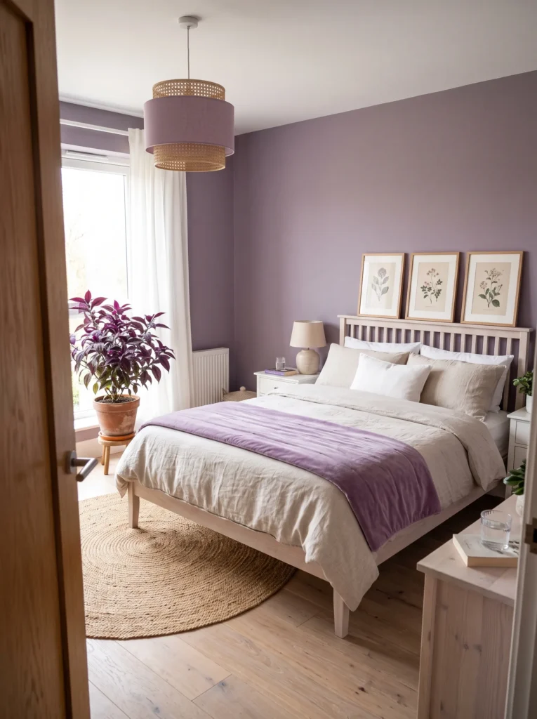
- Walls: Dusty lilac (a soft, gray-leaning purple) in a matte eggshell finish
- Bedding: Undyed linen duvet in oatmeal, layered with a lilac velvet throw
- Wall decor: A trio of unframed botanical prints, leaned against the wall rather than hung
- Plants: Persian Shield in a raw terracotta pot — its metallic purple foliage echoes the wall without matching it exactly
- Hanging element: A rattan pendant light with a lilac linen shade
- Rug: A natural jute rug in warm tan
- Curtains: Sheer ivory linen panels, letting the lilac wall stay the focal point
- Furniture/hardware: A whitewashed oak bed frame with brushed brass pulls on the nightstand
Why this works: Pairing a cool-toned purple with warm, textured naturals like rattan and jute keeps the color from feeling saccharine or overly feminine.
Paint sheen matters more than most people realize when committing to a saturated wall color like dusty lilac. My husband, who’s spent two decades in residential construction, always steers clients toward matte or eggshell finishes for bedrooms — anything glossier bounces light unevenly and can make a cooler purple read almost gray under lamp light at night. Eggshell has just enough sheen to stay washable without turning reflective. In a room this soft and neutral-leaning, that distinction matters: dusty lilac needs even, diffused light to hold its warmth, and the wrong finish can flatten the whole palette by evening.
What makes this bedroom feel finished rather than themed is restraint paired with texture. The lilac wall sets the tone, but nothing else repeats it exactly — the Persian Shield’s foliage is a deeper, more saturated purple, the velvet throw a shade darker still, and everything else leans neutral. That variation keeps a lavender bedroom decor scheme from reading like a paint chip come to life. Rattan, jute, and linen add warmth and weight, so the room feels collected and lived-in rather than a single color poured over every surface in the space.
Deep Grape & Warm Gold
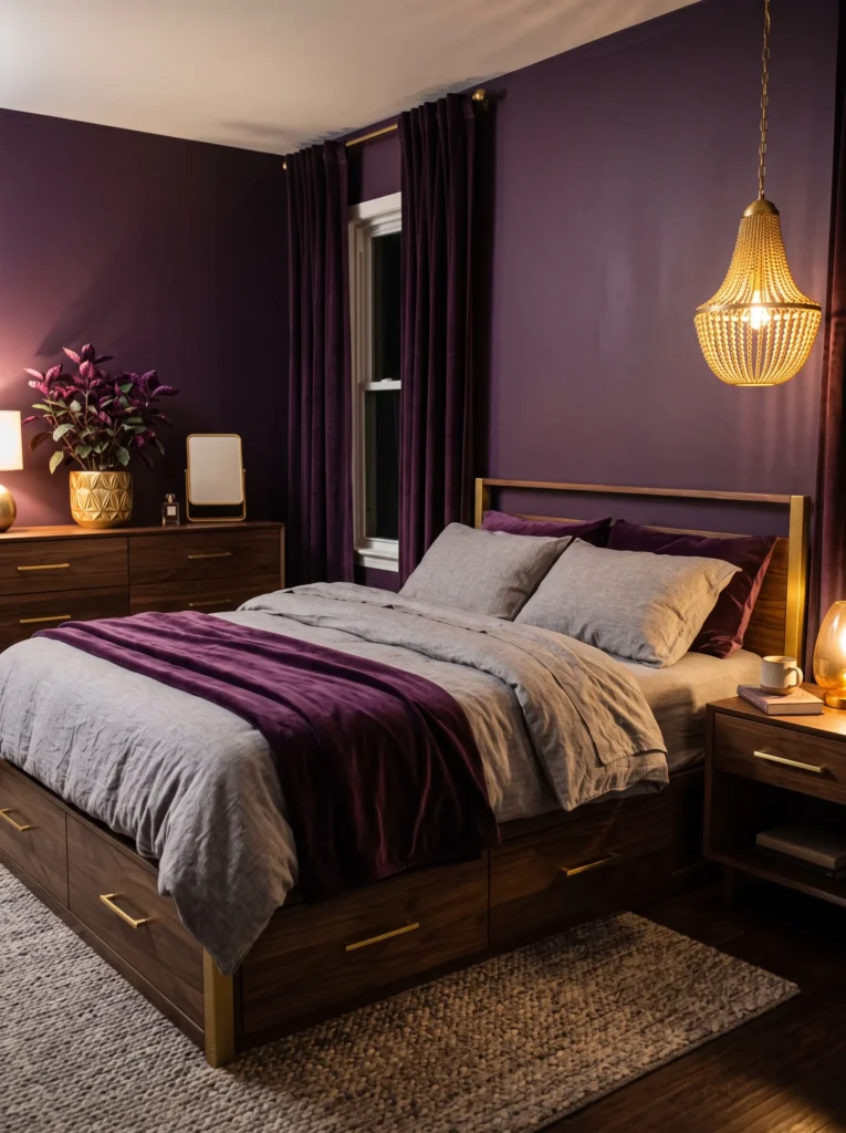
- Walls: Deep grape (a true, saturated purple — not brown-toned or black-leaning) in a matte finish
- Bedding: Heather-gray linen sheets with a grape velvet throw folded at the foot
- Wall decor: A cluster of round, warm-gold-framed art prints in a loose gallery arrangement
- Plants: Purple Waffle Plant (Hemigraphis) in a warm gold ceramic pot — its crinkled, deep-purple leaves are one of the few houseplants that are purple on both sides of the leaf
- Hanging element: A gold beaded chandelier-style pendant, hung slightly off-center above the nightstand
- Rug: A wool rug in heather gray with a grape border
- Curtains: Grape velvet curtains, floor-length, in the same family as the wall but one shade darker
- Furniture/hardware: A black walnut bed frame with warm gold drawer pulls on the nightstand
Why this works: Grape is saturated enough to feel intentional and rich, but because it’s a true purple rather than a purple-black, it still reads clearly as “purple” from across the room — not as a dark neutral.
I get asked a lot whether a deep purple like grape will make a bedroom feel smaller, and the answer depends entirely on the metal you pair it with. Warm gold is the fix — it catches light and adds brightness against a saturated wall, keeping the room from tipping into gloom. This is different from more aubergine-toned rooms, which lean almost black; grape stays recognizably, confidently purple even in low light. That distinction matters if you’re searching for lavender and purple bedroom decor ideas specifically, rather than a moody dark room that just happens to have a purple undertone.
The Purple Waffle Plant is doing more work here than a typical houseplant pick. Its foliage is genuinely purple — deep aubergine-purple on top, a lighter magenta-purple underneath — so it repeats the wall color in a living, textured form instead of just sitting there as green filler. Paired with the grape velvet curtains and throw, the room builds a tonal purple story across three separate materials: paint, plant, and fabric. That’s what makes a saturated color like this feel like a finished, full purple bedroom design instead of one bold wall surrounded by neutral leftovers.
Amethyst & Matte Black
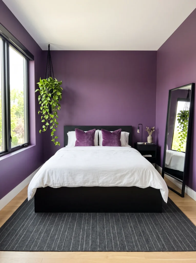
- Walls: Amethyst purple (a clear, jewel-toned violet — brighter and truer than grape or plum) in matte finish, painted full-room rather than a single accent wall
- Bedding: Crisp white cotton percale with an amethyst velvet lumbar pillow and a folded charcoal throw
- Wall decor: A single large leaned mirror in a slim matte black frame, propped against the wall rather than hung
- Plants: A hanging pothos with a variegated purple-and-cream cultivar (Marble Queen grown under warmer light often develops faint purple undertones in new growth) in a matte black pot
- Hanging element: A matte black macrame plant hanger, cradling the pothos near the window
- Rug: A charcoal flatweave rug with a thin amethyst pinstripe
- Curtains: White linen panels on a matte black rod — the color contrast, not the fabric, carries the room’s edge
- Furniture/hardware: A low-profile platform bed in matte black metal
Why this works: Full-room amethyst reads as confidently purple from every angle, because the color isn’t confined to one wall — it’s the room’s baseline, not an accent.
This is the idea I’d point to if someone tells me they love purple but worry a single accent wall will look half-finished. A true jewel-toned purple like amethyst, applied to all four walls in a matte finish, reads as a cohesive design choice rather than a bold experiment, because there’s no unpainted wall competing with it for attention. Matte black hardware and a black-framed leaned mirror keep the room from feeling overly sweet or pastel — sharp, minimal black lines against a saturated violet wall is a pairing that looks current, not dated, and it photographs beautifully in both daylight and lamp light.
What surprises people about this room is how restrained it actually is once you look past the wall color. White bedding, a charcoal rug, and black hardware mean purple only fully repeats in two places — the walls and the lumbar pillow — while the pothos adds a living, textural echo without shouting for attention. That balance is the real lesson here: a fully saturated purple bedroom styling doesn’t need purple on every surface to feel complete. It needs one confident color decision, supported by quiet, well-chosen neutrals that let the wall do the talking.
Muted Plum & Brushed Silver
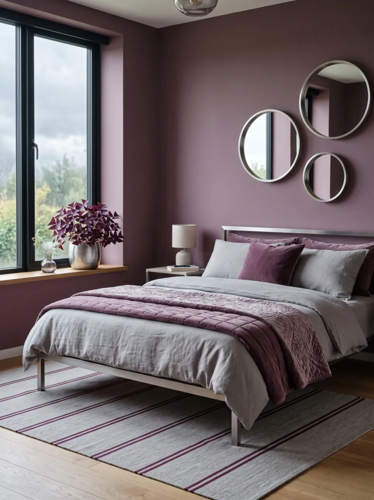
- Walls: Muted plum (a dusty, grayed-down purple-red) in a flat matte finish
- Bedding: Dove-gray Belgian linen duvet with a plum quilted coverlet at the foot
- Wall decor: A row of three small round mirrors in brushed silver frames, clustered asymmetrically
- Plants: Purple oxalis (shamrock plant) in a brushed silver pot, its triangular purple leaves echoing the wall
- Hanging element: A silver disc pendant with a soft frosted-glass shade
- Rug: A flatweave rug in dove gray with a thin plum stripe
- Curtains: Plum linen curtains a full shade darker than the walls, framing the window
- Furniture/hardware: A steel-frame platform bed with brushed silver legs
Why this works: North-facing rooms with limited direct sun tend to gray down warm colors, which is exactly why a muted plum photographs richer in low light than a brighter, truer purple.
Light exposure changes how a purple wall actually reads, and it’s worth checking your room’s orientation before choosing a shade. North-facing bedrooms get cooler, indirect light all day, which tends to mute warm colors — so a true, saturated purple can look flat or dull, while a grayed-down plum like this one actually looks richer in that same light. South- and west-facing rooms get warmer, golden light and can handle a brighter violet without it washing out. If you’re unsure which way your room faces, test a paint sample at both 9 a.m. and 6 p.m. before committing to the full wall.
Brushed silver was the deliberate choice over gold or brass here, because it keeps the room cooler and more contemporary rather than warm and vintage-leaning. The three clustered mirrors do double duty — they bounce extra light around a room that may already run a little dim, and they add movement to a wall that would otherwise sit flat. Paired with the purple oxalis, whose leaves genuinely echo the wall color rather than just complementing it, this bedroom feels cohesive and current, not like separate purple purchases lined up beside each other.
Orchid & Antique Nickel
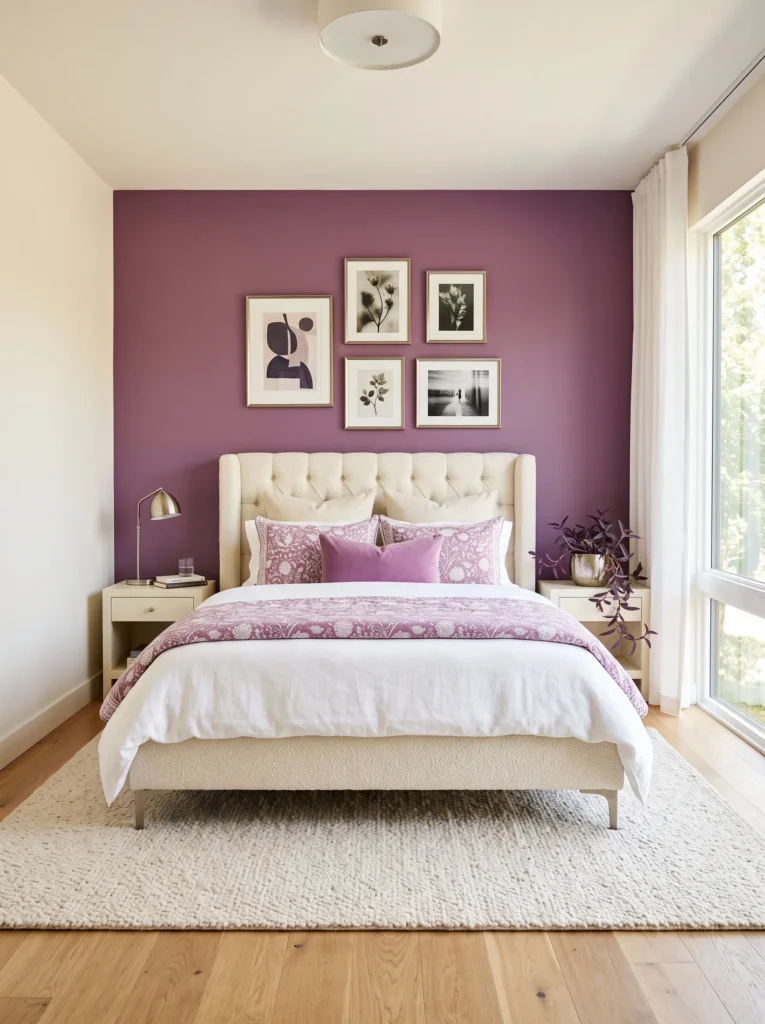
- Walls: Orchid purple (a bright, slightly pink-leaning violet) in a matte finish, on the headboard wall only
- Bedding: White Belgian linen with an orchid-and-white block-print duvet cover
- Wall decor: A gallery wall of five mismatched antique-nickel frames holding botanical sketches
- Plants: Purple Heart plant (Tradescantia pallida) in an antique-nickel-finished pot — its trailing magenta-purple foliage cascades naturally over the pot’s edge
- Hanging element: An antique nickel and glass bubble pendant, hung asymmetrically off to one side
- Rug: A cream boucle rug with a soft, nubby texture
- Curtains: White linen with a thin orchid-purple stripe woven through the hem
- Furniture/hardware: A channel-tufted upholstered bed frame in cream boucle with antique nickel legs
Why this works: Orchid is the brightest, most energetic shade on this list, so isolating it to one wall keeps the room feeling playful instead of overwhelming.
Antique nickel doesn’t get talked about nearly as much as brass or matte black in bedroom design, and that’s a shame, because it does something neither of those finishes can — it stays cool and slightly muted, so it never competes with a bright, saturated purple like orchid. Brass would warm the whole room up and shift the purple’s undertone; matte black would feel too heavy against something this lively. Nickel just quietly supports the color instead of arguing with it. That’s a small material decision, but it’s the kind of thing that separates a room that feels curated from one that feels assembled from whatever was on sale.
The Purple Heart plant is doing something most purple bedroom decor ideas skip entirely: using a plant whose actual bloom and foliage color matches the wall, rather than relying on a colored pot next to green leaves. Its trailing magenta-purple stems drape naturally over the nickel pot, echoing the block-print duvet and the striped curtain hem without ever feeling matched too perfectly. Combined with the cream boucle textures throughout, this bedroom reads as bright and current — genuinely photograph-worthy — rather than a dated purple room from a decade-old mood board.
Thistle & Rose Gold
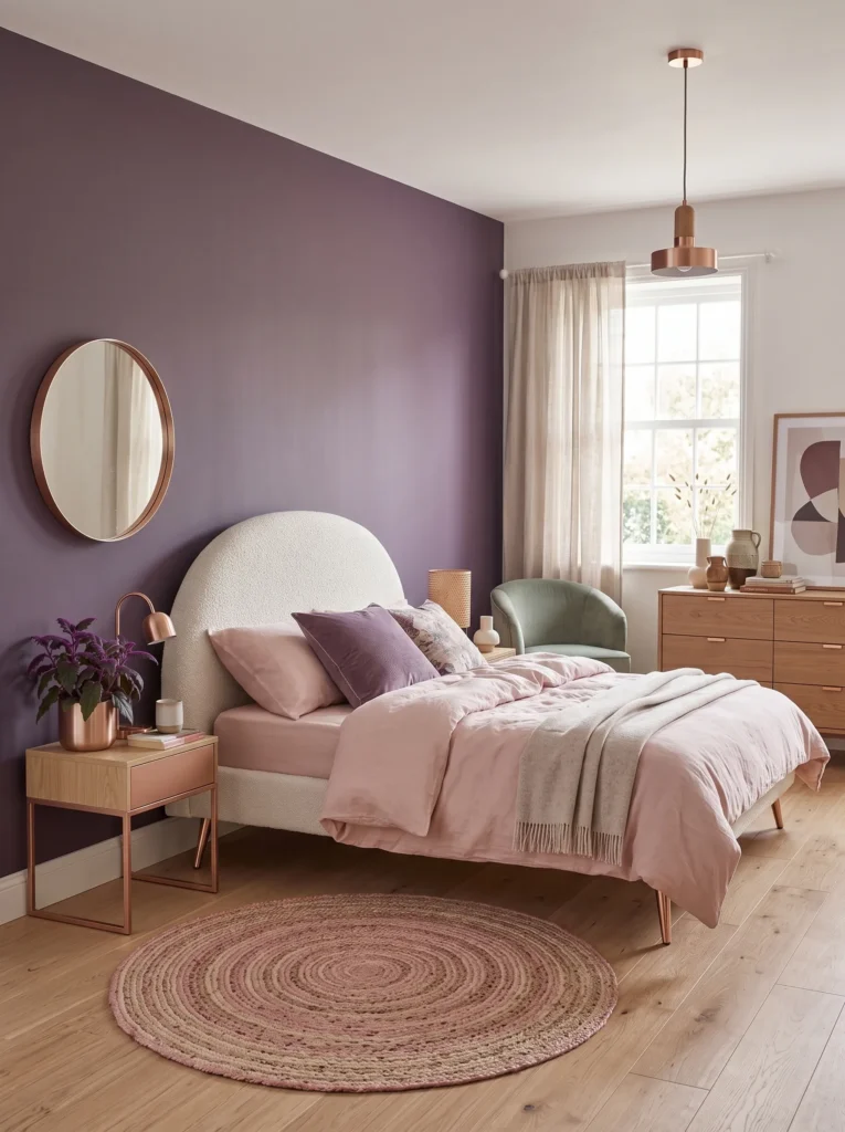
- Walls: Thistle purple (a soft, pink-leaning lavender, close to a dried flower shade) in matte finish
- Bedding: Blush-white linen durable weave with a thistle velvet euro pillow
- Wall decor: A curved, organic-shaped rose gold mirror hung slightly off-center
- Plants: Purple Passion Plant (Gynura aurantiaca) in a rose gold pot — its fuzzy leaves have a genuine violet sheen under direct light, unlike most houseplants that only fake purple through pigment
- Hanging element: A rose gold and glass teardrop pendant, hung low beside the reading chair
- Rug: A cream and dusty pink braided rug
- Curtains: Blush linen curtains with a thistle-purple trim along the leading edge
- Furniture/hardware: A curved boucle headboard in cream with rose gold cone legs
Why this works: Thistle sits closer to pink than most purples on this list, making it the softest, most romantic option — ideal for a reader who wants lavender’s warmth without any of its coolness.
Rose gold gets dismissed as a trend that peaked years ago, but paired with a genuinely soft shade like thistle, it actually reads as timeless rather than dated. The key is restraint — one mirror, one pendant, and the cone-shaped legs on the headboard, rather than rose gold on every single surface. My husband’s take, from two decades of installing lighting fixtures, is that a single statement pendant does more visual work than three smaller ones scattered around a room, and it’s advice that holds true here. One well-placed rose gold light fixture anchors the whole palette instead of competing with it.
The Purple Passion Plant is a genuinely underused choice in lavender bedroom styling, and it deserves more attention than the usual Tradescantia or Purple Heart picks. Its velvety, fuzzy leaves catch light in a way smooth-leafed plants simply can’t, adding a tactile, almost fabric-like texture that echoes the thistle velvet pillow across the room. Combined with the braided rug’s soft pink undertones and the curved boucle headboard, this bedroom feels tender and lived-in — a full lavender and purple bedroom decor idea built for someone who wants softness without it tipping into anything saccharine.
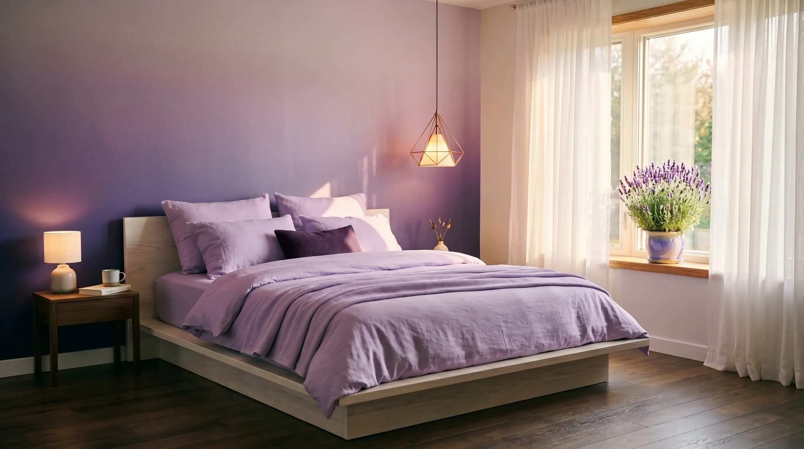
Wisteria Ombre
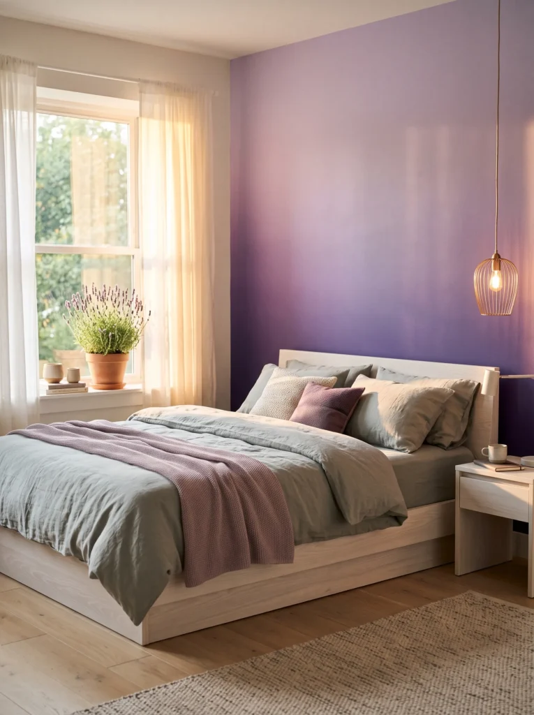
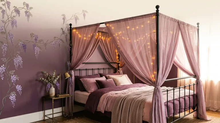
- Walls: A hand-blended ombre wall — pale wisteria near the ceiling deepening to a richer violet-purple at the baseboard — in matte finish
- Bedding: Soft sage-gray linen duvet with a wisteria-purple knit throw draped diagonally
- Wall decor: A single asymmetrical branch-style wall sculpture in aged bronze, mounted above the headboard
- Plants: An actual potted lavender plant (yes, real Lavandula) on the windowsill in a raw stoneware pot — it’s one of the few flowers that matches the room’s name and palette exactly
- Hanging element: A woven bronze-wire pendant light with a fabric wisteria-colored shade
- Rug: A sage-gray wool rug with a subtle ombre wash toward the edges
- Curtains: Sheer pale wisteria voile panels that soften as the wall color deepens below them
- Furniture/hardware: A low platform bed in whitewashed ash wood with aged bronze legs
Why this works: An ombre wall does what a single flat purple can’t — it gives the room visual movement and depth without a single extra accessory.
I’d never attempted an ombre wall myself until a client asked for something that felt “like dusk settling into a room,” and it turned out to be one of the more forgiving techniques I’ve worked with. You don’t need to be a professional painter — a natural sea sponge and two paint colors blended while still wet does most of the work. The gradient reads as intentional and soft rather than sloppy, and it solves a real styling problem: a flat, single-tone purple wall can feel one-dimensional in photos, while this version shifts depending on the light and time of day.
Real lavender on the windowsill is the detail that makes this room feel grounded in something beyond decor. Unlike a purple-leafed houseplant chosen purely for color-matching, actual Lavandula brings scent, texture, and a genuine connection to the room’s name — and it thrives in a sunny window with minimal care, which matters if you’re not naturally plant-inclined. Paired with the aged bronze fixtures and the sage-gray textiles underneath, this bedroom feels like an actual dusk garden rather than a themed paint job, which is the whole point of a real lavender bedroom styling done well.
Lavender-Gray & Warm Copper
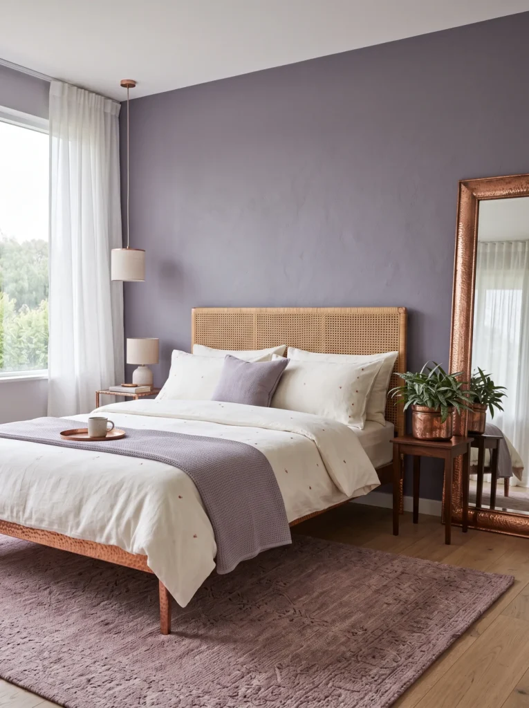
- Walls: Lavender-gray (a soft, smoky purple with almost no saturation) in a warm matte finish
- Bedding: Copper-flecked ivory linen with a lavender-gray quilted coverlet
- Wall decor: A large, irregularly shaped leaned mirror with a hammered copper frame
- Plants: Silver Squill (Ledebouria) in a copper pot — its silvery, purple-striped leaves pick up the wall’s undertone without competing with it
- Hanging element: A woven copper-wire hanging shelf holding a small trailing succulent
- Rug: A vintage-inspired rug in dusty rose and lavender-gray
- Curtains: Ivory linen curtains with a subtle copper-thread edge trim
- Furniture/hardware: A curved rattan headboard with copper-finished bed frame legs
Why this works: Lavender-gray is the quietest version of purple on this list, which makes it the easiest entry point for a reader who wants the palette without a saturated statement wall.
A lavender-gray wall photographs differently at every hour of the day, appearing more gray in overcast morning light and more distinctly purple under warm evening lamp light — which is exactly why it reads as sophisticated rather than flat. That shifting quality is what separates a genuinely well-considered neutral-purple from a wall that just looks washed out. Copper hardware amplifies the effect, since its warm undertone pulls the purple forward in evening light in a way that silver or black hardware simply doesn’t. It’s a subtle color, but subtle doesn’t mean boring.
This is a room built for someone who wants a full purple bedroom design without it dominating every photo. The rattan headboard adds texture and a slightly organic, current shape instead of a sharp upholstered frame, and the dusty rose accents in the rug keep the palette from feeling one-note. I’ve noticed rooms like this tend to age well precisely because the wall color is so quiet — you can swap the copper accents for brass or update the rug in a few years without ever touching the paint, which makes it a genuinely practical long-term choice.
Iris & Pewter
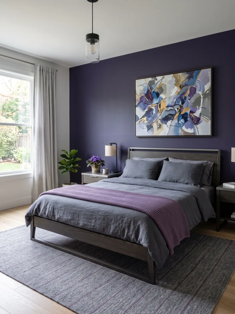
- Walls: True iris purple (a deep, cool-toned blue-violet, richer than periwinkle but not as dark as aubergine) in matte finish
- Bedding: Slate-gray linen with an iris-purple ribbed knit throw
- Wall decor: A single large-scale abstract painting in iris, slate, and cream, hung slightly above standard eye level for drama
- Plants: African Violet in a pewter pot on the nightstand — its classic purple bloom is one of the few flowering houseplants that thrives indoors year-round with minimal light
- Hanging element: A pewter-finished ring pendant with a frosted glass diffuser
- Rug: A slate-gray flatweave rug with a thin iris pinstripe border
- Curtains: Slate linen curtains hung on a pewter rod, floor-to-ceiling for height
- Furniture/hardware: An angular, low-profile bed frame in dark ash wood with pewter hardware
Why this works: True iris purple leans cool and saturated enough to feel dramatic, but because it’s a genuine violet rather than a near-black plum, it still photographs unmistakably purple in every lighting condition.
African Violets are one of the few flowering houseplants that reliably bloom indoors year-round, making them a genuinely low-maintenance way to introduce living purple color into a bedroom rather than relying on cut flowers that need replacing weekly. They prefer bright, indirect light — a north- or east-facing windowsill works well — and they’re forgiving of the kind of inconsistent watering schedule most people actually keep. I’ve killed more finicky houseplants than I’d like to admit, but African Violets have survived every bedroom I’ve styled with them, which says something about how genuinely low-effort they are.
Hanging the abstract painting slightly higher than eye level is a small trick that makes a room with a standard eight-foot ceiling feel taller than it is — it draws the eye upward and creates the illusion of more vertical space. Pewter hardware throughout keeps the whole room cool and architectural rather than romantic, which suits iris purple’s more saturated, confident character. This is a bedroom for someone drawn to lavender and purple bedroom decor ideas that feel moody and considered rather than soft and floral — a full purple bedroom design built on contrast and clean lines.
Heliotrope & Glossy Chrome
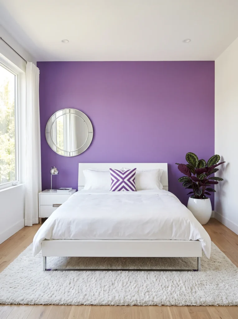
- Walls: Heliotrope (a vivid, saturated pink-purple, brighter and more electric than orchid) in a matte finish, painted on the headboard wall only
- Bedding: Crisp white cotton sateen with a heliotrope-and-white geometric throw pillow
- Wall decor: A glossy chrome-framed mirror in a bold circular shape, hung as a statement piece
- Plants: Calathea Purpurea in a glossy white ceramic pot — its leaves are deep green on top with a vivid purple underside, revealed every time the leaves fold up at night
- Hanging element: A chrome and clear-glass globe pendant, hung in a cluster of three at varying heights
- Rug: A white shag rug with subtle texture, kept intentionally simple against the bold wall
- Curtains: Sheer white curtains with a chrome grommet detail at the top
- Furniture/hardware: A glossy white lacquer platform bed with polished chrome legs
Why this works: Heliotrope is the boldest, most saturated shade on this list, and pairing it exclusively with white and chrome keeps a genuinely electric color from feeling chaotic or overstimulating.
Calathea Purpurea is a plant I recommend constantly for exactly this kind of bold, modern bedroom, because it does something no other plant on this list can — its leaves visibly fold upward at night, revealing a deep purple underside that’s hidden during the day. It’s called nyctinasty, and it’s a genuine, observable behavior tied to the plant’s internal light-sensing rhythm, not just a decorative quirk. Watching it happen in real time is oddly satisfying, and it means this bedroom subtly changes character between afternoon and evening, which is a small but memorable detail most purple-themed rooms never offer.
Glossy chrome and white lacquer are a deliberate departure from the warmer metals used throughout most lavender bedroom styling, and that’s intentional — heliotrope is bright and electric enough that it needs a cool, high-shine counterpart rather than warm brass or copper, which would fight the color’s intensity. The clustered pendant lights at varying heights add movement without adding more color, letting the wall stay the singular bold statement. This is the idea for a reader who wants their full purple bedroom design to feel genuinely modern and a little daring, not soft or traditional.
You’ll Also Love:15 Jewel Tone Bedroom Ideas That Feel Rich
True Lilac & Brushed Brass
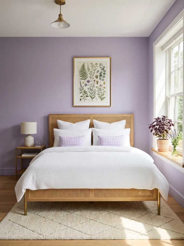
- Walls: True lilac (a clear, medium-light purple — brighter and more saturated than dusty lilac) in a soft matte finish
- Bedding: White waffle-weave cotton with a lilac gingham accent pillow
- Wall decor: A large-scale pressed botanical print in a slim brushed brass frame, hung centered above the headboard
- Plants: Purple Basil in a brushed brass pot on the windowsill — an edible herb with genuinely purple leaves that doubles as a fragrant, functional plant rather than a purely decorative one
- Hanging element: A brushed brass and rattan pendant light, hung slightly forward of the headboard
- Rug: A cream diamond-weave rug with subtle texture
- Curtains: Lilac-and-white striped linen curtains, hung high to draw the eye upward
- Furniture/hardware: A cane-front bed frame with brushed brass legs
Why this works: True lilac is bright enough to feel cheerful and daylight-friendly, which makes it the most naturally “morning” shade in this whole palette.
Purple Basil is a plant I recommend more than people expect, mostly because it does something few decorative houseplants can: it’s genuinely useful. You can snip leaves for cooking, it thrives in a sunny windowsill with regular water, and its deep purple-black foliage happens to complement a lilac wall better than most trailing houseplants sold purely for their looks. That’s the plant-science bias showing — I’d rather recommend something that earns its spot on a windowsill twice over. Paired with the brushed brass pendant and cane bed frame, this room feels bright, functional, and genuinely lived-in rather than staged.
Hanging the curtains higher than the window frame itself is a trick worth using in almost any bedroom, but it matters especially here, where the goal is airy and daylight-bright rather than moody. Extra vertical drop makes the ceiling feel taller and lets more light spill in around the edges of the panels. Combined with the cream diamond-weave rug and white waffle bedding, the lilac wall stays the clear star of the room without anything else competing for attention — a full lavender bedroom decor idea built entirely around morning light.
Hyacinth Violet & Gunmetal
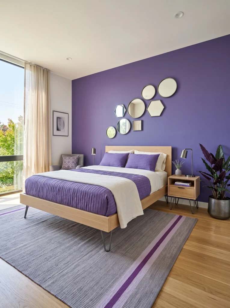
- Walls: Hyacinth violet (a bright, clear purple with a slight blue undertone, named for the spring flower) in matte finish
- Bedding: Ivory linen with a hyacinth-purple pleated coverlet folded at the foot
- Wall decor: An asymmetrical cluster of small gunmetal-framed mirrors, arranged in a loose diagonal line
- Plants: Alocasia ‘Purple Sword’ in a gunmetal-gray pot — its arrow-shaped leaves have a distinct purple cast on the underside, visible whenever a breeze or ceiling fan moves them
- Hanging element: A gunmetal ring pendant with exposed bulb, hung low and off-center
- Rug: A light gray flatweave rug with a thin hyacinth stripe
- Curtains: Ivory linen with a gunmetal grommet top
- Furniture/hardware: A low platform bed in matte white oak with gunmetal hairpin legs
Why this works: Gunmetal is cooler and more industrial than pewter or matte black, giving a bright purple wall an edge that keeps the room from tipping into anything too soft or floral.
Mixed-metal minimalism — pairing one dominant finish like gunmetal with a single warm accent elsewhere in the room — is one of the clearest markers of a current, 2026-forward bedroom rather than a dated one. Here, that warmth comes through in the wood tones of the platform bed rather than a second metal, which keeps the palette disciplined instead of scattered. The Alocasia’s arrow-shaped leaves add height and drama in a way most trailing plants can’t, giving the room a vertical anchor point that draws the eye upward toward the mirror cluster instead of leaving the wall feeling empty above the headboard.
The diagonal mirror arrangement is intentionally imperfect — not a symmetrical grid, but a loose scatter that mimics how light naturally falls across a wall in the late afternoon. That asymmetry is what keeps this bright lavender bedroom decor idea from feeling like a showroom display. Everything else in the room stays quiet and neutral, from the ivory linen to the light gray rug, so the hyacinth violet wall and the gunmetal accents can do all the visual work without competing against a busy supporting cast.
Crocus Purple & Warm White Oak
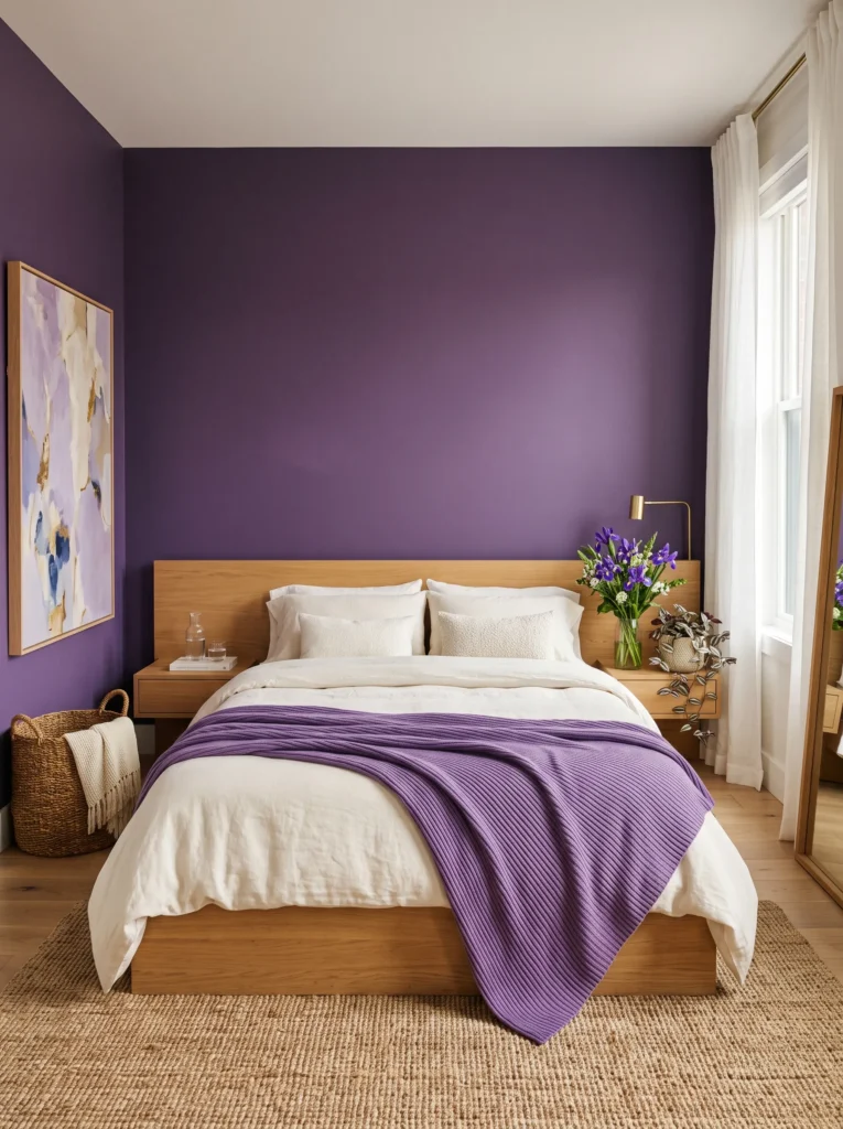
- Walls: Crocus purple (a saturated, true violet-purple named for the early-spring flower, brighter than iris but not pink-leaning like heliotrope) in matte finish
- Bedding: Warm ivory linen with a crocus-purple ribbed knit blanket folded across the bed
- Wall decor: A tall, narrow leaned art piece in crocus and cream abstract brushstrokes, propped in the corner beside the bed
- Plants: A cut bouquet of fresh iris flowers in a simple clear glass vase on the nightstand, alongside a potted Tradescantia zebrina for a permanent purple-leafed anchor
- Hanging element: A warm white oak and cream rope pendant, hung centered above the nightstand
- Rug: A warm white oak-toned jute-blend rug
- Curtains: Crocus-purple linen curtains, a full shade darker than the wall, framing the window
- Furniture/hardware: A warm white oak platform bed with integrated wood nightstands, no metal hardware at all
Why this works: Removing metal from the equation entirely and leaning on warm white oak instead lets a saturated purple like crocus feel Scandinavian and calm rather than bold and dramatic.
I’ve noticed that readers planning a full purple bedroom design almost always assume they need a metal accent to “finish” the room, but that’s not actually true. Warm white oak — the same tone that’s become popular in modern flooring and furniture — does the same grounding job a brass or black finish would, just quieter. It’s also a detail my husband points out often on renovation projects: white oak has become one of the most requested wood tones in new-build bedrooms because it reads warm without going orange, unlike the honey oak popular a decade ago.
Fresh cut iris flowers are a small, seasonal touch that most purple bedroom decor ideas skip in favor of permanent houseplants only, but they’re worth the extra effort. Iris blooms typically last about a week in water, and refreshing them regularly means the room’s purple accent literally changes and breathes with the seasons, unlike a static plant or painted wall. Paired with the Tradescantia zebrina as a permanent purple-leafed backup, this bedroom balances something fleeting and something lasting — a crocus purple room that feels considered rather than assembled once and left untouched.
Sugar Plum & Antique Brass
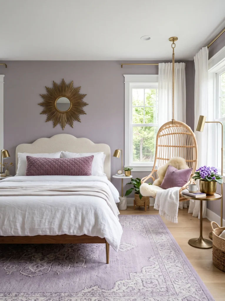
- Walls: Sugar plum (a bright, candy-toned violet-purple with a touch of pink warmth) in matte finish
- Bedding: Soft white linen with a sugar plum quilted euro sham and a cream tufted throw
- Wall decor: A round, sunburst-style mirror in antique brass, hung as the room’s single statement piece
- Plants: A flowering Streptocarpus (Cape Primrose) in an antique brass pot — its violet-purple blooms last for months indoors under bright, indirect light
- Hanging element: An antique brass and rattan swing chair suspended in the corner, doubling as both hanging decor and functional seating
- Rug: A cream and lilac medallion-pattern rug
- Curtains: White linen curtains with a sugar plum tieback
- Furniture/hardware: A scalloped-edge upholstered headboard in cream boucle with antique brass frame legs
Why this works: A hanging swing chair is the kind of unexpected, functional detail that turns a bedroom corner from wasted space into the room’s most photographed feature.
Most full purple bedroom design ideas treat the corners of a room as afterthoughts, but a suspended rattan swing chair does double duty — it’s genuinely useful seating for reading or getting dressed, and it visually repeats the room’s warm brass and natural material story in a spot that would otherwise sit empty. If you’re renting or worried about ceiling anchor points, my husband’s advice is to always locate a ceiling joist rather than relying on drywall anchors alone; a properly mounted swing chair needs real structural support, not just a decorative hook. That’s a detail worth checking before installation, not after.
Streptocarpus is an underused choice for anyone who wants living purple color without committing to foliage plants alone — its violet-toned blooms can last for months with bright, indirect light and consistent watering, genuinely rivaling African Violets for longevity indoors. Paired with the scalloped headboard’s soft curves and the sunburst mirror’s warm brass glow, this bedroom leans playful and a little maximalist in the best way. It’s a sugar plum-toned lavender bedroom decor idea built for someone who wants their space to feel joyful, not just tasteful.
Violet Bloom & Whitewashed Wood
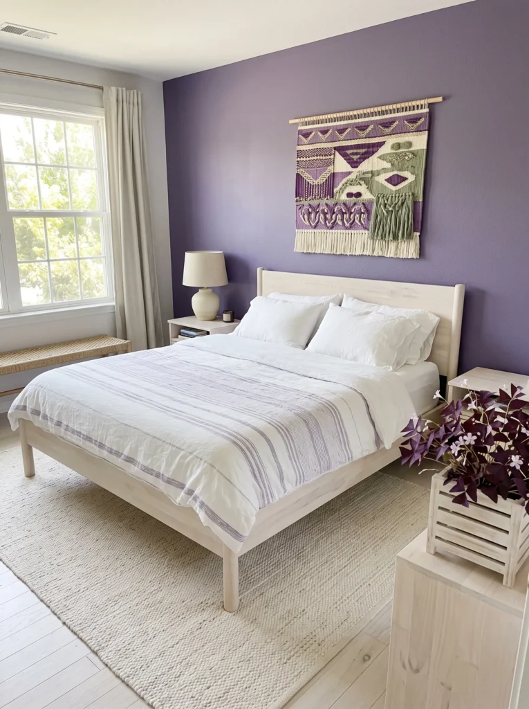
- Walls: Violet bloom (a fresh, medium-bright purple with a slightly cool undertone, close to a fresh violet flower) in matte finish
- Bedding: Crisp white linen with a violet bloom striped duvet cover
- Wall decor: A hanging textile tapestry in violet, cream, and sage, woven rather than printed
- Plants: A hanging Violet Oxalis (Oxalis triangularis) in a whitewashed wood-slat planter — its triangular purple leaves fold shut at night, similar to a shamrock, adding subtle daily movement
- Hanging element: The tapestry itself doubles as the room’s hanging statement, paired with a small whitewashed wood and rope pendant light
- Rug: A whitewashed jute rug with natural texture
- Curtains: Sheer white linen with a violet bloom trim along the bottom hem
- Furniture/hardware: A whitewashed wood bed frame with simple dowel legs, no metal hardware visible
Why this works: A woven textile tapestry instead of framed art gives the wall softness and handmade texture, which keeps a bright purple room from feeling too polished or showroom-like.
A woven tapestry adds acoustic softness to a bedroom the way framed art simply can’t — fabric absorbs sound rather than reflecting it, which is a small but real reason textile wall hangings tend to make a room feel quieter and calmer than one filled with hard-surfaced decor. That’s a detail rarely mentioned in bedroom styling advice, but it’s worth considering if your bedroom doubles as a reading nook or a space you actually want to feel hushed. Whitewashed wood throughout — the bed frame, the planter, the pendant — keeps the room feeling bright, natural, and a little coastal, letting the violet bloom wall stay saturated without the room ever feeling heavy.
The Oxalis triangularis is one of my favorite plants to recommend for exactly this kind of room, because its behavior is genuinely interesting to watch, not just its color. The triangular purple leaves fold closed at night and reopen with morning light, a movement called nyctinasty that’s shared by a handful of purple-leafed plants. It gives this violet bloom lavender bedroom decor idea a quiet, living rhythm — the room subtly shifts character between day and night, which is a detail that makes a space feel genuinely alive rather than simply decorated once and left static.
Styling Principles: Making Purple Feel Finished, Not Themed
The single biggest mistake in lavender and purple bedroom decor is treating color as a single-textile decision — one duvet, one throw pillow — instead of a material story that repeats across the room. A color only reads as intentional design once it appears in at least three different material types: a wall treatment, a textile, and a hard surface like wood, ceramic, or metal. That’s why the bedding-only approach so many articles default to tends to look unfinished no matter how expensive the sheets are.
The second principle is variation within repetition. Every idea above uses a distinct shade of purple — never the exact same violet twice — because repeating one flat tone across every surface flattens a room instead of unifying it. Let your wall color, your plant’s natural foliage, and your textile accents sit a shade or two apart from each other. That subtle mismatch is what separates a curated room from a paint chip enlarged to full scale.
Finally, don’t skip the plant. A living, purple-toned plant does something a purple-dyed object can’t: it adds genuine texture, seasonal change, and — in cases like Calathea or Oxalis — actual movement throughout the day. It’s the detail readers notice in photos even when they can’t quite say why.
Frequently Asked Questions
Is purple or lavender too bold for a bedroom? Not if the shade is chosen with intention. Lighter, grayed-down tones like dusty lilac or lavender-gray function almost like a neutral, while saturated shades like grape or heliotrope work best as a single accent wall rather than a full-room treatment for first-time purple users.
What are the best plants for a purple or lavender bedroom? Plants with genuinely purple-toned foliage work best, since they echo the palette without relying on a colored pot alone. Strong options include Persian Shield, Tradescantia (Purple Heart and Nanouk varieties), Purple Waffle Plant, Purple Passion Plant, and Oxalis triangularis, alongside flowering choices like African Violet and Streptocarpus.
What metal accents pair best with purple walls? It depends on the shade’s undertone. Cool, blue-leaning purples like periwinkle or iris pair well with silver, chrome, or gunmetal, while warm, pink-leaning purples like thistle or sugar plum look richer against brass, gold, or copper. Matte black works as a neutral bridge across almost any purple tone.
What’s the best paint finish for a saturated purple wall? A matte or eggshell finish is generally recommended over satin or gloss. Higher-sheen finishes reflect light unevenly on deeply saturated colors, which can make a rich purple look patchy or shift color under lamp light in the evening.
How can I do a full purple bedroom on a budget? Focus your paint budget on one accent wall rather than all four, then let inexpensive layers do the rest of the work: a single purple-toned houseplant, a thrifted mirror in the right metal finish, and one textile piece like a throw or curtain panel. Repeating the color across just three low-cost elements still creates a finished look.
Does a north-facing room change how purple paint looks? Yes. North-facing rooms receive cooler, indirect light that tends to mute warm colors, so a grayed-down shade like muted plum often looks richer there than a bright, saturated violet, which can appear duller under the same conditions.
Conclusion
A truly beautiful purple or lavender bedroom isn’t about finding the perfect bedding — it’s about letting one thoughtful color show up in the walls, the plant on your windowsill, the metal on your nightstand, and the textiles you layer on top. I’ve seen how small changes like these, done with intention rather than randomly, completely transform a room from “nice sheets” into a space that actually feels designed. Whichever shade speaks to you, whether it’s a soft dusty lilac or a bold heliotrope, pick one idea and try it fully rather than half-committing to several.
Save this post to Pinterest for when you’re ready to start, and share it with anyone who’s been stuck staring at a lavender duvet wondering what else the room needs.