15 Modern Fall Bookshelf Styling Ideas for a Rich Look
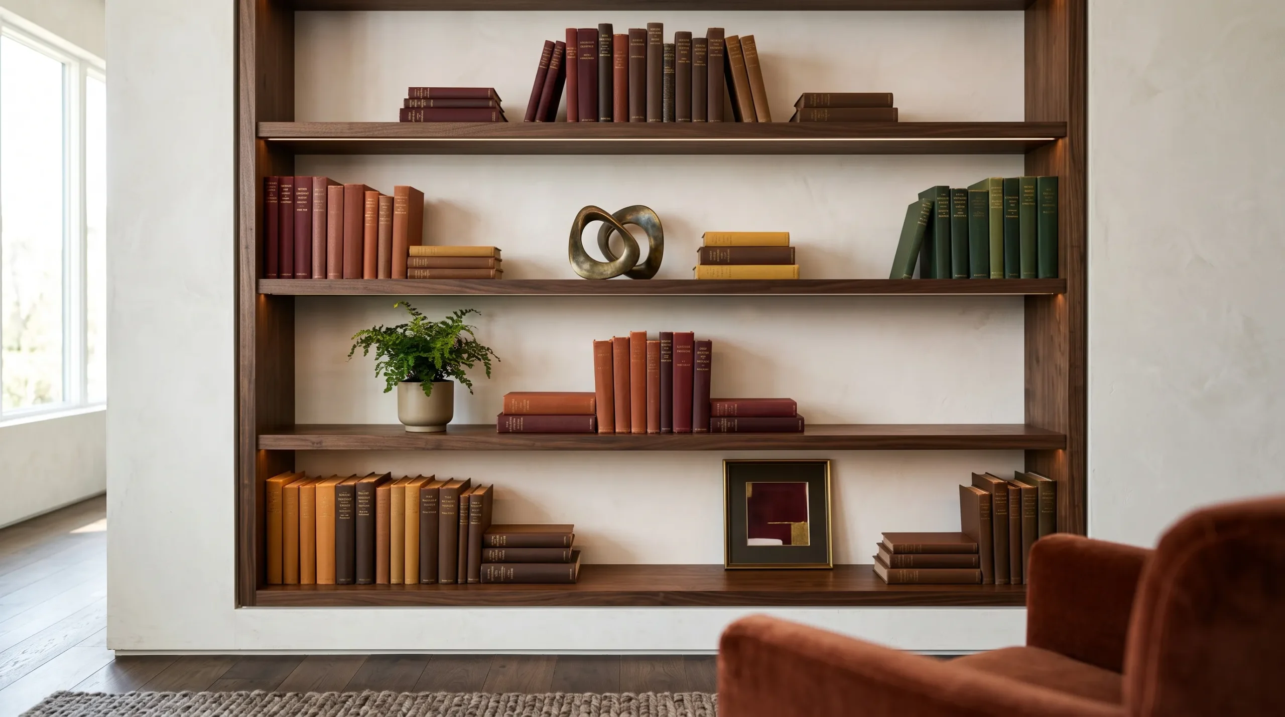
A bookshelf can completely change the mood of a room in fall, but it doesn’t need pumpkins, plaid, or a sea of beige accessories to feel seasonal. The most interesting fall bookshelf styling ideas use the books themselves as part of the design, layering rich burgundy, oxblood, rust, amber, mustard, chocolate, and tobacco tones with meaningful objects, artwork, ceramics, and healthy greenery.
The key is creating visual rhythm rather than filling every open space. Varying book direction, object height, material, and color gives a bookcase the relaxed character of a real collection while keeping the composition intentional.
In this guide, you’ll find 15 distinctive ways to style a bookshelf for fall, including moody bookcase arrangements, colorful autumn shelf decor, small-space solutions, plant styling, built-in lighting considerations, and practical tricks for creating depth without buying an entirely new collection of decor.
What Makes a Bookshelf Look Collected?
A styled bookshelf feels collected when the eye finds variation without losing a sense of order. Asymmetry and varied object heights create visual rhythm: shelves with identical heights and evenly spaced objects can look assembled all at once, while deliberate differences in scale and placement suggest a collection that developed naturally. Book spines also function like a color palette, giving the shelf a visual foundation before decorative objects are added. I’ve found that the shelves I like most usually have one strong focal point, a few quieter companions, and enough empty space for each piece to breathe. A collected bookshelf is organized by visual rhythm, not perfect symmetry. These ideas show you exactly how to create that balance for fall.
1. Oxblood Library Stack
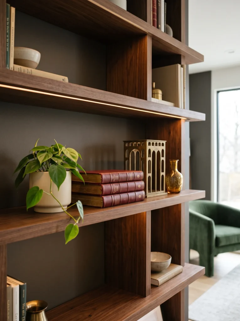
- Palette: Oxblood, dark walnut, antique brass, parchment, and muted amber.
- Books: Place three richly bound books horizontally on the left, with their largest cover underneath and the smallest on top.
- Anchor: Use a small antique brass architectural sculpture centered on the book stack.
- Supporting objects: Add one narrow amber glass object beside the stack, keeping its height below the sculpture.
- Greenery: Tuck a small trailing heartleaf philodendron into the far right corner.
- Lighting: If the shelf has built-in lighting, use warm 2700K illumination aimed downward.
- Negative space: Leave roughly one-third of the shelf visually open on the right.
Why this works: The low horizontal book stack establishes visual weight, while the taller brass sculpture creates intentional upward movement.
The strongest element here is actually the book color. Oxblood spines behave almost like a painted accent wall, giving the shelf depth without requiring a large decorative object. Because the books are stacked horizontally, their horizontal lines contrast with the vertical greenery and sculpture. That contrast creates visual rhythm rather than visual clutter. The brass also introduces a reflective surface against the matte walnut and paper, which helps the arrangement change subtly as daylight moves across the room. Keep the sculpture slightly off-center; perfect centering would make the composition feel more like a display vignette than a working bookshelf.
I’ve found this formula particularly effective on dark-stained built-ins because walnut and oxblood visually connect without becoming monochromatic. My husband’s construction work has also made me more conscious of what actually sits on shelves: three large art books can become surprisingly heavy, especially when several shelves are loaded this way. For permanent built-ins, check the shelf’s span and weight capacity before creating repeated heavy stacks. If the shelf is shallow, use fewer books rather than forcing a taller pile. The goal is a substantial base with breathing room above it, not maximum shelf occupancy.
2. Rust Art-Led Shelf
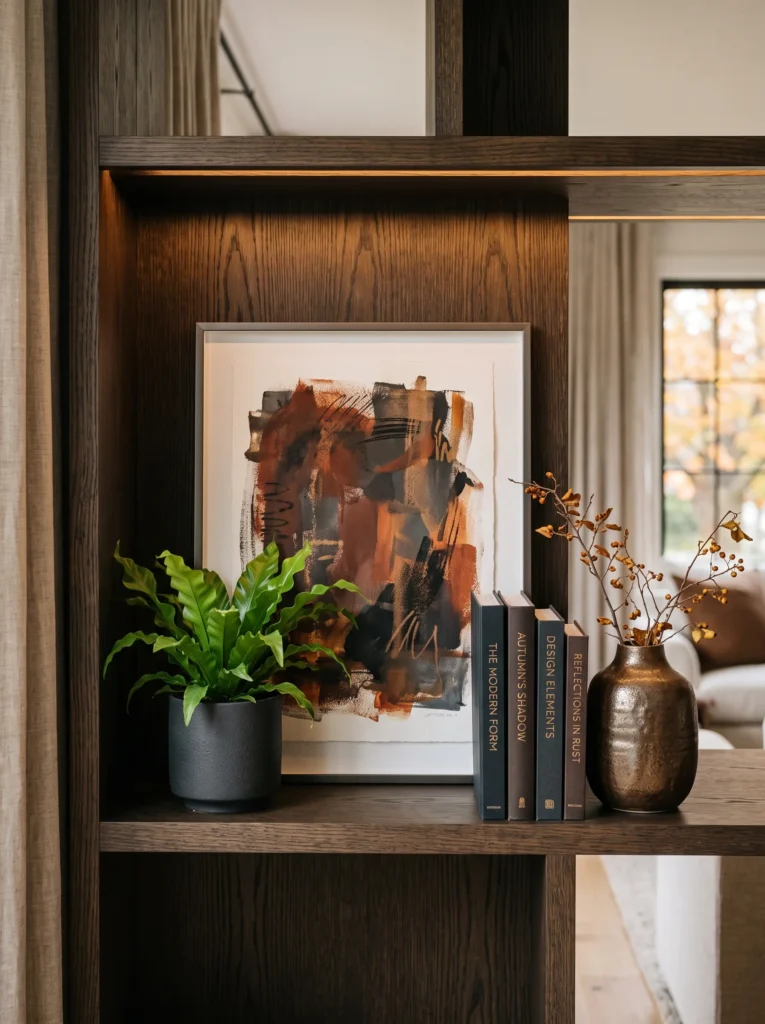
- Palette: Burnt rust, charcoal, aged ivory, smoked oak, and dark bronze.
- Books: Arrange four charcoal and rust-toned books vertically, leaning the final book slightly.
- Anchor: Lean one framed abstract artwork against the back of the shelf.
- Supporting objects: Place a small dark-bronze stoneware piece in front of one lower corner of the frame.
- Greenery: Add a compact bird’s nest fern in a charcoal planter.
- Lighting: Use a concealed warm LED strip along the upper interior edge if available.
- Negative space: Keep a visible gap between the artwork and adjacent books.
Why this works: Leaning artwork creates depth because the frame occupies the background plane while books and objects remain in the foreground.
A bookshelf can act as a miniature layered composition when the back plane, middle plane, and front plane are treated separately. Here, the artwork becomes the background layer, the vertical books establish the middle layer, and the bronze vessel provides the foreground accent. This is particularly effective when the artwork has rust or charcoal marks that echo the books without matching them exactly. The slightly tilted book is important, too. A small directional change interrupts the repeated vertical lines and gives the eye somewhere to move. The composition therefore feels designed, but not rigidly arranged.
This is one of the arrangements I’d use when a shelf already feels visually flat. Instead of adding more accessories, I’d first introduce something with a larger visual plane, such as framed art. The bird’s nest fern then supplies a completely different texture through its fine, arching foliage. From my plant-science background, I’m always looking at foliage as part of the composition rather than simply a finishing touch. Ferns work especially well here because their delicate texture contrasts with the solid geometry of books, wood, and a rectangular frame without competing for attention.
3. Amber Ceramic Focal Point
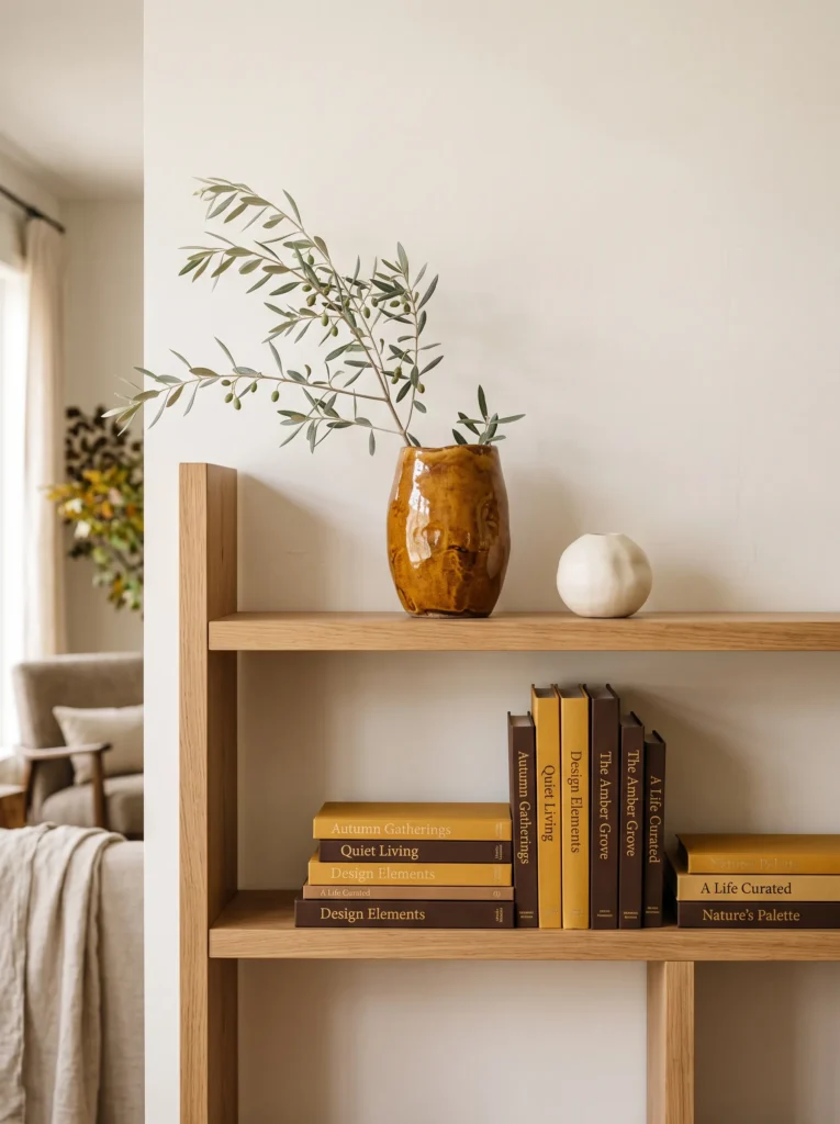
- Palette: Burnt amber, mustard yellow, chocolate brown, aged ivory, and natural oak.
- Books: Create an alternating arrangement with two mustard and brown books stacked horizontally and three ivory and chocolate books standing vertically.
- Anchor: Use a large hand-thrown amber ceramic vessel.
- Supporting objects: Add one small ivory ceramic bead or stone.
- Greenery: Place one slender olive branch in the amber vessel.
- Lighting: Let existing warm room light catch the vessel’s translucent glaze.
- Negative space: Leave open shelf surface around the vessel.
Why this works: A saturated ceramic vessel becomes the color anchor, while contrasting book orientations distribute visual weight.
Color hierarchy matters more than the number of decorative pieces on a shelf. The amber vessel carries the strongest saturation, so the books should support rather than compete with it. Mustard introduces a neighboring warm tone, while chocolate brown grounds the arrangement and aged ivory prevents the palette from becoming too dense. Notice that the books change direction rather than simply alternating randomly. The vertical group supplies height, while the horizontal stack creates a lower visual mass. This difference in orientation gives the shelf structure even though only one decorative object is doing most of the visual work.
I use this type of arrangement when I want the books themselves to feel like part of the decoration. A richly colored shelf does not need a collection of seasonal accessories to announce autumn. The amber glaze catches light beautifully, while the olive branch introduces a narrow organic line that prevents the composition from feeling overly geometric. My preference is to let one material dominate each shelf rather than distributing many finishes equally. Here, ceramic is the focal material, wood provides warmth, and paper quietly fills the background. The result feels intentional without looking like a seasonal display purchased as a matching set.
4. Chocolate Leather Collection
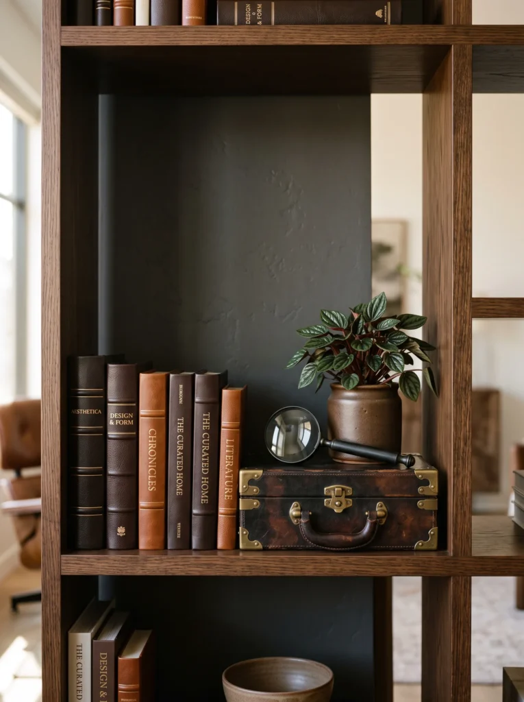
- Palette: Espresso brown, cognac leather, muted cream, blackened bronze, and dark oak.
- Books: Stand five leather-bound books vertically, with two smaller cream books stacked horizontally beneath one end.
- Anchor: Use a vintage leather book box with brass corner details.
- Supporting objects: Place a small blackened-bronze magnifying glass on top of the horizontal books.
- Greenery: Add a compact Peperomia obtusifolia in a dark brown ceramic pot.
- Lighting: Use a warm directional picture light if available.
- Negative space: Leave generous space on both sides of the central grouping.
Why this works: A concentrated dark center creates visual weight, while open space around it prevents rich materials from feeling dense.
Books can be more than background texture when their bindings have substantial material presence. Leather, especially in espresso and cognac tones, introduces a tactile quality that printed paper cannot provide. The arrangement works because the darkest values are concentrated rather than scattered across the shelf. That creates a visual center without requiring symmetry. The cream books beneath the leather volumes also create a value shift, giving the eye a place to pause. Rather than adding several decorative accents, the vintage book box and magnifying glass reinforce the library character through related materials and proportions.
I particularly like this formula for a study, office, or living room with architectural shelving. My husband’s construction work has made me appreciate that decorative weight should respect the structure underneath it. If you’re using genuine leather-bound books or a substantial wooden box, distribute heavier pieces across different shelves rather than concentrating them at one end. This is also a good reason to measure shelf depth before buying accessories. A beautiful object that projects too far forward can make an otherwise carefully planned bookcase feel cramped and physically unbalanced.
5. Burgundy Botanical Layer
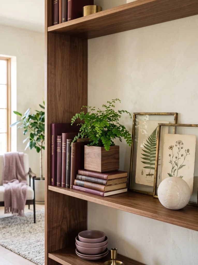
- Palette: Burgundy, dusty mauve, aged brass, pale limestone, and medium walnut.
- Books: Arrange three burgundy books vertically on the left, followed by a single pale stone-colored book.
- Anchor: Lean a botanical print with a thin aged-brass frame against the back.
- Supporting objects: Place a small limestone sphere in front of the artwork.
- Greenery: Use a delicate maidenhair fern in a low walnut planter.
- Lighting: Use natural daylight with concealed 2700K LED support at night.
- Negative space: Preserve visible backing around the artwork.
Why this works: The botanical artwork supplies a tall background shape, while the low stone form and fern create a descending visual triangle.
A triangular distribution of visual weight helps a shelf feel stable without making both sides identical. The framed botanical print creates the highest point, the burgundy books form the middle mass, and the limestone sphere supplies a low counterweight. The fern extends outward rather than upward, widening the base of the composition. This is a subtle but useful styling principle: visual triangles do not need three decorative objects arranged in an obvious triangle. They can emerge from differences in height, width, texture, and direction. The result gives the eye a path through the shelf instead of presenting everything at one level.
The maidenhair fern is the detail I would be most selective about because its delicate foliage needs the right environment to stay attractive. It prefers consistent moisture and indirect light, so I would place this arrangement on a shelf that receives filtered daylight rather than harsh afternoon sun. My plant-science background makes me cautious about treating plants as purely decorative accessories. A healthy plant contributes movement and texture; a struggling plant becomes visual noise. If your shelf conditions are too dry or dark, use a preserved botanical element instead and keep the composition visually botanical without compromising plant health.
You’ll Also Love: 20 Modern Moody Fall Decor Ideas for an Elegant Home
6. Mustard Stoneware Stack
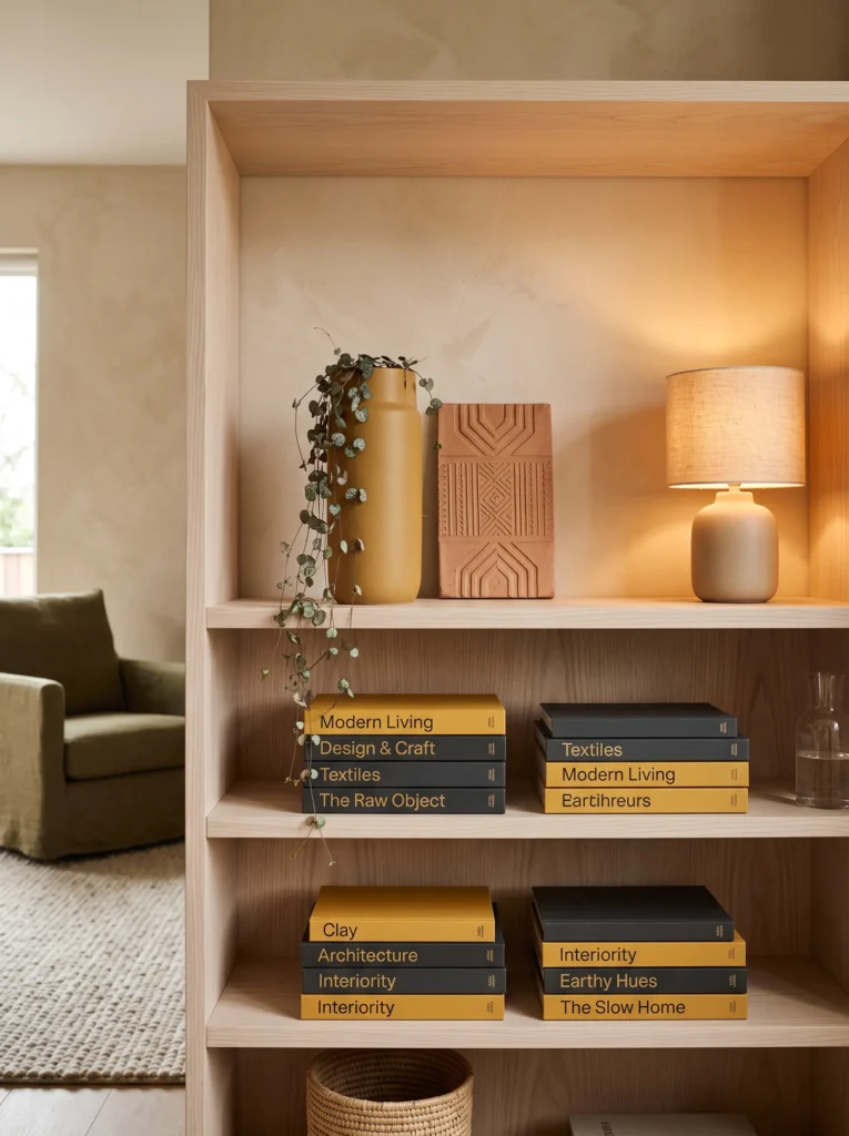
- Palette: Mustard yellow, terracotta brown, charcoal, natural linen, and pale ash wood.
- Books: Stack four books horizontally, alternating charcoal and mustard covers.
- Anchor: Use a tall hand-carved stoneware vessel with a matte mustard finish.
- Supporting objects: Add a small terracotta architectural tile.
- Greenery: Use a short string of hearts plant.
- Lighting: Position near a warm table or floor lamp.
- Negative space: Keep the upper half of the shelf largely empty.
Why this works: Alternating book colors turn the horizontal stack into a deliberate graphic element instead of treating books as filler.
Book-spine color can be handled much like paint color: repeated tones establish rhythm, while a contrasting shade creates emphasis. Here, mustard and charcoal alternate across the horizontal stack, producing a subtle visual pattern without adding another decorative object. The tall stoneware vessel then breaks that horizontal rhythm. Its matte surface is intentionally different from the smooth book covers, while the terracotta tile introduces a related earthy material behind it. The draping string of hearts adds another directional line, but because its foliage remains sparse, it does not obscure the carefully arranged book edges.
This is a useful solution when your existing book collection has mismatched covers. Rather than hiding every bright or unrelated spine, group books by value and color so they become intentional blocks. That approach costs nothing and can completely change how a shelf reads. I’ve also found that a few imperfect book edges are often more convincing than a perfectly coordinated collection. The mustard vessel gives the arrangement its seasonal identity, while the charcoal books keep it grounded. If your shelf is narrow, reduce the book stack to three volumes and preserve the same color sequence.
7. Oxblood Marble Moment
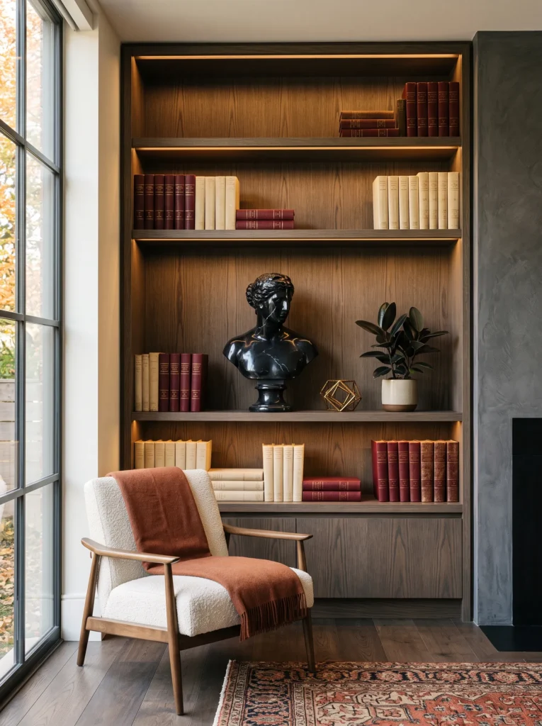
- Palette: Oxblood, black marble, antique gold, smoked oak, and parchment.
- Books: Place two oversized art books horizontally on the bottom left, then stand three slim parchment and oxblood books vertically beside them.
- Anchor: Use a small polished black-marble bust.
- Supporting objects: Add one antique-gold taper holder.
- Greenery: Place a miniature rubber plant in a black stoneware planter.
- Lighting: Install concealed warm LED lighting beneath the shelf above.
- Negative space: Leave the center-front area open around the marble.
Why this works: Dark marble anchors the composition while lighter book spines and foliage create contrast around its visual weight.
This arrangement takes a darker approach to fall bookshelf styling without relying on obvious seasonal decorations. Black marble has enough visual density to function almost like furniture, so it needs lighter elements around it rather than additional heavy accessories. The oxblood books introduce saturated color, while parchment covers keep the palette from becoming too dark. Notice that the tallest elements sit toward the sides rather than forming a symmetrical peak. That creates an asymmetrical rhythm and lets the marble bust become the visual destination. The result feels sophisticated because every material performs a different compositional role.
I would use this look on a substantial built-in where the shelf itself can visually support the darker palette. Built-in lighting makes a particularly noticeable difference here. My husband’s construction background has taught me that lighting should be considered before the shelving is finished, not squeezed in afterward. A concealed LED channel can provide much cleaner illumination than a visible clip-on light. For a retrofit, a slim rechargeable light can achieve a similar effect. Keep the light warm rather than cool; cooler LEDs can make oxblood and wood appear noticeably flatter.
8. Rust-Toned Gallery Shelf
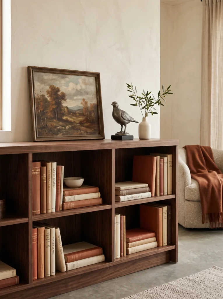
- Palette: Burnt sienna, rust, aged ivory, walnut, and aged pewter.
- Books: Stand four rust and ivory books vertically, then place one large ivory book horizontally.
- Anchor: Lean a narrow vintage landscape painting in a weathered walnut frame.
- Supporting objects: Set a small aged-pewter sculptural bird in front.
- Greenery: Use a single olive stem in a narrow brown ceramic bud vase.
- Lighting: Use directional natural light or a warm picture light.
- Negative space: Leave the upper corner beside the painting empty.
Why this works: A large background plane makes a small shelf collection feel intentional without increasing the number of objects.
One of the easiest ways to make a bookshelf look more sophisticated is to introduce an object that occupies visual space without physically filling the shelf. The vintage landscape painting does exactly that. Its frame establishes a broad background plane, while the books and pewter bird occupy smaller foreground positions. The rust palette works because the painting does not need to match the books perfectly; related undertones are enough to connect them. The ivory book provides a light interruption between the darker wood and saturated rust, creating contrast that helps each element remain legible.
For autumn bookshelf decor, I prefer this technique when the homeowner already owns artwork that has been sitting elsewhere. A shelf can become a temporary gallery without requiring new purchases or permanent installation. I would choose a painting with muted rust, brown, olive, or ochre details rather than an overtly seasonal scene. The olive stem reinforces those natural colors without introducing another strong shape. If the shelf is only 8–10 inches deep, select a narrow frame and keep it securely supported against the back rather than allowing it to project into the walking area.
9. Amber Glass & Poetry
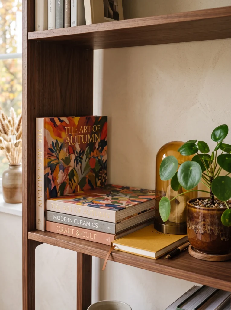
- Palette: Amber glass, deep chocolate, tobacco brown, muted mustard, and creamy parchment.
- Books: Stack three poetry and art books horizontally with their covers facing upward.
- Anchor: Place a large amber glass cloche over a small sculptural stone.
- Supporting objects: Add one mustard linen-bound journal.
- Greenery: Tuck a small pilea peperomioides into a tobacco-colored ceramic pot.
- Lighting: Place the shelf near a warm floor or table lamp.
- Negative space: Keep both sides of the central stack relatively open.
Why this works: Transparent amber glass adds color and lightness simultaneously, allowing a strong seasonal palette without visual heaviness.
Changing the direction of books can completely alter a shelf’s visual language. With the covers facing upward, the books become a horizontal color field rather than a series of vertical rectangles. This works particularly well with beautifully designed art or poetry books whose covers deserve to be seen. The amber cloche then provides a transparent vertical form, creating contrast without introducing another opaque block. Because glass catches ambient light, it also changes throughout the day. The mustard journal provides one smaller color echo, while the chocolate shelf and tobacco planter keep the brighter amber from becoming disconnected.
This is one of my favorite approaches for a bookshelf that needs to feel seasonal without looking themed. I like using plants with architectural foliage here, and the rounded leaves of a pilea create a completely different texture from paper, glass, and wood. If your pilea receives bright indirect light, its compact shape can stay relatively tidy on a shelf. I would rotate the pot occasionally so the plant grows evenly toward the light. That small maintenance habit matters because shelf styling works best when the living element remains healthy and proportional rather than becoming an overgrown focal point.
10. Dark Academia Cabinet
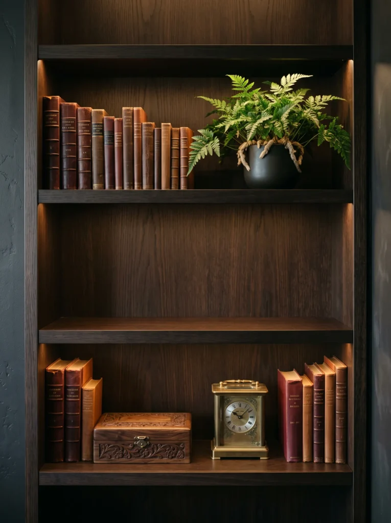
- Palette: Oxblood, espresso, antique bronze, tobacco, and aged parchment.
- Books: Arrange six books vertically in two uneven groups.
- Anchor: Place a vintage brass-and-glass desk clock between the groups.
- Supporting objects: Add one small carved wooden box.
- Greenery: Use a compact rabbit’s-foot fern in an espresso planter.
- Lighting: Use concealed 2700K LED shelf lighting.
- Negative space: Keep the gap between the book groups completely empty.
Why this works: An intentional gap separates two visual masses, allowing the central clock to function as a clear focal point.
The space between objects is just as important as the objects themselves. Here, the two book groups act as separate visual masses, while the clock occupies the middle without physically filling the gap. This creates a simple form of visual hierarchy: books establish the foundation, the clock attracts attention, and the wooden box adds a secondary horizontal line. The oxblood and tobacco tones create the autumn connection, but espresso and antique bronze prevent the arrangement from becoming overly colorful. Uneven book-group sizes are deliberate because identical clusters would introduce unnecessary symmetry.
This arrangement reminds me of why I enjoy older libraries and well-designed studies: the personality comes from useful objects rather than decorations that exist only for display. A vintage clock can suggest that character without turning the shelf into a themed vignette. If your shelves are built into a wall, I would also consider where the electrical components were planned. My husband’s construction background has taught me that hiding wiring during installation produces a much cleaner result than trying to disguise it later. For existing shelving, battery-powered warm LEDs can recreate that layered illumination without remodeling.
11. Rust Linen & Sculptural Form
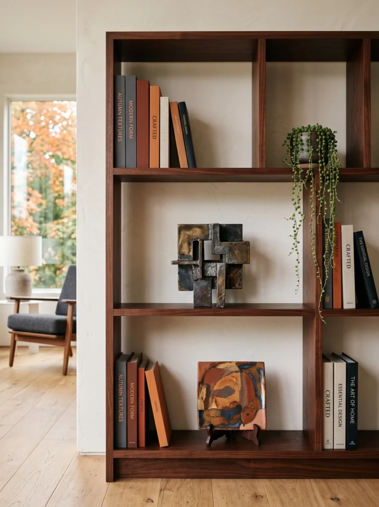
- Palette: Burnt rust, linen beige, dark cherry wood, charcoal, and aged clay.
- Books: Stack two oversized books horizontally on the right and place four slimmer charcoal and rust books vertically on the left.
- Anchor: Use an abstract folded-metal sculpture.
- Supporting objects: Place a small handmade clay tile beneath it.
- Greenery: Add a trailing string of pearls in a low charcoal planter.
- Lighting: Use soft ambient room lighting.
- Negative space: Leave the area above the horizontal books completely clear.
Why this works: Contrasting vertical and horizontal book masses balance the sculptural object without competing with its silhouette.
Sculptural pieces need breathing room because their shape is often more important than their color. The folded-metal form here has a strong directional quality, so the books deliberately create a quieter geometric counterpoint. Four narrow vertical books establish height on one side, while the larger horizontal books lower the visual weight on the other. The small clay tile creates a transition between the books and sculpture without becoming a second focal point. This is a useful principle for moody fall shelf styling: when one object has a distinctive silhouette, reduce the number of competing shapes around it.
I would especially choose this arrangement for someone who likes modern interiors but still wants autumn color. Rust gives the shelf seasonal depth without introducing pumpkins, plaid, or overtly rustic accessories. The string of pearls adds an organic line, but I would keep the trailing stems restrained because excessive foliage would hide the clean geometry. If your home has contemporary architecture, the dark cherry wood and aged metal can bridge modern and traditional elements nicely. The shelf should look like part of the room’s architecture rather than a separate seasonal installation placed on top of it.
12. Mustard Vintage Find
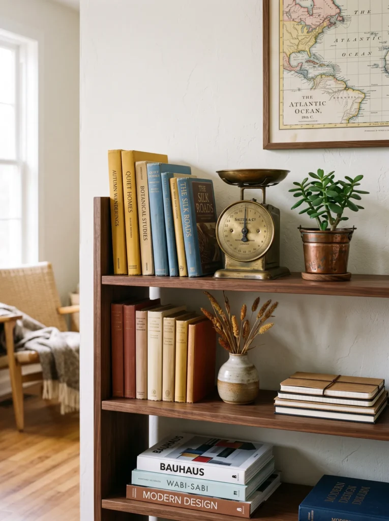
- Palette: Mustard ochre, faded denim blue, walnut, antique ivory, and aged copper.
- Books: Arrange five mixed-height books vertically, using faded blue and mustard spines as visual markers.
- Anchor: Place a small vintage brass postal scale.
- Supporting objects: Set a folded antique map partially beneath the scale.
- Greenery: Add a miniature jade plant in a weathered copper pot.
- Lighting: Use natural afternoon light where possible.
- Negative space: Leave a 5–6 inch section between the postal scale and books.
Why this works: A vintage object becomes more convincing when surrounding materials echo its age without duplicating its exact color.
The postal scale gives this shelf a narrative quality without relying on conventional seasonal props. Its aged brass relates naturally to the copper planter, while mustard and faded blue create a slightly unexpected fall palette. The books are not arranged by size alone; the alternating colors create a visual cadence across the group. The antique map is intentionally only partly visible, because a small fragment can provide texture without becoming another dominant rectangle. Leaving a physical gap around the scale also prevents the arrangement from reading as a tightly packed collection of unrelated objects.
This is the kind of shelf I would create after visiting an antique shop with no specific object in mind. The important part is not finding an item labeled “fall,” but finding something with shape, patina, and a believable connection to the room. A jade plant works beautifully because its thick leaves provide a visual contrast to fragile paper and aged metal. It also tolerates periods of drying better than many delicate houseplants, although it still needs bright light. If the shelf is too dim, move the plant elsewhere and use a small branch or botanical cutting instead.
13. Oxblood Book Sculpture
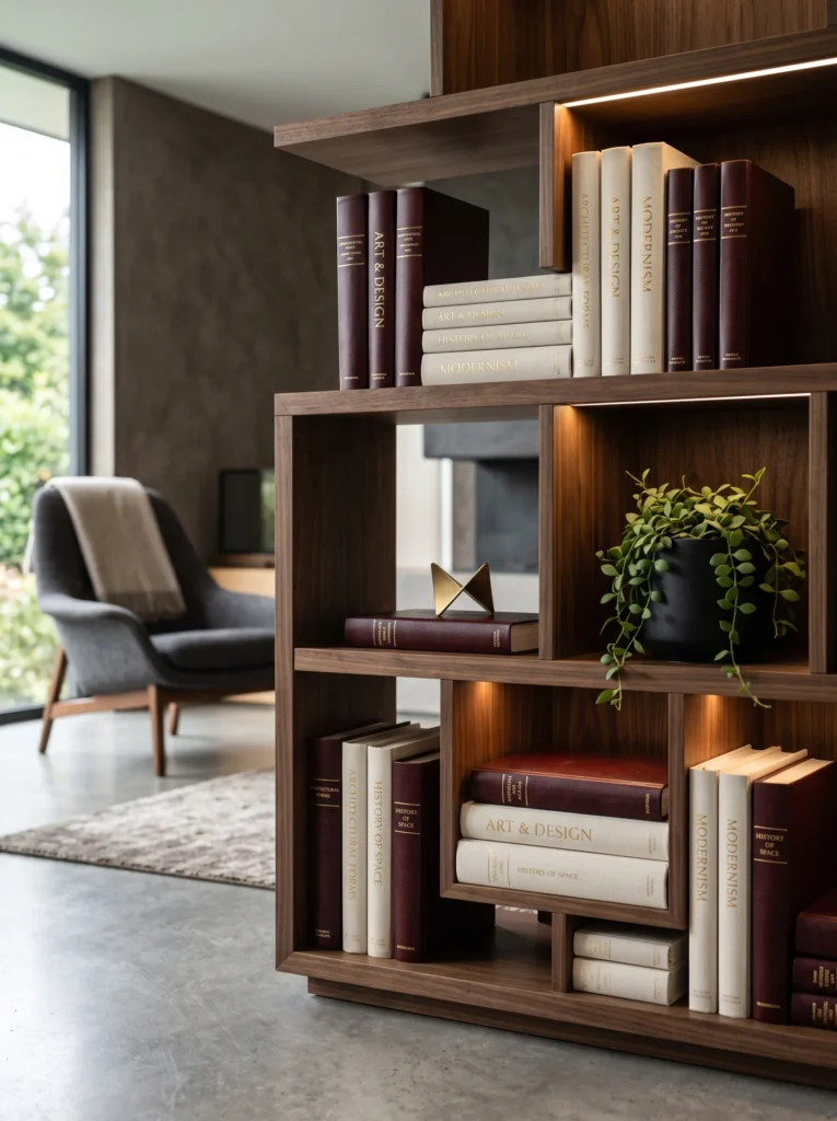
- Palette: Oxblood, warm black, ivory, dark walnut, and brushed brass.
- Books: Use seven richly bound books in a stepped formation from low to high.
- Anchor: Treat the tallest burgundy book itself as the anchor, topped with a small brass bookmark sculpture.
- Supporting objects: Add one narrow ivory book horizontally beneath the lowest section.
- Greenery: Place a small dischidia plant in a matte black pot.
- Lighting: Use concealed warm lighting behind the upper shelf.
- Negative space: Keep the center-front shelf surface visible.
Why this works: Graduated book heights create movement without requiring a separate decorative focal object.
Not every bookshelf needs a decorative object to establish hierarchy. When book bindings are beautiful enough, the books can become the composition themselves. The stepped formation creates a rising and falling rhythm that is more dynamic than placing every volume at the same height. The brass bookmark sculpture adds only a tiny metallic punctuation mark, while the ivory horizontal book breaks the darker color mass below. Because the palette is concentrated around oxblood, black, and walnut, the arrangement feels architectural rather than cluttered. The negative space around the formation is essential to preserving that effect.
I especially like this technique for homeowners who want autumn bookshelf decor without purchasing seasonal accessories. Start by pulling every book with burgundy, wine, brown, black, or deep red covers from your collection and lay them on the floor. Then experiment with height before putting anything back on the shelf. My plant-science instinct is to add greenery only after the structural composition works; otherwise, foliage can become a shortcut that hides weak spacing. A compact dischidia provides texture and movement while staying visually quieter than a large leafy plant.
14. Terracotta Ceramic Pairing
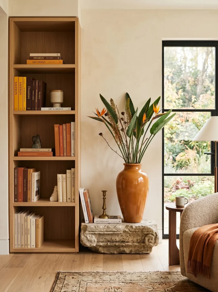
- Palette: Burnt terracotta, chocolate brown, muted saffron, limestone, and natural oak.
- Books: Place three saffron and brown books horizontally on the left, with four limestone-toned books standing vertically on the right.
- Anchor: Use a tall, narrow terracotta amphora.
- Supporting objects: Add one low limestone architectural fragment.
- Greenery: Place a bird of paradise leaf cutting in the vessel.
- Lighting: Use warm natural light from a nearby window.
- Negative space: Keep the wall behind the amphora visible above it.
Why this works: A tall narrow vessel and low stone accent create opposing heights that balance the shelf without mirroring either side.
Height variation is particularly important when decorating bookcases because shelves naturally create horizontal lines. If every object sits at roughly the same elevation, the eye moves across the shelf without much interruption. The amphora breaks that pattern vertically, while the limestone fragment provides a low counterweight. The bird of paradise cutting exaggerates the upward movement but remains sparse enough to preserve the vessel’s silhouette. Saffron books introduce a saturated seasonal note, while limestone and oak prevent the terracotta from becoming visually dominant. The composition therefore uses color and height together rather than relying on accessories alone.
This arrangement would be beautiful against light oak shelving because the terracotta introduces a deeper earthen value without making the room feel dark. I also like using a single architectural plant cutting instead of a full leafy plant when a shelf needs height. The bird of paradise has a strong linear presence, so one or two leaves are enough. If you use a fresh cutting, replace the water regularly and keep the vessel stable. For artificial or preserved foliage, choose a realistic matte finish; glossy plastic leaves can immediately undermine an otherwise carefully considered material palette.
15. Amber & Oxblood Alcove
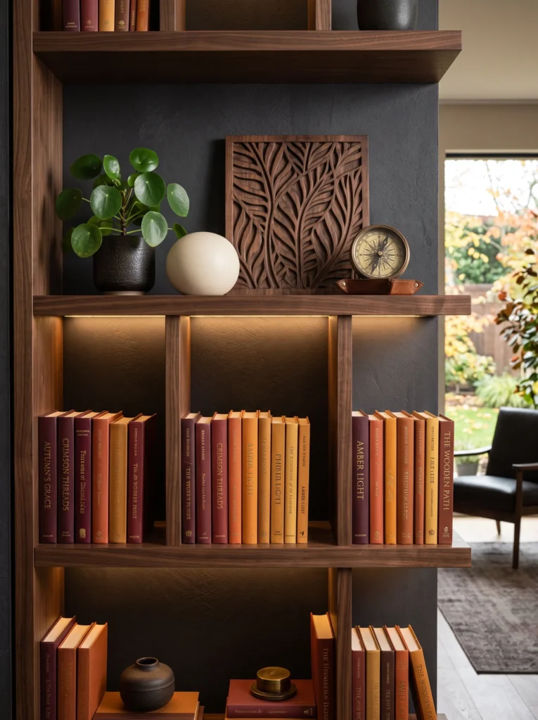
- Palette: Deep amber, oxblood, smoked walnut, aged ivory, and antique brass.
- Books: Create three distinct vertical groups of two, four, and three books, separated by small pockets of empty shelf.
- Anchor: Place a vintage carved wooden relief panel flat against the back.
- Supporting objects: Add one antique-brass compass and a small ivory ceramic sphere.
- Greenery: Use a compact Chinese money plant in a dark amber ceramic planter.
- Lighting: Build warm 2700K LED illumination into the upper shelf where possible.
- Negative space: Keep each book group separated instead of creating one continuous arrangement.
Why this works: Three separated book clusters create visual rhythm because the eye registers each group as a distinct beat rather than one continuous block.
Odd-numbered groupings often feel more intentional because they create variation in visual relationships. Here, three book clusters differ not only in quantity but also in color density and height, creating three separate points for the eye to process. The carved relief provides a strong background texture without projecting far into the shelf, while the compass and ceramic sphere supply two smaller scales. The arrangement avoids perfect symmetry, but the repeated amber and oxblood tones connect the sections. This is a useful approach when a long bookcase feels monotonous because it introduces pauses without leaving large unused areas.
For a custom built-in, I would plan this type of arrangement before the final shelf dimensions are fixed. A few inches of additional vertical clearance can make the difference between a shelf that accommodates art, plants, and books comfortably and one that only works for standard volumes. My husband’s construction experience has made me appreciate that decorative flexibility is partly an architectural decision. If you’re renovating, consider concealed LED channels, adjustable shelving, and adequate depth from the beginning. Those details give you much more freedom to change your fall shelf styling from season to season without rebuilding the composition.
Styling Principles for a Collected Fall Bookshelf
A beautiful bookshelf is easier to style when you stop thinking in terms of filling shelves and start thinking about visual weight, rhythm, color, and breathing room.
Balance Visual Weight
Heavy materials such as dark wood, marble, stone, thick ceramics, and oversized books naturally attract attention. Spread those heavier elements across the bookcase rather than placing all of them on one shelf or at one end.
Factual styling rule: A shelf feels more balanced when visual weight is distributed across different heights and positions rather than concentrated in one dense cluster.
Vary Object Heights
Mix low horizontal book stacks with medium-height vessels and taller artwork, branches, or sculptures. Avoid placing objects at identical heights because repeated horizontal lines can make a shelf look flat.
A useful approach is to create a low, medium, and high point within a larger bookshelf while allowing neighboring shelves to remain quieter.
Use Book Color as Decor
Books are not merely storage. Their spines create some of the largest color blocks on a bookshelf, so they can function almost like paint.
For a richer fall palette, look for:
- Oxblood and burgundy
- Rust and burnt sienna
- Chocolate and espresso
- Amber and cognac
- Mustard and saffron
- Tobacco and walnut
- Deep olive
- Aged ivory
Factual styling rule: Grouping books by related color values can make mismatched collections appear intentionally coordinated without replacing the books.
Follow the Triangle Principle
When arranging three major visual elements, think about their relative heights rather than placing them in a literal triangle. A tall artwork, medium book grouping, and low ceramic object can create a natural visual path.
This is particularly useful on long shelves because it prevents the eye from traveling along one monotonous horizontal line.
Let Negative Space Work
Empty shelf space isn’t unfinished styling. It gives important objects visual separation and makes saturated colors easier to appreciate.
As a practical starting point, leave roughly 20–30% of some shelf sections visually open, while allowing other shelves to carry more books.
Plan Built-Ins Around Real Weight
If you’re styling substantial books, stone objects, ceramic vessels, or architectural pieces, consider the shelf construction before decorating.
My husband’s construction background has made this especially obvious to me: decorative flexibility depends partly on the structural design of the shelving itself. For custom built-ins, ask about shelf span, material thickness, attachment points, and intended load before assuming every shelf can carry the same weight.
Consider Lighting Early
Warm shelf lighting can dramatically change autumn colors. For built-ins, concealed LED channels are usually cleaner visually than exposed fixtures.
A warm color temperature around 2700K generally complements walnut, burgundy, rust, amber, brass, and chocolate tones beautifully.
Frequently Asked Questions
How do you style a bookshelf without buying new decor?
Start with the books you already own and reorganize them by color, height, and orientation. Pull together related burgundy, brown, rust, mustard, olive, or ivory covers. Then use existing artwork, ceramics, plants, boxes, or meaningful objects as anchors. Changing the arrangement can make the same collection look completely different.
What are the best fall colors for a bookshelf?
For a richer, more sophisticated autumn palette, try burgundy, oxblood, rust, burnt sienna, chocolate brown, amber, mustard, cognac, tobacco, deep olive, and aged ivory. These colors create seasonal depth without relying on obvious orange pumpkins or beige accessories.
How do you style a small bookshelf?
Choose one dominant anchor, then keep supporting objects small. Use vertical books to create height, one horizontal stack to establish lower visual weight, and plenty of negative space. A small plant with compact foliage can add texture without overwhelming the shelf.
How many decorative objects should go on a bookshelf?
There is no fixed number, but fewer substantial objects usually create a stronger result than many small accessories. Start with the books, establish the visual structure, then add one anchor and only enough supporting pieces to balance it.
How often should you refresh seasonal shelf decor?
A seasonal bookshelf does not need to be completely restyled every few months. Swapping just two or three elements—such as book groupings, artwork, a ceramic vessel, or botanical accent—can change the season while preserving the room’s overall identity.
How can I make fall bookshelf styling look expensive on a budget?
Use color and arrangement before shopping. Reorganize existing books by spine color, stack selected volumes, remove unnecessary objects, and introduce one inexpensive focal piece rather than several small seasonal accessories. A thrifted ceramic vessel, vintage frame, interesting secondhand book, or healthy houseplant can provide more visual impact than a collection of inexpensive seasonal accessories.
Final Thoughts
The most successful fall bookshelf styling ideas don’t depend on buying a matching collection of autumn decorations. They depend on understanding how books, color, height, texture, and empty space interact.
For a richer look this season, start by pulling the deepest colors from your existing library. Look for burgundy, oxblood, chocolate, rust, amber, mustard, tobacco, and olive before adding anything new. Then introduce one distinctive anchor—a piece of artwork, an old object, sculptural ceramic, architectural form, or even an especially beautiful book.
That is the approach I return to in my own home: give every object a reason to be there, and give every shelf enough space to show why it matters. A bookshelf becomes much more interesting when it reflects the character of the people who actually live among the books.