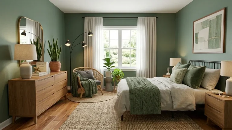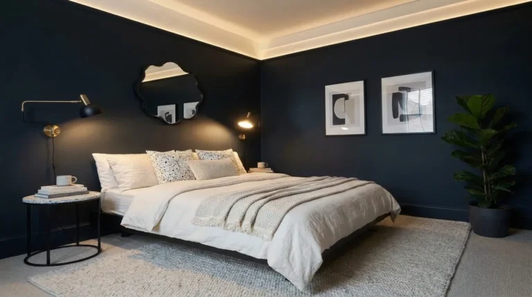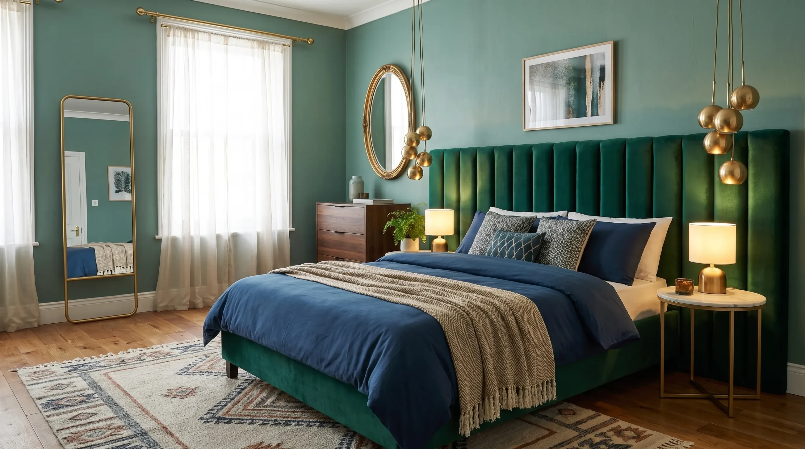
20 Colorful Bedroom Ideas by Color Family (With Paint Tones)
Most people don’t really choose a bedroom color — they default to one. Ask why a bedroom is beige, and you’ll usually hear some version of “it felt safe.” But safe isn’t the same as right for you, and it’s rarely what makes a room worth waking up in. Here’s what most homeowners never hear: saturation matters more than hue. A muted, grayed-down version of almost any color — deep terracotta, dusty sage, soft blush — reads as sophisticated and calm. In contrast, that same color at full intensity can feel overwhelming in a room meant for rest. That’s why colorists usually test bedroom paint at 70–80% of its full saturation before committing to a wall.
I learned this in our own guest room, where a teal I loved on the swatch felt almost jarring by lamp light once it covered four walls. A bedroom color choice comes down to saturation and light exposure — not the hue itself. This guide walks through 20 colorful bedroom ideas by color family, so you can choose with confidence instead of guessing.
Warm & Bold
1. Brick-Cherry Velvet Retreat
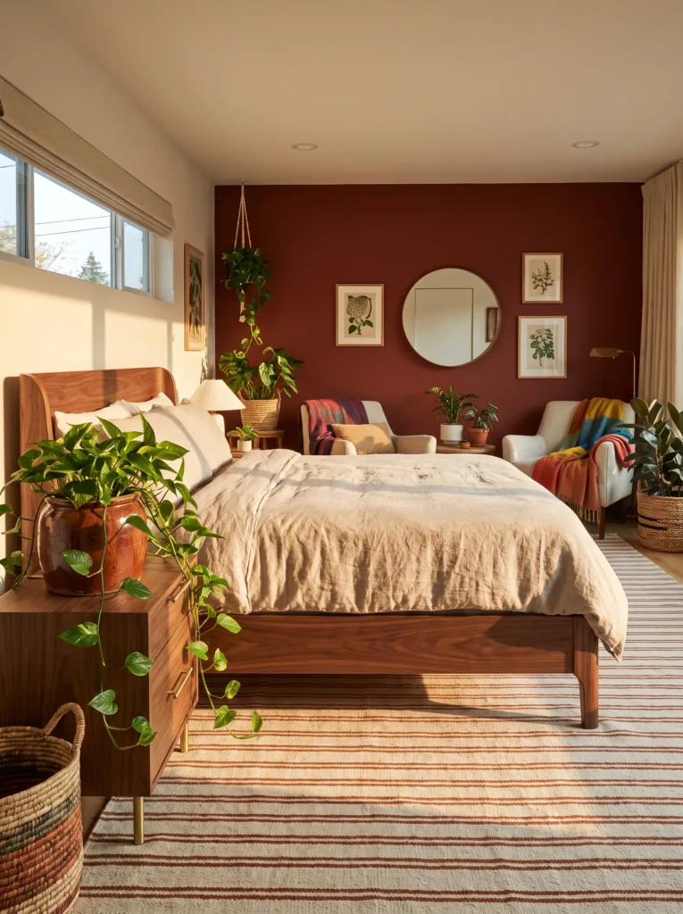
- WALLS: A muted brick-cherry — something like Sherwin-Williams’ Rave Red dialed down to a soft matte finish — on all four walls, at roughly 70% saturation so it reads rich rather than loud
- BEDDING: Ivory heavyweight linen duvet with a rust-brown chunky knit throw folded at the foot of the bed
- WALL DECOR/ART: One oversized abstract botanical print in ochre and cream, framed in unlacquered brass
- PLANTS: Trailing golden pothos in a rust-glazed stoneware pot on the nightstand
- HANGING ELEMENTS: A woven jute pendant shade suspended over a small reading nook in the corner
- RUG: Hand-knotted wool rug in a cream-and-rust stripe pattern
- CURTAINS: Floor-length ivory linen curtains, left unlined so daylight softens the wall color at the edges
- FURNITURE/HARDWARE: Curved walnut bed frame with unlacquered brass pulls on both nightstands
Why this works: A muted, matte cherry at 70% saturation reads as warm and grounding rather than aggressive, especially once it’s balanced against ivory linen and warm wood tones.
Cherry doesn’t have to mean bold in the loud sense. In my experience, the biggest mistake homeowners make with red bedrooms is choosing the wall paint straight off the swatch card at full strength — then wondering why the room feels too intense to sleep in. Dialing the same hue down to a matte, slightly brick-toned version changes everything. It still reads as confident and rich, but it settles into the room instead of competing with it. Paired with a curved walnut frame and unlacquered brass hardware, the whole space feels intentional, warm, and surprisingly calm for a color this saturated.
The real transformation happens in how the room photographs and feels at different times of day. Morning light pulls out the wood’s honey undertones against the wall, while evening lamp light deepens the cherry into something closer to wine. That range is what makes muted cherry more livable than people expect. Golden pothos trailing from a rust-glazed pot softens every hard edge in the room, and the jute pendant over the reading nook adds texture without adding visual weight. This is a bedroom that photographs as dramatic but lives as comfortable.
For 15 more cherry red bedroom ideas, see our full Cherry Red Bedroom guide.
2. Sun-Baked Terracotta Nook
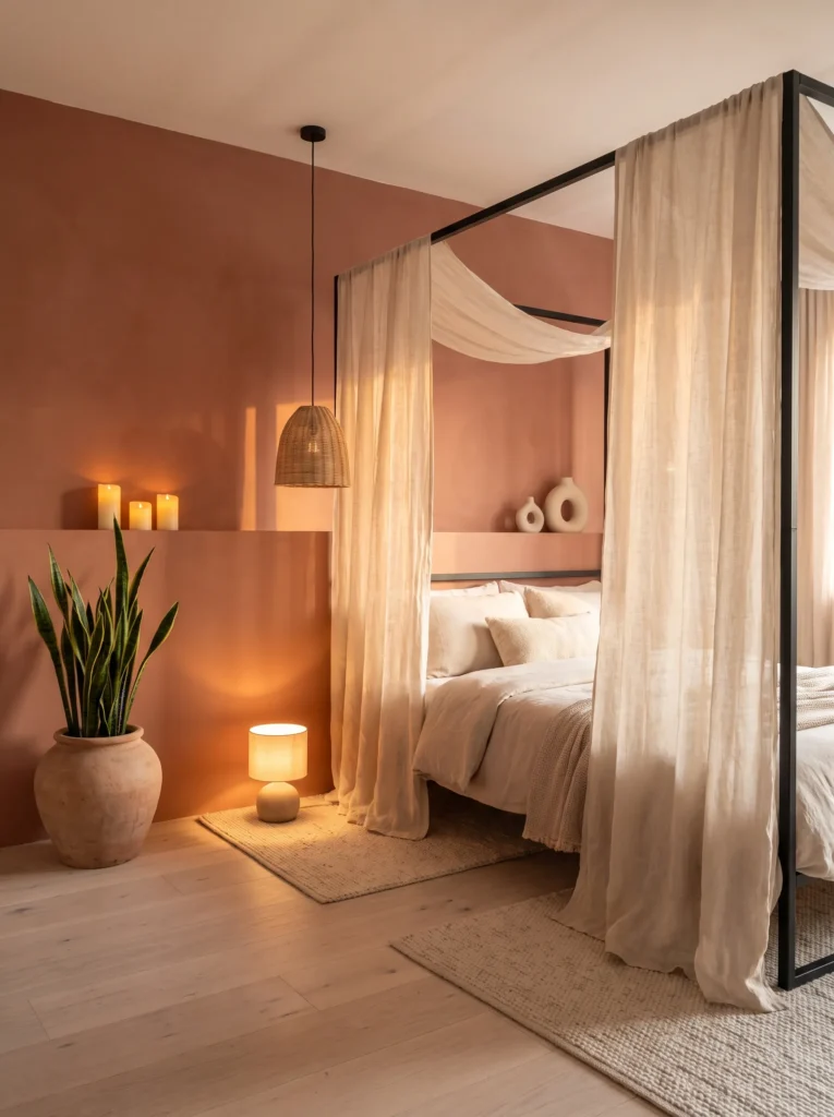
- WALLS: A chalky, sun-baked terracotta — think Benjamin Moore’s Rust softened with a flat matte finish — covering the wall behind the headboard only, with the remaining walls in warm white
- BEDDING: Cream waffle-weave cotton duvet with a single rust-colored lumbar pillow
- WALL DECOR/ART: A raw clay plaster relief sculpture mounted above the headboard, echoing the wall’s texture
- PLANTS: A snake plant (Dracaena trifasciata) in an unglazed raw clay pot on the floor beside the bed
- HANGING ELEMENTS: A macrame plant hanger suspended in the corner window, holding a small trailing succulent
- RUG: Flatweave jute rug in natural tan
- CURTAINS: Unbleached linen sheers that let warm afternoon light filter directly across the bed
- FURNITURE/HARDWARE: Minimal four-poster frame in blackened steel, with a built-in plaster ledge along the accent wall for candles
Why this works: Terracotta at a chalky, matte finish behaves like a natural material rather than a paint color, which is why it pairs so seamlessly with raw clay, plaster, and jute.
Terracotta earns its popularity honestly — it’s one of the few wall colors that looks like it belongs to the room’s architecture instead of sitting on top of it. That’s largely down to finish. A glossy or saturated terracotta reads decorative, but a chalky matte version reads structural, almost like the wall itself is made of clay. My husband has poured actual terracotta tile on job sites, and the color-matching struggle is real — get the undertone even slightly too orange and it stops looking earthy and starts looking like a craft-store project. Keeping it muted is what makes this palette feel expensive rather than themed.
The plaster relief sculpture and the integrated candle ledge are what elevate this from “terracotta accent wall” to a fully considered scene. Texture is doing most of the work here: raw clay pot, jute rug, plaster relief, and linen sheers all sit in the same tonal family, so nothing competes for attention. The blackened steel bed frame is the one hard, cool element in the room, and it keeps the whole palette from feeling too soft or too rustic. It’s warm, but it’s not sleepy.
3. Terracotta & Woven Cane
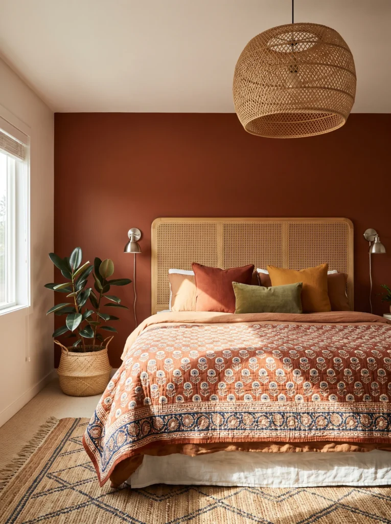
- WALLS: Terracotta accent wall behind the bed only, in a slightly deeper tone than the nook above (closer to burnt sienna), with warm white on the remaining three walls
- BEDDING: Rust-and-cream block-print cotton quilt with a solid cream fitted sheet
- WALL DECOR/ART: A small gallery cluster of five hand-thrown ceramic plates in varied burnt-orange glazes
- PLANTS: A rubber plant (Ficus elastica) in a woven seagrass basket in the corner
- HANGING ELEMENTS: A rattan drum pendant light centered over the bed
- RUG: Vintage-style Moroccan rug in faded rust and cream
- CURTAINS: Burnt-orange linen curtains, left half-drawn to frame the window
- FURNITURE/HARDWARE: Woven cane headboard with brushed nickel hardware, and a low cane bench at the foot of the bed
Why this works: Cane and terracotta share the same sun-warmed, handmade quality, so the pairing feels collected over time rather than styled in a single afternoon.
Woven cane furniture paired with terracotta walls is one of the most reliable ways to make a bedroom feel gathered rather than decorated. I styled a guest room this way last spring, and the thing every visitor commented on wasn’t the wall color — it was the cane headboard catching afternoon light in a way that made shadows move across the wall through the day. That’s the kind of detail a flat photo can’t fully capture but a lived-in room delivers constantly. The rattan pendant repeats that same texture overhead, so the whole room feels connected instead of assembled from separate ideas.
Brushed nickel is doing quieter work here than it usually gets credit for. Against warm terracotta and honey-toned cane, a cooler metal keeps the palette from tipping into pure rustic territory — it adds just enough polish that the room reads current rather than dated. The ceramic plate gallery in varied burnt-orange glazes gives the eye somewhere to land without introducing a new color family, and the low cane bench at the foot of the bed adds function without crowding a room that’s already rich in texture and pattern.
4. Coral & Warm Plaster
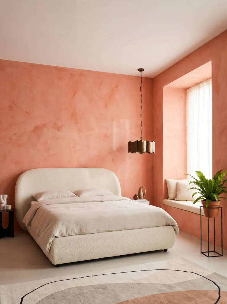
- WALLS: Living coral softened to a dusty, warm coral-pink (imagine Farrow & Ball’s Rangwali muted down) in a limewash finish for subtle texture variation, on all four walls
- BEDDING: White Belgian linen duvet with a single coral-and-cream striped throw pillow
- WALL DECOR/ART: A large-scale abstract painting in coral, cream, and a touch of sage green, unframed and gallery-mounted
- PLANTS: A bird’s nest fern (Asplenium nidus) in a matte cream ceramic pot on a small plant stand near the window
- HANGING ELEMENTS: A scalloped glass pendant with an antique-bronze fixture, hung slightly off-center over the reading chair rather than the bed
- RUG: Cream boucle-textured rug
- CURTAINS: Sheer coral-tinted linen, layered under a solid cream blackout panel
- FURNITURE/HARDWARE: Curved upholstered bed frame in cream bouclé fabric with antique-bronze legs
Why this works: A limewash finish gives coral a soft, cloud-like texture instead of a flat, candy-bright look, which is what keeps this bold color from feeling juvenile.
Limewash coral applied at a muted, dusty saturation is one of the few ways to use a genuinely bold color in a bedroom without it feeling overstimulating. The texture does a lot of the heavy lifting — instead of one flat plane of color, limewash creates soft variation across the wall, almost like watercolor. That subtle movement is what separates a sophisticated coral room from something that reads more like a nursery. Pairing it with cream bouclé and antique bronze keeps the palette grounded, so the wall color gets to be the statement without the whole room feeling like a single loud idea.
The off-center pendant over the reading chair, not the bed, is a small styling choice that changes how the whole room reads in photos. It breaks the expected symmetry and gives the eye a second point of interest beyond the headboard. A bird’s nest fern’s tight, ruffled fronds echo the pendant’s scalloped glass shade in a way that feels coordinated without being matchy. This is a room built for someone who wants color as the main event but still wants the space to feel calm enough to actually sleep in.
5. Coral & Rattan Sunroom Bed
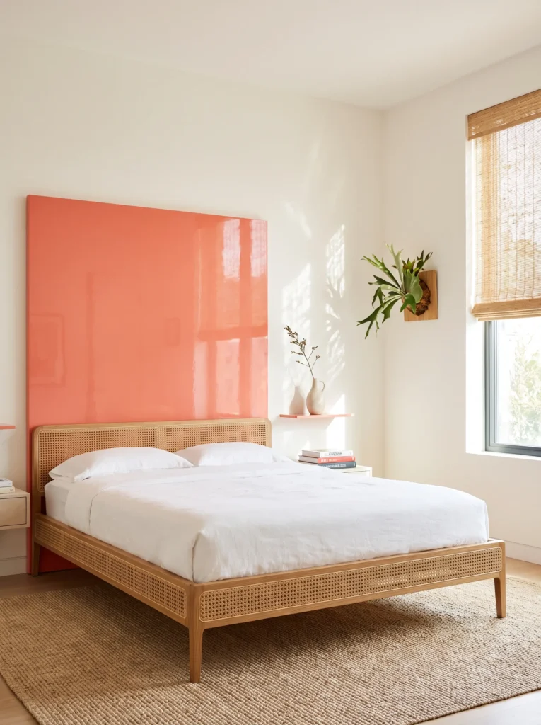
- WALLS: Warm white walls (not coral) with a single coral-lacquered accent panel behind the headboard, high-gloss finish for contrast
- BEDDING: Natural linen in undyed oatmeal, layered with a coral velvet euro pillow
- WALL DECOR/ART: A pressed botanical print series — three small frames in thin brass, arranged in a horizontal row
- PLANTS: A staghorn fern mounted directly on the wall beside the window, plus a small pot of trailing string of pearls on the nightstand
- HANGING ELEMENTS: An open-weave rattan pendant, left natural and unstained, hung centrally
- RUG: Natural sisal rug, undyed
- CURTAINS: No curtains — instead, a woven rattan roller shade for filtered, dappled light
- FURNITURE/HARDWARE: Rattan-and-oak bed frame with brushed brass hardware
Why this works: Confining coral to one high-gloss lacquered panel lets the color read as a deliberate architectural moment rather than a full commitment, which makes it approachable even for color-shy readers.
Not everyone is ready to paint four walls coral, and that’s exactly the gap this idea fills. A single lacquered panel behind the headboard concentrates all the color’s energy into one glossy, reflective surface, so it catches light and genuinely glows at certain times of day rather than just sitting flat on the wall. Everything else in the room — the oatmeal linen, the natural sisal, the unstained rattan — stays quiet and neutral, which gives that one coral panel room to actually be seen. It’s a smaller commitment with a disproportionately large visual payoff.
I’ve noticed high-gloss lacquer gets overlooked in bedroom design because people assume glossy finishes belong in kitchens or bathrooms. But a small, contained gloss panel in a bedroom does something matte paint can’t — it shifts in appearance depending on the light source and time of day. Paired with a mounted staghorn fern and a rattan roller shade instead of curtains, the whole room leans sunroom-adjacent, bright and plant-forward, with coral acting as a single graphic accent rather than an overwhelming backdrop.
Jewel & Rich
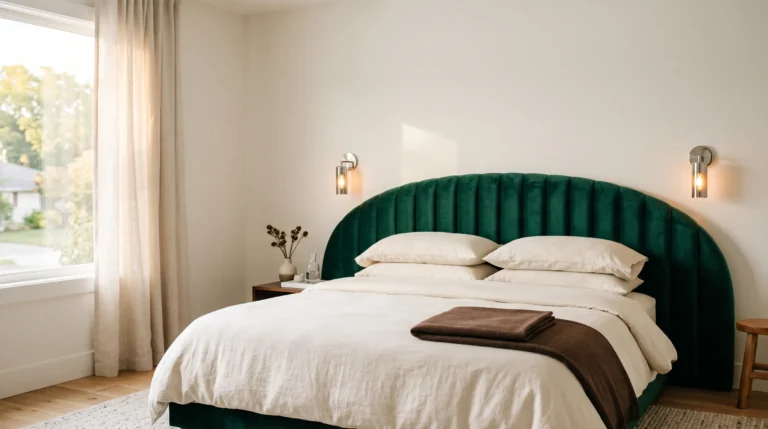
6. Emerald Velvet & Antique Gold
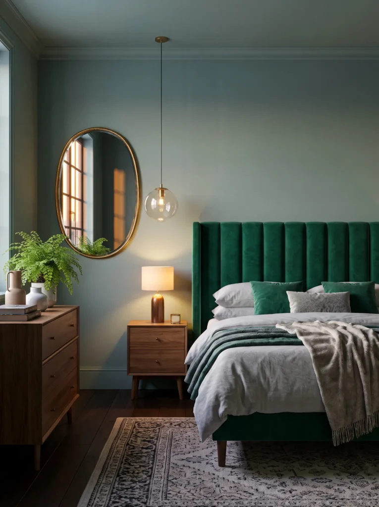
- WALLS: Deep emerald green in a soft eggshell finish (a muted, slightly gray-cast emerald rather than a true jewel-bright green) on all four walls
- BEDDING: Ivory linen duvet with an emerald velvet quilted coverlet folded at the foot
- WALL DECOR/ART: A large vintage-style oval mirror in antique gold, hung as the room’s focal point opposite the bed
- PLANTS: A maidenhair fern in a fluted ceramic pot in antique gold glaze, on the dresser
- HANGING ELEMENTS: A brass-and-glass bubble pendant, hung low over the nightstand
- RUG: Deep ivory Persian-style rug with subtle emerald threading
- CURTAINS: Emerald velvet curtains, floor-length, in a slightly darker tone than the walls for depth
- FURNITURE/HARDWARE: Channel-tufted emerald velvet headboard with antique-gold cone legs
Why this works: Keeping the velvet tone slightly darker than the wall color creates visual depth in a monochromatic room instead of the flat, one-note look most all-green bedrooms end up with.
Emerald is a color people either love immediately or feel nervous about committing to, and the difference usually comes down to whether the room has enough tonal variation. A single flat shade of green across walls, bedding, and curtains can read heavy. Layering a slightly darker velvet against a muted eggshell wall gives the eye depth to move through instead of hitting one solid block of color. That contrast, paired with antique gold’s warmth, is what keeps a fully emerald room feeling luxurious rather than closed-in — especially in a north-facing room where cooler light needs that gold warmth to balance it.
The oversized oval mirror opposite the bed does double duty here, since a room this saturated benefits from anything that bounces light back across it. Antique gold, rather than a brighter polished brass, keeps that reflective surface from feeling too sharp against all the soft velvet in the room. A maidenhair fern on the dresser adds a light, feathery texture that contrasts nicely with the channel-tufted headboard’s structure, and the Persian-style rug’s subtle emerald threading ties the floor back into the wall color without introducing a second, competing green.
For 15 more emerald green bedroom ideas, see our full Emerald Green Bedroom guide.
7. Forest Green & Warm Brass Study Corner
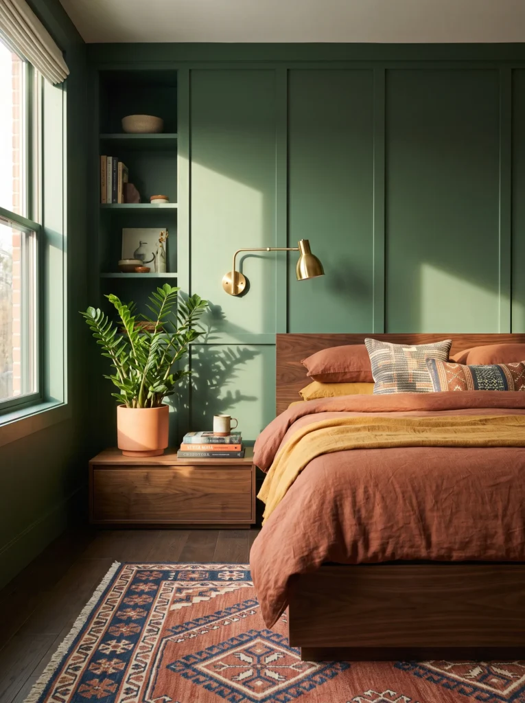
- WALLS: Deep forest green (darker and more blue-cast than the emerald above) in a matte finish, with millwork paneling painted the same tone for a monochromatic, tailored look
- BEDDING: Camel-colored linen duvet with a cream waffle throw
- WALL DECOR/ART: A vintage botanical print series in an oxidized brass frame, hung in a tight vertical column beside the bed
- PLANTS: A ZZ plant (Zamioculcas zamiifolia) in a tall cylindrical terracotta planter on the floor
- HANGING ELEMENTS: A polished brass articulating wall sconce beside the headboard, in place of a table lamp
- RUG: Camel wool rug with a subtle herringbone weave
- CURTAINS: Cream linen curtains with a narrow brass grommet detail
- FURNITURE/HARDWARE: Dark walnut bed frame with polished brass hardware, plus a small vintage brass campaign dresser
Why this works: Painting the millwork the same forest green as the walls removes visual breaks in the room, which makes a small bedroom feel taller and more architecturally intentional.
Forest green paired with warm brass has a slightly different personality than emerald — it leans more library than jewel box, more grounded than glamorous. That distinction matters when you’re choosing between the two: emerald tends to suit a primary bedroom meant to feel indulgent, while a deeper forest tone works beautifully in a smaller guest room or home office nook, especially one with good natural light to balance the darker walls. My husband’s crews often paint millwork a shade lighter than the wall to “define” it, but going tone-on-tone here does the opposite intentionally — it makes the whole wall read as one continuous, elevated surface instead of a chopped-up patchwork of trim and paint.
Swapping a table lamp for a polished brass articulating sconce beside the headboard is a small functional choice that reinforces the study-like mood, freeing up the nightstand for books rather than a lamp base. A ZZ plant in a tall terracotta planter tolerates the lower light this deeper green often creates, and its upright, architectural shape echoes the vertical column of framed botanical prints beside the bed. The small vintage brass campaign dresser is the detail that quietly signals this room was collected over time, not furnished in a single trip.
For 15 more dark green and gold bedroom ideas, see our full Dark Green & Gold Bedroom guide.
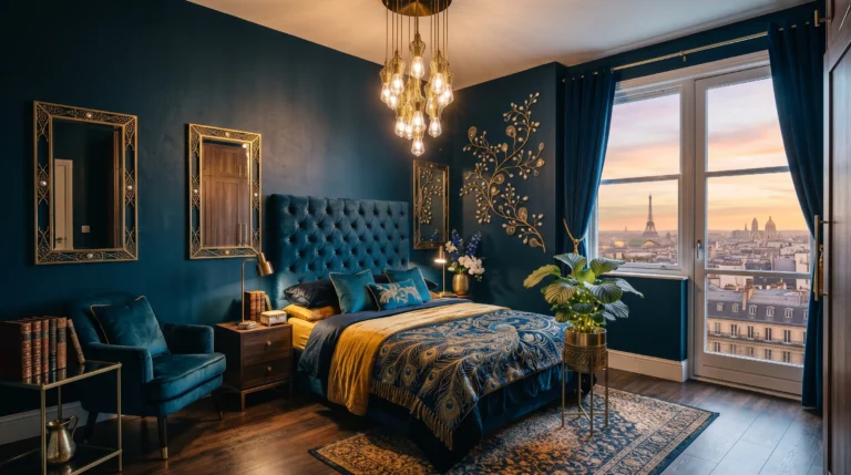
8. Midnight Navy & Aged Brass
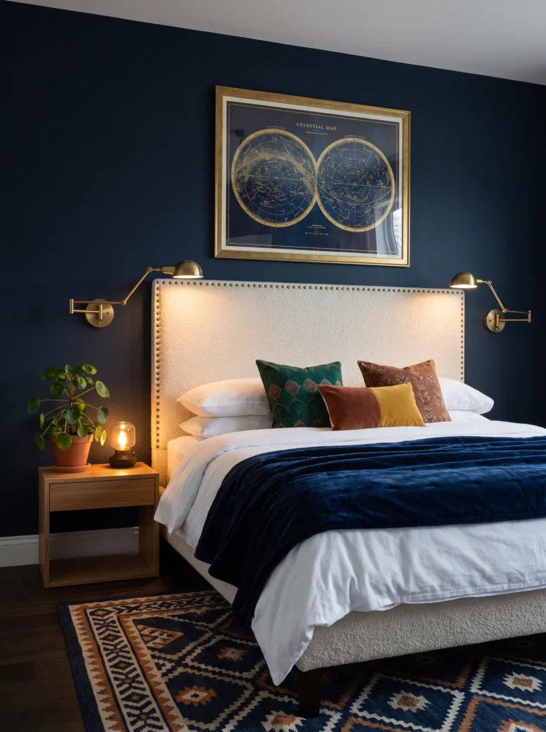
- WALLS: Deep midnight navy in a matte finish, nearly black in low light but reading true blue in daylight
- BEDDING: Crisp white cotton percale sheets with a navy-and-cream striped duvet cover
- WALL DECOR/ART: A single oversized celestial-map art print, framed in aged brass
- PLANTS: A Chinese money plant (Pilea peperomioides) in a small aged-brass planter on the nightstand
- HANGING ELEMENTS: A pair of aged-brass swing-arm sconces flanking the headboard
- RUG: Ivory flatweave rug with a thin navy border
- CURTAINS: Navy linen curtains in the same tone as the walls, for a fully enveloping effect
- FURNITURE/HARDWARE: Upholstered navy bouclé headboard with aged-brass nailhead trim
Why this works: Matching curtains to the exact wall color removes the visual seam where wall meets window, which makes the whole room feel enveloping rather than boxed-in — a trick professional colorists use often in small, dark-toned rooms.
Navy walls read almost black in evening lamp light and true blue in daylight — that shift in perceived color is one of the most underused tools in bedroom design. It means the room genuinely feels like two different spaces depending on time of day, which is part of what makes deep blue such a satisfying color to live with long-term. Aged brass, rather than polished, is doing important work here too — a duller metal finish keeps the whole palette feeling collected and slightly worn-in rather than showroom-new, which suits navy’s moodier, more introspective character far better than a shinier metal would.
The ivory flatweave rug with its thin navy border is a deliberate restraint move, keeping the floor from disappearing into the dark walls the way a full navy rug would. A single oversized celestial-map print in an aged-brass frame gives the room one clear focal point rather than a cluster of smaller pieces competing for attention, and the swing-arm sconces flanking the headboard mean there’s no need for bedside lamps eating into nightstand space. Even a small Chinese money plant adds a bright, rounded green note that keeps the whole navy palette from feeling too serious.
For 15 more dark blue and gold bedroom ideas, see our full Dark Blue & Gold Bedroom guide.
9. Burgundy & Smoked Oak
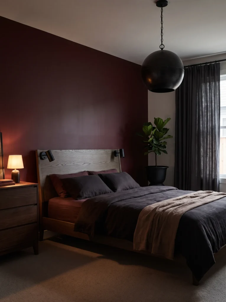
- WALLS: Deep burgundy-oxblood — muted and brown-cast rather than bright red, closer to Farrow & Ball’s Preference Red darkened — in a matte finish on all four walls
- BEDDING: Charcoal linen duvet with a burgundy velvet lumbar pillow
- WALL DECOR/ART: A single large abstract charcoal-and-burgundy painting, unframed canvas edge
- PLANTS: A cast iron plant (Aspidistra elatior) in a smoked-glaze stoneware pot on the floor beside the dresser
- HANGING ELEMENTS: A smoked-glass globe pendant on a blackened chain, hung centrally
- RUG: Charcoal wool rug with a subtle burgundy fleck
- CURTAINS: Charcoal linen curtains, slightly lighter than the walls to avoid a completely enclosed feeling
- FURNITURE/HARDWARE: Smoked oak bed frame with matte black hardware
Why this works: Burgundy is red pulled toward brown rather than pink, which is what allows it to pair with charcoal and smoked oak without ever reading as a Valentine’s Day palette.
Burgundy gets confused with cherry red constantly, but they behave completely differently in a room. Cherry stays warm and vibrant even when muted; burgundy pulls toward brown and almost plum in low light, which gives it a moodier, more masculine-leaning character. That’s why I’d point someone toward burgundy over cherry if they want drama without brightness — it’s the difference between a room that feels energetic and one that feels contemplative. Paired with smoked oak and matte black hardware instead of a warm metal, the whole palette stays cool and restrained, letting the wall color carry all the richness without competing with a shiny accent.
The smoked-glass pendant is the standout detail that keeps this room from reading as a standard dark academia bedroom. Its blackened chain and smoked glass echo the smoked oak frame without repeating it exactly, creating a subtle material conversation across the room. A cast iron plant on the floor — genuinely one of the most forgiving houseplants for a lower-light bedroom like this — adds a grounding, architectural green note without introducing a second bright color. This is a bedroom built for someone drawn to moody, layered spaces who still wants everything to feel deliberate rather than dark for its own sake.
10. Burgundy & Aged Leather Reading Chair
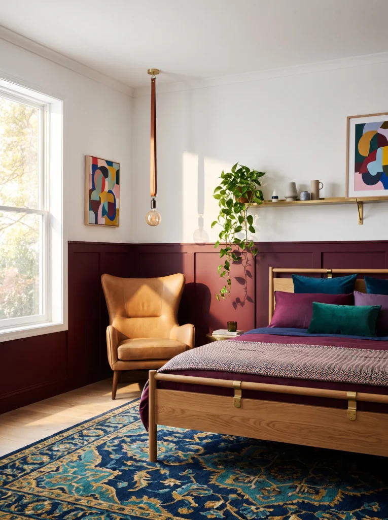
- WALLS: Warm white walls with burgundy confined to a half-wall wainscoting treatment, painted in the same muted oxblood tone, capped with a narrow oak chair rail
- BEDDING: Oatmeal linen duvet with a burgundy corduroy throw
- WALL DECOR/ART: A small collection of vintage brass equestrian prints, mismatched thin frames
- PLANTS: A trailing pothos in a burgundy ceramic pot on a wall-mounted brass bracket shelf
- HANGING ELEMENTS: A leather-strapped pendant light with an exposed Edison bulb, hung over a reading chair in the corner
- RUG: Oatmeal jute-and-wool blend rug
- CURTAINS: Oatmeal linen roman shades, no floor-length curtains
- FURNITURE/HARDWARE: Camel leather wingback reading chair, oak bed frame with brass hardware
Why this works: Confining burgundy to wainscoting height keeps the color at a human, tactile scale, which makes a deep, saturated tone feel approachable in a room with lower ceilings or limited natural light.
Half-wall color treatments solve a real problem: not every room has the ceiling height or light exposure to support a fully saturated wall from floor to ceiling. Capping burgundy at chair-rail height with warm white above it lets the room keep its brightness near the ceiling while still delivering real color impact at eye level, right where you actually notice it. I’ve seen this work particularly well in older homes with 8-foot ceilings, where a full-height dark wall can start to feel low and heavy. The oak chair rail adds a crisp architectural line that makes the whole treatment look built-in rather than applied.
The leather wingback chair and leather-strapped pendant push this idea slightly away from typical bedroom styling and into something closer to a study that happens to have a bed in it. That’s intentional — burgundy has a natural affinity for leather, brass, and worn textures, and leaning into that fully gives the room a sense of history even when everything in it is new. A trailing pothos on a wall-mounted brass bracket softens the masculine leather-and-wood palette just enough to keep the room from feeling too heavy or formal.
Soft & Soothing
11. Muted Lavender & Brushed Nickel
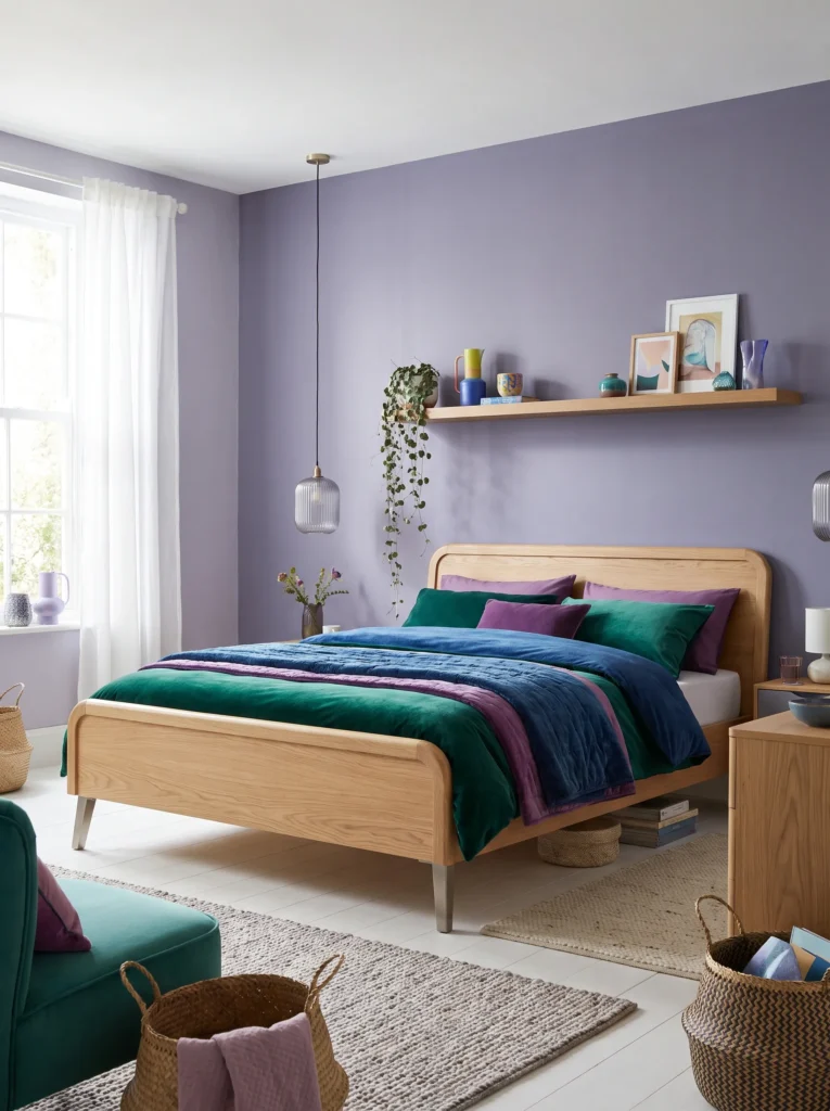
- WALLS: Soft, grayed-down lavender (dialed to roughly 70% saturation, closer to a dusty violet-gray than a bright purple) in a matte finish on all four walls
- BEDDING: White matelassé cotton coverlet with a lavender linen euro pillow
- WALL DECOR/ART: A soft-focus botanical photograph of dried lavender stems, framed in brushed nickel
- PLANTS: A trailing string of hearts in a lilac-glazed ceramic pot on a floating shelf above the headboard
- HANGING ELEMENTS: A fluted glass pendant with a brushed-nickel base, hung slightly asymmetrical to one side of the bed
- RUG: Pale gray wool rug with a subtle lavender undertone
- CURTAINS: Sheer dove-gray linen curtains
- FURNITURE/HARDWARE: Curved oak bed frame with brushed-nickel legs
Why this works: A grayed-down lavender at reduced saturation avoids the two most common failure points of purple bedrooms — reading either too sweet or too cold — landing instead on something genuinely restful.
Lavender is one of the trickiest colors to get right in a bedroom because full-saturation purple can tip either childish or theatrical depending on the undertone. Muting it down toward gray solves both problems at once. This is exactly the kind of room that suits an east-facing bedroom with strong morning light, since cooler colors like this benefit from warm daylight balancing them out rather than competing with already-cool evening light. Brushed nickel keeps the metal palette quiet and modern rather than romantic, and the asymmetrical pendant placement adds a small design tension that keeps the whole room from feeling overly matched or predictable.
The string of hearts trailing from the floating shelf does more for this room than a typical accent plant would, since its thin, heart-shaped leaves pick up the same dusty, muted quality as the wall color instead of introducing a bright, saturated green that would fight with the palette. I’ve found that pairing a grayed-down color like this with equally soft, low-contrast textures — matelassé cotton, sheer dove-gray linen, pale wool — is what keeps the whole room feeling cohesive rather than like a single lavender wall surrounded by mismatched neutrals. The curved oak bed frame adds just enough warmth in the wood tone to stop the room from reading as cold, which is the real risk with any muted cool color pushed too far toward gray.
For 15 more lavender and purple bedroom ideas, see our full Lavender & Purple Bedroom guide.
12. Sage Green & Whitewashed Oak
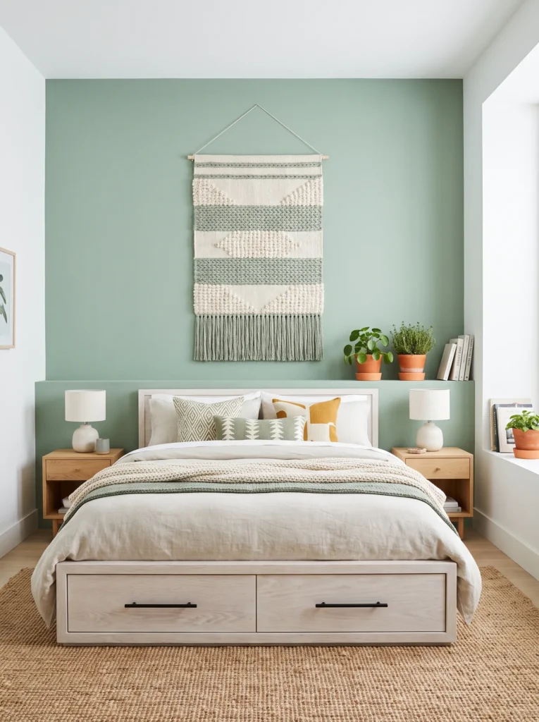
- WALLS: Soft sage green (grayed and slightly muted, not bright or minty) in a matte finish
- BEDDING: Undyed natural linen duvet with a sage-and-cream checked throw
- WALL DECOR/ART: A woven textile wall hanging in cream and sage, in place of framed art
- PLANTS: A pilea and a small pot of thyme grouped together on the windowsill
- HANGING ELEMENTS: A paper lantern-style pendant in natural cream
- RUG: Whitewashed jute rug
- CURTAINS: Undyed linen curtains, unlined
- FURNITURE/HARDWARE: Whitewashed oak bed frame with simple black iron pulls
Why this works: Sage is one of the few greens that photographs almost identically in warm and cool light, which is part of why it’s remained one of the most budget-friendly, versatile bedroom colors to work with.
Grayed-down sage green is genuinely one of the easiest colors to get right on a budget, since it reads as intentional even in basic matte contractor-grade paint rather than requiring a premium finish. That’s a big part of its staying power. This particular version leans into a Scandinavian-meets-farmhouse feel with whitewashed oak and unlined linen curtains, keeping the whole room airy rather than moody. Grouping a small pot of thyme in with the houseplants on the windowsill is a small touch, but it’s the kind of detail that makes a room feel genuinely lived-in rather than staged for a photo.
Swapping framed art for a woven textile wall hanging keeps this room’s material story consistent from top to bottom, since the same handmade, textured quality shows up again in the checked throw and the natural cream pendant shade. Simple black iron pulls are an easy, inexpensive hardware choice that adds just enough contrast against the whitewashed oak without competing with the softness of the wall color. It’s a version of sage green built for someone who wants the palette to feel effortless rather than heavily styled.
For 15 more sage green bedroom ideas, see our full Sage Green Bedroom guide.
13. Dusty Blush & Fluted Glass
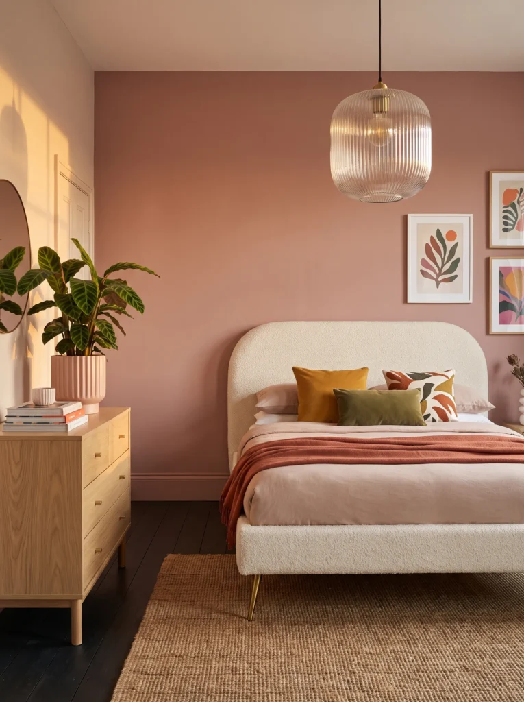
- WALLS: Dusty, grayed-down blush pink (avoiding anything peachy or bubblegum-toned) in a matte finish on all four walls
- BEDDING: Ivory linen duvet with a blush velvet quilted throw
- WALL DECOR/ART: A large abstract painting in blush, terracotta, and cream tones, unframed
- PLANTS: A calathea in a fluted blush-glazed ceramic pot on the dresser
- HANGING ELEMENTS: A fluted glass pendant with a warm brass base, hung centrally
- RUG: Ivory boucle rug
- CURTAINS: Blush linen curtains, one shade darker than the walls
- FURNITURE/HARDWARE: Curved upholstered headboard in ivory bouclé with warm brass legs
Why this works: Blush pink pulled toward gray rather than peach reads as sophisticated and grown-up, which is what finally separates a modern dusty-pink bedroom from a nursery palette.
Blush has an image problem that’s almost entirely about undertone. Warm, peachy pink reads young and soft in a way that can feel more suited to a child’s room; a grayed, slightly cooler blush reads entirely differently — closer to a warm neutral than a “girly” color. That distinction is the whole reason this palette works for an adult primary bedroom. Fluted glass and warm brass add a soft glamour without pushing the room toward anything too precious, and the curved bouclé headboard picks up on 2026’s move toward organic, rounded furniture silhouettes rather than sharp, boxy frames.
A calathea’s dramatic striped leaves are doing real visual work here, giving the room a graphic, almost architectural plant moment against all that softness in the fabric and walls. That contrast between the calathea’s bold pattern and the room’s otherwise muted palette is what keeps dusty blush from feeling flat or one-note. Layering the curtains one shade darker than the wall color creates gentle depth without introducing a second competing hue, and the whole effect reads calm, current, and distinctly adult rather than sweet.
14. Blush & Aged Terracotta Vignette
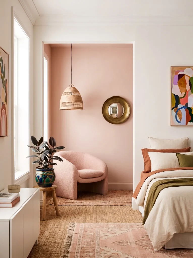
- WALLS: Warm white walls with a blush-pink accent nook (recessed reading alcove) painted in the same dusty blush tone
- BEDDING: Natural linen in warm oatmeal, with a blush-and-rust striped throw pillow
- WALL DECOR/ART: A small round convex mirror in aged brass, hung above the reading alcove
- PLANTS: A rubber plant in an aged-terracotta pot beside the alcove chair
- HANGING ELEMENTS: A woven rattan pendant, small-scale, hung low in the alcove
- RUG: Layered rugs — a jute base rug with a smaller blush wool rug on top, positioned in the alcove
- CURTAINS: No curtains in the main room — a single blush linen curtain panel framing the alcove only
- FURNITURE/HARDWARE: Oak bed frame with brass hardware, plus a low-slung blush bouclé accent chair in the alcove
Why this works: Confining blush to a single architectural nook lets it function as a color moment rather than a full commitment, which suits readers who want softness without redecorating an entire room.
Not every home has room for a dedicated reading nook, but if yours does — even a shallow wall recess or a corner by a window — this is one of the most effective ways to use a color like blush without overwhelming the whole bedroom. The layered rug treatment, jute underneath with a smaller blush wool rug on top, is a trick I use constantly in smaller vignettes: it defines the space as distinct from the rest of the room without needing a wall or furniture to do it. That layering also adds real textural interest underfoot, which flat single rugs rarely deliver.
The aged-terracotta plant pot and aged-brass mirror both nod toward warmth without introducing yet another dominant color, which keeps this vignette feeling cohesive with blush rather than competing against it. A rubber plant’s broad, glossy leaves add scale and a bit of drama next to the small-scale rattan pendant, balancing out proportions in what’s often a compact space. This is blush pink for someone who wants a genuine design moment in their bedroom without repainting every wall to get it.
Grounded & Neutral-Adjacent
15. Soft Butter Yellow & Woven Willow
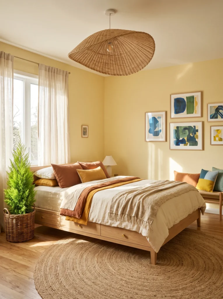
- WALLS: Soft, muted butter yellow (grayed down, not bright or citrusy) in a matte finish on all four walls
- BEDDING: Cream linen duvet with a soft yellow-and-white gingham throw pillow
- WALL DECOR/ART: A small collection of pressed wildflower botanicals in thin cream frames, arranged in a loose grid
- PLANTS: A lemon cypress in a woven willow basket on the floor beside the window
- HANGING ELEMENTS: A woven willow pendant shade, hung centrally
- RUG: Natural jute rug
- CURTAINS: Cream linen curtains with a narrow yellow pinstripe
- FURNITURE/HARDWARE: White oak bed frame with unlacquered brass hardware
Why this works: A grayed, muted yellow reads as sunny without tipping into the overly cheerful territory that keeps a lot of homeowners from considering yellow for a bedroom at all.
Yellow is probably the most avoided bedroom color, and almost always for the same reason: people picture the bright, saturated version and assume it’ll feel too stimulating for a room meant for sleep. A muted, buttery version behaves completely differently. It still carries warmth and cheer, especially useful in a north-facing bedroom that doesn’t get much direct sun, but it settles rather than energizes. Willow and jute textures lean the whole room toward something organic and grounded, and the unlacquered brass hardware will develop a soft patina over time that only adds to that lived-in, collected feeling.
The pressed wildflower botanicals in thin cream frames are a quieter alternative to a single large statement piece, and arranging them in a loose grid gives the wall texture without pulling focus from the color itself. A lemon cypress in a woven willow basket is a smart plant choice for this palette specifically, since its pale, citrusy green sits close enough to the wall’s undertone to feel coordinated rather than contrasting. Even the narrow yellow pinstripe on the curtains is doing quiet work, tying the window treatment back to the wall color without repeating it at full strength.
16. Warm Greige & Fluted Walnut
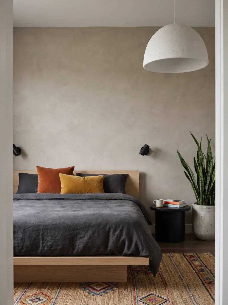
- WALLS: Warm greige with a visible brown undertone (avoiding anything too cool or purple-gray) in a matte finish
- BEDDING: Ivory linen duvet with a warm taupe wool throw
- WALL DECOR/ART: A large-scale minimalist line drawing in a fluted walnut frame
- PLANTS: A fiddle leaf fig in a tall fluted ceramic planter in warm ivory glaze, positioned in the corner
- HANGING ELEMENTS: A sculptural fluted-glass pendant with a warm brass fixture
- RUG: Warm ivory wool rug with a subtle greige border
- CURTAINS: Taupe linen curtains, a shade darker than the wall for depth
- FURNITURE/HARDWARE: Fluted walnut bed frame with integrated nightstands, warm brass legs
Why this works: Warm greige avoids the flat, slightly cold look of standard “griege” trends by leaning noticeably brown rather than purple or blue, which keeps a neutral-adjacent room from feeling sterile.
Greige gets a bad reputation for good reason — most versions of it lean cool and end up feeling like a compromise color rather than an intentional one. The fix is choosing a greige with a visible brown undertone rather than the trendier purple-gray versions that dominated the last decade of paint charts. That single shift changes the entire mood of the room. Fluted walnut furniture is one of 2026’s clearest style signals, replacing flat paneled or boxy furniture with rounded, tactile, curved forms, and it pairs beautifully with a warm neutral wall because there’s enough material texture to carry the room without needing bold color.
This is the palette I’d point toward for someone who wants their bedroom to feel calm and expensive without committing to a strong color statement, which is a completely valid design goal and not just a “safe” default when it’s executed with this much intention. The fluted glass pendant and fluted walnut furniture create a subtle repeating motif throughout the room that ties everything together visually, even though nothing about the palette is loud. A single fiddle leaf fig adds the room’s only real height and drama, doing the work that a bold wall color might otherwise do in a more saturated palette.
17. Chocolate Brown & Warm Bronze
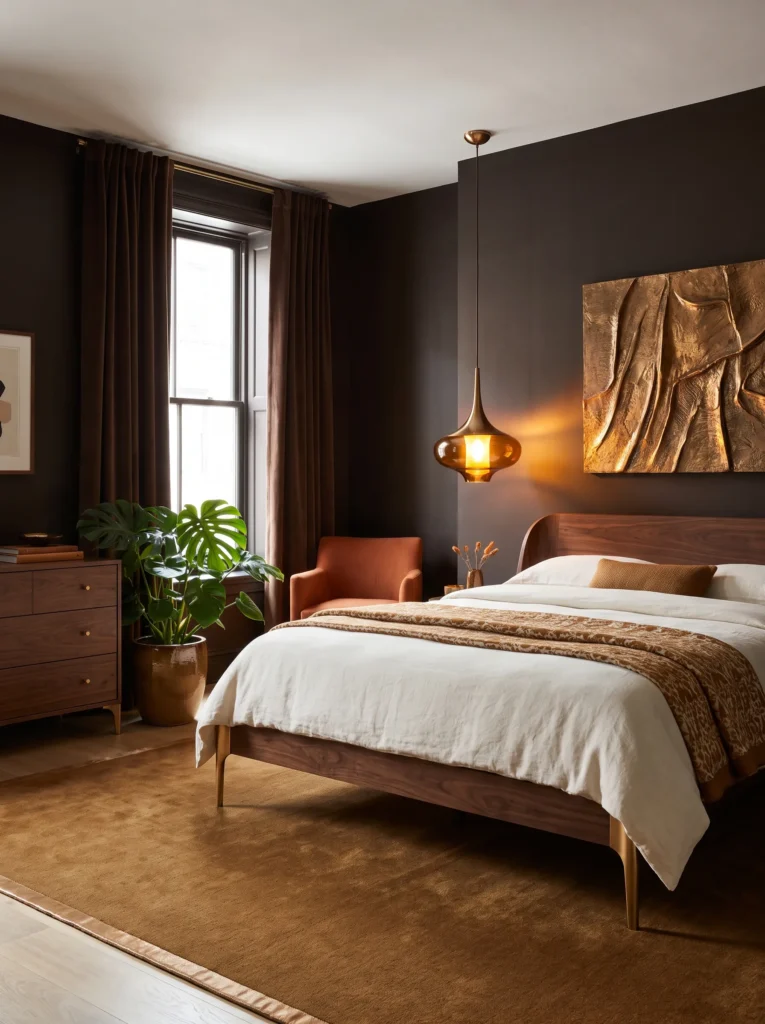
- WALLS: Deep, saturated chocolate brown — closer to dark espresso than a soft taupe — in a rich matte finish, applied to all four walls
- BEDDING: Ivory heavyweight linen duvet with a bronze-and-cream jacquard throw folded at the foot
- WALL DECOR/ART: A large-scale bronze relief sculpture mounted above the headboard, catching light differently throughout the day
- PLANTS: A dramatic split-leaf philodendron in a bronze-glazed ceramic pot on the floor beside the dresser
- HANGING ELEMENTS: A sculptural bronze pendant with a warm amber glass diffuser, hung low and centered
- RUG: A deep caramel wool rug with a subtle bronze-thread border
- CURTAINS: Chocolate-brown velvet curtains, floor-length and fully lined
- FURNITURE/HARDWARE: Curved dark walnut bed frame with polished bronze legs and matching bronze pulls
Why this works: A fully saturated chocolate brown reads as rich and enveloping rather than dull, especially once it’s paired with a warm, reflective metal like bronze that catches light against the deep matte walls.
Chocolate brown has quietly overtaken greige as the neutral-adjacent color people actually want to live with, and the difference comes down to depth. Where greige can flatten a room into something safe but forgettable, a true, saturated espresso-brown holds real richness — closer to a jewel tone than a neutral, even though it still functions as a grounding backdrop for the rest of the room. Bronze is the metal that makes this pairing sing: warmer and moodier than brass, with just enough shine to catch the deep matte walls without competing with them.
The bronze relief sculpture above the headboard is the room’s clear focal point, chosen deliberately over a framed print because its dimensional surface catches morning and evening light differently, giving the wall a sense of movement a flat piece of art can’t provide. A split-leaf philodendron’s broad, dramatic leaves add real scale and a bit of drama in the corner, echoing the room’s overall sense of richness rather than retreating into the background the way a smaller plant would. Velvet curtains in the same chocolate tone as the walls keep the whole room feeling fully enveloping, letting the bronze accents do all the visual sparkle.
18. Onyx Black & Liquid Gold
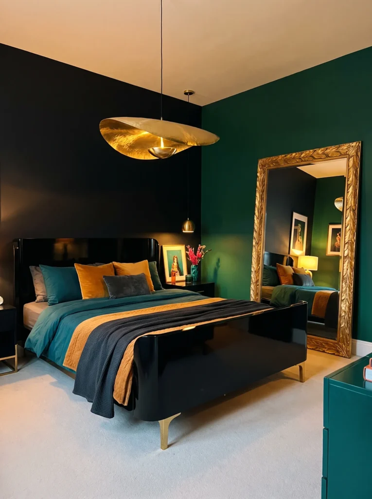
- WALLS: Deep matte black (true onyx black, not charcoal) on all four walls, in a soft-touch matte finish
- BEDDING: Ivory silk-blend duvet with a black velvet lumbar pillow
- WALL DECOR/ART: A single sculptural gold leaf mirror, oversized and asymmetrical, hung opposite the bed
- PLANTS: A ZZ plant in a high-gloss black ceramic pot on a floating black shelf
- HANGING ELEMENTS: A liquid-gold sculptural pendant with organic, molten-looking curves, hung low and centered
- RUG: Ivory silk-blend rug with a subtle sheen
- CURTAINS: Black velvet curtains, floor-length and fully lined for a true blackout effect
- FURNITURE/HARDWARE: Curved black lacquer bed frame with polished gold legs
Why this works: A true, deep matte black wall absorbs light rather than reflecting it, which is exactly what makes a small black bedroom feel enveloping and luxurious rather than cramped, as long as one strong metallic accent breaks up the darkness.
Black bedrooms intimidate people because they assume dark equals small and closed-in. In practice, the opposite tends to happen once you commit fully — a matte black room with strong lighting design and one dramatic metallic accent reads as genuinely luxurious, almost like a jewelry box. The key is choosing a plant that will actually survive with minimal light; a ZZ plant is one of the few statement-worthy options that tolerates a room this dark without struggling, which matters more than people expect when they’re styling with real, living plants rather than faux ones.
The ivory silk-blend rug and duvet are essential counterweights here, since an all-black room with an all-black floor and bedding would tip from luxurious into overwhelming. Keeping those two surfaces light lets the black walls read as backdrop rather than enclosure. The liquid-gold pendant’s organic, molten curves are the room’s single loudest gesture, and everything else — the gold mirror, the polished gold bed legs — echoes that same warm metal so the accents feel like one cohesive statement instead of scattered gold touches.
For 15 more small black luxury bedroom ideas, see our full Small Black Luxury Bedroom guide.
19. Teal & Warm Terracotta Accents
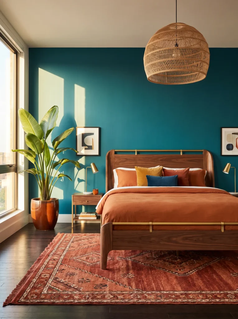
- WALLS: Deep teal-turquoise (muted toward blue-green rather than bright aqua) in a matte finish on all four walls
- BEDDING: Ivory linen duvet with a rust-terracotta velvet throw
- WALL DECOR/ART: A large abstract painting in teal, rust, and cream, unframed canvas
- PLANTS: A bird of paradise in a rust-glazed terracotta pot in the corner
- HANGING ELEMENTS: A woven rattan pendant with a warm brass fixture, hung centrally
- RUG: Rust-and-cream Moroccan-style rug
- CURTAINS: Ivory linen curtains, unlined
- FURNITURE/HARDWARE: Curved walnut bed frame with warm brass hardware
Why this works: Pairing teal with a genuinely warm color like rust or terracotta, rather than the more expected white or gold, keeps the palette from feeling like a predictable coastal cliché.
Teal paired with a warm terracotta accent color, instead of the far more common white-and-gold pairing, is what separates a distinctive bedroom from a generic coastal one. Most teal rooms default to nautical or beachy styling almost automatically, which is exactly the trap worth avoiding here. Terracotta and rust pull teal toward something richer and more global-eclectic instead, closer to a jewel-tone palette than a beach house. That warm-cool contrast is genuinely one of the most striking combinations in color theory — complementary colors sitting almost directly opposite each other on the wheel, which is why the rust throw and rug pop so distinctly against the teal walls rather than blending in.
A bird of paradise’s dramatic, oversized leaves give this room a real architectural moment, something most teal bedrooms skip in favor of smaller, safer plants. In my experience, a single bold plant does more for a saturated wall color than several small ones scattered around the room — it reads as a deliberate design choice rather than an afterthought. The curved walnut bed frame and warm brass hardware keep the furniture soft-edged and current, following the same rounded, organic silhouettes shaping most 2026 bedroom furniture, so the room feels fresh rather than tied to any one decorating era.
20. Teal & Aged Copper Reading Corner
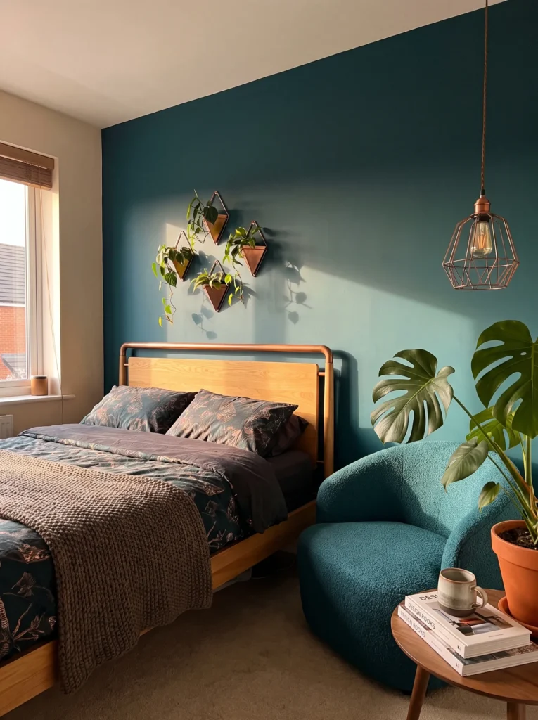
- WALLS: Same deep teal as above, confined to a single accent wall behind the bed, with warm white on remaining walls
- BEDDING: Warm oatmeal linen duvet with a teal velvet euro pillow
- WALL DECOR/ART: A collection of small aged-copper botanical wall planters, mounted in an asymmetrical cluster, each holding a small trailing plant
- PLANTS: String of pearls, a small pothos, and a peperomia distributed across the wall-mounted copper planters, plus a larger Monstera deliciosa on the floor beside the reading chair
- HANGING ELEMENTS: An aged-copper cage pendant with an exposed bulb, hung over the reading chair
- RUG: Oatmeal boucle rug
- CURTAINS: Oatmeal linen roman shades
- FURNITURE/HARDWARE: Oak bed frame with aged-copper hardware, plus a low teal bouclé accent chair
Why this works: A living wall of small copper planters turns houseplant styling into the room’s actual focal point, replacing traditional framed art with something that grows and changes over time.
This idea came out of a real problem I kept running into with clients who wanted lots of plants but had limited floor and surface space. A cluster of small wall-mounted planters solves that directly — it’s essentially a living art installation, and it means the greenery becomes the room’s visual anchor rather than competing with a large piece of framed art for attention. Aged copper develops a natural patina over time, which only improves this look; unlike polished metals, small imperfections and color shifts in aged copper read as intentional rather than in need of upkeep.
Confining the deep teal to a single accent wall, rather than covering the whole room, makes this idea more approachable for someone who loved the boldness of a full teal room but wants a gentler entry point. The Monstera deliciosa on the floor beside the reading chair adds real scale and drama that the small wall planters alone can’t provide, balancing out the room’s proportions. Between the teal accent wall, aged copper hardware, and layered plant textures, this corner ends up feeling like a genuine retreat — plant-filled, warm, and distinctly personal rather than pulled from a template.
Styling Principles
Saturation Is the Real Variable, Not the Hue
Almost every color on this list works in a bedroom at the right saturation level. Professional colorists commonly test a shade at 70–80% of its full intensity before committing to a bedroom wall, since a room meant for rest rarely benefits from a color at full strength. If you’re drawn to a bold color but hesitant, ask your paint store to mix it down a level or two rather than crossing it off the list entirely.
Match Color Temperature to Light Exposure
North-facing rooms with cooler, flatter daylight generally benefit from warm colors — terracotta, cherry, soft yellow, warm greige — to balance that coolness. South- and east-facing rooms with strong warm light can handle cooler tones like navy, emerald, or teal without feeling cold, since the daylight itself provides warmth. If you’re not sure which way your bedroom faces, a compass app on your phone will tell you in seconds, and it’s worth checking before you buy paint.
Build the Palette Around One Anchor, Not Several Competing Colors
Every idea in this guide has a single anchor color driving the room, with metals, plants, and textures supporting it rather than introducing new competing hues. This is the single biggest difference between a bedroom that feels curated and one that feels cluttered. Choose your wall color first, then choose one accent metal (brass, nickel, or black) and stick with it throughout the room’s hardware, lighting, and frames.
Frequently Asked Questions
How do I choose a bedroom color? Start with light exposure and mood, not the color itself. Cooler rooms benefit from warm colors, while bright, sunny rooms can support cooler or deeper tones. From there, choose a saturation level around 70–80% of the color’s full intensity, since bedrooms generally read better with muted rather than fully saturated color.
What’s the most calming bedroom color? There’s no single “most calming” color — muted, low-saturation versions of nearly any hue read as calming, while the same hue at full brightness can feel stimulating. Sage green, dusty blush, and grayed lavender are consistently popular for their soothing qualities, but a muted terracotta or navy can be equally restful when the saturation is dialed down.
What are the best bedroom colors for small or dark rooms? Contrary to common advice, dark colors don’t automatically shrink a small room. A deep, matte color applied to all four walls can make a small room feel enveloping and intentional rather than cramped, especially when paired with good lighting and a single strong metallic accent.
How can I test a bedroom color before committing? Paint a sample swatch at least 2 feet by 2 feet directly on the wall, and view it at different times of day — morning, midday, and evening lamp light. Color shifts dramatically under different lighting, and a shade that looks perfect at noon can feel completely different after sunset.
Can bold colors work in a small bedroom? Yes. Confining a bold color to one accent wall, a wainscoting treatment, or a single architectural nook — as several ideas in this guide demonstrate — lets you use a saturated color without covering the entire room, which is often the better choice in a smaller space.
What’s a budget-friendly way to test bedroom color? Peel-and-stick paint swatches or a small sample pot from any major paint brand, applied to poster board rather than directly on the wall, let you move the color around the room and test it against your existing furniture and light exposure without committing to a full can of paint.
Conclusion
Choosing a bedroom color doesn’t have to mean guessing and hoping for the best. Once you understand how saturation and light exposure actually work together, any color on this list — bold or soft, warm or cool — can become the foundation for a room that feels genuinely yours. I’ve seen how much confidence this shift gives people; once you’re not just picking a color but understanding why it works for your specific room, the whole process gets easier.
Save this guide to Pinterest for reference, pick one colorful bedroom idea to try first, and share it with anyone still stuck on beige. Your bedroom deserves more than a safe default — it deserves a plan.