17 Dark Boho Living Room Ideas That Are Ridiculously Save-Worthy
Introduction
Scroll past enough beige boho boards, and you start craving something with actual color in it. That’s where these Dark Boho Living Room Ideas come in — bold walls, layered rugs, and jewel-toned textiles that trade the usual sun-bleached neutrals for something richer and more dramatic. Traditional boho leans on light, airy backdrops and lets texture carry the room. Dark boho does the opposite: deep, saturated color becomes the foundation, and texture layers on top of it instead. I’ve noticed that rooms built this way photograph with a depth and shadow variation that lighter boho spaces simply can’t match, which is exactly why they perform so well on Pinterest.
Whether you’re drawn to ink black, oxblood, or peacock teal, this roundup shows you how to build a genuinely bold, layered living room without losing the collected, handmade feel that makes boho boho in the first place.
Why Dark Boho Works Differently
Most people think boho has to be light and airy — sun-bleached rattan, cream walls, jute underfoot. That’s only half the story. Traditional boho relies on pale, neutral backdrops, letting texture carry most of the visual interest. Dark boho flips that formula: deep, saturated color becomes the backdrop, and texture — layered rugs, richly dyed textiles, dark ceramics — does the work on top of it instead. That’s why dark boho rooms photograph with more depth and shadow variation than their lighter counterparts, which is exactly why they perform so well on Pinterest.
I noticed this the first time I styled a client’s living room in deep aubergine — the shadows alone did half the work. This post shows you how to build that same depth in your own space.
1. Terracotta Walls, Kilim Layers
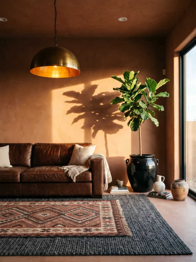
- Walls: Deep burnt terracotta, painted in a matte clay-based finish that absorbs light rather than bouncing it
- Seating: Chocolate brown leather sofa, low-slung and slightly curved, aged enough to show character
- Rug: A large flatwoven kilim rug in rust and cream diamond pattern, layered over a smaller solid charcoal wool rug underneath
- Wall decor: An oversized vintage-style woven tapestry in ochre and rust tones, hung slightly off-center above the sofa
- Plants: A fiddle leaf fig (Ficus lyrata) in a matte black ceramic pot, paired with a trailing pothos (Epipremnum aureum) in an aged brass planter on a side table
- Hanging elements: A brass pendant light with an amber glass shade, casting warm pooled light
- Lighting: Warm 2700K bulbs throughout, evening-leaning even in daylight photos
- Textiles: Four throw pillows — mustard velvet, rust ikat, cream boucle, and a solid clay linen — plus a camel wool throw blanket
- Furniture/hardware: Round wood coffee table with black iron legs, dark walnut side table
Why this works: Terracotta walls paired with cream-and-rust kilim patterns create warmth without ever feeling washed out or flat.
Terracotta rooms have a reputation for feeling sun-drenched and casual, but push the tone darker and pair it with a real kilim rug, and the whole room reads differently. The clay-based matte finish is doing a lot of the work here — it swallows light instead of reflecting it, which is exactly why the walls look rich rather than orange. Layer a second, solid-colored rug underneath the kilim and you get grounding without losing the pattern. This is one of those rooms that photographs better in person than people expect from a flat paint swatch.
I’ve styled a version of this exact palette for a client in South Austin, and the brass pendant light was the detail guests kept asking about. It’s a small fixture, but amber glass over warm bulbs throws a completely different quality of light than a standard flush mount — softer, more golden, almost candlelit by early evening. Combined with the leather sofa’s worn patina and the tapestry’s handwoven texture, the room feels collected rather than decorated. That’s the real goal with dark boho: layers that look gathered over years, not bought in a single afternoon.
2. Aubergine & Suede Corner
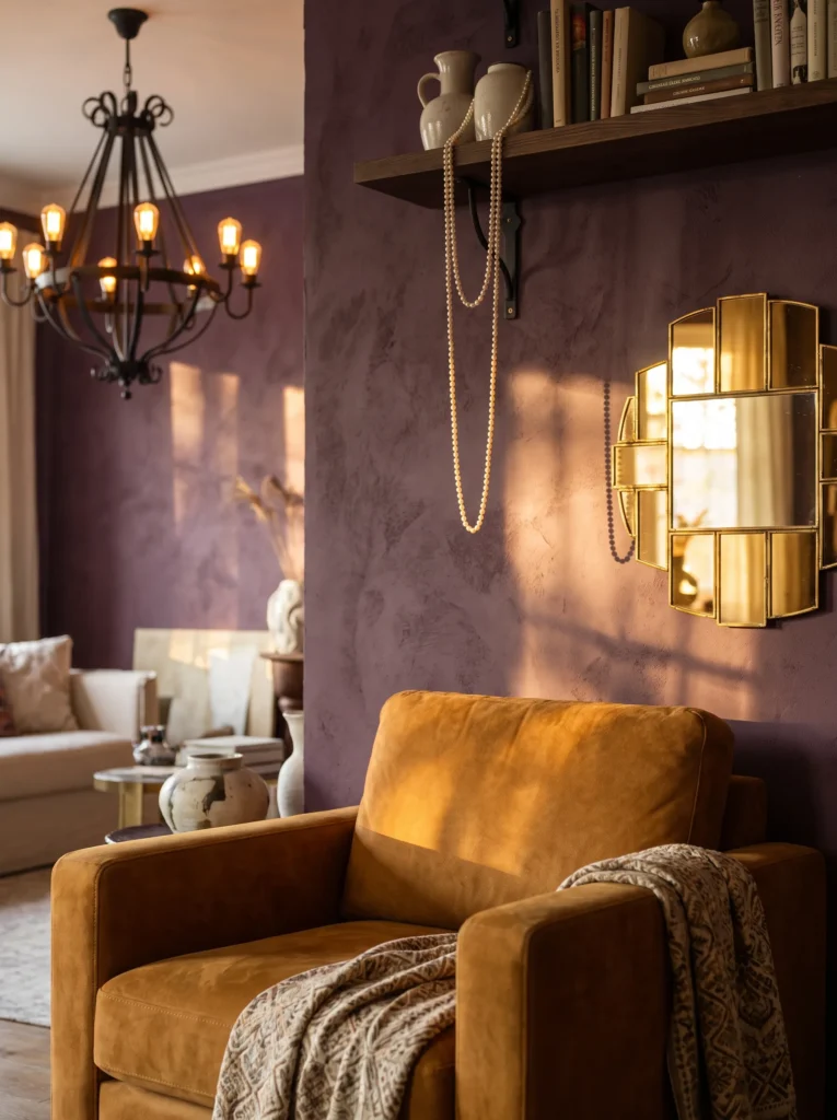
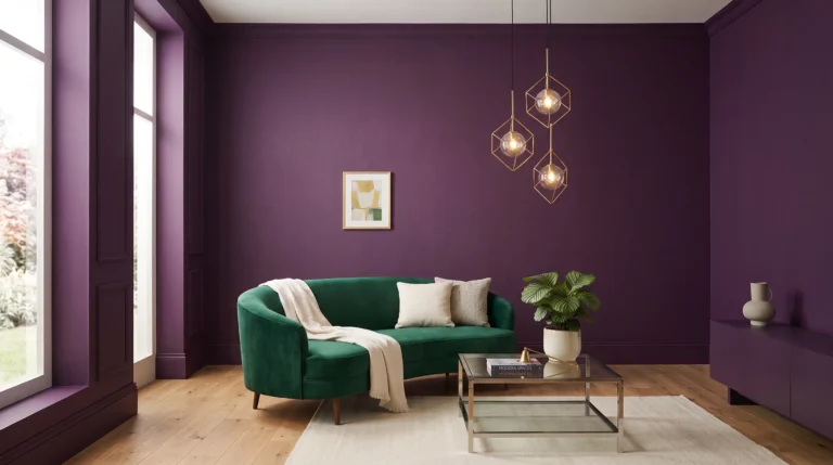
- Walls: Deep aubergine, near-eggplant, in a matte finish that reads almost black in low light and violet in sun
- Seating: Dusty plum suede armchair with a rounded, low-back silhouette
- Rug: A Moroccan-inspired ivory and black diamond-pattern rug layered over a solid deep plum wool rug beneath it
- Wall decor: A gallery wall of five vintage brass mirrors in varying organic shapes, catching light unevenly
- Plants: A snake plant (Dracaena trifasciata) in a matte black pot on the floor, and a trailing string of pearls (Curio rowleyanus) cascading from a high shelf
- Hanging elements: A black iron chandelier fitted with small amber bulbs, understated rather than statement-sized
- Lighting: Dimmable warm bulbs throughout, kept low for an evening mood even during the day
- Textiles: Pillows in indigo-plum ikat, mustard velvet, and burgundy suede, plus a chunky oatmeal knit throw
- Furniture/hardware: Black marble side table, dark walnut console against the far wall
Why this works: Aubergine walls read as nearly black until light hits them, which is exactly what gives this room its shifting, layered depth.
I painted my own reading nook this exact shade of aubergine two years ago, and it’s still my favorite room to sit in after dark. What surprised me was how the color changes completely depending on the light — flat and moody in the morning, almost violet by late afternoon. The suede armchair adds a tactile softness that leather can’t quite match, and the mismatched brass mirrors scatter light in small unpredictable flickers across the walls. It’s a corner that rewards slow mornings and quiet evenings equally, which is rare for a single design choice to pull off.
Dark, saturated wall colors like this one can feel heavy if every surface matches in weight, so contrast matters more than people expect. The suede chair, the polished marble side table, and the brushed brass mirrors are all doing different textural jobs, which keeps the eye moving instead of settling flat. A snake plant’s upright, architectural leaves read as almost sculptural against a wall this dark, while the trailing string of pearls softens the high shelf line. Together, they keep an intensely colored room from ever feeling closed in or claustrophobic.
3. Charcoal Walls, Brass Accents
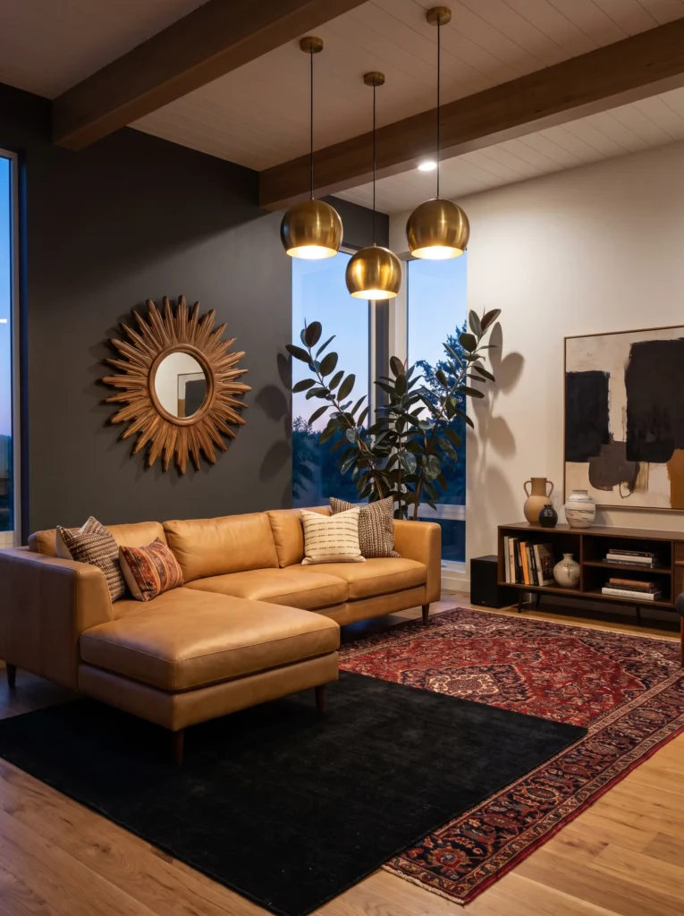
- Walls: Charcoal gray, matte finish, cool-toned rather than warm-toned black
- Seating: Camel leather sofa with a gently curved silhouette and rolled arms
- Rug: A vintage-style Persian rug in deep red and navy tones, layered over a solid black wool rug
- Wall decor: A large carved wood sunburst piece, positioned off-center above the sofa
- Plants: A rubber plant (Ficus elastica) in an aged brass pot, its dark glossy leaves nearly disappearing into the wall color
- Hanging elements: A cluster of three brass-and-glass pendant lights at varying heights
- Lighting: Warm dimmable bulbs, set low for evening ambiance
- Textiles: Pillows in burnt orange velvet, black-and-white ikat, and deep teal boucle
- Furniture/hardware: Antique brass coffee table with a smoked glass top, dark wood bookshelf along the side wall
Why this works: Cool charcoal walls make warm materials like brass and camel leather appear more saturated by contrast, not less.
Charcoal is often treated as a safe, neutral choice, but it’s actually one of the more dramatic backdrops you can use in a living room once warm materials enter the mix. Brass hardware and camel leather don’t fight a cool gray wall — they intensify against it, which is a basic color-contrast principle at work rather than a coincidence. The carved wood sunburst adds a sculptural focal point without introducing another pattern to compete with the layered Persian rug. This is a room built for people who want drama without leaning into anything overtly maximalist or busy.
My husband’s crew installed built-in bookshelves for a client last year in a nearly identical charcoal room, and the thing he mentioned afterward was how much the wall’s undertone mattered under different light sources. A charcoal with blue undertones can read almost navy under LED bulbs, while the same color under warm incandescent bulbs looks softer and more neutral. That’s worth testing with an actual sample on your wall before committing, especially in a room where brass and leather are meant to be the visual stars rather than fighting an unpredictable wall tone.
4. Espresso & Ikat Textiles
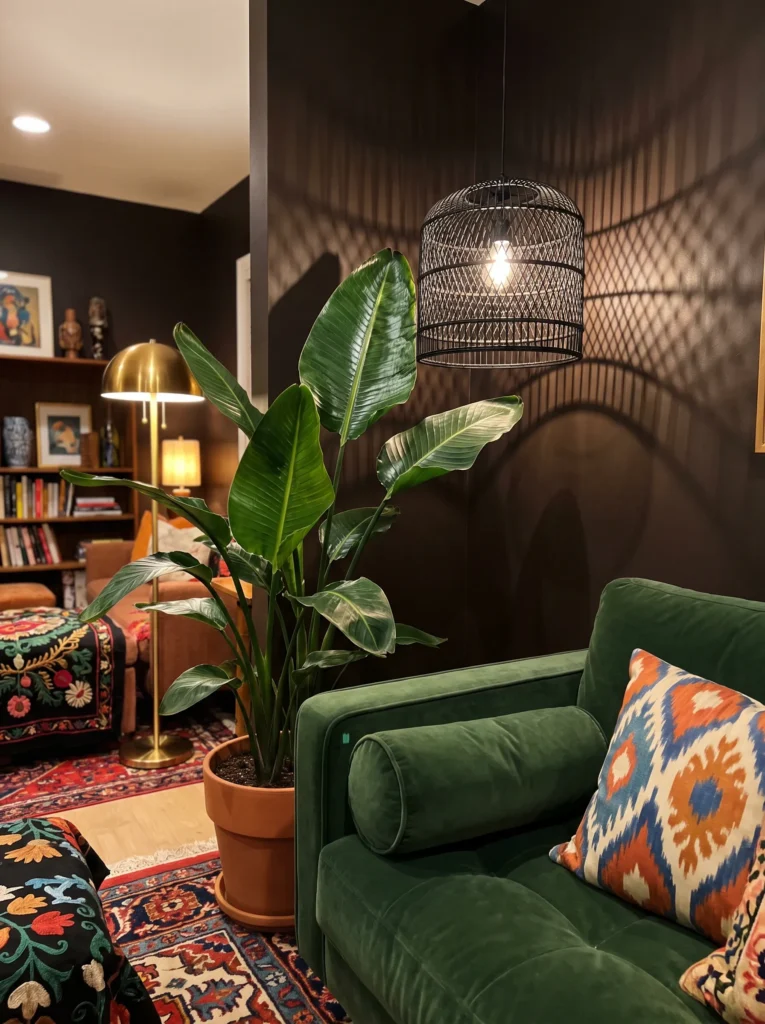
- Walls: Deep espresso brown, matte finish, nearly black but with warmth underneath
- Seating: Dark forest green velvet sofa, tailored and slightly boxy in shape
- Rug: A rust-and-cream ikat-pattern rug layered over a solid espresso-brown flatweave rug
- Wall decor: A handwoven textile wall hanging in burnt sienna and cream, distinct from a macrame piece in its dense, patterned weave
- Plants: A bird of paradise (Strelitzia reginae) in a dark ceramic pot, its broad leaves reaching toward the window
- Hanging elements: A black metal cage pendant light, casting patterned shadows across the ceiling
- Lighting: A brass floor lamp with a linen shade, positioned beside the sofa for reading light
- Textiles: Ikat-patterned pillows, burnt sienna velvet pillows, and a chunky wool throw in oatmeal
- Furniture/hardware: A black metal and dark wood coffee table, mixing matte and warm finishes
Why this works: Espresso walls paired with a single oversized plant create depth and scale that a smaller, sparser room setup can’t achieve.
Espresso is a color people underestimate for living rooms because it reads as heavy on a paint chip, but in person, against warm wood and a genuinely large plant, it becomes the most grounding backdrop in the whole house. A bird of paradise earns its keep here — the leaves are big enough to read as sculpture, not just greenery, and they hold up well in the lower light levels that darker rooms often have. The cage pendant light is doing double duty, functioning as both illumination and a shadow-casting decorative element once evening sets in.
I’ve noticed that rooms built around one dominant deep tone tend to photograph better than rooms trying to balance three or four different dark colors at once. Espresso brown gives this space a single, cohesive backdrop, which means the ikat rug and burnt sienna textiles can carry all the pattern and color variation without competing against the walls. It’s a lower-maintenance approach to dark boho than people expect — one strong wall color, one statement plant, and a handful of well-chosen textiles do more visual work than a room stuffed with a dozen small accents.
5. Ink Black, Velvet & Gold
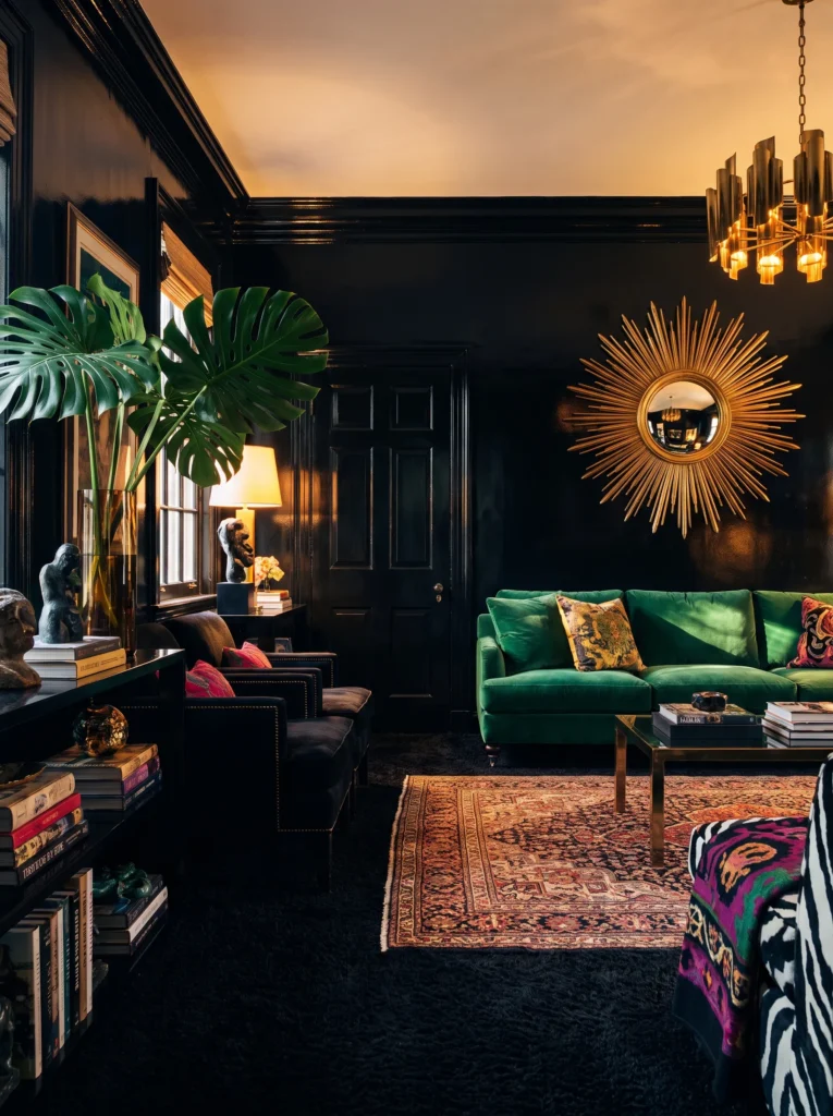
- Walls: Ink black, slightly glossy finish that catches light rather than absorbing it flat
- Seating: Emerald green velvet sofa with a curved, organic silhouette and gold-capped legs
- Rug: A vintage Turkish rug in deep red and gold tones, layered over a solid black shag rug for texture underfoot
- Wall decor: A large brass sunburst mirror, oversized and slightly tarnished for an antique feel
- Plants: A monstera (Monstera deliciosa) in a fluted gold planter, its split leaves catching light against the dark wall
- Hanging elements: A dramatic black iron chandelier with amber glass globes at varying heights
- Lighting: Warm dimmable bulbs, kept low to let the gold accents glow rather than glare
- Textiles: Pillows in gold velvet, deep burgundy silk, and black-and-cream ikat, plus a faux fur throw in warm charcoal
- Furniture/hardware: Black lacquer coffee table with brass inlay, marble-topped side table
Why this works: A glossy black wall finish reflects light instead of swallowing it, which is what keeps this room from feeling like a cave.
Most people avoid black walls because they assume the room will feel small and dark, but a glossy or satin finish changes that completely — light bounces around the space instead of disappearing into it. Pair that with emerald velvet and brass details, and the whole room takes on a jewel-box quality that photographs beautifully in almost any light condition. The monstera’s oversized leaves add scale and softness against a wall this dramatic, keeping the room from tipping into something that feels more like a nightclub than a living room.
That’s why many designers recommend a satin or eggshell sheen over flat matte when painting a living room black — flat finishes tend to absorb every bit of ambient light, while satin holds onto just enough shine to keep depth and dimension visible. My husband’s crew has repainted more than one client’s “too dark, too flat” black room simply by switching the sheen, without touching the color itself. Add brass hardware and a chandelier with warm amber bulbs, and the reflective surfaces do half the lighting work for you, no extra fixtures required.
You’ll Also Love: 22 Cozy Boho Living Room Ideas for a Stunning Home
6. Deep Rust, Bold Pattern Mix
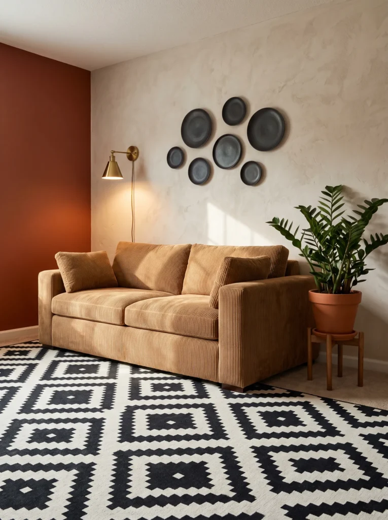
- Walls: Deep rust red, matte finish, warm and saturated without leaning orange
- Seating: Camel corduroy sofa with deep channel-tufted cushions for texture
- Rug: A bold geometric black-and-white rug layered over a solid rust flatweave rug beneath
- Wall decor: A collection of hand-thrown dark ceramic plates mounted in an asymmetric cluster
- Plants: A ZZ plant (Zamioculcas zamiifolia) in a rough clay pot, chosen for its tolerance of the lower light typical in a bold-walled room
- Hanging elements: A woven rattan-and-black-metal pendant light, mixing natural and industrial materials
- Lighting: A pair of brass wall sconces flanking the sofa, warm bulbs at 2400K
- Textiles: Pillows in mustard corduroy, black-and-cream stripe, and deep rust boucle, plus a chunky knit throw in cream
- Furniture/hardware: Reclaimed wood coffee table with black iron hairpin legs
Why this works: Mixing a bold geometric rug with rust walls works because the pattern’s black-and-white contrast keeps the saturated color from overwhelming the room.
Rust walls this saturated can feel like a big commitment, but the trick is giving the eye somewhere neutral to rest — that’s exactly what the black-and-white geometric rug does here. Without it, the room would lean too warm and start to feel one-note. The dark ceramic plate cluster adds a handmade, artisanal touch that reads as collected rather than purchased as a set, which is a hallmark of genuine boho styling. Corduroy on the sofa brings in a subtle ribbed texture that photographs with real depth under warm sconce light.
I’ve seen this exact color combination work in a client’s Austin bungalow where the natural light was limited to one small window — the rust walls actually made the room feel cozier rather than darker, which surprised her at first. A ZZ plant was the right call there too, since it tolerates low light far better than most trailing varieties people default to in boho spaces. The result is a room that feels intentional and grounded, not like bold color was added just for the sake of standing out.
7. Burnt Sienna, Layered Shadow
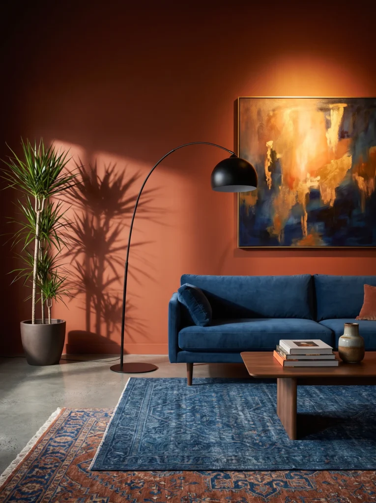
- Walls: Burnt sienna, matte finish, deep and slightly muted rather than bright
- Seating: Rust-colored bouclé loveseat paired with a single dark leather accent chair
- Rug: A faded vintage Persian rug in deep blue and rust tones, layered directly over polished concrete flooring for contrast
- Wall decor: A single oversized abstract painting in ochre, black, and cream tones
- Plants: A dracaena (Dracaena marginata) in a woven dark seagrass basket, its spiky silhouette reading almost graphic against the wall
- Hanging elements: A sculptural black metal arc floor lamp instead of a ceiling fixture, casting light upward
- Lighting: A single warm bulb in the arc lamp, deliberately dim for strong shadow contrast
- Textiles: Pillows in deep blue velvet, rust linen, and a single black-and-cream striped accent, plus a heavy wool throw in charcoal
- Furniture/hardware: Blackened steel side table, low walnut media console
Why this works: Polished concrete floors under a layered vintage rug create a cooler visual counterpoint that keeps a warm-toned room from feeling overly heavy.
Shadow does more design work in this room than any single object does. The arc floor lamp was chosen specifically over a ceiling fixture because upward-angled light throws long, dramatic shadows across the sienna walls in a way that flat overhead lighting simply can’t replicate. Combined with polished concrete flooring instead of the wood or carpet most boho rooms default to, the whole space reads as unexpectedly modern for a style usually associated with soft, rustic surfaces. It’s proof that dark boho doesn’t have to mean predictable materials throughout.
In my experience, one bold graphic element — like this oversized abstract painting — does more to anchor a boho room than a gallery wall of five smaller pieces ever could, especially in a space already carrying this much wall color and shadow. The dracaena’s spiky, upright form echoes the painting’s graphic lines rather than competing with them. Concrete floors also happen to be a practical choice in Austin’s climate, staying cooler underfoot through the warmer months, which is a small but genuinely useful detail worth factoring in.
8. Peacock Teal, Jewel-Tone Layers
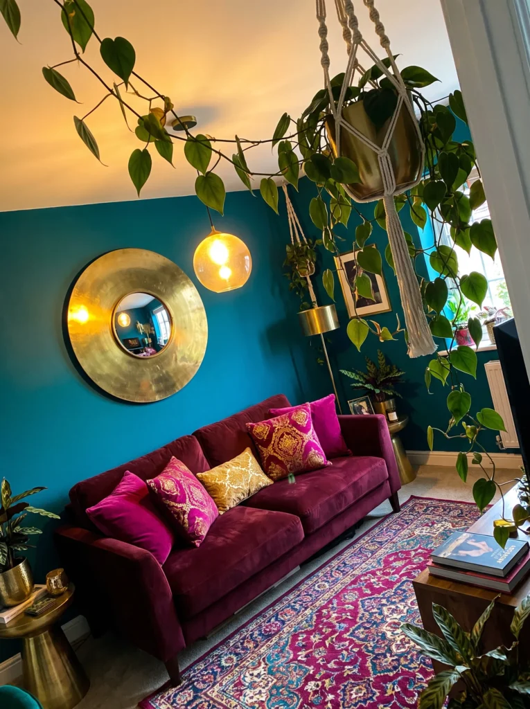
- Walls: Deep peacock teal, matte finish, cool and saturated without leaning navy
- Seating: Burgundy velvet sofa with a rounded, low-profile silhouette and brass casters
- Rug: A jewel-toned vintage rug in teal, magenta, and gold tones, layered over a solid deep navy flatweave rug
- Wall decor: A large hammered brass disc mirror, unframed and slightly irregular in shape
- Plants: A philodendron (Philodendron hederaceum) trailing from a hanging brass planter, paired with a calathea (Calathea orbifolia) in a matte teal ceramic pot on the floor
- Hanging elements: A brass and smoked glass pendant light, hung low over the coffee table rather than centered in the room
- Lighting: Warm dimmable bulbs at 2700K, supplemented by a single brass floor lamp in the reading corner
- Textiles: Pillows in magenta silk, gold velvet, and teal-and-cream ikat, plus a jewel-toned patchwork throw
- Furniture/hardware: Brass and glass coffee table, dark walnut console with brass hardware
Why this works: Peacock teal walls make jewel-toned textiles like magenta and gold read as intentional rather than clashing, because the wall itself sits in the same saturated color family.
Teal gets treated as a safe, spa-like neutral in most decor content, but push it darker and pair it with genuinely bold jewel tones, and it becomes something else entirely — a backdrop confident enough to hold magenta and gold without either color fighting for attention. The hammered brass mirror adds movement to the wall without introducing another hard pattern, which matters in a room already carrying a busy layered rug. This is one of those color combinations that looks risky on a paint chip and completely resolved once the whole room comes together.
I styled a version of this palette in my own sunroom last spring, and the trailing philodendron ended up being the detail that made the whole thing feel finished rather than just colorful. Its vines soften every hard edge in the room — the brass mirror, the glass coffee table, the geometric rug pattern underneath. Calathea’s patterned leaves add a second layer of visual interest at floor level, and both plants tolerate the indirect light most peacock-toned rooms end up with, since darker walls typically sit farther from direct windows.
9. Oxblood Walls, Vintage Brass
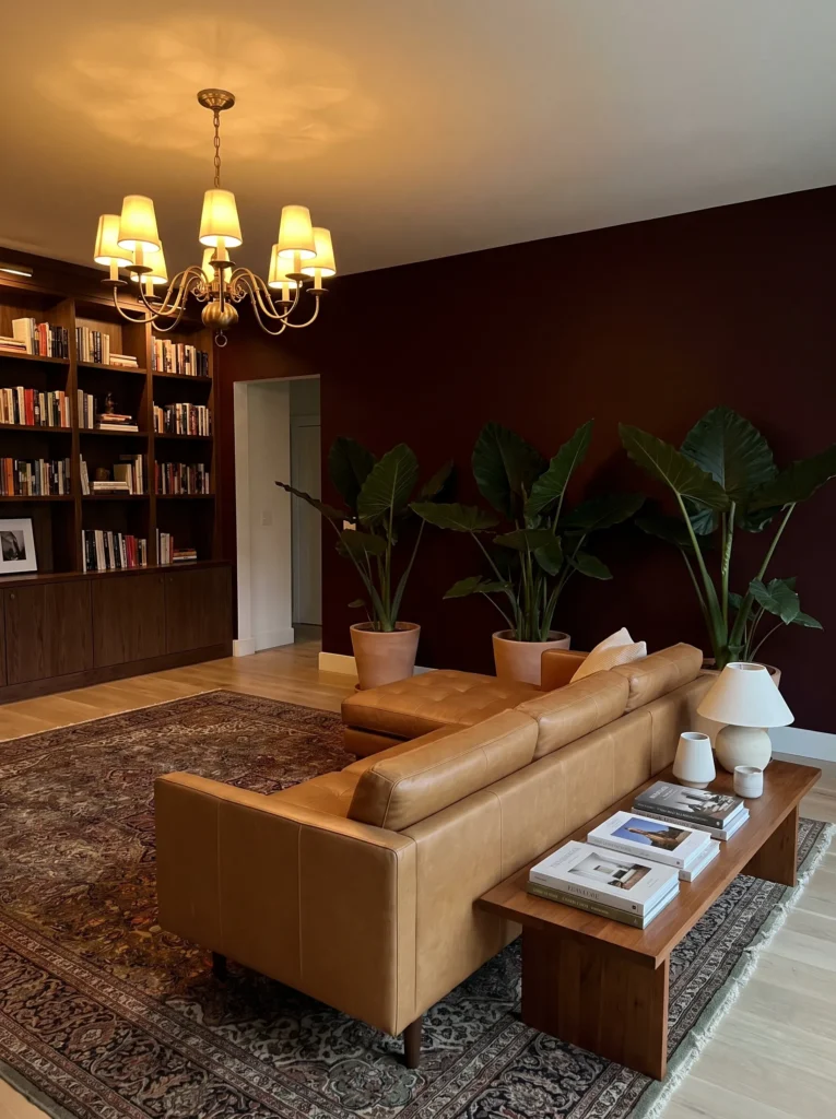
- Walls: Deep oxblood red, matte finish, closer to wine than true red
- Seating: Camel leather sectional, slightly worn-in looking with visible creasing
- Rug: A faded antique Persian rug in oxblood, navy, and cream, layered over a solid black jute-free flatweave rug
- Wall decor: A collection of vintage brass sconces mounted asymmetrically alongside a single framed botanical print
- Plants: An alocasia (Alocasia amazonica) in a dark bronze pot, its arrow-shaped leaves creating sharp silhouettes against the wall
- Hanging elements: A vintage brass chandelier with fabric shades in cream linen, softening the light output
- Lighting: Warm 2400K bulbs throughout, with sconces on a dimmer for evening ambiance
- Textiles: Pillows in navy velvet, oxblood suede, and cream linen, plus a heavy wool throw in charcoal plaid
- Furniture/hardware: Antique brass and dark walnut coffee table, leather ottoman doubling as extra seating
Why this works: Oxblood reads as a historic, library-adjacent color, which is exactly what makes vintage brass and worn leather feel period-accurate rather than randomly chosen.
Oxblood is a color with real history behind it — it shows up in old libraries, leather-bound books, and traditional men’s clubs for a reason: it’s a red that reads as serious rather than playful. That historical weight is why vintage brass sconces and a worn camel leather sectional feel so at home against it, instead of looking like mismatched thrift-store finds. The alocasia’s sharp, arrow-shaped leaves add a graphic modern edge that keeps the whole room from tipping into something that feels like a period recreation rather than a livable space.
That’s why many designers recommend pairing historically-rooted colors like oxblood with at least one clearly modern element — otherwise the room risks feeling more like a movie set than an actual living space. Here, that modern counterpoint comes from the alocasia’s sculptural form and the clean lines of the black flatweave rug underneath the antique Persian layer. The fabric-shaded chandelier softens what could otherwise be a harsh brass fixture, casting a warm, diffused glow that keeps the deep red walls from feeling as heavy as the color alone might suggest.
10. Cobalt Blue, Sculptural Statement
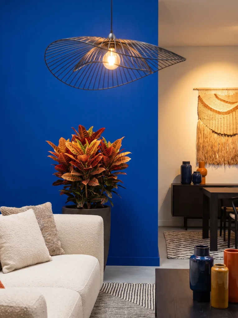
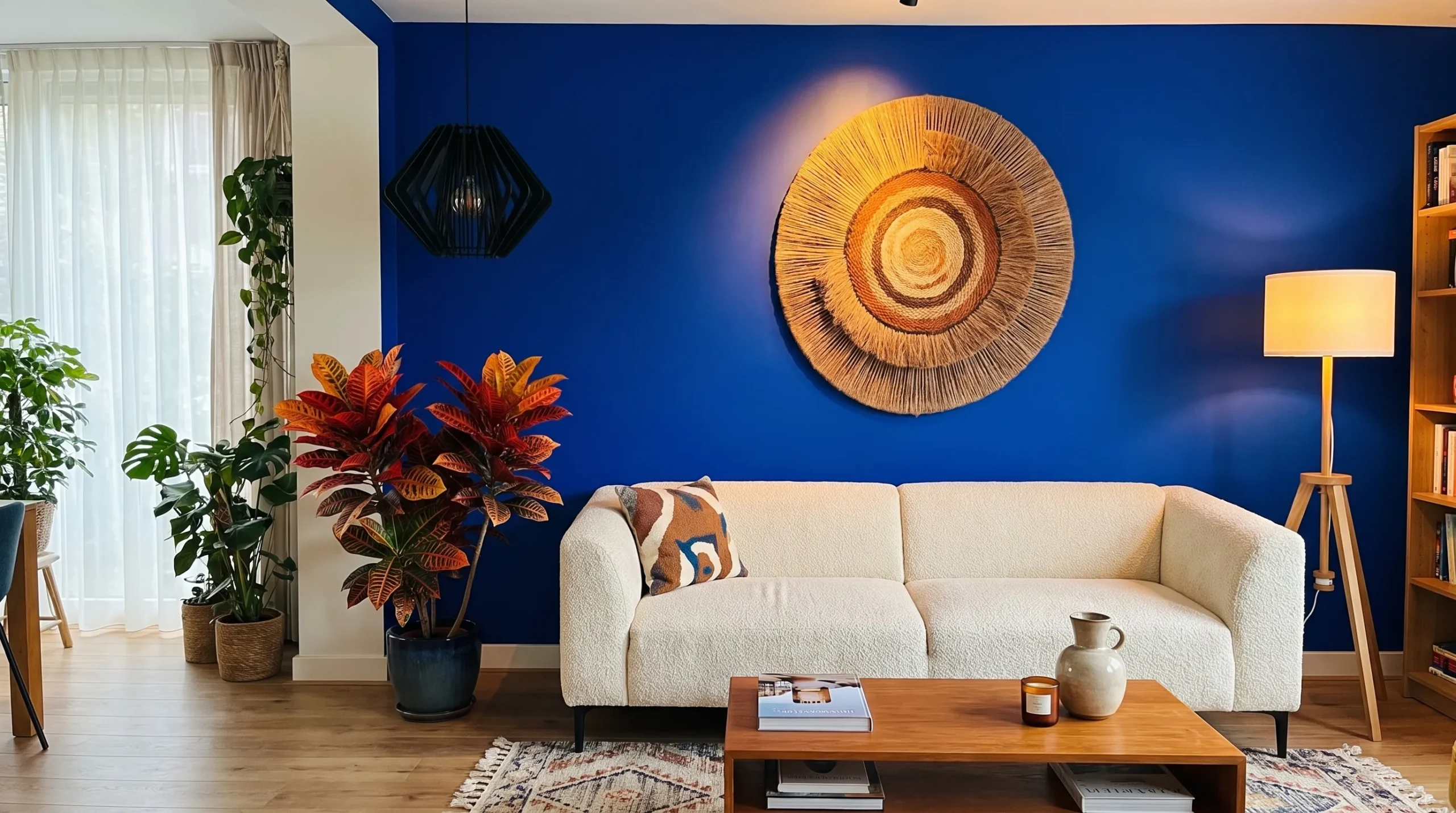
- Walls: Deep cobalt blue, matte finish, bold and fully saturated rather than a muted navy
- Seating: Cream bouclé sofa with a rounded, sculptural silhouette, chosen deliberately to contrast the intensity of the wall
- Rug: A black-and-cream mudcloth-inspired rug layered over a solid cobalt flatweave rug beneath
- Wall decor: A single oversized woven wall sculpture in cream and black, dimensional rather than flat
- Plants: A croton (Codiaeum variegatum) in a black textured pot, its red-and-gold leaves standing out sharply against the blue wall
- Hanging elements: A sculptural black metal pendant light with an angular, asymmetric shape
- Lighting: Warm bulbs offset against the cool wall tone, positioned to create contrast rather than match the room’s temperature
- Textiles: Pillows in black-and-cream mudcloth print, mustard velvet, and cobalt boucle, plus a chunky cream throw
- Furniture/hardware: Black marble coffee table, brass-legged side table
Why this works: Pairing a cool cobalt wall with warm-toned lighting and a croton’s red foliage creates deliberate temperature contrast that keeps the room from feeling one-note.
Cobalt is one of the boldest choices on this entire list, and it works specifically because nothing else in the room tries to match its temperature. The cream bouclé sofa and warm brass lighting push against the wall’s coolness instead of blending into it, which is a basic but often-overlooked styling principle — contrast, not coordination, is what makes a saturated color feel intentional. The croton’s red-and-gold leaves do something similar in miniature, giving the eye a genuinely unexpected pop of warm color against all that blue.
I’ve noticed that fully saturated blue walls are the ones people hesitate over most in consultations, more than black or oxblood even, because blue reads as “cold” on a paint chip in a way it doesn’t once warm lighting and materials enter the room. The angular black pendant light adds a sculptural, almost architectural moment overhead, while the woven wall piece brings in the handmade texture that keeps this from feeling like a sterile, overly modern space. Together, it’s boho with real edge — collected, textured, but unmistakably bold.
11. Forest Green, Botanical Statement
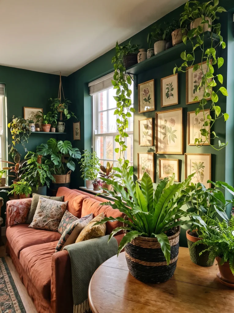
- Walls: Deep forest green, matte finish, dark enough to nearly disappear in low light
- Seating: Rust-colored linen sofa with a relaxed, slightly slouchy silhouette
- Rug: A vintage-style rug in cream, rust, and deep green tones, layered over a solid black flatweave rug
- Wall decor: A dense cluster of pressed botanical prints in mismatched dark wood frames, hung salon-style
- Plants: A bird’s nest fern (Asplenium nidus) in a woven dark basket, paired with a trailing pothos (Epipremnum aureum) cascading from a high shelf
- Hanging elements: A brass and rattan pendant light, mixing warm metal with natural fiber
- Lighting: Warm 2700K bulbs, plus a brass reading lamp positioned beside the sofa
- Textiles: Pillows in rust corduroy, cream boucle, and deep green velvet, plus a chunky wool throw in oatmeal
- Furniture/hardware: Dark walnut coffee table with turned wood legs, brass-accented bar cart in the corner
Why this works: Forest green walls create a backdrop dense enough that plants read as an extension of the wall rather than a separate decorative layer.
Green rooms have a strange effect that most people don’t anticipate until they’ve lived in one — the walls start to feel less like a boundary and more like a backdrop that plants and greenery simply blend into. That’s exactly the effect at play here, where the bird’s nest fern and trailing pothos read almost as part of the architecture rather than separate accessories. The salon-style botanical print cluster reinforces that same feeling, turning the whole wall into something layered and collected rather than a single flat color statement.
This is a palette I keep coming back to because it’s the closest thing to bringing a garden indoors without leaning into anything overtly “jungle” or theme-y. Forest green as a wall color has enough depth to hold rust and cream accents without either one reading as too bright or out of place. The brass-and-rattan pendant light adds warmth overhead, while the dark walnut coffee table grounds the whole room in a way that keeps it feeling substantial rather than sparse, even with a relatively restrained furniture footprint.
12. Marigold & Saffron Warmth
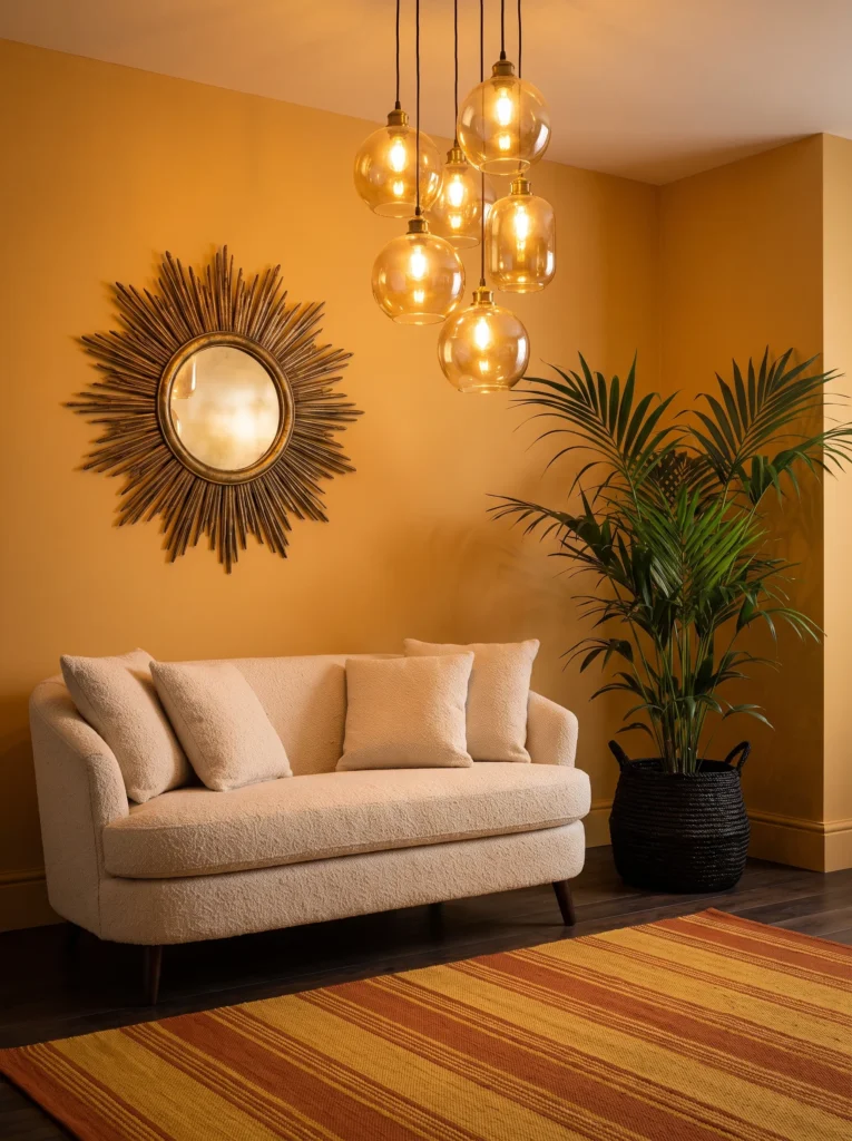
- Walls: Deep marigold gold, matte finish, saturated and warm rather than pastel or muted
- Seating: Chocolate brown leather chair paired with a cream bouclé loveseat
- Rug: A saffron-and-black striped rug layered over a solid rust flatweave rug beneath
- Wall decor: A large sculptural sun mirror in aged brass, oversized and slightly irregular
- Plants: A parlor palm (Chamaedorea elegans) in a woven black basket, chosen for its tolerance of the lower ambient light a gold-walled room tends to have
- Hanging elements: A cluster of small amber glass pendant lights at staggered heights
- Lighting: Warm dimmable bulbs, kept intentionally low to let the gold walls glow rather than flatten out
- Textiles: Pillows in burnt orange velvet, black-and-cream stripe, and saffron linen, plus a chunky cream throw
- Furniture/hardware: Black iron coffee table with a reclaimed wood top, brass-accented console table
Why this works: Marigold walls need warm, low lighting to look intentional rather than flat — bright overhead light washes out the depth that makes this color work.
Gold walls have a reputation for looking dated, but that’s usually a lighting problem, not a color problem. Bright, cool overhead lighting flattens marigold into something closer to a nursery-yellow, while warm, dimmable bulbs kept low let the color hold its depth and read as genuinely rich rather than washed out. The staggered amber pendant cluster is doing exactly that job here, casting small warm pools of light across the room instead of one flat wash. Paired with black iron and aged brass, the whole space feels grounded instead of overly bright.
I’ve noticed that gold as a primary wall color is one people are most nervous to commit to, even more than black or deep red, because it can go wrong so easily with the wrong lighting temperature. My advice is always to test the paint under the bulbs you actually plan to use, at the time of day you’re usually in the room, before committing to a full wall. Get the lighting right, and marigold becomes one of the warmest, most inviting bold colors on this entire list — genuinely save-worthy rather than risky.
13. Deep Indigo, Textural Depth
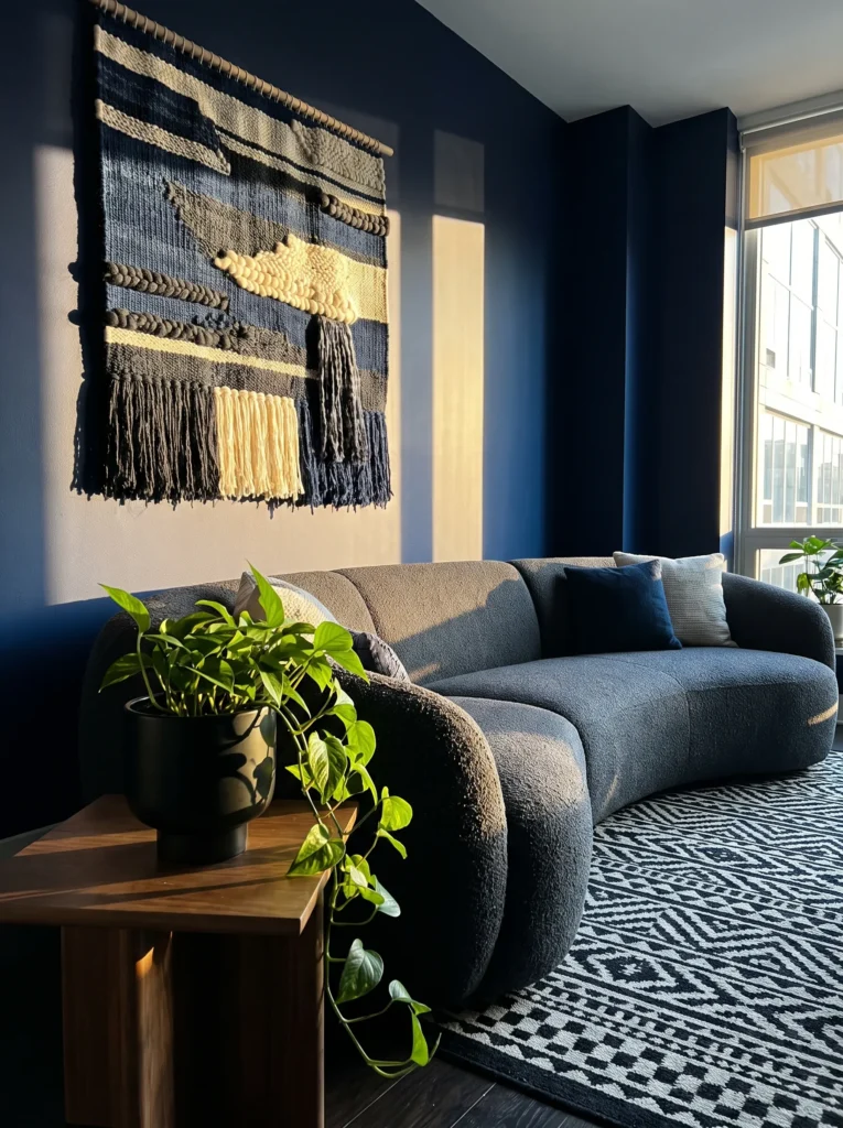
- Walls: Deep indigo blue, matte finish, dark enough to read nearly black in shadow and true blue in direct light
- Seating: Charcoal bouclé sectional with deep, plush cushions
- Rug: A black-and-white geometric rug layered over a solid indigo flatweave rug beneath
- Wall decor: A large handwoven textile piece in indigo, cream, and rust tones, dense and heavily textured
- Plants: A pothos (Epipremnum aureum) trailing from a black hanging planter, paired with a snake plant (Dracaena trifasciata) in a woven basket on the floor
- Hanging elements: A black metal and rattan pendant light, mixing industrial and natural materials
- Lighting: Warm 2400K bulbs, supplemented by a brass floor lamp positioned in the reading corner
- Textiles: Pillows in rust velvet, cream boucle, and indigo-and-white ikat, plus a heavy wool throw in charcoal
- Furniture/hardware: Blackened steel coffee table with a reclaimed wood top, dark walnut media console
Why this works: Indigo shifts visibly between near-black and true blue depending on light angle, which gives this room a sense of movement that a flat, single-tone wall color can’t achieve.
Indigo is one of the more chameleon-like colors you can choose for a living room — it genuinely looks different depending on the time of day and the angle of light hitting it. Morning light reads it as almost navy-black, while direct afternoon sun brings out real blue undertones, which means the room never looks quite the same twice. The handwoven textile piece on the wall leans into that same idea, its dense texture catching and holding shadow differently depending on where you’re standing. It’s a color choice that rewards paying attention.
The charcoal bouclé sectional was a deliberate choice here, since a lighter neutral would have flattened the contrast between wall and furniture that makes this room feel so layered. Snake plant and pothos both handle the lower light levels that deep indigo walls tend to create, which matters more than people think — a plant that needs bright direct sun will struggle and look sparse in a room this saturated. Choose foliage suited to your actual light conditions, not just what looks good in a photo.
14. Fuchsia Accent, Charcoal Base
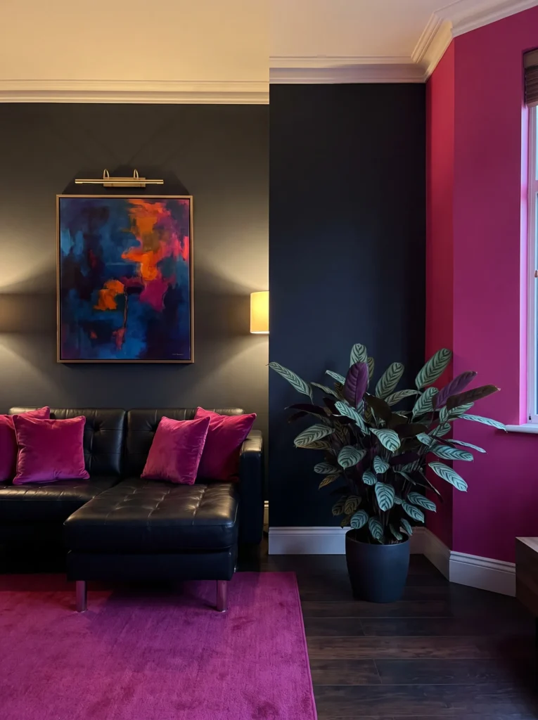
- Walls: Charcoal base wall with one fuchsia accent wall, both matte finish, creating deliberate contrast rather than a single flat color
- Seating: Black leather sofa, low and minimal in silhouette to let the wall color carry visual weight
- Rug: A magenta-and-black abstract pattern rug layered over a solid charcoal flatweave rug beneath
- Wall decor: A single large-scale abstract painting in fuchsia, black, and gold tones, positioned on the charcoal wall opposite the accent wall
- Plants: A calathea (Calathea orbifolia) in a matte black pot, its patterned leaves echoing the room’s bold color mix
- Hanging elements: A black metal and smoked glass pendant light, minimal and architectural in shape
- Lighting: Warm dimmable bulbs, with a dedicated picture light above the painting for evening drama
- Textiles: Pillows in fuchsia velvet, black-and-gold stripe, and charcoal linen, plus a faux fur throw in deep gray
- Furniture/hardware: Black marble coffee table, brass-legged bar cart
Why this works: Using fuchsia as a single accent wall rather than the entire room lets a genuinely bold color feel curated instead of overwhelming.
Fuchsia is a color most people would never consider for an entire living room, and honestly, they’d be right to hesitate — but as a single accent wall against a charcoal base, it becomes something else entirely: bold without being exhausting to live with day to day. The abstract painting on the opposite wall pulls the same fuchsia tone back into the room in a smaller, more controlled dose, which keeps the whole space feeling intentional rather than like two competing color schemes fighting for attention.
That’s why many designers recommend the “80/20 rule” for bold accent colors — roughly 80 percent of the room in a grounding neutral or dark tone, with the remaining 20 percent carrying the boldest color choice. Here, that ratio plays out through the charcoal base, black leather sofa, and dark rug, with fuchsia showing up only on one wall, in the painting, and in a handful of velvet pillows. It’s the most approachable way to bring a genuinely daring color into a boho space without it overwhelming everything else in the room.
15. Burgundy & Antique Gold
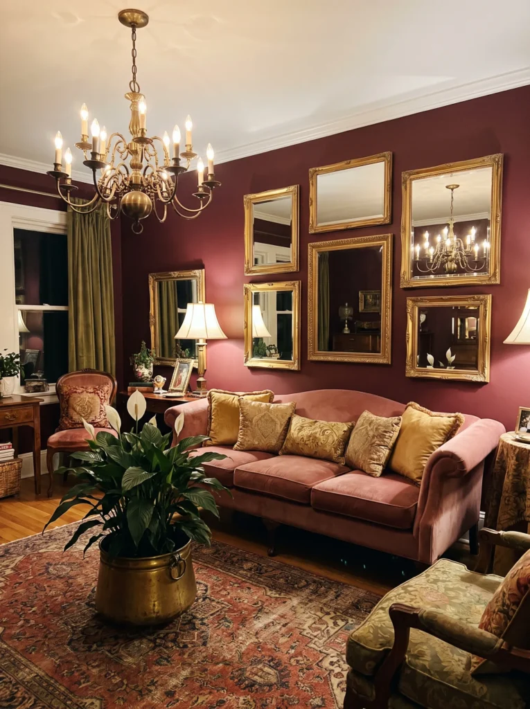
- Walls: Deep burgundy, matte finish, closer to dried wine than bright red
- Seating: Dusty rose velvet sofa with a curved, low-profile silhouette
- Rug: An antique-style rug in burgundy, gold, and cream tones, layered over a solid black flatweave rug beneath
- Wall decor: A cluster of antique gold-framed mirrors in varying sizes, hung asymmetrically
- Plants: A peace lily (Spathiphyllum wallisii) in an aged gold pot, chosen for its tolerance of the softer, indirect light typical in a burgundy room
- Hanging elements: An antique brass chandelier with small cream fabric shades
- Lighting: Warm 2400K bulbs throughout, dimmed low for evening ambiance
- Textiles: Pillows in gold velvet, dusty rose linen, and burgundy suede, plus a heavy wool throw in cream
- Furniture/hardware: Antique gold coffee table with a smoked glass top, dark walnut console
Why this works: Burgundy paired with antique gold rather than polished brass gives this room a softer, more heirloom-like quality than a typical bold-color scheme.
Burgundy has a tendency to read as either overly formal or overly Victorian, and the difference here comes down almost entirely to material choice — antique, slightly tarnished gold instead of sharp polished brass. That small shift softens the whole palette, making dusty rose velvet and cream fabric shades feel like a natural pairing rather than a mismatch. The cluster of mismatched mirrors adds movement and light without introducing a competing color, which matters in a room already carrying this much depth in the walls alone.
I’ve found that burgundy works best in rooms that get at least some afternoon light, since the color can lean almost brown in spaces that stay dim all day. A peace lily handles those softer light conditions well, and its glossy dark leaves pick up the same cool undertone running through the burgundy walls. Antique gold accents throughout — the chandelier, the mirrors, the coffee table — tie everything together without ever feeling matchy, which is really the goal with a heirloom-inspired palette like this one.
16. Plum & Charcoal Contrast
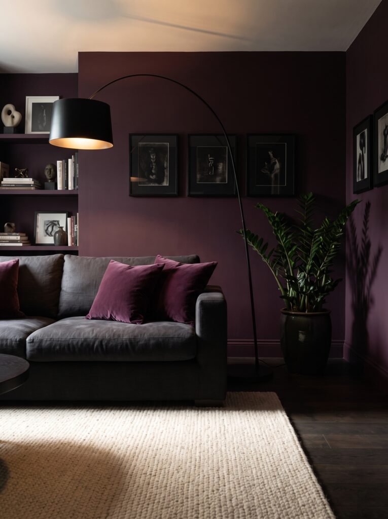
- Walls: Deep plum, matte finish, cooler and more muted than a true purple
- Seating: Charcoal linen sofa with a boxy, tailored silhouette
- Rug: A black-and-plum abstract pattern rug layered over a solid cream flatweave rug beneath, inverting the usual dark-under-light approach
- Wall decor: A large asymmetric fiber art piece in cream and charcoal wool
- Plants: A ZZ plant (Zamioculcas zamiifolia) in a matte plum ceramic pot, its glossy dark leaves nearly blending into the wall
- Hanging elements: A black metal arc floor lamp instead of a ceiling fixture
- Lighting: A single warm bulb in the arc lamp, deliberately dim to emphasize contrast between the light rug and dark walls
- Textiles: Pillows in charcoal boucle, plum velvet, and cream linen, plus a chunky charcoal knit throw
- Furniture/hardware: Blackened steel side table, light ash wood media console for contrast
Why this works: Reversing the typical rug-layering order — a lighter rug on top of a darker one — creates visual lift in a room where every other surface leans deep and saturated.
Most layered-rug advice defaults to a dark accent rug over a lighter base, but flipping that order here does something more useful in a room this saturated: it gives the eye a place to land. The cream rug on top keeps the floor from disappearing into the same tonal range as the plum walls and charcoal sofa, which is a real risk when nearly every surface in a room sits in the same deep color family. The light ash console does similar work, breaking up what would otherwise be an unrelenting wall of dark furniture and finishes.
In my experience, rooms that go this dark benefit enormously from at least one lighter-toned furniture piece, and it doesn’t need to be large to make a difference. That ash console is a small footprint against the wall, but it changes how the whole room reads at a glance. The ZZ plant’s glossy leaves almost disappear into the plum backdrop by design, adding depth without competing for attention the way a lighter-leafed plant would in this particular color scheme.
17. Wine Red, Maximalist Layers
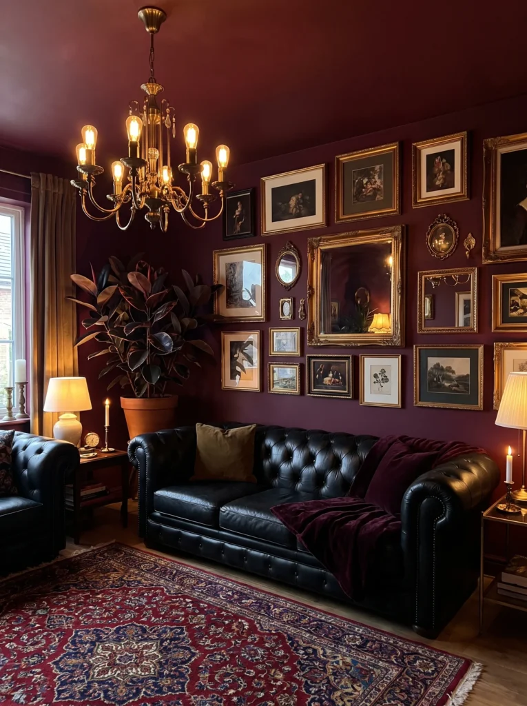
- Walls: Deep wine red, matte finish, richer and more brown-leaning than a true burgundy
- Seating: Black leather chesterfield-style sofa with deep button tufting
- Rug: A heavily patterned vintage rug in wine, navy, gold, and cream, layered over a solid black wool rug beneath
- Wall decor: A dense gallery wall mixing framed botanical prints, a small vintage mirror, and a woven fiber piece — genuinely eclectic rather than curated-to-match
- Plants: A rubber plant (Ficus elastica ‘Burgundy’) in a dark bronze pot, its deep red-black leaves nearly matching the wall tone
- Hanging elements: A vintage brass chandelier, ornate but aged rather than polished
- Lighting: Warm 2400K bulbs throughout, kept moody and low
- Textiles: Pillows in navy velvet, gold silk, wine suede, and black-and-cream stripe, plus a heavy tapestry-weave throw
- Furniture/hardware: Dark walnut coffee table with carved detailing, antique brass bar cart
Why this works: Choosing a burgundy-leafed rubber plant that nearly matches the wall color is a small styling trick that makes the whole room feel unified rather than assembled from separate ideas.
This is the most maximalist idea on the entire list, and it earns that reputation honestly — dense gallery wall, heavily patterned rug, ornate chandelier, four different pillow fabrics. What keeps it from tipping into chaos is a wine-toned color thread running through nearly every element, including a rubber plant variety specifically chosen because its burgundy leaves echo the wall rather than contrast with it. That’s a detail most people never think to consider when picking houseplants for a color-driven room, but it makes a real difference.
I’ve seen this work well in older Austin homes with genuine architectural character — high ceilings, original trim — where a maximalist room like this feels appropriate rather than overwhelming. In a smaller or more modern space, I’d scale back the gallery wall and pillow count by about half. The core idea still holds: deep wine walls, aged brass rather than polished, and a plant variety that intentionally blends rather than pops, all working together instead of competing.
Styling Principles: Layering Without Losing Control
Dark boho rooms live or die on layering, but layering isn’t the same as adding more. The trick is establishing one dominant dark tone per room and letting every other color — gold, rust, cream, magenta — play a supporting role rather than compete for lead. Rugs should always layer in odd numbers of texture, not just pattern: a flatweave under a patterned piece, never two busy patterns stacked directly on top of each other. Plants earn their place by contrast, not quantity — a single large-leafed plant against a dark wall does more visual work than five small pots scattered around a room. And light matters more in dark rooms than in light ones: warm, dimmable bulbs aren’t optional here, they’re what keeps a saturated wall color from reading as flat or heavy instead of rich and intentional. The single biggest mistake in dark boho styling is treating every surface with equal visual weight — the strongest rooms always have one quiet element, whether that’s a plain rug, a solid-color sofa, or a single neutral wall, giving the eye somewhere to rest.
Frequently Asked Questions
Is dark boho too much for a small living room? Not if you manage light correctly. A dark, saturated wall color can actually make a small room feel more intentional and cozy rather than smaller, as long as you layer in warm, dimmable lighting and at least one reflective or lighter-toned element — a mirror, a cream rug, a light wood console — to keep the space from feeling closed in.
What are the best plants for a dark boho living room? Snake plants, ZZ plants, pothos, and rubber plants all tolerate the lower indirect light that darker-walled rooms typically get, since these rooms are often positioned away from direct window exposure. Fiddle leaf figs and bird of paradise work too, but need a bit more natural light to thrive long-term.
How do you layer rugs without it looking messy? Stick to one patterned rug and one solid rug per layered pairing, never two busy patterns together. Keep the solid rug slightly larger so it peeks out as a visible border, and choose colors that already appear somewhere else in the room — a wall tone, a pillow fabric — so the layering feels connected rather than random.
What’s a budget-friendly way to try dark boho? Paint is the cheapest, highest-impact change you can make, and a single accent wall lets you test a bold color without committing an entire room. From there, a layered vintage rug from a secondhand shop and a cluster of thrifted mirrors or frames go a long way before you spend anything on new furniture.
What’s the best lighting for a dark boho space? Warm bulbs in the 2400K–2700K range, kept on dimmers wherever possible. Avoid bright, cool overhead lighting entirely — it flattens saturated wall colors and washes out the shadow depth that makes dark boho rooms feel rich rather than dim.
Does dark boho work in a room with limited natural light? Often better than a light, airy boho scheme would. Rooms with less natural light already read as moodier by default, so leaning into that with a deep wall color and warm artificial lighting tends to look more intentional than fighting the room’s natural conditions with pale paint that just reads as dull instead of bright.
Conclusion
Dark boho isn’t about being loud for the sake of it — it’s about giving a room enough depth and shadow to feel genuinely lived-in. Whether you land on ink black and gold, burnt sienna and shadow, or a jewel-toned peacock corner, each of these dark boho living room ideas proves that bold color and boho texture were always meant to work together, not apart.
I’ve seen how much richer a space feels once the walls stop playing it safe. Save this post before you start your next room refresh, try one palette in a single corner first, and pass it along to anyone still stuck on beige.