15 Pink Coquette Bedroom Ideas That Feel Romantic, Not Juvenile
Pink doesn’t have to read as childish — it just has to be done right. That’s the whole idea behind these 15 pink coquette bedroom ideas: bows, ribbon, and vintage romance styled with real materials and genuine restraint, so the result reads as adult and intentional rather than costume-like. This is the coquette aesthetic’s biggest hurdle, and it’s one most guides skip entirely, jumping straight to pretty photos without explaining why some pink rooms feel sophisticated and others feel like a teenager’s sleepover. I’ve styled versions of this trend for clients who loved the look online but worried it would feel too young for a grown woman’s bedroom, and the fix is almost always the same
: fewer motifs, better fabric, more restraint. Inside, you’ll find fifteen fully styled rooms — each with its own palette, its own signature detail, and its own reason it works — built to feel romantic, not juvenile, and genuinely worth recreating.
What Makes a Coquette Bedroom Feel Sophisticated Instead of Juvenile
Here’s what most coquette bedroom guides get wrong: they treat this trend as a color story, when it’s actually a material story. The difference between a sophisticated coquette bedroom and a teenage pink bedroom comes down to material quality and restraint, not color choice. A bow tied from thin polyester ribbon reads as costume. The same motif hand-tied in silk-satin and mounted once as a deliberate focal point reads as intentional and adult. Scatter five bows through a room and it skews juvenile; place one and let it anchor the space, and it reads as design.
I learned this firsthand restyling a client’s guest room last spring — swapping her craft-store ribbon for grosgrain silk changed the entire mood without moving a single piece of furniture.This post shows you how to build that same sophistication into fifteen distinct coquette bedroom designs.
Oversized Bow Headboard
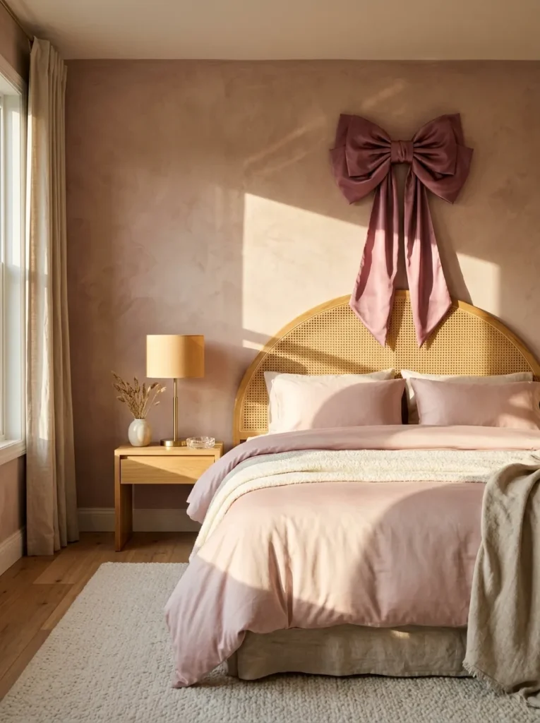
- Walls: Dusty rose limewash paint — a warm, plaster-like matte finish
- Bedding: Ballet-pink cotton sateen duvet with a scalloped lace edge on the pillow shams
- Wall Decor: A vintage 1950s ballet lithograph in a slim brass frame, hung slightly off-center above the nightstand
- Plant: A maidenhair fern in a fluted ivory ceramic pot, chosen for delicate fronds that echo the bow’s texture
- Hanging Detail: A slim grosgrain ribbon tieback knotted at the curtain’s midpoint
- Rug: An ivory boucle rug for texture underfoot
- Curtains: Sheer ballet-pink voile panels
- Bed Frame: A curved cane bed frame with brushed brass hardware, topped with an oversized silk-satin bow hand-tied and mounted directly above the headboard’s center
Why this works: A single oversized bow, made from real silk-satin and mounted with real hardware, functions as a piece of art rather than a costume prop — which is the exact distinction between adult coquette styling and juvenile pink decor.
Scale is what makes a statement bow read as sophisticated rather than juvenile. When a bow spans nearly the width of the headboard, it stops looking like an accessory and starts functioning as an architectural focal point — the same way a piece of oversized art anchors a room. Silk-satin holds a crisp, structured knot that catches light differently than synthetic ribbon, giving the bow visible dimension instead of a flat, craft-store look. Paired with a curved cane headboard and brushed brass hardware, the bow reads as a deliberate design choice, not a decorative afterthought.
I’ve styled this exact bow-over-headboard moment for a client who worried pink would feel too young for her primary bedroom. The reaction surprised both of us — guests kept asking where the “artwork” above her bed came from, assuming it was a custom piece rather than a $40 length of silk ribbon. That’s the real payoff of dusty rose limewash walls: the matte, slightly chalky finish absorbs light instead of reflecting it, so the bow and the brass hardware read as the brightest, most polished elements in the room. Small budget, disproportionate visual impact.
Vintage Vanity Corner with Ribbon-Wrapped Mirror
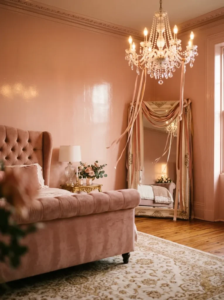
- Walls: Cameo pink (a warm, coral-leaning pink) high-gloss lacquer finish — dramatic enough to catch light across the whole room
- Bed Frame: A channel-tufted upholstered wingback bed in blush velvet, standing on slim gold cabriole legs
- Bedding: Ivory silk-blend duvet with a single wide satin ribbon sewn horizontally across the top third, tied off at one side in a soft bow
- Wall Decor/Anchor: A full-length vintage brass mirror, its entire frame spiral-wrapped in wide ivory silk ribbon, positioned diagonally in the corner rather than flush against the wall
- Lighting Fixture: A small crystal chandelier above the vanity, with two satin ribbon streamers tied loosely around opposite arms
- Plant: A flowering cyclamen in a scalloped porcelain pot on the vanity surface, chosen for blooms that echo the wall’s coral-pink undertone
- Rug: A cream Persian-style rug with a faded raspberry medallion pattern
- Curtains: Floor-length cameo-pink silk dupioni panels with a single satin bow tieback at each side
- Construction Note: My husband always insists a full-length mirror this size gets mounted with a French cleat screwed into studs, never leaned freestanding or hung on a single hook — the weight and the ribbon wrapping make it top-heavy
Why this works: Wrapping an entire mirror frame in ribbon, rather than adding a single small bow somewhere in the room, turns a functional object into the room’s most dramatic focal point — proof that coquette detailing can carry real visual weight without tipping into costume territory.
This is the idea to reach for when a reader wants their coquette bedroom to feel like a full moment, not a single accent. High-gloss cameo pink walls do something matte paint can’t: they bounce chandelier light around the entire room, so every ribbon detail — the mirror wrap, the bedding bow, the curtain tiebacks — catches a slightly different gleam depending on where you’re standing. The channel-tufted wingback bed grounds all that shine in something substantial and upholstered, so the room reads as a genuinely furnished space rather than a set of decorative accessories arranged around a plain bed frame.
I styled a version of this corner for a client who wanted her whole bedroom to feel like “getting ready for something special” every single morning, and the ribbon-wrapped mirror is what did it — she told me she catches herself glancing at it walking past the doorway. A mirror this size holds real visual weight once it’s dressed, which is exactly why my husband treats the mounting like a piece of furniture installation, not a picture hang. Anchored properly, it becomes the kind of detail a reader photographs before they’ve even finished decorating the rest of the room.
Ballet Photograph Wall
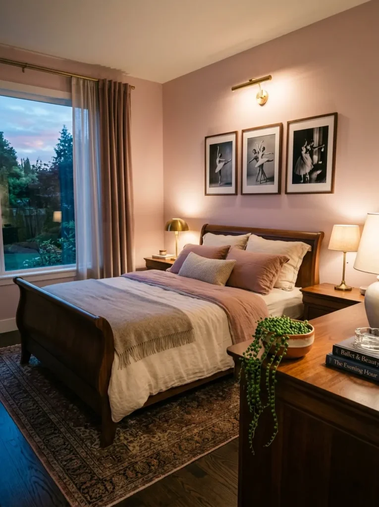
- Walls: Rosewater (a soft, cool-toned pink) eggshell paint
- Wall Decor/Art: A large-scale black-and-white vintage ballet photograph in a thin walnut frame, hung salon-style with two smaller matching prints
- Bedding: Silk-blend duvet in rosewater, left free of lace or trim so the photography wall stays the focal point
- Bed Frame: A low-profile curved wood sleigh bed
- Plant: String of pearls trailing from a low, wide ceramic bowl planter on the dresser
- Hanging Detail: A small bundle of dried pampas grass looped through a satin ribbon and hung beside the window
- Rug: A pale rosewater flokati rug for texture underfoot
- Construction Note: My husband insists on anchoring salon-style frames into studs, not just drywall anchors, since several frames grouped closely puts real strain on one section of wall
Why this works: A vintage photograph, printed large and framed simply, delivers the same visual drama as a bow or ribbon detail without any risk of reading as costume-like — making it one of the safest coquette anchors for a reader who wants restraint.
A photograph does something a physical bow or ribbon can’t: it introduces the coquette aesthetic’s romantic, vintage reference point without adding another physical texture to the room. Black-and-white ballet photography, printed at a genuinely large scale and hung salon-style, reads as gallery-worthy rather than themed, especially against a quiet rosewater wall with almost no other pattern competing for attention. Keeping the bedding free of lace or trim isn’t a missed opportunity — it’s what lets the photography wall carry the entire room’s personality. This suits a reader who wants the reference without the fuss.
I once had a reader tell me she’d always loved coquette styling online but felt too old for bows and lace in her own bedroom — so we built her room around a photograph wall instead. The result read as sophisticated the moment guests walked in, and nobody used the word “girly.” That’s the quiet power of a rosewater flokati rug and a low, curved sleigh bed frame: they carry warmth and softness without a single overt motif. The string of pearls trailing from its bowl planter on the dresser softens the photography wall’s formality.
Lace Canopy Four-Poster
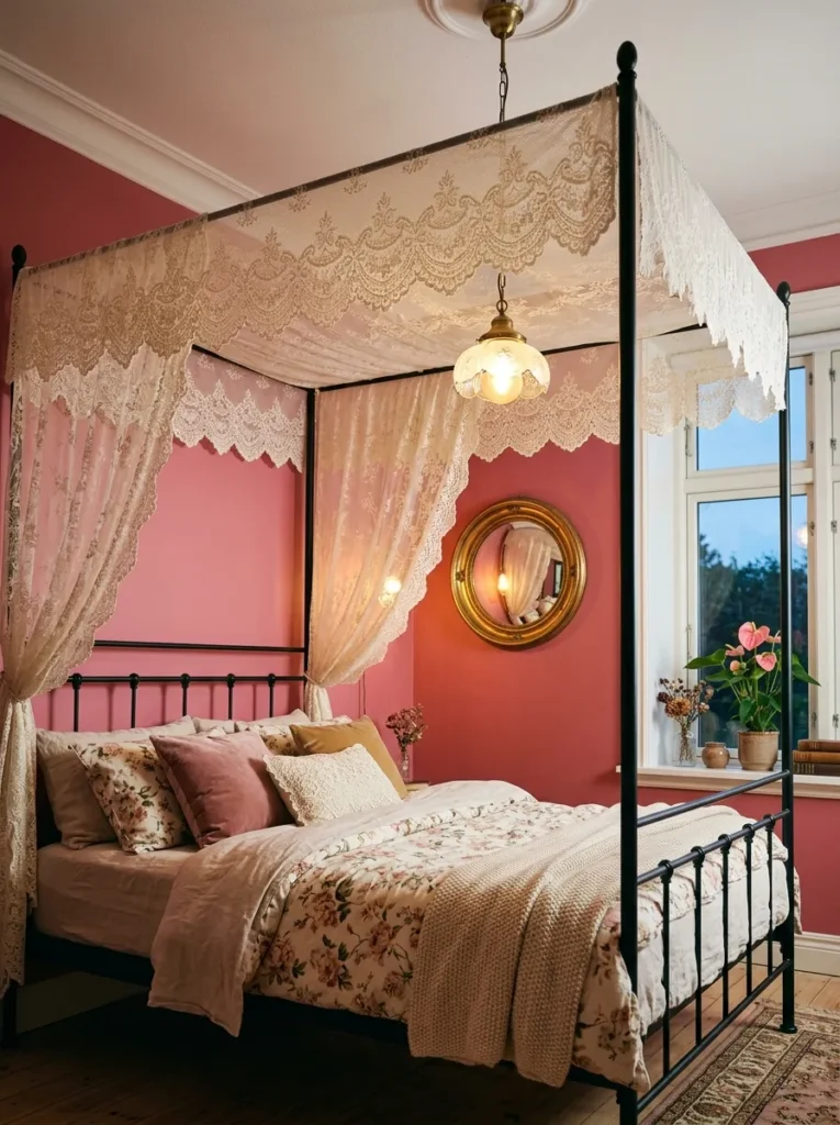
- Walls: Strawberry milk (a warmer, more saturated pink) matte paint
- Bed Frame: A four-poster bed with a slim black metal frame
- Hanging/Anchor: An antique-style lace canopy draped loosely across the top rails, its scalloped edge visible at each corner
- Bedding: Strawberry-milk linen duvet, left plain so the lace canopy stays the visual star
- Wall Decor: A round convex mirror in a warm brass frame above the dresser
- Plant: A pink anthurium in a fluted brass pot on the windowsill
- Rug: A rust-pink Moroccan rug with a cream diamond pattern
- Construction Note: My husband always checks that a canopy frame is screwed into ceiling joists, not just drywall, since fabric weight plus airflow from a ceiling fan can pull a poorly anchored frame down over time
Why this works: Lace reads as delicate and expensive only when it’s used sparingly against a plain, saturated background — a single lace canopy against solid strawberry-milk walls creates far more visual impact than lace scattered across pillows, curtains, and bedding all at once.
Lace has a reputation problem in coquette styling because it so often appears everywhere at once — on the pillows, the curtains, and the bedding simultaneously — which flattens its impact and pushes the whole room toward costume territory. Used once, as a single antique-style canopy draped over a four-poster frame, lace becomes an architectural gesture instead of a decorative pattern repeated to exhaustion. Against a saturated strawberry-milk wall, the canopy’s ivory tone stands out in genuine contrast rather than blending into a sea of matching pink textiles, which is exactly the effect worth chasing.
I’ve noticed that four-poster frames intimidate people who worry the style reads too formal or old-fashioned, but a slim black metal frame solves that instantly — it’s structural without any of the heaviness of a carved wood four-poster. My husband treats the canopy mount the same way he’d treat any ceiling fixture: screwed into a joist, never just drywall, because fabric plus air movement from a ceiling fan puts more strain on that anchor point than most people expect. Once it’s secure, the pink anthurium on the windowsill and the rust-pink Moroccan rug ground the room in pattern and color.
Storybook Canopy Alcove
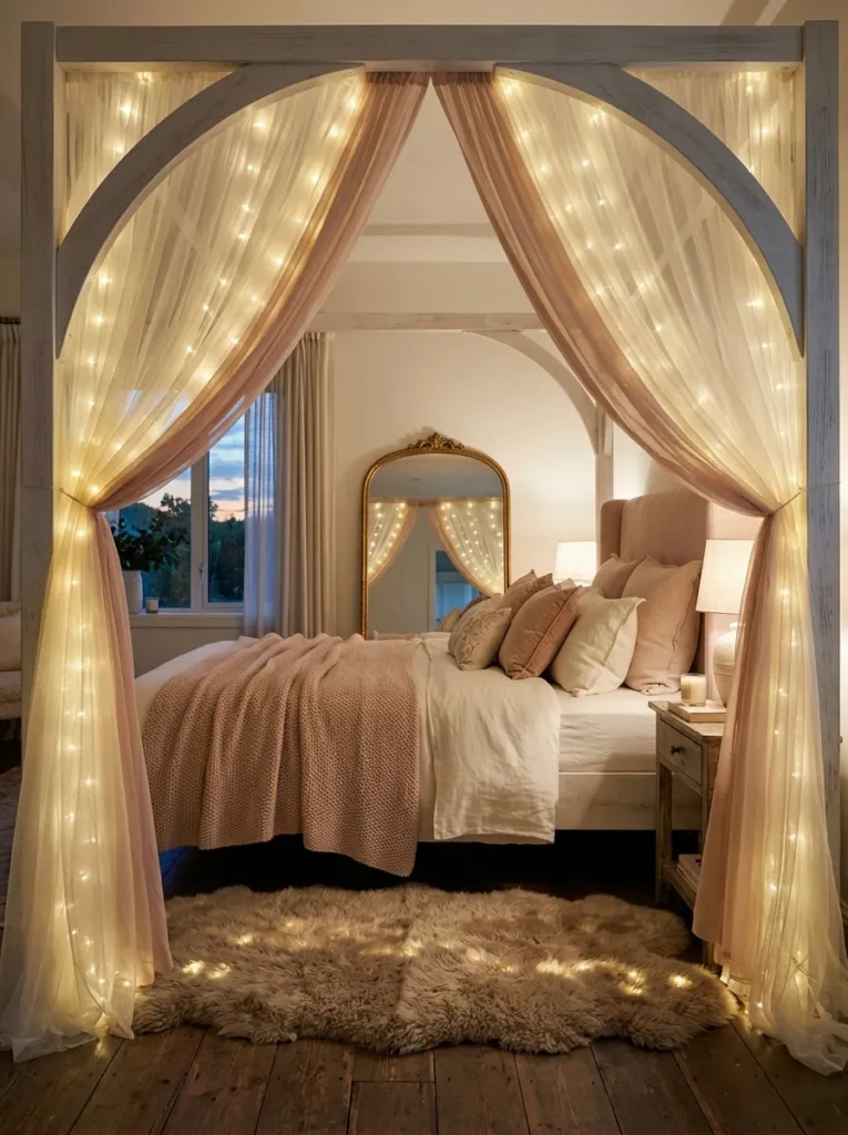
- Walls: Peony pink Venetian plaster — a warm, glazed finish that visibly shifts tone depending on the light hitting it
- Bed Frame: A whitewashed wood arch frame shaped like a storybook doorway, canopy draped from the top of the arch
- Canopy: Layered ivory tulle and blush chiffon, threaded with warm micro fairy lights woven through the fabric folds
- Bedding: Blush silk-satin duvet with a scalloped ivory lace trim along the edge
- Wall Decor: An oversized gilt-edge arched mirror positioned directly behind the headboard, echoing the canopy frame’s shape
- Plant: A miniature potted rose bush in a fluted ceramic urn on the nightstand
- Rug: Ivory sheepskin layered over a blush chenille rug
- Lighting: A floral porcelain chandelier with soft pink glass shades
- Construction Note: My husband insists any fairy lights woven directly into fabric run on low-voltage battery or USB power only — never mains-wired — since fabric sitting this close to a light source becomes a real fire risk if it’s done with the wrong hardware
Why this works: A whitewashed arch frame draped in layered tulle and threaded with warm fairy lights recreates the exact visual language of a storybook illustration — proof that fairy tale styling can be executed as genuine architecture, not costume-store fabric draped over a standard bed frame.
This is the idea for a reader who wants their whole bed to feel like walking through a storybook doorway rather than sleeping under a themed decoration. The arch shape does real architectural work here — it draws the eye upward and gives the canopy fabric something structural to drape from, instead of sagging loosely off a flat headboard. Peony pink Venetian plaster amplifies the effect because its glazed surface catches the chandelier’s pink glow and the canopy’s fairy lights differently throughout the evening, so the whole corner seems to shift and glow rather than sit static.
I built a version of this alcove for my own guest room last winter, mostly out of curiosity, and it became the one thing every visitor photographs before they’ve even set their bag down. The trick is restraint in the layering: two sheer fabrics, not five, so the tulle and chiffon read as soft movement instead of a heavy stage curtain. My husband’s rule about battery-powered lights matters more than it sounds — I’ve seen mains-wired string lights get looped through fabric canopies online, and that’s a genuine hazard once the fabric brushes against a warm bulb overnight.
Rose Garden Arch Headboard
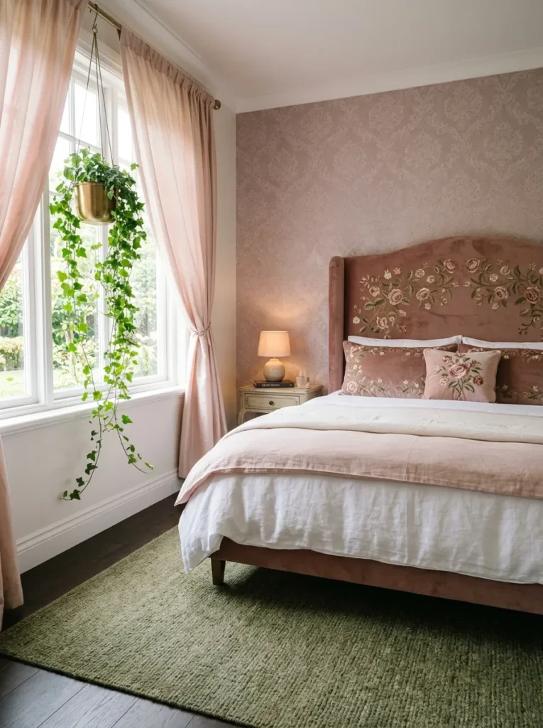
- Walls: Sugarplum pink flocked velvet wallpaper with a subtle raised floral texture
- Bed Frame: A curved wood arch headboard upholstered in dusty rose velvet, hand-embroidered with trailing rosebuds
- Bedding: Cream cotton sateen with a delicate rosebud embroidery border along the top hem
- Wall Decor: A trio of pressed real rose botanical prints in thin antiqued gold frames
- Plant: Trailing ivy in a hanging scalloped brass planter beside the window, cascading down the wall like a garden vine
- Rug: Moss-green wool rug with a faded floral border
- Curtains: Blush silk panels with a scalloped hem, tied back with wide velvet ribbon bows
- Lighting: Warm brass sconces shaped like tulip blooms, flanking the headboard
Why this works: Embroidered rosebuds on an upholstered arch headboard, paired with real trailing ivy and pressed botanical prints, brings an actual garden indoors instead of just referencing one through color — which is what gives this room its fairy tale depth rather than surface-level prettiness.
A garden theme fails the moment it becomes literal — floral wallpaper stacked on floral bedding stacked on floral art. This room avoids that by choosing one dimensional texture, the flocked velvet wallpaper, and letting everything else stay closer to solid: cream sateen, moss-green wool, dusty rose velvet. The rosebud embroidery on the headboard becomes the room’s single floral moment worth lingering on, rather than one pattern lost among five others. Trailing ivy cascading from a hanging planter adds the one truly living element, which does more to sell a “garden” feeling than any printed pattern ever could.
As someone who came to home styling through plant science, this room is close to my heart — living ivy trailing down a wall does something no printed floral can, because it changes slightly week to week as new growth appears. I’ve noticed clients underestimate how much a single trailing plant softens a room compared to adding more decorative objects. Moss-green wool grounds the pink and gold palette in something earthy rather than sugary, which is exactly what keeps this idea reading as garden-romantic instead of overly sweet.
Moonlit Moss & Glass Cloche Corner
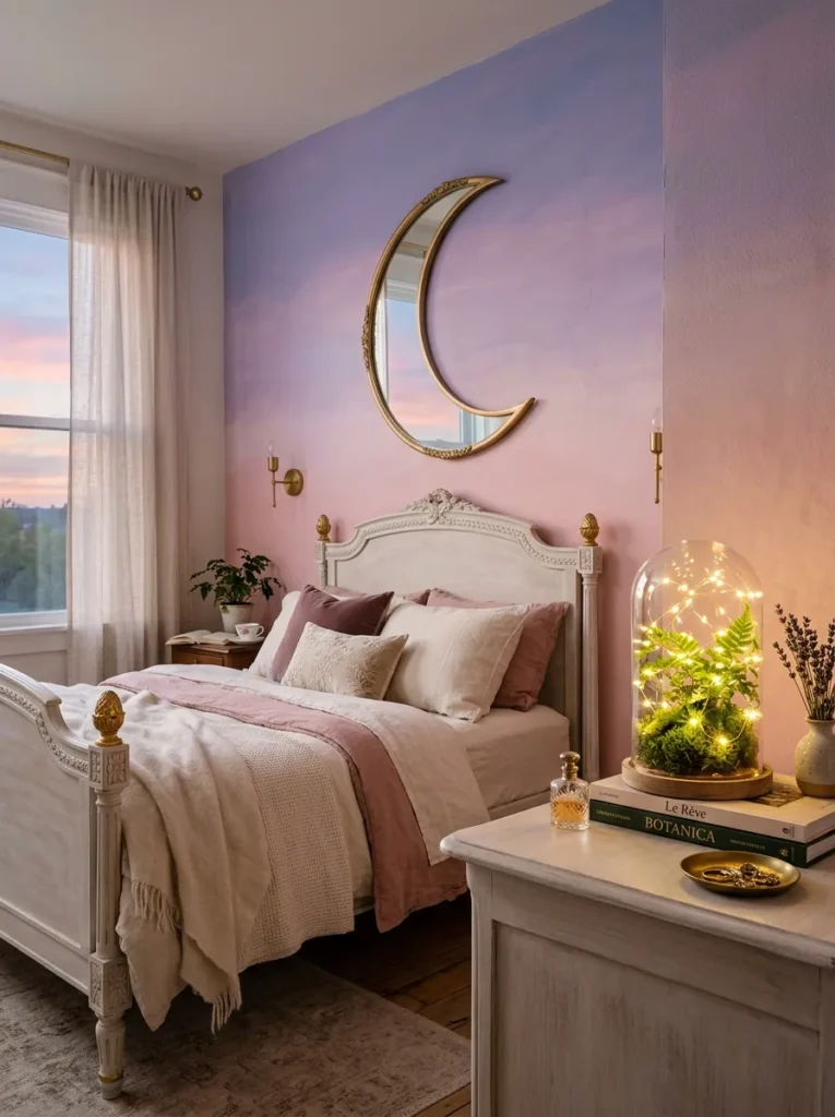
- Walls: Cherry blossom pink hand-painted ombré mural, fading upward into a dusky lavender near the ceiling
- Bed Frame: A hand-carved French provincial bed frame in whitewashed wood with gold leaf detailing on the finials
- Bedding: Ivory silk-blend duvet with a single antique lace-edge pillow sham
- Wall Decor: A large moon-shaped mirror in brushed gold, hung to reflect the mural’s gradient
- Plant: Sheet moss and a baby fern arranged under a glass cloche on the dresser
- Rug: Pale lavender-pink shag rug
- Hanging Detail: A dried baby’s breath garland draped along the headboard’s top edge
- Lighting: Warm micro fairy lights tucked inside the glass cloche and along the mural’s upper edge
Why this works: A moss garden sealed under glass mimics a self-contained woodland scene straight out of a fairy tale, and pairing it with an ombré mural that fades from pink into lavender creates the visual sense of dusk settling over the whole room.
This is the idea for a reader who wants fairy tale romance without a single bow or ribbon in sight. The ombré mural does the heaviest lifting — painted by hand so the transition from cherry blossom pink to dusky lavender looks organic rather than like a printed gradient, it gives the room the exact feeling of a sky changing color at twilight. A moon-shaped mirror positioned to catch that gradient doubles the effect without adding another object competing for attention. Gold leaf on the bed frame’s finials catches whatever light is in the room, day or night, keeping the whole space from feeling flat.
I built the glass cloche detail after noticing how often true woodland fairy tale scenes get reduced to fake moss or plastic greenery in decor photos — using real sheet moss and a small live fern under real glass keeps the moment alive and slightly changing, the same way a terrarium does. That’s a direct carryover from my plant science background: living material photographs and feels different from anything artificial, even at a glance. Fairy lights tucked inside the cloche give it a soft internal glow after dark that no printed decor piece can replicate.
Enchanted Rose Trellis Canopy,pink coquette bedroom ideas
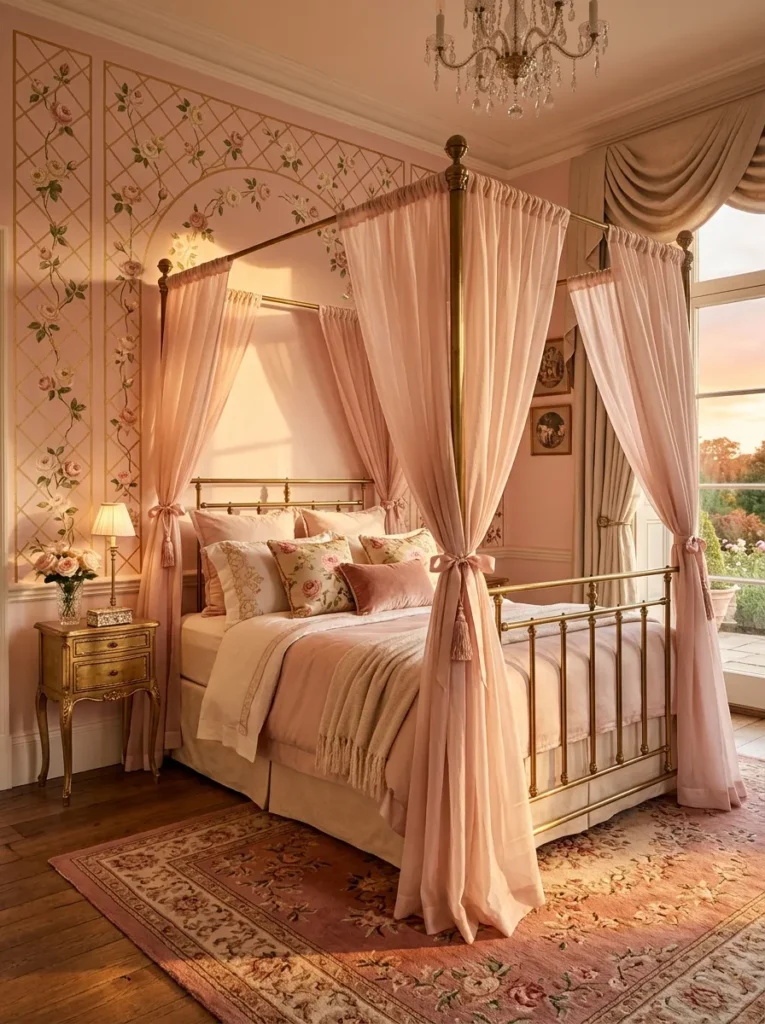
- Walls: Powder pink hand-painted trellis mural — thin gold trellis lines climbing upward with painted rosebuds threaded through the lattice
- Bed Frame: A curved brass canopy bed frame, the posts shaped like slender trellis rails to echo the mural
- Canopy: Sheer blush organza draped between the brass posts, gathered loosely rather than pulled taut
- Bedding: Ivory silk duvet with a raspberry-pink piped edge
- Wall Decor: A gilt birdcage sconce mounted beside the headboard, holding a single flameless candle
- Plant: A climbing jasmine vine trained up a small trellis stake beside the window, chosen for its fragrance and delicate white blooms against the pink mural
- Rug: Antique-rose Aubusson-style rug with a faded floral medallion
- Construction Note: My husband always specifies toggle bolts, not standard drywall anchors, for brass canopy posts this tall — the frame’s height puts real leverage on the mounting point whenever someone leans against it
Why this works: A hand-painted trellis mural gives the illusion of a climbing rose garden growing directly up the wall, and a brass canopy frame shaped to match the trellis lines turns the entire bed into an extension of that garden rather than a separate piece of furniture sitting in front of it.
Most trellis-inspired rooms stop at the wallpaper and leave the bed frame unrelated, which breaks the illusion the moment you look past the headboard. Shaping the brass canopy posts to echo the mural’s trellis lines solves that — the bed reads as part of the garden structure, not a piece dropped in front of a pretty backdrop. Sheer blush organza gathered loosely between the posts, rather than pulled into a tight peak, keeps the silhouette soft and slightly imperfect, the way real climbing vines never grow in a perfectly straight line. Jasmine trained up its own small stake reinforces the sense of an actual garden extending indoors.
I’ve noticed that readers trying a trellis room often reach for printed vine wallpaper and stop there, missing the detail that makes it feel dimensional: a real climbing plant nearby, trained the same direction as the painted lines. That small overlap between painted and living greenery is what convinces a visitor’s eye the whole wall is growing, not just decorated. My husband’s point about toggle bolts matters here more than usual — this frame is taller and heavier than a standard bed, and a loose mount undoes the whole effect fast.
Pearl & Butterfly Vanity Nook
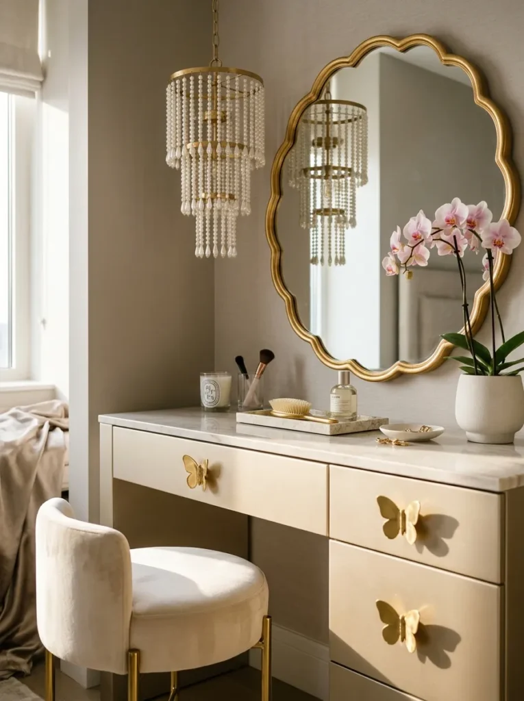
- Walls: Dragée pink (a pale, almond-candy pink) soft matte paint
- Bed Frame: A scalloped upholstered bed in oyster-white bouclé, with a gently curved, cloud-like silhouette
- Bedding: Champagne silk-blend duvet, left unadorned so the vanity nook carries the room’s drama
- Wall Decor: A large scalloped-edge mirror in antiqued gold above the vanity table
- Lighting Fixture: A cascading pearl-drop chandelier hung directly above the vanity stool
- Hardware: Vintage brass butterfly-shaped drawer pulls on the vanity and dresser
- Plant: A flowering orchid in a scalloped porcelain pot, positioned beside the vanity mirror
- Rug: Ivory bouclé rug with a scalloped edge that echoes the bed and mirror shapes
Why this works: Repeating one scalloped shape across the bed frame, the mirror, and the rug — rather than introducing a new silhouette for each piece — gives the whole room a cohesive, custom-designed feeling that reads as far more expensive than the individual pieces actually cost.
A vanity nook lives or dies on lighting, and a cascading pearl-drop chandelier positioned directly above the stool does something a standard overhead fixture never could: it throws soft, broken light across the mirror at exactly the height where someone would sit to get ready. Butterfly-shaped brass pulls on the drawers below add a small, unexpected detail that rewards a closer look without shouting for attention the way a larger motif would. Dragée pink walls stay quiet enough that the vanity nook, not the wall color, becomes the room’s obvious focal point the second you walk in.
I’ve styled vanity corners for years, and the scalloped-edge repetition is the detail that consistently gets remembered. When the bed, the mirror, and the rug all echo the same soft, rounded shape, a room feels custom-designed even when every piece was sourced separately. That’s the quiet trick behind a lot of rooms that look far more expensive than their actual budget. Butterfly hardware sounds like a small thing until a guest opens a drawer and notices it — that’s the moment a room goes from pretty to genuinely considered.
Swan Lake Velvet Corner
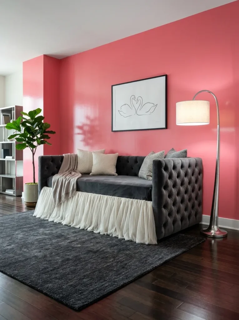
- Walls: Watermelon-ice pink (a cool, slightly deeper pink than blush) high-gloss lacquer
- Bed Frame: A curved tufted velvet daybed shaped with a subtle swan-neck armrest silhouette
- Bedding/Textile: Blush velvet throw layered with an ivory tulle bed skirt, gathered like a ballet tutu around the daybed’s base
- Wall Decor: A single large-scale abstract swan illustration in fine black line art, framed in slim brushed silver
- Lighting: A sculptural silver floor lamp with a frosted glass globe shade beside the daybed
- Plant: White phalaenopsis orchid in a tall, slim silver-toned pot, chosen to echo the swan’s white form in the art
- Rug: Charcoal-gray flat-weave rug with a subtle watermark pattern underfoot
- Construction Note: My husband notes that a daybed positioned this close to a high-gloss lacquer wall needs felt wall-guards behind the frame’s back edge, since lacquer scratches far more easily than eggshell or matte paint
Why this works: A tulle skirt gathered around a daybed’s base, styled the way a tutu gathers at a dancer’s waist, translates the “ballet-core” side of coquette styling into actual furniture construction rather than a printed reference on a pillow.
This corner works because it treats “ballet” as a literal construction detail rather than a decorative theme slapped onto standard furniture. The tulle skirt gathered around the daybed’s base isn’t a throw pillow with a tutu print — it’s built the way an actual costume gathers, with real fullness at the base and a cinched point where it meets the frame. A swan-neck armrest silhouette reinforces the reference without needing an obvious swan object anywhere in the room. Watermelon-ice walls in high-gloss lacquer give the whole corner a cool, glassy sheen that keeps the tulle from feeling overly sweet.
I pulled this idea together after watching a client’s daughter twirl in an actual tutu in her bedroom and thinking: that’s the shape this room should have. The gathered tulle base does exactly that, catching movement and light the same way a real skirt would if someone walked past it. My husband’s point about felt wall-guards isn’t a small detail here — high-gloss lacquer marks easily, and a heavy daybed frame pushed flush against it will scratch the finish within months if it isn’t protected properly.
Castle Turret Reading Alcove
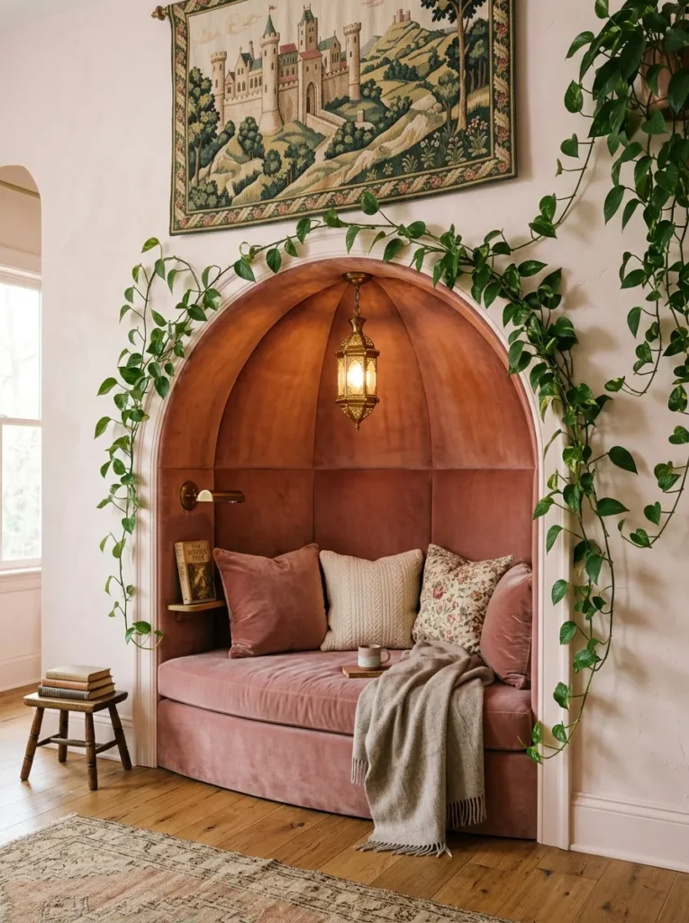
- Walls: Ballet slipper pink (a very pale, warm pink) with a wainscoting lower half painted in soft ivory
- Bed Frame/Nook: A curved, turret-shaped upholstered reading alcove built into the corner, cushioned in dusty rose velvet with a domed canopy top
- Bedding/Cushions: A mix of ivory linen and rosewater velvet throw pillows, no two in an identical fabric
- Wall Decor: A small tapestry-style woven wall hanging depicting a stylized castle silhouette in muted pink and gold thread
- Lighting: A wrought-iron lantern-style sconce mounted just inside the alcove’s curve
- Plant: A trailing pothos cascading from a high shelf just above the alcove, chosen for how naturally it drapes down the curved wall
- Rug: A small round ivory rug fitted to the alcove’s curved footprint
- Construction Note: My husband builds these curved alcove frames from ribbed plywood strips rather than a single sheet, since plywood alone can’t bend into a true curve without cracking
Why this works: Building an actual curved, domed alcove — rather than simply decorating a corner to suggest one — gives this room genuine architectural presence, which is what separates a real fairy tale reading nook from a themed corner assembled entirely out of soft furnishings.
Most “castle” or “turret” bedroom ideas online are really just a color palette and some pillows arranged in a corner. This one is different because the curve itself is built, not implied — a true domed alcove constructed from ribbed plywood, upholstered afterward in velvet, gives the room actual architectural weight that no amount of decorative styling could replicate. The woven tapestry’s muted thread colors keep the castle reference subtle rather than literal, and the trailing pothos softens the alcove’s curve the same way ivy might soften an actual stone turret window.
Structural details like this are where my husband’s construction background genuinely changes what’s possible in a room. He builds these curved sections from thin, flexible ribbed plywood layered and glued into shape, because a single sheet of standard plywood simply can’t bend into a true curve without stress-cracking within months. That’s the difference between an alcove that looks convincing in photos and one that actually holds its shape for years. Readers taking this on with a contractor should ask specifically about ribbed or bent lamination — it’s a small phrase that changes the whole outcome.
Cloud Nine Tufted Cocoon
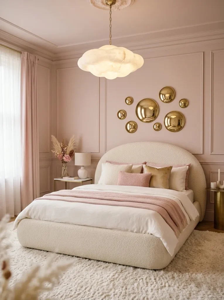
- Walls: Marshmallow pink (a soft, milky pink with a hint of gray) matte paint
- Bed Frame: A rounded, cocoon-shaped upholstered bed with a curved wraparound headboard that extends partway down each side, tufted in cloud-white bouclé
- Bedding: Ivory silk-blend duvet layered with a blush faux-fur throw folded at the foot
- Wall Decor: A cluster of small round convex mirrors in varying sizes, brass-framed, arranged like a scattered constellation above the headboard
- Lighting: A flush-mount cloud-shaped alabaster pendant casting a soft, diffused glow
- Plant: A cascading string-of-hearts plant trailing from a small floating shelf beside the bed
- Rug: A thick ivory shag rug, the kind that swallows footsteps
- Curtains: Sheer marshmallow-pink linen panels, left untied so they pool slightly on the floor
Why this works: A wraparound bouclé headboard that curves down the sides of the bed creates a genuine sense of enclosure, which is the actual psychological reason a “cocoon” bed reads as more restful than a flat headboard — the body registers being partially surrounded as protective, not just visually appealing.
There’s a real reason cocoon-style beds have become such a strong trend beyond their looks: a headboard that wraps around the sides creates a felt sense of enclosure, and enclosed spaces read as psychologically safer to the body, the same principle behind why window seats and reading nooks feel instinctively cozier than open furniture. This room leans into that fully, with bouclé tufting extending down both sides of the bed rather than stopping at a flat panel. Alabaster cloud lighting keeps the glow diffused and shadowless, reinforcing the soft, weightless quality the whole space is built around.
I’ve noticed clients gravitate toward this exact shape without being able to explain why — they just say the room “feels different” to sleep in, and the enclosure effect is almost certainly why. Marshmallow pink walls read as nearly gray in low light and genuinely pink in daylight, which keeps the room from ever feeling one-note. The scattered convex mirror cluster above the headboard adds visual interest without requiring a single large piece of art, and each mirror catches the string-of-hearts plant’s trailing vines from a slightly different angle as it grows.
Midnight Garden Party Bed
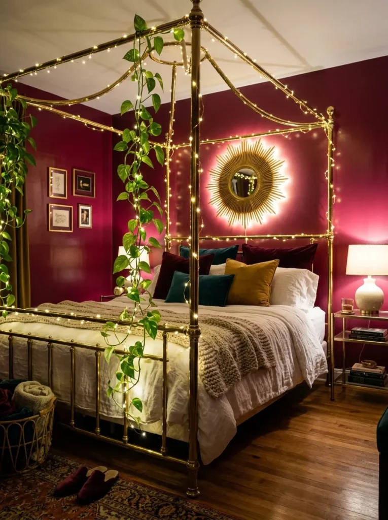
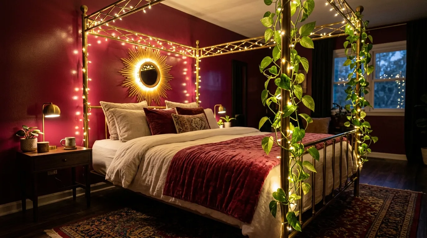
- Walls: Raspberry cordial (a deep, saturated pink-red) high-gloss paint, used only on the headboard wall — the remaining three walls in soft ivory
- Bed Frame: A slim brass four-poster frame with no canopy, left open so the raspberry wall shows through the posts
- Bedding: Ivory silk sheets with a single raspberry velvet lumbar pillow
- Wall Decor: A large round brass sunburst mirror centered on the raspberry wall, doubling as a “moon” motif at night
- Lighting: Dimmable warm-white string lights woven loosely through the brass bed posts, left visible rather than tucked away
- Plant: A dramatic trailing pothos climbing the brass posts themselves, trained to wind around the frame like a garden vine
- Rug: A deep raspberry Persian-style rug with cream detailing
- Construction Note: My husband recommends low-voltage LED string lights rated for continuous overnight use if they’re wound directly onto a metal bed frame, since standard incandescent strings generate more heat against metal than most people expect
Why this works: Using a single saturated accent wall behind an open brass frame, rather than painting the whole room in one bold pink, lets a deep raspberry shade read as dramatic and evening-appropriate instead of overwhelming — proof that one bold wall does more design work than four matching ones.
This room proves a deep, saturated pink works best in small, deliberate doses rather than wall-to-wall. Raspberry cordial on a single headboard wall, framed by an open brass four-poster with no canopy, lets the color read as a dramatic backdrop rather than an enveloping tone — the way a stage set uses one bold surface to focus attention, not four. String lights left visible and woven through the brass posts, rather than hidden inside a canopy, turn the frame itself into the light source, so the room glows from an unexpected place after dark. A single raspberry velvet pillow is the only textile repeating the wall color, keeping the rest of the room quieter by contrast.
I love recommending this layout to a reader nervous about committing to a saturated color, because the risk is genuinely low — one wall, one paint can, reversible in an afternoon if it doesn’t suit the space. Training a real pothos vine to climb the brass posts over several months gives the “midnight garden” reference an actual living element instead of a decorative prop, and it keeps changing shape as the plant grows. My husband’s note about LED versus incandescent string lights matters more than people assume when metal and continuous overnight use are both involved.
You’ll Also Love: 15 Vanity Ideas for Small Bedrooms That Save Space
Sugared Almond Reading Window
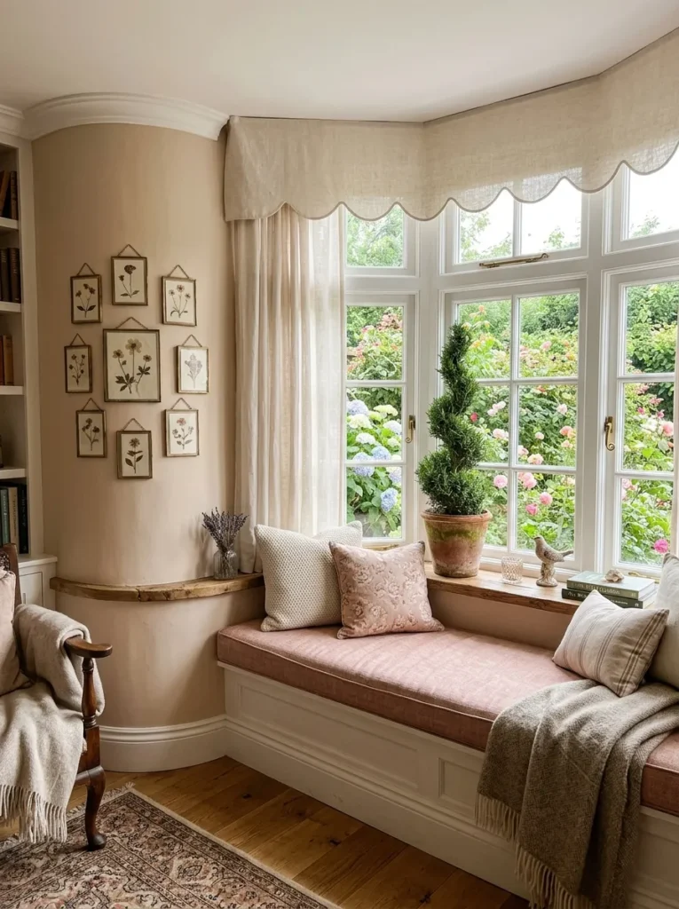
- Walls: Sugared almond pink (a warm, slightly dusty pink-beige) flat matte paint
- Bed Frame: A low platform bed in whitewashed oak, kept deliberately simple to let the window seat carry the room’s drama
- Window Seat: A built-in bay window bench cushioned in blush linen, framed by a curved wood surround with a scalloped valance overhead
- Bedding: Oatmeal linen duvet with a single thin satin ribbon trim along the pillowcase edge
- Wall Decor: A collection of small pressed-flower frames arranged in an asymmetrical cluster beside the window seat
- Plant: A rosemary topiary trained into a small spiral shape, in a simple terracotta pot on the window ledge
- Rug: A soft oatmeal wool rug with subtle raspberry fleck detailing
- Construction Note: My husband builds these window seat surrounds with a slight forward lean on the scalloped valance — about two inches — so it reads correctly from standing eye level instead of looking flat or tilted backward
Why this works: A built-in window seat gives a fairy tale bedroom a genuine architectural anchor rather than a decorative one, and it’s the single upgrade that consistently makes buyers linger longest in a room during real estate showings, according to what my husband sees on renovation projects.
A window seat does something no amount of styling elsewhere in a room can replicate: it gives a fairy tale bedroom an actual destination, a place to sit and read that exists because of the room’s architecture, not because of a chair someone placed there. Sugared almond walls keep the palette warm without leaning too sweet, letting the scalloped valance and pressed-flower frames carry the romantic detail instead. A whitewashed oak platform bed stays intentionally quiet, which is the right call whenever a room already has one strong architectural feature doing the heavy lifting.
My husband has built more built-in window seats than he can count at this point, and he always mentions the same detail: the scalloped valance needs a slight forward lean, roughly two inches, or it reads as flat and slightly wrong from standing height. It’s a small measurement most people would never think to ask about, but it’s the difference between a valance that looks intentional and one that looks like an afterthought. The spiral rosemary topiary on the ledge is a small nod to my plant science background — trained topiary shapes photograph beautifully and require far less light than most flowering plants.
Grand Finale Chandelier Suite
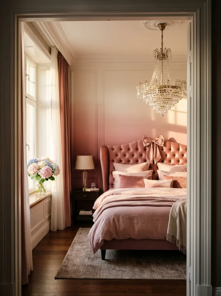
- Walls: Peony blush ombré wallpaper, deepest at the baseboard and fading to near-white at the ceiling line
- Bed Frame: A grand upholstered bed with a tall, gently curved wingback headboard in dusty rose silk-blend fabric
- Bedding: Layered ivory silk and blush velvet, with one oversized silk-satin bow tied at the center of the headboard’s top curve — the room’s single signature motif
- Wall Decor: Two matching gilt sconces flanking the headboard, each holding a small flameless taper candle
- Lighting: A statement crystal chandelier hung slightly off-center above the foot of the bed, positioned so it’s the first thing visible on entering the room
- Plant: A flowering hydrangea in a large fluted ceramic urn beside the window, chosen for its full, romantic bloom shape
- Rug: A blush-and-cream Aubusson rug spanning nearly the full room
- Curtains: Floor-length dusty rose silk dupioni, pooling generously on the floor with a single satin ribbon tieback at each panel
Why this works: Placing the chandelier off-center above the foot of the bed, rather than centered over the bed itself, means it’s the first thing a person sees walking through the doorway — a small positioning choice that makes an entire room feel designed around a single dramatic entrance moment.
This room is built to be the article’s final, most photographed idea, and every choice supports that goal. The ombré wallpaper’s gradual fade from deep peony blush to near-white keeps the walls from competing with the chandelier, which is deliberately hung off-center so it’s the very first thing visible from the doorway rather than centered flatly over the bed. One oversized bow at the headboard’s curve is the room’s only major coquette motif, kept singular even in a room this layered with detail, because restraint is what keeps fifteen bows across fifteen rooms from ever blurring together into one repetitive formula.
I’ve walked into rooms exactly like this one during client walkthroughs and watched people stop in the doorway before saying a word — that pause is the entire point of positioning a chandelier off-center this way. A blush-and-cream Aubusson rug spanning nearly the full floor grounds all that height and drama in something soft underfoot, and the hydrangea’s full, rounded blooms echo the curved headboard shape without repeating any material or color used elsewhere in this article.
Styling Principles: Keeping Coquette Sophisticated
The coquette aesthetic lives or dies on three things: material quality, restraint, and a single anchoring motif. Real silk, quality cotton sateen, and grosgrain or satin ribbon hold their shape and catch light in a way synthetic materials simply can’t — that’s why the same bow looks like a costume prop in polyester and like a design statement in silk. Restraint matters just as much as material: one bow, one lace detail, or one ribbon-wrapped object per room reads as a deliberate choice, while five scattered motifs read as an unfinished theme.
Before adding any coquette detail to your own space, pick the single element you want to be the room’s signature — a headboard bow, a ribbon-laced curtain, a wrapped mirror frame — and let everything else in the room stay quiet enough to support it.
FAQs
1. How do you make a coquette bedroom look adult instead of childish? Limit yourself to one coquette motif per room and execute it in real materials — silk, satin, or quality linen rather than synthetic fabric. A single well-made bow or ribbon detail reads as sophisticated; several scattered around a room reads as juvenile.
2. What are the best pink shades for a coquette bedroom? Muted, complex pinks work best: dusty rose, blush, rosewater, ballet pink, and cameo pink all read as elegant rather than sugary. Bright bubblegum or true baby pink tends to skew younger, so save those for small accents rather than walls or bedding.
3. Can you get the coquette look on a budget? Yes — a single grosgrain or satin ribbon detail, a vintage-style photograph in a simple frame, or one well-placed bow on an existing headboard can shift a room’s whole mood for well under $50. Spend your budget on one quality material moment rather than several cheap ones.
4. What material works best for bows and ribbon details? Silk-satin and grosgrain ribbon hold a crisp, structured shape and reflect light in a way that reads as intentional rather than costume-like. Thin polyester ribbon tends to look flat and craft-store cheap even when the color and shape are right.
5. How do you fit coquette style into a small bedroom? Choose one vertical anchor — a ribbon-wrapped mirror, a single statement bow above the headboard, or a photograph wall — rather than a canopy or full furniture set, which can overwhelm a smaller room. A quiet wall color with one striking detail reads as intentional even in limited square footage.
6. Does coquette styling require a full room renovation? No — most of the ideas in this post can be layered onto existing furniture with paint, textiles, and one anchor detail. The bigger structural ideas, like a built-in window seat or a curved alcove, are optional upgrades rather than requirements for the aesthetic to work.
Conclusion
Fifteen rooms, one clear takeaway: pink coquette bedroom ideas work best when a single motif does the talking — one bow, one ribbon detail, one vintage photograph — rather than five competing for attention. Restraint, real materials, and an intentional palette are what carry this trend from teenage to genuinely elegant. I’ve seen how a small swap, like real silk ribbon instead of synthetic, can completely shift how a room feels the moment you walk in.
Save this post for when you’re ready to start, pick one idea that speaks to you, and give it a try in your own space. If someone in your life would love this look too, pass it along.